
Original post, March 5th, 2020: After 23 years, BMW has updated its logo … but there’s a problem.
Let’s back up a little, as even the previous logo wasn’t perfect. Debuted in 1997, it followed the then-trendy “3D” look, complete with highlights. It was, however, clearly BMW — black background, blue-and-white roundel, chrome outline, lettering. This new one, however, loses the iconic black (for transparent) and chrome outline (for white):
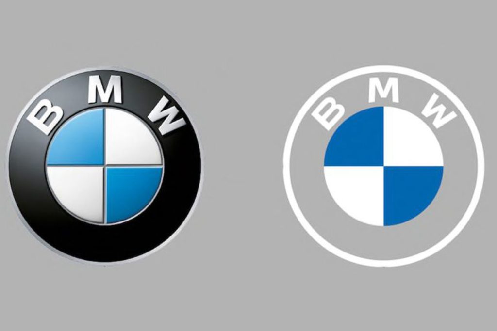
It’s less representative and less clear in my opinion, but hey, I’m only a BMW owner, not any part of their marketing team.
Another problem: it debuted on the Concept i4. controversial all by itself.
Why not revert to the earlier, 1963 version? (Or update it with new type — but keep the black?) Transparency is fine in some cases, but I’m not sure that this isn’t a case of style over substance in the actual use cases (web site logo, app logo, etc. — more than just on the cars, I mean).
More from the always–excellent Brand New.
Update: 3/11/20: “BMW speaks out on ‘misinterpretation’ of new logo.” (Think about the “Instagram-ability!! Gak.)
Update: 3/20/20: BMW explains. (Via BMWBlog.)
Update, 7/15/20: Copenhagen, Denmark-based Dim Newman takes a stab at an alternate solution. (I like it.)
Update, 7/27/20: Dezeen has a roundup of the six other companies that have made their logos “flat,” proving the “3D” look mentioned above is truly out of fashion:
Update, 9/25/20: Vauxhall joins the trend:
Update, 11/27/20: The Ford update that never was:
Ford Almost Let a Graphic Design Legend Update Its Blue Oval Logo in 1966: Paul Rand, who designed iconic logos for IBM, Cummins, ABC and numerous other companies, designed a sleek logo for Ford that went unused.
Update, 12/2/20: Not enough? How ’bout Opel:
“Opel Details All-New, Slimmer And More Modern ‘Blitz’ Logo,” at CarScoops.
Update, 12/30/20: Kia’s was previewed on a show car earlier in the year, but they’ve gone and made it official:
There were some changes along the way, if you compare what’s on the show car and what you see above — and not all for the better, as it almost gets smeared. Still, looking forward to seeing where one of the most dynamic car companies today goes with this.
Update, 1/8/21: GM. One word: GAK.
So bad I actually feel sorry for them. More here and here.
Update, 1/13/21: Brand New is actually much nicer to GM’s logo update than I expected. Diplomacy? You decide. (Brand New is a subscription now, BTW — the best $20/year available, IMHO.)
Update, 3/2/21: Peugeot has joined the fray. Not great, especially at smaller sizes, but at least not the GM train wreck — and, in many ways, better than the last couple of outline lions (this one seems to be based on the 1960 version):
Read about the lion’s history here, Peugeot’s press release “reaffirming its personality and character” here, or one of the regular site’s notes, including a potential move upmarket here or here.
Update, 3/4/21: Audi, while not redoing their iconic “4 rings” logo, has redone the branding around that logo:

Brand New has more (note: BN is now subscription-only — easily the best $20 that I’ve spent in a while).
Update, 3/6/21: Speaking of Brand New, they have a good deal more information regarding Peugeot. Good stuff!
Update, 3/10/21: Dezeen has more on Peugeot, as well. And CarScoops has the first pictures of the new 308 — the new logo premieres on this model update — and discusses that, on the grille, some of the car’s sensors appear behind the logo. Interesting. (I still preferred the lion on the grille, myself. Not that we get Peugeots in the United States, anyway….) Check it out.
Update, 3/10/21: CarScoops has some more on Nizzan — uh, Freudian slip there: Nissan and their new logo.
Okay, who’s gonna be next…?
Update, 3/13/21: Uh… Renault!
Not as big a change as Peugeot, and more successful, too: single color, retains history well, still instantly recognizable, works at small sizes. Nice. Details from Motor1 or CarScoops.
Update, 3/20/21: Brand New discusses the new Renault logo:
There is nothing wrong at all with it and I do like the approach to its construction but, ultimately, it’s like it’s missing some emotion or passion or, pardon my French, a Je ne sais quoi to make it special.
I agree that the 1972 version is superior. Let’s see how this one evolves.