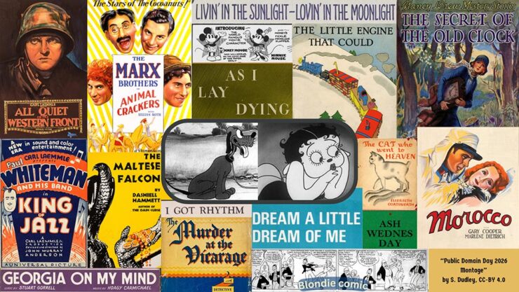
This month, some optimism, some interesting books, some creative fonts, and some fantastic photos, and some positivity — plus a smidgen of pessimism — in the form of Adobe.
On the whole, it’s mostly optimism, promise. And there’s butter. And a sleeping fox. And duck.
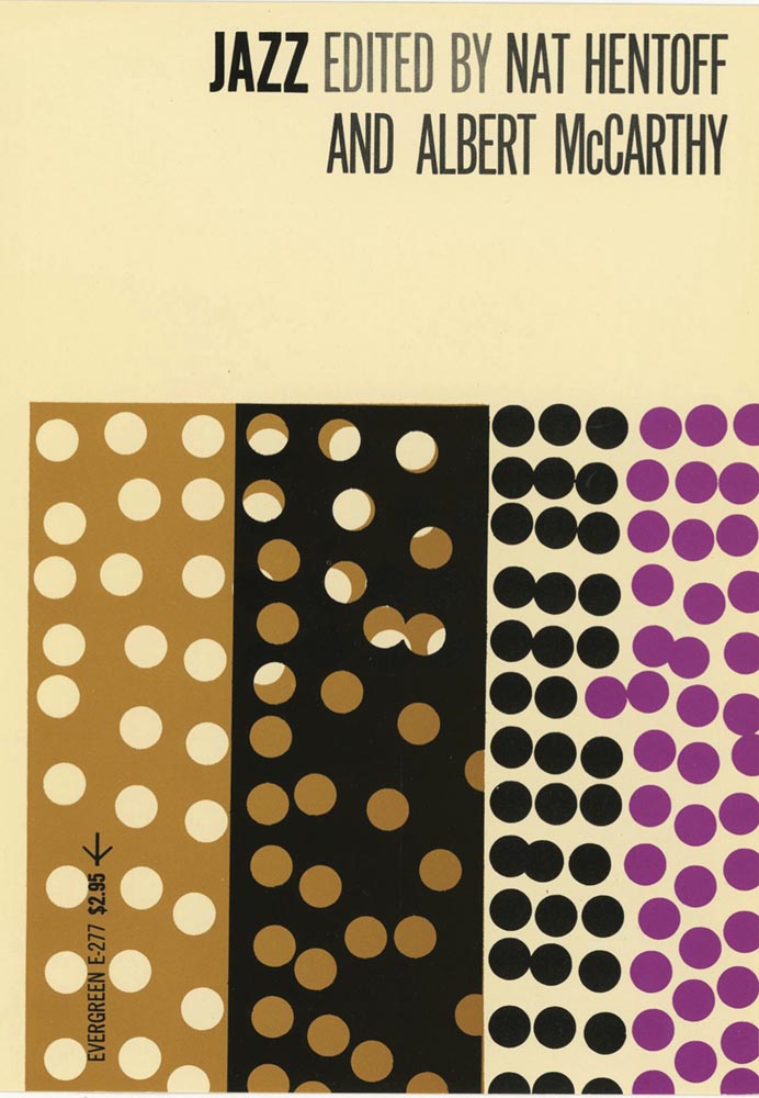
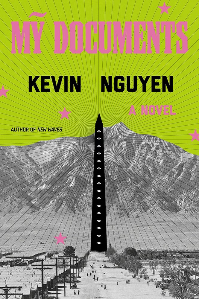
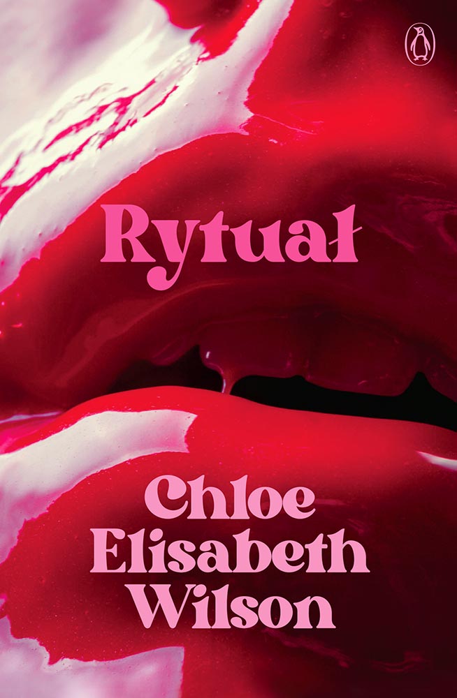
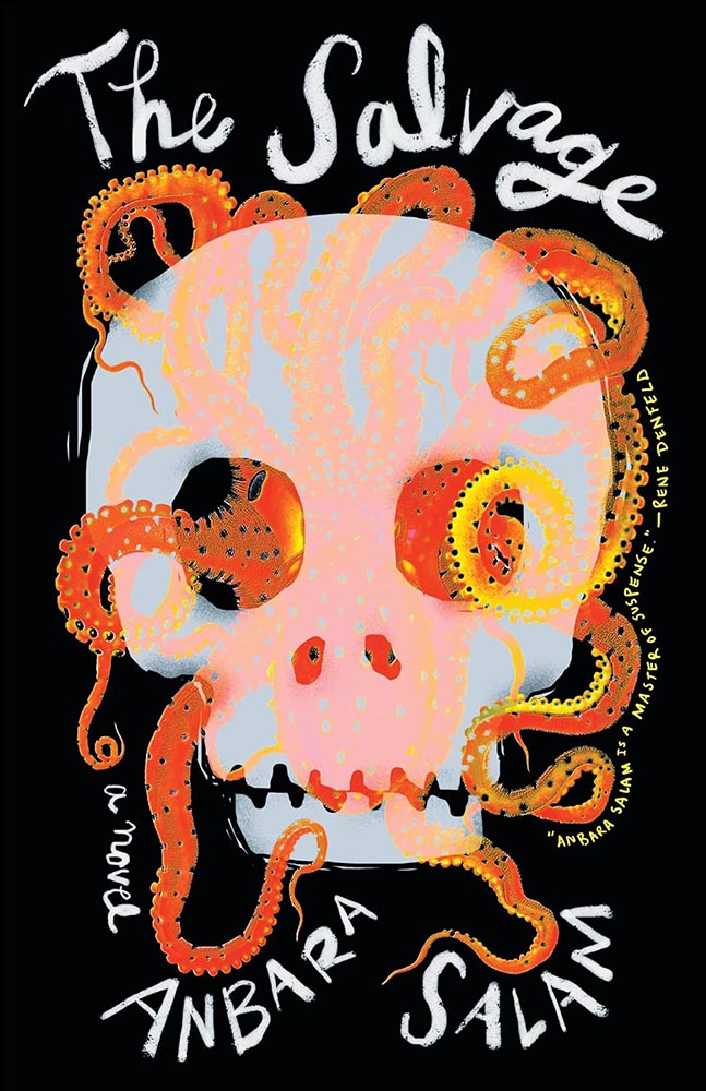
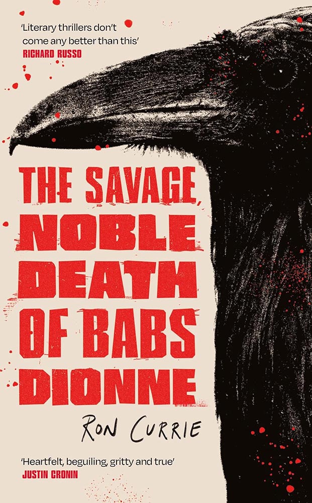
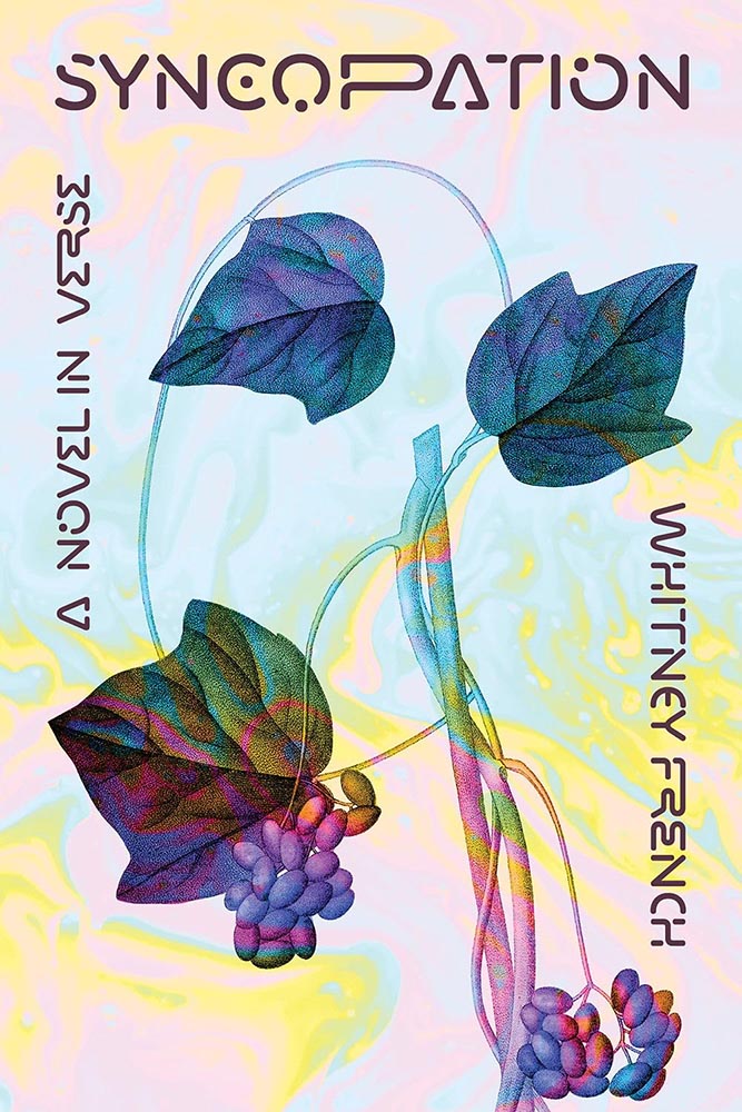
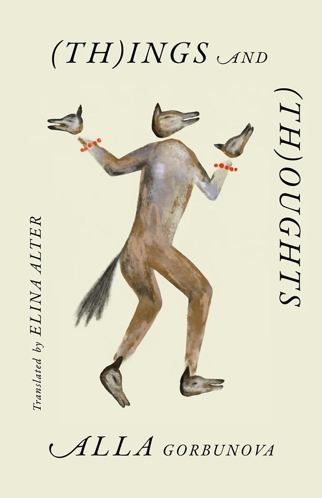
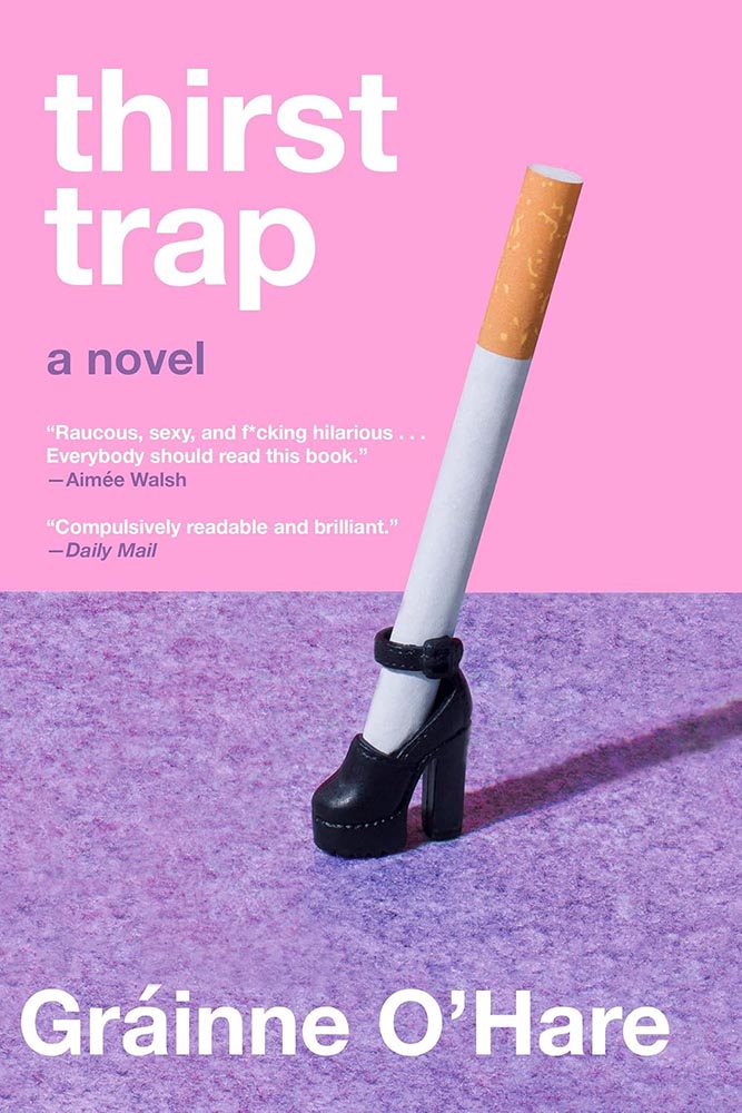
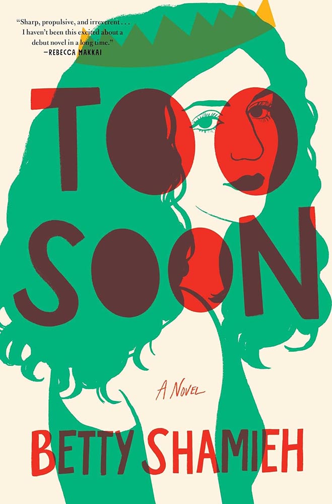
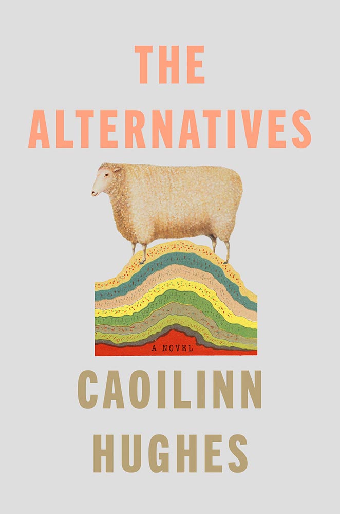
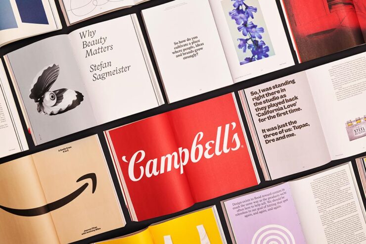
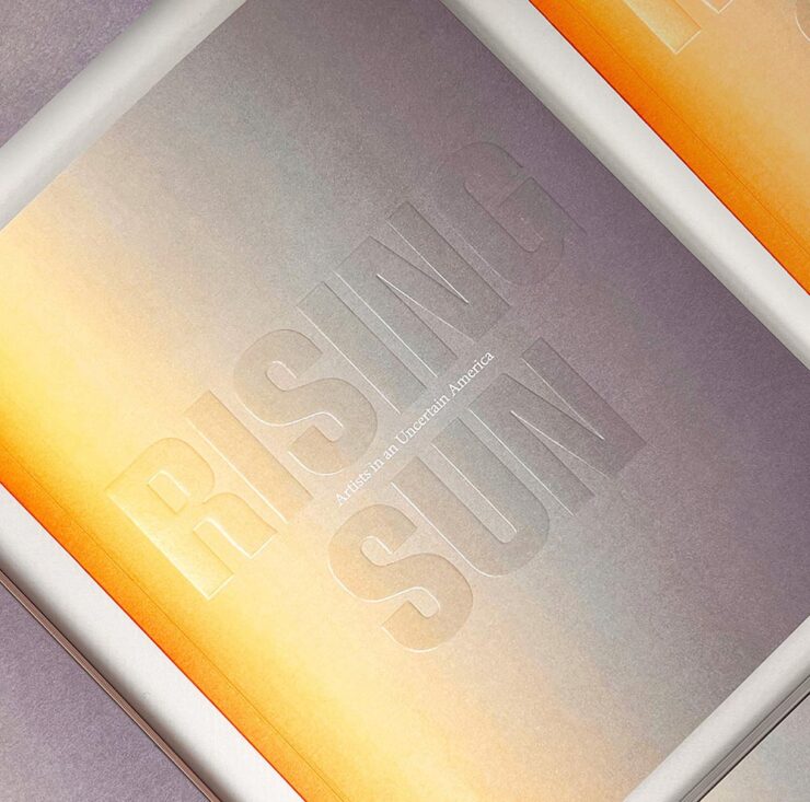
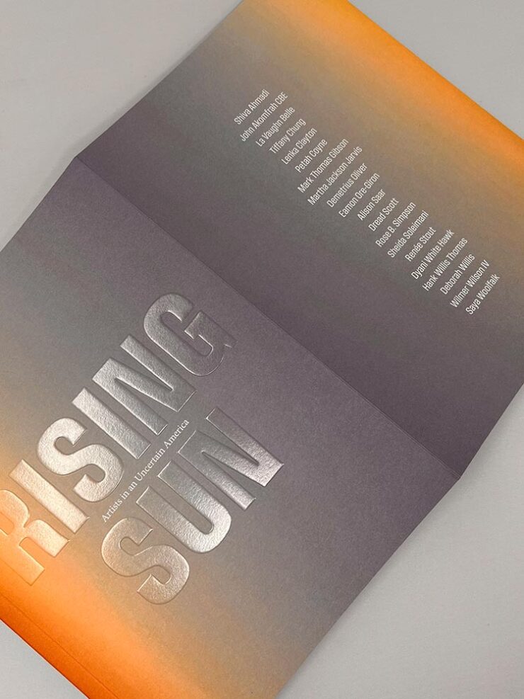
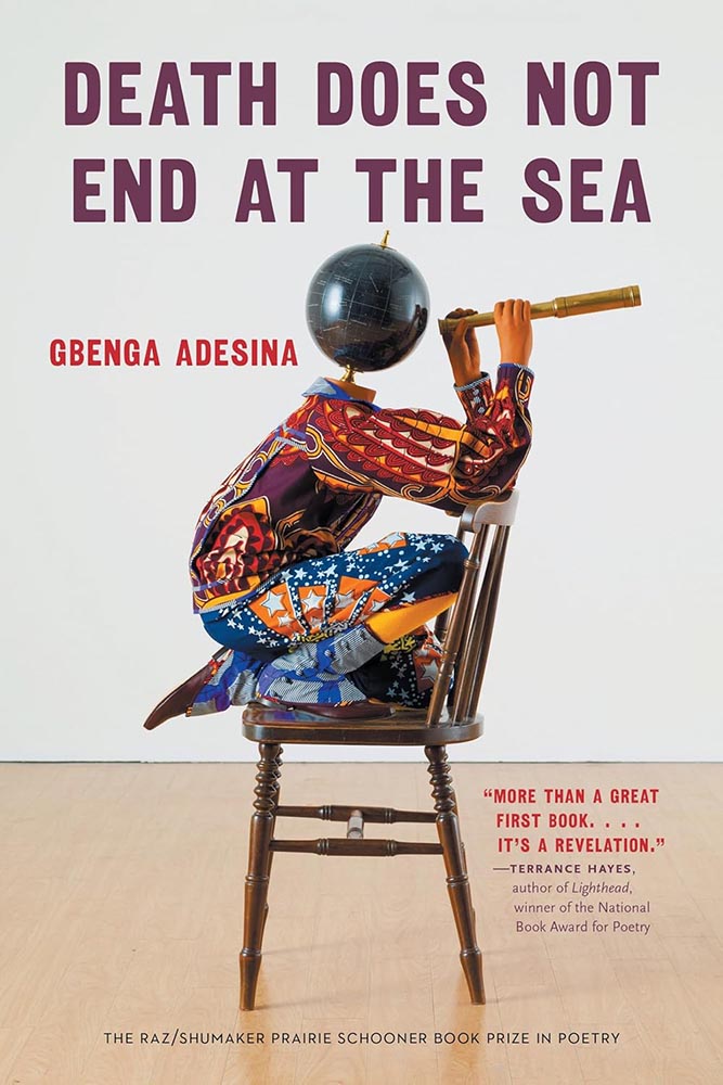
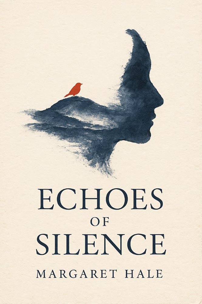
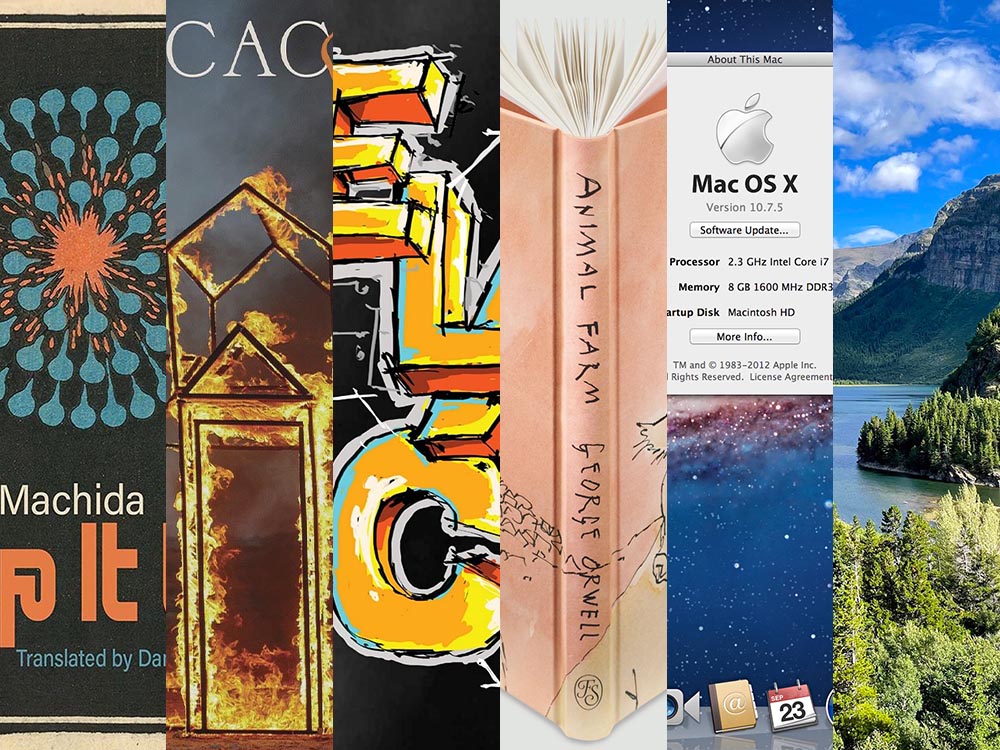
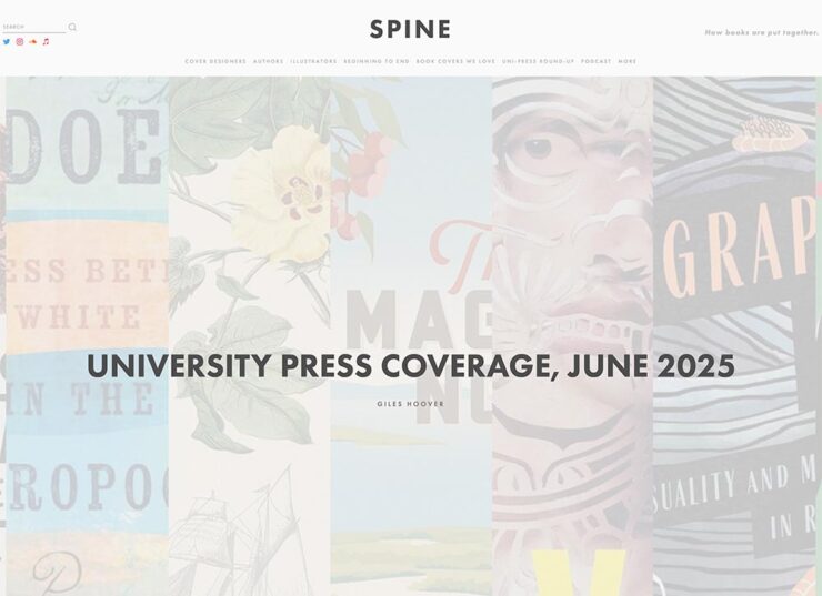
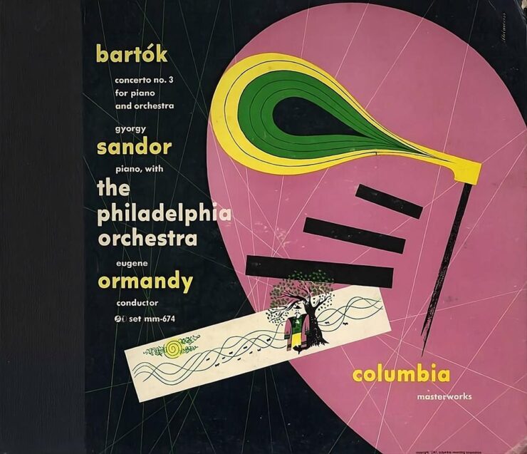
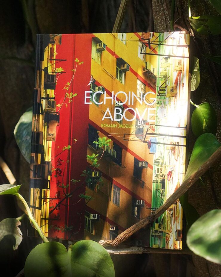
This Month’s Spine
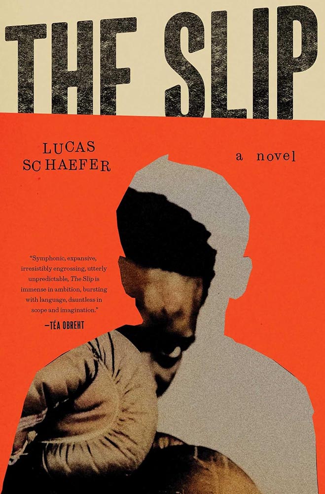
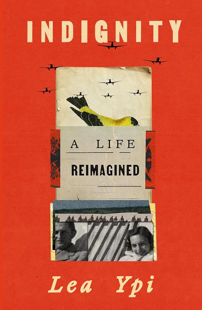
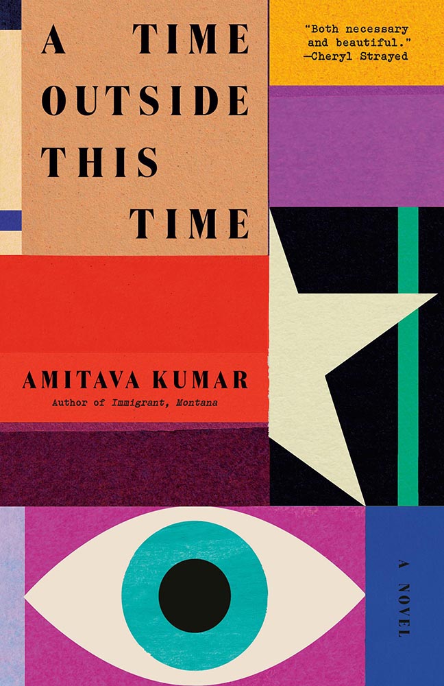
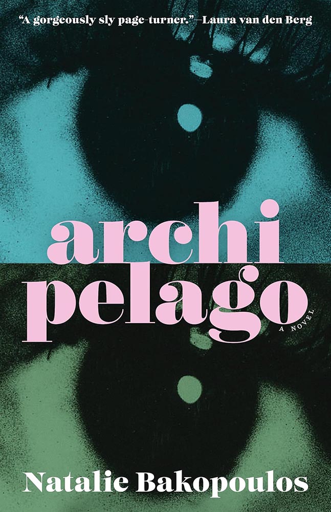
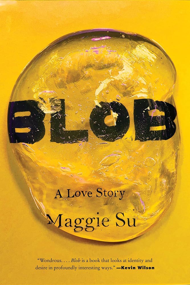
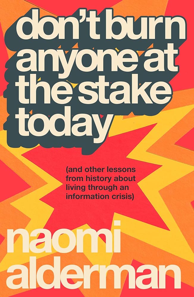
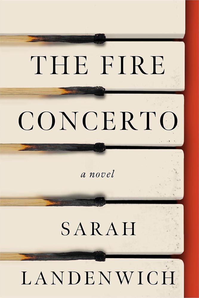
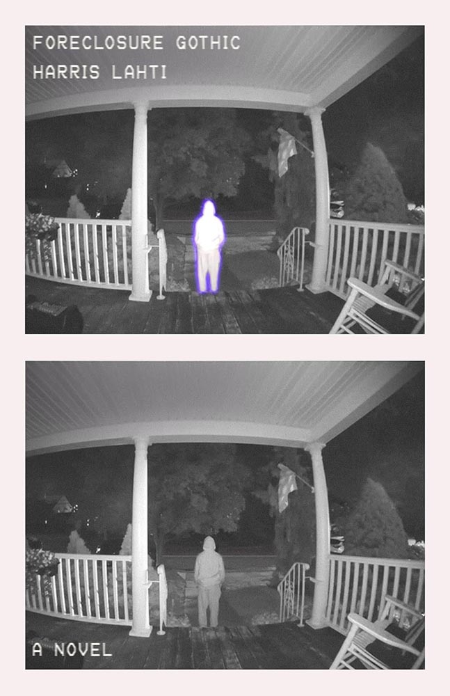
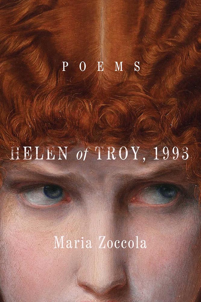
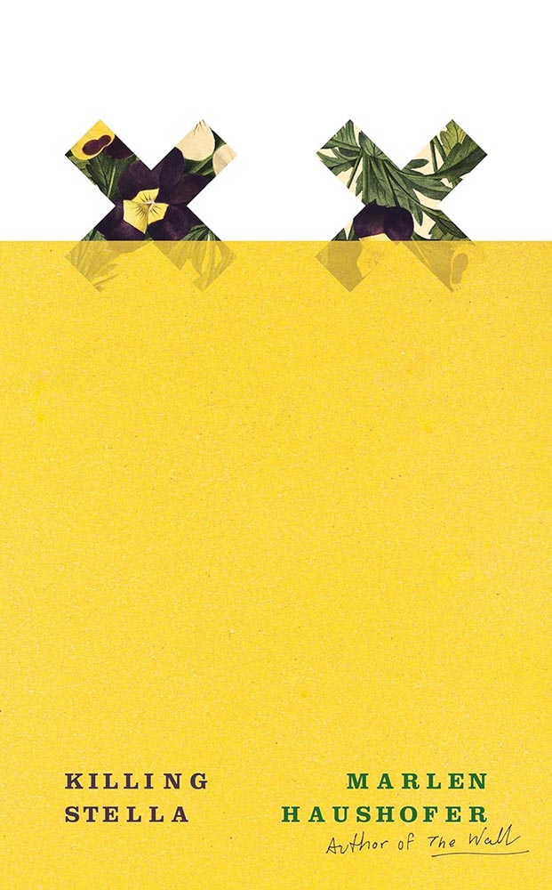
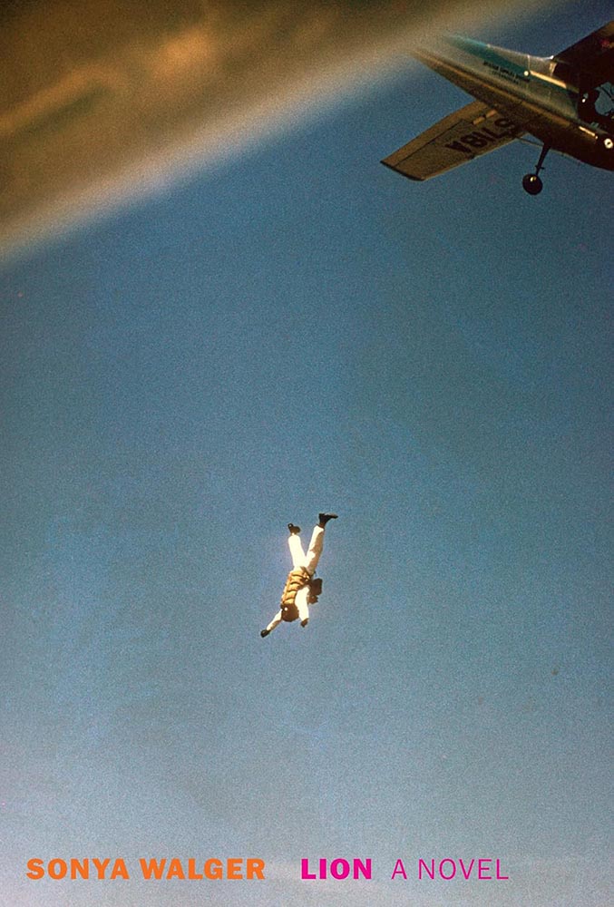
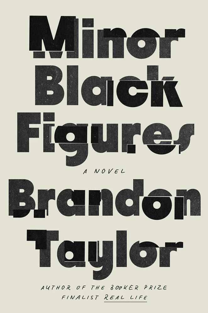
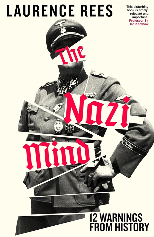
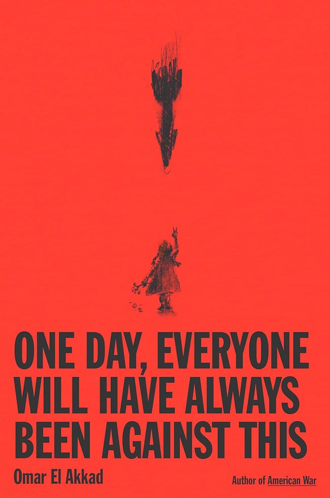
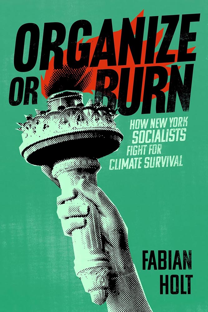
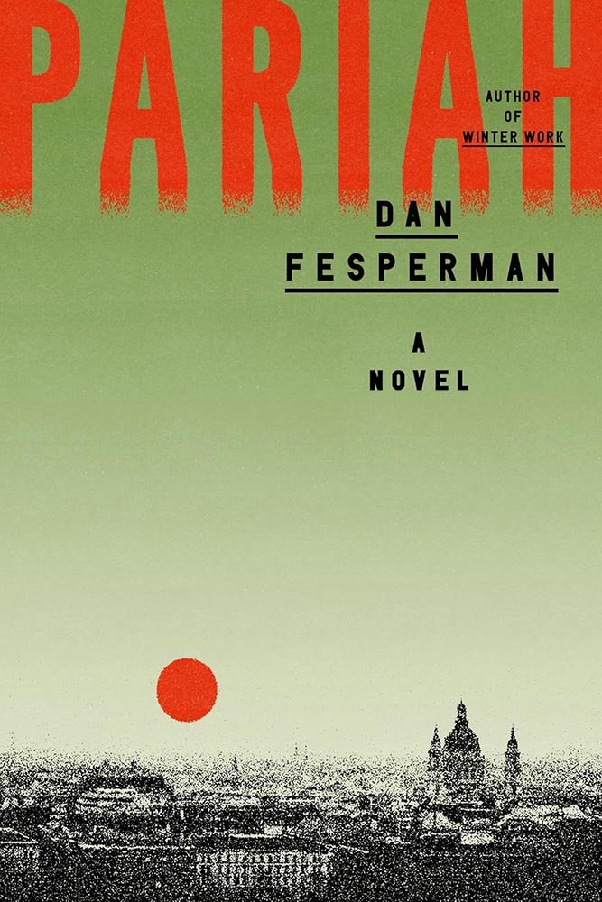
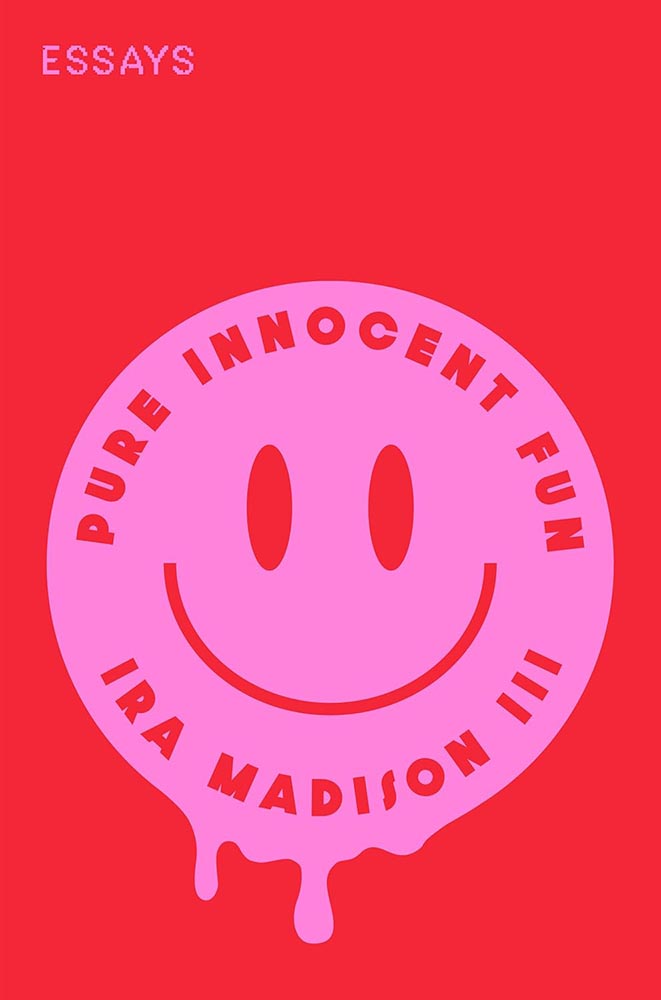
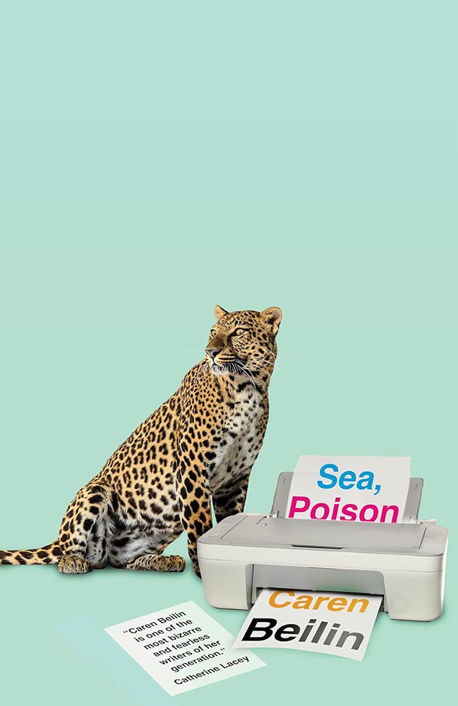
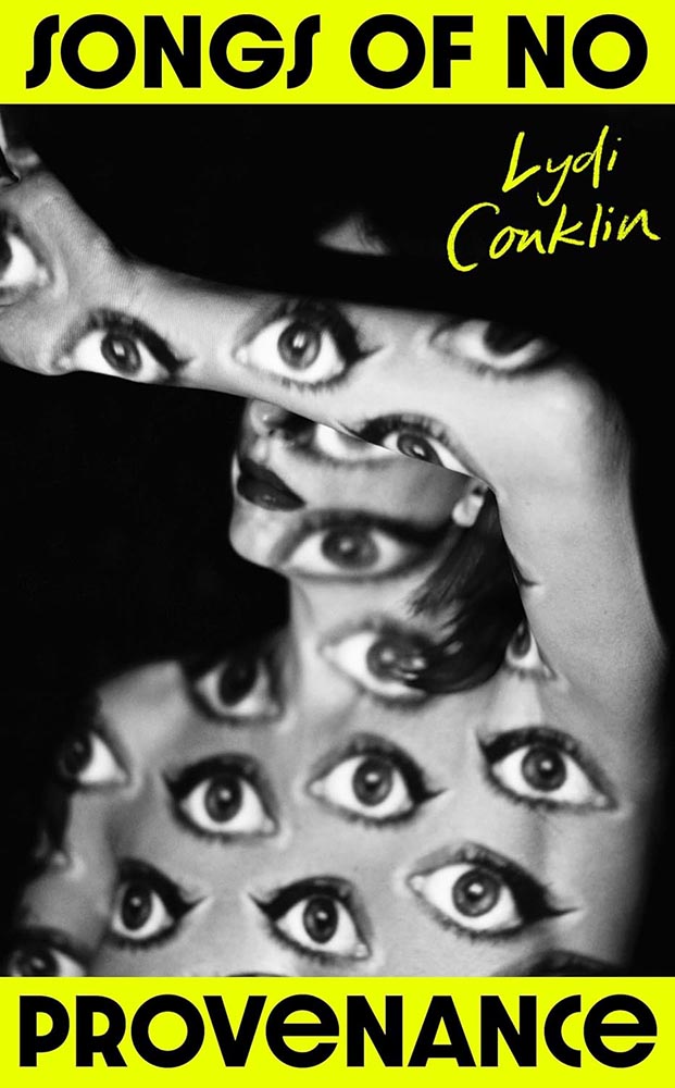
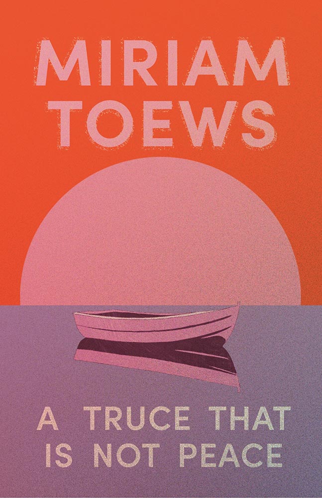
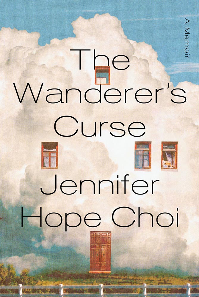
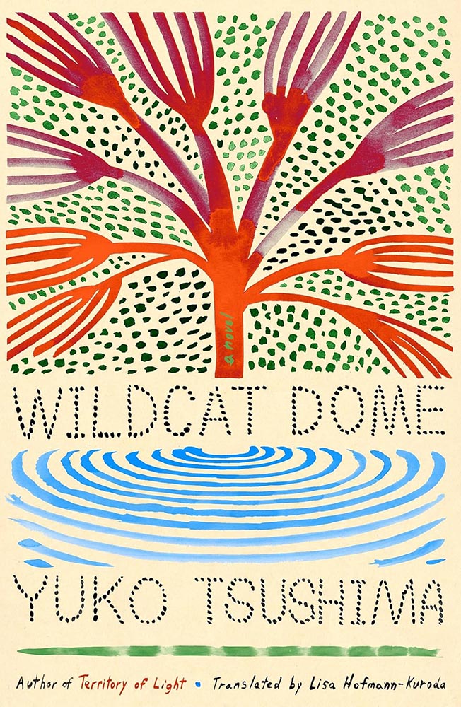
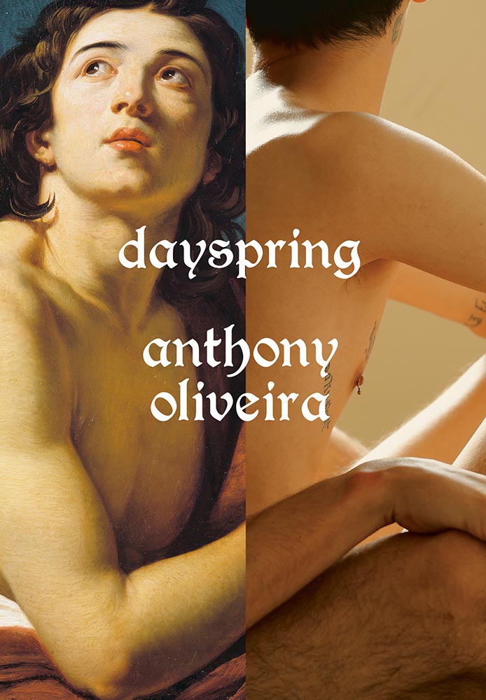
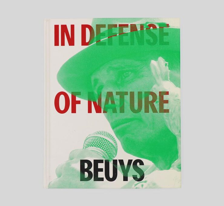
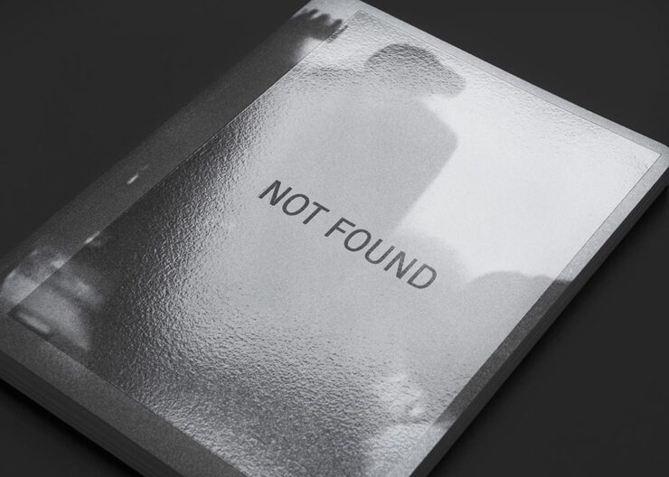
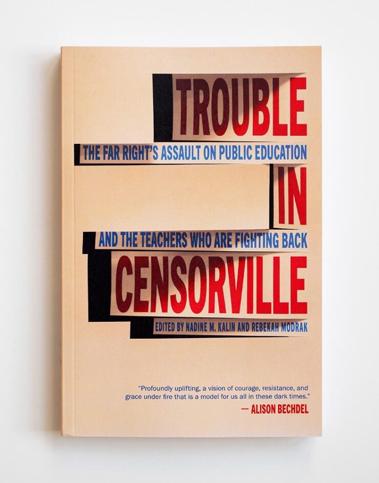
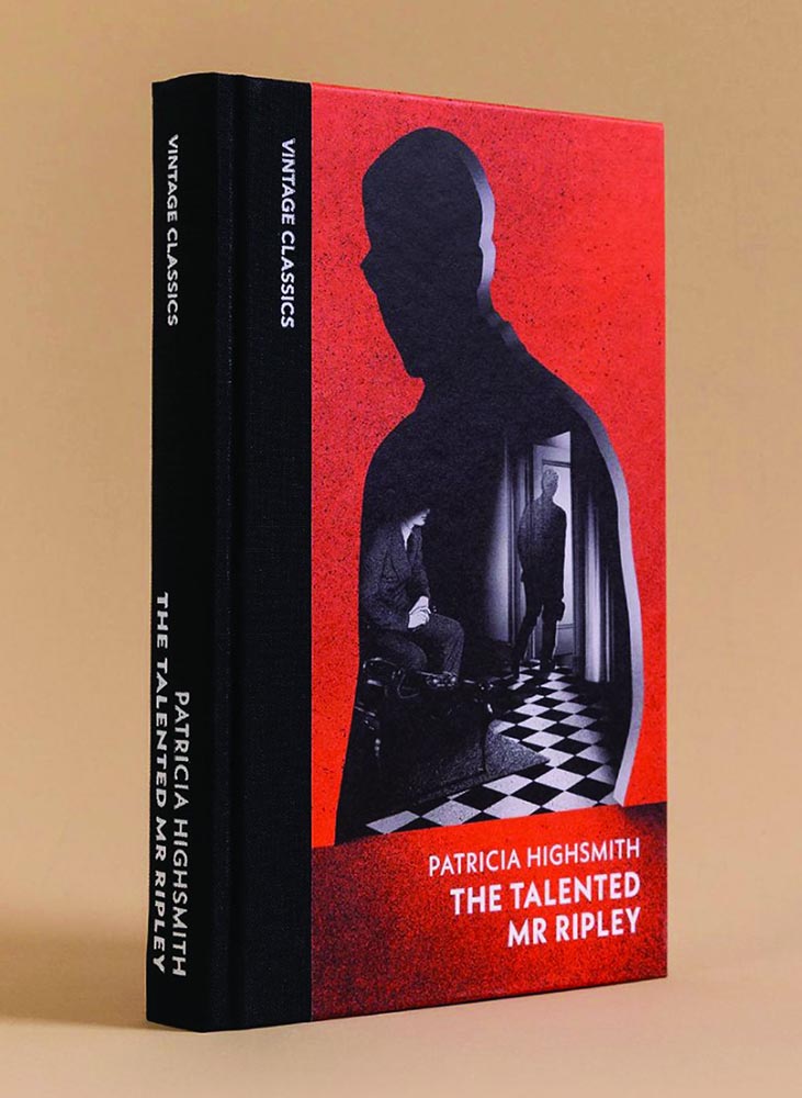
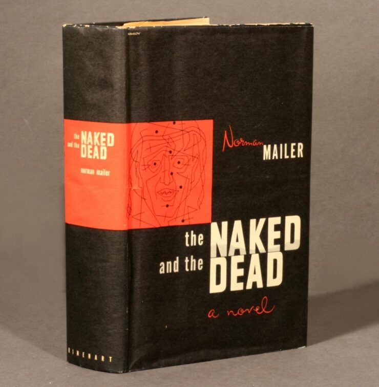
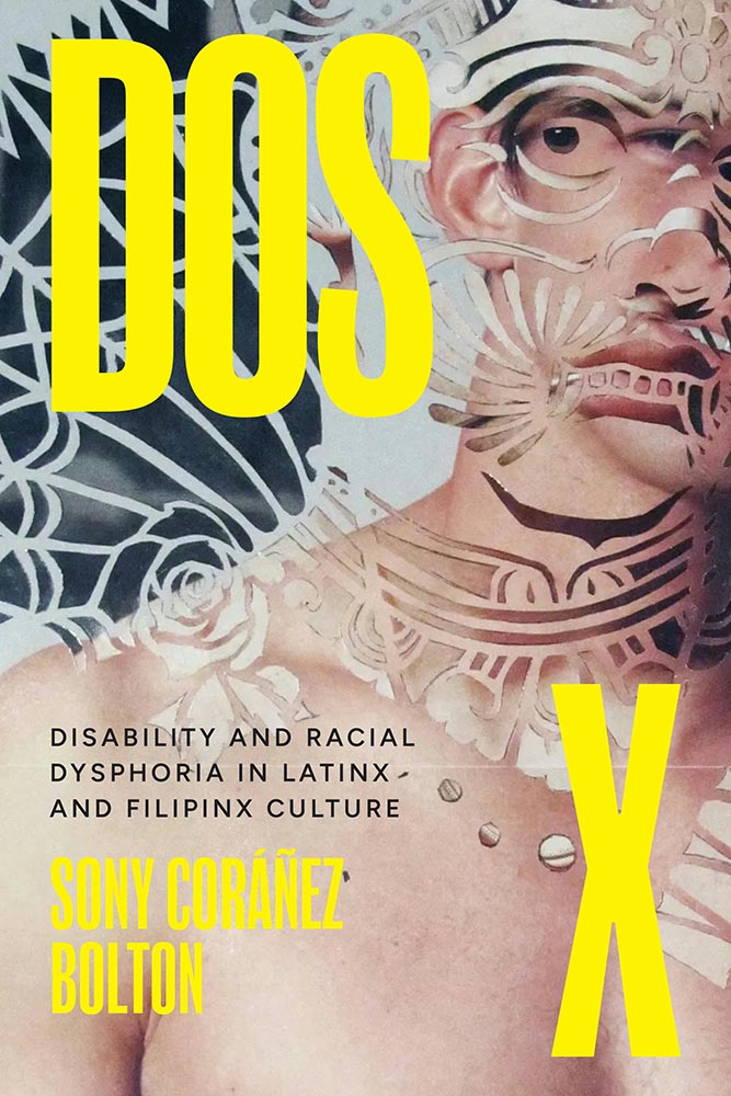
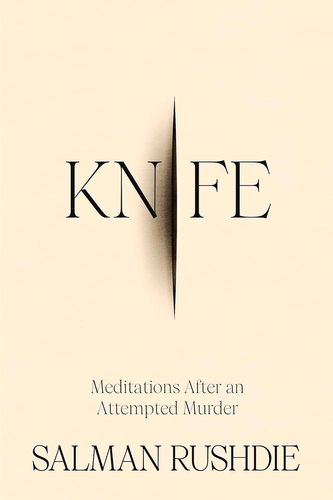
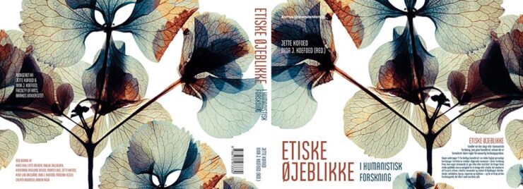
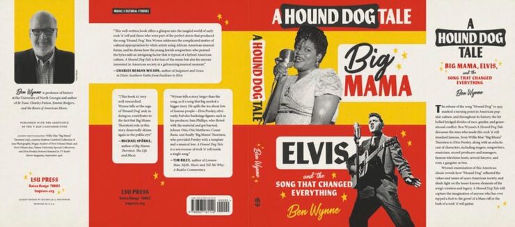
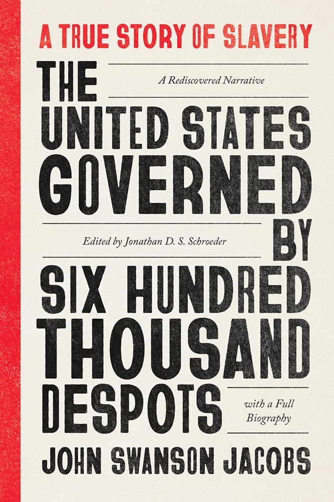
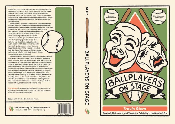
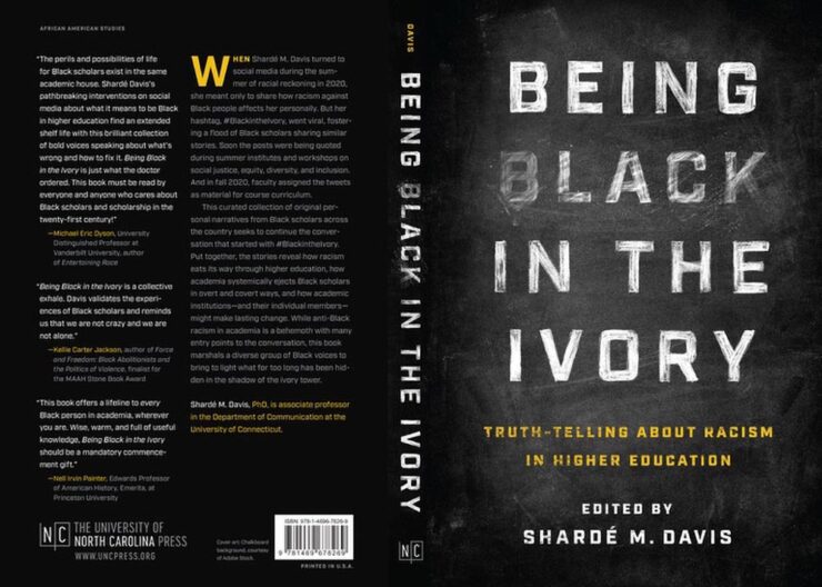
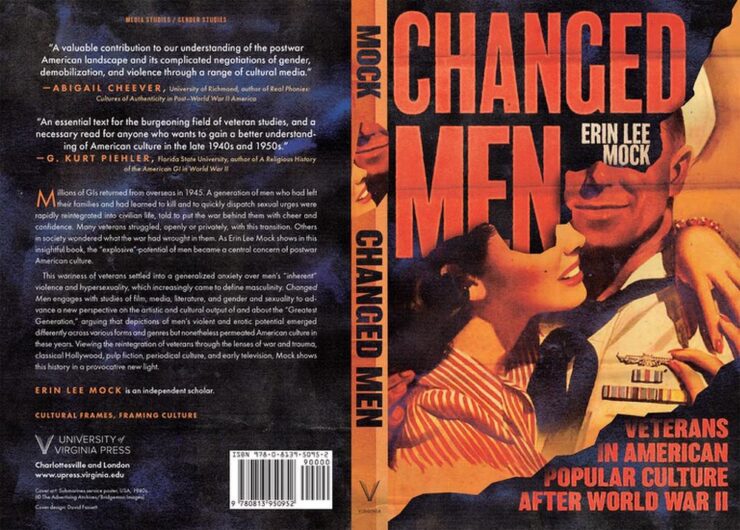
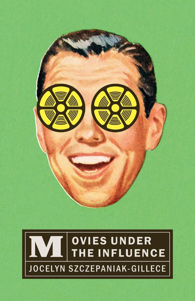
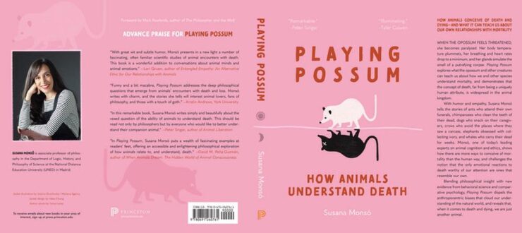
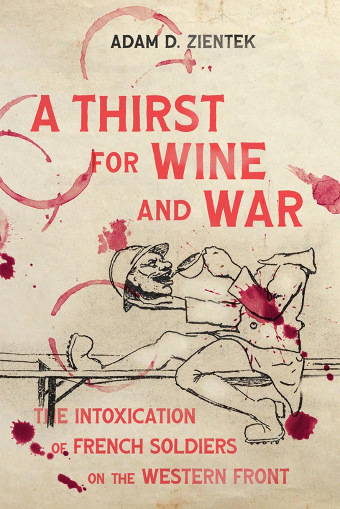
“Our initial direction for [the designer] was to create a clean, simple text design that conveyed crisis, dread, or the element of threat,” this title’s production editor said in response to my request for information.
“To say that someone lit a fire under those directions is an understatement,” I wrote in this title’s commentary. “In today’s American academic reality, where every day could indeed be … shall we say, fraught, this cover takes the brief and runs straight onto the dean’s list.”
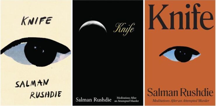
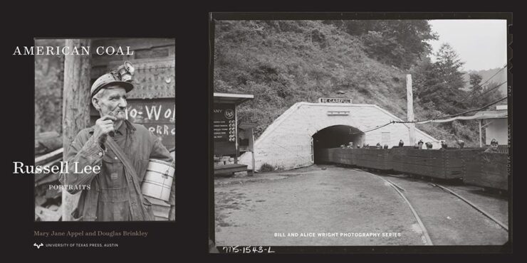
See the rest of this month’s University Press Coverage at Spine.
Why She’s an Optimist
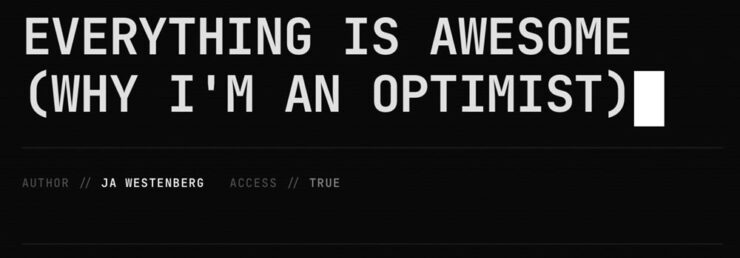
Joan Westenberg (previously) has another great essay up about the AI doom loop — why it’s easy to believe that the downward spiral is tightening, to roughly paraphrase — and why she believes it just isn’t true:
In 1810, 81% of the American workforce was employed in agriculture. Two hundred years later, it’s about 1%. If you had shown someone in 1810 a chart of agricultural employment decline and asked them to model the economic consequences, the only rational projection would have been apocalypse. Where would 80% of the population find work? What would they do? How would anyone eat if the farmers were all displaced by machines?
— Joan Westenberg, “Everything is Awesome”
The answer, of course, is that entirely new categories of work were created that no one in 1810 could have conceived of, and these new jobs paid dramatically more than subsistence farming. Factory work, office work, services, knowledge work, the entire apparatus of modernity: none of it was visible from the vantage point of the pre-industrial economy.
“The transition was brutal and uneven. [People] suffered,” she writes. “But the trajectory was real, and the people projecting permanent immiseration […] were, in the fullest sense, catastrophically wrong.”
The essay isn’t perfect; it’s too long, and the editor failed to catch a few typos (he said, hypocritically). But … it scales. Zoomed out, it applies to more than AI.
“The doomers may have the best stories. I believe the optimists have the best evidence,” she concludes. I agree. Or, at least, I’d like to.
Go read it and see whether you do.
Great Web Moments X2
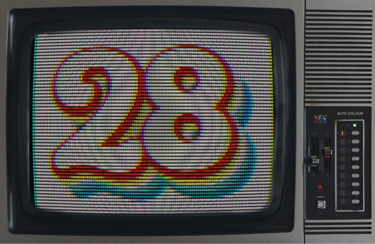
Kottke.org
Kottke Turns 28. There are few websites I nod along with as often as this gem from the late ’90s, still going strong.
Scripting.com
Dave Winer shoots for the stars:
We’re going to try to reboot the web.
— Dave Winer, scripting.com, “Mission Statement”
Doing what the social networks do, but only using the web.
Every part replaceable.
Scripting News has been around since ’94 and if you’re even a little interested in a free web, his site is a fine place to start learning how you can contribute to keeping it free.
Note: scripting.com is, famously, still non-https — which means that if you click on either of the above links you’re likely to get a warning that the site isn’t secure. It’s very much a safe link.
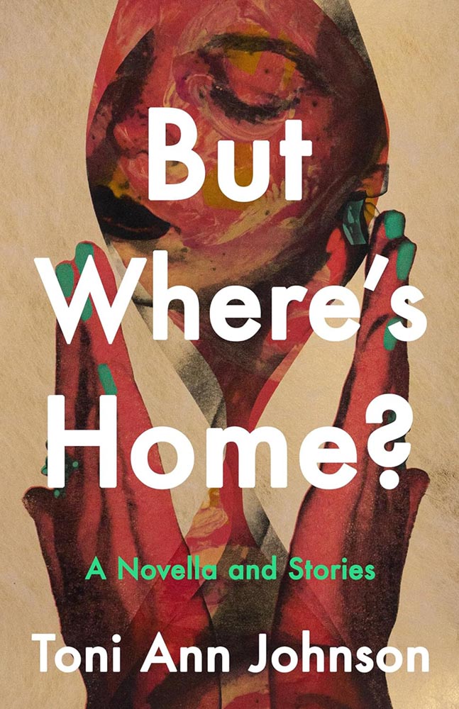
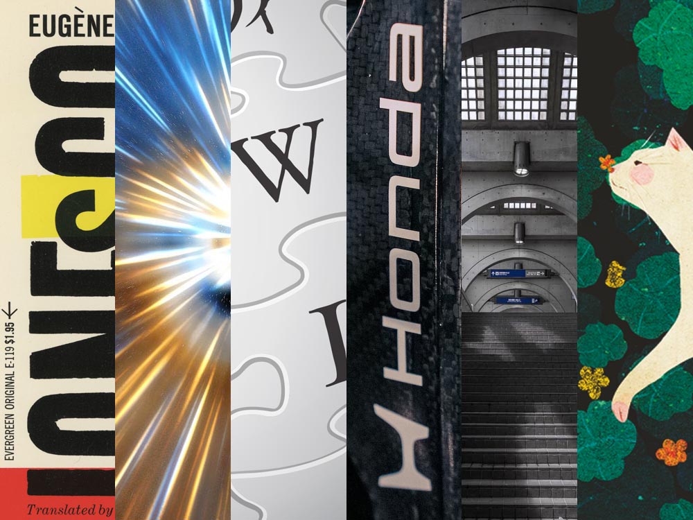
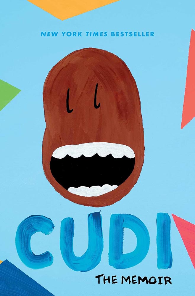
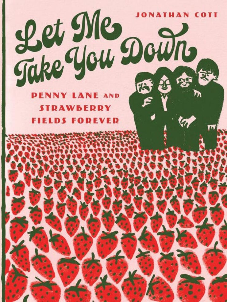
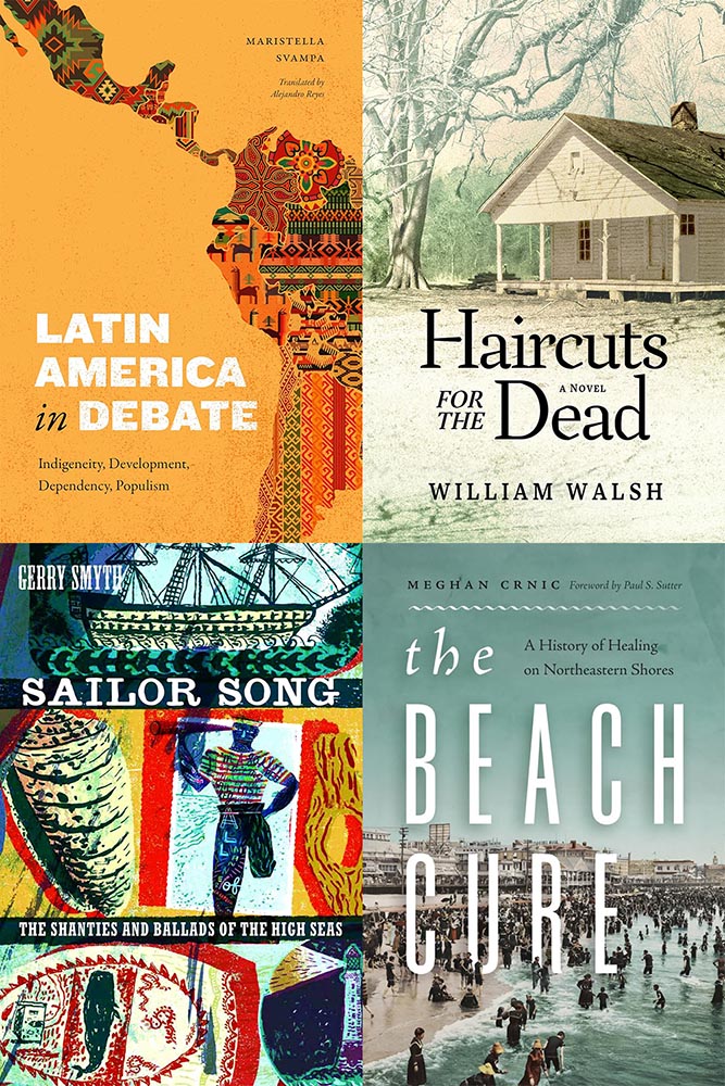
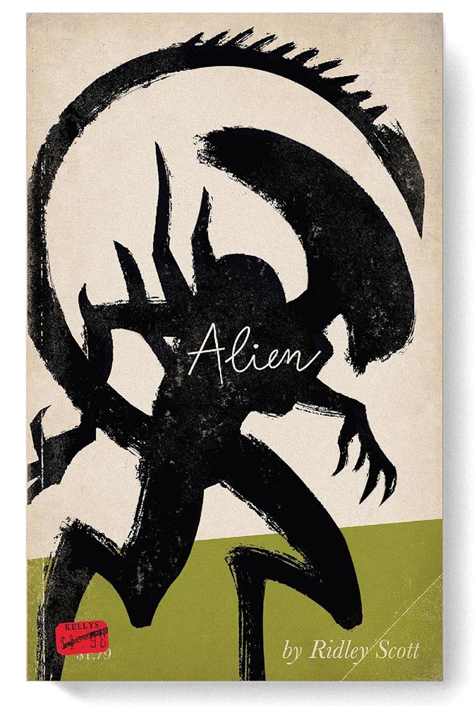
Book Notes X3
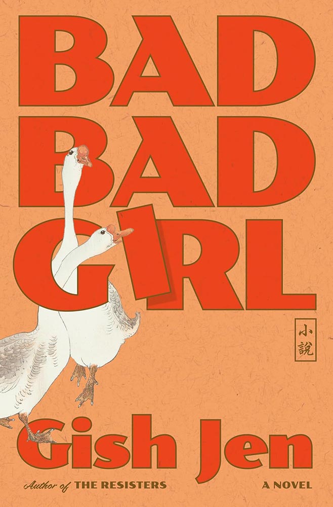
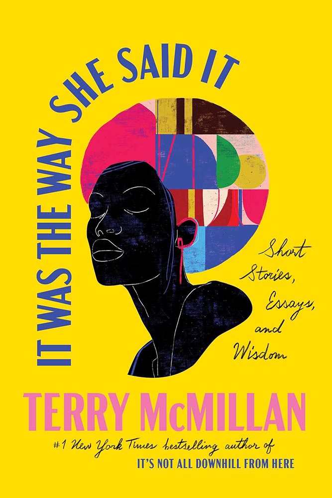
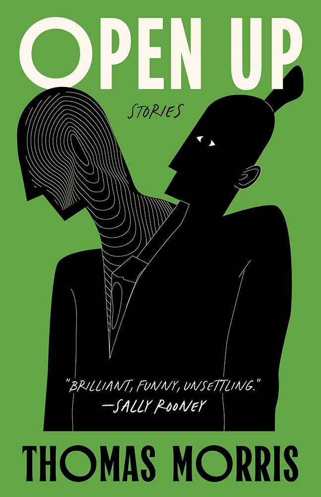
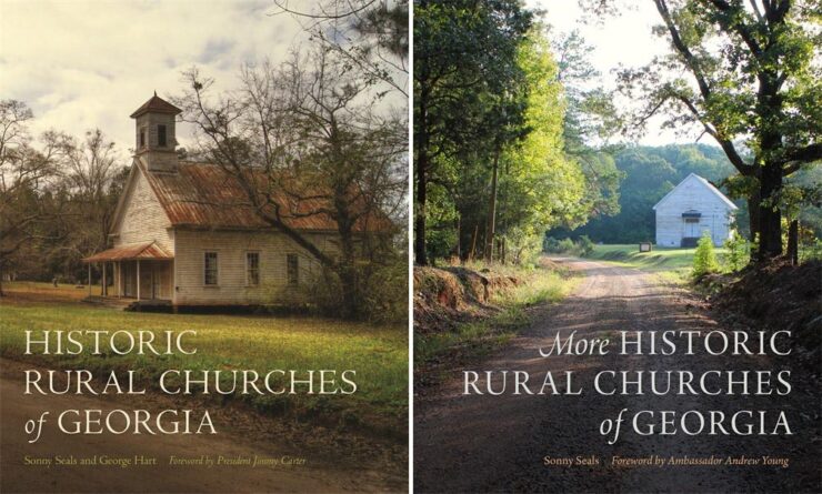
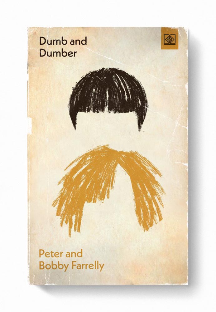
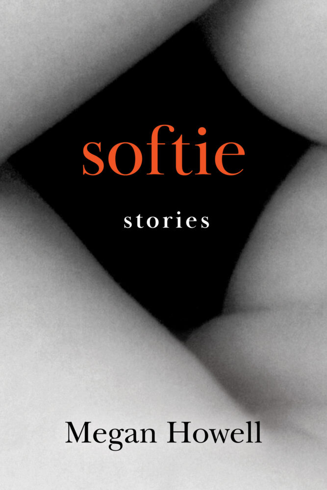
Oliver Munday, Head of Household
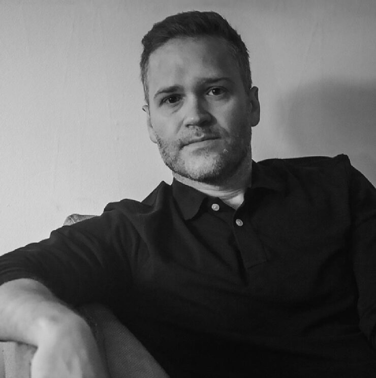
Nearly every one of his book cover designs could be called an instant favorite. He has a wry, brief expression that often delights.
So, when he wrote a book, did he do the cover? Well … no, as it turns out — and he preferred it that way.
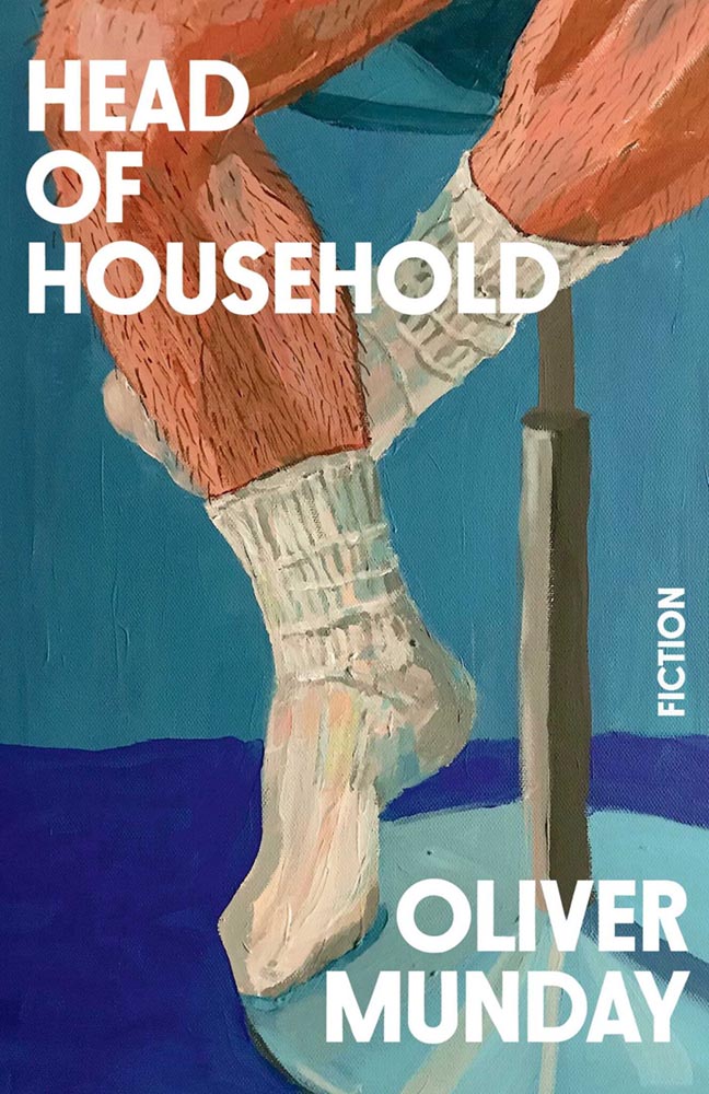
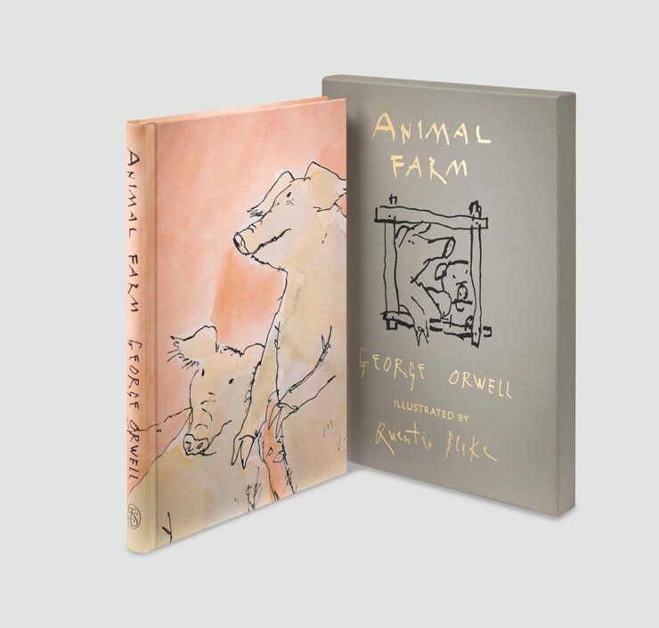
Munday’s collection of stories has an interesting cover by industry veteran Chris Brand, and I like it — although some of the alternatives seem to me like better fits for Munday’s take on life.
But, of course, that’s the point: it’s not about him, it’s about his book.
See the other book cover design drafts Brand designed for Head of Household at LitHub. (And a short Q&A.) Enjoy also this interview with the author/designer at Debutful.
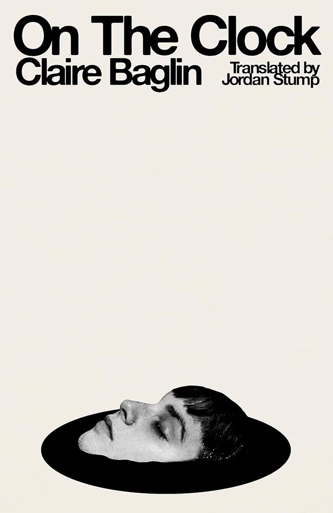
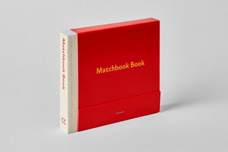
The Butter Book
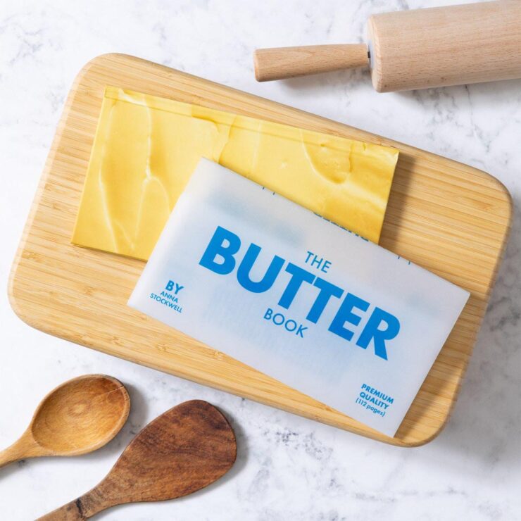
No, it doesn’t soften when left out — or spread any larger meaning. It’s just a great book cover (and jacket).
Chronicle gets a kick out of “things that look like other things.” We made a notepad called Pad of Butter that has been selling steadily since 2015. So, imaginations did not need to stretch when a butter-focused cookbook with a vellum jacket was proposed. It’s our “bread and butter,” so to speak.
— Q&A with author Anna Stockwell and designer Lizzie Vaughan, PRINT
“It’s important to find joy wherever you can these days and it’s hard to hate on butter,” the article says. Read the rest at PRINT.
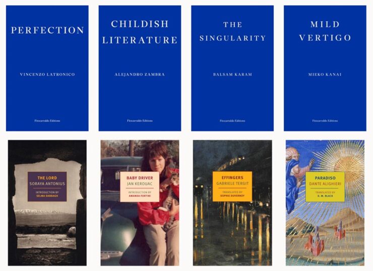
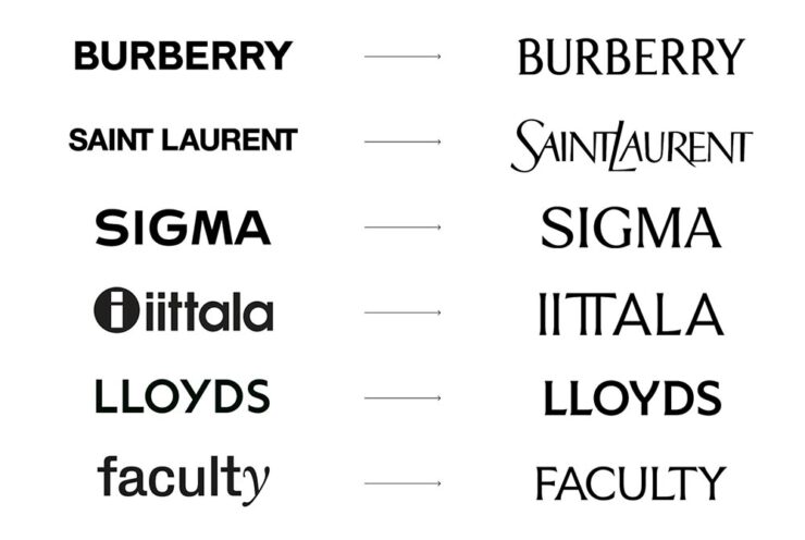
“Naïve” Design
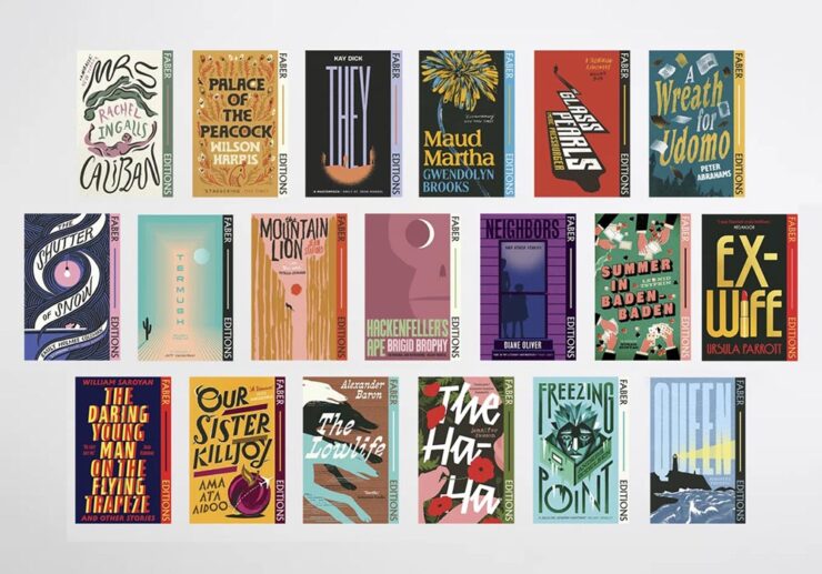
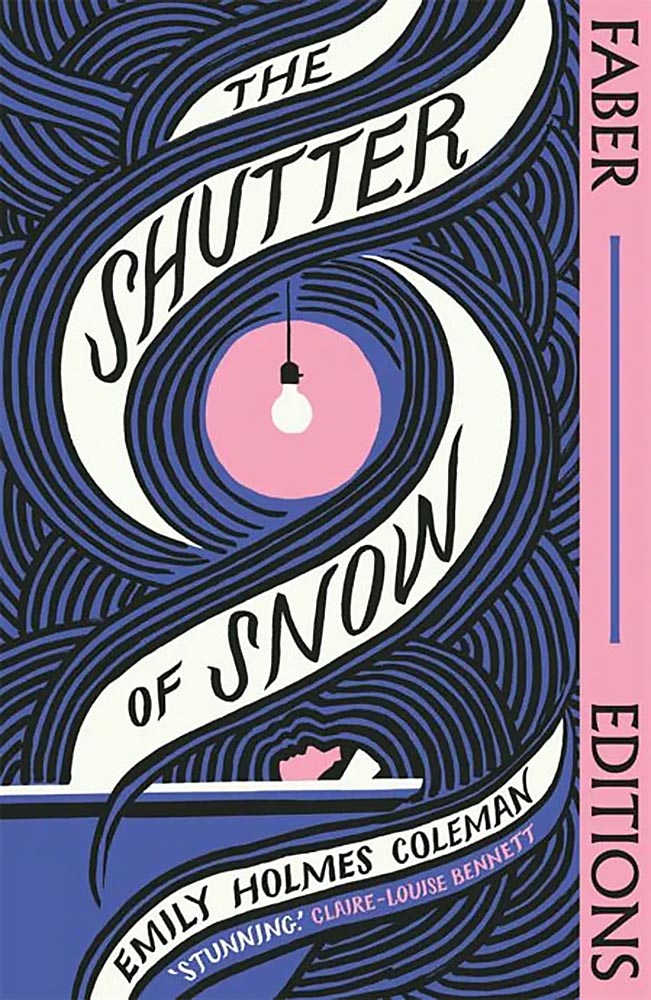
The LA Times examines the latest book design trend: naïve design. (Yes, I pretentiously style that like the New Yorker does. The LA Times does not.) It’s where serious subjects wear … nostalgic cover designs, to use a phrase. Find out why.
Parenthetically, of the covers mentioned in that article, only one — by design legend Na Kim — has found its way into my 2026 Favorite Covers folder. It’ll be a minute, but stay tuned to find out which.
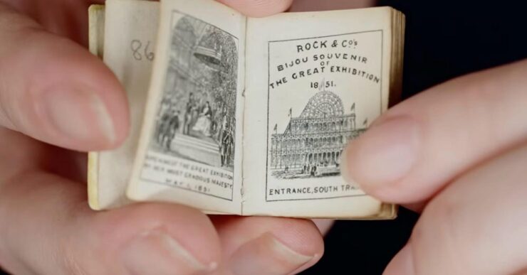
Special Bonus #1: “You’ll need a magnifying glass to read these,” says This is Colossal:
Special Bonus #2: A favorite collectible (and slight tangent), these books “keep a lost design legacy alight,” says It’s Nice That:
Update, 1 April: CreativeBoom has a nice feature on this title as well, with additional images. Check the slipcover:
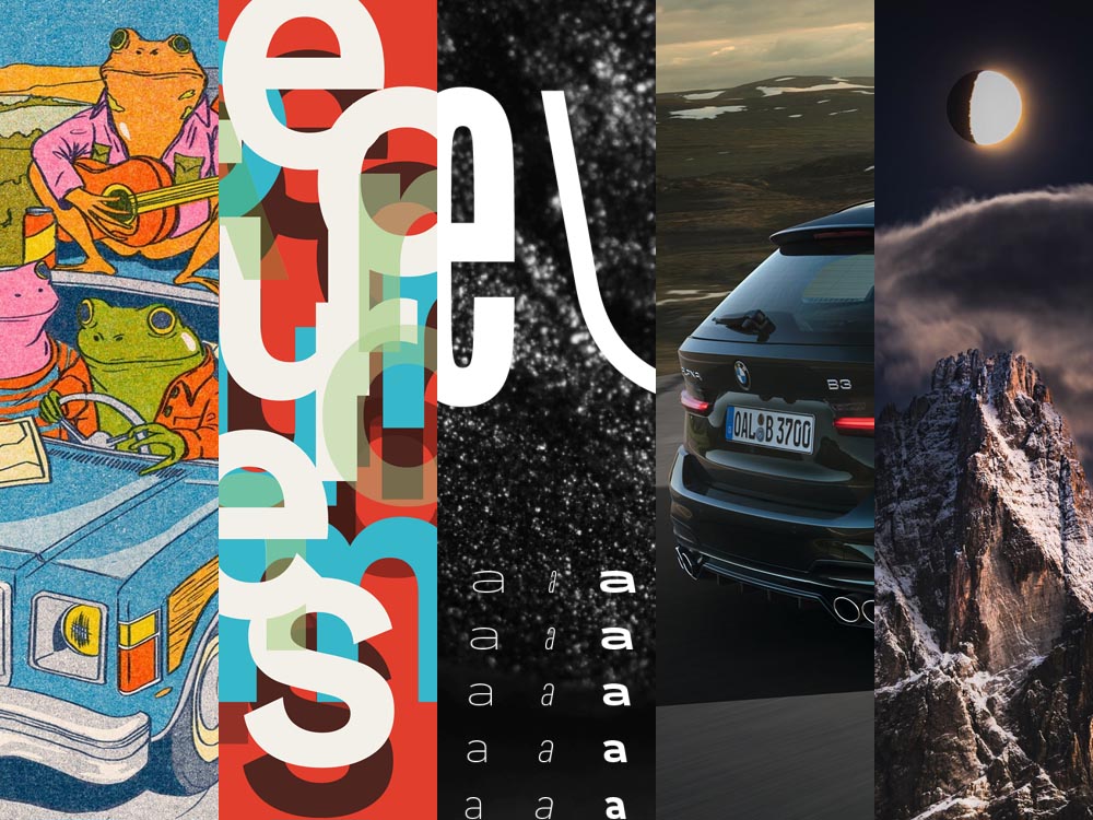
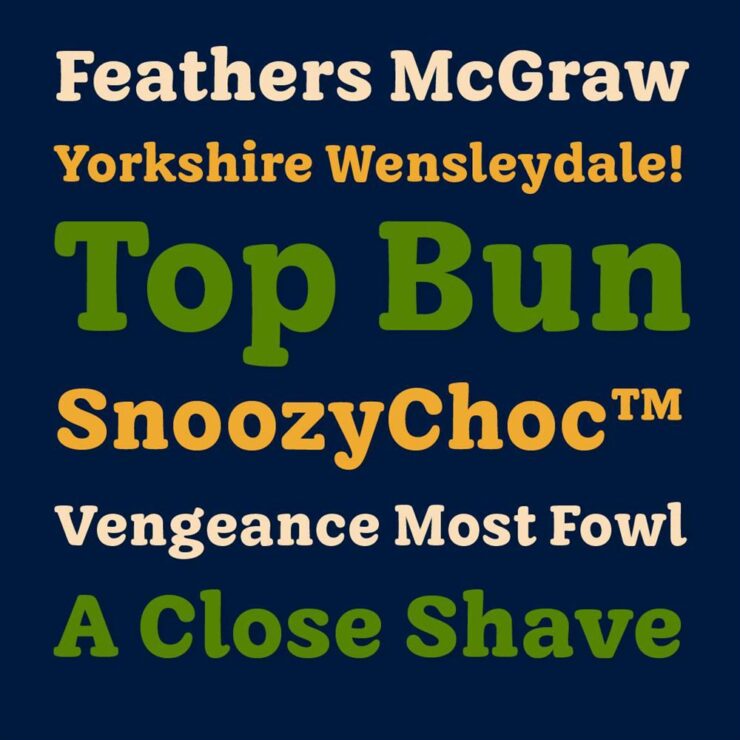
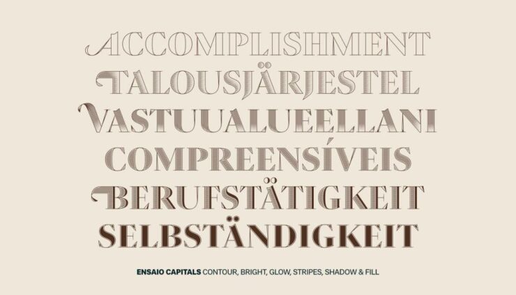
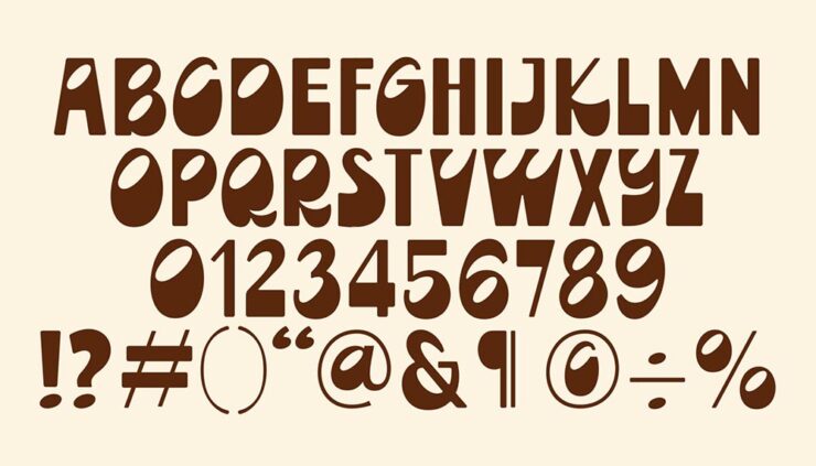
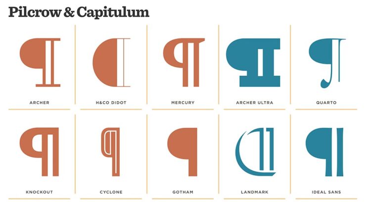
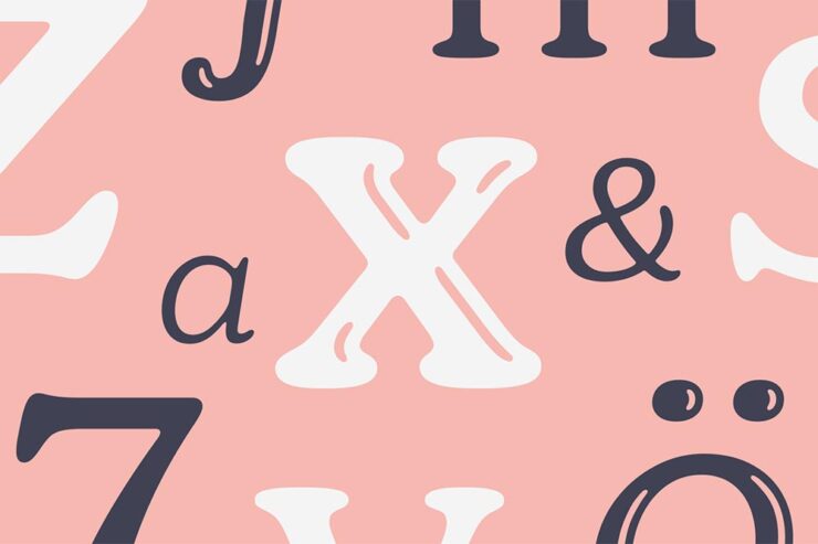
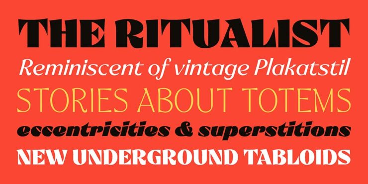
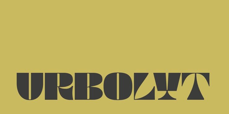
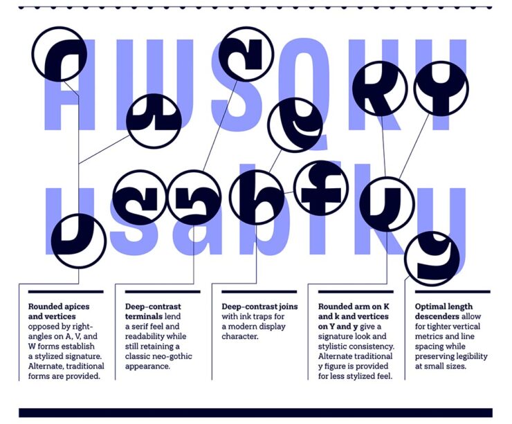
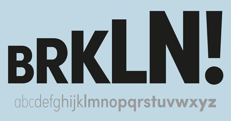
Fonts March Foreword
CreativeBoom’s March Faves
CreativeBoom‘s regular feature contains sixteen choices this month — awesome! — but I’d like to just highlight my three favorites:
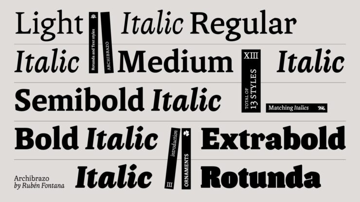
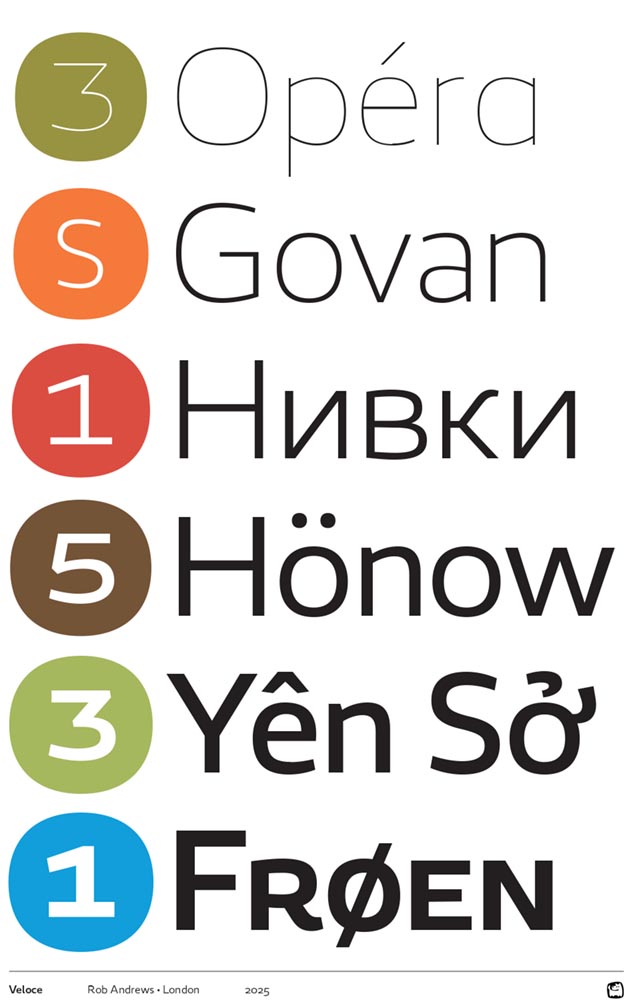
“Rubén Fontana is one of the most respected figures in Latin American type design, and Archibrazo, released through TypeTogether earlier this year, represents a characteristically considered piece of work. The typeface brings together two traditions that might seem at odds: the fluidity of calligraphic practice and the hardness of sculptural form. The result is a serif family that wears its sources with confidence, without collapsing into historicism or affectation.”
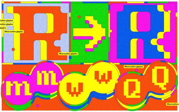
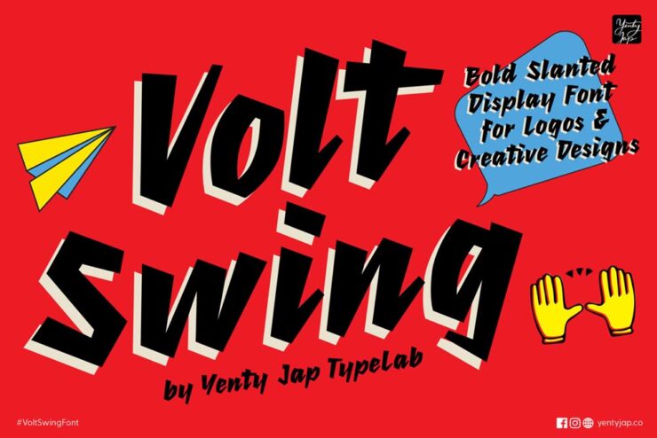
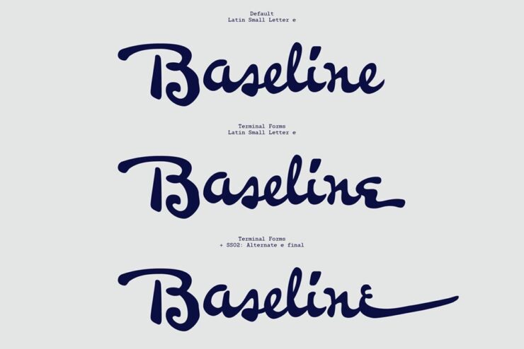
“Djaggety began in a classroom. Alessia Mazzarella of Typeland, who teaches type design to BA Graphic Design students, uses an 8×8 grid exercise as a standard introduction to letterform construction. The constraint, she explains, strips away the paralysis of infinite choice and forces students to focus on what makes a character recognisable within a tightly defined system. During one iteration of the exercise, she found herself drawn into the process rather than simply demonstrating it. […] Overall, it’s a good lesson in how constraint can generate, rather than foreclose, creative possibilities.”
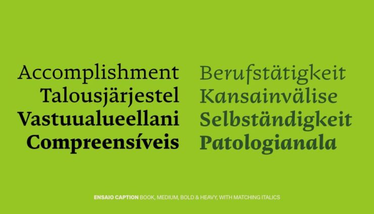
“After three years in development on Future Fonts, Fred Wiltshire’s Musikal has reached v1.0: a significant milestone for a typeface that began with a conscious act of divergence. Herman Ihlenburg’s Obelisk (1880s) served as the starting point: a high-contrast, ornamental display face of considerable geometric rigour and decorative confidence. Rather than reviving Obelisk directly, Wiltshire took its ‘playful nature’ as a conceptual springboard and built something clearly of the present.”
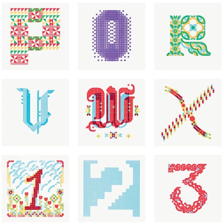
Letterform Archives’ New Celebration of Hand-Painted Type
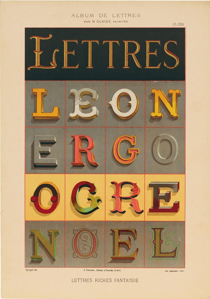
“A new book published by Letterform Archive, Lettres Décoratives: A Century of French Sign Painters’ Alphabets, celebrates the vivacity and timelessness of French sign painting from the 19th and early 20th centuries. Compiled from lithograph portfolios, which range from 1875 to around 1932, the volume includes more than 150 full-color reproductions of these bold lettering samples. These portfolios once served as catalogue-like albums, providing inspiration for styles and motifs that could be translated onto large billboards and small signage alike.”
Read more about this great new book at This is Colossal or PRINT.
Cambridge’s Old Baskerville Punches
Heavy metal for the type crowd:
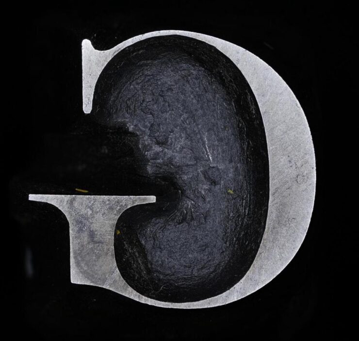
“John Baskerville was an influential 18th-century printer and type designer; you’ve probably used (or at least heard of) the Baskerville typeface. Cambridge University has the original punches used to create his signature typeface and has made high-res digital photos of them available online,” Kottke writes. “[S]eeing close-ups of the actual cut & shaped metal from 1757 is something else.”
In case you’re not familiar:
The typographic punch is the initial design for the letterform and one of the first of three stages in the manufacturing of metal type: short lengths of steel onto which his letters were cut in reverse and in relief. The punch was ‘tempered’ to increase its toughness and enable its use as a tool. Secondly, the punch was struck into the surface of a softer piece of metal (copper), leaving an impression of the ‘right-reading’ character to be cast. This was called the matrix. Finally, type was manufactured when the matrix was passed to the type-caster and inserted into a mould, into which molten lead-alloy was poured. This produced a cast of the type in relief and in reverse which were then arranged to create a text block and once inked, paper could be pressed against it.
Not just hi-res photos of punches for various sizes of type, either: some have 3D versions. Very cool.
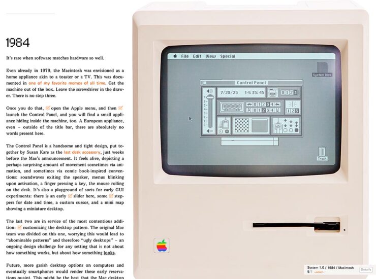
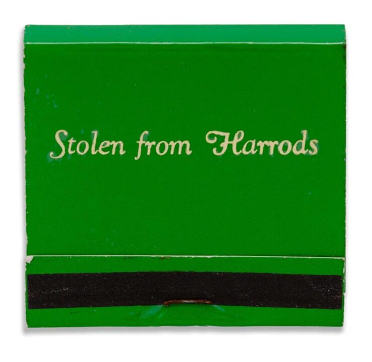
Special Bonus #3: The menu that never was:

Okay, okay, that’s not actually an unused menu from before Apple’s Macintosh was released in 1984, but how it came about isn’t something I’m going to quote. Instead, I’m just going to ask you to read it in full — it’s fantastic.
Courtesy of Unsung, Marcin Wichary’s awesome blog. (Yes, he of Shift Happens fame.)
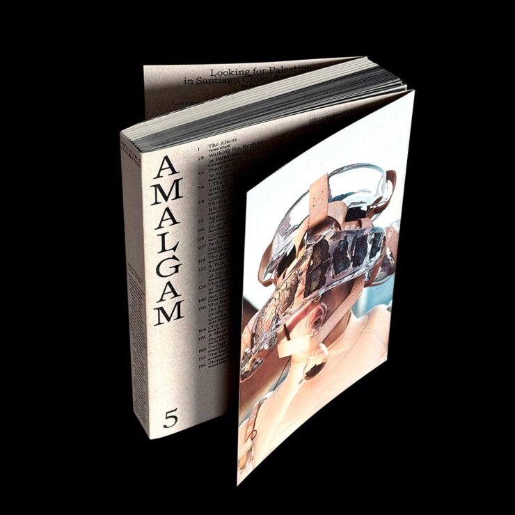
Great Graphic Items X2
The Tenth Muse
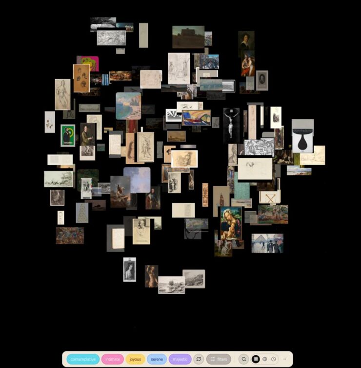
“The Tenth Muse is an art discovery engine. Over 120,000 artworks from museums and institutions — searchable by feeling, mood, atmosphere, era, and medium.”
(Via Kottke.)
AIGA NY: 50 Years of Posters
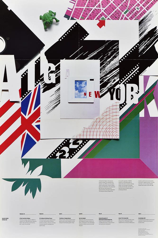
“A 50-year goldmine of design: AIGA New York unveils its poster archive to the public,” It’s Nice That reports. “A newly opened window into its design archive, this unique visual library provides the public with an inside view of the design, art and activism that’s emerged from the city’s recent history. AIGA NY has ambitions for the collection to become physically accessible with an accompanying book that will showcase the posters in more depth.”
Adobe, Yet Again
DNG Now Standard
Let’s start with the positive:
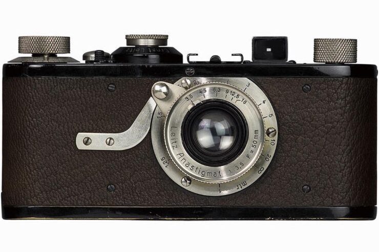
“In March 2004, Australian photographer Robert Edwards asked a simple but meaningful question on Rob Galbraith’s now-defunct photography forums: ‘Could Adobe make a RAW format?’ The answer was very much ‘yes,’ and Adobe announced the DNG format, or Digital Negative, later that same year. Now, more than two decades later, DNG is now the official standard under the International Organization for Standardization (ISO),” PetaPixel writes.
I remember lurking on Rob Galbraith site. Such were the importance of his forums — and, for that matter, the overall size and condition of the ’net in the early Aughties — that Thomas Knoll himself, one of the creators of Photoshop, would post there.
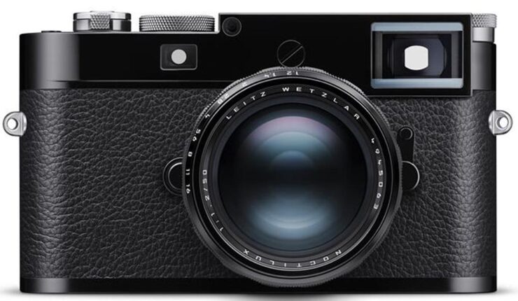
In case you’re not familiar, a camera’s RAW file is what the sensor sees at the moment of exposure, stored in a format for later editing. It’s completely different from a JPG file, which has all the camera’s choices baked in to the final image. Sports or journalism photographers usually shoot JPG, due to the need to post immediately; social media photography is, of course, its own animal.
Most fine photographers — that is, folks who shoot for art or pleasure, including your author — only shoot RAW, because it gives you maximum flexibility in “look.”
I’m honestly not sure how much of a difference this will make, but it’s nice to see DNG accepted as a standard — and it’s an example of Adobe meaningfully contributing to the bigger picture.
Train Adobe’s AI on Your Style
From the “mixed” department:
Adobe has launched Firefly Custom Models, “allowing artists to generate image variations that ‘more consistently reflect’ their own style, subject, or characters.
Adobe’s Deepa Subramaniam says, “Today, we’re expanding access to Firefly custom models, which let you turn your creative style into a reusable model trained on your own images. In this public beta release, custom models are optimized for ideation in character, illustration and photographic style.”
The goal of Custom Models, according to PetaPixel, is to “allow artists to train Adobe’s Firefly AI specifically to unique workflows so that when it generates content, it is more aligned with their specific style.”
Hmmm. How ’bout practical effects? Seriously, this might turn out to be useful. Time will tell. Helmet of tin flowers and all.
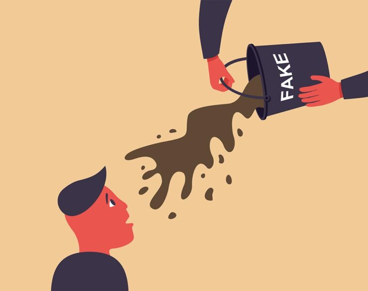
CEO Retires. Stock … Down?
Here’s where the attitude sneaks in: most of us, present company included, are sick of Adobe’s attitude towards its customers.
“Adobe’s longtime CEO, Shantanu Narayen, announced this week that he is stepping down after 18 years as CEO and nearly 30 years at the company. If you ask shareholders, Narayen was, for a long time, among the very best in the biz. If you ask Adobe’s core customers, the artists who were once indispensable to the company’s success, it’s a different story,” writes Jeremy Gray in an opinion piece for PetaPixel.
Adobe made more than $7 billion in net profit last year, a clear win for shareholders. This is due to their choice to treat creatives as a profit center. But their stock is down because their AI efforts have fallen flat — Firefly is way behind Midjourney or Gemini — and the planned additional profit center has failed to materialize.
And by “down,” I mean significantly. During Narayen’s tenure, Adobe’s share price increased from around $40 in late 2007 when he took over to an all-time high of $688.37 in 2021. But as of this writing, it’s $243. “Although Adobe and Narayen are painting his departure as entirely the outgoing CEO’s decision,” Gray continues, “it’s easy to wonder whether tumbling share prices had something to do with the transition, or at least sped up existing plans.
“I respect the sheer scale of what he achieved. I admire that he grew Adobe so that it could hire more great workers to build better software. But for me, Narayen’s legacy is ultimately one of treating [creatives] like an afterthought […] using our passion and love for art to boost his brand.”
I understand that Adobe has become one the Internet’s favorite punching bags of late, and I try to distance myself from that sport (no matter the subject). But I can’t help but agree with many of the things expressed in that piece.
Let’s hope that the future bring change, one way or another. For many professionals, Adobe essentially holds a monopoly.
But then, so did Microsoft.
Special Bonus #4: Unsung asks, “Why wouldn’t everyone deserve the gift of focus?” He’s talking about the tragically-short-lived focus mode in Photoshop, wherein the user isn’t automatically shown pop-ups or blaring (bleating?) buttons regarding new features.
I mention this because I just uninstalled Acrobat, Adobe’s PDF management program, because I couldn’t turn off the pop-ups, sharing invitations, or requests to add comments. All I wanted was to proof documents, but what I was gifted with was frustration — even anger, on days where a deadline was involved.
Special Bonus #5: “A slap on the wrist” is understatement writ large:
“Canceling a software subscription is supposed to be easy — that’s what US law dictates. Adobe, however, has played fast and loose with its Creative Cloud subscriptions in the past. The company was sued by the Department of Justice in 2024 due to its practice of hiding hefty termination fees when customers signed up. The case has now been settled, with Adobe agreeing to a $75 million fine and matching free services to users of its products,” Ars Technica writes.
The company doesn’t admit to violating the law. “While we disagree with the government’s claims and deny any wrongdoing, we are pleased to resolve this matter,” Adobe said in a statement.
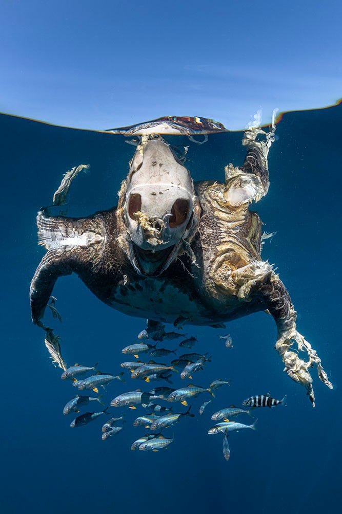
March Photo Round-Up
Okay, let’s switch gear and end with inspiration — even happiness.
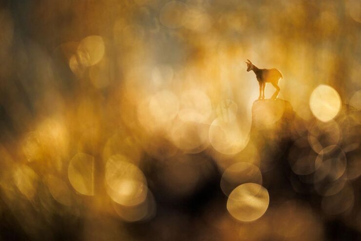
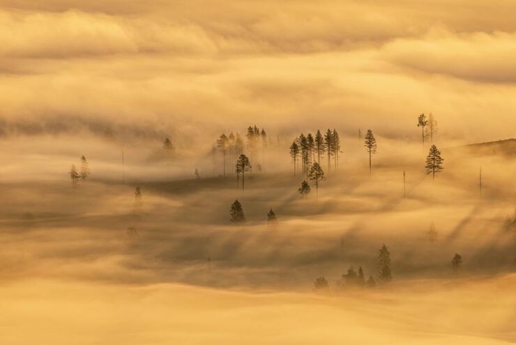
International Garden Photographer of the Year 2026
Yes, you read that right: there’s an international contest for the best garden photograph. (If you want hard-hitting stuff, see Sony’s awards. There’s enough “news” in the world, so….)
Soothing. The image also earned first place in the Breathing Spaces — more soothing —category, and was captured in Borrowdale in England’s Lake District; the “photograph shows heather, silver birch trees, and the warm light of sunset viewed from Grange Fell,” PetaPixel writes.
See all the winning photographs at the contest website.
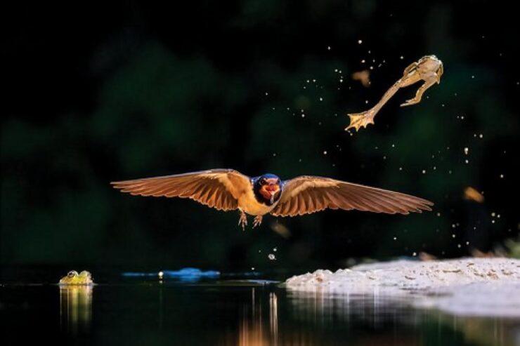
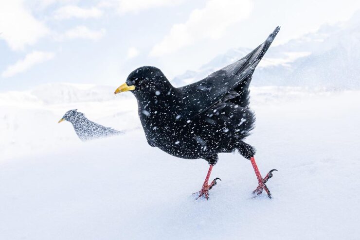
British Wildlife
It’s a shame these are still photographs. Hearing a red fox bark in a British accent is a hoot.

Proof that excellence in photography extends to all parts of the realm. See all twenty-one winners at This is Colossal or PetaPixel.
London Camera Exchange Photographer of the Year 2026
Last of the items originating in the UK this month, although the excellent photographs within aren’t limited to just those countries. Some examples:
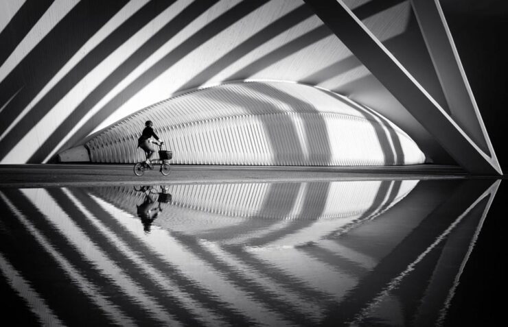
“A lone cyclist moves through sweeping arcs of light and shadow at the City of Arts and Sciences. Reflections echo the architecture’s rhythm, momentarily aligning human motion with structure, symmetry, and space.”
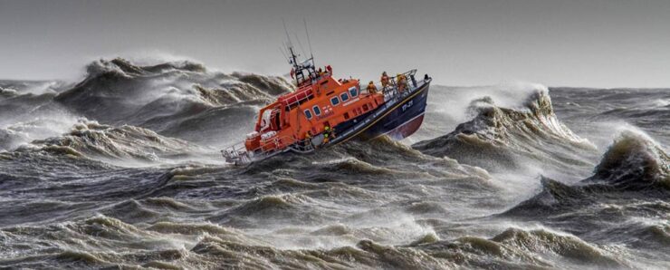
“Captured from the shore, during a regular Newhaven training exercise.”
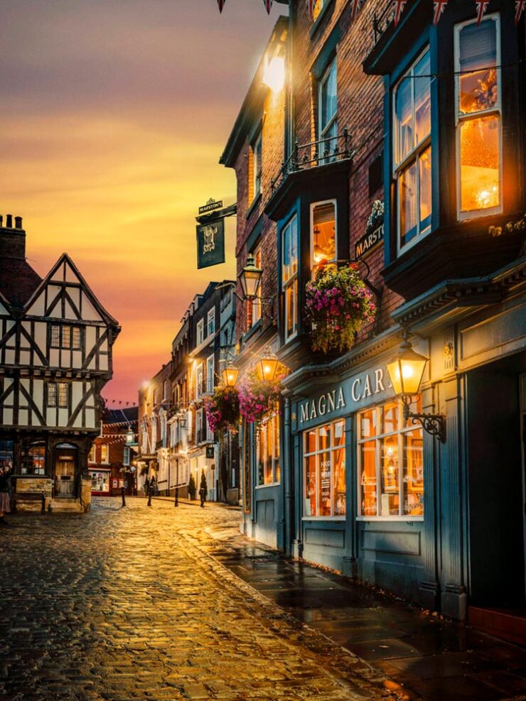
“This image was taken during golden hour in Lincoln. The image captures the historic streets and architecture of Lincoln as a golden sunset sets in. […] The golden glow of the sky, cobbles and light from the window add that extra dimension in terms of how the overall image works as a result.” (The description somehow missed “soothing.”)
See all the winners at the London Camera Exchange website. Via Macfilos.
Andrew Moore: Theater
“Known for his atmospheric photographs of landscapes, interiors, and urban centers that feel mysteriously locked in a not-so-distant past, Andrew Moore’s enigmatic images invite us into a slippage of time,” This is Colossal writes.
Not only great, but currently on display: Moore has a solo show running at Atlanta’s Jackson Fine Art. (Update: The show ended March 21st, darned it. I’d have gone if I’d read that properly.)
Cinematic Plastic
No, not current events — something better:
“Chicago-based photographer Chuck Eiler transforms action figures into cinematic, story-driven miniature worlds that blur the line between toy photography and film. Through meticulously crafted sets, practical effects, and careful lighting, he creates immersive scenes that bring nostalgia and storytelling to life,” PetaPixel writes.
Awesome. (And available as prints, in case you want for your sandbox walls.)
Finally: Duck This
Last month saw the incredible fresh pasta camera. Well, in case you think I only recommend a vegetarian lifestyle, there’s…:
Martin Cheung’s Chinese roast duckcam.
Presumably, he throws a fresh camera into the oven every time he needs one: “I will continue making Duckcam while I travel, so next time when you see a person with a roasted duck on a tripod, please say hello to me.”
Enjoy your spring, everyone!