Beautifully Briefed 23.6 Follow-up: New Automotive Logos

Within literal days of my writing that we should be done with the automobile companies’ logo updates, we got three. (Well, two and a preview.) Details follow.

Infinity

Back in the early ’90s, Nissan introduced a premium brand called Infiniti. Following the likes of Lexus (Toyota) and Acura (Honda), Nissan wanted a piece of the upscale action and knew that a public that still remembered Datsun would need convincing.

So they embraced the home country: Japan. They leaned heavily into the distinctive style and craftsmanship; their initial products were different and put up an interesting argument when compared to (especially) Lexus.

Awesome original emblem from the 1991 Q45’s “grille.” Photo by Ben Hsu.

Alas, they lost the cachet almost immediately — to a point where today, I almost always get out of an Infiniti’s way due to their being the official representative of the poorest-quality drivers on the road. (And I say that as a BMW driver.) It’s also, unfortunately, one of the most-likely brands to wear a coffee-can-sized exhaust finisher, heavily-tinted windows, and/or dubious lowering springs.

Enhancing customer connection and delivering thoughtful hospitality across all touch points underpins INFINITI’s comprehensive refresh. Central to the update is a new global retail architecture design, along with an evolved logo and new multisensory experience.

Infiniti Press Release

So to hear them recommit to the “Japaneseness” of their brand is, well, interesting. Perhaps the signature scent will help.

Infiniti’s logo evolution, with the oldest at the left.
Note the available illumination.

Brand New, as usual, has the best coverage, but as it’s a subscription, alternatively see this story from Motor1.

Opel
Forgive the color banding — it’s in the original.

Opel earned a brief mention here on Foreword in December 2020, when they joined were sold to PSA — Peugeot, Citroen, and company — which a month later (!) merged with Fiat Chrysler to form Stellantis. They’re back with an unfortunate update to embrace their 2028 switch to all-electric.

The “increased sharpness,” as Motor1 puts it, is appreciated, I suppose — but the break in the middle goes against everything the lightning bolt its meant to represent. In fact, I’d argue that the mark now doesn’t resemble lightning at all. (Perhaps clouds?)

Sigh.

Preview: Alpina

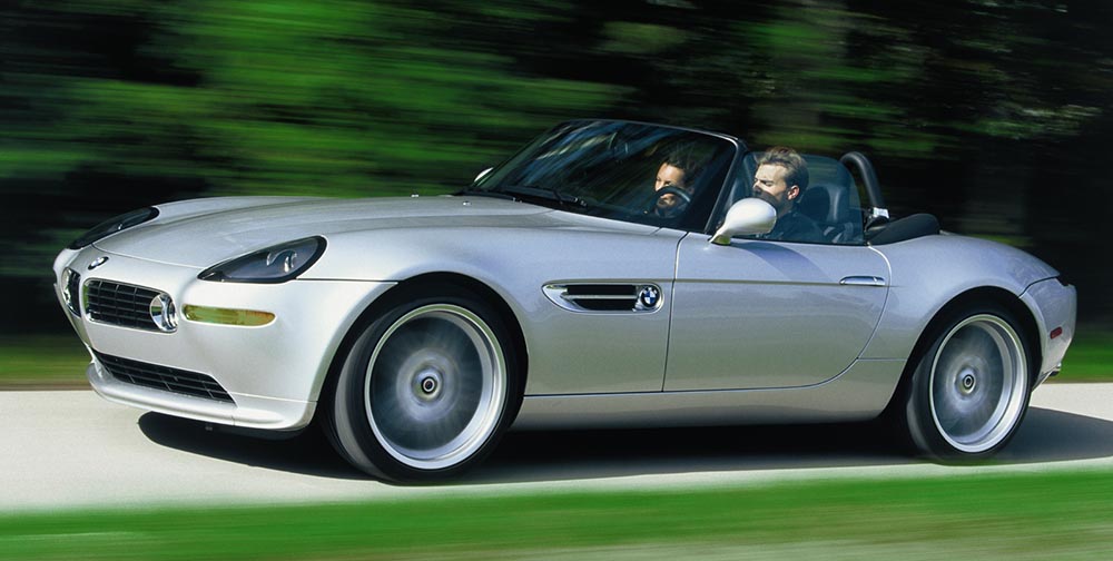
So, on to more interesting things: Alpina. Established in 1962 as a tuner and racer of BMWs, it’s had more or less the same logo since 1967 and was established as an actual manufacturer in 1983: they do more than just tune BMWs, they reengineer them. These days, they stand for the ultimate Grand Tour cars, simultaneously more comfortable, more powerful, and more stylish than the cars they’re based on. (See the lovely Alpina Z8 at the top of this post, for instance.)

Aplina’s 1962 logo: exhaust and crankshaft, sir. Nuthin’ like it.

Naturally, that means most of them aren’t available here in the US.

The ultimate unobtanium machine: a 2022 Alpina B3 touring. Drool.

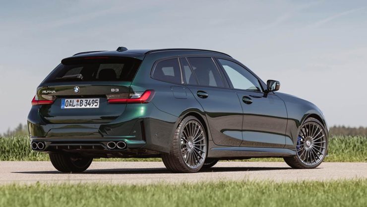
In any case, they’ve recently entered into an agreement to be purchased by BMW itself, not unlike AMG becoming part of Mercedes-Benz, and, starting in 2025, are scheduled to represent the middle ground between BMW and Rolls-Royce — hopefully continuing the comfort, power, and style. It seems that the new ground will be the upmarket models only (that is, no 3-series-based items, and possibly even no 5-series), so think of items $200,000 and up.

Now, an eagle-eyed I5 Talk forum poster noted a filing with the German government:

The proposed wordmark, horizontal.
A close-up of the Alpina “A.” Note that it’s the trailing one; hopefully, not a sign of things to come.

BMW Blog has the details.

Bonus #1: Motor1 has updated their roundup of every automaker logo refresh from recent years.

Bonus #2: All of the automotive — and carmaker logo — stories here on Foreword, from newest to oldest.

On BMW’s New Logo (16 Updates, latest 3/20/21)

Original post, March 5th, 2020: After 23 years, BMW has updated its logo … but there’s a problem.

Let’s back up a little, as even the previous logo wasn’t perfect. Debuted in 1997, it followed the then-trendy “3D” look, complete with highlights. It was, however, clearly BMW — black background, blue-and-white roundel, chrome outline, lettering. This new one, however, loses the iconic black (for transparent) and chrome outline (for white):

BMW’s logo: 1997 (left) and 2020 (right)

It’s less representative and less clear in my opinion, but hey, I’m only a BMW owner, not any part of their marketing team.

Another problem: it debuted on the Concept i4. controversial all by itself.

Why not revert to the earlier, 1963 version? (Or update it with new type — but keep the black?) Transparency is fine in some cases, but I’m not sure that this isn’t a case of style over substance in the actual use cases (web site logo, app logo, etc. — more than just on the cars, I mean).

More from the alwaysexcellent Brand New.

Update: 3/11/20: “BMW speaks out on ‘misinterpretation’ of new logo.” (Think about the “Instagram-ability!! Gak.)

Update: 3/20/20: BMW explains. (Via BMWBlog.)

Update, 7/15/20: Copenhagen, Denmark-based Dim Newman takes a stab at an alternate solution. (I like it.)

Update, 7/27/20: Dezeen has a roundup of the six other companies that have made their logos “flat,” proving the “3D” look mentioned above is truly out of fashion:

Audi, Citroen, VW, Nissan, Mini, and Toyota, oh boy!

Update, 9/25/20: Vauxhall joins the trend:

Update, 11/27/20: The Ford update that never was:

Ford Almost Let a Graphic Design Legend Update Its Blue Oval Logo in 1966: Paul Rand, who designed iconic logos for IBM, Cummins, ABC and numerous other companies, designed a sleek logo for Ford that went unused.

Ford’s unused 1966 logo

Read more at The Drive.

Update, 12/2/20: Not enough? How ’bout Opel:

Opel’s new “Blitz” logo, circa 2020

“Opel Details All-New, Slimmer And More Modern ‘Blitz’ Logo,” at CarScoops.

Update, 12/30/20: Kia’s was previewed on a show car earlier in the year, but they’ve gone and made it official:

There were some changes along the way, if you compare what’s on the show car and what you see above — and not all for the better, as it almost gets smeared. Still, looking forward to seeing where one of the most dynamic car companies today goes with this.

Update, 1/8/21: GM. One word: GAK.

So bad I actually feel sorry for them. More here and here.

Update, 1/13/21: Brand New is actually much nicer to GM’s logo update than I expected. Diplomacy? You decide. (Brand New is a subscription now, BTW — the best $20/year available, IMHO.)

Update, 3/2/21: Peugeot has joined the fray. Not great, especially at smaller sizes, but at least not the GM train wreck — and, in many ways, better than the last couple of outline lions (this one seems to be based on the 1960 version):

Read about the lion’s history here, Peugeot’s press release “reaffirming its personality and character” here, or one of the regular site’s notes, including a potential move upmarket here or here.

Update, 3/4/21: Audi, while not redoing their iconic “4 rings” logo, has redone the branding around that logo:

Brand New has more (note: BN is now subscription-only — easily the best $20 that I’ve spent in a while).

Update, 3/6/21: Speaking of Brand New, they have a good deal more information regarding Peugeot. Good stuff!

Update, 3/10/21: Dezeen has more on Peugeot, as well. And CarScoops has the first pictures of the new 308 — the new logo premieres on this model update — and discusses that, on the grille, some of the car’s sensors appear behind the logo. Interesting. (I still preferred the lion on the grille, myself. Not that we get Peugeots in the United States, anyway….) Check it out.

Update, 3/10/21: CarScoops has some more on Nizzan — uh, Freudian slip there: Nissan and their new logo.

Okay, who’s gonna be next…?

Update, 3/13/21: Uh… Renault!

Not as big a change as Peugeot, and more successful, too: single color, retains history well, still instantly recognizable, works at small sizes. Nice. Details from Motor1 or CarScoops.

Update, 3/20/21: Brand New discusses the new Renault logo:

There is nothing wrong at all with it and I do like the approach to its construction but, ultimately, it’s like it’s missing some emotion or passion or, pardon my French, a Je ne sais quoi to make it special.

I agree that the 1972 version is superior. Let’s see how this one evolves.