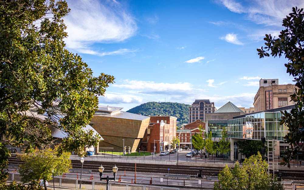
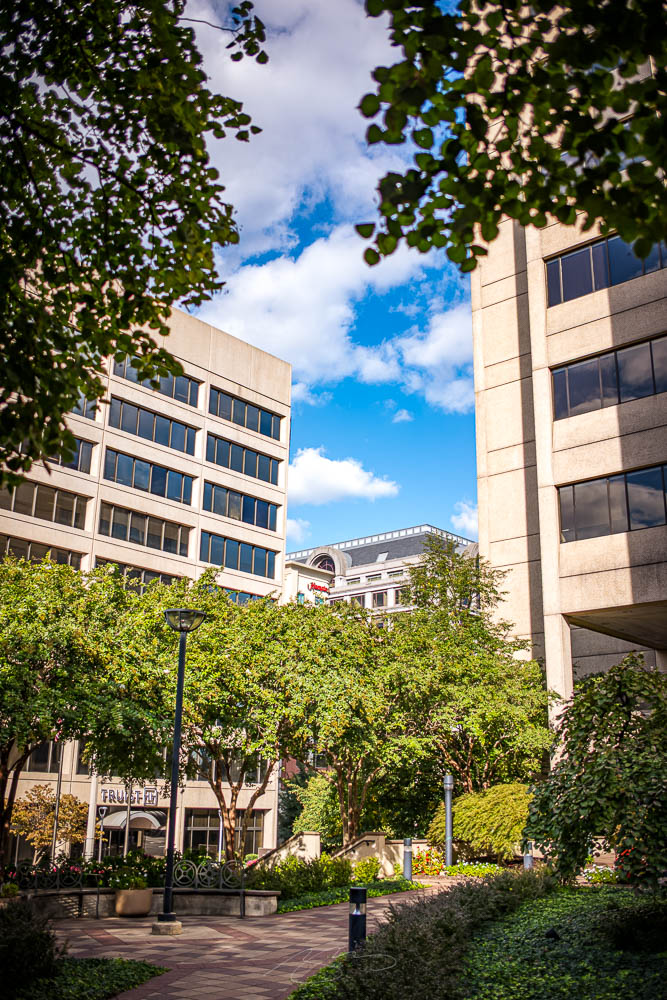
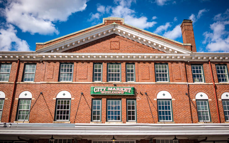
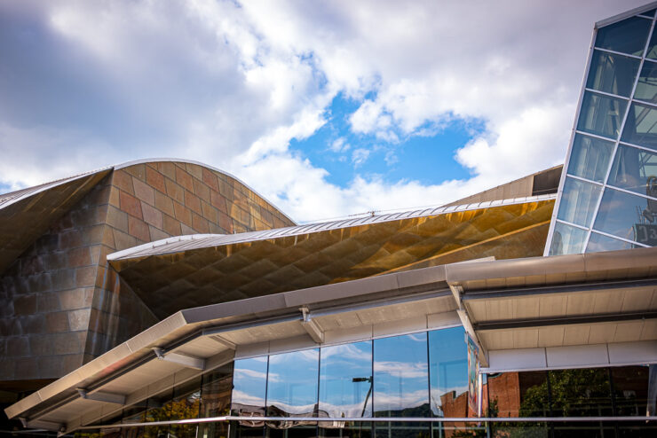
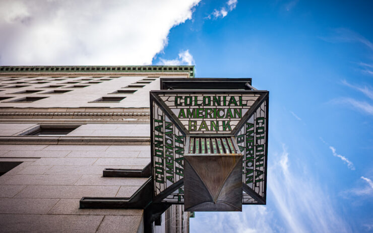
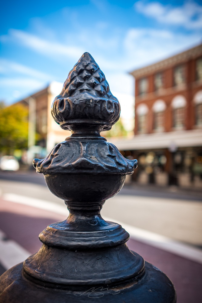
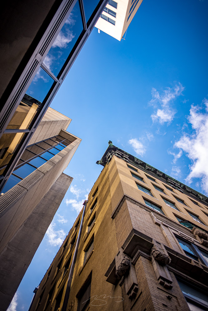
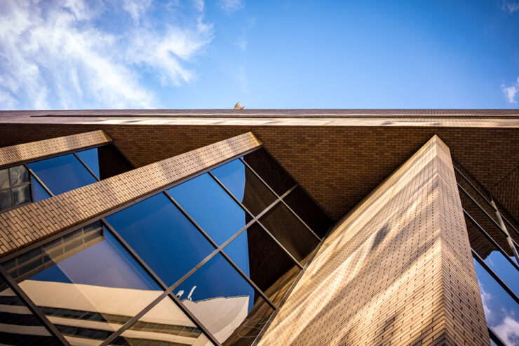
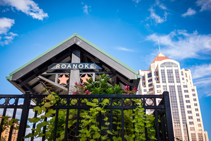
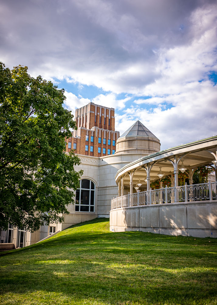
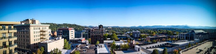
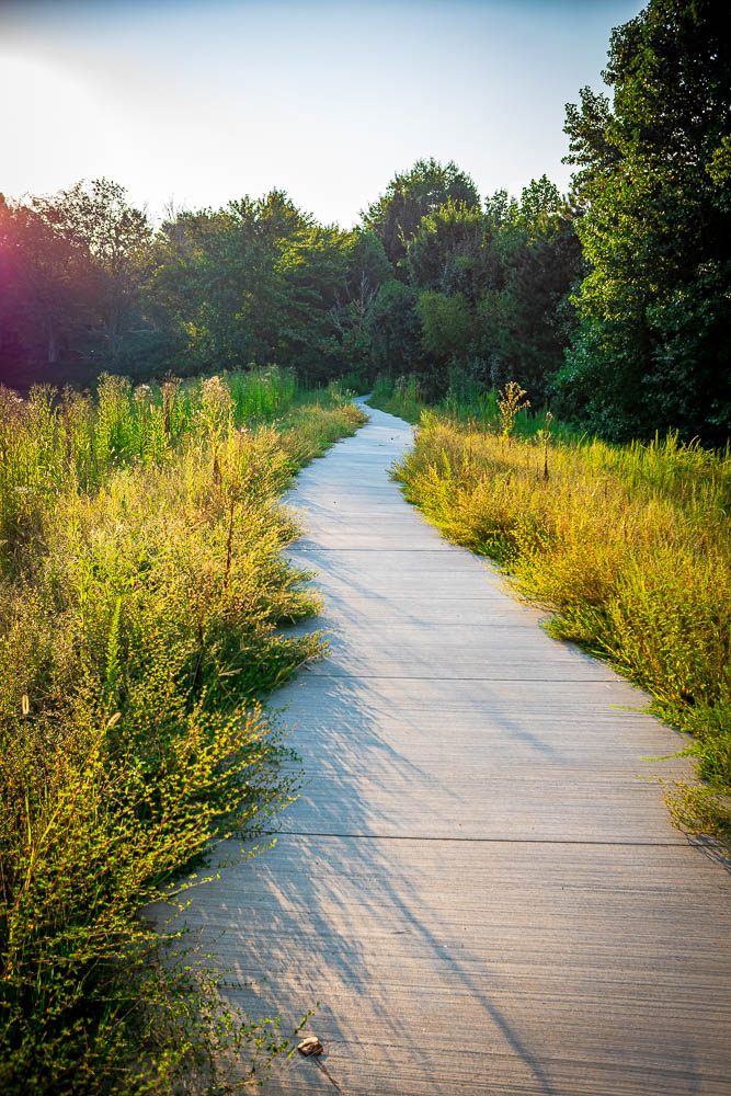
Back in September, shortly after the spontaneous photostroll in Asheville, I spent a day wandering around the valley city of Roanoke, Virginia. I’d been there many times before, but only with a camera once (in 2018) — and said, at the time, that I’d like to plan to spend a minute documenting this interesting Southern city.
I finally had the chance.
Greenery in (City) View, Franklin Rd SE and S Jefferson St
It took longer than hoped. But I’m really pleased with the results.
Roanoke Vity Market Building, 100 Campbell Ave SE
Unlike Asheville, with its Art Deco vibes, Roanoke is more a mix of older, more traditional brick and ’70s/80s concrete and glass — with some more modern, exciting architecture on display.
Taubman Art Museum (Building Detail #1), 110 Salem Ave SEColonial American Bank (Clock), Campbell Ave SE and S Jefferson St(Not) Electric Charging Post, 102 Market St SE
Downtown is also surprisingly vertical. While there’s really only one skyscraper — the Wells Fargo tower — there’s a several-block radius that really says, “city.”
Skyward Amongst Buildings, 301 1st St SWAngled Windows Detail (#2), First Citizen’s Bank Building, 110 Church Ave SW
Which makes sense; by nature of its location, Roanoke benefits from being the largest metropolitan area in quite a little circumference, and is the only actual city in southwestern Virginia. And given its history, it’s heartening to see that there’s still a major railroading presence in the city.
Amtrak Roanoke #2, 55 Norfolk Ave SWConference and Higher Education Centers, from Hotel Roanoke Circle, 110 Shenandoah Ave NE
I’m glad to have spent this warm and beautiful day photographing Roanoke. Enjoy this preview, and please check back for part two — and the link to the full gallery of ninety selected photographs — on Thursday.
Usually, I try to limit the Briefed posts to ~30 photographs. Today, you get fifty-four. So, unlike some months, where I encourage just any beverage….
Also, if you’ve not seen, I recently had a few-hour layover in beautiful Asheville, North Carolina. There was a camera involved.
This month’s Spine
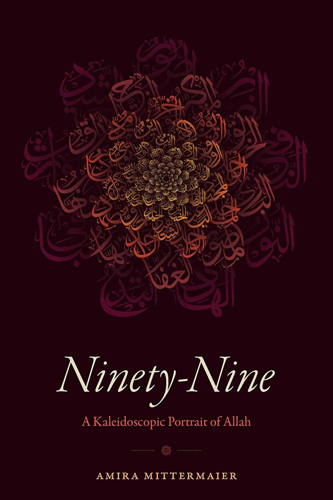
Duke University Press. Cover design by Matthew Tauch with calligraphy by Md. Zahid Hasan; art director, Dave Rainey.
“According to Islamic tradition, God has at least ninety-nine names,” the description says. But it’s the flower on the cover — a mosaic of script, best described as a “calligraphic gift” — that catapults this to the fore. Combined with a simple and classic title treatment, only one characterization is needed: brilliant.
Now in its 46th year, the PRINT Awards “continue a legacy of recognizing creative excellence across the design industry,” recognizing “89 winners whose work represents some of the most exciting, innovative, and thoughtful design today.”
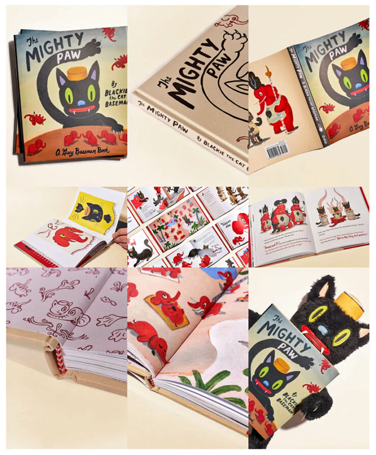
The award for best book package is not actually called, “The Mighty Paw PRINT.”
One defining quality stood out across this year’s winning work, reflecting a theme that continues to emerge throughout the history of the PRINT Awards: the power of design as a form of expression, activism, and reflection of the world around us.
— The PRINT Awards jury
The item above exemplifies this: The Mighty Paw is a “visually striking illustrated book that uses the story of a lone cat surviving an ‘Era of the Great Hate’ to explore themes of identity, displacement, war, and intolerance.”
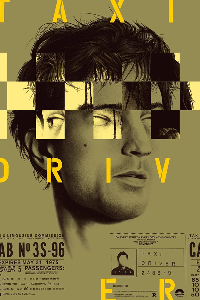
“Reelizer is a personal project by Roger Erik Tinch,” Jason Kottke writes, “that is a collection of movie art: prints, posters, illustrations, albums, books, covers, etc. Careful, you can lose hours here . . . Tinch has a great eye.”
Special bonus #2: Nathan Yau, at Flowing Data, writes: “OKpalette is a tool to grab a color palette from an image. Load the image in the browser, set the number of colors, and define a region in the image and you get a collection of shades. Images stay on your computer and the color picking is in-browser. Nifty.” Bonus movie poster content in their example images — awesome.
Yes, that’s The Motion Picture . . . in Japanese. Note the dots — and corresponding colors on the left.
Type
Creative Boom‘s post is also a honker this month, with 23 choices. My favorites:
Puerile Grotesque
Puerile Grotesque, from Applied Systems.
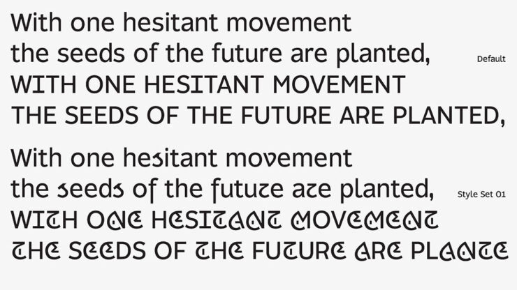
Social media isn’t a part of my life, but you can bet I heard about Instagram’s redesign; the Style Set 01 variant of a new typeface from Applied Systems feels like the same branch — just slightly farther out. Perhaps amongst the leaves.
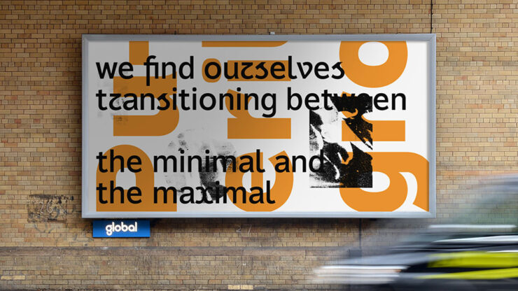
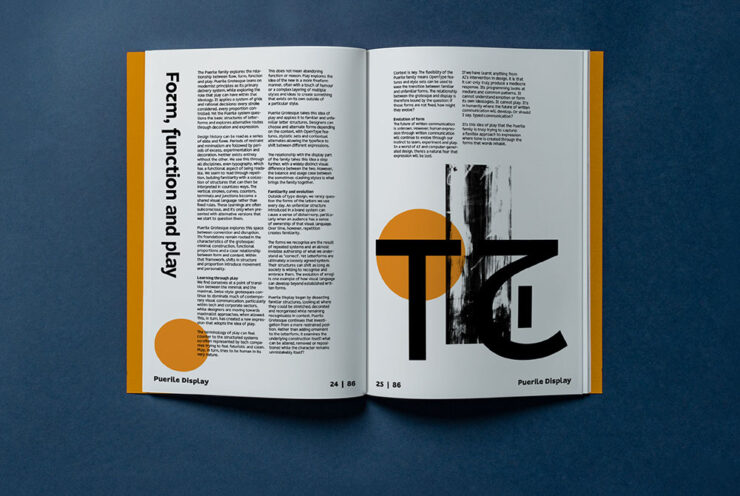
“Alister Shapley at Applied Systems Design Studio has been thinking about what ‘play’ actually means in typography,” CreativeBoom writes. “Puerile Grotesque is his answer. While his earlier font, Puerile Display, explored ornament and expressive forms, Puerile Grotesque questions the underlying structure of letterforms. Together, they form a complementary, convention-busting family.”
Pen by DDOTT
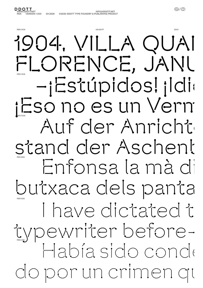
What happens when a pen pauses on paper? “Those small drops of ink … form the core concept of Pen, a new typeface from DDOTT, developed in collaboration with Morula,” CreativeBoom writes.
Pen, by DDOTT in conjunction with Morula.
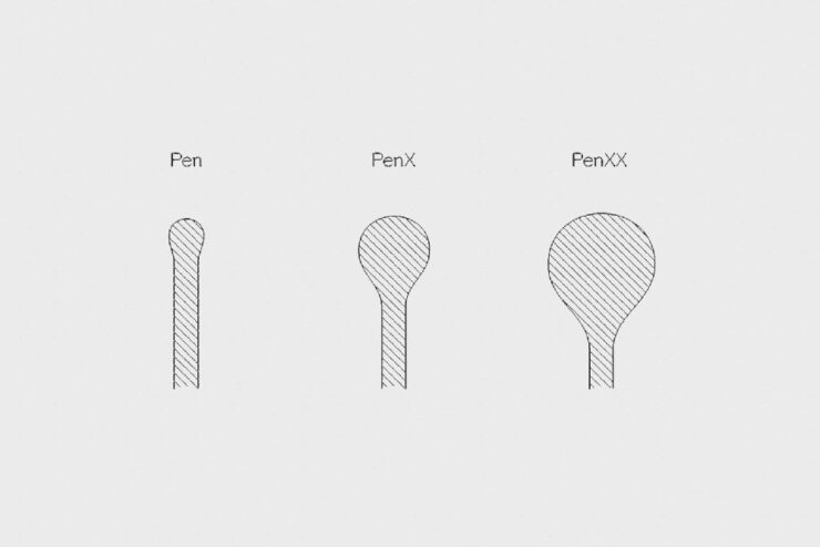
“Pen turns a pause into a mark,” DDOTT writes. “Inspired by the small accumulations of ink left when a pen pauses on paper, it turns these human moments of hesitation, correction, and decision into visible features of the letterform. What would normally be treated as an error becomes part of the design.”
“Pen’s roots lie in standardised lettering systems that accompanied industrialisation, when technical lettering became increasingly regulated and executed through mechanical and digital systems such as plotters and printers. Based on the tradition of round-pen lettering, Pen follows a monoline skeleton without stroke contrast or optical correction, drawing its underlying forms from neo-grotesque models.”
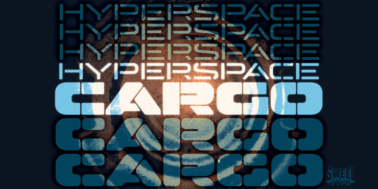
Hyperspace Cargo by Swell Type
Hyperspace Cargo, by Swell Type
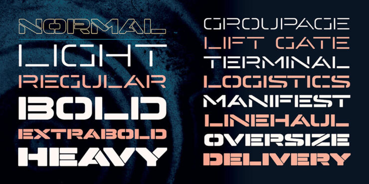
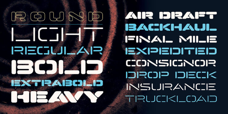
“Hyperspace Cargo looks exactly like its name,” CreativeBoom writes (and I agree). “Derived from the earlier Hyperspace Race, it’s an all-caps, stencil typeface available in a range of weights from Light to Heavy.”
“Horizontal-line Stylistic Alternates add further variety, and it also supports Cyrillic, Greek and Vietnamese. The variable version offers Weight and Roundness axes for extra flexibility.”
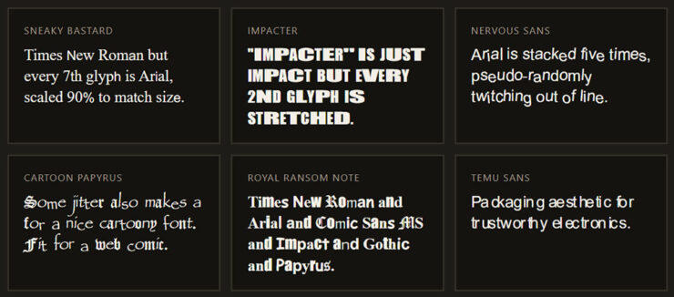
Special bonus #3: “Bastardica is ‘a foundry for bastard web fonts. Mix, stretch and/or squish them.’ E.g. Nervous Sans: ‘Arial is stacked five times, pseudo-randomly twitching out of line.’” Kottke finds the best stuff.
You’ve no doubt heard of utilizing various AI systems to create code, known as “vibe-coding.” The same systems can reverse-engineer, too, a software version of those sites that run new iPhones through X-ray machines to see what’s inside. Fair turnabout, I suppose.
But what happens when you do the same to, say, Adobe’s Creative Cloud? Microsoft Office?
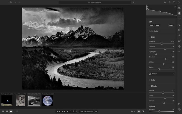
It’s clean-sheet, which is to say using completely new code. It’s open-source. And, as of this writing, it’s three weeks old and Adobe hasn’t sued — yet. “That practice has generally been found legally acceptable,” Ars reminds us, but “the ArtCraft apps could still face legal trouble if their “trade dress” too closely mimics Adobe’s familiar appearance and interface.”
Here’s the interface for LightCraft, which is only superficially similar to Adobe’s.
AI lets us take back tech and set the clock back to the pre-shitty era. But now you can just create 1:1 functional equivalents, clean room, that are highly performant and cross-platform. Nothing is stopping you. We’ll replace Google Search; we’ll build our own smartphones; we’ll build better infra. We’ll remove all the ads and de-enshittify the entire tech world.
Big tech sowed the seeds of their own commodification with AI. It’s all going to come down to this now that we can rebuild everything without toiling for years to even get close to scaling software capability moats. The internet is going to reset to 1990-2004 (pre-Facebook / “Web 2.0” era). The indie web era. Everything is going to be reborn as open source. We’re going to own it all.
“The swagger is immense,” Tom May remarks at Creative Boom.. But the same article wonders whether software is facing a Napster moment — and they might be on to something.
As a profession, we’ve become used to the idea that developing creative software requires thousands of highly paid programmers and decades of work. That serves as a moat for a company like Adobe: few others can afford to build anything on the scale of the Creative Cloud. But will AI bring all that crashing down around them?
— Tom May, Creative Boom
“It’s one thing to make a huge promise like this and another thing entirely to actually deliver,” Jeremy Gray at PetaPixelcomments. “An app is more than just its codebase; it is also its stability, performance, functionality, and ability to handle the extreme edge cases that make or break professional success.”
“If you’re worried this is just some one-off flash in the pan that will die, it isn’t,” Thomas promises.
Time will tell.
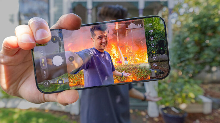
Special bonus #5: On the subject of AI: “Apple, Content Authenticity, and the War to Prove What’s Real,” from PetaPixel, details Apple’s new Reference Image technology. Different from other content authentication systems, for sure, taking advantage of Apple’s ownership of the entire pipeline from camera to output — but of course limited to Apple cameras.
PetaPixel’s header image for the article is awesome.
Special bonus #6: The ongoing Getty/Shutterstock saga/failed merger fallout continues — Getty’s declared bankruptcy. Looks like they’re clearing the road for an equity grab private ownership; together with the Getty family, the Koch bros are involved. Ug. MacFolishas an overview, or PetaPixelhasmoredetail (3 links there).
Automotive
McLaren and Vauxhall
New branding from, shall we say, opposite ends of the automotive spectrum. Let’s start on the high end.
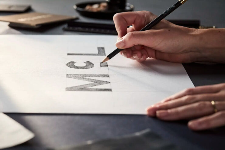
A detail — marketing image, really — of McLaren’s 2026 logo update, highlighting the underlined “c.”
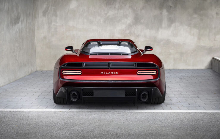
The Internet, in its infinite wisdom, doesn’t like it, suggesting that the new wordmark is more upscale food item than sports car. I disagree — the swoosh/arrow is still very much there, it’s just that the name is styled differently; since it’ll be rolled out with redesigned models, it should serve them well into the next decade. The new look debuts on the M6 GT I drooled oncovered last month.
The M6 GT, highlighted here on Foreword in August, wearing the new wordmark.
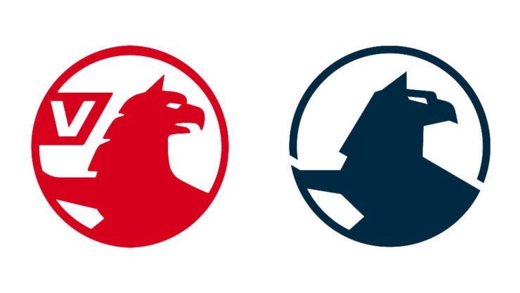
Meanwhile, Vauxhall, part of the sprawling Stellantis empire, has redone the whole brand — griffin, wordmark, and stores:
Before, left; after, right.
This one I’m going to have to mark as less successful. With each change, the creature looks less like its namesake and more . . . well, they’ve got the “bird head” thing kinda right, but the wing, the talons, and the whole “lion thing” are tragically missing in action.
“In the latest update, [the] previous flat logo introduced in 2020 was further simplified,” Dezeen writes,1Dezeen, too, has “new” written all over it — while the logo is the same, the website has been refreshed, simultaneously making its homepage both less readable and more difficult to tell what’s new. Not all bad news, though: the posts themselves feel more modern and are still filled with interesting stuff. “with the griffin made more angular. In particular, the mythical creature’s neck hair was simplified while its beak was closed.”
Also, “for the first time in the logo’s 121-year history, the flag depicting the letter V no longer forms part of the logo.”
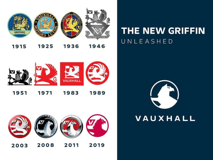
I mentioned it only in passing in 2020; this time, not so much. Take a look at the progression pictured above. Is this the best it’s ever been? Better than ’71 or ’89? I’m honestly surprised the corporate executives evaluated those, looked at the new proposal, and said, “yes.” (See their press release for some “reasons,” along with a few more images.)
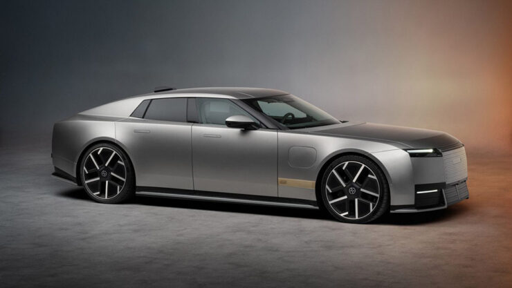
The Jaguar Type 01
On the subject of the Internet’s wisdom, as you know, Jaguar’s Type 00 concept car landed with what could be best described as a “thud.”
But wait: that’s not the concept — that’s the production version.
It still lacks a rear window, and it’s still festooned with the new logo that may or may not do it any favors. The did, at least, more prominently feature the leaping cat.
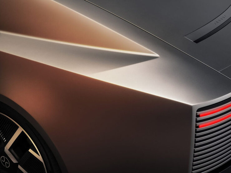
But the rest hews remarkably close to the concept: it’s long, low, wide, and with 1015 horsepower and four cocooned seats, it seems like something that steamroll through traffic with ease. (Less sure about a back road.)
The “impossible panel,” named for its difficult manufacturing process.
I’m glad Jaguar stuck to its guns here. To say it has “presence” is an understatement.
Update, 2 November: Jaguar has opened a new flagship store in Knightsbridge, London — and it’s, shall we say, non-traditional.
Jaguar’s Knightsbridge store/restaurant/hangout.
“Rather than a traditional showroom, we wanted to design a destination where architecture, culture, hospitality and craftsmanship come together — and London felt like a natural home for that vision,” says the senior design manager, a guy named Rolls. Dezeen has more.
Special bonus #7: The reviews for Ferrari’s 12Cilindri Manuale are out — none better than Jason Cammisa’s fabulous Icons series for Hagerty on YouTube:2Folks will notice that I’ve stopped embedding YouTube videos; my site is prominently labeled, “no information collected,” something embedded videos violate by requiring cookies. YouTube, along with any other sites requiring data collection, will be limited to links only. Thanks for understanding.
Ferrari “reinvented the transmission,” Jason Cammisa argues. (Note the pin striping — it’s relevant.)
When Foreword previewed this expensive delicacy in July, I said was convinced that this setup — or, at least, something like it — is the future of the manual transmission. Cammisa agrees, and lo and behold, so might Porsche. I hope BMW hears the call, too.
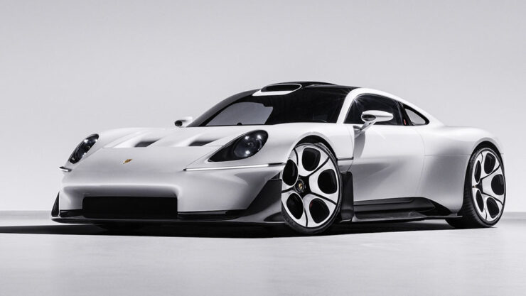
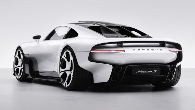
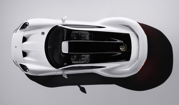
The Porsche Mission S
Porsche’s fortunes of late haven’t been spectacular: between too many EVs aimed at folks who aren’t convinced electric is “right” for a sports car brand — or, at least, for them — and being tied to Volkswagen’s many, many missteps have meant buyers’ interests have waned.
Fortunately, they decided to do something about it.
It’s called the Mission S. It’s a concept, with no production planned, but make no mistake: a production version, which will sit above the 911 in Porsche’s lineup, will be along.
It’s mid-engined. Rumors say it runs a flat-eight, although Porsche themselves are coy about the drivetrain. It’s an automatic in pictures, but:
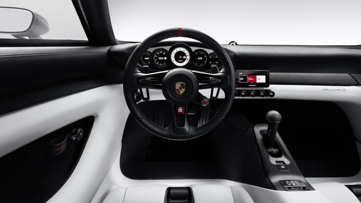
And get this: the interior basically defines “minimalist.” The screen, pictured below, is your phone.
That’s right, Porsche has declared that “real sports cars” should not feature distractions. It even has a real tach. (“Digital detox is now a luxury item,” The Drive says. They may be right.)
But never mind that: equal parts nostalgia — 917, 959, many more — and future, the Mission S is the first Porsche I’ve insta-clicked in a minute. Well done.
Cornucopia of goodness — almost entirely unobtanium, but still.
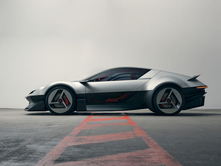
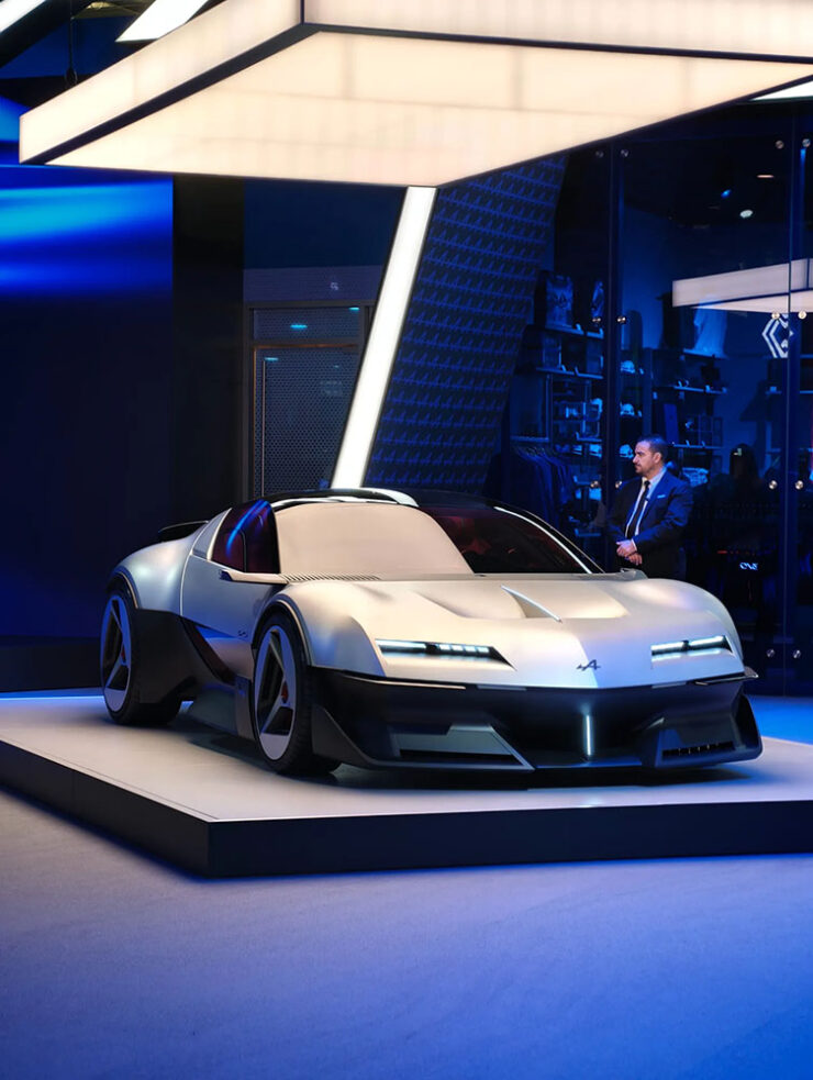
“Alpine offered up one of the true show stars in the shape of the Alpine A310 Concept. Another exercise in retro design, this two-seater sports car is a contemporary update of the 1971 original.” — Wallpaper*
“The modern version doesn’t stray too far from the proportions and details of the striking four-seater 1970s version, one of the most futuristic production cars of the era. If it goes into production, the new A310 will be an electric supercar that … would only be built in very limited numbers.” — Wallpaper*
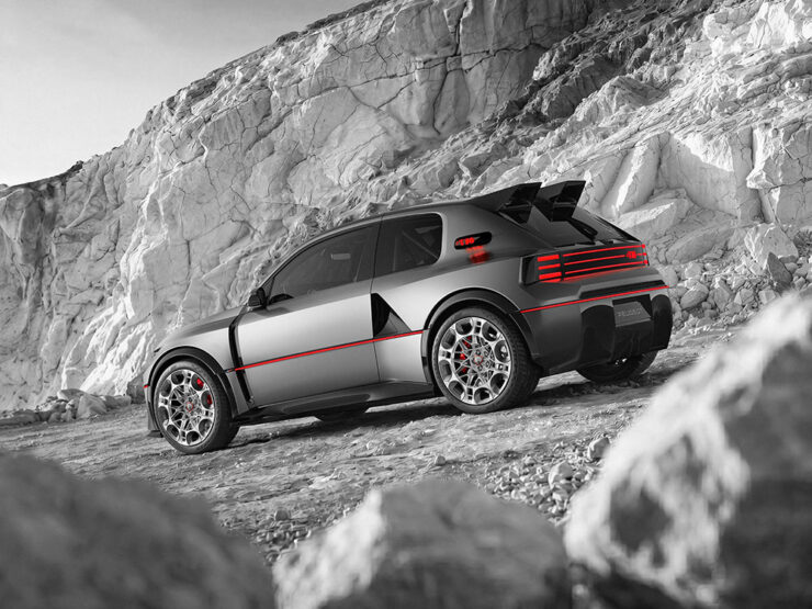
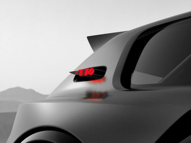
“The French hot hatch has always been celebrated for its excellence. In essence, it’s about combining a small, light car with a peppy engine, not a world removed from the core principle of a sports car, even if most French hatchbacks are front-wheel-drive. You still get the full usability and versatility of the hatchback on which the hot hatch in question is based, but it’s faster and drives even better. There have been a number of cars like that throughout the years, but the Peugeot 205 GTI is one of the best known. That’s why the 205’s rally variant, the 205 T16 Group B rally car, was such a beastly creation: it looks like a 205 that’s gone to the gym, a lot, and taken a few supplements.
“Peugeot’s new E-T16 electric concept manages two things: it’s a successful visual throwback to the 205, and it’s also the most powerful Peugeot anywhere, ever.” — The Autopian
“The Peugeot 205 GTi was a Gallic alternative to the late ’80s-era Golf GTIs that Americans will be familiar with, and it’s into this well that Peugeot dipped for Paris. Or rather, the wild 205 T16 Group B rally homologation special that the 205 GTi gave birth to, a car that won the world Rally Championships in 1985–86. The E-T16 Concept shows us that hatchbacks needn’t just be humble devices for running errands; they can excite, too.” — Ars Technica
“The original Renault Espace was very much loved and created the people-carrier segment out of thin air, at least in Europe. The familiar one-box shape remains for the new E-Space Concept … There is a criminal lack of electric minivans on the market today.” — Ars Technica
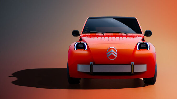
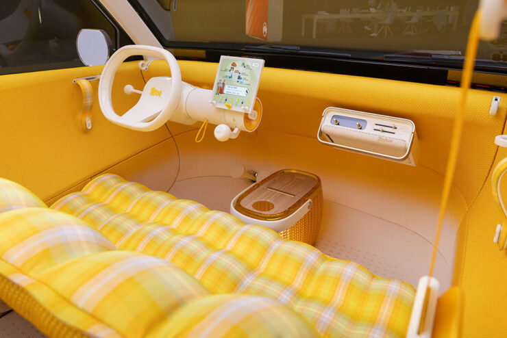
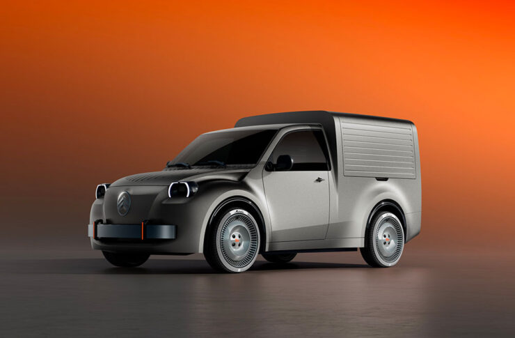
“I’ve been excited to hear that the car is intended to fit the spirit of the original 2CV (you can read that as affordable) and not just be a retro, nostalgia-flavored cash grab. Well, yesterday the full new 2CV concept was revealed at the Paris Motor Show, and I’m happy to say I think Citroën did a damn good job of translating the archaic 2CV into a modern design vocabulary.” — The Autopian
“The best-received concept … was the long-awaited revival of the legendary Citroën 2CV. Electric only, the concept is — we’re promised — apparently very close to the production reality.
“There’s a wealth of genuinely entertaining detailing here, all of which hasn’t just been carried out in homage to the original, but as a way of finding new methods to keep costs down. Citroën aims to get the production 2CV … to come in at the magic €15,000 mark. Nostalgists will have a field day, and it’s still a delightful sight for the rest of us.” — Wallpaper*
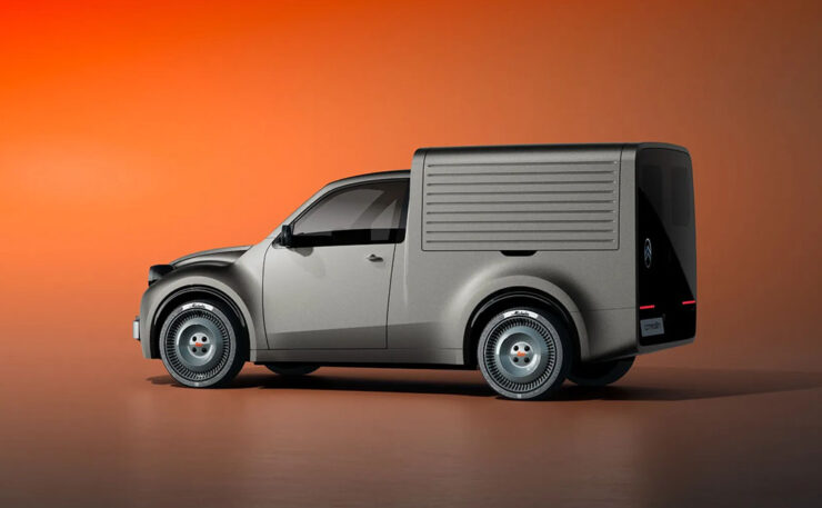
“Back in the day, the original 2CV wasn’t just a family car, it was the vehicle of choice for French business big and small. From La Poste to the local boulangerie, the box-backed 2CV van was everywhere.” — Wallpaper*
“Citroën is hoping that the new generation 2CV Fourgonnette will do similar business. Bringing the admirable simplicity of the passenger car concept to a small van, the focus here is on maximising load space and practicality, whilst not losing sight of the character that will give this tiny van its competitive edge — a serve as a lovable mobile advert for whichever businesses chose to adopt it.” — Wallpaper*
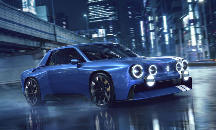
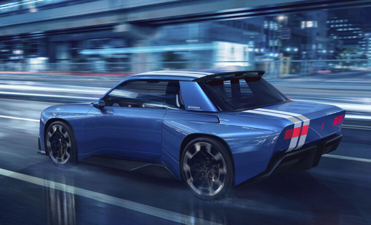
“The French carmaker Renault seems to be having a blast digging into the treasure trove that is its historic output. As Renault’s concept cars show, it’s not done digging.
“Between 1962 and 1976, Renault built a rear-engined family sedan called the 8. The company exported these cars to the United States, and despite being down on power, they were simply marketed as being faster than the previous cars! Yet, the R8 also provided the basis for one of Renault’s early sports sedans, the Renault 8 Gordini. The most recent concept car from Renault takes the visual identity of that late-1960s car and reinvents it for the future.” — The Autopian
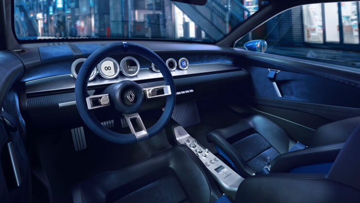
“The interior is all 1960s-styled concept car aesthetic, with brushed metal on a very narrow center console. The interior looks great in both renders and photographs, with suede on the steering wheel and velour on the dash.” — The Autopian
“The rear is now swept up, with blocky taillights glowing through a pixelated texture, on a surface that’s completely blank with the lights switched off. To maintain a visual connection to the original, there’s no rear spoiler on the rear deck. Instead, the spoiler is up there at the rear edge of the roof, and the diffuser presumably deals with the rest of the airflow. A large GORDINI logo is proudly affixed to the wide C-pillars.
“It all looks like a school kid’s dream, which it will also remain: no production plans exist, even if some of the detailing and ethos are likely to trickle down to production versions.” — The Autopian
Literally all of these tickle my fancy in one way or another, but it’s the Gordini — naturally the one least likely to make production, let alone come to the US — that I’d have without question. (Well, the Ferrari . . . .)
But that only scratches the surface of the goodness introduced in Paris: from Alfa to Volkswagen, there were dozens of concepts and production cars to delight the eye. The best overview is at Wallpaper* (1, 2), but also see coverage at Ars Technica and The Autopian (1, 2, 3, and 4).
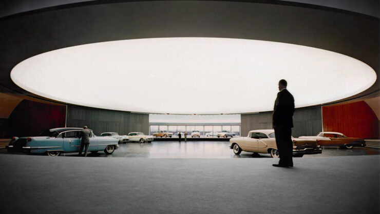
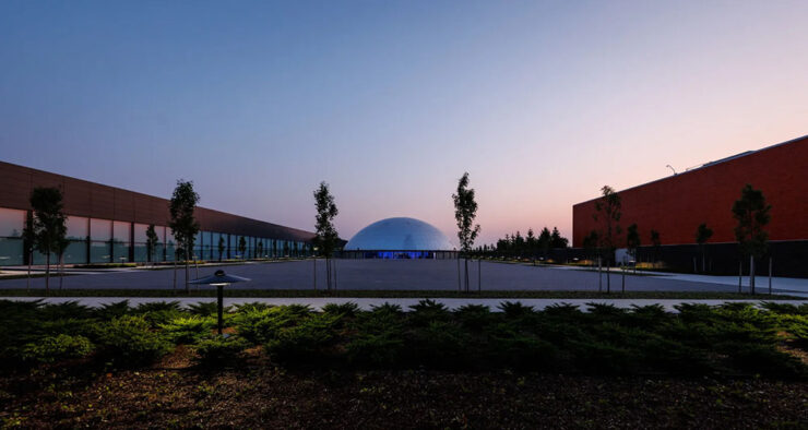
Special bonus #8: Inside GM’s Global Technical Center in Michigan. A long item from Wallpaper* featuring “ample opportunity to celebrate GM’s products, heritage and the all-important ‘surprise and delight.’”
Harley Earl beneath the “dome” back in the day.
“This was the ‘dream factory’, the birthplace of the stylish, status-driven mobility that convinced a nation of its place at the forefront of the industrialised world. To visit the campus today is to simultaneously step back in time to the auto industry’s heyday of boundless confidence, whilst also sampling the far future of manufacturing.” — Wallpaper*
The Center today. The exterior of the “dome” is visible amongst newer buildings and additions.
Photography
“Occasionally bizarre”
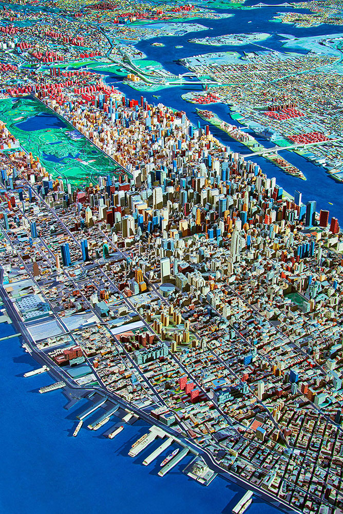
“This work does not propose conclusions. It documents a condition in which biological life and technological systems are no longer separable, yet remain unevenly aligned,” photographer Spencer Lowell says.
Aerial of Manhattan and Queens, 2016. Photograph by Spencer Lowell.
Lowell describes himself as a photographer of “science, technology, industry, environment, and people,” and all of that is shown throughout his debut monograph, Futures Past. PetaPixel has more.
2026 Epson Pano Awards
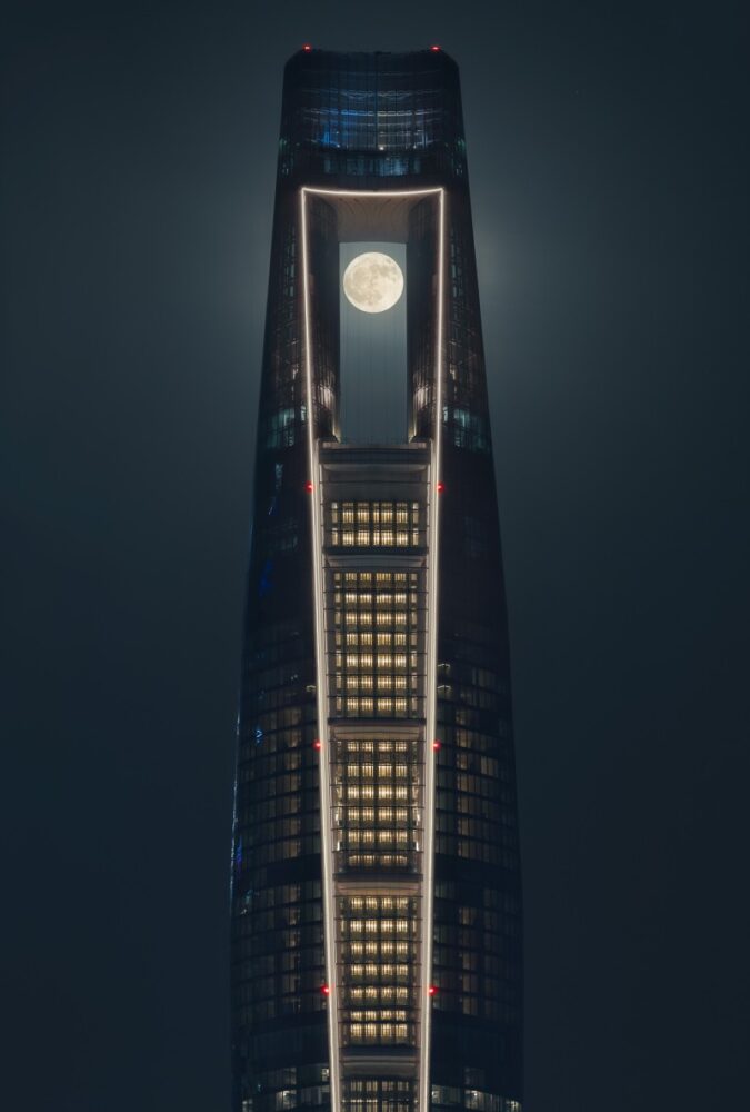
The 17th Epson International Pano Awards have announced its 2026 winners, which drew 4,084 entries from photographers in 93 countries.
‘Center of the Cosmos.’ Photograph by Xuecheng Liu. Winner of the Open Built Environment category.
Tons of great stuff here; according to their rules, by the way, “pano” is defined as a ratio of at least 2:1. See all of the winners and finalists at the Pano Awards website, check out Kottke’s favorites, or see PetaPixel‘s top 10.
2026 Astrophotography Prize
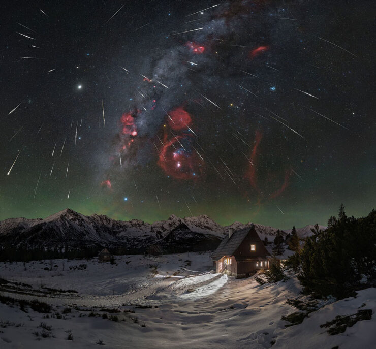
“Established in 2023,” PetaPixel writes, “the Astrophotography Prize is an international astrophotography competition run by astrophotographers, for astrophotographers.”
“Geminids Above Betlejemka,” Poland. Photograph by Lukasz Remkowicz..Finalist in the Astro Landscape category.
They continue: “the competition recognizes excellence across Astro Landscape, Aurora, Deep Space and Remote Imaging. Its emphasis on public live judging and constructive feedback gives entrants an opportunity to have their work assessed by experienced photographers while allowing a wider audience to learn about the craft.”
Special bonus #9: See also this year’s Natural Landscape Photography Awards winners, “a collection of beautiful landscape and nature photos that emphasize realism and authenticity.” (Via PetaPixel.)
2026 Architecture Photography MasterPrize
“The Needle,” Qatar. Photograph by Ahmad Alnaji. Winner in the Hospitality Exterior category.
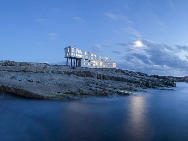
This contest is a little different, in that it’s winners from the photography program of the Architecture MasterPrize (AMP), “an international awards program now in its eleventh edition that also recognizes architecture, interior design, landscape architecture, and product design.”
“Fogo Island Inn,” Newfoundland. Photograph by Alex Fradkin. Winner in the Hospitality Exterior category.
Not at all described as “catnip,” this contest has some of the best architecture photography extant, year after year. The complete list of 2026 winners is on the AMP website. (Via PetaPixel.)
“Handcrafted images of memory and time”
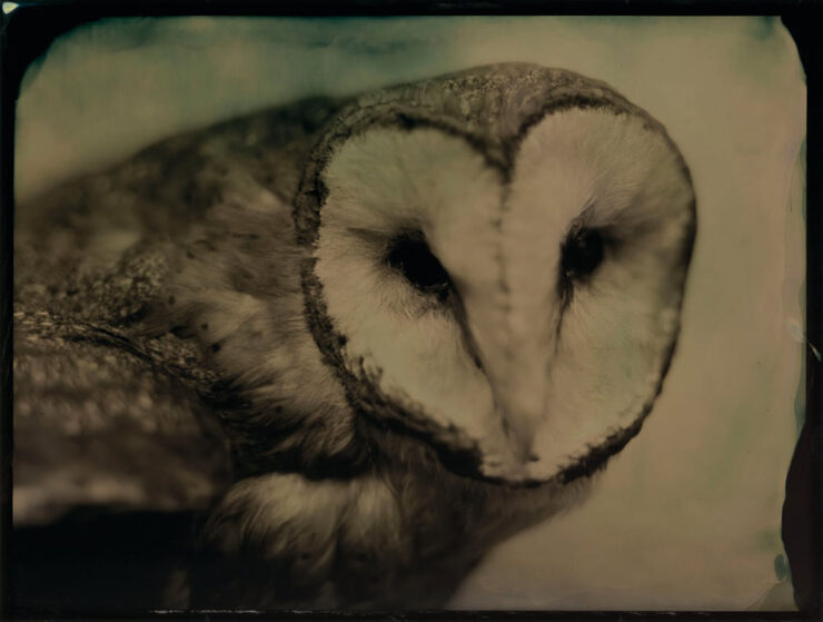
Photographer Lara Porzak “works exclusively with analog techniques,” PetaPixel writes, “including tintypes and gelatin silver printing, using a slow, hands-on process to produce her photographs. She often develops images on site in a mobile darkroom, creating handcrafted prints that explore the relationship between photography, memory, and time.”
“Barn Owl.” Photograph by Lara Porzak.
As many of you know, I love tin- and old-style photography, and these are excellent. Better still, Los Angeles-based Porzak has brought “over 140 of her photographs together in her first monograph, The Chemistry of Memory.”
Have I mentioned that open-sewn bindings are hot right now?
2026 Nikon Comedy Wildlife Awards
Finally, to close out October’s post, we have . . . a smile or two:
“Are you kidding me?” Photograph by Kevin Lohman.
I inadvertently selected three owl photographs in a row — but left it. Owls are awesome. (We have several that live on my block here in Macon; hearing them hoot and howl at each other — despite being on the urban-suburban boundary — is one of the reasons I treasure them.)
“Two little owls form one,” Al Qudra Desert, Dubai. Photograph by Lynn Emery.
“Each year the competition supports a sustainable conservation organization,” PetaPixel writes. “This year Comedy Wildlife is working with the Born Free Foundation, an international charity rescuing and protecting wild animals from exploitation and conserving threatened species.”
The People’s Choice Award is open now until March 1, 2027. Vote!
• • •
On that last subject: in the United States, Election Day is next Tuesday, November 3rd. Please make your vote heard.
1
Dezeen, too, has “new” written all over it — while the logo is the same, the website has been refreshed, simultaneously making its homepage both less readable and more difficult to tell what’s new. Not all bad news, though: the posts themselves feel more modern and are still filled with interesting stuff. ↩︎
2
Folks will notice that I’ve stopped embedding YouTube videos; my site is prominently labeled, “no information collected,” something embedded videos violate by requiring cookies. YouTube, along with any other sites requiring data collection, will be limited to links only. Thanks for understanding. ↩︎
At the end of September, I had the opportunity to wander around downtown Asheville on a particularly beautiful Fall afternoon and evening. I was happy to grab the camera and document this energetic — and photogenic — city.
Downtown is a wonderful mix of Art Deco, 20th Century, and modern buildings:
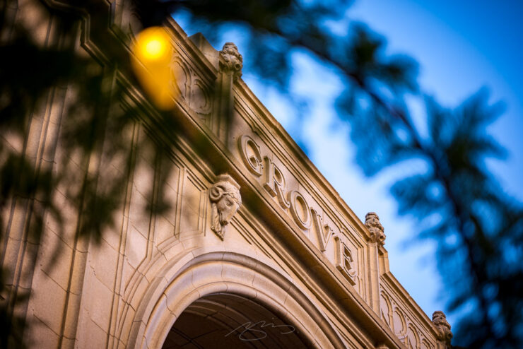
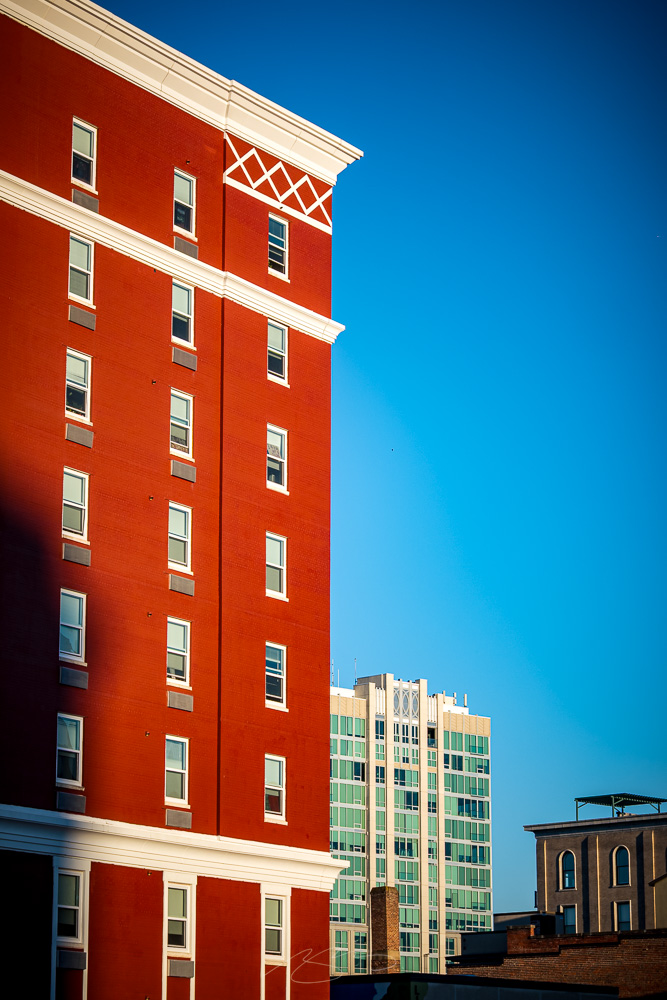
Grove Arcade (Detail #5), 1 Page AveGrove Arcade (Detail #6), 1 Page AveDowntown Buildings in Evening Light (#1), Haywood St
Which intermix with delightful details:
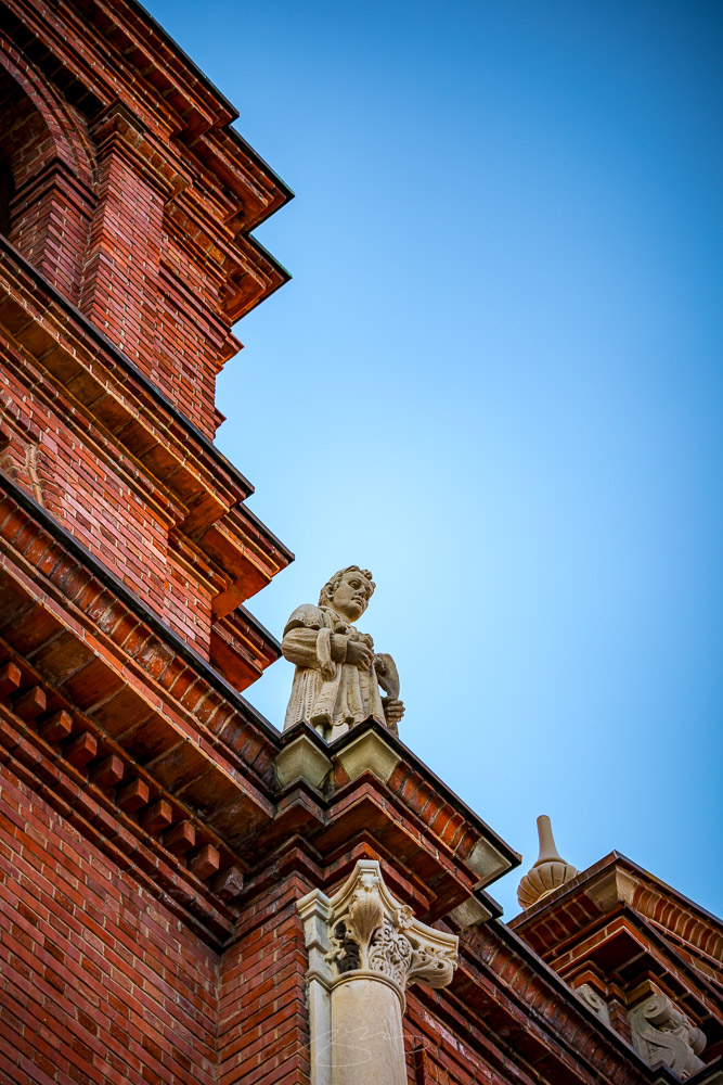
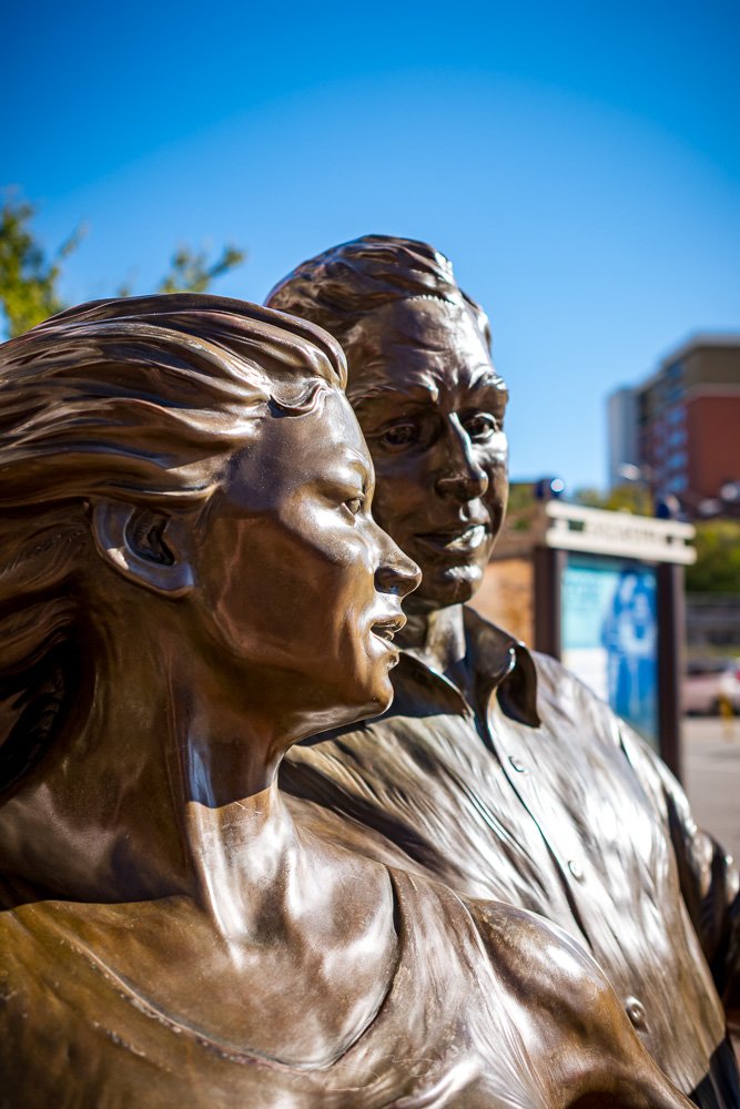
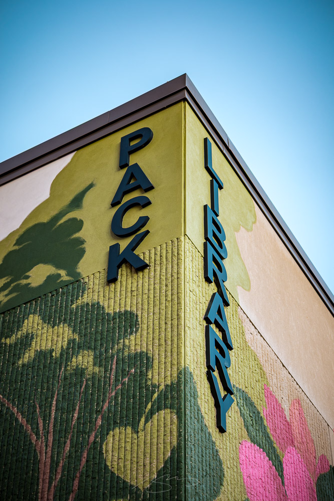
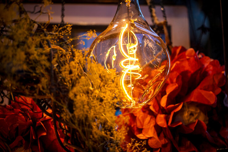
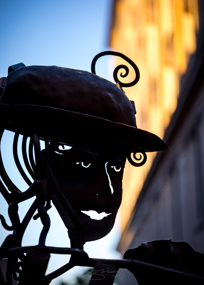
Basilica of Saint Lawrence, Deacon and Martyr (Detail #2), 97 Haywood StThe Appalachian Dancers Of The Ashville Urban Trail #1, Flint StPack Library (Building Detail), 67 Haywood StEdison Light in Fall Window Display, Wall St
It was a quick visit; I was traveling and had only the one afternoon free — but was very much reminded that Asheville deserves more. As the smaller Southeast cities go, it has a special quality.
Shopping Daze At Sunset #1, Haywood and Walnut Sts
I will be back, hopefully soon, so please look forward to more.
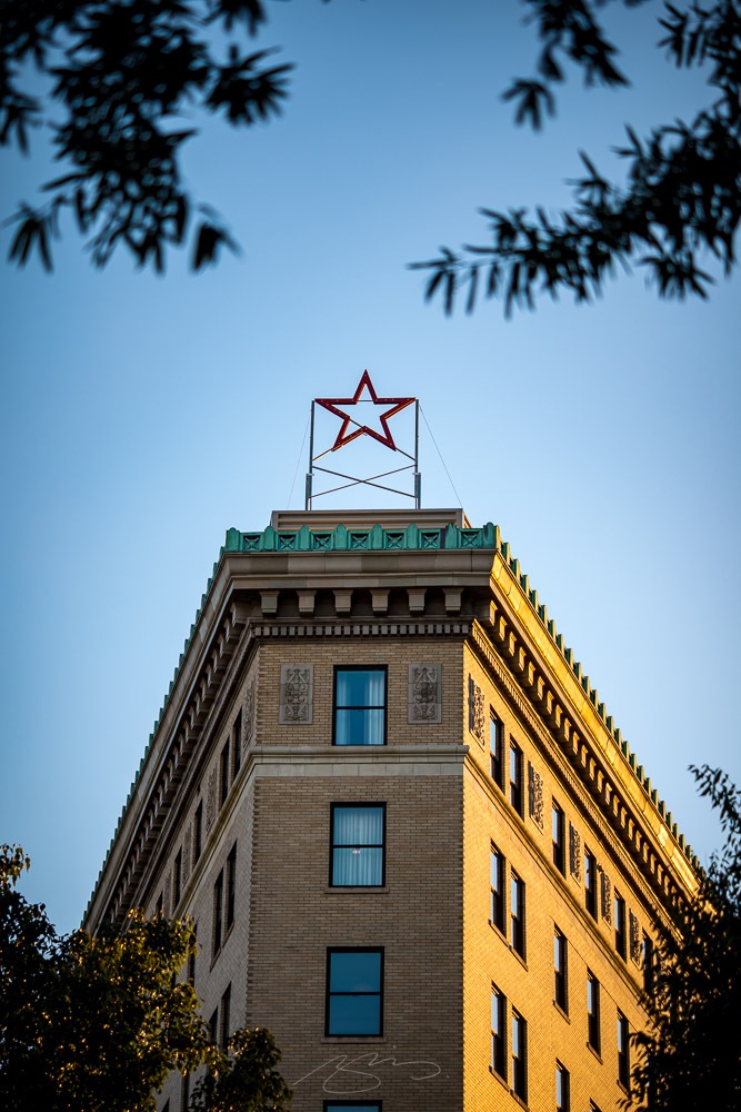
The Flat Iron (Hotel) Star at Sunset, Battery Park & WallAsheville Panorama (from Above Hemingway’s, 15 Page Ave) – Click to Enlarge.
As I sit down to write this post, Middle Georgia’s first taste of Fall has come by to say hello — that delightful moment when the summer heat breaks and we have the start of open-window weather. Welcome.
September: highlights
This month’s Spine
West Virginia University Press. Cover design by Zoe Norvell.
Great group of covers this month in my regular column on Spine. It’s fall catalog season, so lots of University titles to choose from. The cover above is not only great, the story of how it came to be is appreciated, too.
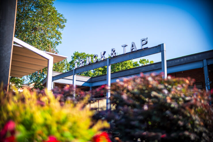
Truck & Tap (Sign #2), 3137 Main St., Duluth, Georgia
In addition to being posted early, Beautifully Briefed is a little shorter than usual — but you’re not left wanting for goodness: in case you’ve not already had the chance, check out some photographs from a visit to Johns Creek, Georgia; two separate galleries for Duluth, Georgia; and my annual take on AIGA’s 50 Books | 50 Covers. Enjoy!
Celebrate: Unsung
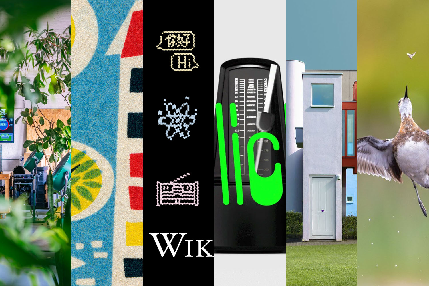
Marcin Wichary’s blog quickly earned a spot on my regular-checks routine; after the fabulous publicity for the amazing Shift Happens, finding out that he was going to post regularly was a gift — and regular readers will know that he’s become a oft-cited link destination in the Briefed series.
I dreaded even attempting the redesign, but as I was adding full-text search to the blog, I realized the previous simple frame couldn’t accommodate it — no matter what I did, the search felt bolted on. I suppressed my PM side, decided to scope creep, and the 500th postiversary provided a good arbitrary deadline. (This is post №492, so hopefully I’m not jinxing it.)
— Marcin Wichary, Unsung
His work is filled with delightful details, like the angled change in color between posts (that’s different on desktop and mobile) and so much more . . . that he’s thoughtfully documented:
If you have a moment, and you’re into his interface and design work as much as I am, complete #3 (or 4) on that list.
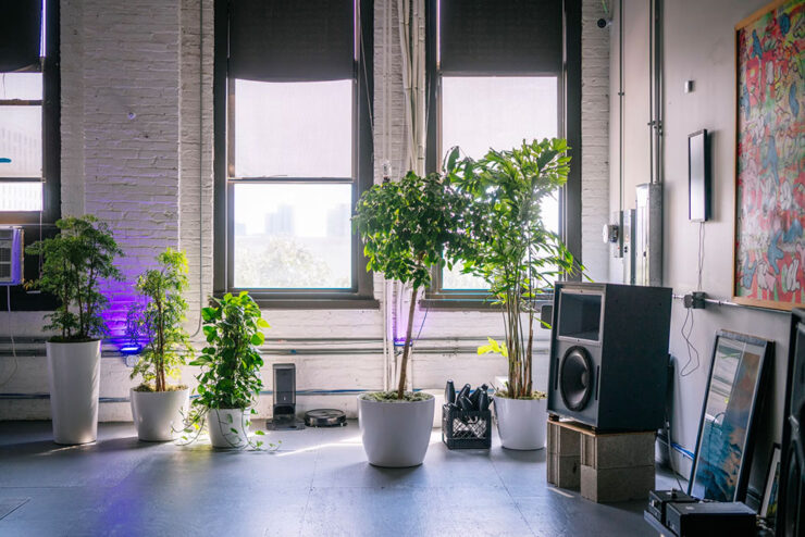
One interesting strategy on the redesign: decamping to a friend’s coworking space for a motivation — and a new perspective:
Coworking space at a Chicago startup — nice.
I’m frankly jealous of his results here. I struggled with the tech end of the rework here — stubbornly, perhaps, refusing to ask an “agent” for help — results that, for him, come so naturally . . . yet with all of the necessary design chops.1Parenthetically, I’m not 100% satisfied with how my redesign is working out. The body font, especially, is good at first — and second — glance, but some of the minutiae, like the minuscule quote marks and the collision/confusion between a capital I or L and a bracket (something I use often) is causing problems. I hope folks won’t mind if I do a point-one update sometime this fall or winter.
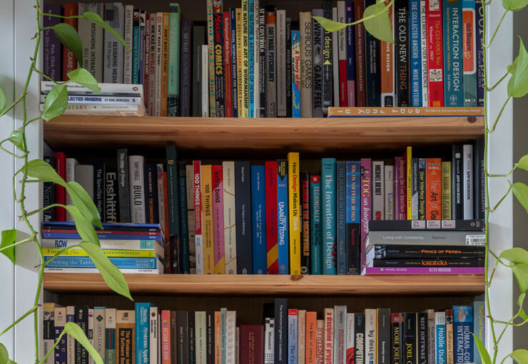
No, he can’t just share a photograph of his bookcase. Awesome.
Special Bonus #1: Marcin’s design bookshelves, now a mini-site (!). Hover over each book for more information. Favorites are highlighted, and each includes a look at the cover — and a link to OpenLibrary.
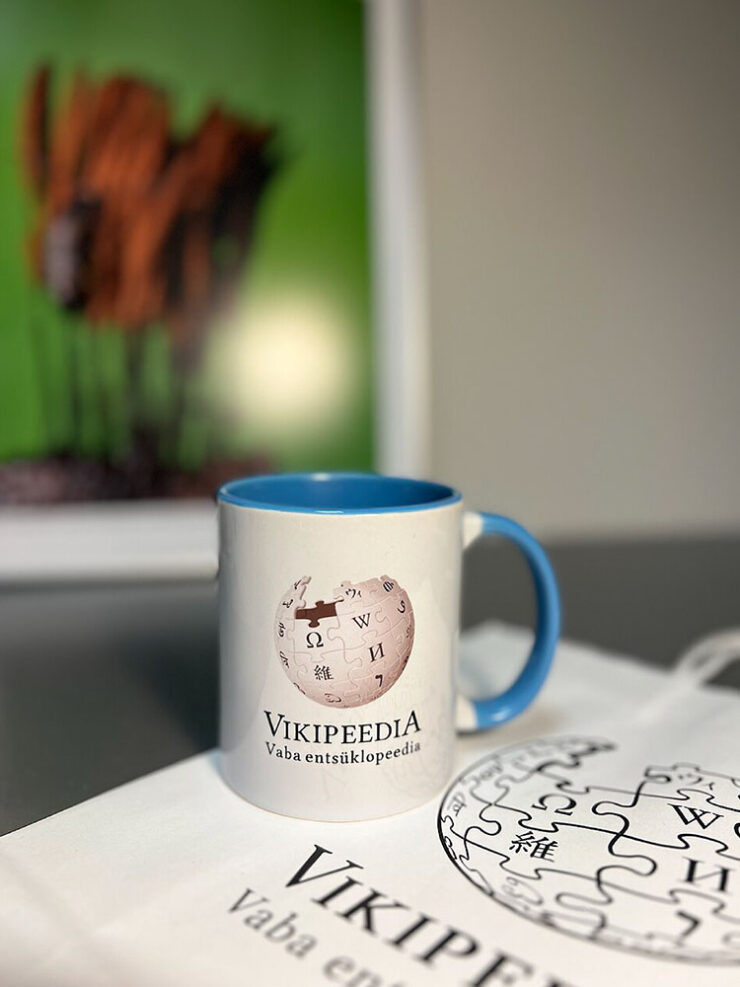
Merch . . . from the Estonian version of Wikipedia.
Wikipedia is the most classic idea of the internet you could possibly imagine: function over aesthetics, a treasure trove of knowledge rooted in homage to The Library of Alexandria, a website that you can really explore (you know, like how the internet is for exploring… an idea that has long been abandoned by most!). My friend calls it a relaxation medium — it’s serene, a place where you can effortlessly glide from learning about the moon landing to all of a sudden: exploding trousers. “Wikipedia pre-dates the attention economy,” says Justin Scherer, UX designer at the Wikimedia Foundation, the non-profit that supports Wikipedia and its visual design system. There are no infinite doomscrolls, only enriching rabbit holes that avoid those all-too-common psychic blasts of negative energy you get from Instagram reels.
— Paul Moore, It’s Nice That
But those aesthetics aren’t ignored. The article “speaks to the creatives behind, in-front and all around the greatest internet database, the site where every single human is the target audience.”
Logo design evolution. Did you know one of the puzzle characters represents Klingon?
It goes into the design evolution of the site, from the early days through its 25th anniversary, celebrated in January of this year — where, as part of the goings-on, they introduced their first mascot, Baby Globe:
Wikipedia’s Baby Globe. (I spared you the GIF-in-motion.)
“Wikipedia is more than just a database, it’s an entire world — and in its orbit is a ring of fascinating design history, volunteer-led artworks and community that goes a little unsung,” It’s Nice That concludes. Enjoy some great details!
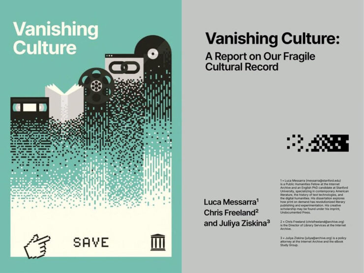
Special bonus #2: From the Internet Archive: Vanishing Culture: A Report on Our Fragile Cultural Record. “When digital materials are vulnerable to sudden removal . . . our collective memory is compromised, and the public’s ability to access its own history is at risk.” (Via Kottke.)
September: my type
Diverse group of new typefaces this month!
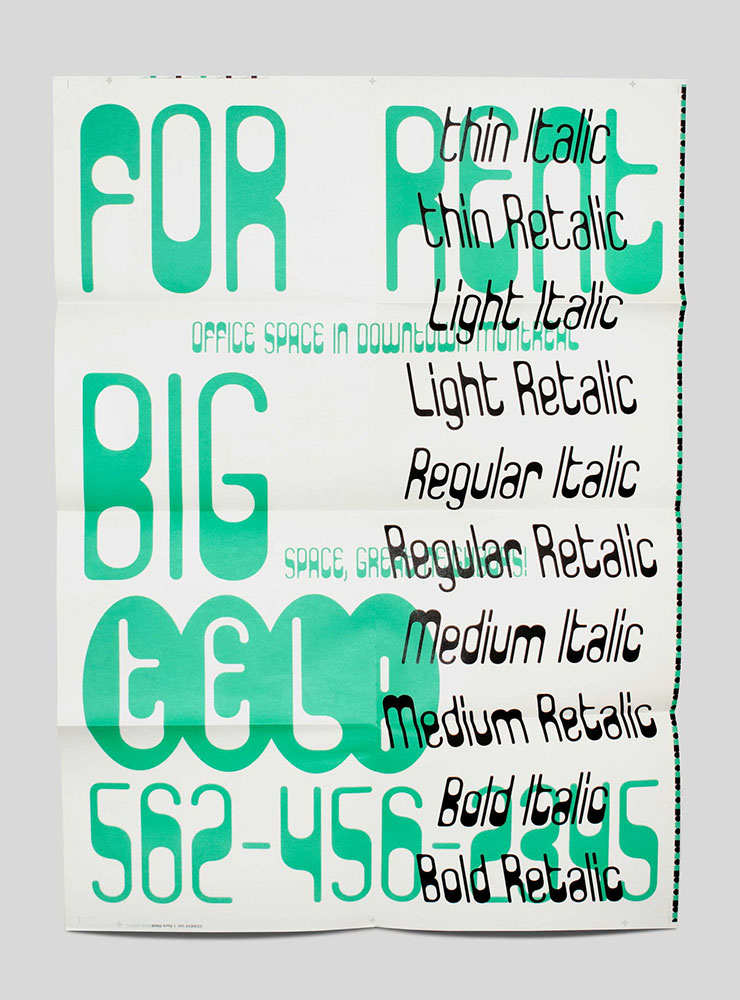
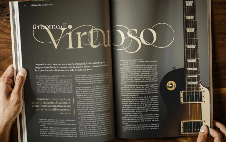
Clippy, by Kanon Foundry
Not the Clippy I bet you’re thinking of — something better:
Clippy, the new Paperclip Countour, by Kanon Foundry
“When Tor Weibull, a type designer who co-founded Kanon Foundry with Alexander Örn in 2019, came across Paperclip Contour on the record sleeve for Kissin’ in the Back Row of the Movies by The Drifters, he was enamoured with its modular expression, but felt that the contour style and absence of uppercase letters made it limited in use. Naturally, as a type designer, he felt moved towards reinventing the idiosyncratic typeface, filling in the letters and developing uppercase letters alongside the lowercase forms. After all, work at Kanon Foundry is rooted in research, historical references and a hands-on approach, so taking a typeface from the 70s and bringing it into 2026 makes total sense for the independent designers.”
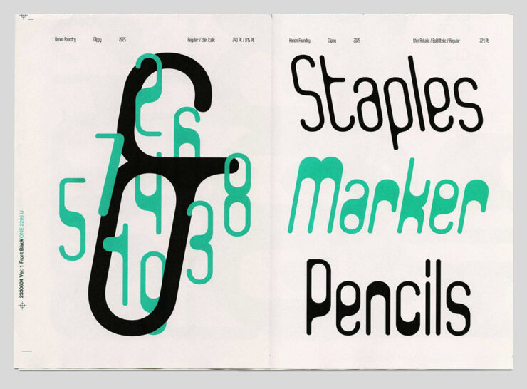
Clippy, the new Paperclip Countour, by Kanon Foundry
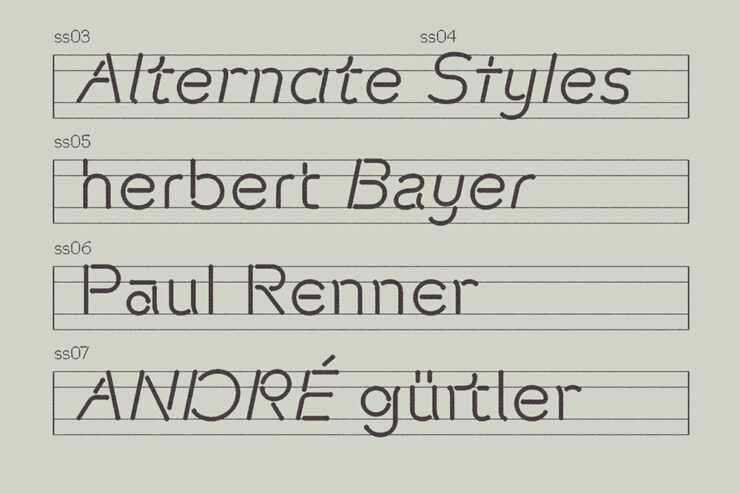
“The variable font technology allows Clippy to move between Retalic, Roman and Italic with fifteen styles that cover a range of weights – it’s quite the range for one system, all tied together with a similar, playful character and the freedom to find out what works best for the intended use. Besides Paperclip Contour, Tor took inspiration from modular lettering such as Herbert Bayer’s work, and as new weights and associations emerged during the creation of Clippy, Tor saw similarities to E13B-like mid-weights and CNC engraving, a manufacturing process that utilises computer-controlled machines to carve and etch lettering into materials.”
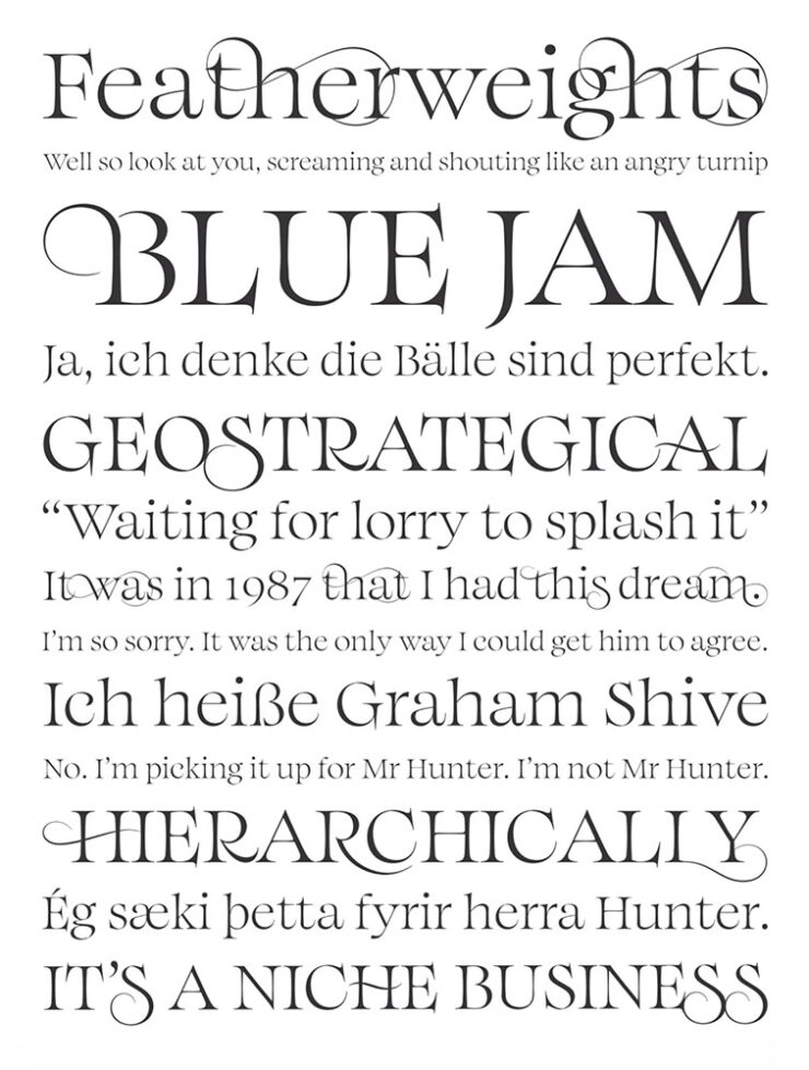
Arpeggio, a “delightful transitional serif” from Paulo Goode
Arpeggio is described as a “transitional serif,” something “warm, readable and disciplined,” CreativeBoom says in this month’s new typefaces post. “It could serve as a workable alternative to Baskerville; not to mention Caslon, Mrs Eaves, Georgia, Perpetua and Bookman.”
Arpeggio, a “delightful transitional serif” from Paulo Goode
“Described by Paulo as ‘an original text typeface that balances disciplined rhythm with expressive character,’ it oozes clarity and confidence in the text weights whilst the Display collection amplifies the characterful nuances with sharpened forms, graceful swashes and exuberant flourishes. A strong choice for books, magazine design or a luxury brand identity.”
Incredibly well-named, too. Nice.
FYI, CreativeBoom‘s post had fifteen new faces, but Arpeggio was the only one that I immediately wanted to use. Your needs may vary: check ’em all out.
No, it’s not my writing — hopefully — it’s late-day screenshotting, reflected.
Special bonus #3:CreativeBoom has updated their “mascot”: the eyes have it. “Keep an eye on them because they’ll now offer lots more entertainment depending on seasons, events, and whether it’s night or day.”
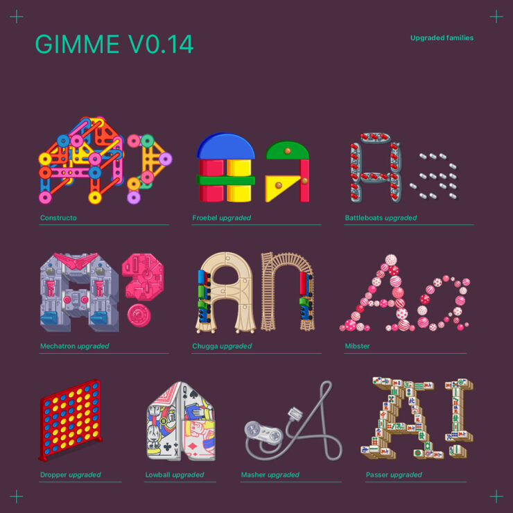
Gimme, by Future Fonts
“This is bonkers,” Kottke writes, ”letters made from Battleship pieces, Connect Four boards, playing cards, wooden railroad tracks, etc.”
Gimme, a “toy box” from Future Fonts
“Gimme is the kid in class who has everything, from the latest toy as seen on TV to a tricked out BMX bike. It’s the only person you knew with the complete Playmobil Mansion or USS Flagg. This time however, it can be you!”
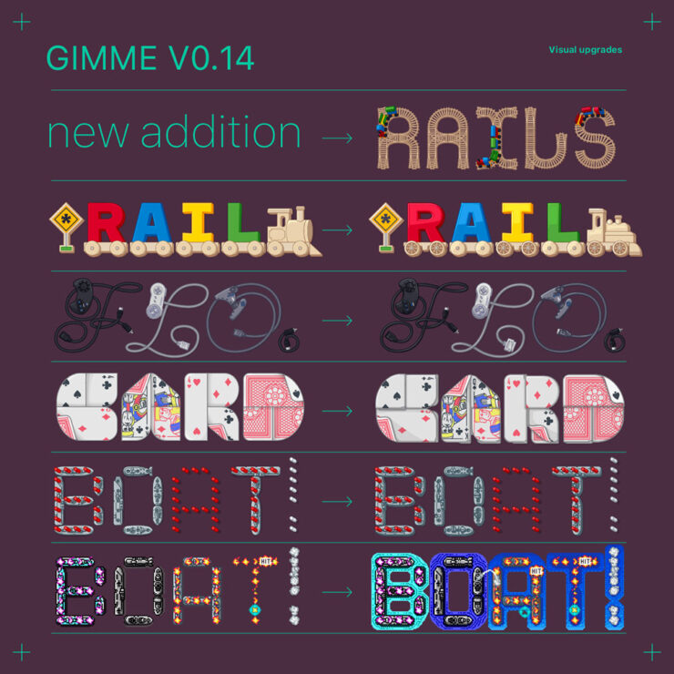
Gimme, a “toy box” from Future Fonts
“Gimme is a dazzling ever-growing type family of multi-chromatic and variable display typefaces which will leave you saying: gimme more! And you are in luck, because updates will deliver on that!
“Inspired by a box full of toys, more type families will be added as we go along, expanding them further and adding new features. And the more allowance, the more it will grow!”
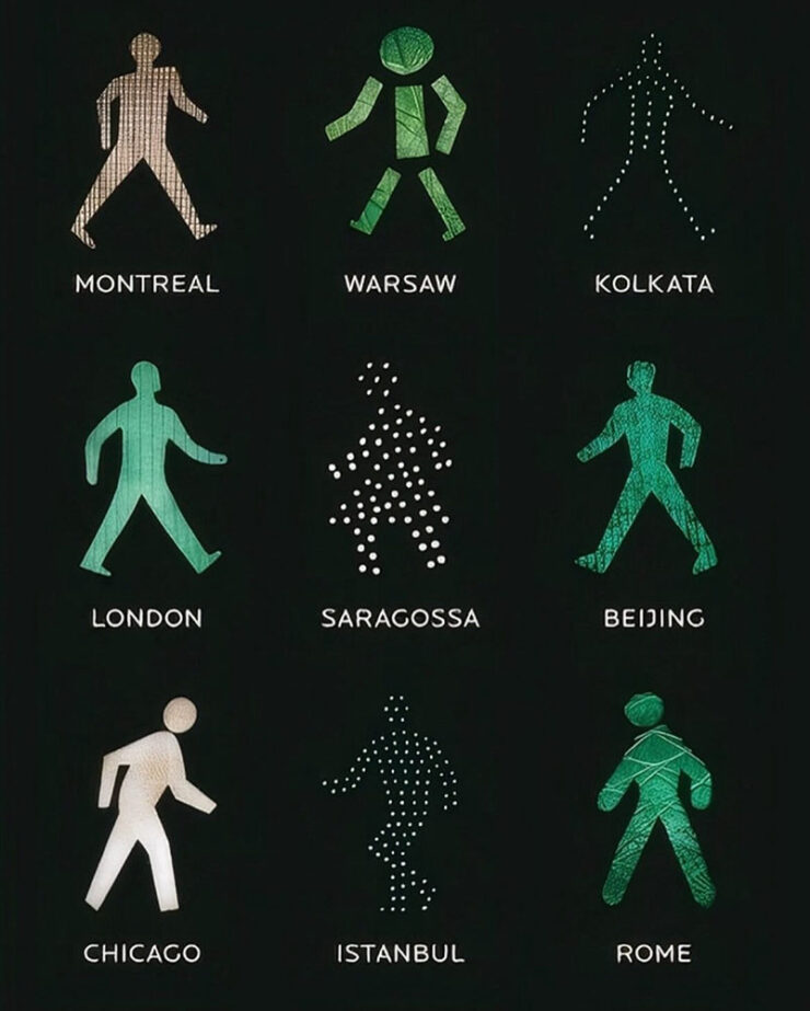
Special bonus #4: Kottke’s also responsible for bringing Walking Men Worldwide to my attention. These are awesome: Beijing is oddly reflective of London, Warsaw invited aliens, Chicago leans into the winter wind, and Istanbul dances. See many more (and other projects) — public art at its design best.
Walking Men Worldwide, by Maya Barkai
Special bonus #5, and the last Kottke mention for this post: Jason has answered the call to wander and relocated to Japan (!). He’s been checking out bookstores.
September: photography round-up
The power of simplicity
“Curves in Colour.” Part of a series by Louis Phillippe Provost.
The 2026 Minimalist Photography Awards are out . . . and no, it isn’t at all catnip. Not even a little. I can’t imagine what made you think that.
“Controlled Silence.” Photograph by Steffen Reichardt.“Highway to Nowhere.” Photograph by Tadej Cerkvenik.
Appropriately, the awards site quotes Henry David Thoreau: ”It’s not what you look at that matters, it’s what you see.” See the winners’ gallery. (Via PetaPixel.)
The solitude and beauty of modern life
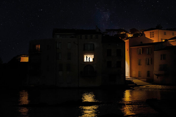
“St. Tropez, 2021.” Photograph by Nicholas Rachline.
Nicolas Rachline’s “cinematic, Edward Hopper-esque photographs capture the solitude of contemporary life as well as its fragile beauty,” PetaPixel writes. His images “capture fleeting moments with a film noir-style intensity. His dreamlike scenes of cities such as Paris, Los Angeles, and New York are both familiar and slightly unsettling, in ways that can be difficult to explain.”
“Brussels, 2022.” Photograph by Nicholas Rachline.
This series is not only fascinating, it features more than a couple of photographs from Sarasota/Bradenton Florida, a familiar stomping ground.
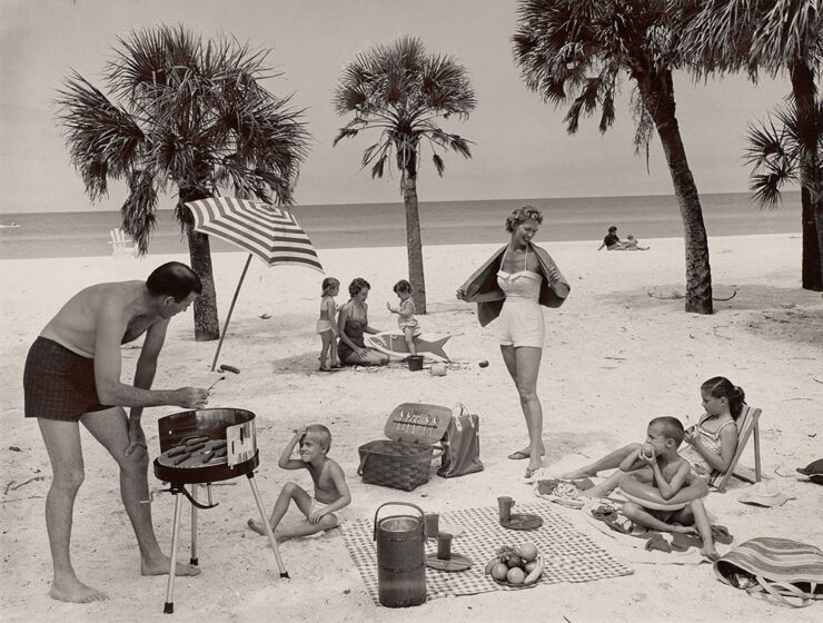
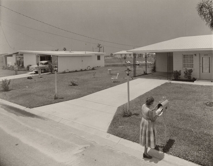
“Idealized Family Picnic on Beach,” Longboat Key, Florida, 1958. Photograph by Joseph Janney Steinmetz.
“Harvard Art Museums has delved into its extensive photographic collection,” PetaPixel writes, “to put on a thought-provoking exhibition titled The Way We Never Were that questions the postwar narrative in the United States.”
Untitled (Woman at mailbox), Bayshore Gardens, Florida, 1959. Photograph by Joseph Janney Steinmetz.
“American life after World War II is often portrayed as a rosy world of sock hops, malt shops, manicured lawns, and renewed optimism. This image was heavily shaped by commercial photographers, who worked on commission for private clients, corporations, and government agencies. Their carefully staged portraits and promotional imagery, constructed using polished visual conventions and framing devices, helped define many of the era’s most familiar scenes.”
Not that different from social media’s idealized influencers, in many ways, yet nostalgic and somehow endearing. (Longboat’s beach — which did still look like that when I first visited in 1978 — was reclaimed by the Gulf of Mexico a long while ago, and to say that Bayshore Gardens no longer looks like that the definition of understatement.)
Anyway, the photographs are not just Florida, and are both varied and engrossing. The Way We Never Were: The American Professional Photographers Collection is at the University Research Gallery at Harvard Art Museums in Cambridge, Massachusetts, until May 9, 2027. (Via PetaPixel.)
Special bonus #6: “I found a famous photographer’s early print in an antique store for just $5.” Another classic Florida tale.
Stargazing
“The Crown.” Photograph by Radoslav Sviretsov.
“I never tire of seeing the new entries into the ZWO Astronomy Photographer of the Year competition,” Dr. Greg Brown, Royal Observatory Greenwich Astronomer and competition judge, tells PetaPixel. “For a sky that, at least in some ways, is remarkably unchanging from year to year, the skill and innovation of the entrants, coupled with improvements in technology, means that there is always a wealth of new sights to be seen even in targets that have been observed many times over.”
“Botswana Star Trail.” Photograph by Stephano Pellegrini.
“The images from this, the 18th year of the competition, continue to show the growth of a community whose passion to capture the stunning variety of our Universe knows as few bounds as the subjects of their images.”
Birding, part one: Audubon 2026
“Brandts and Sawgrass.” Photograph by Kevin Lohman.
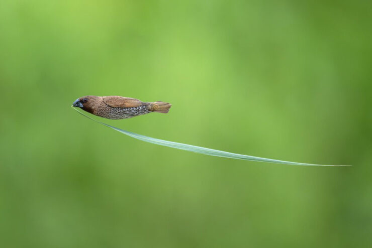
“The National Audubon Society has unveiled the winners of the 2026 Audubon Photography Awards, a competition that captures the beauty of birds and the challenges they face,” PetaPixel reports.
“Yellow-Eared Parrot.” Photograph by Santiago Perez Rincon.
“In addition to $5,000, grand prize winners each received a voyage to Antarctica with HX Expeditions.” Now that’s a prize. Check out all the winning photographs, grand or otherwise..
Birding, part two: BPOY 2026
“Let the Bullets Fly.” Photograph by Zhikai Wu.
“It’s all things avian at Bird Photographer of the Year, the world’s largest contest dedicated to images of feathered creatures planet-wide,” This is Colossal writes. “Highlighting birds of all kinds, the competition emphasizes the diverse appearances and behaviors of the animals and also raises awareness of the challenges they face due human-triggered habitat loss, poaching, pollution, and other factors.”
“Majesty.” Photograph by Asmund Keilen.
“In a world where AI-generated imagery is becoming increasingly common, this year’s winners are a powerful reminder of the value of authenticity,” Will Nicholls, Director of Bird Photographer of the Year, said to PetaPixel.
“Stay Hydrated.” Photograph by Nicolas Apelojg.
“Every image in the competition represents a real moment in the wild, earned through patience, dedication and a genuine connection with nature. People will always value real stories told by real people, and this year’s extraordinary photographs celebrate the beauty, wonder and authenticity of our natural world.”
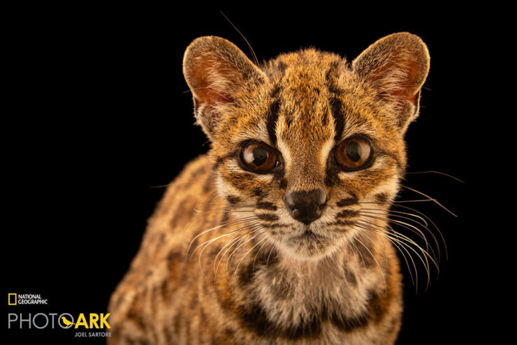
“10 years ago, National Geographic Explorer and biologist Paola Nogales-Ascarrunz was working in Bolivia when she got a call from a local wildlife sanctuary that had received “a weird cat.” Today, that “weird cat” has been officially identified as a new species, Leopardus tilcayo. This is the first time in over a century that scientists have formally named and described a new living cat species.” Awesome.
1
Parenthetically, I’m not 100% satisfied with how my redesign is working out. The body font, especially, is good at first — and second — glance, but some of the minutiae, like the minuscule quote marks and the collision/confusion between a capital I or L and a bracket (something I use often) is causing problems. I hope folks won’t mind if I do a point-one update sometime this fall or winter. ↩︎
The American Institute of Graphic Arts — the AIGA — announced the winners of the 102nd 50 Books | 50 Covers competition last month, exploring the best of submitted covers (specifically) and books (as a whole) published during 2025. As is always the case with their selections, it’s a collection of interesting and thought-provoking material.
Book design competitions are ultimately about the most minute perceptions, which can only truly be evaluated by having the objects in hand. This year’s in-person jurying of the 50/50 competition was a necessary return to form — validated by the energy and engagement that filled the room during the two full days we shared together, surrounded by books and exchanging critiques, questions, and appreciations. At the end of the jurying, we walked away feeling we collectively chose a phenomenal and diverse selection of 50 books and 50 covers.
— Scott Vander Zee, 2025 Jury Chair
The “return to form” reflects this year’s less-popularly-styled selections — which is to say, more about excellence in design than excellence in Insta-clicks. Let’s take a look at some of the titles and see if there’s agreement.
From the 50 Covers category
Cover design by Dustin Kilgore.
Kraft paper with gold lettering and black ink. Timeless — in a handmade, caring, environmentally-friendly way. Even better when seen in person, but this might help visualize:
Cover design by Dustin Kilgore.Cover design by Lauren Peters-Collaer.
“Sometimes, it’s possible to be knocked askew awed by a simple idea,” I said in my Favorite Covers of 2025 post.
Cover design by Peter Selgin.
A wonderfully intentional look — the friendly croc, the slightly-misaligned-ink-plate-style, the texture — with a cascading title that highlights this collection of greatness.
Cover design by Grace Han.
A one-color triumph whose simplicity belies the story within. (Also on my ’25 Favorites list.)
Cover design by Grace Han.
A wolf amongst the trees, sure — but what a way to do it. (Bonus points for three typefaces in such a small area working together so well.)
Cover design by Andrew LeClair and Linda Huang.
This cover was actually a candidate for one of my 2025 Favorites, one that didn’t get chosen not because of how good it is or isn’t, but for what it represents. I know, that’s not fair — but since it’s come up . . . :
It makes me fear for further blurring between book cover and content, in the way that title sequences for television shows and movies are being shortened into oblivion or absorbed into — or an afterthought to — the “content.”
I miss amazing title sequences. (I miss longer attention spans, too, but that’s a discussion for another time.) Some of this is a ship that’s already sailed, but unlike a title sequence — decidedly outside of my wheelhouse — I’m going to fight for the artistry, the magnificence, that is a fantastic book cover.
From the 50 Books category
Barbara Glauber, creative director.
This would benefit from a 3D photograph so you could see the cover cutout and the little tufts of hair. (It’s still fun even if your first take is . . . something else.)
Barbara Glauber, creative director.
Note the subtle difference in typeface from the cover. Fab. As is probably known by now, I’m also a sucker for great contents design:
Barbara Glauber, creative director.
From Chicago, we move to Ecuador and New York:
Book design by Julie Cho, Alice Chung, and Karen Hsu.Book design by Julie Cho, Alice Chung, and Karen Hsu.
I love the choice of drawing distinction between languages using color, and that the page itself is printed color — the paper is still white. (It is a pain for the printer, with its tight tolerances, but when done well . . . .)
Book design by Julie Cho, Alice Chung, and Karen Hsu.
Turning now to a “technicolor dreamscape”:
Cover design by Julie Wolfe and Jeanette Abbink.
The first of an exceptionally interesting trend this year: exposed stitching on the binding — structural expressionism for the publishing industry. Nice.
The second I’m featuring with exposed binding also boasts a clear cover that meshes with — and adds so much to — its cover:
Book design by Cem Eskinazi.Book design by Cem Eskinazi.Book design by Cem Eskinazi.
Continuing on the subject of folks who can put together a collage — while adding a dose of architecture:
Book design by Kimberly Varella with Gabrielle Pulgar.Book design by Kimberly Varella with Gabrielle Pulgar.
This title features a bonus, in the form of decorated page edges:
Book design by Kimberly Varella with Gabrielle Pulgar.
Also from the architectural area, an item that “reimagines the Yale School of Architecture’s annual journal as a set of unfolding conversations.”
Book design by Amy Fang and Xiwen Zhang.Book design by Amy Fang and Xiwen Zhang.
Simple journal design this is not! (Note the decorated page edges on this one, too.)
Book design by Amy Fang and Xiwen Zhang.
More photography-centric is Olga Ignatovich. In the Shadow of the Big Brother, with a magnificent gate-fold-style cover that I’ve not seen before:
Book design by Konstantin Eremenko.Book design by Konstantin Eremenko.
Fantastic choices inside and out. (Another great subject, too — I want to read several of these titles!)
Book design by Konstantin Eremenko.
From WWII Soviet photography we move to post-war Soviet architecture — some of which takes brutalism to a surprisingly beautiful conclusion:
Book design by Hubertus Design.
The choice of pink to support this subject is unexpected (and welcome).
Book design by Hubertus Design.
Don’t sneer at Soviet architecture in Tashkent, by the way. Some of it is awesome. (Further details here.)
Book design by Hubertus Design.
Don’t feel like going to Uzbekistan? How about a trip to the ‘90s instead?
Book design by Abbott Miller and Daniel Varillas.
Almost thirty years ago now — long enough for a celebration!
Book design by Abbott Miller and Daniel Varillas.Book design by Abbott Miller and Daniel Varillas.
We’ll close out with a two-fer from one of my favorite subjects, typography:
Book design by Kobi Franco.Book design by Kobi Franco.
Love the fold-over cover . . . and pretty much everything about this title. Awesome. (Wait: is that another exposed binding!?)
Book design by Kobi Franco.Book design by Richard Ardagh.
It’s difficult to tell from this photo, but the jacket actually only covers the bottom three-quarters of this title. (It’s easier to distinguish in the three photos that follow.)
Book design by Richard Ardagh.
It’s not often I get to leave the phrase “insert text here” in the final post!
Book design by Richard Ardagh.Book design by Richard Ardagh.
• • •
As usual, I’ve only plucked a few favorites. There are many more — some whose qualities are immediately obvious, some which require study or thought. All deserve scrutiny, an itch that is scratched with additional photographs of each title and, for some, text about the title or design.
It’s a very different set of winners than last year. There might, in fact, be something to that “return to form.”
The highlight this year was really all about the atmosphere. I loved walking into a room full of books for two straight days, watching everyone nose-deep in the books on the tables — sharing anecdotes, laughing, questioning, theorizing, and whittling our way down to the final 50 books and 50 covers. It’s fantastically fun, serious, and hard work — the best.
In Part 1, we were southwest of the proper city of Duluth at the Southeastern Railway Museum. This time, we’re in the town center.
Eastern Continental Divide Obelisk, (Across from) 3550 W. Lawrenceville St.
I have to admit: I had forgotten about the regional continental divides. In a nutshell, it’s the line that marks where waters flow — east and south go to the Atlantic, while west and north go to the Gulf of Mexico. (We all think of the one in the Rockies, sure, but they’re more of ’em!)
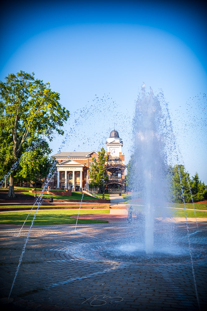
Buildings Overlooking Main Street Park (with Chairs) Duluth Town GreenDuluth City Hall #1 (with Town Green Fountain), 3167 Main St.
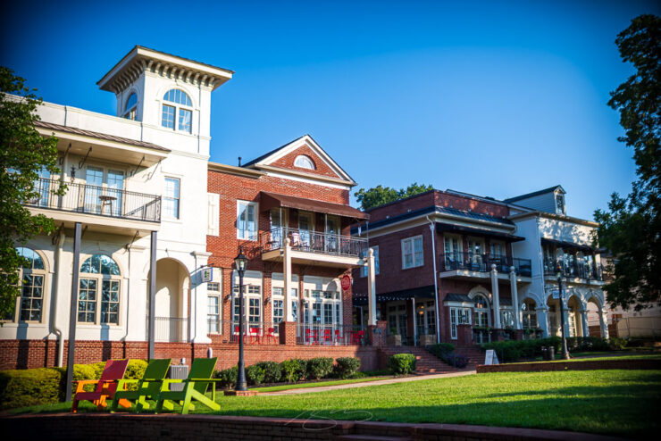
All of these photographs were taken on or near the lovely Town Green. Duluth may have a car-centric culture — it is a suburb of the perpetually-traffic-jammed Atlanta — but its downtown has ample opportunities to park the car and just walk around.
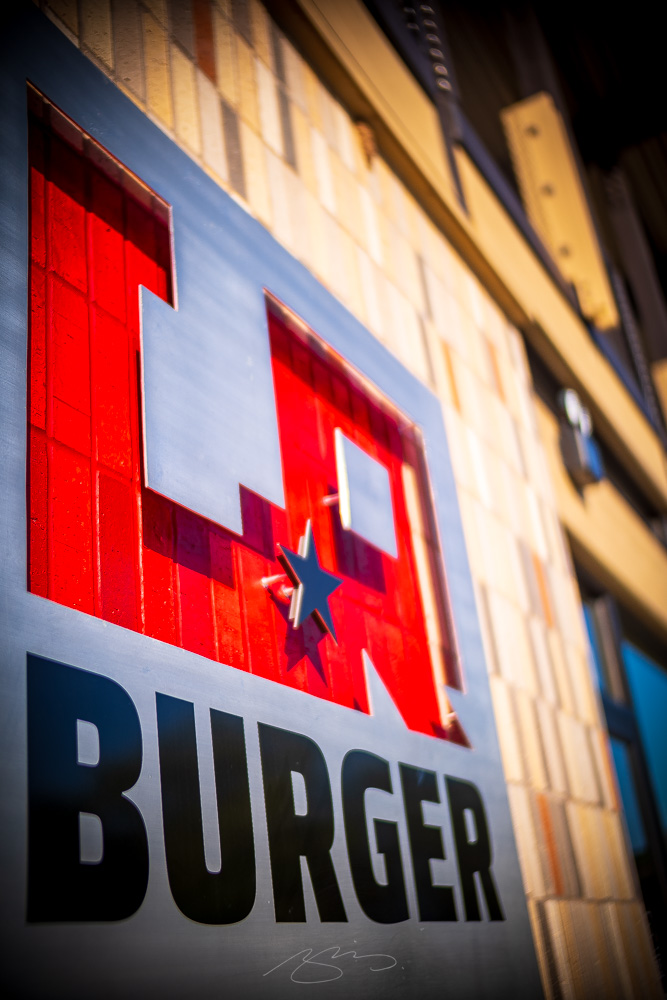
LA Burger #1 (Sign), 3151 Main St.LA Burger #4 (Screen Detail), 3151 Main St.Truck & Tap (Sign #2), 3137 Main St.
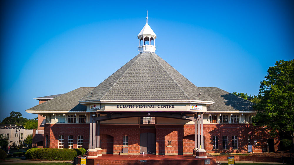
Aside from the various city structures (including the Festival Hall at the top of the post), there’s a huge library and a bunch of restaurants — several of which have been bookmarked for a later visit. There’s also this brand-new tribute to the city’s railroad past, named after former a former mayor:
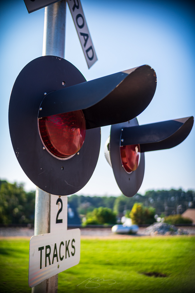
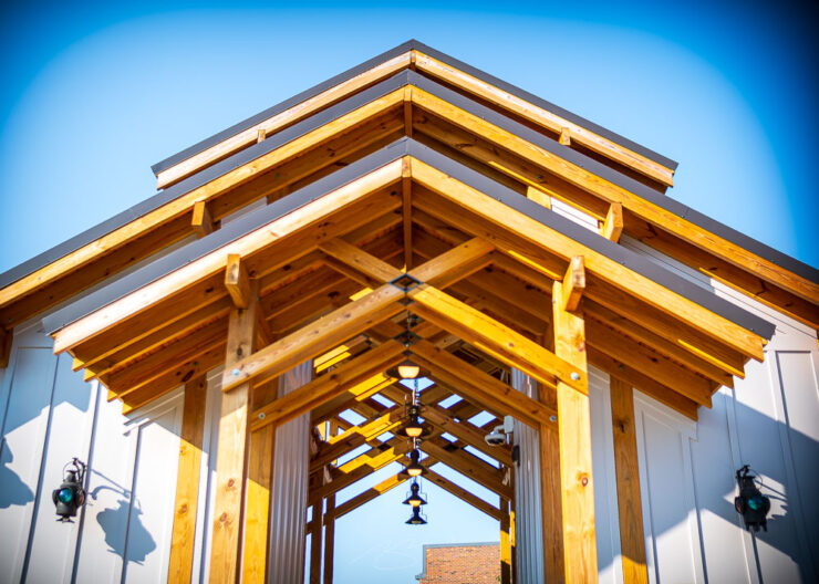
Nancy Harris Pavilion #2 (Crossing Lights), 3178 Main St.Nancy Harris Pavilion #3 (Roof and Light Detail), 3178 Main St.
An enjoyable visit. I’m glad to have had the opportunity to enjoy a couple of days in the area, camera in-hand.
On a side note, the Duluth gallery — and the one from Johns Creek — have featured a new lens: a manual-focus, solidly-cheep=and-cheerful item from Chinese brand 7Artisans. The heavy vignetting is a result of its slightly ridiculous but enormously fun aperture of f0.95 (!), which enables extreme subject isolation, but at a cost of weight and size. The lens definitely features a “look,” but one that I’m glad to have available.
The same trip that took me to Johns Creek also gave me the opportunity to spend a day in Duluth. This is the first of two posts covering that Atlanta suburb. This time: the Southeastern Railway Museum.
Duluth Depot
Atlanta foundations are, famously, as a railroad crossroads — the biggest in the Southeast — but Duluth, 30 miles to the northeast, was for a long while a rural outpost. (Atlanta’s growth has changed that.)
Georgia Railroad 1026Caboose and Box (Detail)
The Southeastern Railway Museum celebrates this strong history of railroading in the area with an interesting and varied collection of locomotives, cars of all types, and associated materials, from models to support vehicles.
Central of Georgia Passenger (#1)Georgia Building Authority Car
There’s a good selection of items from Georgia, from multiple eras. And, of course, a bunch of items from the age of steam:
Savannah & Atlanta 750Chattahoochee Valley Railroad 21 (Detail)
While I’d suggest a visit when the weather is cooler — the exhibits are, by their nature, mostly in open spaces — if you’re at all a railroad buff (or care for one), check out this enjoyable venue an easy day trip from anywhere in the greater Atlanta area. Or, combine it with a stay in Duluth or Johns Creek and explore.
NRHS Chapter Special (Sign)
36 photographs have been posted to the new Duluth gallery. The link will be posted with part two on Monday. Thank you! (Update:Posted.)
Update: I discovered after the fact that the Museum doesn’t allow professional photographers — oops. To honor their policy, I’ve turned off the option for ordering prints (and don’t make anything from the website anyway), but am leaving the post as encouragement for readers to patronize this valuable collection.
The City of Johns Creek, a suburb of Atlanta, recently opened The Boardwalk at Town Center, a 20-acre park and walking area centered around City Hall. The upgrade turned a scenic view for those that worked nearby into a vibrant park and performance venue for all. The transformation also included re-wilding a section of Johns Creek — the waterway, that is — from a man-made lake to something much more pleasant, much more natural, and something that locals and visitors alike can use and enjoy year-round.
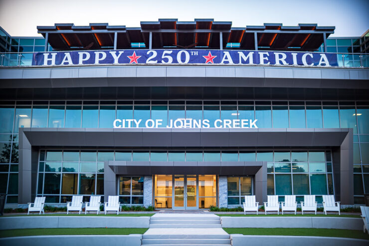
Johns Creek City Hall #2, 11360 Lakefield Dr.
I was there at dawn and, as Georgia late-summer mornings go, I couldn’t have asked for a nicer time to wander.
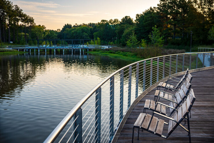
Lakeside Relaxation (at Dawn), 11360 Lakefield Dr.
As part of the park’s construction, they’ve added a performance venue in front of City Hall, along with extensive landscaping and opportunities to sit lakeside.
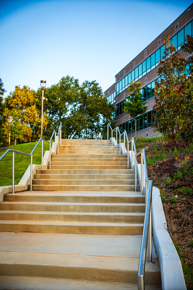
Boardwalk Stairs, 6455 E. Johns Crossing(Walk to) 11330 Lakefield Dr. #1
The surrounding office park and shopping areas have added access to the park, as well, aiding the public’s ability to access the improved areas.
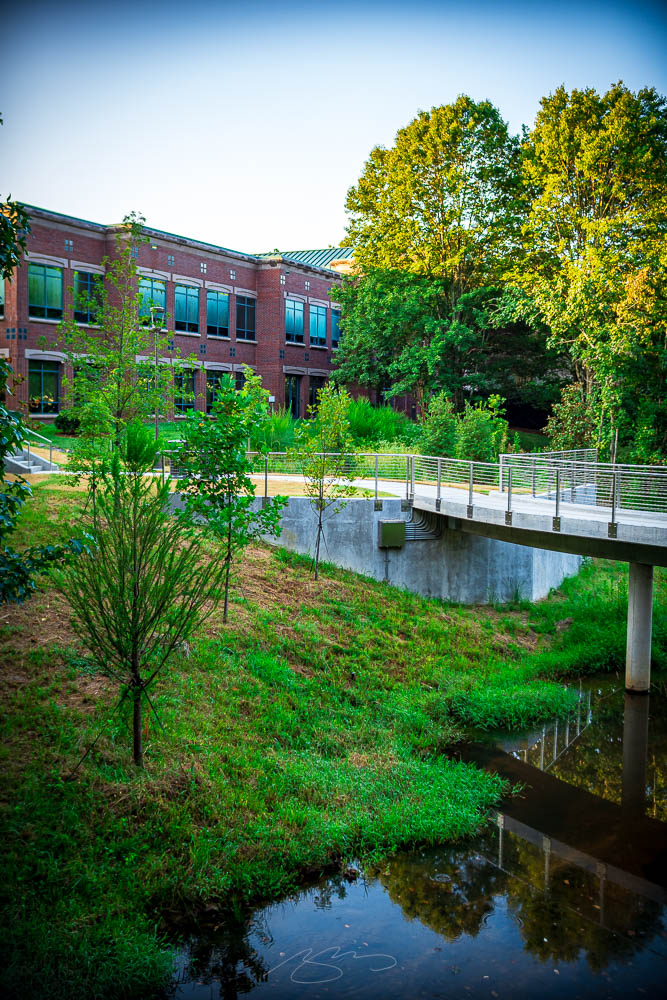
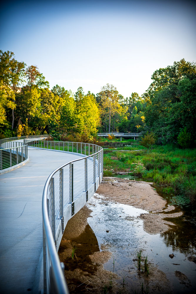
Former Lake Basin #3, 11362 Lakefield Dr.Former Lake Basin #5, 11362 Lakefield Dr.
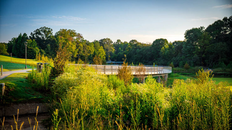
The best area, however, is the former artificial lake basin at the southwestern end; between the raised walks and return of the waterway to nature, it’s become an valuable addition to this suburb populated mostly with busy roads, retail and planned living.