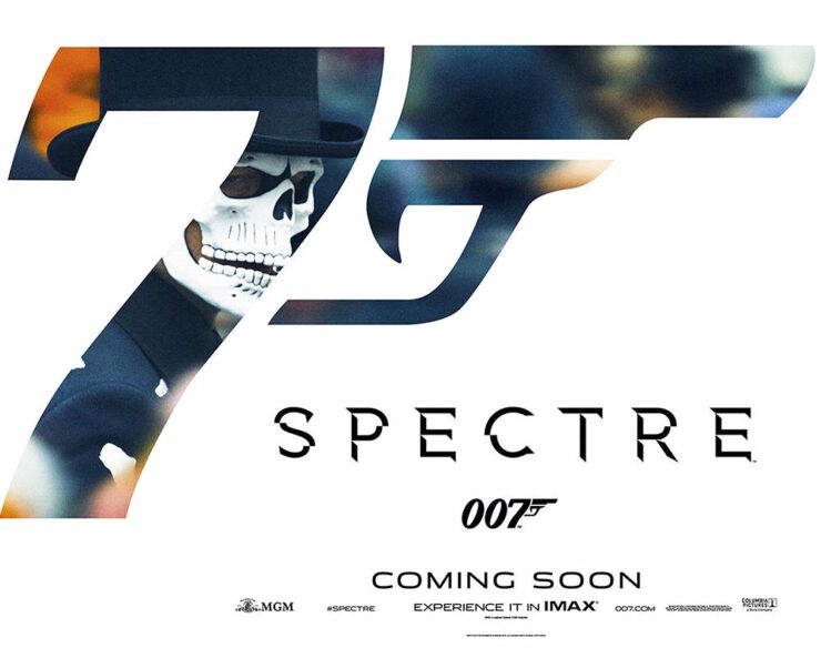
In this episode, design whims and wins, fontastic links, a Toyota Century, and the monthly round-up of great photography bracket some thoughts on — what else? — AI, especially as it relates to art. Grab a beverage, brush, or a comfy chair, and let’s dig in.
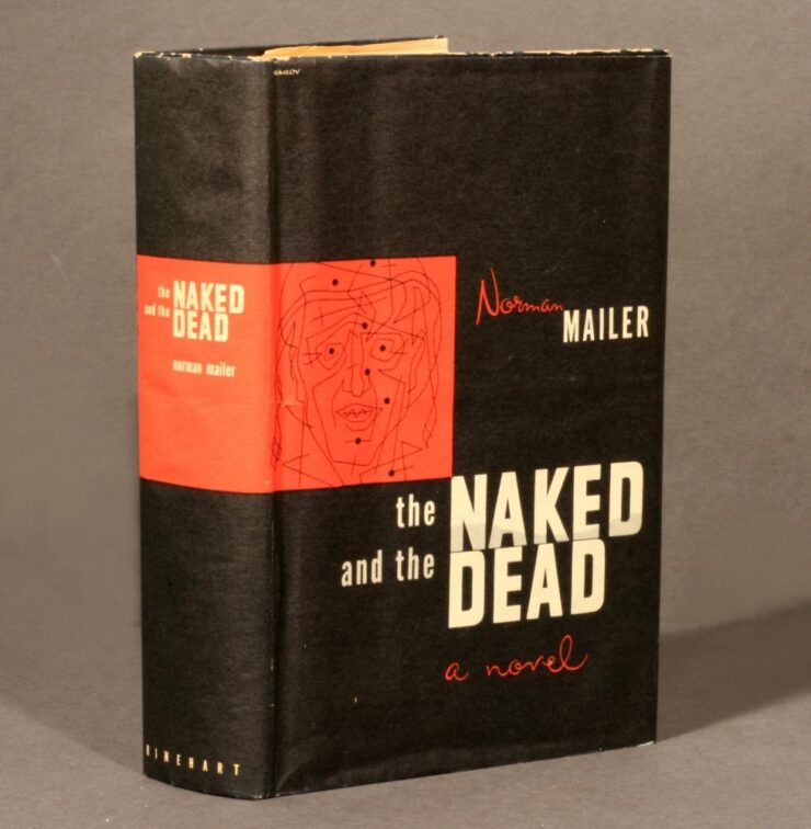
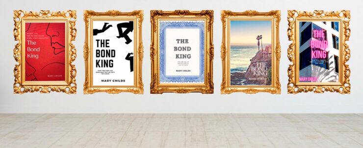
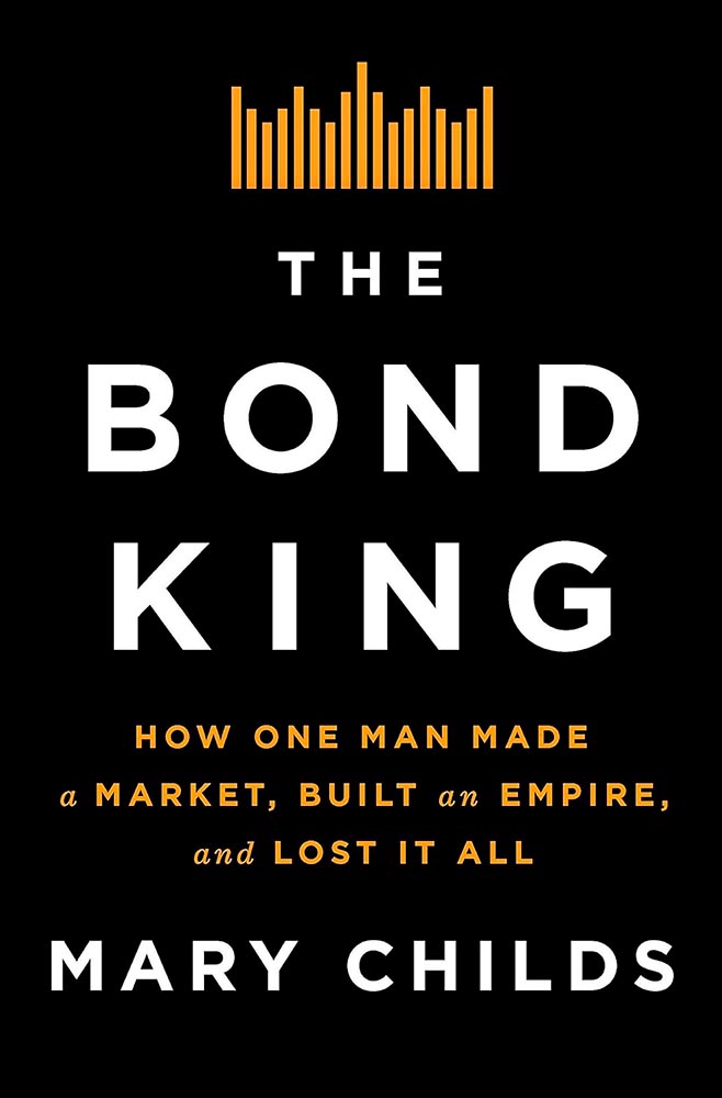
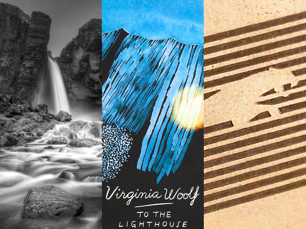
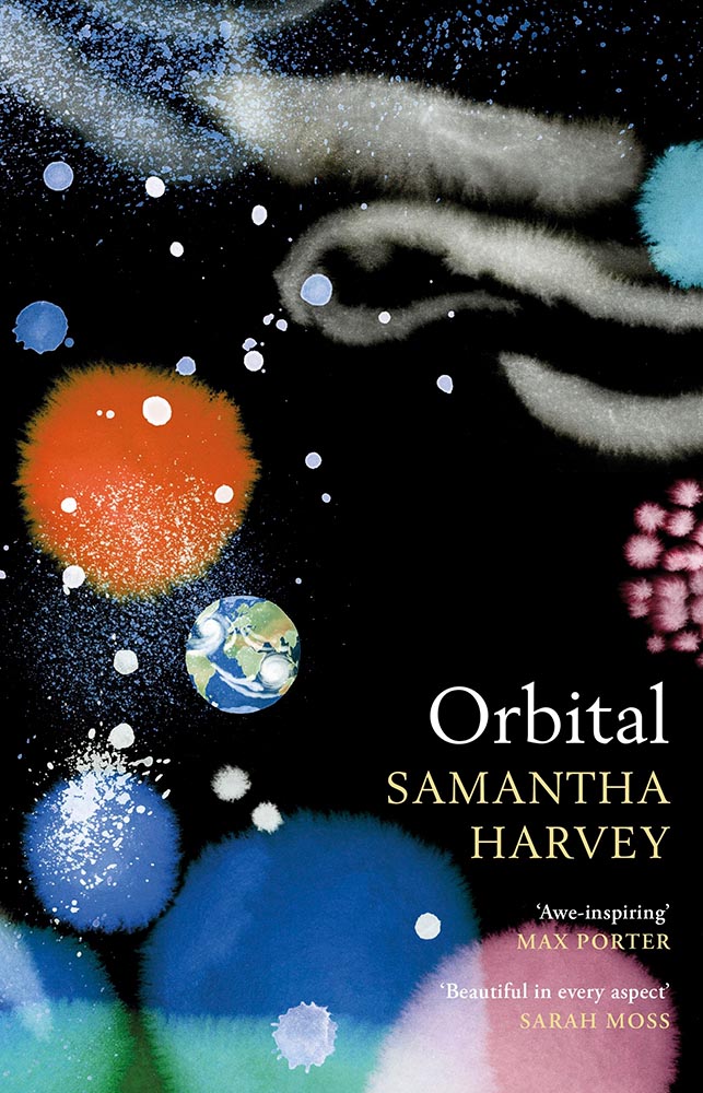
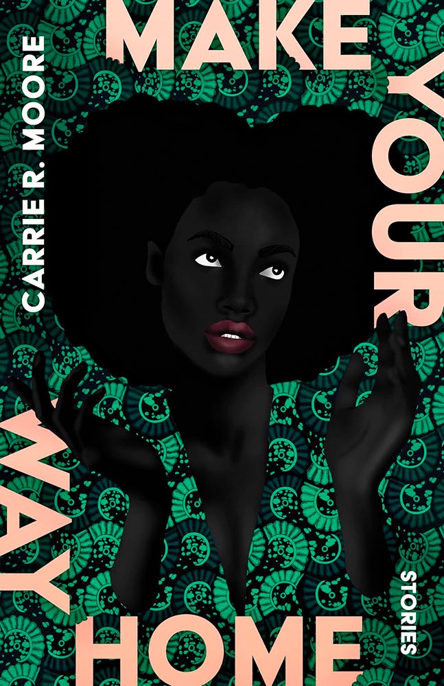
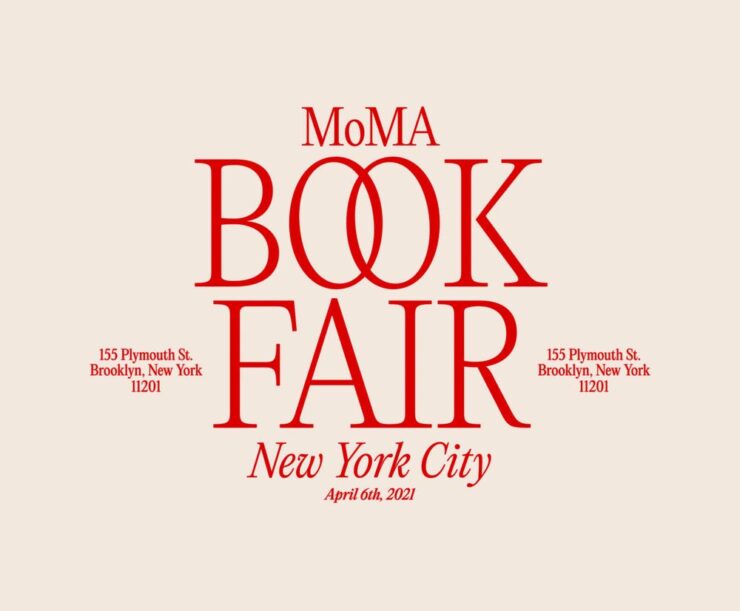
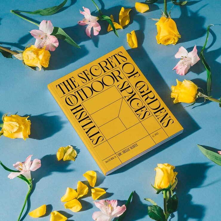
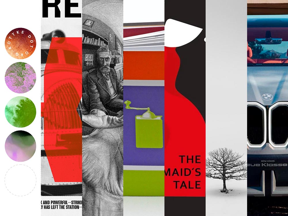
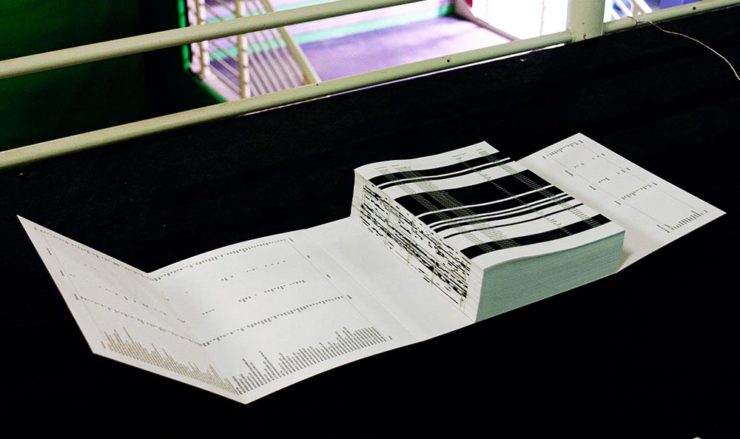
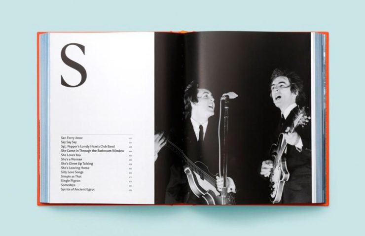
This Month’s Spine
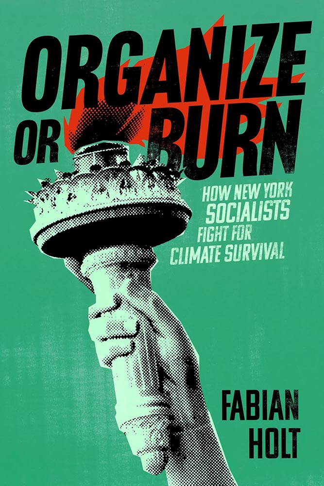
One could argue that this cover — and title — could work well even if the word “climate” was removed. See the whole list of University Press goodness.
And check back for a special, mid-month post in honor of University Press week, Nov. 10–14.
Good Movies as Old Books, Revisited
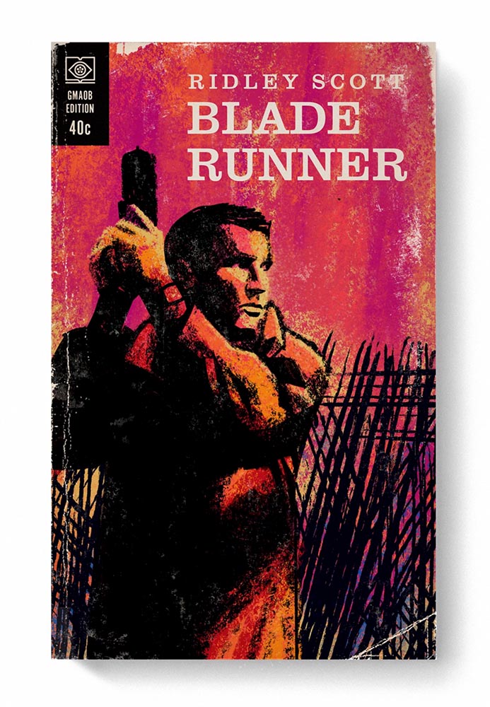
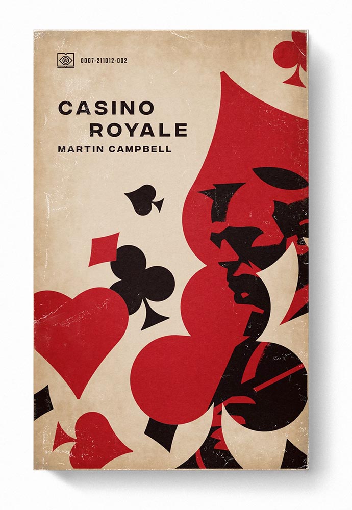
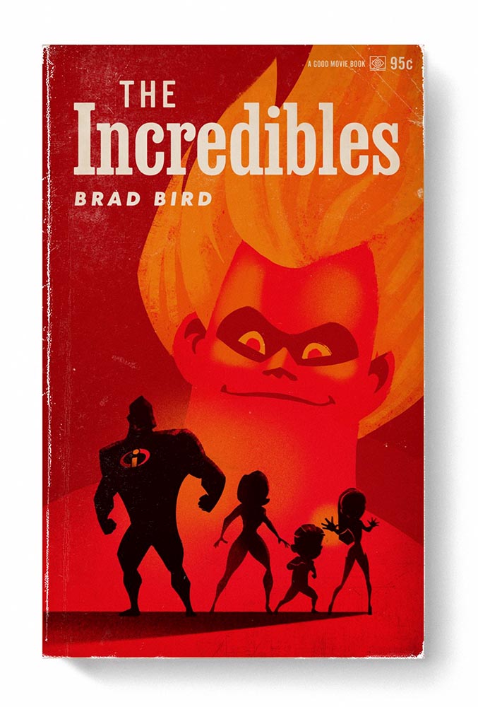
Let’s start with something great: Steven Heller highlights the “talent and imagination” of Matt Stevens (previously) as the paperback version of his book, Good Movies as Old Books, becomes available.
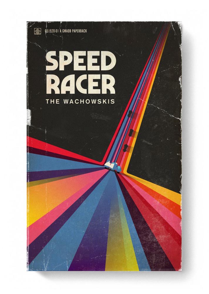
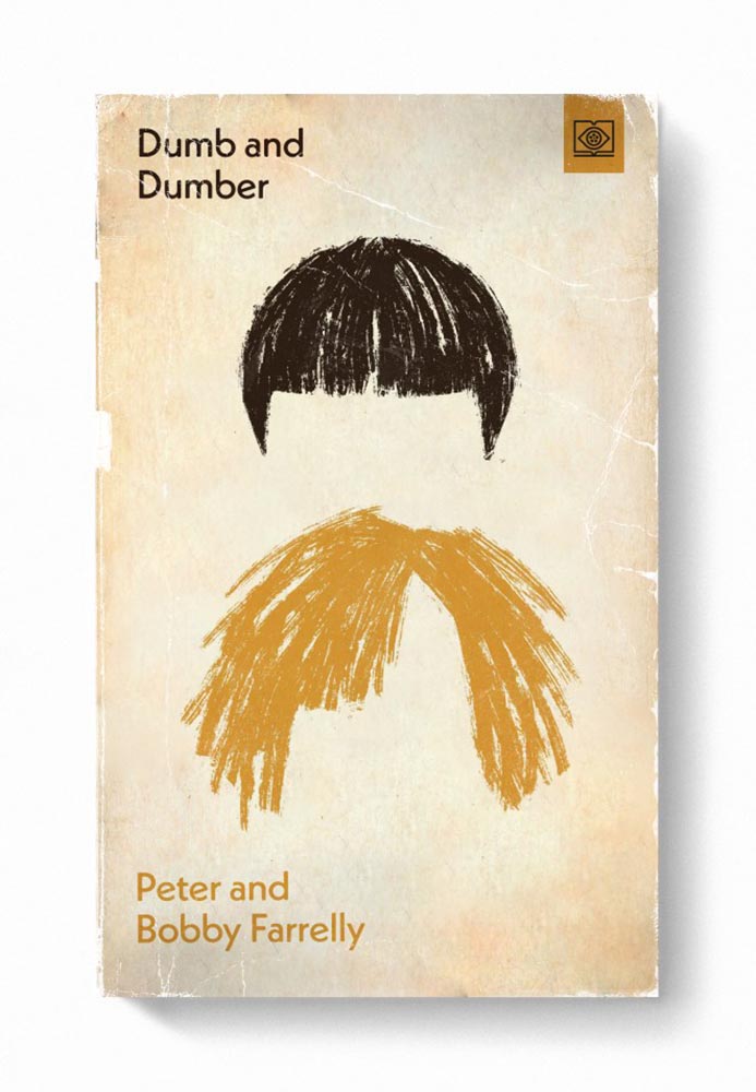
“My goal with the style was to try new things and create interesting combinations. Oftentimes, I was trying to do something that had not been done for a particular film,” Stevens says. Short and fun, the PRINT interview is worth a few minutes of your time.
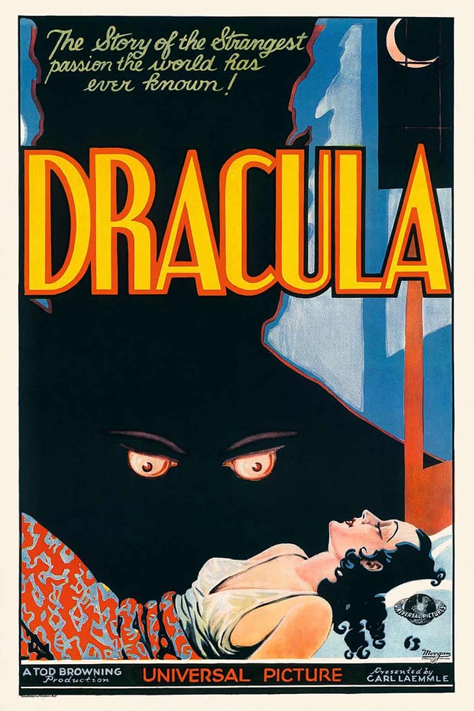
Old-Fashioned Methods, Delightfully Off-Kilter Results
While we’re on the subject of movies, let’s slip closer to … well, what passes for reality these days: items “steeped in human anxieties and fever dreams.” It’s Nice That highlights poster and title design for films by Greek artist Vasilis Marmatakis.
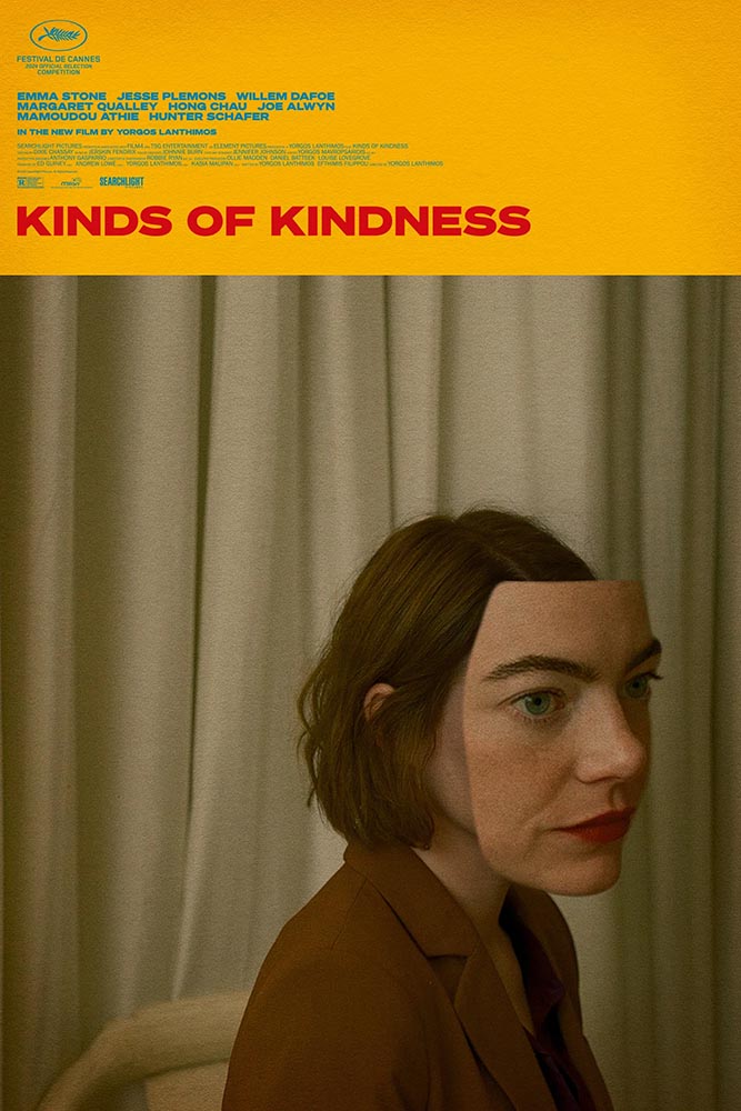
With design, much like life itself, Vasilis says that his posters are his honest reactions to the films. The same approach runs like a red thread throughout his work, each poster leaning a little too heavily into one of the film’s themes. […] In Bugonia, Vasilis consciously restricts superfluous elements and allows the frames to breathe.
— Arman Kahn, It’s Nice That
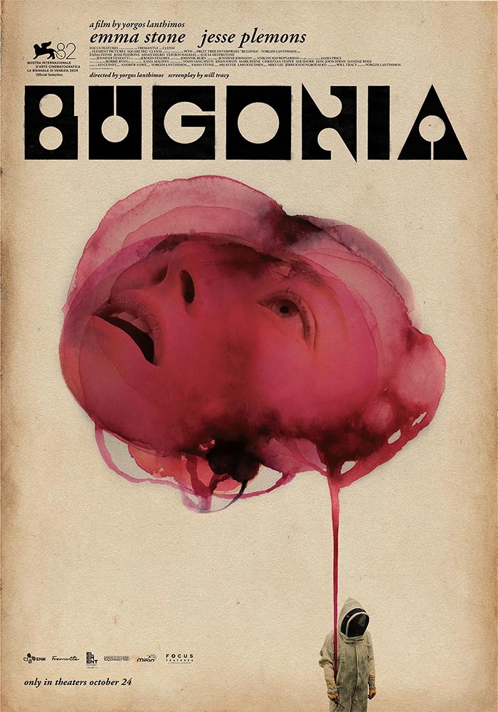
Even the font — and how it’s used — is interesting: the freely-available Churchward Roundsquare, customized with brush and ink. That and much more is discussed in this great article.
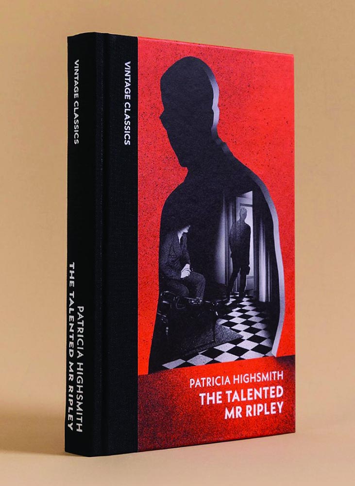
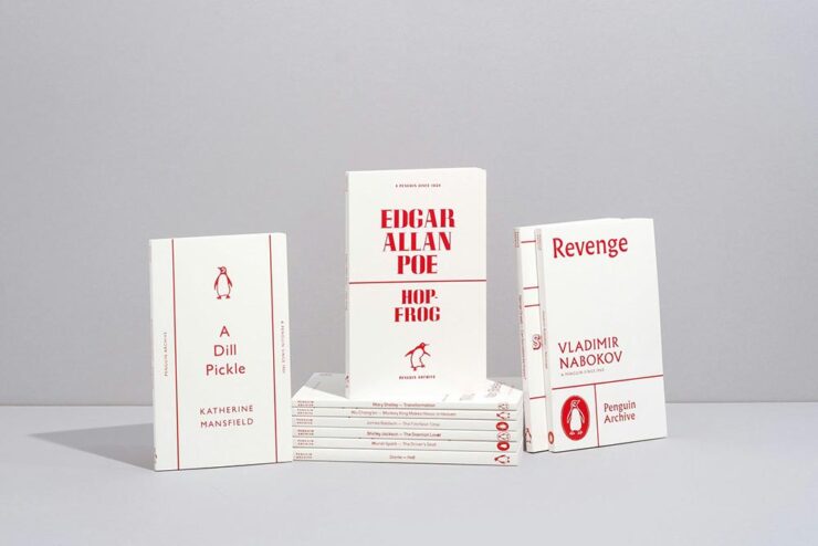
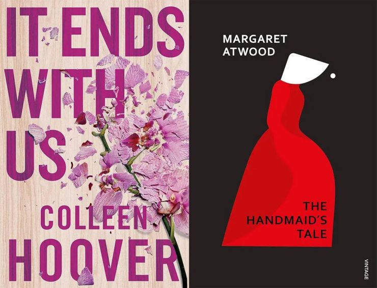
New Vintage Classics Series
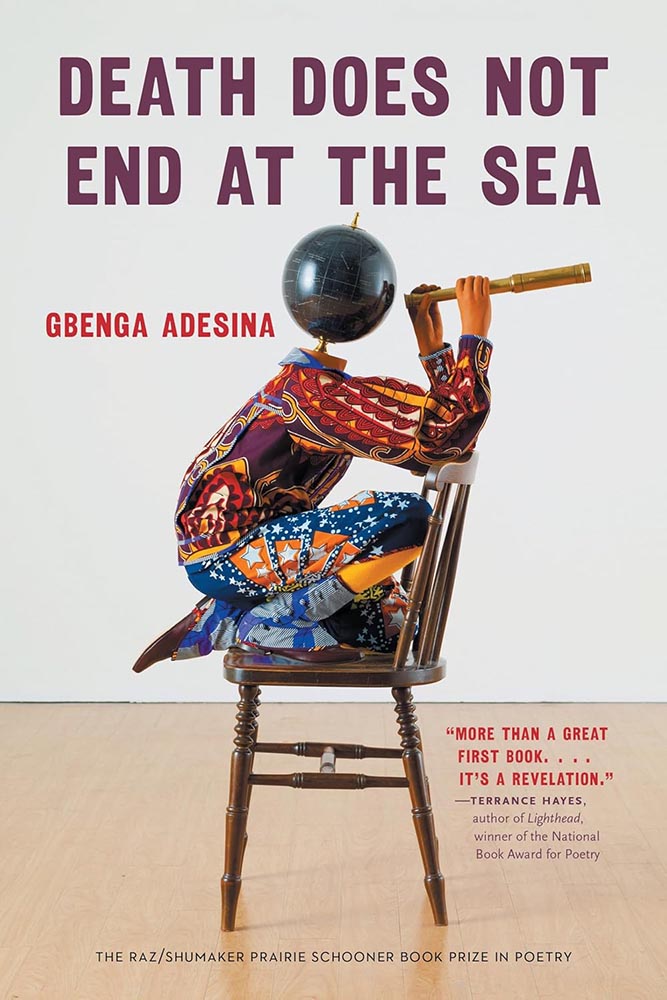
It’s unusual not to relish a new set of reissues from Vintage, and the new editions of Julio Cortázar are no exception:
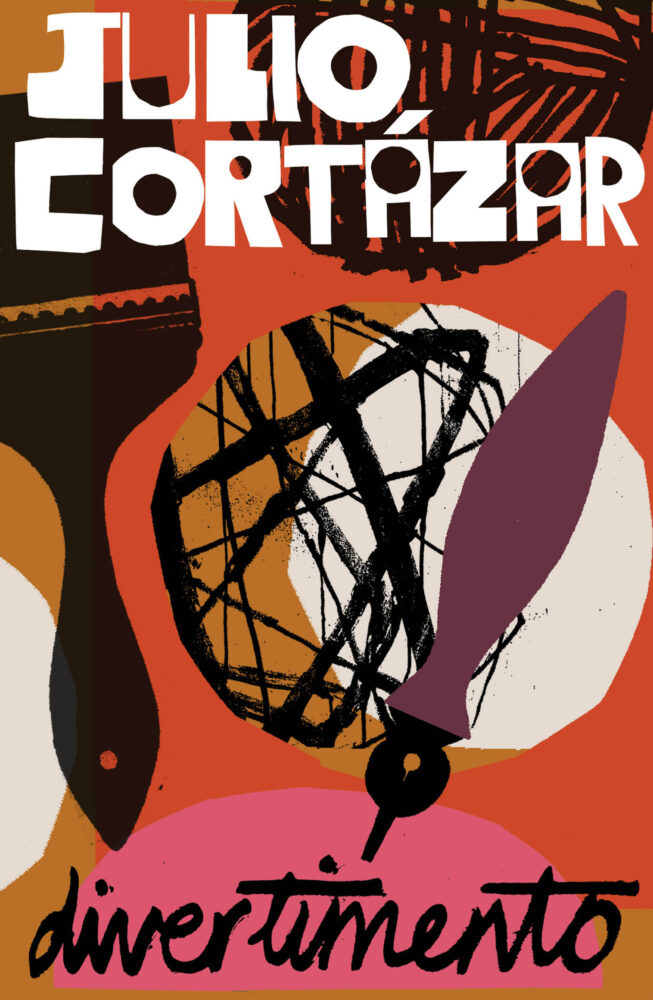
The always great — and not mentioned often enough — Casual Optimist has more.
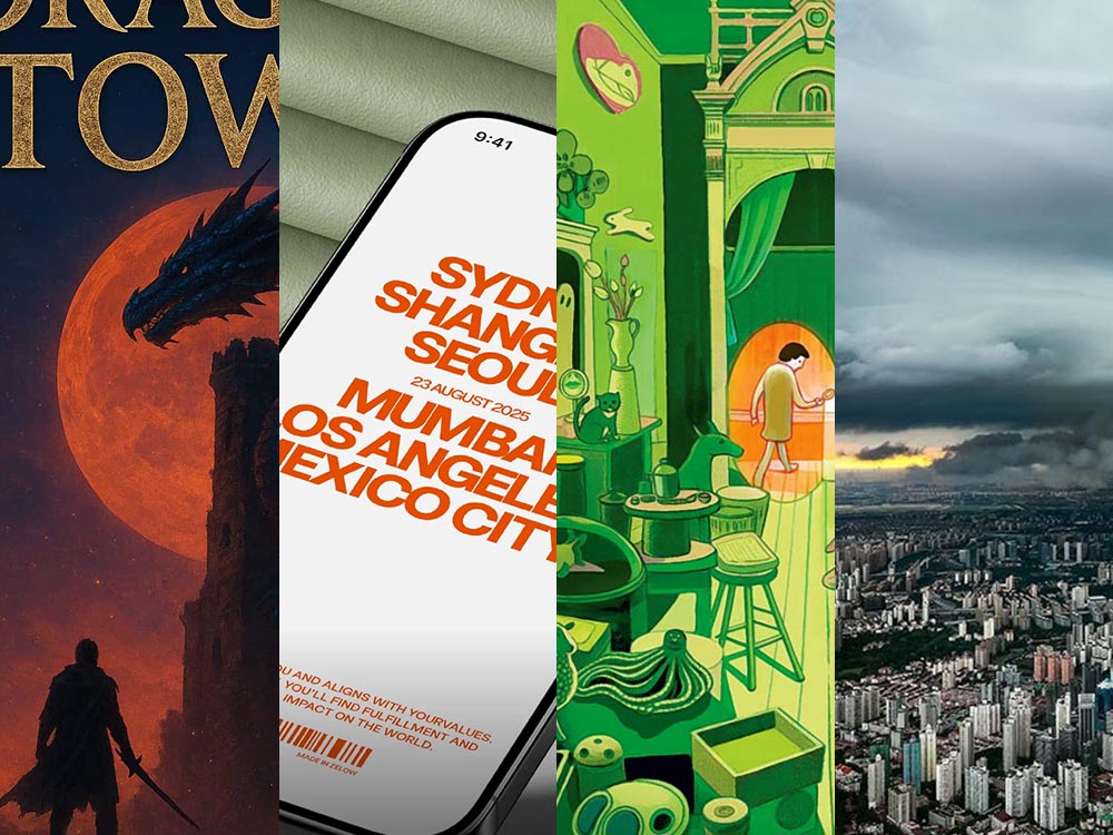
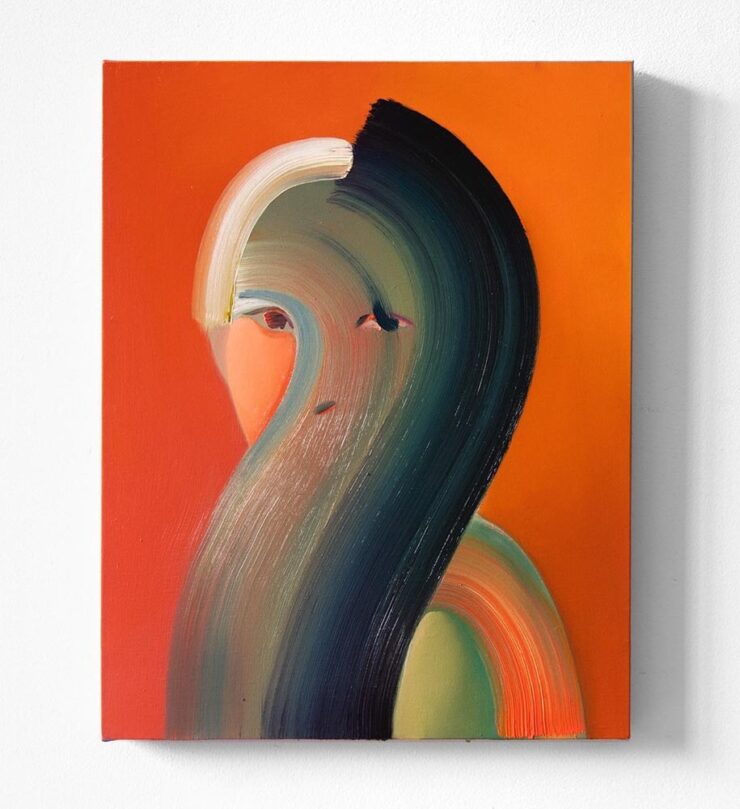
Special Bonus #1: Via Kottke, Na Kim’s self-portrait:
Fascist Posters, Italian Style
Also via Kottke are these posters, which evoke a certain … something:
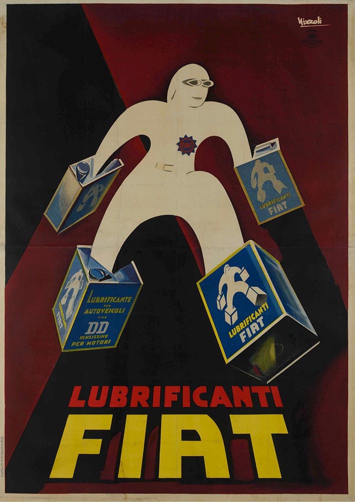
In a fascist movement inspired by art, how does the fascist government influence the artists living in its grasp? This exhibition explores how Benito Mussolini’s government created a broad-reaching culture that grew with and into the Futurist movement to claw into advertising, propaganda, and the very heart of the nation he commanded.
— Poster House exhibition The Future Was Then: The Changing Face of Fascist Italy.
The exhibit features “some of the best posters produced during the worst period in modern Italian history.” See more.
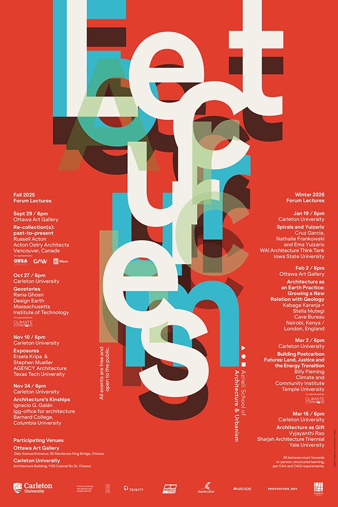
Special Bonus #2: While we’re perusing the poster department, Archinect‘s ongoing lecture series (previously) has another winner:
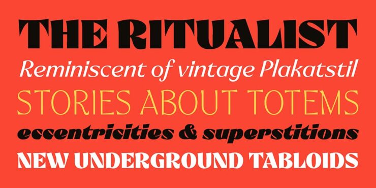
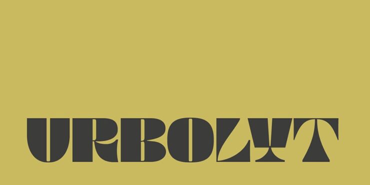
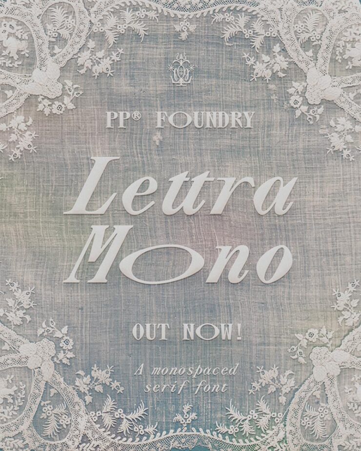
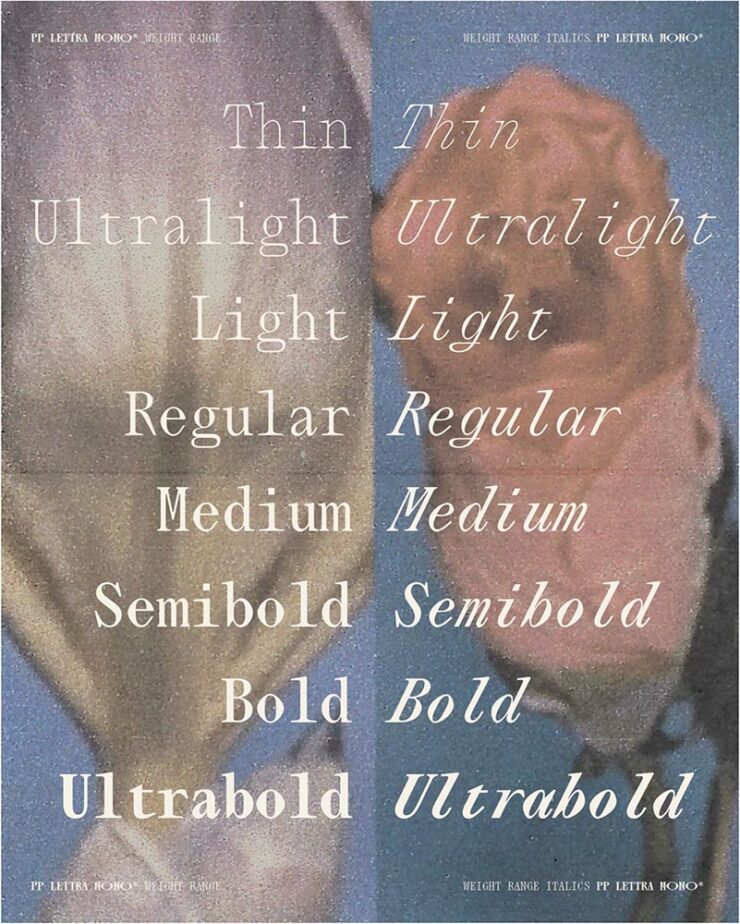
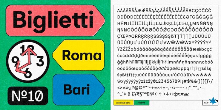
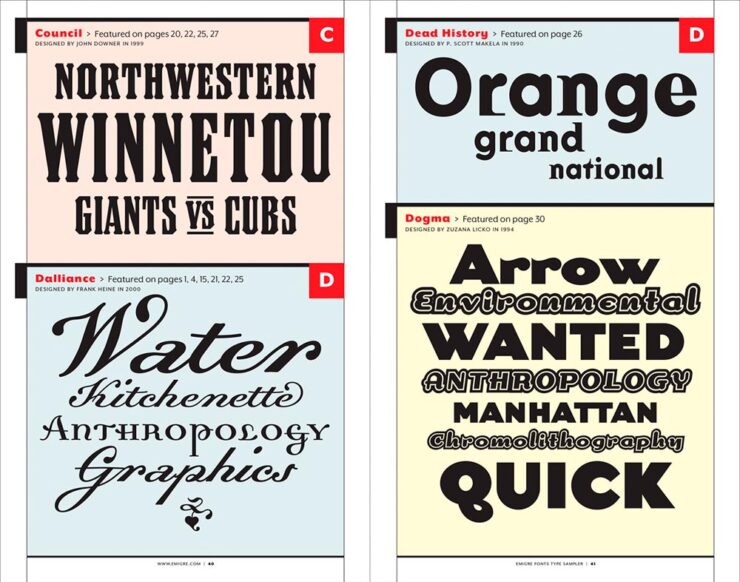
Fontastic Fall
New for October
CreativeBoom‘s monthly roundup is out, and while Grundtvig is retrotastic and the three-axis variable Pranzo is accompanied by some great illustrations, it’s Jovie that I’d love to use in print project:
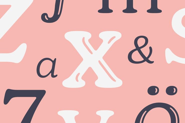
“Jovie’s character emerges through its soft-serif approach, which tempers traditional serif authority with contemporary approachability. Playful italics, expressive alternates, swashes, and ligatures provide designers with a rich typographic palette, whilst maintaining coherent family relationships across all variations,” they note. (Another variable-width item, too.) Great stuff.
Custom Type is Everywhere, It Seems
Meanwhile, custom type for branding is becoming the norm. In another article, CreativeBoom explains why: “Bespoke letterforms are no longer a “nice-to-have” and they are increasingly seen as a strategic necessity[.] Type has become the glue that holds their voice together,” they write.
Those letters are your brand’s voice. They do the heavy lifting, they carry personality, and they create instant recognition – sometimes without the need for any other distinctive assets. […] Typography is everywhere in a brand system – packaging, products, campaigns, interfaces. When you build your own, you’re not at the mercy of someone else’s design choices, and you get a voice that’s tuned to your values, your audiences, and your long-term ambitions.
— Frankie Guzi, business director, Studio DRAMA.
Elizabeth Goodspeed (previously) agrees, mostly. “For most of the 20th century, branding treated typography as background, not backbone,” she writes. But now, brands are recognizing that, “[a]s a primary container for meaning, typography inevitably carries an enormous share of that emotional load.”
But, she cautions, “[s]peed also feeds a kind of conceptual shallowness. With so many studios drawing type, the market has been flooded with fonts that solve narrow visual problems but can’t stand up to long-term use. Too often, new brand fonts cling to a single gimmick while leaving the structure of the letters untouched.”
Read the rest at It’s Nice That.
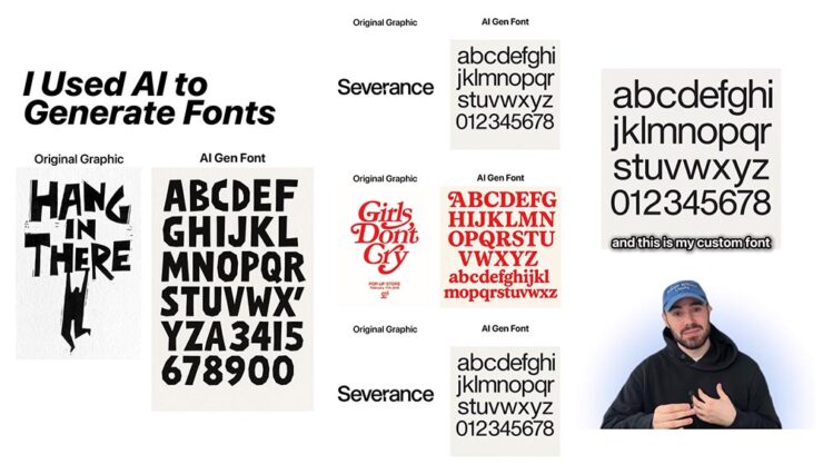
AI All the things
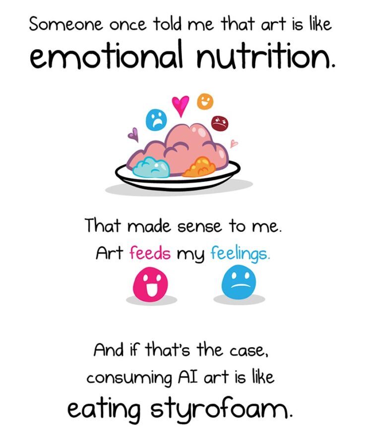
The new-to-me FlowingData — via Kottke’s rolodex feature — first pointed me to this piece, and it’s gotten a ton of press. In summary, Inman suggests that AI art causes a certain discomfort; that, perhaps, AI art even deserves air quotes around the word art because it’s somehow less than “actual” art.
Indeed, much of that press has been approving: a pile-on of people (not that such things happen on the internet) saying, “yes, AI art deserves those air quotes. It is less.”
One of my favorite reactions was from Nick Heer:
A good question to ask when looking at an artwork is “who made this?”, and learning more about what motivated them and what influences they had. This is a vast opportunity for learning about art of all mediums, and it even applies to commercial projects. Sometimes I look up the portfolios of photographers I find on stock image sites; their non-stock work is often interesting and different. There is potential for asking both questions of A.I.-assisted works in the hands of interesting artists. But it is too often a tool used to circumvent the process entirely, producing work that has nothing to offer beyond its technical accomplishment.
— Nick Heer, Pixel Envy
“Who made this?” is the right question — to start. But let’s take that a step further.
John Gruber, at Daring Fireball, quotes the piece: “[When] I find out that it’s AI art[,] I feel deflated, grossed out, and maybe a little bit bored. This feeling isn’t a choice.” Then says that he fundamentally disagrees with that premise:
I think it very much is a choice. If your opinion about a work of art changes after you find out which tools were used to make it, or who the artist is or what they’ve done, you’re no longer judging the art. You’re making a choice not to form your opinion based on the work itself, but rather on something else. […] Stanley Kubrick said, “The test of a work of art is, in the end, our affection for it, not our ability to explain why it is good.” If an image, a song, a poem, or video evokes affection in your heart, and then that affection dissipates when you learn what tools were used to create it, that’s not a test of the work of art itself. To me it’s no different than losing affection for a movie only upon learning that special effects were created digitally, not practically. Or whether a movie — or a photograph — was shot using a digital camera or on film. Or whether a novel was written using a computer or with pen and paper.
— John Gruber, Daring Fireball
“Good art is being made with AI tools, though, and more — much more — is coming,” he says. Over the next few days, he cited some examples, including David Hockney’s art made with a Xerox machine, and then this:
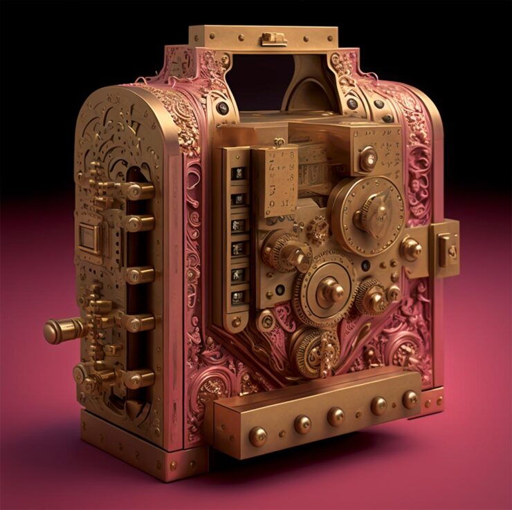
The objects in the Apocryphal Inventions series are technical chimeras, intentional misdirections coaxed from the generative AI platform Midjourney. Instead of iterating on the system’s early drafts to create ever more accurate renderings of real-world objects, creator Jonathan Hoefler subverted the system to refine and intensify its most intriguing misunderstandings, pushing the software to create beguiling, aestheticized nonsense. Some images have been retouched to make them more plausible; others have been left intact, appearing exactly as generated by the software. The accompanying descriptions, written by the author, offer fictitious backstories rooted in historical fact, which suggest how each of these inventions might have come to be.
— Jonathan Hoefler
These images represent some of AI’s most intriguing answers to confounding questions — an inversion of the more urgent debate, in which it is humanity that must confront the difficult and existential questions posed by artificial intelligence.
“This is art,” Gruber says, with no other text. I don’t think any other is needed.
On a Related Note
“The top 200 photographers requested by Midjourney users have been exclusively revealed to PetaPixel — and it’s a world-famous, still active photographer that tops the list.” I bet you can guess who that is.
This is, in fact, the majority of what Inman was thinking — or at least, feeling — when he drew out an argument on why AI art can be such a let-down, both intellectually and emotionally. The above “photograph” is both awesome and hugely disappointing at the same time.
Further Reading
I’m not qualified to speak with any authority on the state or potential future of AI, AGI (artificial general intelligence), or the continuing convergence of AI with … well, all the things. I will say that, to me, there’s a palpable sense of bubble going on; whether financial, material, or resource requirements, it feels like something is going to need to give fairly soon.
Below are several articles on the intersection of AI with life, culture, or art that I found valuable. If you can set aside a few minutes, the information provided could be helpful in the quest to stay informed:
- iRobot Founder: Don’t Believe The (AI & Robotics) Hype! (Om Malik, Crazy Stupid Tech)
- The Majority AI View (Anil Dash)
- Beyond the Machine: Creative agency in the AI landscape (Frank Chimero)
- Everything Is Television: A theory of culture and attention (Derek Thompson)
- Where’s the AI design renaissance? (Erik D. Kennedy)
- Designers most likely among creatives to believe AI dulls creativity (Rima Sabina Aouf, Dezeen)
Side Note: I’ve dropped the punctuation in “AI.” Not unlike capitalizing “Internet,” I think we’ve crossed that bridge.
Special Bonus #3: AI apparently overuses em dashes, something that has, frankly, caused me to use them less. Which is a good thing — I overuse them. But then, I am a professional. [That’s only funny if you’ve read the link. —Ed.]
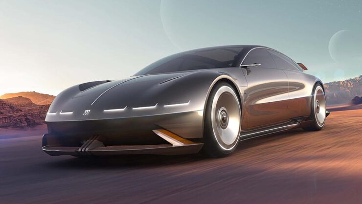
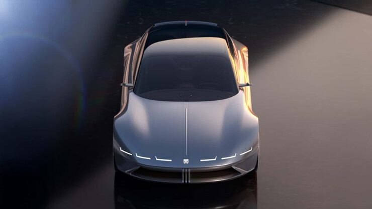
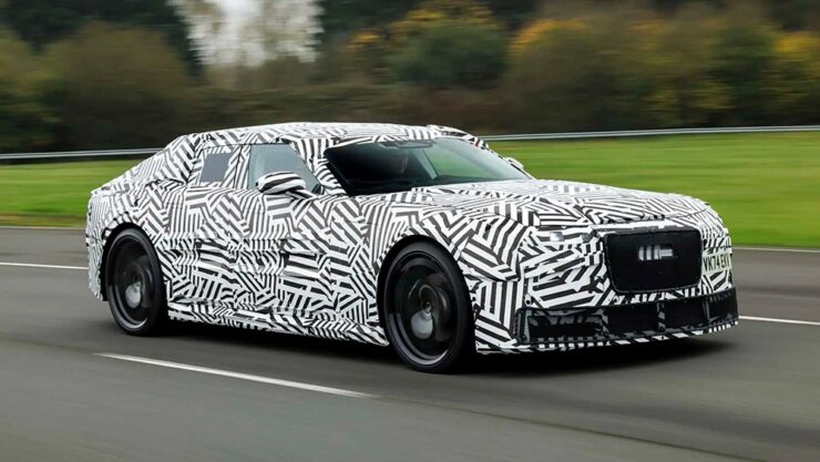
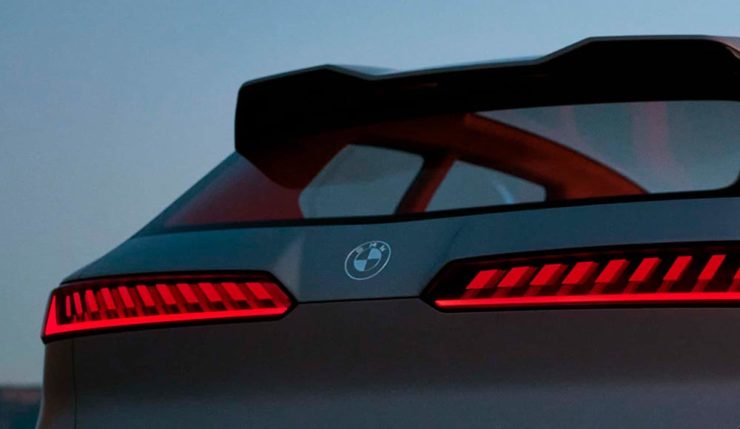
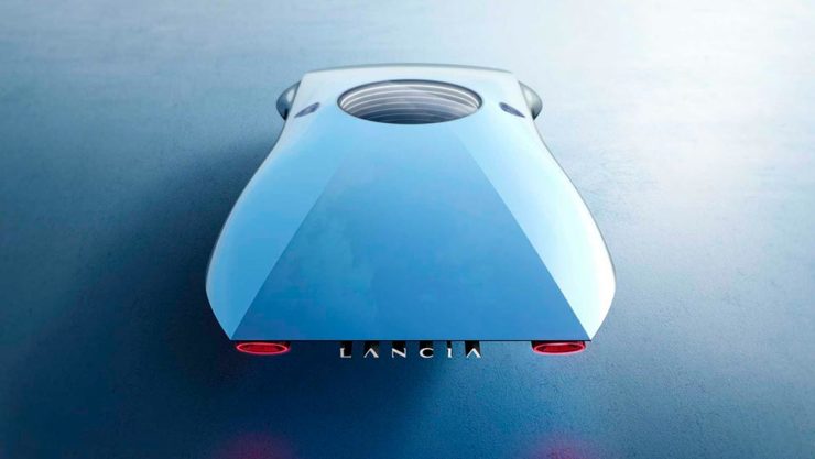
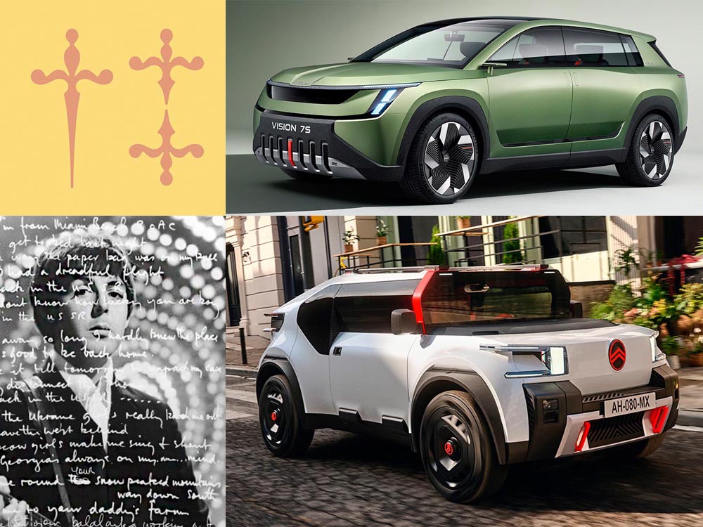
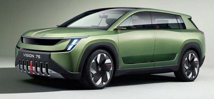
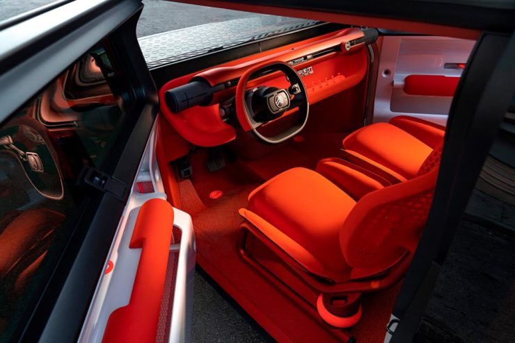
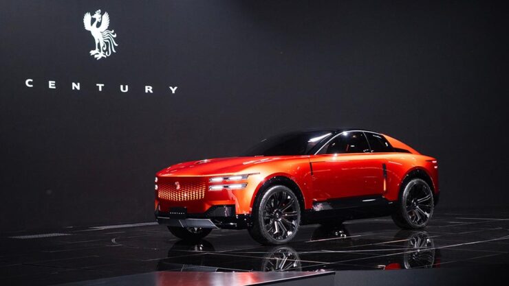
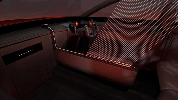
The Century Coupé Concept
Toyota (the company) has reorganized: there are now three levels. There’s Toyota (the car line), for the mass market; Lexus, Japan’s first answer to BMW et al from the late ’80s and also very much mass market (if targeted differently); and now, to compete in the ultra-high-end market, Century:


Powertrain is yet to be determined; the rumors suggest it’ll be available both with a combustion engine (possibly a V12) and electric drive. In the case of the latter, owners will, of course, be able to send their driver off to get the thing charged while they lunch or plot takeovers — no range anxiety here.
Car geeks will know that Toyota’s Century sedan model has been around forever. It’s always been badged as a Toyota, and is aimed at Japanese executives and members of state (and will, in fact, still be produced). It was joined a few years ago by a SUV that bears more than a passing resemblance to a Rolls-Royce Cullinan. Both existing Century models available only in Japan and China.
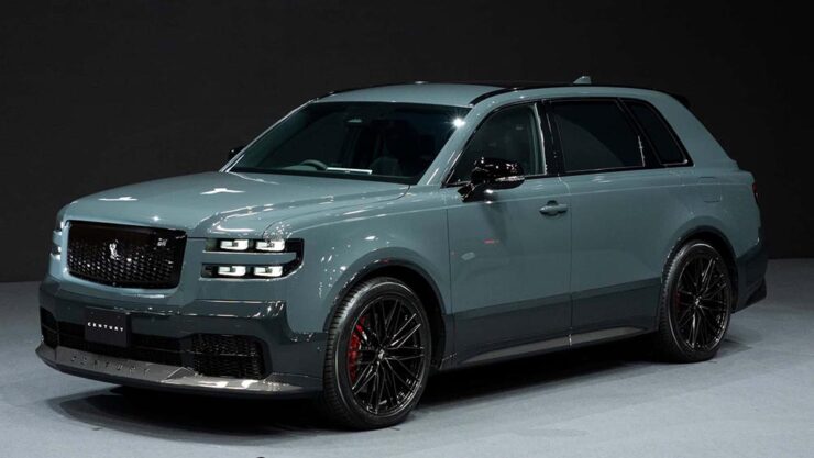
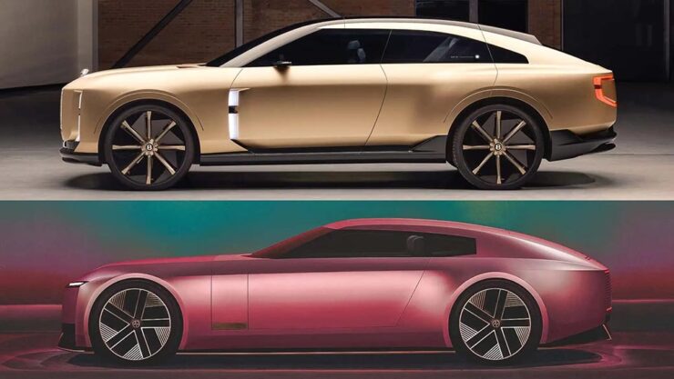
Toyota has decided to make those three models into a new brand that’s just called, “Century.” It’s going to be set up with exclusive dealers, eventually be available worldwide, and compete with Bentley’s new EXP 15 (previously) and Rolls-Royce’s … everything.
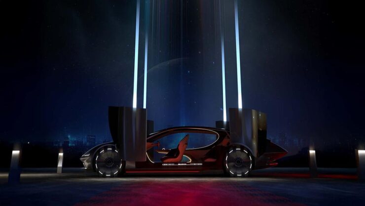
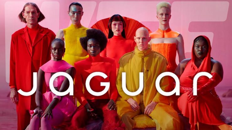
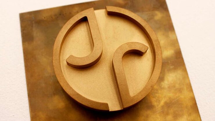
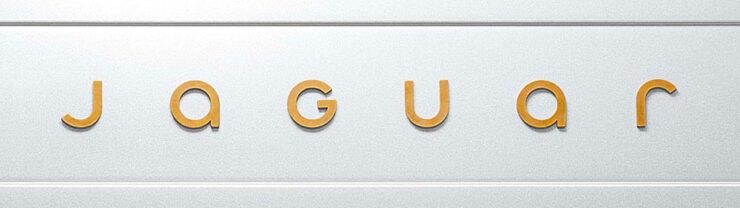
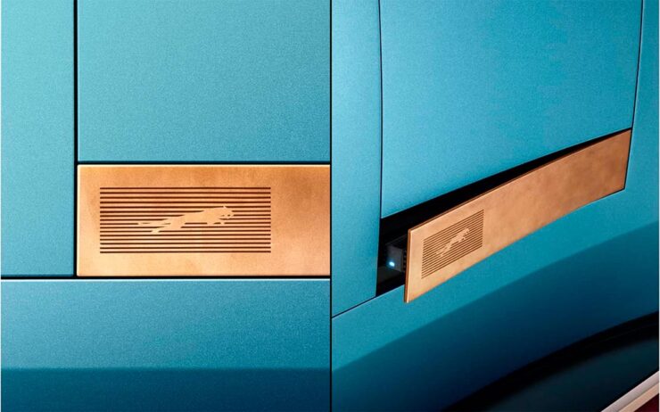
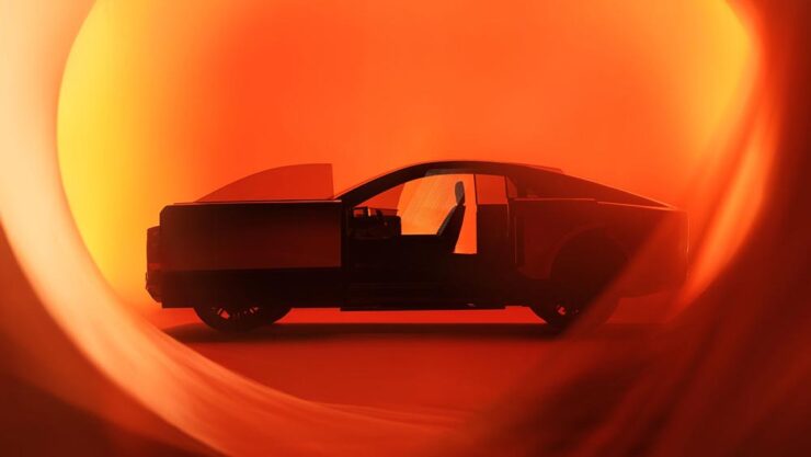
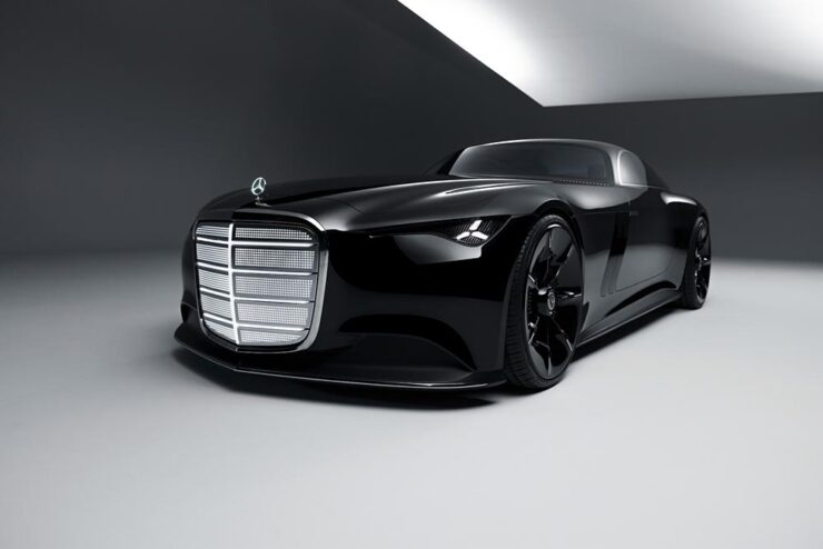
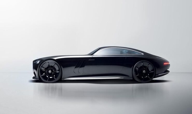
And, of course, Jaguar. The elephant in the room get a mention here because it’s looking more and more like JLR made the right call in targeting one-percenters with out-there, vaguely coupe-like designs. Because if the Century SUV resembles a Cullinan, the new coupé concept looks like a cross between the Jaguar Type 00 concept and said Bentley:
Very much unlike the Jag, which is low and could possibly be described as “sleek,” the Toyota has a higher stance; a coupé/sedan and SUV mix seems to be a new answer to the so-called “death of the sedan.” Volvo’s ES 90 might also apply here.
Bear in mind that I’m not talking about the coupé-style SUVs (BMW’s X6, for instance), which are a different animal — at least for now. It’s possible the whole class of “coupe-like things” might converge in the not-too-distant future.
That being said, a member of that new class of vehicle being aimed at the chauffeur-driven market is new.
One more item: The old-school isn’t going quietly.
Mercedes is, arguably, the best (non-American manufacturer) at displaying “gangster” qualities. Oh, and check out the awesomely-retro interior:
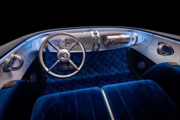
Read more about the Toyota (teaser or intro, both at The Drive) or Mercedes (The Drive, Wallpaper*).
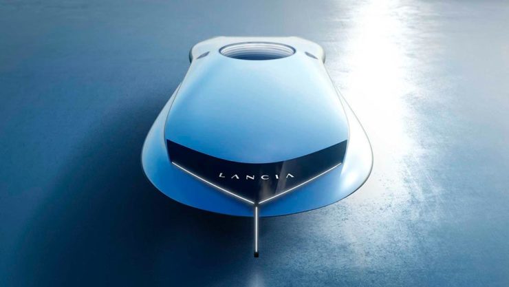
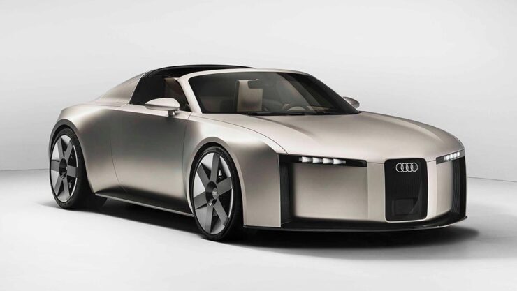
Special Bonus #4: Audi poached the Type 00’s designer. His first showing is the Concept C, Audi’s return to form, called “radical simplicity.” It’s a cross between their sports-driven R8 and designer-driver TT:
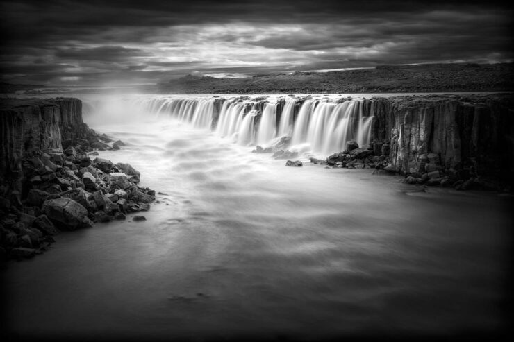
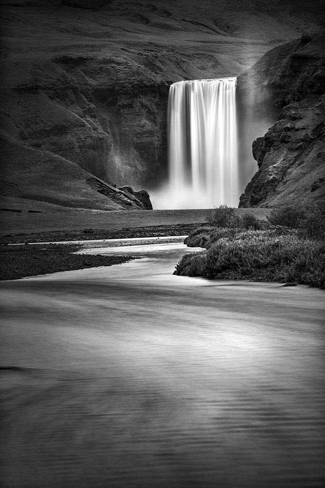
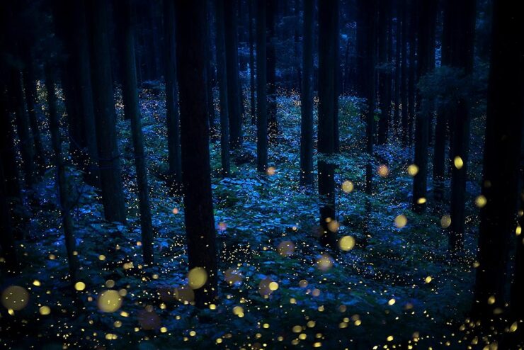
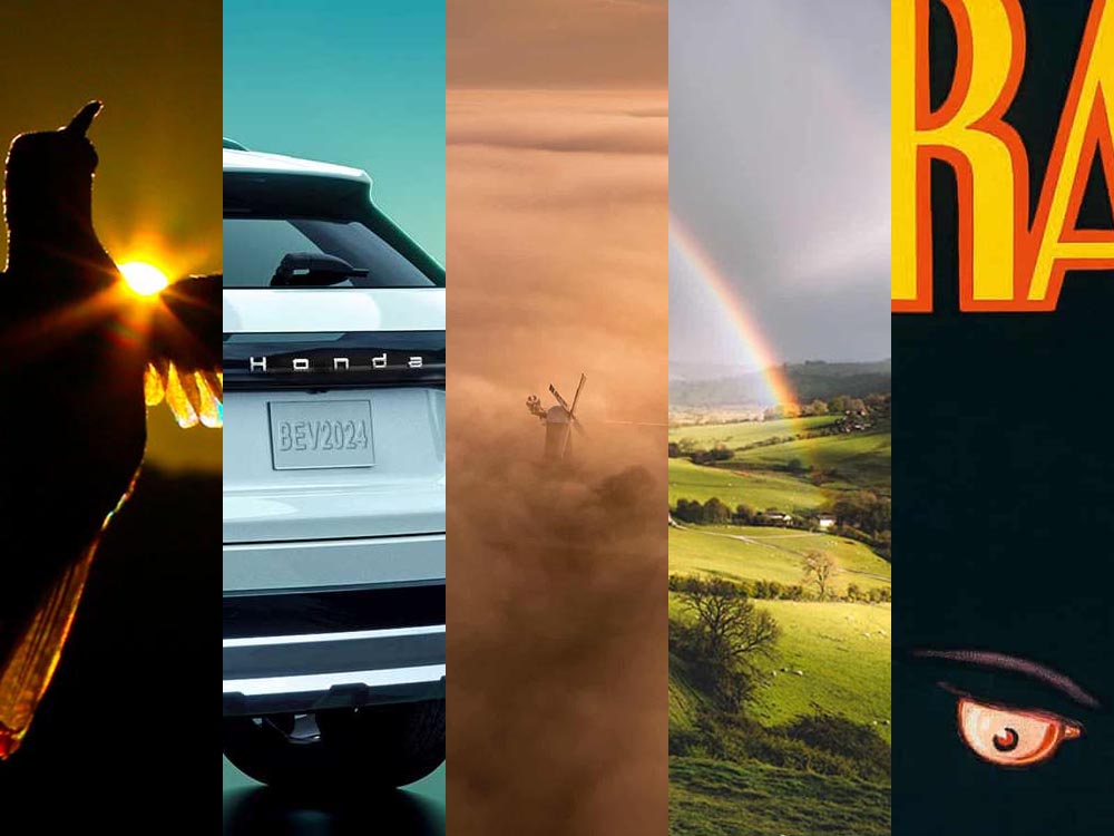
October’s Photography Round-Up
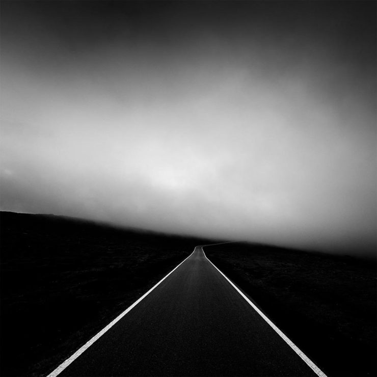
2x Film
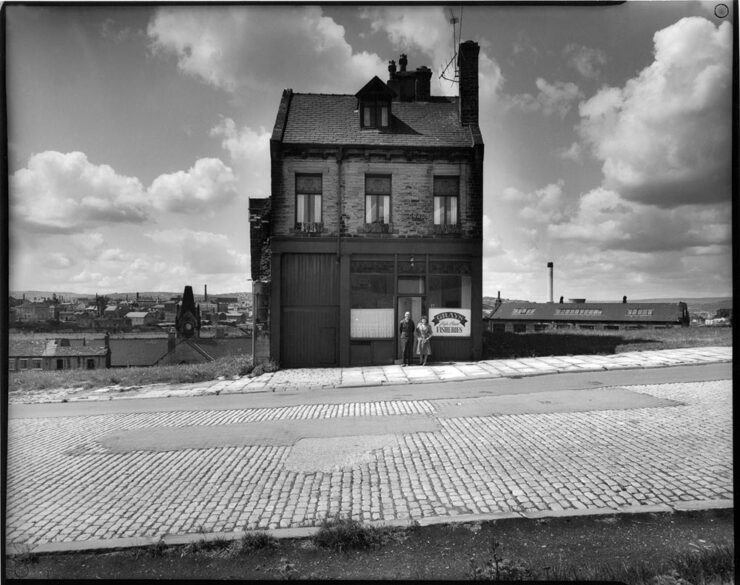
From an interesting and moving feature at MacFilos, “Capturing the decline of industries and communities with a Leica M6”:
At my recent career retrospective exhibition “Life” at Salt’s Mill, Saltaire (a world heritage centre near Bradford, West Yorkshire, England), a man came to talk to me. He said, “You won’t remember me, but I remember you. I worked in a camera shop in Bradford, and you were always coming in to buy rolls of black and white film. It makes me so proud to think that the film I sold you created some of these wonderful photographs.”
— Ian Beesley, MacFilos
I take this as a great compliment and a very moving one. It is one of the reasons why I decided to donate my entire archive of negatives, prints, notebooks (over 200,000 items) to Bradford City Art Galleries and Museums. I am hanging on to my Leica M6 for a bit longer, but at some point, it will be re-united with all the negatives it created.
“The Analog Sparks 2025 International Film Photography Awards celebrate analog photography as a medium and elevate the best film photographers worldwide,” PetaPixel writes. Some excellent reminders that sometimes, the old ways are still the best ways.
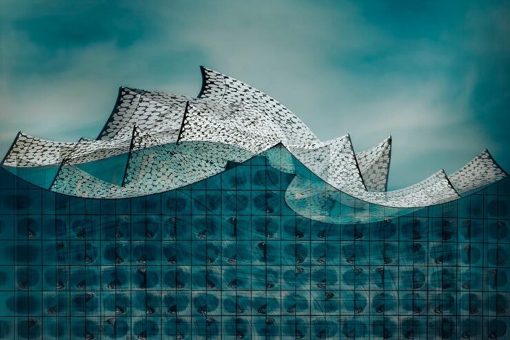
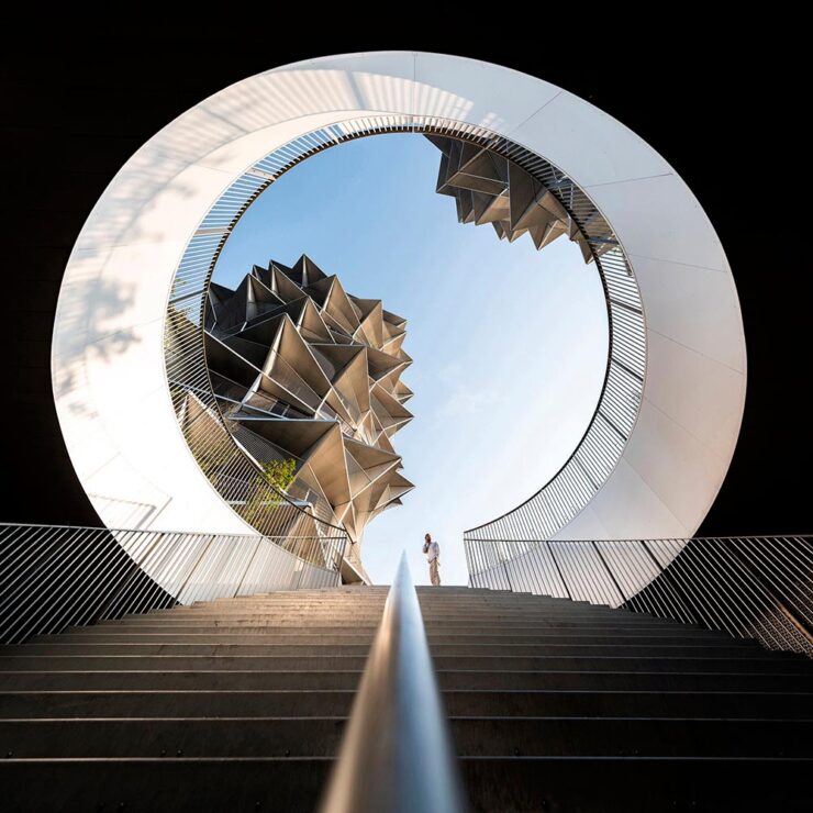
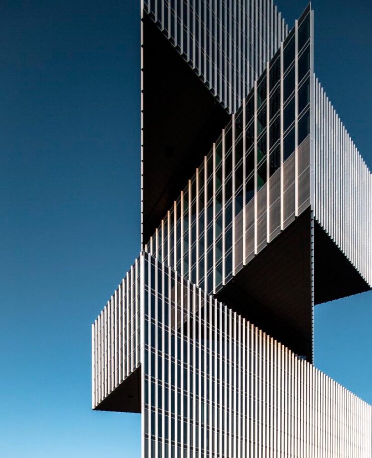
Color and Pano
“All About Photo Magazine unveiled the winners of its latest competition: Colors. The 25 prize-winning photographers demonstrate how powerful color can be in images, whether it’s vibrant, subtle, or minimal,” PetaPixel writes.
To be honest: at first, I thought this was a coin-operated binocular thing you see at attractions or overlooks, and laughed out loud. Alas, the laughter died away when I realized it was, in fact, CCTV — an overlook of an entirely different kind. I guess there’s a certain irony in the “face.”
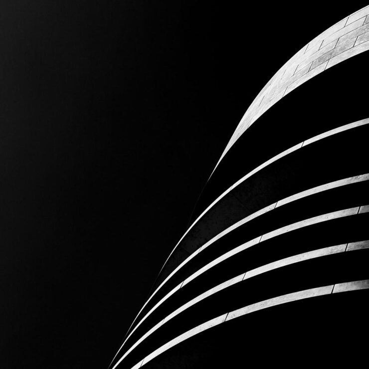
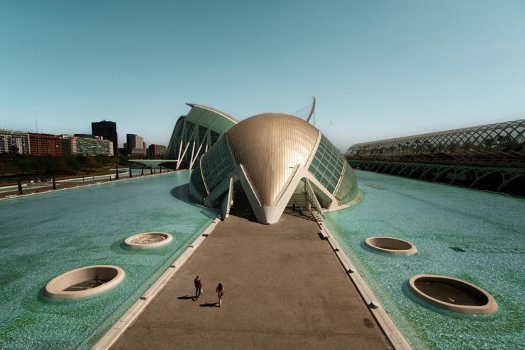
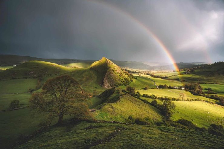
It is possible to recognize a Santiago Calatrava building immediately, with its soaring, often winged structures. (The World Trade Center Transportation Hub in New York springs to mind, for instance.) This panoramic photograph captures two of them — nice.
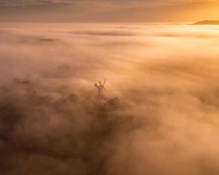
A press release from Epson, the contest’s sponsor, notes that this year there was a “prevalence of ultra-wide panoramas and increasingly innovative perspectives, including very low angles, very close-up subjects, and aerial photography,” including the above. PetaPixel has more.
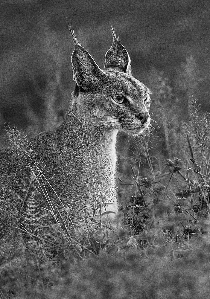
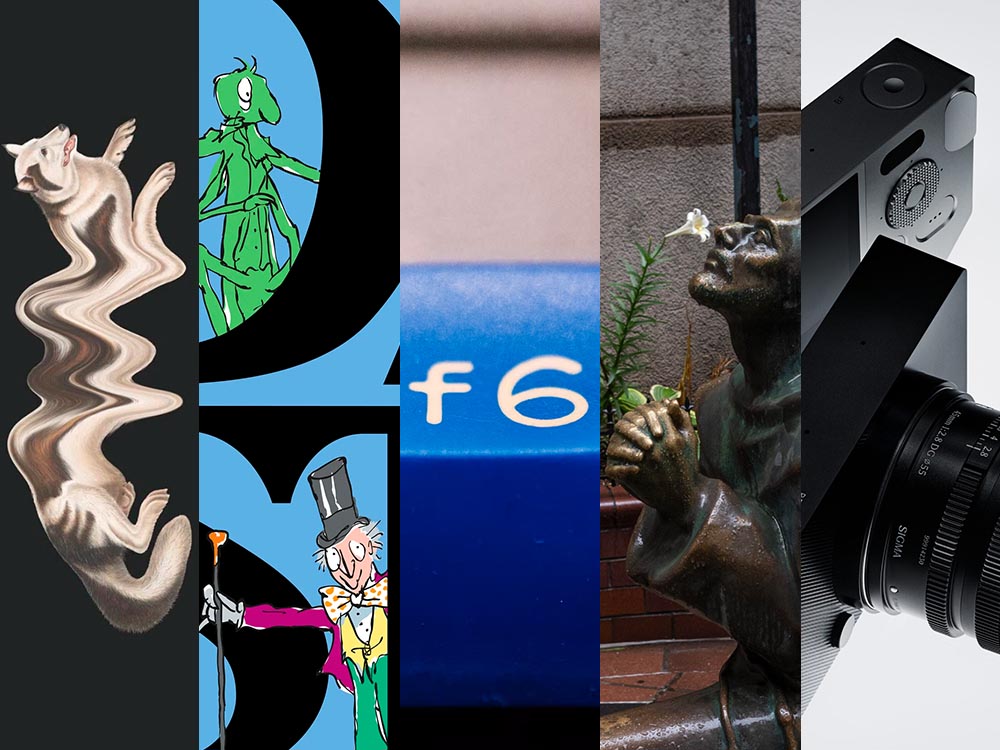
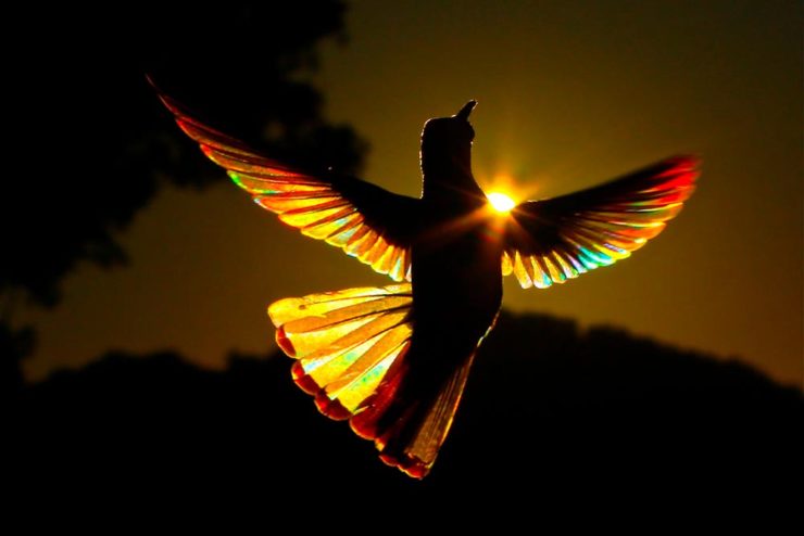
Birds and Wildlife
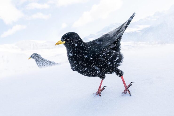
“The 2025 Bird Photographer of the Year gives a lesson in planning and patience,” This is Colossal writes about this year’s contest winners (specifically, regarding the photo seen at the right in the header image) — but getting the cold shot, above, wasn’t an easy thing either. (See also: PetaPixel‘s plumage article.)
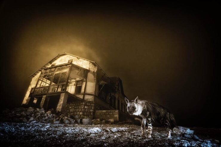
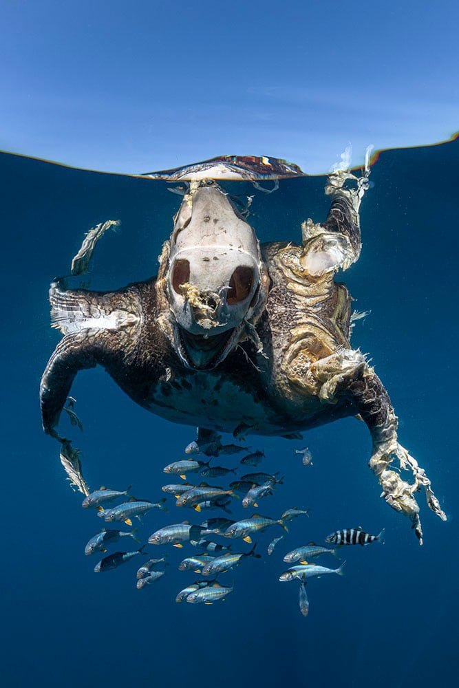
From PetaPixel‘s coverage of the Wildlife Photographer of the Year 2025 contest: “Capturing the unusual intersection between nature and abandoned urban spaces, Wim’s photograph is a haunting yet captivating image of a brown hyena wandering through the skeletal remains of Kolmanskop, Namibia’s long-deserted diamond mining town. The shot was taken with a camera trap and is the result of a decade-long effort that began when Van den Heever first discovered the animal’s tracks at the site.” [Emphasis mine.] See This is Colossal‘s post, too.
Comedy and Dogs
To round out this month’s super-long post — thanks for bearing with me — something from the light-hearted department:
The Nikon Comedy Wildlife Awards, 2025 edition, brings us 40 … um, moments. Awesome. PetaPixel has all the winners.
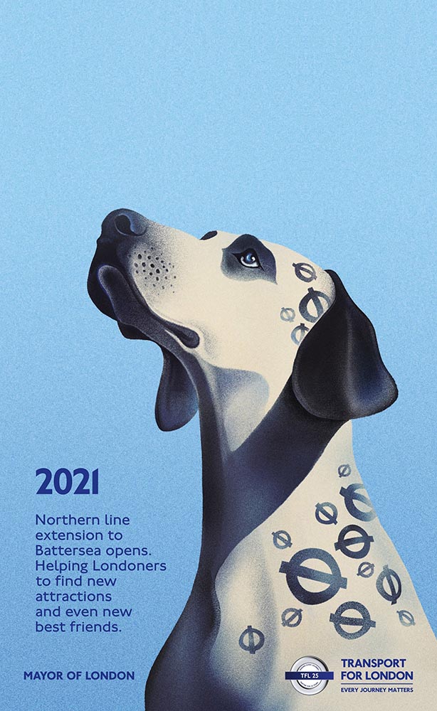
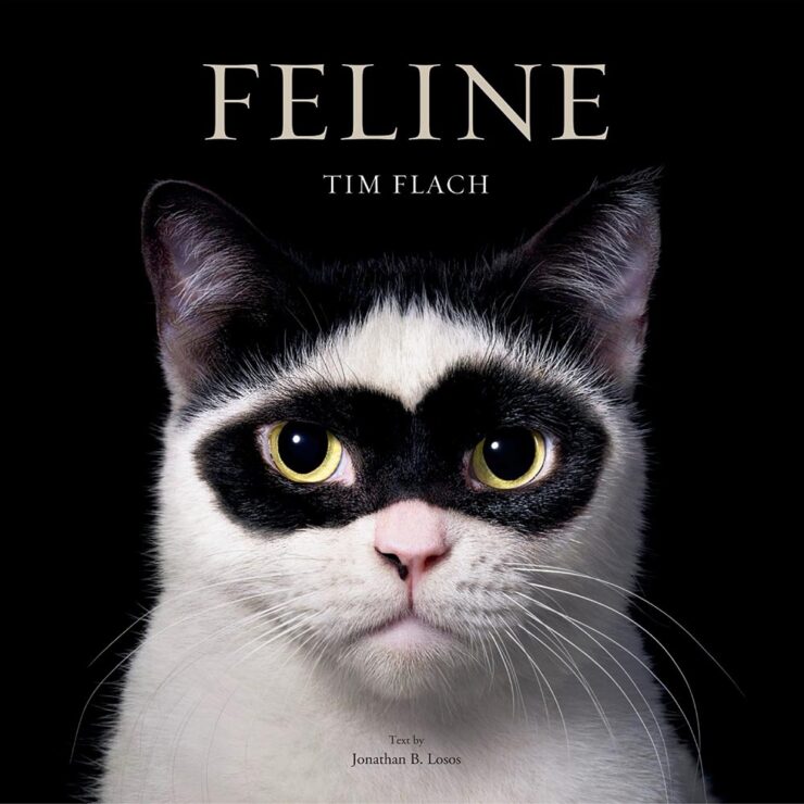
“Good Boys and Girls,” PetaPixel barks, regarding the 2025 Dog Photographer of the Year. (In the name of equal-opportunity pet celebration, I chose one that includes cats.)
Have a great Halloween. If you’re in the US, be sure to vote, Tuesday, Nov. 4th. And, don’t forget to check back for the special Spine post, Nov. 10th. Thank you!