
NOTE: See my previous car logo redesign coverage regarding BMW, Mini, etc., and more recently, Volvo.
Update, 7 December, 2021: Brand New has, as usual, done a superlative job of discussing the new Cadillac logo. See their post here, remembering that they’re subscription now — possibly the best $20/year available.
Original post follows:
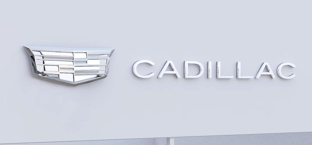
Cadillac has updated their logo, their first redesign since 2014. First, though, some history:
The mid-century look, with the “crowned” logo, might be my favorite:
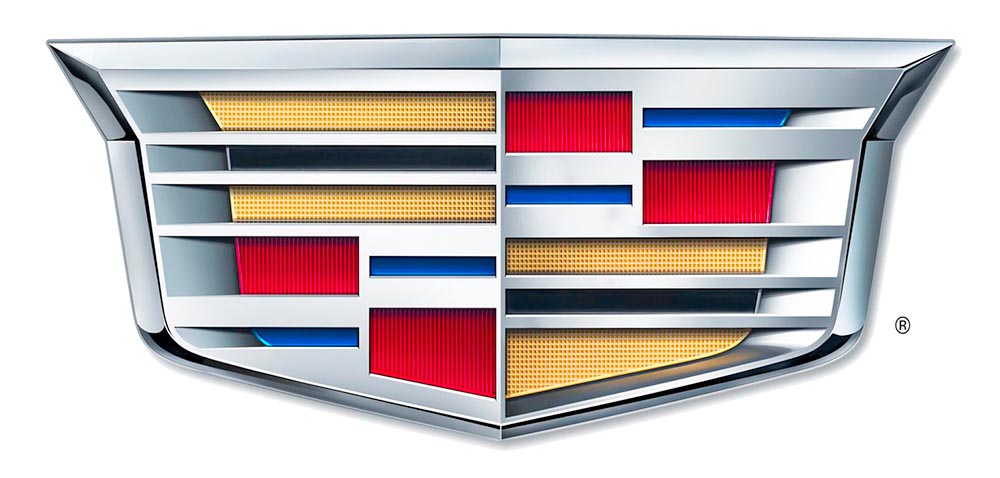
As seen in the last line above, the 2014 logo is a simplification of the 2000 logo, sans the “old-person” wreath, and I thought quite successful:
Fast-foreword (ahem) to 2021, and the monochromatic, flat-logo thing is in full swing. The latest “old-person” target is the Cadillac script, replaced with another trendy item, a custom “Cadillac Gothic” font.
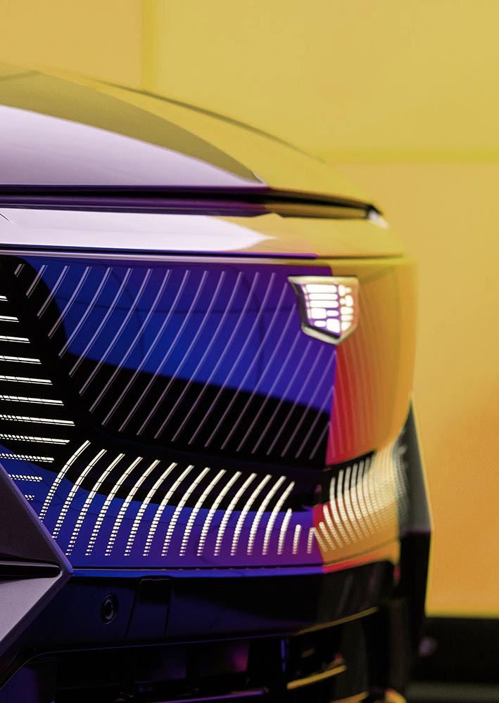
Not only that, but there’s the new trend among luxury automobiles — mere cars aren’t good enough — of illuminated logos;
It’s Nice That has more on Mother Design’s new take on Cadillac.
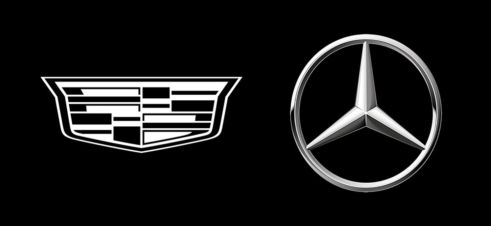
Mercedes, on the other hand, has just celebrated the 100th anniversary of the three-pointed star. Then:
Now:
When it’s done right….