We’re setting into our third snow of the season here in Georgia, an extraordinary event even in a world where “normal” doesn’t seem to happen all that often any more. Thankfully, there are still gems, waiting to be discovered. Hopefully you’ll find several in the links below.
Note: The site was offline for several hours mid-month due entirely to my mismanaging an update; the backups took a minute and didn’t restore the plug-ins, so it wound up being rough around the edges for a couple of days. If you visited — or tried to — during that time, apologies.
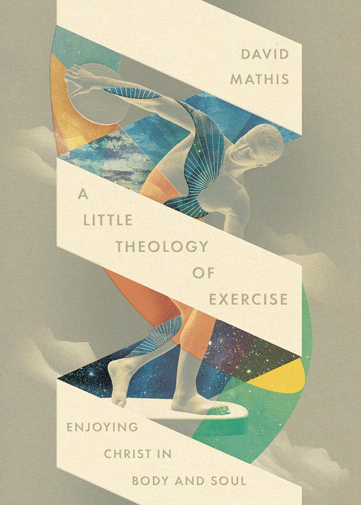
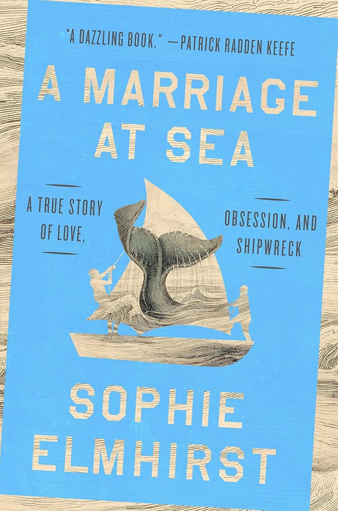
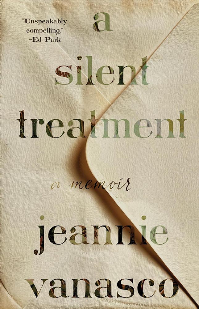
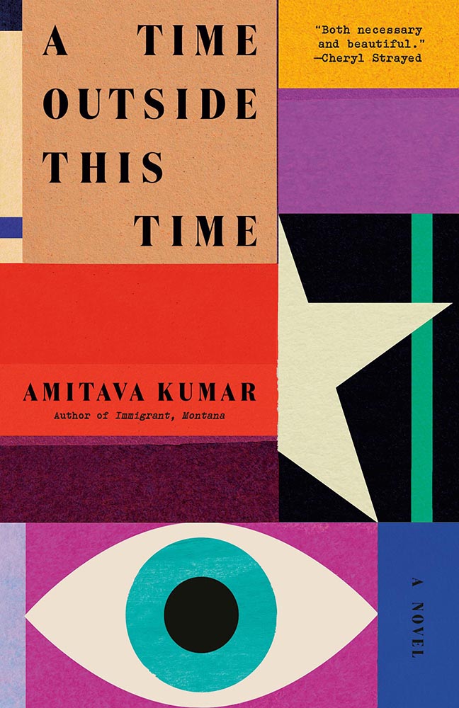
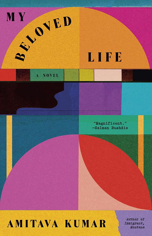
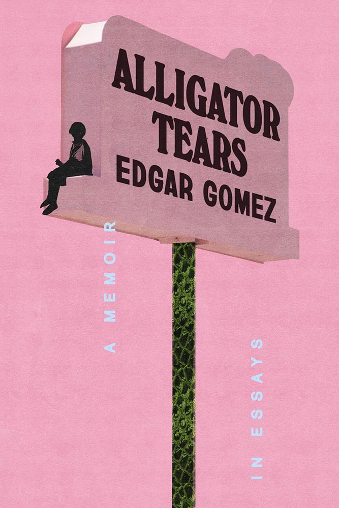
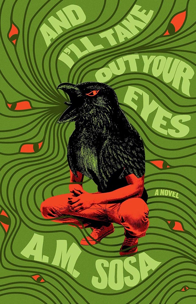
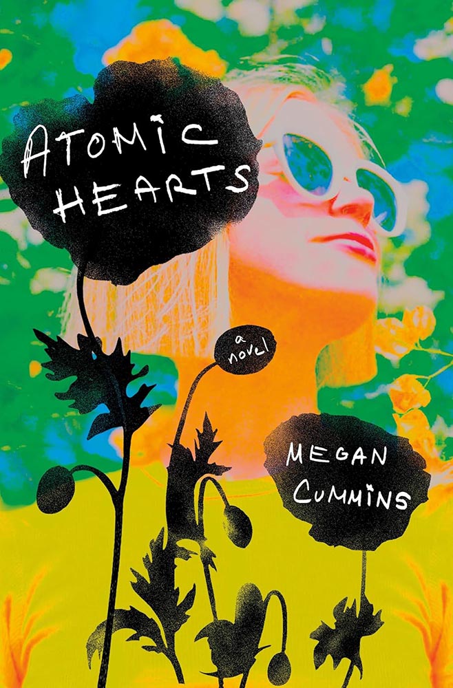
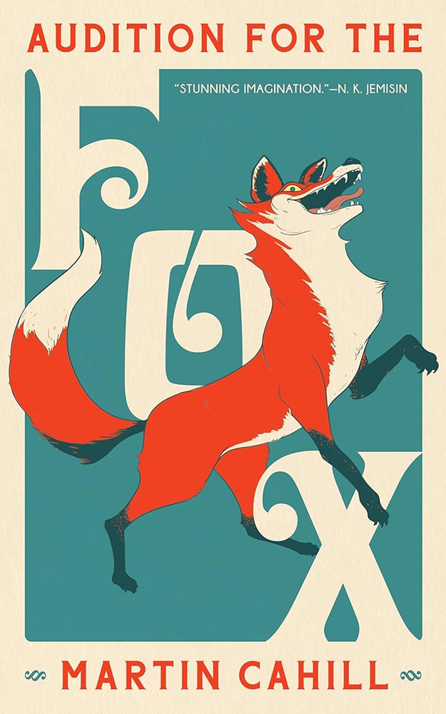
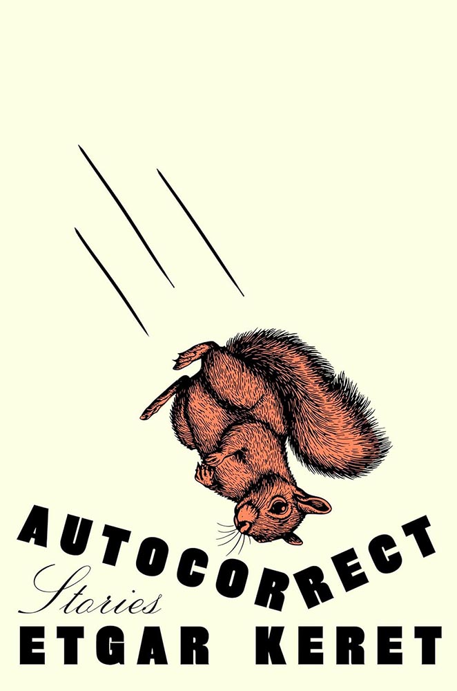
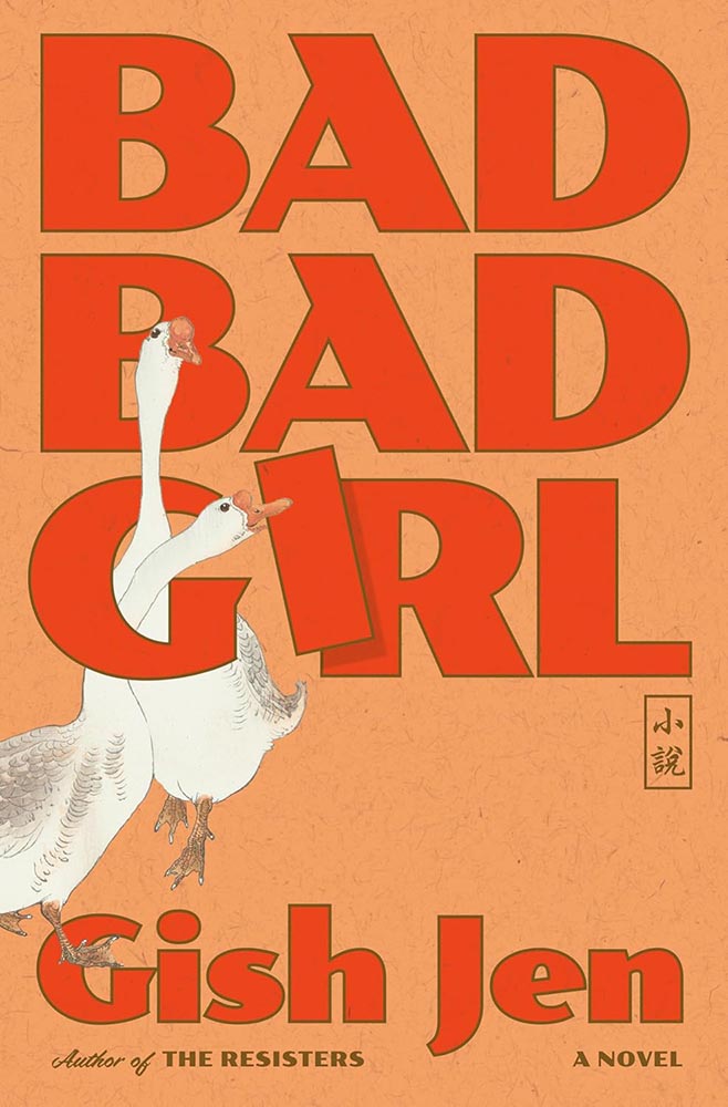
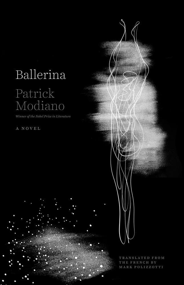
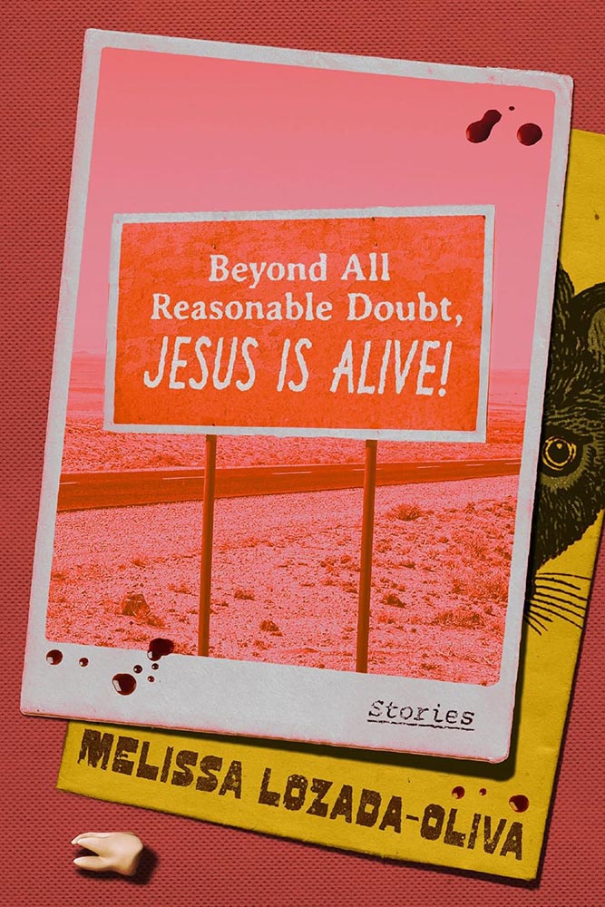
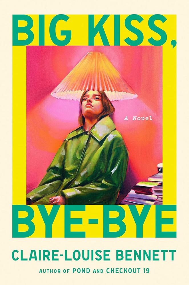
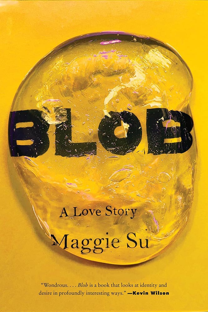
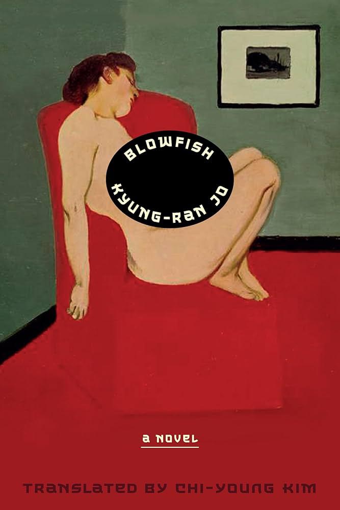
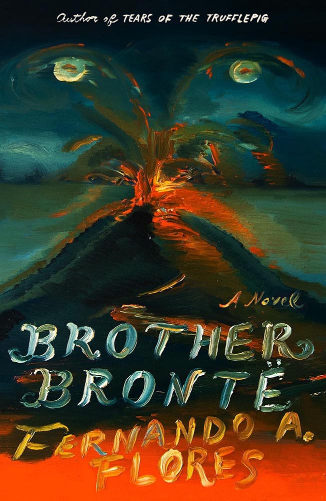
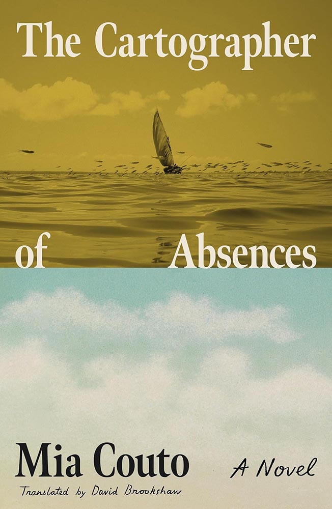
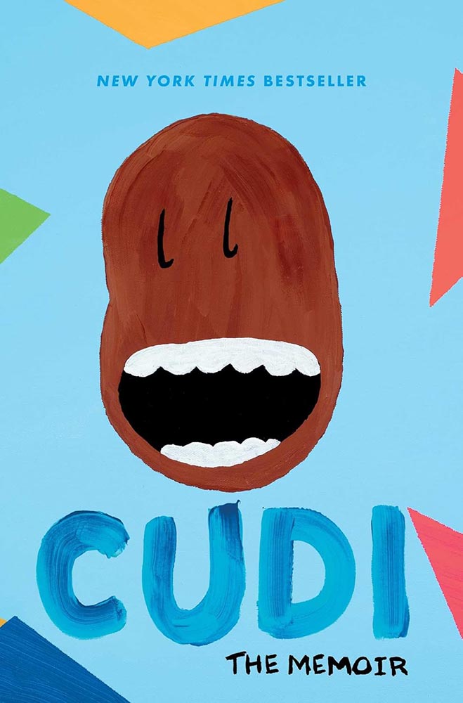
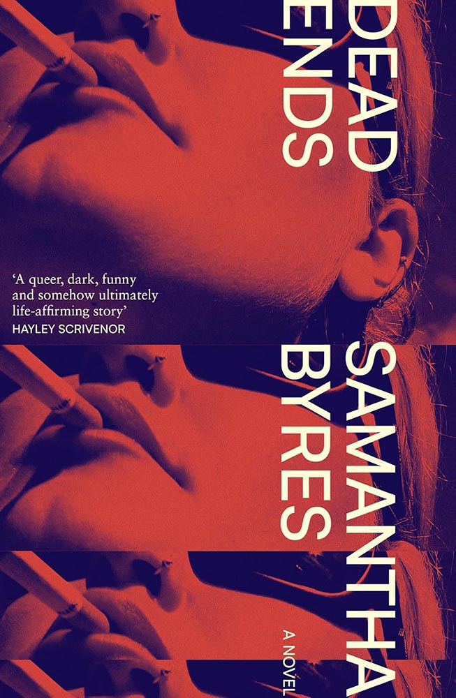
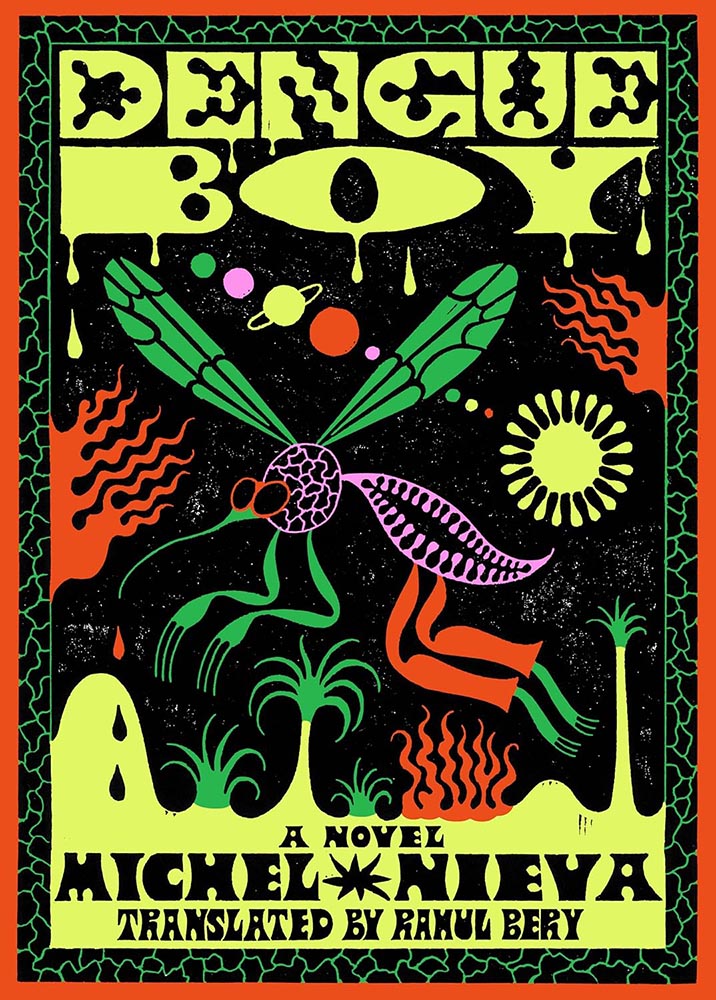
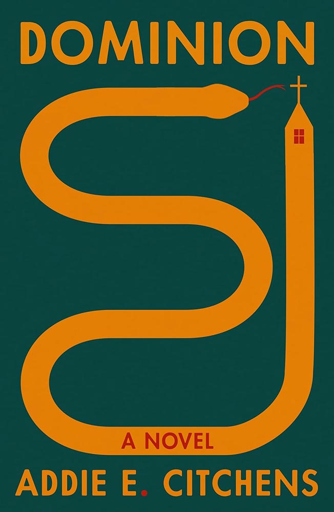
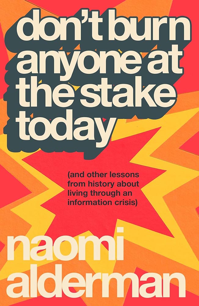
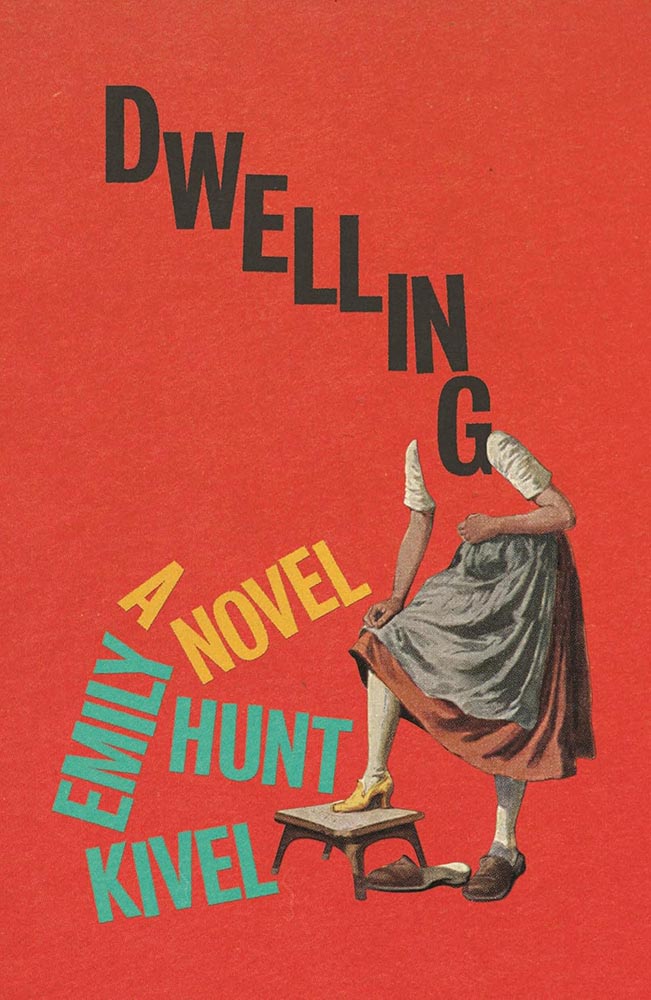
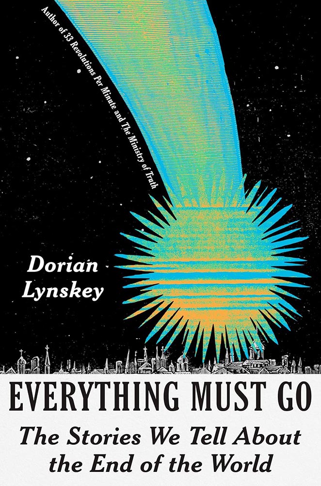
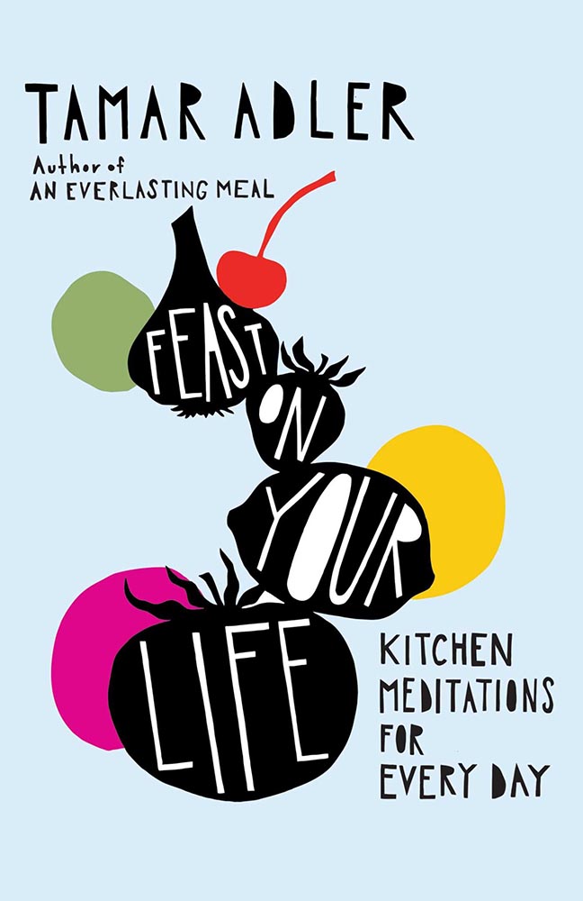
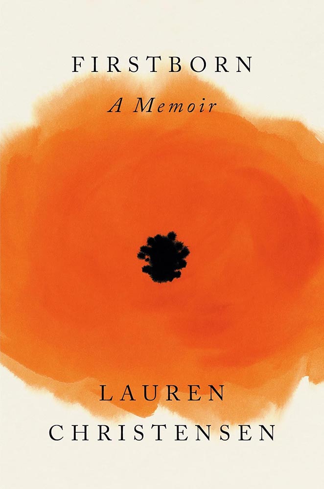
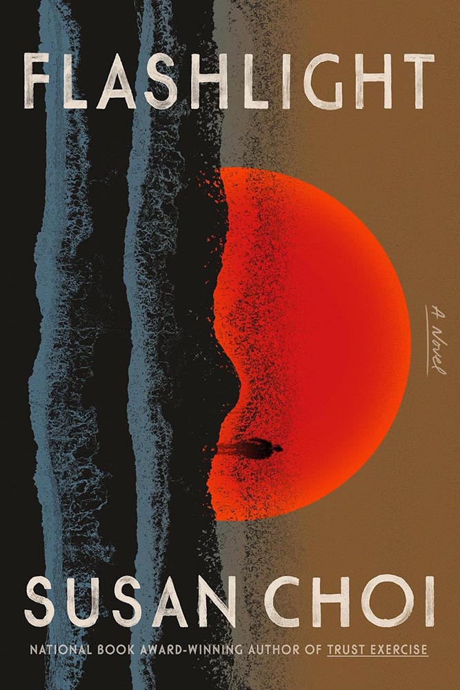
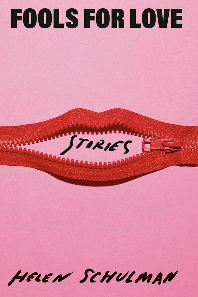
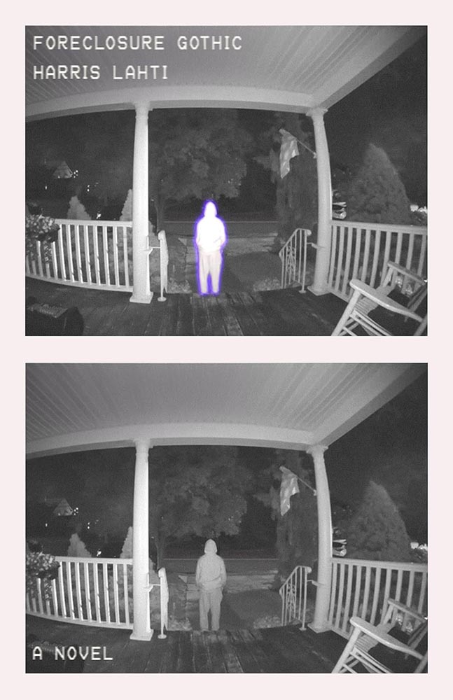
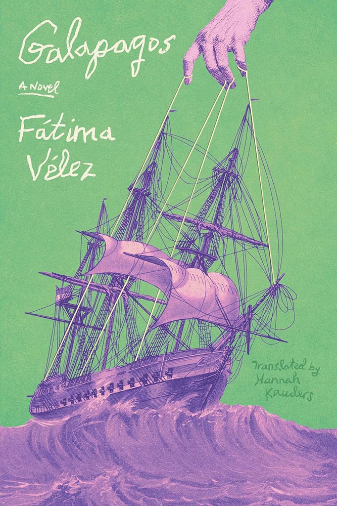
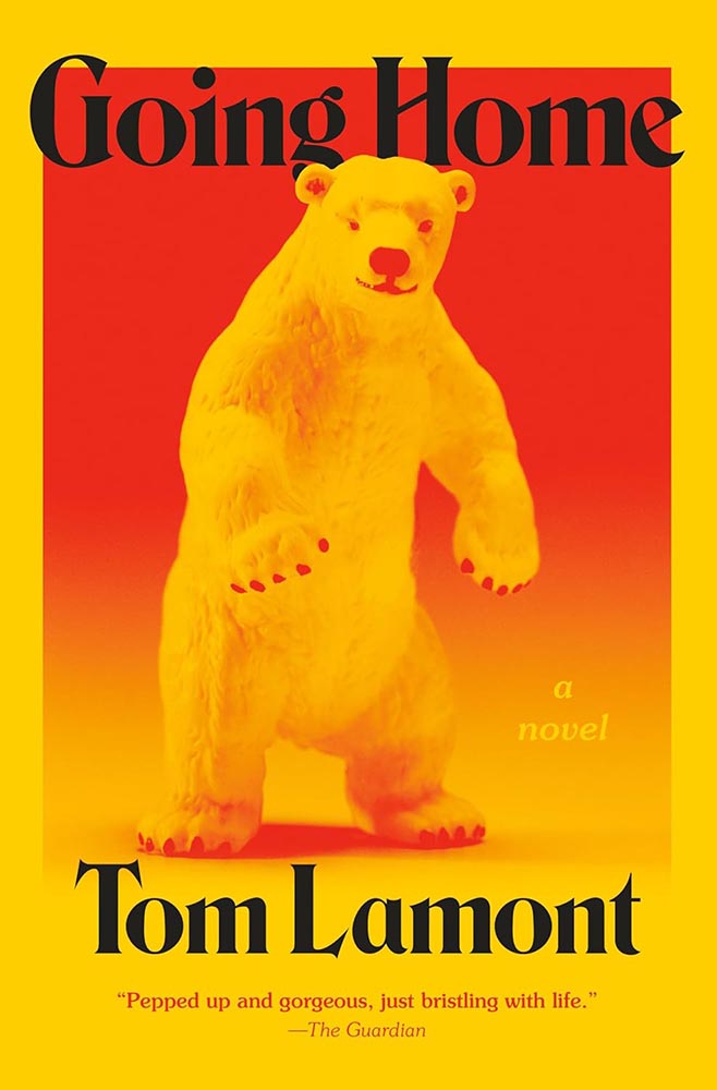
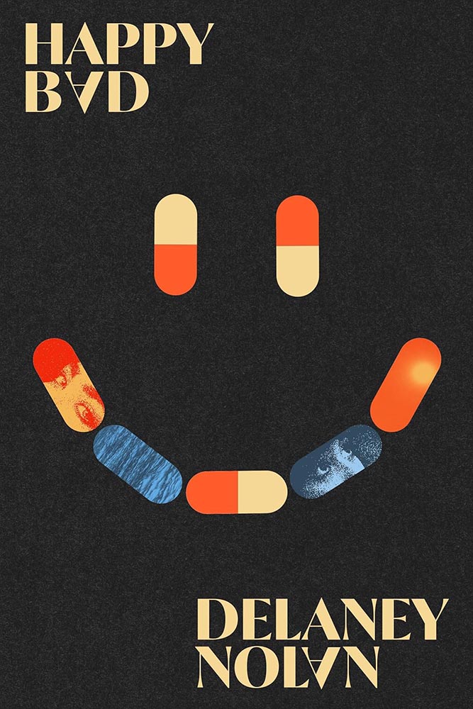
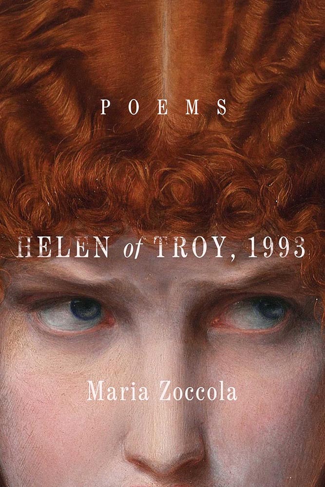
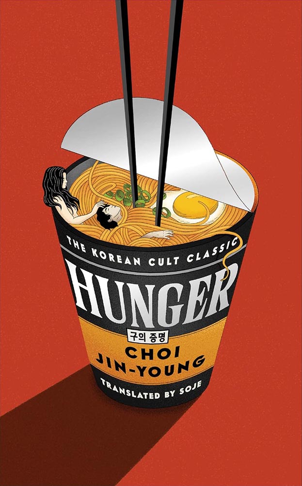
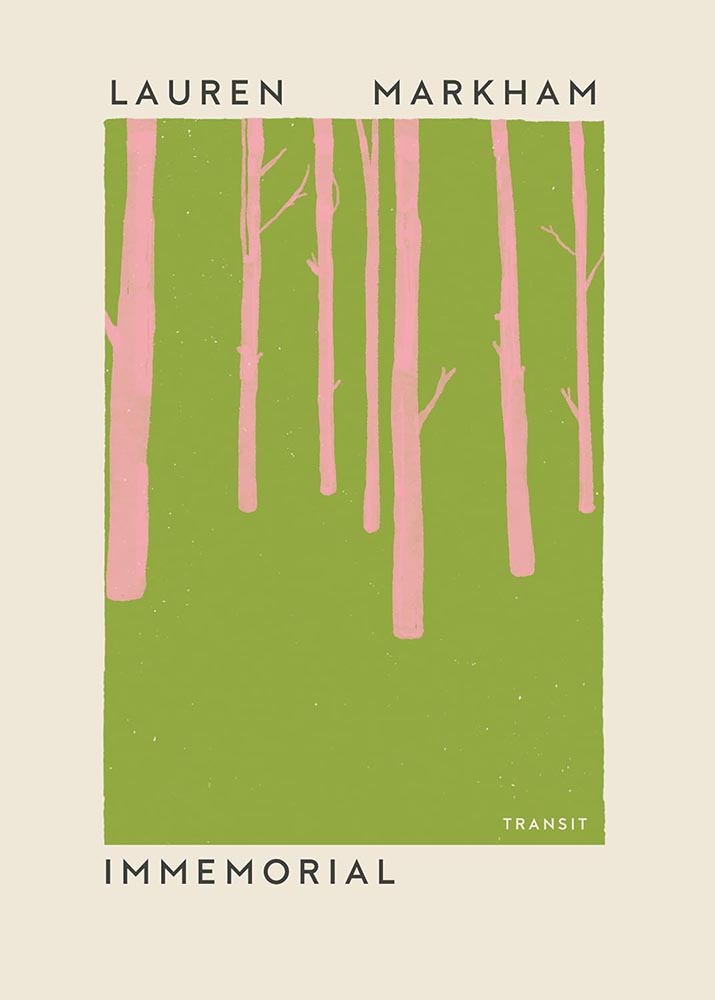
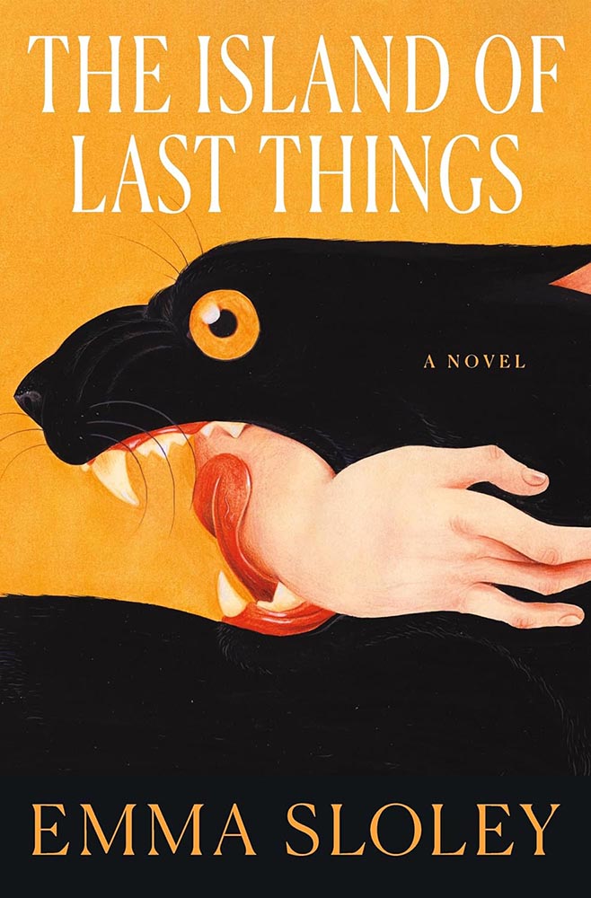
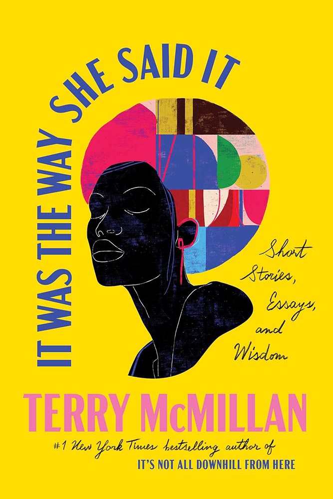
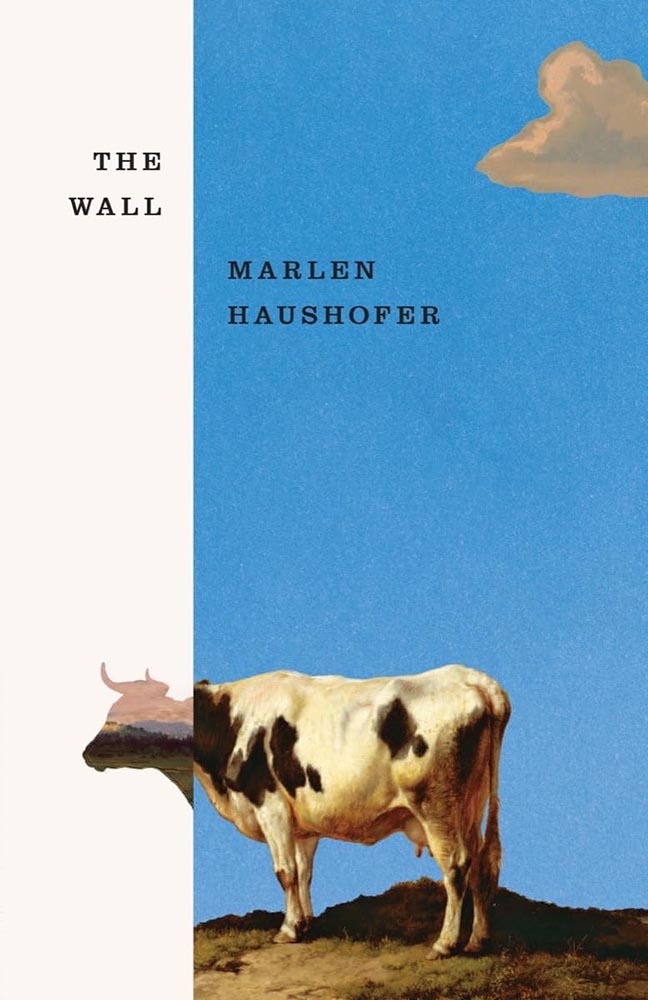
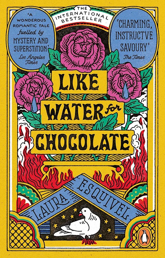
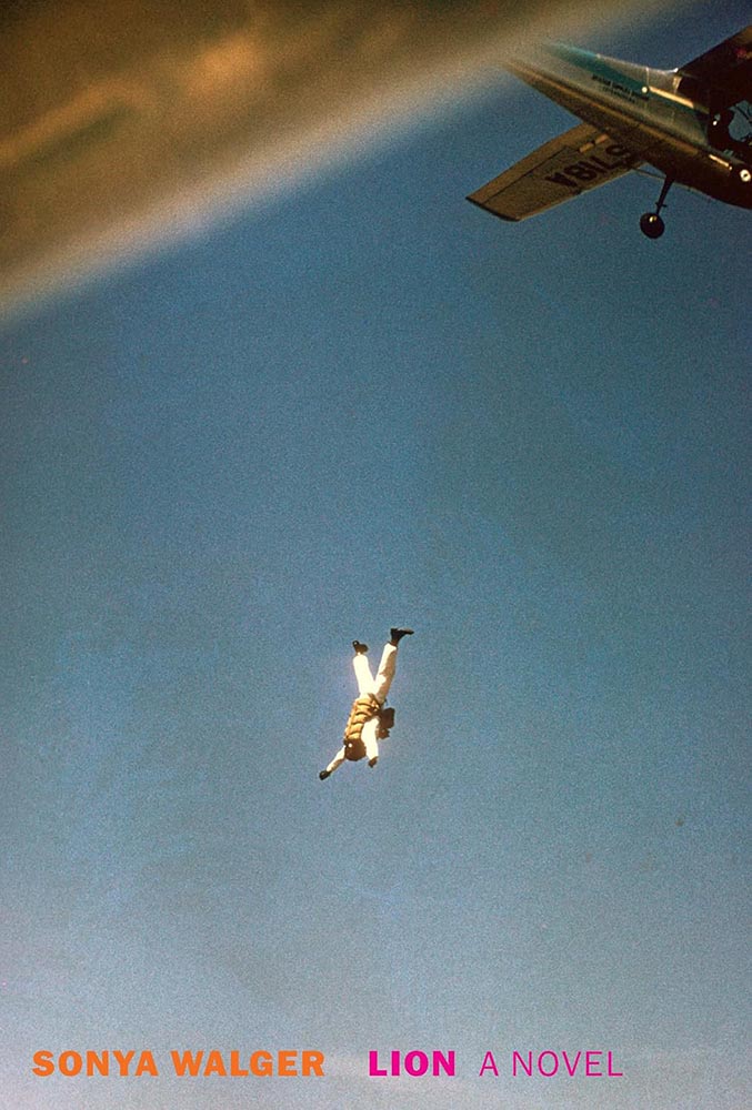
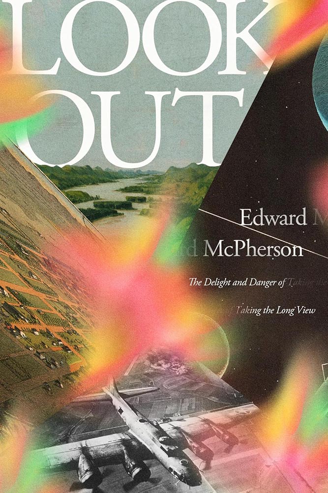
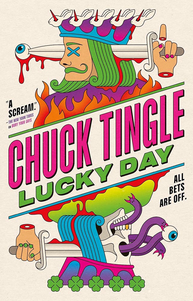
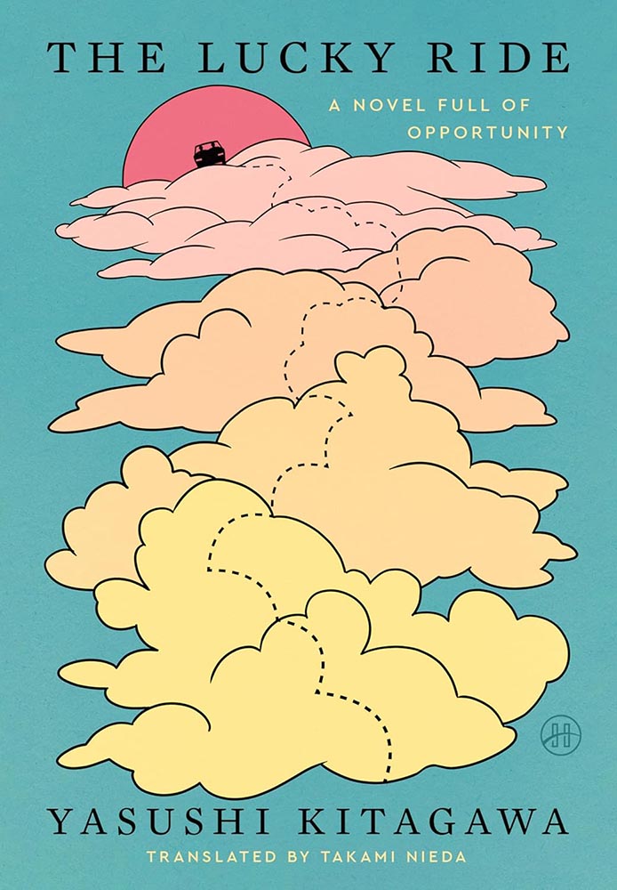
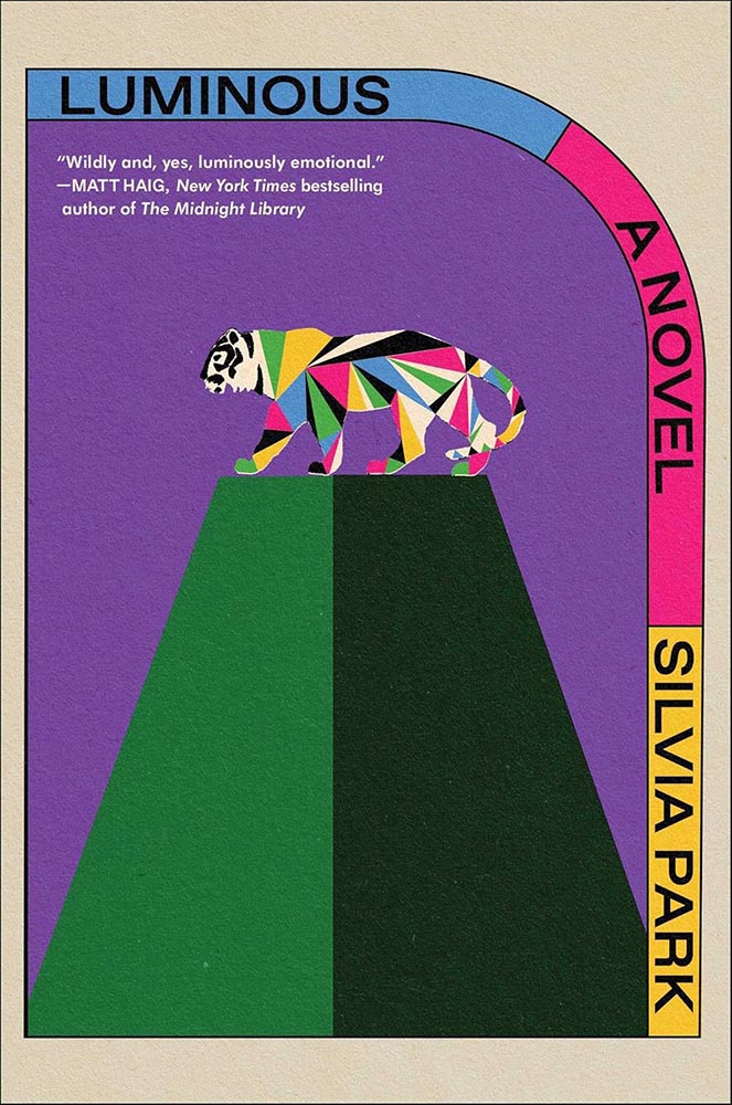
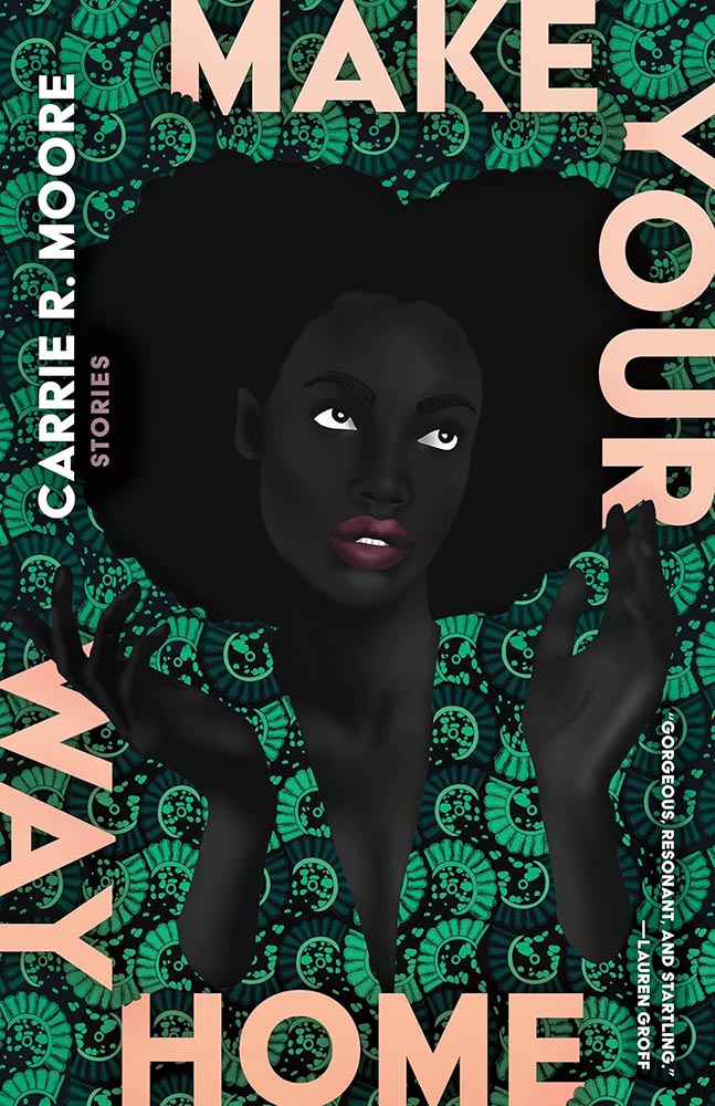
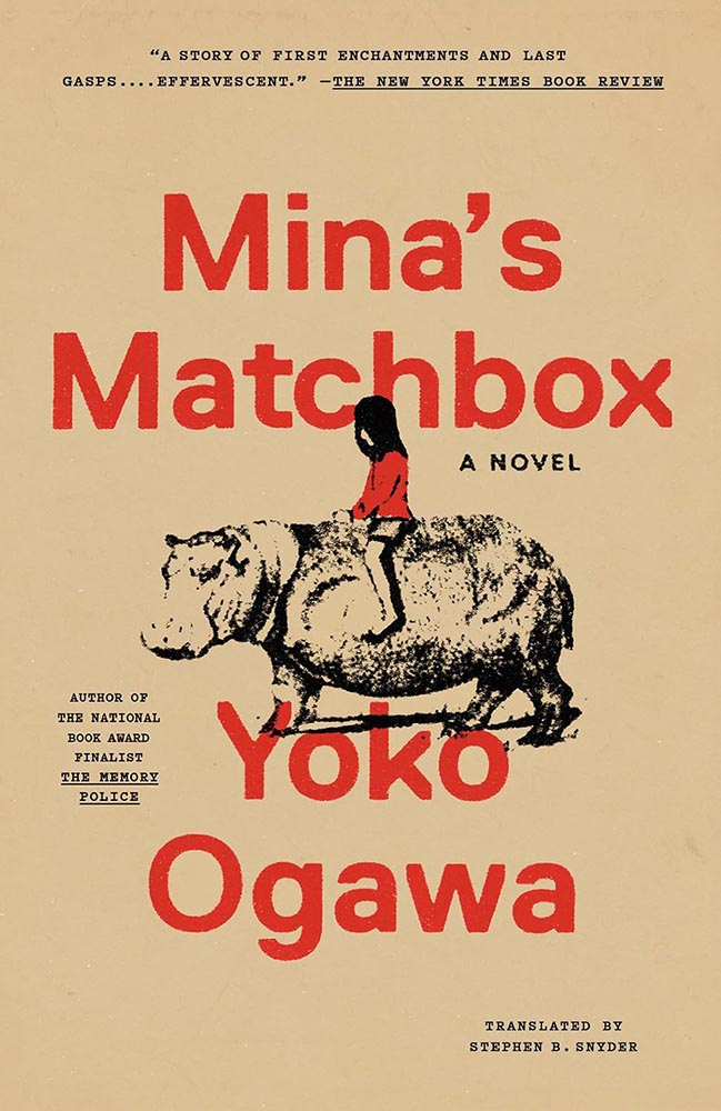
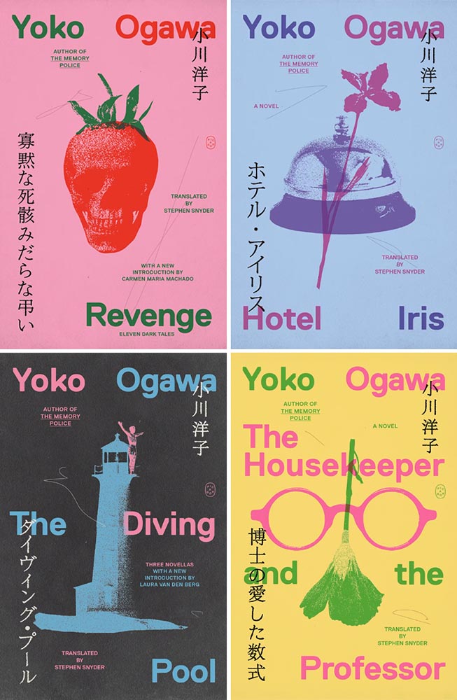
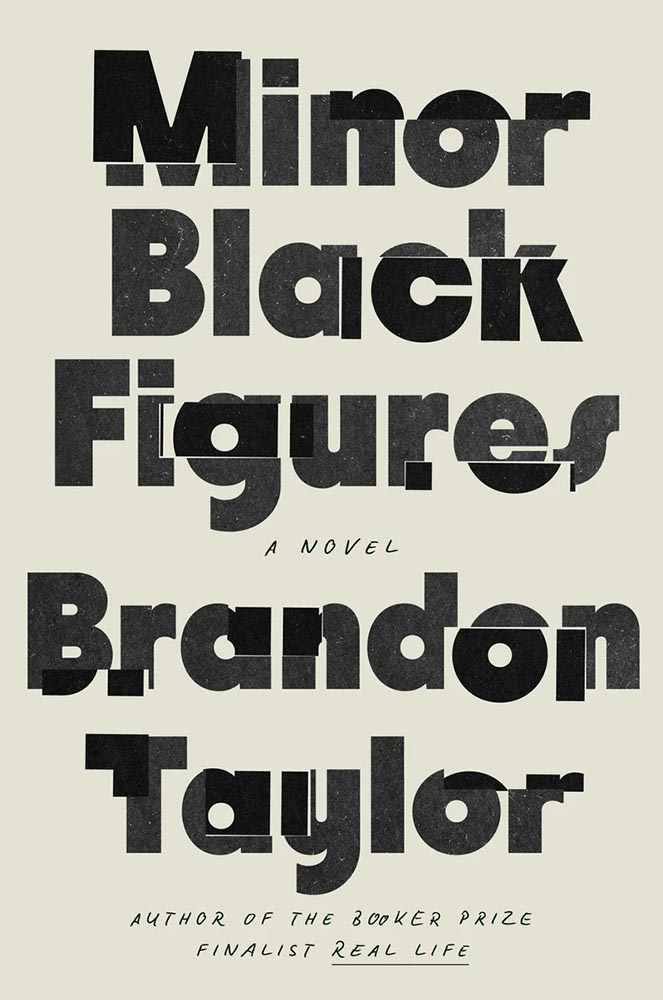
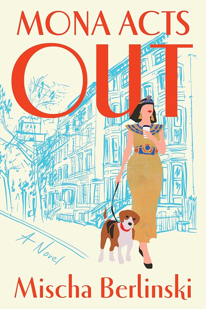
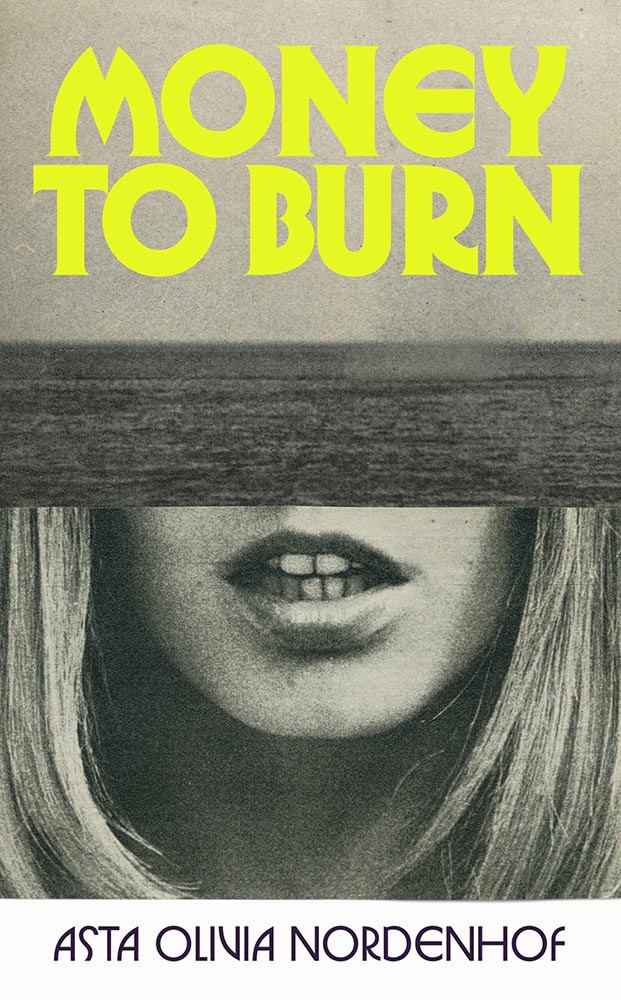
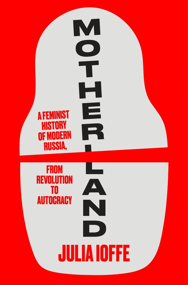
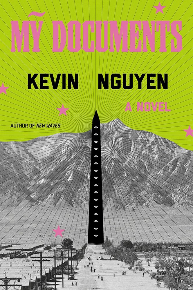
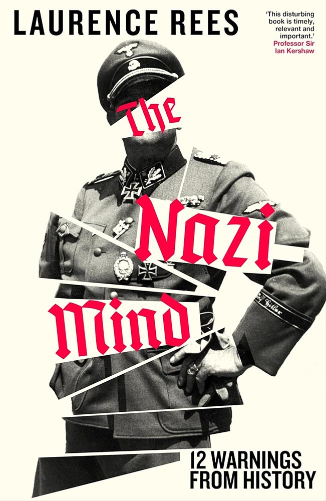
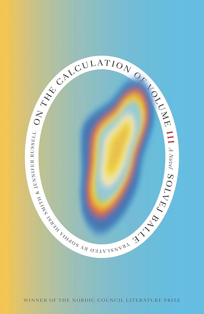
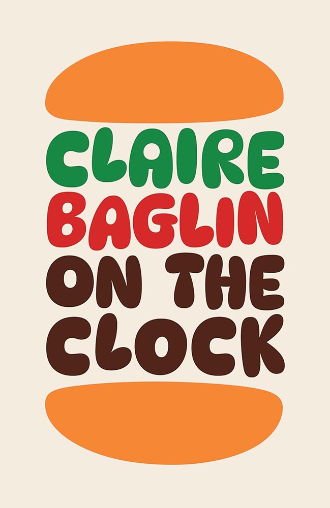
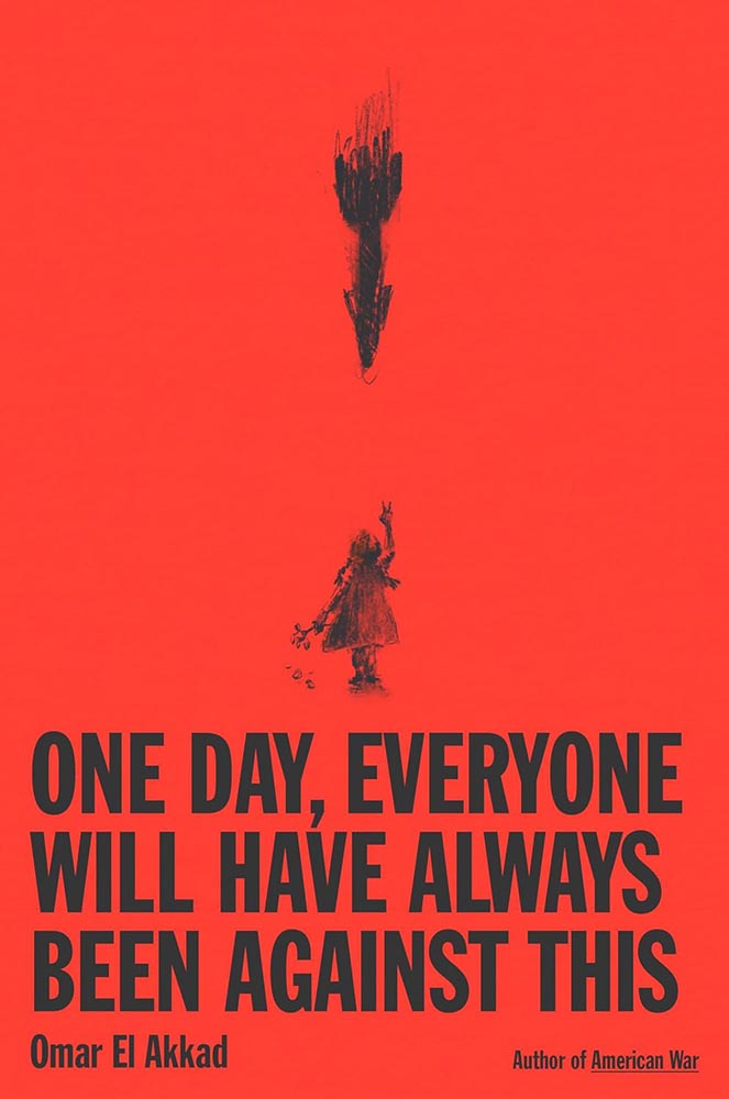
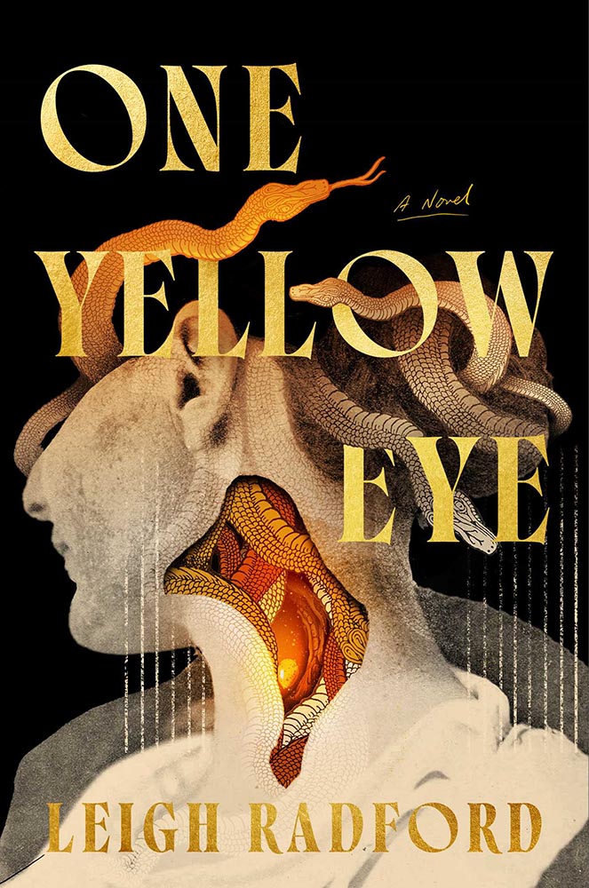
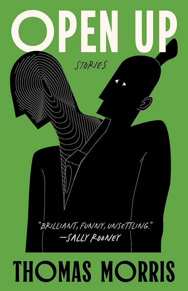
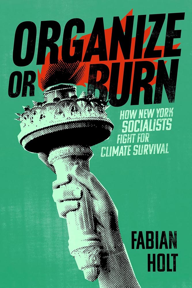
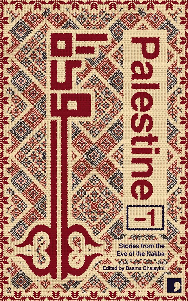
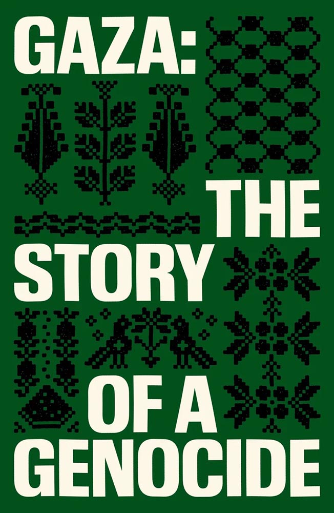
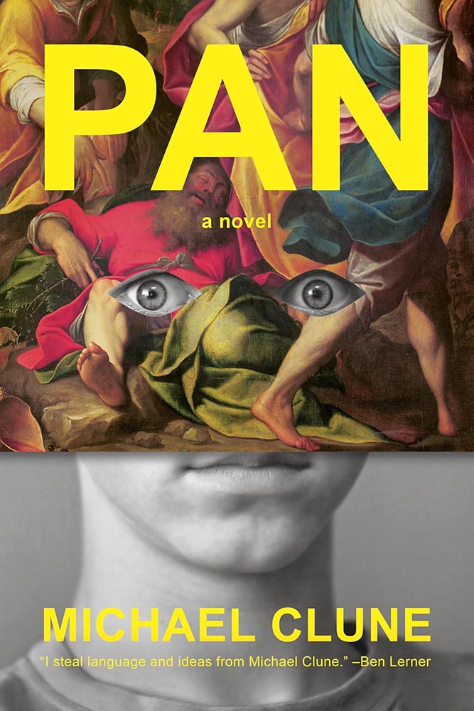
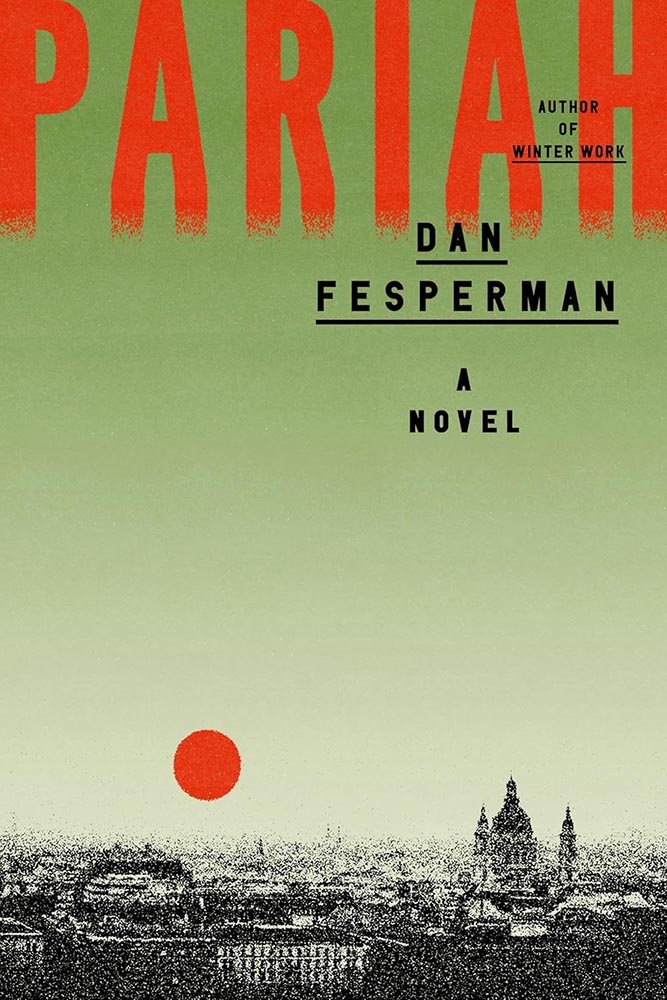
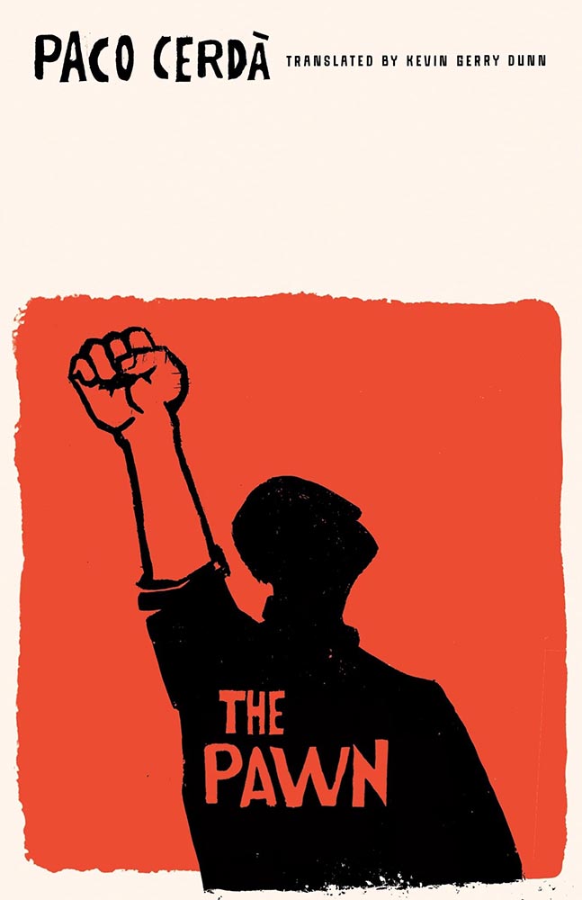
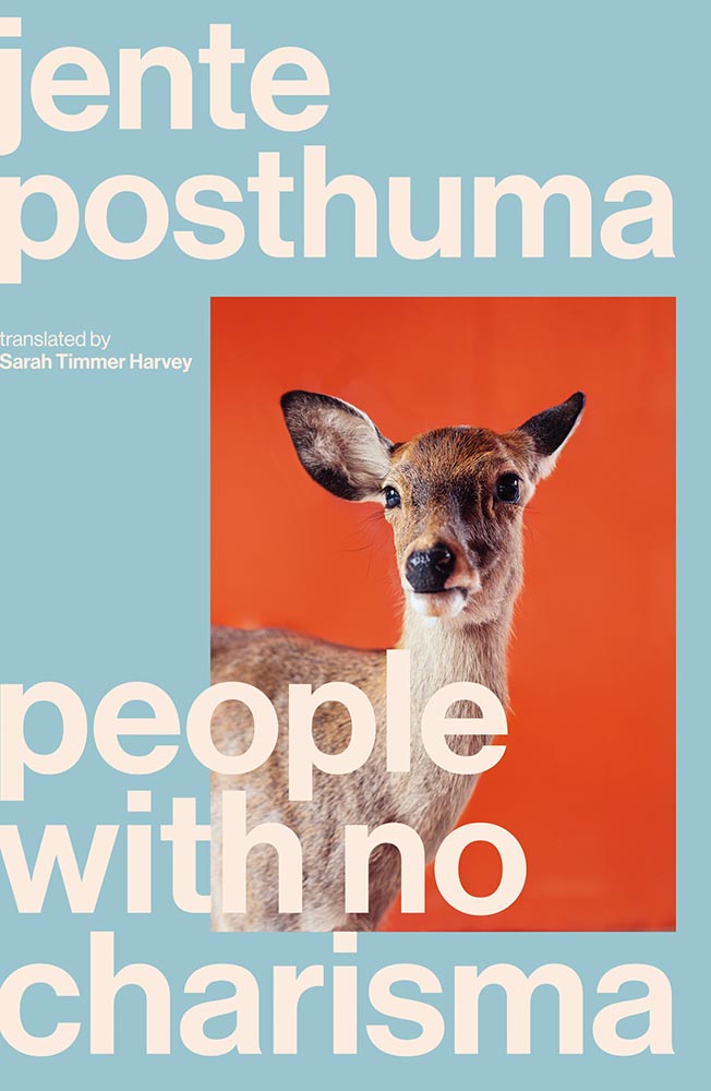
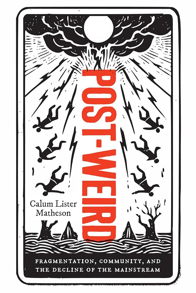
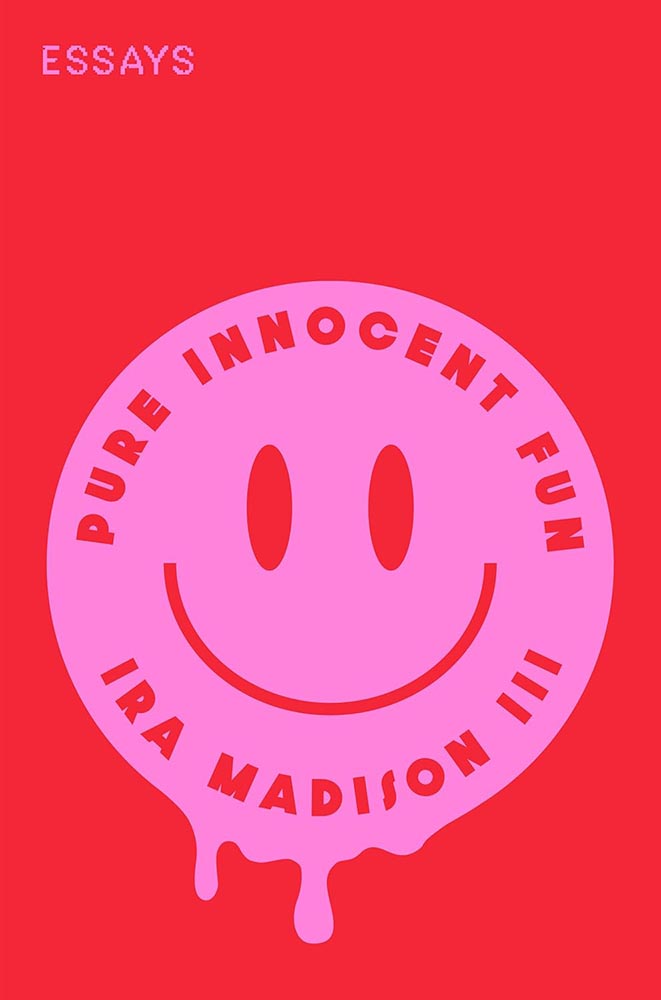
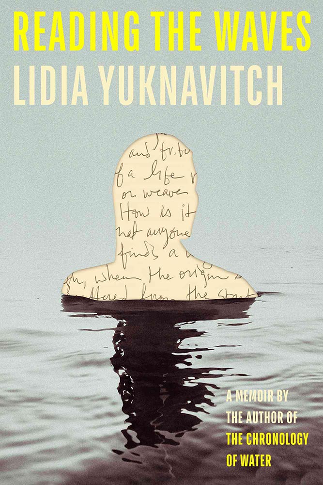
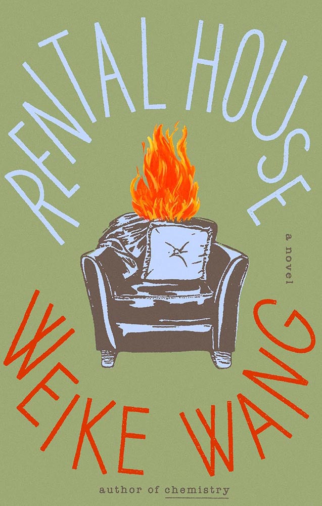
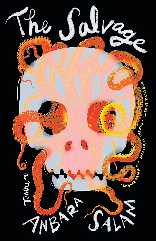
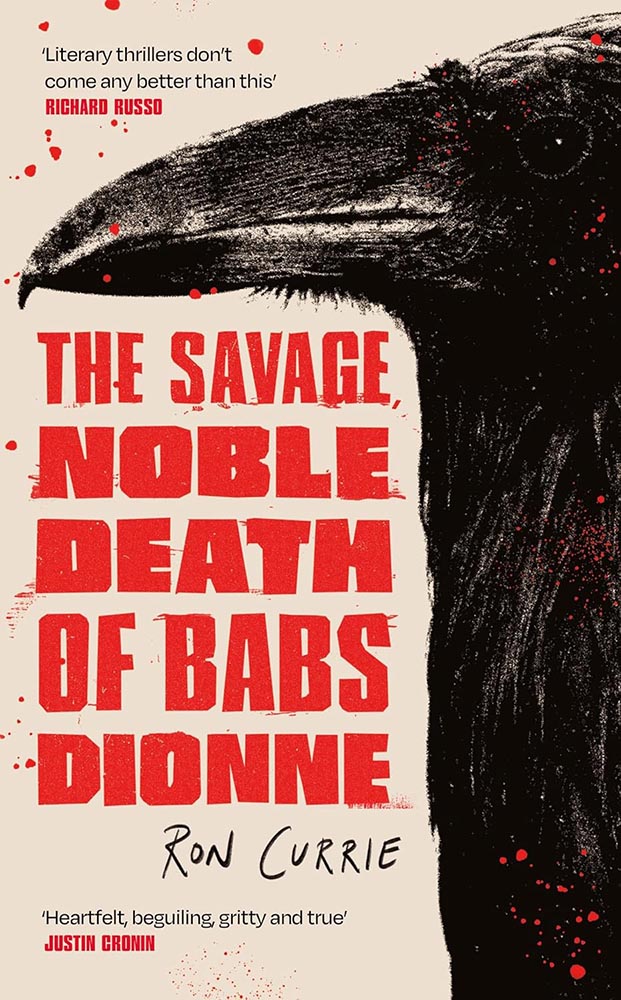
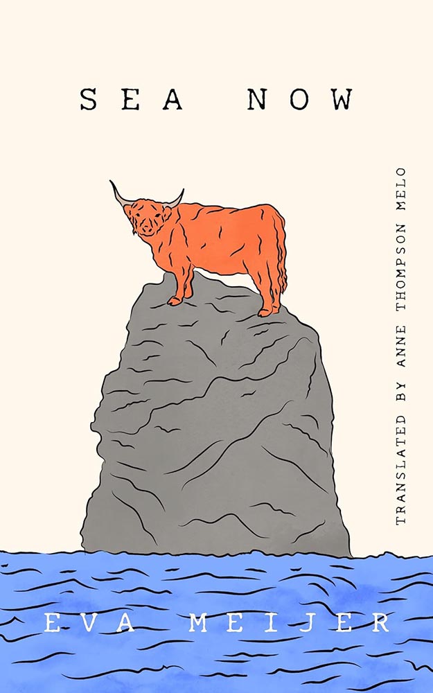
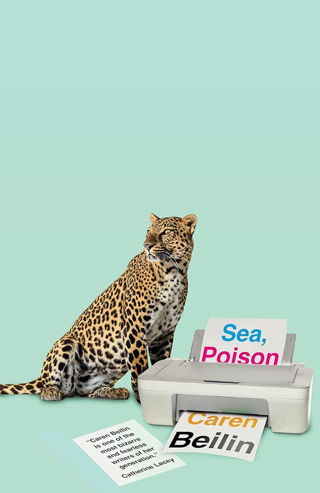
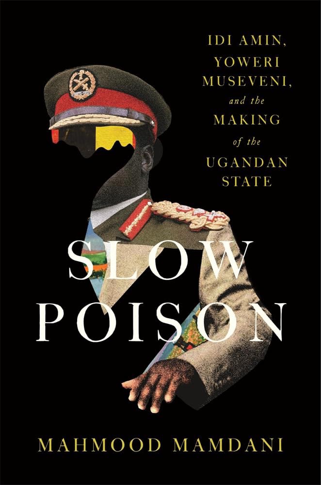
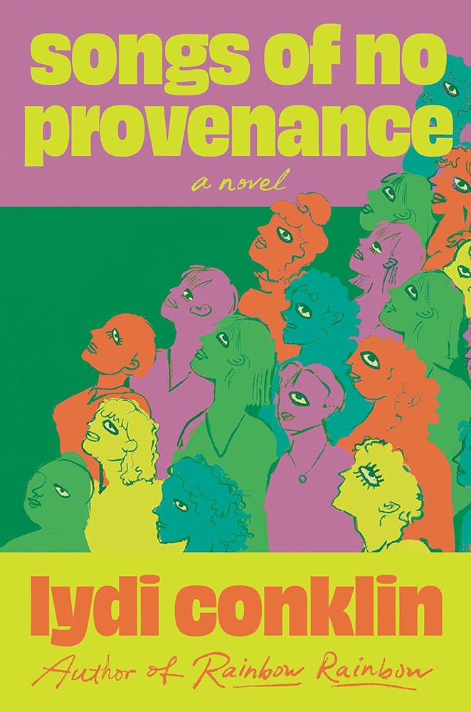
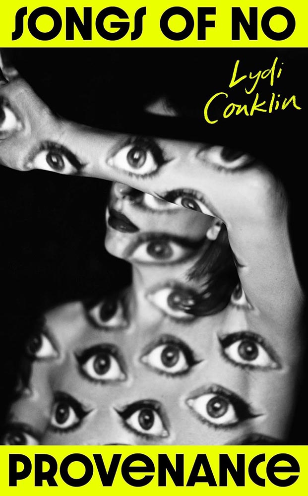
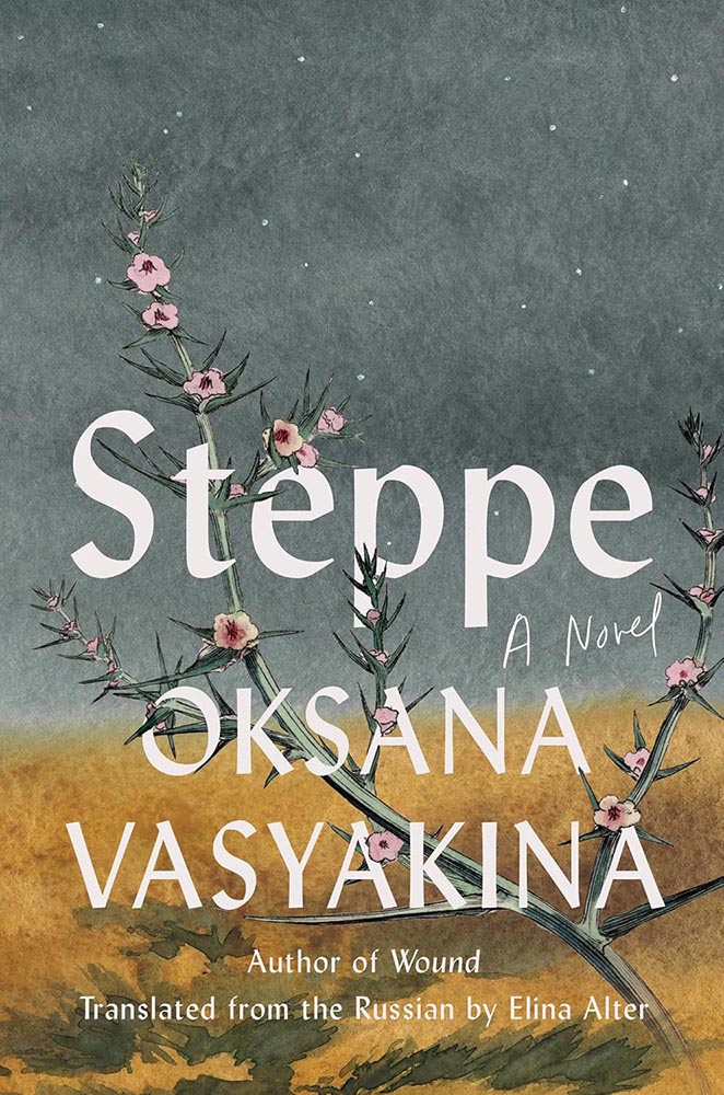
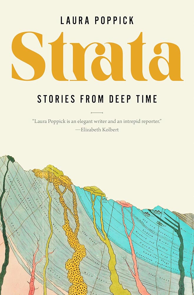
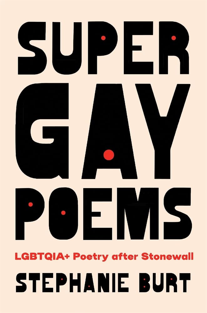
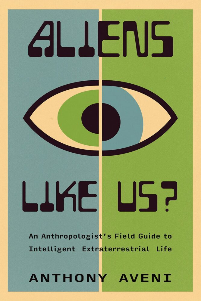
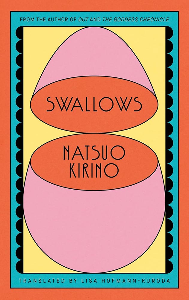
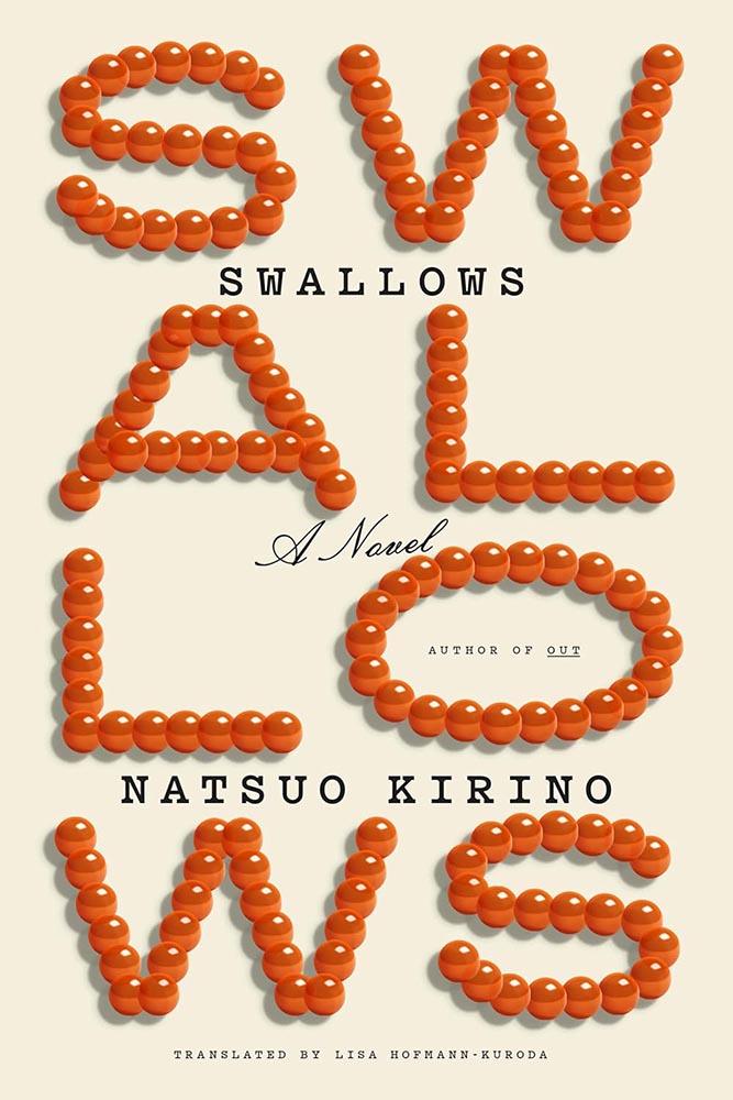
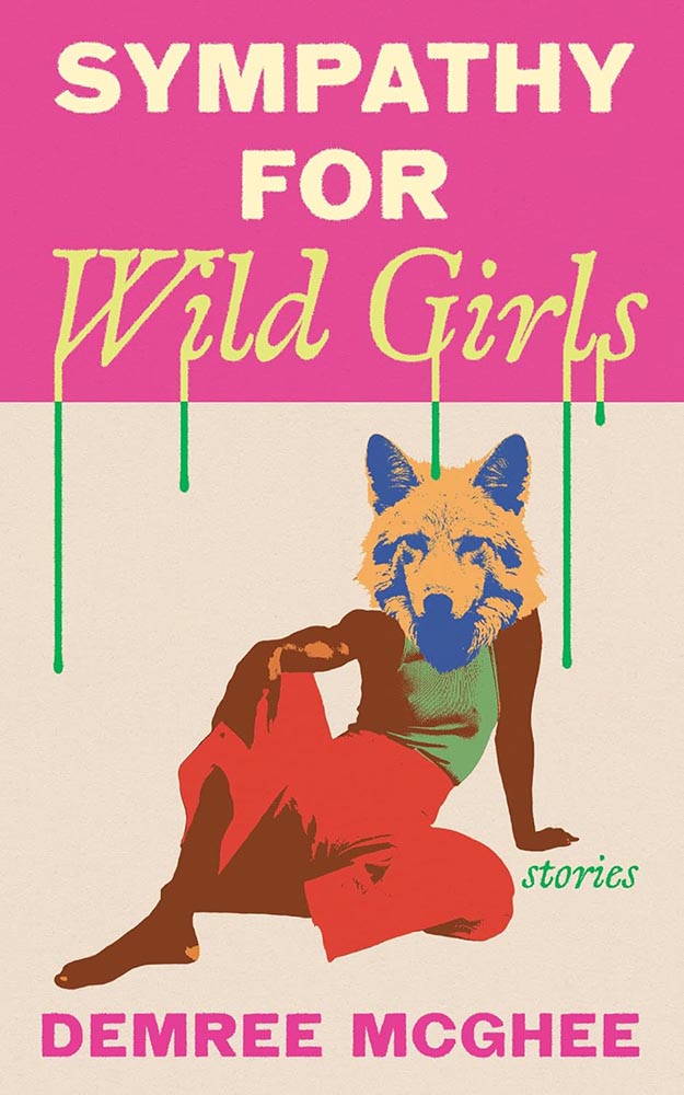
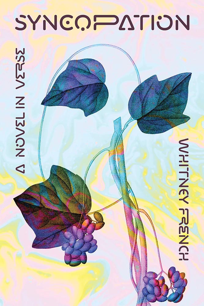
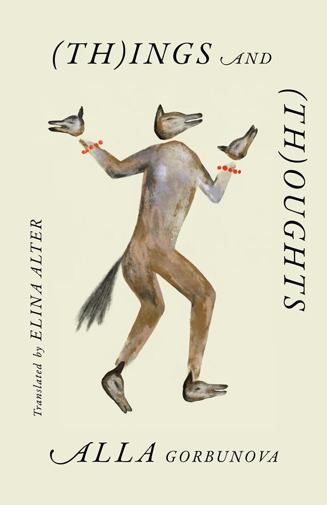
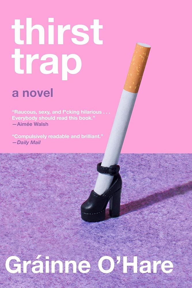
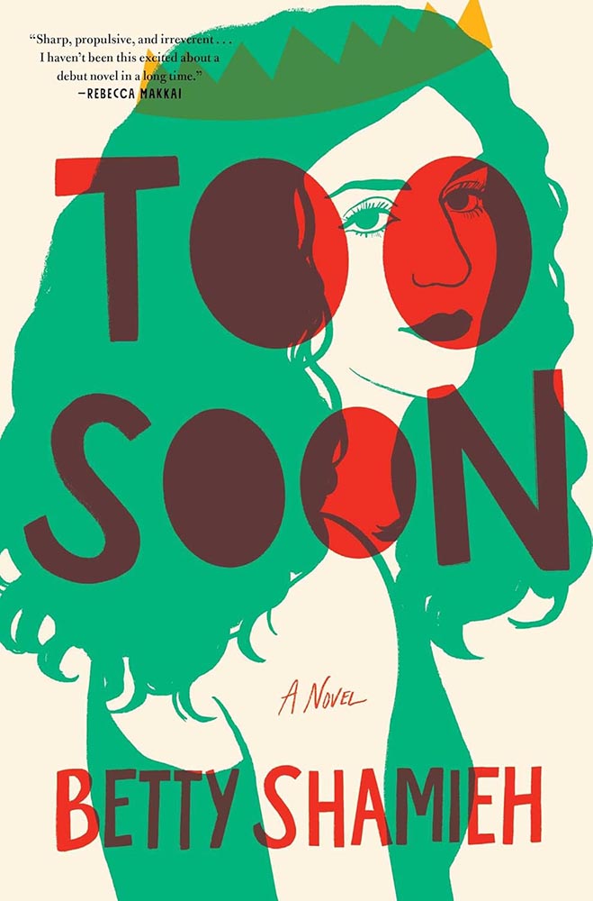
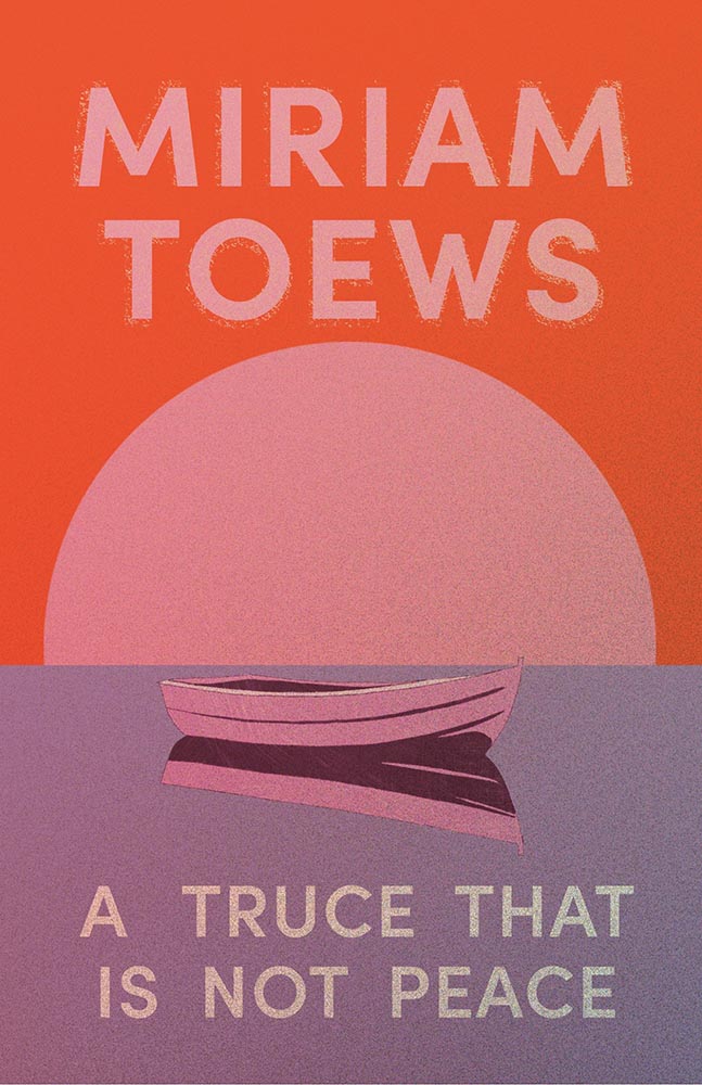
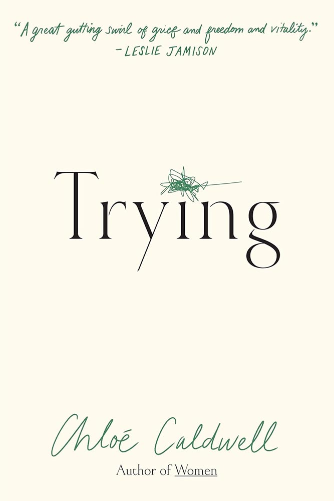
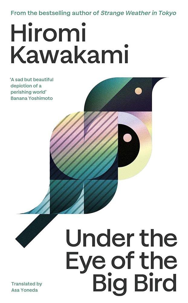
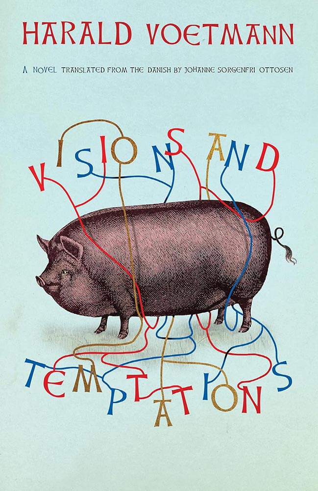
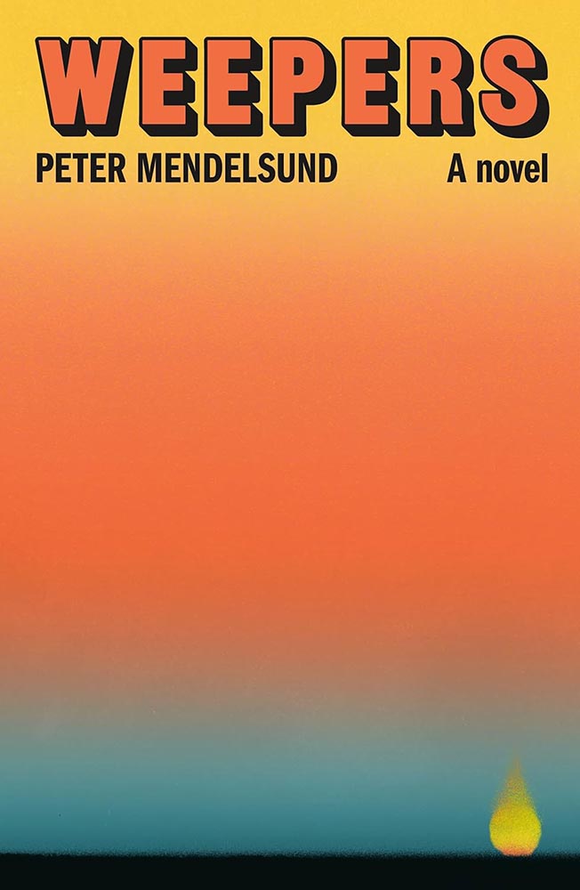
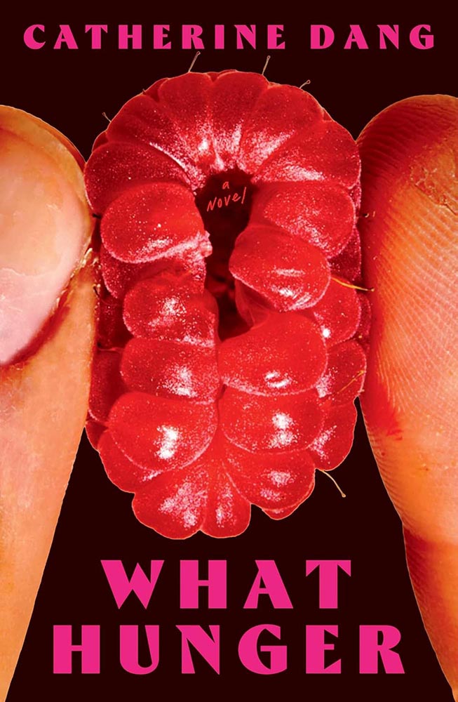
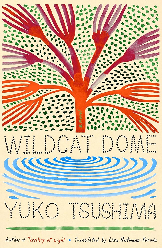
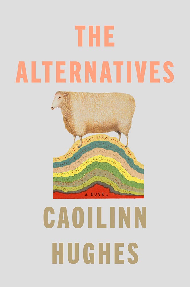
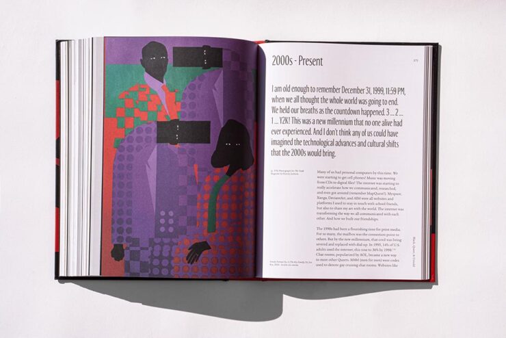
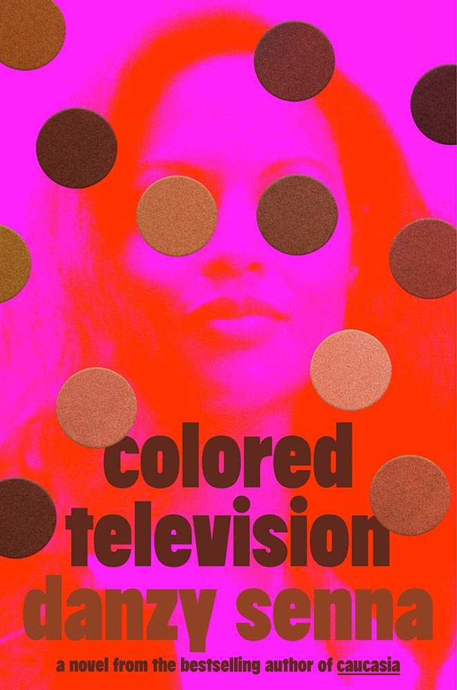
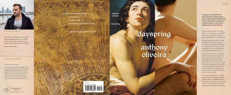
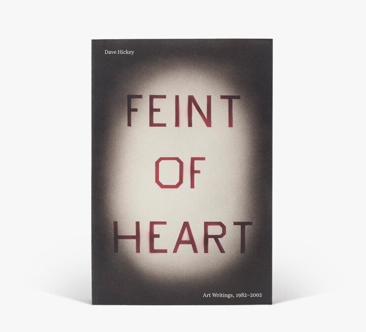
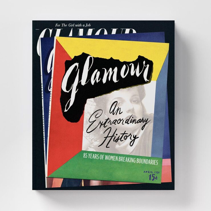
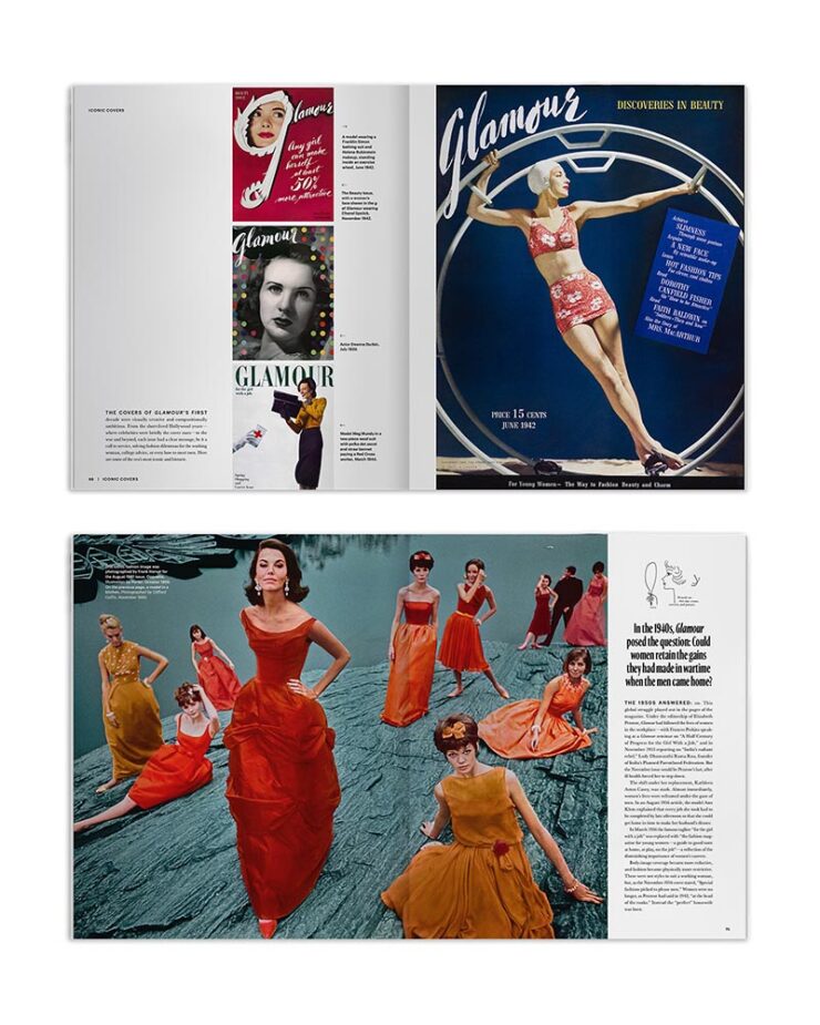
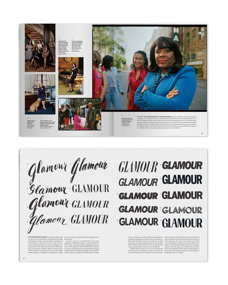
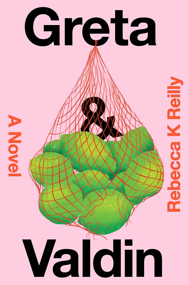
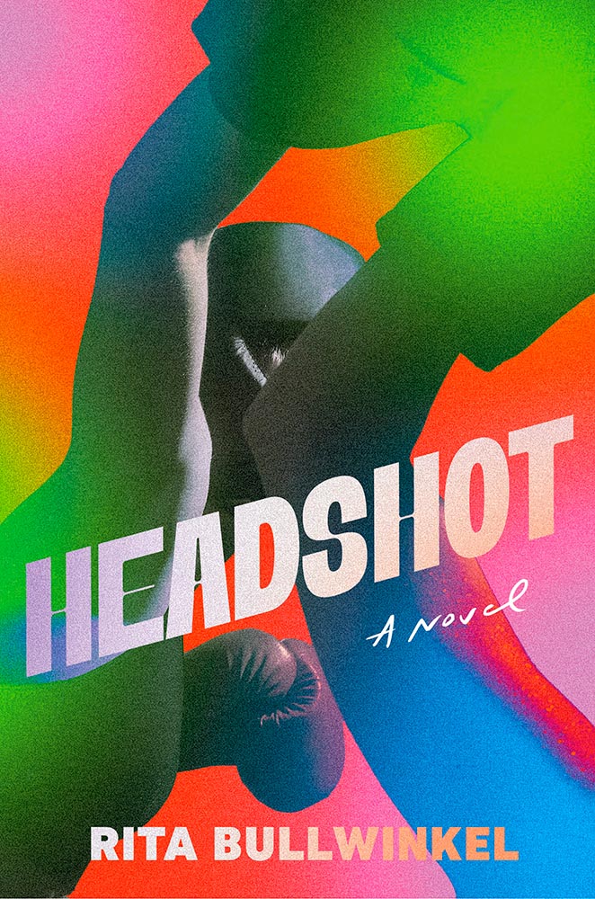
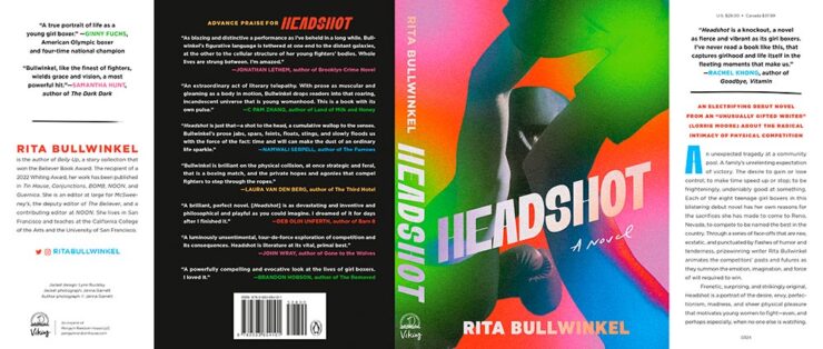
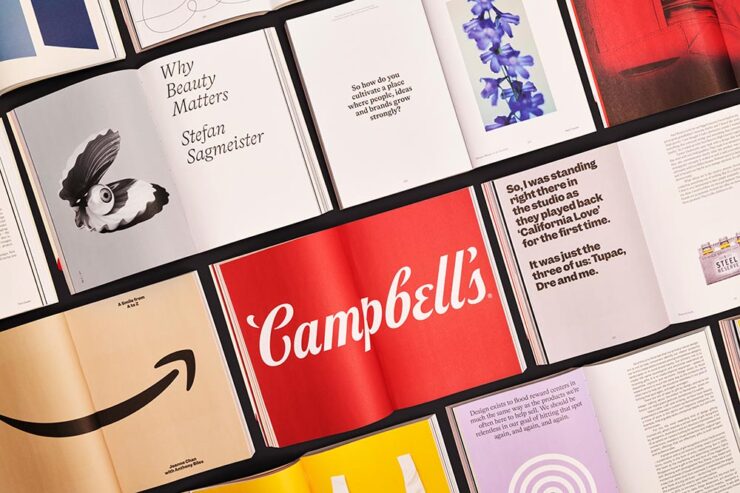
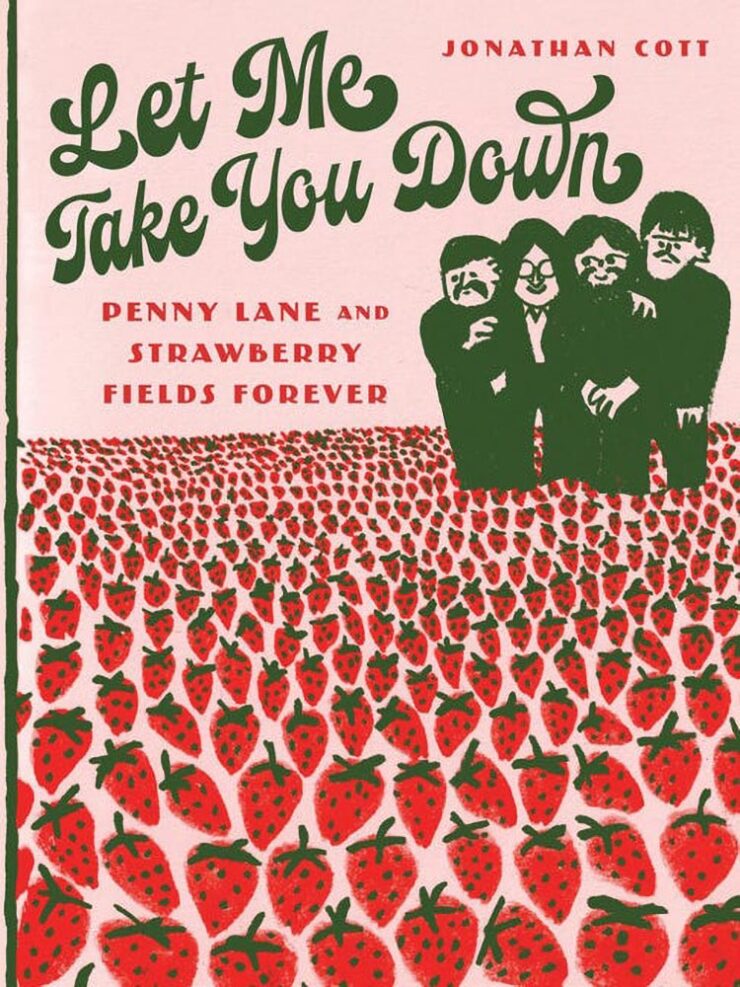
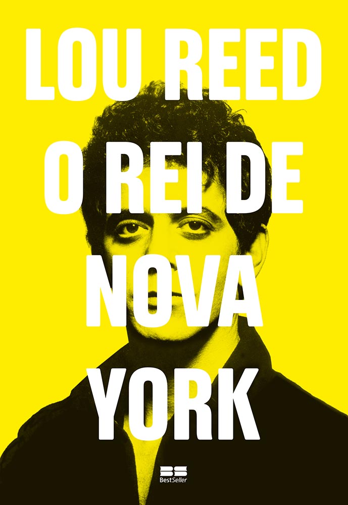
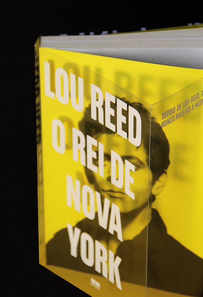
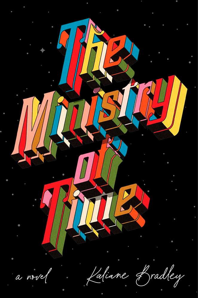
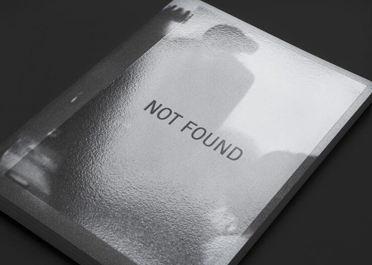
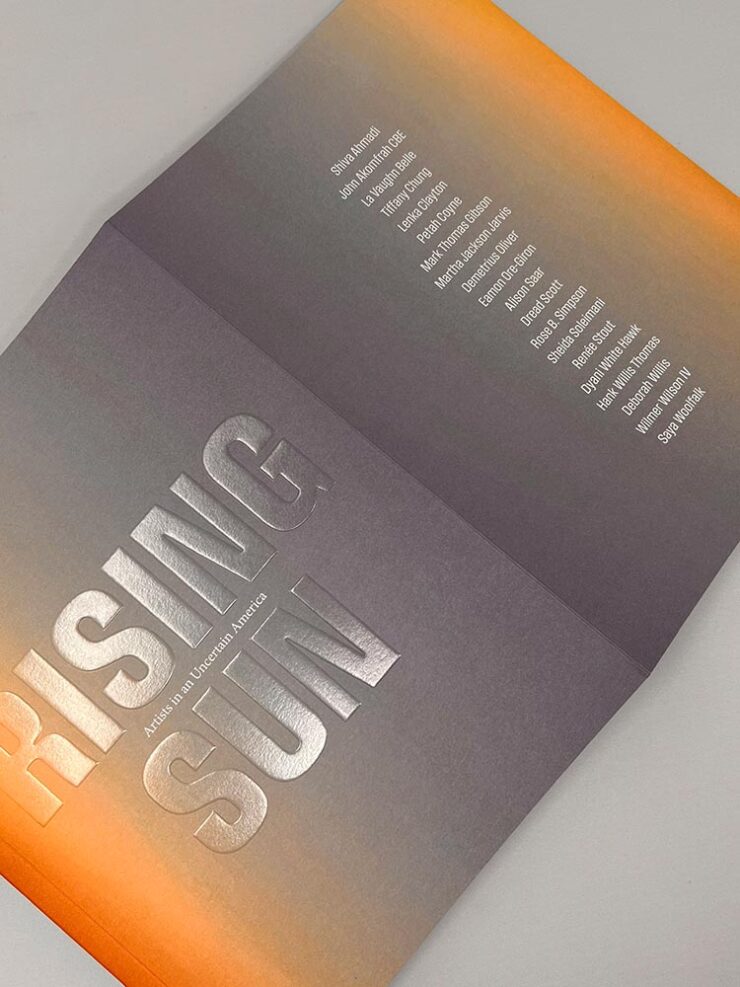
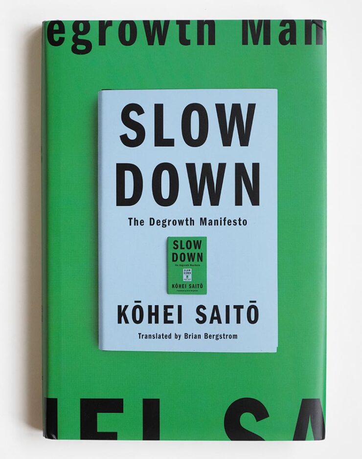
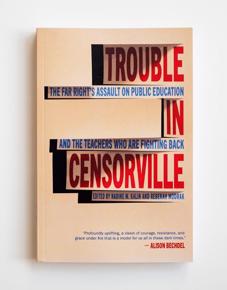
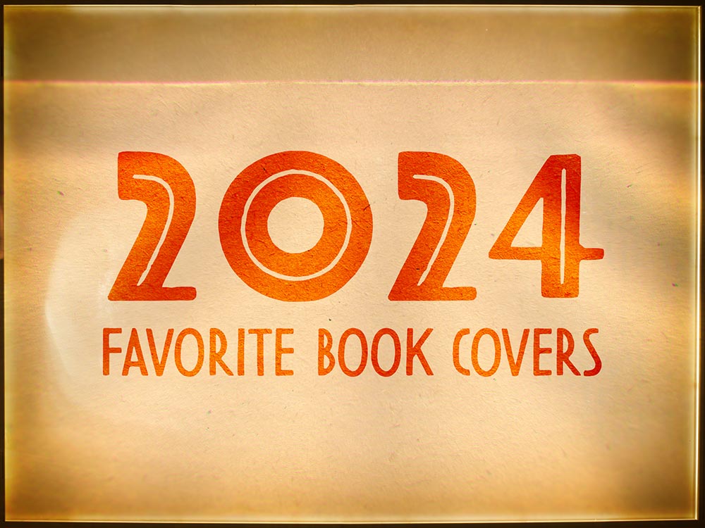
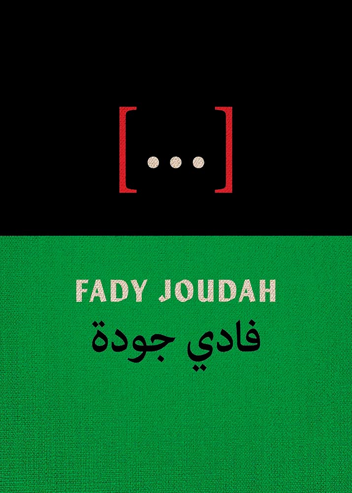
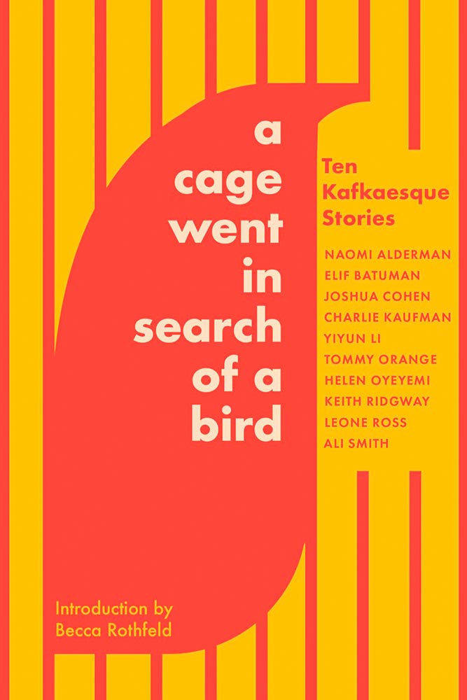
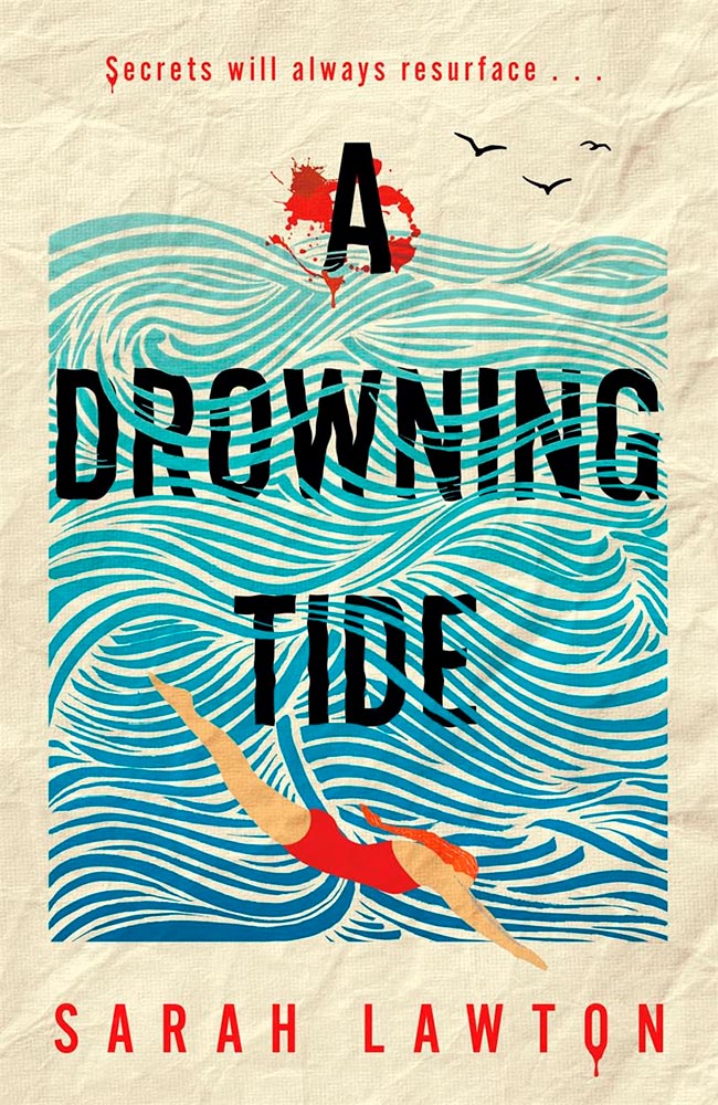
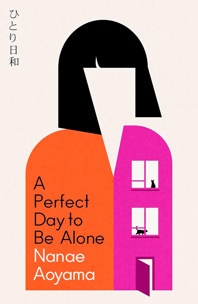
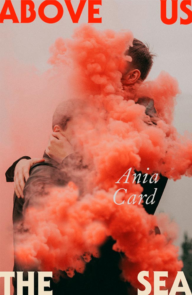
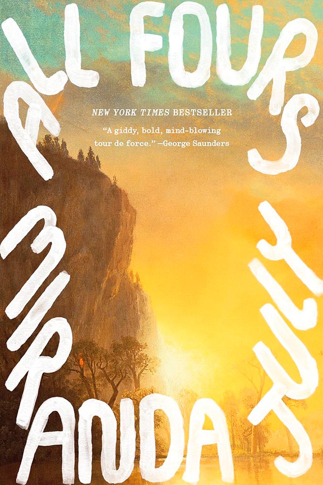
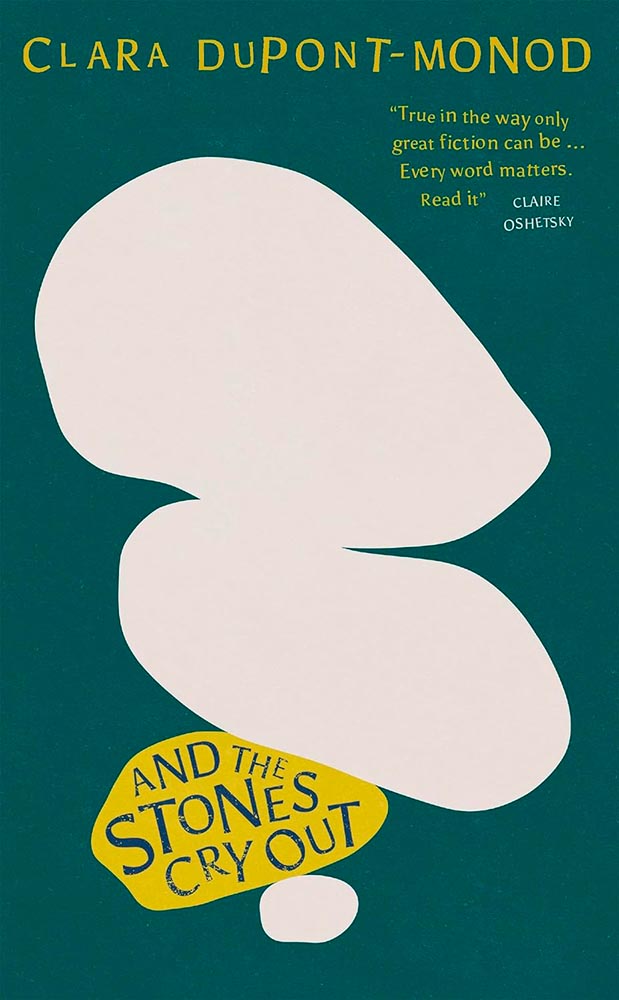
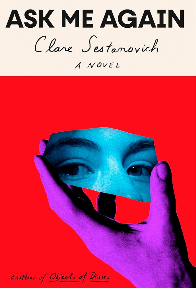
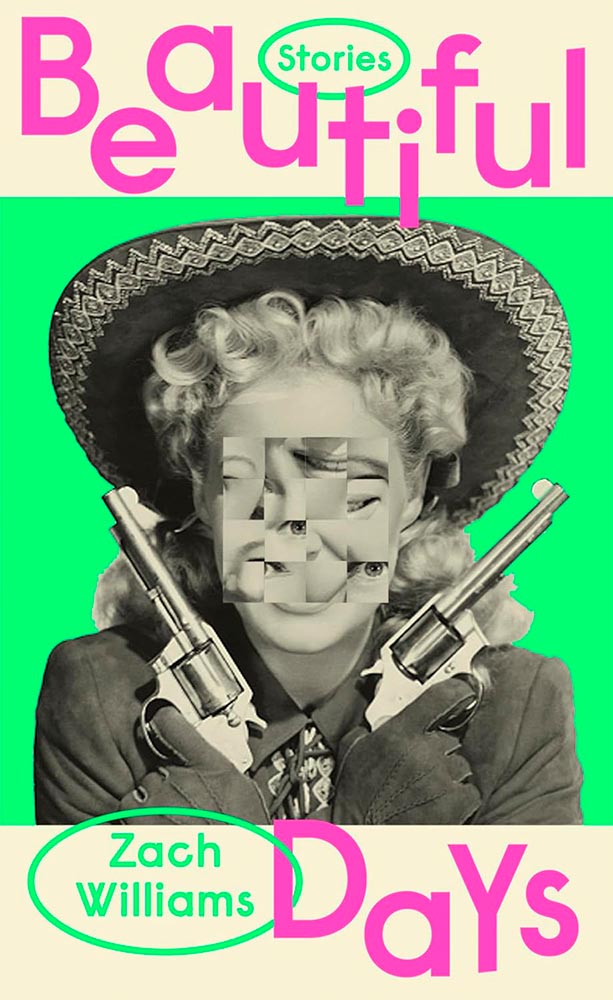
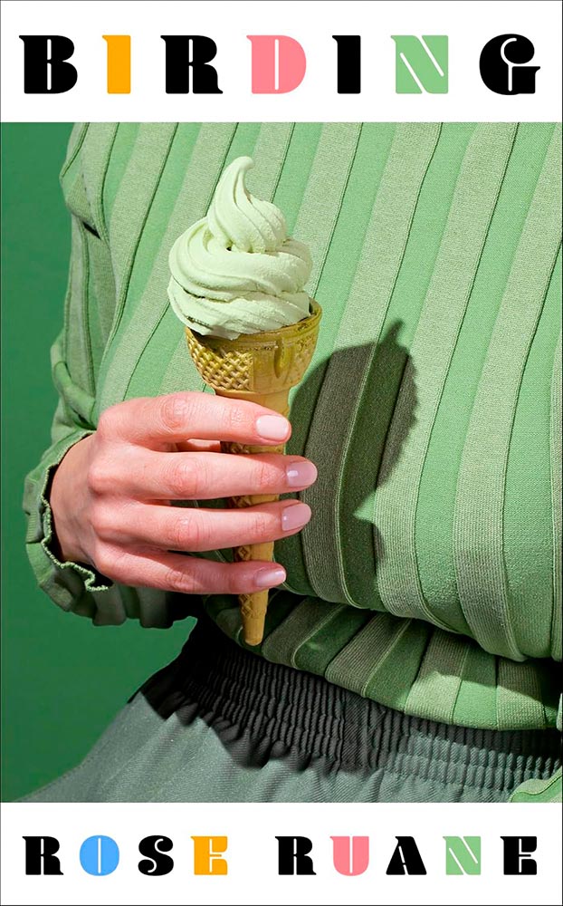
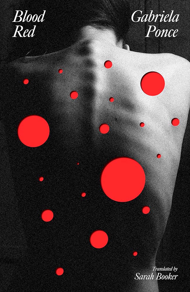
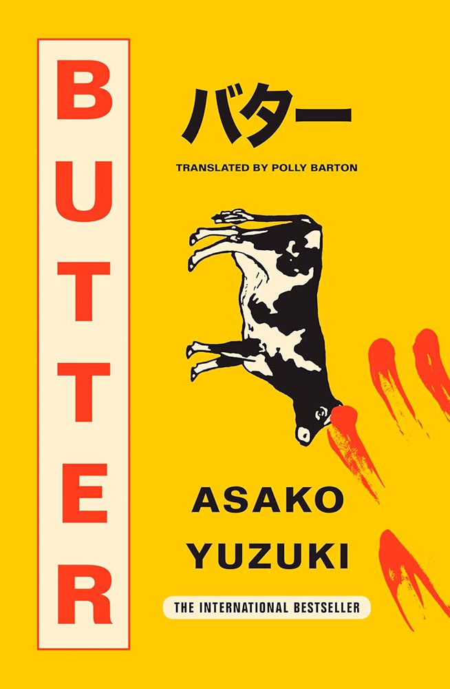
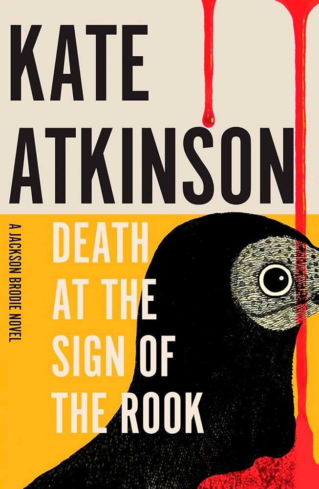
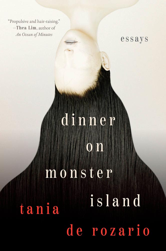
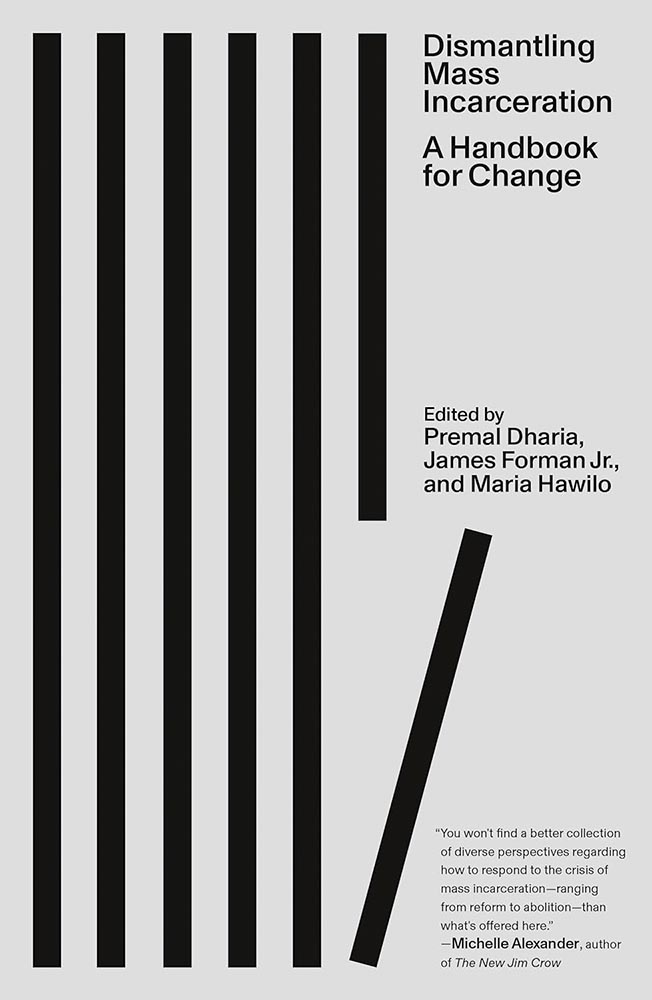
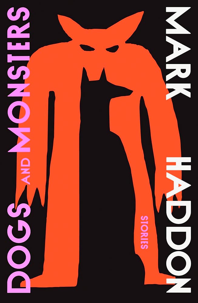
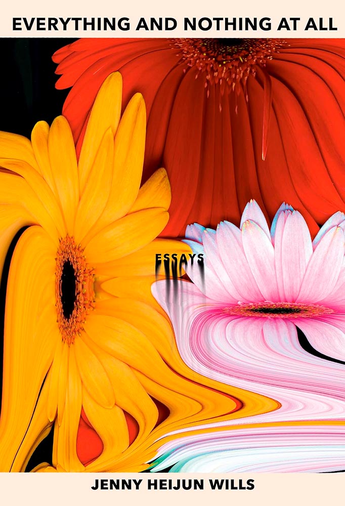
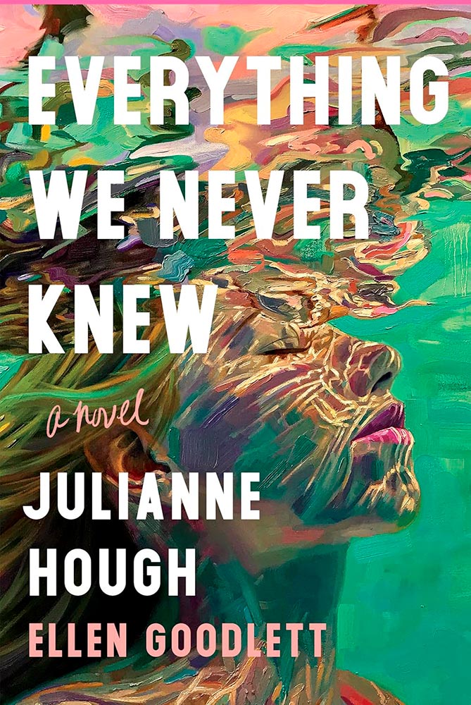
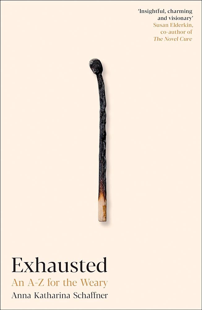
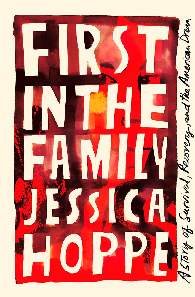
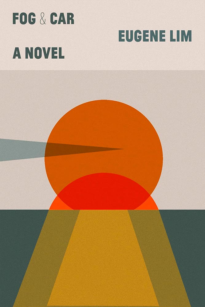
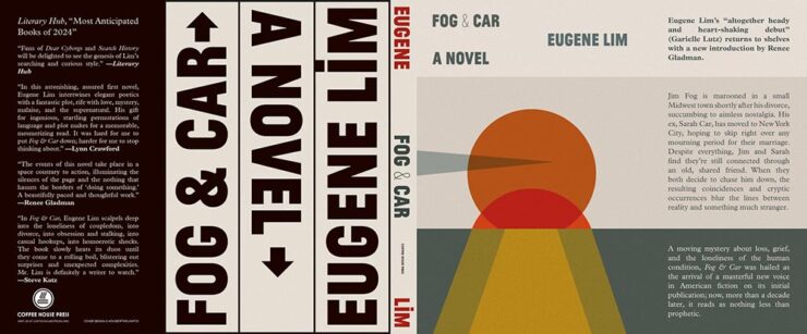
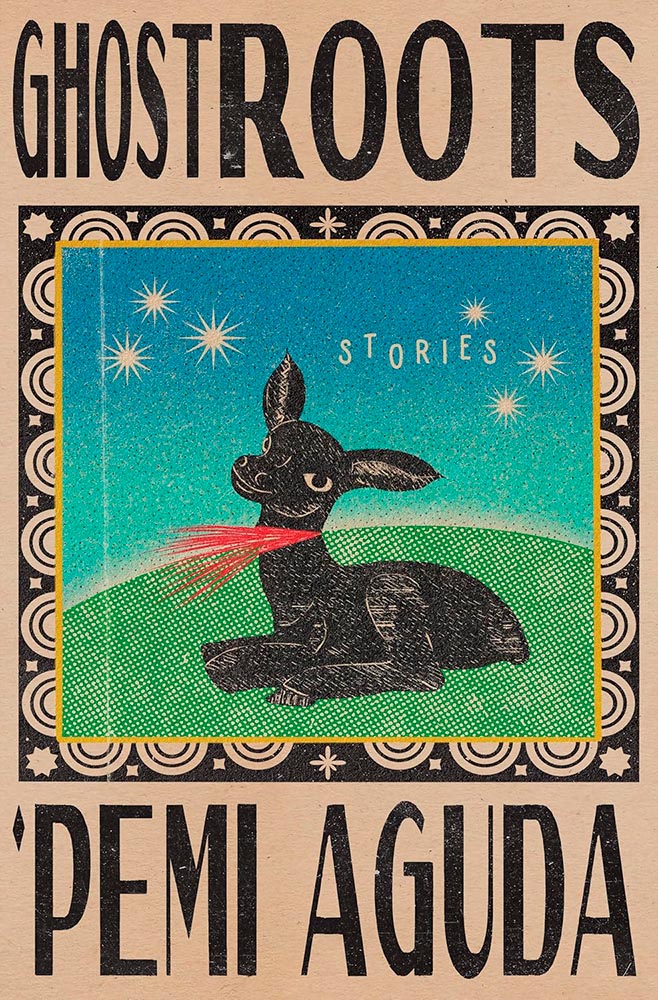
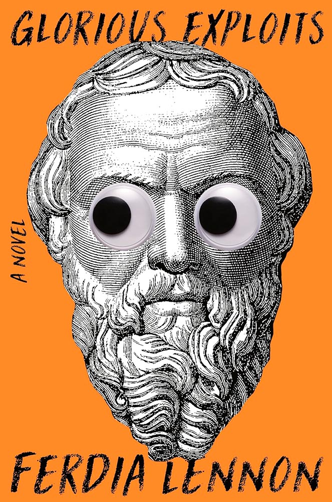
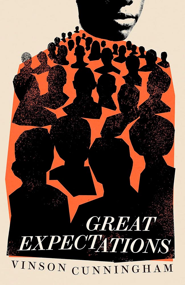
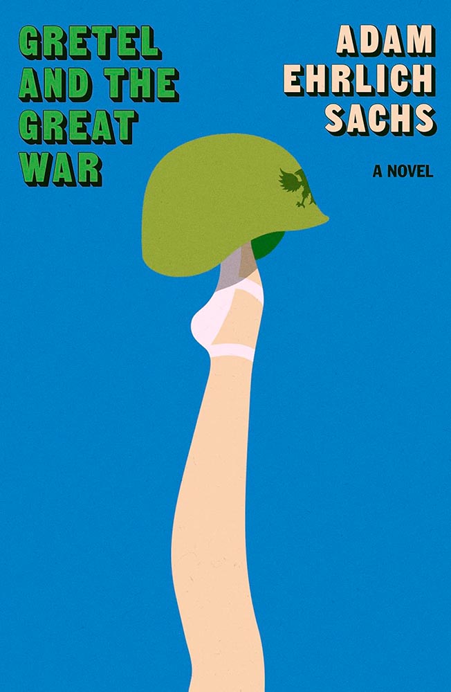
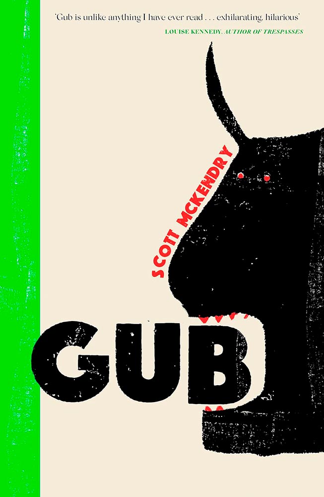
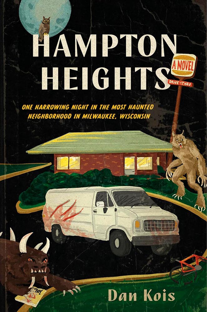
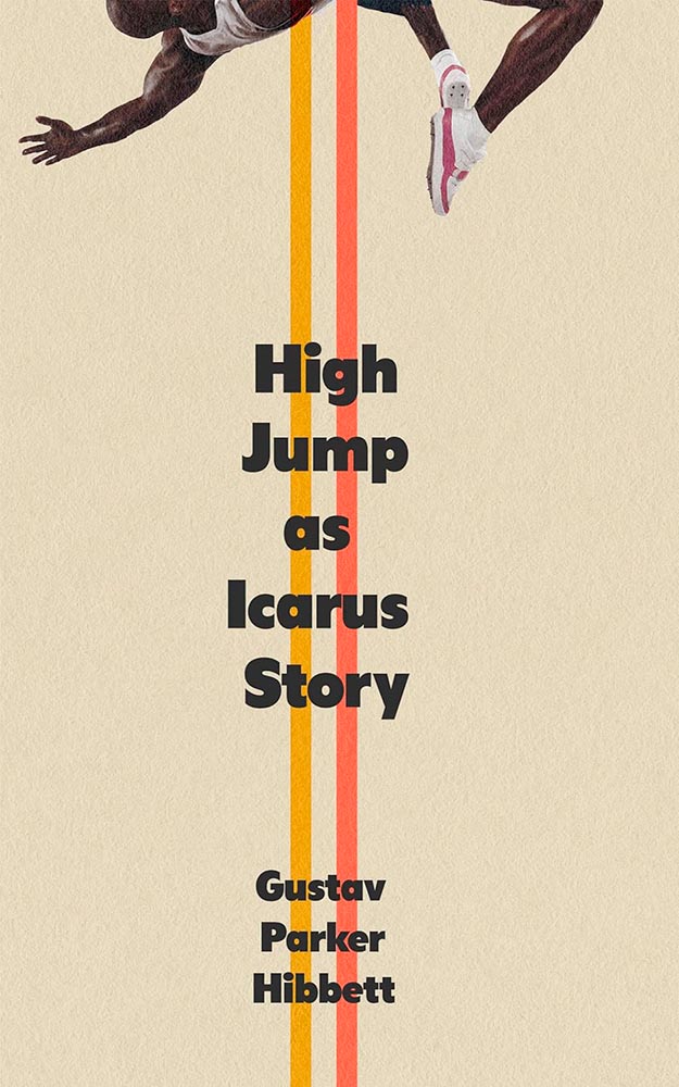
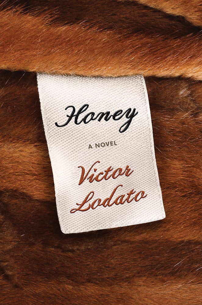
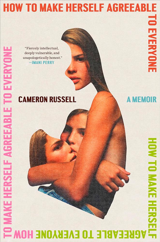
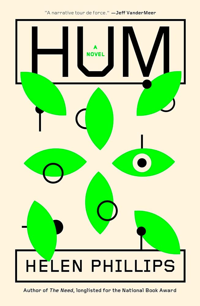
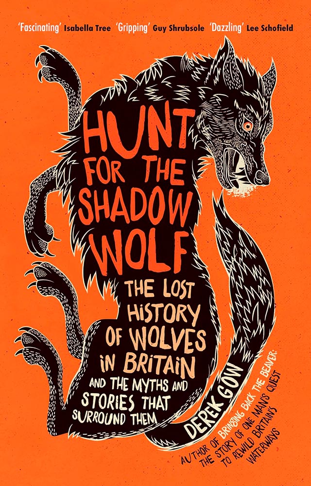
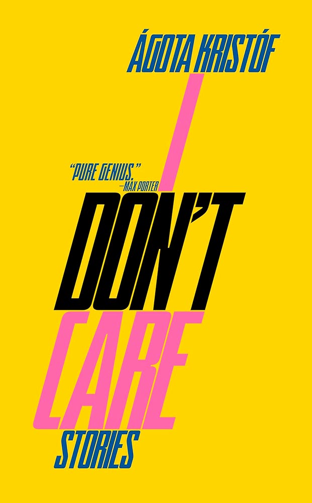
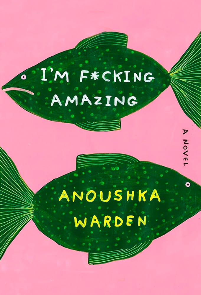
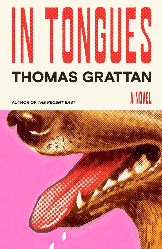
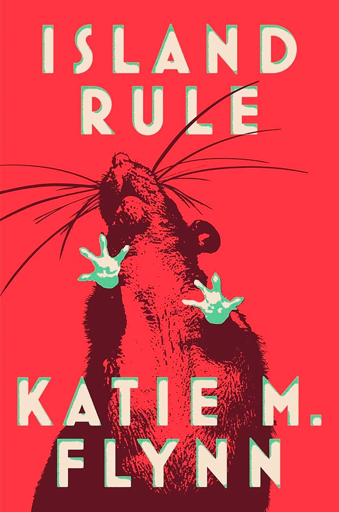
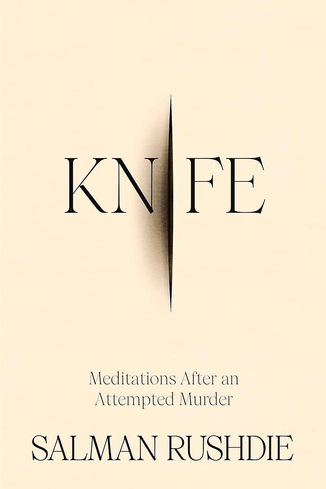
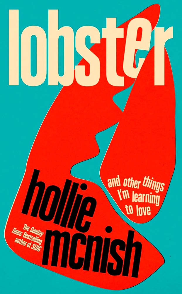
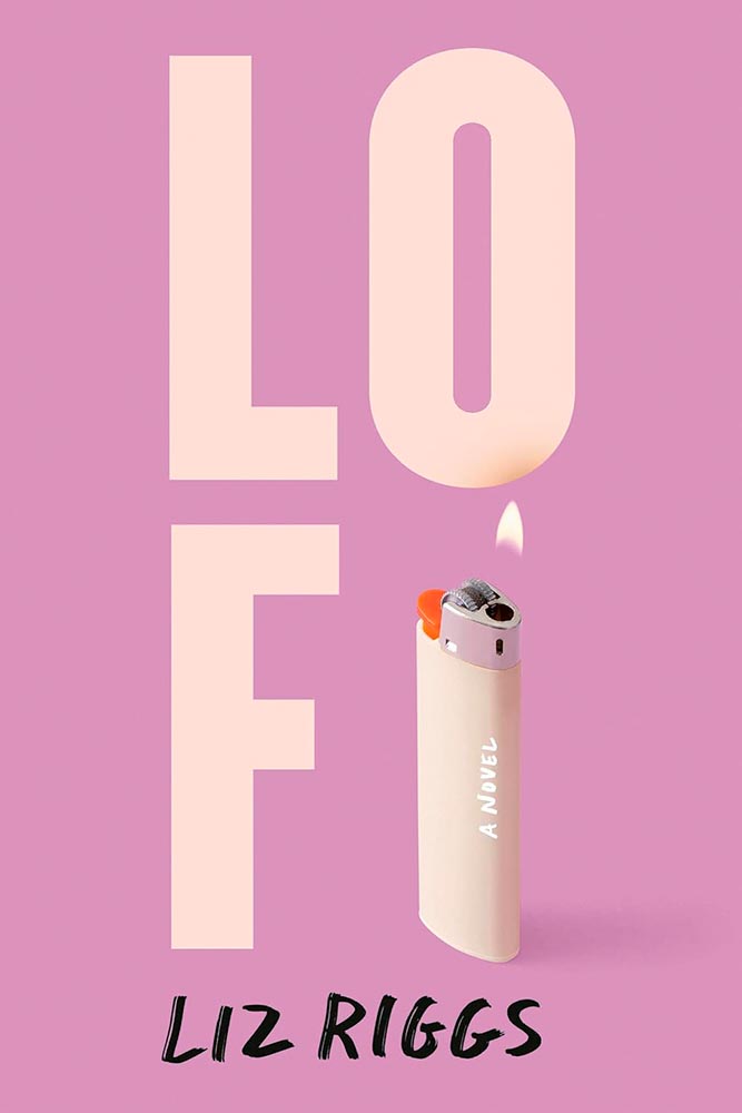
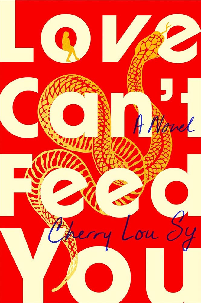
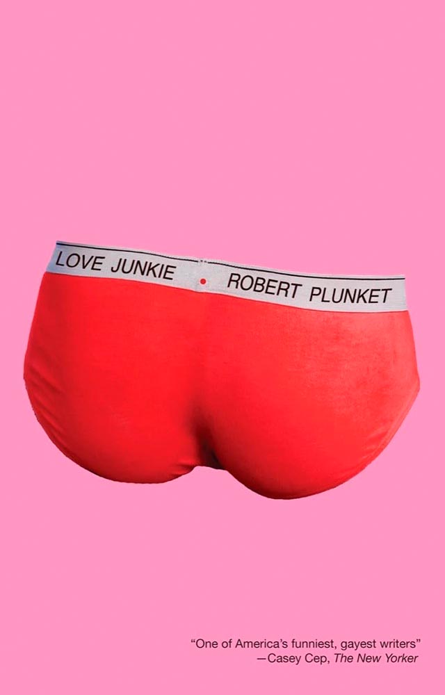
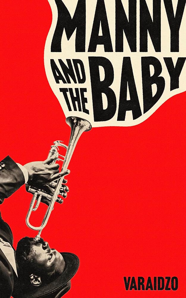
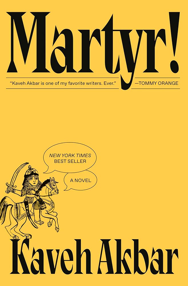
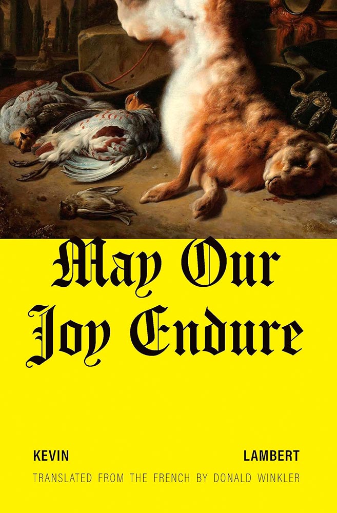
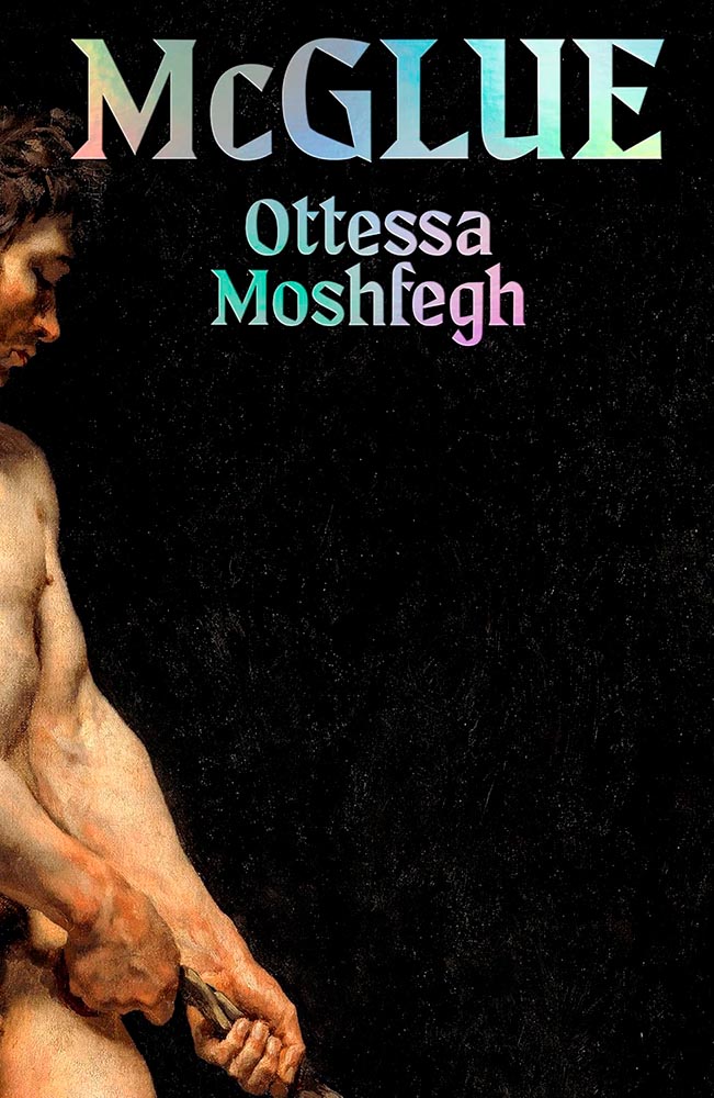
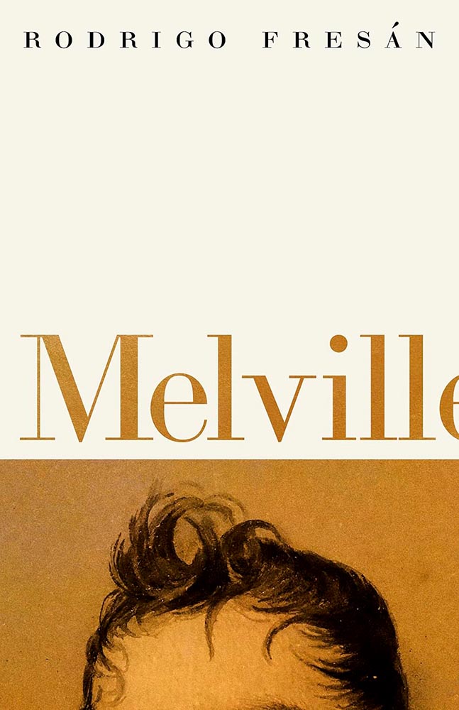
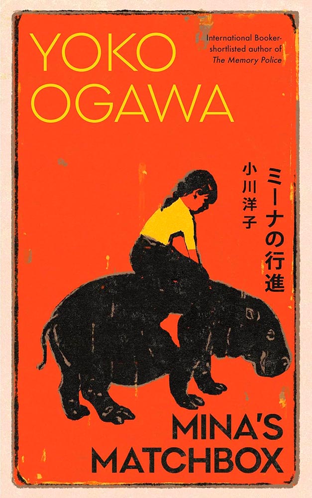
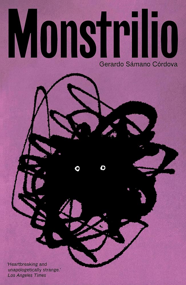
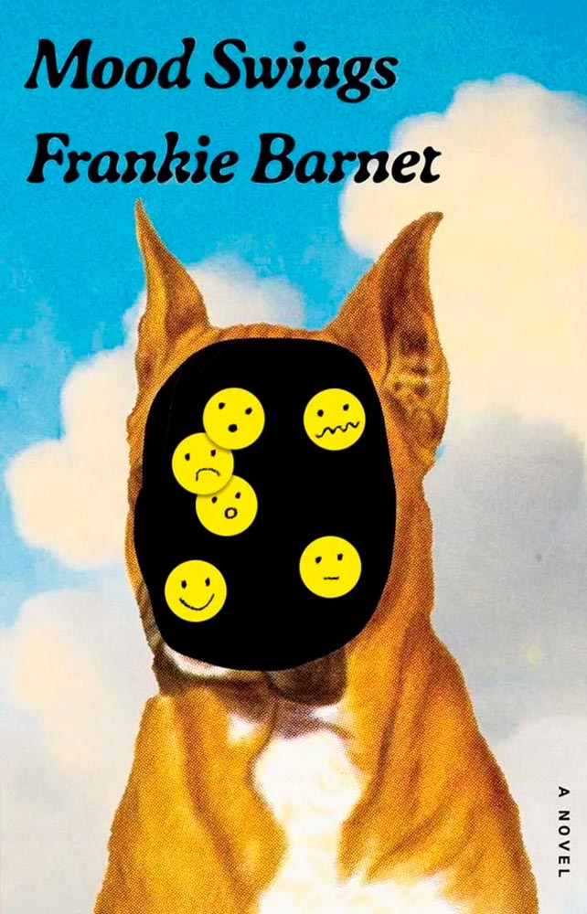
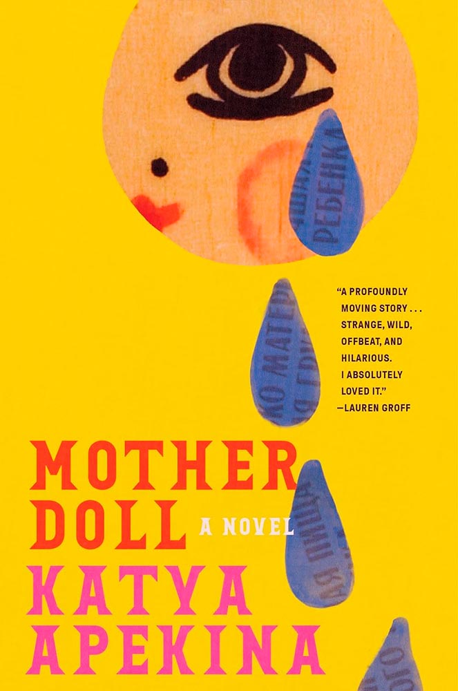
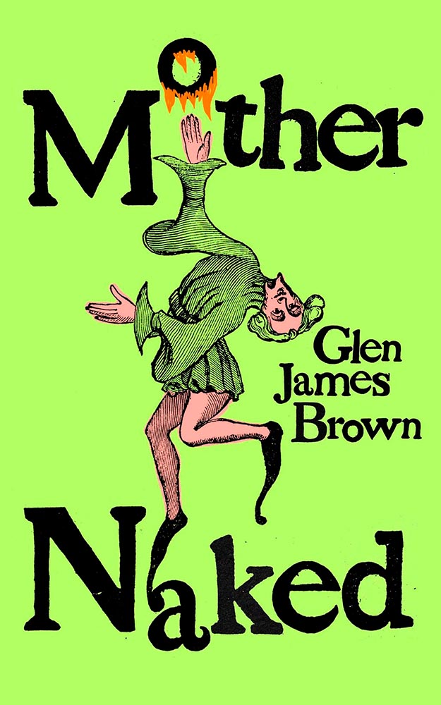
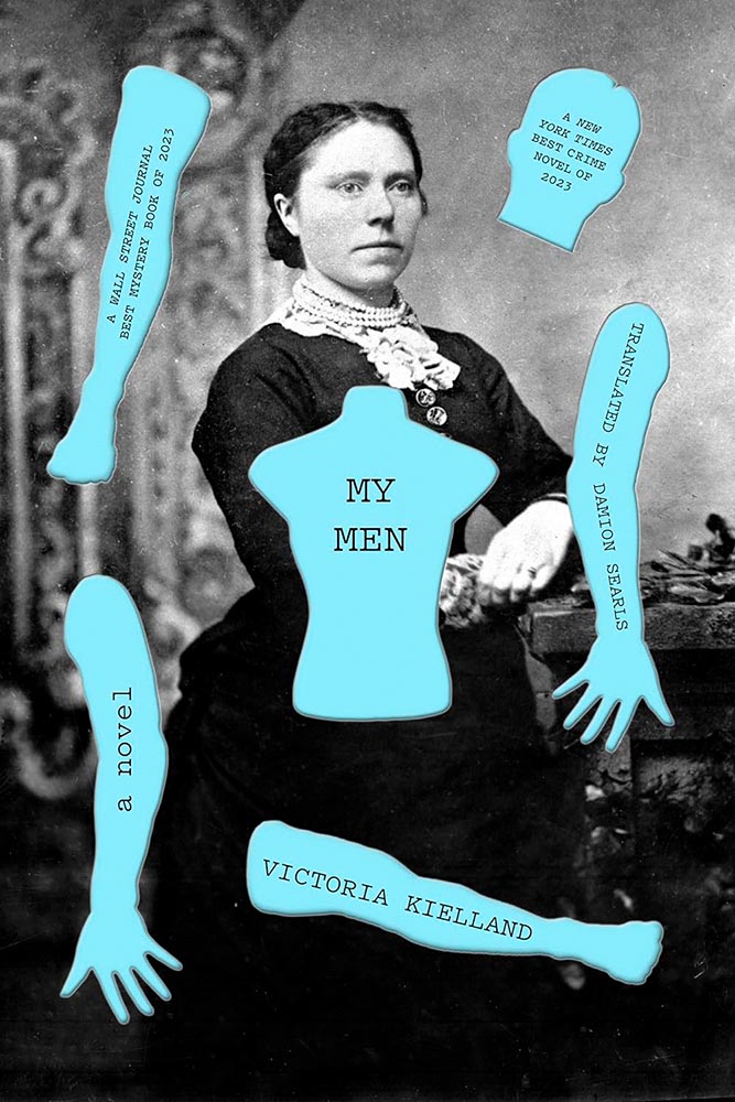
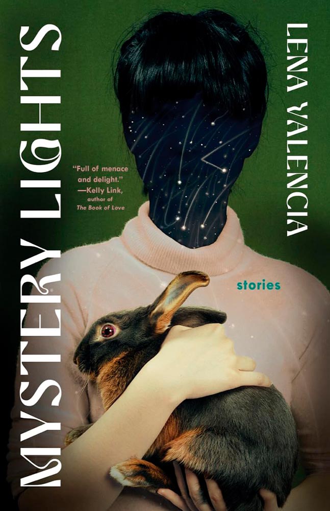
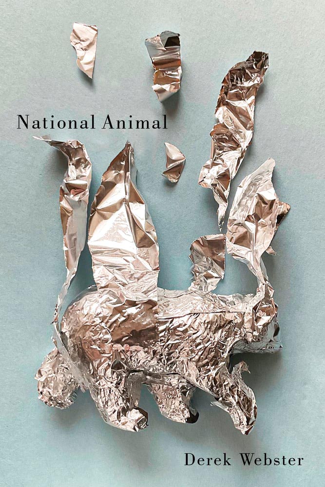
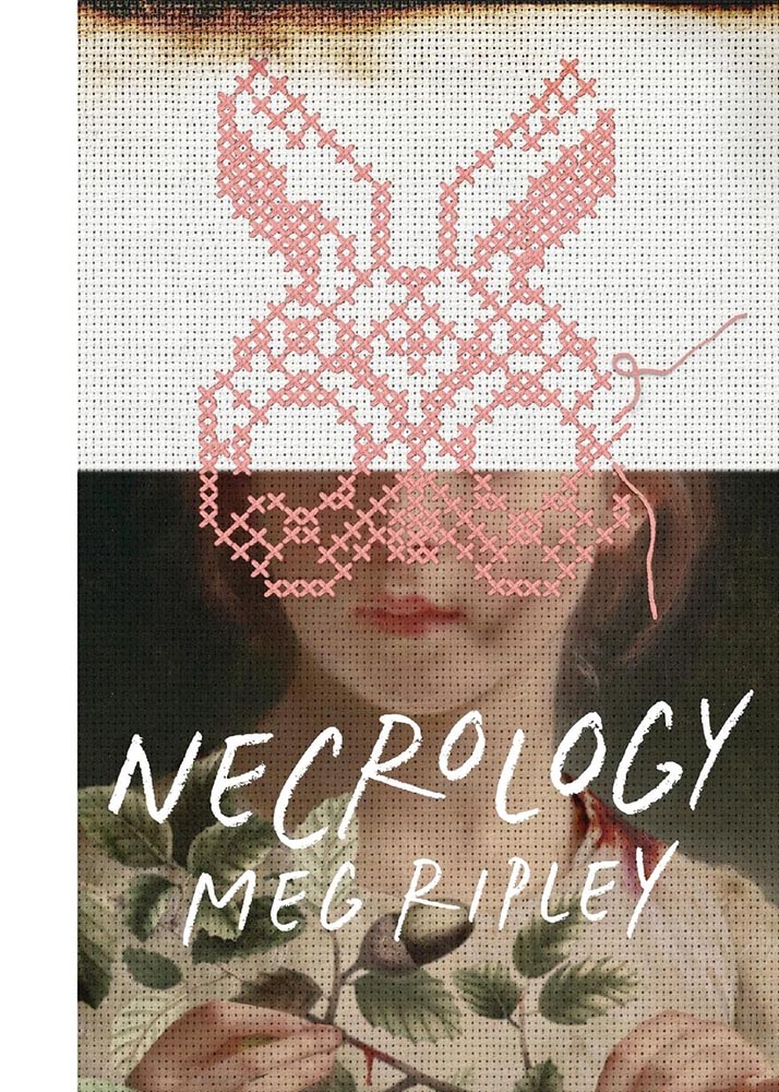
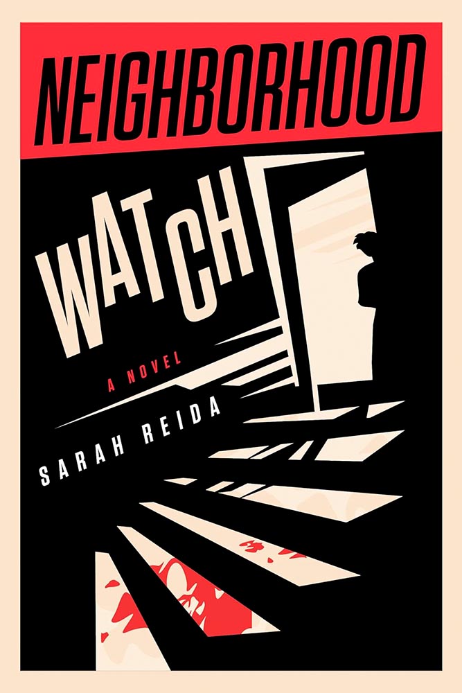
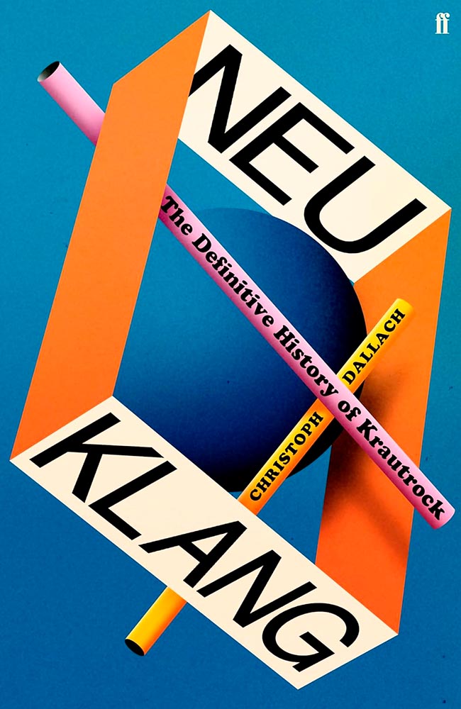
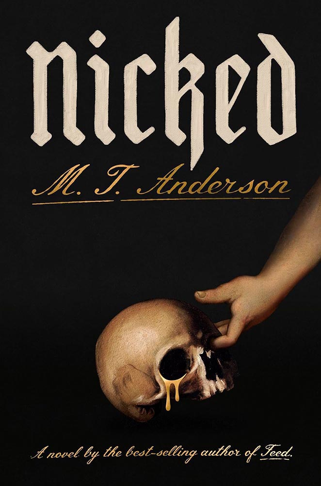
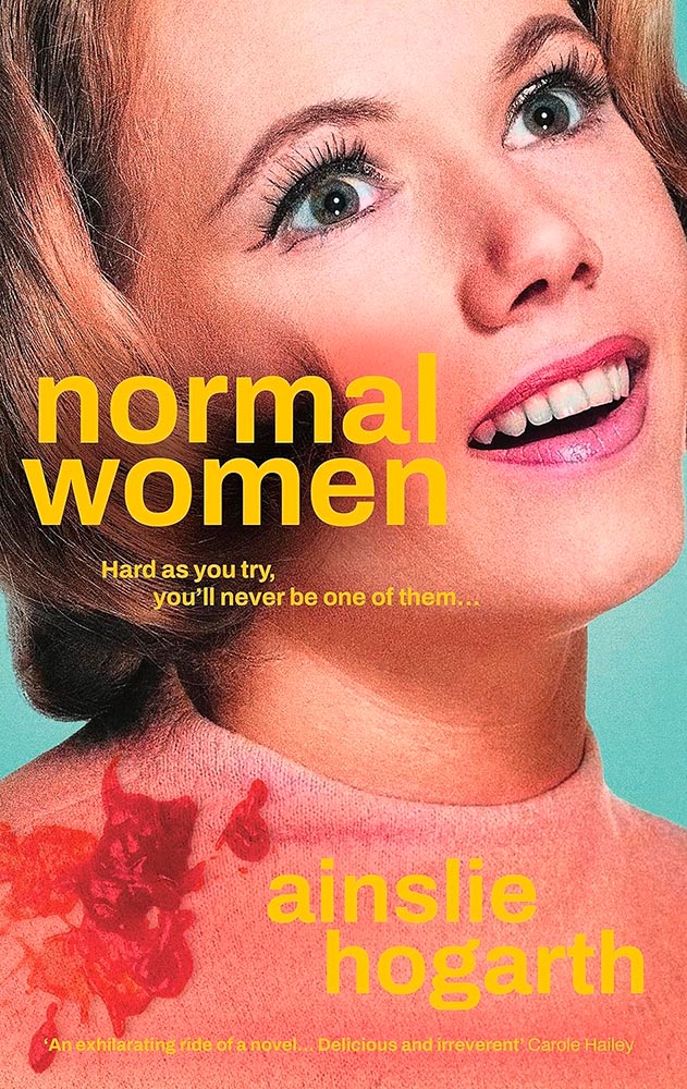
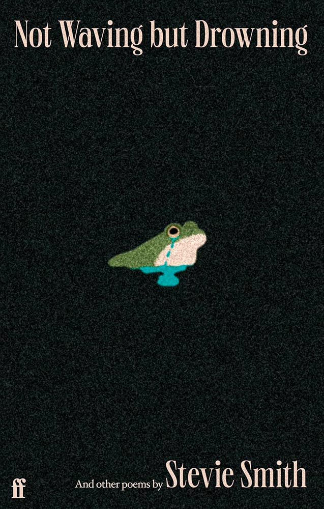
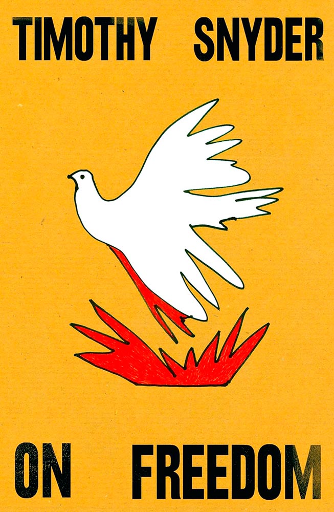
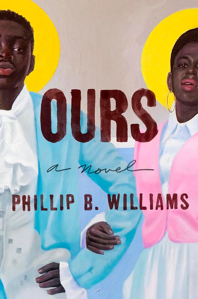
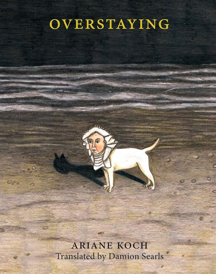
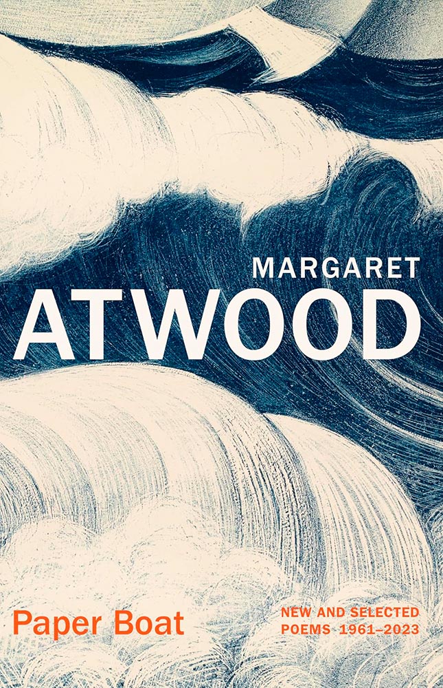
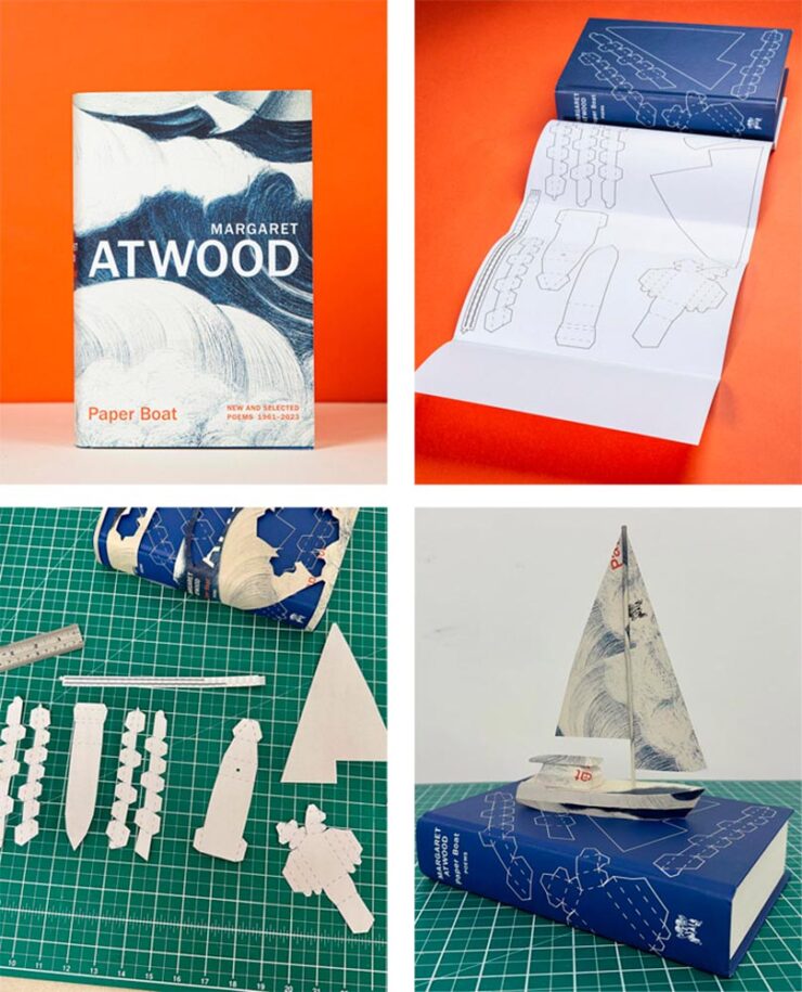
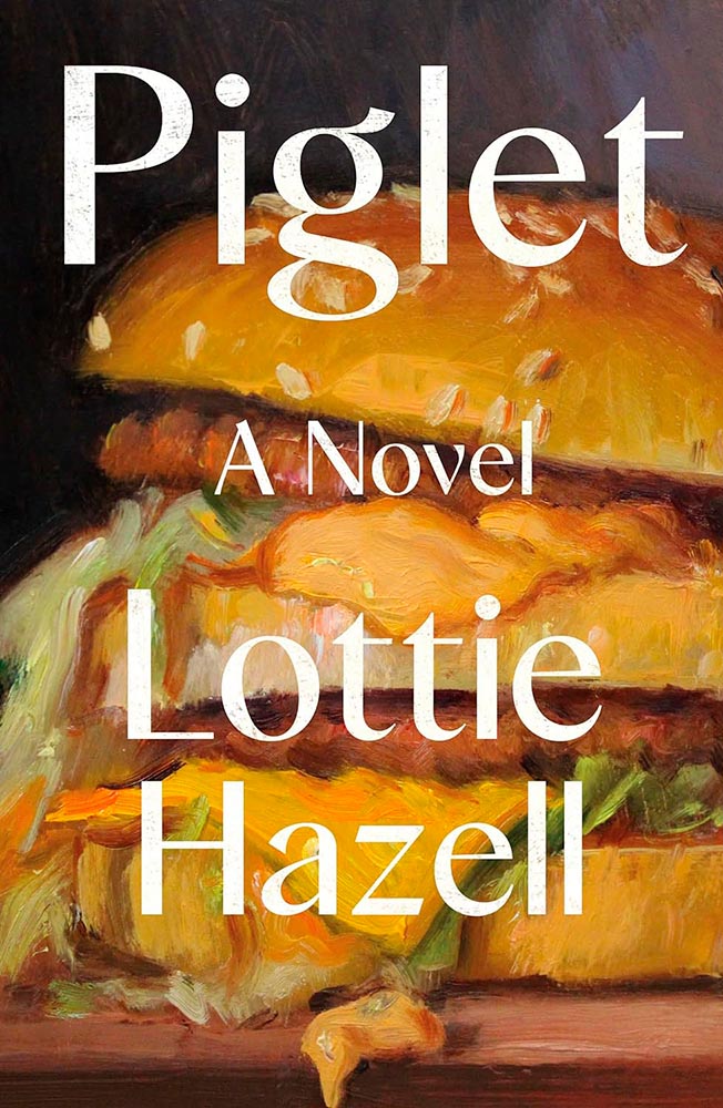
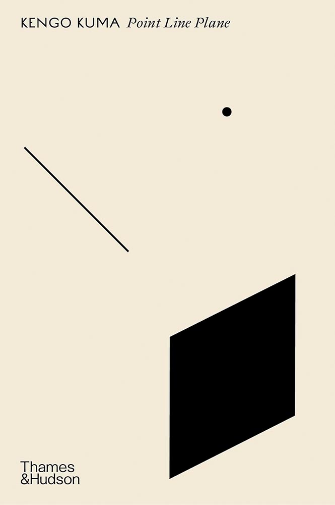
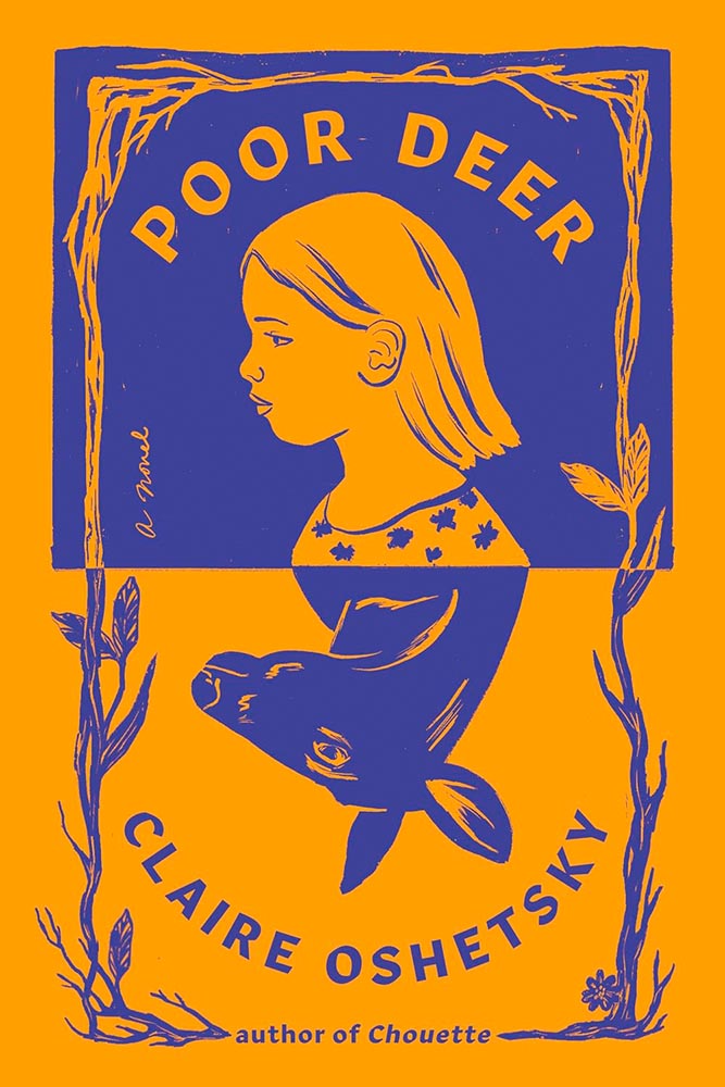
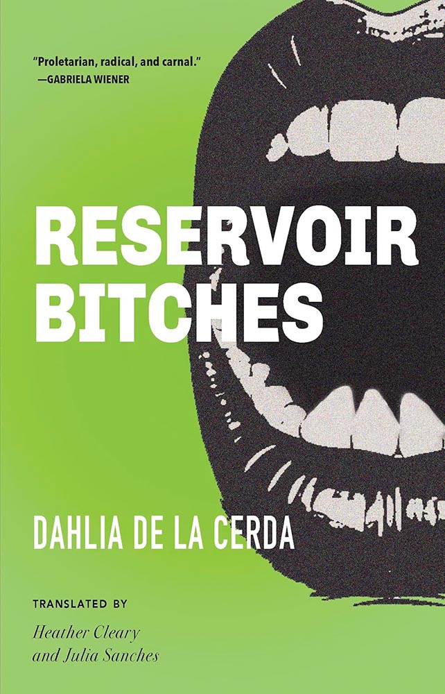
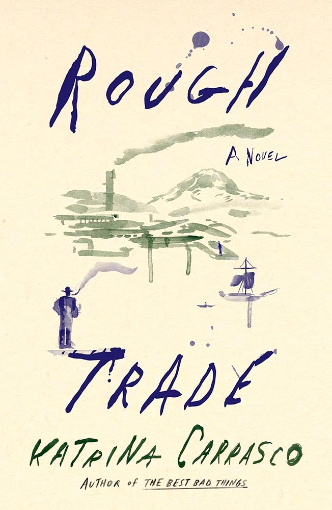
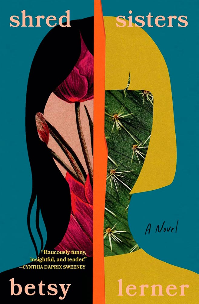
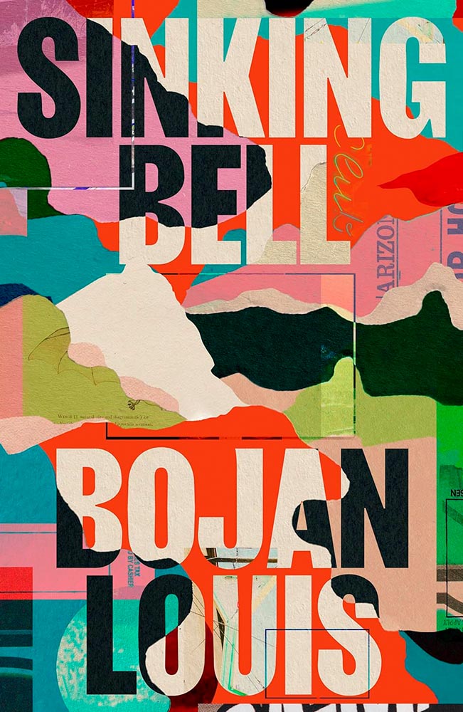
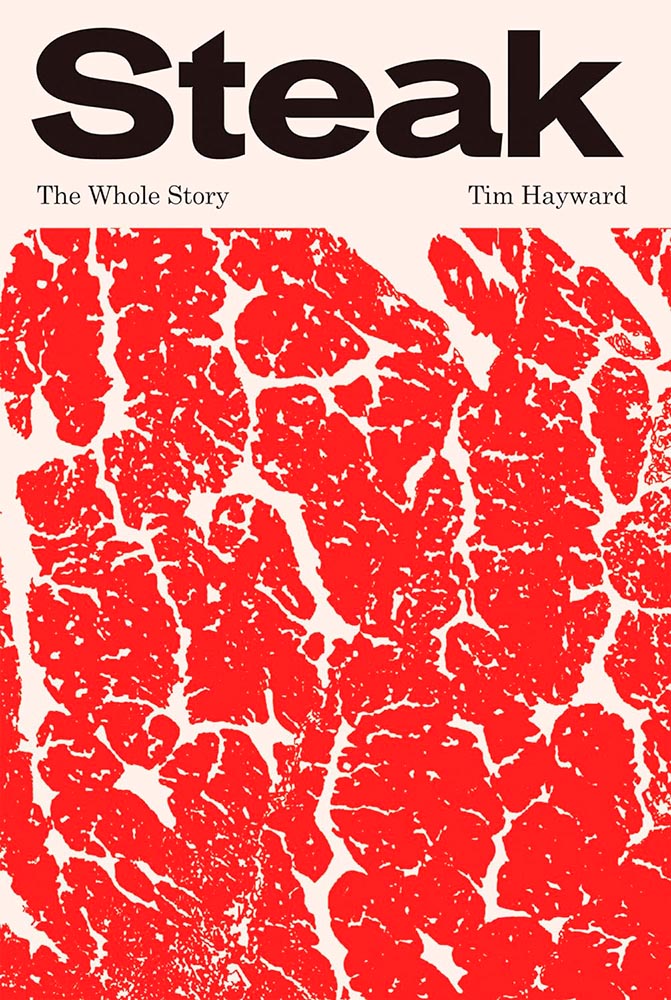
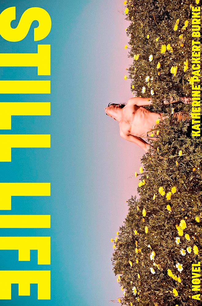
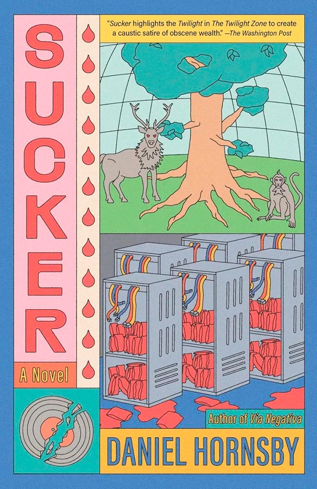
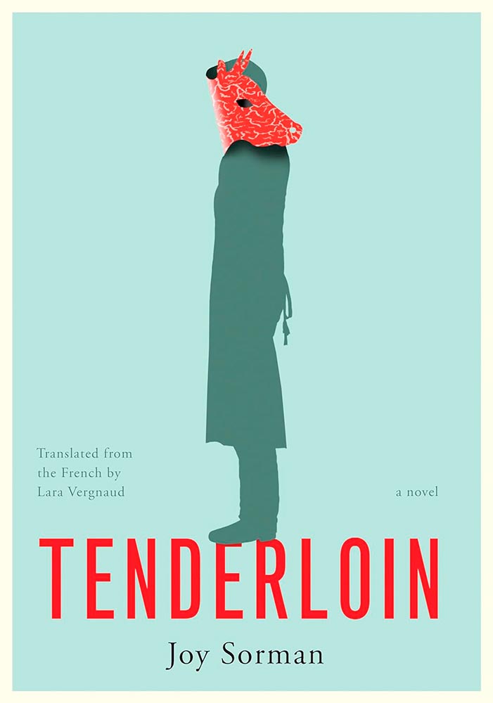
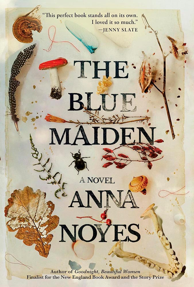
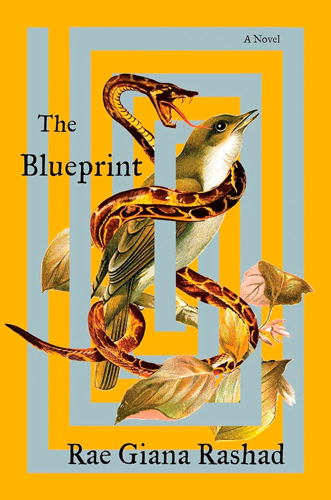
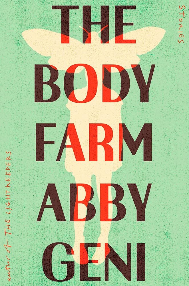
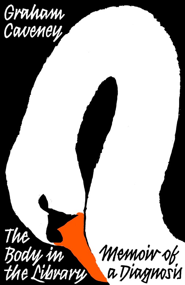
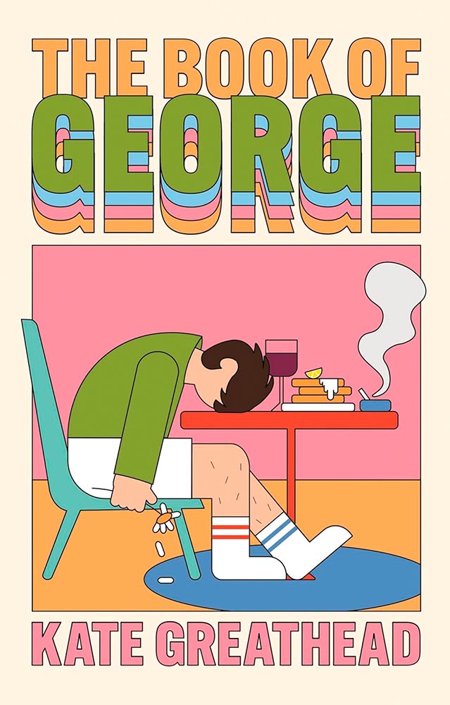
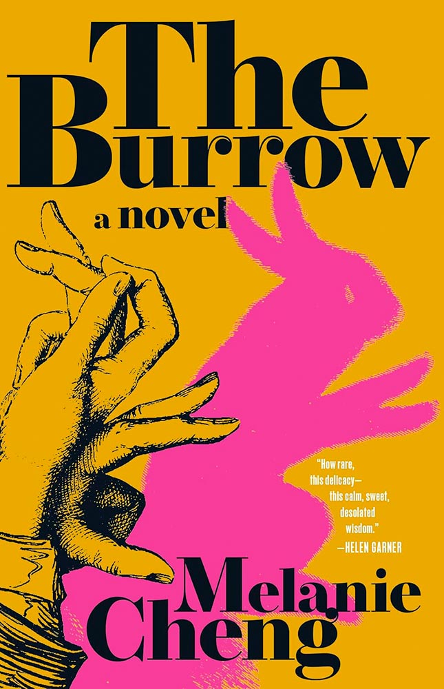
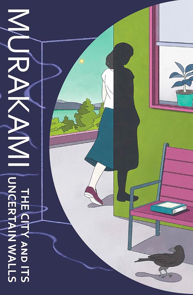
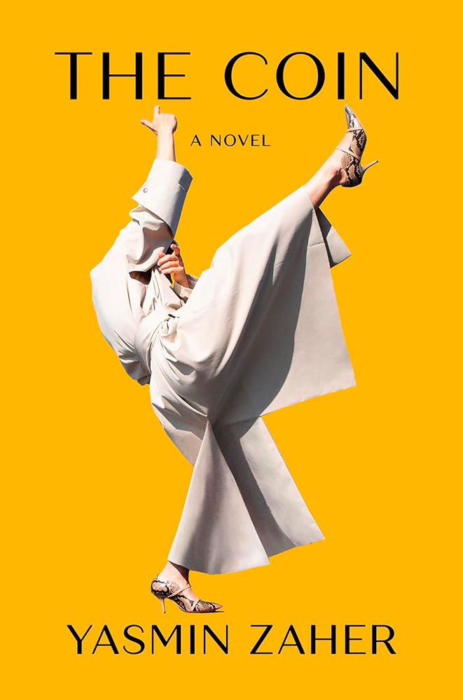
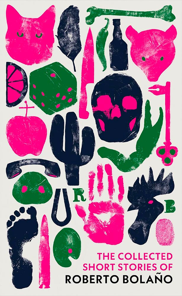
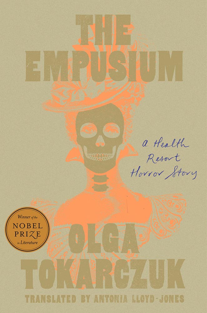
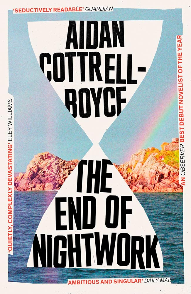
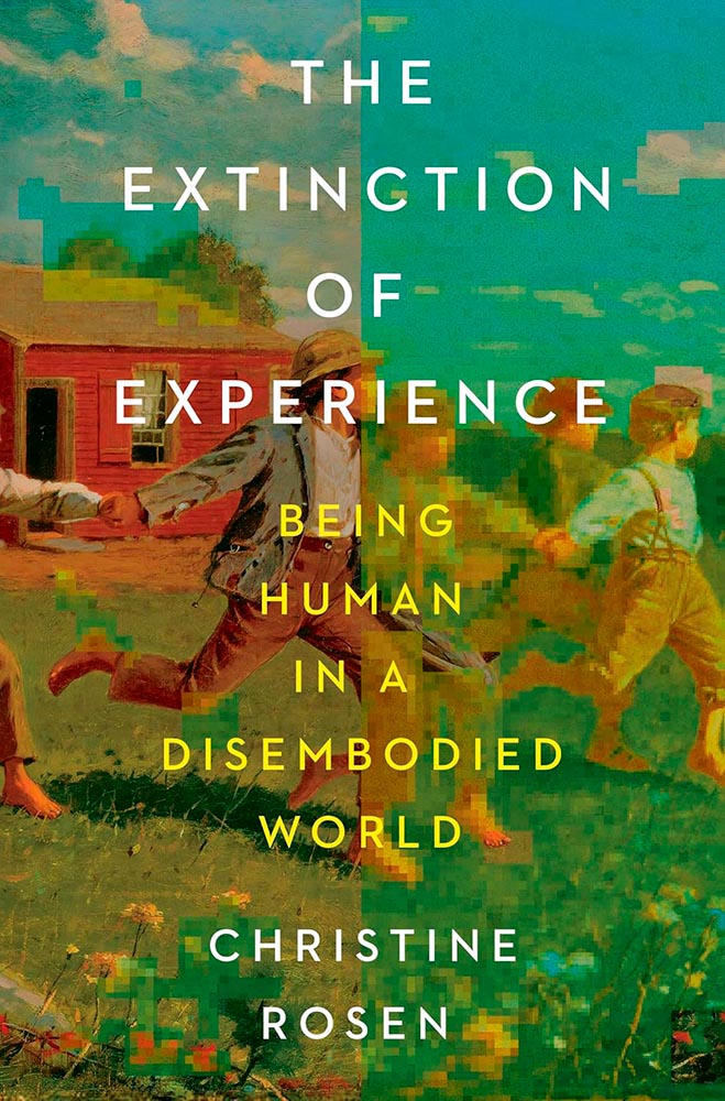
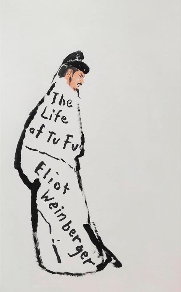
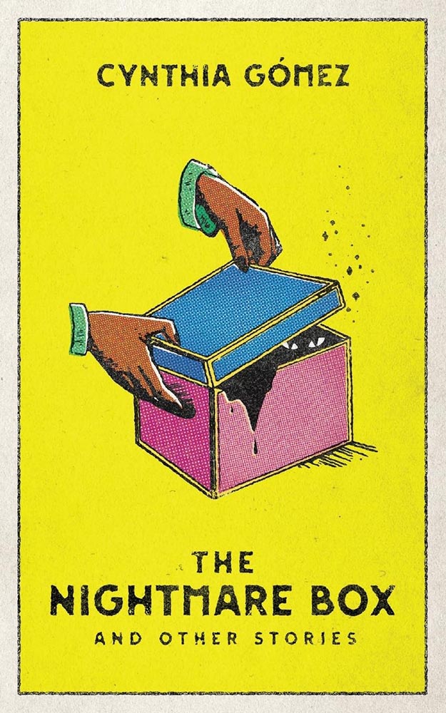
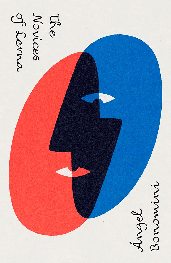
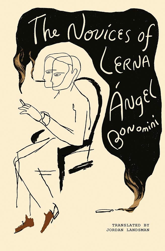
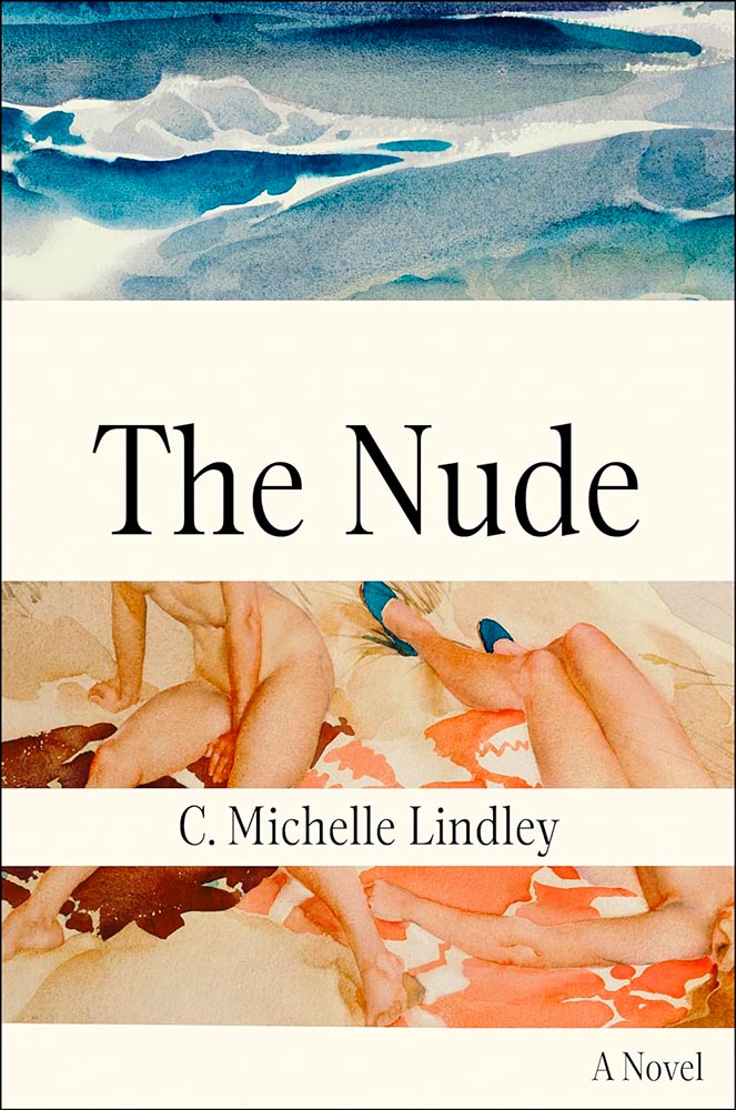
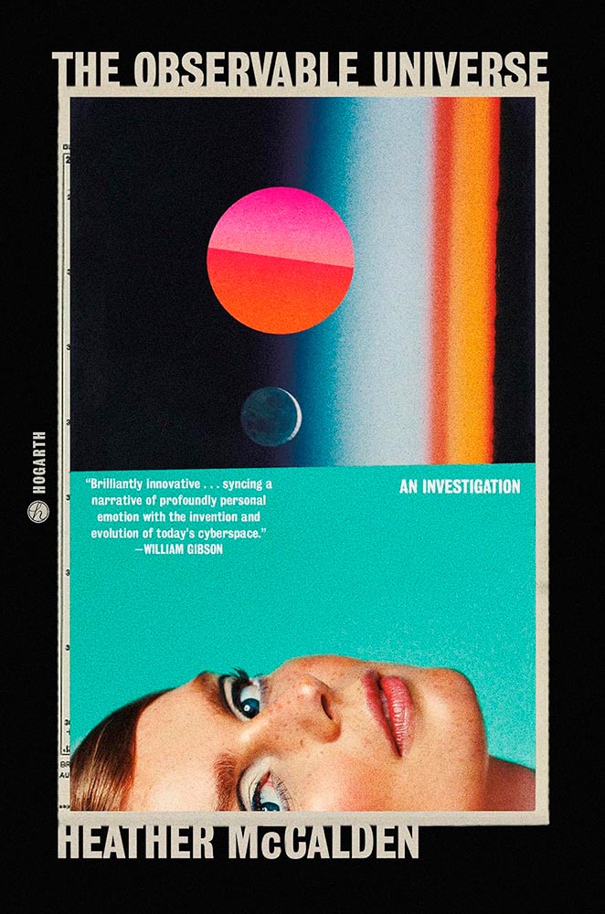
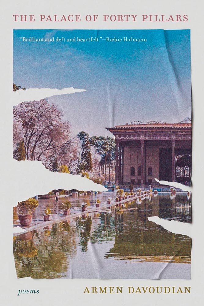
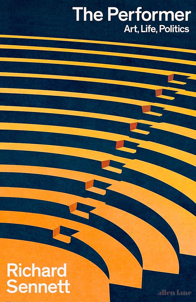
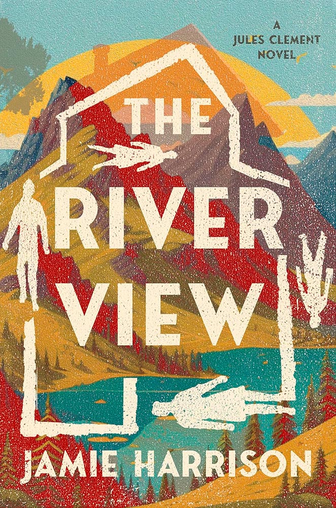
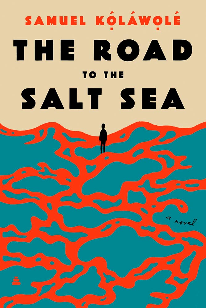
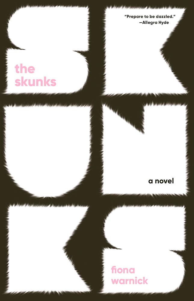
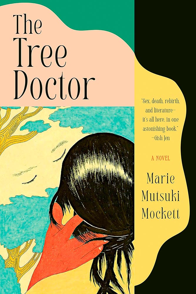
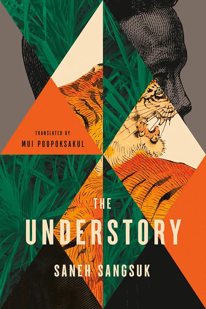
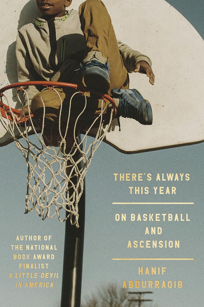
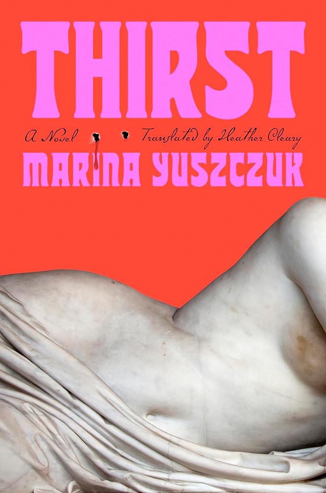
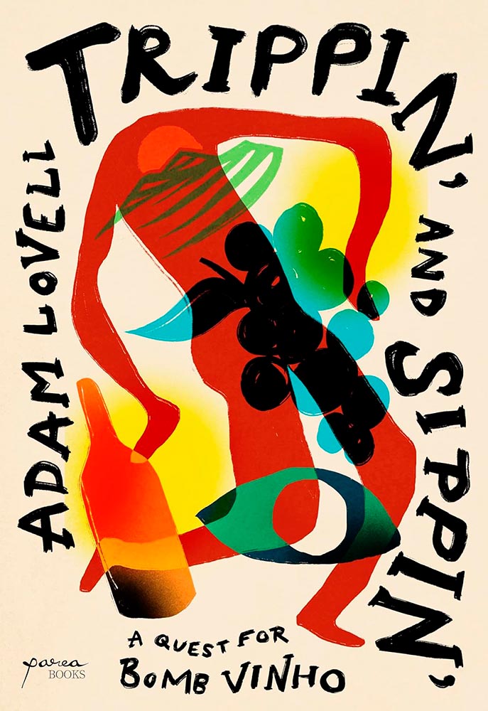
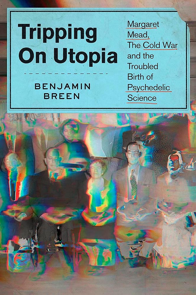
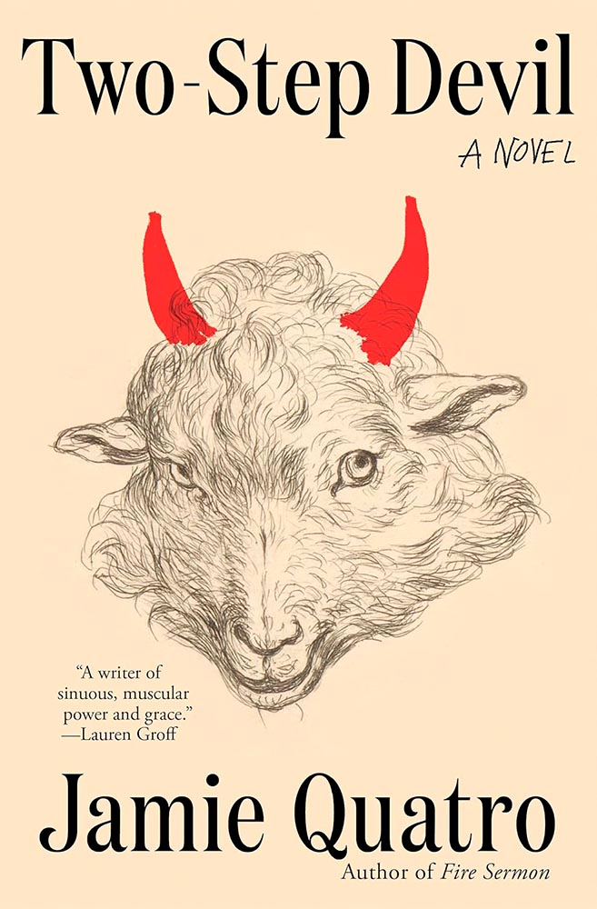
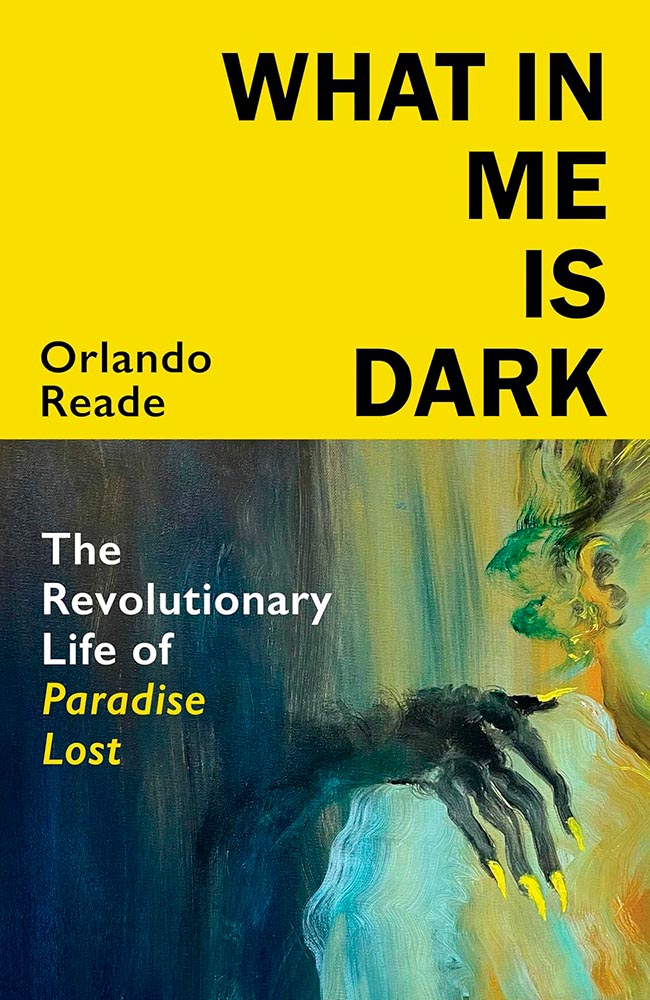
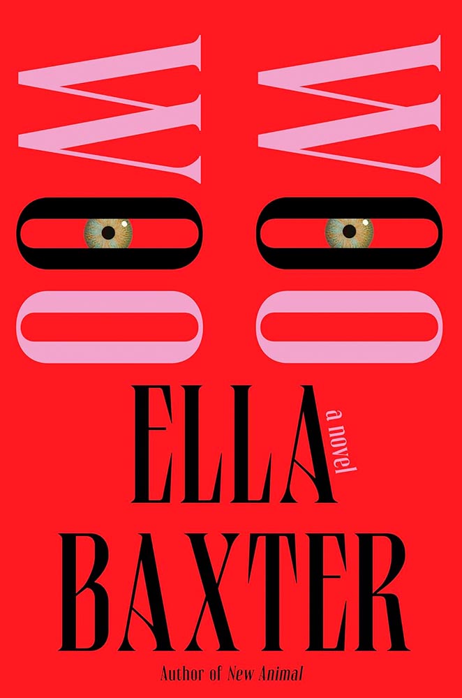
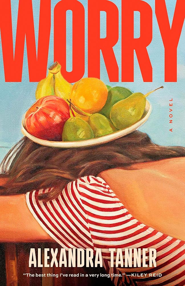
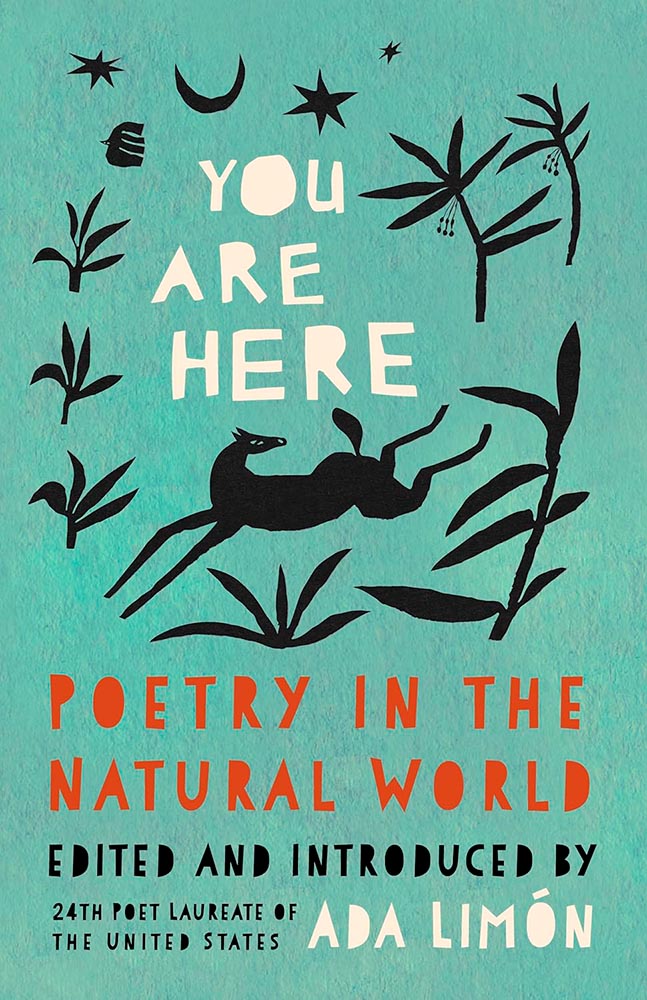
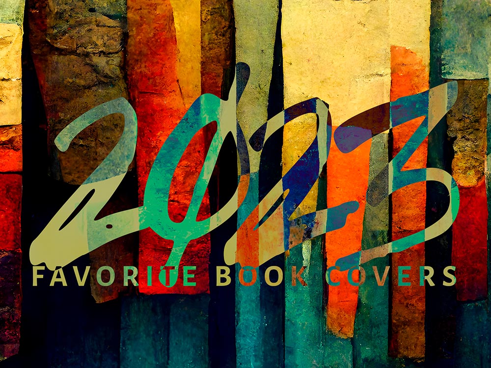
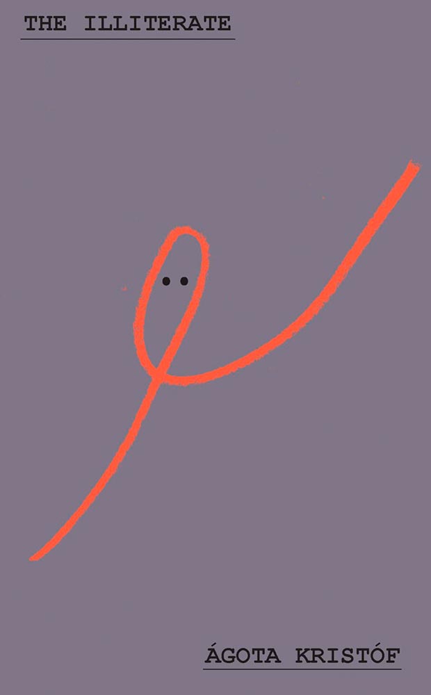
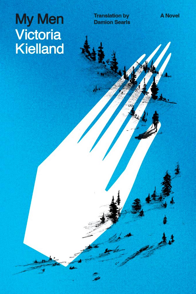
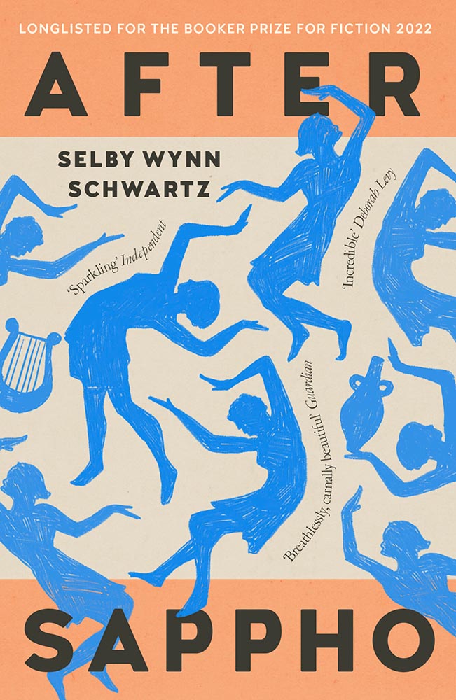
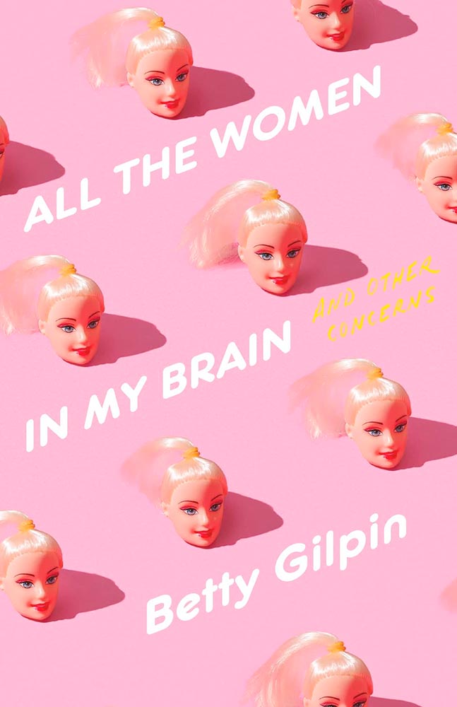
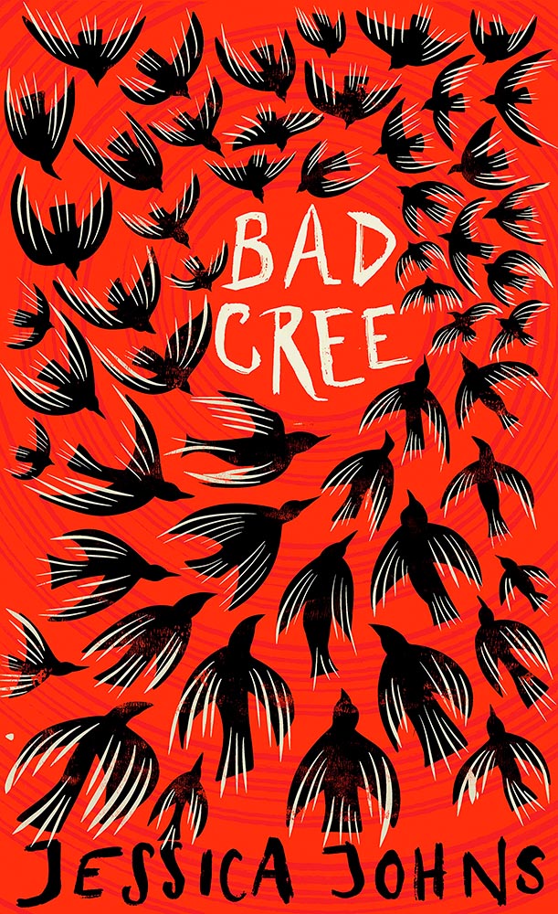
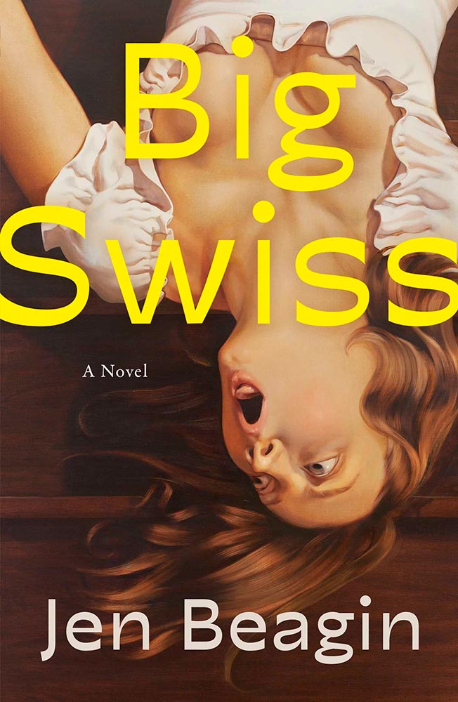
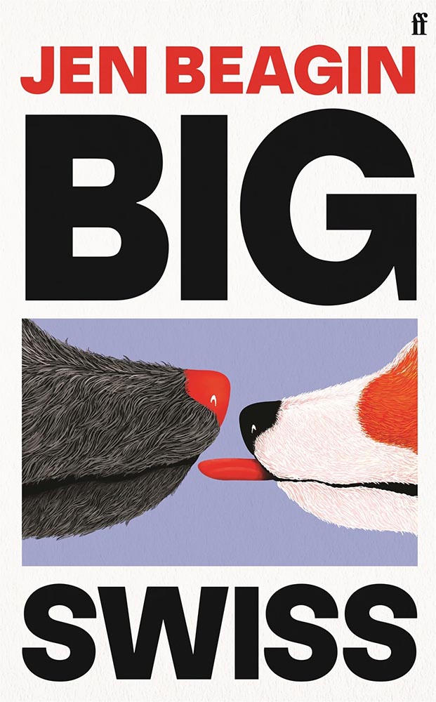
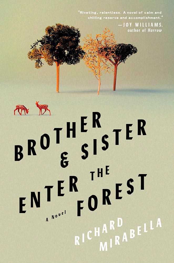
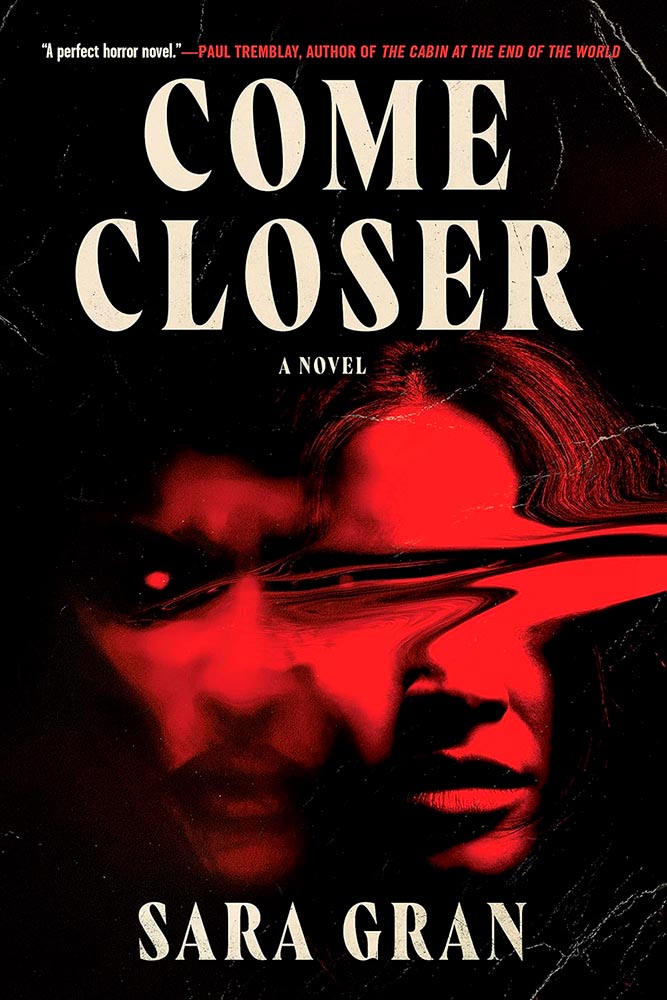
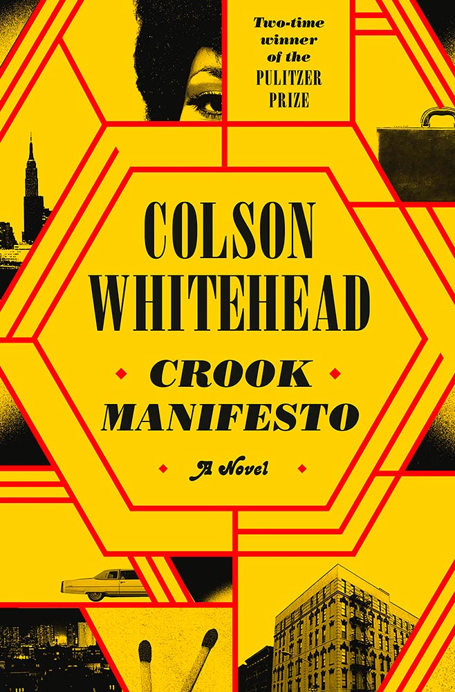
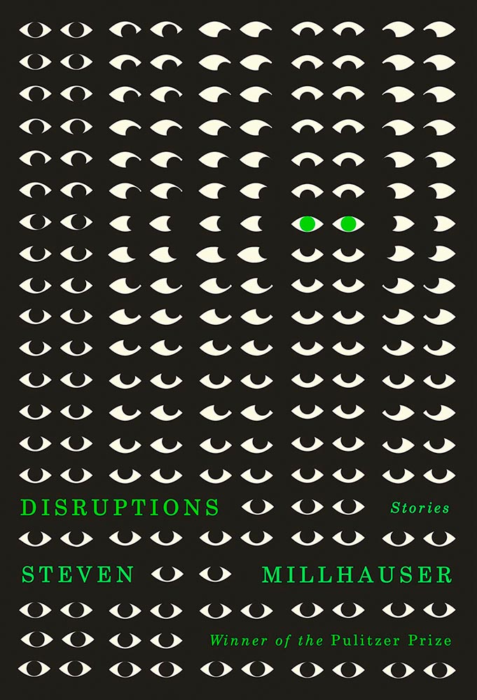
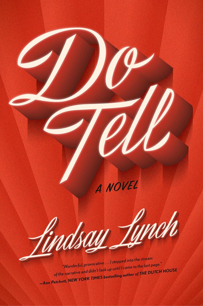
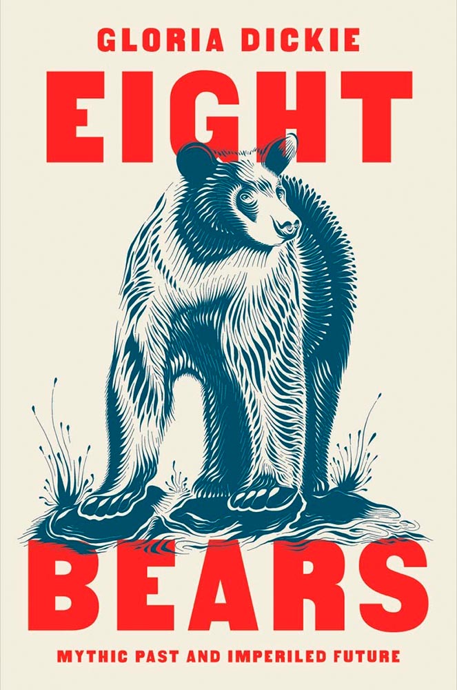
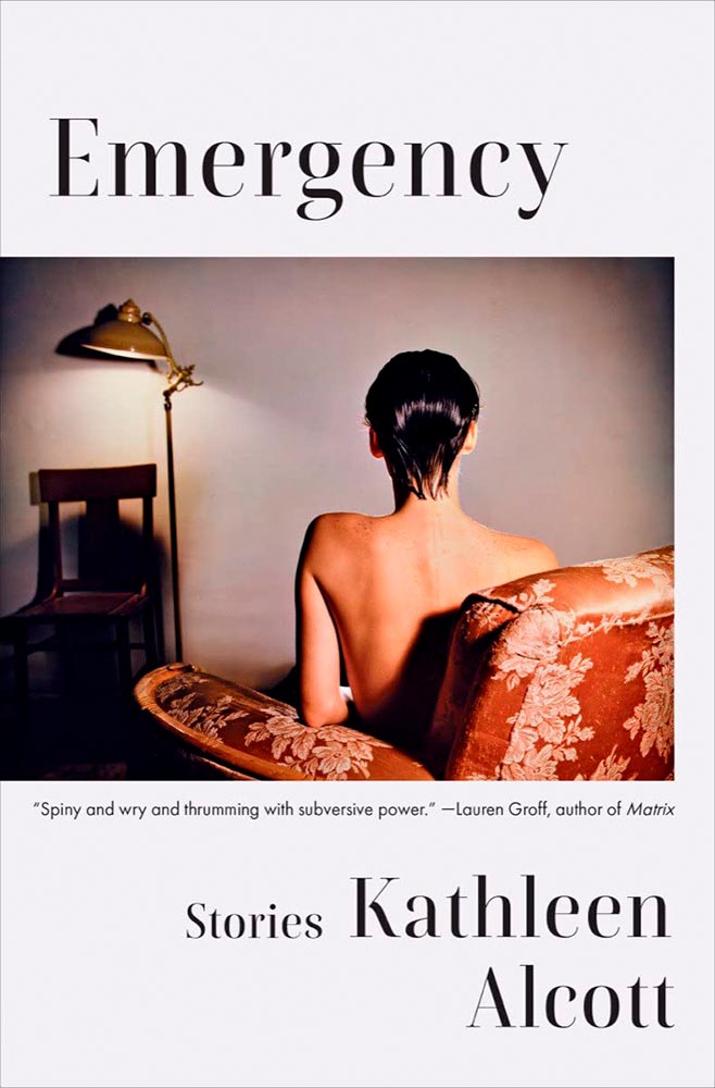
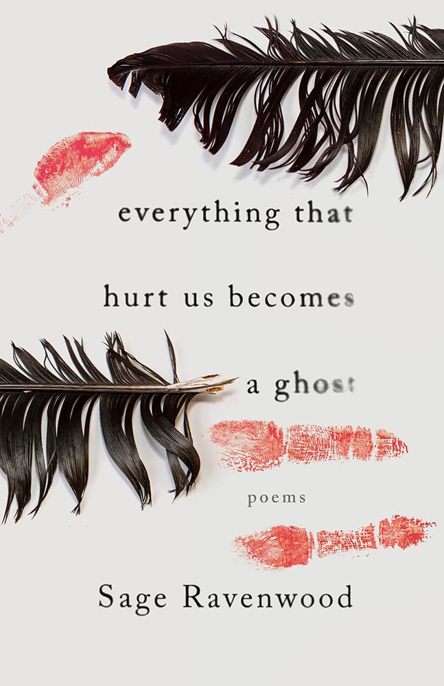
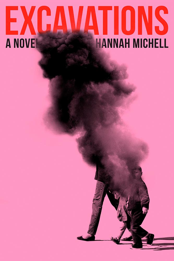
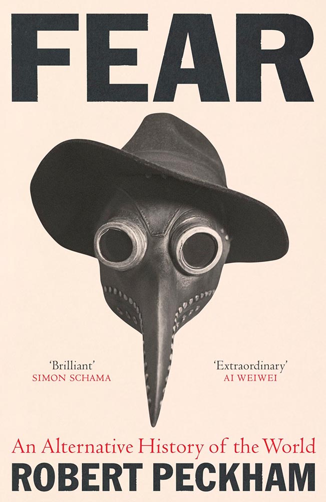
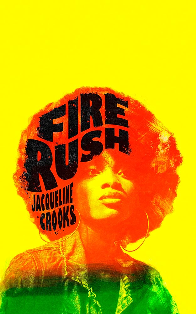
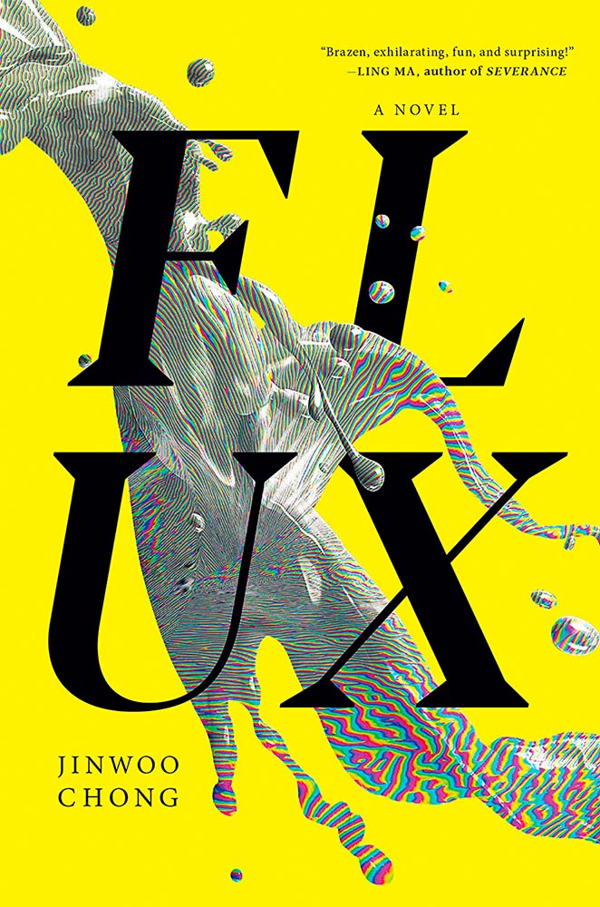
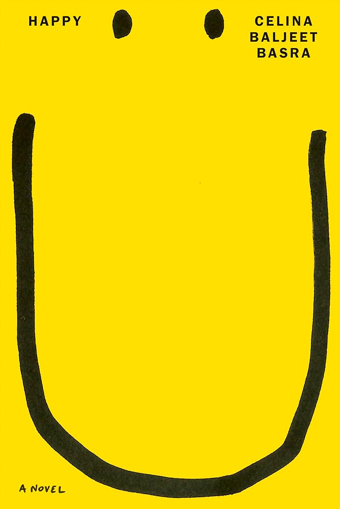
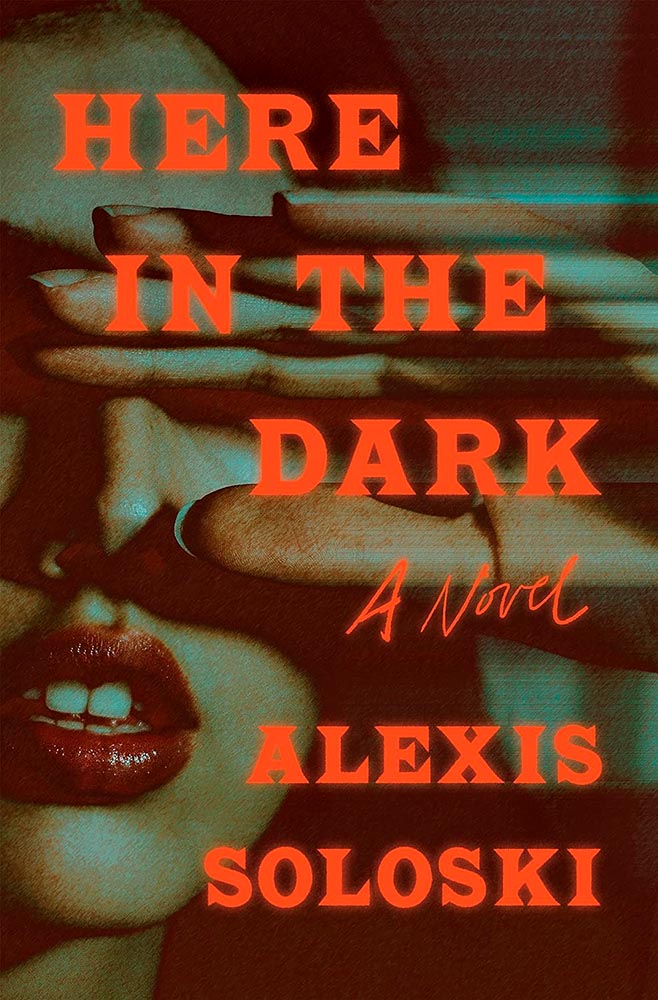
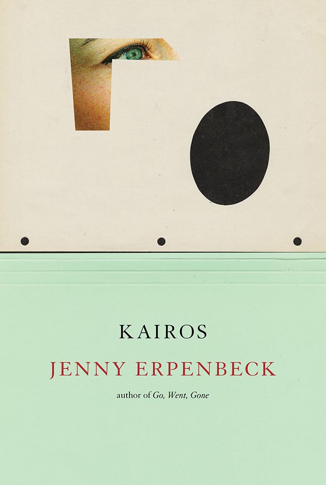
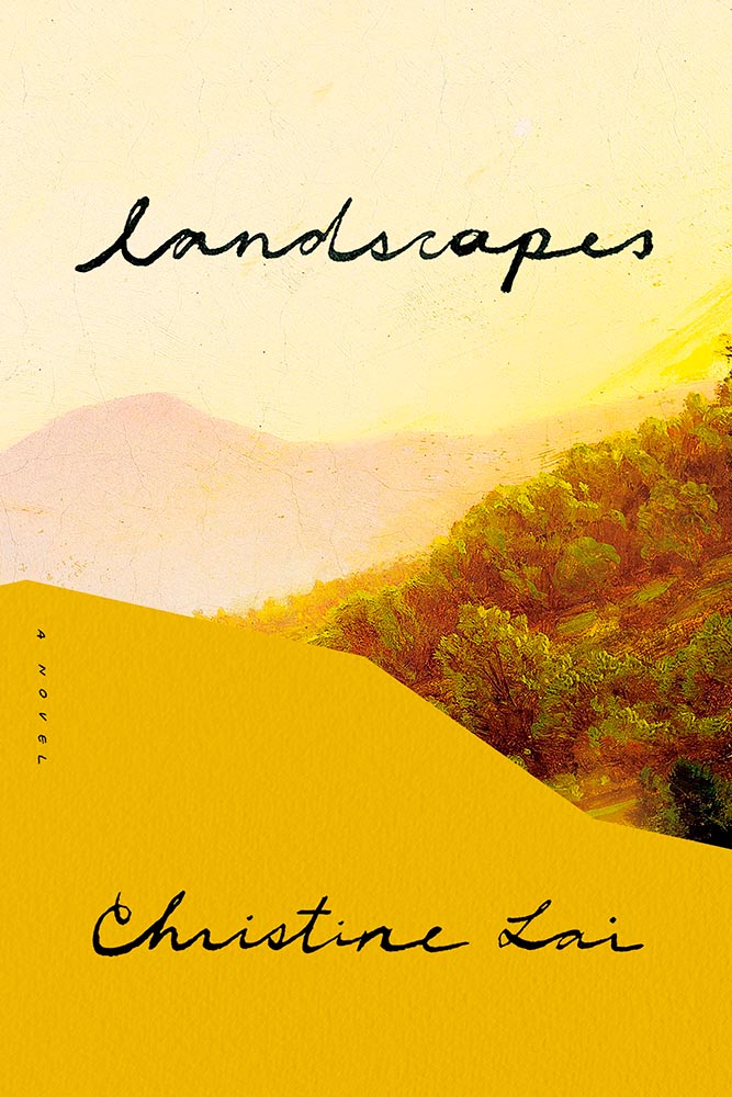
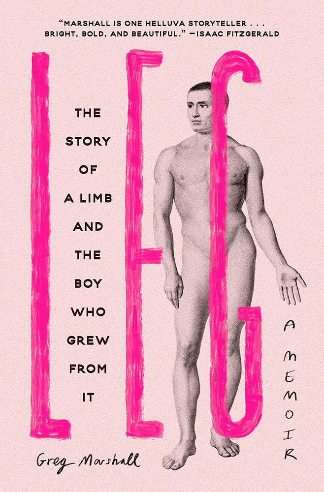
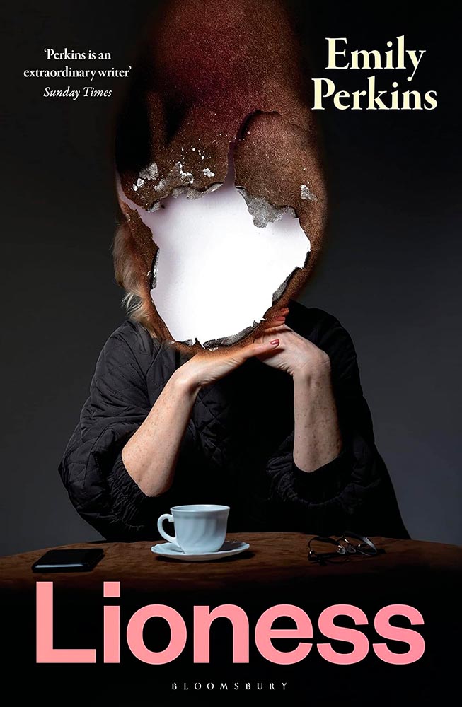
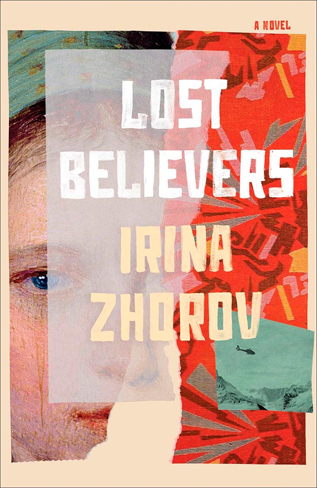
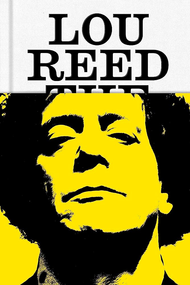
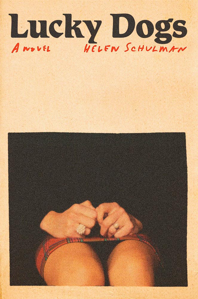
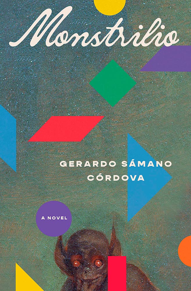
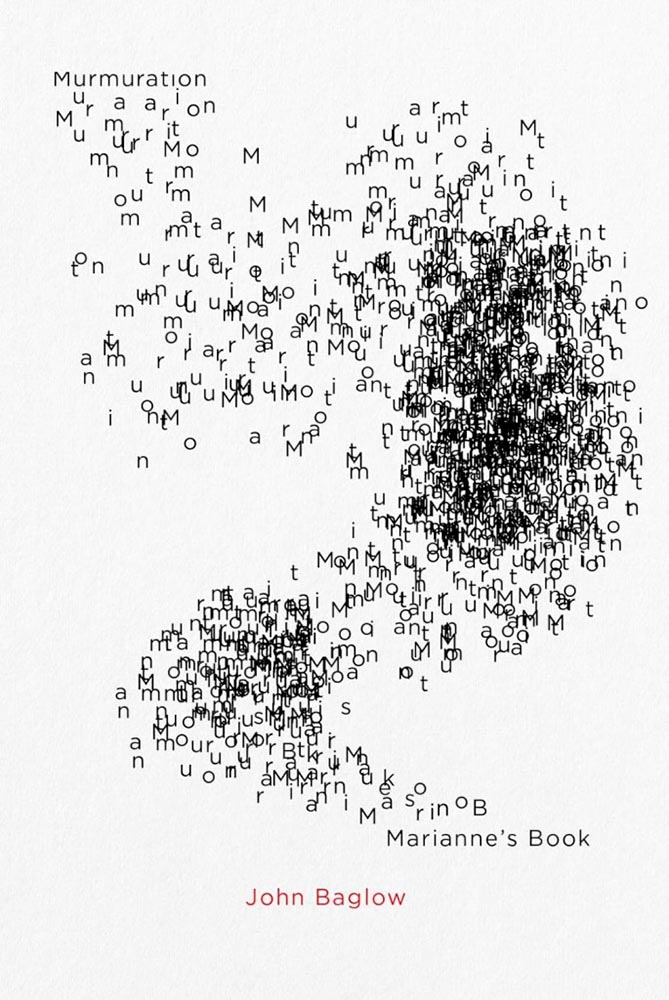
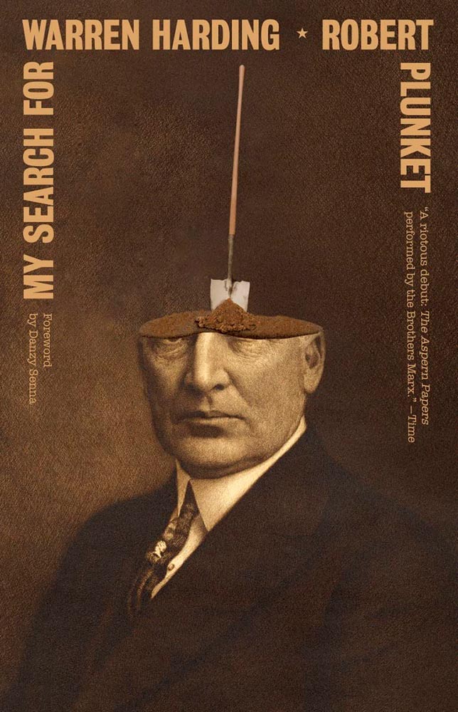
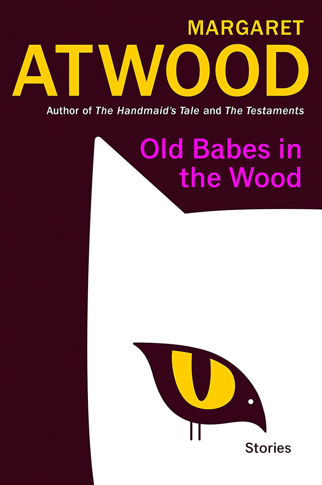
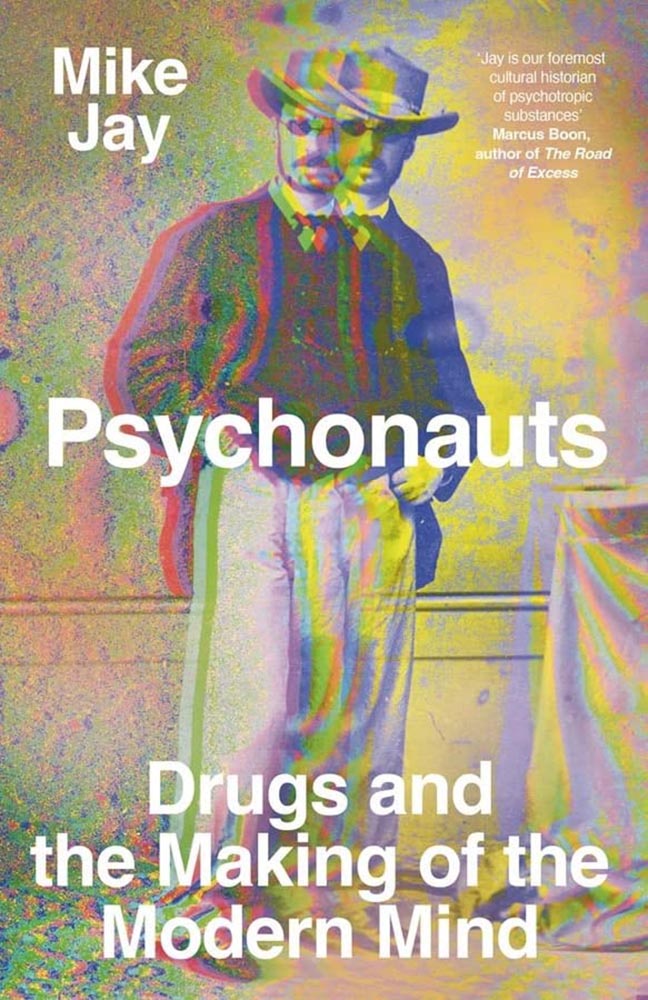
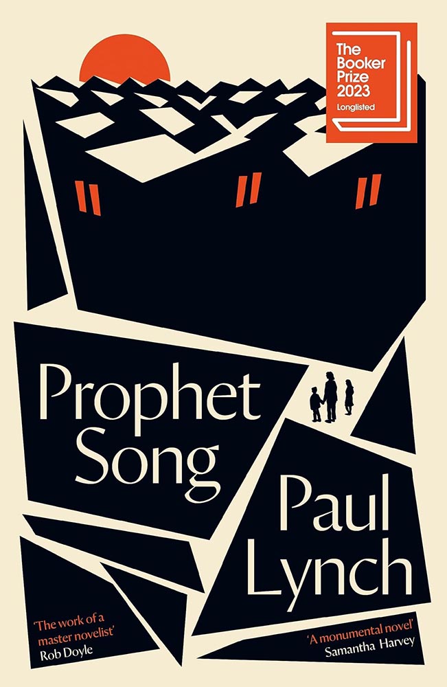
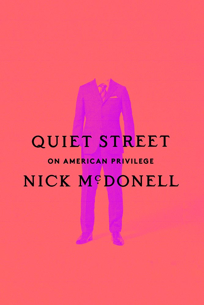
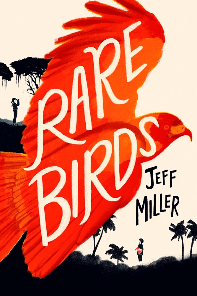
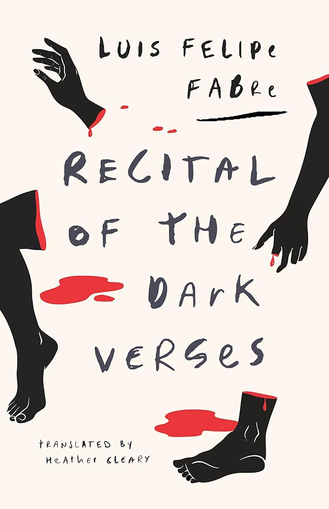
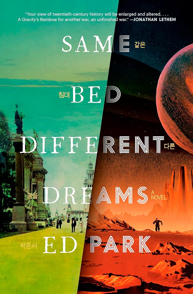
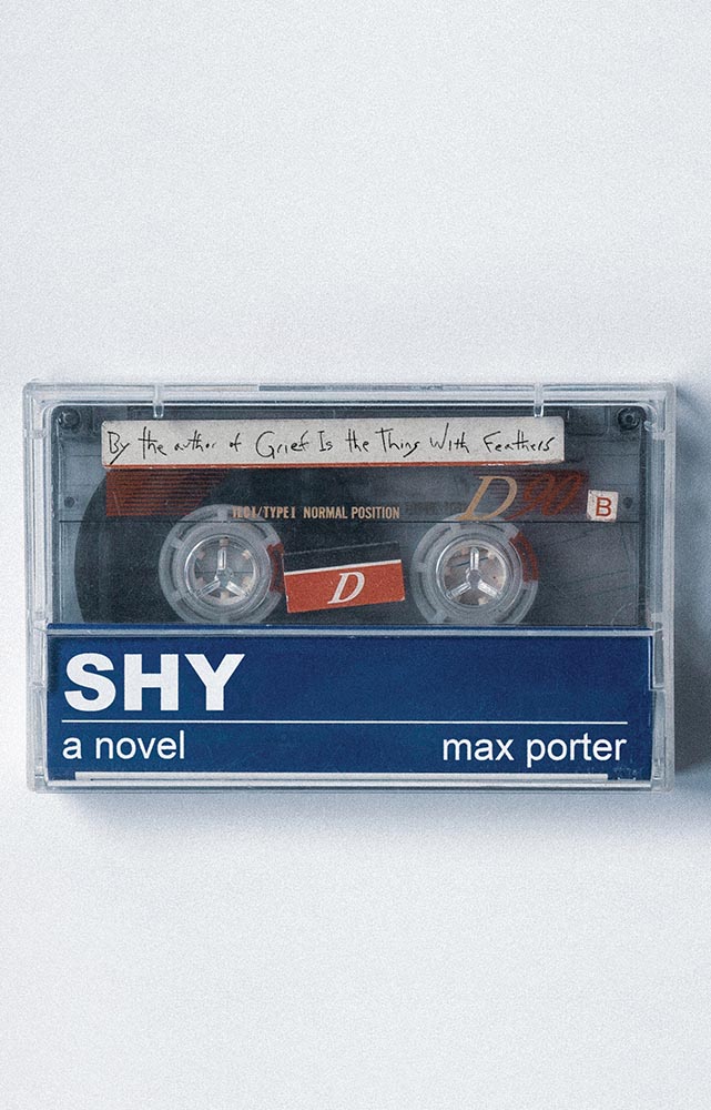
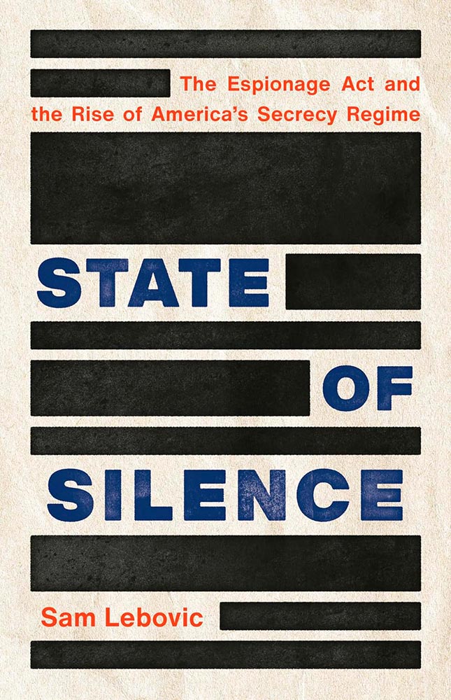
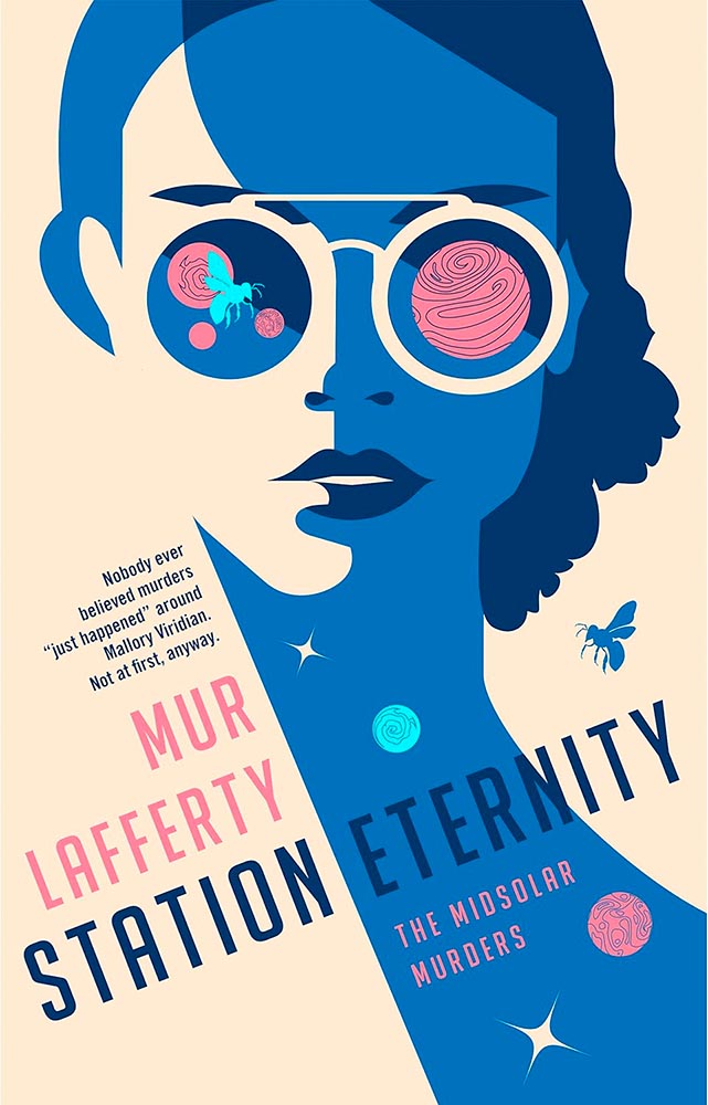
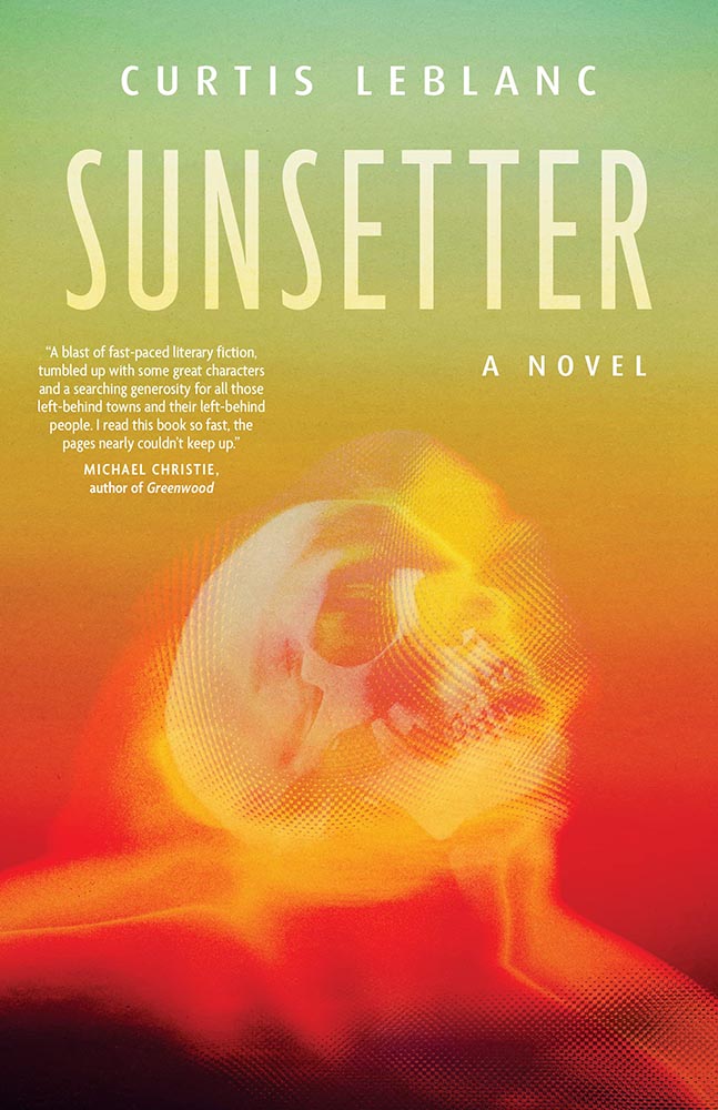
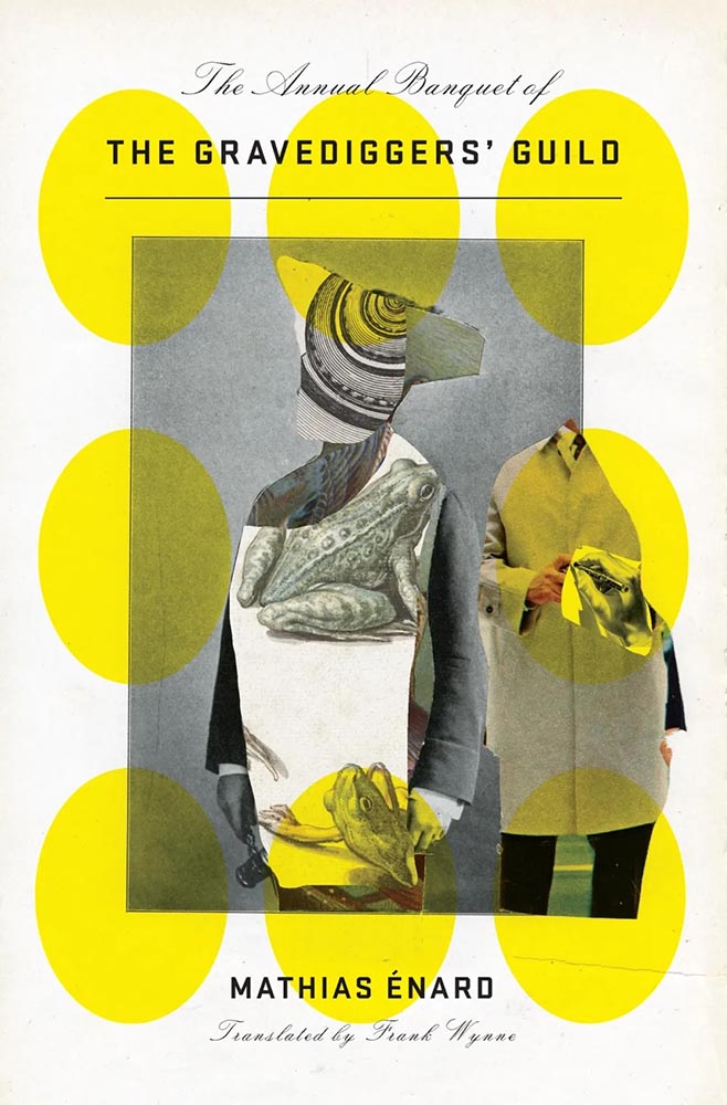
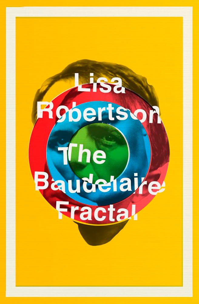
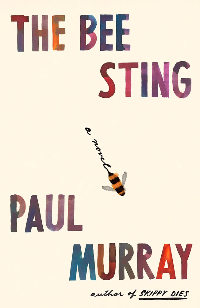
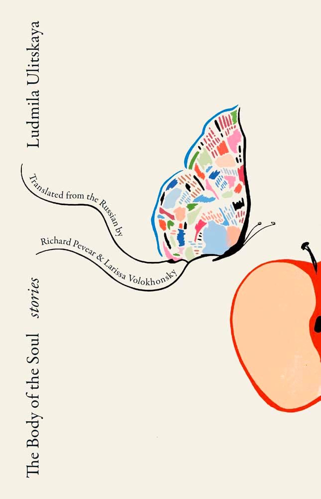
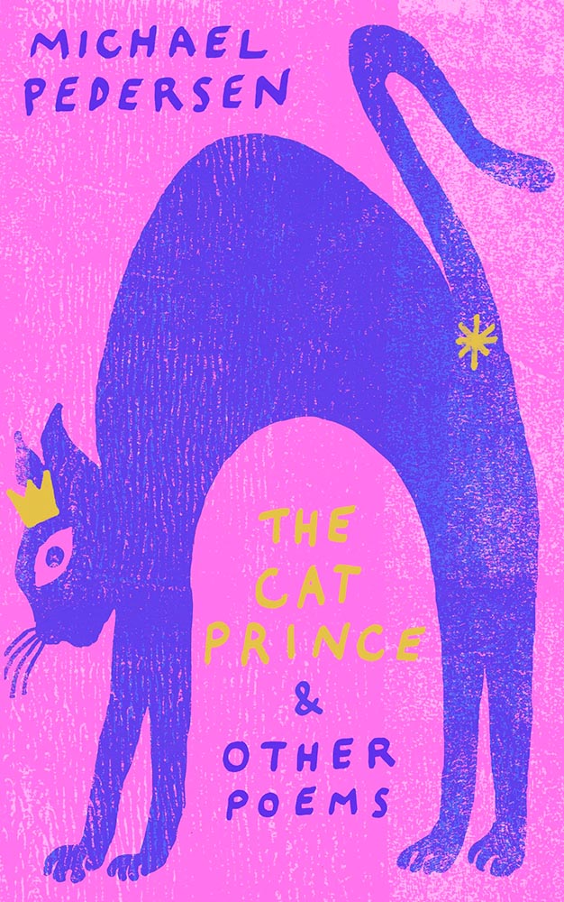
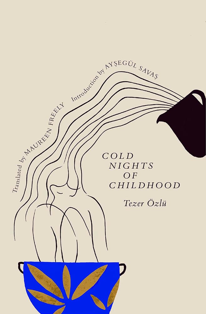
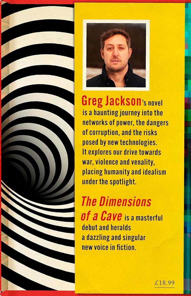
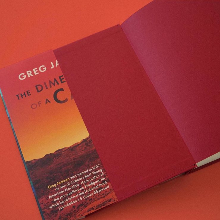
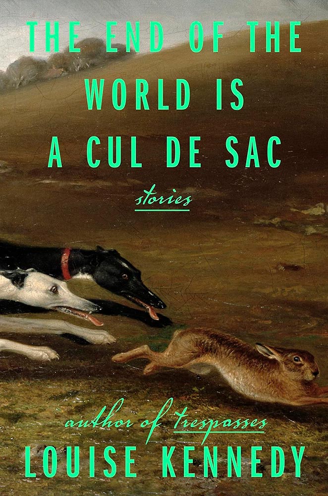
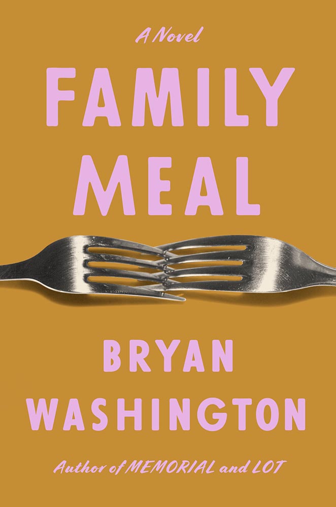
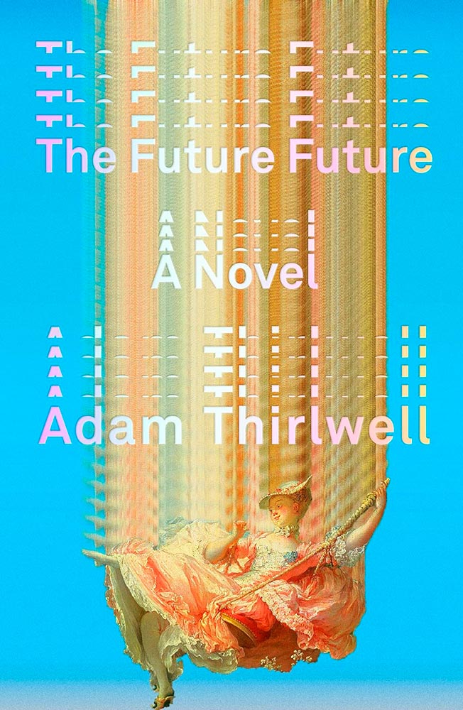
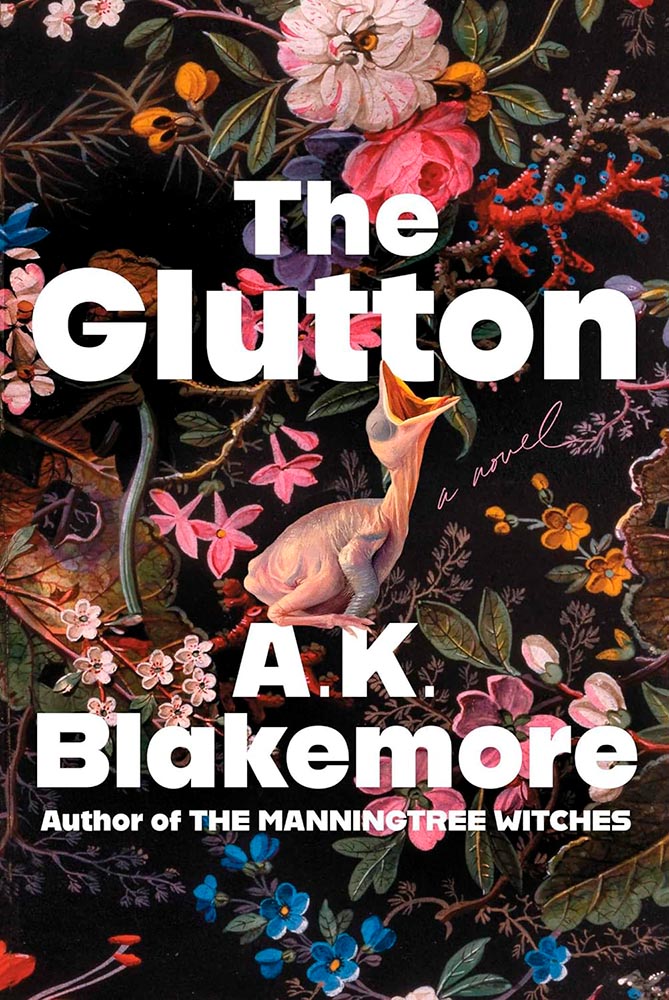
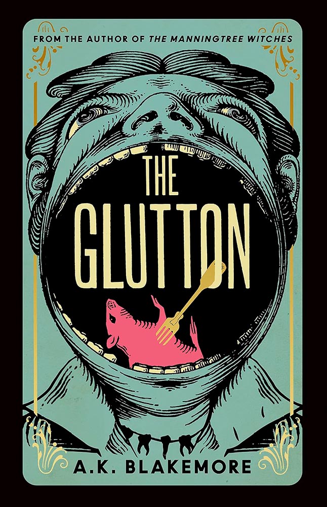
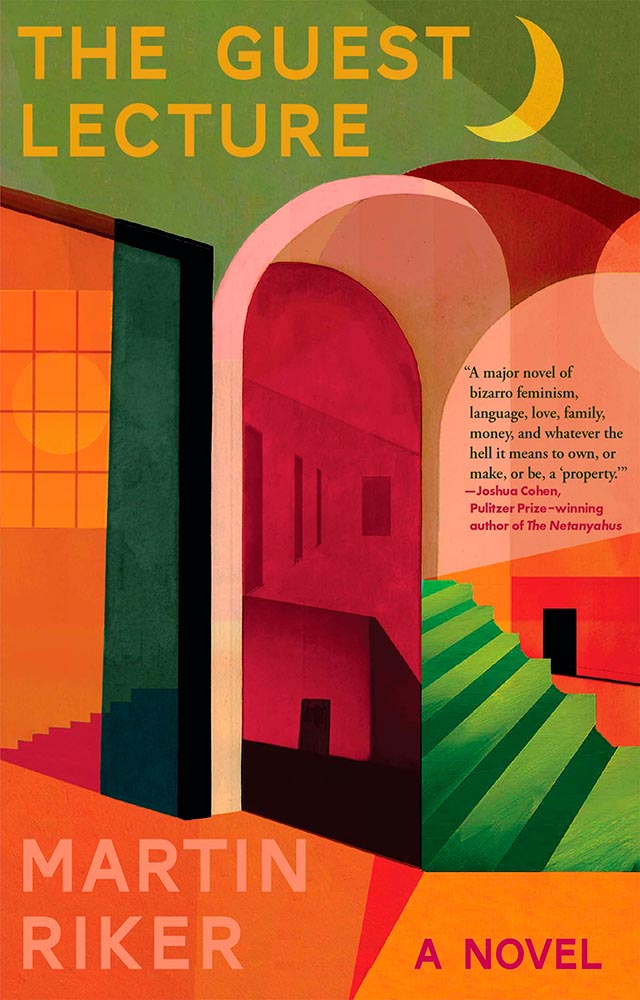
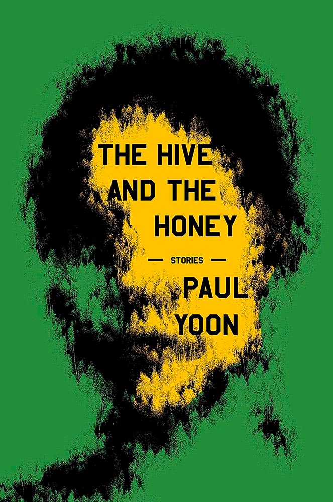
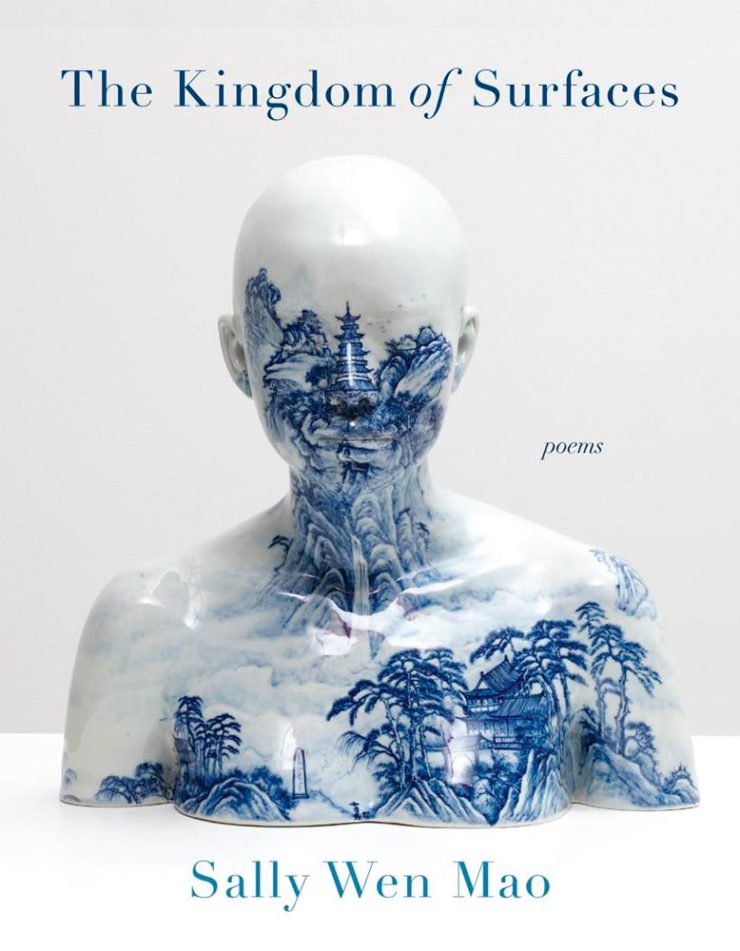
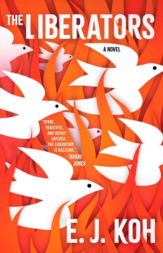
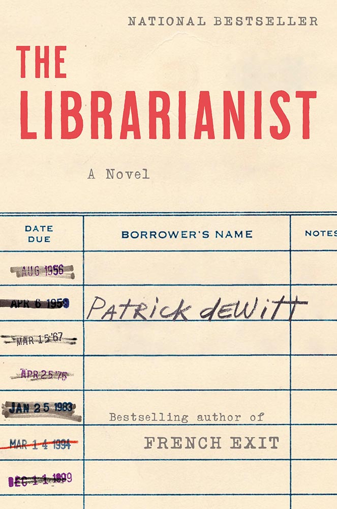
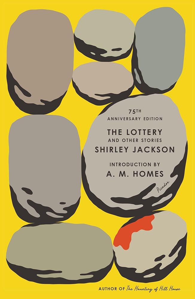
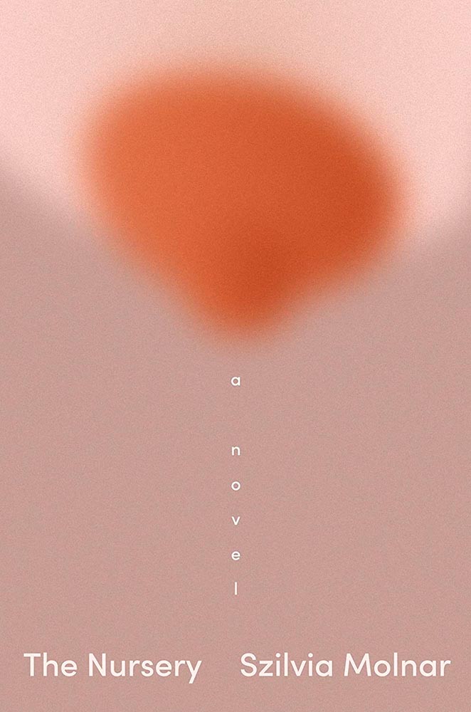
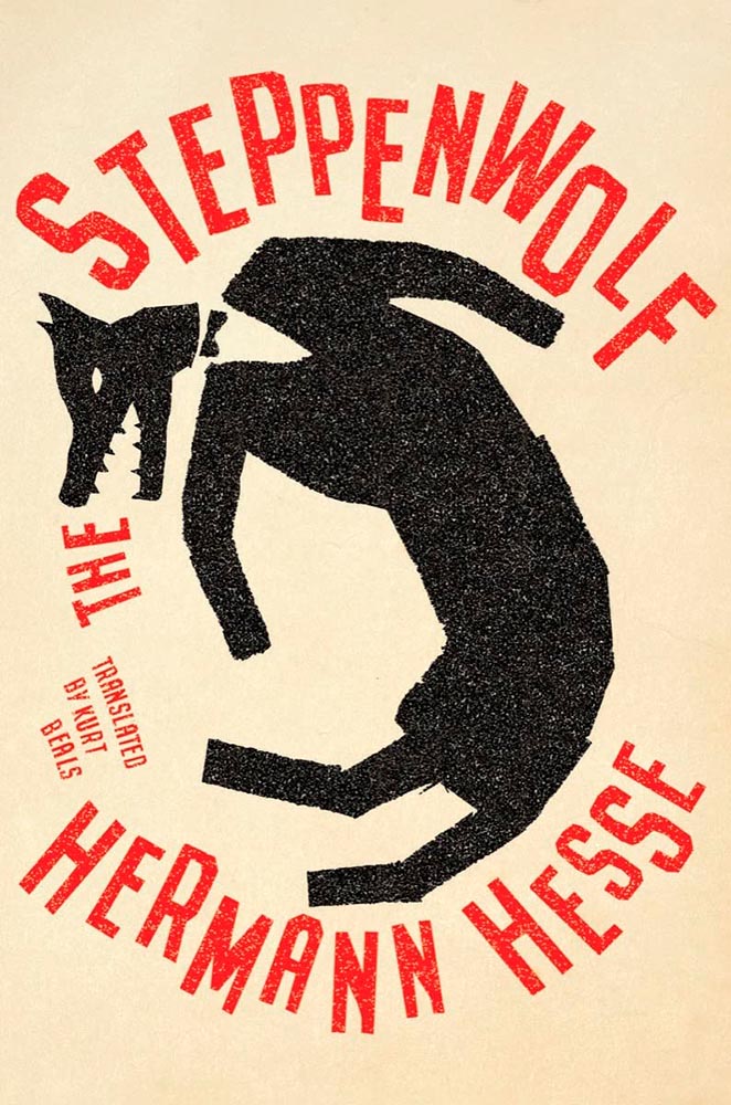
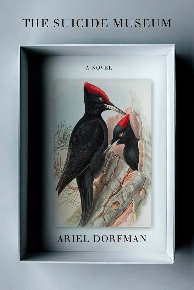
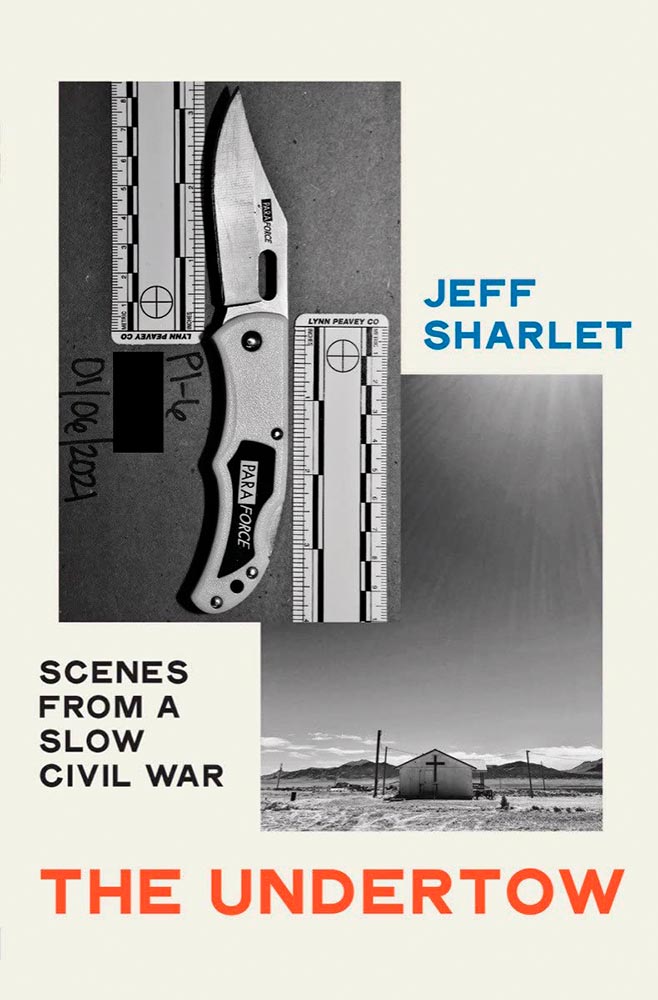
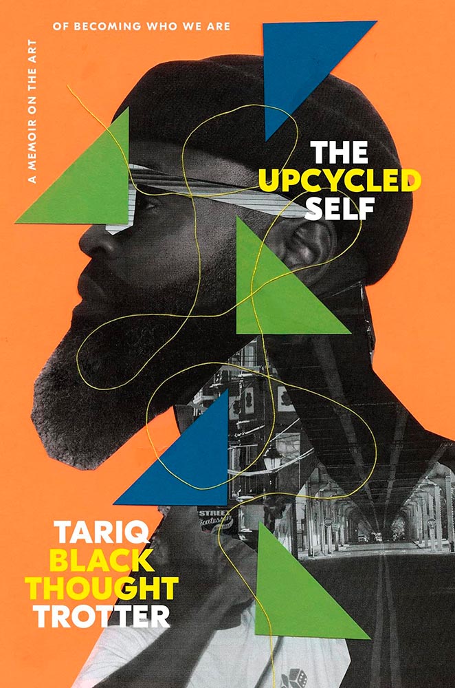
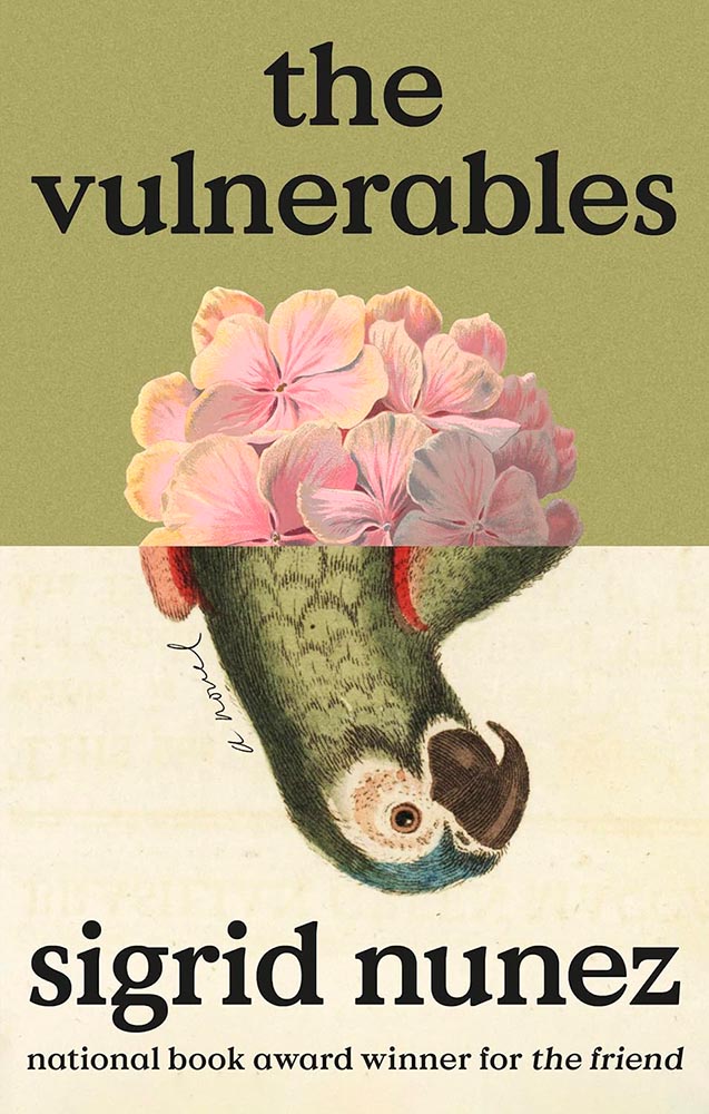
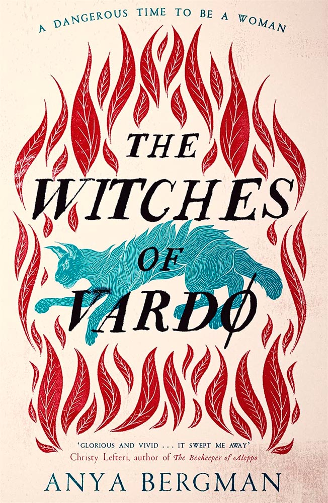
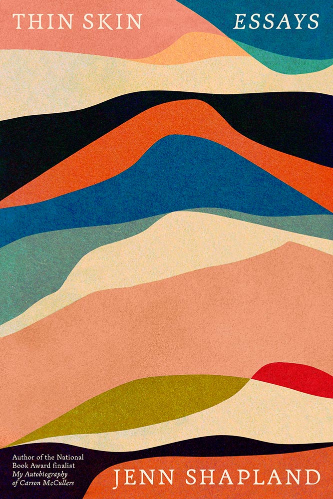
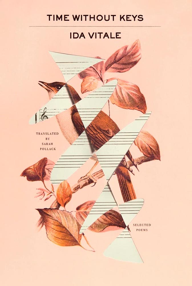
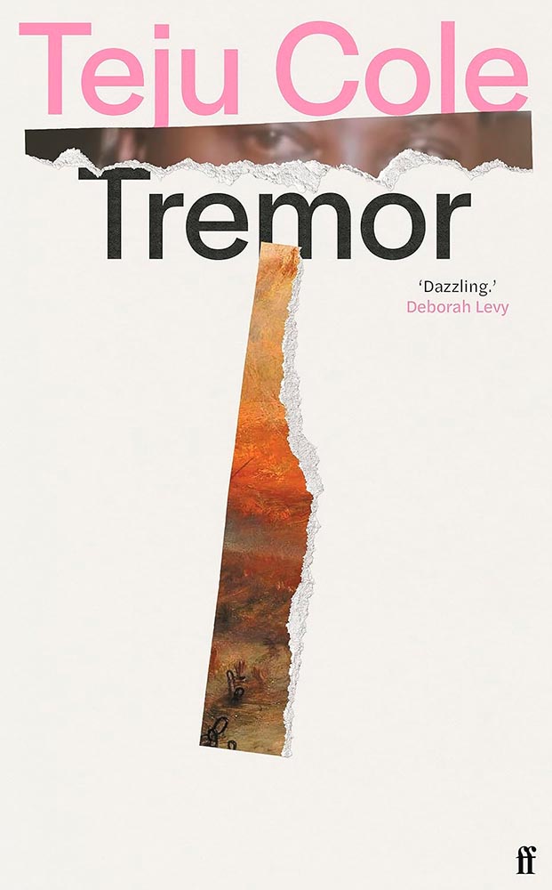
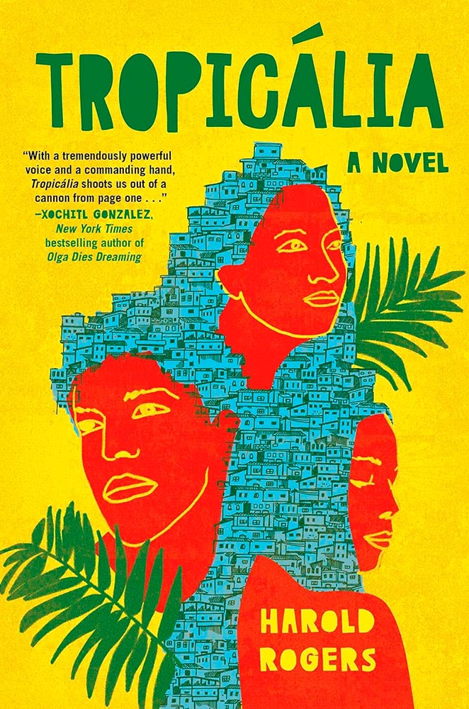
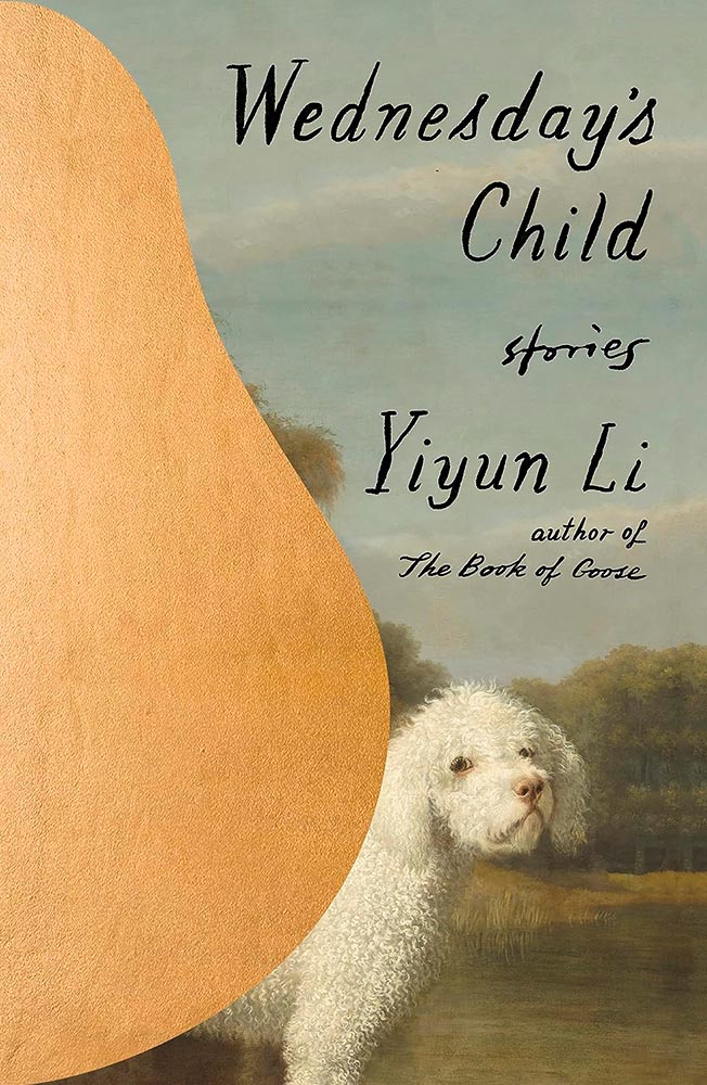
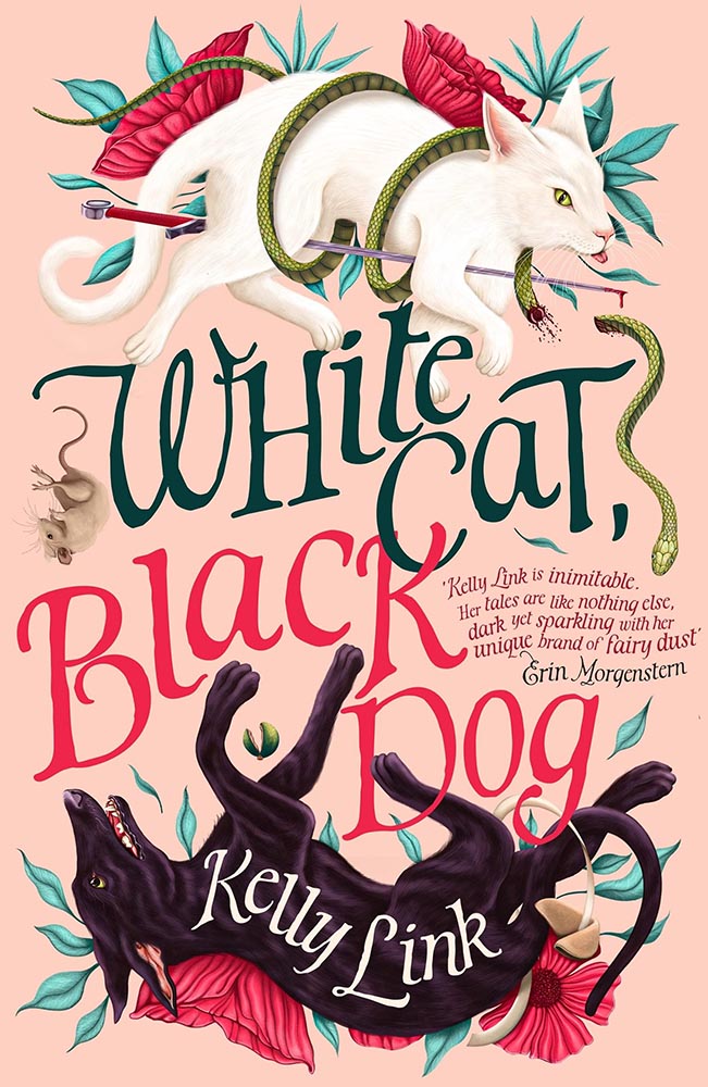
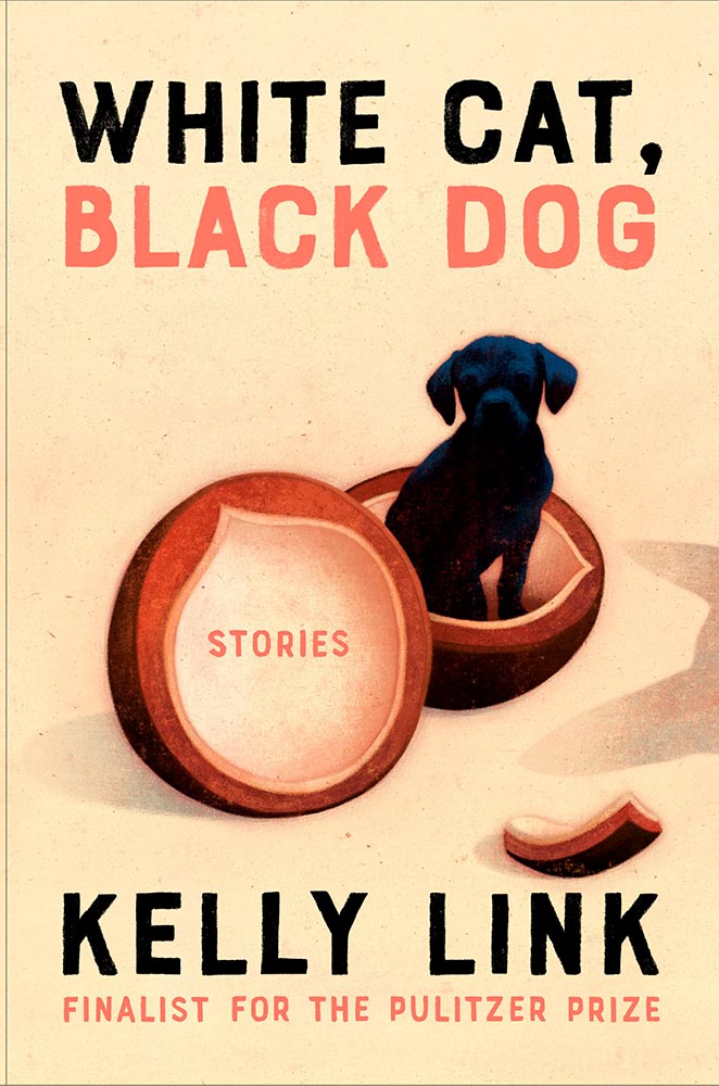
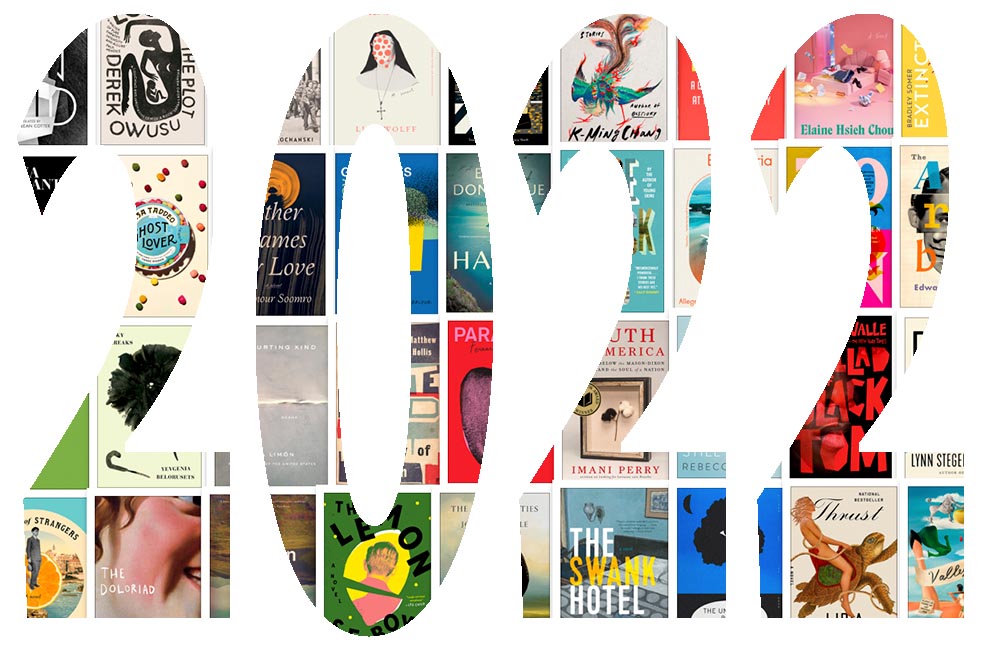
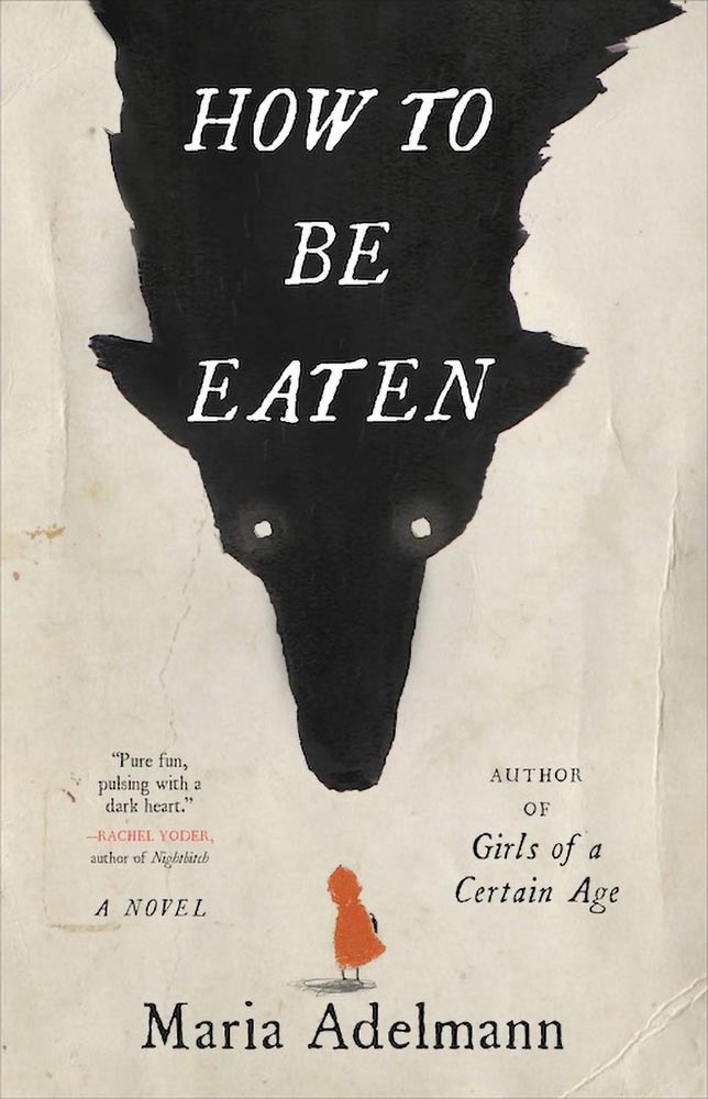
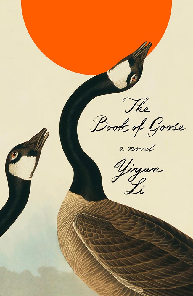
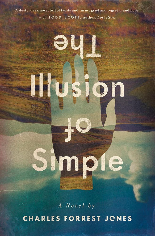
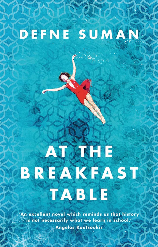
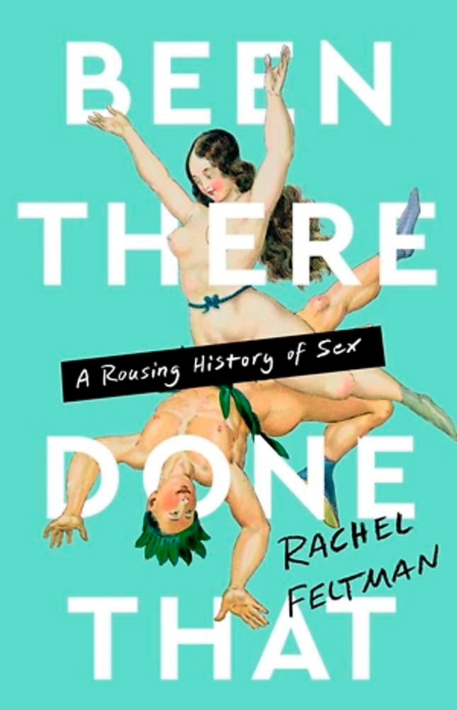
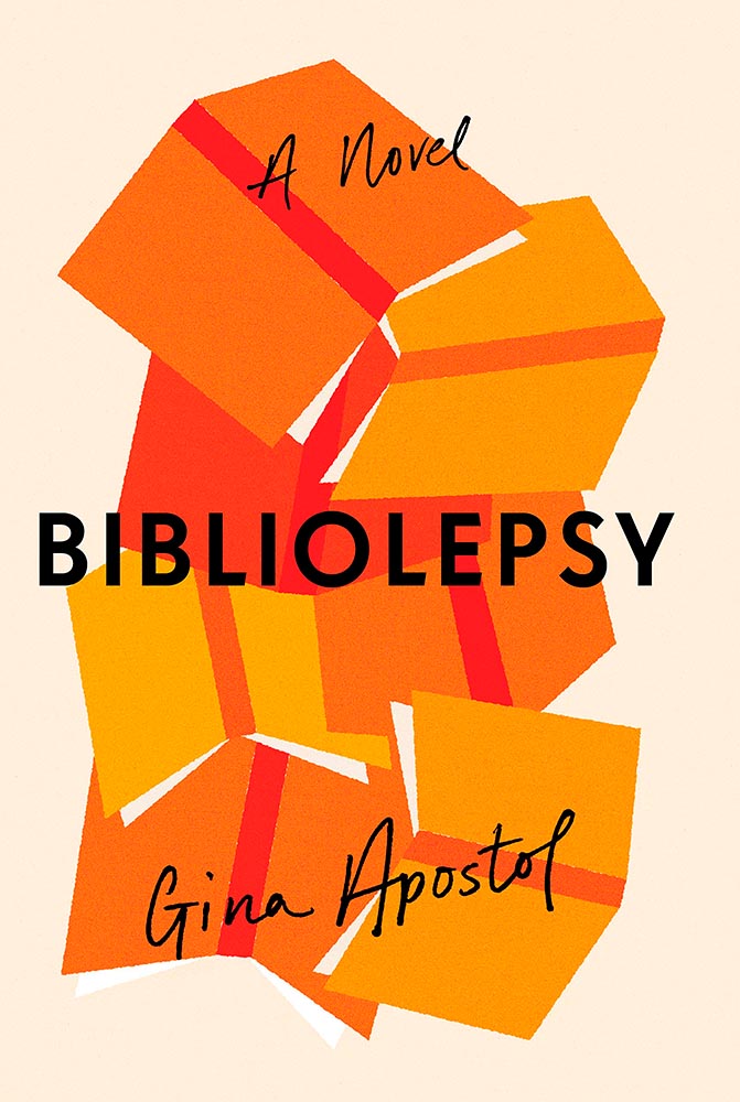
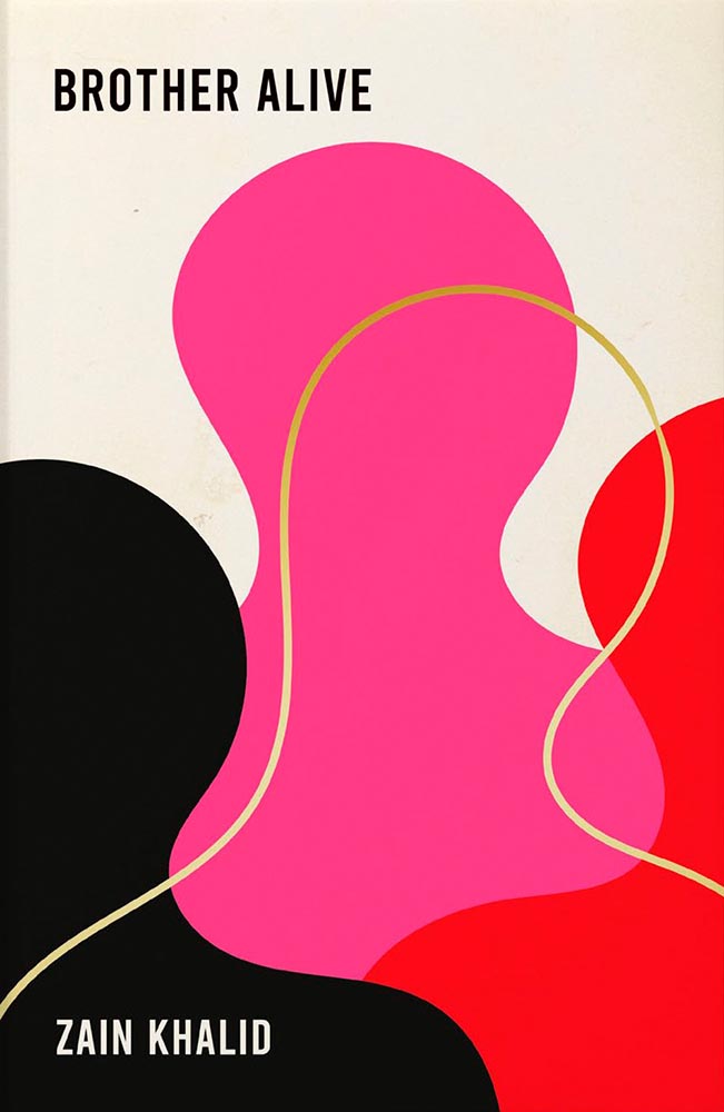
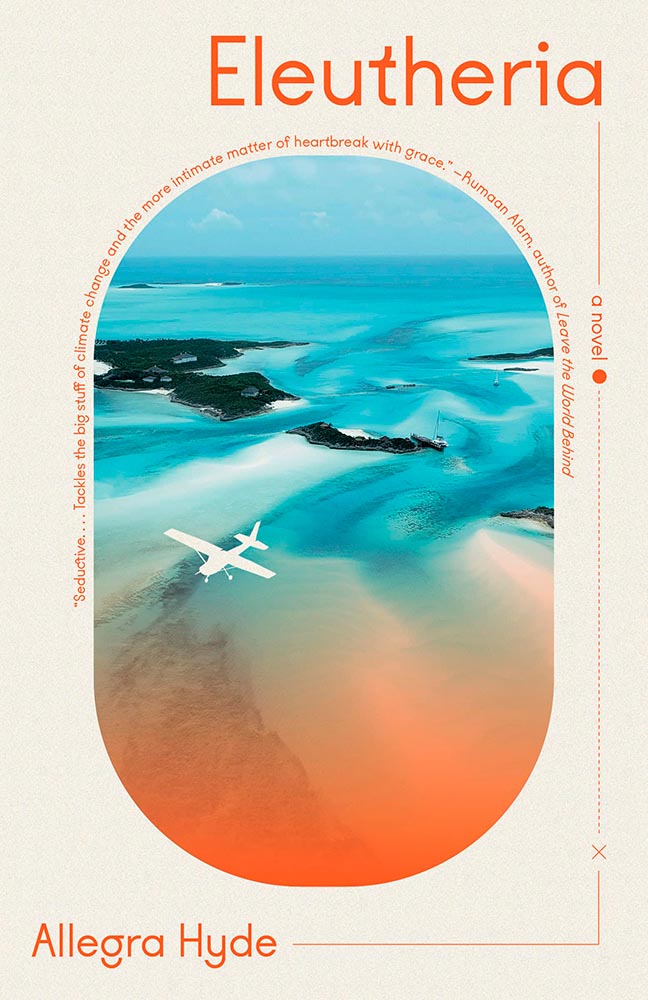
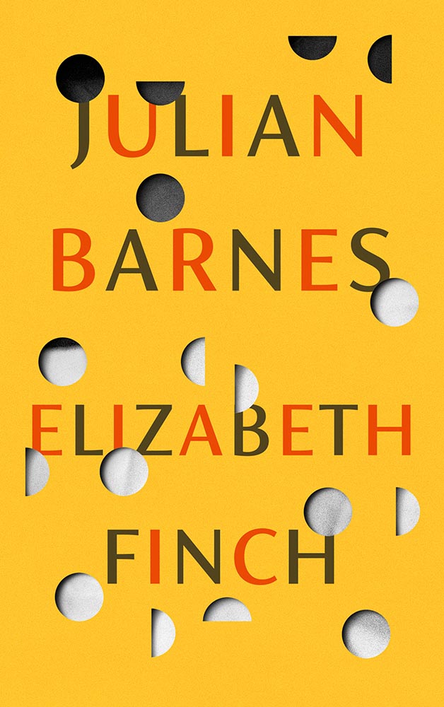
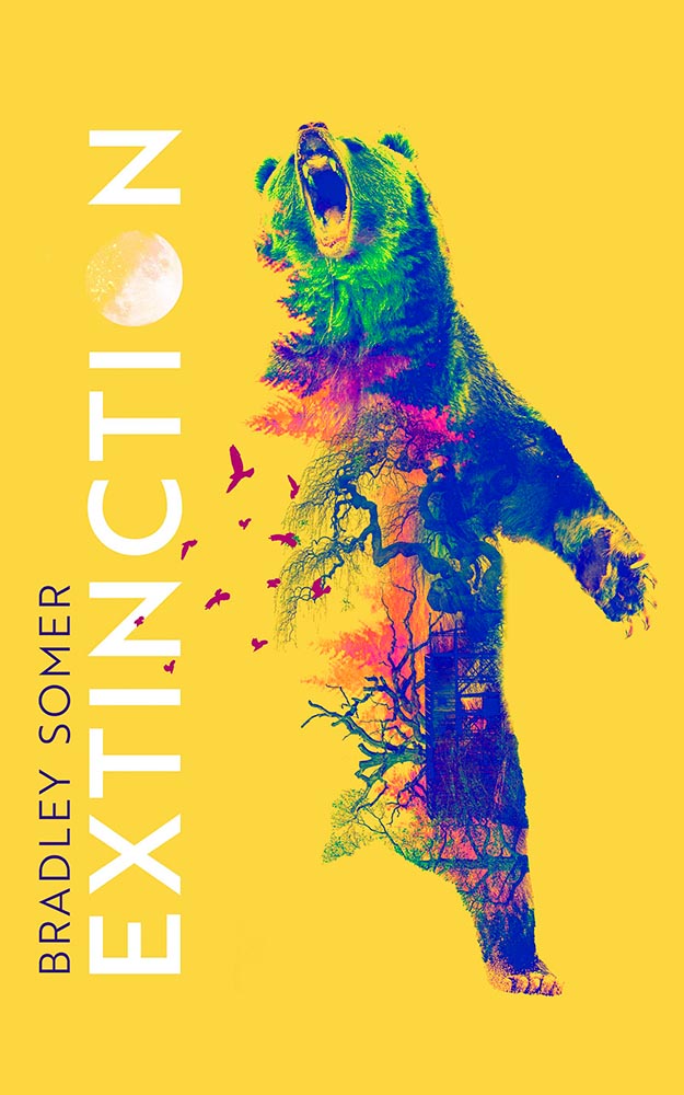
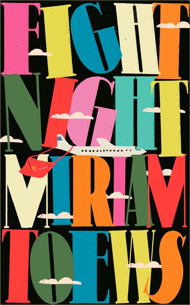
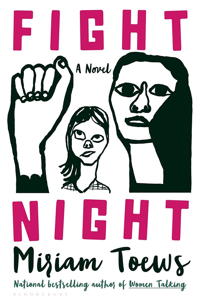
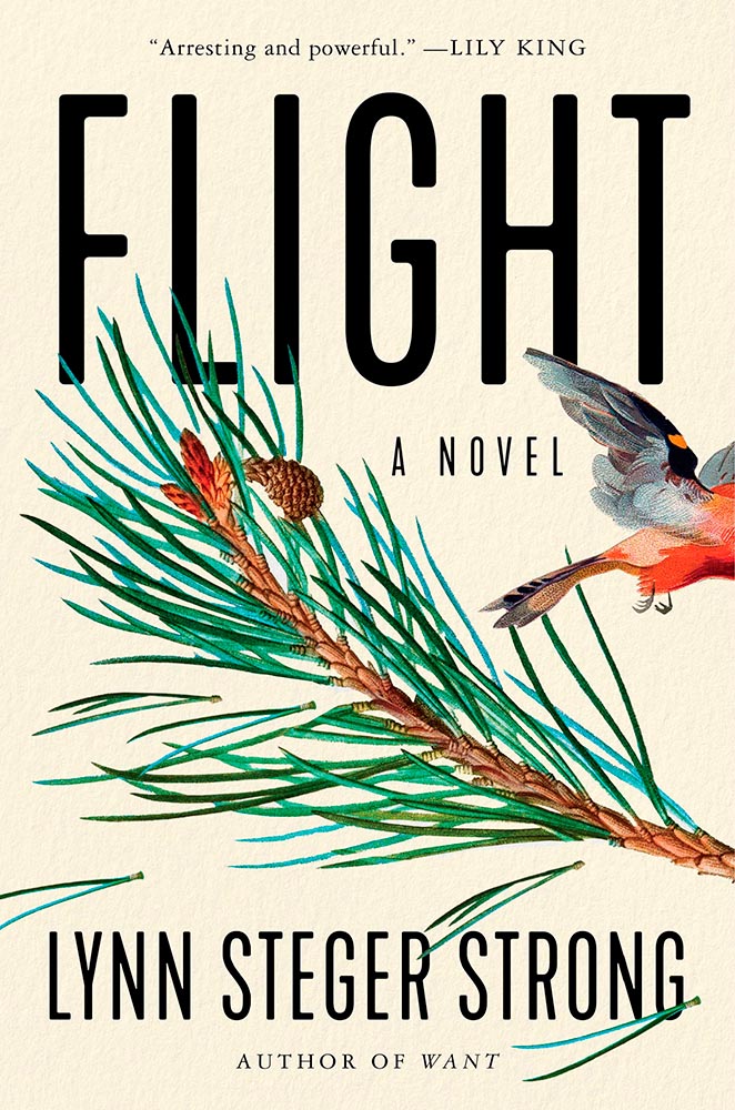
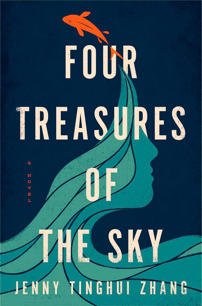
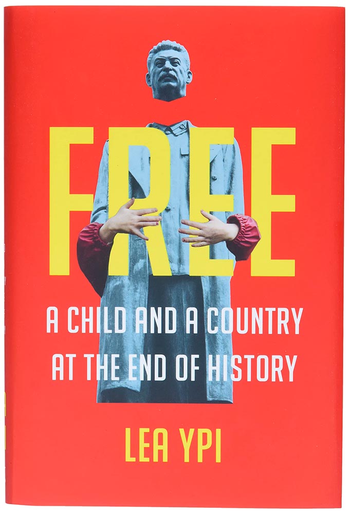
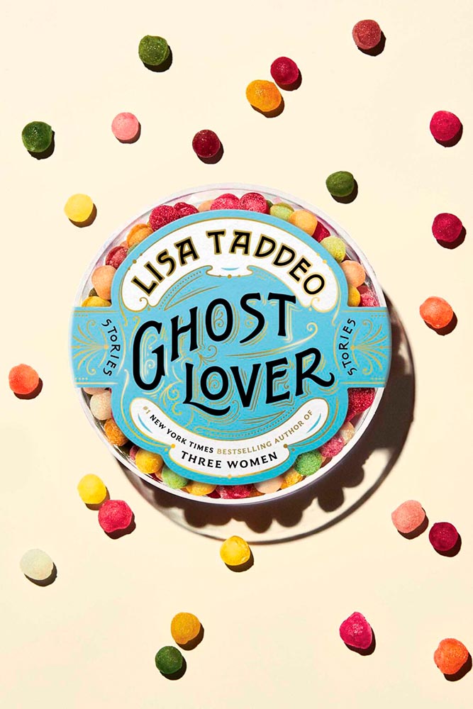
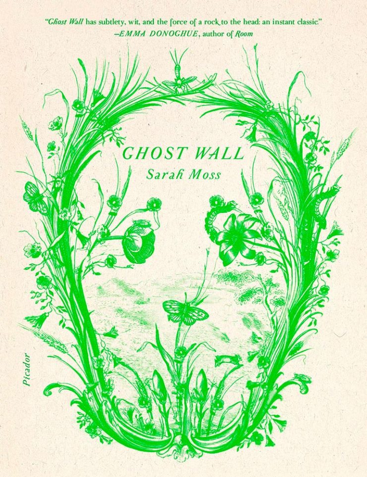
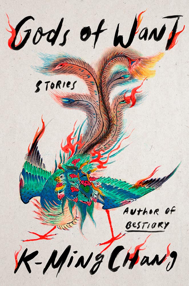
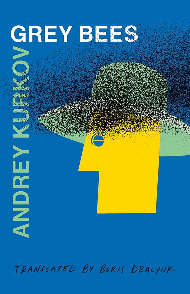
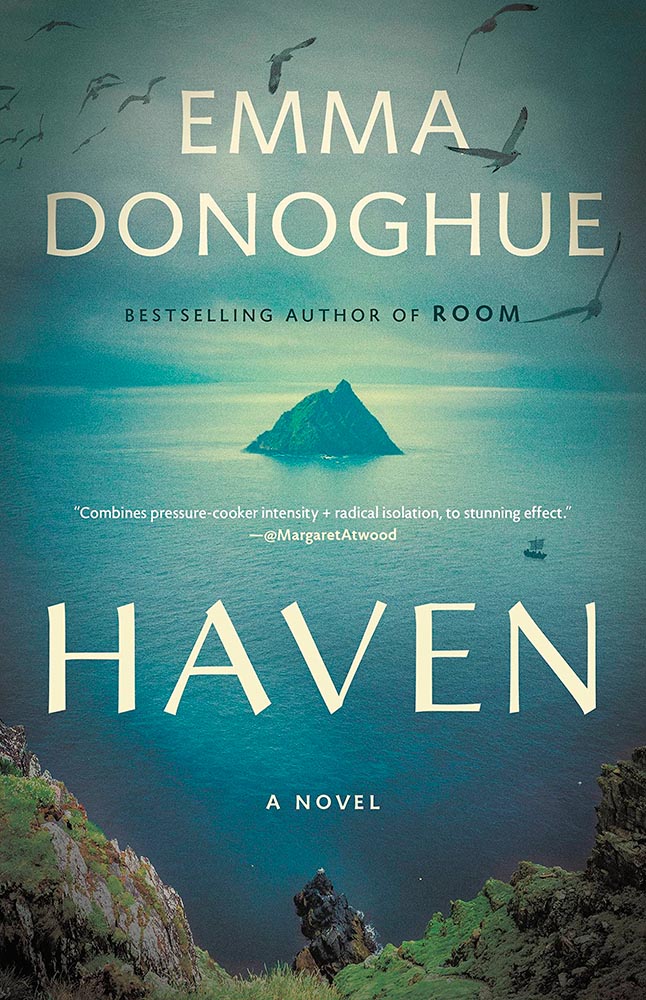
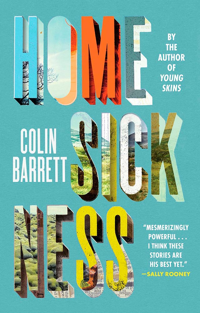
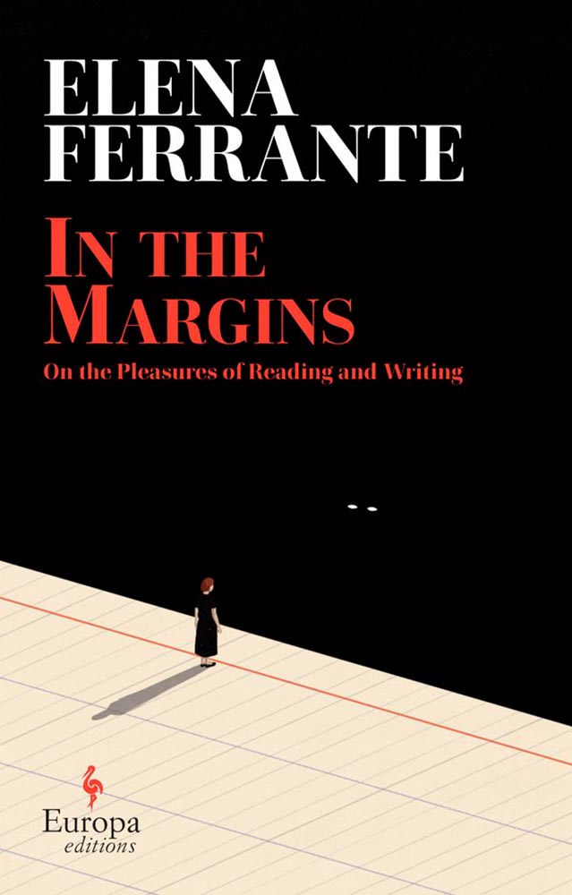
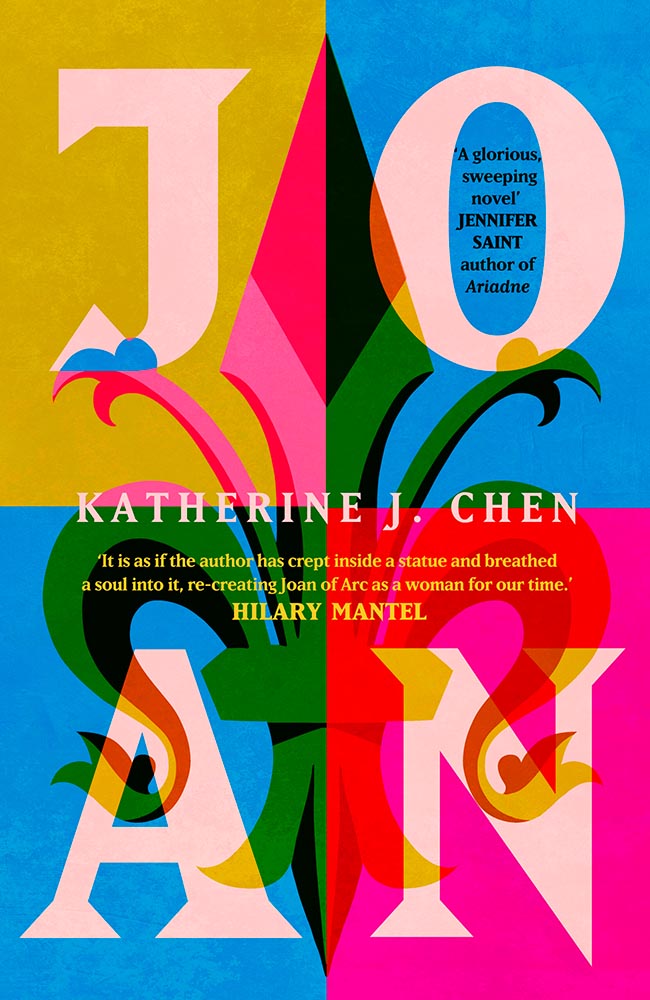
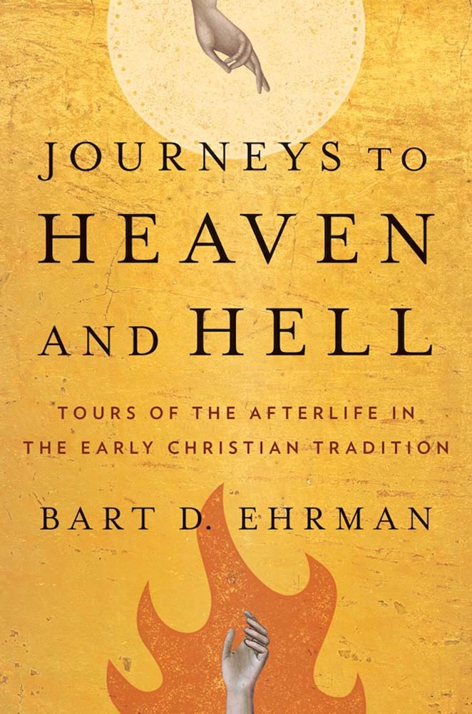
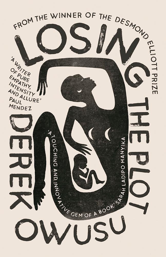
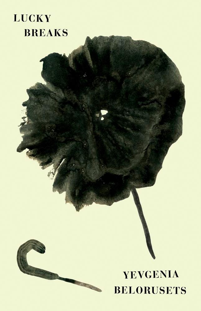
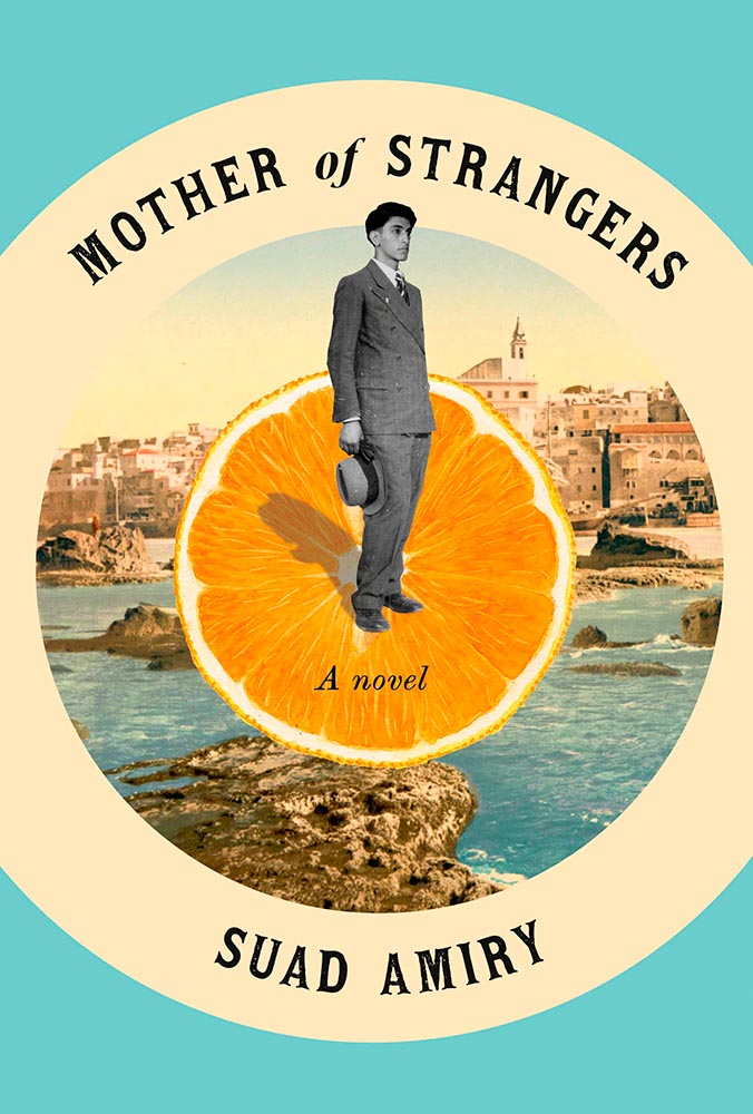
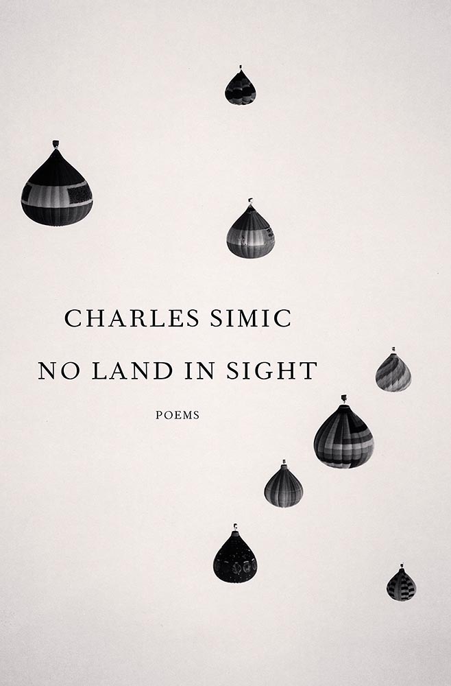
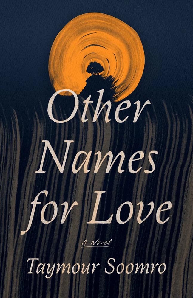
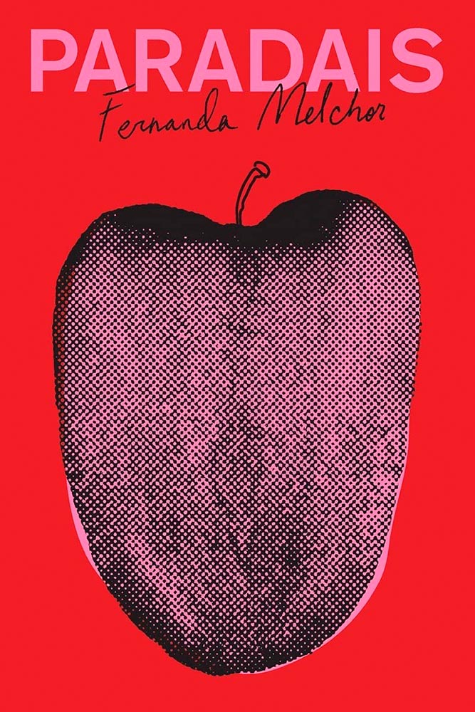
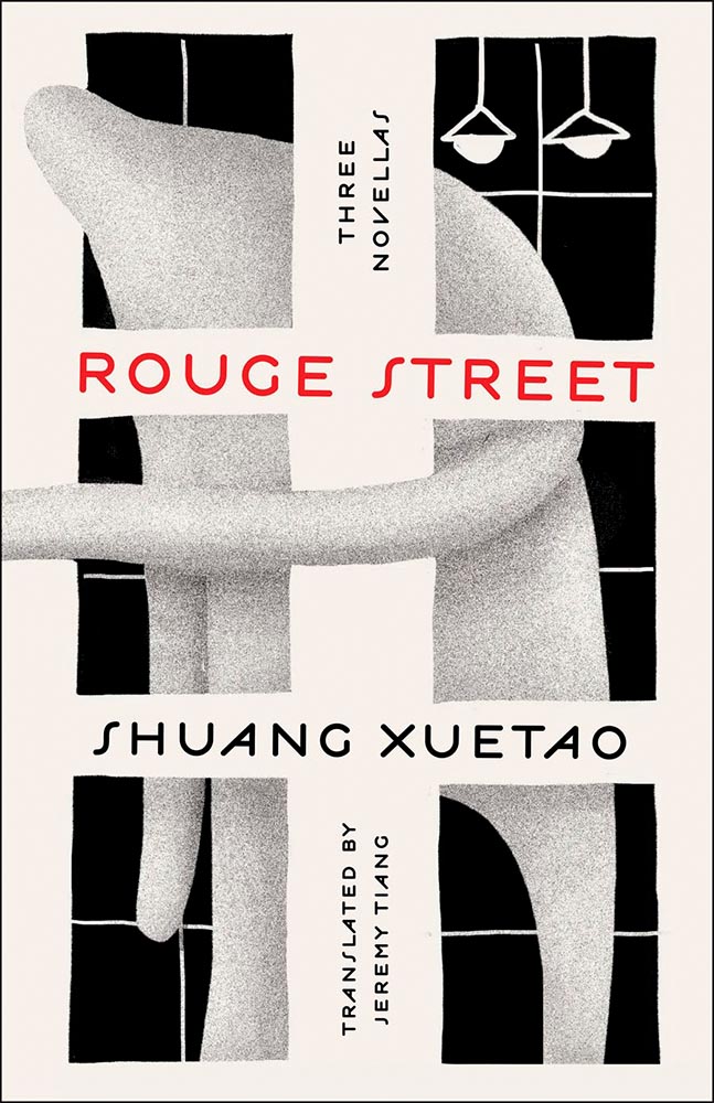
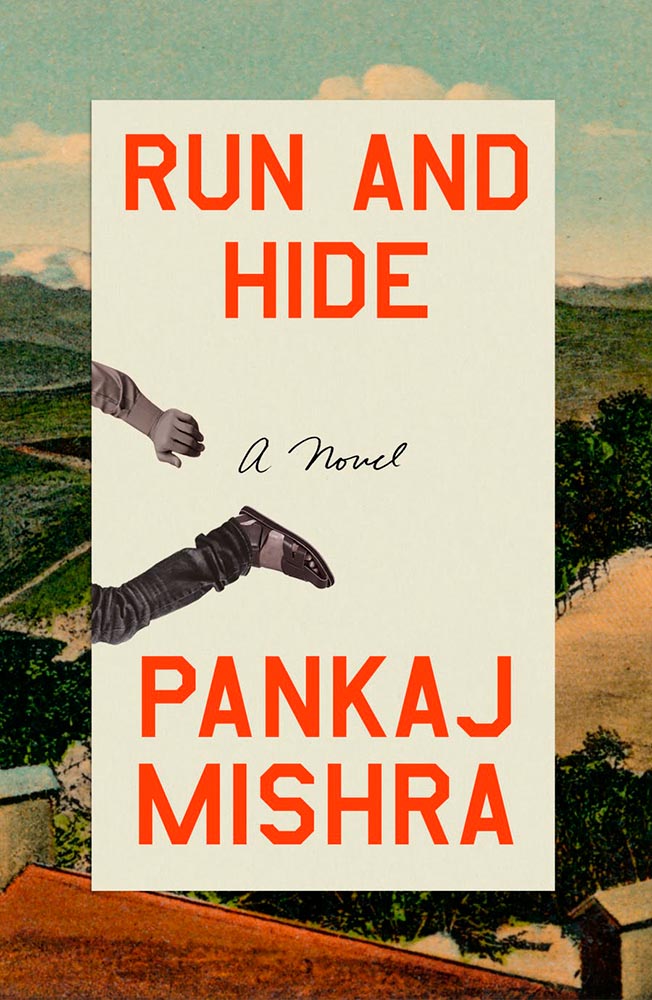
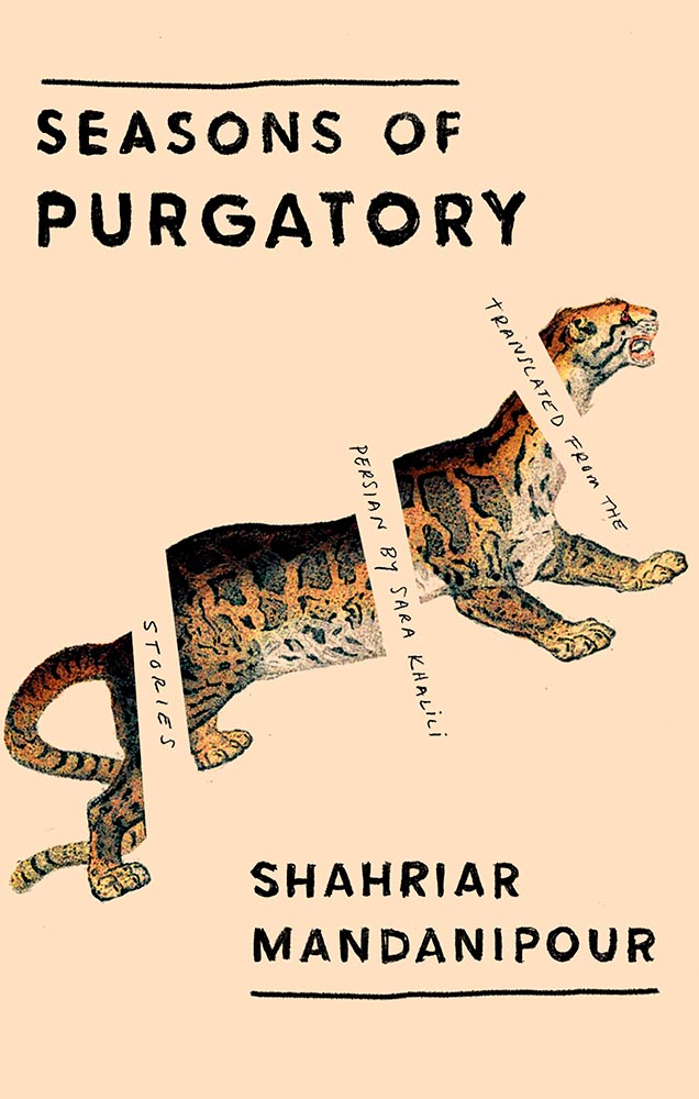
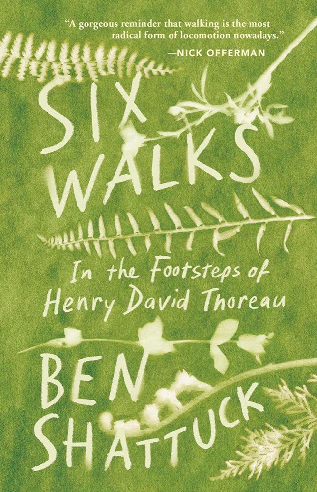
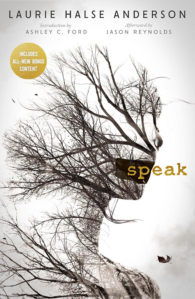
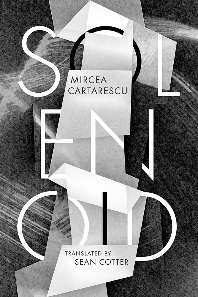
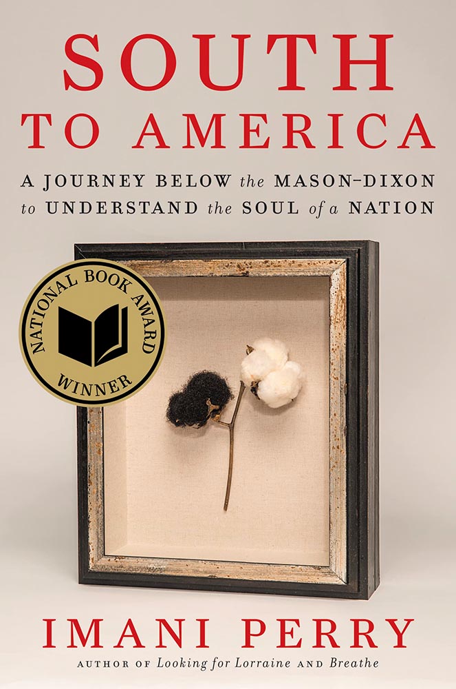
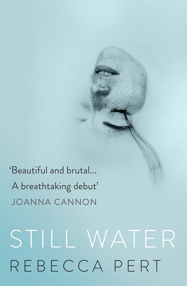
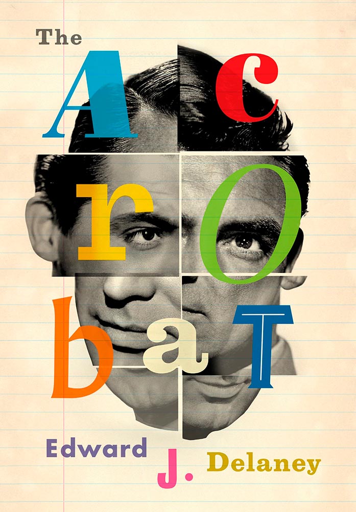
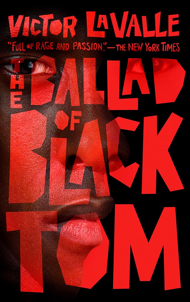
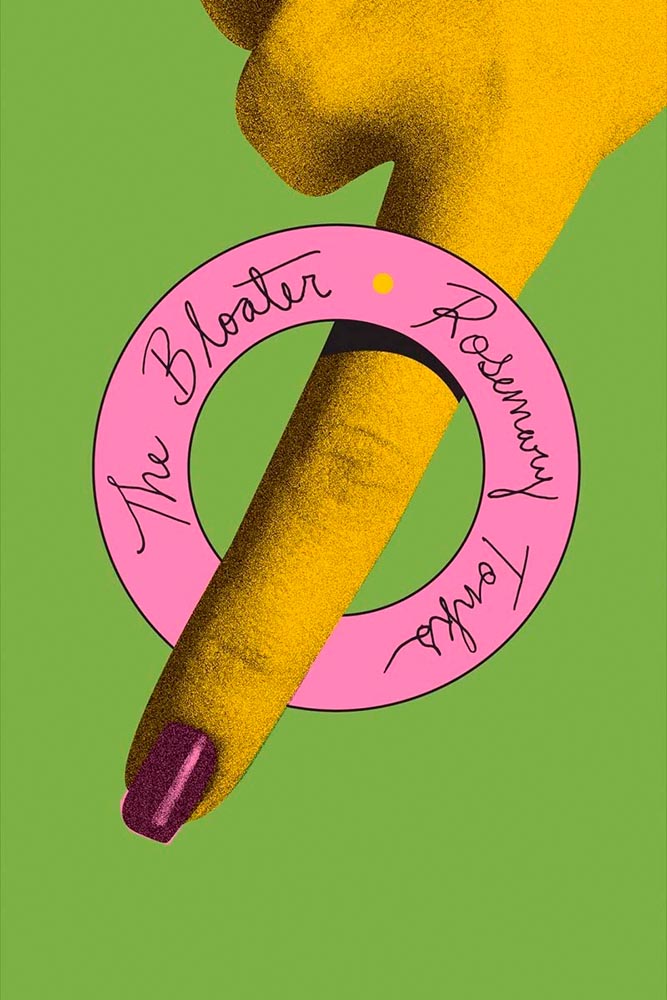
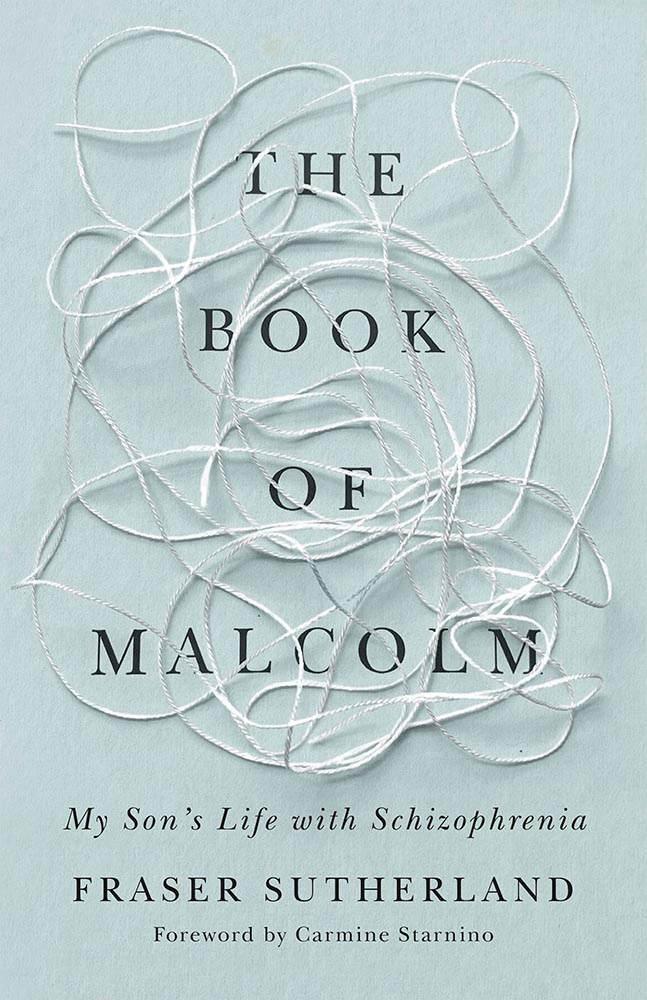
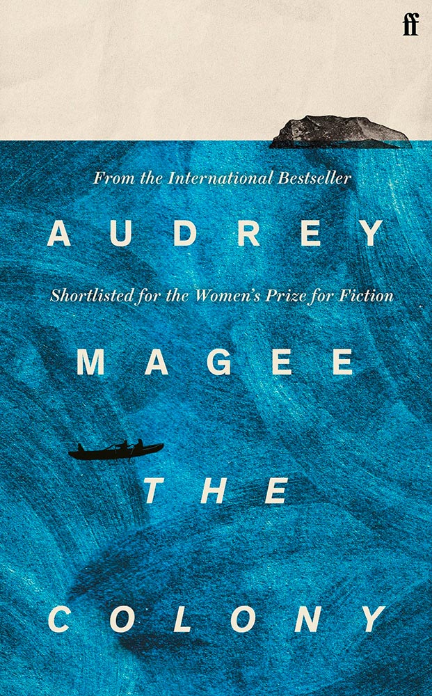
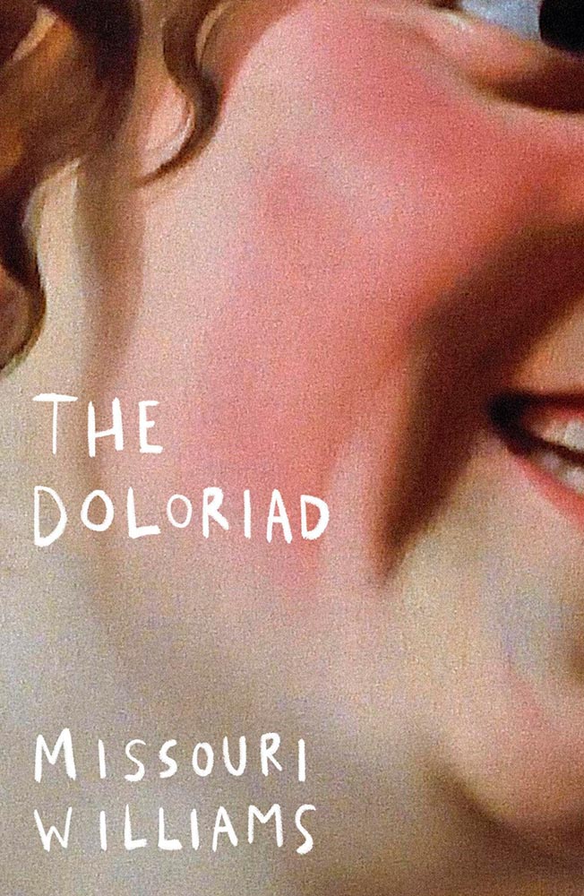
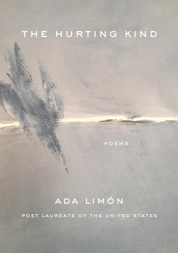
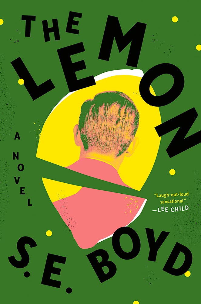
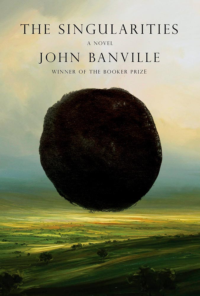
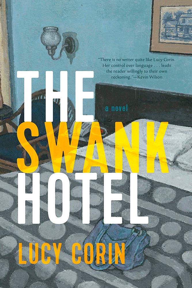
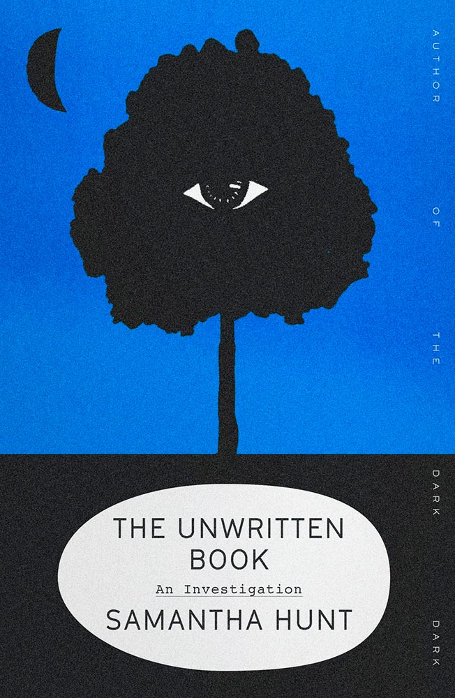
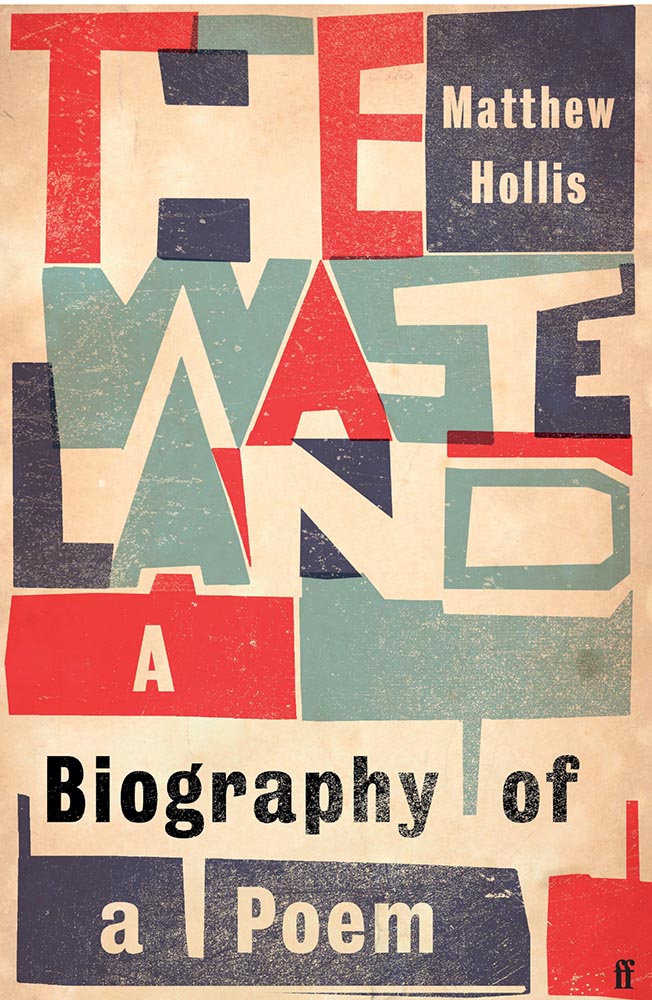
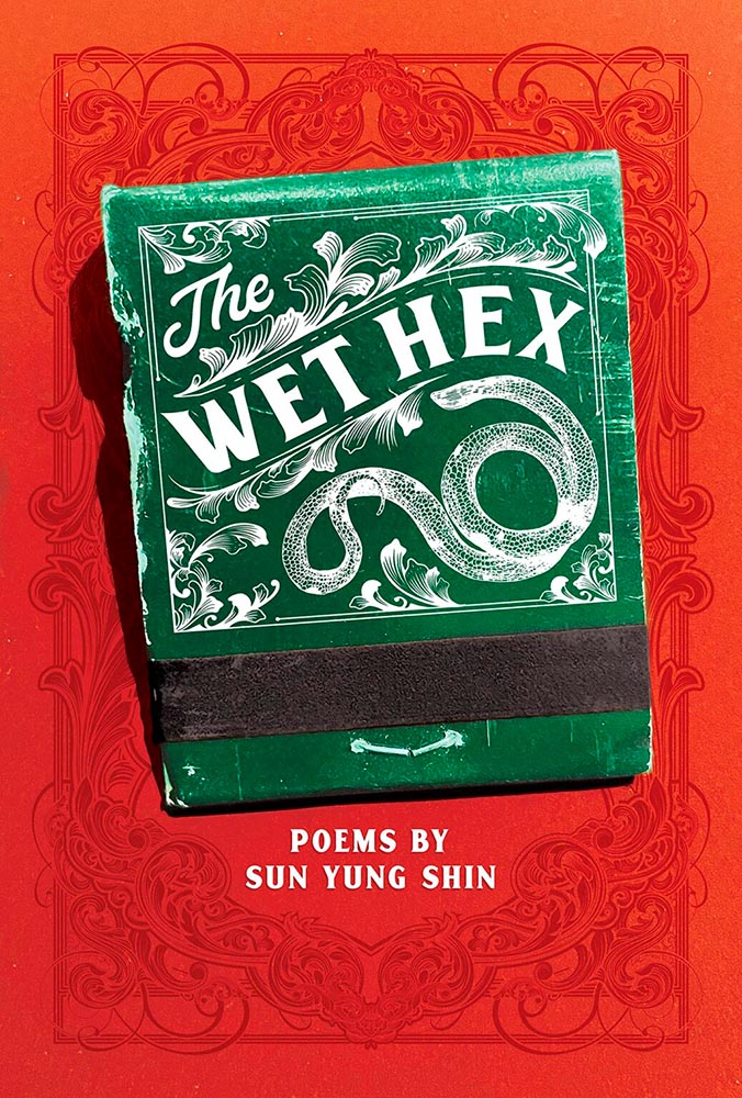
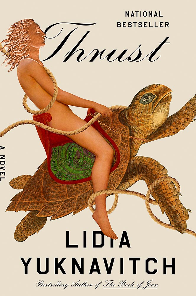
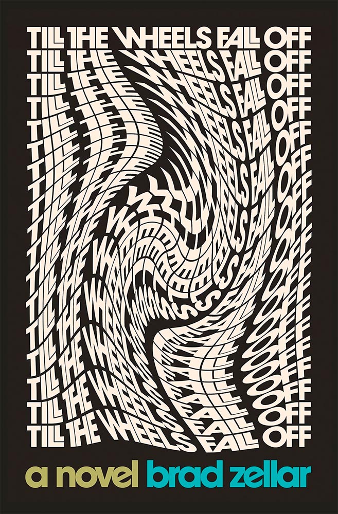
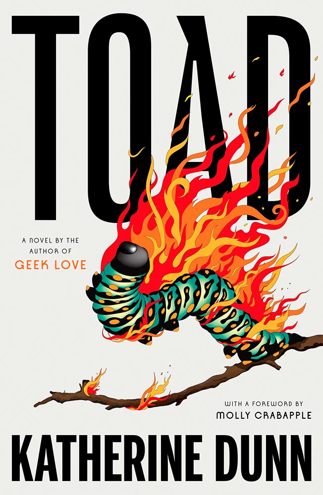
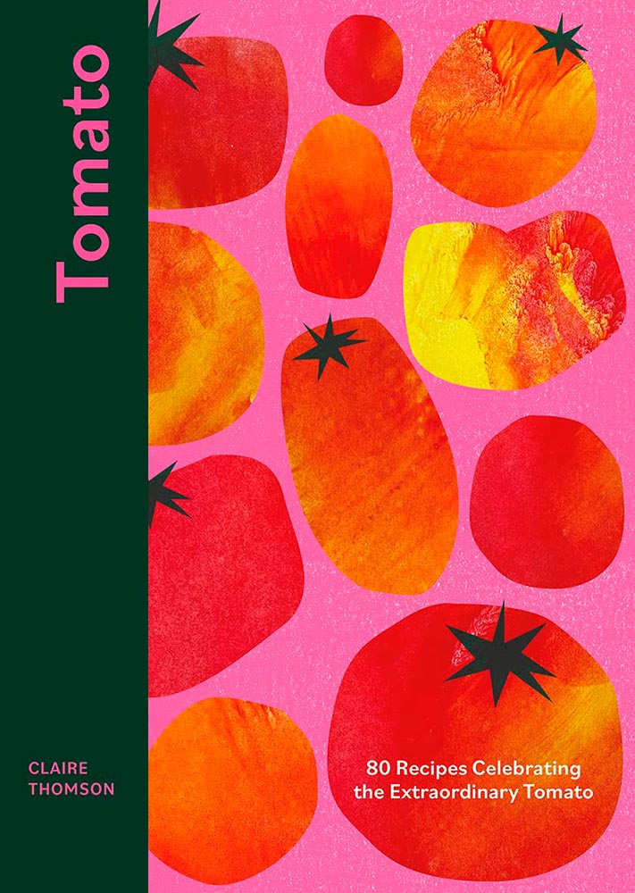
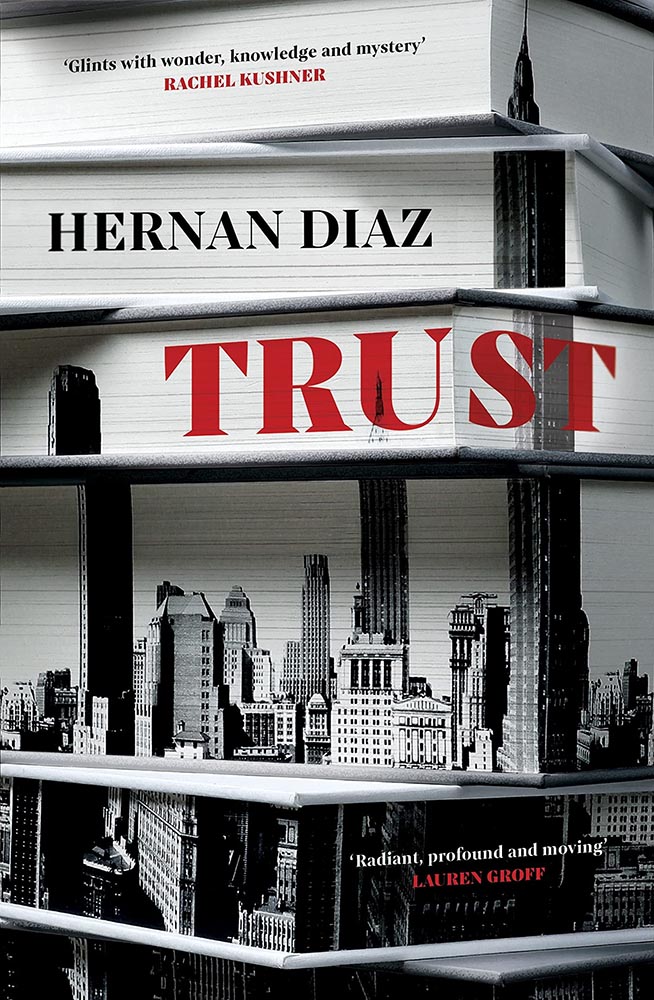
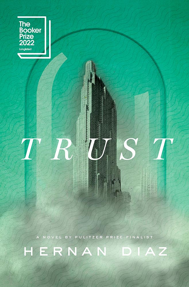
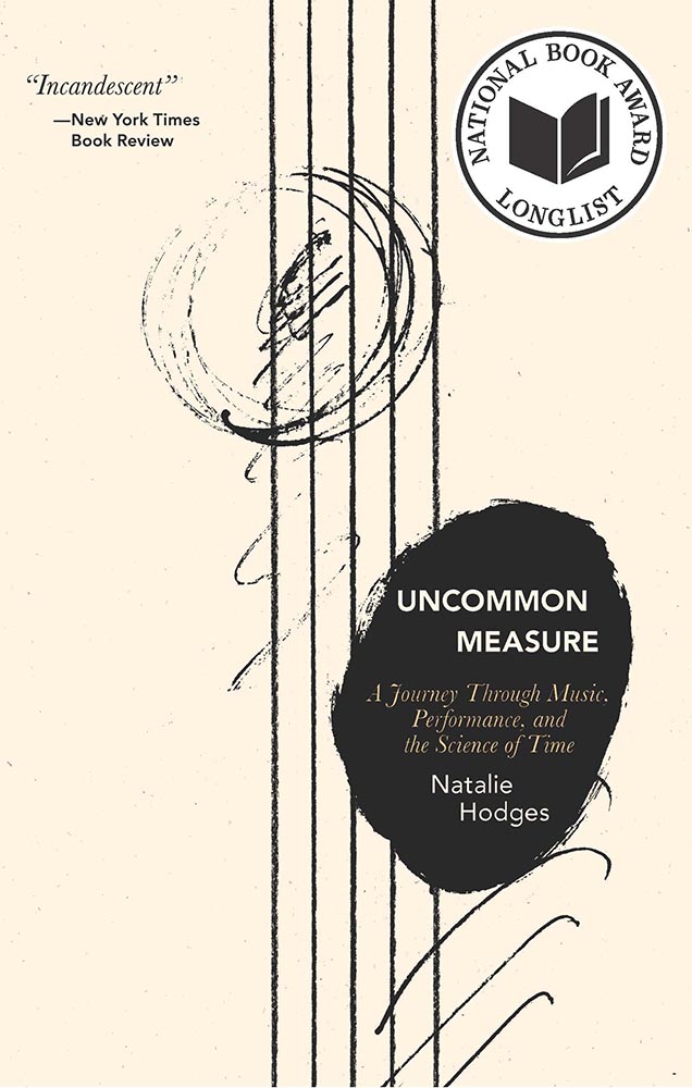
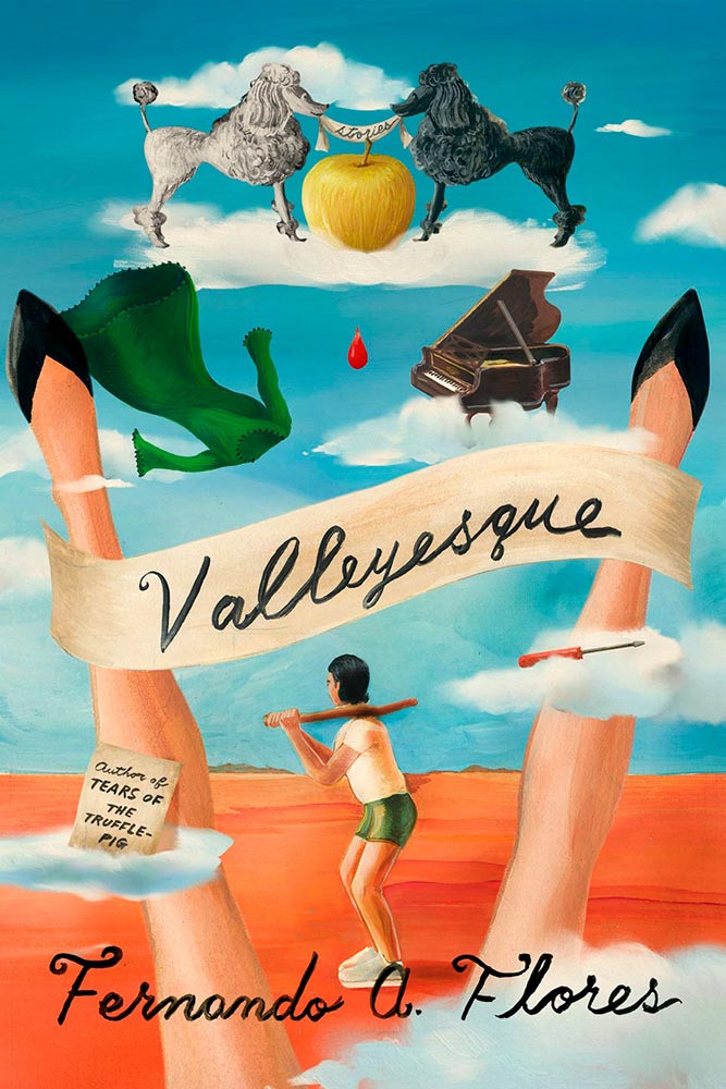
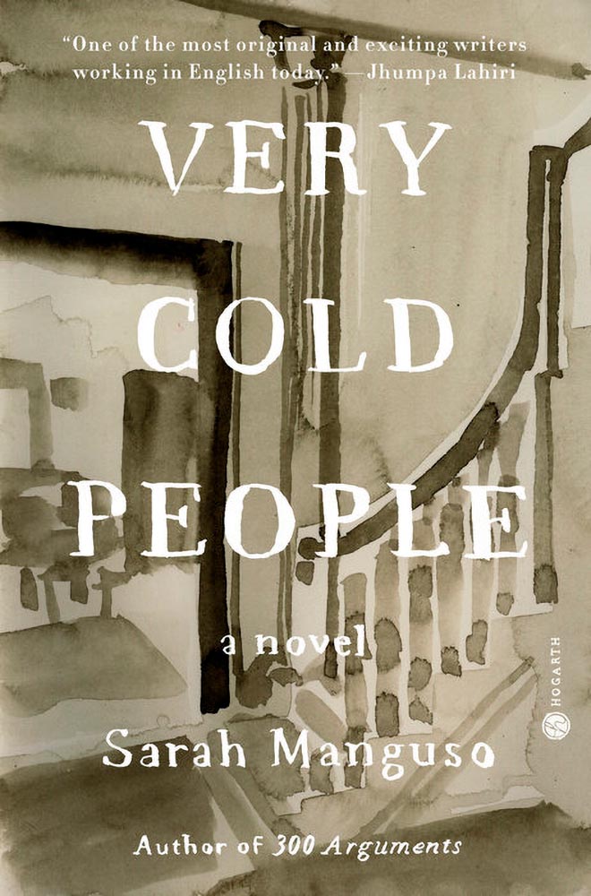
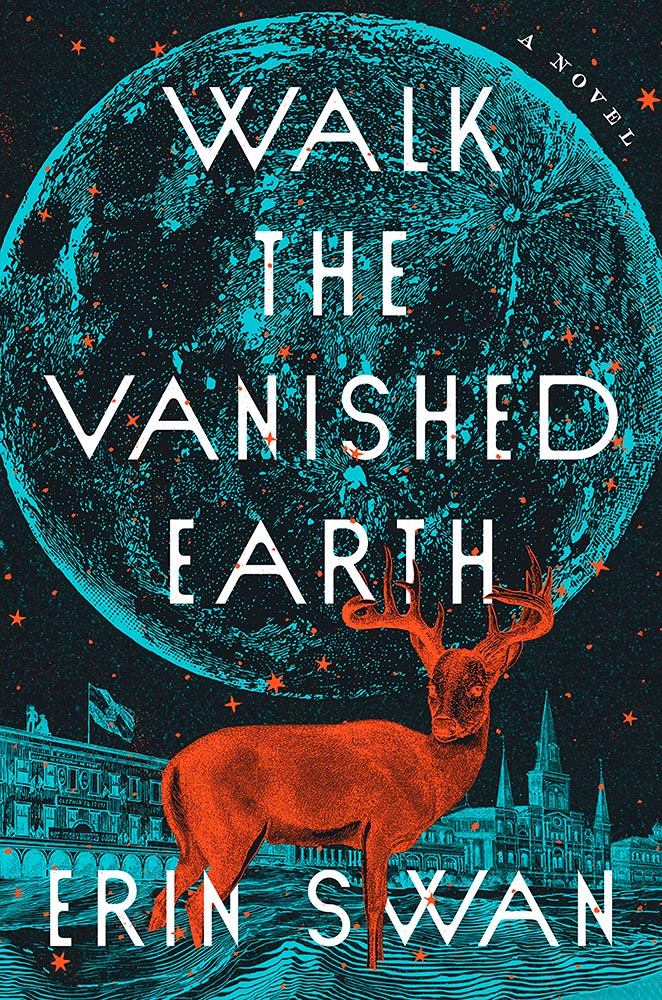
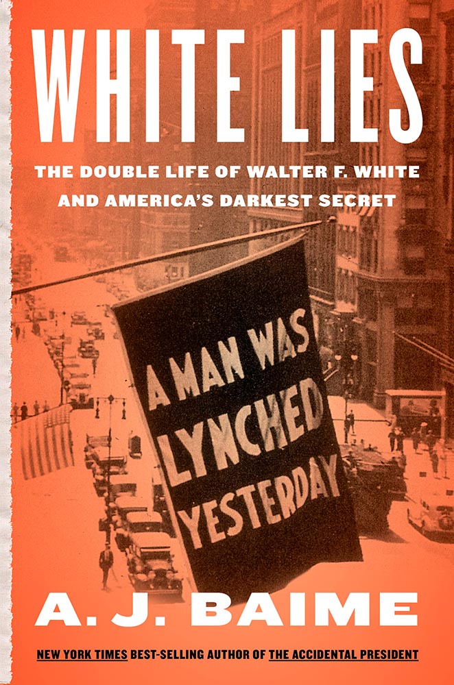
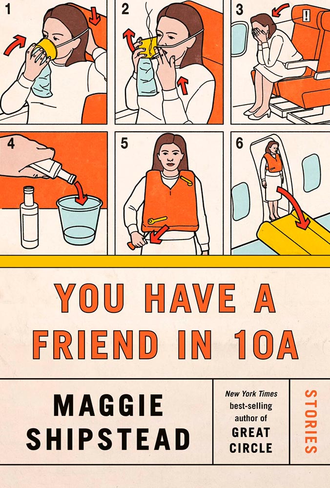
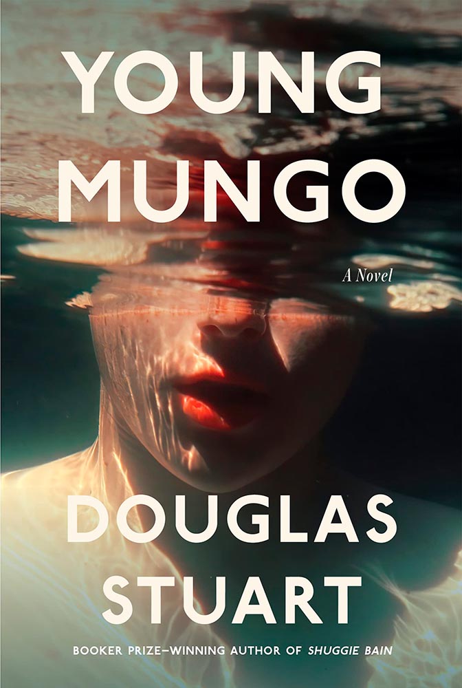
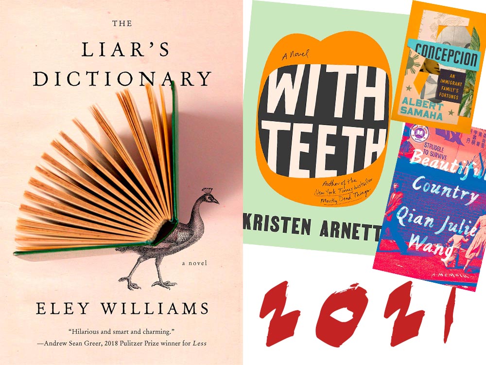
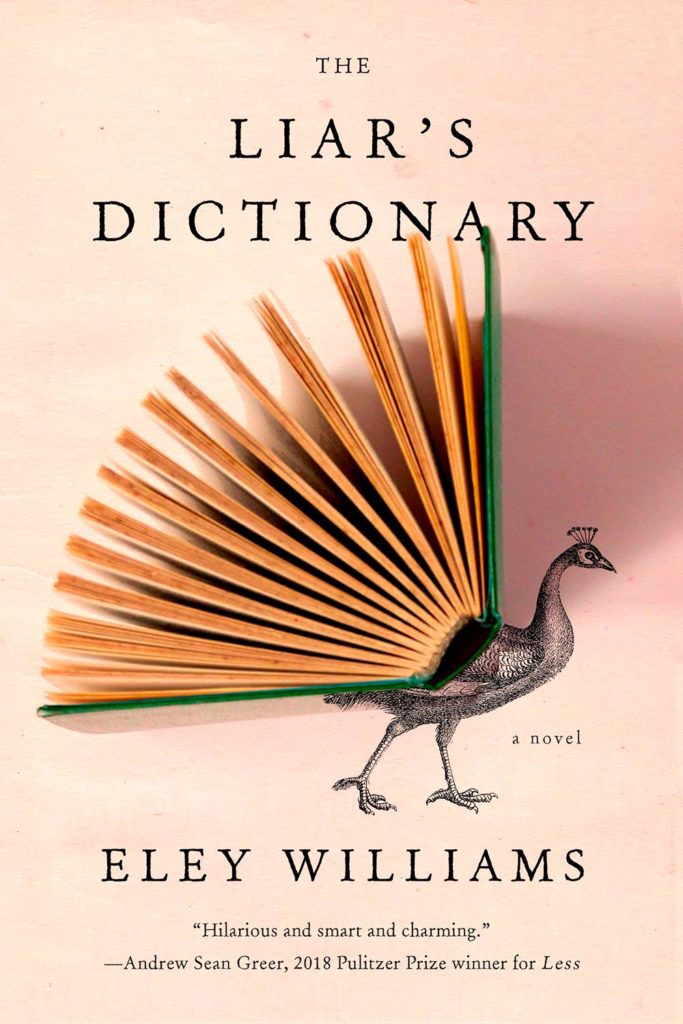
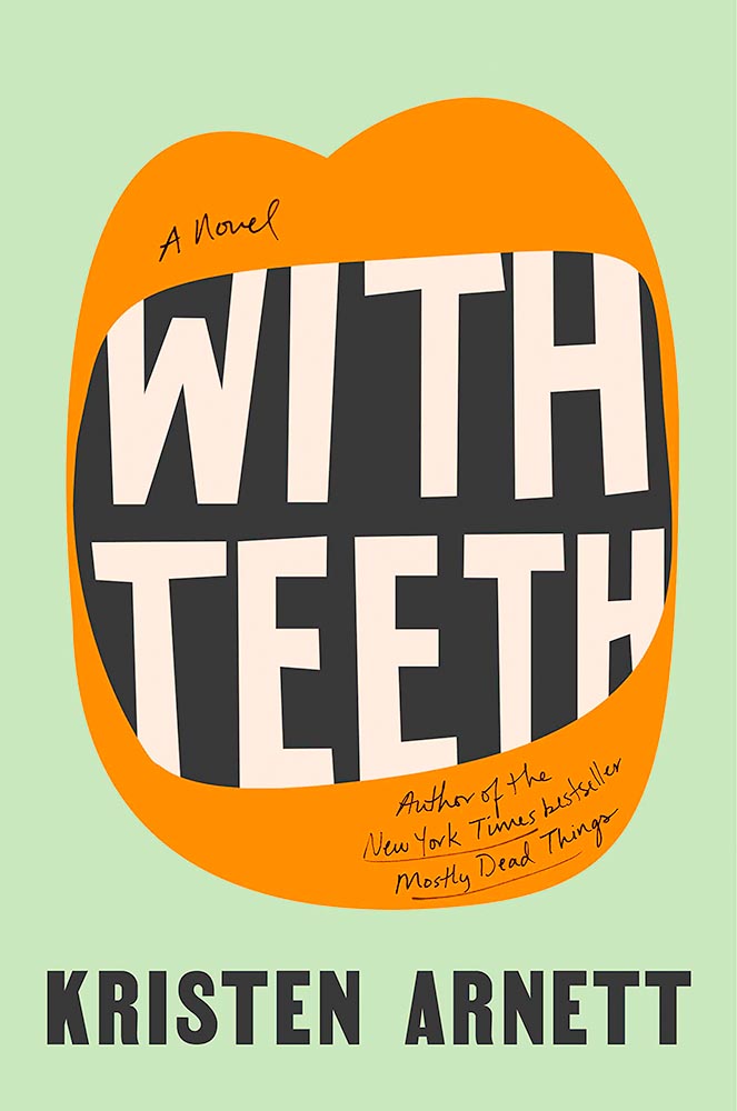
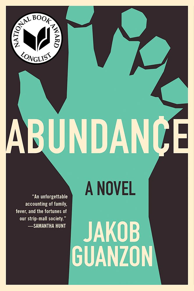
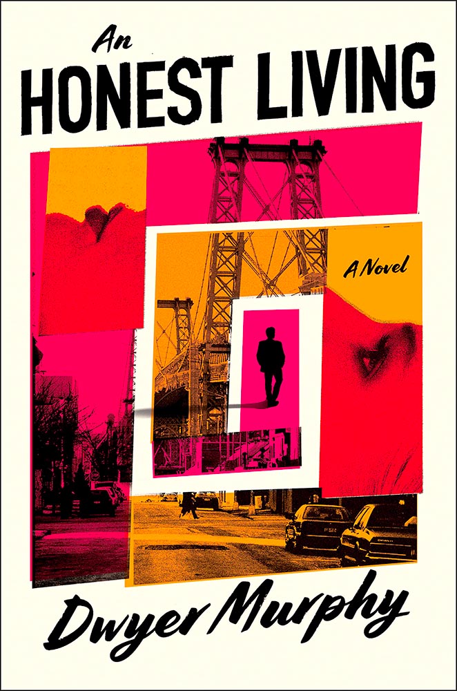
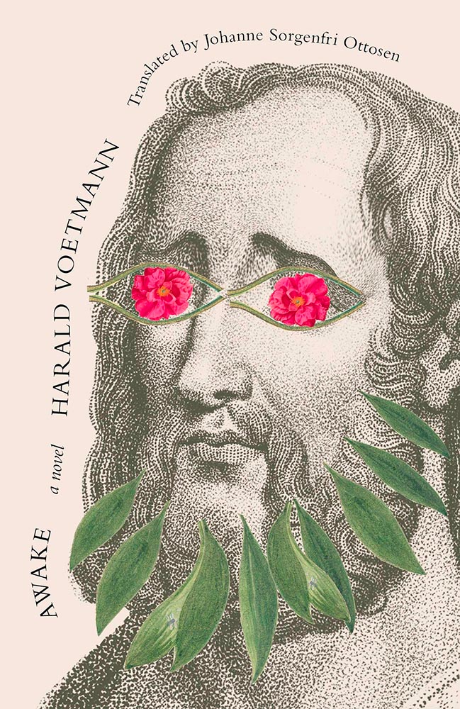
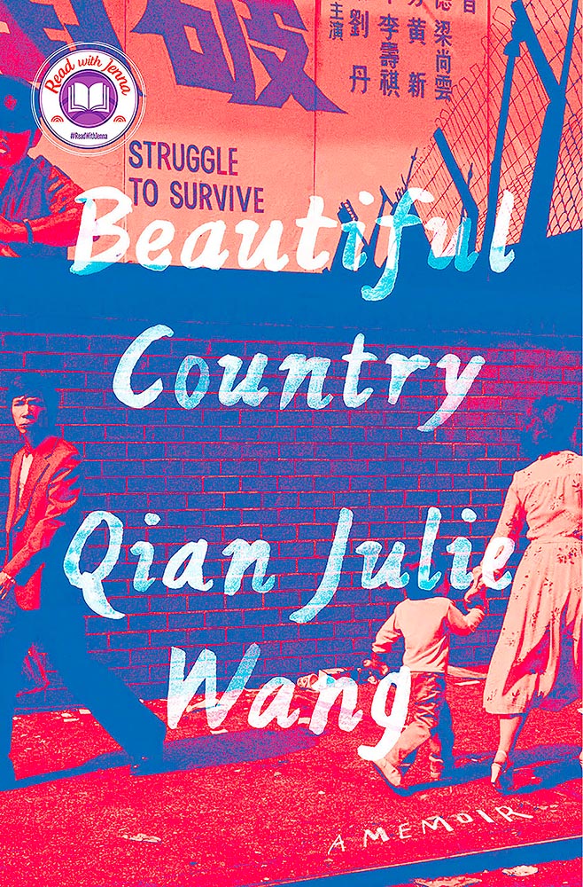
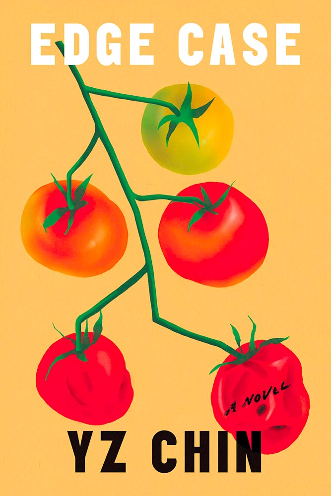
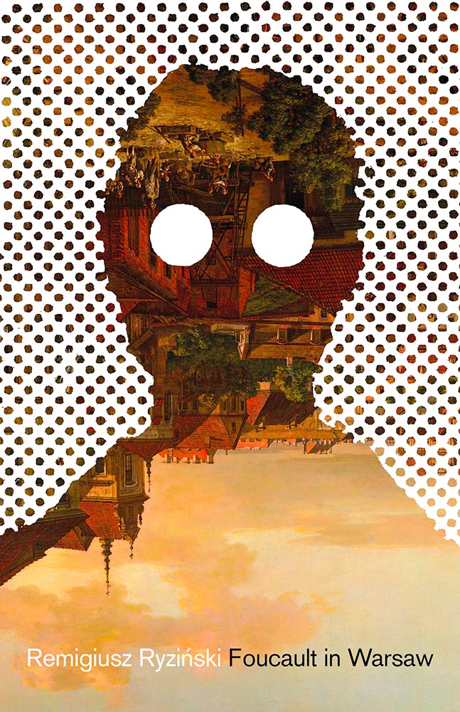
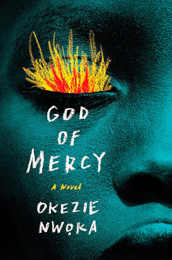
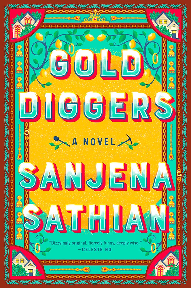
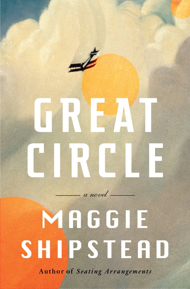
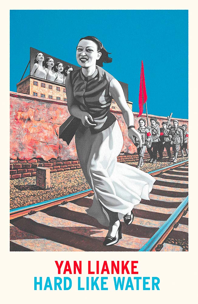
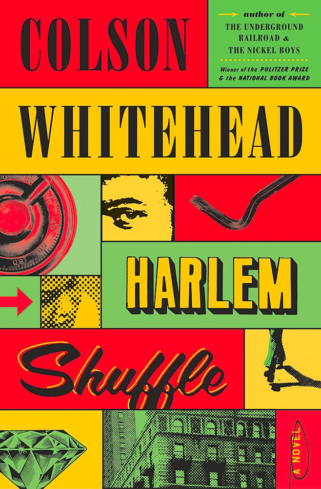
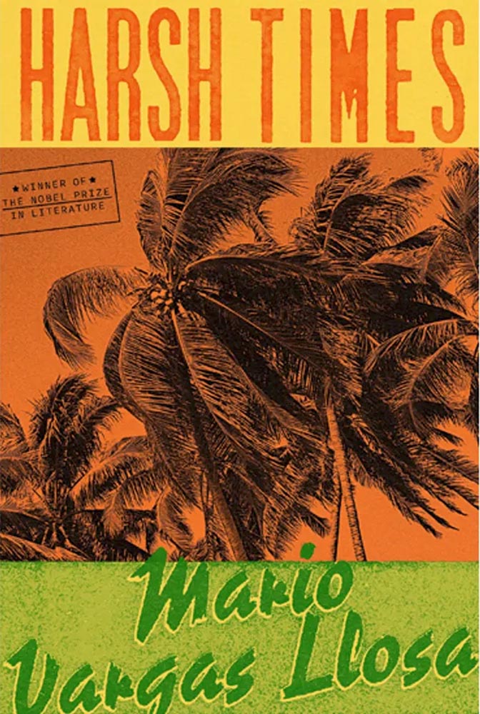
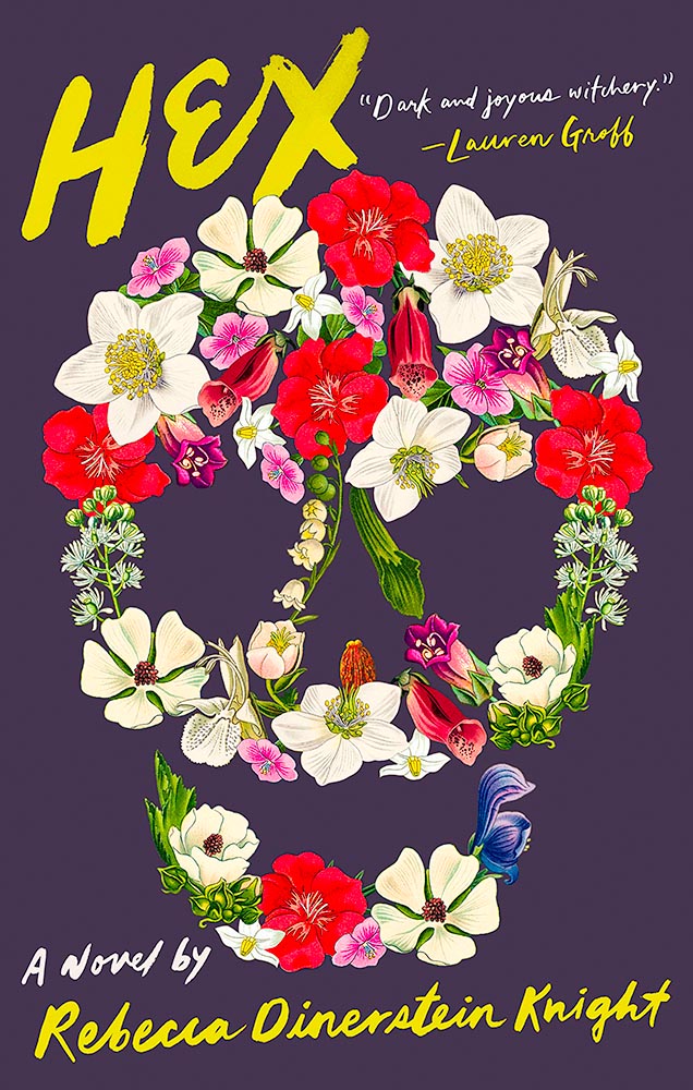
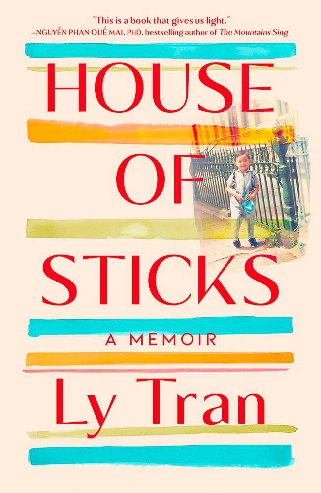
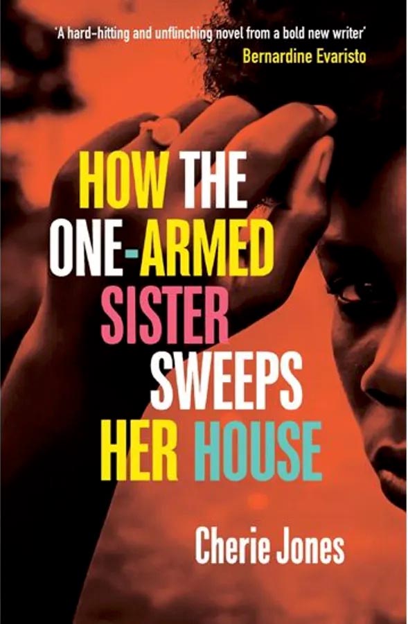
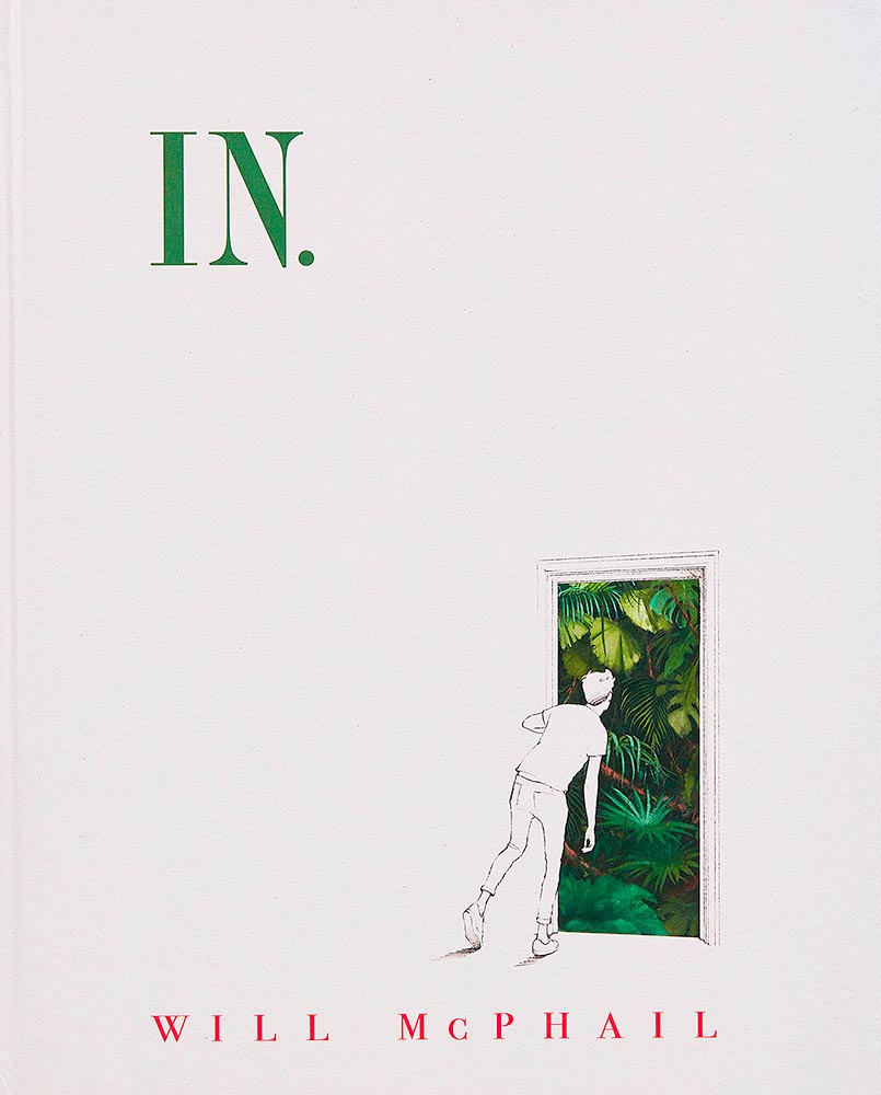
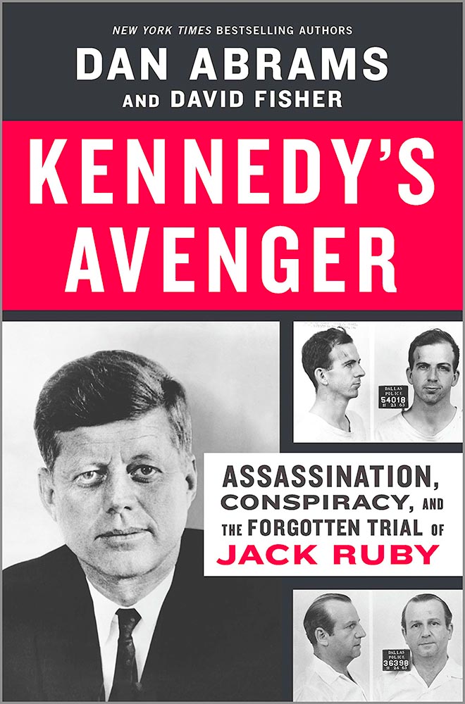
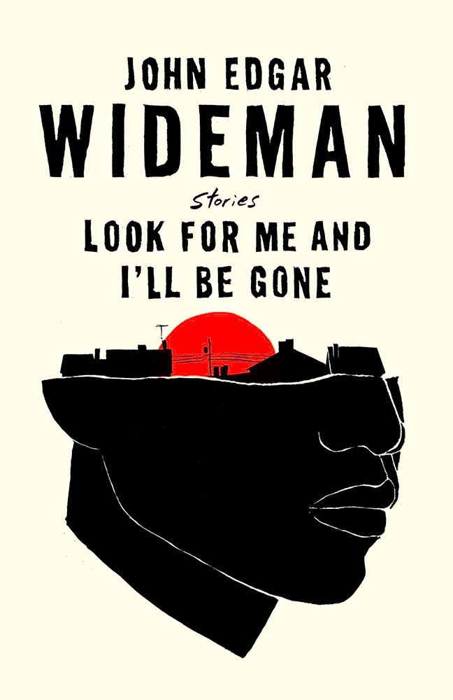
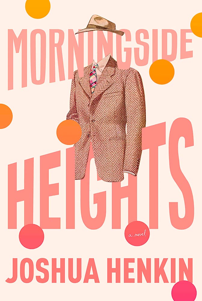
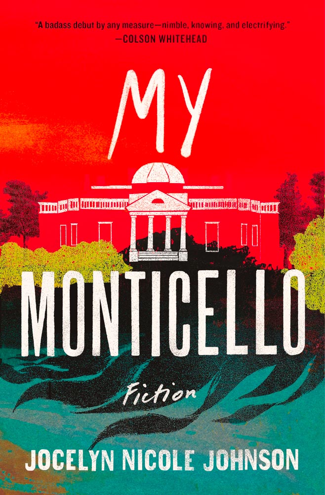
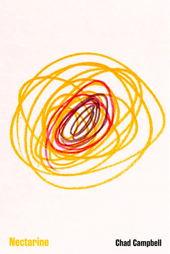
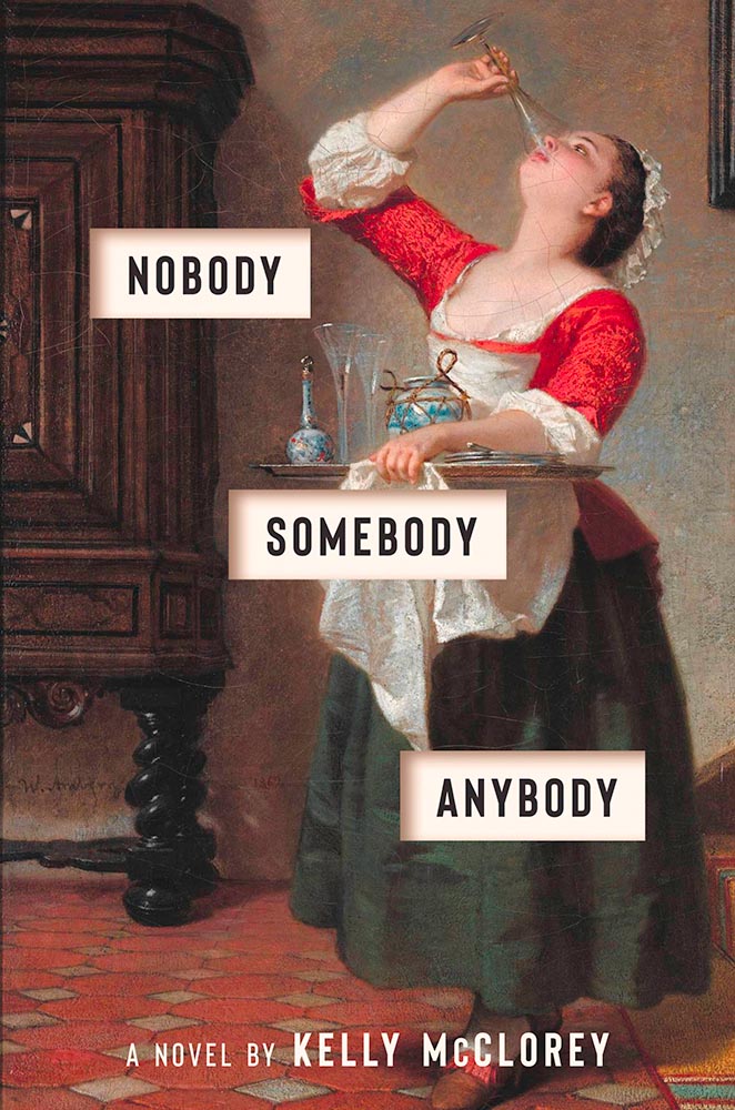
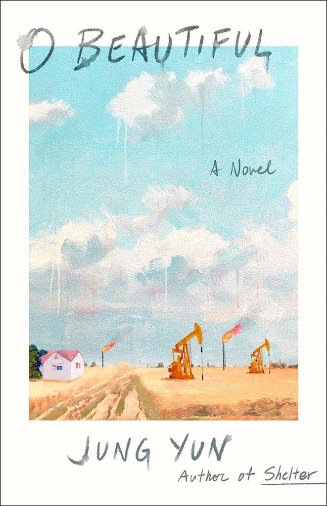
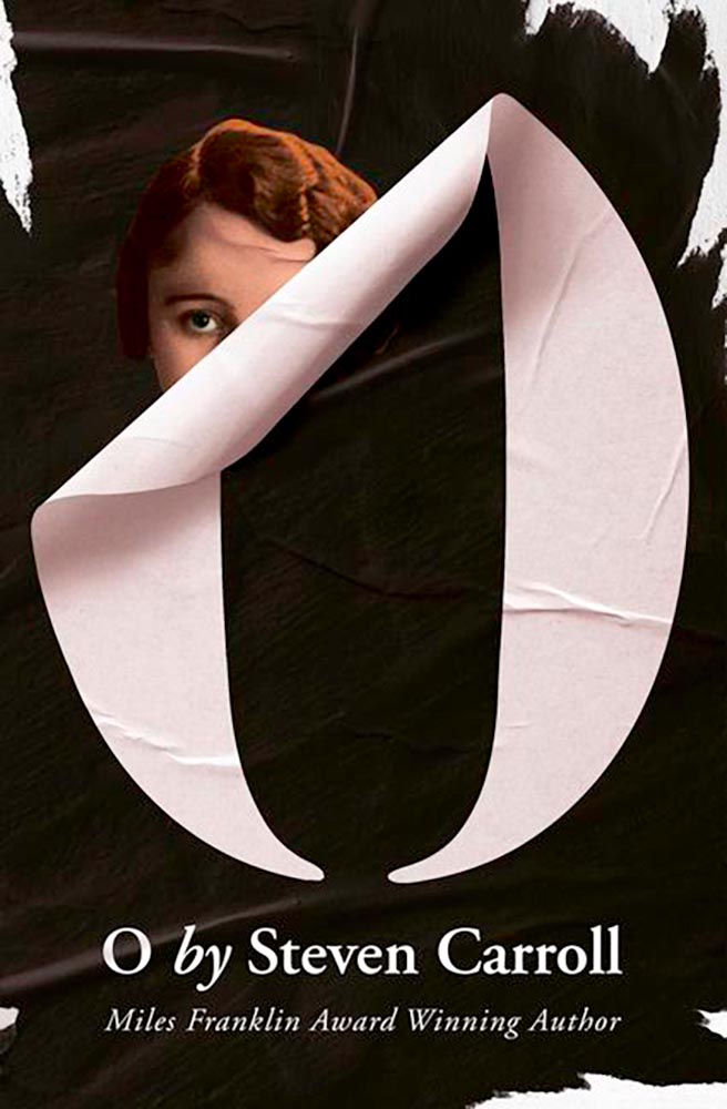
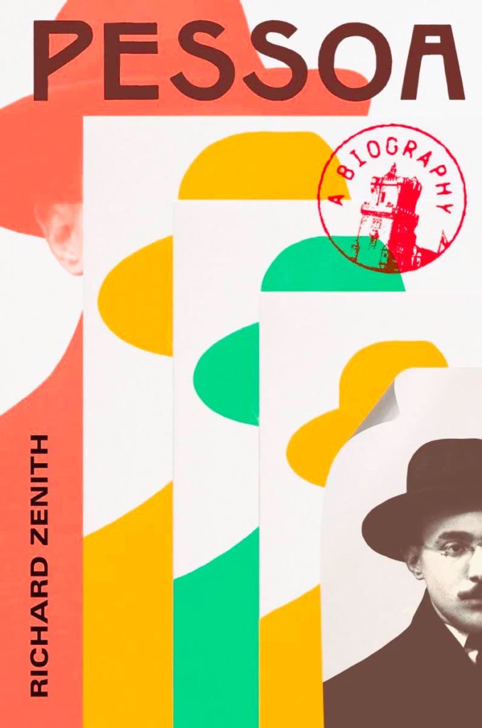
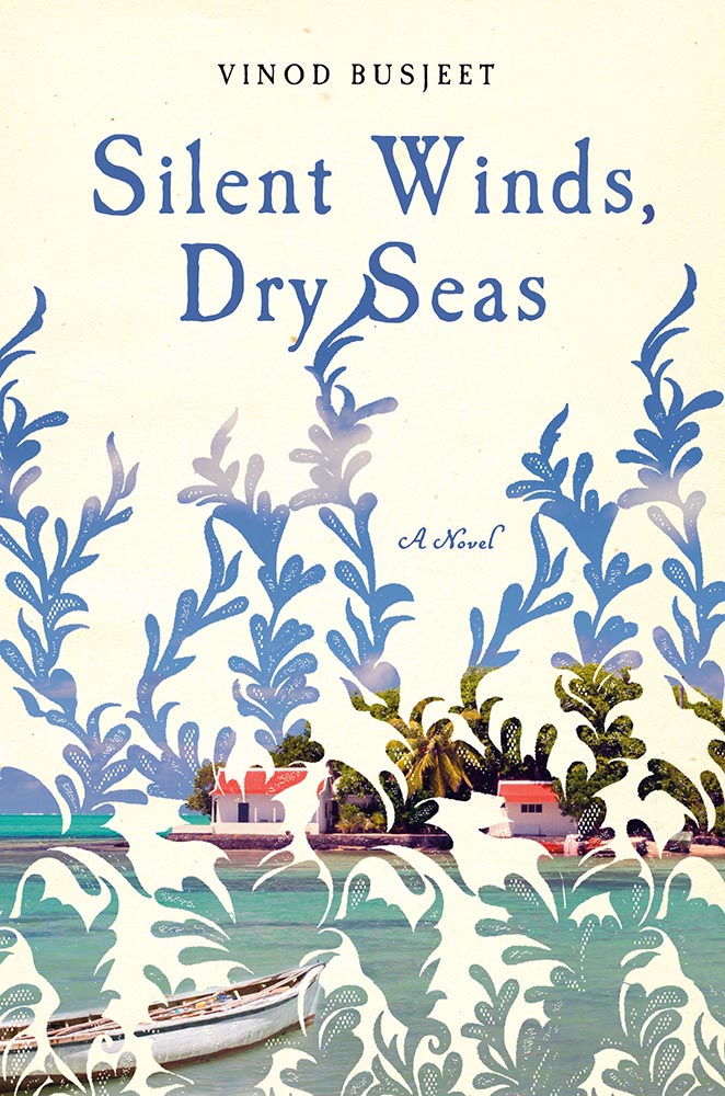
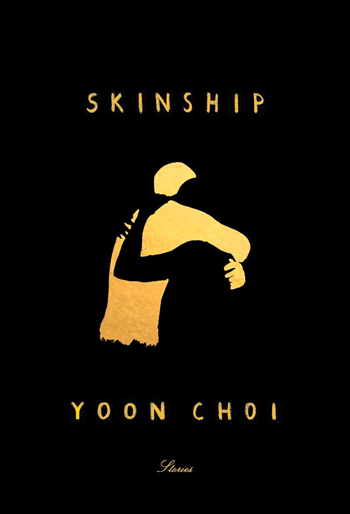
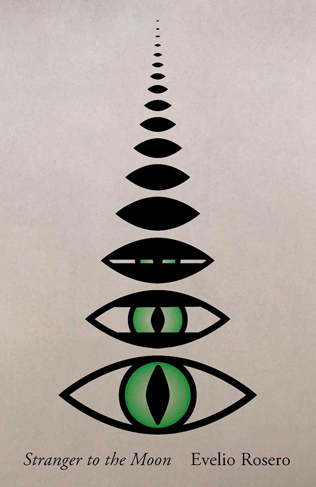
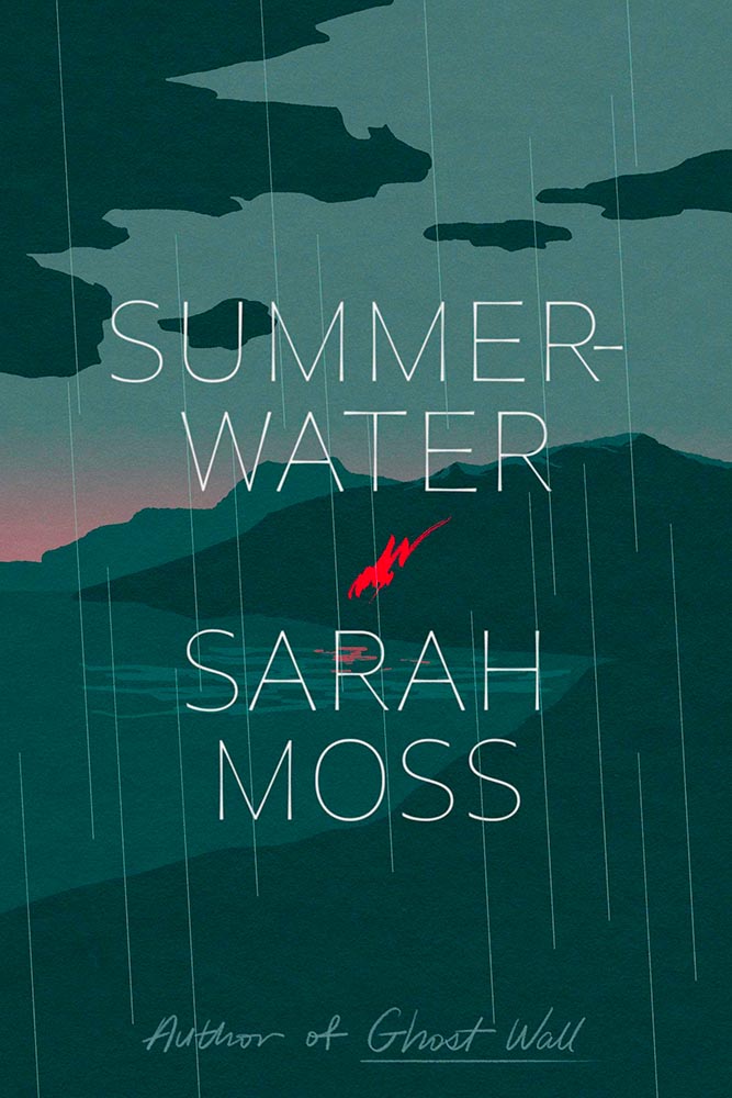
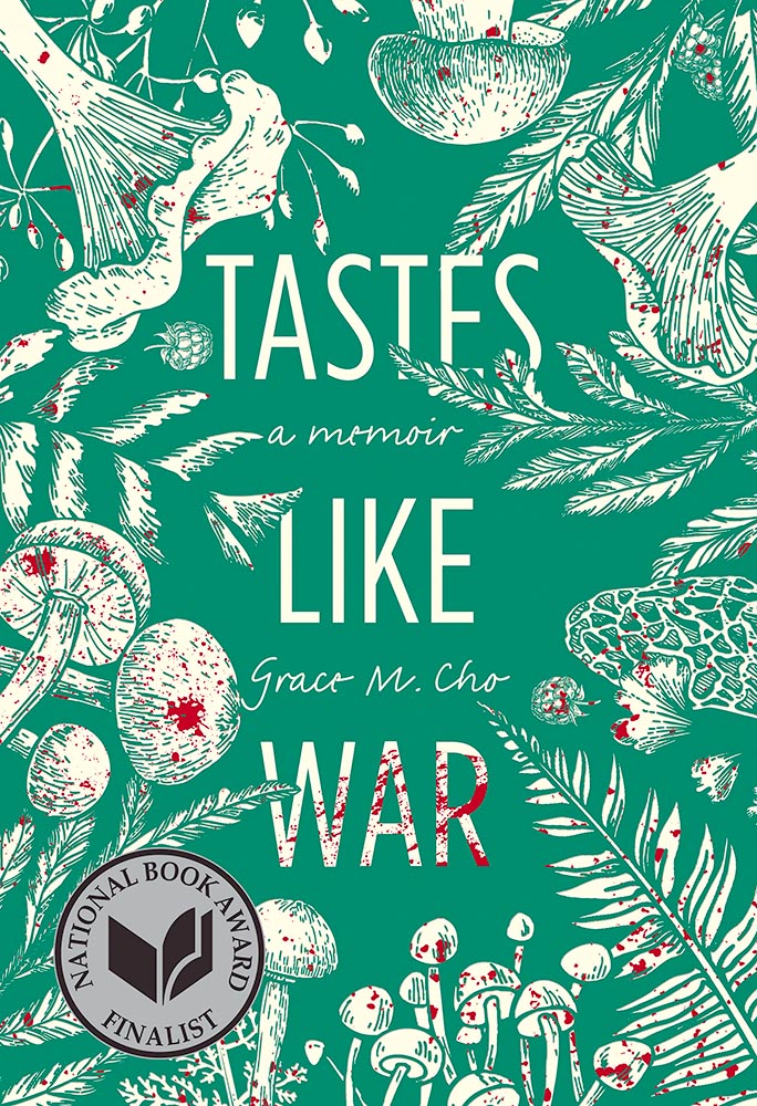
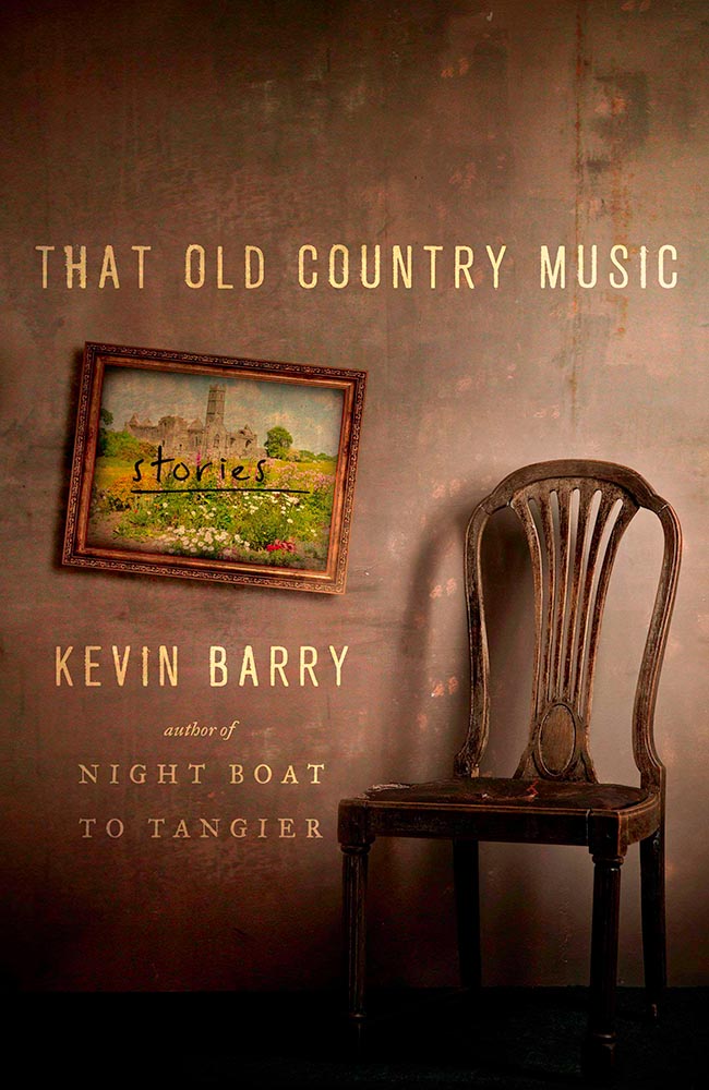
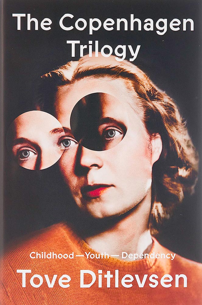
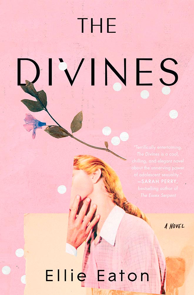
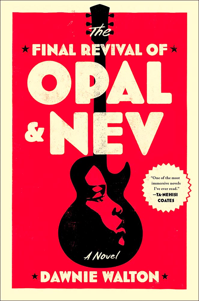
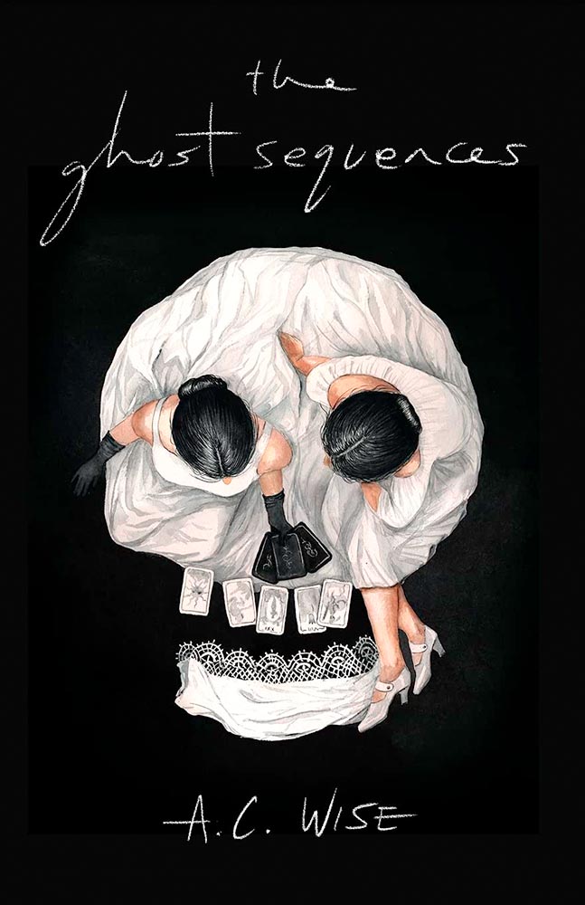
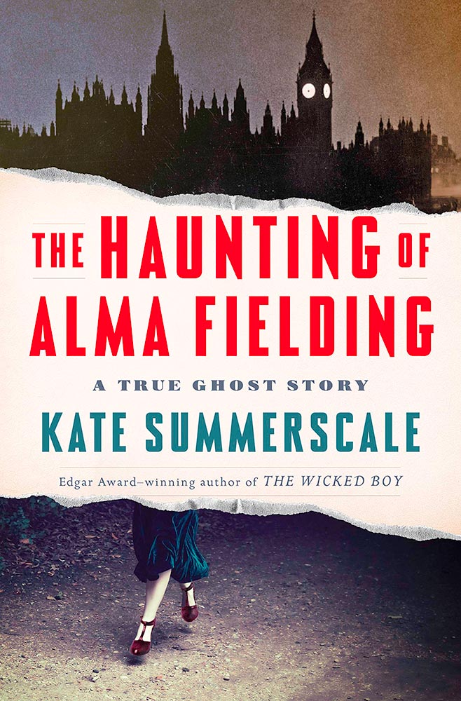
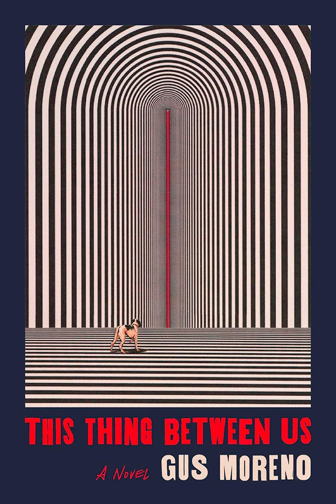
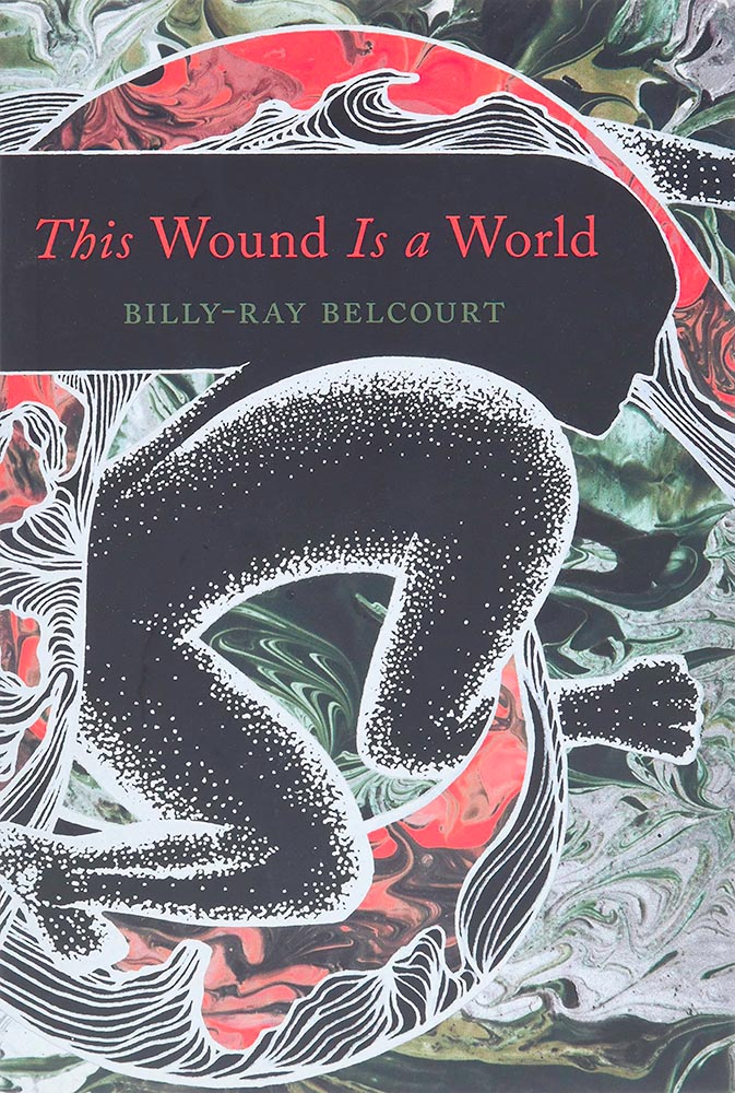
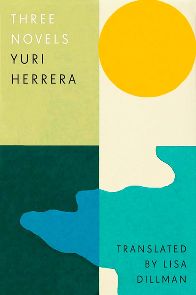
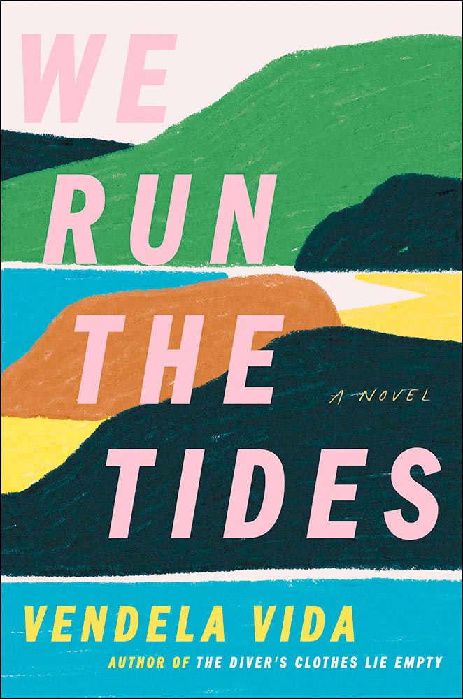
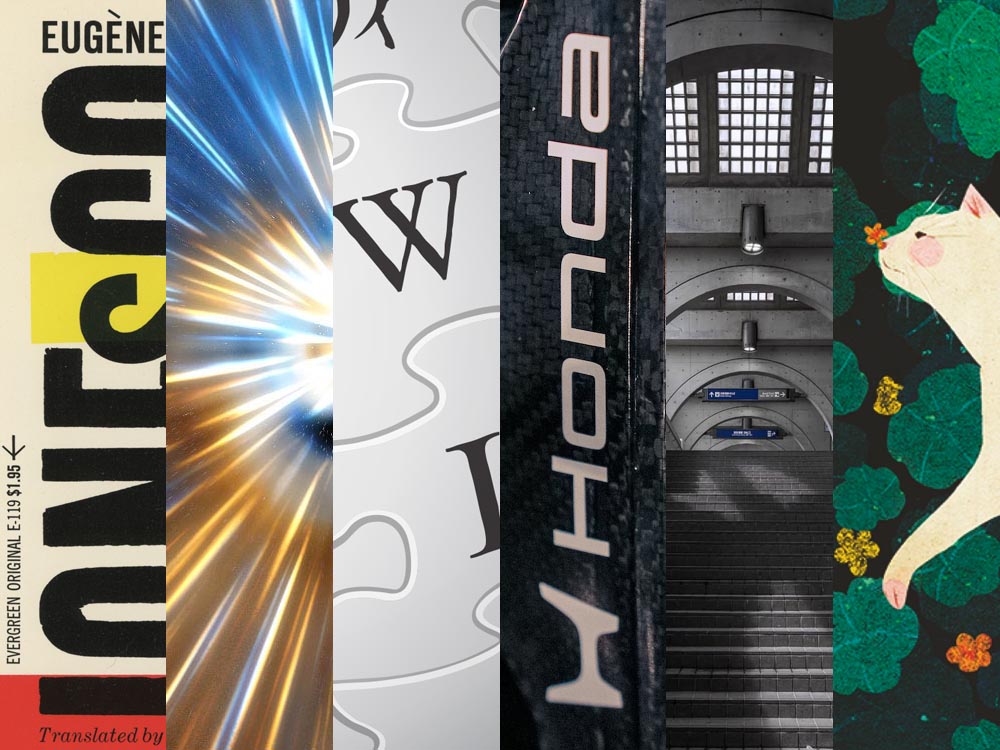
Favorite Book Covers of 2025, and More
If you’ve not seen, set aside a few minutes to enjoy:
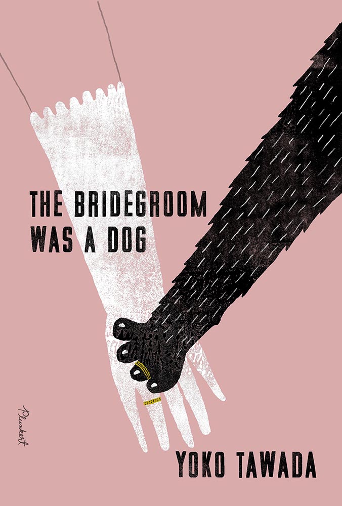
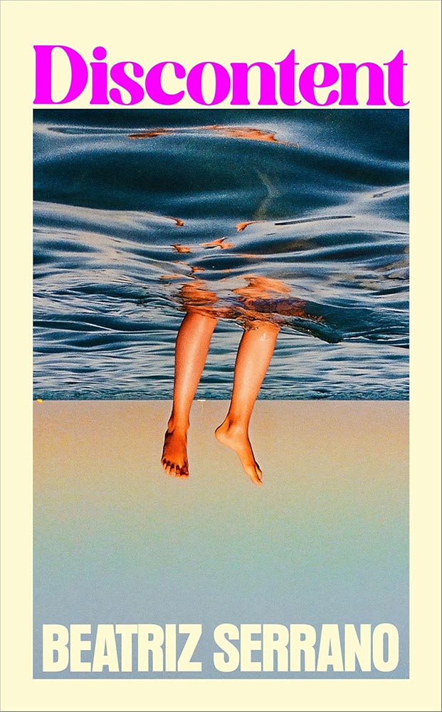
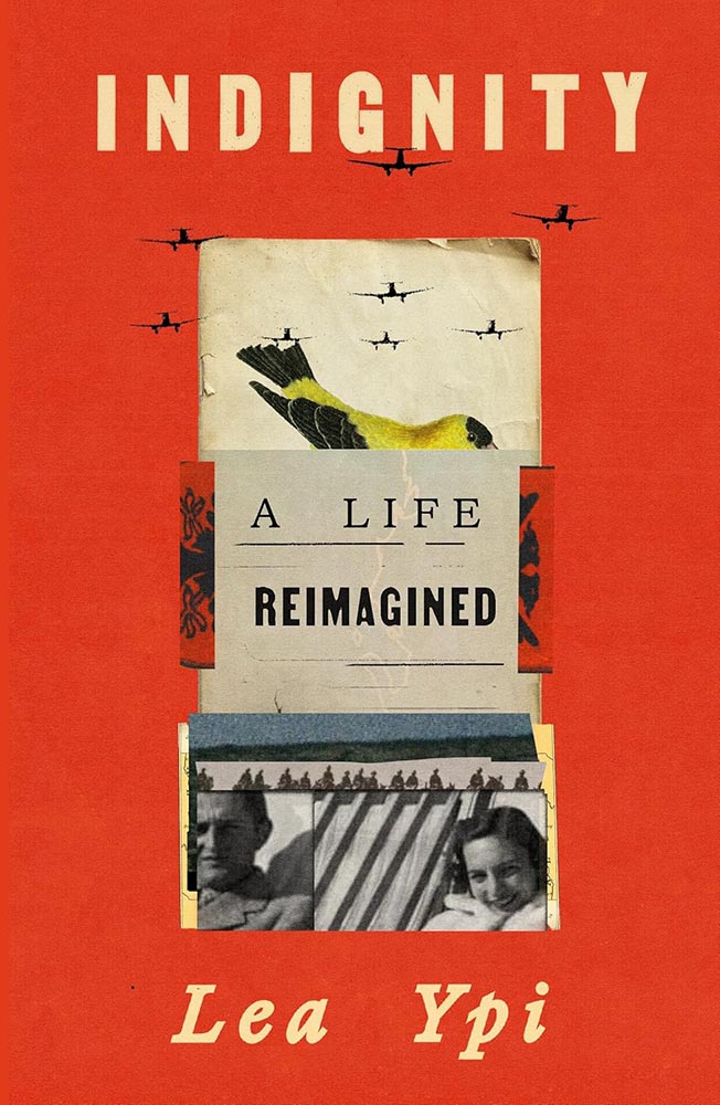
More than a hundred examples of book design greatness, with commentary, for the fifth year in a row. Bring a beverage.
But wait, there’s more:
LitHub has posted a summary of the last decade of their favorites, too. Whew!
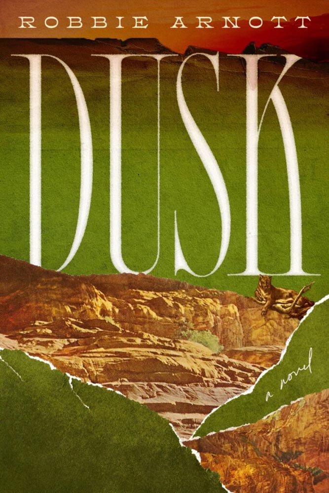
Special Bonus #1: Our Culture has a feature on seven book designers to watch in 2026. None will be a surprise to regular readers, although Alicia Tatone hasn’t been highlighted here as much as she deserves (she had three cover designs, including Dusk, in the runners-up folder for my ’25 favorites, but didn’t appear in the final list).
This Month’s Spine
Meanwhile, over at Spine, my monthly column on University Press goodness has been posted, including this:
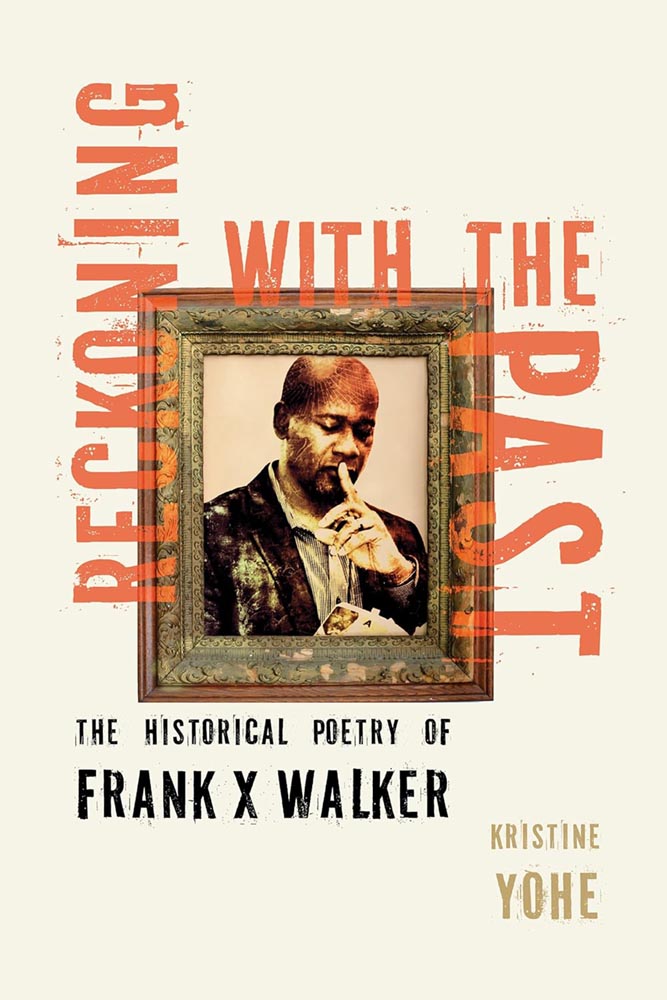
Walker, FYI, was the first Black person to be named Kentucky Poet Laureate and coined the term, “Affrilachia.”
More from the Design Department
Heller on Roy Kuhlman
Steven Heller’s column in PRINT is always fantastic, but some introduce designers more of us should know by name — this time, Roy Kuhlman:
“He designed almost exclusively for the edgy indie Grove Press, defining its list of literary, critical, philosophical and politically radical nonfiction titles,” Heller writes, discussing a new retrospective (that he wrote the introduction for):
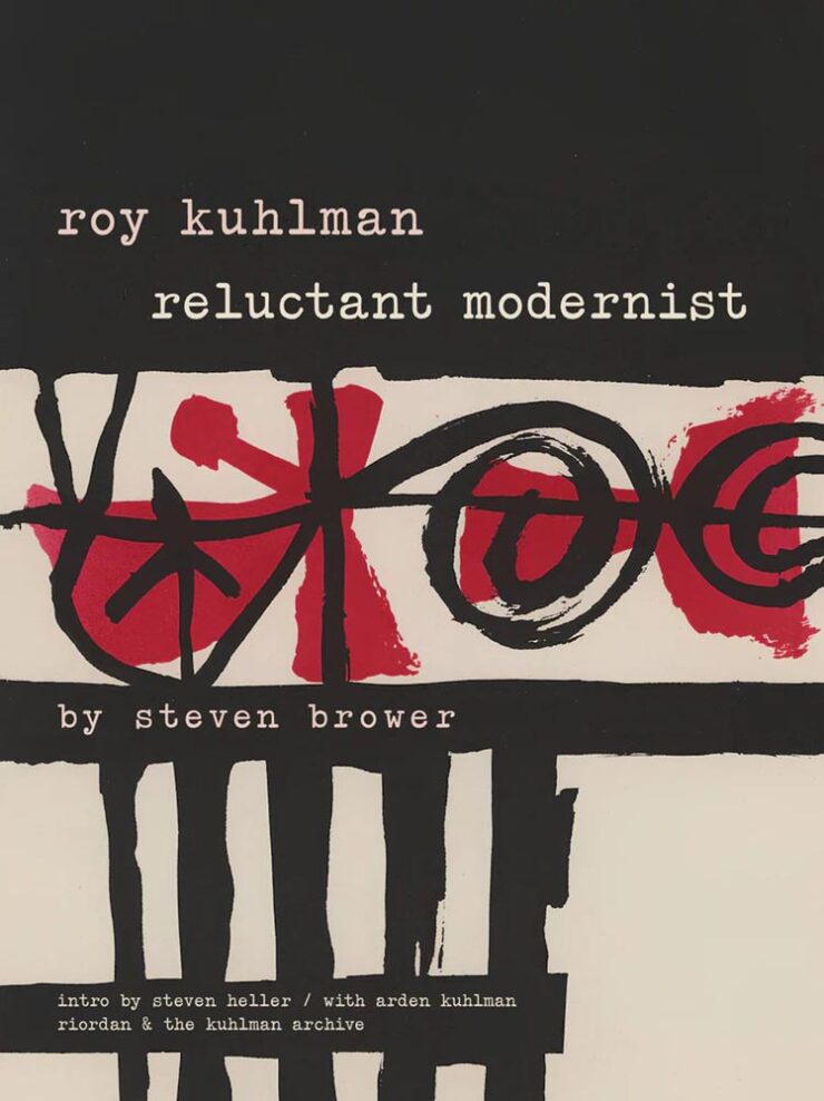
Many of his abstractions tested the reader’s perception. His lexicon of kinetic, morphing shapes was usually rendered in flat colors with painterly and collage randomness. They could stand on their own. But usually, to make them functional, he used simple sans serif or elegant classic serif typefaces; fitting the abstract nature of his manner, he’d frequently draw or paint hand-scrawled titles and subsidiary texts. Much of his work employed two or three colors, as opposed to four-color process — and he was more than adept with limitations.
— Steven Heller, PRINT
Very cool. See the rest.
January Typeface Favorites
Speaking of CreativeBoom, their regular feature on new typefaces has several that I like. Let’s start with the elegant Appeal, by new foundry We Type:
Next up, the old-style, almost-evokes-needlepoint Bárur, by MNDT Type:

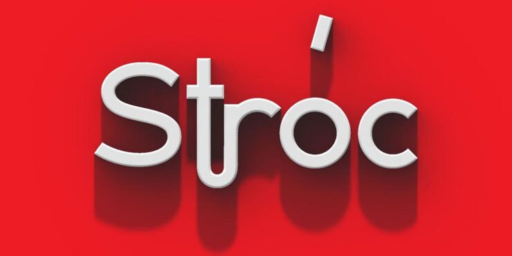
Another new foundry, Designomatt, brings us the neat and “unpretentiously functional” Stróc:
The last to highlight is probably my favorite of the bunch, this cool and well-executed script called Pennline, from The Northern Block. It’s a “meticulous resurrection of Bulletin — a script first cast in 1899 by Philadelphia’s Keystone Type Foundry — demonstrat[ing] how historical preservation and contemporary utility can coexist when approached with respect and imagination.”
See ’em all — type joke intended — at CreativeBoom.
Faber Editions: Just My Type
It’s Nice That has a great feature on the new — actually, newly-revisited — Faber Edition titles, with their primarily type-driven cover designs:
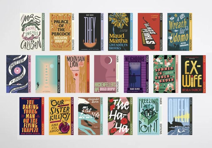
“In an industry that can often be focused on newness, Faber Editions is a great reminder of the groundbreaking literature that’s come before us, and a clear indicator of the importance of the artwork the words sit within,” writes Olivia Hingley.
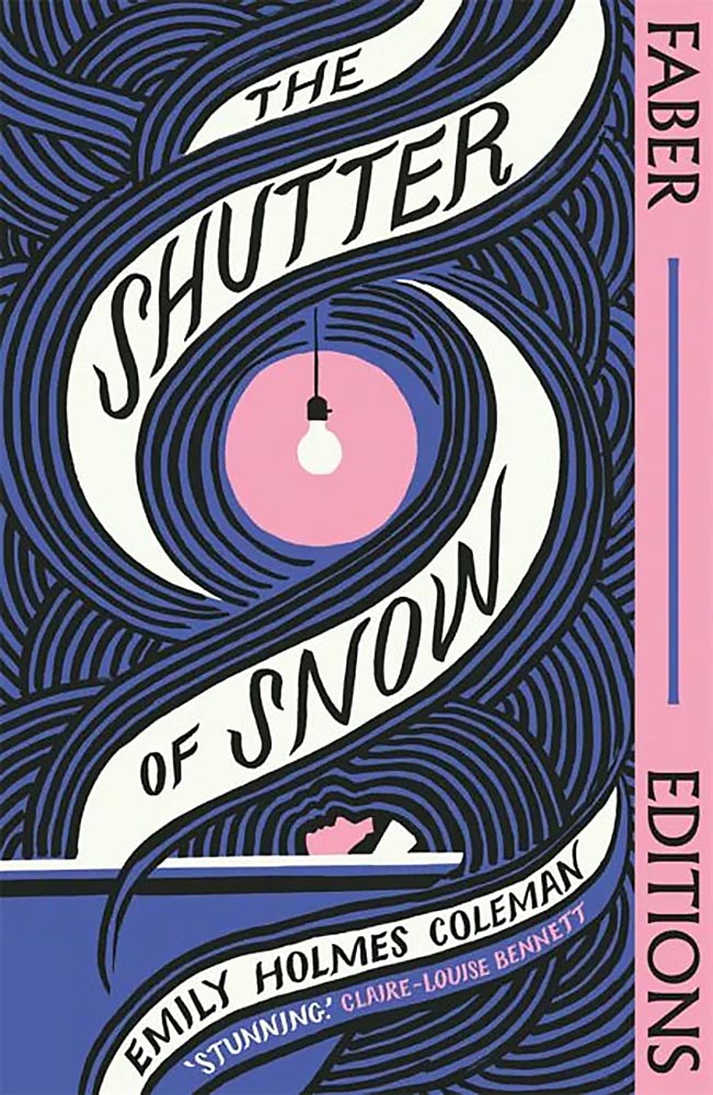
Faber is a UK publisher, so while these covers could be excellent because they’re British — see several examples of the US vs. UK titles in the favorites post — I’m just going to call the style interesting, the “look” of the complete series compelling, and the resulting work excellent. Read on.
Special Bonus #2: “The graphic trends you’ll want to bookmark for 2026,” also from It’s Nice That. In short: lo-fi, anti-trends continue:
In other words, if AI struggles with it — if it’s authentic — it could be a winner. See the specifics.
Special Bonus #3: “AI isn’t the enemy. Our lack of nuance is,” Liz Seabrook writes at CreativeBoom. “The most powerful response is being more human.”
Life in ’26: DDOS? Or Just Velocity?
A few days apart, two new essays caught my attention and wound up feeling relevant enough — significant enough — that I wanted to share. They’re new takes on where we’re at, or, the specifics of “how.”
The first is from new-to-me author Joan Westenberg, discussing a computer term called the Distributed Denial of Service (DDOS) attack:
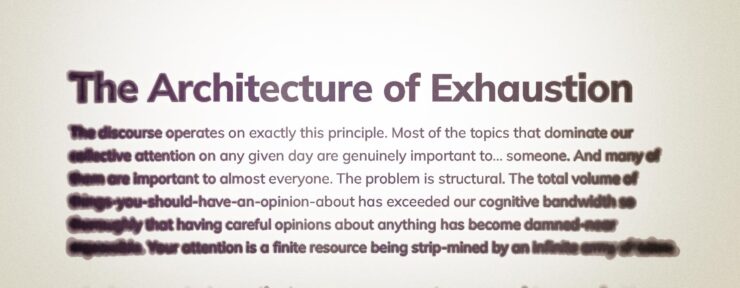
[The] attack works by exhausting resources. It doesn’t need to be clever. It just needs to be overwhelming. The target’s defenses are simply overrun. The server can’t distinguish between legitimate requests and attack traffic because, in a sense, all the traffic is legitimate. The attack succeeds when the system has spent so much energy processing requests that it can no longer serve its actual function.
— Joan Westenberg, “The Discourse is a DDOS”
Does that sound like it might apply to life in the ’Twenties? Yeah.
The old media ecosystem had gatekeepers, and those gatekeepers were often stupid or corrupt, but at least the stupidity and corruption were bounded. There were only so many column inches in the New York Times, only so many minutes of evening news. A finite supply of attention-worthy items existed, and someone had to decide which ones made the cut. That selection process was biased and imperfect, but it performed an important function: it told you, implicitly, that you didn’t have to have an opinion about everything. Most things that happened in the world weren’t important enough to make it into your awareness at all. Local political disputes in New South Wales? Nobody in Washington DC gave a [crap], and vice-versa. This was as close to optimal as we’ve ever got.
— Joan Westenberg, “The Discourse is a DDOS”
But the gatekeeping function has now been distributed across millions of individual users, each of whom can boost any piece of content into viral prominence if it happens to resonate with the right combination of tribal anxieties and engagement incentives. The feed is infinite, and every slot in the feed is optimized to make you feel something strongly enough that you’ll engage with it. Outrage works, and so does fear. Disgust works, and righteousness really […] works. Nuance and careful reasoning don’t work at all, because by the time you’ve finished a thought that begins with “Well, it’s complicated…” someone else has already posted a much simpler take that makes people feel validated, and the algorithm has moved on.
Om Malik, long-time in-the-trenches tech nerd (and fellow Leica enthusiast), completely agrees:
Authority used to be the organizing principle of information, and thus the media. You earned attention by being right, by being first in discovery, or by being big enough to be the default. That world is gone. The new and current organizing principle of information is velocity.
— Om Malik, “Velocity Is the New Authority. Here’s Why.”
What matters now is how fast something moves through the network: how quickly it is clicked, shared, quoted, replied to, remixed, and replaced. In a system tuned for speed, authority is ornamental. The network rewards motion first and judgment later, if ever. Perhaps that’s why you feel you can’t discern between truths, half-truths, and lies.
Westenberg has a suggestion I wholeheartedly recommend:
What I do know is that the feeling of being overwhelmed, of never being able to keep up, of having strong opinions about everything and confident understanding of nothing, is not a personal failing. It’s a predictable response to an impossible situation. Your brain is being DDoS’d, and the fact that you’re struggling to think clearly under that onslaught is evidence that your brain is working normally. The servers aren’t broken. They’re overloaded. And until we figure out how to reduce the load or increase the bandwidth, the best any of us can do is recognize what’s happening and try, when possible, to step away from the flood long enough to do some actual thinking.
— Joan Westenberg, “The Discourse is a DDOS”
“Find one topic,” she says, and start there. Get with experts, get evidence, get uncomfortable, actually get into it … but just get into that one.
And stay true to the idea that it shouldn’t — can’t — get away from you.
I get some feedback for my lack of participation in social media. I don’t hate social media; if anything, the past few weeks of mayhem organized resistance in Minneapolis proves it has a place. But I long ago heeded advice to narrow my focus. Instead of burying my head in the sand — tempting though it may be at times — I choose to concentrate on those things that a) really hold interest and b) things I actually want to be part of my life.
Both of these essays summarize the situation well, and both offer insights on how we got here. Westenberg’s offers good advice. When you have a spare few minutes, read both.
(DDOS article via Doc Searls, whom I don’t link to often enough. Om’s article via Daring Fireball.)
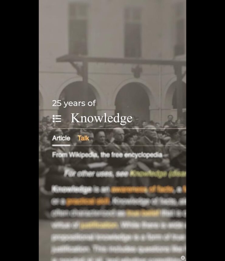
Wikipedia Turns 25
Let’s please turn to something that the Internet does right.
Whenever I worry about where the Internet is headed, I remember that this example of the collective generosity and goodness of people still exists. There are so many folks just working away, every day, to make something good and valuable for strangers out there, simply from the goodness of their hearts. They have no way of ever knowing who they’ve helped. But they believe in the simple power of doing a little bit of good using some of the most basic technologies of the internet.
— Anil Dash, “Wikipedia At 25: What The Web Can Be”
“When Wikipedia launched 25 years ago today, I heard about it almost immediately, because the Internet was small back then, and I thought ‘Well… good luck to those guys,’” Dash writes.1I, too, remember those days of a small Internet — not a young person anymore. While I miss the community it felt like, the resources available today, of which Wiki might be at the fore, are without parallel. But it’s grown into something something amazing: the encyclopedia that’s free in every sense of the word.
Like countless others, I value being a contributor, in an incredibly small way, to the collective effort that is Wikipedia. Indeed, editors “span continents, professions and motivations,” a CreativeBoom article writes. “Together, their stories underline that, even in an age of AI, knowledge is still human and it still needs humans.”
“The site is still amongst the most popular sites on the web,” Dash agrees. “[B]igger than almost every commercial website or app that has ever existed. There’s never been a single ad promoting it. It has unlocked trillions of dollars in value for the business world, and unmeasurable educational value for multiple generations of children.”
Of course, all is not perfect. Like Universities, DEI, and whatever else, Wikipedia has become a target; Grokipedia, for instance, exists specifically to undermine Wiki’s centrality and success. (And, it’s important to note, Groki used Wiki as a basis … because it’s open and freely available. No hypocrisy.)
In fact, so many rely on Wikipedia that access has become a thing. Luckily, some large enterprise users of the site have recognized that the trillions they’ve earned as a result of having access to Wiki’s collective knowledge is worth paying for:
[T]he Wikimedia Foundation announced API access deals with Microsoft, Meta, Amazon, Perplexity, and Mistral AI, expanding its effort to get major tech companies to pay for high-volume API access to Wikipedia content, which these companies use to train AI models like Microsoft Copilot and ChatGPT. […] In April 2025, the foundation reported that bandwidth used for downloading multimedia content had grown 50 percent since January 2024, with bots accounting for 65 percent of the most expensive requests to core infrastructure despite making up just 35 percent of total pageviews.
— Benj Edwards, Ars Technica (15 Jan 2026)
Anil Dash best finishes up: “Twenty-five years later, all of the evidence has shown that they really have changed the world.” I couldn’t agree more.
Happy 25 to Wikipedia. May there be countless more.
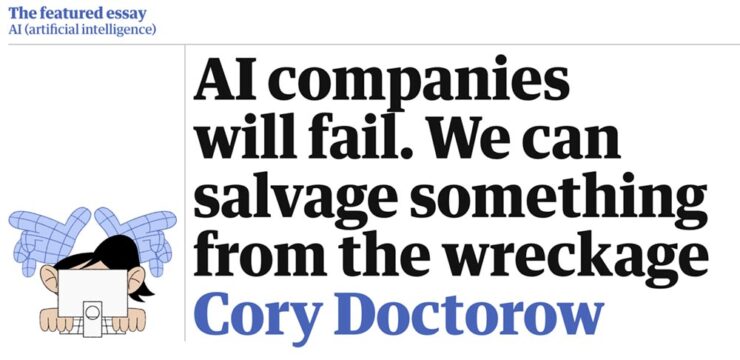
Special Bonus #4: In an excellent article, Ars calls 2025 “the year AI came back down to Earth.” And while we’re on the subject of excellence, Cory Doctorow’s essay for The Guardian applies.
Follow-Up: BMW Alpina and Honda Formalize Logos
Alpina, for formerly-independent tuner of BMW cars (and SUVs), has, as of the first of this year, officially become a division of BMW, akin to MINI or Rolls-Royce. With it comes a new logo — well, at least, this:
That’s slightly different that what I covered back in June of 2023; the “A” is less dramatic, probably for the better. BMW calls the new logo “calm and confident,” saying the upcoming models will “master performance and comfort.”
[Alpina] recently entered into an agreement to be purchased by BMW itself, not unlike AMG becoming part of Mercedes-Benz; starting in 2026, they are scheduled to represent the middle ground between BMW and Rolls-Royce — hopefully continuing the comfort, power, and style. It seems that the new ground will be the upmarket models only (that is, no 3-series-based items, and possibly even no 5-series), so think of items $200,000 and up.
— Beautifully Briefed, June 2023
Here’s the old logo, for reference:
And: they’re going to update the wheels!
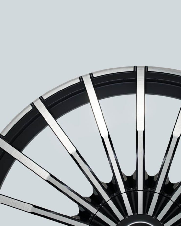
As someone who’s become much more familiar with Alpina in the ten years I’ve owned BMWs, these wheels are iconic. Here’s the existing version, on one of my favorite pieces of unobtainium:

That’s a 2016 Aplina B4 BiTurbo Coupé, by the way. Not quite my favorite B3 Touring, but in either case, “drool” doesn’t quite cover it. (Neither were available in the States.)
Curious to see whether this is successful. Expectations are high.
Meanwhile, Honda initially said — and I reported, two years ago — that their new, slightly-retro “H” logo would be limited to electric cars. Of course, electric as a strategy has changed; they decided this month to make it official for all their cars.
Motorsports, too. Here’s their F1 engine with the new logo:
I love that both Honda and BMW are, at their heart, engineering companies.
Get the full story on BMW Alpina at Dezeen or BMW Blog (logo, wheels). Honda’s details are available at The Drive (logo, F1) or The Autopian, where you can enjoy some sharp commentary on Honda’s press release.
January Photography Round-Up
2025 Architecture Master Prize

I suppose it’s no surprise that an architectural photography selection tops this round-up, but the annual Architecture Photography MasterPrize highlights “compelling perspectives on buildings, cities, landscapes, and interior spaces, revealing the rich visual language of the built environment.”
In other words, “catnip.”
There’s a huge variety of winning photographs, from professionals, amateurs, and students alike — all excellent. (They have awards for designs, firms, and products, as well.)
I can’t possibly cover them all, but can provide links: photography winners, honorable mentions, student winners, and winners by country. Both Archinect and PetaPixel have stories. Enjoy!
Two Photographers, Highlighted
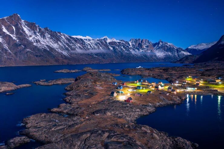
Neither drone images nor folks who primarily post to social media usually get featured here, but these images of Greenland are both timely and excellent. This is Colossal has a great selection of items from photographer Dennis Lehtonen.
“My photography style is rooted in landscape and night photography, with an emphasis on atmosphere, scale, and a strong sense of place. I’m drawn to environments that feel raw, remote, and otherworldly,” Tom Rae relates to PetaPixel. Otherworldly feels just right: good stuff.
Society of Photographers’ Photographer of the Year 2025
I also usually don’t cover documentary-style photography — see narrow focus, discussed above — but there were several documentary-style photographs in this set of award winners that were excellent, including this Medivac flight from the UK.
However — thankfully — there were more categories:
It’s the winner in the “travel” category, because apparently they don’t have one called “dramatically soothing.” No matter the labelling, see the rest of the winners at PetaPixel or head over to the Society’s website for more.
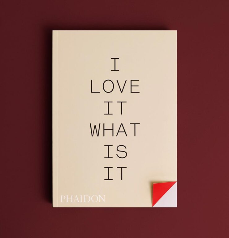
Finally: Some Cats
Speaking of catnip, let’s close out with something that purrs — in soprano:
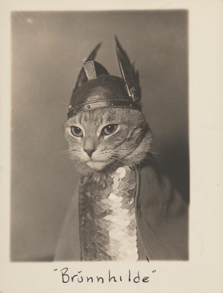
Let’s not go ’round and ’round: that deserves framing. Or at least publication. Thankfully, Phiadon has you covered:
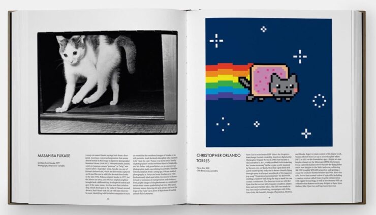
A “whimsical visual survey of the house cat in art and popular culture, exploring humanity’s enduring connection to one of our most loved animal companions.” Awesome. (Via This is Colossal.)
Have a great February, everyone!
- 1I, too, remember those days of a small Internet — not a young person anymore. While I miss the community it felt like, the resources available today, of which Wiki might be at the fore, are without parallel.