This time: authenticity fake and real, practical photography, and lots more goodness — things you can connect with. Enjoy.
This Month’s Spine
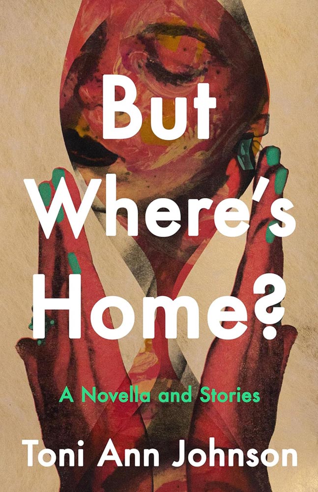
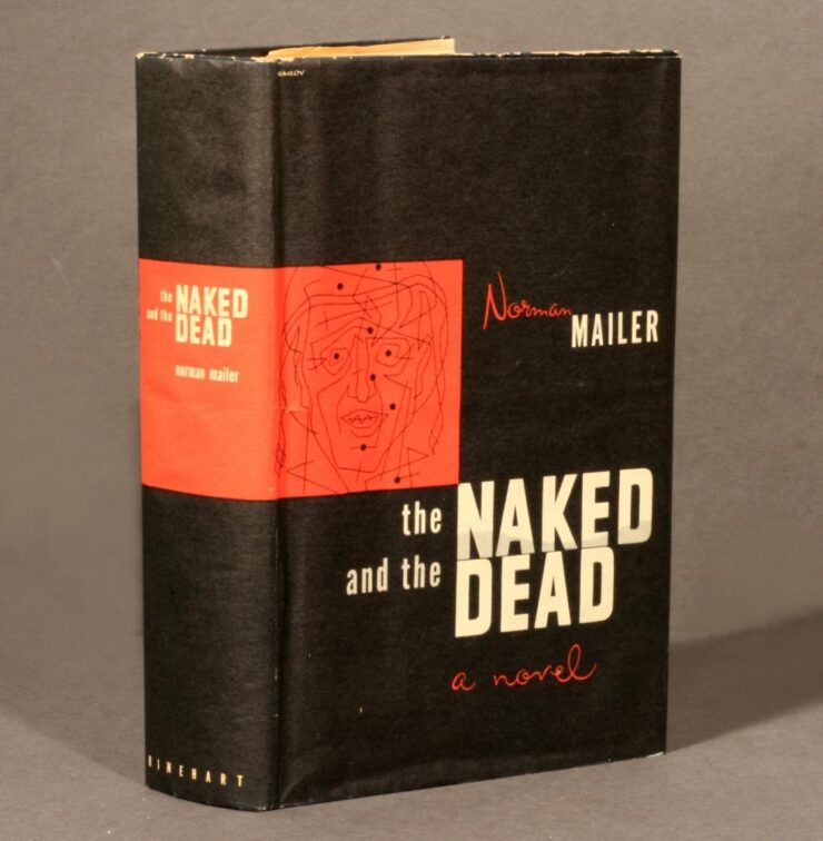
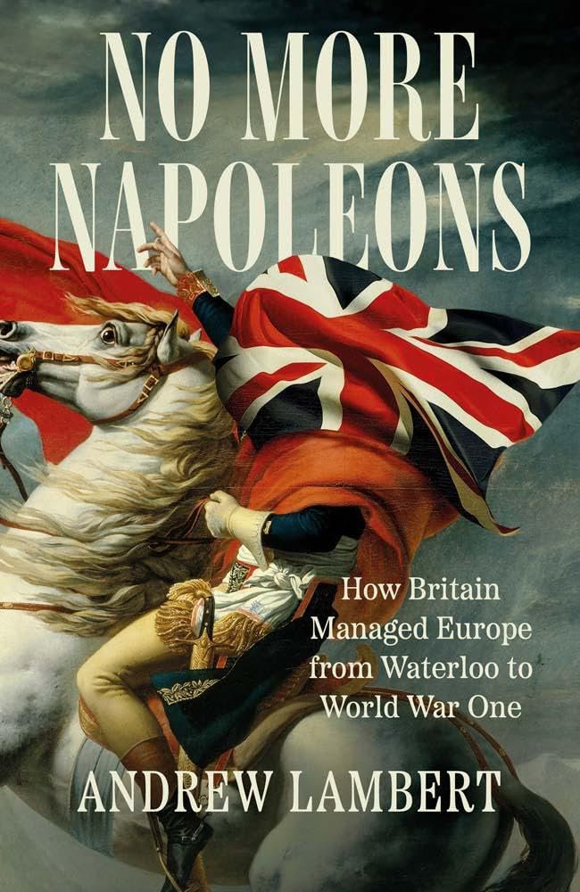
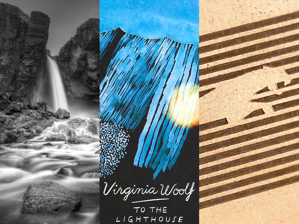
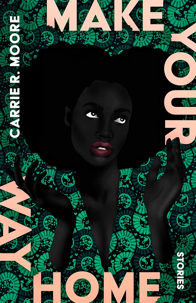
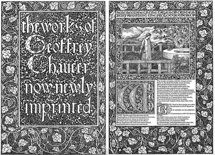
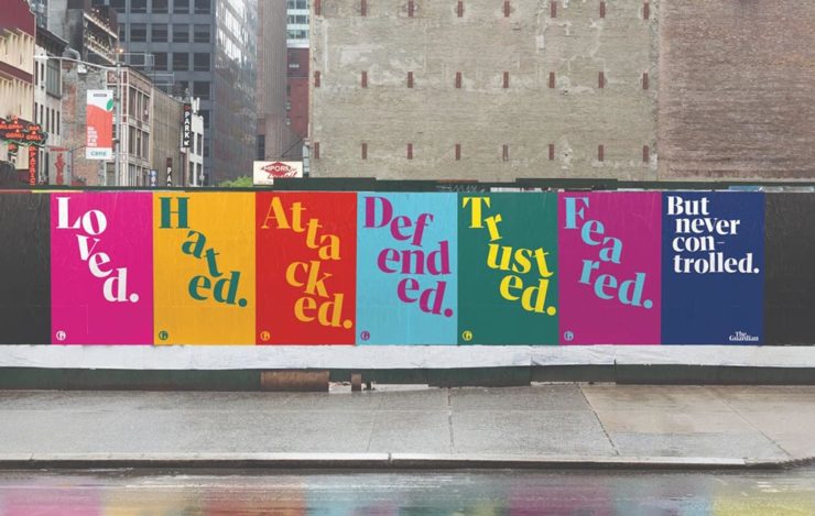
“[T]his collection of connected stories is about a Black family moving to and living in a very white New York town — begging the question that is the title. This is supported by an absolutely superb cover, whose painterly qualities and expert composition evoke emotions and make potential readers want to seek answers,” I said in this month’s University Press Coverage.
“There’s well-done, and then there’s next-level. This is definitely the latter.”
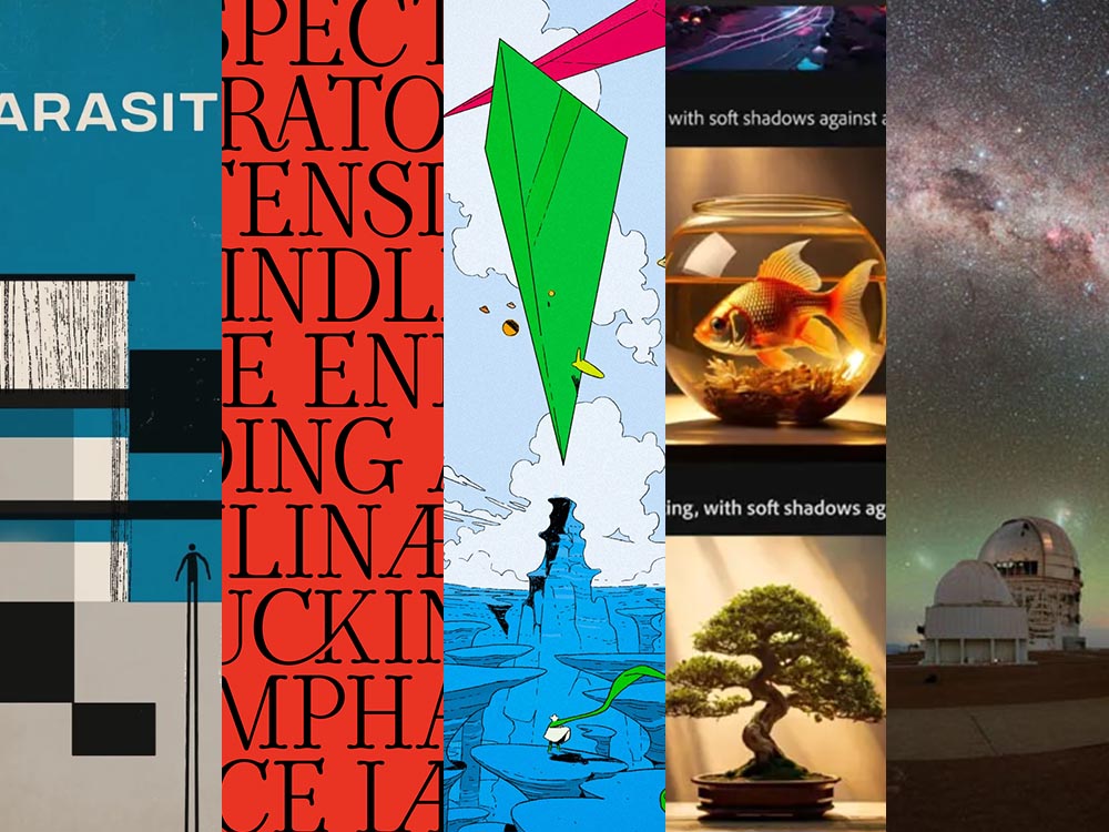
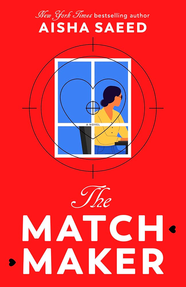
But Where’s Home is one of fifteen covers highlighted this month. Check it out.
Elsewhere in Book Design
While we’re on subject of Spine, Linnea Gradin posted an article — she’s usually a writer for Reedsy — about design trends for ’25 and predictions for this year.
I didn’t devote much time to book design trends in my annual Favorite Book Covers post, so if you’re not familiar with what’s hot in book design at the moment, this article could be worth a moment of your time.
That’s not to say trends aren’t important. I completely (begrudgingly?) acknowledge trends exist and definitely drive design, from book design to logos; however, like so many things these days, trends seem to be are about chasing social media — and I’m not going to celebrate popular opinion when I can celebrate excellence.
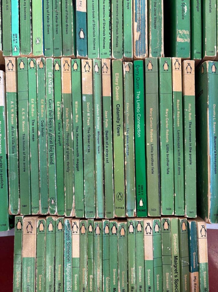
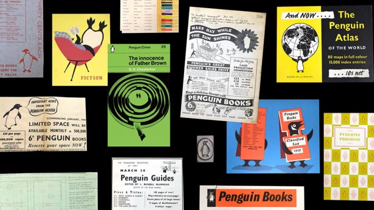
Meanwhile, Jason Kottke posted a link to The Case of the Green Covers, a risograph-printed zine that documents the history of the “Green Penguins”, “a series of hundreds of crime novels published with green covers by the UK publisher Penguin in the 1960s.”
After years and years of doggedly collecting what are commonly called “Green Penguins,” a series of hundreds of crime novels published with green covers by the UK publisher Penguin in the 1960s, I’ve both mounted an exhibition of the collection, and created a zine that documents the history of the books, their design, and the designers that made them. The content in the zine is an expansion and re-crafting of the writing I did about these books here, on the Justseeds blog, for my old Judging Books By Their Covers series (you can read those HERE).
— Josh MacPhee, Justseeds
Great stuff. If you’re in Philly, go see the exhibit — “held at Tomorrow Today, a very cool art & politics bookshop that recently opened,” Josh writes — but if not, the zine might very well be fun.
As is Justseeds, now bookmarked.
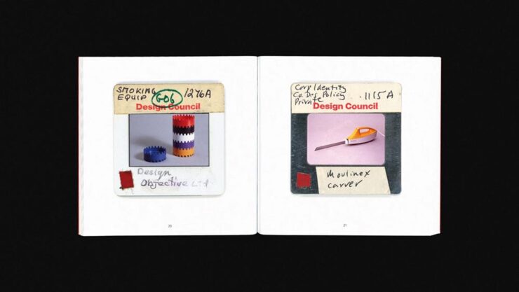
Special Bonus #1: It’s Nice That highlights a new title from the British Design Council:
Tucked away in a Manchester Metropolitan University archive lies 22,000 photographic slides of iconic British post-war design, ranging from the grand (a high-speed passenger train, for example) to the seemingly inconspicuous (plush bean bags and stackable ashtrays). These 35mm slides were made between 1948-1994 by the UK’s Design Council […] as a means of cataloging and preserving the UK’s design history, alongside a select handful of items from abroad. Now, Projecting British Design, a book published by the modernist, documents a selection of 100 of those slides — in the process demonstrating the vast array of objects that have changed the way we live.
— Olivia Hingley, It’s Nice That
I do wish the collection were online, but the post is cool — there are a bunch of examples — and the book will be fun for aficionados of British design, no matter the era.
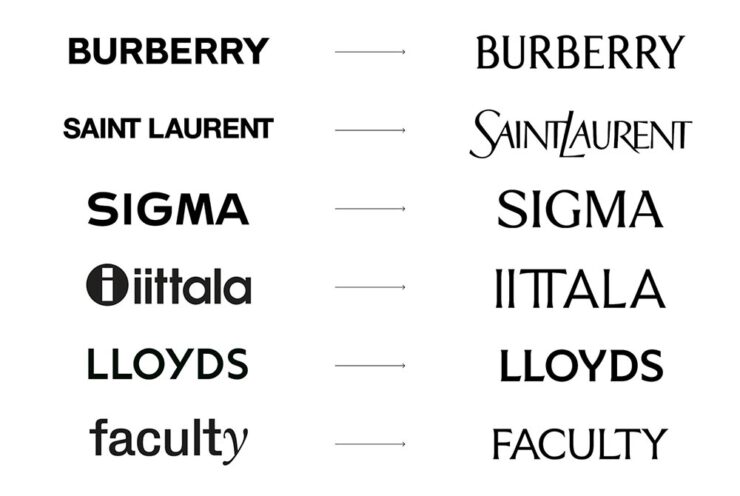
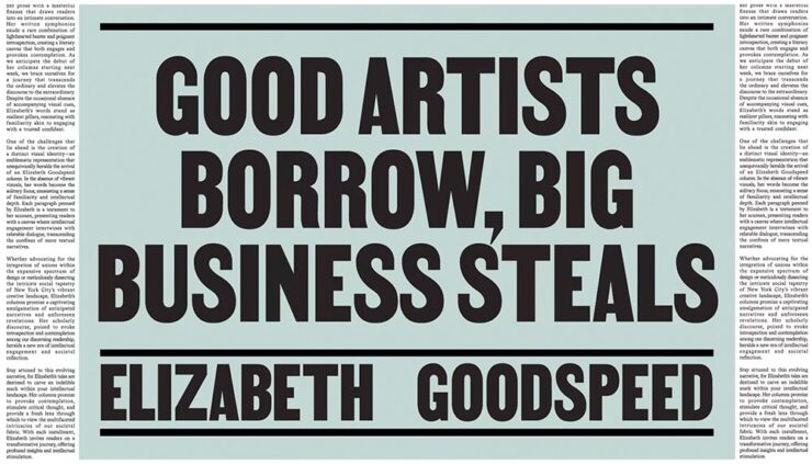
Faking Analog
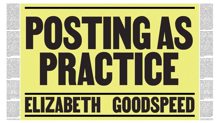
Elizabeth Goodspeed, by now a regular here on Foreword, has a new column up at It’s Nice That, in which she posits on imperfection as a design strategy: “Faking ‘realness’ on a computer doesn’t get us anywhere new.”
By now, the central point — “[f]or every person declaring that analogue is back, there’s someone offering the same explanation why: AI and other digital tools have made perfection cheap, fast, and easy, so imperfection now signals authenticity” — is generally accepted in design circles. (See comments regarding trends, above.) But she asks a better question: “But if analogue only matters as a foil to the digital, why are analogue aesthetics being embraced without analogue tools?”
“[T]his suggests that what’s being described as an “analogue revival” is less a material shift than a semiotic one. Terms like “handcrafted” no longer reliably describe how something was produced, but how an image wants to be read. Whether something was made with ink, a brush, or film often seems secondary, if it matters at all. What’s actually taken on weight is the idea of analogue, and the set of values now projected onto it.
— Elizabeth Goodspeed, It’s Nice That
As ever, the blame doesn’t fall on artists (or even the people selling texture packs). The practical reality is that most people no longer have the time, tools, or support to make fully analogue work, even if they want to. The creative infrastructure that would make it viable – materials access, slower timelines, financial stability – isn’t widely available. Designers and illustrators are stuck in a bind: analogue signals value, but digital is what’s feasible.”
It’s another case of I-could-quote-the-whole-thing-but-should’t, of course — so please just go read it. Because she’s right: it’s a trend, it’s a response, and it’s something that needs to be recognized. (Additional teasers for the article: a stack o’ pancakes and pre-stained Prada. No mention of who’s wearing it.)
Actual Analog
A three-fer for you:
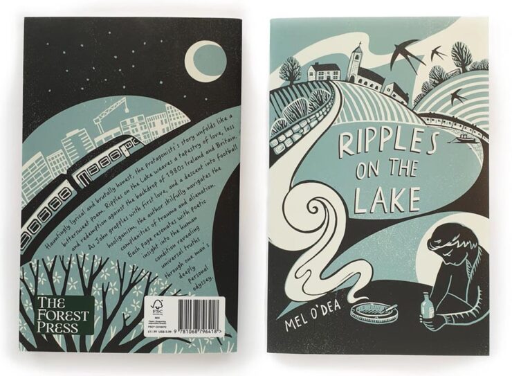
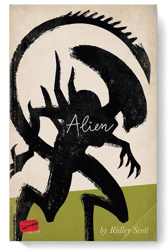
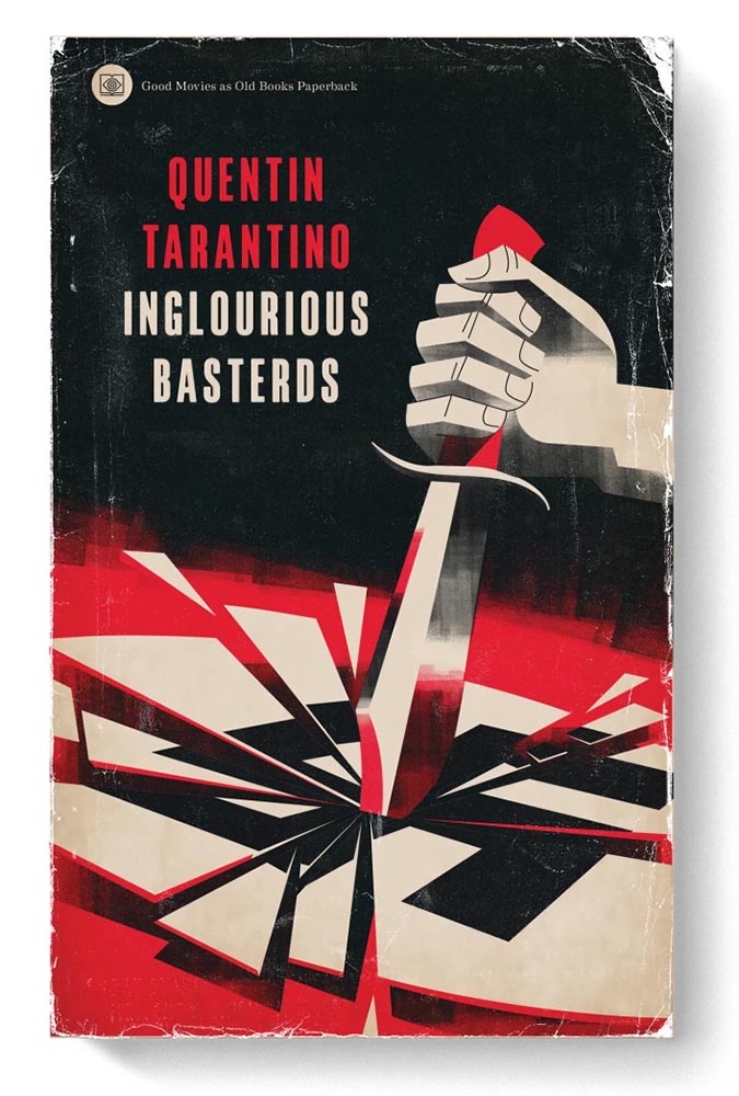
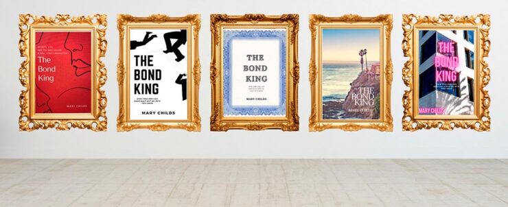
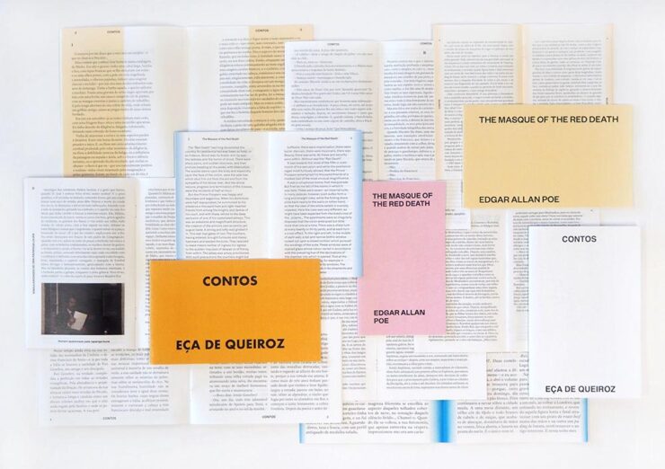
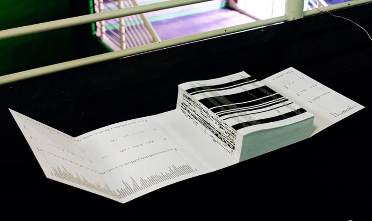
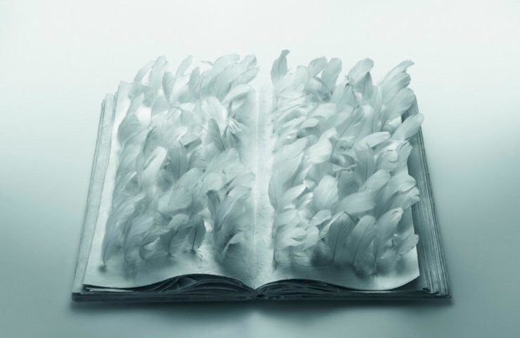
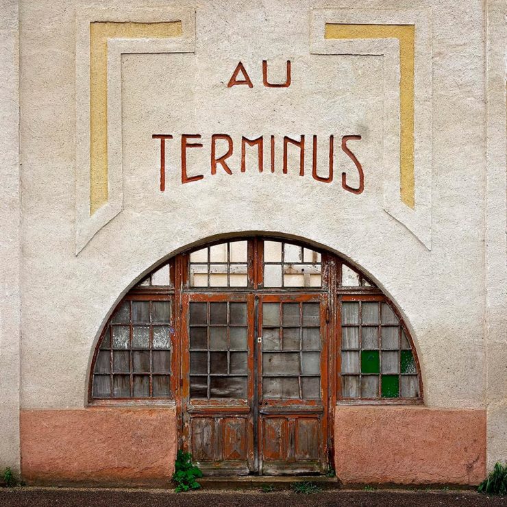
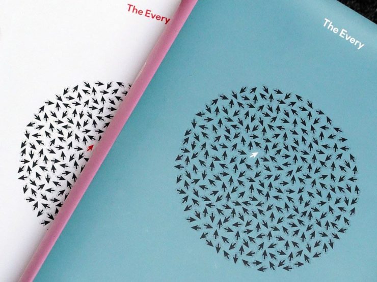
• From Spine, a book cover where analog — that is, actual composition of items, arranged and photographed, won the day. See the other options presented.
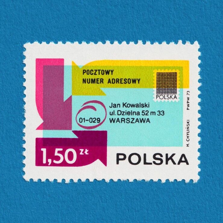
• From It’s Nice That, via Kottke: lovely collection of stamps. If you’re into great examples of “graphic design in miniature,” “from the recurring Olympics theme to the colourful modernist designs” — and you can stomach Instagram — you can enjoy daily goodness. If not, there are plenty of still to choose from at the links.
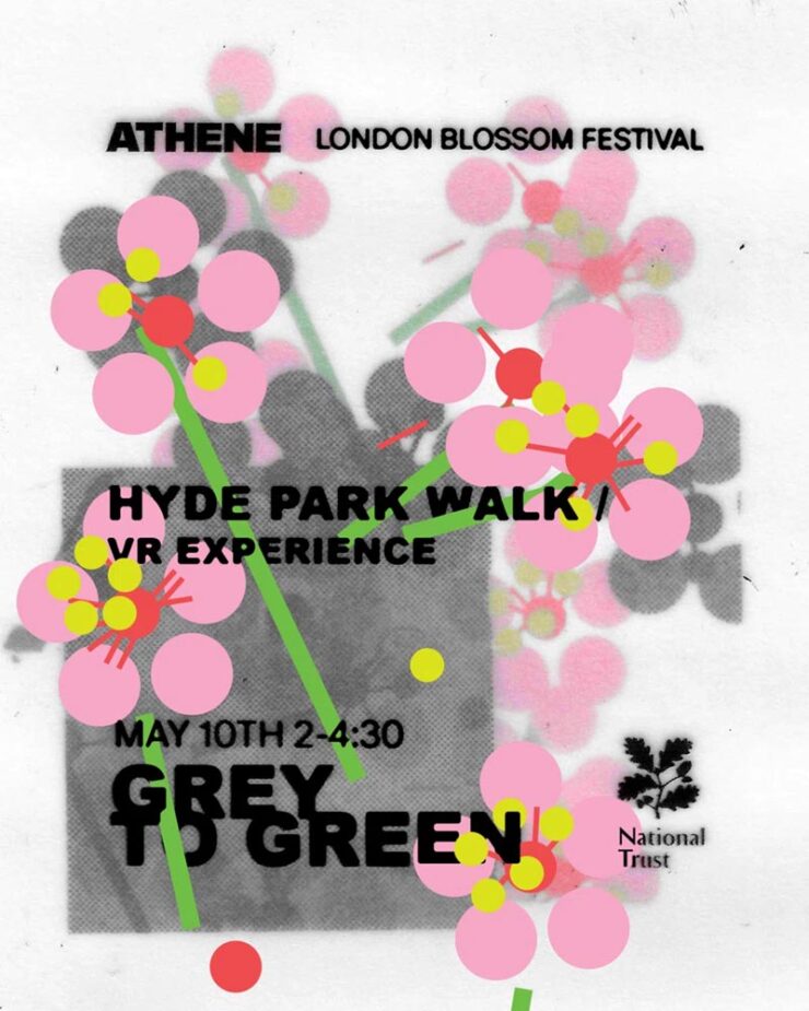
• An identity for Athene Club, a women-centred run and hike club in the UK, designed by Cat Duncan. Done in a style that’s awesomely analog — okay, okay, there might be a computer involved — and started before it became a trend. (Also via It’s Nice That.)
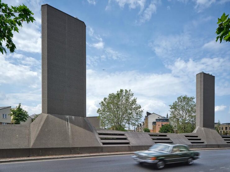
Architecture Poster Favorites, Again
Archinect‘s ongoing series of architecture school lecture posters (previously) highlights examples that continue serve an informational purpose with fantastic design:
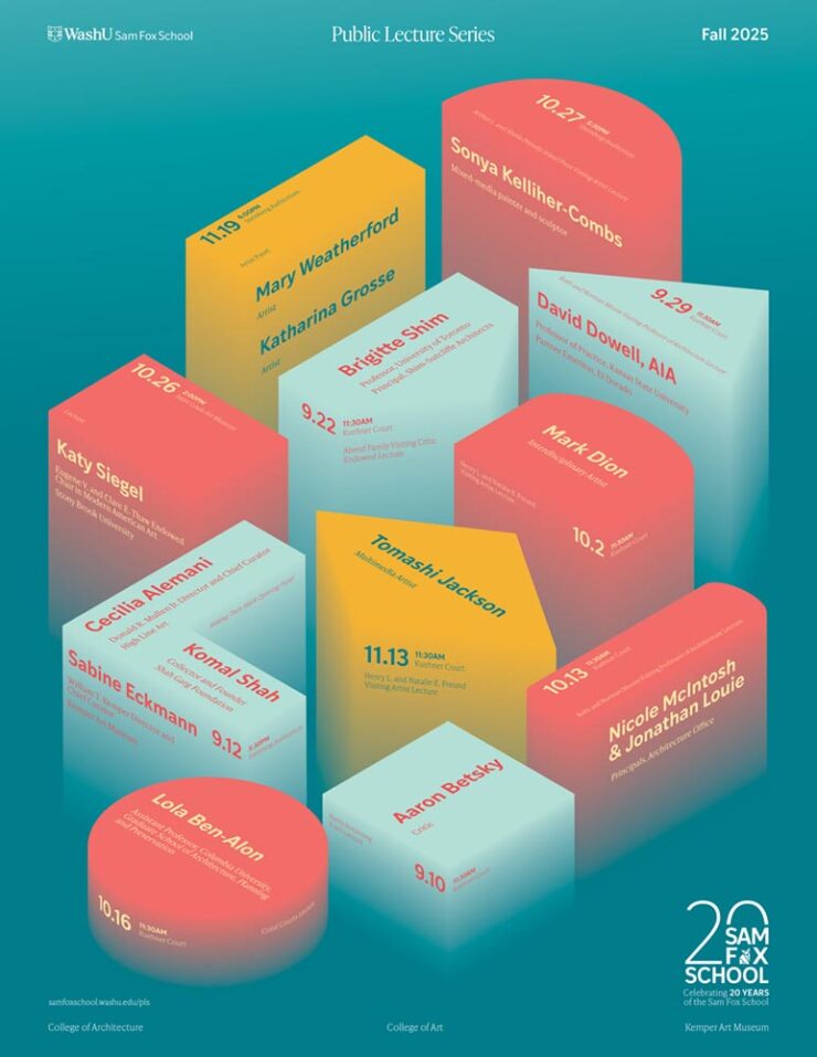
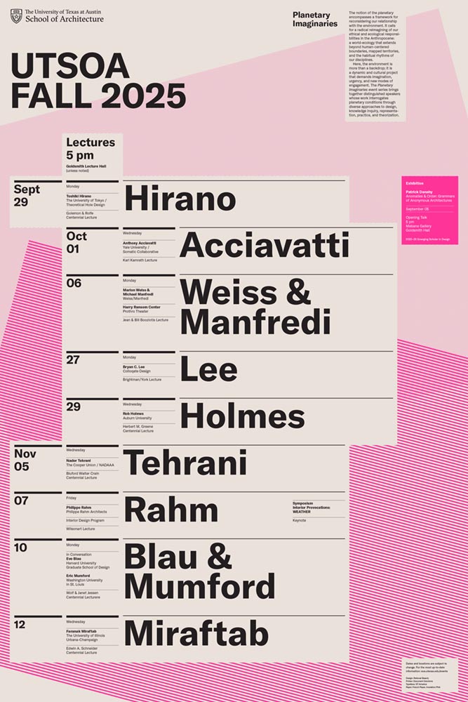
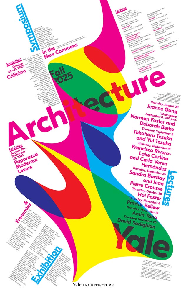
Although their contest for readers to vote for their favorite closed yesterday, it’s not the winner — it’s that they all pretty much win. See the whole list. (And get a head start with the Spring ’26 posters with one from Pratt.)
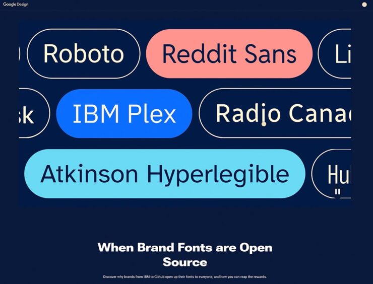
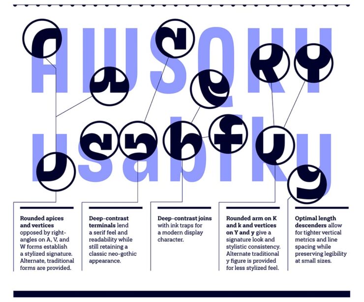
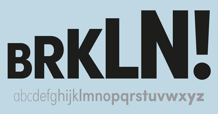
Your February Fonts
CreativeBoom‘s usually-monthly roundup of new fonts includes some I’d like to mention — and hopefully use. (Is typeface addiction a thing?)
WG Buttered Crumpet by Jamie Clark Type
Yes, absolutely, the name has everything to do with Wallace and Gromit.
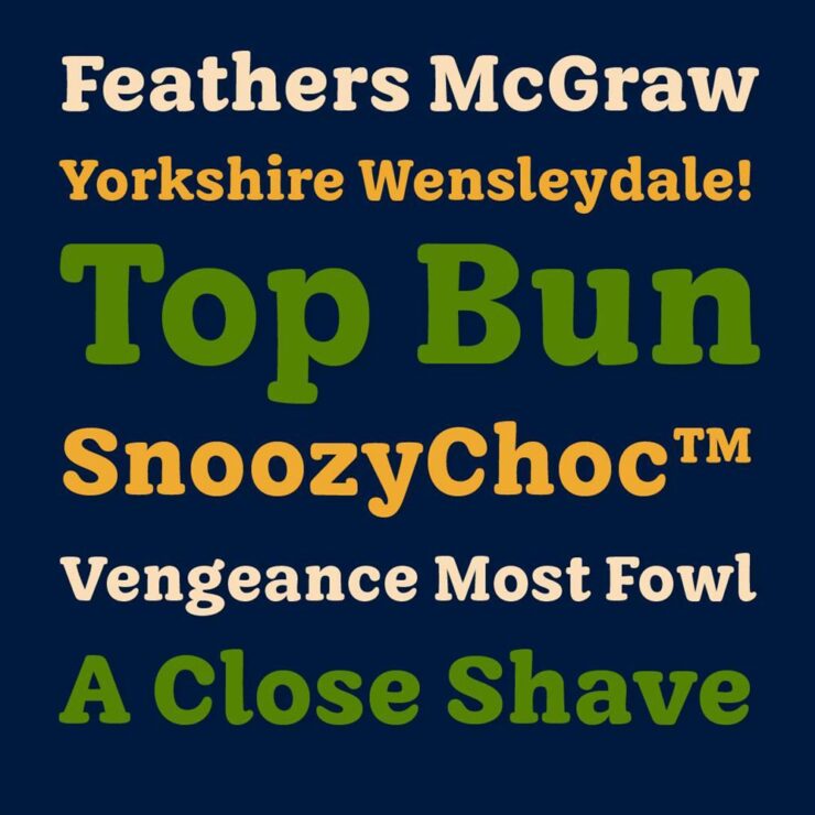
“The finished typeface – Buttered Crumpet – gives Aardman [Studios] a timeless, familiar tone of voice with bundles of charm. It includes over 200 characters, covering all Western European languages, and was designed in a single, carefully crafted weight with room for future expansion,” Clark writes. “As a Bristol-based designer, it was a joy to create a lasting connection with my home city and one of its most renowned creative studios.”
Veloce by Rob Andrews
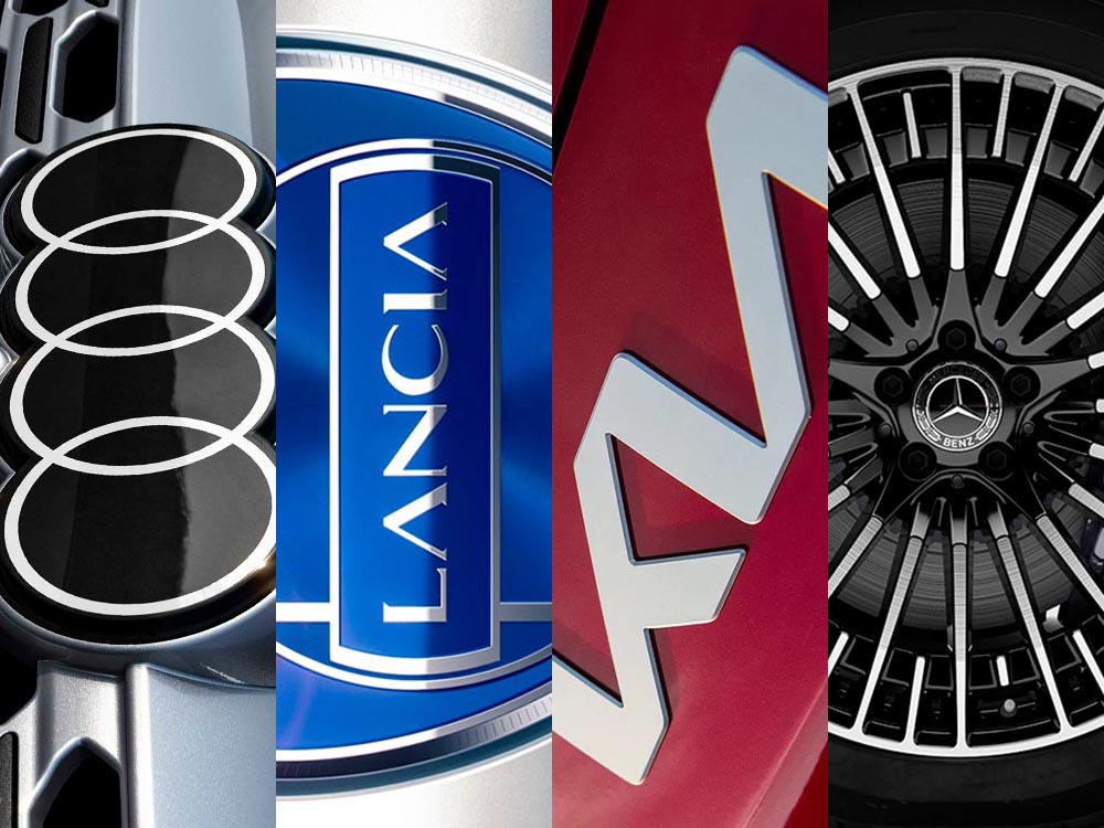
Yes, absolutely named after an Alfa Romeo.
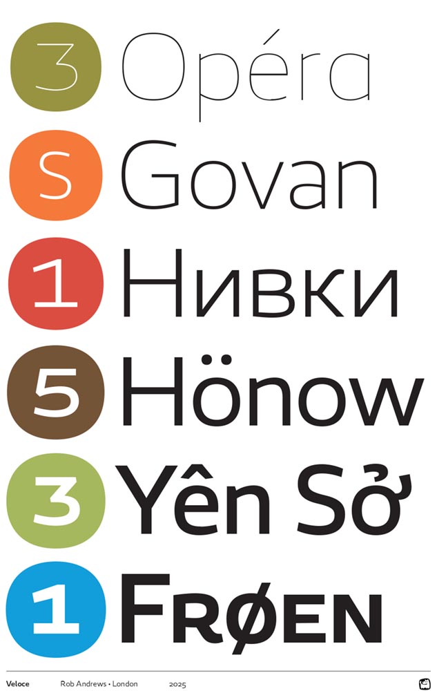
“Veloce began as a single-weight studio font and grew into something with real range. Clear and neutral, with enough personality to avoid feeling anonymous, it’s a strong choice for both body text and signage,” CreativeBoom writes. “What really sets it apart, though, is the language coverage. […] It’s an unusually thoughtful decision for a debut, reflecting serious long-term thinking about global communication.”
The website is admittedly not great. (You can cheat: see the specimen PDF here.)
YJC Volt Swing by Yenty Jap Creative
No, absolutely not what CreativeBoom said it was:
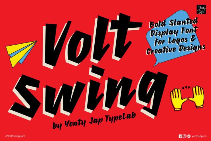
“[A] font born from a spark of energy and a little nudge of mischief. It started as a scribble with attitude, leaning forward like it had somewhere important to be — and honestly, it still does,” Yenty Jap writes on her site. “YJC Volt Swing carries that charged-up spirit into every letter, giving your words a bold voice that feels alive, confident, and just a tiny bit rebellious (in the good, hug-you-after kind of way).”
(CreativeBoom had listed — and spoke well of — YJ Knotted Ink, something completely different, while using pictures from YJC Volt Swing. Oops.)
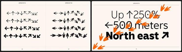
Special Bonus #2: PRINT says, “From DSType Foundry [and] designed by Dino dos Santos in 2025, Ensaio feels like a modular system for book design.” The caption flavor is my favorite — but they’re all awesome.
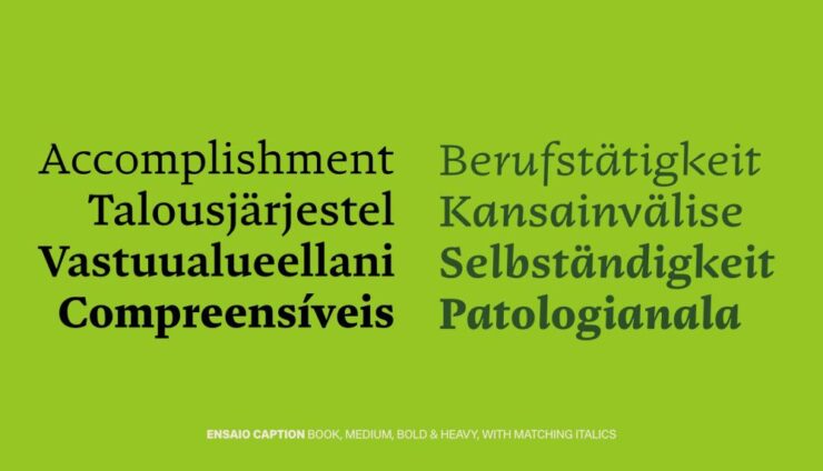
“Rather than having one set of forms stretch across every application, it’s built into four purpose-built variants: Text, Cover, Caption, and Capitals — acknowledging that the typographic needs of a novel’s body copy are fundamentally different from those of a cover or a footnote,” PRINT says.
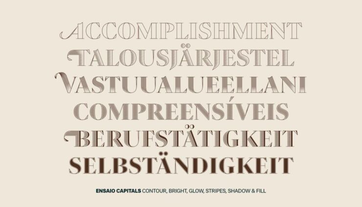
“Yes,” this book designer agrees.
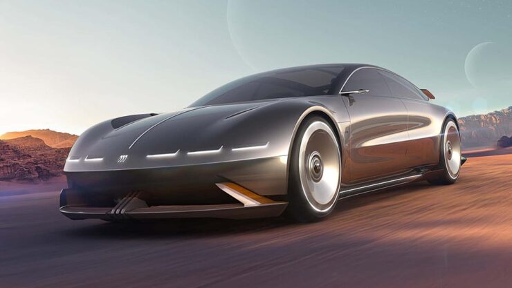
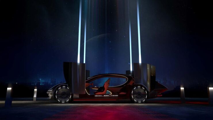
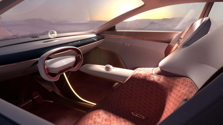
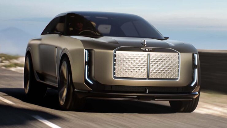
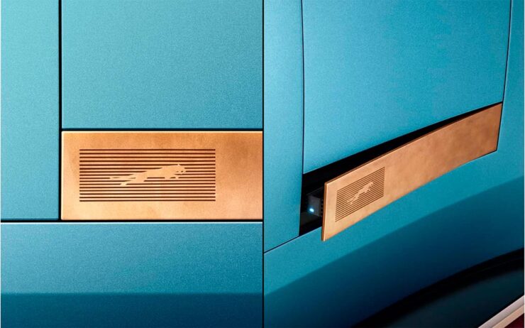
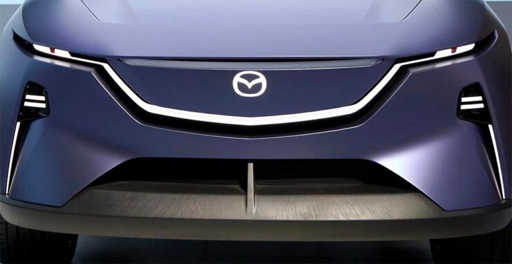
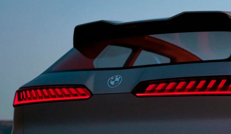
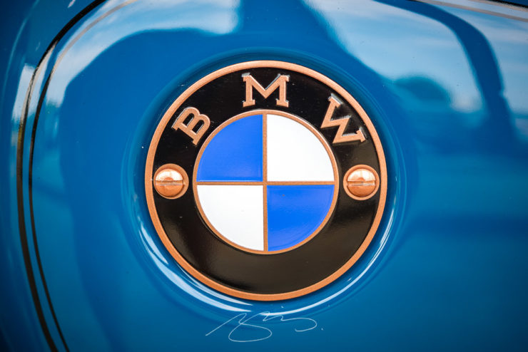
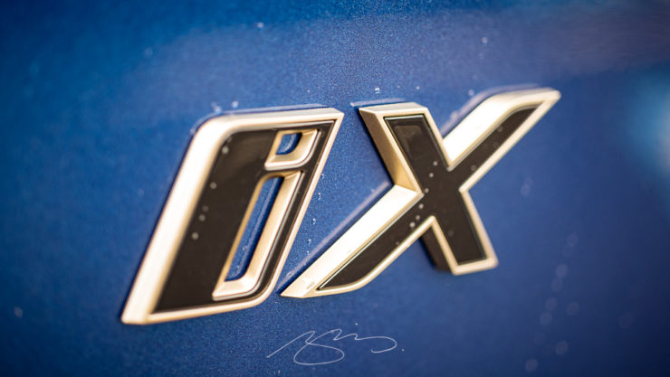
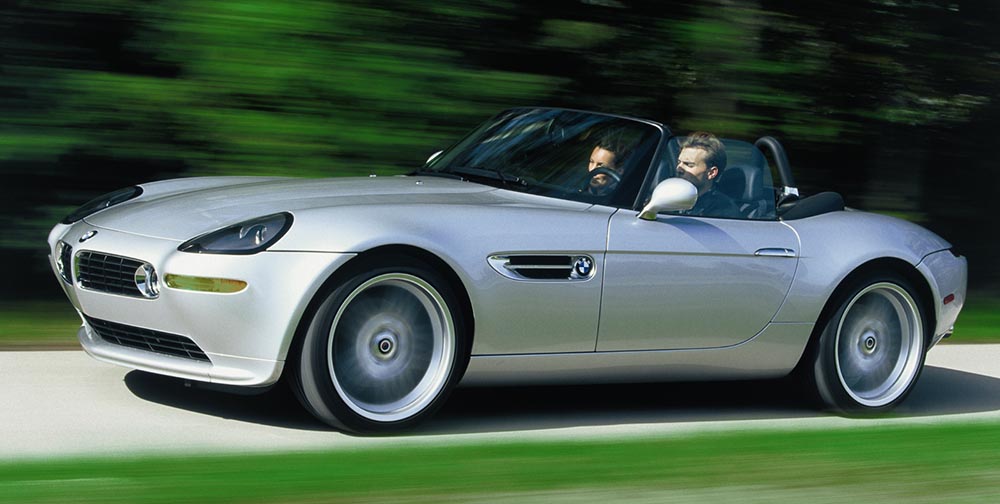
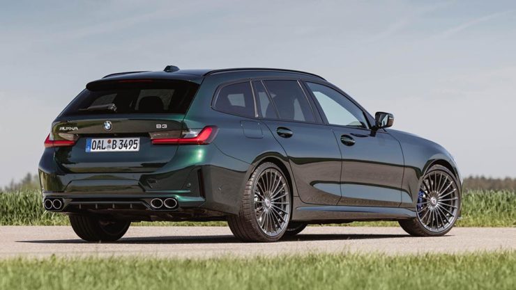
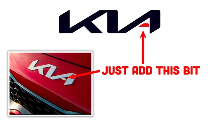
BMW-Alpina, Again
Last month’s Beautifully Briefed mentioned the new BMW-Alpina wordmark. (I incorrectly used the word logo, ’cause someone did in something I read and I repeated it without thinking — sorry). The actual logo, which is to say, the badge you’ll see on the vehicles, the website, and some marketing materials, has now been made public:
Still an exhaust and crankshaft, but in the “flat” style also used by BMW (and countless others — see trends, above).
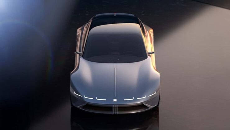
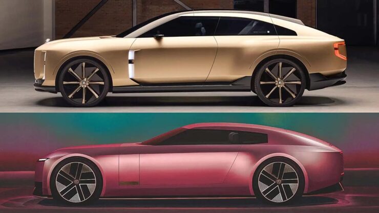
Parenthetically, BMW has suggested that at some point their logo will be etched into the paint rather than a chrome add-on (as on the concept, below), or possibly used as a backlight on the grille (much more trendy likely, I believe):
In any case, here’s a before-and-after, courtesy of The Autopian:
Read the excellent article at The Autopian, or two different, quicker posts at BMW Blog.
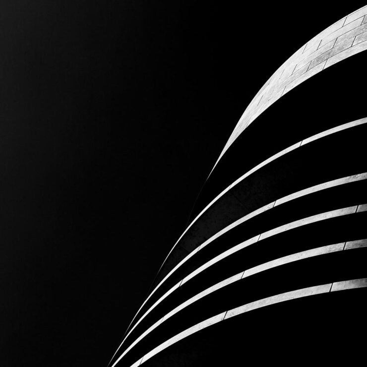
January Photography Faves
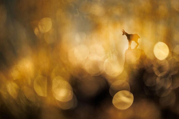
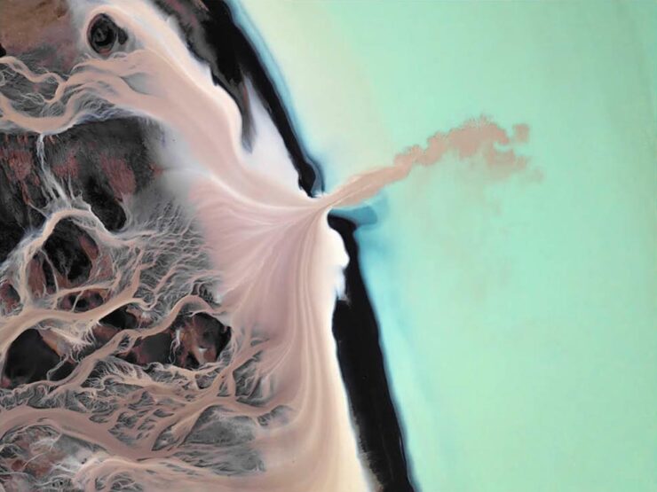
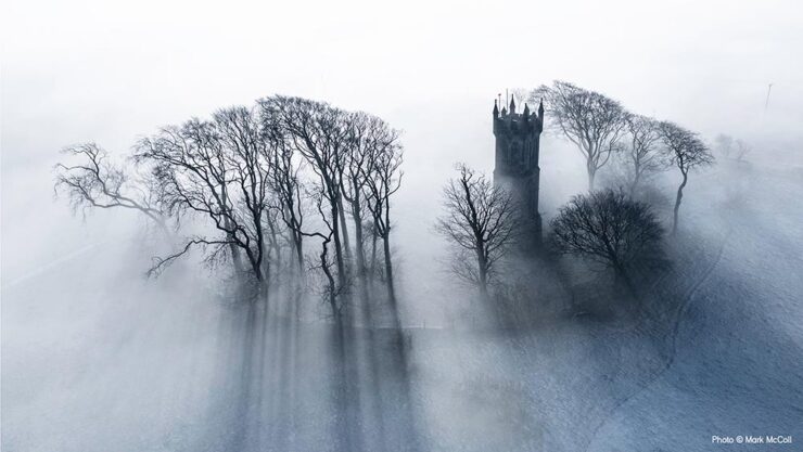
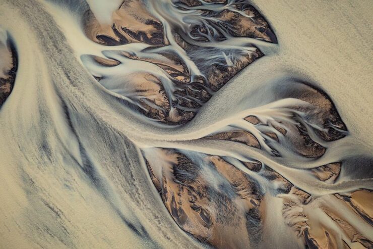
The Art of Emptiness
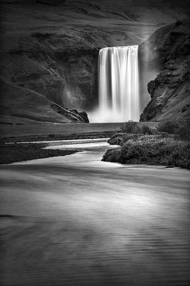
MacFilos‘ title for their profile of Italian photographer Marco Ronconi suggests a certain negativity — which, in a way, is true. But in the positive sense.
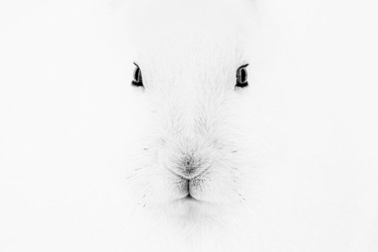
He “masters the art of reducing his images to what is essential. By omitting everything he believes to be unnecessary, even colour, he creates unusual wildlife images.”
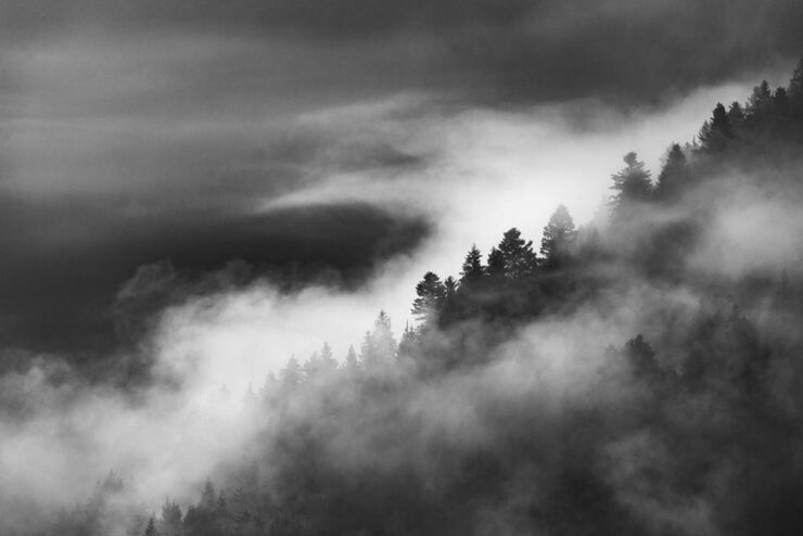
Very satisfying landscapes, too. See more.
Special Bonus #3: “Berlin-based Italian photographer Paride Ambrogi recently combined two of his loves, photography and pasta, in a brilliant, possibly tasty way,” PetaPixel writes. “Ambrogi made the Ravihole Camera, a working pinhole camera made entirely from fresh pasta dough.”
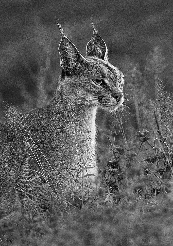
SINWP Bird Photographer of the Year 2025
Bird photography is an incredibly specialized skill. So contest winners are usually pretty amazing photographs. These absolutely don’t disappoint:
“With over 2,200 photographs submitted from around the globe, the SINWP Bird Photographer of the Year 2025 competition has revealed a stunning celebration of avian beauty, from kingfishers and bald eagles to owls, flamingos, and countless species beyond. The diversity and quality of the entries have been truly breathtaking,” a press release reads. The contest benefits the Royal Society for the Protection of Birds, or RSPB.
That’s Society of International Nature and Wildlife Photographers, by the way. See more at PetaPixel.
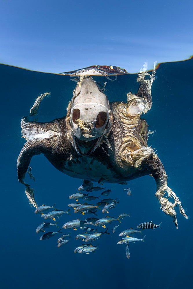
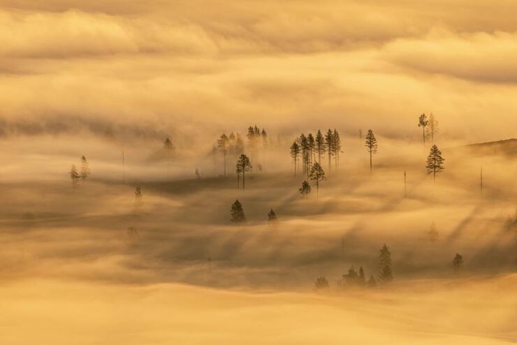
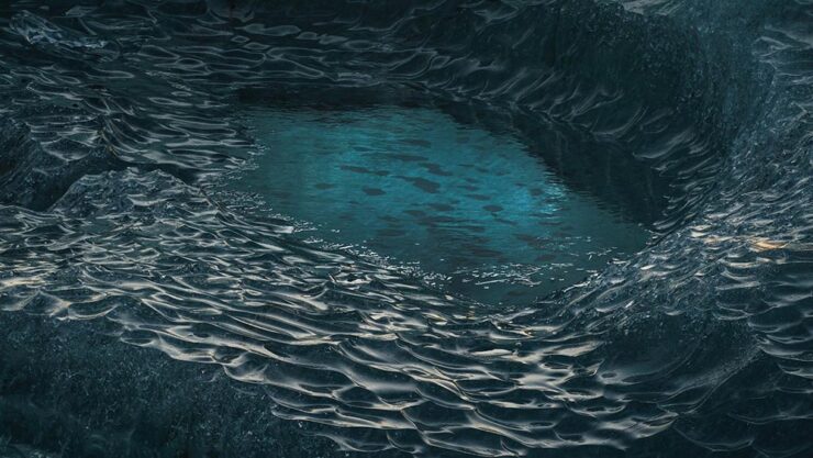
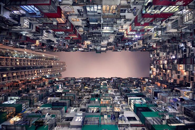
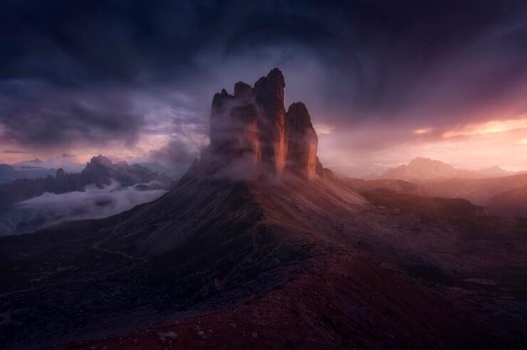
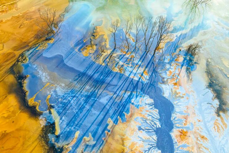
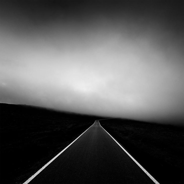
Sony World Photography Awards Open Competition Winners 2025
Sony has announced the “10 category winners and the 120 shortlisted photographs from its Open competition, which recognizes the best single images captured by photographers worldwide in the past year.”
Photographers do not need Sony cameras or lenses, only talent — of which there’s plenty.
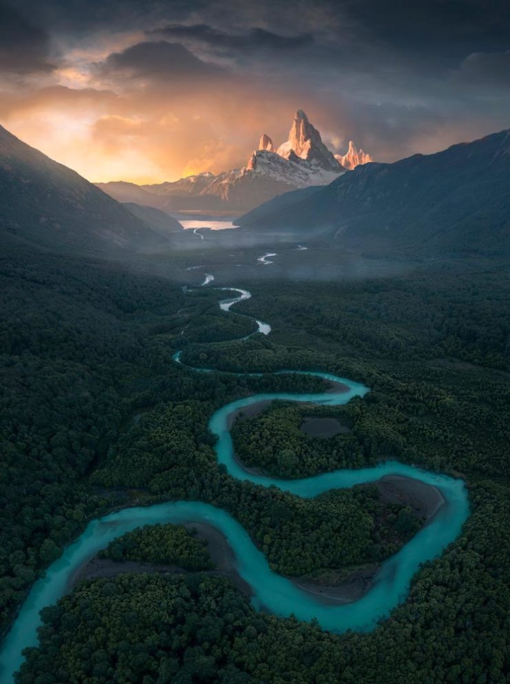
As is often the case, I prefer some of the shortlisted photographs to the winners. Like the skier above, or this dystopian, almost science fiction shot from Asia:
A couple of celebrities, lots of great portraits, and many of nature. That latter category has what’s probably my favorite:
See all 130 photographs at PetaPixel, or selected favorites at This Is Colossal.
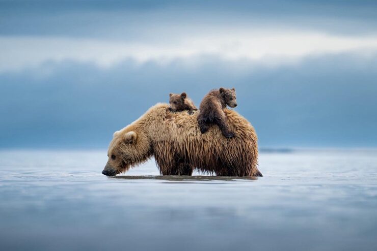
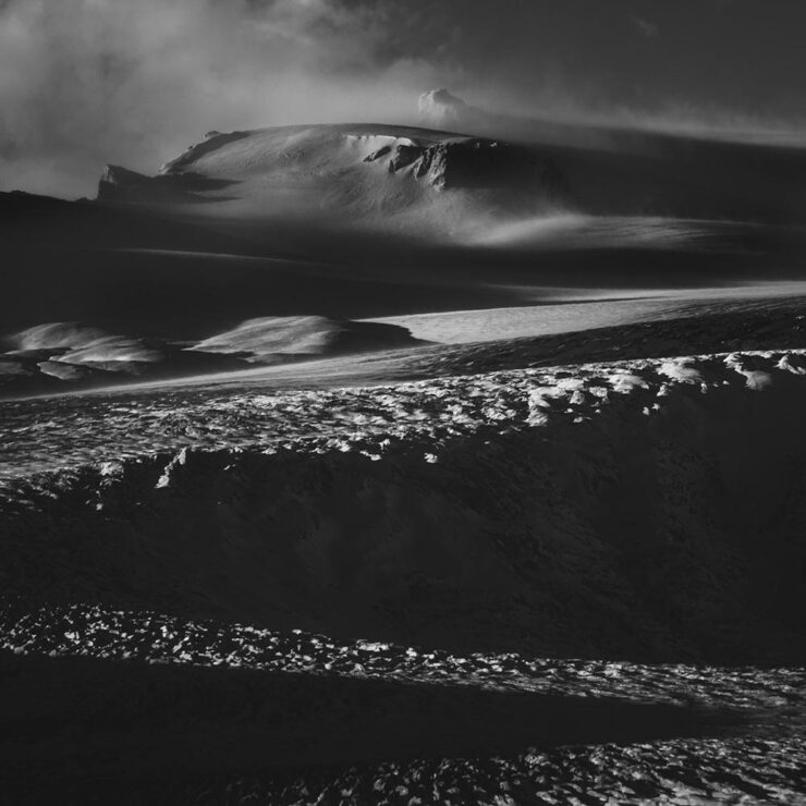
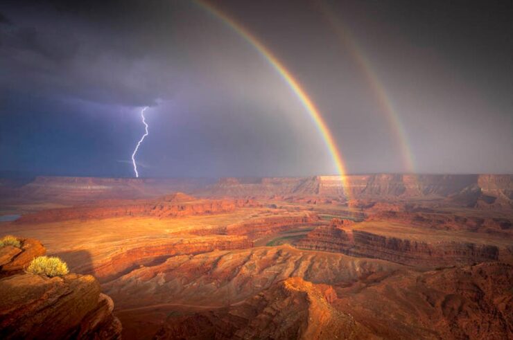
World Nature Photography Awards 2026
“The World Nature Photography Awards were founded in 2020 with the goal of not only promoting the world’s best nature photos but also inspiring people to connect deeper with nature,” PetaPixel writes. “WNPA partners with Ecologi to plant a tree every time someone enters the competition as well.”
“This year’s winning images are a powerful reminder of both the wonder of our planet and the importance of protecting it,” a press release perhaps understates.
See all 42 winning images at PetaPixel.
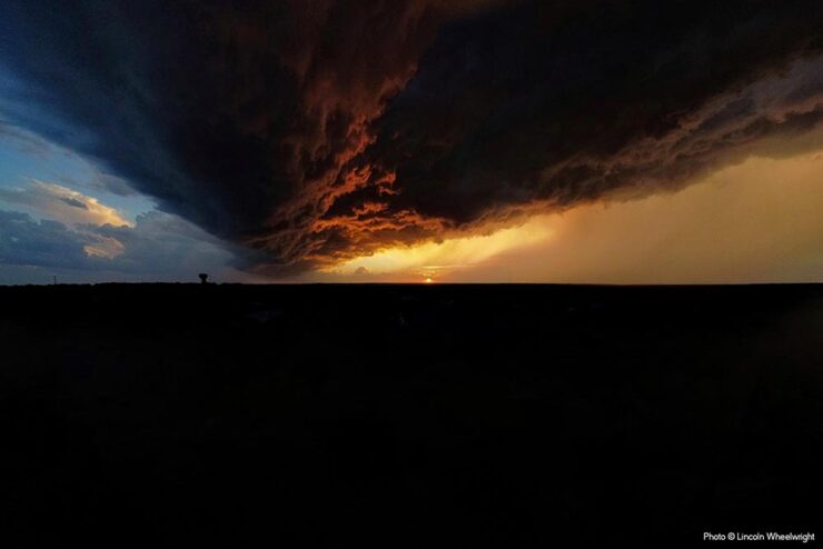
Special Bonus #4: “My photography boomed when I stopped looking at social media,” Ivor Rackham writes at PetaPixel, with tips and ideas for successful business alternatives aplenty.
Interesting comparison to soap operas — or is that soapboxing? You decide, but I’d argue that his photos prove some talent.
The flowers are just starting to come out here in Georgia. May spring bloom for all of you, too. See you soon.