Take a break from the summer heat with a Mac delight, two interesting typefaces, a discussion of Bentley’s new concept — and updated flying “B,” with a quick mention of the other double-R — and, of course, some great photography. Better still, we close out with a guaranteed smile.
’Cause we need more smiles these days.
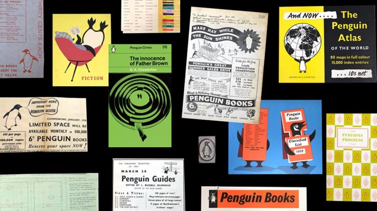
July’s Spine Post
July’s University Press Coverage has already been posted. My personal favorite of the bunch:
Darn near perfect. Hat tip to Jonathan Pelham.
Frame of Preference
While we’re on the subject of darn near perfect, Marcin Wichary — he of the now-sold-out Shift Happens fame, not to mention The Hardest Working Font in Manhattan — has gifted the world with another absolute gem:
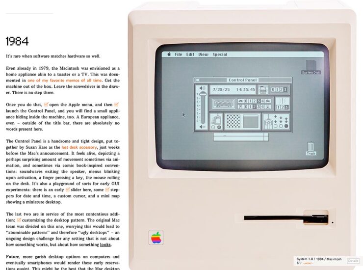
If you’re a Mac geek, whether a software history buff, or a just grizzled veteran, set aside a few minutes to take this trip down memory lane. There are 150 tasks to complete (!), five extra Easter eggs, great Mac hardware and software, and some of the best web programming extant. Enjoy!
ATC Identity Program Upgraded
The Appalachian Trail Conservancy celebrates its hundredth anniversary this year, and took advantage of the occasion to update its logo and identity system for the next hundred years.
The logo is a combination of a mountain peak, the AT symbol, a trail shovel, leaves (“growth and diversity”), and a holding shape (“protected ecosystem”); while overcomplicated in explanation, in practice it’s warm and friendly at first glance yet has depth for folks who know the Trail.
The supporting system works well, too, but I’ll leave that to Amy Borg, whose extensive post on the work is excellent. (Via BrandNew.)
Special Bonus #1: A new Goodreads logo:
July’s Font Finds
Karel, by Typonym
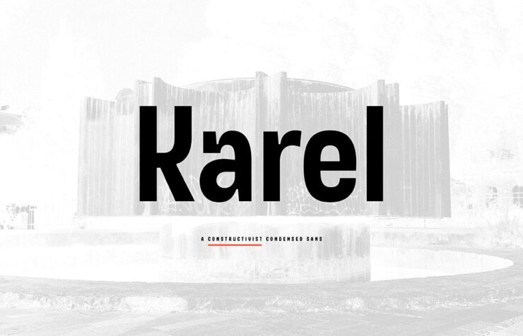
“Inspired by glyphs on a mid-century Prague plaque, Karel synthesises historical discovery with contemporary invention. Developed for brand messaging and retail identity, it includes alternate figures to vary the level of stylisation,” CreativeBoom writes.
“A constructivist condensed sans, [that,] in every case stands apart from the multitude of neo-grotesque alternatives,” Typonym writes. (Great company name, by the way.)
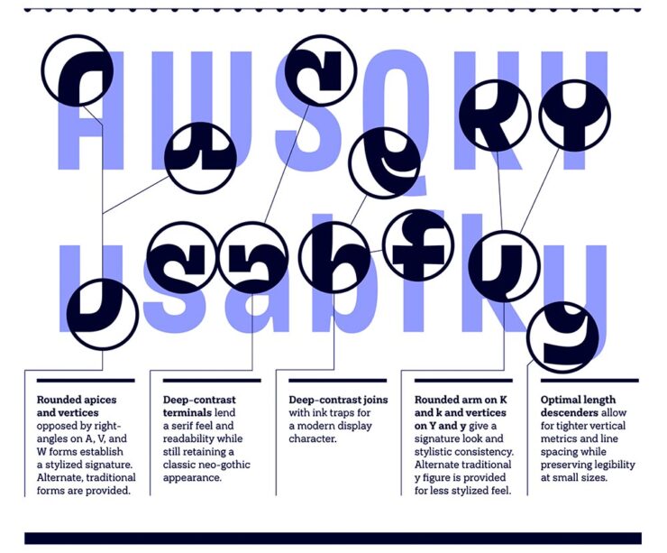
Penguin Inclusive Sans, with Olivia King
We’ve covered Inclusive Sans before, but to recap, it’s awesome, it’s free, it’s open-source, and as of February, it’s available at Google Fonts for anyone to use. So, guess who has adapted it into something new? (Okay, header spoiler, but still.) No one less than a publishing heavyweight: “A bespoke typeface for Penguin Books, uniting brand heritage, accessibility, and contemporary design to create a versatile typeface for its global publishing house,” creative director Olivia King writes.
“For 90 years, Penguin has been committed to making books for everyone. Its iconic sixpenny paperbacks revolutionised access to stories and knowledge, making reading more inclusive and affordable. Staying true to this spirit of inclusion, Penguin commissioned a custom version of Inclusive Sans — an accessible typeface — to serve as its primary brand font across its global publishing house.”
— Olivia King, Creative Director
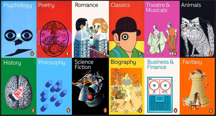
“We transitioned Inclusive Sans from a Grotesque to a Humanist foundation, adding playful flicks and flourishes to create a sense of movement and approachability[;] whether used in a refined, understated way or in strong, confident applications, the typeface offers flexibility and distinctiveness.” Marketing speak, sure, but speaking to the applications rather than past them.
The entire page is great: well put-together, well illustrated, and approachable. And wander around the site while you’re there — more than “O.K.,” it’s example after example of work the rest of us aspire to. (Via BrandNew.)
July’s Graphic Design Two-Fer
The World Illustration Awards 2025 Shortlist
“The Association of Illustrators has unveiled those in the running for this year’s World Illustration Awards, featuring 200 standout projects from over 4,700 entries worldwide. From editorial brilliance to site-specific design, it’s a showcase of illustration at its most imaginative,” CreativeBoom writes. It’s books and editorial to animation and product design — a cornucopia of illustrative goodness. Check it out.
Designer as Influencer
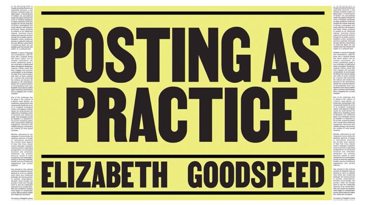
“As social platforms reward visibility, creatives are increasingly expected to make their practice public. Designers are no longer just making work; they are the work. But what started as promotion now risks swallowing design itself,” It’s Nice That writes.
Yet another reason to avoid social media … says the old guy who reads web pages published by actual individuals (and sticks to blogging). Still, very much worth a read.
Special Bonus Two-Fer. #2: From PetaPixel, DuckDuckGo, my search engine of choice, can now filter out AI images from search results. (It’s a simple toggle.) Nice.
#3: Not so nice is WeTransfer’s predicted face-plant, also via PetaPixel.
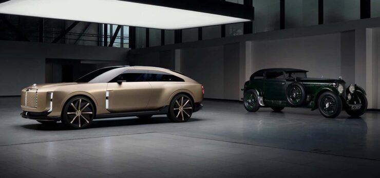
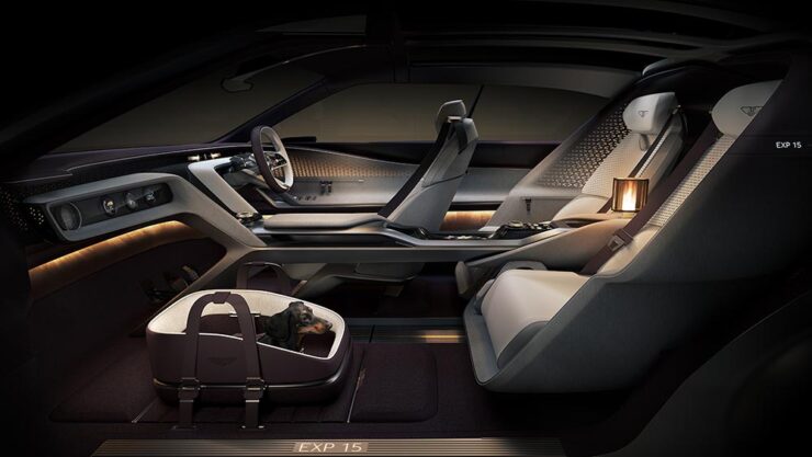
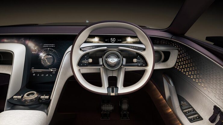
Bentley EXP15 Concept: Buckle Up
Let’s just get this out of the way: the brutalist automobile is officially a trend.
Yes, you’ve seen that shape before — and that time, I asked y’all to hang on see what happens. This time, I’m less confident it will turn out well:
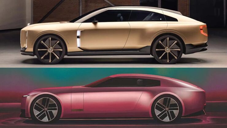
The Jaguar is both more compelling and fresh — it’s somehow more, yet with less detail. Interestingly, Jag is trying to reposition itself in the Bentley space (including comparative pricing), preferring to move upmarket rather than compete with the likes of BMW or Mercedes.
It’d be quite the coup for Jaguar to leap in (sorry) and take charge.
Update, 31 July (hours after posting, in fact): Jaguar Land Rover’s CEO has unexpectedly announced that it’s time to step aside. It’s apparently not about expectations, but….
Enough about Jaguar. Some more photographs/renders of the Bentley:
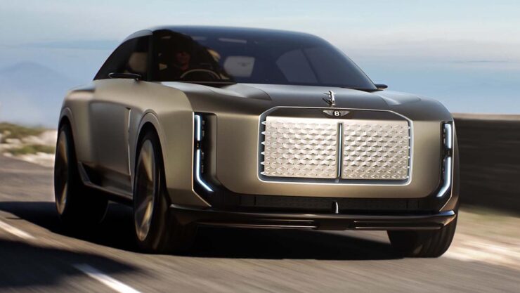
Lastly, from the rear:
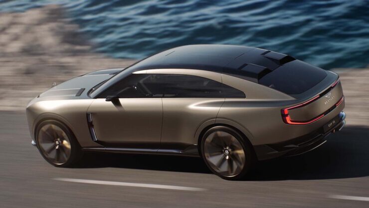
I apologize for not being more positive on this one; I’ve been down on the Volkswagen Group in general for a while, and it makes me sad that, with their flagship brand, nothing in their new concept suggests they’re trying to reverse the trend.
Coverage: “This is What the Future of Bentley Will Look Like,” from Motor1; “The Bentley EXP 15 brings the bling and delves into tomorrow’s luxury automotive experience,” from Wallpaper*; and “Bentley Is Showing Jaguar How To Take A Luxury Brand Into The Future With The New EXP 15 (IPSO Fatso),” from The Autopian. (Apologies also for the three differing headline capitalization styles — blame the sources.)
Also worth reading: The Autopian questions whether the new “Autobrutalist movement” — where I got the term — can be stopped; and Motor1 has not one but two items asking readers to give Jaguar a chance. (Probably unrelated.)
But wait: there’s another reason I’m down on Bentley right now.
The New Bentley Logo: Style over Substance
When you’re Bentley, you shouldn’t be chasing trends, you should be leading them. Style over substance is nothing less than a mistake.
Also, because everyone else has one:
This new version was done in-house, the wrong choice on every level; this isn’t a time to save money. Another sad moment: the storied history of a brand like Bentley, running on the equivalent of a flat tire. (Perhaps even the rim. Trailing sparks.)
Dezeen was mostly positive, BrandNew mostly negative. (“[E]verything here feels cheap and overwrought.” Subscription, alas.) The Autopian goes for balance. You can tell where I land.
Special Bonus #4: Range Rover’s new logo, best described as “not trying very hard” or even perhaps “goofy as hell.”
Special Bonus #5: In case you’ve never seen it, Paul Rand’s 1966 proposal for a redesign of the now-iconic Ford logo:
July’s Photography Faves
Astronomy Photographer of the Year Shortlist
“Awe-inspiring scenes of the Milky Way, dancing aurorae, and serene galaxies all feature on the shortlist for this year’s ZWO Astronomy Photographer of the Year,” PetaPixel writes. Indeed:
The competition is run by Royal Observatory Greenwich, supported by ZWO and in association with BBC Sky at Night Magazine.
See the other 28 on the shortlist here. The winners will be announced in September, so stay tuned.
Abstract Fireworks
Every year, photographers across the world flock to fireworks displays, something that’s never interested me — until now:
PetaPixel takes a moment to self-congratulate here, and I think they’ve earned it — although it’s good to note that the original post cites This is Colossal. (And that PetaPixel did a poor job with the cite in that original story, using only Colossal’s photography tag rather than an easily-found, specific link. Shame on them.)
Anyway, photographer Bryan Szucs took the defocusing idea and absolutely ran with it:
Great stuff. See more on his website SmugMug.
Special Bonus #6: Apple filed a fascinating image sensor technology patent last month, which describes a stacked image sensor with vast dynamic range and very low noise. PetaPixel has the story.
Unbuilt Frank Lloyd Wright
Okay, officially these are renders, not photographs. Still:
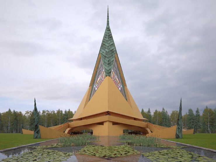
“Hooked on the Past emerged from the intersection of two personal passions: the history of architecture and the fascinating world of computer-generated imagery,” Romero tells This is Colossal.

Wright was ahead of his time in that he pushed material science to make a concept, shape, or cantilever work (often demonstrated in the maintenance and repair bills); his unbuilt projects demonstrate what could have been, and there’s nowhere better to imagine those than in generated imagery.

See more at this great Colossal post.
High-Octane Dogs
“Ultimately, it’s not the equipment that creates the magic. It’s the connection with the dog, the timing, the light, and the intention behind every shot. The gear just helps bring that vision to life,” photographer Caludio Piccoli tells PetaPixel.
I could easily repost every photograph from the story; they’re all great. Just go read it instead.
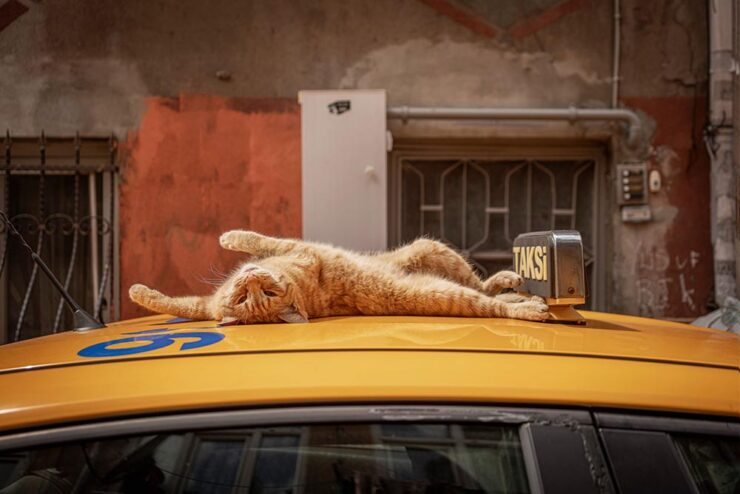
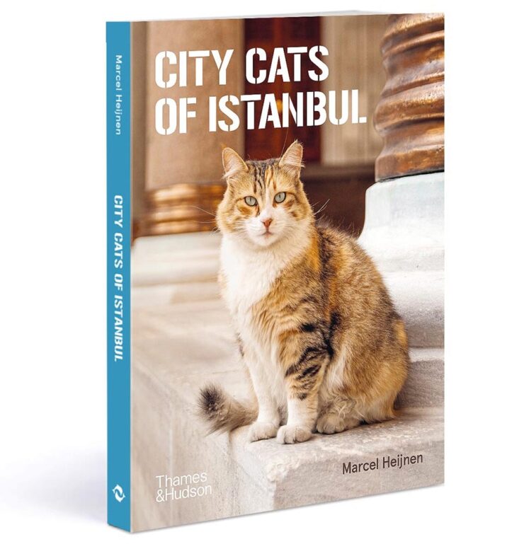
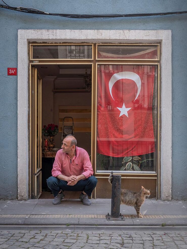
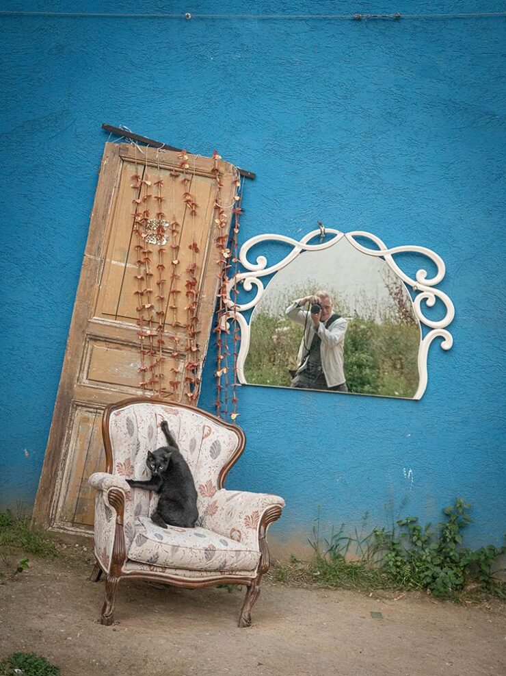
City Cats of Istanbul
To close out this month, well, the title says it all:
Somehow, they completely fit the location:
The author (supposedly the one in the mirror):
See more at This is Colossal or CreativeBoom — and then go enjoy August with a smile on your face.