To close out 2025, a bunch of disparate items for your edification and enjoyment: the usual categories plus some stuff imported from left-field. Get caffeinated, get comfy, and let’s get to it.
Please note that the photography trip planned for mid-December had to be cancelled at the last minute — circumstances beyond my control — and hasn’t yet been rescheduled. Apologies.
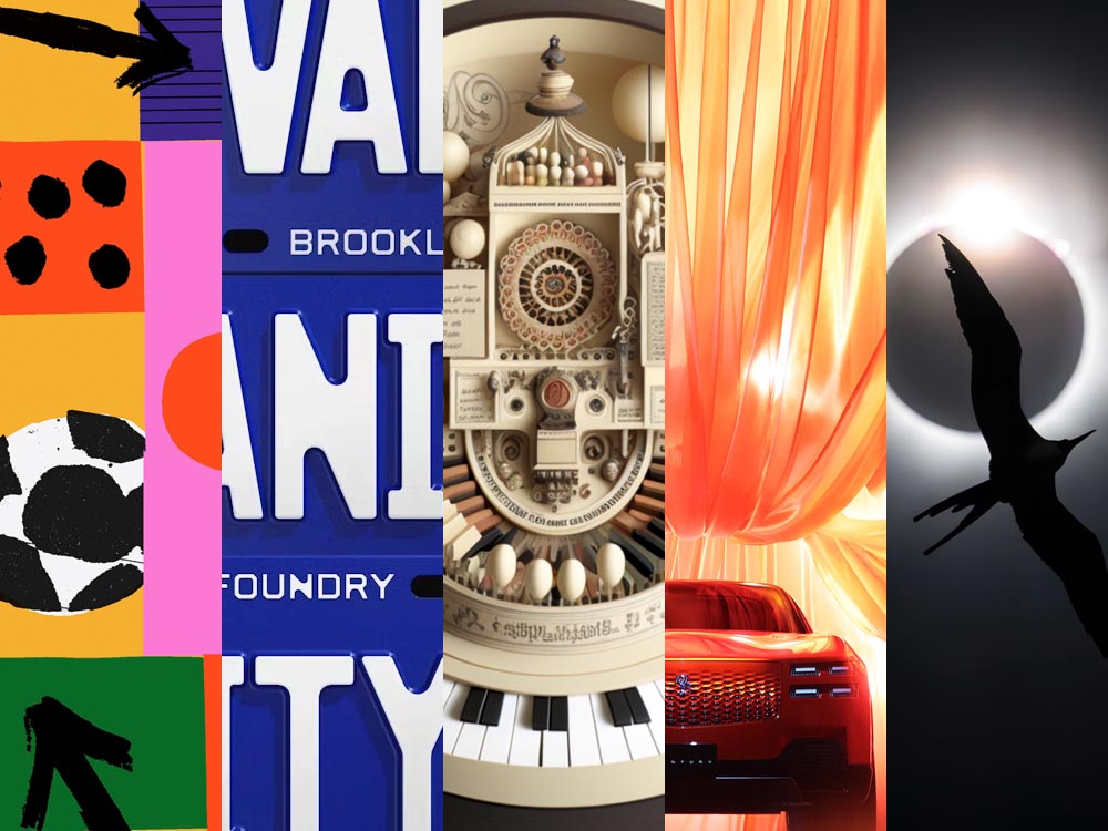
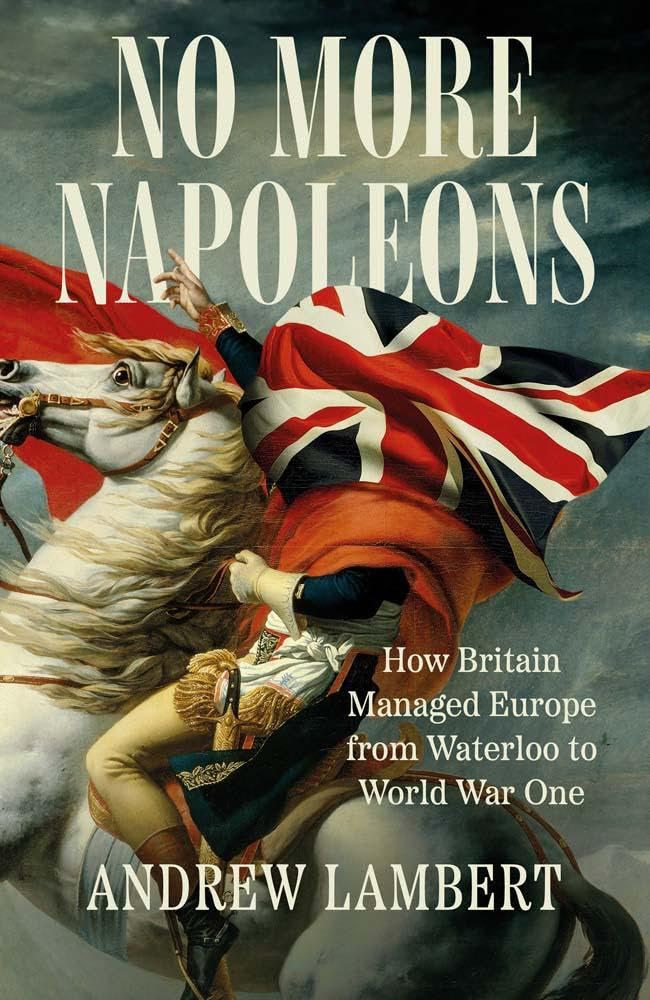
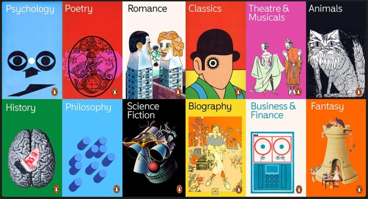
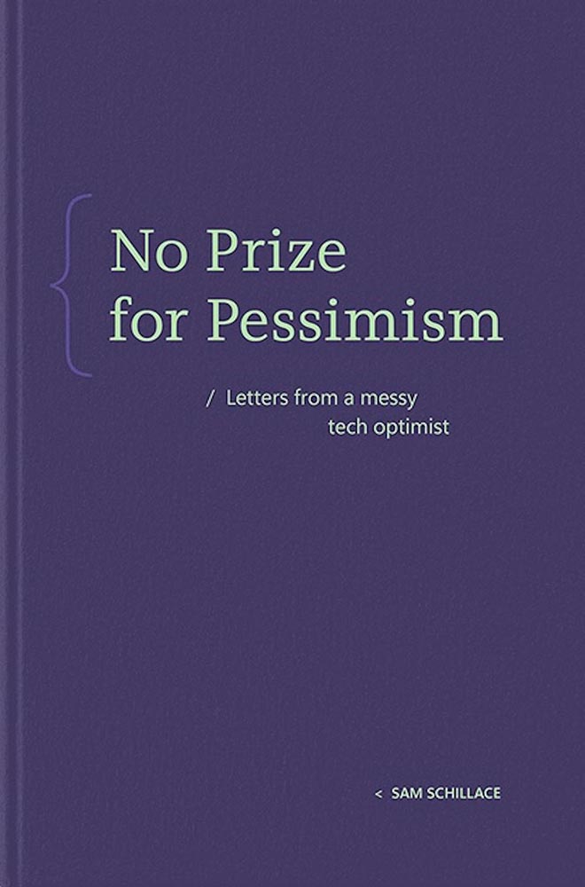
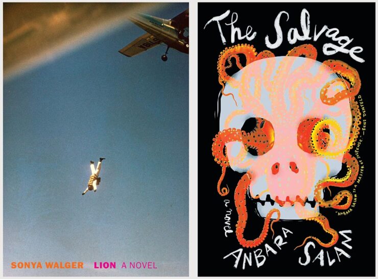
December’s Spine
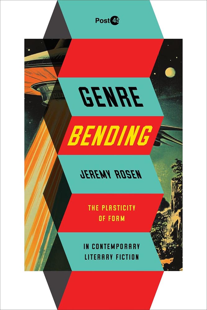
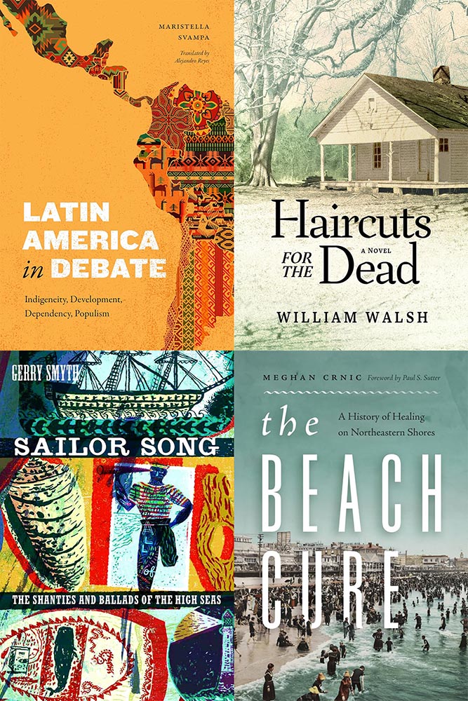
Fourteen great University Press book covers in December’s column, including the genre-bending example above. Check it out.
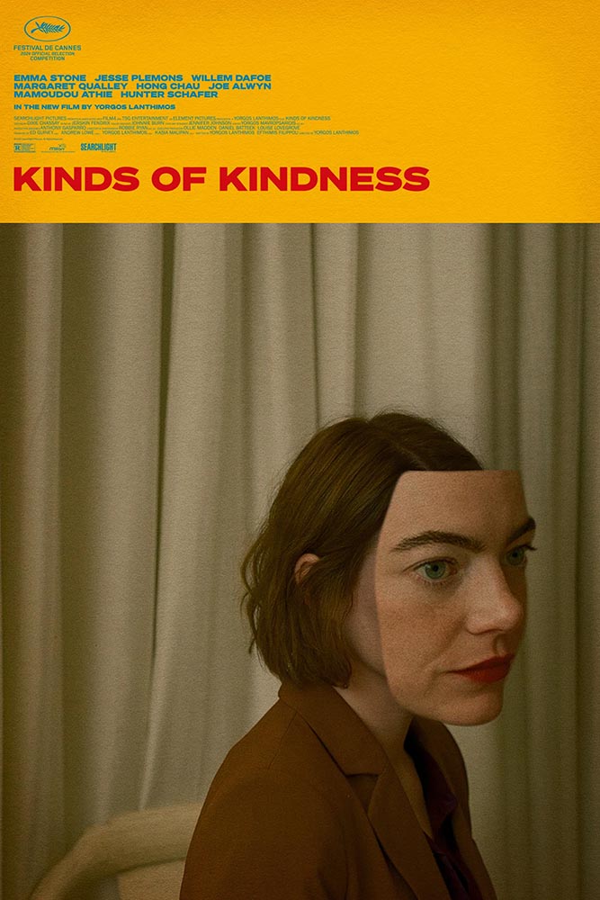
December 25th: Designer Holiday Cards
“Long live the Christmas card — a ritual that feels increasingly endangered in our digital age. The simple act of putting pen to paper and sending wishes inked in black or blue is, in a word of instant messages, profoundly gratifying,” Wallpaper* writes. “In celebrating this venerable tradition, we found ourselves asking: what sort of Christmas card does an architect send?”
January 1st: Public Domain Day
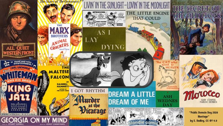
On January 1, 2026, thousands of copyrighted works from 1930 enter the US public domain, along with sound recordings from 1925. They will be free for all to copy, share, and build upon. The literary highlights range from William Faulkner’s As I Lay Dying to Agatha Christie’s The Murder at the Vicarage and the first four Nancy Drew novels. From cartoons and comic strips, the characters Betty Boop, Pluto (originally named Rover), and Blondie and Dagwood made their first appearances. Films from the year featured Marlene Dietrich, Greta Garbo, the Marx Brothers, and John Wayne in his first leading role. Among the public domain compositions are I Got Rhythm, Georgia on My Mind, and Dream a Little Dream of Me. We are also celebrating paintings from Piet Mondrian and Paul Klee. [In this post] you can find lists of some of the most notable books, characters, comics, and cartoons, films, songs, sound recordings, and art entering the public domain. After each of them, we have provided an analysis of their significance.
— Jennifer Jenkins and James Boyle, Duke Law
The annual list is, in every manner of speaking, a gift to society. (Via Pluralistic.)
Has Judging a Book by its Cover Gone Too Far?
Excellent question from It’s Nice That, discussed in a post with book designers Na Kim and David Pearson. Book covers these days are driven by trends that are all-too-fleeting — what does that mean for what’s contained within? Is “salability” all that matters?
Perhaps the question should be, “Where are we as a society, and is this it, in microcosm?”
Special Bonus #1: 100 Notable Small Press Books of 2025, from LitHub:
A reminder that press size and cover quality do not necessarily correlate — as noted in the above item, small presses might be willing to bend the “rules” more readily than the big players.
“Our guiding principles were ‘read a lot, recommend a few’ and ‘seek out a diverse array of authors and publishers,’” they write. “We were especially interested in BIPOC and LGBTQ authors and publishers, who have an even steeper climb to mainstream recognition.” Enjoy.
Special Bonus #2: Bar codes as design objects:
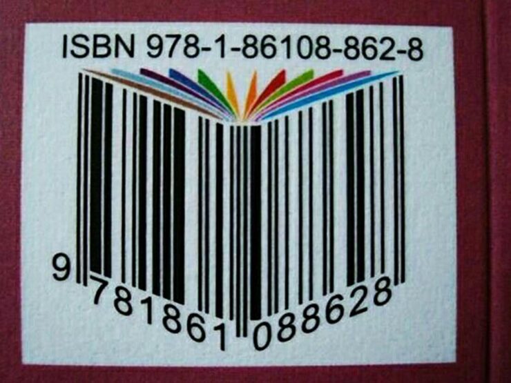
This short piece from type foundry Pangram Pangram includes several book covers.
CreativeBoom: Six Surprising Illustration Trends for 2026
Contrary to popular belief, illustration — like photography — is not on its deathbed. Despite the temptation for some companies (or budgets) to reach for generative AI, the consensus is that in order to stand out, bringing something unique to the table will be worth the effort. CreativeBoom talked to seven illustration agencies to get an idea what will work in 2026.
Special Bonus #3: A repository of mid-20th-century illustration, for research or just enjoyment: “Illustrator Zara Picken has an incredible searchable archive of mid-century modern illustration from c.1950-1975. It’s a goldmine of graphic, type, color, and texture inspiration.”
Zara’s illustrations are in a cut-paper style and awesome; link via SimpleBits Studio Notes #60. (The entire series of Notebook entries is cool when you have a few extra minutes.)
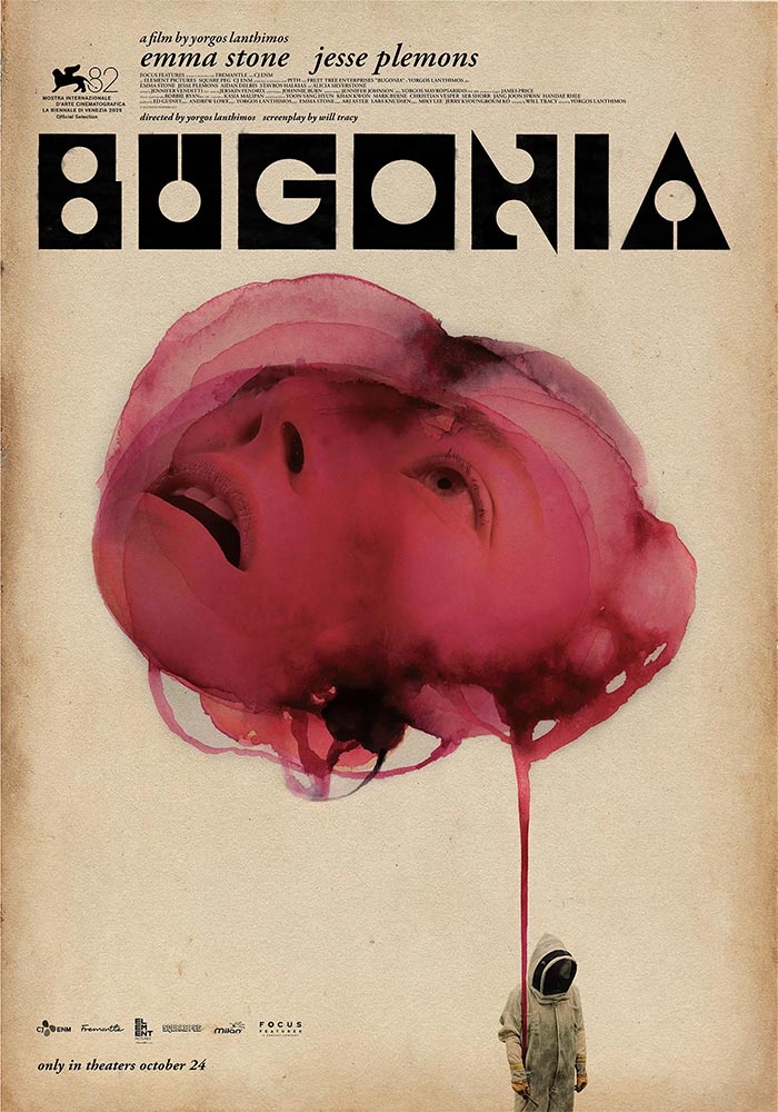
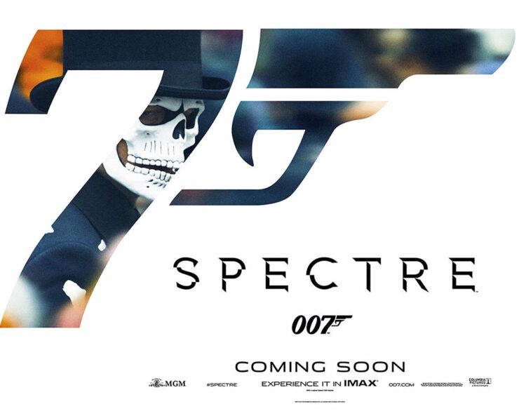
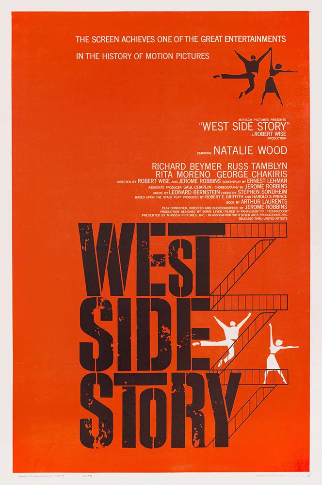
Creative Review‘s Movie Posters of 2025
Begonia was mentioned in October. A couple are by Empire Design, including the above — which is a master class in nested photographs. (“Claustrophobic,” CR says.) Great stuff.
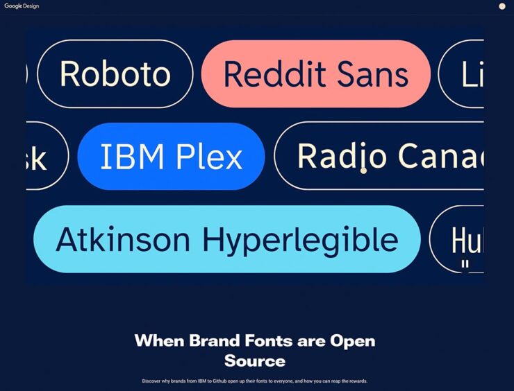
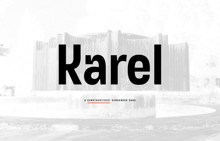
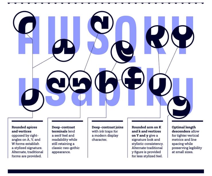
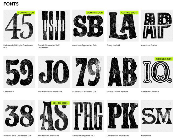
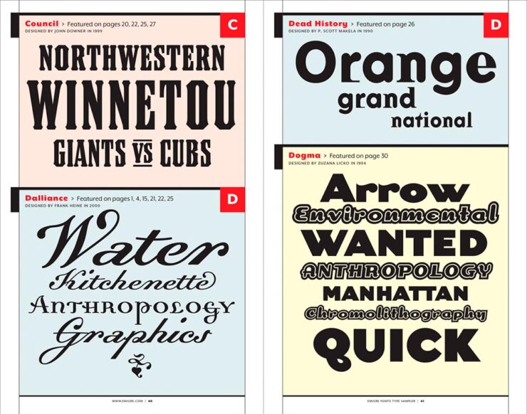
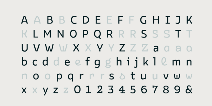
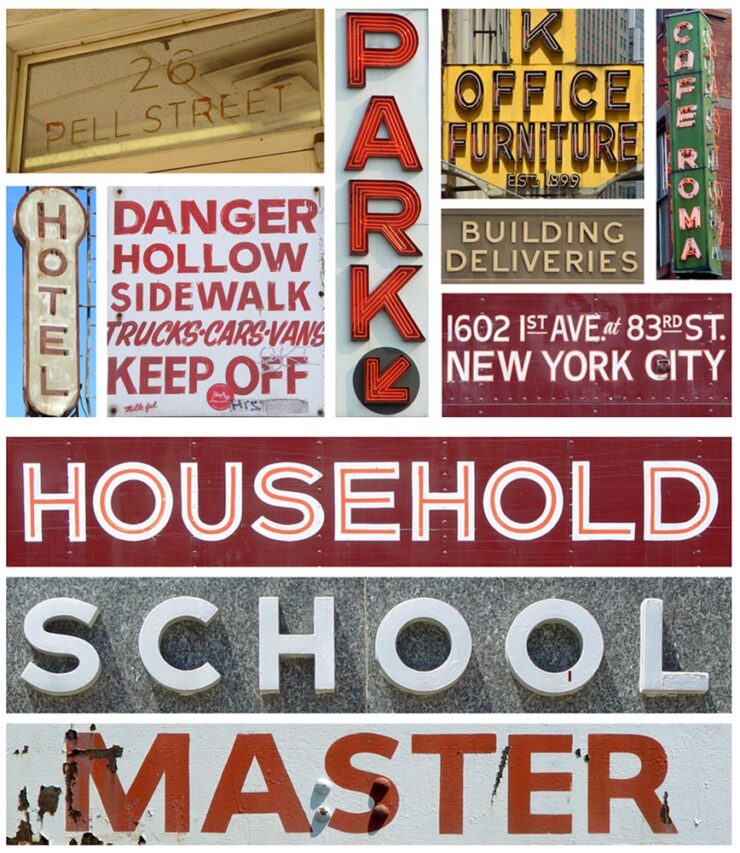
Typefaces, Pt. 1: Notes for December
Snowee
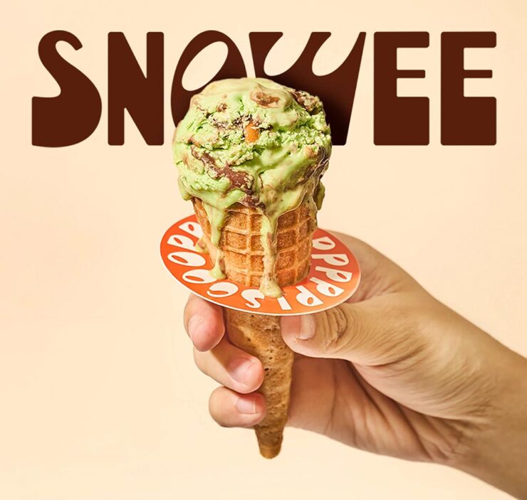
CreativeBoom‘s new font post for December includes Snowee, which is far and away my favorite: interesting, characterful (heh), and just fun — something lacking amongst the sea of Helvetica wannabes.
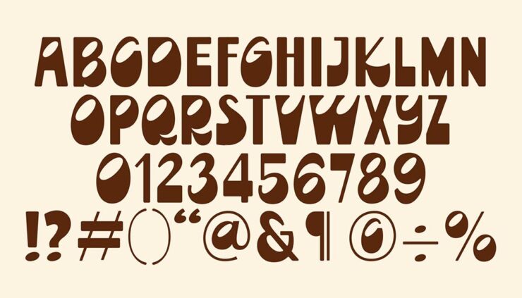
It’s caps-only and not great at small sizes, but given a headline or poster or … whatever, it could be a pleasant, different choice. (I love that the O looks like an olive.)
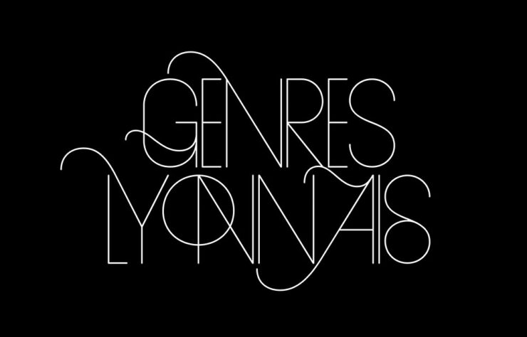
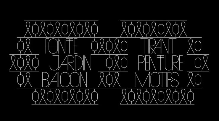
LEGO’s Letterforms
Meanwhile, LEGO features in a new project called “A2Z,” an international effort to create letterforms highlighting strength found in limited systems:
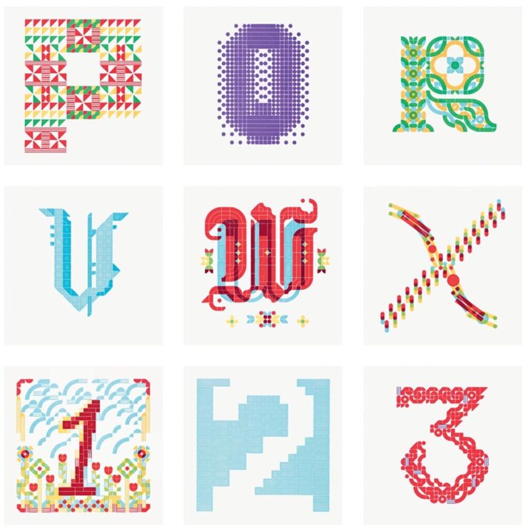
LEGO “offered an ideal blend of fixed constraints and room for playful exploration. Each brick’s scale and form could not be altered, but the grid’s size could be individually defined,” This is Colossal writes of this hand-printed awesomeness.
Gotham
From Tobias Frere-Jones, the story of how Gotham came to be:
“In 2021, Monotype bought Hoefler & Co, and with it several families that I designed. As these families are now further removed from their origin, I want to ensure that their stories are accurately recorded,” Frere-Jones says. (Part of a series, in fact.)
The Garamonds
Lastly (for now), John Gruber’s Daring Fireball is among many who point out that condensed serifs are back in vogue, including — naturally, given the source — Apple Garamond:
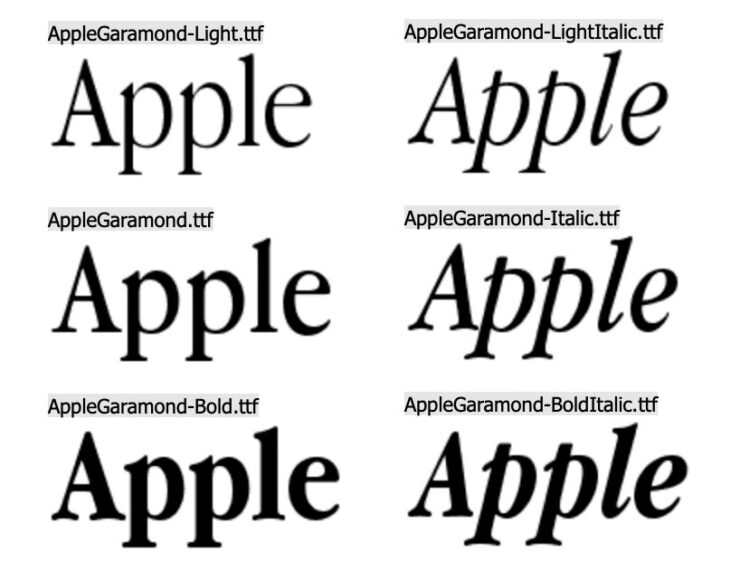
Gruber also reminds us that Apple’s gone through more processor types than typefaces.
Special Bonus #5: Gruber also has a quick item linking to a brilliant essay arguing that not all Garamonds are created equal — ITC’s version, especially. (Which Apple Garamond was based on, interestingly.)
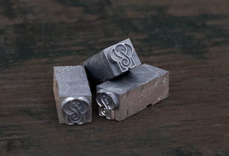
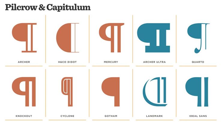
Special Bonus #6: Who doesn’t love a Pilcrow?
Fonts, Pt. 2: The Calibri Flame-Out
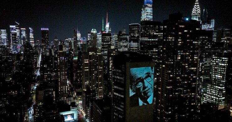
Let’s face it: type rarely generates headlines. But these aren’t “normal” times. Headlines were definitely made when the US State Department decided that its house style rules ditch Calibri, a font chosen to be more readable — more inclusive — and revert to Times New Roman. Because … tradition? Politics? Readability?
Let’s stipulate for the moment that the memo’s drafters saw choices as limited to the defaults available in Microsoft Word. (Because … you saw that coming.)
John Gruber was all over it, and argued thus:
While neither is a good choice, between the two, Times New Roman is clearly better. […] I just think it’s stupid for an institution with the resources of the U.S. State Department to shrug its shoulders at the notion that they should license and install whatever fonts they want on all of their computers. Anyone making excuses that they “can’t” do that should be fired. […]
— John Gruber, Daring Fireball
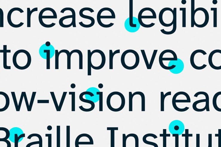
Calibri does convey a sense of casualness — and more so, modernity — that is not appropriate for the U.S. State Department. And I do not buy the argument that Calibri is somehow more accessible for those with low vision or reading disabilities. People with actual accessibility needs should be catered to, but they need more than a sans serif typeface, and their needs should not primarily motivate the choice for the default typeface.
But he didn’t stop there. He somehow got his hands on the complete memo written by Secretary of State Rubio, and it’s … surprisingly sober. Gruber comments:
It drives me nuts when news sites in possession of a statement or original document do not make the full original text available, even if only in a link at the bottom, and choose only to quote short excerpts.
— John Gruber, Daring Fireball
With regard to today’s news regarding Marco Rubio’s directive re-establishing Times New Roman as the default font for U.S. State Department documents (rescinding the Biden administration’s 2023 change to Calibri), I very much wanted to read the original. The New York Times broke the news, stated that they had obtained the memo, and quoted phrases and words from it, but they did not provide a copy of the original.
The State Department has not made this document publicly available, and to my knowledge, no one else has published it. I have obtained a copy from a source, and have made it available here in plain text format. The only change I’ve made is to replace non-breaking spaces (U+00A0) with regular spaces.
Please do read it yourself, and do so with an open mind.
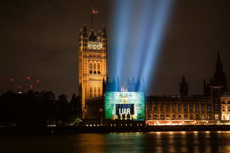
It seems clear to me that The New York Times did Rubio dirty in their characterization of the directive. The Times story, credited to reporters Michael Crowley and Hamed Aleaziz, ran under the headline “At State Dept., a Typeface Falls Victim in the War Against Woke.”
Engagement sells?
Wallpaper*, a UK publication I generally enjoy (and cite elsewhere in this post), is one of many examples where a chosen narrative framed the piece. However, they did one thing to help: they introduced us to Calibri’s designer:
His comments, directly quoted (from HackerNews — sorry — but also via DF):
The decision to abandon Calibri on the grounds of it being a so-called “wasteful diversity font” is both amusing and regrettable. Calibri was specifically designed to enhance readability on modern computer screens and was selected by Microsoft in 2007 to replace Times New Roman as the default font in the Office suite. There were sound reasons for moving away from Times: Calibri performs exceptionally well at small sizes and on standard office monitors, whereas serif fonts like Times New Roman tend to appear more distorted. While serif fonts are well-suited to high-resolution displays, such as those found on modern smartphones, on typical office screens the serifs introduce unnecessary visual noise and can be particularly problematic for users with impaired vision, such as older adults.
— Lucan de Groot, LucasFonts
Professional typography can be achieved with both serif and sans-serif fonts. However, Times New Roman—a typeface older than the current president—presents unique challenges. Originally crafted in Great Britain for newspaper printing, Times was optimised for paper, with each letterform meticulously cut and tested for specific sizes. In the digital era, larger size drawings were repurposed as models, resulting in a typeface that appears too thin and sharp when printed at high quality.
Serif fonts are often perceived as more traditional, but they are also more demanding to use effectively. While a skilled typographer can, in theory, produce excellent results with Times, using it in its default digital form is not considered professional practice.
I don’t know whether there’s much needed beyond that takedown. Okay, maybe this:
[Y]ou can still make good typography with system fonts. But choose wisely. And never choose Times New Roman or Arial, as those fonts are favored only by the apathetic and sloppy. Not by typographers. Not by you.
— Matthew Butterick, “Typography in Ten Minutes”
In case all you encountered were the headlines, now you know there was more to the story.
See also: The Scourge of Arial, A Brief History of Times New Roman, and Typefaces for Dyslexia, all from Daring Fireball, and The Guardian‘s fun Calibri: Is this Really the World’s Wokest Font?
While I’m at it: Word of the Year
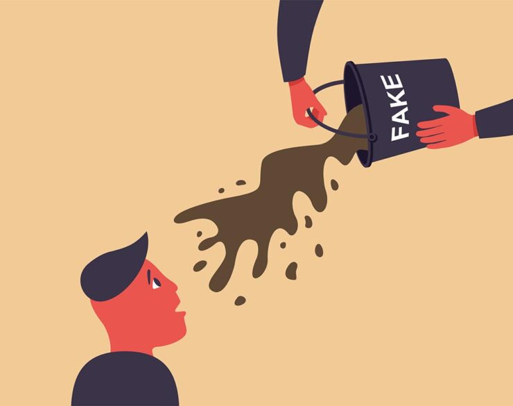
Merriam-Webster announced that “slop” is its 2025 Word of the Year, reflecting how the term has become shorthand for the flood of low-quality AI-generated content that has spread across social media, search results, and the web at large. The dictionary defines slop as “digital content of low quality that is produced usually in quantity by means of artificial intelligence.”
— Benj Edwards, Ars Technica
“It’s such an illustrative word,” Merriam-Webster President Greg Barlow told The Associated Press. “It’s part of a transformative technology, AI, and it’s something that people have found fascinating, annoying, and a little bit ridiculous.”
To select its Word of the Year, Merriam-Webster’s editors review data on which words rose in search volume and usage, then reach consensus on which term best captures the year.
I’d like to suggest an alternative: “brown.”
Brown is the color you don’t want to be in the U.S. right now, lest you face legalized discrimination, illegal arrest — or worse. Brown is the color of the FUD the “Health Department” employs to prevent use of lifesaving treatments and vaccines. Brown is the substance, or lack thereof, the United States exports worldwide in the place of aid, education, fairness, or leadership. Brown is the color of the ink the Supreme Court uses to write opinions stripping people of their rights. Brown is the color of the flag a supine Congress continues to wave, surrendering its authority. Brown is the color of everything that comes from the stool-sample spectacular otherwise known as the U.S. Executive. And, of course, brown is today’s engagement-driven social media, a fecosystem of algorithms and AI built to exploit people for profit.
Red Scare? Been there, done that. Welcome to the new.
The Brown Scare.
[/soapbox]
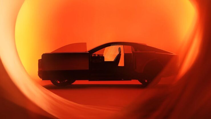
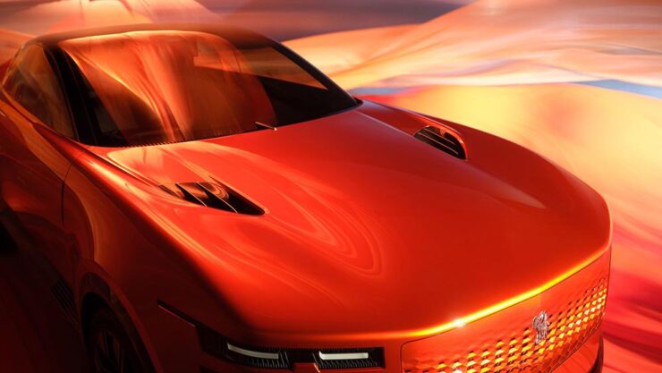
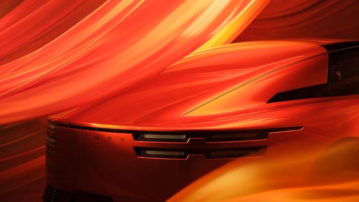
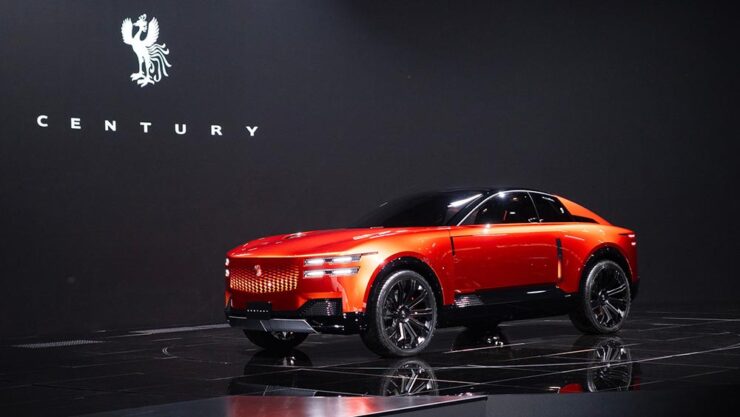
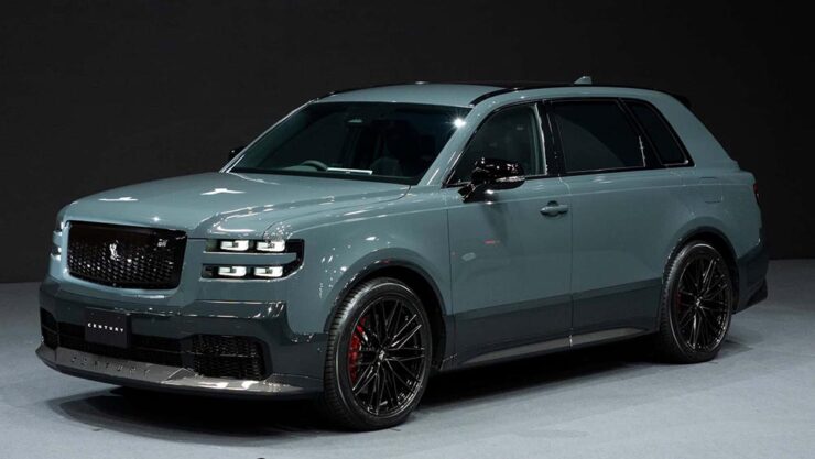
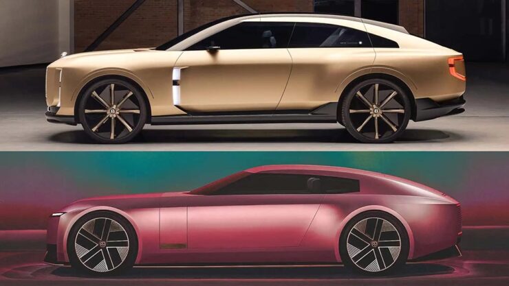
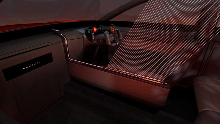
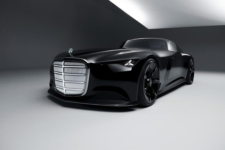
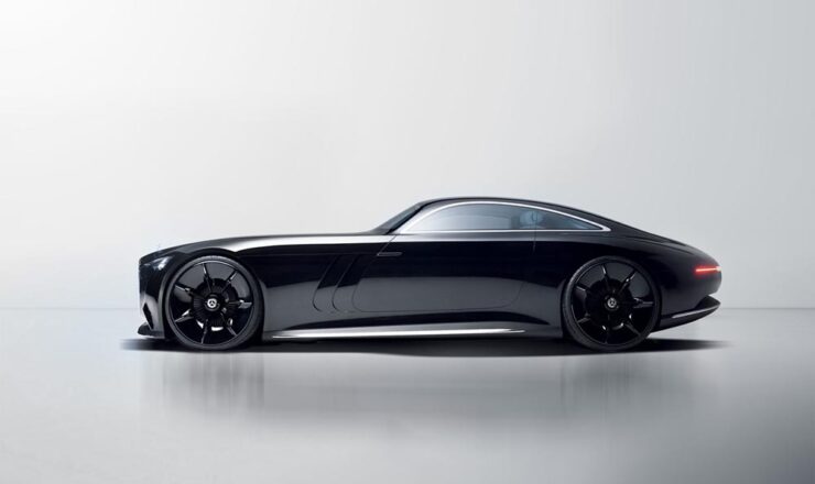
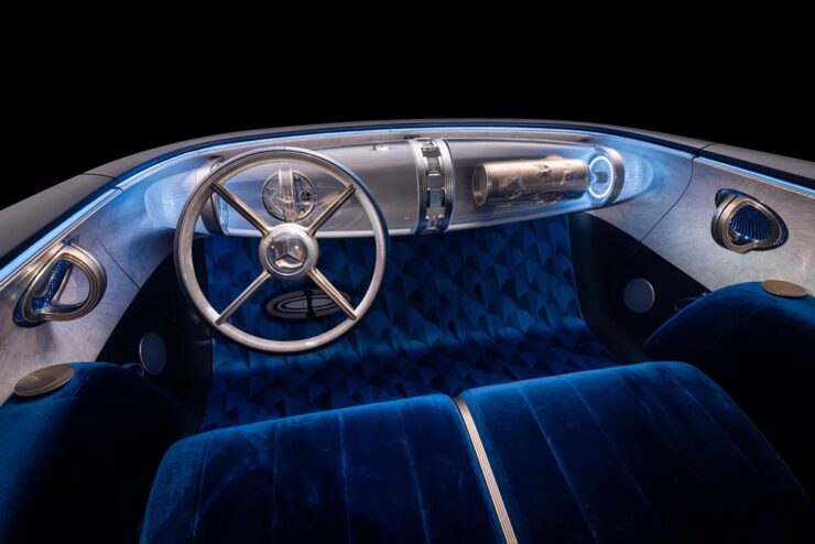
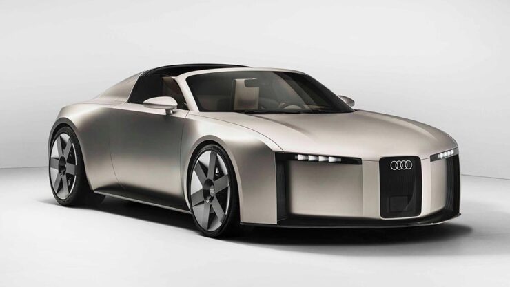
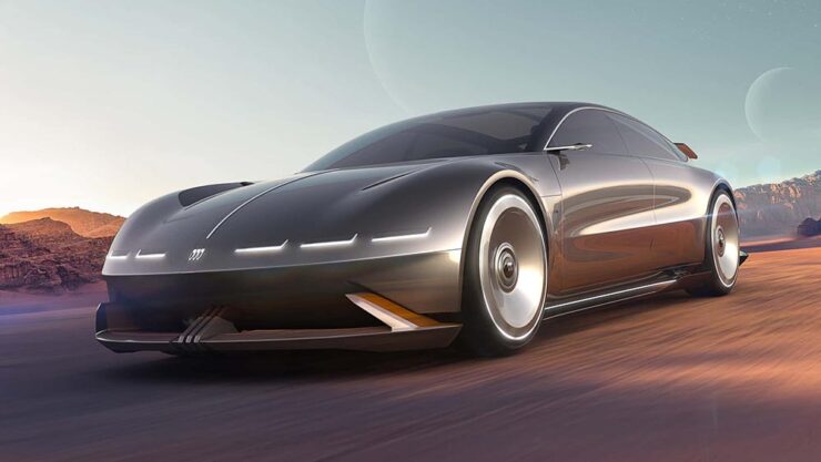
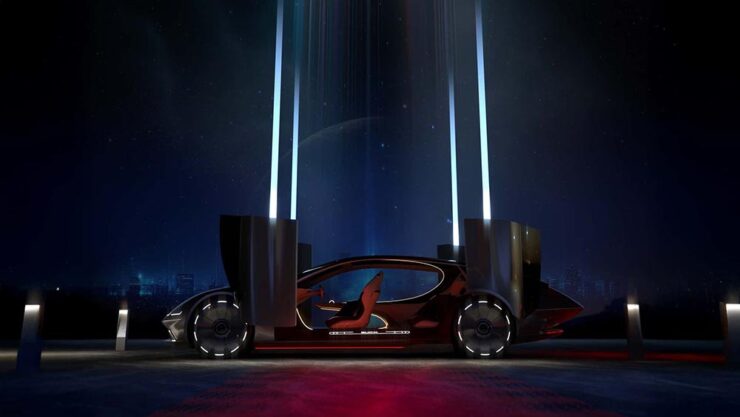
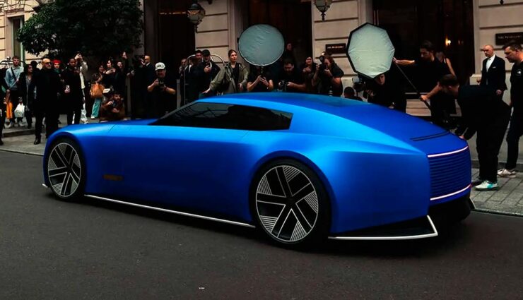
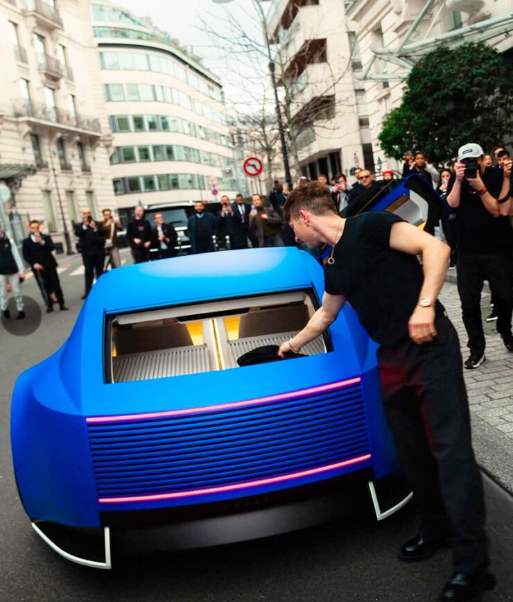
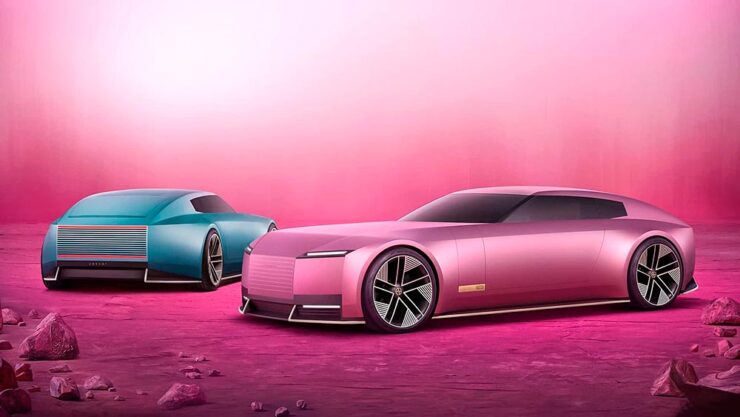
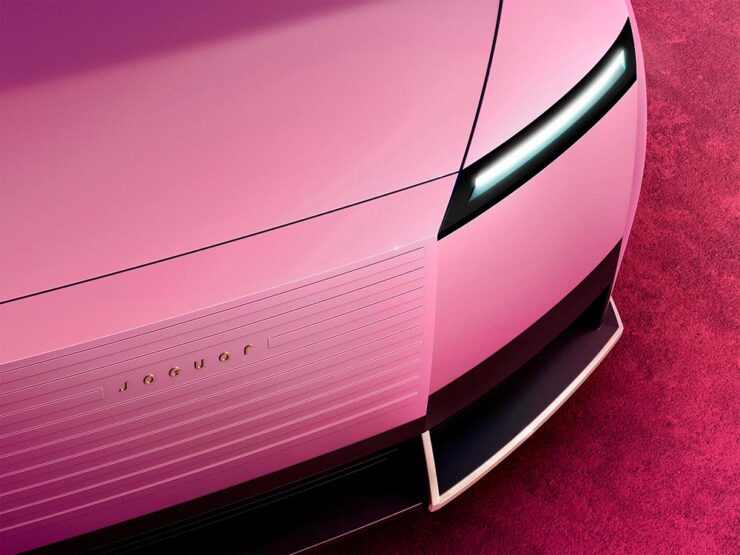
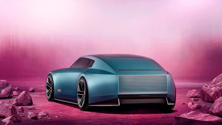
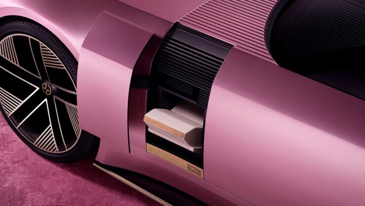
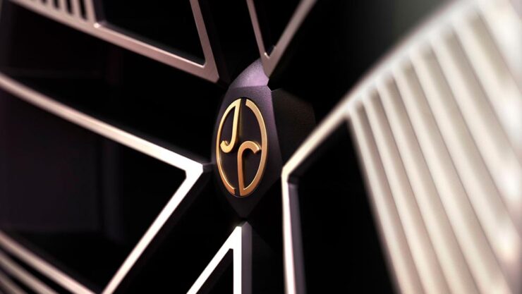
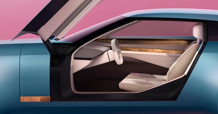
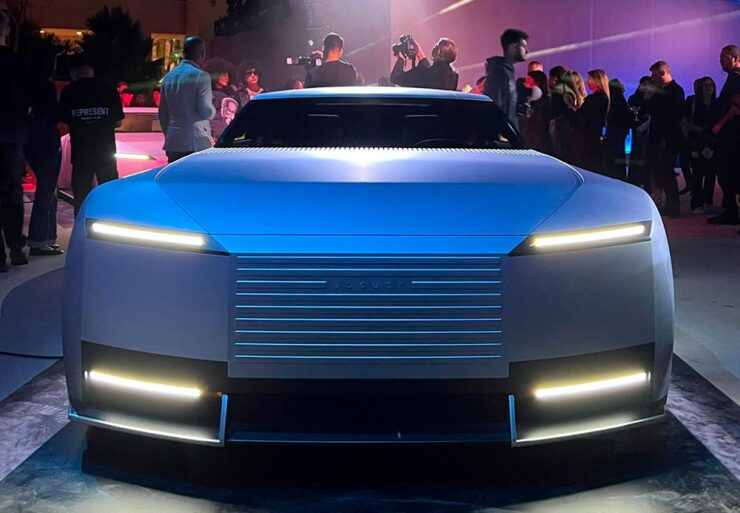
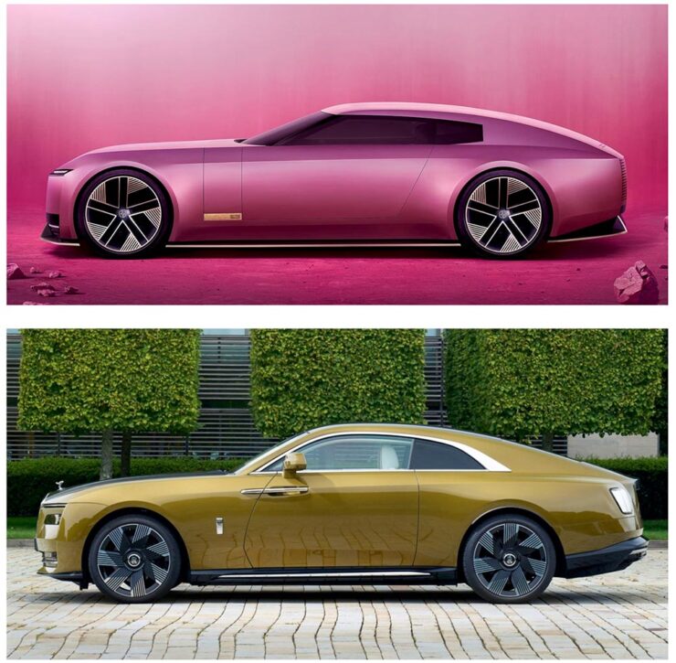
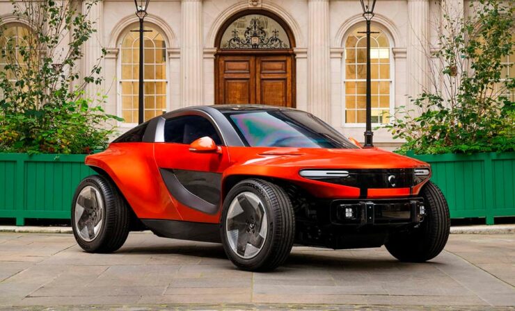
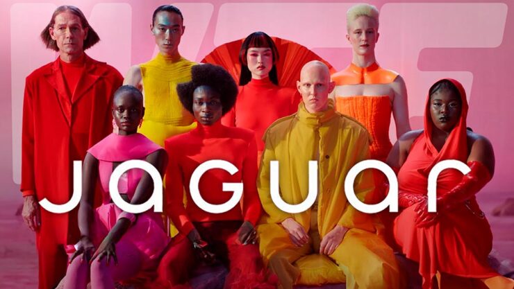
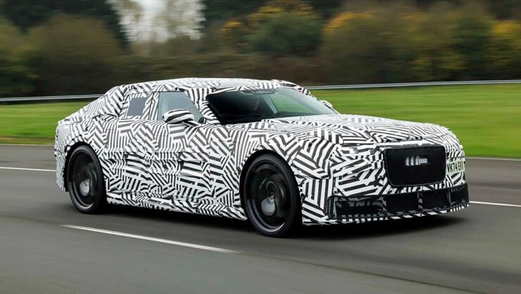
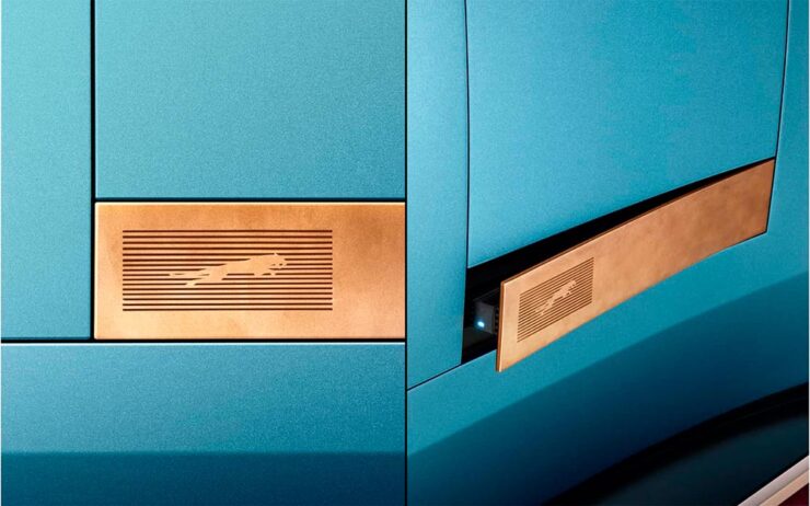
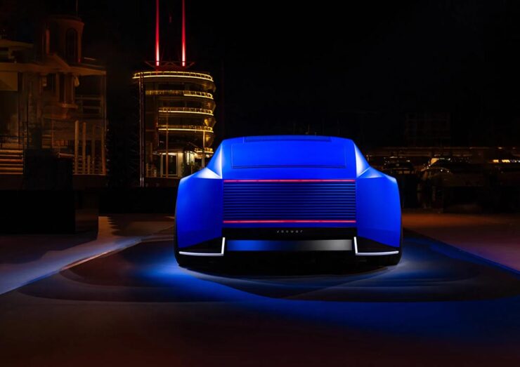
Briefly: Jaguar
On multiple occasions, I predicted that JLR might actually succeed at making something interesting out of Jaguar — in the face of, well, the Internet. They’re still working on it:
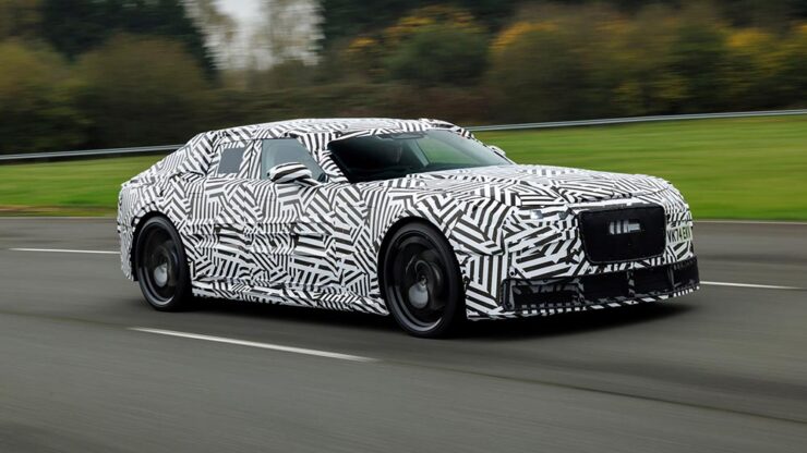
Alas, the world has changed around them; EVs are no longer what they were, and basing a new, ultra-high-end product line exclusively around an EV platform might not work out quite the way they’d hoped.
Frankly, the pullback from EVs is beyond stupid — ask anyone who owns one — but then, “stupid” is something to be proud of these days. (I know: soapbox. Sorry.)
What’s important regarding Jaguar at this moment in time is, supposedly, the company has pulled so far back that it fired its chief designer, Gerry McGovern.
Or not. There are questions.
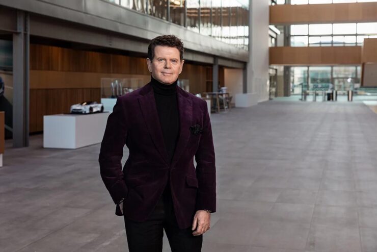
“It’s long been rumoured that McGovern was personally liked by Ratan Tata, who ran JRL’s parent company,” The Drive quotes. “Mr. Tata passed away last year, leaving Autocar India to speculate that ‘key support’ for Mr. McGovern may have waned in the corporate titan’s absence.”
That was on December 2nd. On the 15th, rumors started circulating that the news stories weren’t correct: Jaguar has reportedly stated it’s “untrue” that McGovern was “terminated.”
Time will tell.
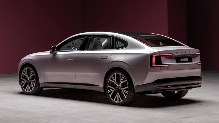
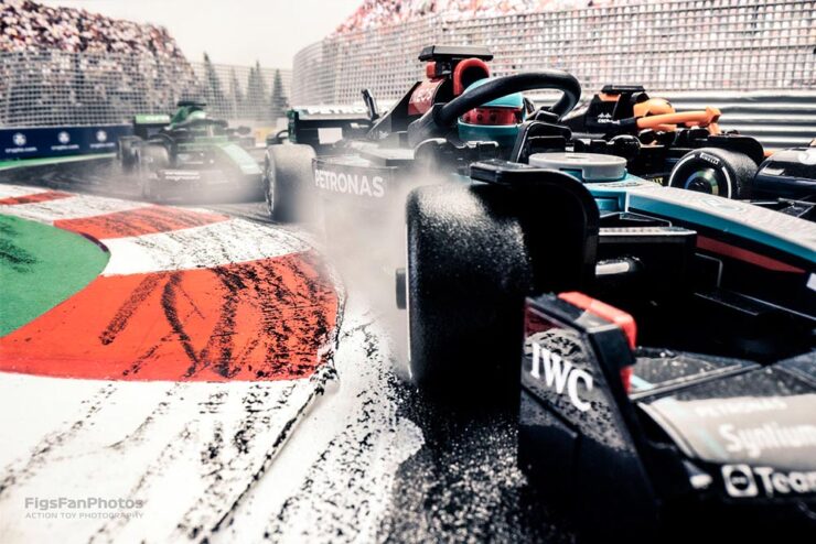
Special Bonus #7: How ’bout a mash-up? Cars and type: Volvo has a new corporate font, Centum, designed “with safety in mind.” (Naturally.) Dezeen has the story.
December’s Photography Round-Up
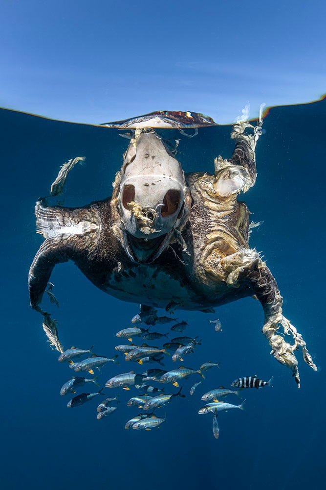
A Royal Competition
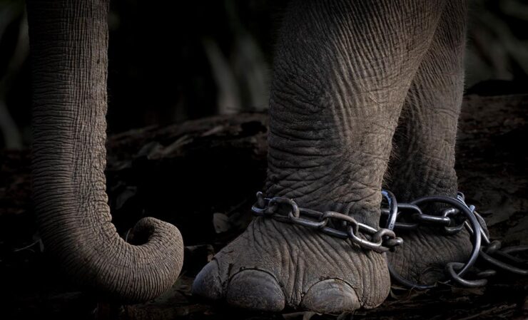
See the winners of the Royal Society Publishing Photography Competition 2025, ten images that showcase “the best scientific photography worldwide across multiple categories, celebrating the overlap between compelling art and influential science.” (Via PetaPixel.)
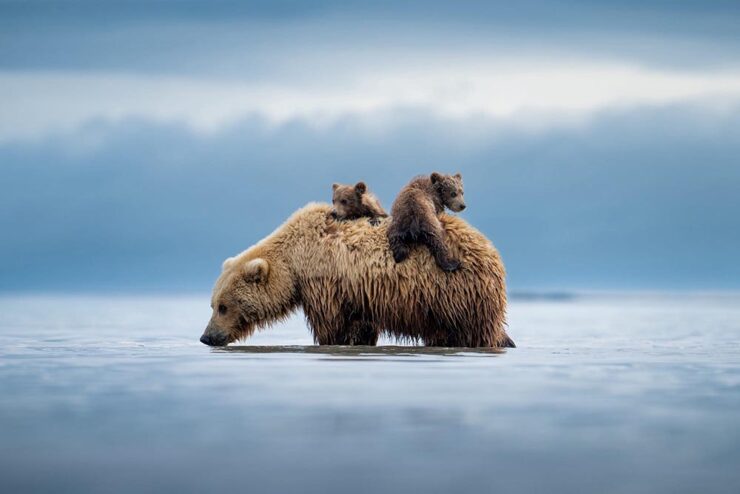
Nature’s Best Science Photos of 2025

Nature’s annual picks for favorite science photography reflect a diverse range that’s always worth checking out. While it includes the skydiving image covered briefly last month without appropriate comment, the others delight (especially the sloth). Props, too, for the excellent web design on show here.
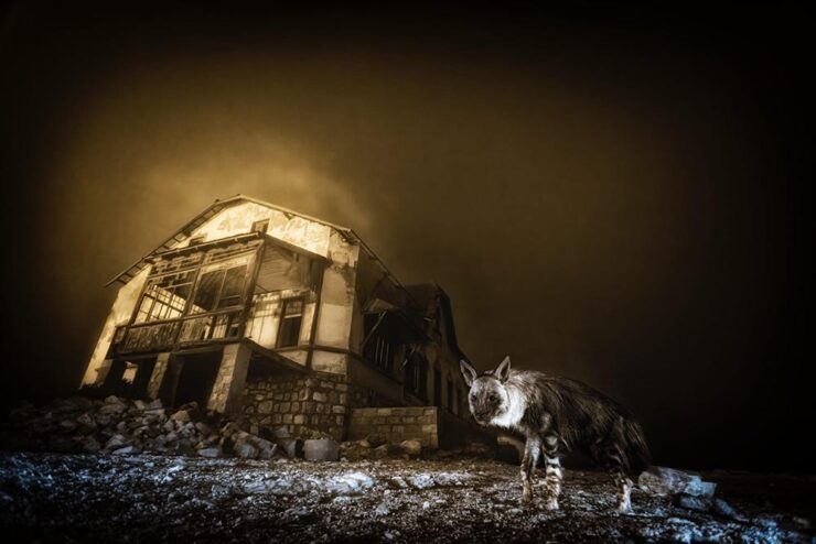
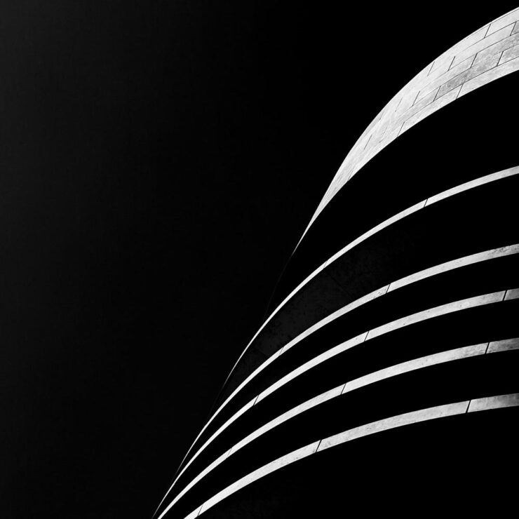
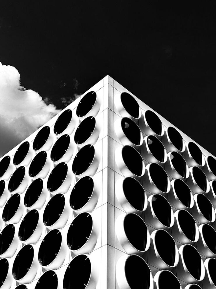
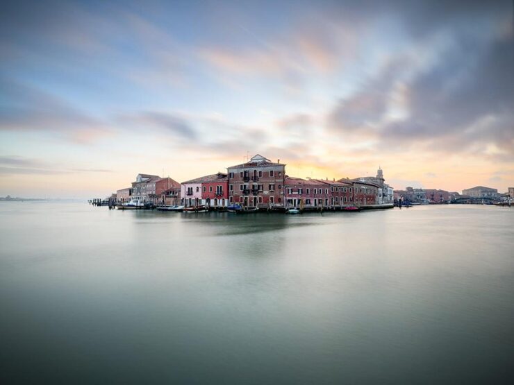
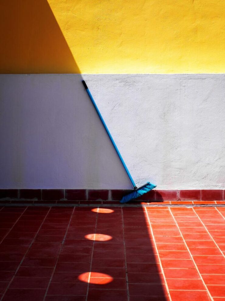
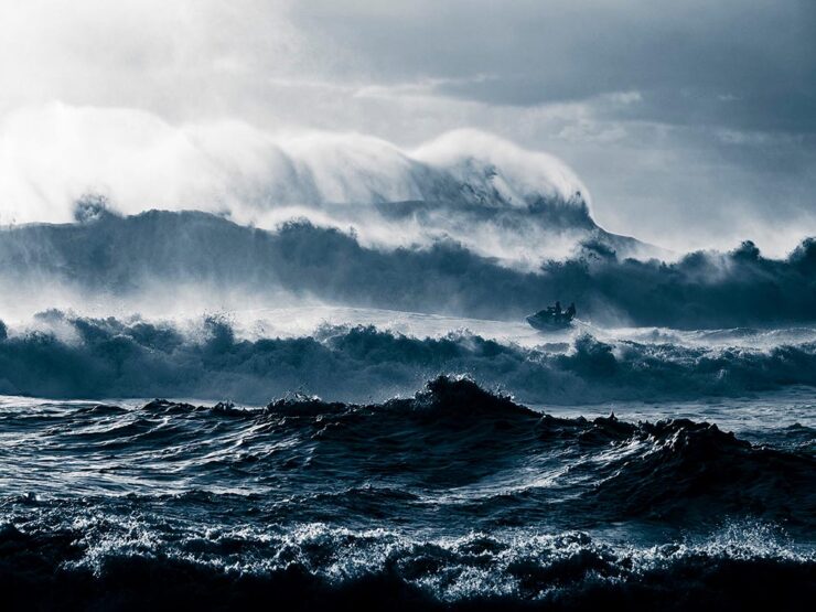
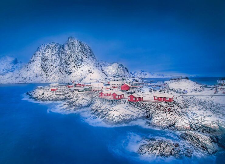
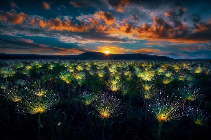
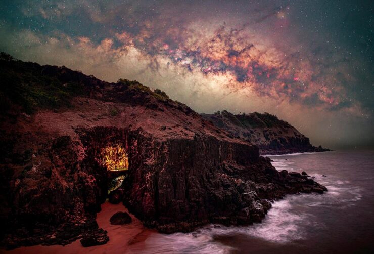
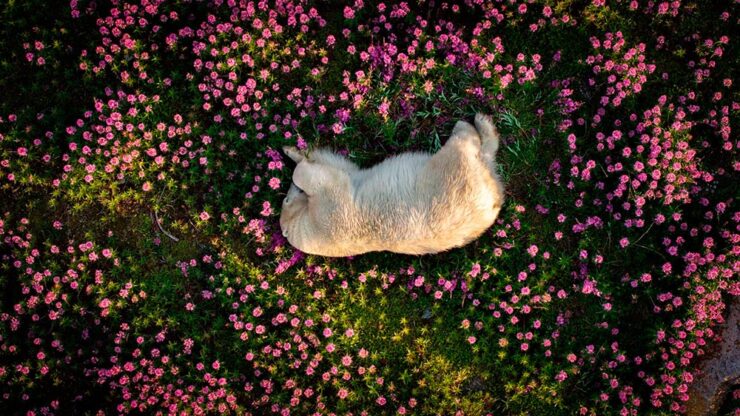
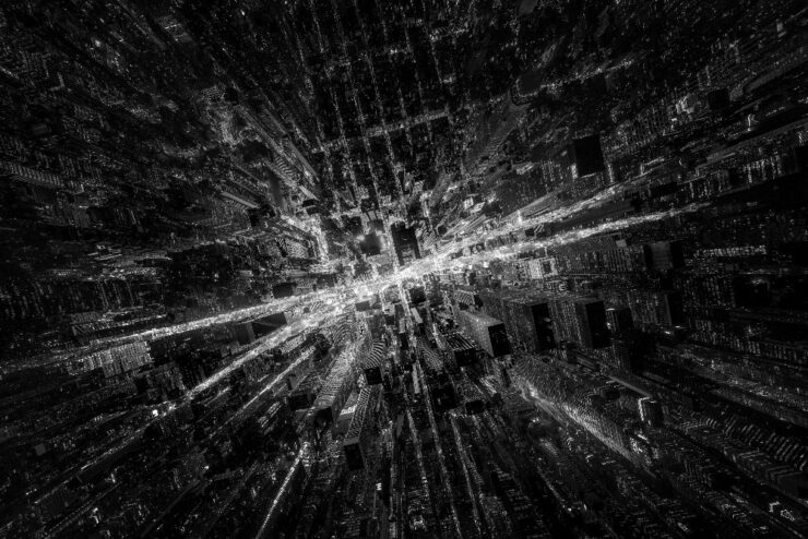
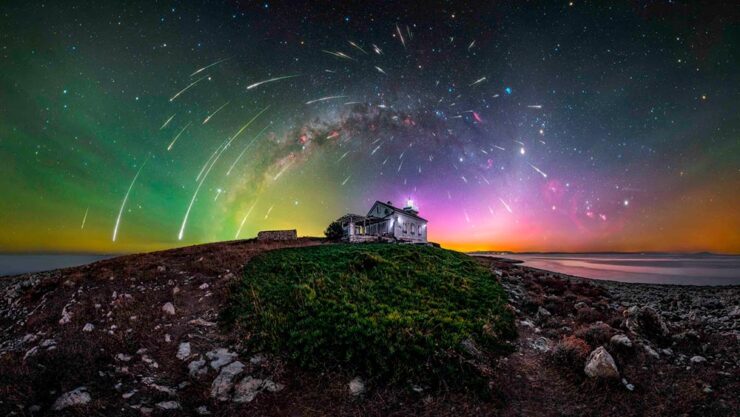
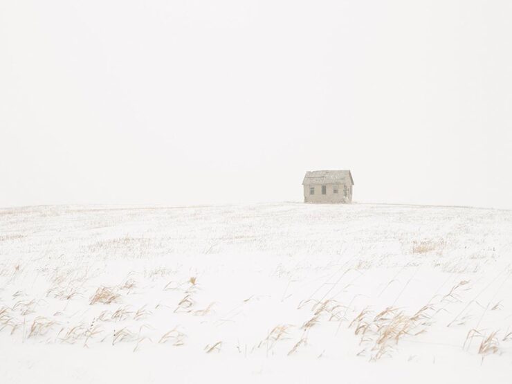
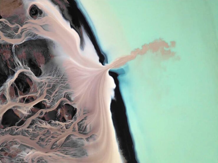
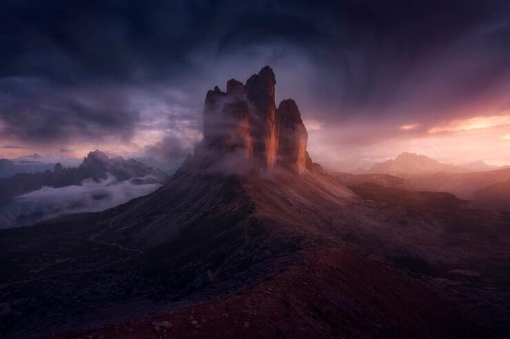
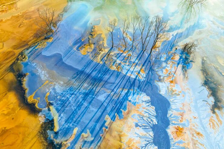
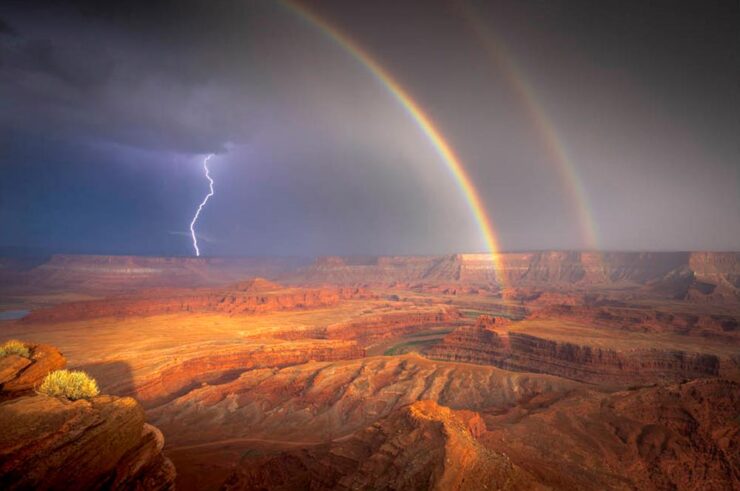
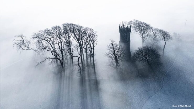
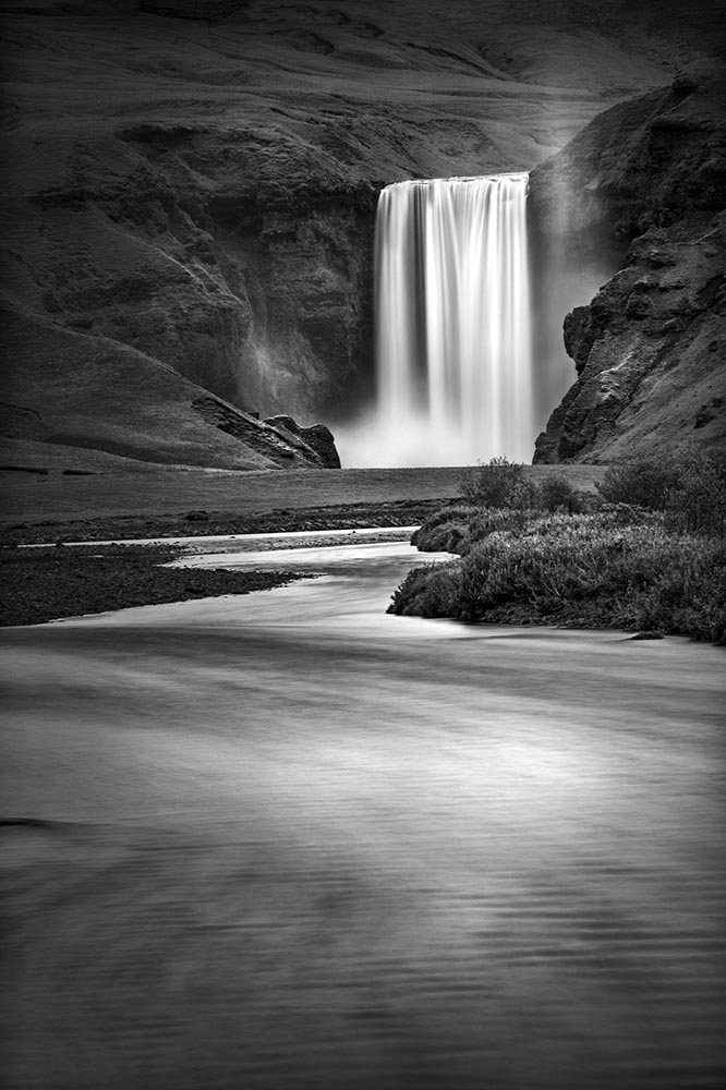
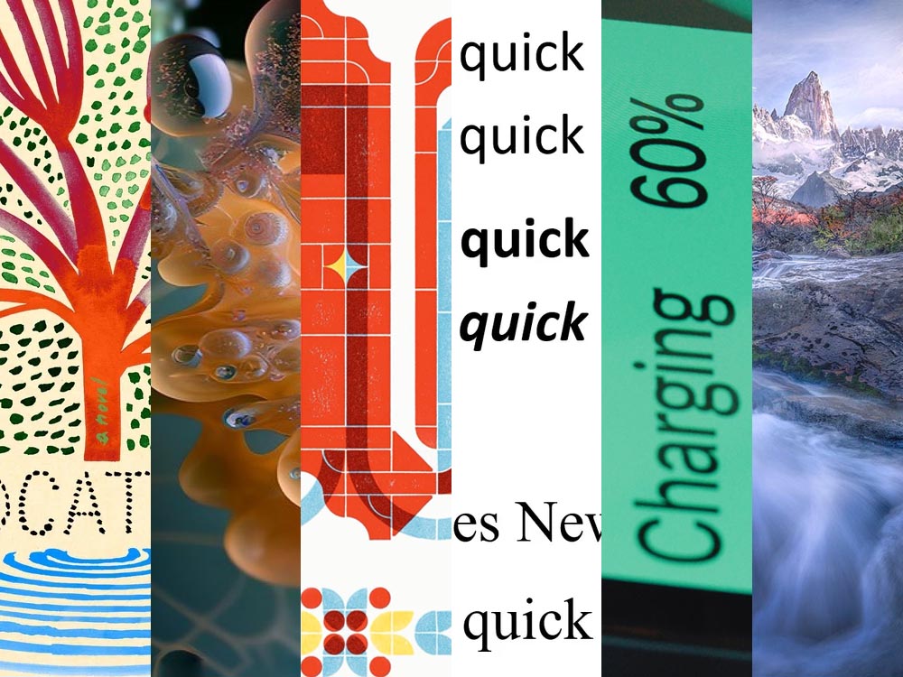
International Landscape Photographer of the Year 2025
Three examples among the twenty winning — and astonishing and inspiring — images:
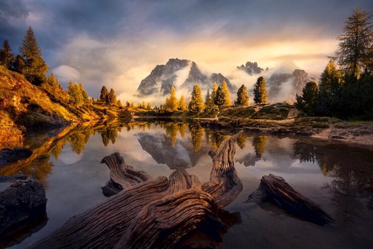
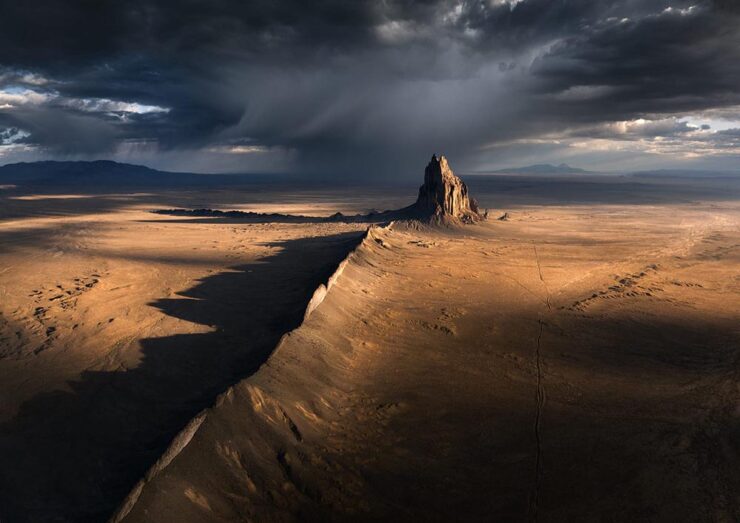
The rules of the competition state that all images must be taken by the photographer and AI-generated images of any kind are prohibited. Photographers are required to edit the images themselves as the competition “consider[s] this part of the art of landscape photography.” Nice.
The competition’s website is unfortunately offline as of this writing (Dec 31st), but see more at PetaPixel or This is Colossal.
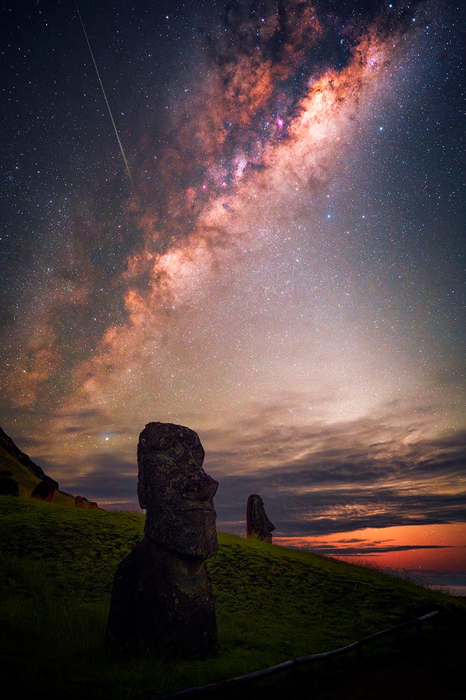
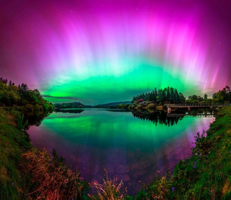
Northern Lights Photographer of the Year 2025
“Capture the Atlas has unveiled the winners of its eighth annual Northern Lights Photographer of the Year contest, and the 15 award-winning photos […] are as beautiful as they are inspiring,” PetaPixel writes.
I remember lying on my back on the rocks by the Maine beach where I grew up, watching with wonder at the natural display. It’s a pleasure to revisit, however vicariously.
Otherworldly Forest Photos

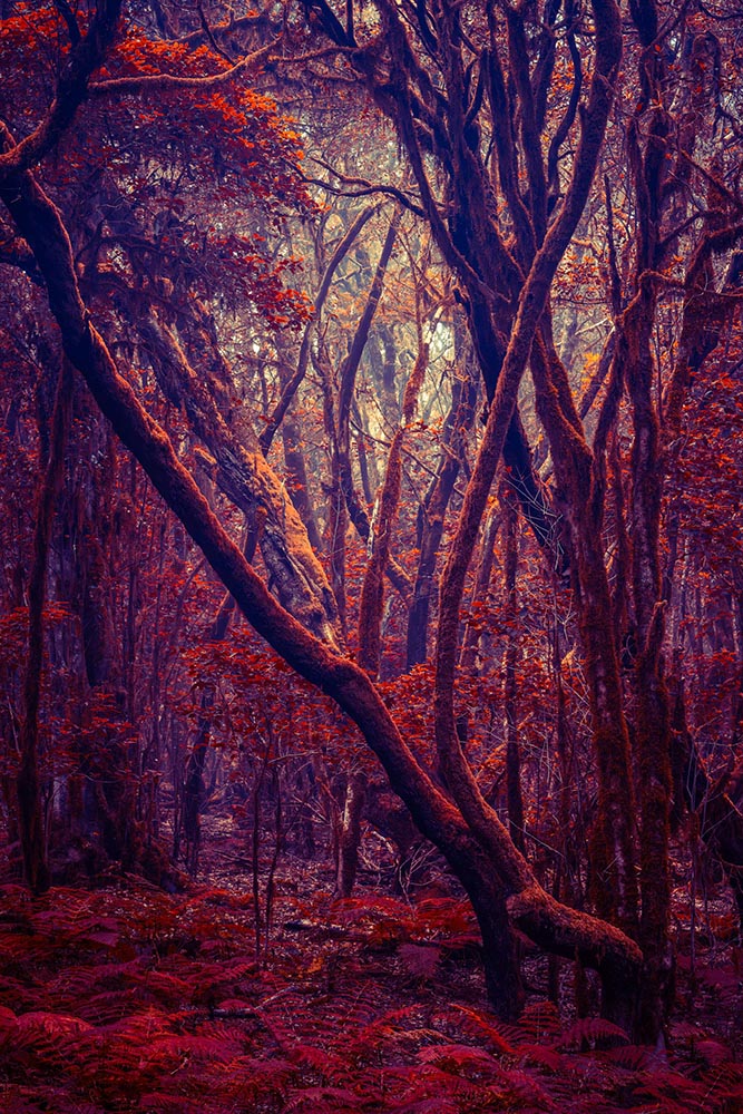
“‘I’ve always been fascinated by the idea that our perceived reality is shaped by our minds and reflecting our inner world,’ says artist Michelle Blancke, whose ethereal photographs of trees, glens, and foliage invite us into a familiar yet uncanny world,” writes This is Colossal. Great stuff.
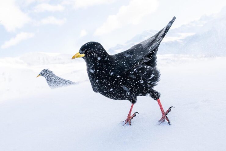
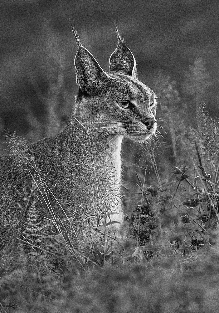
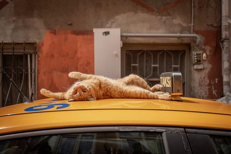
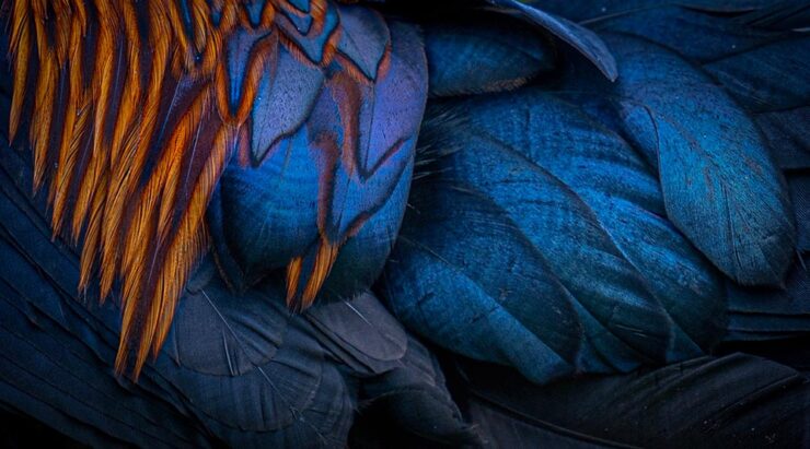
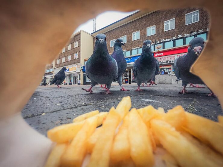
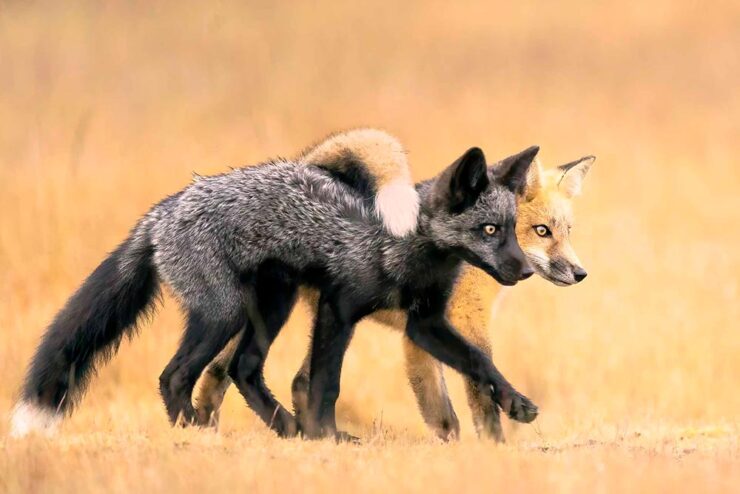
Nikon Comedy Wildlife Awards 2025
The “AI-Inside” Camera
At MacFilos, Andrew has a new piece of kit — an “unexpected trade deal benefit” — that’s capable of making all his images everything he’s ever dreamed of:
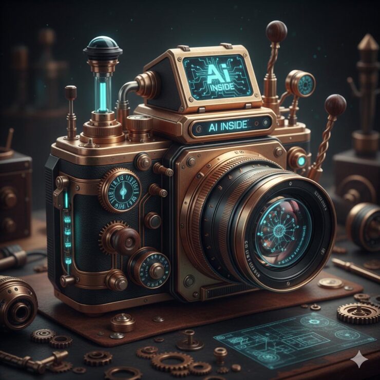
“May we all remain capable of laughing and smiling through these turbulent times,” he writes. Yes, please!
Wishing you a safe and happy New Year.