Tag: penguin

  • Beautifully Briefed 26.4: Showered with… [Insert Here]

    Beautifully Briefed 26.4: Showered with… [Insert Here]

    This month, Apple turned 50. Plus, the usual dose of great design, fonts, and photographs. Let’s spring into it!

    This month’s Spine
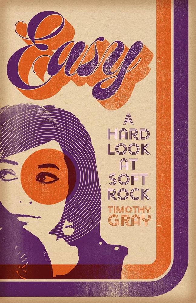
    The University of Iowa Press.

    Genius placement of record label, great typography, and more — although the folks at the University of Iowa generally don’t respond to requests for information (hence the lack of designer credits), their production department deserves all the kudos. Great stuff.

    See the whole list of University Press Coverage at Spine.

    Apple turns 50

    I’m just enough older than Apple that it’s been pretty much a constant presence in my life. Early on, it was only in schools that I interacted with them; we couldn’t afford a Mac in 1984, and I was stuck, nose pressed up against the glass, until 1990.
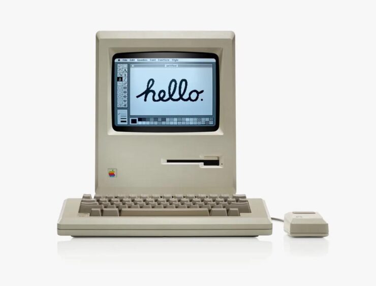
    The original Mac 128k. Photo courtesy of Apple.

    My first Mac was the same iconic beige, except it was a Mac Plus — which, together with a 20MB (!) Jasmine external hard drive and an ImageWriter — really allowed me to start down the path of making documents and publications lookgreat.

    Over the years, I’ve been through many Macs (more than I should probably try to count, honestly). I still use and love the platform today.

    Of course, I’ve added iPhones, iPads, and miscellaneous others, too. (Oddly, I was never an iPod person — I’ll take speakers over headphones if at all possible.)
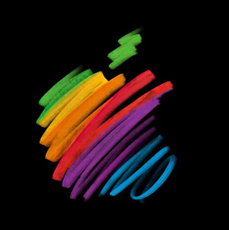
    iPad wallpaper courtesy of Basic Apple Guy.

    There are too many great opinions on this anniversary, frankly, for mine to really matter — so I’m going to point to a few excellent items from others, in case you’ve not read them or would appreciate some additional perspectives:

    If you’d rather listen, this episode of the podcast Upgrade (Jason Snell and Myke Hurley) also covers the early — that is, really early — years:

    Whew. Enjoy.

    Meanwhile, I have to point at another article that will probably surprise … well, none of my regular readers: a great Architectural Record piece on the many Apple Stores and their fantastic, now-iconic look.
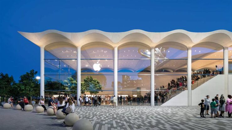
    Apple Aventura (Miami). Photograph courtesy of Architectural Record / Nigel Young, Foster + Partners.

    The possibility exists that I might have mocked Apple in 2001 for announcing that they’d be opening brick-and-mortar locations. (They had resellers, after all.) But, man, did I get that one wrong. Five hundred plus stores later, all over the world, Apple’s story is being told every day through great products — and great architecture.

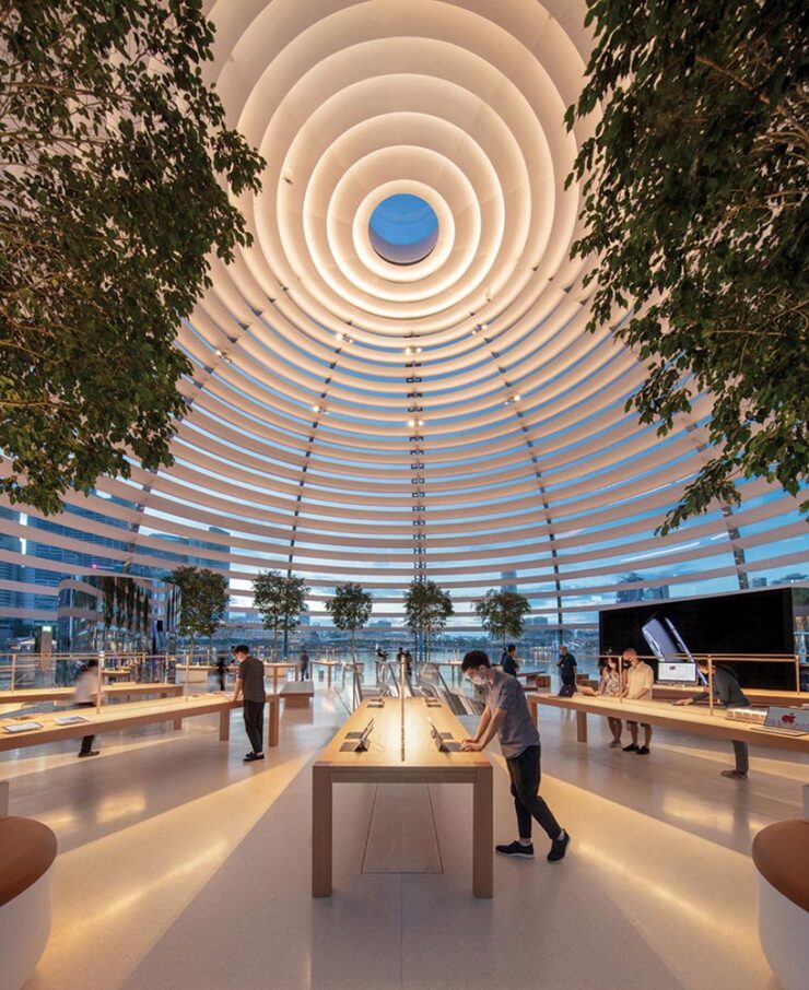
    Apple Zorlu Center (Istanbul). Photograph courtesy of Architectural Record / Nigel Young, Foster + Partners.
    Apple Marina Bay Sands (Singapore). Photograph courtesy of Architectural Record / Finbarr Fallon.

    Many thanks to Apple for making my daily life better. It sounds strange to thank a company with a nearly four trillion dollar market cap, but as someone who’s been there since the dark days of the ’90s — indeed, basically all of those 50 years — they’re more than just a company to me. May there be many more anniversaries to come.

    Late-breaking supplement: new Apple CEO

    As it turns out, Apple’s 50th also marks a turning point:

    Today we announced that I’m taking the next step in my journey at Apple. Over the coming months I will be transitioning into a new role, leaving the CEO job behind in September and becoming Apple’s executive chairman. A new person will be stepping into what I know in my heart is the best job in the world. That leader is John Ternus, a brilliant engineer and thinker who has spent the past 25 years building the Apple products our users love so much, obsessed with every detail, focused on every possible way we can make something better, bolder, more beautiful, and more meaningful. He is the perfect person for the job.

    John cares so much about who we are at Apple, what we do at Apple, who we reach at Apple, and he has the heart and character to lead with extraordinary integrity. I am so proud to call him Apple’s next CEO. 
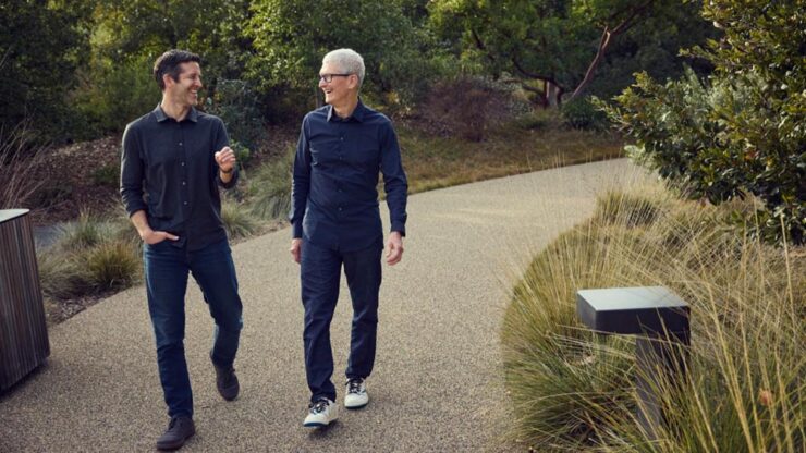
    — Tim Cook, CEO, Apple

    John Ternus and Tim Cook. Photograph courtesy of Apple.

    Ternus’ long-time role at Apple has been as its head of hardware. Among the things Apple does extraordinarily well, hardware arguably tops that list. Every piece of hardware has an level of quality the rest of the industry just can’t match; from the early days of the iMac to today’s MacBook Neo, from the first iPhone to the orange powerhouse that is today’s iPhone 17 Pro, there’s a feel that Apple does like no one else.

    That also means, for all intents and purposes, that Apple recognizes that the next CEO isn’t going to — can’t — increase its net worth another thousand percent the way it did under Cook’s tenure. They’re going to concentrate on what they do best: products.

    I hope.

    For more on the CEO announcement, see also: 

    Special bonus #1: What happens when you put greed first. I’ve spent a minute slogging on Adobe — hopefully fairly — but Nick Heer of PixelEnvy summarizes better than I have.

    Design
    Penguin’s 2026 cover design award

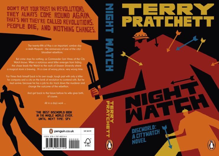
    This CreativeBoom article is framed as “Gen Z judges books by their covers” — breaking news, surely — but is really about what happens when you give some design novices1Entrants had to have no more than one year of paid creative experience, and 60% of those on this year’s shortlist were students. an assignment redesigning covers of two iconic titles. Here are a couple of winners:
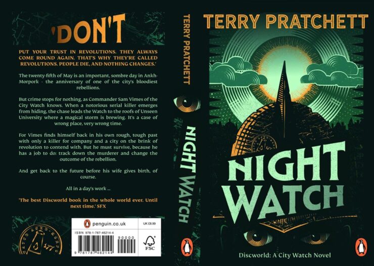
    Night Watch design study for Penguin UK by Peter Goddard.
    Night Watch design study for Penguin UK by Sunny Tsang.

    Of course, there are a couple of age-related stats in the article worth mentioning: “40% of 18 to 24-year-olds like to display books at home, with nearly a third using them as interior design objects or art pieces. Among the over-55s, that figure drops to 8%.” (Raises hand on the latter.)

    The other title is the always-awesome A Wrinkle in TimeTake a look.

    Post of goodness

    While we’re on the subject of awesome: “Print and design studio Risotto is marking 100 months of artist postcards, all printed by hand and posted worldwide, with an exhibition that puts the beauty and breadth of Risograph on show,” It’s Nice That writes.
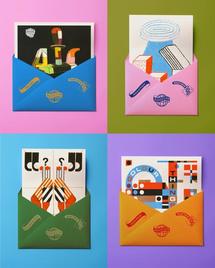
    A sample of Risotto postcards, oddly with envelopes.

    “For the Glasgow-based print and design studio Risotto, a connection to slower publishing in a fast world has been part of its fabric since its beginnings. Risotto’s Riso Club has been a constant print project running in the background at the press for the past decade: A monthly not-for-profit postcard subscription that directly supports independent artists by sending their colourful work to a community of print enthusiasts around the world,” the article continues.
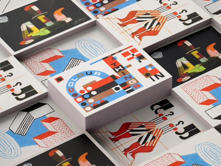
    More of the fantastic artists’ postcards.

    “It’s a bit of an antidote to the speed of the doom scroll or just the amount of content that’s out there,” studio owner Gabriella Marcella says. I couldn’t agree more — in fact, if I had even a smidgen of display space available, I’d subscribe (and may anyway).

    Read more at It’s Nice That or CreativeBoom.

    That’s the ticket

    Kottke, while bringing us a quick snippet with a brand designer’s “compendium of transit tickets” from around the world, also reached back into his archives to bring us these absolute gems:
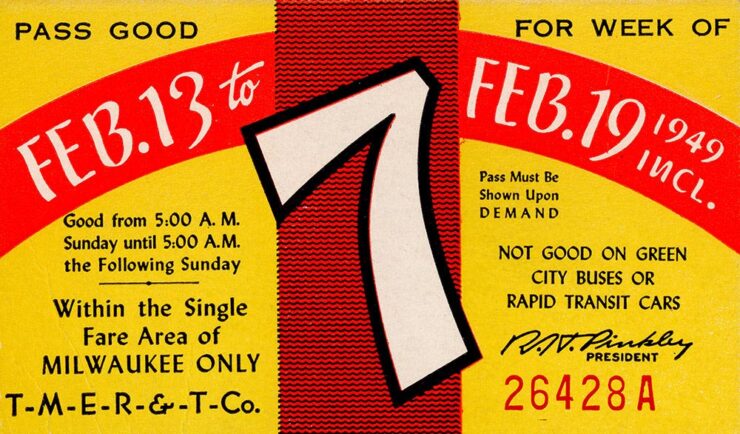
    Golden Tickets, Milwaukee, week 7, 1949.

    collection of weekly bus passes from Milwaukee, WI. Years covered are 1930-1979.
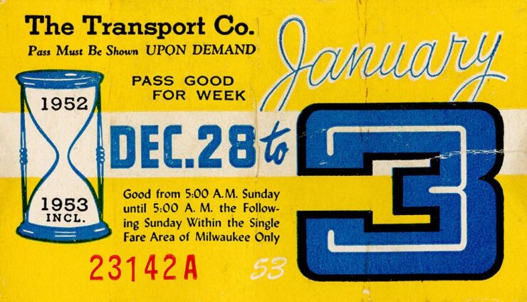
    Golden Tickets, Milwaukee, week “53,” 1952-3.

    Originally posted at the not-cited-enough Present & Correct.

    Special bonus #2: Extra large Pan Am ticket recreations as art, framed, for your wall:
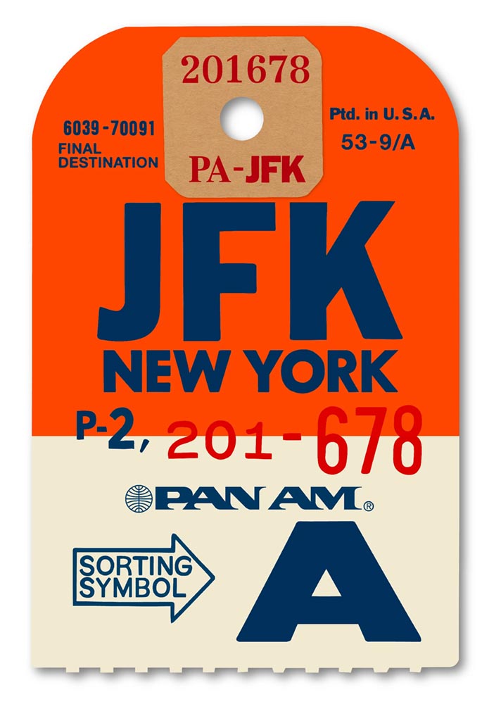
    Flight of fancy by Ella Freire. 

    These are perfect for an Air BNB or other travel/hospitality locale — as mentioned above, my walls are full — but no matter what, looking through the destinations is fun. Check it out. (Via Daring Fireball, citing another not-cited-enough item, SimpleBits by Dan Cederholm.)

    Special bonus #3: Speaking of travel and hospitality, “Letterform Archive has turned a century of vintage hotel luggage labels into 330 gorgeous stickers: a new sticker book from the San Francisco-based design archive revives the golden age of travel through the vibrant graphic art of hotel luggage labels.” Awesomeness at CreativeBoom.

    April’s typography greats
    Mark Simonson’s start in type

    …actually has a great story attached:
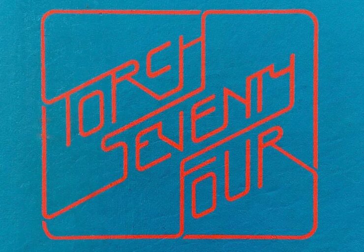
    Hand lettering for Mark Simonson’s 1975 yearbook.

    “Fifty years ago this month, March 1976, at 20 years old, is when my interest in type design began,” he writes. I’m not going to spoil it — just go read instead.

    CreativeBoom‘s April selections

    Nineteen in all, but as usual, I’m only going to mention a few faves:
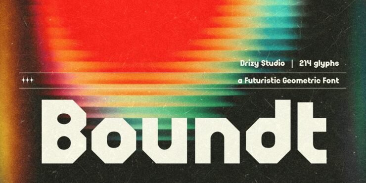
    Boundt (not cake), by Ahmadi Hasan.

    “Boundt arrives from Drizy Font with a clear visual proposition: bold, architectural geometry at display scale, informed by mechanical bolt-and-nut structures and the graphic language of vintage broadcast design. The mechanical metaphor gives the letterforms a coherence that purely decorative display faces often lack: a sense that the same underlying system generated them all.” See more.
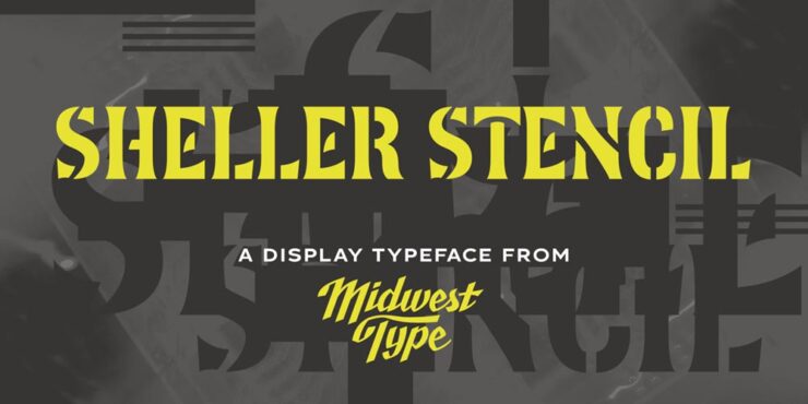
    MWT Sheller Stencil by Jesse R. Ewing. (Who was not shot for their efforts.)

    “Sheller Stencil originates in the stencilled lettering found on agricultural machinery from Tiffin, Ohio, in the late 19th century: anonymous commercial graphics that, on close examination, turn out to be genuinely inventive. Some characters split at right angles; others follow curvilinear breaks that track the Art Nouveau-inflected letterforms rather than cutting across them mechanically. The result reads as antique but carries enough formal authority for contemporary packaging, editorial work and heritage-positioned branding.” See more.

    Herald News by Kevin Foley.

    “The story behind Herald News is a personal one. Kevin Foley grew up with the Fall River Herald News (delivered it as a paperboy, absorbed its typography over years of handling), and later found himself scanning its pages to find his daughter’s name in the results after track meets. That very human relationship with a newspaper’s visual character is precisely the kind of deep familiarity from which good type design grows.”

    This is a serif family was built for editorial work — and I like so much, it’s been bookmarked for when the right project comes along. See more.
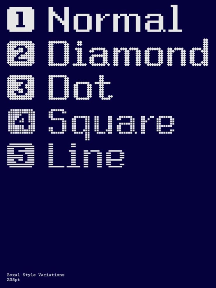
    Boxal by The Northern Block.

    “Boxal is The Northern Block’s newest typeface – a meticulously crafted, retro-inspired pixel font that captures the nostalgic charm of classic arcade gaming while delivering modern precision and versatility. With the personal design history of founder and type designer Jonathan Hill very much in mind, Boxal draws on the pixel artistry of iconic titles like Zelda, Shinobi, and Cops and Robbers, and represents a cultural homecoming for the studio.”

    Fantastically retro yet proportionally spaced, best at large sizes, preferably slowly scrolling up a screen. Awesome. See more.

    Zed, for when Z just isn’t enough
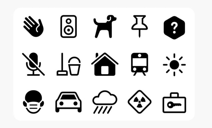
    Zed’s icon family by Typotheque.

    “Zed is extremely practical, both in terms of its extraordinarily broad language support and the stylistic variations available via its adjustable width, weight, roundness, and slant. It even offers Braille characters and an icon font. But Zed is also simply beautiful. It’s a font family and type system that exemplifies the belief that rich accessibility and pure aesthetic appeal are not at odds,” Daring Fireball writes. (In, admittedly, a sponsored spot — but his sponsors are so highly curated that I actually read the posts … and, occasionally, pass them along.)

    Zed used in a display at the V&A, London.

    See more.

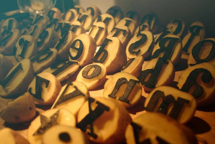
    HVD Bodedo
    Hand cut, not fried.

    No, your eyes are not deceiving you: those are potatoes, carefully carved in the service of Bodoni. Mostly. But it’s got tasty ink content — and is free. Check it out. (Via Kottke.)

    Special bonus #4: ChatGPT can now think … about type, traditionally one of AI’s weak points:
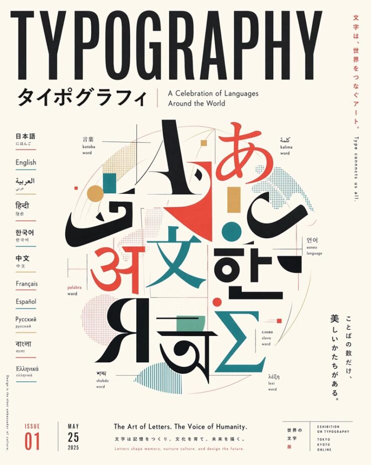
    Generated. (“Create everything at once,” Open AI claims.) We’re all going to be out of a job!
    April’s Photography Round-up
    Artemis II (#1)

    Only a few items this time — but that partially because, at least in my mind, one event more or less dominated photography during April: the Artemis mission.
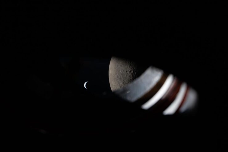
    “Room with a View.” A view from the window of the Orion spacecraft approximately 9 minutes before Earthset during the Artemis II lunar flyby on April 6, 2026. Photograph courtesy of NASA. (No specific astronaut credited.)

    “I like perspective. As much as I enjoy the wide, sweeping shots of our Moon and Earth set against each other (and I do very, very much enjoy those), my favorite photos remind me that there were people there,” Jason Schneider writes at PetaPixel. I couldn’t agree more: the shot above, for instance, is both spare and overwhelmingly expansive. Awesome.

    See also: NASA’s official photo page, the Planetary Society’s favoritesScientific American‘s twelve favorites, and Space.com’s sweet sixteen.

    Artemis II (#2)

    Artemis II launch. Photograph by Steven Madow.

    How did that image get created — I mean, it’s practically right on the pad? “Photographer Steven Madow has been photographing rocket launches for over a decade, but arguably no rocket launch he has photographed has been as big of a deal. […] Madow set up 14 different Panasonic Lumix cameras to cover the monumental event, including seven remote cameras at the launch site. His outstanding photos are the result of years of practice and planning,” PetaPixelwrites.

    For Artemis II, Madow partnered with Space Explored, a website dedicated to sharing all the inspiring stories surrounding spaceflight and exploration. Read the whole story.

    Patterns: the book
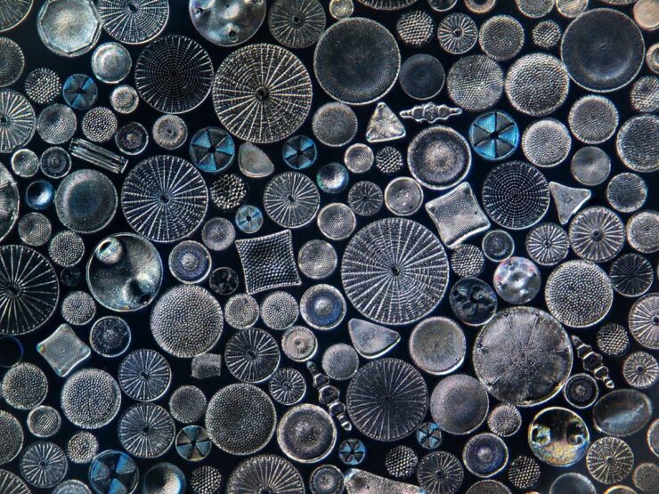
    “Big Diatom Stack, Edit 2.” Photograph by Jon McCormack.

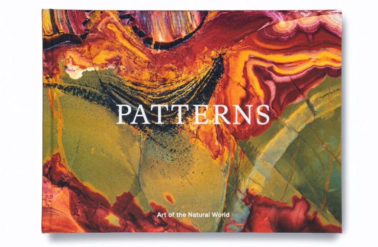
    “In the words of Georgia O’Keefe, to see takes time,” says photographer Jon McCormack. His new monograph, “Patterns: Art of the Natural World,” is a “beautiful visual love letter to nature and all its intricate patterns, from microscopic and rarely-seen to vast and majestic,” writes PetaPixel

    Patterns cover.

    McCormack’s photographic journey, which started with a hand-me-down film camera in the rugged, rural Australian Outback and has taken him all over the world to — get this — the iPhone camera software lead at Apple. (The man has a clue, ladies and gentlemen.)

    The book is something after my own heart. Read the entire piece. (You can also see the book at This is Colossal.)

    Hans Hansen’s explosions
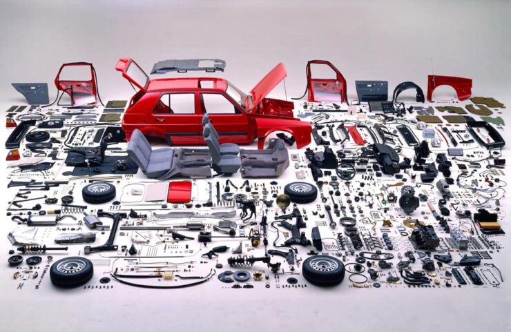
    1988 Volkswagen advertisement. Photograph by Hans Hansen.

    …aren’t quite what you might expect — but might be something you remember, like the above VW spot from the ’80s (which triggered a memory of the awe experience upon first seeing that collection of, well, parts).

    “Hans Hansen is not necessarily well known to anyone but the most studious of photographic historians. Throughout a long career, the self-taught German photographer has quietly carved a niche as a master of still life and commercial image-making. His work explores colour and composition, as well as drawing lessons from modern artistic movements, resulting in some of the most striking and memorable product images of the 1970s, 1980s and beyond,” Wallpaper*writes. 

    See more great examples.

    Finally: X-ray *this*
    X-Ray Microbus. (Don’t ask how.) Photograph by Nick Veasey.

    Over at The AutopianJason Torchinsky writes: “Seriously! Full-scale X-rays! Of cars! Using five X-ray machines and/or a massive German-sourced X-ray machine, in a studio that features 30-inch-thick walls, British artist Nick Veasey took X-ray images of so many cars, and they’re stunning.”

    Have a great rest of your Spring, everyone!

    • 1
      Entrants had to have no more than one year of paid creative experience, and 60% of those on this year’s shortlist were students.
  • Beautifully Briefed, 25.7: Hot (and Cold)

    Beautifully Briefed, 25.7: Hot (and Cold)

    Take a break from the summer heat with a Mac delight, two interesting typefaces, a discussion of Bentley’s new concept — and updated flying “B,” with a quick mention of the other double-R — and, of course, some great photography. Better still, we close out with a guaranteed smile.

    ’Cause we need more smiles these days.

    July’s Spine Post

    July’s University Press Coverage has already been posted. My personal favorite of the bunch:

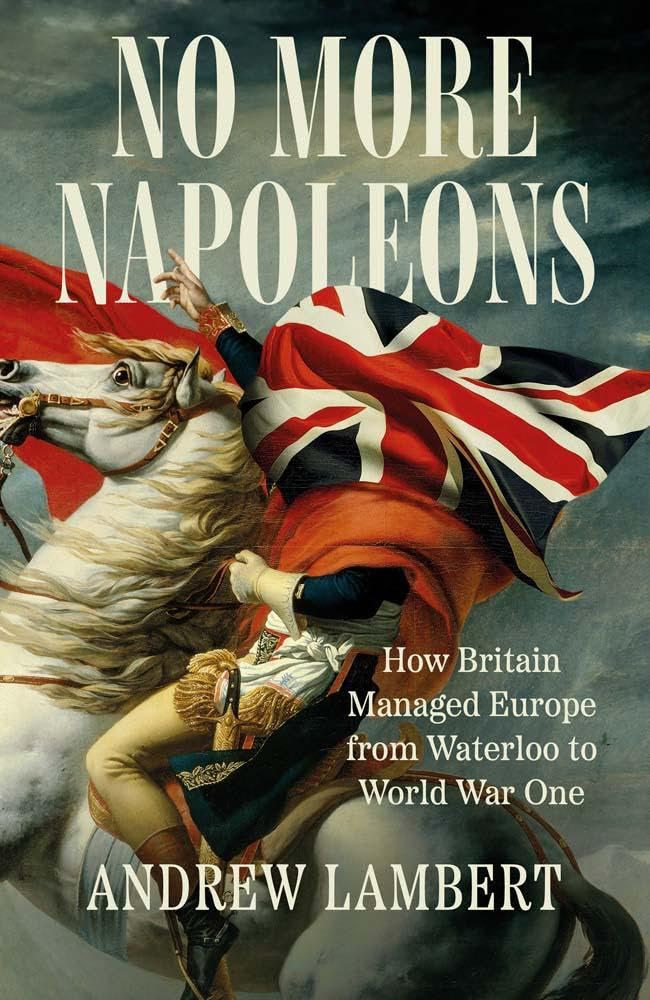
    Yale University Press. Cover design by Jonathan Pelham; art direction by Rachael Lonsdale; image is an adaptation of Jacques-Louis David’s Napoleon Crossing the Alps.

    Darn near perfect. Hat tip to Jonathan Pelham.

    Frame of Preference

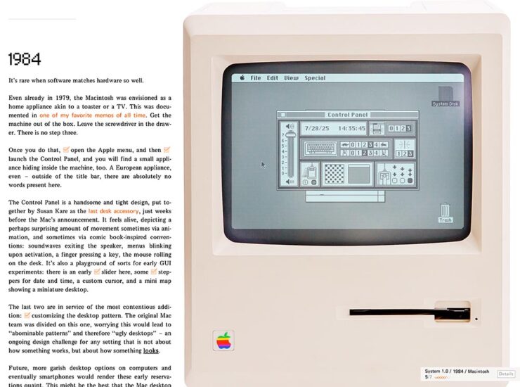
    While we’re on the subject of darn near perfect, Marcin Wichary — he of the now-sold-out Shift Happens fame, not to mention The Hardest Working Font in Manhattan — has gifted the world with another absolute gem:

    Frame of Preference (Screenshot)

    If you’re a Mac geek, whether a software history buff, or a just grizzled veteran, set aside a few minutes to take this trip down memory lane. There are 150 tasks to complete (!), five extra Easter eggs, great Mac hardware and software, and some of the best web programming extant. Enjoy!

    ATC Identity Program Upgraded

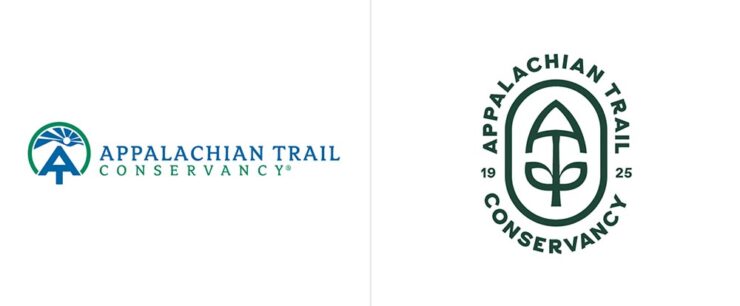
    The Appalachian Trail Conservancy celebrates its hundredth anniversary this year, and took advantage of the occasion to update its logo and identity system for the next hundred years.

    Previous logo (left) and new (right).

    The logo is a combination of a mountain peak, the AT symbol, a trail shovel, leaves (“growth and diversity”), and a holding shape (“protected ecosystem”); while overcomplicated in explanation, in practice it’s warm and friendly at first glance yet has depth for folks who know the Trail.

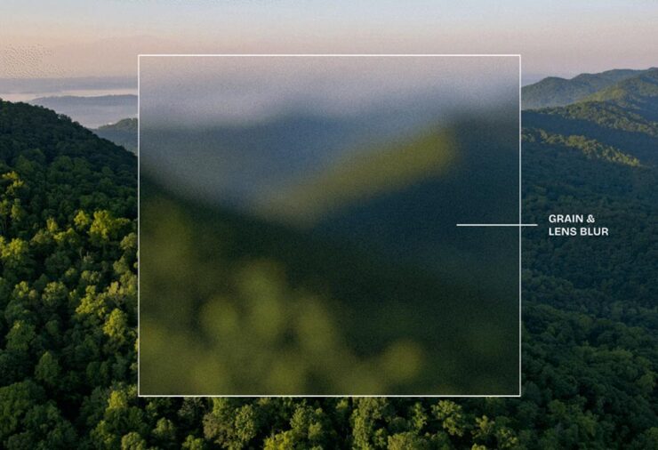
    The blur and grain, highlighted against the beautiful scenery the AT is known for.
    The new logo against one of grain/blur backgrounds.

    The supporting system works well, too, but I’ll leave that to Amy Borg, whose extensive post on the work is excellent. (Via BrandNew.)

    Indeed. Donate, too, if you can.

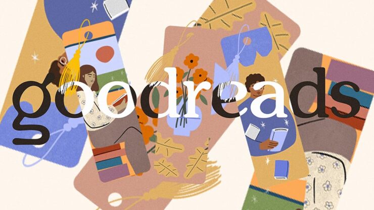
    Special Bonus #1: A new Goodreads logo:

    I’ll have to guess as to whether it’s actually “good for BookTok.”
    July’s Font Finds
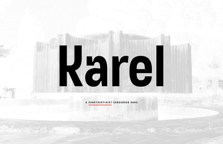
    Karel, by Typonym

    “Inspired by glyphs on a mid-century Prague plaque, Karel synthesises historical discovery with contemporary invention. Developed for brand messaging and retail identity, it includes alternate figures to vary the level of stylisation,” CreativeBoom writes.

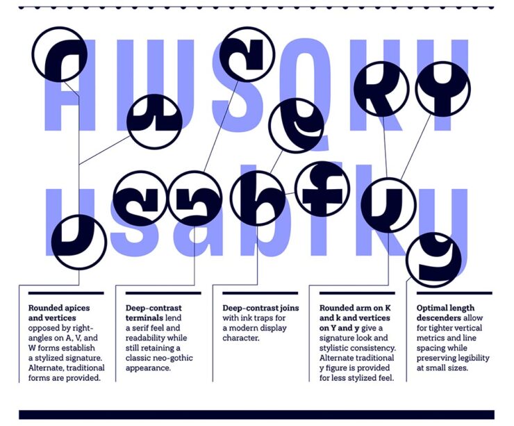
    Details on some of the glyph choices.
    Different versions are available, allowing you to match style with project.

    “A constructivist condensed sans, [that,] in every case stands apart from the multitude of neo-grotesque alternatives,” Typonym writes. (Great company name, by the way.)

    Penguin Inclusive Sans, with Olivia King

    We’ve covered Inclusive Sans before, but to recap, it’s awesome, it’s free, it’s open-source, and as of February, it’s available at Google Fonts for anyone to use. So, guess who has adapted it into something new? (Okay, header spoiler, but still.) No one less than a publishing heavyweight: “A bespoke typeface for Penguin Books, uniting brand heritage, accessibility, and contemporary design to create a versatile typeface for its global publishing house,” creative director Olivia King writes.

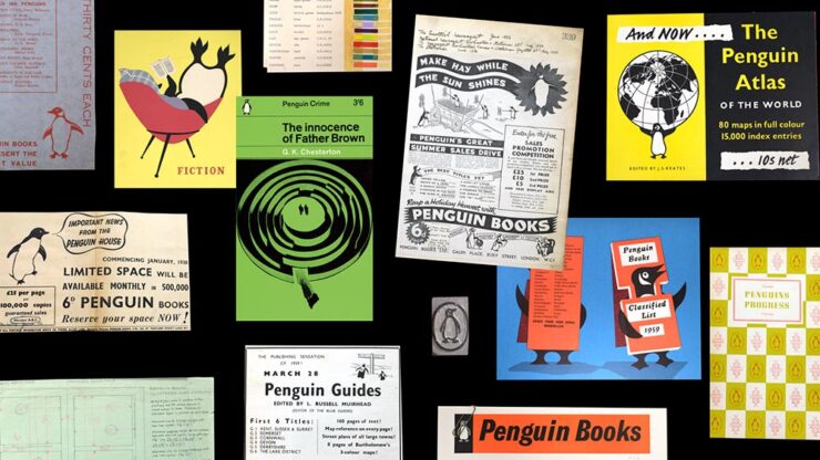
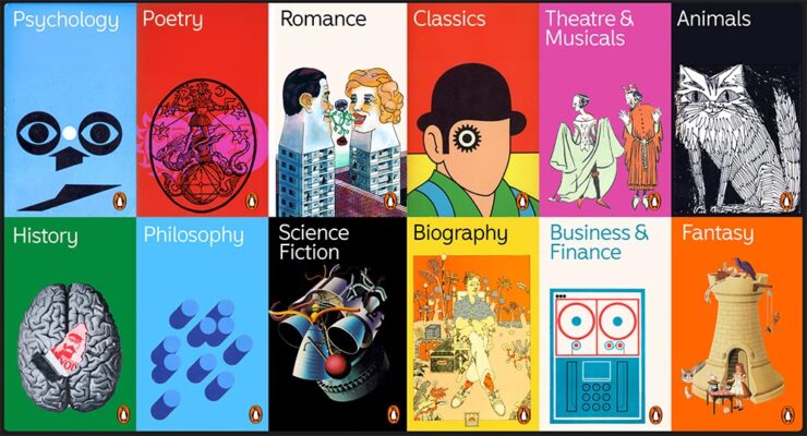
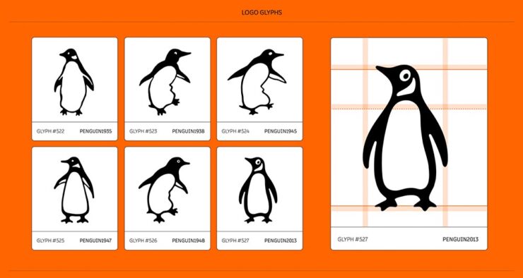
    Some historical images, worth including just for the penguin reading in the chair — feet up, natch.

    For 90 years, Penguin has been committed to making books for everyone. Its iconic sixpenny paperbacks revolutionised access to stories and knowledge, making reading more inclusive and affordable. Staying true to this spirit of inclusion, Penguin commissioned a custom version of Inclusive Sans — an accessible typeface — to serve as its primary brand font across its global publishing house.

    — Olivia King, Creative Director
    Another item included “just ’cause” — mostly for the science fiction illustration.
    Included in the character set are glyphs for the Penguin.

    “We transitioned Inclusive Sans from a Grotesque to a Humanist foundation, adding playful flicks and flourishes to create a sense of movement and approachability[;] whether used in a refined, understated way or in strong, confident applications, the typeface offers flexibility and distinctiveness.” Marketing speak, sure, but speaking to the applications rather than past them.

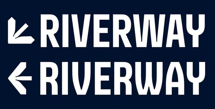
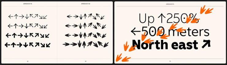
    Penguin’s footprints as arrows: says something positive, I think.

    The entire page is great: well put-together, well illustrated, and approachable. And wander around the site while you’re there — more than “O.K.,” it’s example after example of work the rest of us aspire to. (Via BrandNew.)

    July’s Graphic Design Two-Fer
    The World Illustration Awards 2025 Shortlist
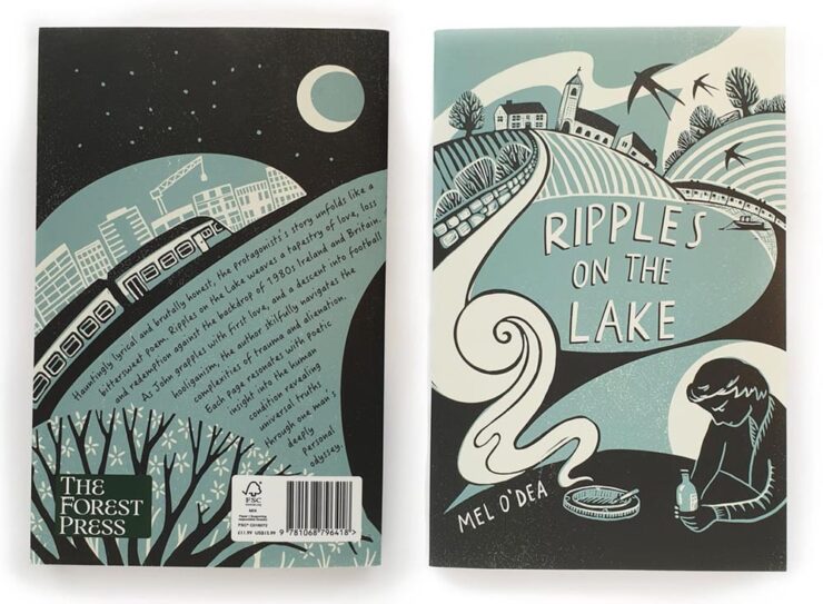
    From the book covers category, Ripples on the Lake by Becca Thorne.

    “The Association of Illustrators has unveiled those in the running for this year’s World Illustration Awards, featuring 200 standout projects from over 4,700 entries worldwide. From editorial brilliance to site-specific design, it’s a showcase of illustration at its most imaginative,” CreativeBoom writes. It’s books and editorial to animation and product design — a cornucopia of illustrative goodness. Check it out.

    Designer as Influencer
    More than slightly NSFW — while actually about work. Read wherever you’re comfortable.

    “As social platforms reward visibility, creatives are increasingly expected to make their practice public. Designers are no longer just making work; they are the work. But what started as promotion now risks swallowing design itself,” It’s Nice That writes.

    Yet another reason to avoid social media … says the old guy who reads web pages published by actual individuals (and sticks to blogging). Still, very much worth a read.

    Special Bonus Two-Fer. #2: From PetaPixel, DuckDuckGo, my search engine of choice, can now filter out AI images from search results. (It’s a simple toggle.) Nice.

    #3: Not so nice is WeTransfer’s predicted face-plant, also via PetaPixel.

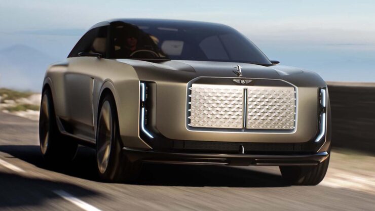
    Bentley EXP15 Concept: Buckle Up

    Let’s just get this out of the way: the brutalist automobile is officially a trend.

    The new EXP15 with a 1930 Speed Six.

    Yes, you’ve seen that shape before — and that time, I asked y’all to hang on see what happens. This time, I’m less confident it will turn out well:

    The EXP15, top, with the Jaguar Type 00, bottom.

    The Jaguar is both more compelling and fresh — it’s somehow more, yet with less detail. Interestingly, Jag is trying to reposition itself in the Bentley space (including comparative pricing), preferring to move upmarket rather than compete with the likes of BMW or Mercedes.

    It’d be quite the coup for Jaguar to leap in (sorry) and take charge.

    Update, 31 July (hours after posting, in fact): Jaguar Land Rover’s CEO has unexpectedly announced that it’s time to step aside. It’s apparently not about expectations, but….

    Enough about Jaguar. Some more photographs/renders of the Bentley:

    Arguably the best angle, somewhat hiding the EXP15’s SUV-esque size.
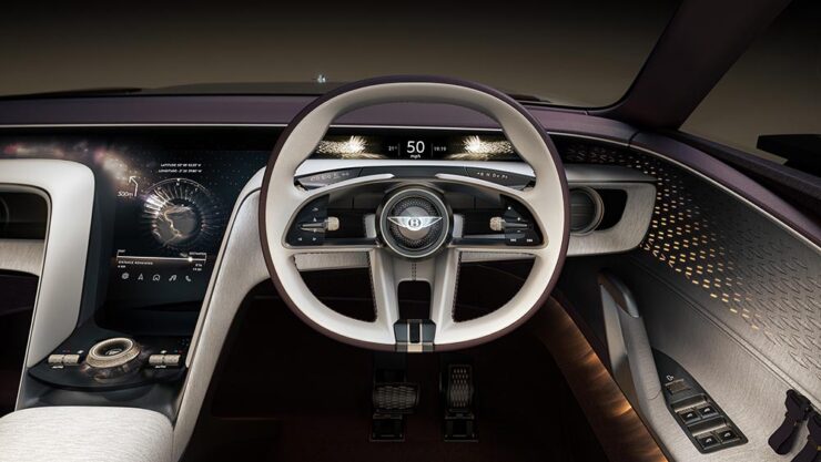
    The interior is better than the exterior, with some Bentley traditions intact. (Yes, the concept is a three-seater: the passenger seat was eliminated in favor of the pampered purebred.)
    The dash is all screens, yes, but not necessarily obviously so — something likely to age better than the iPad-on-dash approach.

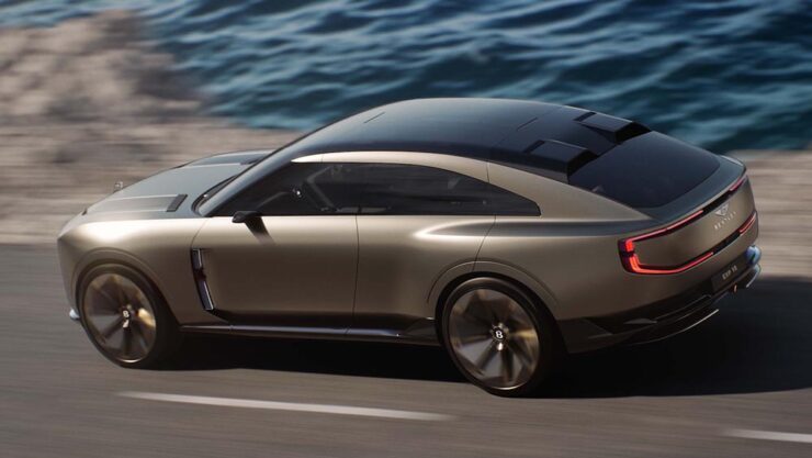
    Lastly, from the rear:

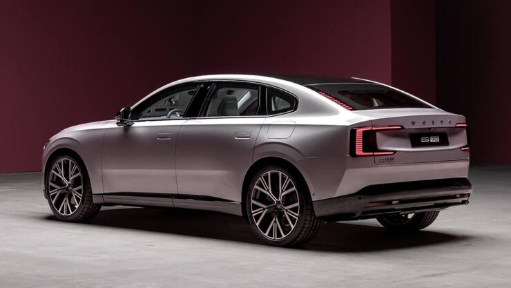
    Wait. I’ve seen that look somewhere else.
    Oh, yeah, the Volvo ES90. (Itself riding at SUV height.)

    I apologize for not being more positive on this one; I’ve been down on the Volkswagen Group in general for a while, and it makes me sad that, with their flagship brand, nothing in their new concept suggests they’re trying to reverse the trend.

    Coverage: “This is What the Future of Bentley Will Look Like,” from Motor1; “The Bentley EXP 15 brings the bling and delves into tomorrow’s luxury automotive experience,” from Wallpaper*; and “Bentley Is Showing Jaguar How To Take A Luxury Brand Into The Future With The New EXP 15 (IPSO Fatso),” from The Autopian. (Apologies also for the three differing headline capitalization styles — blame the sources.)

    Also worth reading: The Autopian questions whether the new “Autobrutalist movement” — where I got the term — can be stopped; and Motor1 has not one but two items asking readers to give Jaguar a chance. (Probably unrelated.)

    But wait: there’s another reason I’m down on Bentley right now.

    The New Bentley Logo: Style over Substance
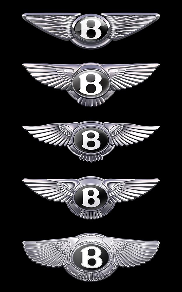
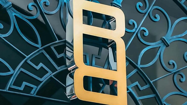
    The five versions of the “winged B” logo, in order: 2025, 2002, 1996, 1931, and 1919.
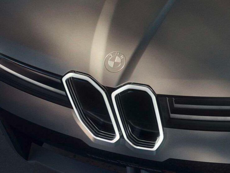
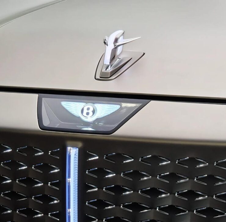
    BMW called light “the new chrome.” Bentley absolutely gagged on it. At least the infamous Flying B is still there — hood ornaments are few-and-far-between these days.

    When you’re Bentley, you shouldn’t be chasing trends, you should be leading them. Style over substance is nothing less than a mistake.

    Also, because everyone else has one:

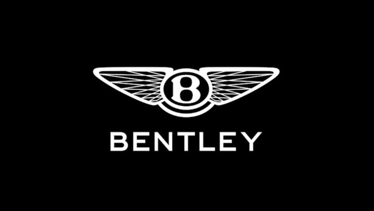
    The flat version.

    This new version was done in-house, the wrong choice on every level; this isn’t a time to save money. Another sad moment: the storied history of a brand like Bentley, running on the equivalent of a flat tire. (Perhaps even the rim. Trailing sparks.)

    Dezeen was mostly positive, BrandNew mostly negative. (“[E]verything here feels cheap and overwrought.” Subscription, alas.) The Autopian goes for balance. You can tell where I land.

    Special Bonus #4: Range Rover’s new logo, best described as “not trying very hard” or even perhaps “goofy as hell.”

    Posted without comment.

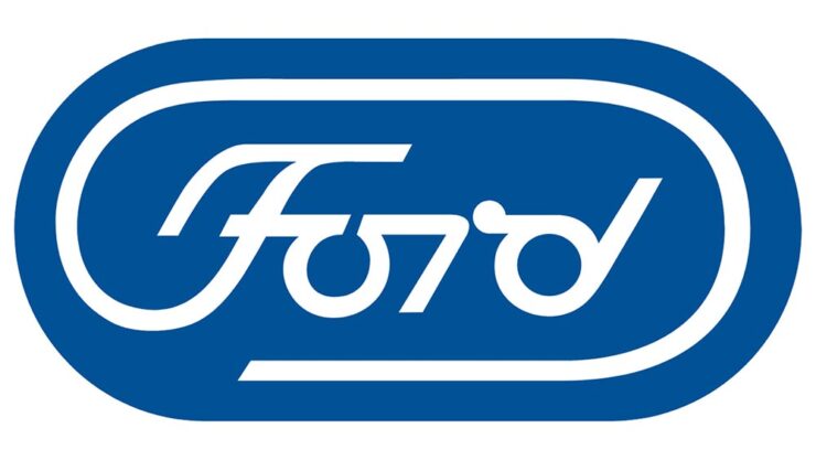
    Special Bonus #5: In case you’ve never seen it, Paul Rand’s 1966 proposal for a redesign of the now-iconic Ford logo:

    The Autopian has a nice piece on this.
    July’s Photography Faves
    Astronomy Photographer of the Year Shortlist

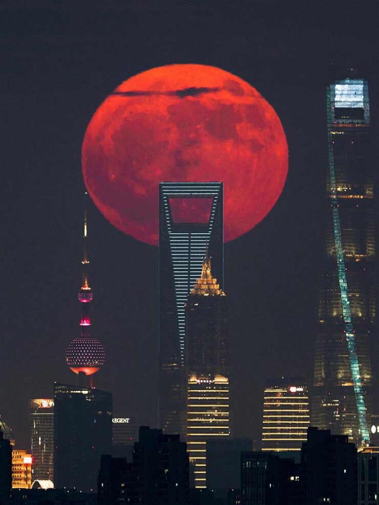
    “Awe-inspiring scenes of the Milky Way, dancing aurorae, and serene galaxies all feature on the shortlist for this year’s ZWO Astronomy Photographer of the Year,” PetaPixel writes. Indeed:

    “Blood Moon Rising Behind the City Skyscrapers,” Shanghai. Photograph by Tianyao Yang.

    The competition is run by Royal Observatory Greenwich, supported by ZWO and in association with BBC Sky at Night Magazine.

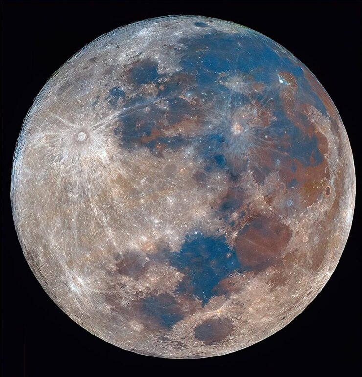
    “The Last Mineral Supermoon of 2024,” Delhi. Photograph by Karthik Easvur.

    See the other 28 on the shortlist here. The winners will be announced in September, so stay tuned.

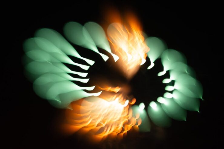
    Abstract Fireworks

    Every year, photographers across the world flock to fireworks displays, something that’s never interested me — until now:

    Photograph by Bryan Szucs.

    PetaPixel takes a moment to self-congratulate here, and I think they’ve earned it — although it’s good to note that the original post cites This is Colossal. (And that PetaPixel did a poor job with the cite in that original story, using only Colossal’s photography tag rather than an easily-found, specific link. Shame on them.)

    Anyway, photographer Bryan Szucs took the defocusing idea and absolutely ran with it:

    Photograph by Bryan Szucs.

    Great stuff. See more on his website SmugMug.

    Special Bonus #6: Apple filed a fascinating image sensor technology patent last month, which describes a stacked image sensor with vast dynamic range and very low noise. PetaPixel has the story.

    Unbuilt Frank Lloyd Wright

    Okay, officially these are renders, not photographs. Still:

    Trinity Chapel. Image by David Romero.

    Hooked on the Past emerged from the intersection of two personal passions: the history of architecture and the fascinating world of computer-generated imagery,” Romero tells This is Colossal.

    Gordon Strong Automobile Objective. Image by David Romero.

    Wright was ahead of his time in that he pushed material science to make a concept, shape, or cantilever work (often demonstrated in the maintenance and repair bills); his unbuilt projects demonstrate what could have been, and there’s nowhere better to imagine those than in generated imagery.

    Hunftingdon Hardford. Image by David Romero.

    See more at this great Colossal post.

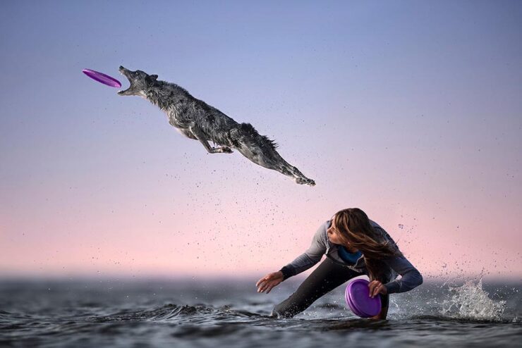
    High-Octane Dogs
    Photograph by Caludio Piccoli.

    “Ultimately, it’s not the equipment that creates the magic. It’s the connection with the dog, the timing, the light, and the intention behind every shot. The gear just helps bring that vision to life,” photographer Caludio Piccoli tells PetaPixel.

    Photograph by Caludio Piccoli.

    I could easily repost every photograph from the story; they’re all great. Just go read it instead.

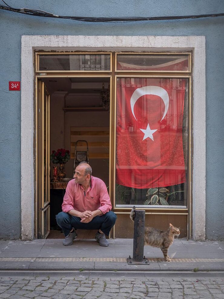
    City Cats of Istanbul

    To close out this month, well, the title says it all:

    Somehow, they completely fit the location:

    Photograph by Marcel Heijnen.

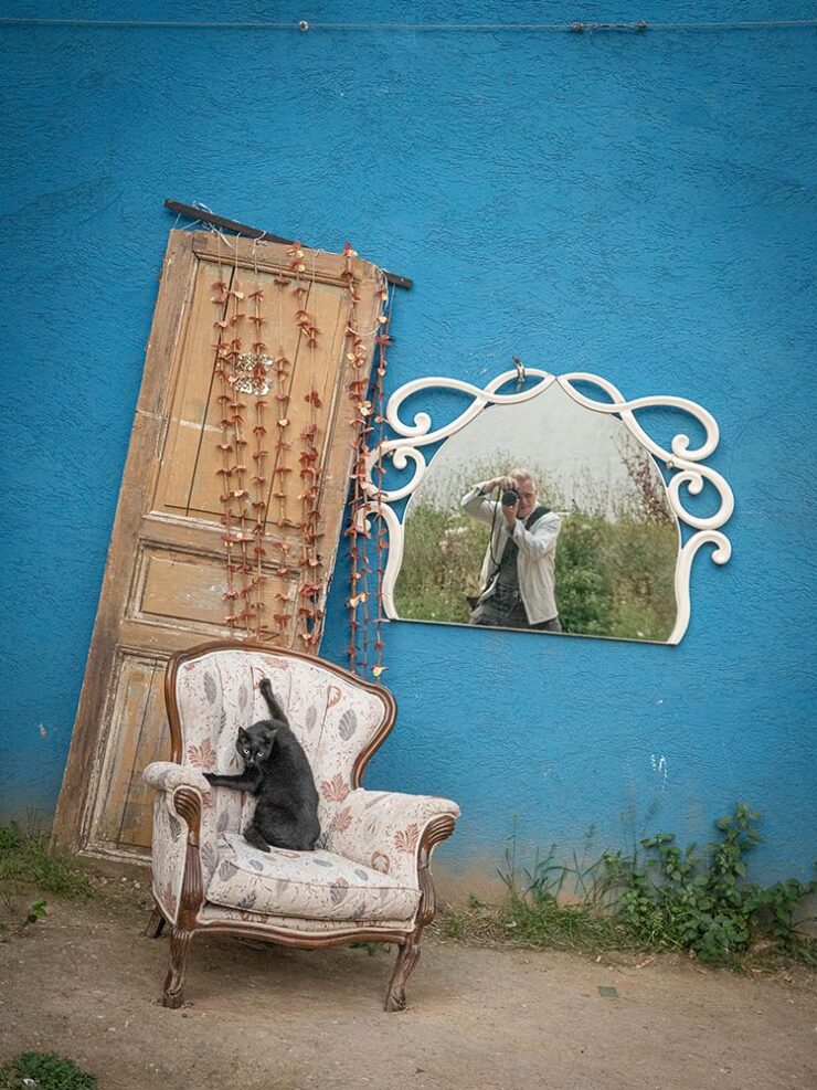
    The author (supposedly the one in the mirror):

    Photograph by Marcel Heijnen.

    See more at This is Colossal or CreativeBoom — and then go enjoy August with a smile on your face.

    Photograph by Marcel Heijnen.
  • Climate: Little Books, Big Ideas, Great Design

    Climate: Little Books, Big Ideas, Great Design

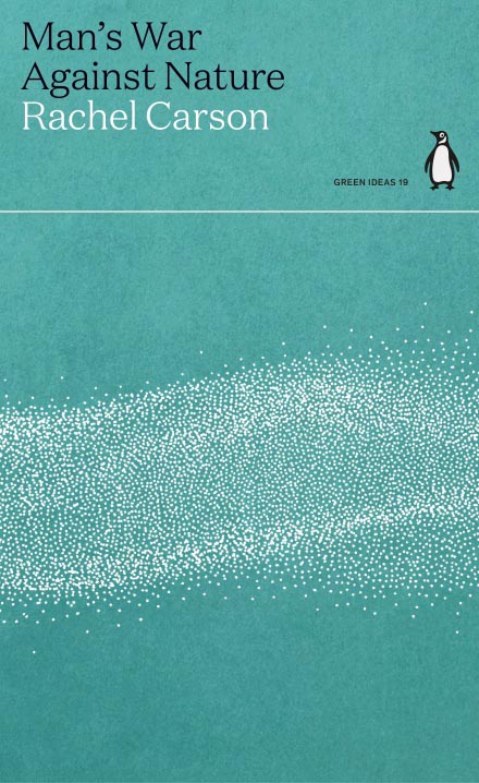
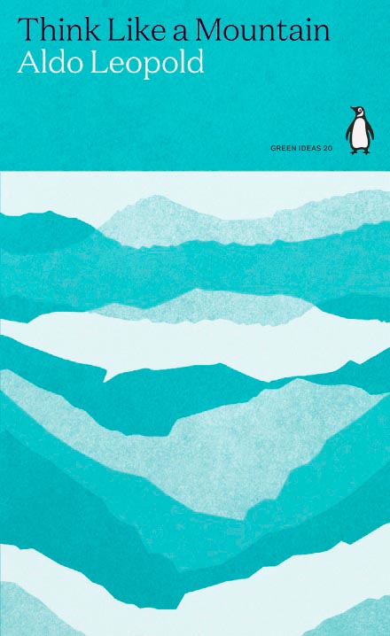
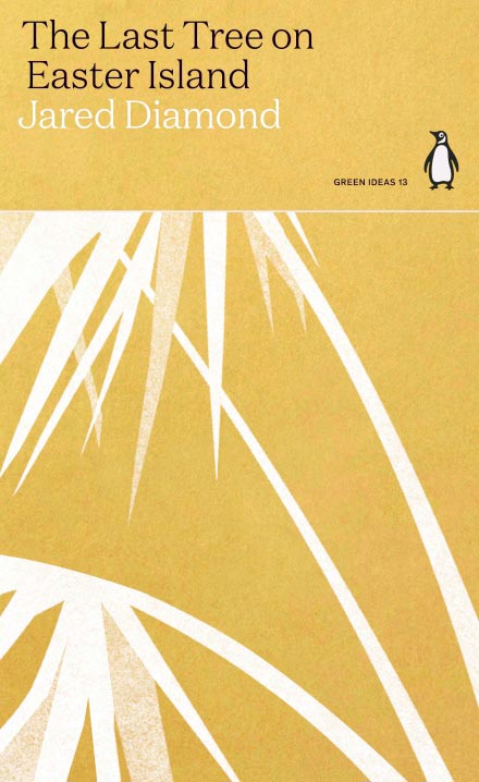
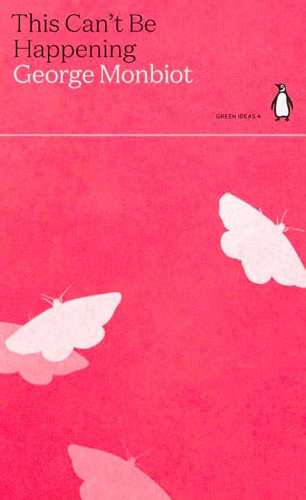
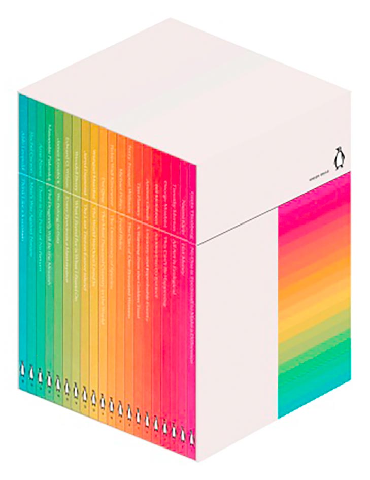
    Penguin has introduced — and reissued — a number of small titles regarding climate change, and done so with some great design:

    Green (Mountains)
    Palm (Island)
    Is (Happening)

    They’re even available as a boxed set:

    Green Ideas (Set)

    More at Penguin (UK). Via It’s Nice That, which has a nice writeup — check it out.

  • Penguin UK on the semicolon

    Penguin UK on the semicolon

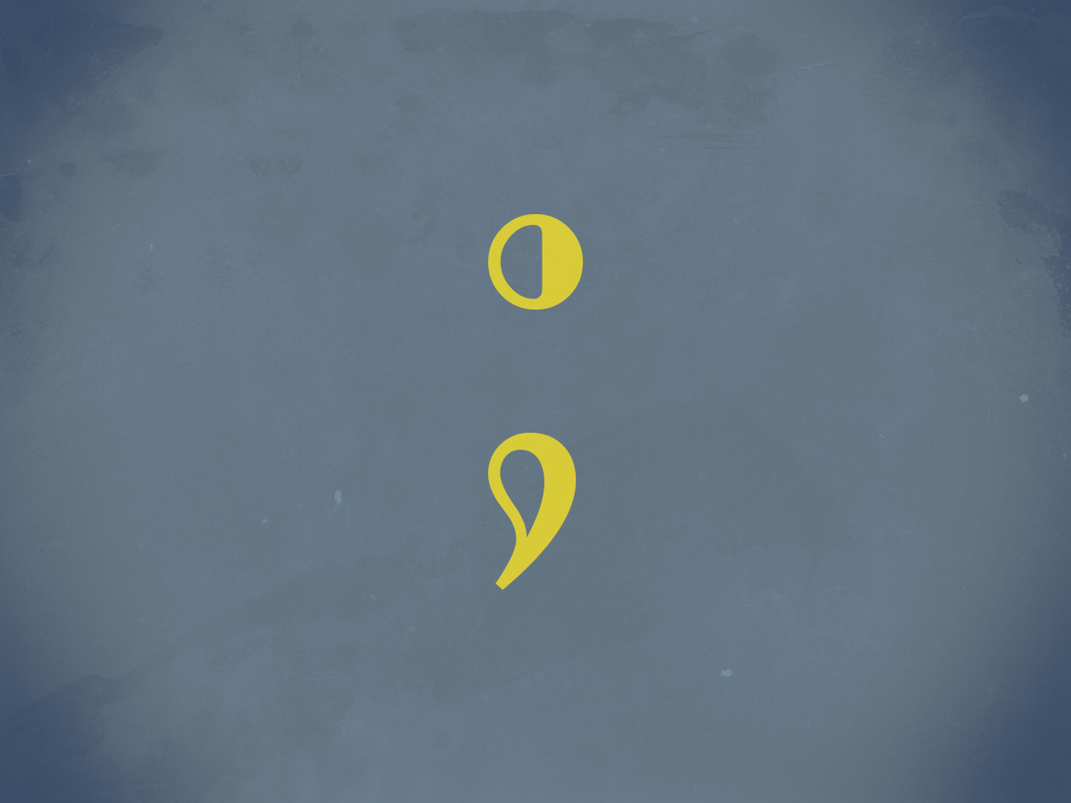
    “Do not use semicolons,” wrote Kurt Vonnegut; “All they do is show you’ve been to college.”

    I love a semicolon. (Perhaps a little too much, some might say.) Read more about this underutilized punctuation: Semi-colons; or, learning to love literature’s most misunderstood punctuation

  • Latest in Regular Sport: New Orwell Covers

    Latest in Regular Sport: New Orwell Covers

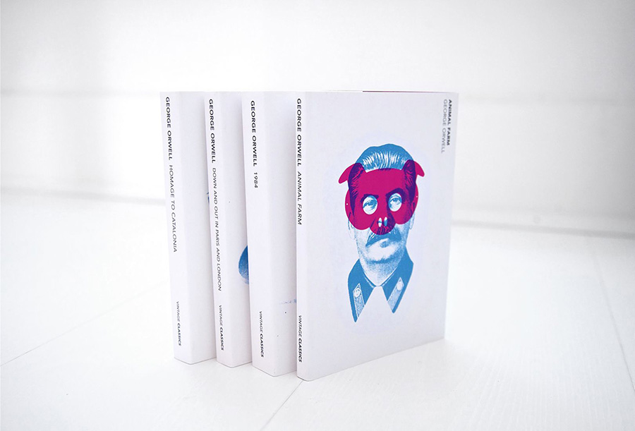
    Creativeboom points out that Heath Kane, not a citizen but in fact a subject of the Crown, has designed new covers for George Orwell’s classics Animal Farm, 1984, and more.

    Two interesting things about this: they call it the “final printed edition,” without further explanation. I somehow doubt there won’t be more editions in print — high schoolers everywhere would mourn, professors cry, and surveillance societies everywhere smile. Okay, overdramatic, but still.

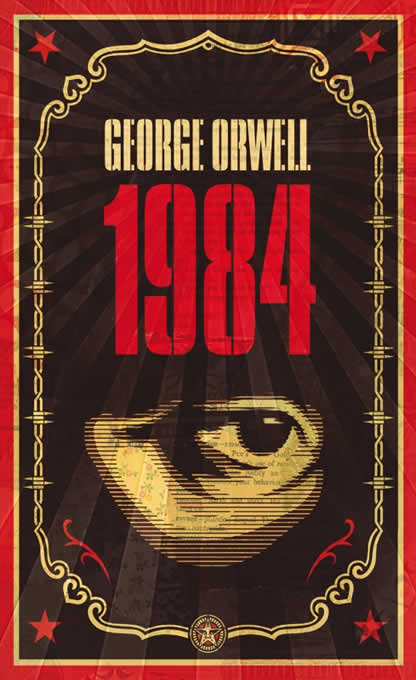
    And, I really preferred this one:

    More from Penguin on Orwells through the ages.