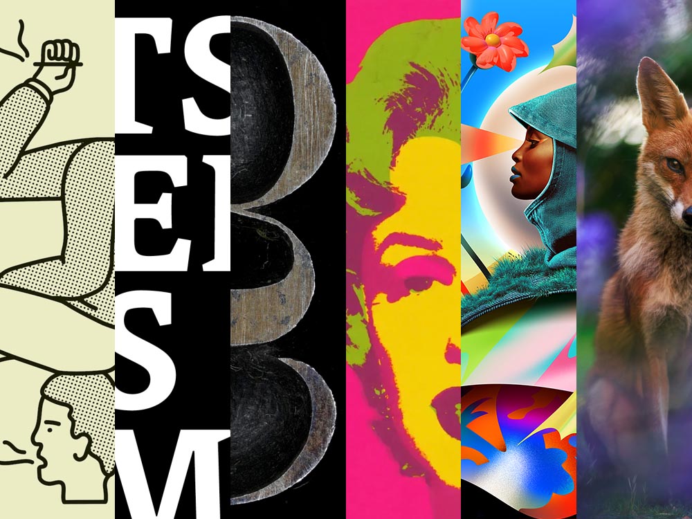
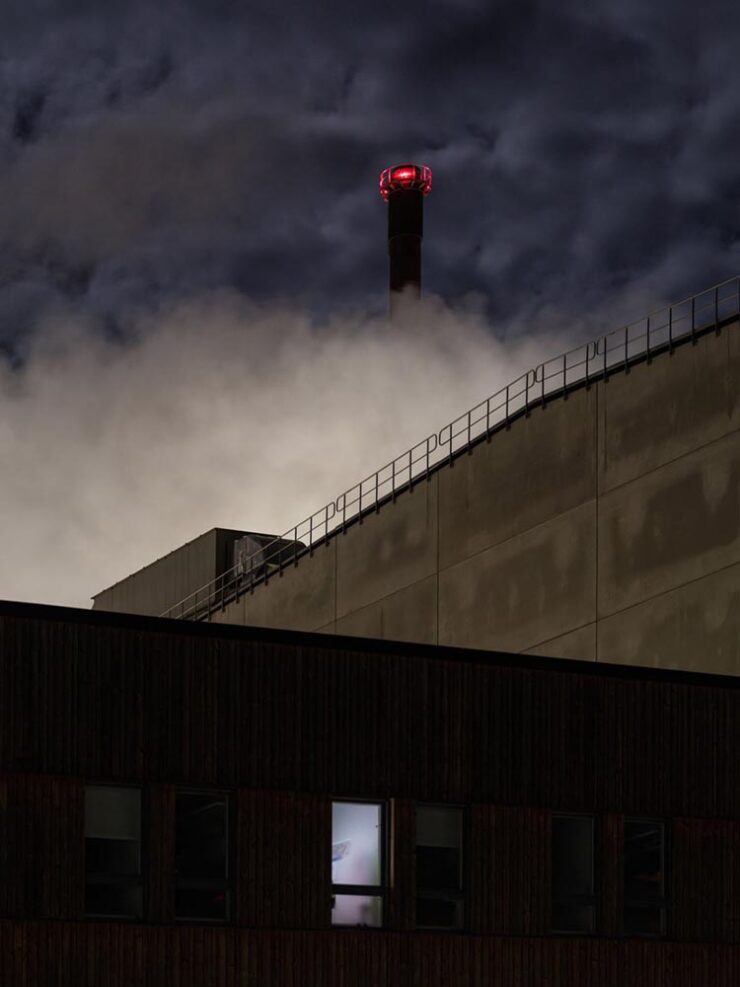
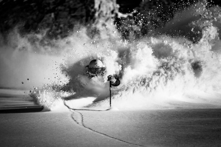
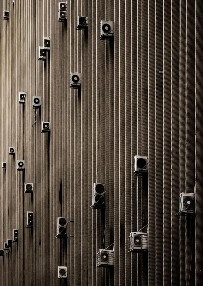
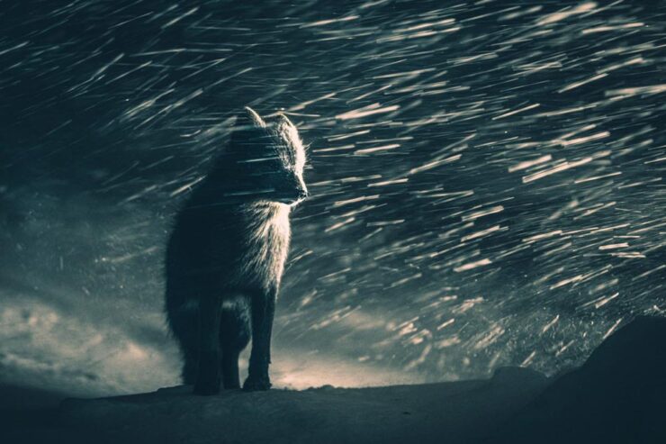
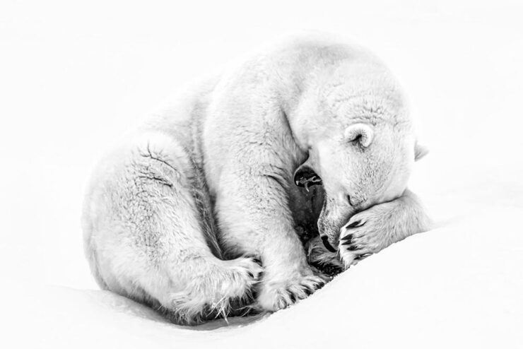
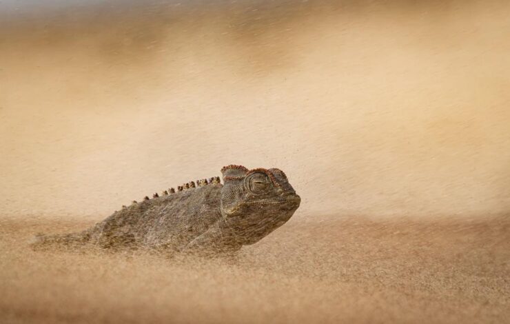
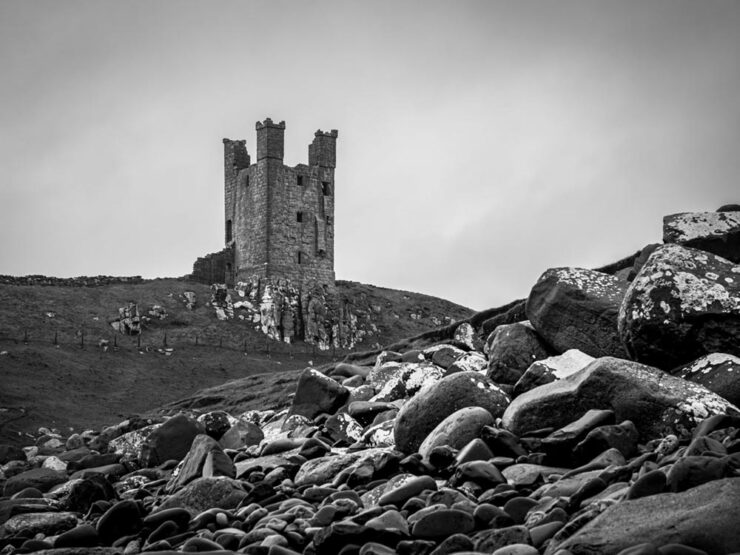
Photography in all its forms, including — but certainly not limited to — portraiture, landscapes, objects, macros, and still life. Most of the photography Foreword looks at are appropriate for books or walls.
July photography in Georgia — even on a day that was “only” hot, as opposed to “scorching” or “overwhelmingly humid” — is a challenge. But yesterday’s photostroll was completely worth the effort.
Monroe Light Sign, S. Broad St.
This north-central town is named after James Monroe and is on the way from Athens to Atlanta. Typical of towns of the era, has an old-fashioned town square and 19th-century architecture everywhere you turn:
Old Monroe City Hall (Roofline Detail), 101 S. Broad St.Cast and Classic (Building Detail), 124 N. Broad St.
It has an excellent selection of stores to choose from:
Sign to Rinse, 106 S. Broad St.Streetfrontages, N. Broad St.
Chairs to enjoy the ice cream, and plenty more:
Scoop a Spell, 140 N. Broad St.Monroe – Walton Center for the Arts (Building Detail), 205 S. Broad St.Crepes A’wash, W. Washington St.Monroe – Walton Center for the Arts (Garden #3), 205 S. Broad St.
I enjoyed the visit — a stop on a trip to “The A-T-L” — very much. I hope you’ll enjoy the results.
“Welcome to the new,” he said, pointing to the old, now dressed in a new suit. You’re reading this because the words and ideas resonated — and it’s why only the style is newly tailored.
Sometimes, though, a new look can be enormously satisfying. Enjoy.
This month’s Spine
Beacon Press.
“Paperwork. Nice,” I said, while potentially allowing a smidgen of political speak through the door. (Not sorry.) Read the column here.
Design and type
Matt Dorfman’s many hats
Matt Dorfman’s book covers are a regular item here on Foreword, including several of my Favorite Book Covers of the Year posts. So it was a delight to see a new interview with It’s Nice That.
[B]usy days and late nights begin with, as Matt puts it, “churning out a generous amount of trash”. Much to his frustration he will be “working through what often feels like a landfill-sized hill of boring ideas”. Despite taking up quite a bit of time, it’s a necessity, as among this trash will be a shred of an idea worth expanding upon. “Usually it’s a minor detail from an earlier comp made in haste and far afield from anything that book is actually about,” he says, “but it typically has a quality of brokenness or something unfinished that just looks interesting.”
— Harry Bennett, It’s Nice That
“Do anything except what’s right in front of you,” he tells them, while mentioning that he often favors collage. “Collage has become one of my shorthands for pairing themes and ideas together that aren’t so readily represented in nature or culture.” As in:
VQR. Book design by Matt Dorfman. Image via It’s Nice That.
Did I mention that he’s also the art director The New York Times Book Review? Yeah:
One of Matt Dorfman’s covers for the NYT Book Review. Image via It’s Nice That.
And a quick preview of next year’s Favorites list, with this gem:
Cover design by Matt Dorfman.
If it looks familiar, that’s because…:
Cover design by Matt Dorfman.Cover design by Matt Dorfman.
Both previous Favorites here on Foreword. Awesome.
Glenn Fleishman, writing at Six Colors, points us at a YouTube documentary on the history of Lorem Ipsum:
A screenshot of the YouTube video.
“I found it riveting and hilarious, and exactly the kind of Rabbit Hole (her channel name) that I fall down with printing and type history myself,” he writes. “[H]er dogged research has largely filled in the missing pieces of the story of where the run of seemingly Latin text used by designers to act as placeholder (or ‘Greeked’) text in mock-ups since the late 1960s came from.”
I agree: it’s well put-together and, more importantly, answers a question you might not have actually had — but now can’t resist. Enjoy.
Side note: Privacy where possible: I’ve switched to screenshots of YouTube videos rather than embedding them. That way folks who choose not follow the link aren’t stuck with the trackers embedding foists upon all.
Special bonus #1: Glenn is one of those people who wears many hats — 2019’s awesomeTiny Type Museum project is his, for instance — but it’s the comics connection that might be most appreciated. He’s got a book out about it, now in its second edition, which has just been nominated for Will Eisner Comic Industry Awards — the Eisners. Read more.
2026 logo trends
The Logo Lounge has posted its 2026 Report.
The quality of the Logo Trend Report has slipped over the past couple of years — there are suggestions that parts of it are generated rather of written — but I think the zoom-out is still useful for those of us in design.
If, for no other reason, to make sure our work is ahead of the curve.
Via Brand New, one of the only subscription sites I’ll link to. (Because it gives me an excuse to encourage you to subscribe, too: at $20/year, it’s sensibly priced and very much earns its keep.)
Best new fonts: a one-off
This month’s CreativeBoom post on new fonts was shorter than some — it’s summer! — with only one I’d like to highlight:
Sahlia, by Arcane Type Foundry.
But what a one it is. How often are we given an excuse get excited about stencil-style?
Marcin Wichary, whose brilliant Unsung continues to impress, has a neat item that we’ve all seen at this point: font menus that preview the font name in the style of the typeface, sometimes poorly.
Turns out, that’s not at all easy.
Oopsie. Screenshot courtesy of Unsung.
“Font previews are fascinating because they are the perfect showcase of how tricky fonts can be at scale,” he writes. The question is: why?
It’s actually impossible to left align or center text. Ever. Not just because each font does whatever it wants – font size is a number that doesn’t really give you anything to hang a hat on, and the font can place itself in its box however it desires, too – and not just because fonts often lie (via bad metrics) about what they store inside, but also because aligning and centering are really in the eye of the license holder, and have more than one definition.
So, every time you align text to anything, in whatever way, it’s only an approximation. Most of the time that’s good enough. Here it is not.
— Marcin Wichary, Unsung
It takes a surprising amount of work to get this right. Screenshot courtesy of Unsung.
“There are icon fonts, color fonts, and non-Western fonts so rich in variety and tradition that this category itself is basically a fractal,” he says. “There’s a craft to getting it right.”
Special bonus #2: Wichary also built something called Fontificator. “I thought it’d be fun to share this internal tool I made over a decade ago to aid with exploring options for Medium’s typographical redesign,” he says.
Fontificator. Screenshot courtesy of Unsung.
“The motivation for building Fontificator came from two observations:
font previews on type foundry sites were generally too limited to get a real sense of how a certain typeface feels, and it was best to see a font in situ,
often an extremely tiny nuance — like adding some letter spacing, or messing with line height — was what separated something that was promising from something that seemed very far from working.”
I know, I know, more Abode stuff. I’ll keep it quick(ish).
PetaPixel reminds us that, “the vast majority of working photographers are using AI to help save them time, handling tedious tasks that aren’t necessarily all that creative.” Adobe’s latest updates address that:
AI removal tools now have flavors, including on-device if needed.
Lightroom’s AI Sharpen tool can now use Topaz Labs’ Noise-Aware Sharpen model directly in the app. This promises to recover fine details more effectively, per Adobe. (More on Topaz below.) 👍
Lightroom’s Assisted Culling automatically stacks similar images into groups and automatically suggests the “strongest one.” 👎
Lightroom has a new Photo to Video feature that uses Firefly and Google Veo to turn a still photo into “polished b-roll or reels with AI-generated motion.” 👎
Photoshop’s reflection removals are now isolated on a separate layer, “giving users control over opacity for more natural-looking results,” according to PetaPixel. 👍
Photoshop’s Remove Tool, which uses generative AI to erase a selected object and replace it with realistic-looking pixels, can now be used offline using an on-device AI model. 👍
The agentic AI “assistant” might — or might not — be good. (Subscribers pay $$ for it, so….)
Meanwhile, Adobe’s promised “creative agent” — ’cause agentic AI — has “fully arrived” in Creative Cloud, PetaPixel writes. “Inside Premiere, Photoshop, Illustrator, InDesign, and Frame.io, users can tell Adobe’s Firefly-powered AI Assistant how to edit photos, videos, and other graphics.” It runs in a panel, like having Chat GPT or Claude right in the app.
“As a creative, you remain in control, choosing what to hand off, what to refine and how to apply your taste, expertise and judgment to shape every editable outcome. These tools are built for how you’ve told us you actually work,” Adobe explains.
I’m going to have to try this one. Maybe. Someday.
Several days after the above items were debuted, Adobe purchased Topaz outright. It’ll “fully integrate Topaz’s [AI scaling] models across apps like Photoshop, Lightroom, and its AI image generator Firefly” — which should be a good thing.
Special bonus #3: In case AI-all-the-things is getting to you, there’s this:
“A ‘centaur’ describes a human augmented with a technology, like machine learning, or even just driving a car or using autocomplete,” ArsTechnica writes as part of an interview with Doctorow. “A reverse centaur ‘is a machine head on a human body, a person who is serving as a squishy meat appendage for an uncaring machine.’”
“Being a centaur is generally viewed as a positive thing; few people relish being a reverse centaur. And yet the AI industry….” Read the rest.
People
Jason Snell
Amongst the tech names I’ve know for what seems forever, Jason Snell’s is up there. He was first at MacUser, then Macworld, then hung out his own banner at Six Colors.
From Macworld: Jason Snell (highlighted) at the introduction of the iPod, 2001.
My first day on the job at Macworld, Apple was perilously close to going out of business. It was the fall of 1997, and Steve Jobs had returned to Apple and engineered the ejection of Gil Amelio as CEO, but there was no iMac yet, no visible turnaround in terms of products at all. Beyond the release of the iconic “Think Different” ad campaign, there was nothing.
Apple’s survival hung by a thread. Steve Jobs asked everyone to trust him. At Macworld Expo, he had enlisted Bill Gates — Bill Gates, of all people! — to help him instill belief in the world that Apple would find a way to survive.
The world was skeptical, to say the least. My family asked what job I thought I’d get once Apple went out of business.
—Jason Snell
Ah, the good old days. (I jest.) Hard to believe, but that was almost 30 years ago. Sheesh.
So long, in fact, that another milestone has passed: Jason’s left Macworld. Read the column. I’m glad he’ll be continuing with Six Colors, and am looking forward to his new podcast on Apple’s history, Designed in California.
David Hockney
I was familiar more than a fan, but it’s undeniable that the world has lost a character — something very ably underscored by the tribute illustrations posted at CreativeBoom:
Illustration by Nia Gould.
“From Bradford to Beverly Hills, Hockney’s bold colours and irrepressible joy for living inspired a generation. Here’s what they created in response to his passing,” they write. See the rest.
Om Malik
Early this month, Om released an essay for the times — and the ages:
Most people remember Pinocchio as a story about lying. The nose grows. You get caught. Lesson learned. But that reading misses almost everything Collodi was actually doing. The book is a close study of a society where deception has gone ambient, woven into every institution, every transaction. Courts punish victims. Authority figures perform competence without exercising it. Experts are decorative. Society holds together through spectacle and habit rather than accountability. Into this environment, a naive creature is released, constitutionally unable to resist a good story about easy reward.
The nose is the least interesting lie in the book. The interesting lies are the ones that work.
Okay, sure, it was social commentary cleverly disguised as an essay about a pen. This Mont Blanc, in fact:
The point is, it was as insightful as ever. (See also the previously-cited “Velocity is the New Authority.”) It was immediately deposited in the to-be-posted folder. Before I could could get to that, however, heart disease snatched him away. He was 59.
I first heard via Pixel Envy, which linked to Om’s excellent photographs posted to Glass (social media),1Forgive the repetition, but just in case: I don’t participate in social media. While I’d heard of Glass, I didn’t know of Om’s posts there — and wouldn’t have followed in any case. Perusing those photos, and posting that link, are a one-off celebrating Om’s talent. and, later, appreciated John Gruber’s thoughtful piece at Daring Fireball.
Both reminded me of Om’s love of Leica and preference for black-and-white:
“Sleepy in Seattle.” Photograph by Om Malik.“Does This Qualify as Flora?” Photograph by Om Malik.
Special bonus #4: The day after Om’s Pinocchio essay, above, Daring Fireball posted on Jason Zweig’ on’s three ways to get paid. I won’t spoil it — just go read.
Photography
2026 Beaker Street Science Photography finalists
“This is the 10th anniversary of the Australian Beaker Street Festival. Each year, the competition celebrates fantastic photos of rare and unusual scientific phenomena, endangered species, conservation missions, and much more,” PetaPixel writes.
Some of these are awesome:
“Southern Ocean Energy.” Photograph by Nick Green.“Just Another Bioluminescent Tantrum.” Photograph by Deni Cupit.
26 finalists in all. See the rest (and, if you’d like, vote at the link).
2026 Australian Geographic Nature Photographer of the Year shortlist
This contest takes entries from the majestic Australasian Realm, including the ANZANG bioregion consisting of Australia, New Zealand, Antarctica, and New Guinea, and to quote PetaPixel, “there are some real bangers on there.”
“Bin Turkey.” Photograph by Emma Perry.“Penguin Poe.” Photograph by Matt Bell.
Nature in all its marvelously diverse glory. See the rest.
Burton’s America
I’m surprised I haven’t linked to Brendon Burton’s work before, ’cause it’s right up my alley:
Traces #10. Photograph by Brendon Burton.Traces #6. Photograph by Brendon Burton.
His second book, Epitaph, “is a series that attempts to unravel the knot of mystery that exists within the dark corners of North America, shedding light on unseen histories and buried past lives.”
• Travel and nature photographer Jake Guzman has spent the past two years creating Otherworldly America, his new 256-page photography book:
“Picture Lake Washington.” Photograph by Jake Guzman.“Richardson Highway, Alaska.” Photograph by Jake Guzman.
• Arpan Das has fallen in love with the Kishtwar Himalaya in the Jammu and Kashmir region, part of the Indian Himalayas:
“Barnaj Rainbow.” Photograph by Arpan Das.
• Michael Shainblum photographs the volatile, weather-driven landscapes of New Zealand with “a body of work shaped less by fixed composition and more by responsiveness to constant change”:
“New Zealand #19.” Photograph by Michael Shainblum.“New Zealand #40.” Photograph by Michael Shainblum.
“Venice Beach: Dreamy #3.” Photograph by Craig Hubbard.
Hubbard’s photos are ethereal and cinematic, with surfers and wave crests illuminated by the early morning sun or backdropped by the marine layer. Sometimes the intense spray, curl, shoulder, or lip become the sole subjects of the portraits. “The water is the muse and artist,” Hubbard recently told an interviewer. “I’m just a biased translator and documentarian. Lastly, my ego relaxes in the ocean; the need to peacock recedes. This is where my best work comes from — or favorite, I should say.”
— Kate Mothes, This is Colossal
“Venice Beach: Dreamy #9.” Photograph by Craig Hubbard.
That’s it for this month. As always, thanks for visiting.
For folks in the US, have a safe and enjoyable holiday weekend as America turns 250. Let’s hope that we can make it a better place.
Also: Please don’t forget to let me know of any problems or concerns with the new site. I’ve got a list of items — going to work on them now — but always welcome feedback. Thanks.
1
Forgive the repetition, but just in case: I don’t participate in social media. While I’d heard of Glass, I didn’t know of Om’s posts there — and wouldn’t have followed in any case. Perusing those photos, and posting that link, are a one-off celebrating Om’s talent.
Update 2, 30 June: I forgot to mention that I’ve reformatted all of the posts for 2026 to match the new style. Posts from 2025 and earlier will have mismatched pullquotes, among other minor items — but the content is unchanged.
Update, 30 June: Fingers crossed, things seem to be working. Please don’t hesitate to let me know if you run across anything. Thanks.
Update, 29 June:I broke something yesterday. The images on some posts from 2026 have been disconnected, and I’m not sure why. Posts from 2025 and earlier, and a couple from 2026, are displaying correctly. Working on it. Fixed.
Update, 28 June:The search results return mostly non-clickable results. Hmph. Will fix as soon as I have a moment. Fixed.
Original Post: It’s one of those things: something needs work, but since it’s yours — and not a clients’ — it doesn’t get done.
After a while, it starts to annoy. Still … other priorities take precedent.
But then something happens. In my case, it was the installation of WordPress 7, which caused several problems on the site. Old is one thing, but broken is another. It was time.
The itch finally got the scratch.
The New Foreword, June 2026
The site’s undergone a major reorganization, and as a result, it’s more focused. While there are static pages, visitors are directed to where the updates are posted: my blog, Foreword.
The site features completely new style sheets, which means a more flexible layout, dynamic fonts, and more. As a result, it has better compatibility with tablets and mobile devices — even if it’s still best viewed on a big screen.
The kicker: it’s based on modern code. That means it’s both faster and more private, stripping out third-party services (and their trackers), including search. The site continues to not have cookies, and does not save visitor information.1With one exception: if you use the contact form, a duplicate message is temporarily saved in case of an email hiccup.
Vetrans Super(fortress), Georgia Vetrans State Park, Cordele, Georgia, 2018
The photography sections got a bump, too. They’re now broken down into categories:
Regional Imagery, photography from selected cityscapes, rural scenes, landscapes, and architectural photographs from ten US states (plus several additional locations in the UK)
College Street, photography from colleges and universities, and
Maine Revisited, covering a ten-year span — 2008–2018 — of photography from the great State of Maine, “the way life should be.” While the book has sold out, there are hundreds of additional items to enjoy in the galleries.
And debuting this fall: Frequency Shift, which is macro, detail, and abstract photography from the world of hi-end audio.
Brick Arches, Fort McClary, Kittery Point, Maine, 2014
As often happens with a ground-up rewrite, it’s still a work in progress — there are wrinkles that’ll hopefully be smoothed out in the next few weeks, most likely including things I don’t yet know about.
Kindly let me know of anything that doesn’t work for you.
However, it’s the end of the month, and I have the dozens of saved pages, notes, and photos set aside for this month’s Beautifully Briefed that I must attend to. (That’ll be posted Tuesday.)
As always, thank you for visiting!
Top image: (Signs of) Bolingbroke, Georgia, 2018
1
With one exception: if you use the contact form, a duplicate message is temporarily saved in case of an email hiccup.
Design is grand; illustration and type are grand, too; the new BMW Alpina is a grand tourer extraordinaire; and space photography is grand indeed. Only Adobe, unfortunately, is the outlier, but on balance, a grand sendoff to Spring.
This month’s Spine
University of Chicago Press.
I inked as many jokes as I could — penishment, one could say — but the University Presses column is still worth a read when you have a moment.
Painting book covers
Hyperallergic comments, “In a market flooded with design templates and AI-generated imagery, the painted cover stands out as distinctly human.” Which, they suppose, is why when you “[w]alk into any bookstore in the United States lately, […] the shelves and new-release tables resemble group exhibitions.”
Cover design by Rodrigo Corral Studio. (A 2025 Favorite Book Cover here on Foreword, too.)
The recent shift from color fields and geometric abstraction to gestural figuration on book covers may reflect a broader craving for embodiment and physical presence — proof, in other words, of the artist’s hand and subjectivity in the era of the internet. Just as painting implies time, so does the novel, demanding sustained attention to both write and to read. It’s a tension that undermines the forces driving creation and consumption in the service of ever-increasing profit margins, both in the art market and the publishing industry.
— Tara Anne Dalbow, Hyperallergic
Cover design by Jaya Miceli.
Regular readers will know this isn’t a new thing, but I think the post — whose author is much more likely to be familiar with social media and bigger-picture trends than I am — is correct in the notion that, “the painted cover seemingly aligns the book with an art-historical lineage rather than the curation of an algorithmic feed.”
Aside from misspelling Jaya Miceli’s name, there’s lots of good stuff in the article. Take a look.
Note: I somehow hadn’t seen I Am You before, and am disappointed to have missed this great cover … that would absolutely have been in running for the 2025 Favorite Book Covers. Apologies.
Speaking of great book design: Jenny Volvovski
In 2012, Jenny Volvovski “really wanted to design book covers but didn’t have any book cover work. So I hired myself to redesign my personal library.” An interesting approach, to be sure:
That, as it turns out, has worked very well for her — she’s now amongst the elite:
Cover design by Jenny Volvovski. Was a finalist — but not selected — for my 2025 Favorite Book Covers.
“Yeah,” I hear you say, “but that’s only a runner-up.” Okay:
Cover design by Jenny Volvovski. One of my 2025 Favorite Book Covers.
In addition to the above, Beethoven, The Novel and the Blank, and The Master of Contradictions are among several that fall into the outstanding category; see many more in the “published” section of her website.
Fantastic early 20th-century movie posters (and more)
Eric Rohman wasn’t a name I was familiar with — he’s Swedish, so I suppose there’s an excuse — but the great design transcends not only the language barrier but the years, as well:
Poster design by Eric Rohman, 1918.
“Eric Rohman (1891–1949) was born in Nyköping and grew up in Helsingborg. He was one of the very few people in Sweden who could make a living by only producing posters. He produced about 7,000 works, according to his own estimate.
“Rohman’s brother was the manager of one of the big cinema chains and the need for posters was great. Rohman usually worked with few colors and did not spend much time on details, he had a great ability to quickly pick out the essentials.”
Poster design by Eric Rohman, 1917.
From Laurel and Hardy and Charlie Chaplin to Ingrid Bergman and Greta Garbo, this online archive is both inspirational and sure to bring a smile to your face.
When you’re done, the site, Artvee, has countless more from artists worldwide, in hi-res where possible, all in the public domain. A fantastic resource.
Special bonus #1: Quentin Blake, at 93, continues to advocate “for a discipline that’s lacked attention and prestige for far too long,” CreativeBoom writes.
Photograph courtesy of CreativeBoom.
The master illustrator of Roald Dahl’s Matilda, The BFG, and around 500 more instantly-recognizable titles has been working on a singular goal for more than three decades; the fruit of his labor, The Quentin Blake Centre for Illustration, “the world’s largest permanent public space dedicated to illustration,” opens its doors in Clerkenwell, London, this summer.
One of the famous cockatoos gifted to the world by Quentin Blake.
Update, 6 June 2026:Dezeen has a great article on both the Center and its facility: “The site, known as New River Head, was once the end of an artificial river created in the early 1600s to channel drinking water into London,” they write.
Facility by Tim Ronalds Architects. Photograph courtesy of Dezeen.
“Many of the structures on the site were created as part of the endeavour to pump this water to people’s houses. The oldest of these was the base of a windmill dating back to 1707, which stands at the entrance to the museum’s site and has been converted into a gallery space for temporary exhibitions.” Check it out.
This month’s new fonts
CreativeBoom‘s monthly feature has twelve choices, a couple of which I’d love to have the opportunity to use.
Ardent, by Typofounderie
Ardent, by Typofonderie.
“Jean François Porchez began designing Ardent in January 2021, starting from his earlier Le Monde Journal and asking what that typeface would need to become to serve modern screen reading. The answer involved drawing wider letterforms and more open counterforms, following the research of Ladislas Mandel and Matthew Carter on legibility and apparent size. Serifs in the italics (an unusual, but actually sensible choice) serve readability on screen, rather than print conventions. […]
Ardent’s ”angular counters,” as they call them, do stand out.
“More broadly, the font draws on a rich historical lineage: Elzevirs, Albertus, Vendôme, Meridien, even Verdana. Angular and triangular shapes sit alongside round terminals and both bracketed and unbracketed serifs, creating what Jean describes as a typeface that reveals subtle contrasts invisible at small sizes but gives graphic projects a distinct identity at large ones.”
Have to emphasize: unlike my usual selections, this is aimed at screens, not the printed page. Still, good stuff.
Tareco, by Dalton Maag
Tareco, by Dalton Maag.
“Deiverson Ribeiro’s pulled off something a bit special here. Developed at Dalton Maag, Tareco takes the beloved sweet treat of the same name as its starting point. This is not a polite, restrained script, but one with a loud, confident personality. Thick, confident strokes and precise details give these letterforms a jazz-like syncopation: a sense of forward propulsion and playful energy that helps to bring designs to life on the page.”
And seriously: who doesn’t love a biscuit?
Software woes, rants and hopes
Part One: Adobe
I’ve not had much goodto say about Adobe recently, I’ll admit. I’m also not thrilled to be back, bemoaning something else. It’s a shame they’ve given me another reason to.
Recently, I’ve noticed that in Photoshop, the “canvas size” dialog (among others) has looked … well, off. Windows-like, even, which is most assuredly not a compliment. But on a more fundamental level, it’s broken — it has, to use the parlance, lost its focus sequence: the standard workflow of open dialog, type value, tab, type, enter (no mousing required) is just gone. Each value has to be manually selected and entered, a much more arduous process — it’s additional movement, clicks, and time unnecessarily added.
The old interface is on the left, “new” on the right. Screenshot courtesy of Unsung.
You can bet I’m not the only one to have noticed.
Marcin Wichary, at the excellent Unsung:
I generally avoid such harsh labels on this blog, but: this is awful work.
I’m angry. (Clearly.) We should all be angry in the face of stuff like this. This is how people get fed up with software – because it feels unstable and deteriorates on its own without needing to.
I know I brought up that an existing power user base can be a huge pain in the ass, and I am a decades-old Photoshop power user. But this is different than other examples where the product needs or at least wants to evolve past its core audience or toward a different market. For Photoshop here, nothing I see indicates any change in course or clientele – and yet all of these good moments in UI that used to help me out no longer exist.
Plus, all those transgressions are solved problems. Those issues are not buried in pages of heavily litigated patents, or in seven collective brains of world-class interface designers whose driveways are presently occupied by cash-filled trucks sent over by frontier companies. This isn’t some long lost art that requires archaeologists to decipher. This feels like carelessness and laziness in face of basic UI engineering; in a likely internally-motivated effort to refresh the interface, the team threw an entire nursery worth of babies [out] with the bathwater.
— Marcin Wichary, Unsung
“It’s not just about disservice to craft. It’s not even about disrespect for change management, trivialization of institutional memory, and disinvestment in quality assurance. This isn’t only […] sloppy coding,“ he continues. “This is a failure of imagination.”
I have been using Photoshop since John Sculley was the CEO of Apple.Longtime users can be brutally resistant to change, but I would like to think that I remain open-minded. One can’t have used Photoshop for more than three decades without having adapted to change and found utility in the new features Adobe has added over the years. I’ve used generative fill. I’ve used AI-enhanced edge detection. I’m hip and with it.
But, as Wichary detected, what Adobe is doing with the Modern User Interface is not to make a new, improved, modern interface. Adobe’s own description gives it away: It’s a hammering of all of Adobe’s user interfaces so they look alike, across Creative Cloud. It’s a “multi-platform design system,” which means in addition to Adobe being committed to “modernizing” Photoshop by making it look like Premiere, it’s also going to make it look the same on the Mac as Windows.
Already, Photoshop desperately wants to run in single-window mode, with multiple documents opening in a single uberwindow—in other words, the stink of Windows. Fortunately, you can turn that feature off, and I have. […]
That all said, of course, this decision could benefit Photoshop users, because Adobe could put in the work to make the app better while also fulfilling its own corporate goals of homogeneity.
Ha ha ha. Sorry. I tried to write that with a straight face.
If you do a little poking around in Adobe’s application bundles, a key reason for the jankiness of these user interfaces becomes apparent: it is because they are little webpages. These dialog boxes are HTML files that reference a chunky CSS file and oodles of JavaScript […].
This is loathsome.
There are people out there who will insist it is unfair to blame the tools and that bad user interfaces can be built in entirely native languages, too, which is true. Also, Adobe’s interface has always been unique and not quite at home on either MacOS or Windows. Maybe it really is possible to build a web app that feels platform native. But I have never used one — not once — and for this mess to be increasingly used in the industry-standard professional suite of creative tools is maddening.
— Nick Heer, Pixel Envy
John Gruber, on Daring Fireball, notes that, “The before-and-after screenshots look like examples from a lecture on user interface design — if you swap them around make the new ones ‘before’ and the old ones ‘after’. Better balance, better focus behavior, appropriate platform-native typography.”
Michael Tsai has a post on the whole “conversation” if you’d like to get a sense of just how many people are upset; for what it’s worth, it includes a comment from Adobe’s “Lead Scientist” for user interface: “These sharp edges are acknowledged, and we are working on them.” I’m sure I’m not the only one who doesn’t entirely trust their reassurances.
Wichary did provide a solution, however temporary: turn off the interface “improvements.” There’s an option buried in the settings:
Uncheck the box, then note the last line.
Part Two: Folklore
The hope part: Gruber followed up with a thought-provoking piece called, “Software as the Product of Obsession Times Voice.” He reminds us of a famous quote from Walt Disney — “We don’t make movies to make money; we make money to make more movies” — and that it applies to software development, especially for independents. To wit:
It feels like the world of software is bifurcating quality-wise. This whole thing about Adobe’s new craptacular “modern” UI language (a.k.a. “Spectrum”) exemplifies one side of that bifurcation — the bad-and-getting-worse side. Software that is the product not just of an ignorance of long-established principles of interaction design, but of a willful disdain for those principles. What Adobe is now shipping is just inexplicably bad UI, ignoring literally decades of great work and long-mastered concepts — a lot of which work was pioneered by Adobe itself!
— John Gruber, Daring Fireball
He goes on to discuss that what’s expected from Apple is “insanely great,” and that Adobe is failing so hard precisely becausethey’re Adobe and know better. He also mentions a concept known as software brain — read the post to get that — but, in a nutshell, it’s not about the quality of the software. It’s about the quality of the profits. Quelle surprise.
However, “[t]he other side of the software fork is not deserted. It’s just populated, more than ever, by the products of small independent developers who obsess, first and foremost, over quality and artistic vision.”
Which leads us to Folklore. Mentioned on Upgrade’s Apple 50th anniversary podcast episode, Folklore is a list of 123 great stories from Apple’s early days, from when Apple was that company obsessing, first and foremost, over quality and artistic vision.
Never doubt that a small group of thoughtful, committed people can change the world. Indeed, it’s the only thing that ever has.
— Margaret Mead
Special bonus #2: Taken, a single webpage that shows just how much information you share by … visiting a webpage. Sigh.
Special bonus #3: Boring, an interactive essay arguing that some of the items mentioned above have, in fact, gone too far — and that forces are at work to redress. Speaking of hope: let’s do that.
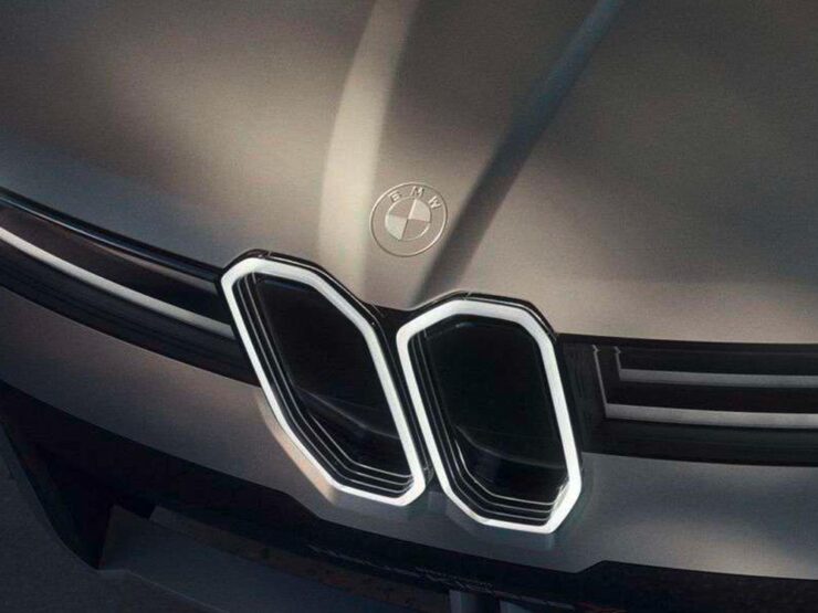
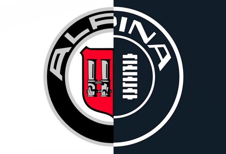
BMW Alpina
So, it’s finally happened: after what seems like forever — including severalmentions here on Foreword — we’ve now seen where BMW is going to take the Alpina brand.
I’m both relieved and excited: it could be very cool.
Image courtesy of BMW.
Unlike BMW M, which is focused on sport, BMW Alpina will be focused on speed. Mile-munching, cross-continent stuff. (If you’re a Mercedes fan, think closer to Maybach than AMG — or maybe an amalgamation of both.) “[T]he understated character of ALPINA fits the way wealthy buyers are spending now,” writes BMW Blog. “That is the market BMW is aiming at — not M buyers, not 7 Series buyers, but the segment above both.”
“An ALPINA is for connoisseurs, meaning people that love driving, they like driving fast, but they don’t want to communicate to the outside world that they bought a race car,” said BMW Group Chief Designer Adrian van Hooydonk. “That would be an M customer. And therefore we thought that is the position, that is the opportunity for ALPINA.”
Image courtesy of BMW.
Which makes sense. It’s what Alpina always stood for: faster than standard models, more luxurious than M models. Exclusive and expensive.
Four images above courtesy of BMW Blog.
There’s nothing about this I don’t like. It’s a great design in a great color with a fantastic interior. Indeed, it’s a great presentation, and looks like a great place to park yourself for hours on end while scenery rips by.
Of course, not all is perfect: it’s only a “vision.” BMW’s concept cars tend to get watered down fairly extensively, and this one’s no exception; the first model isn’t even going to be a coupé but rather a modified 7-series sedan. They’ll be both gas — ahem, petrol — and electric, and will cost Bentley money.
The concept on stage at the 2026 Concorso d’Eleganza Villa d’Este. Image courtesy of BMW Blog.
Alpina has always been the car for people who found M too loud and Rolls-Royce too theatrical. The buyer who knew what a it was and didn’t need anyone else to. I’m excited that Alpina is going to, thankfully, continue to represent that — and seemingly, successfully transition to a new era under direct BMW control.
“NASA has released a tranche of 12,000 photos taken during the historic voyage that were shot on a combination of the Nikon D5 SLR, Nikon Z9 mirrorless, and iPhone 17 cameras that the Artemis crew took with them,” PetaPixelnotes in a post showing some of their favorites. (This is Colossal has a post of their favorites, as well.)
The timeline is an interactive way to scroll through photos from the mission — but pinned to NASA’s official schedule. Green also explains something I was wondering, which is why there are no credits on the photos: “the four astronauts together agreed that they did not want credit for any photos taken on the mission. I’m somewhat conflicted about this because this project is about giving as much context as possible, but of course there is also something very beautiful about not wanting to take individual credit for something that was the result of so much collaboration.”
Hat tipped to all of that. A month later, and the excitement is still palpable.
Space #2: The Milky Way
“Night at the Remarkables.” Photograph by Tom Rae.
The 2026 Milky Way Photographer of the Year winning images have been announced, and they’re stunning. “Every year, this collection reminds us that photographing the Milky Way is not only about technique or planning. It is about curiosity, patience, and the desire to experience the night sky in places where it still feels wild,” says Dan Zafra, editor of Capture the Atlas.
“Perseid Meteors Over Durdle Door.” Photograph by Josh Dury.
The Matterhorn, the summer arch (left), the Gegenschein (center), and the winter arm of the Milky Way (right). Photograph by Angel Fux.
From high up in the Alps, a stacked image of events that took place in one night, taken from one location by one photographer, with no AI involved: a celestial phenomenon that has never been captured in this exact way before. Awesome. PetaPixel has the details.
And Finally: Lightning Bugs, Indeed
“Presence,” Australia. Photograph by JJ.
PetaPixelbrings us the story of JJ, who went on a mission to capture lightning sprites, an elusive-yet-beautiful item — and got something else, too.
“Those little fireflies reminded me of why I do this in the first place. It reminded me that it wasn’t about getting something better; it was about fully appreciating things there in the moment. And this is why I named the image ‘Presence.’”
Special bonus #4: Engagement with the arts slows aging!
“[R]esearchers believe that a significant part of why engaging with the arts slows biological aging is the diverse range of visual, sensory, and physical stimuli associated with art, as well as the social interactions that often accompany it,” PetaPixel notes.
“The new findings go much farther than that, though: they also found evidence that artistic engagement can have roughly the same health benefits as physical exercise. This is a huge deal, especially for those in middle- and late-age groups who may find strenuous physical exercise too difficult.”
So, be glad: taking the time to read Foreword today may have had benefits beyond entertainment. Thanks for visiting.
This month, Apple turned 50. Plus, the usual dose of great design, fonts, and photographs. Let’s spring into it!
This month’s Spine
The University of Iowa Press.
Genius placement of record label, great typography, and more — although the folks at the University of Iowa generally don’t respond to requests for information (hence the lack of designer credits), their production department deserves all the kudos. Great stuff.
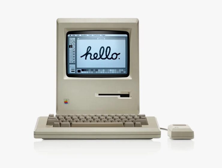
I’m just enough older than Apple that it’s been pretty much a constant presence in my life. Early on, it was only in schools that I interacted with them; we couldn’t afford a Mac in 1984, and I was stuck, nose pressed up against the glass, until 1990.
The original Mac 128k. Photo courtesy of Apple.
My first Mac was the same iconic beige, except it was a Mac Plus — which, together with a 20MB (!) Jasmine external hard drive and an ImageWriter — really allowed me to start down the path of making documents and publications lookgreat.
Over the years, I’ve been through many Macs (more than I should probably try to count, honestly). I still use and love the platform today.
Of course, I’ve added iPhones, iPads, and miscellaneous others, too. (Oddly, I was never an iPod person — I’ll take speakers over headphones if at all possible.)
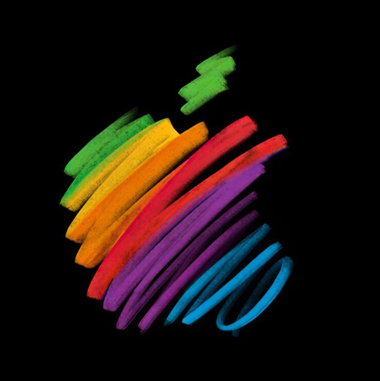
iPad wallpaper courtesy of Basic Apple Guy.
There are too many great opinions on this anniversary, frankly, for mine to really matter — so I’m going to point to a few excellent items from others, in case you’ve not read them or would appreciate some additional perspectives:
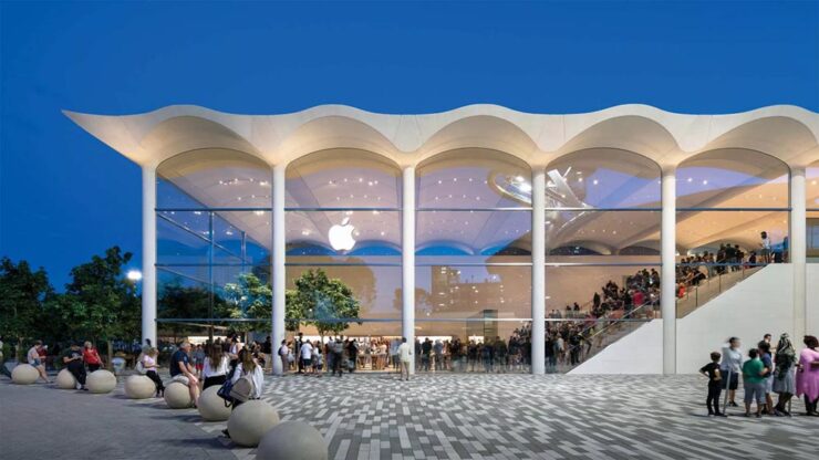
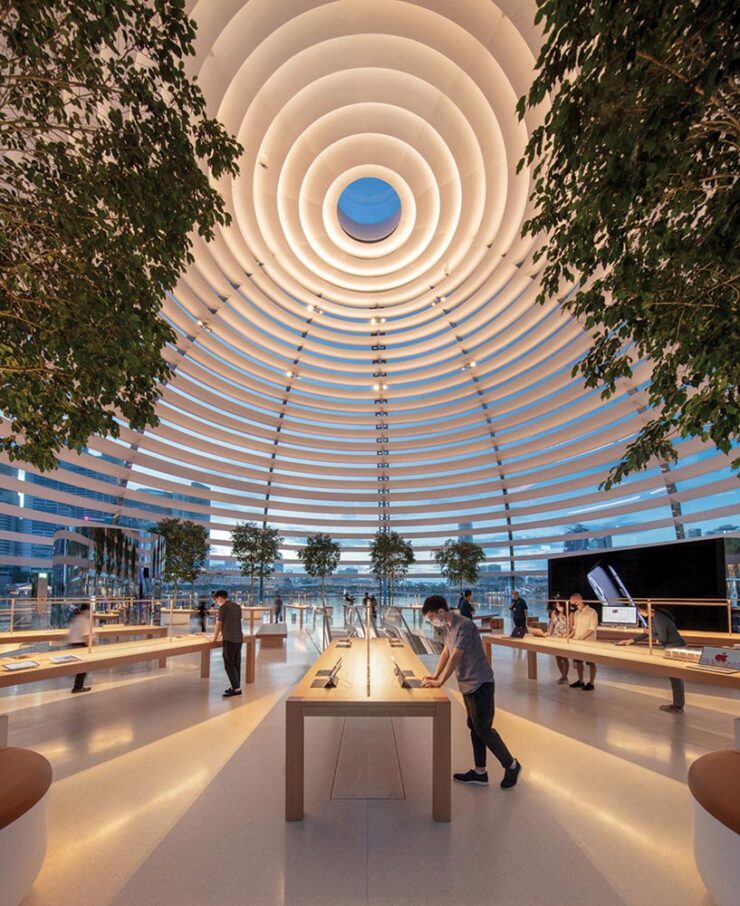
Meanwhile, I have to point at another article that will probably surprise … well, none of my regular readers: a great Architectural Record piece on the many Apple Stores and their fantastic, now-iconic look.
Apple Aventura (Miami). Photograph courtesy of Architectural Record / Nigel Young, Foster + Partners.
The possibility exists that I might have mocked Apple in 2001 for announcing that they’d be opening brick-and-mortar locations. (They had resellers, after all.) But, man, did I get that one wrong. Five hundred plus stores later, all over the world, Apple’s story is being told every day through great products — and great architecture.
Apple Zorlu Center (Istanbul). Photograph courtesy of Architectural Record / Nigel Young, Foster + Partners.Apple Marina Bay Sands (Singapore). Photograph courtesy of Architectural Record / Finbarr Fallon.
Many thanks to Apple for making my daily life better. It sounds strange to thank a company with a nearly four trillion dollar market cap, but as someone who’s been there since the dark days of the ’90s — indeed, basically all of those 50 years — they’re more than just a company to me. May there be many more anniversaries to come.
Late-breaking supplement: new Apple CEO
As it turns out, Apple’s 50th also marks a turning point:
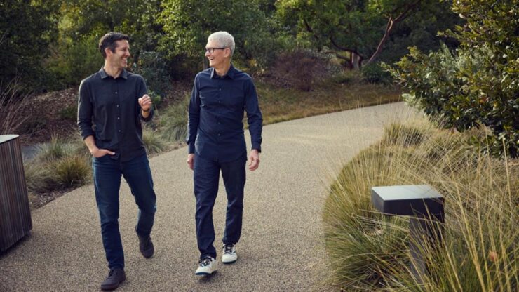
Today we announced that I’m taking the next step in my journey at Apple. Over the coming months I will be transitioning into a new role, leaving the CEO job behind in September and becoming Apple’s executive chairman. A new person will be stepping into what I know in my heart is the best job in the world. That leader is John Ternus, a brilliant engineer and thinker who has spent the past 25 years building the Apple products our users love so much, obsessed with every detail, focused on every possible way we can make something better, bolder, more beautiful, and more meaningful. He is the perfect person for the job.
John cares so much about who we are at Apple, what we do at Apple, who we reach at Apple, and he has the heart and character to lead with extraordinary integrity. I am so proud to call him Apple’s next CEO.
John Ternus and Tim Cook. Photograph courtesy of Apple.
Ternus’ long-time role at Apple has been as its head of hardware. Among the things Apple does extraordinarily well, hardware arguably tops that list. Every piece of hardware has an level of quality the rest of the industry just can’t match; from the early days of the iMac to today’s MacBook Neo, from the first iPhone to the orange powerhouse that is today’s iPhone 17 Pro, there’s a feel that Apple does like no one else.
That also means, for all intents and purposes, that Apple recognizes that the next CEO isn’t going to — can’t — increase its net worth another thousand percent the way it did under Cook’s tenure. They’re going to concentrate on what they do best: products.
Special bonus #1:What happens when you put greed first. I’ve spent a minute slogging on Adobe — hopefully fairly — but Nick Heer of PixelEnvy summarizes better than I have.
Design
Penguin’s 2026 cover design award
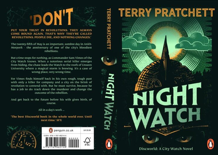
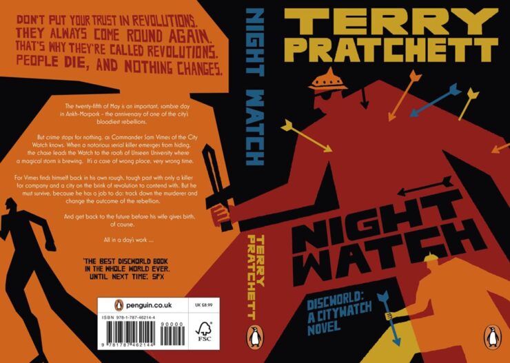
This CreativeBoom article is framed as “Gen Z judges books by their covers” — breaking news, surely — but is really about what happens when you give some design novices1Entrants had to have no more than one year of paid creative experience, and 60% of those on this year’s shortlist were students. an assignment redesigning covers of two iconic titles. Here are a couple of winners:
Night Watch design study for Penguin UK by Peter Goddard.Night Watch design study for Penguin UK by Sunny Tsang.
Of course, there are a couple of age-related stats in the article worth mentioning: “40% of 18 to 24-year-olds like to display books at home, with nearly a third using them as interior design objects or art pieces. Among the over-55s, that figure drops to 8%.” (Raises hand on the latter.)
The other title is the always-awesome A Wrinkle in Time. Take a look.
Post of goodness
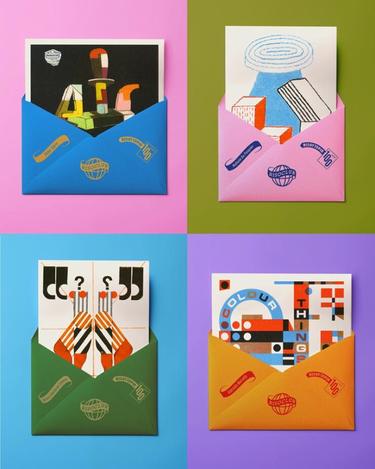
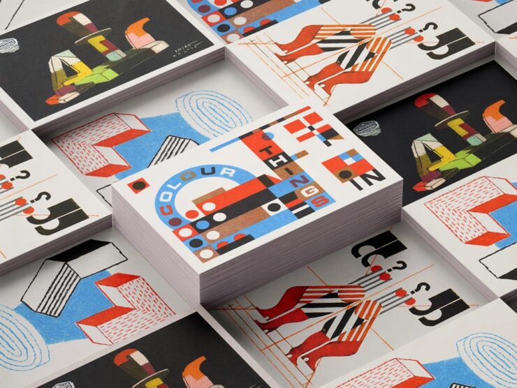
While we’re on the subject of awesome: “Print and design studio Risotto is marking 100 months of artist postcards, all printed by hand and posted worldwide, with an exhibition that puts the beauty and breadth of Risograph on show,” It’s Nice That writes.
A sample of Risotto postcards, oddly with envelopes.
“For the Glasgow-based print and design studio Risotto, a connection to slower publishing in a fast world has been part of its fabric since its beginnings. Risotto’s Riso Club has been a constant print project running in the background at the press for the past decade: A monthly not-for-profit postcard subscription that directly supports independent artists by sending their colourful work to a community of print enthusiasts around the world,” the article continues.
More of the fantastic artists’ postcards.
“It’s a bit of an antidote to the speed of the doom scroll or just the amount of content that’s out there,” studio owner Gabriella Marcella says. I couldn’t agree more — in fact, if I had even a smidgen of display space available, I’d subscribe (and may anyway).
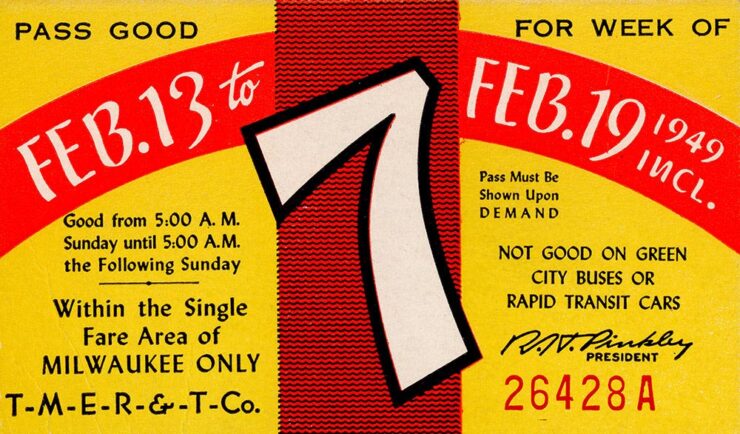
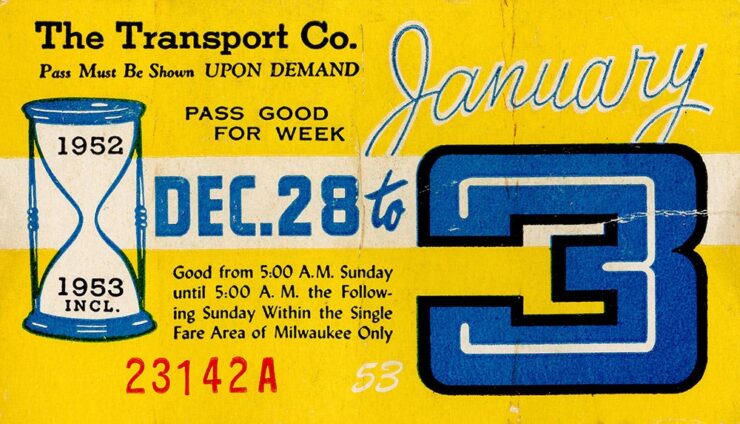
Kottke, while bringing us a quick snippet with a brand designer’s “compendium of transit tickets” from around the world, also reached back into his archives to bring us these absolute gems:
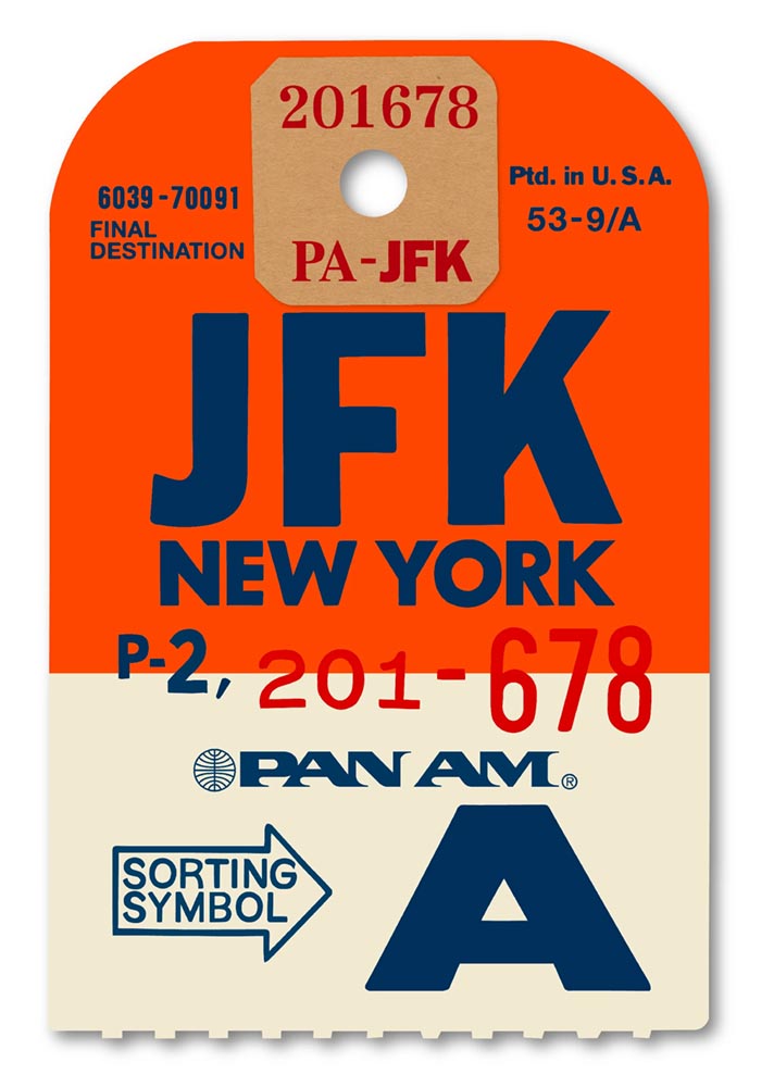
Special bonus #2: Extra large Pan Am ticket recreations as art, framed, for your wall:
Flight of fancy by Ella Freire.
These are perfect for an Air BNB or other travel/hospitality locale — as mentioned above, my walls are full — but no matter what, looking through the destinations is fun. Check it out. (Via Daring Fireball, citing another not-cited-enough item, SimpleBits by Dan Cederholm.)
Special bonus #3: Speaking of travel and hospitality, “Letterform Archive has turned a century of vintage hotel luggage labels into 330 gorgeous stickers: a new sticker book from the San Francisco-based design archive revives the golden age of travel through the vibrant graphic art of hotel luggage labels.” Awesomeness at CreativeBoom.
April’s typography greats
Mark Simonson’s start in type
…actually has a great story attached:
Hand lettering for Mark Simonson’s 1975 yearbook.
“Fifty years ago this month, March 1976, at 20 years old, is when my interest in type design began,” he writes. I’m not going to spoil it — just go read instead.
CreativeBoom‘s April selections
Nineteen in all, but as usual, I’m only going to mention a few faves:
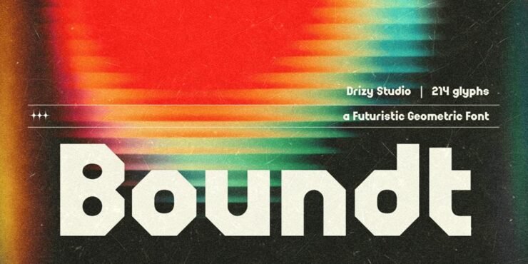
Boundt (not cake), by Ahmadi Hasan.
“Boundt arrives from Drizy Font with a clear visual proposition: bold, architectural geometry at display scale, informed by mechanical bolt-and-nut structures and the graphic language of vintage broadcast design. The mechanical metaphor gives the letterforms a coherence that purely decorative display faces often lack: a sense that the same underlying system generated them all.” See more.
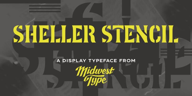
MWT Sheller Stencil by Jesse R. Ewing. (Who was not shot for their efforts.)
“Sheller Stencil originates in the stencilled lettering found on agricultural machinery from Tiffin, Ohio, in the late 19th century: anonymous commercial graphics that, on close examination, turn out to be genuinely inventive. Some characters split at right angles; others follow curvilinear breaks that track the Art Nouveau-inflected letterforms rather than cutting across them mechanically. The result reads as antique but carries enough formal authority for contemporary packaging, editorial work and heritage-positioned branding.” See more.
Herald News by Kevin Foley.
“The story behind Herald News is a personal one. Kevin Foley grew up with the Fall River Herald News (delivered it as a paperboy, absorbed its typography over years of handling), and later found himself scanning its pages to find his daughter’s name in the results after track meets. That very human relationship with a newspaper’s visual character is precisely the kind of deep familiarity from which good type design grows.”
This is a serif family was built for editorial work — and I like so much, it’s been bookmarked for when the right project comes along. See more.
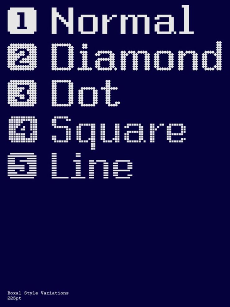
Boxal by The Northern Block.
“Boxal is The Northern Block’s newest typeface – a meticulously crafted, retro-inspired pixel font that captures the nostalgic charm of classic arcade gaming while delivering modern precision and versatility. With the personal design history of founder and type designer Jonathan Hill very much in mind, Boxal draws on the pixel artistry of iconic titles like Zelda, Shinobi, and Cops and Robbers, and represents a cultural homecoming for the studio.”
Fantastically retro yet proportionally spaced, best at large sizes, preferably slowly scrolling up a screen. Awesome. See more.
Zed, for when Z just isn’t enough
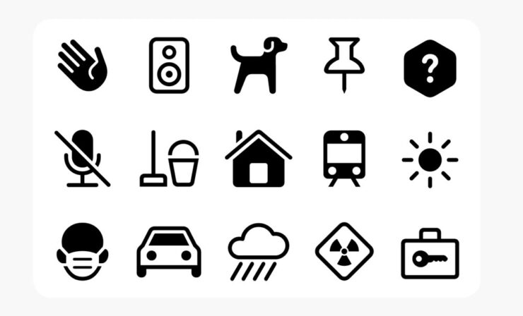
Zed’s icon family by Typotheque.
“Zed is extremely practical, both in terms of its extraordinarily broad language support and the stylistic variations available via its adjustable width, weight, roundness, and slant. It even offers Braille characters and an icon font. But Zed is also simply beautiful. It’s a font family and type system that exemplifies the belief that rich accessibility and pure aesthetic appeal are not at odds,” Daring Fireballwrites. (In, admittedly, a sponsored spot — but his sponsors are so highly curated that I actually read the posts … and, occasionally, pass them along.)
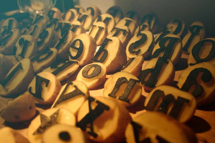
No, your eyes are not deceiving you: those are potatoes, carefully carved in the service of Bodoni. Mostly. But it’s got tasty ink content — and is free. Check it out. (Via Kottke.)
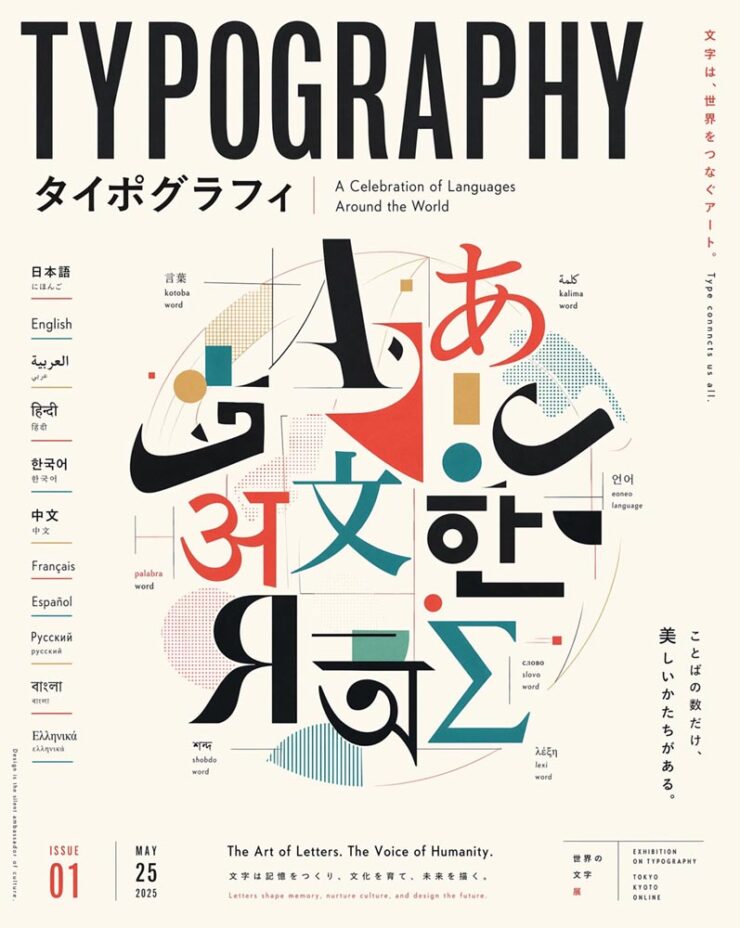
Special bonus #4: ChatGPT can now think … about type, traditionally one of AI’s weak points:
Generated. (“Create everything at once,” Open AI claims.) We’re all going to be out of a job!
April’s Photography Round-up
Artemis II (#1)
Only a few items this time — but that partially because, at least in my mind, one event more or less dominated photography during April: the Artemis mission.
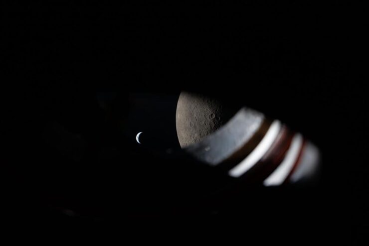
“Room with a View.” A view from the window of the Orion spacecraft approximately 9 minutes before Earthset during the Artemis II lunar flyby on April 6, 2026. Photograph courtesy of NASA. (No specific astronaut credited.)
“I like perspective. As much as I enjoy the wide, sweeping shots of our Moon and Earth set against each other (and I do very, very much enjoy those), my favorite photos remind me that there were people there,” Jason Schneider writes at PetaPixel. I couldn’t agree more: the shot above, for instance, is both spare and overwhelmingly expansive. Awesome.
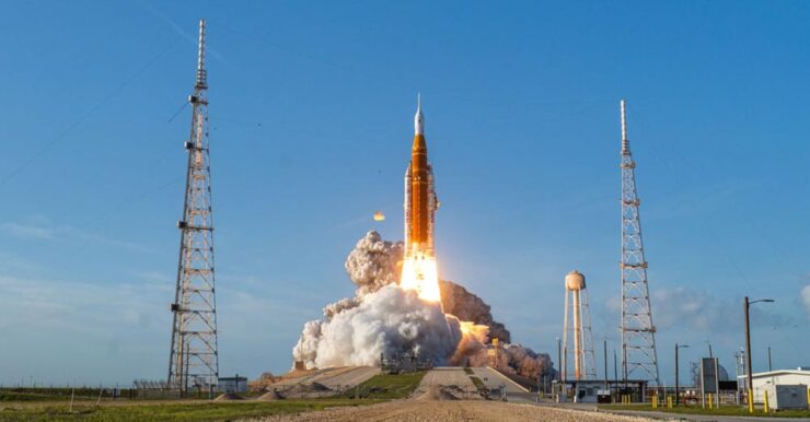
How did that image get created — I mean, it’s practically right on the pad? “Photographer Steven Madow has been photographing rocket launches for over a decade, but arguably no rocket launch he has photographed has been as big of a deal. […] Madow set up 14 different Panasonic Lumix cameras to cover the monumental event, including seven remote cameras at the launch site. His outstanding photos are the result of years of practice and planning,” PetaPixelwrites.
For Artemis II, Madow partnered with Space Explored, a website dedicated to sharing all the inspiring stories surrounding spaceflight and exploration. Read the whole story.
Patterns: the book
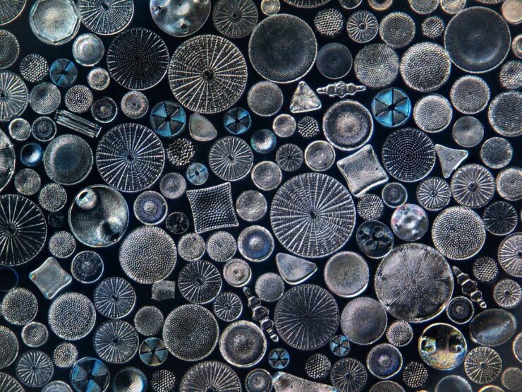
“Big Diatom Stack, Edit 2.” Photograph by Jon McCormack.
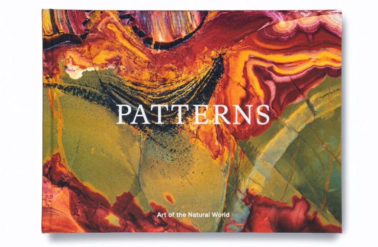
“In the words of Georgia O’Keefe, to see takes time,” says photographer Jon McCormack. His new monograph, “Patterns: Art of the Natural World,” is a “beautiful visual love letter to nature and all its intricate patterns, from microscopic and rarely-seen to vast and majestic,” writes PetaPixel.
Patterns cover.
McCormack’s photographic journey, which started with a hand-me-down film camera in the rugged, rural Australian Outback and has taken him all over the world to — get this — the iPhone camera software lead at Apple. (The man has a clue, ladies and gentlemen.)
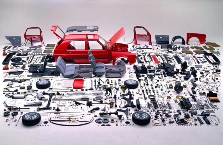
1988 Volkswagen advertisement. Photograph by Hans Hansen.
…aren’t quite what you might expect — but might be something you remember, like the above VW spot from the ’80s (which triggered a memory of the awe experience upon first seeing that collection of, well, parts).
“Hans Hansen is not necessarily well known to anyone but the most studious of photographic historians. Throughout a long career, the self-taught German photographer has quietly carved a niche as a master of still life and commercial image-making. His work explores colour and composition, as well as drawing lessons from modern artistic movements, resulting in some of the most striking and memorable product images of the 1970s, 1980s and beyond,” Wallpaper*writes.
X-Ray Microbus. (Don’t ask how.) Photograph by Nick Veasey.
Over at The Autopian, Jason Torchinsky writes: “Seriously! Full-scale X-rays! Of cars! Using five X-ray machines and/or a massive German-sourced X-ray machine, in a studio that features 30-inch-thick walls, British artist Nick Veasey took X-ray images of so many cars, and they’re stunning.”
Have a great rest of your Spring, everyone!
1
Entrants had to have no more than one year of paid creative experience, and 60% of those on this year’s shortlist were students.
This month, some optimism, some interesting books, some creative fonts, and some fantastic photos, and somepositivity — plus a smidgen of pessimism — in the form of Adobe.
On the whole, it’s mostly optimism, promise. And there’s butter. And a sleeping fox. And duck.
This month’s Spine
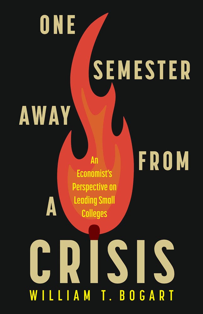
Rutgers University Press. Cover design by Ashley Muehlbauer; production editor, Vincent Nordhaus.
“Our initial direction for [the designer] was to create a clean, simple text design that conveyed crisis, dread, or the element of threat,” this title’s production editor said in response to my request for information.
“To say that someone lit a fire under those directions is an understatement,” I wrote in this title’s commentary. “In today’s American academic reality, where every day could indeed be … shall we say, fraught, this cover takes the brief and runs straight onto the dean’s list.”
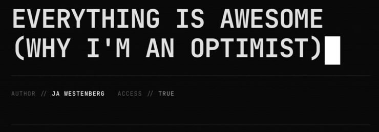
Joan Westenberg (previously) has another great essay up about the AI doom loop — why it’s easy to believe that the downward spiral is tightening, to roughly paraphrase — and why she believes it just isn’t true:
In 1810, 81% of the American workforce was employed in agriculture. Two hundred years later, it’s about 1%. If you had shown someone in 1810 a chart of agricultural employment decline and asked them to model the economic consequences, the only rational projection would have been apocalypse. Where would 80% of the population find work? What would they do? How would anyone eat if the farmers were all displaced by machines?
The answer, of course, is that entirely new categories of work were created that no one in 1810 could have conceived of, and these new jobs paid dramatically more than subsistence farming. Factory work, office work, services, knowledge work, the entire apparatus of modernity: none of it was visible from the vantage point of the pre-industrial economy.
— Joan Westenberg, “Everything is Awesome”
“The transition was brutal and uneven. [People] suffered,” she writes. “But the trajectory was real, and the people projecting permanent immiseration […] were, in the fullest sense, catastrophically wrong.”
The essay isn’t perfect; it’s too long, and the editor failed to catch a few typos (he said, hypocritically). But … it scales. Zoomed out, it applies to more than AI.
“The doomers may have the best stories. I believe the optimists have the best evidence,” she concludes. I agree. Or, at least, I’d like to.
Scripting News has been around since ’94 and if you’re even a little interested in a free web, his site is a fine place to start learning how you can contribute to keeping it free.
Note:scripting.com is, famously, still non-https — which means that if you click on either of the above links you’re likely to get a warning that the site isn’t secure. It’s very much a safe link.
Book notes, x3
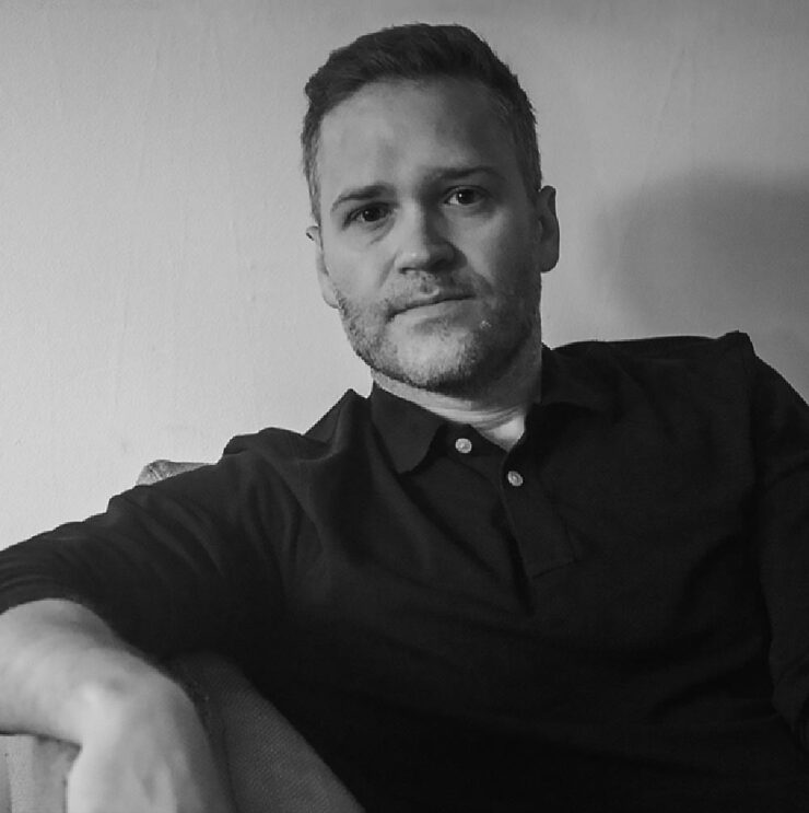
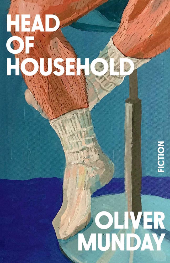
Oliver Munday, Head of Household
Somehow, I expected someone older. (Courtesy of Debutful.)
Nearly every one of his book cover designs could be called an instant favorite. He has a wry, brief expression that often delights.
So, when he wrote a book, did he do the cover? Well … no, as it turns out — and he preferred it that way.
Cover design by Chris Brand.
Munday’s collection of stories has an interesting cover by industry veteran Chris Brand, and I like it — although some of the alternatives seem to me like better fits for Munday’s take on life.
But, of course, that’s the point: it’s not about him, it’s about his book.
No, it doesn’t soften when left out — or spread any larger meaning. It’s just a great book cover (and jacket).
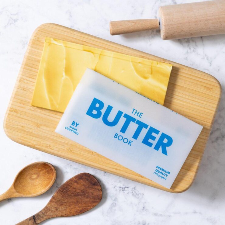
Chronicle gets a kick out of “things that look like other things.” We made a notepad called Pad of Butter that has been selling steadily since 2015. So, imaginations did not need to stretch when a butter-focused cookbook with a vellum jacket was proposed. It’s our “bread and butter,” so to speak.
— Q&A with author Anna Stockwell and designer Lizzie Vaughan, PRINT
“It’s important to find joy wherever you can these days and it’s hard to hate on butter,” the article says. Read the rest at PRINT.
“Naïve” design
Image courtesy of the LA Times.
The LA Times examines the latest book design trend: naïve design. (Yes, I pretentiously style that like the New Yorker does. The LA Times does not.) It’s where serious subjects wear … nostalgic cover designs, to use a phrase. Find out why.
Parenthetically, of the covers mentioned in that article, only one — by design legend Na Kim — has found its way into my 2026 Favorite Covers folder. It’ll be a minute, but stay tuned to find out which.
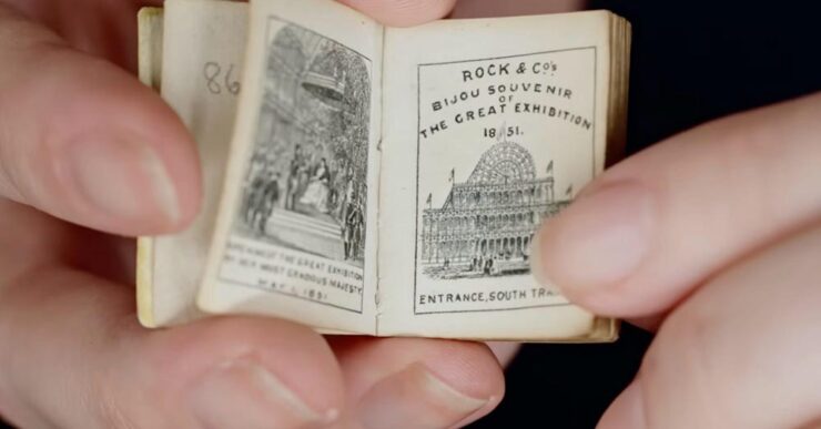
Special bonus #1: “You’ll need a magnifying glass to read these,” says This is Colossal:
Courtesy of the V&A Museum.
Special bonus #2: A favorite collectible (and slight tangent), these books “keep a lost design legacy alight,” says It’s Nice That:
CreativeBoom‘s regular feature contains sixteen choices this month — awesome! — but I’d like to just highlight my three favorites:
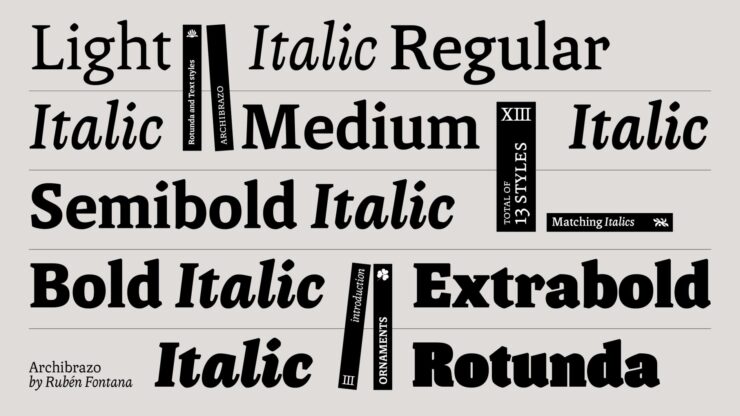
Archibrazo by Rubén Fontana.
“Rubén Fontana is one of the most respected figures in Latin American type design, and Archibrazo, released through TypeTogether earlier this year, represents a characteristically considered piece of work. The typeface brings together two traditions that might seem at odds: the fluidity of calligraphic practice and the hardness of sculptural form. The result is a serif family that wears its sources with confidence, without collapsing into historicism or affectation.”
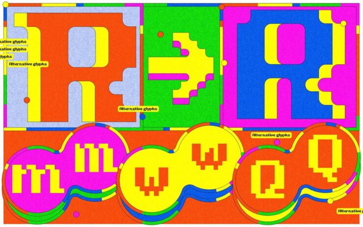
“Djaggety began in a classroom. Alessia Mazzarella of Typeland, who teaches type design to BA Graphic Design students, uses an 8×8 grid exercise as a standard introduction to letterform construction. The constraint, she explains, strips away the paralysis of infinite choice and forces students to focus on what makes a character recognisable within a tightly defined system. During one iteration of the exercise, she found herself drawn into the process rather than simply demonstrating it. […] Overall, it’s a good lesson in how constraint can generate, rather than foreclose, creative possibilities.”
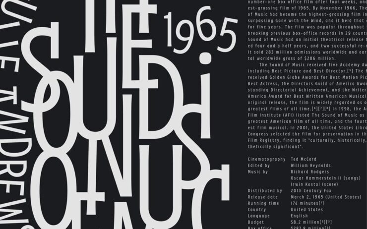
“After three years in development on Future Fonts, Fred Wiltshire’s Musikal has reached v1.0: a significant milestone for a typeface that began with a conscious act of divergence. Herman Ihlenburg’s Obelisk (1880s) served as the starting point: a high-contrast, ornamental display face of considerable geometric rigour and decorative confidence. Rather than reviving Obelisk directly, Wiltshire took its ‘playful nature’ as a conceptual springboard and built something clearly of the present.”
Letterform Archives’ new celebration of hand-painted type
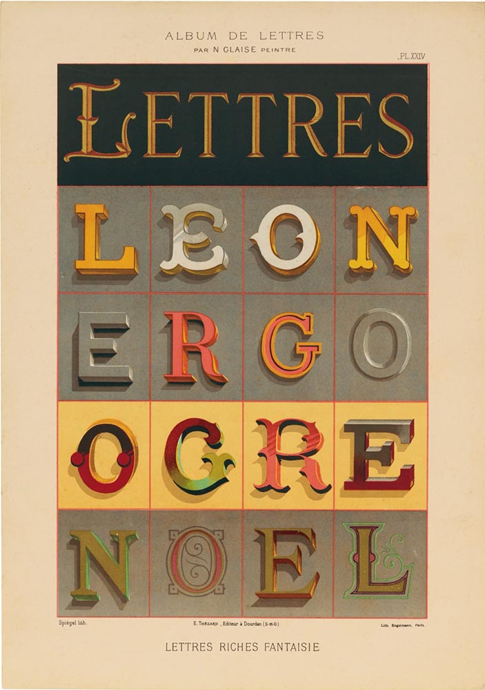
One example — I mean, who can argue with “Lettres Riches Fantaisie“?
“A new book published by Letterform Archive, Lettres Décoratives: A Century of French Sign Painters’ Alphabets, celebrates the vivacity and timelessness of French sign painting from the 19th and early 20th centuries. Compiled from lithograph portfolios, which range from 1875 to around 1932, the volume includes more than 150 full-color reproductions of these bold lettering samples. These portfolios once served as catalogue-like albums, providing inspiration for styles and motifs that could be translated onto large billboards and small signage alike.”
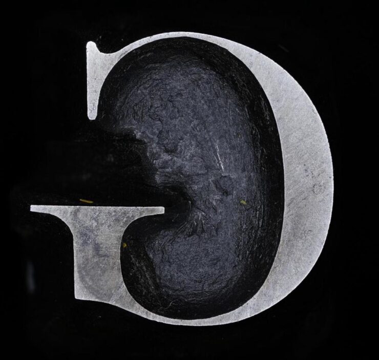
“John Baskerville was an influential 18th-century printer and type designer; you’ve probably used (or at least heard of) the Baskerville typeface. Cambridge University has the original punches used to create his signature typeface and has made high-res digital photos of them available online,” Kottke writes. “[S]eeing close-ups of the actual cut & shaped metal from 1757 is something else.”
In case you’re not familiar:
The typographic punch is the initial design for the letterform and one of the first of three stages in the manufacturing of metal type: short lengths of steel onto which his letters were cut in reverse and in relief. The punch was ‘tempered’ to increase its toughness and enable its use as a tool. Secondly, the punch was struck into the surface of a softer piece of metal (copper), leaving an impression of the ‘right-reading’ character to be cast. This was called the matrix. Finally, type was manufactured when the matrix was passed to the type-caster and inserted into a mould, into which molten lead-alloy was poured. This produced a cast of the type in relief and in reverse which were then arranged to create a text block and once inked, paper could be pressed against it.
Not just hi-res photos of punches for various sizes of type, either: some have 3D versions. Very cool.
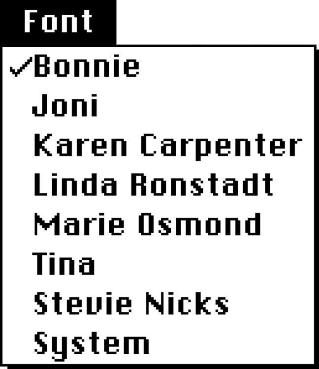
Special bonus #3: The menu that never was:
World Class Female Singers.
Okay, okay, that’s not actually an unused menu from before Apple’s Macintosh was released in 1984, but how it came about isn’t something I’m going to quote. Instead, I’m just going to ask you to read it in full — it’s fantastic.
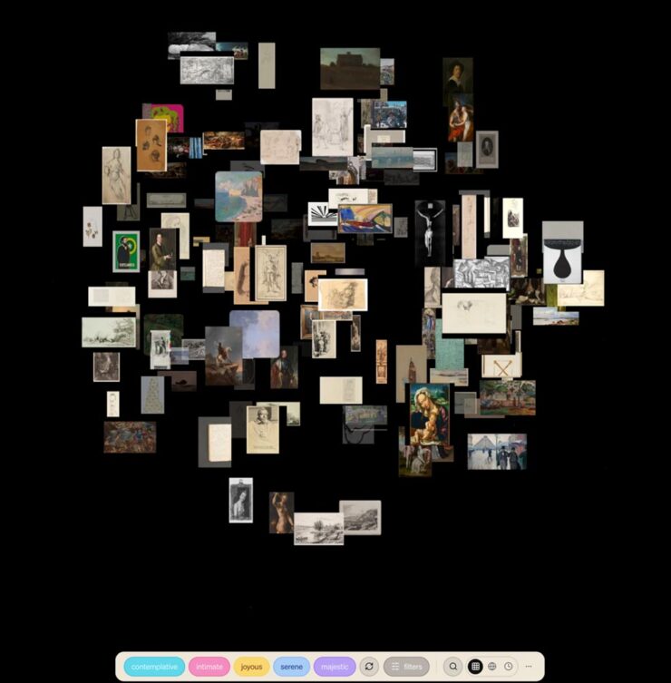
“The Tenth Muse is an art discovery engine. Over 120,000 artworks from museums and institutions — searchable by feeling, mood, atmosphere, era, and medium.”
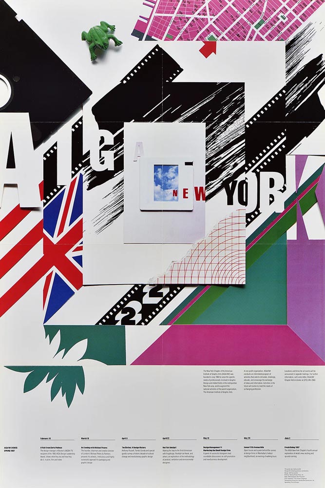
Just one example of the many posters now available for your persual.
“A 50-year goldmine of design: AIGA New York unveils its poster archive to the public,” It’s Nice That reports. “A newly opened window into its design archive, this unique visual library provides the public with an inside view of the design, art and activism that’s emerged from the city’s recent history. AIGA NY has ambitions for the collection to become physically accessible with an accompanying book that will showcase the posters in more depth.”
Adobe, yet again
DNG now standard
Let’s start with the positive:
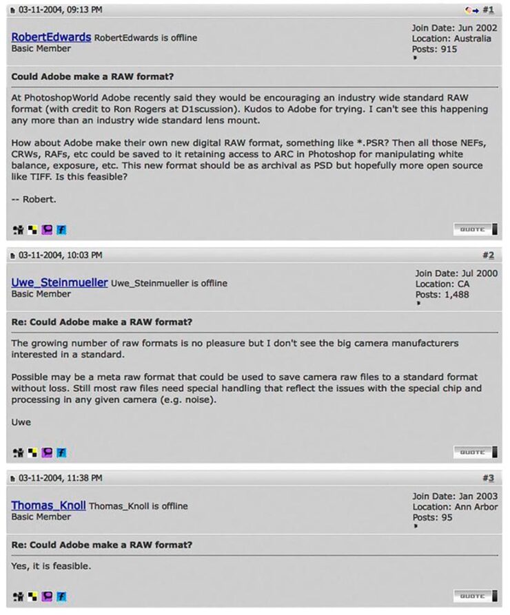
“In March 2004, Australian photographer Robert Edwards asked a simple but meaningful question on Rob Galbraith’s now-defunct photography forums: ‘Could Adobe make a RAW format?’ The answer was very much ‘yes,’ and Adobe announced the DNG format, or Digital Negative, later that same year. Now, more than two decades later, DNG is now the official standard under the International Organization for Standardization (ISO),” PetaPixelwrites.
From back in the day.
I remember lurking on Rob Galbraith site. Such were the importance of his forums — and, for that matter, the overall size and condition of the ’net in the early Aughties — that Thomas Knoll himself, one of the creators of Photoshop, would post there.
In case you’re not familiar, a camera’s RAW file is what the sensor sees at the moment of exposure, stored in a format for later editing. It’s completely different from a JPG file, which has all the camera’s choices baked in to the final image. Sports or journalism photographers usually shoot JPG, due to the need to post immediately; social media photography is, of course, its own animal.
Most fine photographers — that is, folks who shoot for art or pleasure, including your author — only shoot RAW, because it gives you maximum flexibility in “look.”
I’m honestly not sure how much of a difference this will make, but it’s nice to see DNG accepted as a standard — and it’s an example of Adobe meaningfully contributing to the bigger picture.
Train Adobe’s AI on your style
From the “mixed” department:
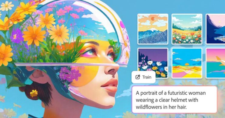
It’s not tin foil.
Adobe has launched Firefly Custom Models, “allowing artists to generate image variations that ‘more consistently reflect’ their own style, subject, or characters.
Adobe’s Deepa Subramaniam says, “Today, we’re expanding access to Firefly custom models, which let you turn your creative style into a reusable model trained on your own images. In this public beta release, custom models are optimized for ideation in character, illustration and photographic style.”
The goal of Custom Models, according to PetaPixel, is to “allow artists to train Adobe’s Firefly AI specifically to unique workflows so that when it generates content, it is more aligned with their specific style.”
Hmmm. How ’bout practical effects? Seriously, this might turn out to be useful. Time will tell. Helmet of tin flowers and all.
CEO retires. Stock … down?
Here’s where the attitude sneaks in: most of us, present company included, are sick of Adobe’s attitude towards its customers.
“Adobe’s longtime CEO, Shantanu Narayen, announced this week that he is stepping down after 18 years as CEO and nearly 30 years at the company. If you ask shareholders, Narayen was, for a long time, among the very best in the biz. If you ask Adobe’s core customers, the artists who were once indispensable to the company’s success, it’s a different story,” writes Jeremy Gray in an opinion piece for PetaPixel.
Adobe made more than $7 billion in net profit last year, a clear win for shareholders. This is due to their choice to treat creatives as a profit center. But their stock is down because their AI efforts have fallen flat — Firefly is way behind Midjourney or Gemini — and the planned additional profit center has failed to materialize.
And by “down,” I mean significantly. During Narayen’s tenure, Adobe’s share price increased from around $40 in late 2007 when he took over to an all-time high of $688.37 in 2021. But as of this writing, it’s $243. “Although Adobe and Narayen are painting his departure as entirely the outgoing CEO’s decision,” Gray continues, “it’s easy to wonder whether tumbling share prices had something to do with the transition, or at least sped up existing plans.
“I respect the sheer scale of what he achieved. I admire that he grew Adobe so that it could hire more great workers to build better software. But for me, Narayen’s legacy is ultimately one of treating [creatives] like an afterthought […] using our passion and love for art to boost his brand.”
I understand that Adobe has become one the Internet’s favorite punching bags of late, and I try to distance myself from that sport (no matter the subject). But I can’t help but agree with many of the things expressed in that piece.
Let’s hope that the future bring change, one way or another. For many professionals, Adobe essentially holds a monopoly.
But then, so did Microsoft.
Special bonus #4:Unsung asks, “Why wouldn’t everyone deserve the gift of focus?” He’s talking about the tragically-short-lived focus mode in Photoshop, wherein the user isn’t automatically shown pop-ups or blaring (bleating?) buttons regarding new features.
I mention this because I just uninstalled Acrobat, Adobe’s PDF management program, because I couldn’t turn off the pop-ups, sharing invitations, or requests to add comments. All I wanted was to proof documents, but what I was gifted with was frustration — even anger, on days where a deadline was involved.
Special bonus #5: “A slap on the wrist” is understatement writ large:
“Canceling a software subscription is supposed to be easy — that’s what US law dictates. Adobe, however, has played fast and loose with its Creative Cloud subscriptions in the past. The company was sued by the Department of Justice in 2024 due to its practice of hiding hefty termination fees when customers signed up. The case has now been settled, with Adobe agreeing to a $75 million fine and matching free services to users of its products,” Ars Technica writes.
The company doesn’t admit to violating the law. “While we disagree with the government’s claims and deny any wrongdoing, we are pleased to resolve this matter,” Adobe said in a statement.
March photo round-up
Okay, let’s switch gear and end with inspiration — even happiness.
International Garden Photographer of the Year 2026
Yes, you read that right: there’s an international contest for the best garden photograph. (If you want hard-hitting stuff, see Sony’s awards. There’s enough “news” in the world, so….)
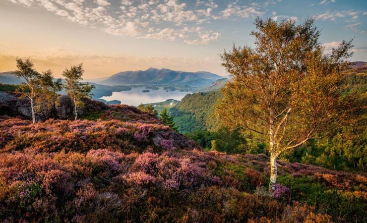
Grange Fell Last Light. Overall Winner. Photograph by Mark Hetherington.
Soothing. The image also earned first place in the Breathing Spaces — more soothing —category, and was captured in Borrowdale in England’s Lake District; the “photograph shows heather, silver birch trees, and the warm light of sunset viewed from Grange Fell,” PetaPixel writes.
Asleep at the Wheel. Winner, Urban Wildlife. Photograph by Simon Withyman.
It’s a shame these are still photographs. Hearing a red fox bark in a British accent would be a hoot.
Standing Tall. Winner, Animal Portrait. Photograph by Alastair Marsh.
Proof that excellence in photography extends to all parts of the realm. See all twenty-one winners at This is Colossal or PetaPixel.
London Camera Exchange Photographer of the Year 2026
Last of the items originating in the UK this month, although the excellent photographs within aren’t limited to just those countries. Some examples:
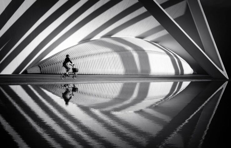
Crossing the Curves. Winner, Street. Photograph by Helen Trust.
“A lone cyclist moves through sweeping arcs of light and shadow at the City of Arts and Sciences. Reflections echo the architecture’s rhythm, momentarily aligning human motion with structure, symmetry, and space.”
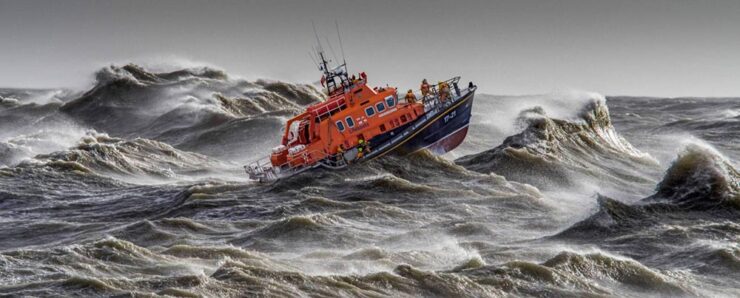
Saving Lives at Sea. Winner, Action. Photograph by David Lyon.
“Captured from the shore, during a regular Newhaven training exercise.”
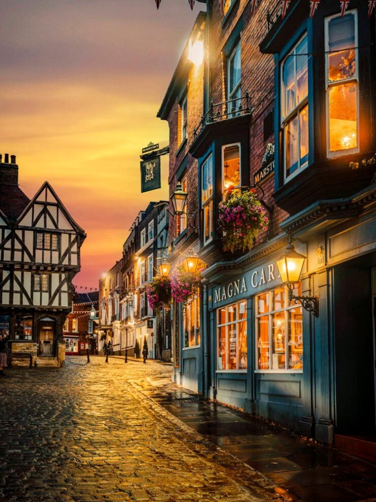
Magical Uphill Lincoln. Winner, People’s Choice. Photograph by Andrew Scott.
“This image was taken during golden hour in Lincoln. The image captures the historic streets and architecture of Lincoln as a golden sunset sets in. […] The golden glow of the sky, cobbles and light from the window add that extra dimension in terms of how the overall image works as a result.” (The description somehow missed “soothing.”)
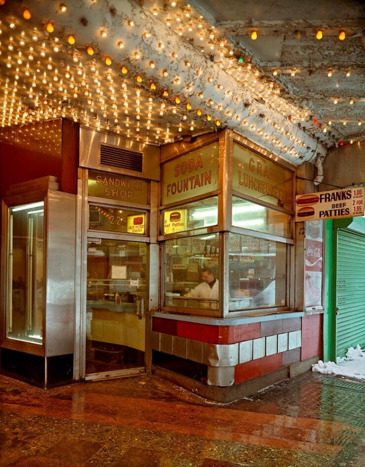
“Known for his atmospheric photographs of landscapes, interiors, and urban centers that feel mysteriously locked in a not-so-distant past, Andrew Moore’s enigmatic images invite us into a slippage of time,” This is Colossal writes.
Grand Luncheonette, New York, 1996. Photograph by Andrew Moore.
Not only great, but currently on display: Moore has a solo show running at Atlanta’s Jackson Fine Art. (Update: The show ended March 21st, darned it. I’d have gone if I’d read that properly.)
Cinematic plastic
No, not current events — something better:
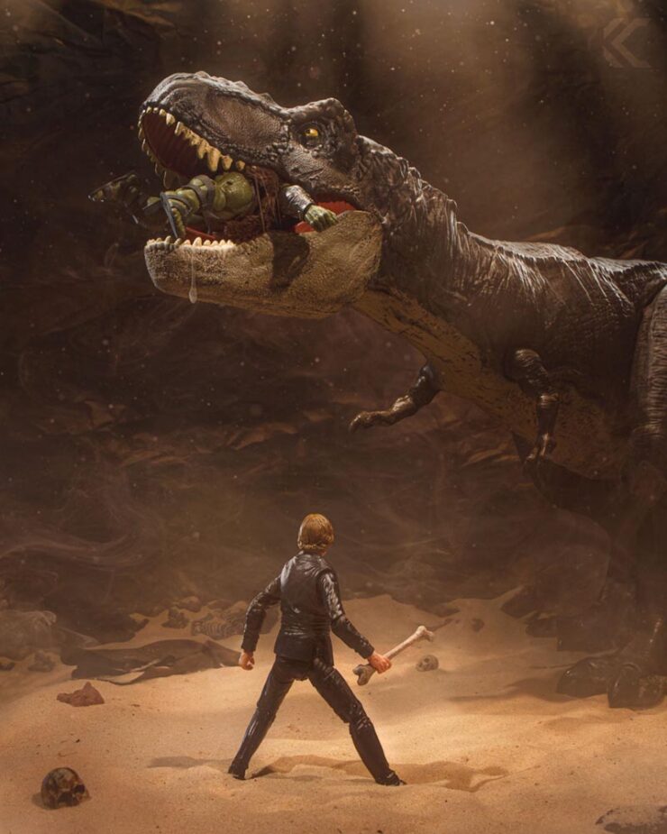
Jurassic Pit. Photograph by Chuck Eiler.
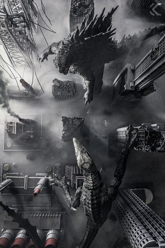
“Chicago-based photographer Chuck Eiler transforms action figures into cinematic, story-driven miniature worlds that blur the line between toy photography and film. Through meticulously crafted sets, practical effects, and careful lighting, he creates immersive scenes that bring nostalgia and storytelling to life,” PetaPixel writes.
Apex Predators. Photograph by Chuck Eiler.
Awesome. (And available as prints, in case you want for your sandbox walls.)
Finally: duck this
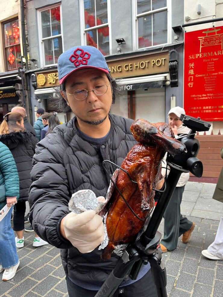
Last month saw the incredible fresh pasta camera. Well, in case you think I only recommend a vegetarian lifestyle, there’s…:
Presumably, he throws a fresh camera into the oven every time he needs one: “I will continue making Duckcam while I travel, so next time when you see a person with a roasted duck on a tripod, please say hello to me.”
The first photostroll downtown this year involved some new gear, an extremely sharp and astonishingly compact wide-angle zoom from Sigma. I’ve wanted something wider that the 35mm-equivalent that is my daily driver for a minute now, and this absolutely fits the bill.
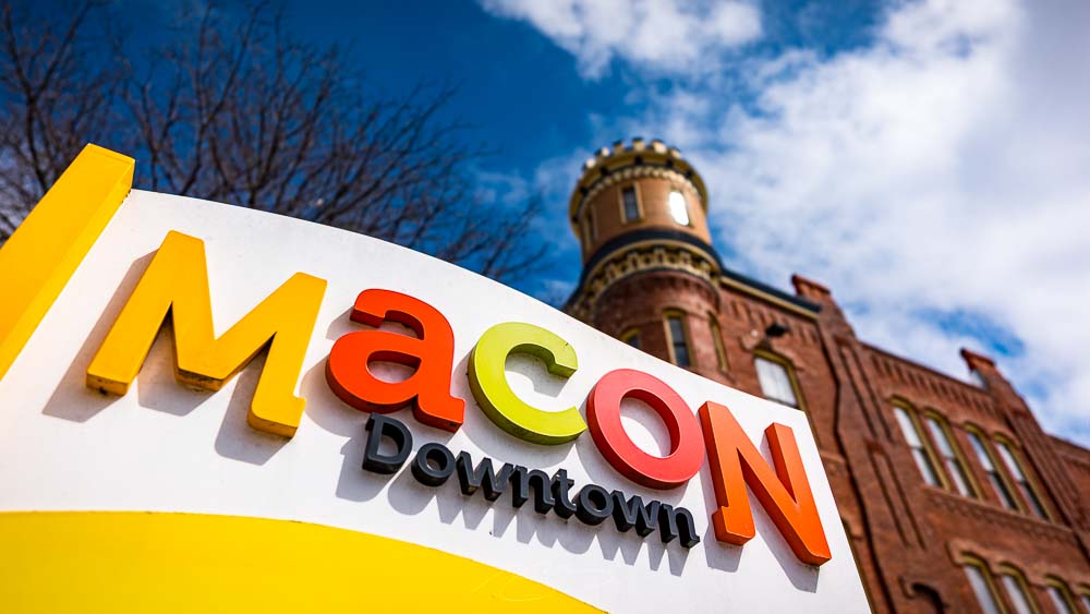
It also gave me an excuse to see a couple of new and updated spots in Macon:
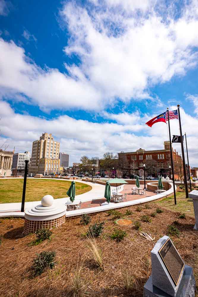
Rosa Parks Square (Memorials and Seating), Poplar and First Sts.
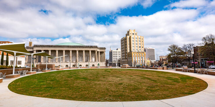
First up is the refreshed completely redone Rosa Parks Square, now with extensive hardscaping, seating and more — a much needed change to one of the most important areas in the city, right next to the City Auditorium and downtown’s Hotel 45:
Rosa Parks Square (Circle), Poplar and First Sts.
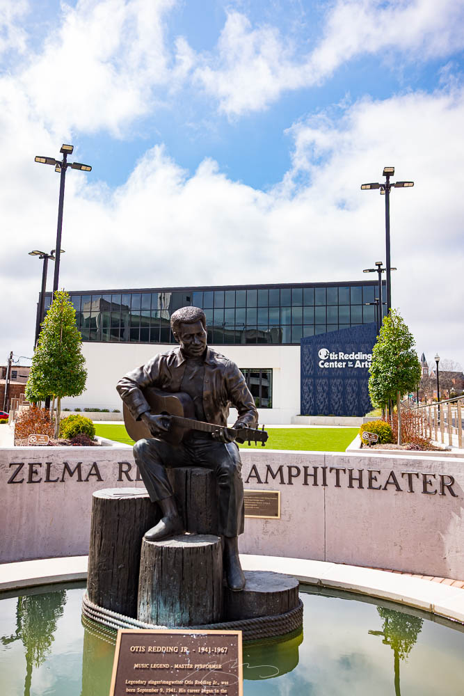
Also completely new is the Otis Redding Center for the Arts, a refreshingly contemporary building with its own new landscaping and gardens:
Zelma Redding Amphitheater (with Statue), Cherry St. and First St. Ln.
It’s a pleasure to be able to get a huge amount of detail, landscape, and space into a single photograph; the wide-angle itch is well and truly sated. Better still, when asked to focus on details, it shines very brightly indeed:
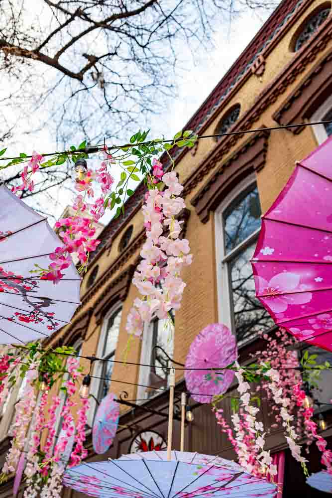
Cherry Blossom Festival Decor (#1), Parish Seafood, 580 Cherry St.
It does retro well, too:
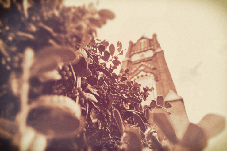
St. Joseph’s Catholic Church (Spire), 830 Poplar St.
So, ask me how I feel about this upgrade. Well, how ’bout this:
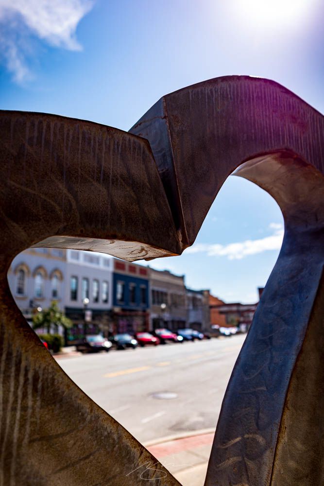
I Heart Downtown (Sculpture), Second St.
Sigma got this lens just right. Including the seven posted here, a total of 30 new photographs have been added to the Downtown Macon (2022-2026) gallery.
Note: Once you’re in the photo gallery, the new items are near the middle of the stack — look for the retro photo from this post and it’s the photos that follow. Remember that you can click on any photo to enlarge to a single photo with locations/titles and next/back controls (or run a slideshow). If you’re in a downtown Macon mood, don’t forget the 2008–2018 and 2020–2021 galleries as well. Thank you!
This time: authenticity fake and real, practical photography, and lots more goodness — things you can connect with. Enjoy.
This month’s Spine
University of Kentucky Press. Cover design by Dominique Jones.
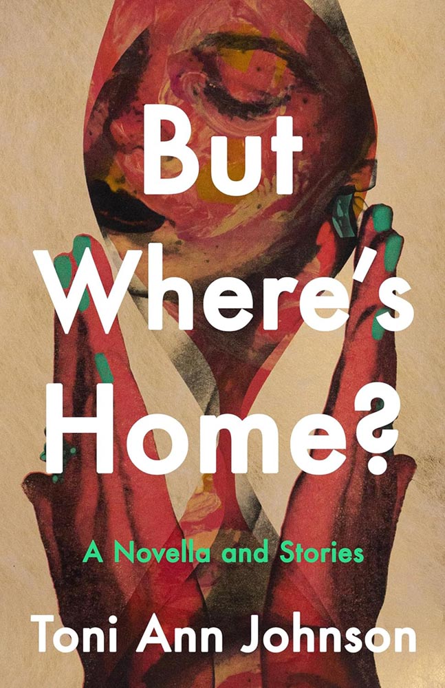
“[T]his collection of connected stories is about a Black family moving to and living in a very white New York town — begging the question that is the title. This is supported by an absolutely superb cover, whose painterly qualities and expert composition evoke emotions and make potential readers want to seek answers,” I said in this month’s University Press Coverage.
“There’s well-done, and then there’s next-level. This is definitely the latter.”
But Where’s Home is one of fifteen covers highlighted this month. Check it out.
Also in book design
While we’re on subject of Spine, Linnea Gradin posted an article — she’s usually a writer for Reedsy — about design trends for ’25 and predictions for this year.
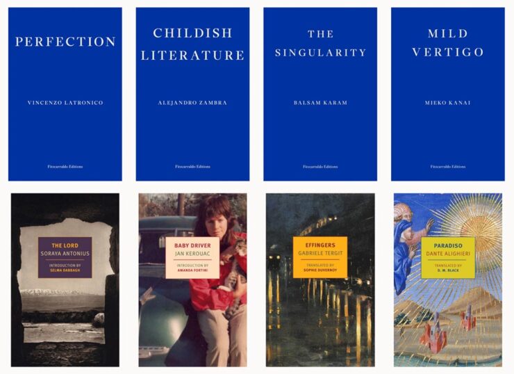
A selection of titles the article calls, “The Serialized Standalone.”
I didn’t devote much time to book design trends in my annual Favorite Book Covers post, so if you’re not familiar with what’s hot in book design at the moment, this article could be worth a moment of your time.
That’s not to say trends aren’t important. I completely (begrudgingly?) acknowledge trends exist and definitely drive design, from book design to logos; however, like so many things these days, trends seem to beare about chasing social media — and I’m not going to celebrate popular opinion when I can celebrate excellence.
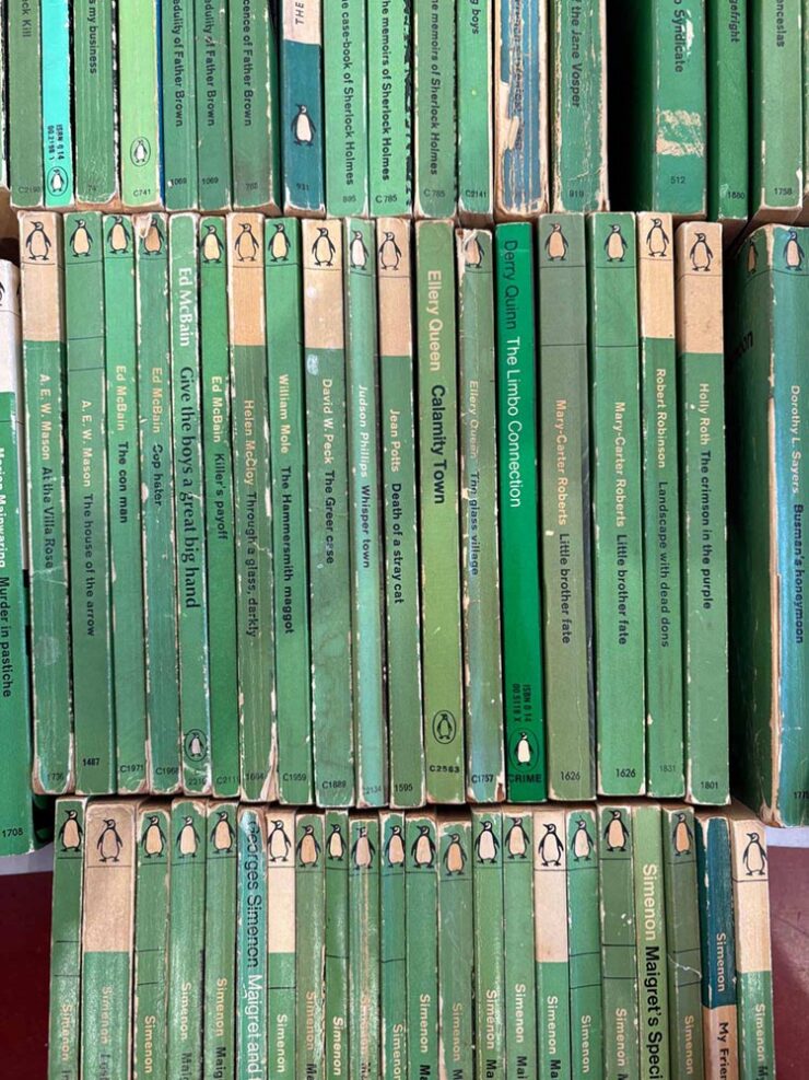
A selection of 1960s Penguin crime novels.
Meanwhile, Jason Kottke posted a link to The Case of the Green Covers, a risograph-printed zine that documents the history of the “Green Penguins”, “a series of hundreds of crime novels published with green covers by the UK publisher Penguin in the 1960s.”
After years and years of doggedly collecting what are commonly called “Green Penguins,” a series of hundreds of crime novels published with green covers by the UK publisher Penguin in the 1960s, I’ve both mounted an exhibition of the collection, and created a zine that documents the history of the books, their design, and the designers that made them. The content in the zine is an expansion and re-crafting of the writing I did about these books here, on the Justseeds blog, for my old Judging Books By Their Covers series (you can read those HERE).
— Josh MacPhee, Justseeds
Great stuff. If you’re in Philly, go see the exhibit — “held at Tomorrow Today, a very cool art & politics bookshop that recently opened,” Josh writes — but if not, the zine might very well be fun.
Special bonus #1: It’s Nice That highlights a new title from the British Design Council:
Tucked away in a Manchester Metropolitan University archive lies 22,000 photographic slides of iconic British post-war design, ranging from the grand (a high-speed passenger train, for example) to the seemingly inconspicuous (plush bean bags and stackable ashtrays). These 35mm slides were made between 1948-1994 by the UK’s Design Council […] as a means of cataloging and preserving the UK’s design history, alongside a select handful of items from abroad. Now, Projecting British Design, a book published by the modernist, documents a selection of 100 of those slides — in the process demonstrating the vast array of objects that have changed the way we live.
— Olivia Hingley, It’s Nice That
I do wish the collection were online, but the post is cool — there are a bunch of examples — and the book will be fun for aficionados of British design, no matter the era.
Faking analog
Elizabeth Goodspeed, by now a regular here on Foreword, has a new column up at It’s Nice That, in which she posits on imperfection as a design strategy: “Faking ‘realness’ on a computer doesn’t get us anywhere new.”
By now, the central point — “[f]or every person declaring that analogue is back, there’s someone offering the same explanation why: AI and other digital tools have made perfection cheap, fast, and easy, so imperfection now signals authenticity” — is generally accepted in design circles. (See comments regarding trends, above.) But she asks a better question: “But if analogue only matters as a foil to the digital, why are analogue aesthetics being embraced without analogue tools?”
She provides a lovely — and classic — graphic.
“[T]his suggests that what’s being described as an “analogue revival” is less a material shift than a semiotic one. Terms like “handcrafted” no longer reliably describe how something was produced, but how an image wants to be read. Whether something was made with ink, a brush, or film often seems secondary, if it matters at all. What’s actually taken on weight is the idea of analogue, and the set of values now projected onto it.
As ever, the blame doesn’t fall on artists (or even the people selling texture packs). The practical reality is that most people no longer have the time, tools, or support to make fully analogue work, even if they want to. The creative infrastructure that would make it viable – materials access, slower timelines, financial stability – isn’t widely available. Designers and illustrators are stuck in a bind: analogue signals value, but digital is what’s feasible.”
— Elizabeth Goodspeed, It’s Nice That
It’s another case of I-could-quote-the-whole-thing-but-should’t, of course — so please just go read it. Because she’s right: it’s a trend, it’s a response, and it’s something that needs to be recognized. (Additional teasers for the article: a stack o’ pancakes and pre-stained Prada. No mention of who’s wearing it.)
Actual analog
A three-fer for you:
Cover design by Samantha Hahn.
• From Spine, a book cover where analog — that is, actual composition of items, arranged and photographed, won the day. See the other options presented.
A lovely additive-printed stamp from Poland.
• From It’s Nice That, via Kottke: lovely collection of stamps. If you’re into great examples of “graphic design in miniature,” “from the recurring Olympics theme to the colourful modernist designs” — and you can stomach Instagram — you can enjoy daily goodness. If not, there are plenty of still to choose from at the links.
Flyer design by Cat Duncan.
• An identity for Athene Club, a women-centred run and hike club in the UK, designed by Cat Duncan. Done in a style that’s awesomely analog — okay, okay, there might be a computer involved — and started before it became a trend. (Also via It’s Nice That.)
Architecture poster favorites, again
Archinect‘s ongoing series of architecture school lecture posters (previously) highlights examples that continue serve an informational purpose with fantastic design:
Washington University.UTexas at Austin. Yale University.
Although their contest for readers to vote for their favorite closed yesterday, it’s not the winner — it’s that they all pretty much win. See the whole list. (And get a head start with the Spring ’26 posters with one from Pratt.)
February fonts
CreativeBoom‘s usually-monthly roundup of new fonts includes some I’d like to mention — and hopefully use. (Is typeface addiction a thing?)
WG Buttered Crumpet by Jamie Clark Type
Yes, absolutely, the name has everything to do with Wallace and Gromit.
“The finished typeface – Buttered Crumpet – gives Aardman [Studios] a timeless, familiar tone of voice with bundles of charm. It includes over 200 characters, covering all Western European languages, and was designed in a single, carefully crafted weight with room for future expansion,” Clark writes. “As a Bristol-based designer, it was a joy to create a lasting connection with my home city and one of its most renowned creative studios.”
Veloce by Rob Andrews
Yes, absolutely named after an Alfa Romeo.
“Veloce began as a single-weight studio font and grew into something with real range. Clear and neutral, with enough personality to avoid feeling anonymous, it’s a strong choice for both body text and signage,” CreativeBoom writes. “What really sets it apart, though, is the language coverage. […] It’s an unusually thoughtful decision for a debut, reflecting serious long-term thinking about global communication.”
“[A] font born from a spark of energy and a little nudge of mischief. It started as a scribble with attitude, leaning forward like it had somewhere important to be — and honestly, it still does,” Yenty Jap writes on her site. “YJC Volt Swing carries that charged-up spirit into every letter, giving your words a bold voice that feels alive, confident, and just a tiny bit rebellious (in the good, hug-you-after kind of way).”
(CreativeBoom had listed — and spoke well of — YJ Knotted Ink, something completely different, while using pictures from YJC Volt Swing. Oops.)
Special bonus #2:PRINT says, “From DSType Foundry [and] designed by Dino dos Santos in 2025, Ensaio feels like a modular system for book design.” The caption flavor is my favorite — but they’re all awesome.
“Rather than having one set of forms stretch across every application, it’s built into four purpose-built variants: Text, Cover, Caption, and Capitals — acknowledging that the typographic needs of a novel’s body copy are fundamentally different from those of a cover or a footnote,” PRINT says.
“Yes,” this book designer agrees.
BMW Alpina, again
Last month’s Beautifully Briefed mentioned the new BMW-Alpina wordmark. (I incorrectly used the word logo, ’cause someone did in something I read and I repeated it without thinking — sorry). The actual logo, which is to say, the badge you’ll see on the vehicles, the website, and some marketing materials, has now been made public:
Still an exhaust and crankshaft, but in the “flat” style also used by BMW (and countless others — see trends, above).
Parenthetically, BMW has suggested that at some point their logo will be etched into the paint rather than a chrome add-on (as on the concept, below), or possibly used as a backlight on the grille (much more trendy likely, I believe):
From the Vision Neue Classe X concept.
In any case, here’s a before-and-after, courtesy of The Autopian:
MacFilos‘ title for their profile of Italian photographer Marco Ronconi suggests a certain negativity — which, in a way, is true. But in the positive sense.
Face to Face (Arctic Hare). Photograph by Marco Ronconi.
He “masters the art of reducing his images to what is essential. By omitting everything he believes to be unnecessary, even colour, he creates unusual wildlife images.”
An image from the Chiaro | Scuro Project. Photograph by Marco Ronconi.
Special bonus #3: “Berlin-based Italian photographer Paride Ambrogi recently combined two of his loves, photography and pasta, in a brilliant, possibly tasty way,” PetaPixel writes. “Ambrogi made the Ravihole Camera, a working pinhole camera made entirely from fresh pasta dough.”
Al Dente Photography.
SINWP Bird Photographer of the Year 2025
Bird photography is an incredibly specialized skill. So contest winners are usually pretty amazing photographs. These absolutely don’t disappoint:
Photograph by Liam McBride.
“With over 2,200 photographs submitted from around the globe, the SINWP Bird Photographer of the Year 2025 competition has revealed a stunning celebration of avian beauty, from kingfishers and bald eagles to owls, flamingos, and countless species beyond. The diversity and quality of the entries have been truly breathtaking,” a press release reads. The contest benefits the Royal Society for the Protection of Birds, or RSPB.
Photograph by Emma Brooke.
That’s Society of International Nature and Wildlife Photographers, by the way. See more at PetaPixel.
Sony World Photography Awards Open Competition winners 2025
Sony has announced the “10 category winners and the 120 shortlisted photographs from its Open competition, which recognizes the best single images captured by photographers worldwide in the past year.”
Winner, Architecture. Photograph by Markus Naarttijarvi.
Photographers do not need Sony cameras or lenses, only talent — of which there’s plenty.
Shortlisted, Motion. Photograph by Christoph Oberschneider.
As is often the case, I prefer some of the shortlisted photographs to the winners. Like the skier above, or this dystopian, almost science fiction shot from Asia:
Shortlisted, Architecture. Photograph by Utshaho Gupta.
A couple of celebrities, lots of great portraits, and many of nature. That latter category has what’s probably my favorite:
Winner, Natural World and Wildlife. Photograph by Klaus Hellmich.
“The World Nature Photography Awards were founded in 2020 with the goal of not only promoting the world’s best nature photos but also inspiring people to connect deeper with nature,” PetaPixel writes. “WNPA partners with Ecologi to plant a tree every time someone enters the competition as well.”
“Shy but Still Majestic.” Silver, Black and White. Photograph by Ross Wheeler.
“This year’s winning images are a powerful reminder of both the wonder of our planet and the importance of protecting it,” a press release perhaps understates.
“Stoicism in a Sandstorm.” Gold, Behavior — Amphibians and Reptiles. Photograph by Dewalkd Tromp.
Special bonus #4: “My photography boomed when I stopped looking at social media,” Ivor Rackham writes at PetaPixel, with tips and ideas for successful business alternatives aplenty.
Cold and wet — but happy. Photograph by Ivor Rackham.
Interesting comparison to soap operas — or is that soapboxing? You decide, but I’d argue that his photos prove some talent.
The flowers are just starting to come out here in Georgia. May spring bloom for all of you, too. See you soon.

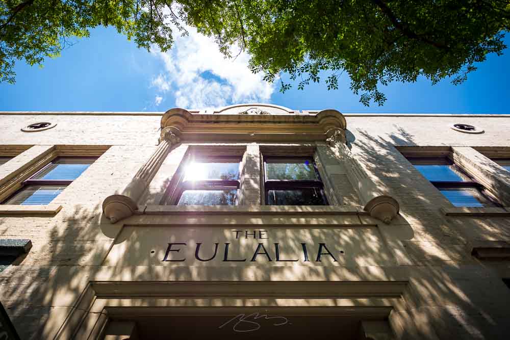
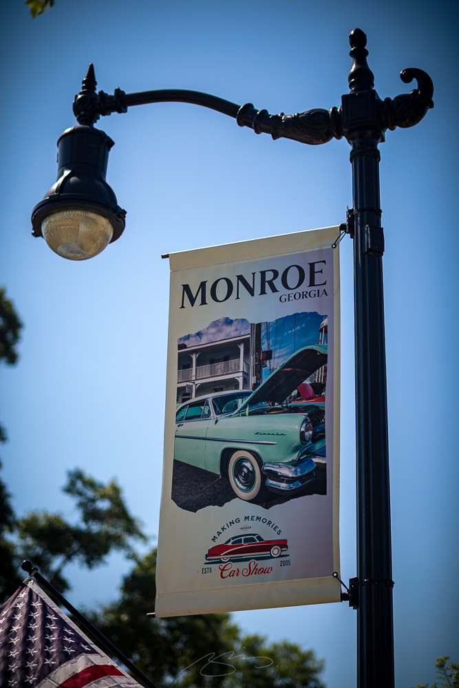
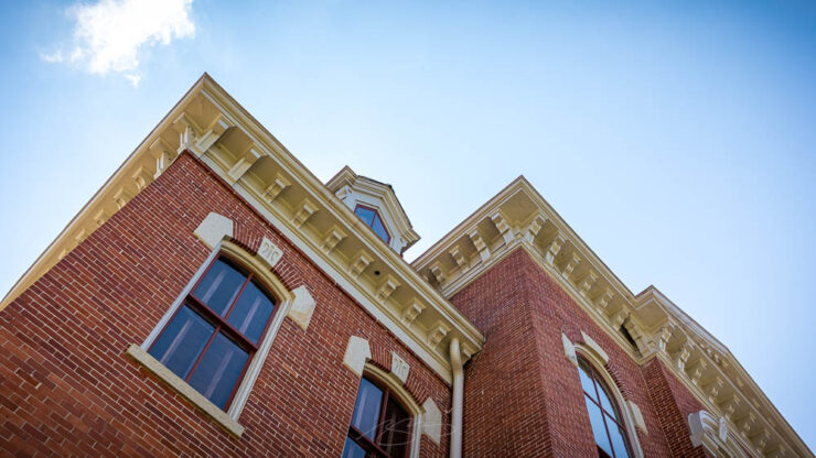
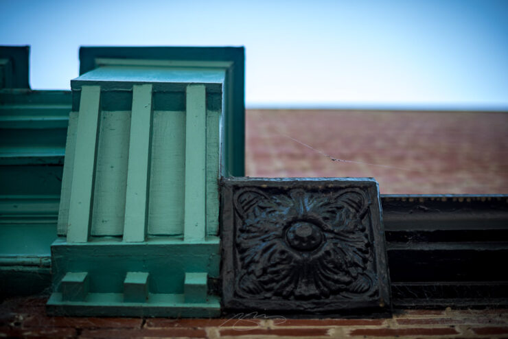
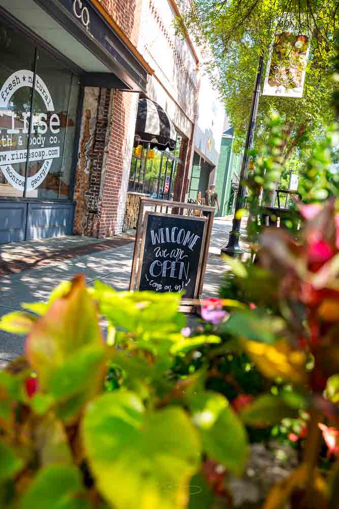
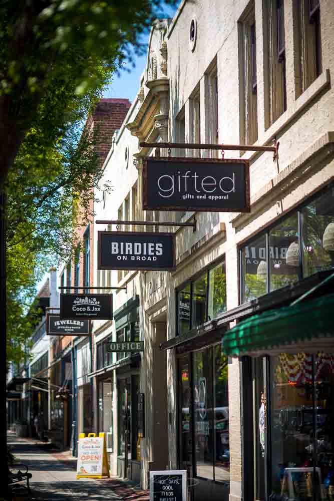
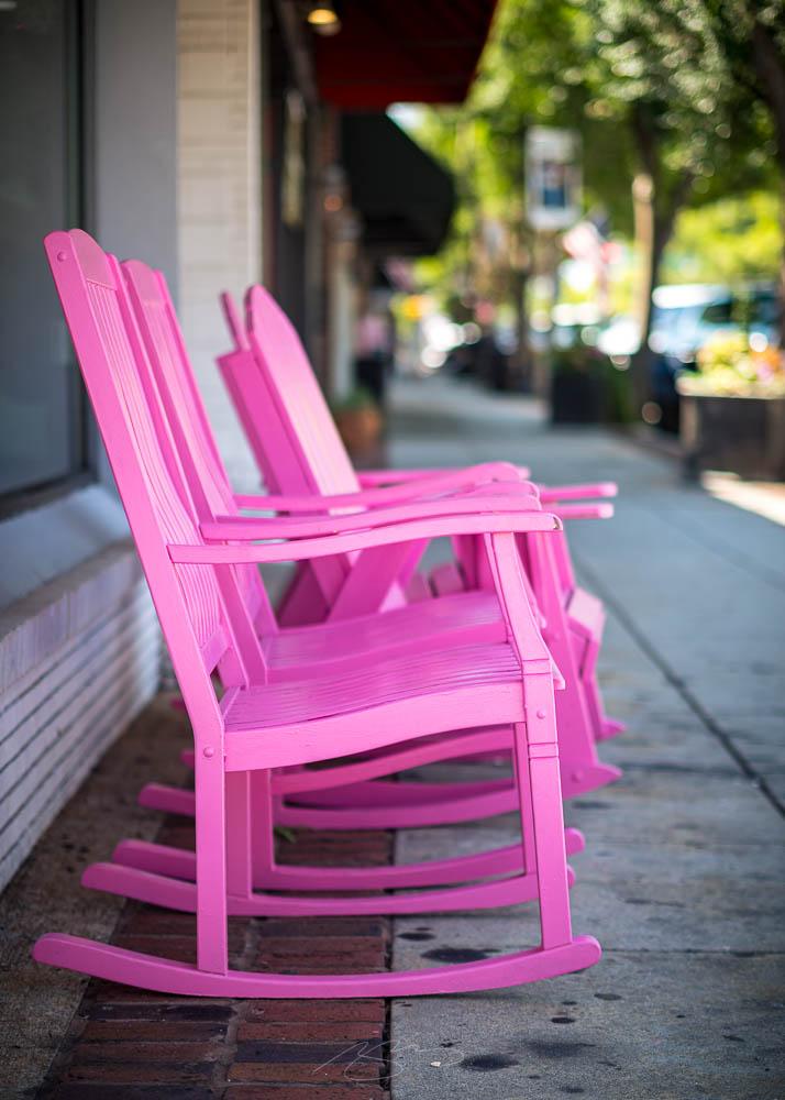
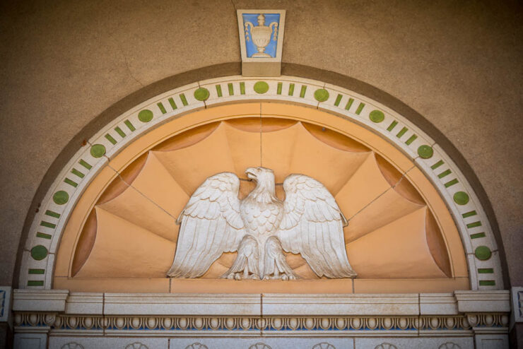
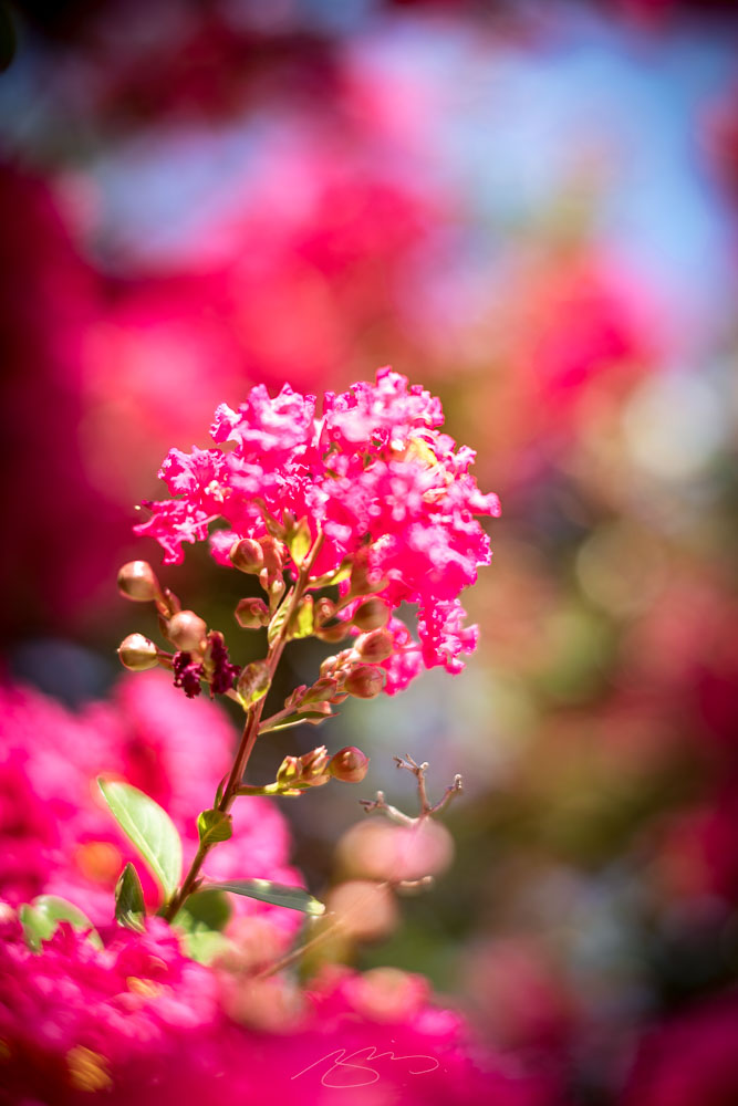
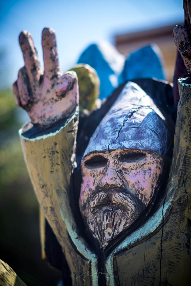
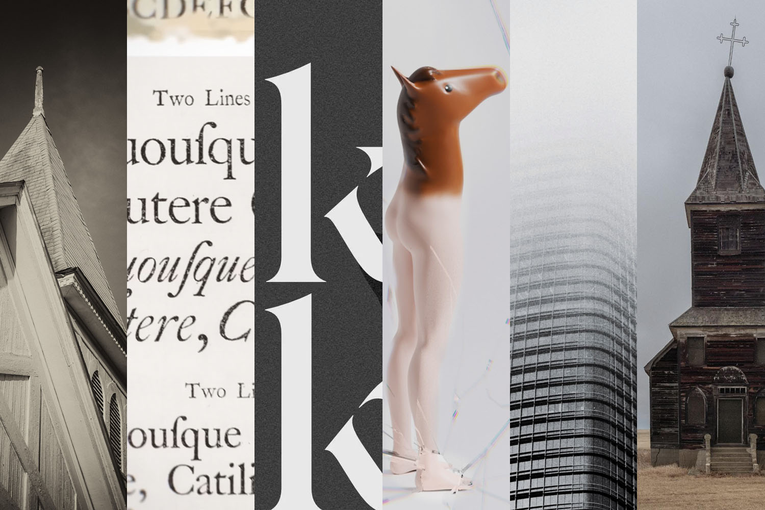

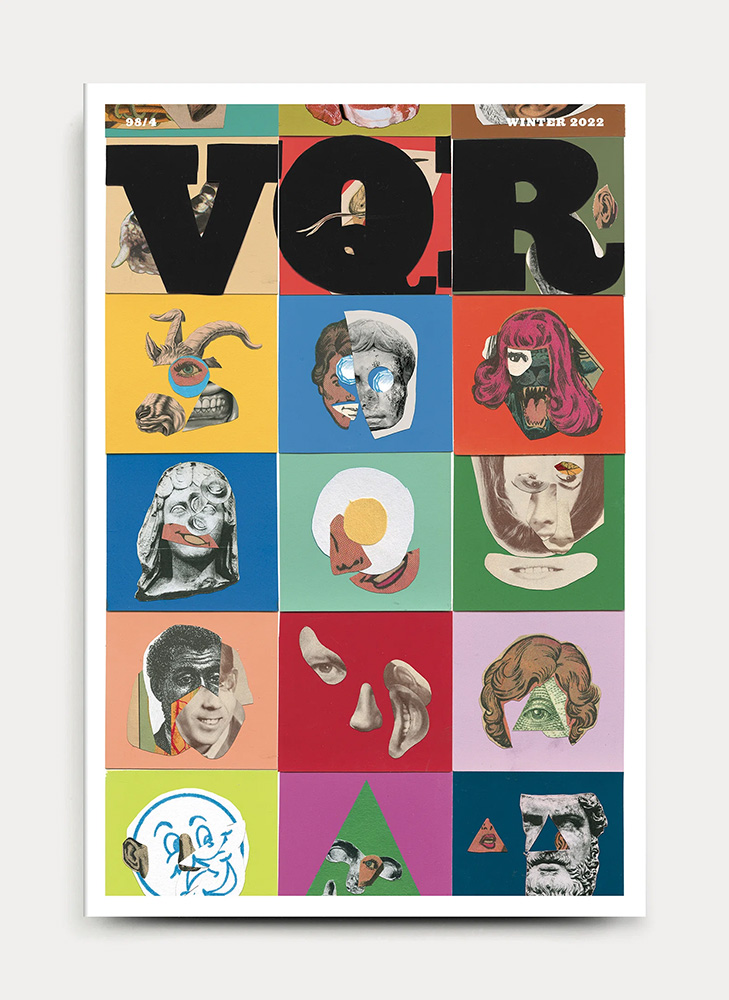
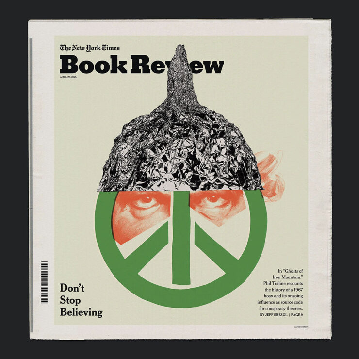
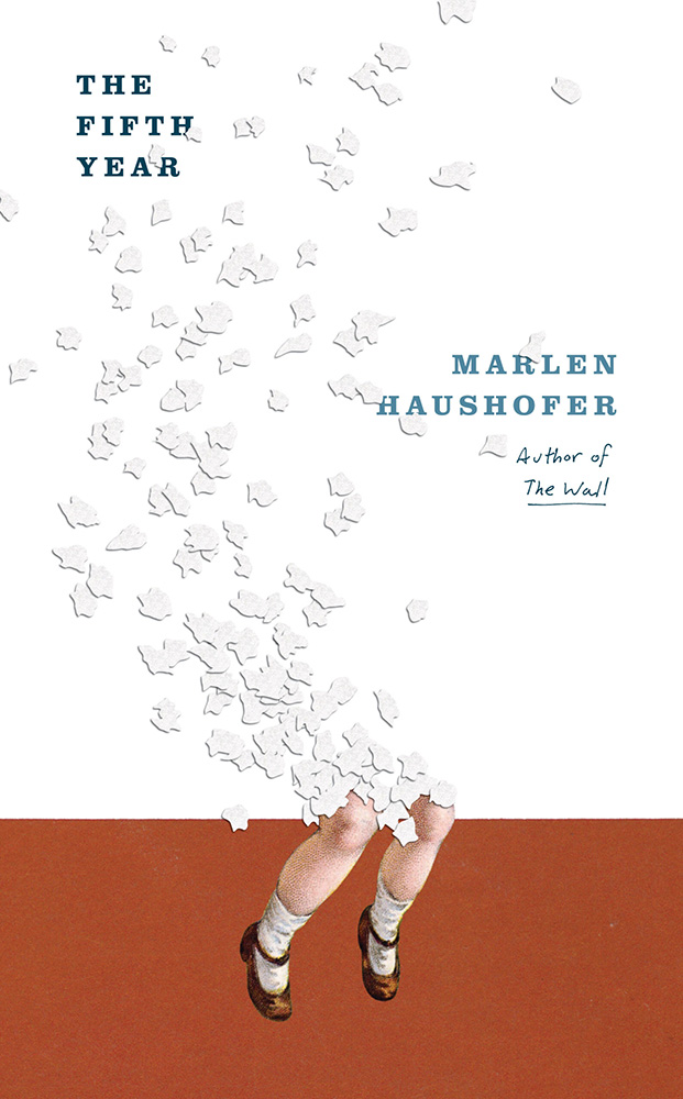
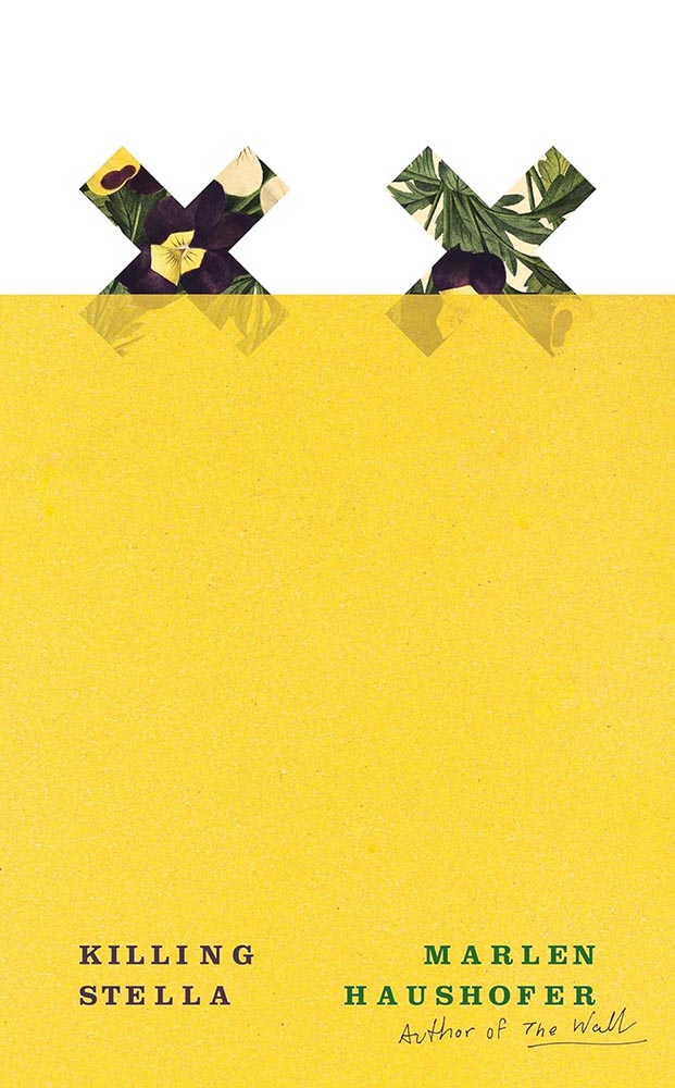
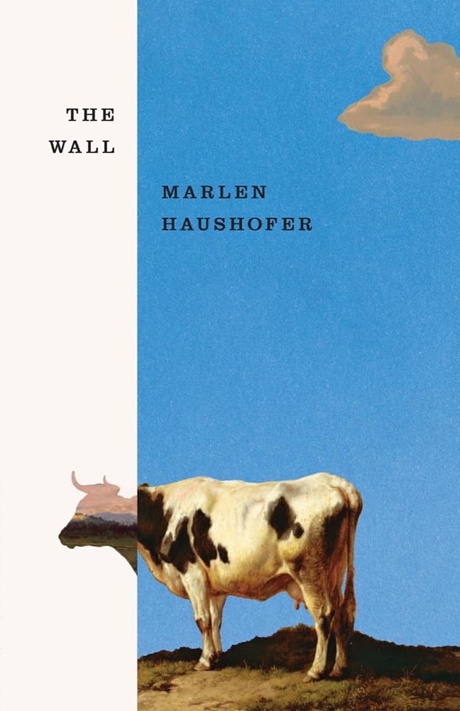
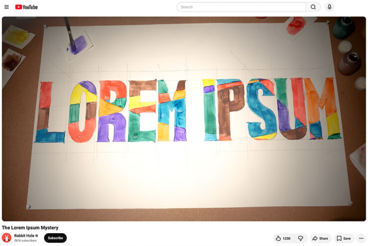
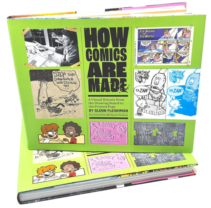
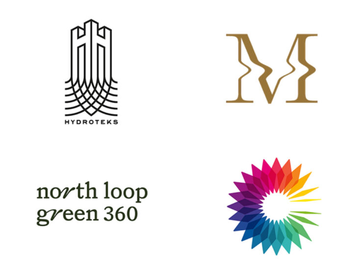
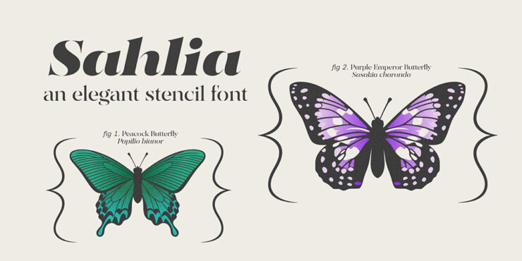
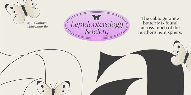
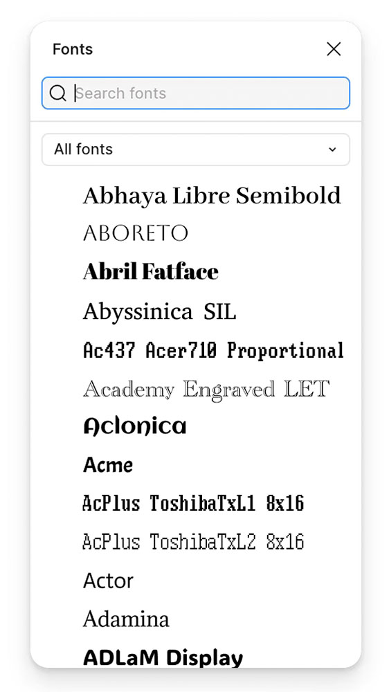
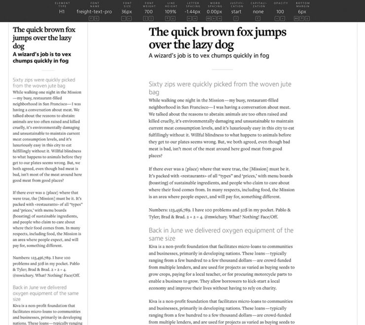
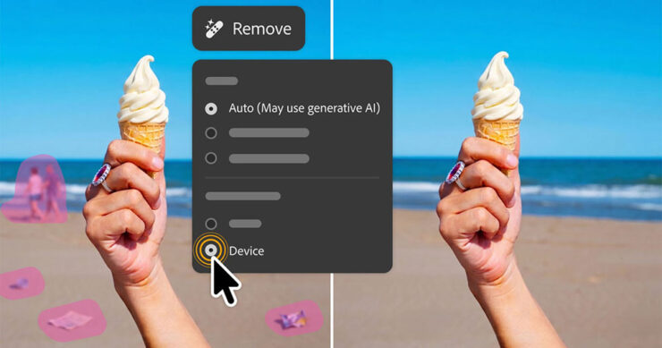
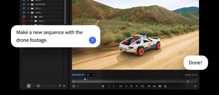
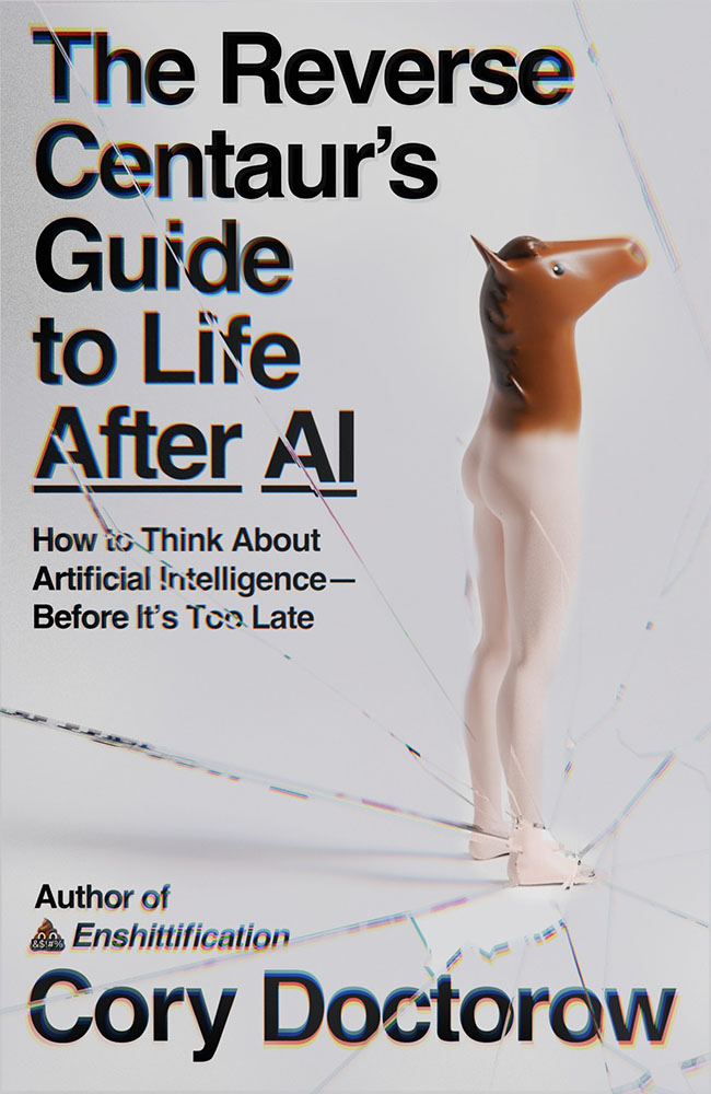
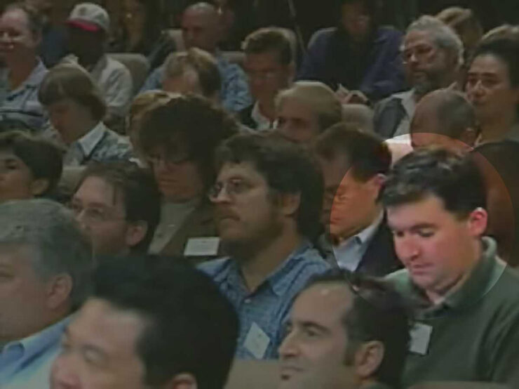
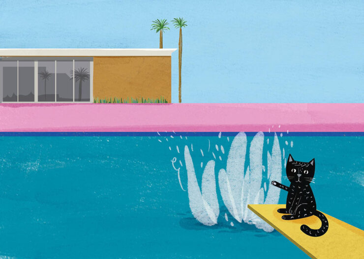
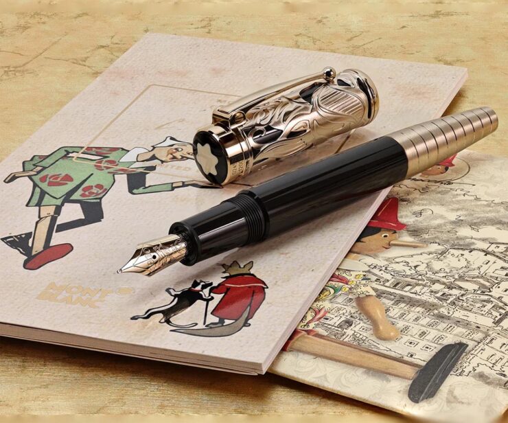
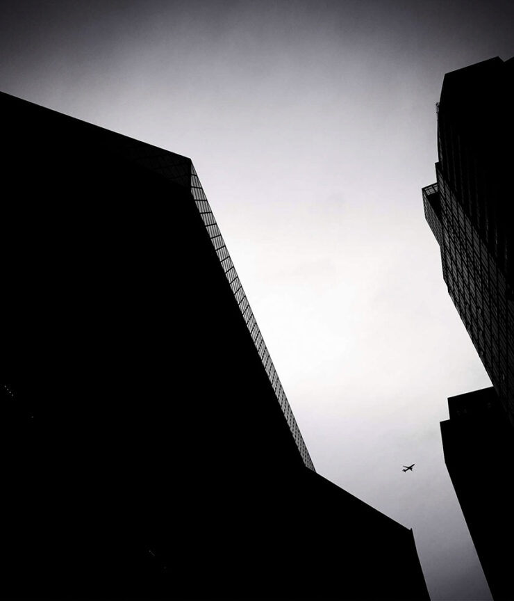
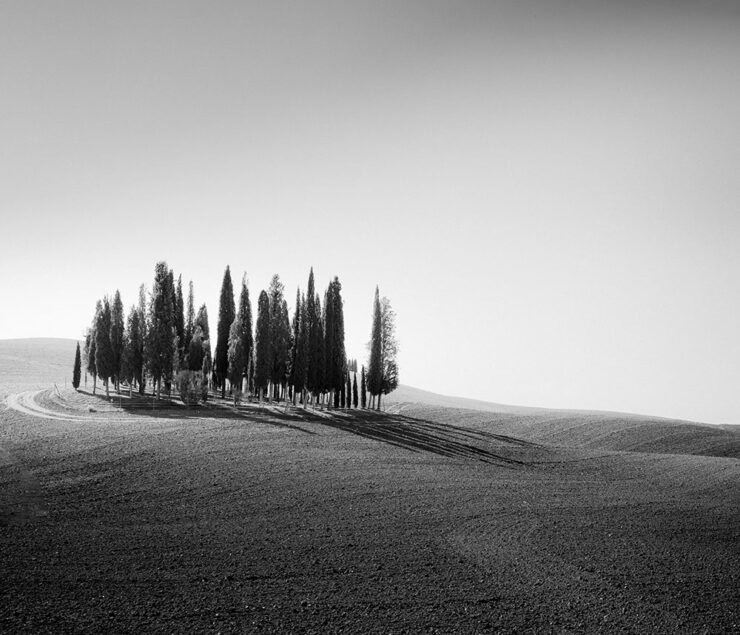
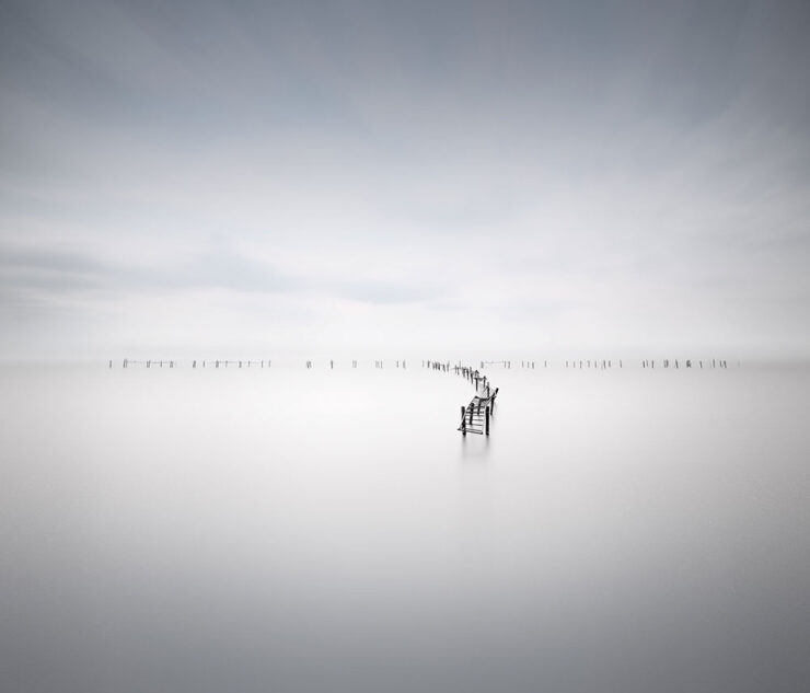
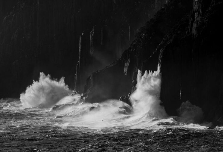
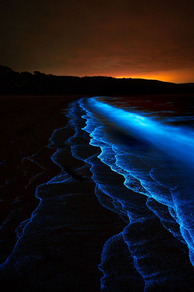
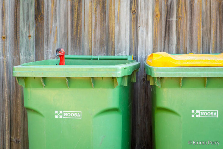
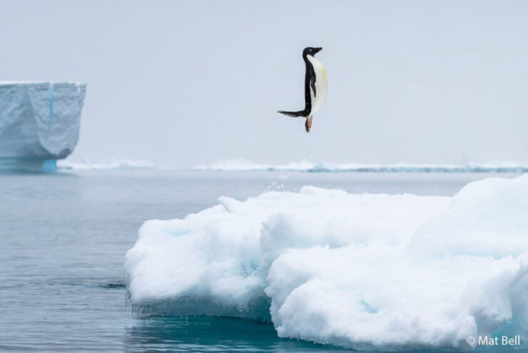

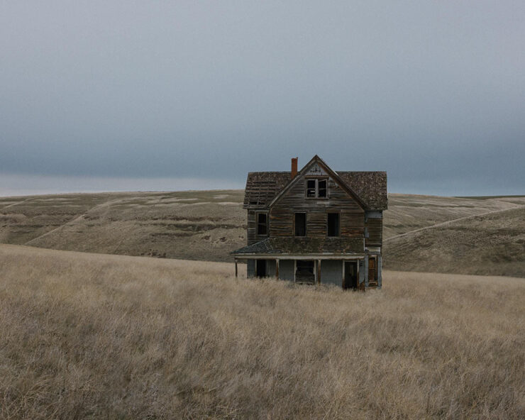


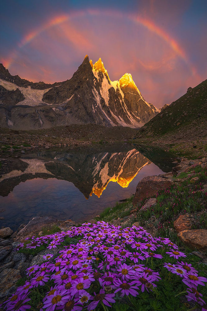
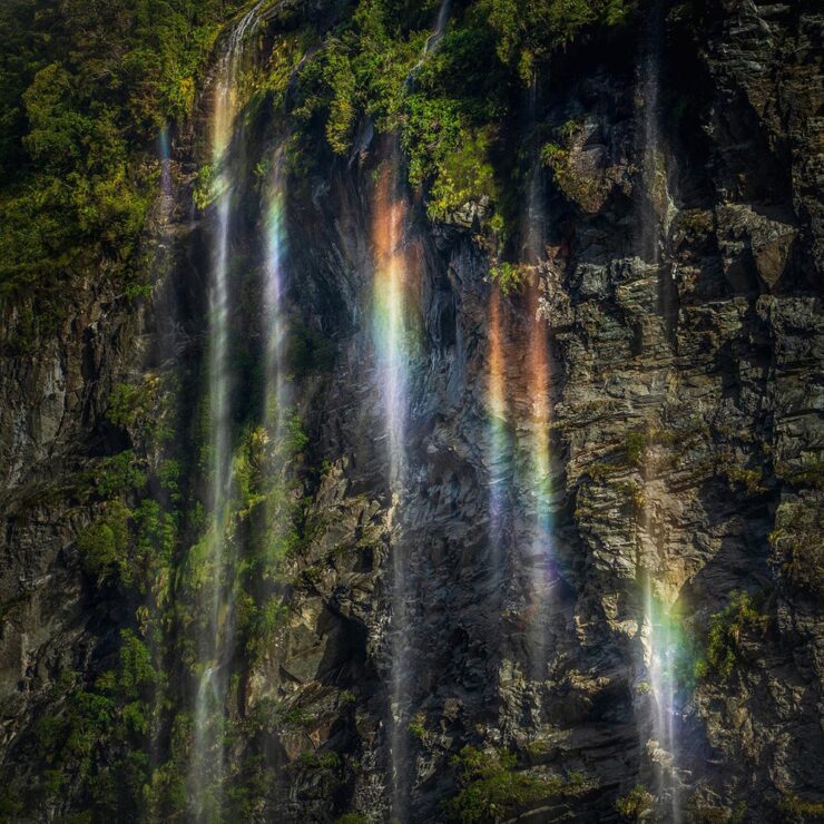
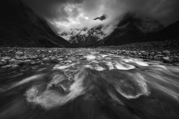
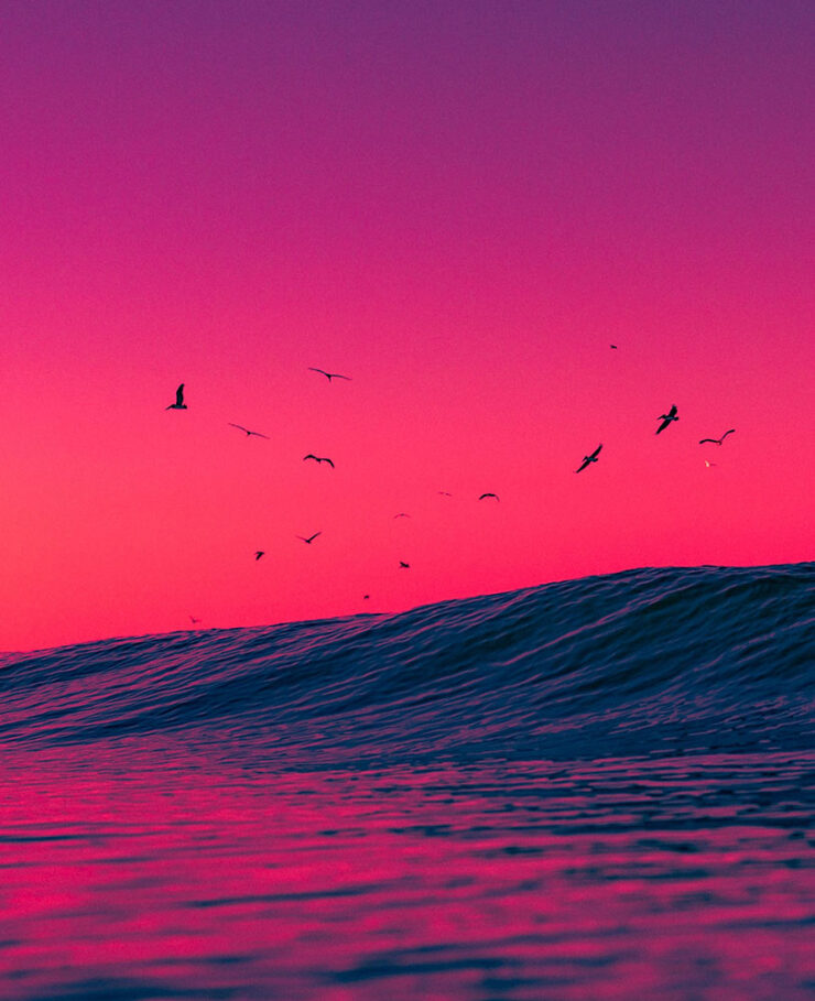
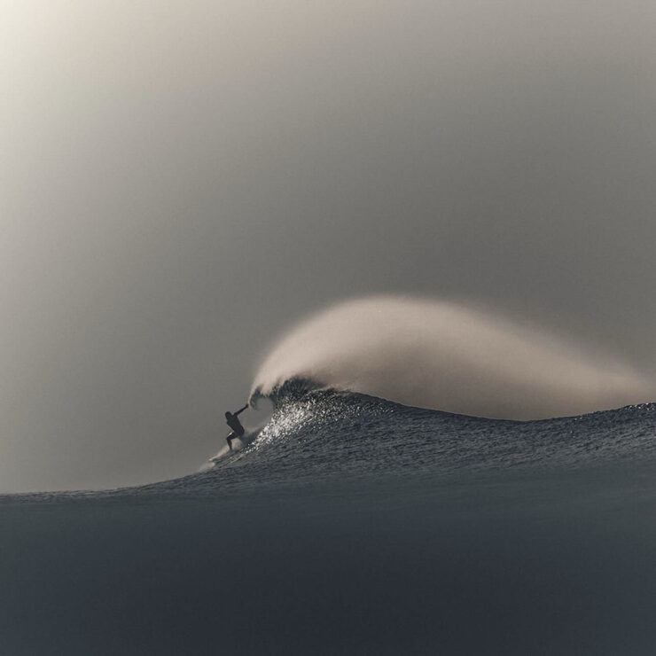


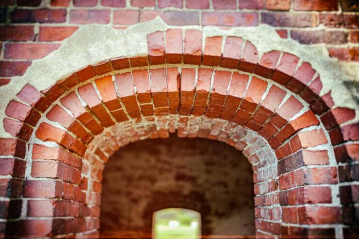

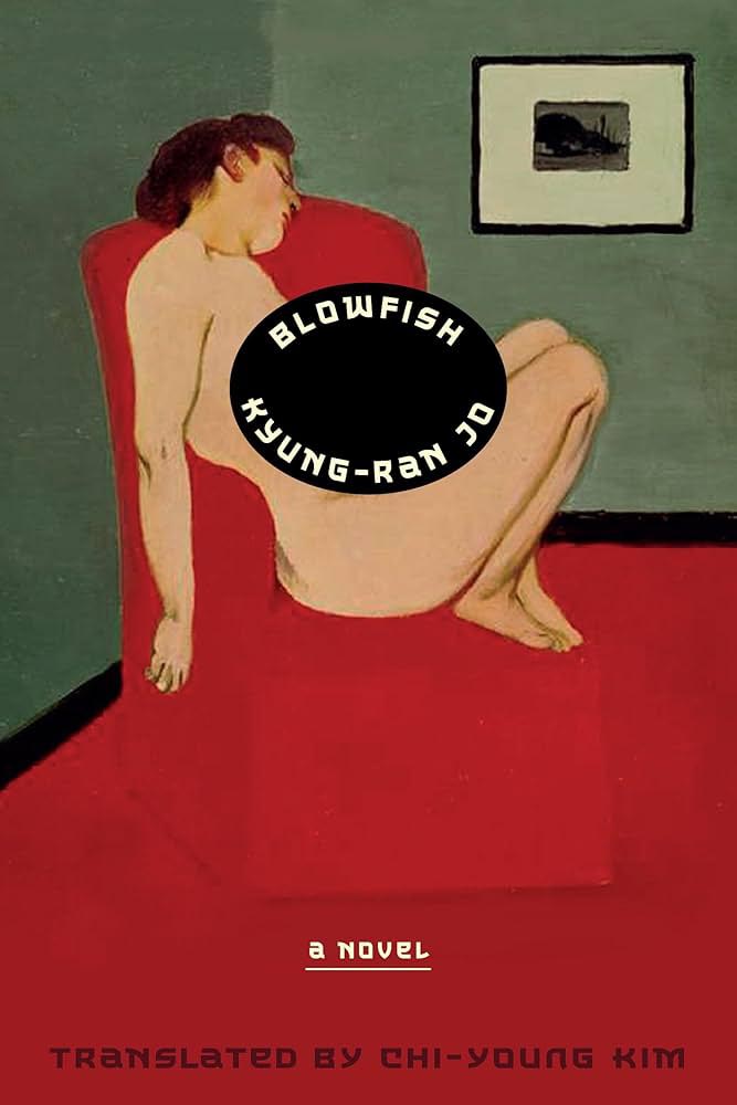


![Beautifully Briefed 26.4: Showered with… [Insert Here]](https://www.gileshoover.com/wp-content/uploads/2026/05/bb-hdr-apr26.jpg)