
A variety of interests addressed this time: a bit on Shift Happens, a great question on branding, and Leica’s new M camera — and its content credentials. (Plus, bonuses.) Happy October!
Booking a Keyboard
We talked about this title back in January, but it’s worth the reminder:
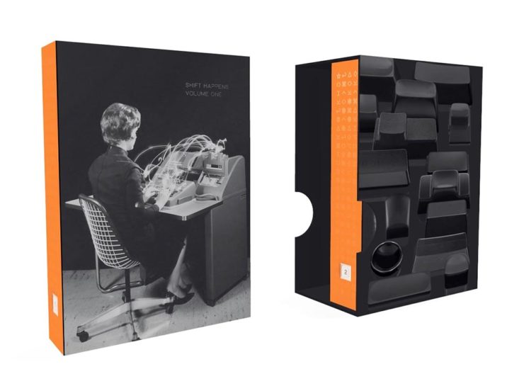
Marcin Wichary has long been interested in keyboards. In his words,
Keyboards fascinated me for years. But it occurred to me that a good, comprehensive, and human story of keyboards — starting with typewriters and ending with modern computers and phones — has never been written. How did we get from then to now? What were the steps along the way? And how on earth does QWERTY still look the same now as it did 150 years ago? I wanted a book like this for years. So I wrote it.
—Marcin Wichary, Shift Happens
This title fascinates me, partially because it’s an interesting subject — one we’ve all interacted with, often without thinking about — and partially because it’s a great, well-covered exercise in book design.
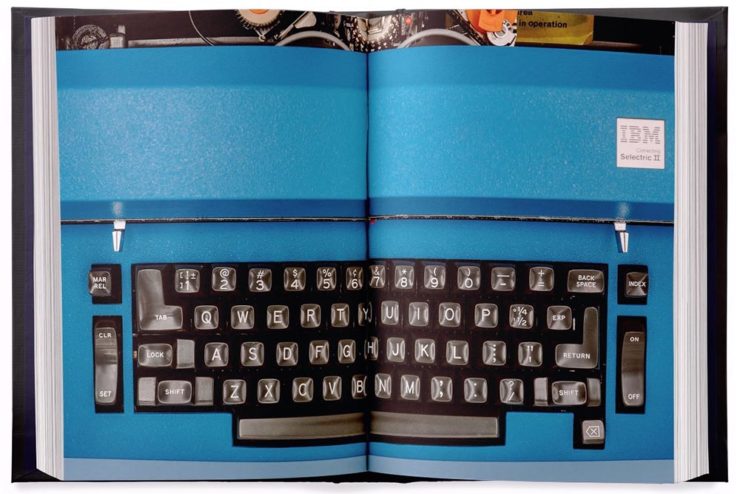
Further, Marcin has done a fantastic job in getting the word out. He’s designed a killer web site, written some great updates, and gotten some good press — including a recent interview with Ars Technica, in which he says:
I am a web guy, and I used to think that the web (just like typewriters, once) took away a lot of hard-won typesetting nuance and tradition. But it turns out that the web also makes it much easier to do certain things. To have a word be surrounded by a rounded rectangle—a visual representation of a key—is a few lines of CSS or a few clicks in Figma. But for the book, I had to cut my own font and then write Python scripts to do typesetting inside the font-making software, which I’m pretty sure you are not supposed to do[.]
—Marcin Wichary, Shift Happens
Really looking forward this title. Copies are, as of this writing, still available.
Let’s Talk Branding.
It’s Nice That asks a great question: “Are rebrands starting to look the same? The challenges facing commercial design,” in which author Elizabeth Goodspeed discusses whether “shortened turnarounds and economic tensions” are taking a toll on originality.
The answer might seem to be, “Well, duh,” but it’s nonetheless a thoughtful and insightful article that asks the correct question: “how does one define originality in an age saturated with visual stimuli?”
[T]he digital applications more often associated with modern rebrands, while comparatively easy to update, may counter-intuitively promote less care and attention towards their making. [A]nother possible issue contributing to rebrand redundancy: lack of rollout support beyond rebrand launch. Even a unique identity may lose its spark when its primary consumer touchpoint is what a social media manager produces on Canva after skimming the brand guidelines once. Further still, many clients no longer approach design studios to harness their expertise but, instead, with preconceived notions of the result they expect; design studios may want to create original work, but sometimes clients are willing to pay more for a rebrand that mirrors their own preconceived ideas of what the work should look like.
— Elizabeth Goodspeed, It’s Nice That
The whole article is great (and richly illustrated) — give it a few minutes of your time.
Special Bonuses #1 & 2: Let’s look at a couple of places where branding has been in the news recently (pun intended). Also from It’s Nice That, an article on The Irish Independent rebrand. Here, as is often the case recently, it’s the custom illustrations that carry the day:
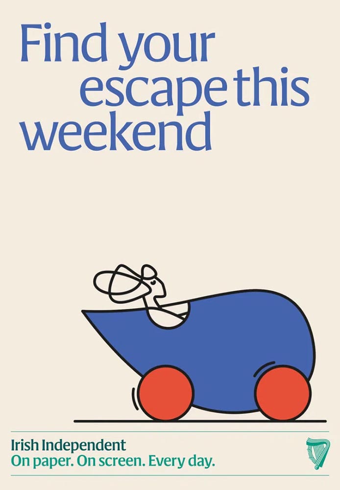
“Andy Goodman is the illustrator responsible for the lively work found throughout, which toe the line between measured and playful,” It’s Nice That writes. Agreed 100%.
Less successful is England’s The Guardian, whose ongoing campaign to raise money — they don’t have a paywall, relying instead on reader contributions — perhaps could have used more work:
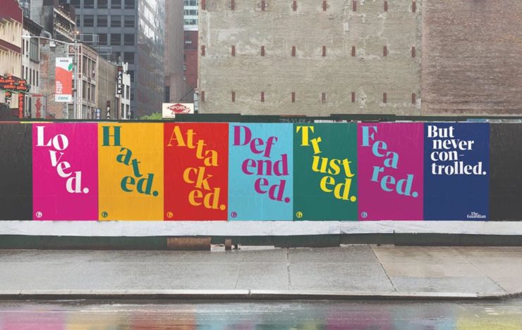
Meh. (And this from a huge fan of The Guardian.) Creative Boom is more positive.
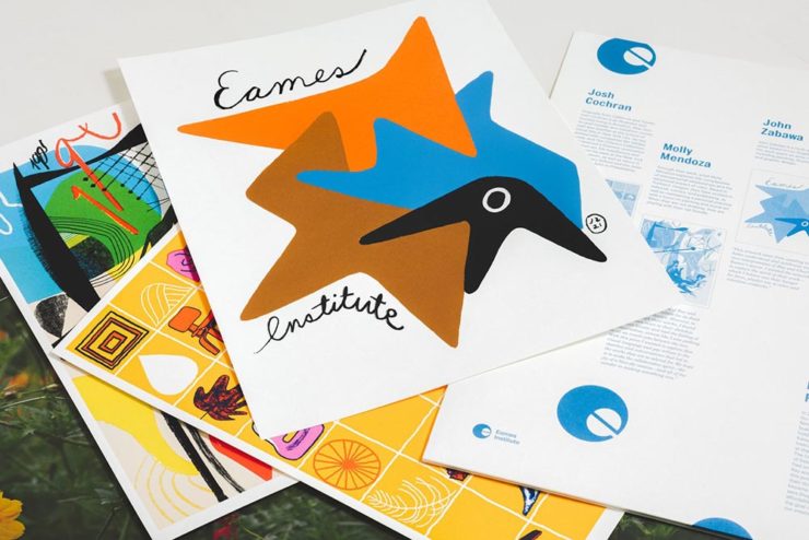
Special Bonus #3: From the wildly successful, original branding department comes, of course, the brilliantly-named Eames Institute of Infinite Curiosity. They’ve been covered here twice before, but are back in the news with a new branding Manual. See why that’s capitalized at Dezeen.
Leica, Adobe, and Content Authenticity
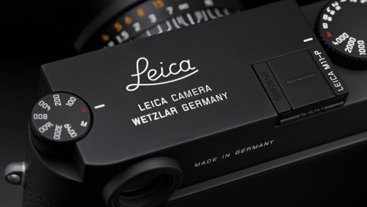
One would assume that Leica users are the epitome of content authenticity — there’s nothing like the world’s best lenses (IMHO), attached to some incredible cameras, to provide photographers with all that’s needed to make the best possible images.
Leica’s new M11-P, however, packs a world first: hardware encryption that supports a system called the “Content Authenticity Initiative (CAI).” In CAI corporate-speak, it’s “the future of photojournalism […] usher[ing] in a powerful new way for photojournalists and creatives to combat misinformation and bring authenticity to their work and consumers, while pioneering widespread adoption of Content Credentials.”
B&H puts it another way:
The Content Authenticity Initiative (CAI) is a collaborative effort initiated by Adobe in partnership with various other organizations, including The New York Times and Leica, among others. Announced in late 2019, its primary goal is to develop a standard for digital content attribution. The rise in manipulated digital content, deep fakes, and misinformation has underlined the need for a more transparent system of content attribution, which the CAI seeks to address.
The interesting thing here is Adobe’s initiative. What’s their goal?
Adobe has been suffering a few hits recently. They’ve just raised prices — on the heels of record profits — and “monopoly” is not in any way a stretch. Photoshop? Entered the lexicon. InDesign? No credible alternatives. Illustrator? Professional standard across multiple industries. In other words, we’re stuck with ’em, and they know it.
This line of thinking is expanded at CreativeBoom: “Is Adobe Becoming the Frenemy of Creatives? But that’s not all.
They’re pushing hard into AI, too, and surprisingly up-front about it changing creative work in ways potentially less creative:
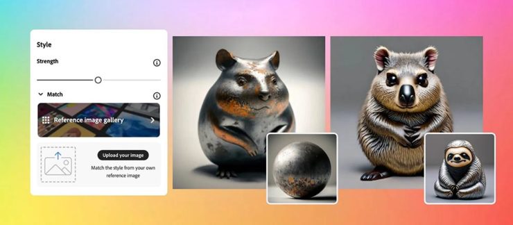
Firefly 2 was unveiled yesterday at the 2023 Adobe Max conference with the artificial intelligence (AI)-powered tool incorporated into Lightroom’s new lens blur feature that simulates depth of field along with a host of other tools. However, it was the new “Generative Match” tool that will allow users to upload a reference image to guide the AI image generator to a specific style that prompted Adobe to comment that the new tools could mean less work for photographers.
Adobe is appealing to companies who want a “consistent look across assets.” It is offering brands the chance to generate hundreds, if not thousands, of similar images for different uses such as websites, social media, and print advertisements.
— Matt Growcoot, PetaPixel
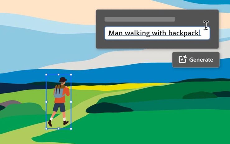
Or how about this example: An agency or freelancer working on a vector image in Illustrator, and need to add something that they either don’t have the time or talent to do myself. Previously, they could find either a stock item — made by a human (who is paid, by the way) — or hire it out (again, to a human, and again, one who is paid for their work). Now? Just tell the computer what you need.
Get more from Ars Technica’s Unlimited Barbarians Dept.
All of which ties nicely back to the previous section on whether branding is beginning to homogenize. Is AI going to accelerate that process? You betcha.
Value human creativity, folks. Artists, teachers, writers, thinkers: all the people pushing at the edges of the envelope will now have to push even harder, in an era when envelope-pushing is increasingly demonized.
Special Bonus #4: Ars Technica argues that the U.S. Copyright Office’s blanket ban on the copyright-ability of AI-generated images isn’t going to age well, using photography as an argument.
Special Bonus #5 (Updated 31 Oct): Via Nick Heer’s excellent Pixel Envy, we have a great explainer from Tim Bray regarding The Coalition for Content Provenance and Authenticity (C2PA), the actual implementation of CAI. Better than my brief description by a country mile.
Special Bonus #6: To round out this post, from the department of envelope-pushing: PRINT Magazine put together the book covers of the 11 most-banned books in America. Dangerous, indeed!