A wide selection of items for the beginning of fall, from positive fonts to jolly cameras — with Adobe and Pantone pouring some cold water on things. Let’s get to it!
Indigenous Letterforms
As Americans, Europeans, or, more generally, Westerners, we take for granted that fonts will reflect the various pieces of individual type — that is, letterforms — that we’ll need. But not everyone falls into that category.
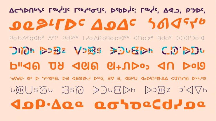
Dezeen points us to an especially interesting effort: “Typotheque typography project aims to protect Indigenous languages from “digital extinction.” In this case, folks who were in the Americas long before Westerners arrived used languages often not written down, or that use letterforms that simply aren’t supported in modern typographic systems.
“When [the Unicode Standard] doesn’t contain characters in a given language’s orthography, it is not possible for that community to accurately use their language on digital text platforms.”
Typotheque typeface designer Kevin King
Fascinating. Read more at Dezeen.
Italic Letterforms
The always-great Hoefler & Co. spends a minute educating us about italics:

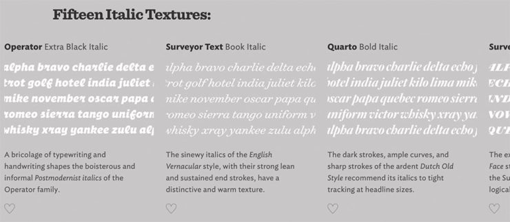
Italics can be the most colorful part of a type family, diverging dramatically from their roman cousins. Here’s a look at twelve kinds of italic typeface, with some notes on their cultural contexts, historical backgrounds, and practical applications.
Hoefler & Co.
Read the article, “Italics Examined,” at Hoefler & Co.’s Typography.com.
Adobe Types, “Stop.”
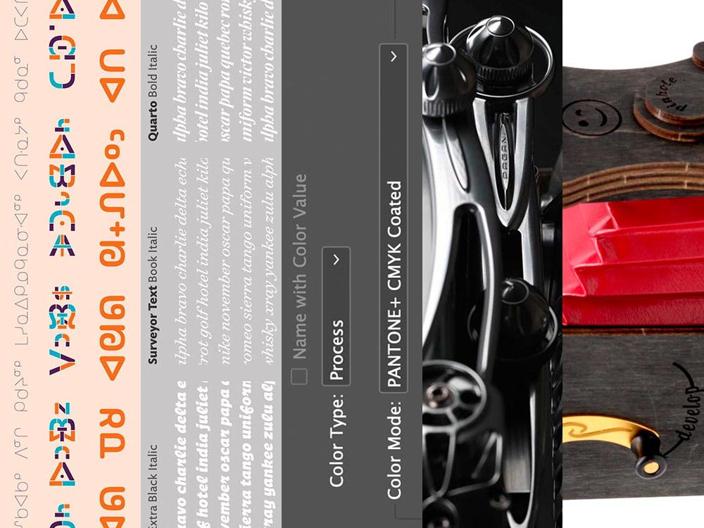
Adobe and Pantone are having a . . . thing. As a result, all Pantone spot libraries have been removed from Adobe products:
A classy move, completely in character for both companies, to reach into users’ machines and remove stuff they had paid for and may rely on because of some licensing spat.
Nick Heer, Pixel Envy
I didn’t get a notice in either InDesign or Photoshop, but a check in InDesign (the CC 2022, aka 17.4, version) shows only the CMYK libraries:
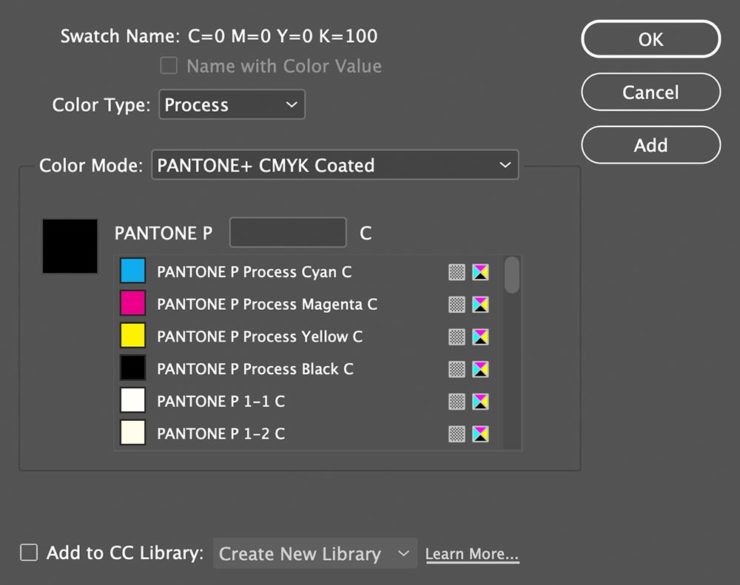
You can subscribe to the additional libraries from Pantone for $60/year. Book design is almost exclusively CMYK, so I won’t be . . . but grrrr.
On the subject of Canadians: thanks to Nick Heer’s north-of-the-border reporting for the notice.
Update, 28 September, 2022: Adobe got around to putting up a banner in my version of InDesign — blaming Pantone:

They’ve put up a “help” page. (I took a moment to fill in the feedback at the bottom of that page, too: “Removing features we’ve paid for is incredibly uncool, Adobe. Shame on you.”)
Two Awesome New Cameras, from $100 to $100,000
So Pagani, the multi-million-dollar sports car manufacturer, has decided to market large-format cameras. Okay!
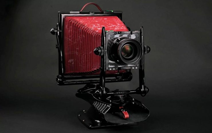
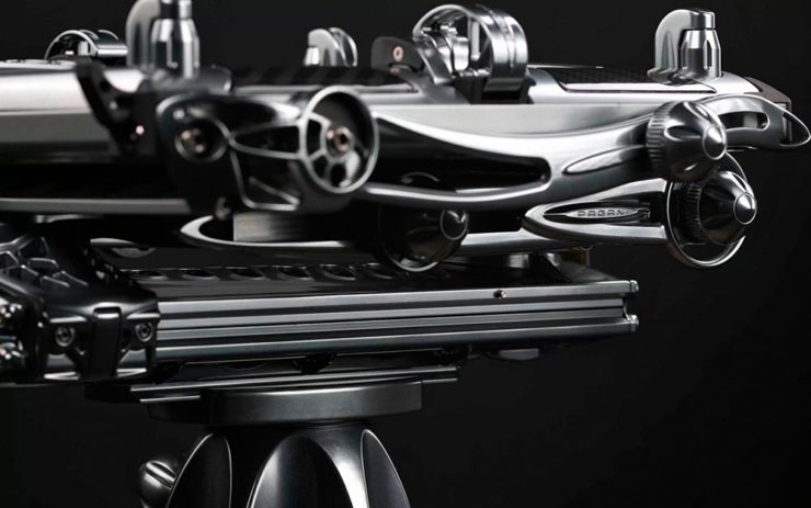
Incredible, breathtaking detail and quality, based on Gibellini models but taken to 11. But like their cars, mere mortals need not apply: their cameras start over $100,000.
Mortals can dream, sure, but here on Earth, I encourage an order from this Ukrainian company instead:
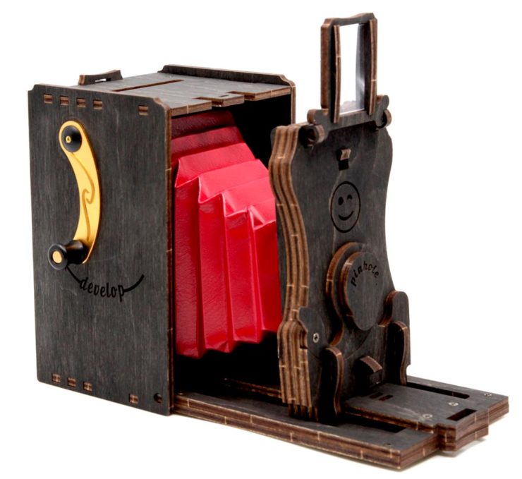
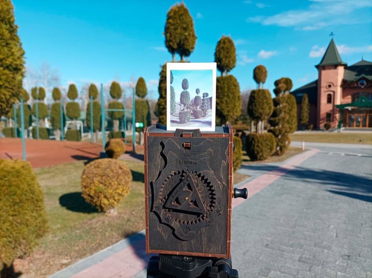
They’re based on instant film cartridges, are made of recycled materials, look incredibly cool, and a kit starts at an incredibly-reasonable $99. Throw in a few extra dollars to support Ukraine and . . . feel Jolly.
Thanks to This is Colossal for the link.