Design, art, photography, and book design often involve a certain lifestyle, and those items generally get categorized as such here on Foreword. (That said, it might just be life in general, too.)
In this edition: Hummingbirds, the UK’s 2022 Landscape Photography of the Year 2022, a potential new logo treatment from Honda, and something just in time for Halloween.
Who Knew: Hummingbird Edition
Wow.
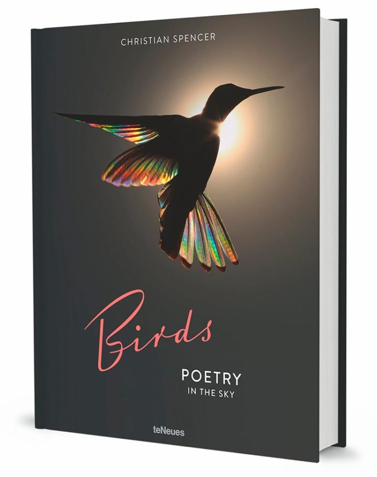
Taken when the creatures are mid-flight and beating their wings at incredible speeds, Spencer’s striking photos capture sunlight as it filters through their feathers, emitting a full spectrum of color. The opalescent phenomenon is caused by diffraction and transforms their limbs into tiny, ephemeral rainbows.
This is Colossal
Let’s set aside for the moment the time and energy get these photographs and just celebrate that Australian photographer Christian Spencer worked to get these shots. Better still, there’s a book:
Like the typography in addition to the photograph, too. Thanks to This is Colossal for pointing us in this pretty wonderful direction.
New Honda Logo?
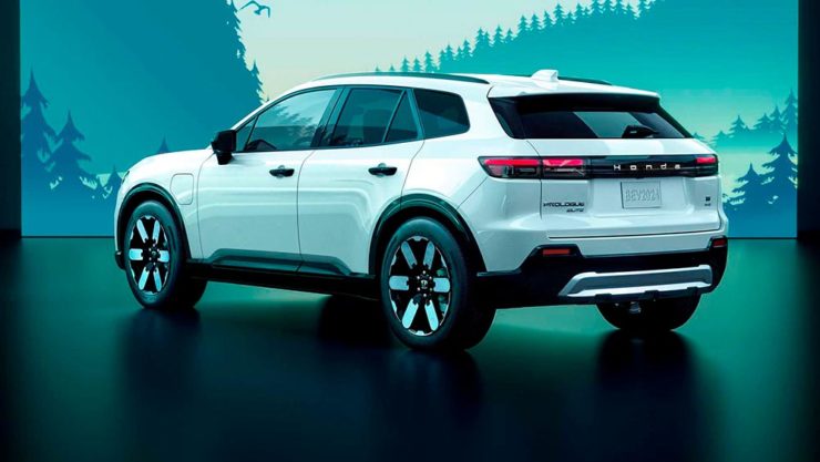
This hasn’t been reported anywhere, so I don’t know whether there’s a shift ahead for Honda (pardon the expression), but…:
This is a photograph — well, graphic — of the 2024 Prologue EV. Note that instead of the classic “H” seen on every Honda since I don’t know when, the name is spelled out.
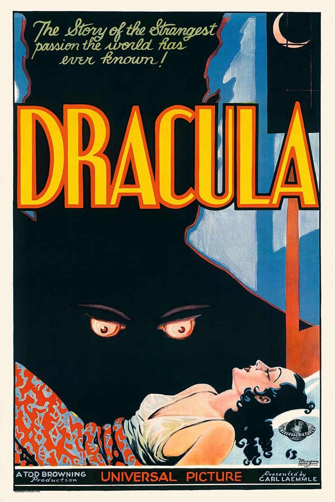
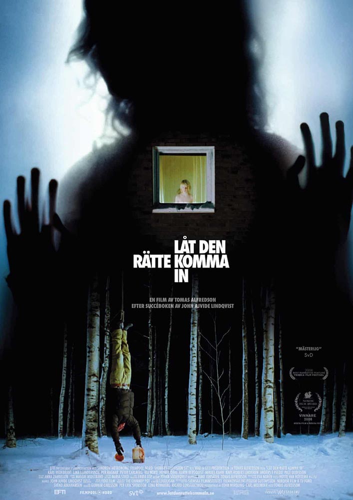
Speaking of slideshows on The Guardian, they had a great subject just in time for Halloween: “Cinema’s unquenchable thirst for vampires celebrated in posters.”
A classic.A future classic — scary-great.
Unquenchable thirst, indeed. Enjoy.
1
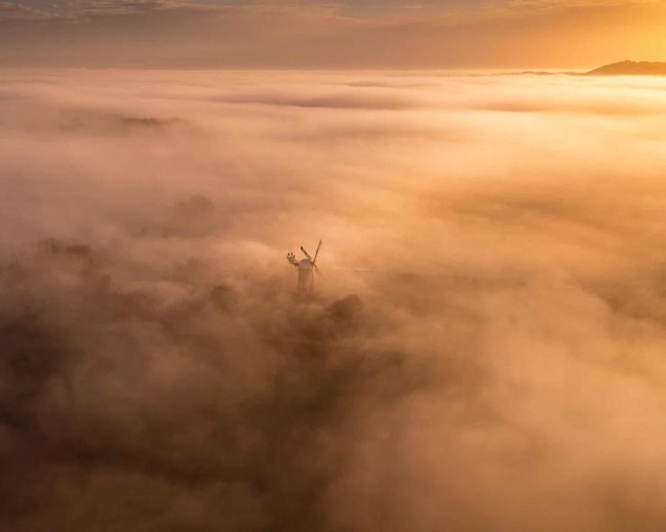
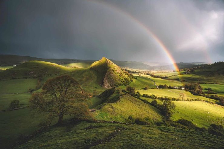
The aptly-named Dragon’s Back is in the Brecon Beacons National Park, Black Mountains, Wales. Take a walk. ↩︎
This time, we’ve got some great book design (with a bonus), Hoefler educates on typography (with a bonus), and two updated car company logos. Let’s get right to it!
Print Magazine on the design of Lyrics
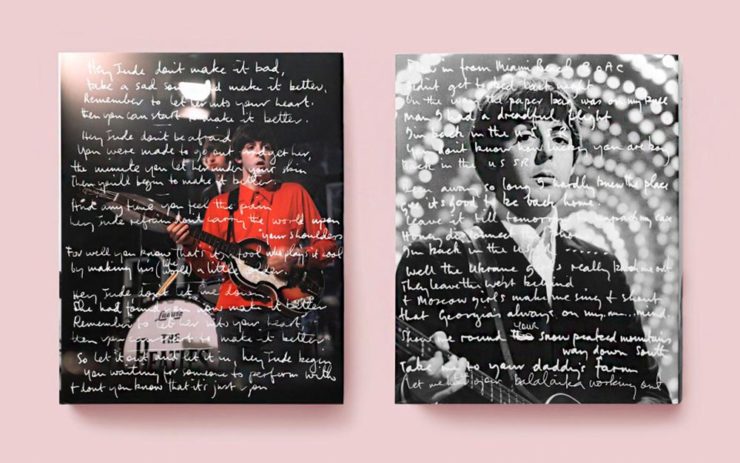
The still-very-relevant-in-2022 Print Magazine brings us a great feature on the design of Paul McCartney’s book, Lyrics:
Front and back covers of Paul McCartney’s Lyrics, by Triboro Design.
Turns out it was designed by an outfit called Triboro Design, from Brooklyn (appropriately). Print brings us an interesting interview with David Heasty, the principal:
I […] found him to be sharp, quick, articulate, and modest. Below, we discuss Paul’s involvement with the project, the book’s gorgeous bespoke typeface, and the importance of staying true to a legend’s vision.
Ellen Shapiro, Print Mag
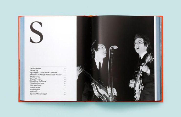
The “S” spread of Paul McCartney’s Lyrics, by Triboro Design.
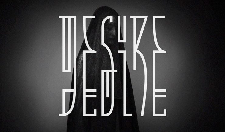
Bonus: Looking at Triboro’s website, this lovely piece of typography stood out:
Triboro Design’s Zolo Jesus album typography creates desire.
Hoefler Discusses Daggers
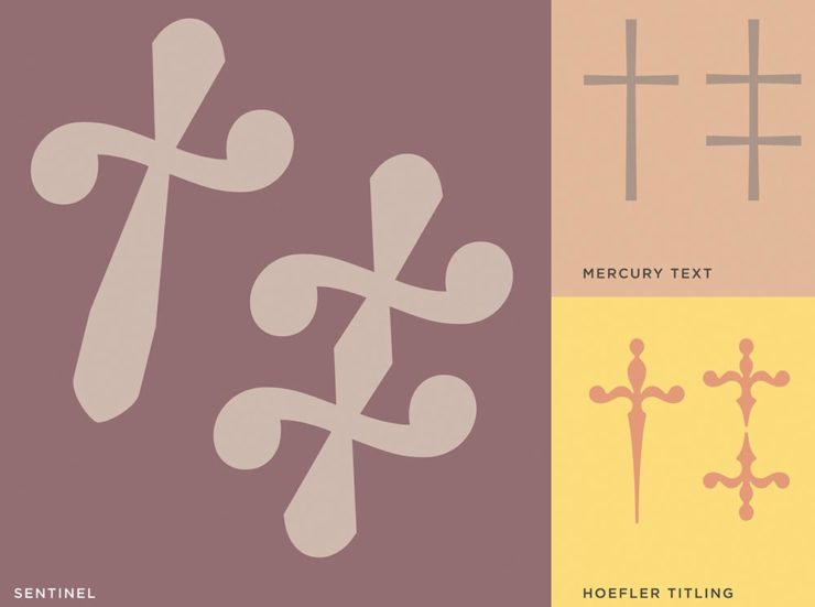
In “House of Flying Reference Marks,” Jonathan Hoefler talks about daggers, or, what you use when an asterisk isn’t enough:
Hoefler on daggers.
Beautiful examples, complete with a phrase you don’t hear everyday: “twisted quillon.” Read and enjoy. (If the opportunity presents, follow on with the ampersand article — which, uh, takes a stab at where the word came from. Nice.)
It seems like nearly all of the major car manufacturers have introduced a new logo in the past couple of years, but here are two more. One’s best described as “an update,” while the other … goes a little farther.
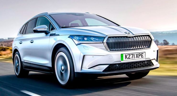
Skoda, for those that don’t know, is a Czech company and part of the massive VW Group. Frankly, it shows:
Skoda’s 2022 Kodiaq, a thoroughly VW Group product.
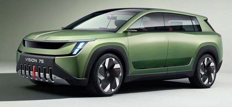
For 2023, they’re introducing a push to separate themselves from VW a little, resisting the downmarket image. As is (now) normal with updated car company identities, there’s a concept:
Skoda’s Vision 7s concept.
It’s … not inspiring. Maybe the actual updated logo will turn the corner:
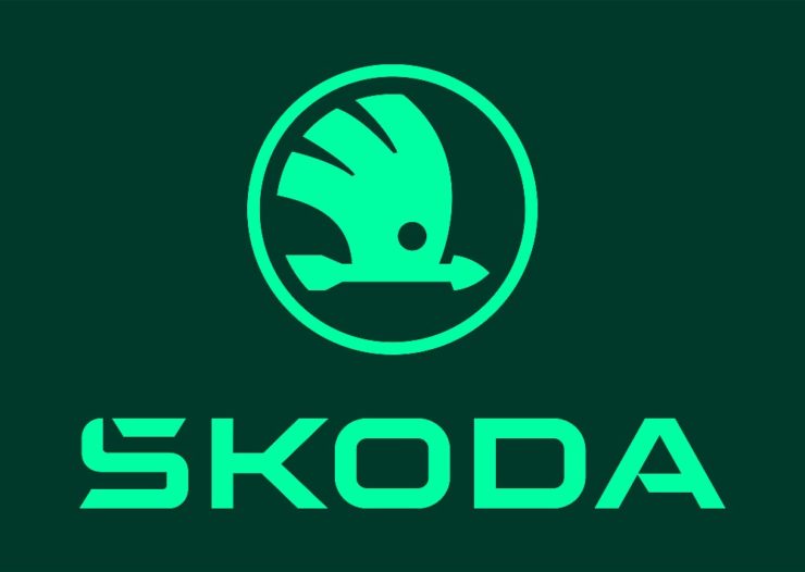
Skoda’s 2022 logo.
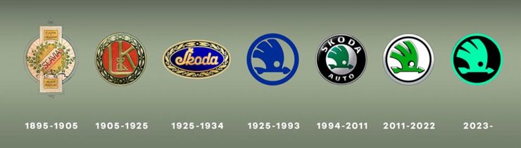
Solid. (Pardon the pun.) But seriously, even an avid car nut like me didn’t know that represents a winged arrow — and I’m not sure the new version helps. At least they get points for consistency:
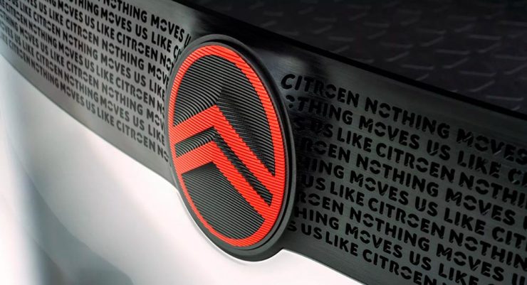
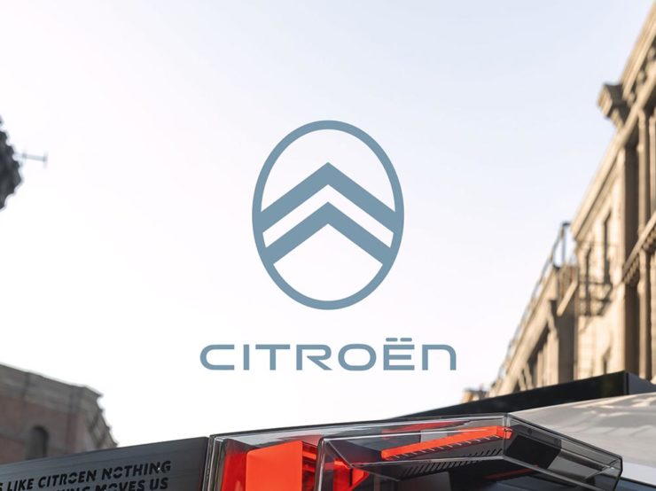
Then there’s Citroen. Even under the potentially-smothering corporate blanket that is Stellantis (there’s a name!), the pioneer of decades past still manages to actually thrive. First their new logo:
Citroen’s 2022 logo.
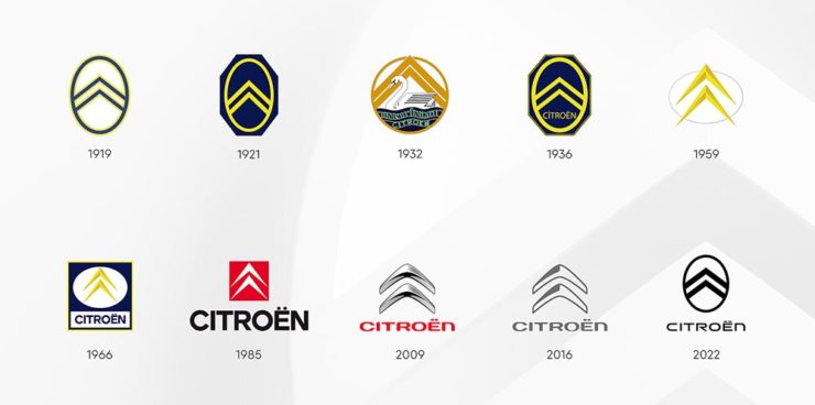
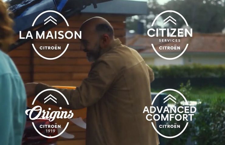
They’re not quite as consistent — the dual chevrons have varied a bit. This time, they’ve literally gone back to their roots, pulling the 1919/1921/1936 version out and dusting it off for modern use:
History of Citroen’s logos, 1919–2022.
Points to them for hinting at what’s to come, too:
Citroen’s 2022 logo, with just a slice of concept car showing.
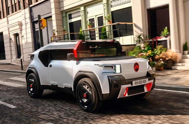
…Which turns out to be something with, ahem, Oli bits:
Citroen’s Oli: the antithesis of a Skoda.
“Nothing moves us like Citroen,” they say. The Oli moves me, to a point where I truly wish Citroen was once again available in the ’States. Cool and radically innovative, without losing sight of something VW has truly lost: fun. Well done.
Updated, 19 October, 2022:Brand New adds to Citroen’s new logo story, with a slightly-less-than-enthusiastic take on the logo and has frankly unkind things to say about the new, custom typeface (custom typefaces are now de rigueur — a policy as much related to rights ownership than creativity, alas).
I really like the cursive in this Vimeo screenshot:
YouTube? What YouTube? Citroen posts to Vimeo. Ahh, the French.
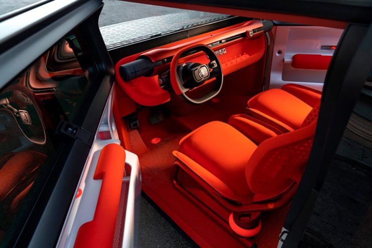
BN also includes a number of extra photographs of the simply awesome Oli, too. Here are a couple, for your enjoyment:
Plug-and-Citroen.
Note the removable Bluetooth speakers (the black tubes with “+” and “-“) and, especially, the seats:
A wide selection of items for the beginning of fall, from positive fonts to jolly cameras — with Adobe and Pantone pouring some cold water on things. Let’s get to it!
Indigenous Letterforms
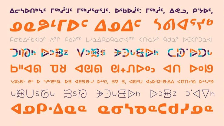
As Americans, Europeans, or, more generally, Westerners, we take for granted that fonts will reflect the various pieces of individual type — that is, letterforms — that we’ll need. But not everyone falls into that category.
North American Indigenous fonts — with updated Unicode. Major Kudos. (Courtesy of Dezeen.)
“When [the Unicode Standard] doesn’t contain characters in a given language’s orthography, it is not possible for that community to accurately use their language on digital text platforms.”
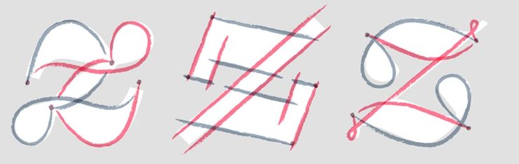
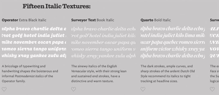
Italics can be the most colorful part of a type family, diverging dramatically from their roman cousins. Here’s a look at twelve kinds of italic typeface, with some notes on their cultural contexts, historical backgrounds, and practical applications.
Hoefler & Co.
Read the article, “Italics Examined,” at Hoefler & Co.’s Typography.com.
Adobe Types, “Stop.”
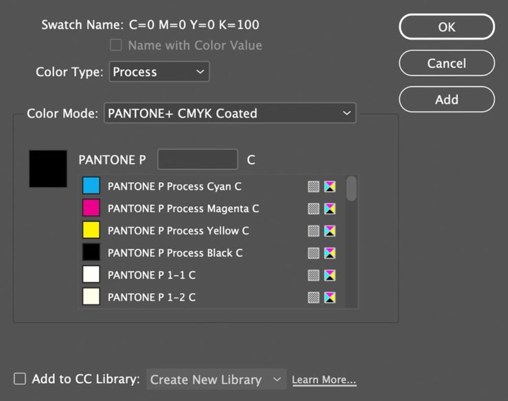
Adobe and Pantone are having a . . . thing. As a result, all Pantone spot libraries have been removed from Adobe products:
A classy move, completely in character for both companies, to reach into users’ machines and remove stuff they had paid for and may rely on because of some licensing spat.
Nick Heer, Pixel Envy
I didn’t get a notice in either InDesign or Photoshop, but a check in InDesign (the CC 2022, aka 17.4, version) shows only the CMYK libraries:
Adobe’s Pantone+ CMYK (Coated) color picker, from InDesign CC 2022
You can subscribe to the additional libraries from Pantone for $60/year. Book design is almost exclusively CMYK, so I won’t be . . . but grrrr.
Update, 28 September, 2022: Adobe got around to putting up a banner in my version of InDesign — blaming Pantone:
This notice showed up September 27th, 2022.
They’ve put up a “help” page. (I took a moment to fill in the feedback at the bottom of that page, too: “Removing features we’ve paid for is incredibly uncool, Adobe. Shame on you.”)
Two Awesome New Cameras, from $100 to $100,000
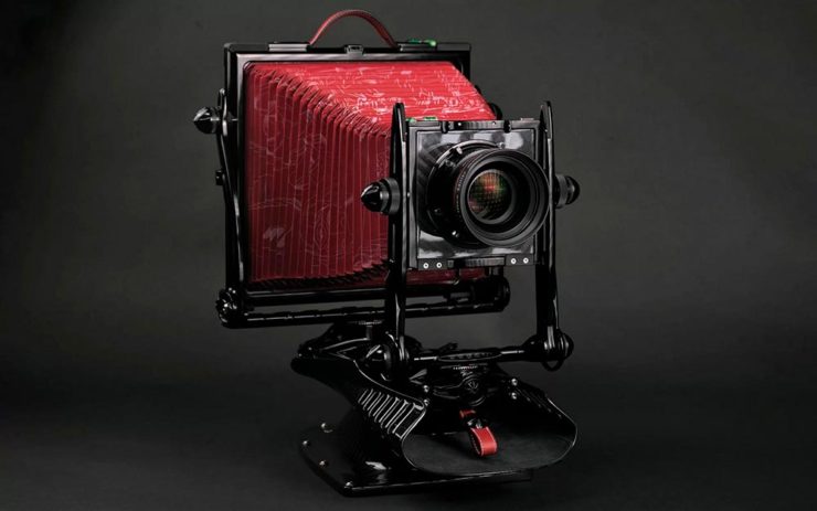
So Pagani, the multi-million-dollar sports car manufacturer, has decided to market large-format cameras. Okay!
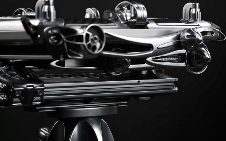
One of Pagani’s new camera modelsA closeup of the (beautifully-detailed) tripod plate for Pagani’s new cameras.
Incredible, breathtaking detail and quality, based on Gibellini models but taken to 11. But like their cars, mere mortals need not apply: their cameras start over $100,000.
Mortals can dream, sure, but here on Earth, I encourage an order from this Ukrainian company instead:
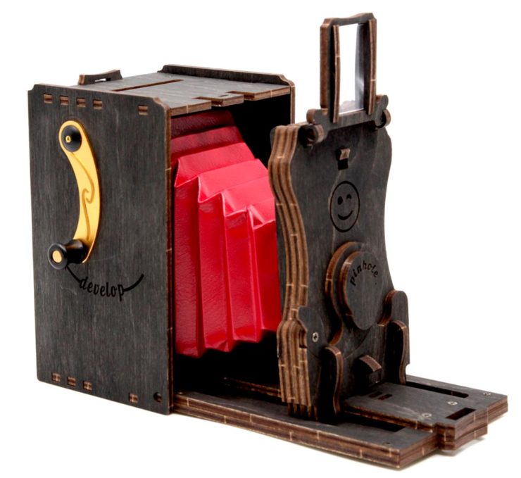
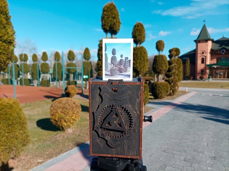
Jollylook’s Pinhole Instant Mini film cameraJollylook’s Pinhole Instant Mini in situ
They’re based on instant film cartridges, are made of recycled materials, look incredibly cool, and a kit starts at an incredibly-reasonable $99. Throw in a few extra dollars to support Ukraine and . . . feel Jolly.
Three interesting logo redesigns this month, plus a moment where venti has nothing to do with coffee. Oh, and a airy bonus.
Drobo Declares Bankruptcy
Generally speaking, I’m not one to engage in schadenfreude, aka “enjoying the pain or suffering of another.” (Wiki. Anyone surprised that the Germans have a word for this … but I digress.)
A selection of expensive, unreliable junk.
Back in 2011, I lost two Drobos in short order — and with them, the majority of my back files. Project I’d worked on, photographs I’d taken, personal documents, years worth of stuff, just gone.
Drobo, the company, did nothing to help, offering neither solutions nor apologies. I wasn’t alone; forums across the ’net suggested that I should have chosen more carefully.
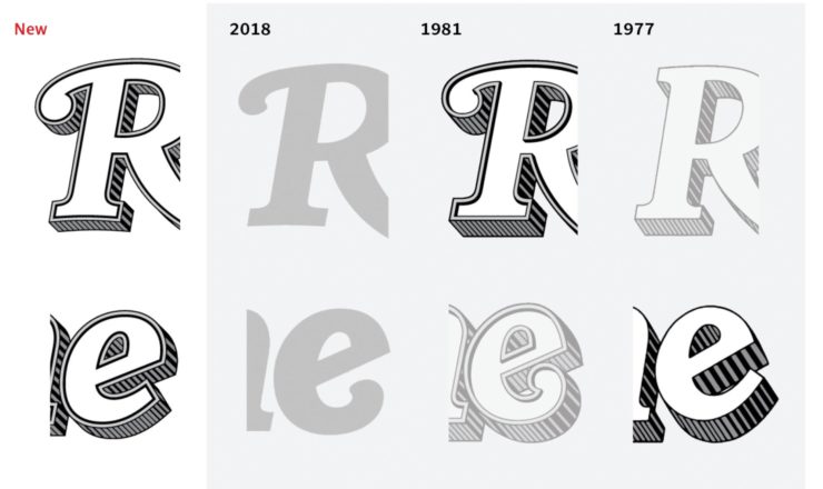
To call Rolling Stone‘s place in America culture iconic might be selling it short, and their logo plays a large role in that. In 2018, they flattened it — leading that trend, possibly — and it lost something.
However, this month, it’s back:
Rolling Stone’s 2022 logo redesign.
“The assignment was a paradox. How could we make the logo look like it did in the past, without making it feel dated? My hope is that loyal readers will believe the old logo is back, but on closer inspection will be surprised to notice how much it has been modernized.”
Jesse Ragan, XYZ Type
The “old logo” he’s referring to is the one that ran from 1981–2018, but there were others, too:
Rolling Stone’s lettering shapes through the years. See more at both links.
A great study in logo evolution: read more at the Type Network, and lettering specifics from XYZ Type. Awesome. (Hat tip to, as usual, Brand New.)
Aston Martin’s New Logo
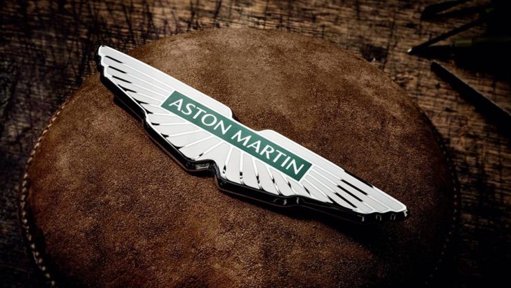
On the subject of subtlety, Aston Martin usually isn’t the first thing that comes to mind. Their recent logo redesign, however, falls into that category:
Wings of Glory (so to speak)
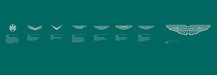
The evolution of their logo emphasizes those small steps:
AM’s logo through the years.
Not a great amount of information on this one, but the accompanying photographs of the logomark being made are fantastic. See more at The Drive, with more at Brand New.
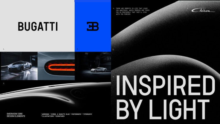
Bugatti’s New Logo
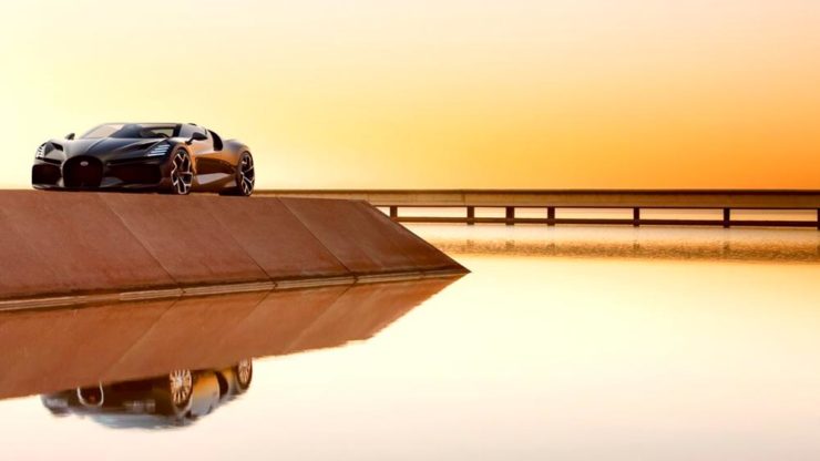
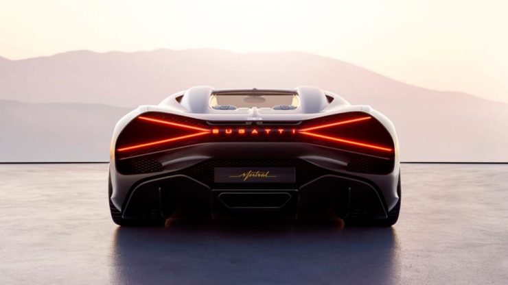
Subtlety and Bugatti rarely — if ever — fit in the same sentence. Aston is stratospheric as far as I’m concerned, so Bugatti would qualify as the antithesis of subtlety. But, but, but: there’s something about one.
The new Mistral. (Sorry, it’s sold out.)
They have a new logo and marketing campaign to go with:
Specifics, courtesy of Interbrand.The Mistral from the back, showing the new type treatment.
It’s been a busy August, including having to make a lightning trip through the usually-not-fun Atlanta airport. But there’s always a bright spot at the end of that tunnel: being the little boy again, awed by the simple act of flying.
Better still, the flight was on a 757, the sports car of big planes. Everybody around me had their window shades pulled and noses in their phones, but I was looking out the window:
Car site The Autopian scores with book design, Ford posts old marketing material gold mine, and more on the Eames Institute of Infinite Curiosity in this edition of Beautifully Briefed.
Autopian suggests book design
The Autopian, founded by a couple of former Jalopnik writers, is a new automotive gem: in these days of more-of-the-sameism sites trying to make money of others’ ideas, the Autopian has a retro style and interesting, original content.
Including this short post from their Cold Start column:
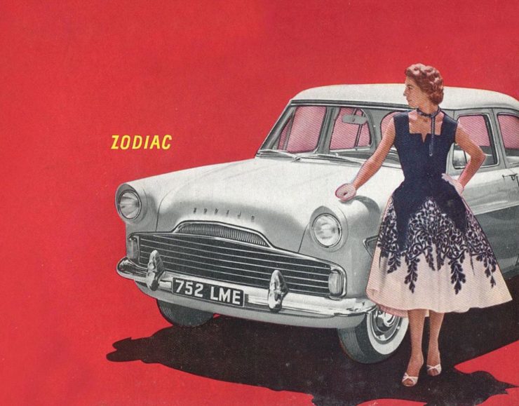
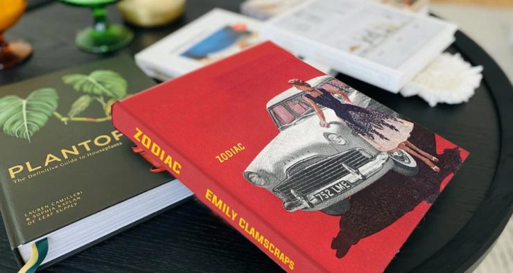
Sometimes you may encounter an old car ad and realize that the design of it could lend itself very well to something completely different. In this case, this 1958 Ford Zodiac ad, with its rich, saturated colors, striking dress on the model, and evocative name with understated typography just feel like something you’d see on modern book cover design.
Jason Torchinsky, Autopian Founder
The ad:
A 1958 Ford Zodiac (European)
His book design idea “realized”:
Jason’s book cover mock-up. Love the author name.
Nice.
The Ford Heritage Vault
Ford has taken the unusual step of posting a good chunk of their old — 1903 to 2003, their first 100 years — marketing materials online: “promotional materials, photographs, and all kinds of other historical goodies,” according to CarScoops.
“Our archives were established 70 years ago, and for the first time, we’re opening the vault for the public to see. This is just a first step for all that will come in the future,” says Ted Ryan, Ford archive and heritage brand manager.
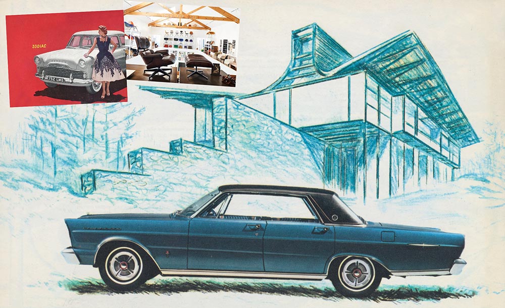
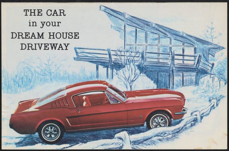
Here’s a personal favorite: the 1965 full line brochure, showing the cars set in architectural drawings — presumably, matching the car to the house:
We discussed the Eames Institute of Infinite Curiosity back in April, but Metropolis magazine has published an extensive article covering a visit to the Institute.
Modernism has largely been diluted from a series of ideas rooted in social change to one of just style—Instagram moments, if you will. The Eameses insisted that they did not have a style or even an “ism.” […] Modernism was an idea, not a style. With the establishment of the Eames Institute, I hope Charles and Ray will be remembered most of all for their ideas and processes.
Kenneth Caldwell, Metropolis
An exhibit at the Eames Institute of Infinite Curiosity.
With our ongoing struggle to use materials more efficiently, many of the Eameses’ ideas and ideals need to be taken for the solutions that they are: style with incredible substance.
Three items for the end of June, 2022: AIA Los Angeles announces photography awards, the 2022 edition of the Logo Lounge logo trends report is out, and Buick makes its new logo official. Let’s get into the details.
AIALA Photography Awards
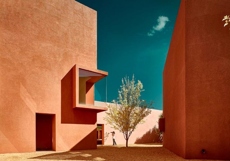
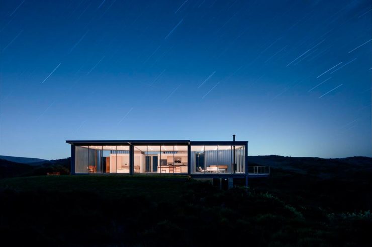
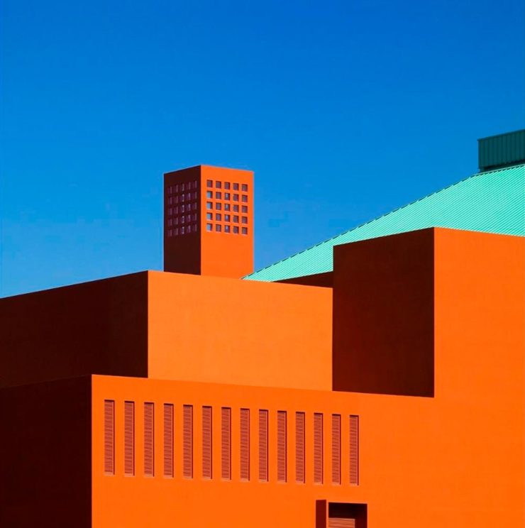
The Los Angeles chapter of the American Institute of Architects (AIA|LA) has announced this year’s winners of the annual Architectural Photography Awards, and there’s some pretty great stuff:
Ryan Gobuty: Santa Fe (Santa Fe, NM)Taiyo Watanabe: C-Glass House (Dillon Beach, CA)Tim Griffith: Mission Bay (San Francisco, CA)
[W]hile there are still corporate-looking marks being crafted there is a stronger effort to find ways to identify products that are artisanal and handcrafted.
Bill Gardner, Logo Lounge
Corporations trying to be more human. (News at 11.) But then, my use of that particular phrase perhaps betrays my lack of being in touch with the modern corporate world; I think publishing is a different animal, and prefer being part of that world despite the regular influence of corporate entities there, too.
Nonetheless, following logo trends is, from a purely graphic design perspective, worthwhile — and this report summarizes beautifully. Read on.
Buick’s New Logo, Officially
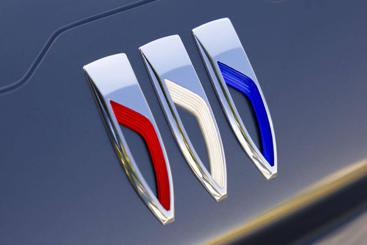
We’ve touched upon it before, but Buick has, with the release of the Electra Wildcat concept, officially updated its logo:
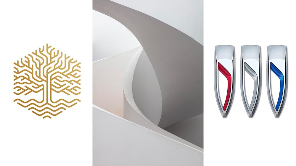
Official: Buick’s new logo
Electra is Buick’s name for electric cars, simultaneously stating the obvious while giving a big nod to past models — and the Wildcat concept is, dare I say it, borderline cool:
Both Buick and Cadillac have hinted at more Art Deco in their upcoming products, perhaps best illustrated on this concept’s interior:
It’s a head rest, folks.
Nice. (Not even remotely possible on a production model, but still.) Read more on Buick’s new logo and transition to an electric car brand at Car and Driver or The Drive.
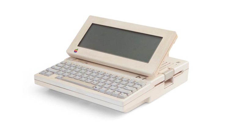
This time: System Six, from Glider’s programmer; MacOS 8 — including Glider — in your browser; and a pictorial history of Apple monitors. Nostalgia for your enjoyment!
System Six
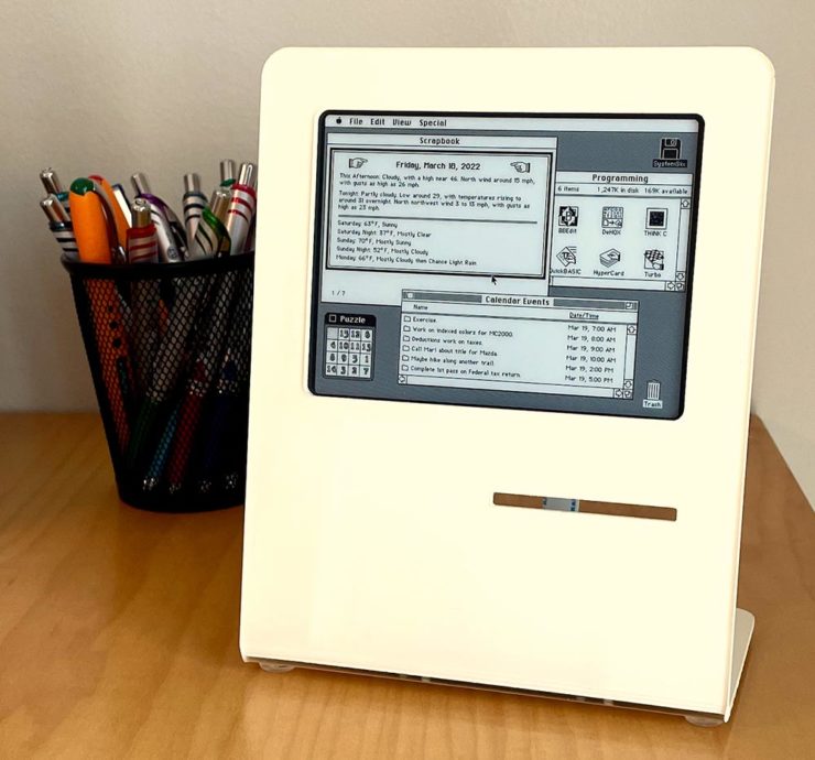
John Calhoun, who wrote one of my all-time favorite games for the classic Mac, Glider, has taken a Raspberry Pi, an e-ink screen, and a great deal of ingenuity to make this:
It’s only got the shape of a classic Mac — and yet….
Calendar events, the current moon phase, and more, in a form that can’t help but bring a smile. Better still, he’s written about the process so others can make one, too. (Ahem, Gerald.) Best desk accessory evah, to coin a phrase.
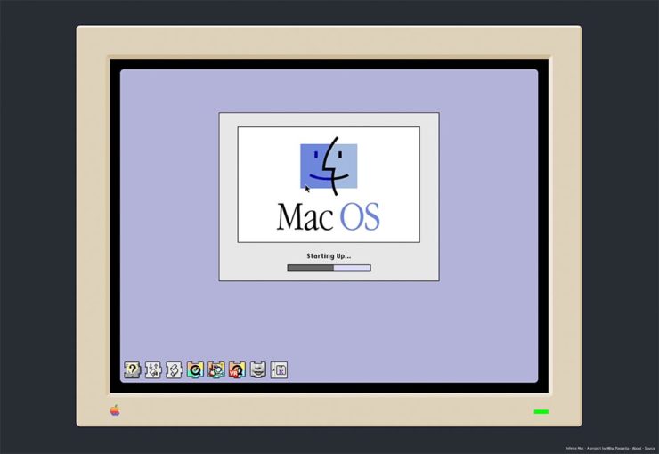
Infinite Mac
Fastest MacOS 8 startup times in history.
A project to have an easily browsable collection of classic Macintosh software from the comfort of a (modern) web browser. […S]ee what using a Mac in the mid-1990’s was like.
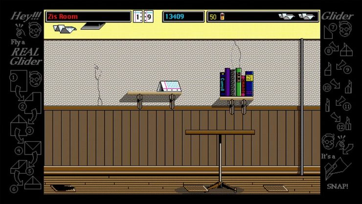
Well, naturally, I’ve been . . . here:
Glider works — and wastes time — just as well as on the original.
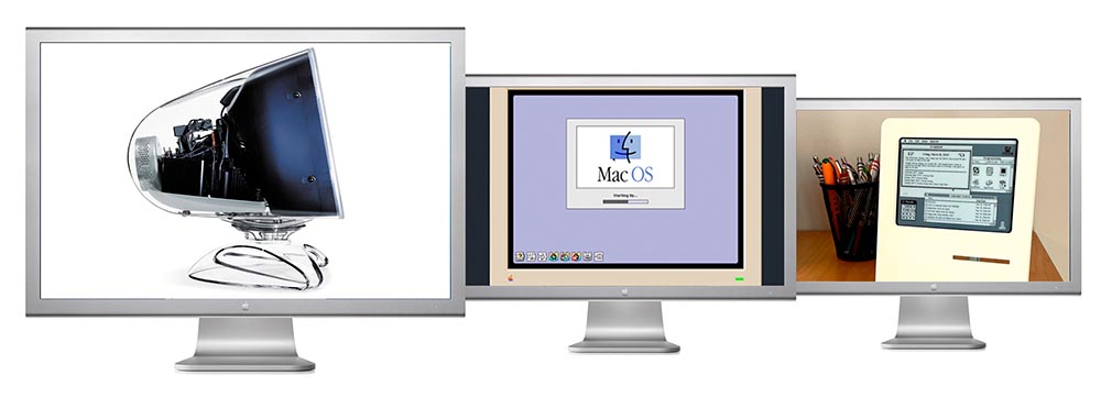
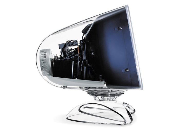
It takes a footnote — hmph — to get to what Steven and I both agree is a favorite, the last iteration of the CRT-based Apple Studio Display (you knew that name was familiar, right?):
The last great CRT monitor, IMHO.
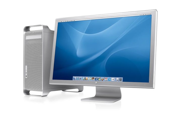
And then there’s the 30-inch Cinema Display, shown here with the G5 tower:
Awesome.
I had several of these monitors, including one of the 30-inchers, and have loved every one of them. And while I, like a lot of creatives, use a 27-inch iMac these days, thanks to Apple’s discontinuation of said iMac, the next iteration of my office setup will include a standalone Apple monitor. I’m glad Steven took the time to remind us what’s been — thanks.
Three completely unrelated items for you this time, ranging from the serious and interesting through the loony and interesting to something of a whole different stripe.
The Eames Institute of Infinite Curiosity
Update 2, 25 Apr:Brand New discusses this logo, with the usual catchy title: The Fast and the Curious: Counterspace Drift
Eames Institute’s “curious” logo variations, discussed at Brand New
Update, 8 Apr: It’s Nice That has more: The Eames Institute launches with a curious, “Eamesian” identity, and a logo that observes
Original post: Practically everyone has heard of an Eames Chair:
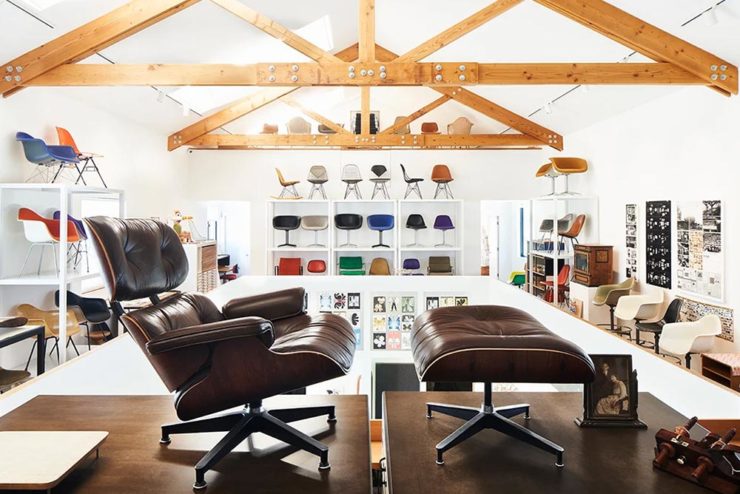
A particularly awesome example of an Eames Chair (and ottoman).
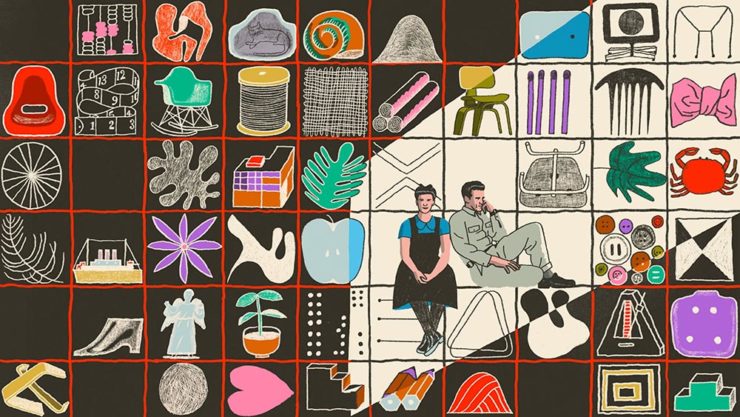
What you might not realize is that the legacy Charles and Ray Eames left behind enriches our lives to this day. It’s a shame, then, that while their house is a mid-century masterpiece (and museum), much of their lives have remained behind closed doors.
For almost three decades, a barn-like building in Petaluma, California, contained remnants of one of the most iconic design legacies of the twentieth century. […] We created the Eames Institute because we want you to examine the archive of what you know—the collection of your experiences, understanding, memories, and questions—and connect to the provocations that call to you. We want you to tap into that same fount of relentless curiosity, and its power to shift your perception and open you to innovations and discoveries.
Now, however, there’s the Eames Institute of Infinite Curiosity. Awesome name aside, it introduces us to the more personal side of one of design’s strongest partnerships.
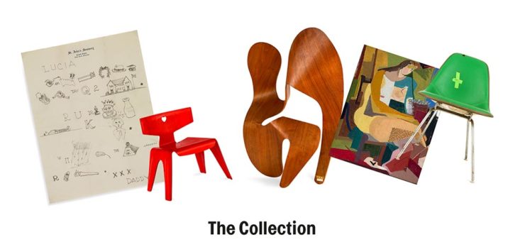
Items from the Charles and Ray Eames Institute. Drawings from the Charles and Ray Eames Institute.
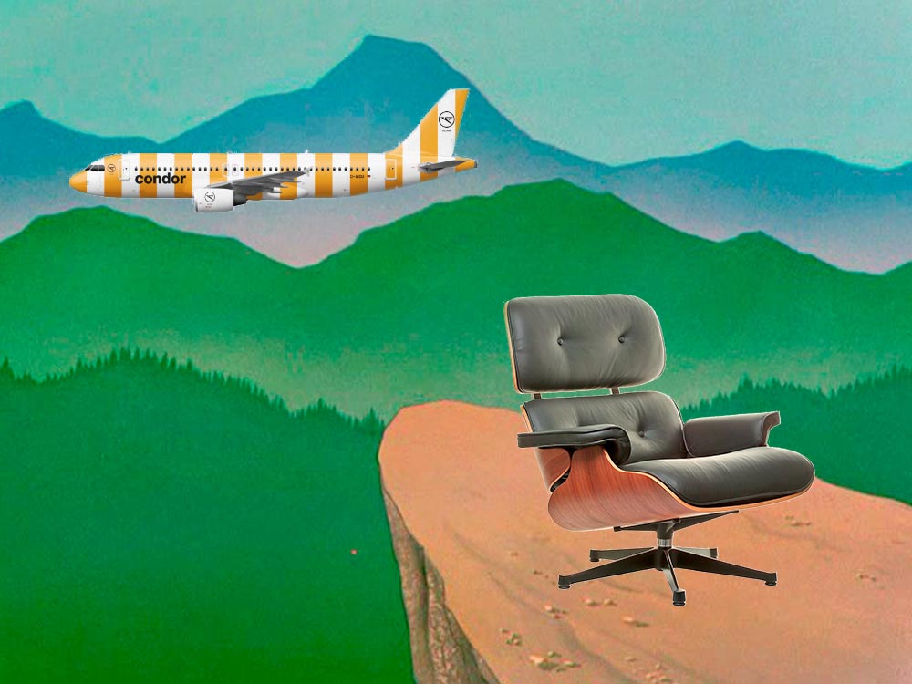
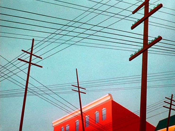
Crossed wires, anyone?Imagine who might run up to — or even get pushed off of — this cliff.A nice, innocent factory. Nothing could possibly go wrong.
Next time I treat myself to a Loony break, I’m going to make sure to spend some time looking beyond the action and appreciate the backgrounds. Nice.
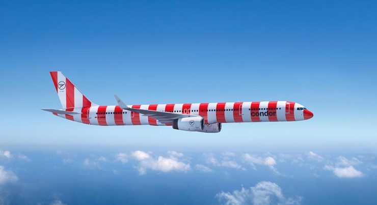
Condor Airlines Rebrands
Most of you have probably never heard of Condor Airlines; they’re mainly a European thing, a “leisure” airline associated with Thomas Cook, formerly owned and run by Lufthansa. (Here’s some history.)
It doesn’t particularly matter. What does is the bravado exhibited by management. Before, a typical airline logo — dare I say, typically Germanic:
Condor’s OLD livery.
Then someone said yelled, “HEY. WE DO VACATIONS. LIKE BEACH TOWELS. LET’S DO STRIPES.” The result:
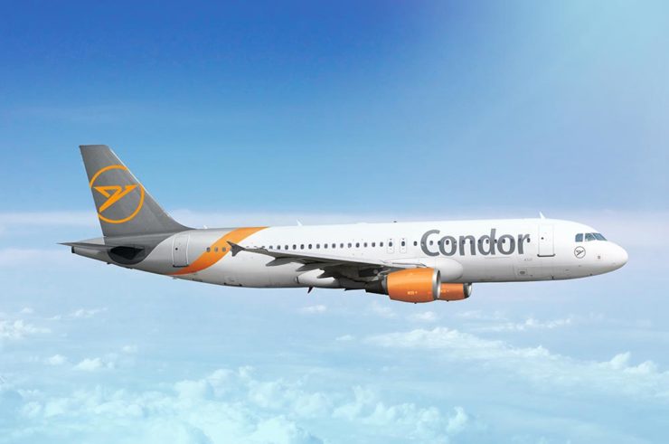
Condor’s NEW livery. Wow.
Armin Vit:
The new livery has zero fucks to give and just plasters every plane with thick vertical stripes that go against pretty much every single assumed tenet of what makes a good livery. It doesn’t look speedy, it doesn’t look nimble, it requires a lot of paint, and by all other standards it is just plain ugly and I love it.

![Beautifully Briefed, Late October 2022 [Updated X2]: Translucent Hummingbirds, Honda, Landscape Photography, and … Vampires!](https://www.gileshoover.com/wp-content/uploads/2022/10/BB-late-oct-2022.jpg)

![Beautifully Briefed, Early October 2022 [Updated]: Triboro’s Lyrics, Hoefler’s Daggers, and Skoda and Citroen Provide Contrast](https://www.gileshoover.com/wp-content/uploads/2022/10/BB-2022-early-oct.jpg)

![Beautifully Briefed, Mid-September 2022 [Updated]: Indigenous Type, Italic Type, Adobe Types “Stop,” and Two Awesome New Cameras](https://www.gileshoover.com/wp-content/uploads/2022/09/bb_sept-22-1.jpg)

![Beautifully Briefed, August 2022 [Updated]: Drobo, Rolling Stone, Aston Martin, and Bugatti](https://www.gileshoover.com/wp-content/uploads/2022/08/bb_aug22.jpg)