Beautifully Briefed 24.3: Bloomin’ Breadth

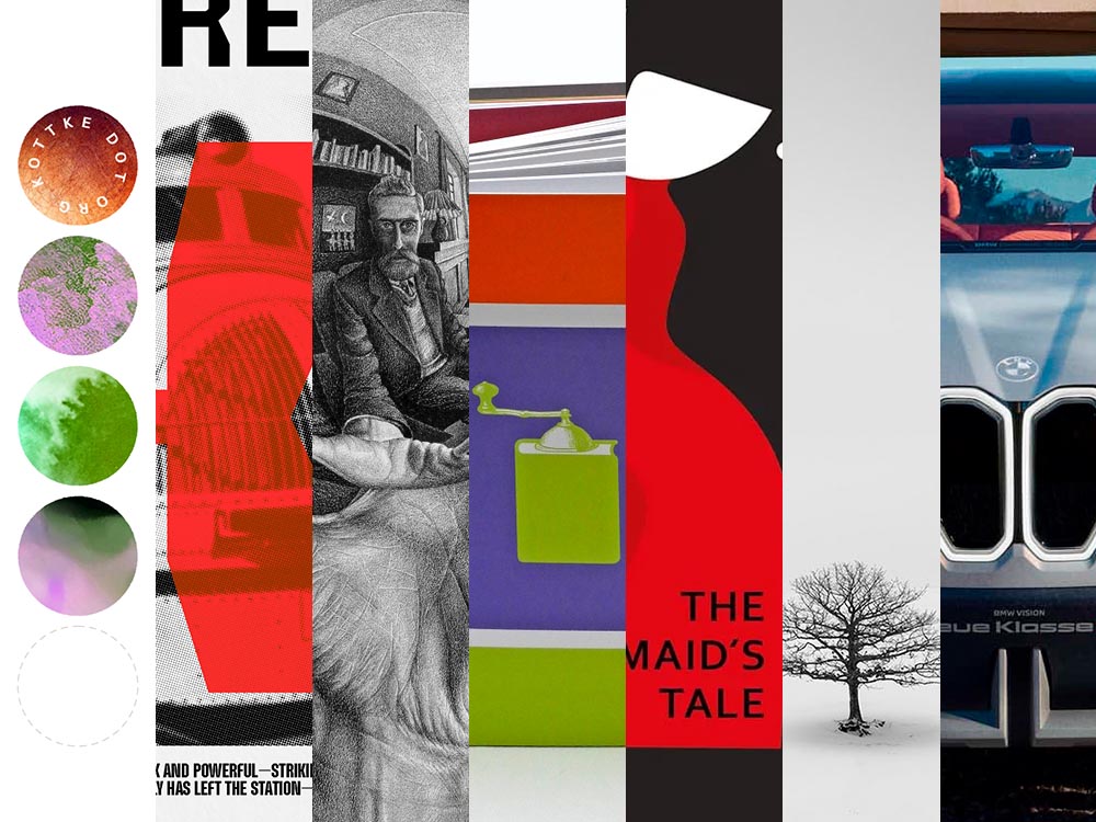
The end of March here in Middle Georgia means flowers aplenty, and usually with that, some photography — but I’ve not yet had a chance. (Stay tuned.) I have, however, been saving up links o’ interest: fonts, books, photography, and new(ish) car logos. Let’s go!

Kottke Meets 2024

Starting with one of the very few places that is still around from Foreword’s old days, the always-interesting Jason Kottke:

2024 marks Kottke.org’s 26th year on the ’net.

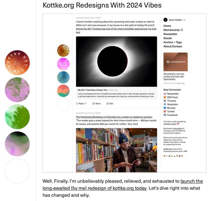
Great new looks for great content, with better Quick Links — the previews are ace — and incredibly-appreciated gift links to places like The New York Times and The Atlantic. If you haven’t been in a while, click and enjoy.

Fab Spring Type

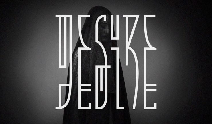
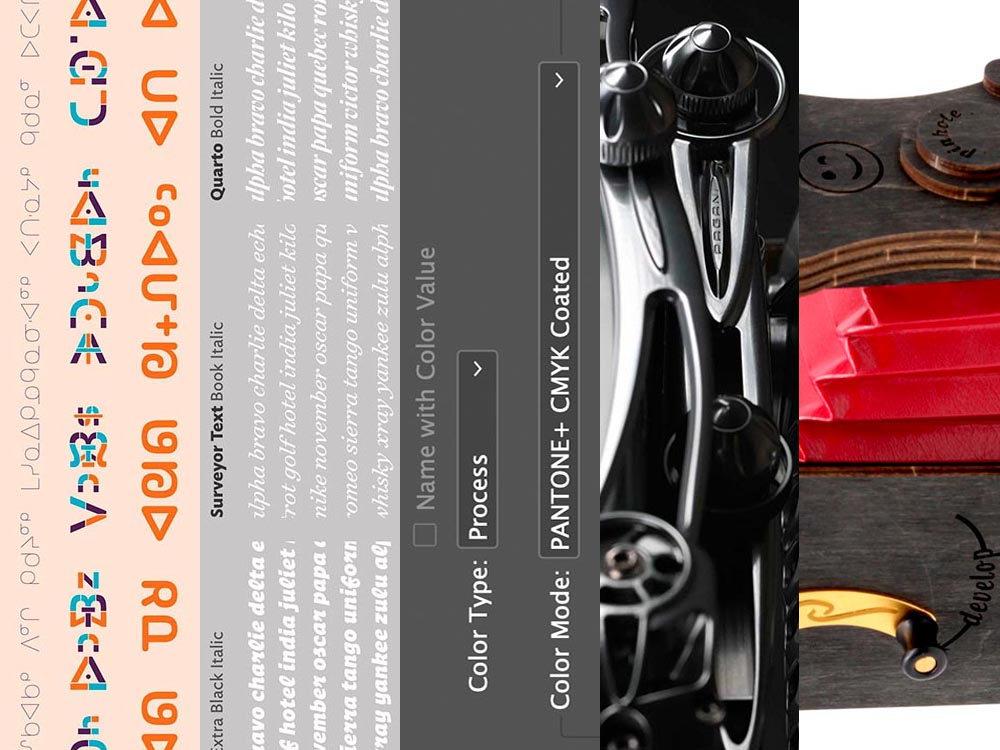
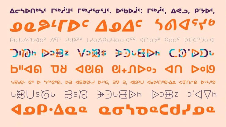
With “a plethora of captivating new typefaces,” CreativeBoom celebrates spring with 11 new faces to tempt, inspire, and bring joy:

Arillatype.Studio brings us a thousand glyphs of greatness.

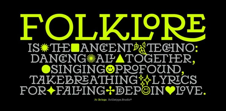
Zanco, with its bell-bottom style; Seabirds, inspired by 1930s book covers; Module, a “fluke side hustle;” and Graffeur, improvised from gaffer tape and glimpsed in this post’s header image, are all great. My far-and-away favorite, though, is At Briega, “inspired by the concept of hybridisation” and shown above.
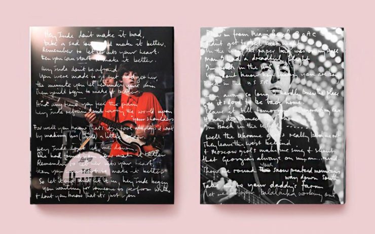
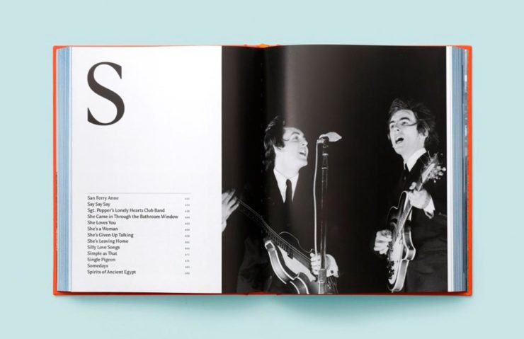
See ’em all here.

Literary Three-Fer
M.C. Escher’s Lesser-Known Works
“The Drowned Cathedral,” a 1929 woodcut.

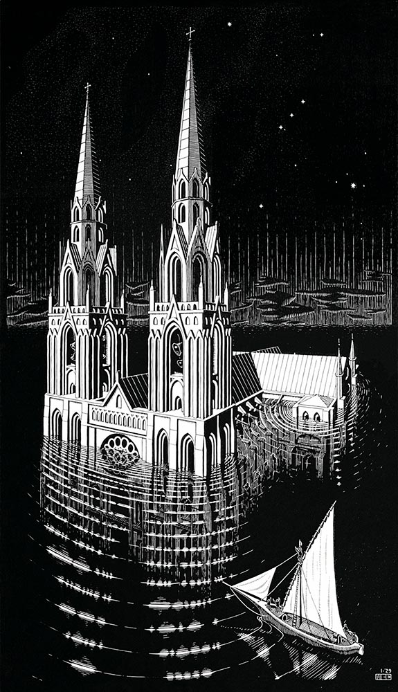
“Unique perspective” never does justice to someone whose name defines the term. See some never-before-seen images alongside old favorites in a new Escher book highlighted at Hyperallergic.

Multidimensional Libri

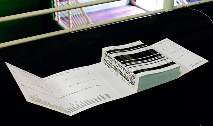
“Experimental books are flourishing, [a]nd the evidence is seen” in this Daily Heller from PRINT: a traveling exhibition on three-dimensional books, all published titles.

Oh, those Italians. Read on.

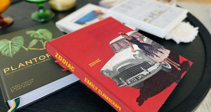
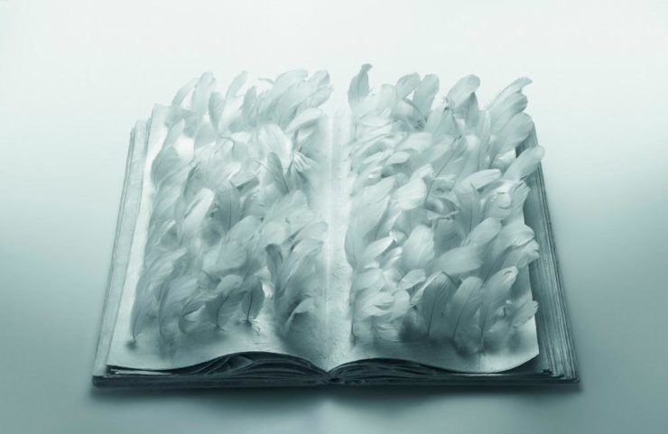
Book Design Snobbery
Hoover vs. Atwood — no joke.

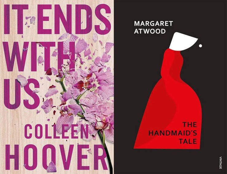
“Don’t get held back from the simple pleasures of reading,” argues Natalie Fear at CreativeBloq, “not everything needs to be minimalist.” Justification for commercialism or a common-sense explanation for the bookshelves’ current look? You decide.

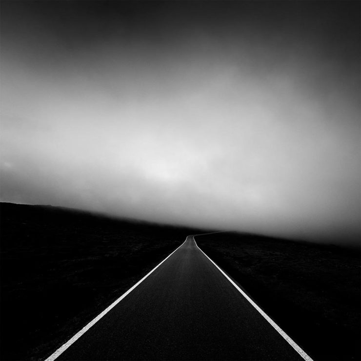
Photography Three-Fer
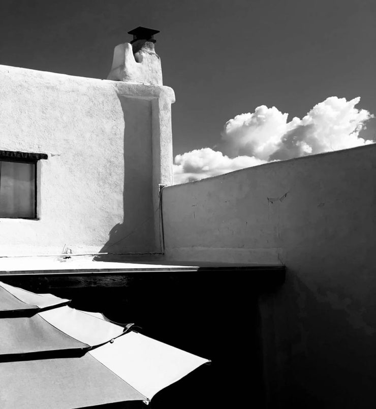
Winners of Monochromatic Minimalism
“Black Pearl” by Sascha Kohne. An honorable mention for the magazine, but a winner for me.

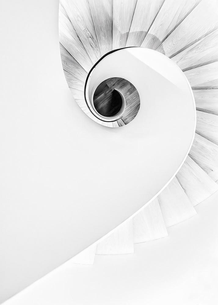
Some incredibly good stuff here — but perhaps more importantly, did you know of Black & White Minimalism Magazine? There’s no end to today’s continued diversification, methinks.

“Traveling through Costa da Morte, Galicia. 600m above sea level where the mountains separate the Cantabria sea from the Atlantic Ocean,” explains third-place winner Alexandre Caetano.
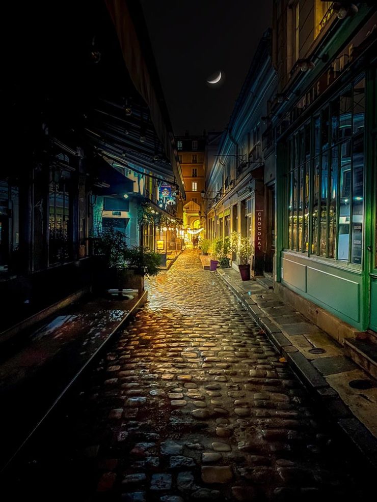
Aging Facades of France

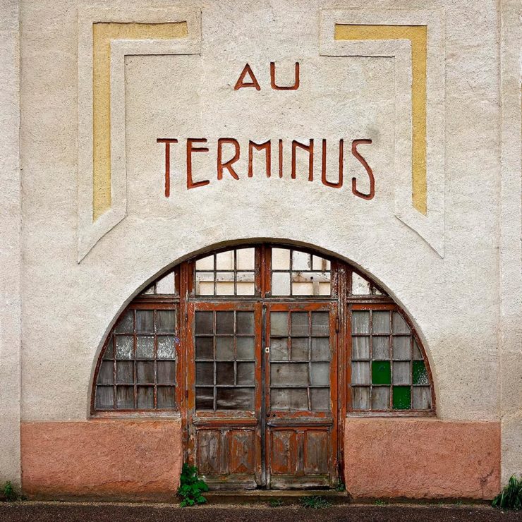
“Shuttered blinds, peeling paint, and aging doors don’t usually indicate an invitation, but for French photographer Thibaut Derien, the fading facades of long-closed shops are well worth a stop,” This is Colossal says.

Sony Photography Awards: Architecture
The Ciudad de las Artes y las Ciencias (City of Arts and Sciences) in Valencia, Spain: “Hemispheric,” by Eng Tong Tan, Malaysia.

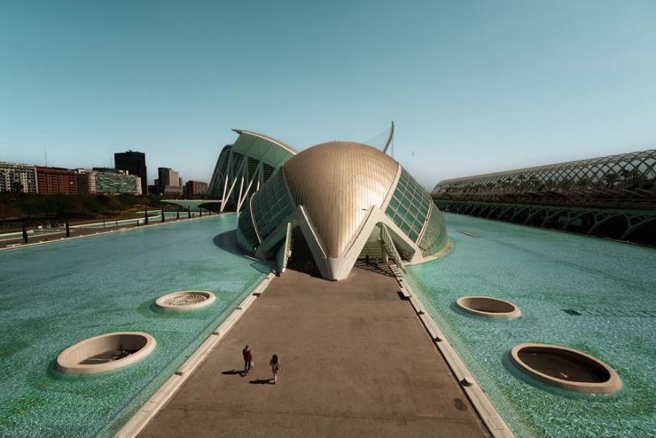
ArchDaily‘s coverage of the annual Sony awards shortlist announcement was an insta-click.

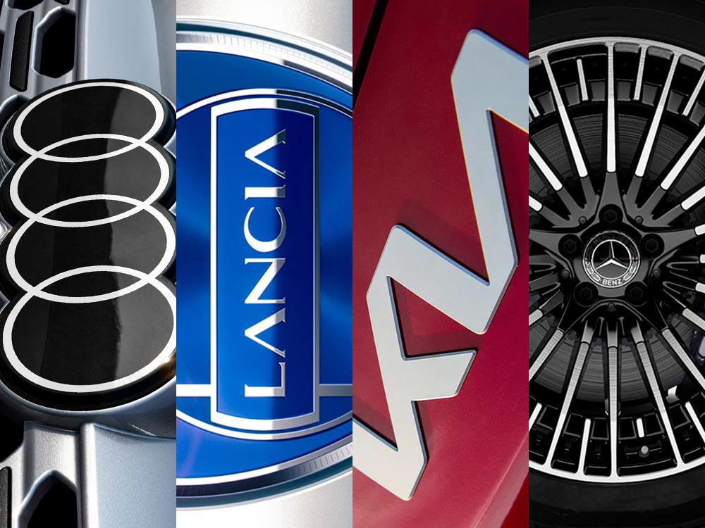
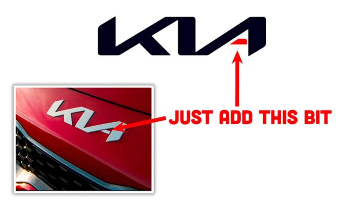
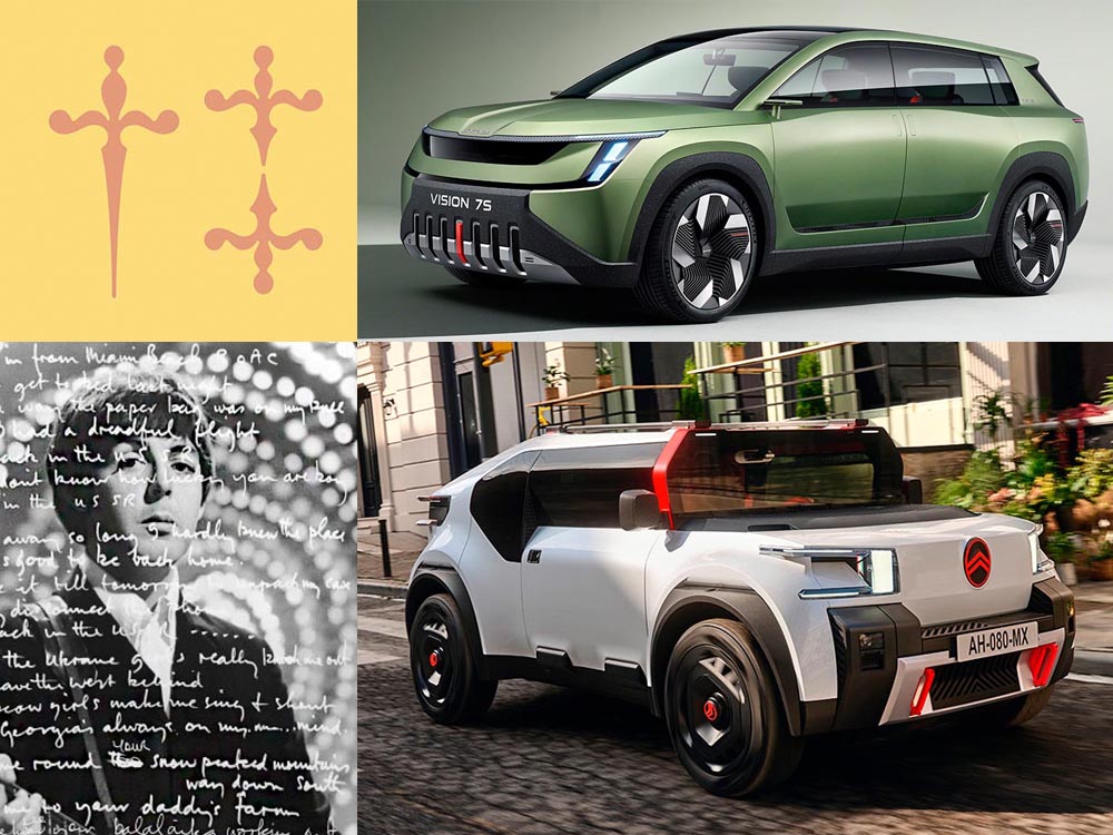
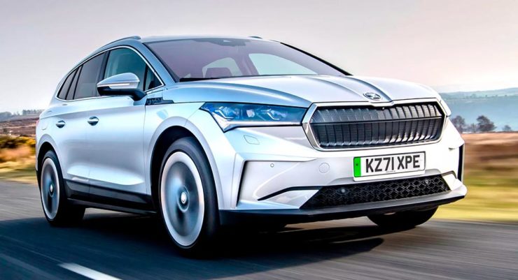
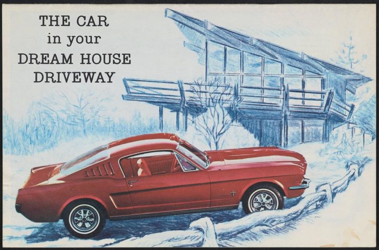
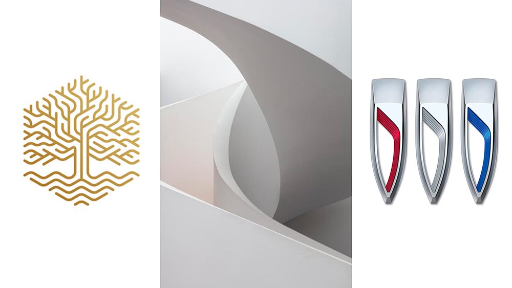
New Bull: Now Flat. (And a BMW.)

Lamborghini practically defines flamboyant. So it’s worth a link when their logo gets less interesting:

Old logo, left, new, right.

Late at following the industry trend of flat-is-better, because, well, Volkswagen. (Okay, I undersell. Perhaps.) Read the lack of news at Motor11Motor1 also has a decent roundup of new car logos, from 2016-present, which underscores the “flatness” trend. or The Drive, where they manage to convey the brand’s use of the phrase “digital touchpoints.”

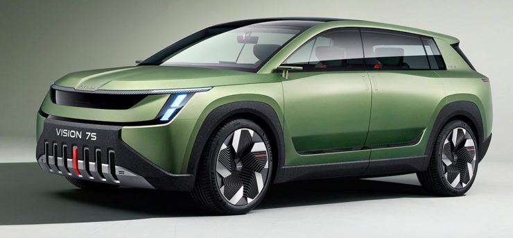
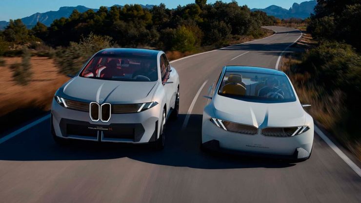
I don’t know whether this will make any more sense in a few or even many months — which is relevant because of BMW. Four years ago, one of the industry’s design leaders expressed strong this new style, and I didn’t get it. But it’s worn better than most, and superlatively on occasion — check out the logo’s use on the Vision Neue Klasse X:

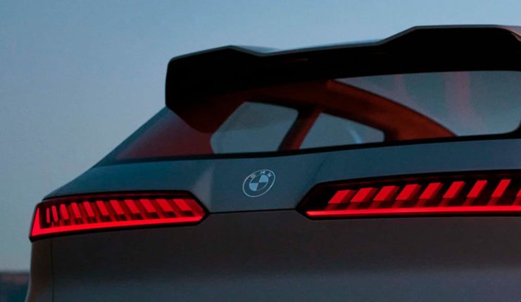
Rather than a standalone, plastic part sitting on the paint, it’s etched into the finish. Man, I hope that makes it into production.

Neue Klasse: do like. Bull? No so much.

Update, 2 April: BrandNew, itself sporting a new look, has weighed in on the new Lambo style, calling it “not good.” (FYI, BrandNew is a subscription, quite possibly the best $20/year someone interested in design can spend.)

  • 1
    Motor1 also has a decent roundup of new car logos, from 2016-present, which underscores the “flatness” trend.

Beautifully Briefed 23.8: Summer Stew

The August heat is met with some refreshingly cool items for you this time: beloved movies reimagined as vintage paperbacks, graphic design on the Internet Archive, and winners of the 2023 iPhone photography awards. Plus, a bit on social media that hopefully won’t leave an aftertaste. Let’s dig in.

“Good Movies as Old Books”

This is Colossal points us to an extraordinary personal project by graphic designer Matt Stevens: classic, acclaimed movies visualized as vintage paperback books. Everything about these spells “win.”

From the aged look, illustration choices, and director-as-author to the logo and occasional price, these are all … perfect.

Volume One is 100 titles, and while that book is sold out, prints are available at his website. The items in Volume Two, due this month, are guaranteed to be awesome.

Graphic Design on the Internet Archive
Emigre #20 – Expatriates. Courtesy of the Internet Archive via archive.digital.

Another treasure via Jason Kottke:

archives.design is a labor of love site run by Valery Marier where she collects graphic design related materials that are available to freely borrow, stream, or download from the Internet Archive. I’ve only scratched the surface in poking around, but so far I’ve found Olivetti brochures, a collection of theater programs from the 19th and early 20th centuries, several Apple thingsThe Vignelli Canona specimen book of wood type from the 1880s, and many issues of Emigre. What a resource!

Jason Kottke, kottke.org
An advertising brochure for the Olivetti Tetractys, circa 1956.

Some of these are fantastic — set aside some time to explore and enjoy.

2023 iPhone Photography Winners

I don’t always link to these contests — it often seems like the publicity (and rights!) are all about the folks holding the contest rather than the people entering them — but I often look, and am always impressed with the quality coming out of a “simple” iPhone.

Long Nguyen, France – 1st Place, Travel – “Last Night before Xmas”
Scott Galloway, United States – 1st Place, Nature – “Wonder Wheel”

And while both of the above are (relatively) recent phones, in the latter case showing the macro capabilities of an iPhone 12 Pro Max, even older phones can highlight the talent of the person using it:

Derek Hager, United States – 3rd Place, Photographer of the Year – “Tucson Morning”

Shot on a 2017 iPhone X. Nice.

See all the winners, for 2023 and years past, at IPPAwards.com. (Via PetaPixel.)

A Moment Regarding Social Media

I’m not going to spend much time on this; I eschewed pretty much all forms of social media years ago now, and don’t regret it. That said, I do keep up with social media in the meta sense (a word that’s been stolen, as far as I’m concerned, by — wait for it — a social media company), and have noted the pain and concern associated with the implosion of Twitter.

While this conversation started with Nick Heer and the always-excellent Pixel Envy, it’s obviously evolved as the year has seen one extraordinary cage fight event after another.

Threads on Apple’s App Store, via the BBC.

For the past decade, It’s been all but required for serious brands to maintain a social media presence […] yet instead of scrambling to claim digital real estate across all these newly emerging platforms, some companies are choosing to be more judicious about which platforms they choose to join. In some cases, they’re learning from brands who jumped the social media ship years ago.

Chris Stokel-Walker, BBC

The quote above, from the BBC, attempts to answer the question, “Why your favourite brand may be taking a social media break.” Short answer: it’s complicated. I’d argue there’s an even shorter answer — it’s smart! — but for people and brands that aren’t yet established, social media is often key to discoverability.

This may be especially true for artists, designers, photographers, and others in the self- and small-business-employed creative field. Indeed, let’s go to a great source for those in the arena, Creative Boom, who recently spent a minute asking, “Creatives are saying social media is over… so what next?”

Like any new craze, it was fun for a while. But there’s certainly nothing new about it any more. Facebook’s now been around for almost two decades. Twitter’s 17 years old. Even Instagram has reached its teens. And while many of us joined these platforms during their fun, “anything goes” eras, when everything was about the users, now it’s all about the algorithms and their use to make venture capitalists vast amounts of money.

Tom May, Creative Boom

While I agree that social media is a mess and has been for a while, I’m absolutely not going to tell you to give it up — only to remind you that I have given it up and continue to be completely okay with the decision.

I do want to ask you, though, to choose wisely:

Facebook’s “Threads (an Instagram app),” their answer to the Twitter/X debacle, as shown via Apple’s iOS App Store privacy report.
Tapbot’s “Ivory,” available in Apple’s iOS App Store and showing that app’s privacy report, for the Mastodon social platform.

Enough said. Turn off the computer, go forth, and enjoy a beautiful summer’s day.

Updated Gallery: Columbus, Georgia

Gerald and I were in Georgia’s lower Chattahoochee River valley yesterday, visiting the city of Columbus — and ran across a couple of treasures. Naturally, there was a camera handy.

The first is the best restaurant I’ve enjoyed in a long while: The Animal Farm.

The Animal Farm, 105 W. 12th St.

If you’re in or going to be going to Columbus anytime soon, I cannot recommend it highly enough. The food was superlative, the service excellent, and the ambiance simultaneously upscale, casual, and fresh.

The second — and no less tasty — stop was the Ma Rainey Museum of the Blues. This period house downtown is small but demonstrates a remarkable comeback from the (literal) wreckage they started with in the ’90s. I’d originally wanted to return to the Columbus Museum, but it’s being renovated; Gerald’s suggestion here was pitch-perfect.

Ma Rainey House, 805 5th Ave.
Ma Rainey House Marker, 805 5th Ave.
Bust and Albums, Ma Rainey House, 805 5th Ave.
Record Player Detail, Ma Rainey House, 805 5th Ave.

Inside, Gerald and I enjoyed a lengthy conversation with Xavier, a guide who was knowledgeable and enthusiastic; he absolutely made us want to explore more blues history. (I’m also going to be listening to some Ma Rainey on Tidal.)

Meanwhile, gallery of Columbus photographs is deep and varied, spanning almost fifteen years and 180 items — check it out.

As always, thanks for visiting.

Update: Gerald’s take on the day.

Beautifully Briefed 23.3: Kottke’s 25, The Book Cover Review, B&N Back to its Roots, The End of Type 1 Fonts, and I Don’t Want to Log In

This time, the twenty-fifth anniversary of one of my favorite websites, a new book cover review site, an interview with B&N’s CEO, the end of Type 1 fonts, and a world-class rant.

Kottke Turns 25
“Fine Hypertext Products,” indeed.

Jason Kottke has been publishing a blog continuously for twenty-five years — more than half his life — and along the way, earned many an eye. (It’s been a full-time job since 2005.) Some of his thoughts from the anniversary post:

My love for the web has ebbed and flowed, but mainly it’s persisted — so much so that as of today, I’ve been writing kottke.org for 25 years. A little context for just how long that is: kottke.org is older than Google. 25 years is more than half of my life, spanning four decades (the 90s, 00s, 10s, and 20s) and around 40,000 posts — almost cartoonishly long for a medium optimized for impermanence.

I had a personal realization recently: kottke.org isn’t so much a thing I’m making but a process I’m going through. A journey. A journey towards knowledge, discovery, empathy, connection, and a better way of seeing the world. Along the way, I’ve found myself and all of you. I feel so so so lucky to have had this opportunity.

— Jason Kottke, Kottke.org

Cited here often, always brimming with interesting items, and a regular source of learning, Jason deserves massive congratulations. Happy 25! Here’s to many more.

Bonus: Kottke was a guest on Daring Fireball’s The Talk Show. Check the links — Textism! — and enjoy a trip down blogging’s memory lane.

The Book Cover Review
NYT? No, English, actually.

FastCompany points us to a new and interesting cover review site: mostly classic titles, covered in ~500 words “from a range of voices around the world.” Good stuff, with a NYT Book Review look and feel, updated regularly. Give it a try.

The Verge interviews B&N’s CEO
Decode B&N with James Daunt

I’m not a regular listener of The Verge’s Decoder — it’s usually business-centric, going so far as to describe itself as secretly about org charts — but this one’s interesting: an interview between Nilay Patel and Barnes and Noble CEO James Daunt. They cover changes at B&N (with emphasis on why) and, of course, the elephant in any room:

[Amazon is] really terrible at putting a book in front of you that you never thought you’d want to read, that you have no reason to read and no tether to at all. Whereas a bookstore is precisely the place that does that. You pick up the book that you never thought you would want to read, might read, or could even think about reading, by an author you’ve never even heard of until that moment. When a bookseller says, “Look at that,” “Read that when you next come in,” or “I love that,” or whatever it is, all those small, little recommendations are personal and able to attach themselves to books that otherwise have nothing going for them at all.

James Daunt, CEO, B&N

Props to The Verge for providing a full transcript, especially helpful for folks who would rather read the interview than listen to it. Whether you want to read or listen, though, book lovers in the US should take in this interview.

Adobe Discontinues Type 1 Support
Flying Suitcases.

Back in the old days, Type 1 fonts were the backbone of desktop publishing. They were multi-part, often incomplete or corrupted, and always getting in the way of perfect print output — and yet beautiful and opening never-before-appreciated horizons of possibility for your projects.

Now, in these days of OpenType, Google Fonts, and digital output, Adobe has taken the decision to discontinue support for the legacy Type 1 format. TypeNetwork has the full story, along with some options, and there are other converters if you need ’em.

Bonus: TypeNetwork also has all of the Adobe Originals, from back when Adobe was your go-to instead of the corporate behemoth. Classy classics: see the list.

The end of an era. (Via BrandNew.)

The Perfect Rant: Solved
There’s a park calling your name.

One more from The Verge: “I don’t want to log in to your website.” The surge of login and email requests before being allowed to read “free” content is addressed brilliantly:

So what we’re looking at here is creating a worse user experience in order to pursue a variety of scummy money-making schemes. And that sucks because there are no real public spaces on the internet. Here in reality, I can fuck off to a park and hug a tree and sit on a bench and do stuff without ads, without anyone trying to track me, and without having to pay a dime. There was a time within my memory when people tried to make websites feel like semipublic places — you could hang out on someone’s cool blog and enjoy yourself. 

Elizabeth Lopatto, The Verge

Read the whole thing, nod in agreement, and go enjoy that park.

Beautifully Briefed, Holiday Edition (Late December, 2022): Nick Heer, Jason Kottke, Stealing Sheep, a Landscape Photograph, and Some Old Logos

“The Bleak Cycle”

I don’t usually think it’s fair to quote another blog post in its entirety, and I certainly won’t make a habit of it. With that out of the way, the always-interesting Pixel Envy, written by Nick Heer, hits us with a doozy — one that, due to its length and depth, requires the complete quote:

The Bleak Cycle

It’s a cycle. People create something, together, that reflects their energy and weird work; that thing becomes compelling as a result, and that makes it valuable, and at some point someone puts a price on it and someone else pays that price. It is at that moment that the thing begins to change. The new owner will almost always decide that what is most interesting about this thing is not the human essence that gave it value, but The Owner Himself, and will act accordingly. People will come back for the valuable stuff until the owner succeeds in crowding it out; when that crowding is done, the owned thing dies. Until then, what’s left is just what’s valuable—the humanity and brilliance and unpredictability and fun that all that cynical and idiotic and self-serving wealth is always and everywhere busy replacing with itself. There’s nothing to do but look for the good stuff until the looking becomes too challenging, or until it’s gone.

David RothDefector

Heer writes in response: “You may disagree with Roth’s headline thesis — ‘everything is Silicon Valley now’ — or his tie-in with the story du jour, Twitter, or his analysis of baseball’s problems. But the paragraph above? That is something to keep pinned in your brain. For most of us, it is a reminder to be wary of how things are changed in exploitative ways; for those in power, it should be seen as a cautionary pattern.”

Pinned.

Kottke is Back!

After a few months off, Jason Kottke is back in the blogger’s seat to enrich all of our lives. As someone who’s been reading for years — he started in 1998, and I’m certain his site was in the blogroll of the old Foreword, back in the Aughts.

Fine hypertext products indeed: Kottke.org, December, 2022.

We might be waiting a while for his so-called “comically long what I did on sabbatical post,” but his Sabbatical Media Diet post is a gold mine of to-read and to-watch items.

Welcome back, sir. May you blog for many seasons more.

Stop Stealing [Free] Sheep

No, not that — the type book:

From Kottke, while we’re on the subject, one of his Quick Links from Dec 20th: “Google Fonts is offering a free download of the newly updated 4th edition of Erik Spiekermann’s Stop Stealing Sheep & Find Out How Type Works.” It’s a PDF, available now.

9th Annual Landscape Photography Awards

It’s fair criticism to say that I both decry photography contests and yet sometimes celebrate the results. But…:

“The Winding Journey” by Max Rive, Border Between Chile And Argentina, Patagonia

Wow. I couldn’t not highlight that photograph.

Many more at the source. (Via DPReview.)

Oldest Logos Still in Use

Image Relay has an interesting item showing how long some familiar logos have been used — and, yeah, there’s a reason they’re familiar!

The black triangle is when the company was founded, and the bar indicates how long a logo with elements still used today has been around.

That’s but a sample of the complete listing; shown are nos. 3–8. Coca-Cola, the company I’d probably name if asked for the oldest logo, is no. 12. Click through for the rest.

That’s it for this year

Foreword will be back in January with our annual first-of-the-year best-of: my favorite book covers of 2022. Happy holidays, everyone!

Top image: Tree Lights, December 2020, downtown Macon, Georgia.

Beautifully Briefed, Automotive Edition (December 2022): Audi, Lancia, Kia, and Mercedes-Benz

This time, it’s three automotive logos . . . and Mercedes’ accounting department, plus a holiday bonus. Joy to the Auto!

New Audi Logo Falls Flat

Audi’s “Four Rings” have been around for a long time — since Auto Union was formed, ninety years ago:

Now Audi follows the pack (see VW, Mini, Volvo, etc.) and converts their logo from three-dimensional to two; the rings now are either white and framed by a thin black border or dark grey with black borders.

Four-ring closeup. (It’s hiding sensors, too.)

Not an improvement, IMHO. One of the articles mentions the concept of “a consequence of digitalization,” and think that’s about as good a description as you’re gonna get.

The change will roll out starting with the updated Q8 e-tron — which, thankfully, still looks good:

Even better in Sportback form:

Dezeen has the best coverage of Audi’s new logo, but see also Motor1 and CarScoops for more pictures.

Lancia Debuts … a Mouse

Okay, it’s not really — it’s a conceptual sculpture, titled “Pu+Ra Zero,” that represents their rebirth:

They call it a “a three-dimensional manifesto,” and no, I don’t get it either. (The light signatures and, apparently, the circular sunroof will carry through to the new models, however.) The logo, their eighth in 116 years, is new as well:

I didn’t know Lancia well (only in passing? Eh. —Ed.) until the famous Top Gear segment naming them “the Greatest Car Manufacturer of All Time,” although I knew of the Delta Integrale — and think that the Fulvia is one of the prettiest sedans ever:

The 1972 Lancia Fulvia

Let’s hope their new models, and conversion to an all-electric manufacturer, lives up to their past achievements. Meanwhile, The Autopian has the best roundup of the new Lancia.

Kia, KN, and … Wait, What?

30 thousand folks a year are doing Google searches for “the KN car.” Why? Kia’s logo, of course:

Thankfully, the Autopian to the rescue:

I’m not a huge fan of the new Kia logo — and can absolutely see the “KN problem” — but I think it speaks more to modern society that this is a news item than anything related to graphic design. Willing to be wrong.

Mercedes: $1200/yr for Full Output

This subscription thing has gotten seriously out of hand: Mercedes-Benz USA, in an effort to further bilk their customers — ’cause, y’know, MBs don’t cost enough — has decided that the last 60-110 horsepower available on their 2023 electric vehicles are only available for a yearly fee.

The MB EQS gets even less attractive.

Gak.

Holiday Bonus: Free Online Automotive Design

Interested in car design? Happy Holidays.

Beautifully Briefed, Late October 2022 [Updated X2]: Translucent Hummingbirds, Honda, Landscape Photography, and … Vampires!

In this edition: Hummingbirds, the UK’s 2022 Landscape Photography of the Year 2022, a potential new logo treatment from Honda, and something just in time for Halloween.

Who Knew: Hummingbird Edition
Wow.

Taken when the creatures are mid-flight and beating their wings at incredible speeds, Spencer’s striking photos capture sunlight as it filters through their feathers, emitting a full spectrum of color. The opalescent phenomenon is caused by diffraction and transforms their limbs into tiny, ephemeral rainbows.

This is Colossal

Let’s set aside for the moment the time and energy get these photographs and just celebrate that Australian photographer Christian Spencer worked to get these shots. Better still, there’s a book:

Like the typography in addition to the photograph, too. Thanks to This is Colossal for pointing us in this pretty wonderful direction.

New Honda Logo?

This hasn’t been reported anywhere, so I don’t know whether there’s a shift ahead for Honda (pardon the expression), but…:

This is a photograph — well, graphic — of the 2024 Prologue EV. Note that instead of the classic “H” seen on every Honda since I don’t know when, the name is spelled out.

Maybe it’s because this is a rebadged GM?

Either way, you heard it here first. (Read more about the Prologue on Motor1.)

Update, 29 October 2022: Motor1 has another preview, this time of the upcoming 11th-gen Accord, the rear of which uses the usual “H.” So, electric-only? Models from 2024?

Update, 7 November 2022: Here’s a future Honda model for China with the name spelled out. (Here’s the Motor1 story, and a second, better article from Autopian.) So … maybe?

2022 Landscape Photography of the Year

These haven’t gotten much press here in the US, and they deserve better:

Windmill in the Mist, Itay Kaplan – winner, historic Britain
Loch Awe, Damian Waters – winner, lines in the landscape

My personal favorite is this stunning shot:

Ascension, Demiray Oral – winner, classic view

The Dragon’s Back.1The aptly-named Dragon’s Back is in the Brecon Beacons National Park, Black Mountains, Wales. Take a walk. Thanks to The Guardian for the slideshow. See the entire list of winners on the official contest website.

Vampires!

Speaking of slideshows on The Guardian, they had a great subject just in time for Halloween: “Cinema’s unquenchable thirst for vampires celebrated in posters.”

A classic.
A future classic — scary-great.

Unquenchable thirst, indeed. Enjoy.

  • 1
    The aptly-named Dragon’s Back is in the Brecon Beacons National Park, Black Mountains, Wales. Take a walk.

Beautifully Briefed, Early October 2022 [Updated]: Triboro’s Lyrics, Hoefler’s Daggers, and Skoda and Citroen Provide Contrast

This time, we’ve got some great book design (with a bonus), Hoefler educates on typography (with a bonus), and two updated car company logos. Let’s get right to it!

Print Magazine on the design of Lyrics

The still-very-relevant-in-2022 Print Magazine brings us a great feature on the design of Paul McCartney’s book, Lyrics:

Front and back covers of Paul McCartney’s Lyrics, by Triboro Design.

Turns out it was designed by an outfit called Triboro Design, from Brooklyn (appropriately). Print brings us an interesting interview with David Heasty, the principal:

I […] found him to be sharp, quick, articulate, and modest. Below, we discuss Paul’s involvement with the project, the book’s gorgeous bespoke typeface, and the importance of staying true to a legend’s vision.

Ellen Shapiro, Print Mag
The “S” spread of Paul McCartney’s Lyrics, by Triboro Design.

Interesting and informative. Catch this interview when you can.

Bonus: Looking at Triboro’s website, this lovely piece of typography stood out:

Triboro Design’s Zolo Jesus album typography creates desire.
Hoefler Discusses Daggers

In “House of Flying Reference Marks,” Jonathan Hoefler talks about daggers, or, what you use when an asterisk isn’t enough:

Hoefler on daggers.

Beautiful examples, complete with a phrase you don’t hear everyday: “twisted quillon.” Read and enjoy. (If the opportunity presents, follow on with the ampersand article — which, uh, takes a stab at where the word came from. Nice.)

Bonus: Creative Boom’s article, “18 highly respected type foundries that remain fiercely independent.” (I guess you could say I’m still surprised Hoefler is now, well, Monotype.)

Skoda and Citroen have new logos

It seems like nearly all of the major car manufacturers have introduced a new logo in the past couple of years, but here are two more. One’s best described as “an update,” while the other … goes a little farther.

Skoda, for those that don’t know, is a Czech company and part of the massive VW Group. Frankly, it shows:

Skoda’s 2022 Kodiaq, a thoroughly VW Group product.

For 2023, they’re introducing a push to separate themselves from VW a little, resisting the downmarket image. As is (now) normal with updated car company identities, there’s a concept:

Skoda’s Vision 7s concept.

It’s … not inspiring. Maybe the actual updated logo will turn the corner:

Skoda’s 2022 logo.

Solid. (Pardon the pun.) But seriously, even an avid car nut like me didn’t know that represents a winged arrow — and I’m not sure the new version helps. At least they get points for consistency:

Evolution of Skoda’s logo, 1895–2023.

Read more at Brand New’s “Czech this Out,” or Carscoops’ more optimistic take, “Thriving Skoda Brand Forging Its Own Path Within The VW Group.”

Then there’s Citroen. Even under the potentially-smothering corporate blanket that is Stellantis (there’s a name!), the pioneer of decades past still manages to actually thrive. First their new logo:

Citroen’s 2022 logo.

They’re not quite as consistent — the dual chevrons have varied a bit. This time, they’ve literally gone back to their roots, pulling the 1919/1921/1936 version out and dusting it off for modern use:

History of Citroen’s logos, 1919–2022.

Points to them for hinting at what’s to come, too:

Citroen’s 2022 logo, with just a slice of concept car showing.

…Which turns out to be something with, ahem, Oli bits:

Citroen’s Oli: the antithesis of a Skoda.

“Nothing moves us like Citroen,” they say. The Oli moves me, to a point where I truly wish Citroen was once again available in the ’States. Cool and radically innovative, without losing sight of something VW has truly lost: fun. Well done.

Read more on the logo: Motor1, “Citroen Unveils Updated Retro-Flavored Logo And New Slogan,” and Carscoops, “Citroen Unveils New Logo Inspired From Its Past, Teases New Concept.” Read more on the Oli at the excellent Autopian: “The Citroen Oli Concept Is An EV Made From Cardboard And Good Ideas.”

Updated, 19 October, 2022: Brand New adds to Citroen’s new logo story, with a slightly-less-than-enthusiastic take on the logo and has frankly unkind things to say about the new, custom typeface (custom typefaces are now de rigueur — a policy as much related to rights ownership than creativity, alas).

I really like the cursive in this Vimeo screenshot:

YouTube? What YouTube? Citroen posts to Vimeo. Ahh, the French.

BN also includes a number of extra photographs of the simply awesome Oli, too. Here are a couple, for your enjoyment:

Plug-and-Citroen.

Note the removable Bluetooth speakers (the black tubes with “+” and “-“) and, especially, the seats:

I love everything about this interior.

Check the rest, and BN’s take, here.

Apologies to both Skoda and Citroen for the lack of language-correct accents. WordPress needs a glyph function.

Beautifully Briefed, Mid-September 2022 [Updated]: Indigenous Type, Italic Type, Adobe Types “Stop,” and Two Awesome New Cameras

A wide selection of items for the beginning of fall, from positive fonts to jolly cameras — with Adobe and Pantone pouring some cold water on things. Let’s get to it!

Indigenous Letterforms

As Americans, Europeans, or, more generally, Westerners, we take for granted that fonts will reflect the various pieces of individual type — that is, letterforms — that we’ll need. But not everyone falls into that category.

North American Indigenous fonts — with updated Unicode. Major Kudos. (Courtesy of Dezeen.)

Dezeen points us to an especially interesting effort: “Typotheque typography project aims to protect Indigenous languages from “digital extinction.” In this case, folks who were in the Americas long before Westerners arrived used languages often not written down, or that use letterforms that simply aren’t supported in modern typographic systems.

“When [the Unicode Standard] doesn’t contain characters in a given language’s orthography, it is not possible for that community to accurately use their language on digital text platforms.”

Typotheque typeface designer Kevin King 

Fascinating. Read more at Dezeen.

Italic Letterforms

The always-great Hoefler & Co. spends a minute educating us about italics:

Hoefler examines italics: point-and-sketch
Hoefler’s Fifteen Italic Textures illustration

Italics can be the most colorful part of a type family, diverging dramatically from their roman cousins. Here’s a look at twelve kinds of italic typeface, with some notes on their cultural contexts, historical backgrounds, and practical applications.

Hoefler & Co.

Read the article, “Italics Examined,” at Hoefler & Co.’s Typography.com.

Adobe Types, “Stop.”

Adobe and Pantone are having a . . . thing. As a result, all Pantone spot libraries have been removed from Adobe products:

A classy move, completely in character for both companies, to reach into users’ machines and remove stuff they had paid for and may rely on because of some licensing spat.

Nick Heer, Pixel Envy

I didn’t get a notice in either InDesign or Photoshop, but a check in InDesign (the CC 2022, aka 17.4, version) shows only the CMYK libraries:

Adobe’s Pantone+ CMYK (Coated) color picker, from InDesign CC 2022

You can subscribe to the additional libraries from Pantone for $60/year. Book design is almost exclusively CMYK, so I won’t be . . . but grrrr.

On the subject of Canadians: thanks to Nick Heer’s north-of-the-border reporting for the notice.

Update, 28 September, 2022: Adobe got around to putting up a banner in my version of InDesign — blaming Pantone:

This notice showed up September 27th, 2022.

They’ve put up a “help” page. (I took a moment to fill in the feedback at the bottom of that page, too: “Removing features we’ve paid for is incredibly uncool, Adobe. Shame on you.”)

Two Awesome New Cameras, from $100 to $100,000

So Pagani, the multi-million-dollar sports car manufacturer, has decided to market large-format cameras. Okay!

One of Pagani’s new camera models
A closeup of the (beautifully-detailed) tripod plate for Pagani’s new cameras.

Incredible, breathtaking detail and quality, based on Gibellini models but taken to 11. But like their cars, mere mortals need not apply: their cameras start over $100,000.

Mortals can dream, sure, but here on Earth, I encourage an order from this Ukrainian company instead:

Jollylook’s Pinhole Instant Mini film camera
Jollylook’s Pinhole Instant Mini in situ

They’re based on instant film cartridges, are made of recycled materials, look incredibly cool, and a kit starts at an incredibly-reasonable $99. Throw in a few extra dollars to support Ukraine and . . . feel Jolly.

Thanks to This is Colossal for the link.

Beautifully Briefed, August 2022 [Updated]: Drobo, Rolling Stone, Aston Martin, and Bugatti

Three interesting logo redesigns this month, plus a moment where venti has nothing to do with coffee. Oh, and a airy bonus.

Drobo Declares Bankruptcy

Generally speaking, I’m not one to engage in schadenfreude, aka “enjoying the pain or suffering of another.” (Wiki. Anyone surprised that the Germans have a word for this … but I digress.)

A selection of expensive, unreliable junk.

Back in 2011, I lost two Drobos in short order — and with them, the majority of my back files. Project I’d worked on, photographs I’d taken, personal documents, years worth of stuff, just gone.

Drobo, the company, did nothing to help, offering neither solutions nor apologies. I wasn’t alone; forums across the ’net suggested that I should have chosen more carefully.

It turns out they should have, too. Good.

Gloat Read more at DPReview or PopPhoto.

Rolling Stone’s New Logo

To call Rolling Stone‘s place in America culture iconic might be selling it short, and their logo plays a large role in that. In 2018, they flattened it — leading that trend, possibly — and it lost something.

However, this month, it’s back:

Rolling Stone’s 2022 logo redesign.

“The assignment was a paradox. How could we make the logo look like it did in the past, without making it feel dated? My hope is that loyal readers will believe the old logo is back, but on closer inspection will be surprised to notice how much it has been modernized.”

Jesse Ragan, XYZ Type

The “old logo” he’s referring to is the one that ran from 1981–2018, but there were others, too:

Rolling Stone’s lettering shapes through the years. See more at both links.

A great study in logo evolution: read more at the Type Network, and lettering specifics from XYZ Type. Awesome. (Hat tip to, as usual, Brand New.)

Aston Martin’s New Logo

On the subject of subtlety, Aston Martin usually isn’t the first thing that comes to mind. Their recent logo redesign, however, falls into that category:

Wings of Glory (so to speak)

The evolution of their logo emphasizes those small steps:

AM’s logo through the years.

Not a great amount of information on this one, but the accompanying photographs of the logomark being made are fantastic. See more at The Drive, with more at Brand New.

Bugatti’s New Logo

Subtlety and Bugatti rarely — if ever — fit in the same sentence. Aston is stratospheric as far as I’m concerned, so Bugatti would qualify as the antithesis of subtlety. But, but, but: there’s something about one.

The new Mistral. (Sorry, it’s sold out.)

They have a new logo and marketing campaign to go with:

Specifics, courtesy of Interbrand.
The Mistral from the back, showing the new type treatment.

Read up at It’s Nice That. Car and Driver has more information on the Mistral.

Update, 20 Sept., 2022: Brand New weighs in on Bugatti’s updated logo.

Bonus: In the Skies

It’s been a busy August, including having to make a lightning trip through the usually-not-fun Atlanta airport. But there’s always a bright spot at the end of that tunnel: being the little boy again, awed by the simple act of flying.

Better still, the flight was on a 757, the sports car of big planes. Everybody around me had their window shades pulled and noses in their phones, but I was looking out the window:

Delta Ship 5654, Above Clouds and Sea

See you in September!

Beautifully Briefed, Early July 2022: The Autopian, The Ford Heritage Vault, and an Eames Follow-Up

Car site The Autopian scores with book design, Ford posts old marketing material gold mine, and more on the Eames Institute of Infinite Curiosity in this edition of Beautifully Briefed.

Autopian suggests book design

The Autopian, founded by a couple of former Jalopnik writers, is a new automotive gem: in these days of more-of-the-sameism sites trying to make money of others’ ideas, the Autopian has a retro style and interesting, original content.

Including this short post from their Cold Start column:

Sometimes you may encounter an old car ad and realize that the design of it could lend itself very well to something completely different. In this case, this 1958 Ford Zodiac ad, with its rich, saturated colors, striking dress on the model, and evocative name with understated typography just feel like something you’d see on modern book cover design.

Jason Torchinsky, Autopian Founder

The ad:

A 1958 Ford Zodiac (European)

His book design idea “realized”:

Jason’s book cover mock-up. Love the author name.

Nice.

The Ford Heritage Vault

Ford has taken the unusual step of posting a good chunk of their old — 1903 to 2003, their first 100 years — marketing materials online: “promotional materials, photographs, and all kinds of other historical goodies,” according to CarScoops.

“Our archives were established 70 years ago, and for the first time, we’re opening the vault for the public to see. This is just a first step for all that will come in the future,” says Ted Ryan, Ford archive and heritage brand manager.

Here’s a personal favorite: the 1965 full line brochure, showing the cars set in architectural drawings — presumably, matching the car to the house:

The 1965 Ford Family of Cars brochure

Fancy a drive down memory lane?

More from the Eames Institute

We discussed the Eames Institute of Infinite Curiosity back in April, but Metropolis magazine has published an extensive article covering a visit to the Institute.

Modernism has largely been diluted from a series of ideas rooted in social change to one of just style—Instagram moments, if you will. The Eameses insisted that they did not have a style or even an “ism.” […] Modernism was an idea, not a style. With the establishment of the Eames Institute, I hope Charles and Ray will be remembered most of all for their ideas and processes.

Kenneth Caldwell, Metropolis
An exhibit at the Eames Institute of Infinite Curiosity.

With our ongoing struggle to use materials more efficiently, many of the Eameses’ ideas and ideals need to be taken for the solutions that they are: style with incredible substance.

Read the whole article at Metropolis. (Via ArchDaily.)

Beautifully Briefed, Late June 2022: AIA’s Best Architectural Photography, 2022 Logo Trends, and … Buick!

Three items for the end of June, 2022: AIA Los Angeles announces photography awards, the 2022 edition of the Logo Lounge logo trends report is out, and Buick makes its new logo official. Let’s get into the details.

AIALA Photography Awards

The Los Angeles chapter of the American Institute of Architects (AIA|LA) has announced this year’s winners of the annual Architectural Photography Awards, and there’s some pretty great stuff:

Ryan Gobuty: Santa Fe (Santa Fe, NM)
Taiyo Watanabe: C-Glass House (Dillon Beach, CA)
Tim Griffith: Mission Bay (San Francisco, CA)

See more at AIA|LA. (Via Archinect.)

2022 Logo Trends Report

The always-excellent Brand New points us at Logo Lounge’s 2022 Logo Trends report, it’s 20th annual look at what logos and branding, as a group, are looking like this year.

Logo Lounge 2022 Logo Trends Report

[W]hile there are still corporate-looking marks being crafted there is a stronger effort to find ways to identify products that are artisanal and handcrafted.

Bill Gardner, Logo Lounge

Corporations trying to be more human. (News at 11.) But then, my use of that particular phrase perhaps betrays my lack of being in touch with the modern corporate world; I think publishing is a different animal, and prefer being part of that world despite the regular influence of corporate entities there, too.

Nonetheless, following logo trends is, from a purely graphic design perspective, worthwhile — and this report summarizes beautifully. Read on.

Buick’s New Logo, Officially

We’ve touched upon it before, but Buick has, with the release of the Electra Wildcat concept, officially updated its logo:

Official: Buick’s new logo

Electra is Buick’s name for electric cars, simultaneously stating the obvious while giving a big nod to past models — and the Wildcat concept is, dare I say it, borderline cool:

Scandinavian, American, Futuristic, Retro … Buick!

Both Buick and Cadillac have hinted at more Art Deco in their upcoming products, perhaps best illustrated on this concept’s interior:

It’s a head rest, folks.

Nice. (Not even remotely possible on a production model, but still.) Read more on Buick’s new logo and transition to an electric car brand at Car and Driver or The Drive.

See you in July!

Update, 12 August 2022: Brand New weighs in: A New Point of View… ick

Beautifully Briefed, Late April 2022: Old Macs, More or Less, to the Fore(word)

This time: System Six, from Glider’s programmer; MacOS 8 — including Glider — in your browser; and a pictorial history of Apple monitors. Nostalgia for your enjoyment!

System Six

John Calhoun, who wrote one of my all-time favorite games for the classic Mac, Glider, has taken a Raspberry Pi, an e-ink screen, and a great deal of ingenuity to make this:

It’s only got the shape of a classic Mac — and yet….

Calendar events, the current moon phase, and more, in a form that can’t help but bring a smile. Better still, he’s written about the process so others can make one, too. (Ahem, Gerald.) Best desk accessory evah, to coin a phrase.

Infinite Mac
Fastest MacOS 8 startup times in history.

A project to have an easily browsable collection of classic Macintosh software from the comfort of a (modern) web browser. […S]ee what using a Mac in the mid-1990’s was like.

Well, naturally, I’ve been . . . here:

Glider works — and wastes time — just as well as on the original.

MacOS8, with infinite fun. But that’s not all! For — wait for it — $0, you also get System 7 and KanjiTalk. (Set aside a few hours before clicking.)

Mac Monitor history, detailed

With the advent of the Apple Studio Display, Steven Hackett, of 512 Pixels fame (along with a variety of podcasts — he’s the co-founder of Relay FM), decided it was a good time to look back at some of Apple’s monitors. Starting with this gem:

Apple IIc with its LCD screen!

It takes a footnote — hmph — to get to what Steven and I both agree is a favorite, the last iteration of the CRT-based Apple Studio Display (you knew that name was familiar, right?):

The last great CRT monitor, IMHO.

And then there’s the 30-inch Cinema Display, shown here with the G5 tower:

Awesome.

I had several of these monitors, including one of the 30-inchers, and have loved every one of them. And while I, like a lot of creatives, use a 27-inch iMac these days, thanks to Apple’s discontinuation of said iMac, the next iteration of my office setup will include a standalone Apple monitor. I’m glad Steven took the time to remind us what’s been — thanks.

Bonus: Steven has an eMac G4 article up, too. Great times.

Beautifully Briefed, Early April 2022: Eames Institute, Loony Backgrounds, and … Condor!

Three completely unrelated items for you this time, ranging from the serious and interesting through the loony and interesting to something of a whole different stripe.

The Eames Institute of Infinite Curiosity

Update 2, 25 Apr: Brand New discusses this logo, with the usual catchy title: The Fast and the Curious: Counterspace Drift

Eames Institute’s “curious” logo variations, discussed at Brand New

Update, 8 Apr: It’s Nice That has more: The Eames Institute launches with a curious, “Eamesian” identity, and a logo that observes

Original post: Practically everyone has heard of an Eames Chair:

A particularly awesome example of an Eames Chair (and ottoman).

What you might not realize is that the legacy Charles and Ray Eames left behind enriches our lives to this day. It’s a shame, then, that while their house is a mid-century masterpiece (and museum), much of their lives have remained behind closed doors.

For almost three decades, a barn-like building in Petaluma, California, contained remnants of one of the most iconic design legacies of the twentieth century. […] We created the Eames Institute because we want you to examine the archive of what you know—the collection of your experiences, understanding, memories, and questions—and connect to the provocations that call to you. We want you to tap into that same fount of relentless curiosity, and its power to shift your perception and open you to innovations and discoveries.

Now, however, there’s the Eames Institute of Infinite Curiosity. Awesome name aside, it introduces us to the more personal side of one of design’s strongest partnerships.

Items from the Charles and Ray Eames Institute.
Drawings from the Charles and Ray Eames Institute.

The website requires some interesting scrolling to get where you need, but the results are more than worth the time — and is one that earns (Eames?) its suggestion of satisfying infinite curiosity. Explore and enjoy. (Hat tip: ArchDaily, The Newly Launched Eames Institute Brings Insight into the Eameses’ Design Methodology.)

Loony Toons Backgrounds

Design You Trust: “Looney Tunes Without Looney Tunes: Existential, Surreal, And Creepy Backgrounds.” The post sends readers to an Instagram account, which I’m not going to link to, but the images themselves are fascinating:

Crossed wires, anyone?
Imagine who might run up to — or even get pushed off of — this cliff.
A nice, innocent factory. Nothing could possibly go wrong.

Next time I treat myself to a Loony break, I’m going to make sure to spend some time looking beyond the action and appreciate the backgrounds. Nice.

Condor Airlines Rebrands

Most of you have probably never heard of Condor Airlines; they’re mainly a European thing, a “leisure” airline associated with Thomas Cook, formerly owned and run by Lufthansa. (Here’s some history.)

It doesn’t particularly matter. What does is the bravado exhibited by management. Before, a typical airline logo — dare I say, typically Germanic:

Condor’s OLD livery.

Then someone said yelled, “HEY. WE DO VACATIONS. LIKE BEACH TOWELS. LET’S DO STRIPES.” The result:

Condor’s NEW livery. Wow.

Armin Vit:

The new livery has zero fucks to give and just plasters every plane with thick vertical stripes that go against pretty much every single assumed tenet of what makes a good livery. It doesn’t look speedy, it doesn’t look nimble, it requires a lot of paint, and by all other standards it is just plain ugly and I love it.

Read more or see images at Condor, see the Brand New post, or even hear from the armchair pilots at Airliners.net. Now: anyone got a beach?

Where You At? A Bioregional Quiz

A few days ago, Jason Kottke posted an item that raised an important enough question — well, twenty of them — that I wanted to repeat it here. The questions stem from a 1981 quiz1Developed by Leonard Charles, Jim Dodge, Lynn Milliman, and Victoria Stockley, originally published in Coevolution Quarterly 32, from winter 1981, asking how well you know your local natural environment. They are:

  1. Trace the water you drink from precipitation to tap.
  2. How many days til the moon is full? (Slack of 2 days allowed.)
  3. What soil series are you standing on?
  4. What was the total rainfall in your area last year (July-June)? (Slack: 1 inch for every 20 inches.)
  5. When was the last time a fire burned in your area?
  6. What were the primary subsistence techniques of the culture that lived in your area before you?
  7. Name 5 edible plants in your region and their season(s) of availability.
  8. From what direction do winter storms generally come in your region?
  9. Where does your garbage go?
  10. How long is the growing season where you live?
  11. On what day of the year are the shadows the shortest where you live?
  12. When do the deer rut in your region, and when are the young born?
  13. Name five grasses in your area. Are any of them native?
  14. Name five resident and five migratory birds in your area.
  15. What is the land use history of where you live?
  16. What primary ecological event/process influenced the land form where you live? (Bonus special: what’s the evidence?)
  17. What species have become extinct in your area?
  18. What are the major plant associations in your region?
  19. From where you’re reading this, point north.
  20. What spring wildflower is consistently among the first to bloom where you live?

I did poorly. (In the words of the authors, “It’s hard to be in two places at once when you’re not anywhere at all.”) In fact, I did so poorly that I decided to not only follow up on the questions but put my camera where my mouth is.

In answer to the first question, Macon and a good chunk of Middle Georgia get their drinking water from the Ocmulgee River:

Ocmulgee (River) Origin

In fact, this past weekend’s trip to Monticello and Barnesville were merely extensions of the trip to Jackson Lake and Dam, so I could see where the Ocmulgee starts. Next up is to trace the Yellow, Alcovy and South Rivers, which feed Jackson Lake. (See the rest of the photographs from the Jackson area.)

Jackson Dam #1

But I’d ask everyone reading this to ask yourselves the same questions. As Kottke points out, most of the people living here years ago would have known more of the answers than those of us who live in the built environment do. He passes on an idea from Rob Walker:

Pick one of the questions you don’t know the answer to – and make it a point to learn what that answer is. After you’ve mastered that, move on to a new question.

Go!

  • 1
    Developed by Leonard Charles, Jim Dodge, Lynn Milliman, and Victoria Stockley, originally published in Coevolution Quarterly 32, from winter 1981