Within literal days of my writing that we should be done with the automobile companies’ logo updates, we got three. (Well, two and a preview.) Details follow.
Infinity
Back in the early ’90s, Nissan introduced a premium brand called Infiniti. Following the likes of Lexus (Toyota) and Acura (Honda), Nissan wanted a piece of the upscale action and knew that a public that still remembered Datsun would need convincing.
So they embraced the home country: Japan. They leaned heavily into the distinctive style and craftsmanship; their initial products were different and put up an interesting argument when compared to (especially) Lexus.
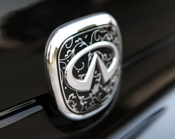
Alas, they lost the cachet almost immediately — to a point where today, I almost always get out of an Infiniti’s way due to their being the official representative of the poorest-quality drivers on the road. (And I say that as a BMW driver.) It’s also, unfortunately, one of the most-likely brands to wear a coffee-can-sized exhaust finisher, heavily-tinted windows, and/or dubious lowering springs.

Enhancing customer connection and delivering thoughtful hospitality across all touch points underpins INFINITI’s comprehensive refresh. Central to the update is a new global retail architecture design, along with an evolved logo and new multisensory experience.
— Infiniti Press Release
So to hear them recommit to the “Japaneseness” of their brand is, well, interesting. Perhaps the signature scent will help.

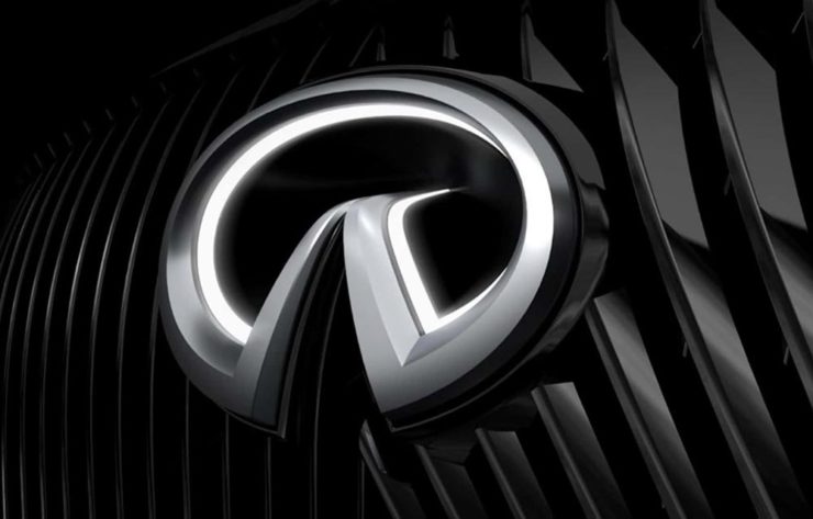
Brand New, as usual, has the best coverage, but as it’s a subscription, alternatively see this story from Motor1.
Opel
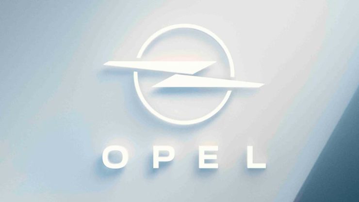
Opel earned a brief mention here on Foreword in December 2020, when they joined were sold to PSA — Peugeot, Citroen, and company — which a month later (!) merged with Fiat Chrysler to form Stellantis. They’re back with an unfortunate update to embrace their 2028 switch to all-electric.
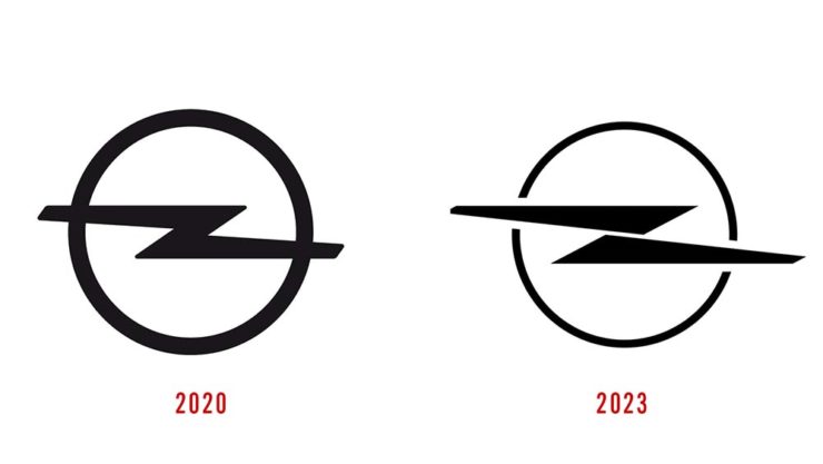
The “increased sharpness,” as Motor1 puts it, is appreciated, I suppose — but the break in the middle goes against everything the lightning bolt its meant to represent. In fact, I’d argue that the mark now doesn’t resemble lightning at all. (Perhaps clouds?)
Sigh.
Preview: Alpina
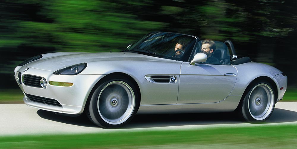
So, on to more interesting things: Alpina. Established in 1962 as a tuner and racer of BMWs, it’s had more or less the same logo since 1967 and was established as an actual manufacturer in 1983: they do more than just tune BMWs, they reengineer them. These days, they stand for the ultimate Grand Tour cars, simultaneously more comfortable, more powerful, and more stylish than the cars they’re based on. (See the lovely Alpina Z8 at the top of this post, for instance.)
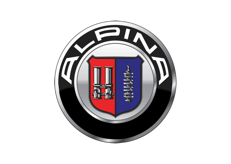
Naturally, that means most of them aren’t available here in the US.
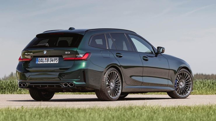
In any case, they’ve recently entered into an agreement to be purchased by BMW itself, not unlike AMG becoming part of Mercedes-Benz; starting in 2026, they are scheduled to represent the middle ground between BMW and Rolls-Royce — hopefully continuing the comfort, power, and style. It seems that the new ground will be the upmarket models only (that is, no 3-series-based items, and possibly even no 5-series), so think of items $200,000 and up.
Now, an eagle-eyed I5 Talk forum poster noted a filing with the German government:


Bonus #1: Motor1 has updated their roundup of every automaker logo refresh from recent years.
Bonus #2: All of the automotive — and carmaker logo — stories here on Foreword, from newest to oldest.

