In this edition: Hummingbirds, the UK’s 2022 Landscape Photography of the Year 2022, a potential new logo treatment from Honda, and something just in time for Halloween.
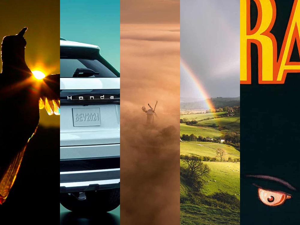
Who Knew: Hummingbird Edition
Wow.
Taken when the creatures are mid-flight and beating their wings at incredible speeds, Spencer’s striking photos capture sunlight as it filters through their feathers, emitting a full spectrum of color. The opalescent phenomenon is caused by diffraction and transforms their limbs into tiny, ephemeral rainbows.
This is Colossal
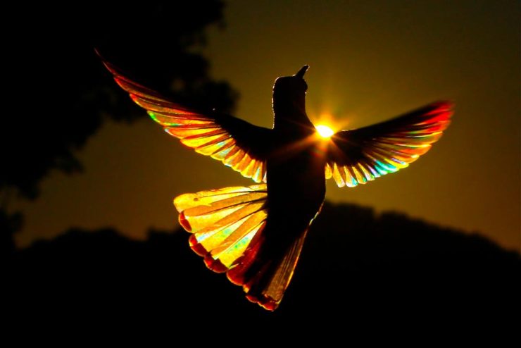
Let’s set aside for the moment the time and energy get these photographs and just celebrate that Australian photographer Christian Spencer worked to get these shots. Better still, there’s a book:
Like the typography in addition to the photograph, too. Thanks to This is Colossal for pointing us in this pretty wonderful direction.
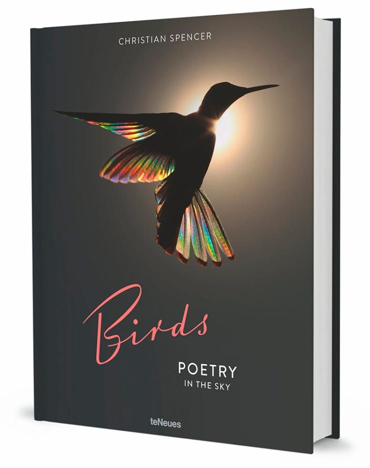
New Honda Logo?
This hasn’t been reported anywhere, so I don’t know whether there’s a shift ahead for Honda (pardon the expression), but…:
This is a photograph — well, graphic — of the 2024 Prologue EV. Note that instead of the classic “H” seen on every Honda since I don’t know when, the name is spelled out.
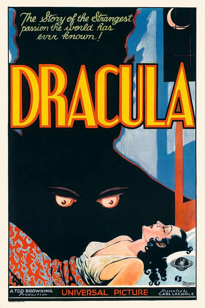
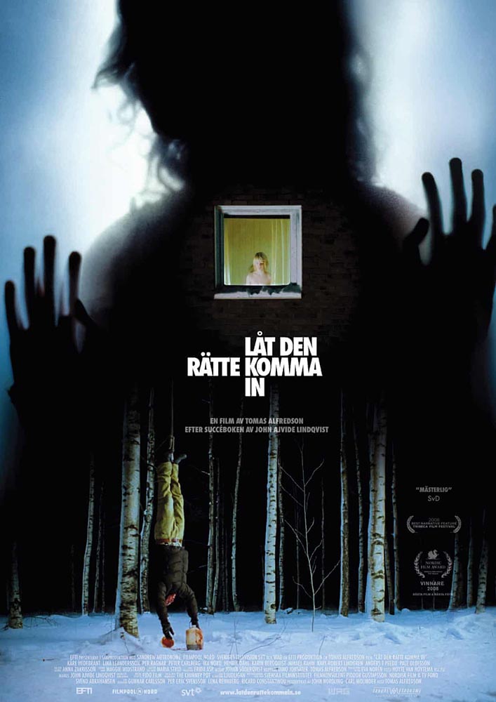
Speaking of slideshows on The Guardian, they had a great subject just in time for Halloween: “Cinema’s unquenchable thirst for vampires celebrated in posters.”
A classic.A future classic — scary-great.
Unquenchable thirst, indeed. Enjoy.
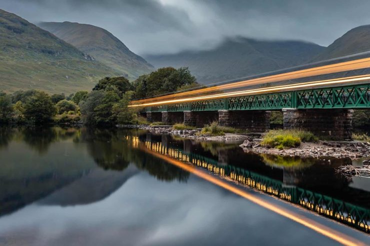
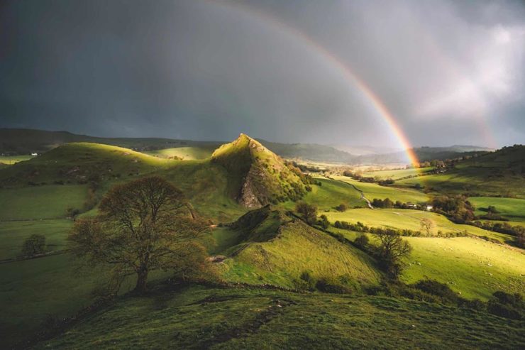
1
The aptly-named Dragon’s Back is in the Brecon Beacons National Park, Black Mountains, Wales. Take a walk.
This time, we’ve got some great book design (with a bonus), Hoefler educates on typography (with a bonus), and two updated car company logos. Let’s get right to it!
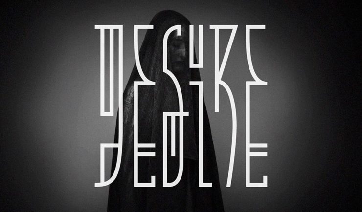
Print Magazine on the design of Lyrics
The still-very-relevant-in-2022 Print Magazine brings us a great feature on the design of Paul McCartney’s book, Lyrics:
Front and back covers of Paul McCartney’s Lyrics, by Triboro Design.
Turns out it was designed by an outfit called Triboro Design, from Brooklyn (appropriately). Print brings us an interesting interview with David Heasty, the principal:
I […] found him to be sharp, quick, articulate, and modest. Below, we discuss Paul’s involvement with the project, the book’s gorgeous bespoke typeface, and the importance of staying true to a legend’s vision.
Ellen Shapiro, Print Mag
The “S” spread of Paul McCartney’s Lyrics, by Triboro Design.
Bonus: Looking at Triboro’s website, this lovely piece of typography stood out:
Triboro Design’s Zolo Jesus album typography creates desire.
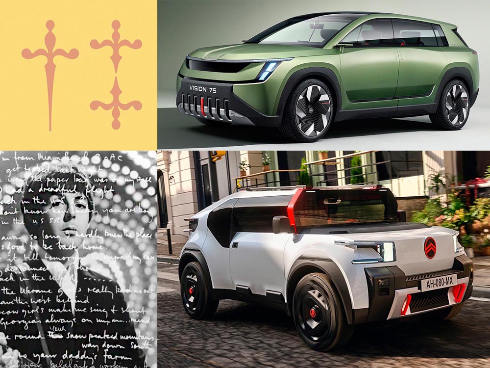
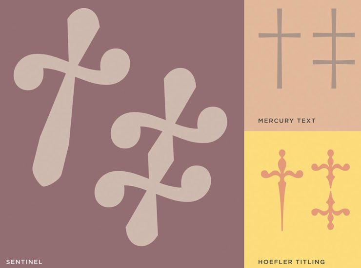
Hoefler Discusses Daggers
In “House of Flying Reference Marks,” Jonathan Hoefler talks about daggers, or, what you use when an asterisk isn’t enough:
Hoefler on daggers.
Beautiful examples, complete with a phrase you don’t hear everyday: “twisted quillon.” Read and enjoy. (If the opportunity presents, follow on with the ampersand article — which, uh, takes a stab at where the word came from. Nice.)
It seems like nearly all of the major car manufacturers have introduced a new logo in the past couple of years, but here are two more. One’s best described as “an update,” while the other … goes a little farther.
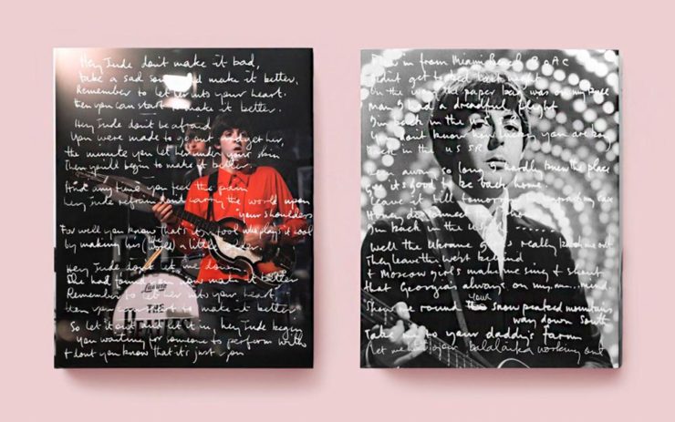
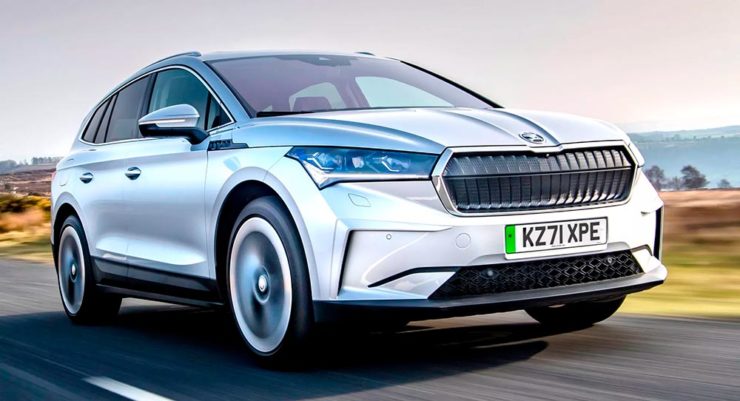
Skoda, for those that don’t know, is a Czech company and part of the massive VW Group. Frankly, it shows:
Skoda’s 2022 Kodiaq, a thoroughly VW Group product.
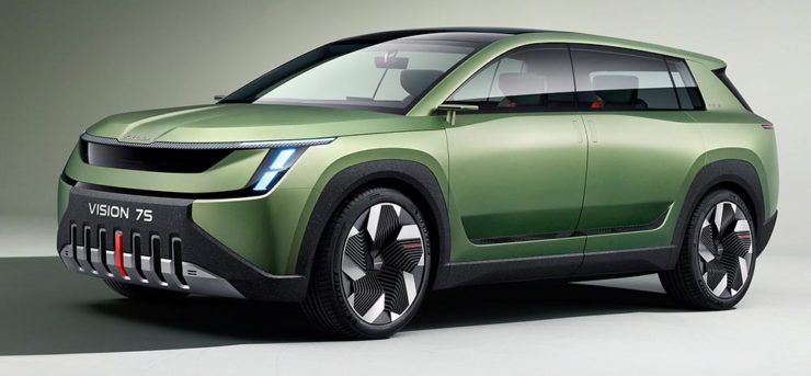
For 2023, they’re introducing a push to separate themselves from VW a little, resisting the downmarket image. As is (now) normal with updated car company identities, there’s a concept:
Skoda’s Vision 7s concept.
It’s … not inspiring. Maybe the actual updated logo will turn the corner:
Skoda’s 2022 logo.
Solid. (Pardon the pun.) But seriously, even an avid car nut like me didn’t know that represents a winged arrow — and I’m not sure the new version helps. At least they get points for consistency:
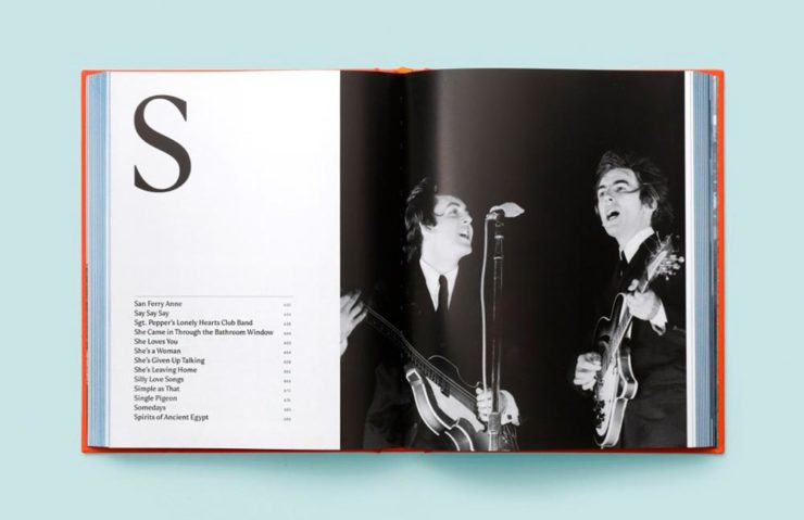
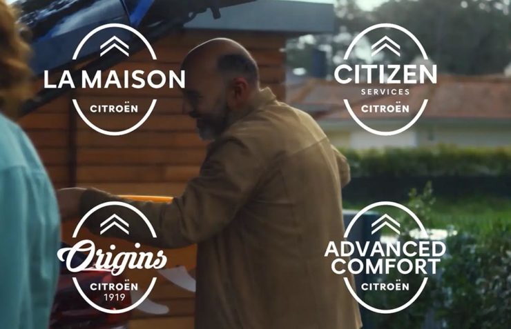
Then there’s Citroen. Even under the potentially-smothering corporate blanket that is Stellantis (there’s a name!), the pioneer of decades past still manages to actually thrive. First their new logo:
Citroen’s 2022 logo.
They’re not quite as consistent — the dual chevrons have varied a bit. This time, they’ve literally gone back to their roots, pulling the 1919/1921/1936 version out and dusting it off for modern use:
History of Citroen’s logos, 1919–2022.
Points to them for hinting at what’s to come, too:
Citroen’s 2022 logo, with just a slice of concept car showing.
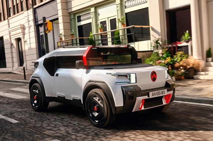
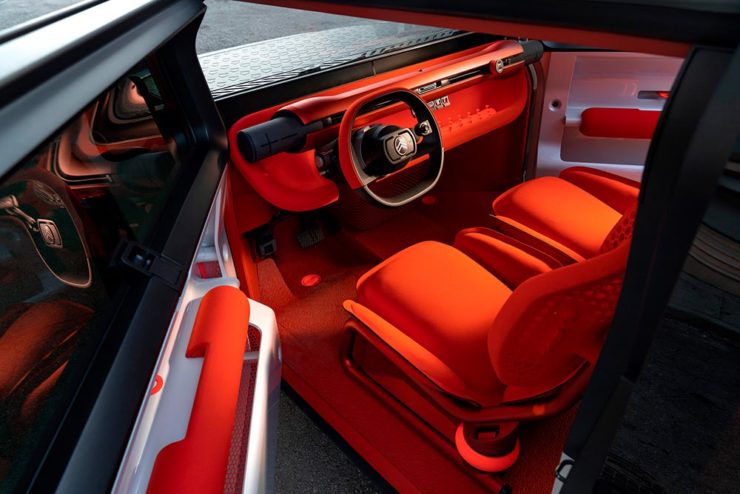
…Which turns out to be something with, ahem, Oli bits:
Citroen’s Oli: the antithesis of a Skoda.
“Nothing moves us like Citroen,” they say. The Oli moves me, to a point where I truly wish Citroen was once again available in the ’States. Cool and radically innovative, without losing sight of something VW has truly lost: fun. Well done.
Updated, 19 October, 2022:Brand New adds to Citroen’s new logo story, with a slightly-less-than-enthusiastic take on the logo and has frankly unkind things to say about the new, custom typeface (custom typefaces are now de rigueur — a policy as much related to rights ownership than creativity, alas).
I really like the cursive in this Vimeo screenshot:
YouTube? What YouTube? Citroen posts to Vimeo. Ahh, the French.
BN also includes a number of extra photographs of the simply awesome Oli, too. Here are a couple, for your enjoyment:
Plug-and-Citroen.
Note the removable Bluetooth speakers (the black tubes with “+” and “-“) and, especially, the seats:
Three interesting logo redesigns this month, plus a moment where venti has nothing to do with coffee. Oh, and a airy bonus.
Drobo Declares Bankruptcy
Generally speaking, I’m not one to engage in schadenfreude, aka “enjoying the pain or suffering of another.” (Wiki. Anyone surprised that the Germans have a word for this … but I digress.)
A selection of expensive, unreliable junk.
Back in 2011, I lost two Drobos in short order — and with them, the majority of my back files. Project I’d worked on, photographs I’d taken, personal documents, years worth of stuff, just gone.
Drobo, the company, did nothing to help, offering neither solutions nor apologies. I wasn’t alone; forums across the ’net suggested that I should have chosen more carefully.
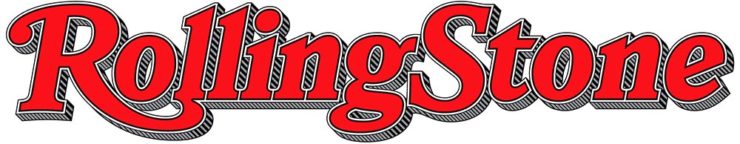
To call Rolling Stone‘s place in America culture iconic might be selling it short, and their logo plays a large role in that. In 2018, they flattened it — leading that trend, possibly — and it lost something.
However, this month, it’s back:
Rolling Stone’s 2022 logo redesign.
“The assignment was a paradox. How could we make the logo look like it did in the past, without making it feel dated? My hope is that loyal readers will believe the old logo is back, but on closer inspection will be surprised to notice how much it has been modernized.”
Jesse Ragan, XYZ Type
The “old logo” he’s referring to is the one that ran from 1981–2018, but there were others, too:
Rolling Stone’s lettering shapes through the years. See more at both links.
A great study in logo evolution: read more at the Type Network, and lettering specifics from XYZ Type. Awesome. (Hat tip to, as usual, Brand New.)
Aston Martin’s New Logo
On the subject of subtlety, Aston Martin usually isn’t the first thing that comes to mind. Their recent logo redesign, however, falls into that category:
Wings of Glory (so to speak)
The evolution of their logo emphasizes those small steps:
AM’s logo through the years.
Not a great amount of information on this one, but the accompanying photographs of the logomark being made are fantastic. See more at The Drive, with more at Brand New.
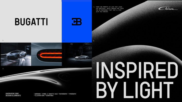
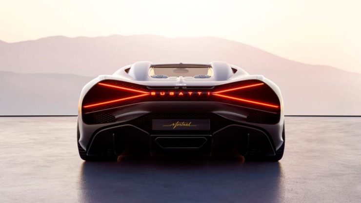
Bugatti’s New Logo
Subtlety and Bugatti rarely — if ever — fit in the same sentence. Aston is stratospheric as far as I’m concerned, so Bugatti would qualify as the antithesis of subtlety. But, but, but: there’s something about one.
The new Mistral. (Sorry, it’s sold out.)
They have a new logo and marketing campaign to go with:
Specifics, courtesy of Interbrand.The Mistral from the back, showing the new type treatment.
It’s been a busy August, including having to make a lightning trip through the usually-not-fun Atlanta airport. But there’s always a bright spot at the end of that tunnel: being the little boy again, awed by the simple act of flying.
Better still, the flight was on a 757, the sports car of big planes. Everybody around me had their window shades pulled and noses in their phones, but I was looking out the window:
Three items for the end of June, 2022: AIA Los Angeles announces photography awards, the 2022 edition of the Logo Lounge logo trends report is out, and Buick makes its new logo official. Let’s get into the details.
AIALA Photography Awards
The Los Angeles chapter of the American Institute of Architects (AIA|LA) has announced this year’s winners of the annual Architectural Photography Awards, and there’s some pretty great stuff:
Ryan Gobuty: Santa Fe (Santa Fe, NM)Taiyo Watanabe: C-Glass House (Dillon Beach, CA)Tim Griffith: Mission Bay (San Francisco, CA)
[W]hile there are still corporate-looking marks being crafted there is a stronger effort to find ways to identify products that are artisanal and handcrafted.
Bill Gardner, Logo Lounge
Corporations trying to be more human. (News at 11.) But then, my use of that particular phrase perhaps betrays my lack of being in touch with the modern corporate world; I think publishing is a different animal, and prefer being part of that world despite the regular influence of corporate entities there, too.
Nonetheless, following logo trends is, from a purely graphic design perspective, worthwhile — and this report summarizes beautifully. Read on.
Buick’s New Logo, Officially
We’ve touched upon it before, but Buick has, with the release of the Electra Wildcat concept, officially updated its logo:
Official: Buick’s new logo
Electra is Buick’s name for electric cars, simultaneously stating the obvious while giving a big nod to past models — and the Wildcat concept is, dare I say it, borderline cool:
Both Buick and Cadillac have hinted at more Art Deco in their upcoming products, perhaps best illustrated on this concept’s interior:
It’s a head rest, folks.
Nice. (Not even remotely possible on a production model, but still.) Read more on Buick’s new logo and transition to an electric car brand at Car and Driver or The Drive.
Three completely unrelated items for you this time, ranging from the serious and interesting through the loony and interesting to something of a whole different stripe.
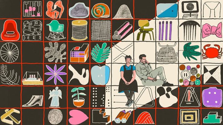
The Eames Institute of Infinite Curiosity
Update 2, 25 Apr:Brand New discusses this logo, with the usual catchy title: The Fast and the Curious: Counterspace Drift
Eames Institute’s “curious” logo variations, discussed at Brand New
Update, 8 Apr: It’s Nice That has more: The Eames Institute launches with a curious, “Eamesian” identity, and a logo that observes
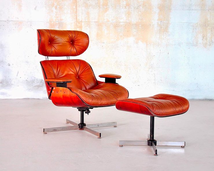
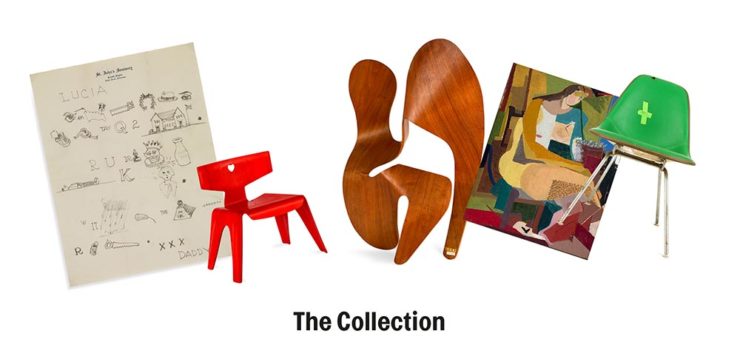
Original post: Practically everyone has heard of an Eames Chair:
A particularly awesome example of an Eames Chair (and ottoman).
What you might not realize is that the legacy Charles and Ray Eames left behind enriches our lives to this day. It’s a shame, then, that while their house is a mid-century masterpiece (and museum), much of their lives have remained behind closed doors.
For almost three decades, a barn-like building in Petaluma, California, contained remnants of one of the most iconic design legacies of the twentieth century. […] We created the Eames Institute because we want you to examine the archive of what you know—the collection of your experiences, understanding, memories, and questions—and connect to the provocations that call to you. We want you to tap into that same fount of relentless curiosity, and its power to shift your perception and open you to innovations and discoveries.
Now, however, there’s the Eames Institute of Infinite Curiosity. Awesome name aside, it introduces us to the more personal side of one of design’s strongest partnerships.
Items from the Charles and Ray Eames Institute. Drawings from the Charles and Ray Eames Institute.
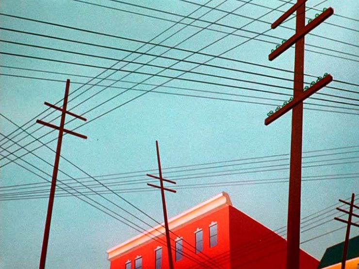
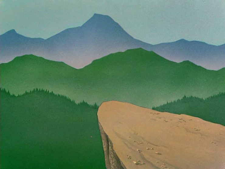
Crossed wires, anyone?Imagine who might run up to — or even get pushed off of — this cliff.A nice, innocent factory. Nothing could possibly go wrong.
Next time I treat myself to a Loony break, I’m going to make sure to spend some time looking beyond the action and appreciate the backgrounds. Nice.
Condor Airlines Rebrands
Most of you have probably never heard of Condor Airlines; they’re mainly a European thing, a “leisure” airline associated with Thomas Cook, formerly owned and run by Lufthansa. (Here’s some history.)
It doesn’t particularly matter. What does is the bravado exhibited by management. Before, a typical airline logo — dare I say, typically Germanic:
Condor’s OLD livery.
Then someone said yelled, “HEY. WE DO VACATIONS. LIKE BEACH TOWELS. LET’S DO STRIPES.” The result:
Condor’s NEW livery. Wow.
Armin Vit:
The new livery has zero fucks to give and just plasters every plane with thick vertical stripes that go against pretty much every single assumed tenet of what makes a good livery. It doesn’t look speedy, it doesn’t look nimble, it requires a lot of paint, and by all other standards it is just plain ugly and I love it.
Catching up with a few unrelated stories that I’ve been meaning to post — including one pretty significant failure on my part, one potentially significant failure, and because not everything should be about fail, an extremely interesting and thoughtful interview.
Tiny Type Museum Sold Out
I was cleaning up open Safari tabs on my phone the other day — the detritus that results from checking things on the fly when out and about, often or never closed — and noticed that I’d sort-of bookmarked something for action and … missed it. Crap!
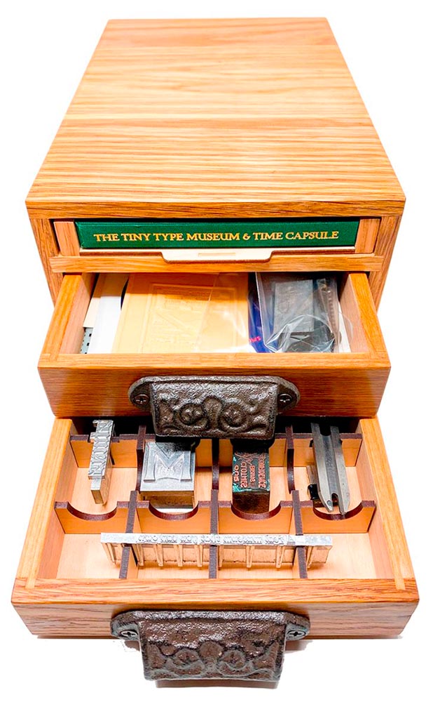
The Tiny Type Museum & Time Capsule, with specimens and those beautiful drawer pulls.
The Tiny Type Museum & Time Capsule is a celebration by journalist and printing historian Glenn Fleishman of type and printing, and an effort at preserving history for future generations to re-discover. Each custom, handmade wood museum case holds several dozen genuine artifacts from the past and present, including a paper mold for casting newspaper ads in metal, individual pieces of wood and metal type, a phototype “font,” and a Linotype “slug” (set with a custom message), along with original commissioned art, a letterpress-printed book, and a few replicas of items found in printing shops.
The Tiny Type Museum. (Bottom drawer.)
The museum includes a letterpress-printed book written for the project, Six Centuries of Type & Printing, in which Fleishman traces the development of type and printing starting before Gutenberg printed his Bible around 1450 up through the present day. This book acts as “docent” for the museum, providing insight into the stages in technological and artistic development that took place, and explaining the importance and nature of the artifacts. It also slides out neatly as part of a sled from the top of the museum case, and provides the visible name.
The letterpress book is still available: get your copy, or subscribe to the podcast. But even if you don’t, take a moment to appreciate the work that went into this — well done, indeed.
Buick’s New Logo
This one … I dunno. The race to do car logos flat black-and-white has seemed like a race to the lowest common denominator. (See previous coverage of BMW, Volvo, Cadillac, and more.) Below, Buick’s old (left) and new (right) logos, courtesy of Motor1:
The trademark filing for Buick’s new logo.
Thankfully, there’s been a leak — Instagram, natch, so no link here — demonstrating that it’ll still be in color:
From Instagram (alas): The new Buick logo in living color.
Still, not sure. Will have to see the official announcement and package that goes with it; Motor Trend suggests that it might be part of an EV-only future. Stay tuned for Brand New’s take, I guess….
I think innovation doesn’t come in one huge leap. It’s a series of small steps. Accumulations of small discoveries, followed by incremental implementation. And then it all adds up. Innovation is not a single idea—it’s incredibly incremental and additive. Even these small discoveries can change the way we think about things very quickly. So I think every step of the way—problematizing “what are the issues?” and “what are the solutions?” filtering issues of sustainability, supply chain, accessibility, will eliminate many solutions which are not possible. And then you end up with small nuggets of potential. In a way it’s very systematic, innovation, and so is experimentation. It’s the elimination of what’s not possible and focusing on goals.
Toshiko Mori. Image courtesy of New Reader.
You know, history is not about the past, really. History is about the story of an individual interpreting history. Historians cannot be unbiased narrators. Every history is a story, and then yes, there are facts—which are important, but the way you connect facts and then make diverse narratives is super interesting.
As you can see, Fox News provides false narratives, and a lot of times they skew the facts, and that’s a problem. It can be used dangerously, but it can also be used productively. I think that’s what makes history rich. It’s not about the past, it’s about projecting into the future. So when I teach students, I ask them to make their own story based upon their research. But it’s a story—so that’s kind of their own reality. And based upon that reality, they can develop diverse narratives and then communicate the story to others. It’s not as if you have different opinions, but you have different stories to share. It’s not about controversial opinions, but about the way we each look at life very, very differently—and that enriches everybody.
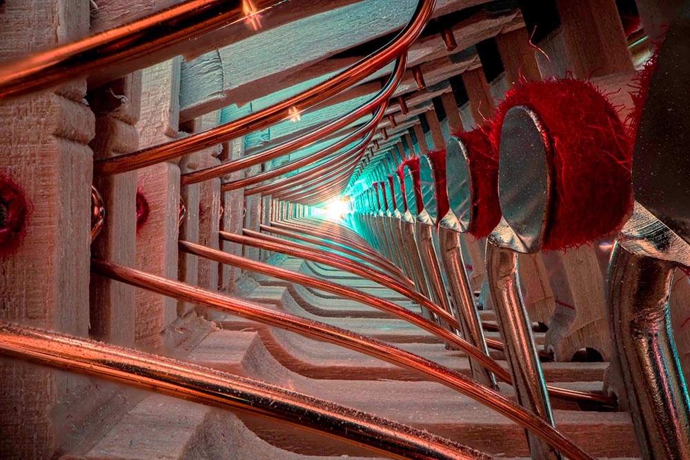
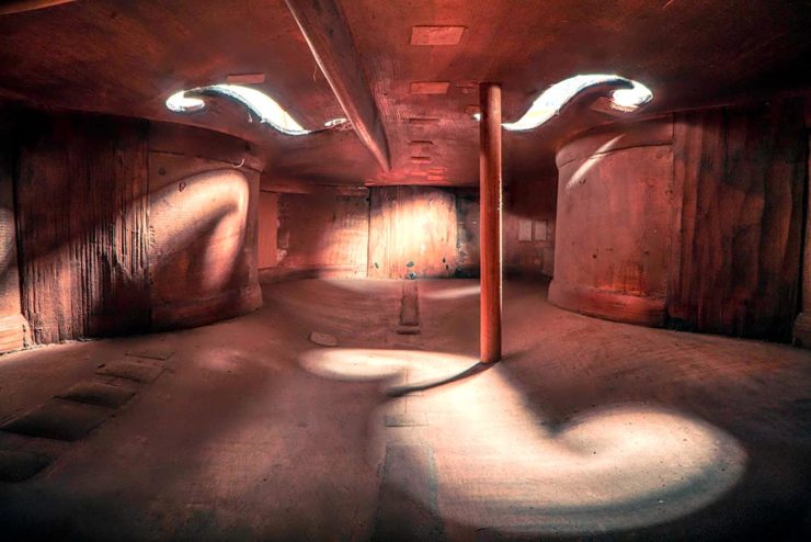
New Zealand-based photographer Charles Brooks, who happens to have spent years as a professional cellist, brings us some astonishing inside-the-instrument shots, including this one:
The Colossal post, where I ran across this, is definitely worth a read. But let me just add one thing: He’s using an L-mount (yes!) Laowa probe lens, an insightful choice driven by curiosity. Well done, sir.
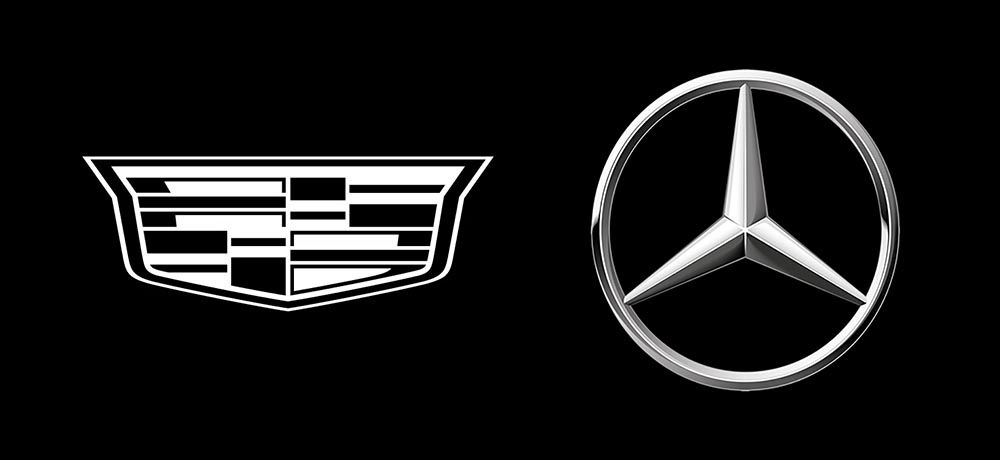
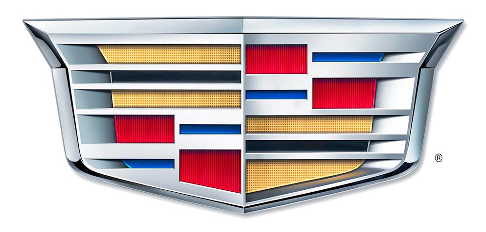
As seen in the last line above, the 2014 logo is a simplification of the 2000 logo, sans the “old-person” wreath, and I thought quite successful:
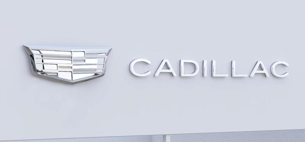
Fast-foreword (ahem) to 2021, and the monochromatic, flat-logo thing is in full swing. The latest “old-person” target is the Cadillac script, replaced with another trendy item, a custom “Cadillac Gothic” font.
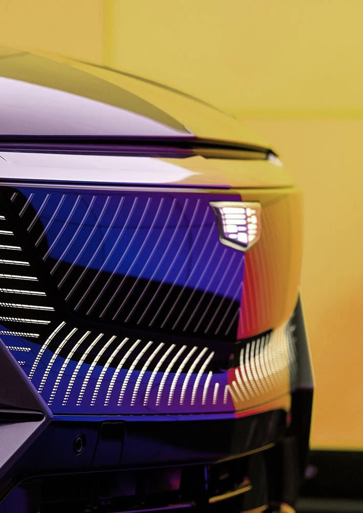
Not only that, but there’s the new trend among luxury automobiles — mere cars aren’t good enough — of illuminated logos;
It’s been thirty-two years, four months, and fourteen days since I hung out a shingle to announce that The Hoefler Type Foundry was open for business. What started as a sole proprietorship grew into the Hoefler&Co of today, a diversified design and technology practice with an international reach, still dedicated to the invention of original, thoughtful, and hard-working typefaces.
Meanwhile, “nothing will change,” Jonathan Hoefler (previously) says, except that he’ll be stepping down. That’s kind of a big change, IMHO — but after using typography to “help elect a president,” where do you go from there? Read more here.
In happier news, the much-delayed new Bond movie, No Time to Die, is finally in theaters next week.
Keith Fleck has gotten a good deal of press for his Corporate States of America, but in case you haven’t seen it, it’s absolutely worth a look. Maine’s L.L. Bean, Florida’s Publix, and, of course, Georgia’s Coca-Cola are all winners. 51 bonus points!
Lastly for this month, some book design:
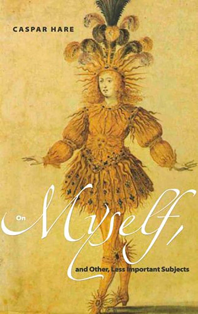
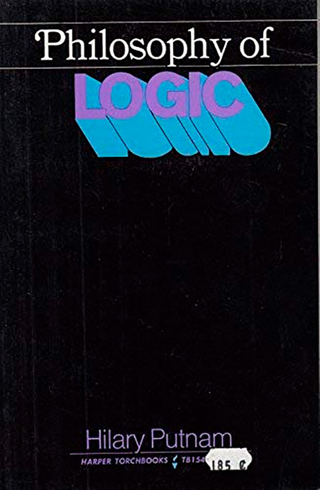
Daily Nous asks their readers to nominate the best philosophy book covers — Judging Philosophy Books By Their Covers — and there are some winners, some absolute losers, and a few funny moments, too:
“This always reminded me of a rejected Black Sabbath album cover or something,” says the poster. Nice. (And only 185 cents!)
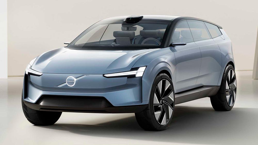
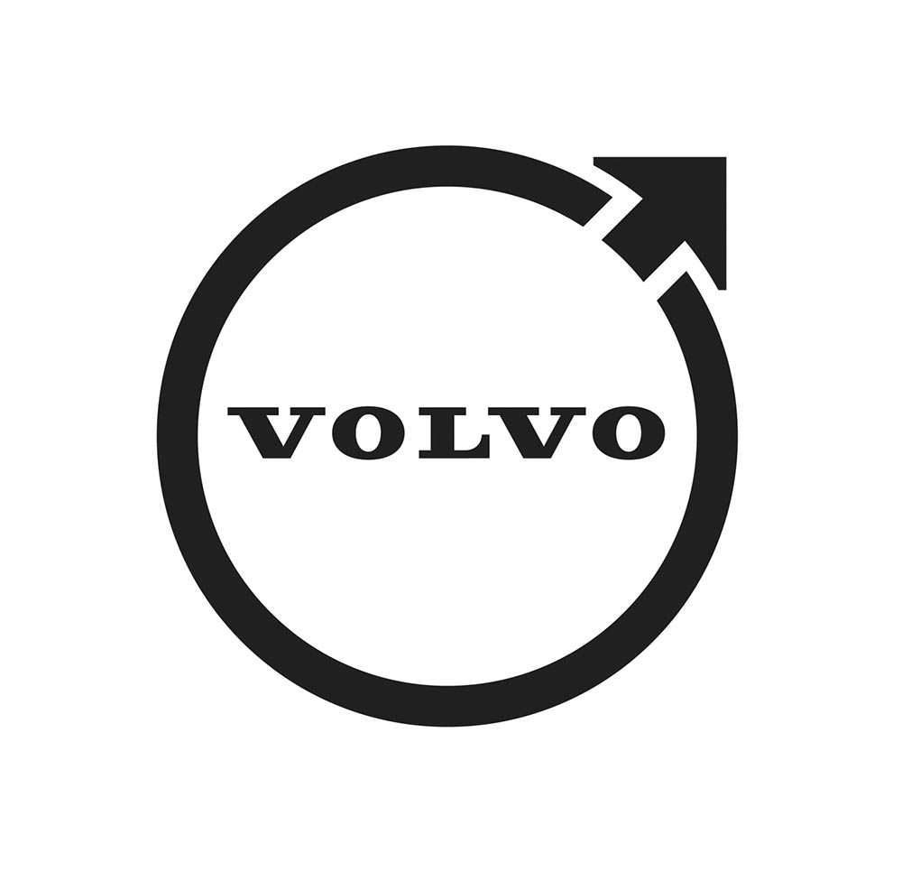
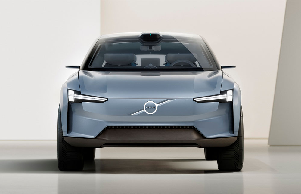
The “Iron Mark” has been given a makeover, and the result is … interesting. First, as a reminder, here’s the logo as it appeared previously — no, the one previous to that:
My mother’s 2010 Volvo S80
The blue has been associated with Volvo’s logo for a long while now, and it’s slowly been disappearing from the lineup (in favor of black in the same location). However, they’ve decided — they being both Volvo Cars and Volvo Group, two distinct entities (the latter including Volvo Trucks, the Volvo construction folks, Volvo Penta [marine], etc.) — to change to this new, more austere logo and word mark simultaneously. Aaaaaand:
See the previous coverage on Foreword. Can’t go, however, without a hat tip to Kristen Shaw at The Drive, who dug out this 1937 version — which, I’d argue, beats ’em all. Kudos.
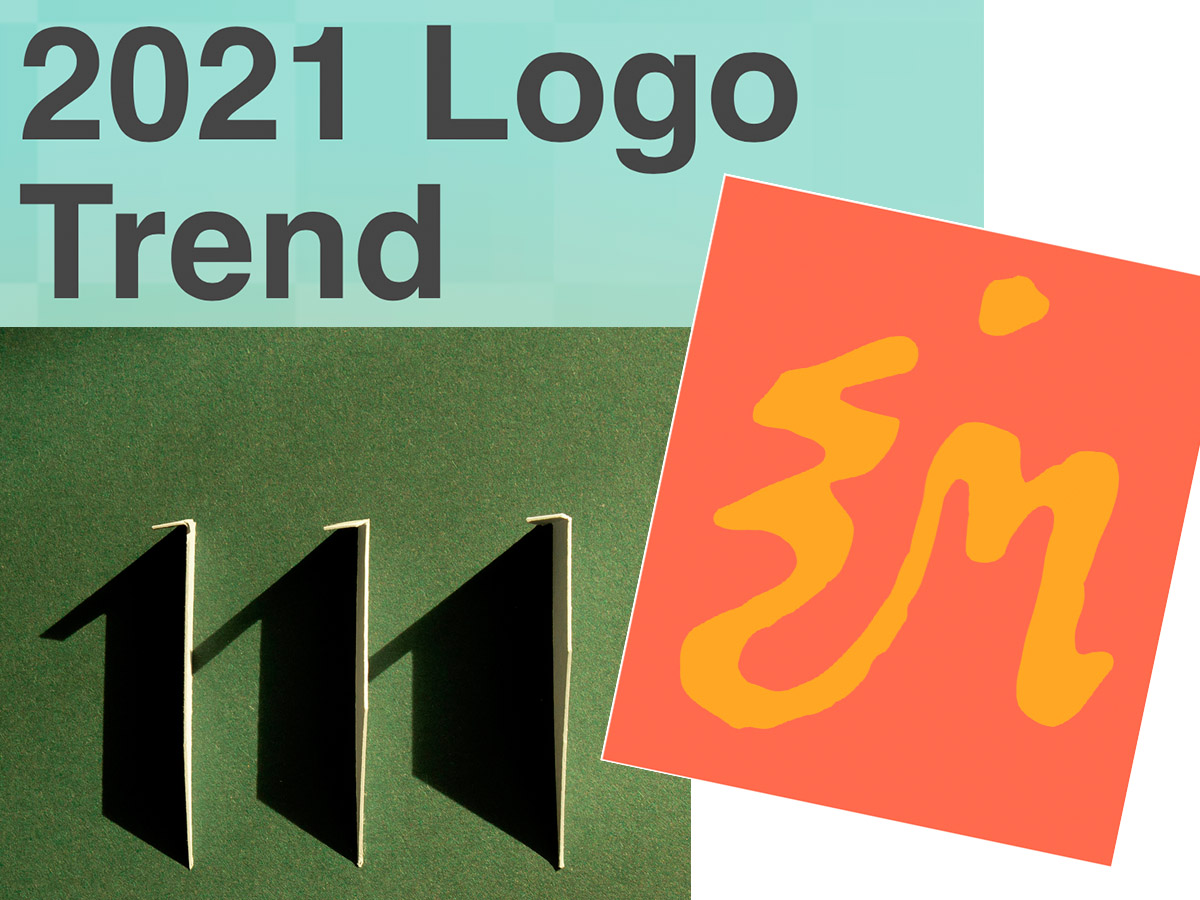
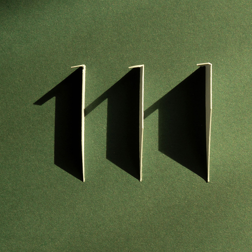
Three items for you here, starting off with the 2021 Logo Trend Report, from the Logo Lounge. From the Asterisk to Electric Tape, Quads, Chains, and more:
Bill Gardner discusses all fifteen different trends, with logos to back ’em up (naturally).
Next, “A Cabinet of Curiosities” from Hoefler & Co.
Printers once used the colorful term ‘nut fractions’ to denote vertically stacked numerators and denominators that fit into an en-space. (Compare the em-width ‘mutton fraction.’)
Now, let’s take a moment to celebrate the creator: Ken Garland. Not your typical graphic designer, he reached out, embraced the 1960’s and ’70s, and never looked back.
It’s been a minute since I’ve been in London — 2011, to be exact — and I’d love to go back. The food, the parks, the museums, the Thames, the short train rides to more interesting places (Hello, Cambridge?), and even the Tube. (We’ll leave the anti-Americanism aside for right now — we’re post-Trump and post-Covid, so traveling is at least an option!) Yet even the cultural masterpiece that is London is showing some cracks; from the New Statesman:
Hockney’s Piccadilly Circus has also drawn criticism for its simplistic approach. Over on the cesspit of arts criticism that is Twitter, anonymous accounts that decry all art made post-1920 as an abomination have ridiculed Hockney’s scrawl as indicative of the death of art. Other critics have rightly argued that the work feels like a red flag to a bull: fuelling culture-war debates about the legitimacy of public art, rather than encouraging the public to get onside.
I like it more every time I see it. Read more at It’s Nice That.
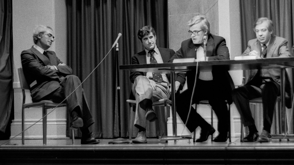
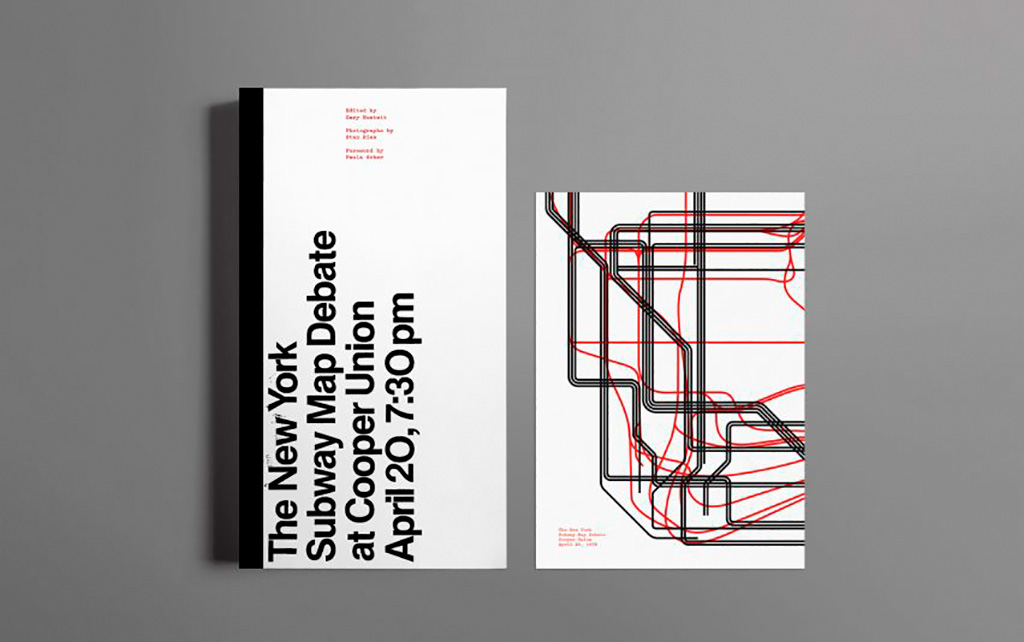
On the NYC subway map:
Speaking of It’s Nice That, an interesting new book from Gary Hustwit . . . on the debate over the New York City subway map. On the one side, the iconic Massimo Vignelli version, introduced in 1972, representing the less-is-more approach. On the other, the replacement version from John Tauranac, introduced in 1979, representing the more-accurate-is-more approach. (An updated version of the latter is still in use today.)
But back in 1978, the two got up on stage at Cooper Union’s Great Hall — home to debates of, among others, Abraham Lincoln — and pitched their case:
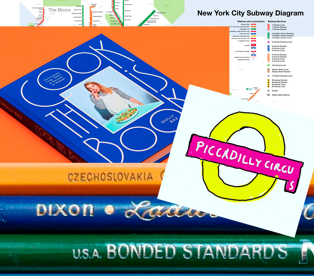
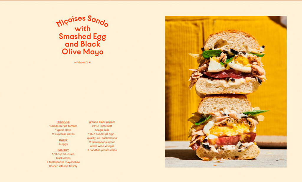
Nice new cookbook chock full o’ seventies-era design, “Violaine et Jérémy returns with a cookbook for Molly Baz, featuring three of the studio’s much-loved typefaces,” at — wait for it — It’s Nice That:
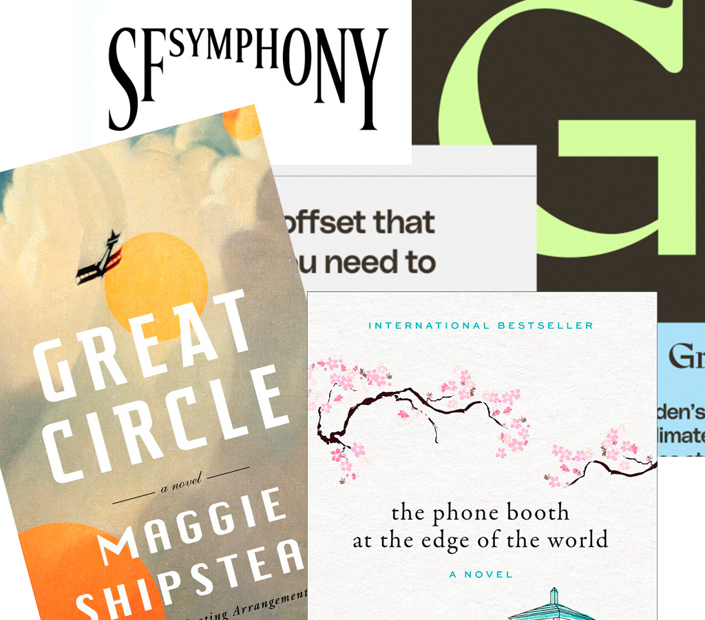
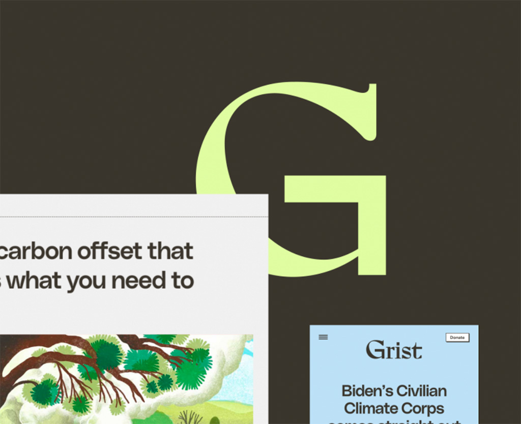
Four things for you in this edition of Briefed, starting with a redesign for Grist:
“Climate. Justice. Solutions,” now looking good. Still worth reading (and bookmarking). Love that shade of green, too. Read about the hows and whys at Upstatement. Kudos for the excellent work.
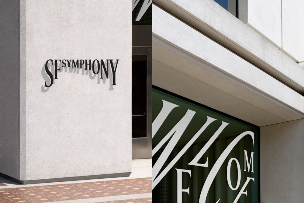
Next, from the regularly-brilliant Jason Kottke — which he got from Print magazine — winners of the 2021 Type Directors Club Design Awards, including this fave:
Read more about the SF Symphony redesign at the (also) regularly-brilliant Brand New (very worthy subscription required).
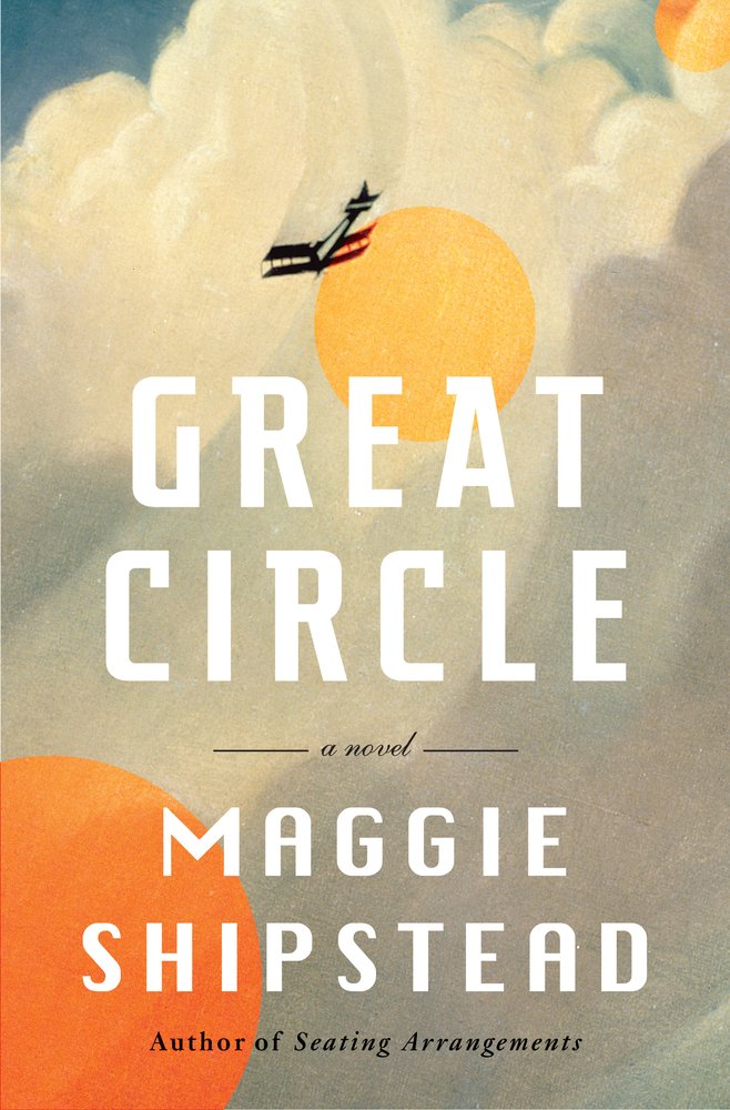
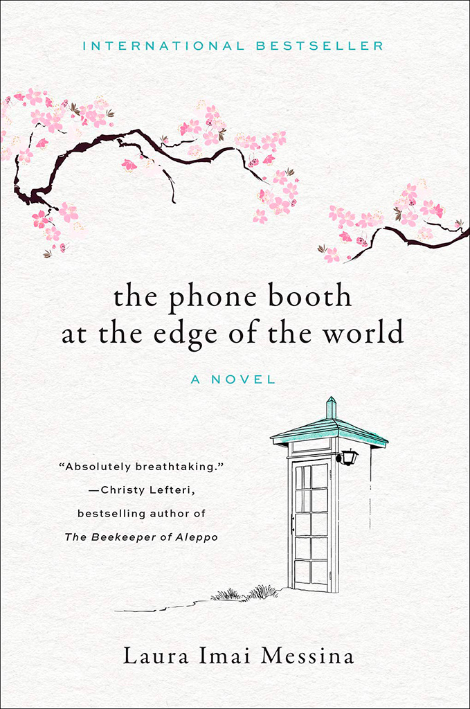
Lastly, a reminder that this blog originates in Middle Georgia, home of the Cherry Blossom Festival — which might explain why this title and its quite awesome cover design caught my eye:
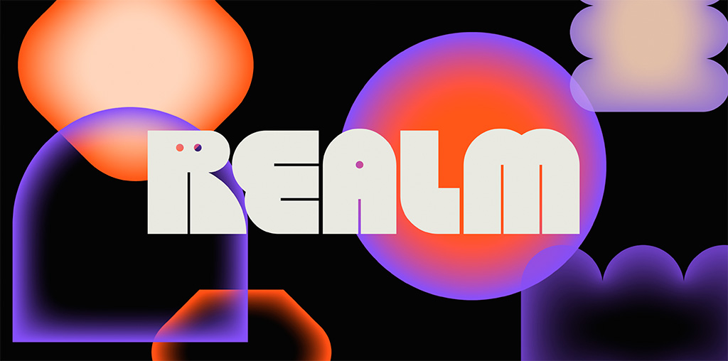
Three items for your update this month, starting with one of the best logos I’ve seen in a long while: Realm. Check this out:
Just … wow. Colors aplenty in the supporting materials, but the logo itself in beautiful black and white — and that GIF. (Update: the GIF isn’t working here, which lessens its appeal. CRAP. See it at either link below, but either way, see it. So worth it!) Congrats to Mother Design on this triumph.
Update, May 4: Brand New says, “A Nightmare on Realm Street.” Frankly, I’m surprised:
The animations for both the full wordmark and monogram are a little clunky. Maybe it’s on purpose, maybe not, but something about them feels half-cooked. Some killer animations would have really taken this to the next level.
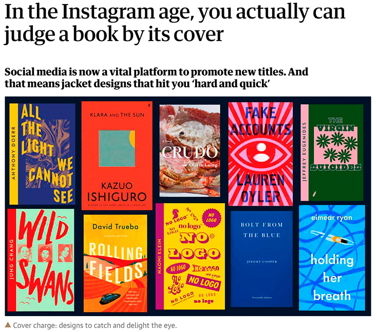
Next. a Guardian item on book covers — and how being “Instagrammable” is now, thanks to Covid and bookstores being less accessible, what’s expected:
I’ve famously chosen to boycott social media, so it’s probably not a surprise that I’m not 100% in agreement with the sentiment that Instagram is necessary for successful cover design. Nonetheless, supporting quality design — and acknowledging that more than a few do, in fact, judge a book by its cover — is a good thing. Read the rest.
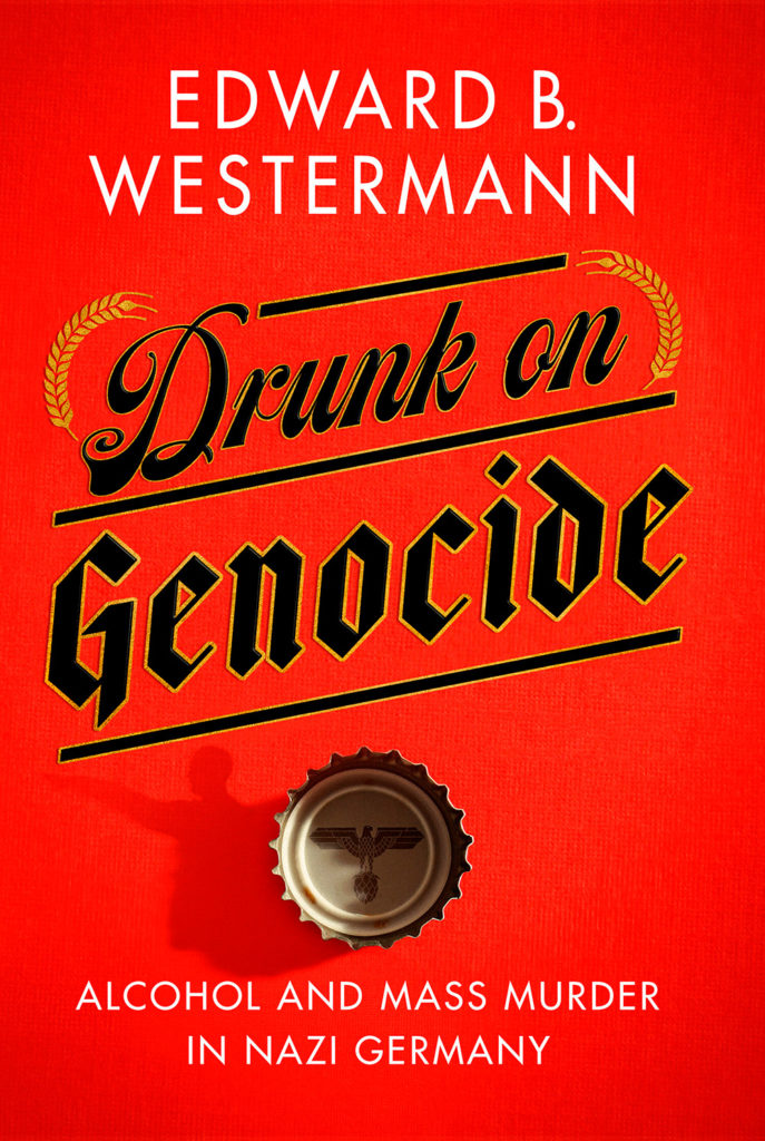
Last but not least, from Spine’s fantastic University Press Cover Round-Up, this:
Check the shadow of the bottle cap. Now, go to Spine and check the texture in the background. Revel. Repeat.