It’s been a lovely, cool spring here in Middle Georgia; it seems that in the 2020s, springtime has had more rain and less of the dive from winter into hot that’s featured in years past. (Not to fear: we’ll be into summer soon enough.) Open window weather, we call it, to be enjoyed while we can.
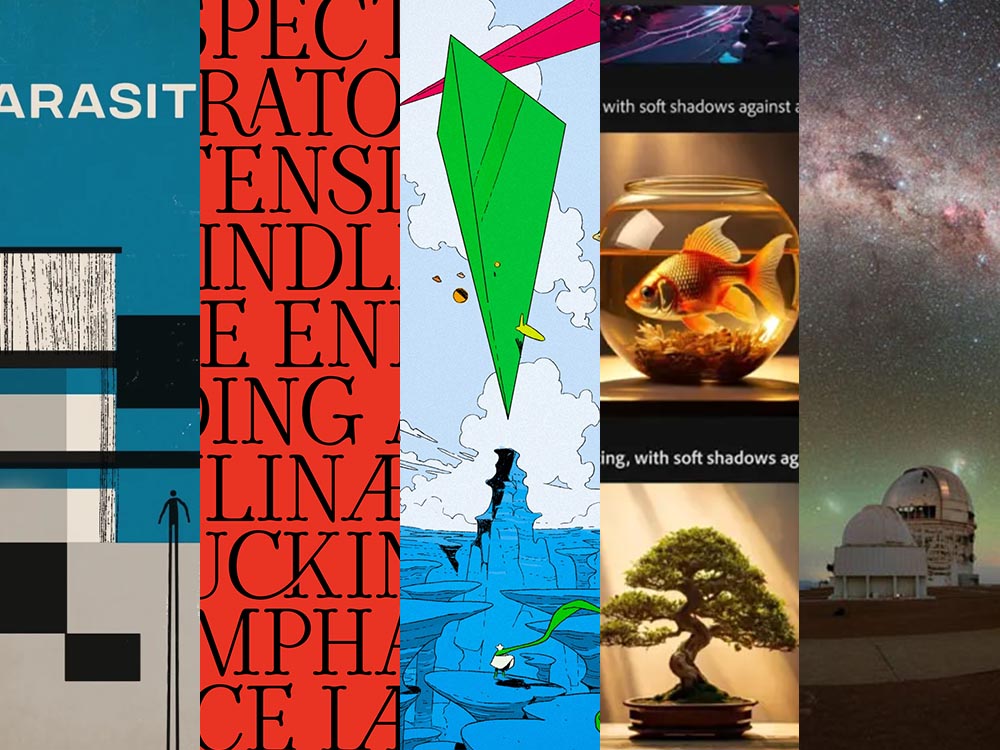
That said, there’s been plenty of goodness gathering for this month’s posting: more movie/books, more album art, more typefaces, and more great photography. There’s also an excellent observation regarding design trends and a bit on Adobe.
Also posted this month: The annual University Presses Show roundup, now also available on SPINE, and an updated photography gallery from Forsyth, Georgia.
But First: A Bit o’ Nostalgia
This is the 200th post on the new Foreword, which I restarted six years ago today. It’s taken a bit to get back into regular blogging, but I’ve once again found my sea legs, really enjoy it and hope to continue for a long while yet.
Thanks very much for stopping by — genuinely appreciated.
“Good Movies as Old Books,” Again
I’ve featured the work of designer Matt Stevens before, but there’s an update to his fantastic personal project to make vintage paperback covers from movies.
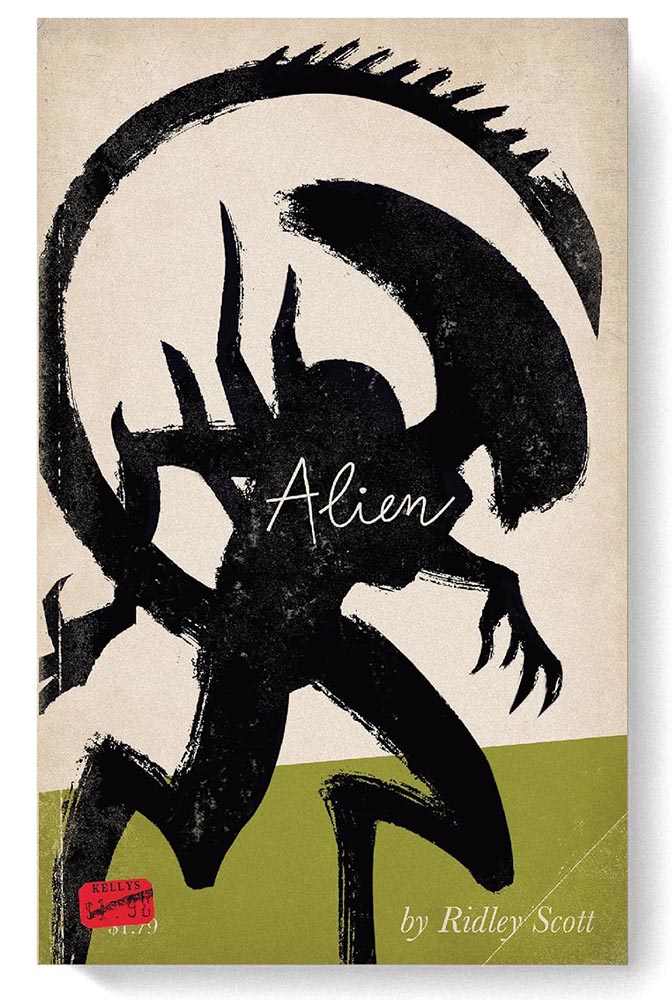
Perfect — and still available as prints. They’re also now available in new book, which combines the best of the first two books (published via Kickstarter) and adds a few more … or as a set of 100 postcards, perfect for framing and scattering about on walls near you.

Better still, Stevens’ work has led to actual book cover design jobs, and his work for North Carolina tourism is awesome. Read this Fast Company post for the full story.
Special Bonus #1: Heading to Europe? It’s Nice That has “Where to book hunt in Amsterdam, a playground for contemporary book design,” listing “why the city is so known for its publishing prowess, and shares a comprehensive list of places for designers, printers, publishers, and enthusiasts alike, to check out.”
The History of Album Art
Album art didn’t always exist, Matt Ström-Awn reminds us. Utilitarian at first, it evolved.
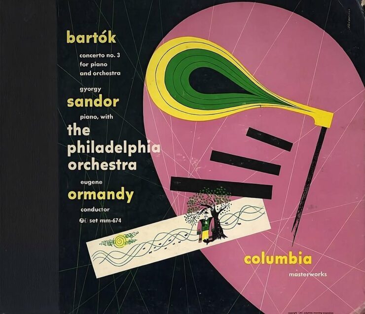
The invention of album art can get lost in the story of technological mastery. But among all the factors that contributed to the rise of recorded music, it stands as one of the few that was wholly driven by creators themselves. Album art — first as marketing material, then as pure creative expression — turned an audio-only medium into a multi-sensory experience.
— Matt Ström-Awn
This is the story of the people who made music visible.
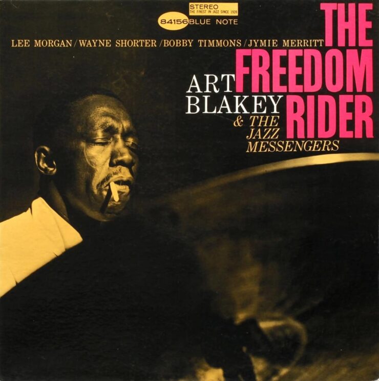
Well-written and informative. If, like me, you’re old enough to remember music on vinyl — or you’re one of the new generation of devotees — take a minute this weekend to appreciate the particular goodness that is album art.
There May be Typefaces Here
CreativeBoom continues its monthly roundup of new fonts, and I wanted to highlight a couple:
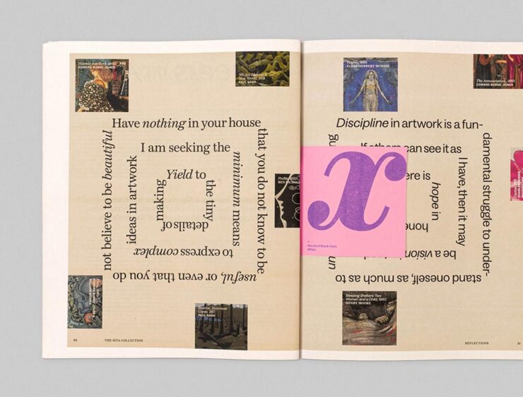
I’m a sucker for fonts that have both serif and sans together in the same family — they’re incredibly flexible and perfectly complimentary in design projects. “Order Type Foundry’s first superfamily is a thoughtful homage to 19th-century Scottish typographic traditions, reimagined for contemporary design needs,” CreativeBoom writes. See more at Order.
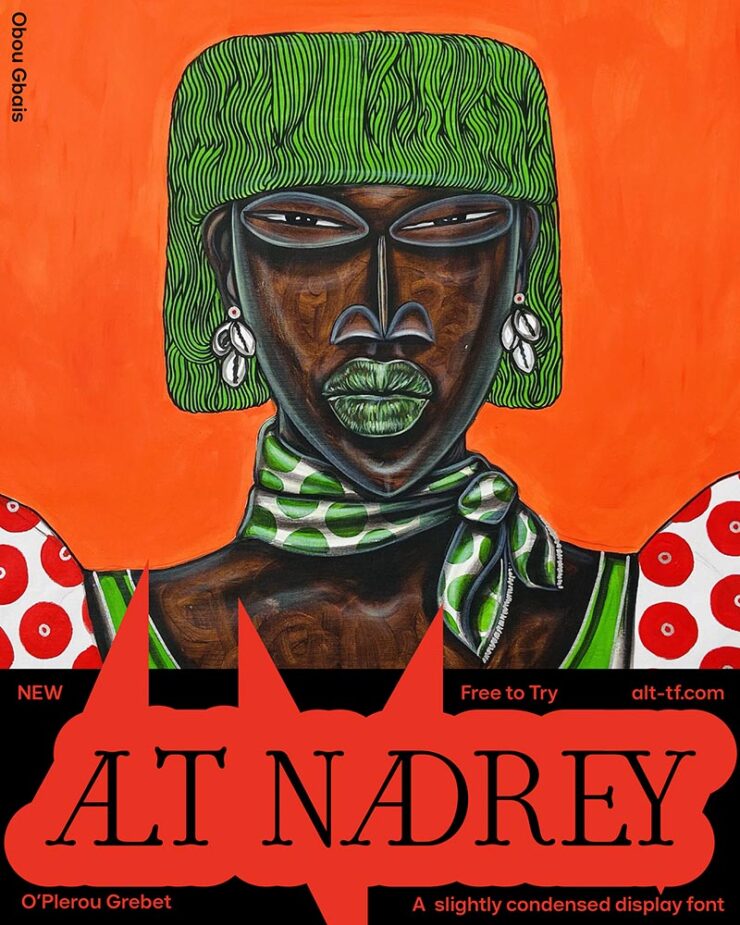
Described by its creator as a “typographical rendition of love,” the beautiful letterforms “draw inspiration from 90s poster fonts, combining narrow-ish, rounded letterforms with a contemporary sensibility. Its gentle curves and subtle serifs create a sophisticated softness while maintaining refined elegance.” Côte d’Ivoire-based type designer O’Plérou does the world a favor, as far as I’m concerned. See more at ALT.
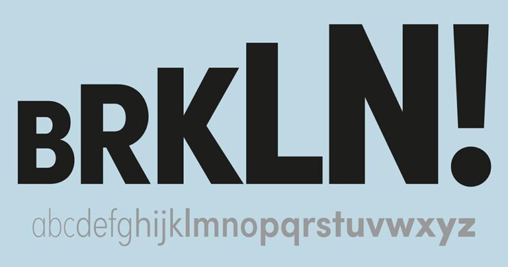
Up there with Futura, from which it’s descended (see what I did there?), Sofia is one of those faces you see everywhere: “a familiar presence in contemporary visual communication, even for those who can’t identify it by name,” CreativeBoom writes. Sofia’s been updated and expanded, now available in a variable format. Spread the Mostard.
Special Bonus #2: It’s not over the top: “[r]ather than uber-pragmatic, sterile fonts, Ornamental & Title Type (OTT) is dedicated to expressive display typefaces,” It’s Nice That writes in a profile of Eliott Grunewald’s foundry. Check it out.
“Fun Fatigue”

DesignWeek asks, “Is formality returning in branding?” An article by Mother Design’s Alec Mezzetti covers how we got to casual in the first place — and why we might be turning a corner away from it.
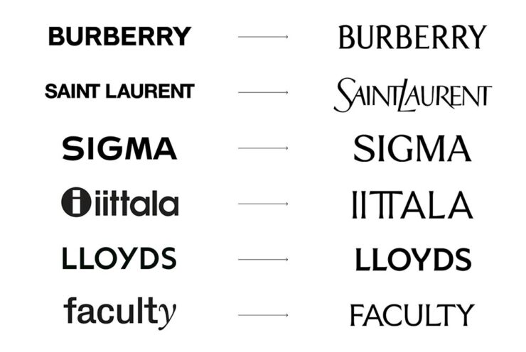
“In a landscape of homogenous casualised branding, widespread disillusion with the idealism that birthed it, and a growing sense of insecurity, these old codes hold power,” Mezzetti writes. The RobinHood investing/trading example, shown above, now looks like this:

The money quote, if you’ll forgive the expression: “The extreme end of this trend towards symbols of old luxury, hierarchy and tradition has been labelled […] as ‘Boom Boom’ aesthetics, which overtly embrace past eras of excess such as the roaring 1920s or, the boom years of the 1980s.”
See if you agree. (Via BrandNew.)
Let’s Talk about Adobe, again
A two-parter, here. First, let’s start with more from Mother Design:1Oddly, Mother Design’s page on Adobe, mentioned in Google Search results, now nets a 404 error. I wonder what that’s about.

That’s right, Adobe has a new logo and branding. ’Course, some of us have been using Adobe’s software for a minute — and clearly remember this:
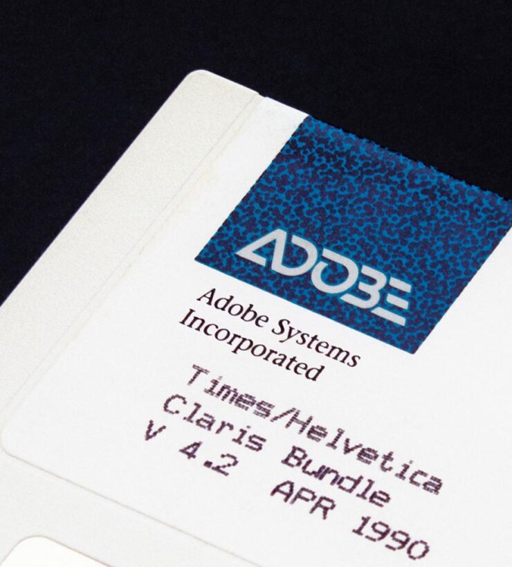
In any case, Adobe is ignoring the trend mentioned above and heavily embracing the current-thinking, very corporate-casual approach:

And hyping the value:
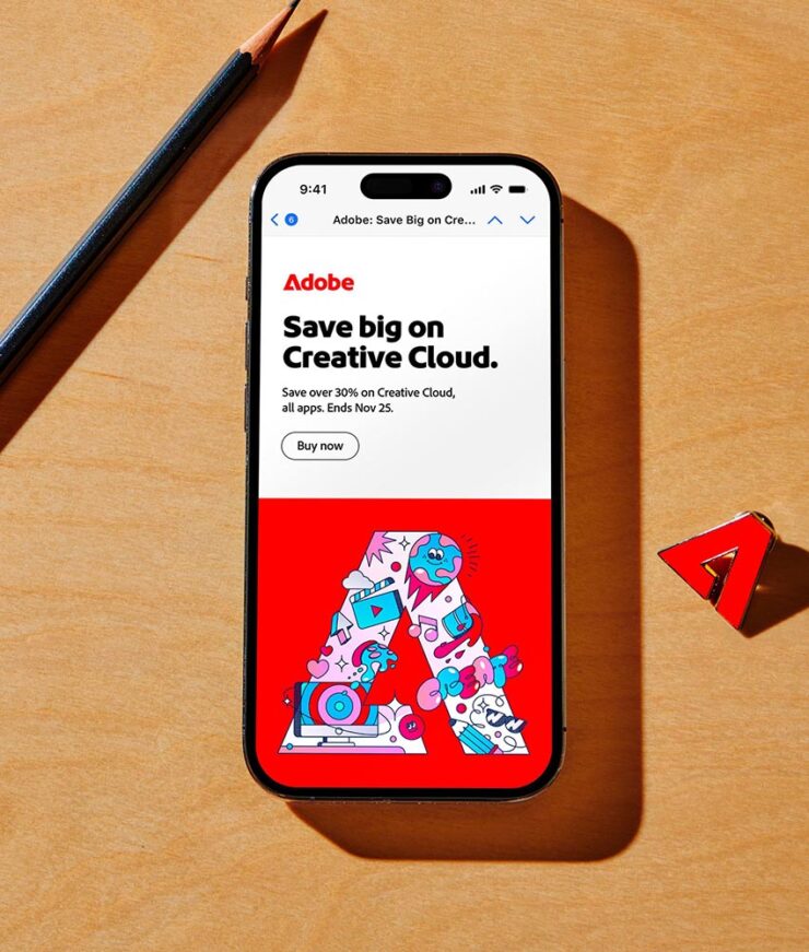
This leads directly to the second part: Adobe is, once again, both flouting its record profits and raising its prices. Why? AI, of course. (We’ll save the potential monopoly position for another discussion.)
Adobe has rewritten pretty much all of their apps to include AI, making it so that many functions are better; retouching power lines in Lightroom, for example, is now a one-click affair. Others seem to be there because Adobe believes the general public somehow demands it. (The AI “summaries” of the PDFs in Acrobat, for example, are being pushed so hard it’s actually annoying, although to be fair, that’s not unique to Adobe.)
In retrospect, it’s obvious that the new AI functions have been written in such a way that we’d get used to having them … and then be forced to pay extra to keep them. In other words, you’d think that, as customers of the Adobe ecosystem for decades now, we’d somehow get to the other side of the fishbowl and not be surprised at the wall.
Adobe has introduced a new “Standard” tier that’s actually slightly less pricy, but with the AI stuff — along with iPad functionality, online access, and other features — turned off. No one who already has a subscription and gotten used to what’s available is going to want that.
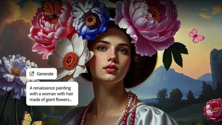
Firefly, shown above, is new, and AI from the ground up, and the generative fill options in Lightroom, Photoshop, and Illustrator, plus the always-useful access to the Adobe Font collection, mean that I’m going to continue to argue that the yearly subscription actually represents a value.
That said, it’s an increasing cost that has to get passed along. I don’t like it, and I’m going to continue to say — in public, on the record — that Adobe is putting profits before people. But this is 2025, and these days, sport contains blood.
Read more at Ars Technica, see the handy chart at PetaPixel, or read Adobe’s marketing for the new Creative Suite Pro.
Special Bonus #3: Apple, the most beloved of all motherships, is also taking fire these days. Longtime fans will know the name John Siracusa — and, thus, know instinctively what this essay represents.
Update, 9 June, 2025: Nick Heer, Pixel Envy: “It is hard to see how one could be a fan of a multi-trillion-dollar company. I am just a customer, like a billion-plus others.”
Special Bonus #4: The Onion, May 16. “[Today, we] announced today the launch of its in-house advertising venture, America’s Finest Creative Agency.” Chef’s kiss.
May Photography Round-up
As has become the norm, let’s end with some awesome photography posted around the ’net in May.
Just a little bit “off,” in the best way
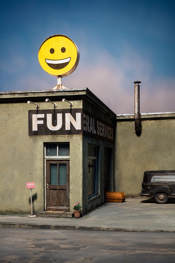
No, it’s not AI: it’s a fabulous series of miniatures, meticulously constructed and photographed for our viewing pleasure. This is Colossal has more. (The behind-the-scenes photo shows all: lots of work.)
The German Society of Nature Photographers
This annual competition is a members-only affair, but in no way, shape, or form is that a compromise:
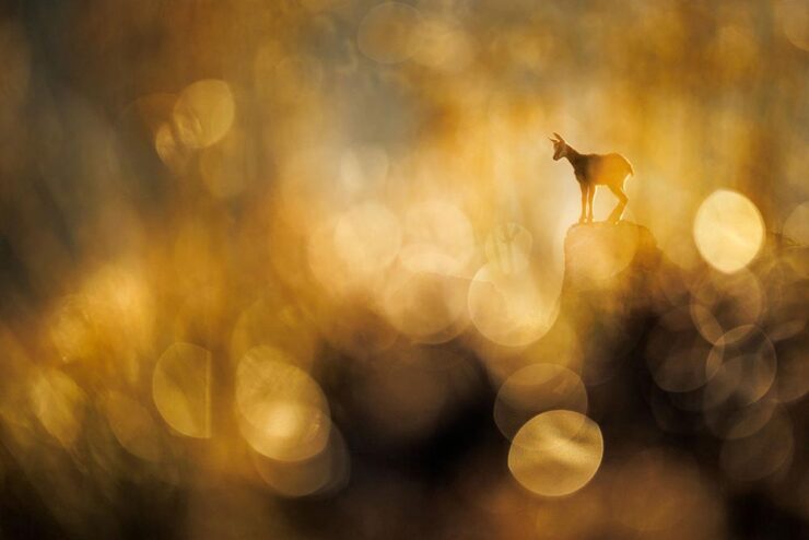

See many more — including a bird bursting through a waterfall (!) — at PetaPixel or head straight to the competition’s website.
From Norway to Hong Kong
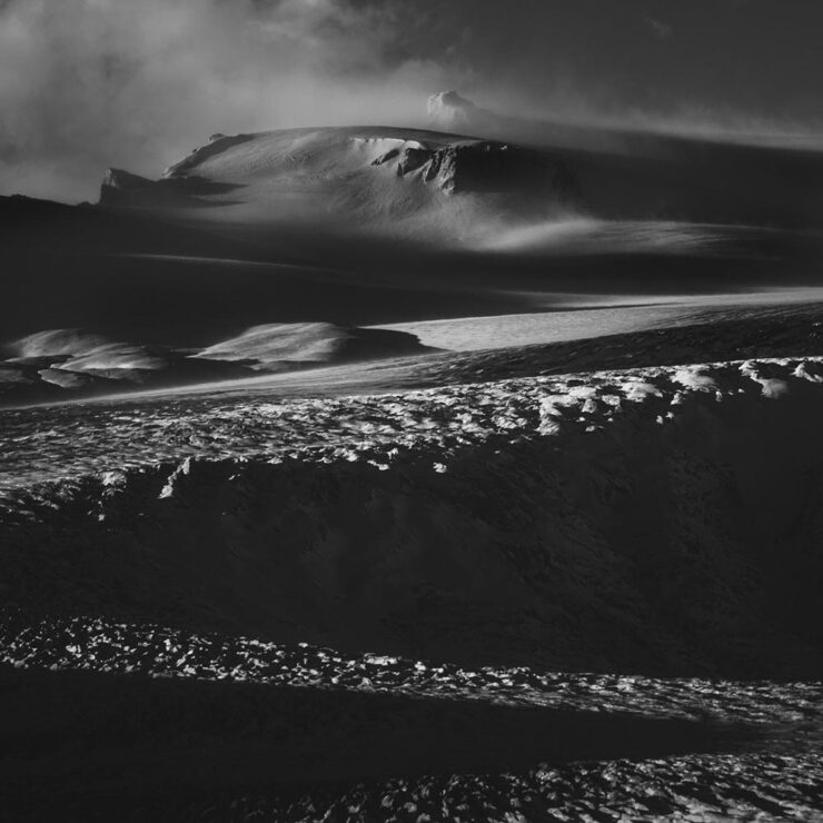
“Like a love letter to nature, Arild Heitman weaves images together as letters into words to create a visual narrative,” PetaPixel writes of the Norwegian photographer.
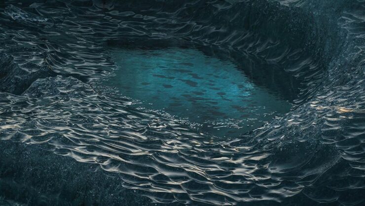
A style that’s “more fine art than sweeping vistas,” they argue; I agree. Of course, there are some vistas, too, but with an interesting quality:
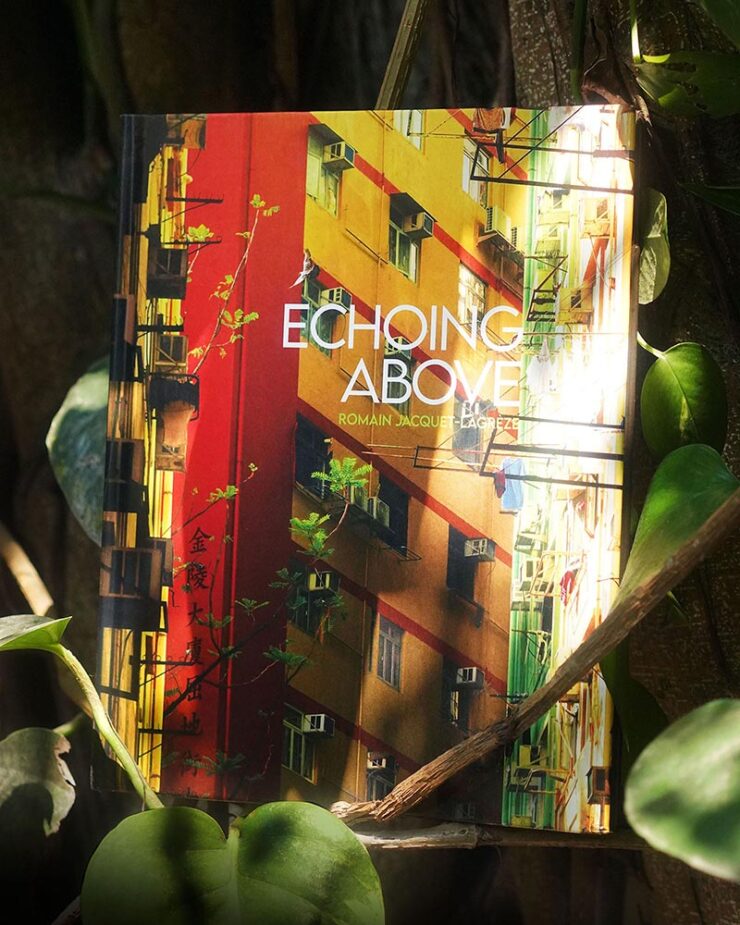
Architecture is another where details and point of view matter. French photographer Romain Jacquet-Lagrèze moved to Hong Kong in 2009, partially because of what he describes as “verticality,” something the Chinese city certainly has in abundance.

“I am especially proud of my latest body of work, Echoing Above. I started it by shooting trees growing wildly on residential buildings in the middle of the city. While looking up to find the trees, I spotted the men building scaffolding. And by looking for the men, I discovered the variety of birds that live in the heights of the city,” PetaPixel quotes.

“I find it beautiful to see how the presence of trees, men, and birds are taking turns above our heads, like an echo in a concrete canyon,” he tells This is Colossal. His latest collection has been gathered into a book, available on his website.
Paris in Color
Jason Kottke brings us an incredible before-and-after, which I hope he won’t mind my reposting:
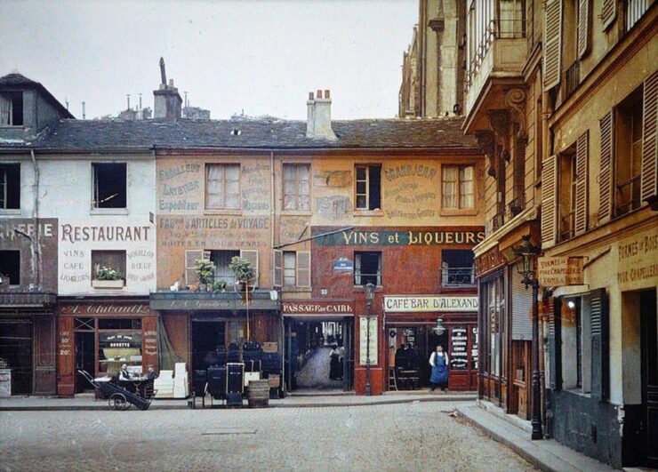
“That photo is of the entrance to the Passage du Caire at the corner of Rue d’Alexandrie and Rue Sainte-Foy in the 2nd arrondissement.” he writes. Here’s what it looks like today:
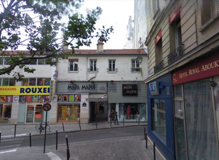
Is it just me, or is the photograph from 1914 infinitely more compelling? Click through for more.
Looking Up
In its sixth year, Nature‘s Scientist at Work competition invites readers to submit their best photos that show the “diverse, interesting, challenging, striking, and colorful work that scientists do around the world.”

For scale, look closely: there are two people at the bottom of that dish. Awesome.

We finish up this month with one of the most beautiful sights in the night sky: the Milky Way. Travel photography blog Capture the Atlas has announced the winners of its annual Milky Way Photographer of the Year competition. (And getting these isn’t easy: the photographer shown above, Uros Fink, hiked through the snow for hours with a 22-kilogram backpack and sled.)
“It bridges the gap between science and art, giving us an awe-inspiring look at the galaxy that surrounds us — from both Earth and orbit,” Capture the Atlas explains, via PetaPixel. The competition site includes the winning photographs, a bit about each, and camera data. Using the word “awesome” somehow falls a little short here….
My favorite gets both the sky and, implausibly, my favorite flower — in an amazing location:

Have a great weekend!
- 1Oddly, Mother Design’s page on Adobe, mentioned in Google Search results, now nets a 404 error. I wonder what that’s about.

