
Three items for you here, starting off with the 2021 Logo Trend Report, from the Logo Lounge. From the Asterisk to Electric Tape, Quads, Chains, and more:
Bill Gardner discusses all fifteen different trends, with logos to back ’em up (naturally).
Next, “A Cabinet of Curiosities” from Hoefler & Co.
Printers once used the colorful term ‘nut fractions’ to denote vertically stacked numerators and denominators that fit into an en-space. (Compare the em-width ‘mutton fraction.’)
This is beautiful:
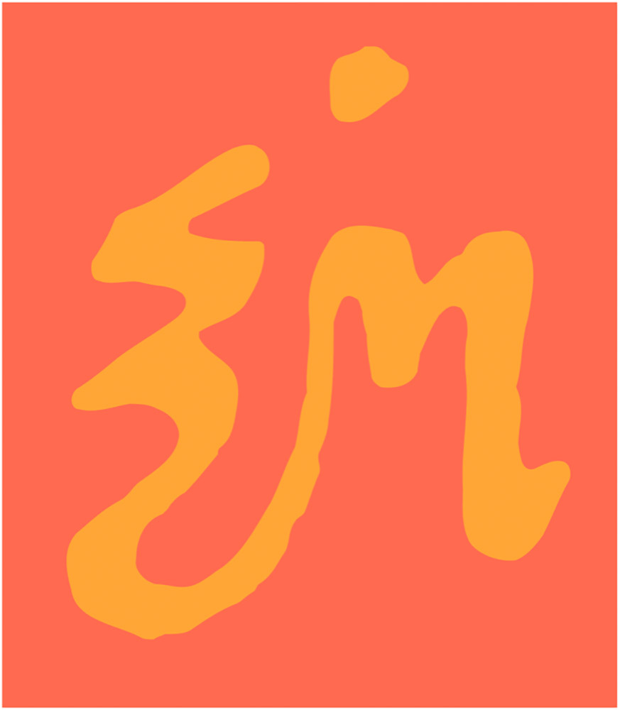
A Dutch curio, representing the letters z-i-j.
Lastly, these are amazing . . . and simple, the better form of “simply amazing.” Yeah:
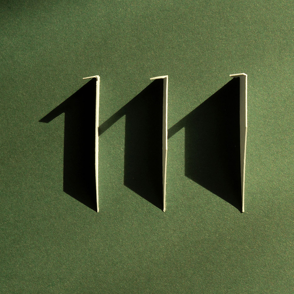
See the rest at This is Colossal.
Happy June!