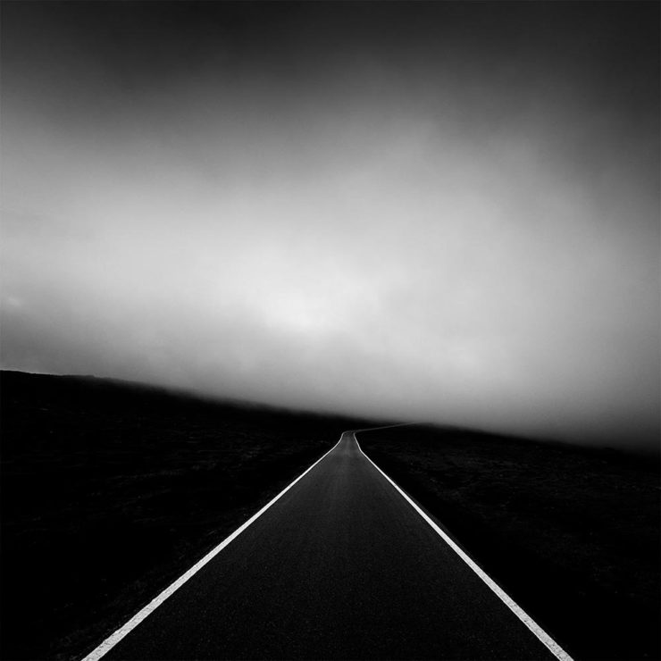
The end of March here in Middle Georgia means flowers aplenty, and usually with that, some photography — but I’ve not yet had a chance. (Stay tuned.) I have, however, been saving up links o’ interest: fonts, books, photography, and new(ish) car logos. Let’s go!
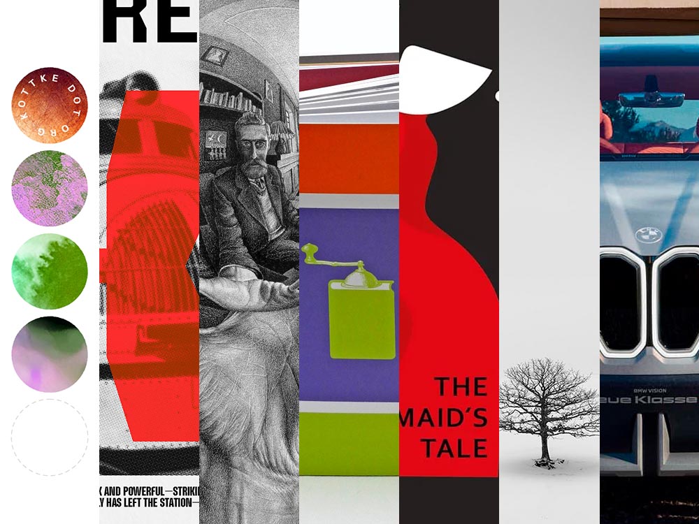
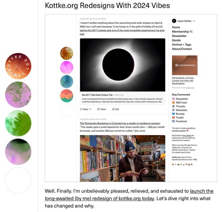
Kottke Meets 2024
Starting with one of the very few places that is still around from Foreword’s old days, the always-interesting Jason Kottke:
2024 marks Kottke.org’s 26th year on the ’net.
Great new looks for great content, with better Quick Links — the previews are ace — and incredibly-appreciated gift links to places like The New York Times and The Atlantic. If you haven’t been in a while, click and enjoy.
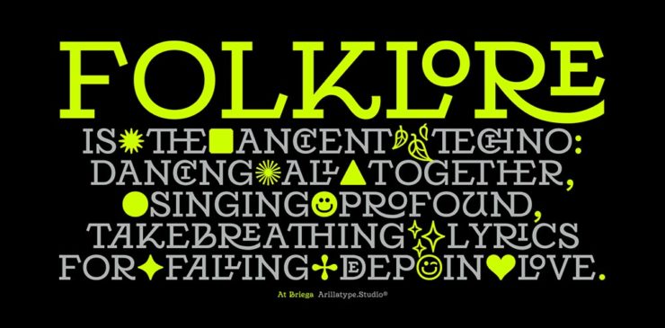
Fab Spring Type
With “a plethora of captivating new typefaces,” CreativeBoom celebrates spring with 11 new faces to tempt, inspire, and bring joy:
Arillatype.Studio brings us a thousand glyphs of greatness.
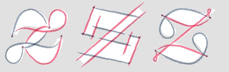
Zanco, with its bell-bottom style; Seabirds, inspired by 1930s book covers; Module, a “fluke side hustle;” and Graffeur, improvised from gaffer tape and glimpsed in this post’s header image, are all great. My far-and-away favorite, though, is At Briega, “inspired by the concept of hybridisation” and shown above.
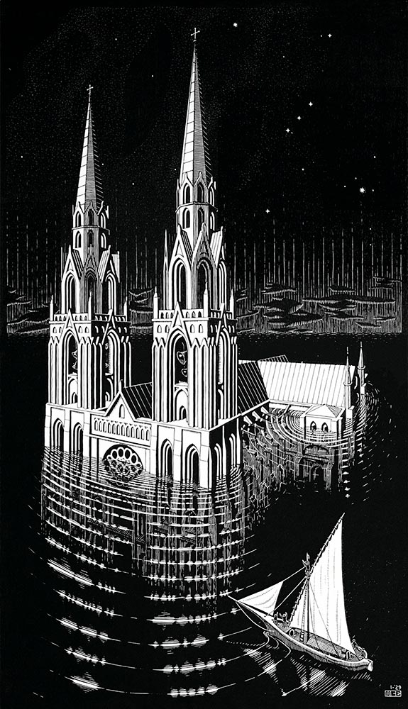
“Unique perspective” never does justice to someone whose name defines the term. See some never-before-seen images alongside old favorites in a new Escher book highlighted at Hyperallergic.
Multidimensional Libri
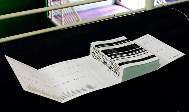
“Experimental books are flourishing, [a]nd the evidence is seen” in this Daily Heller from PRINT: a traveling exhibition on three-dimensional books, all published titles.
“Don’t get held back from the simple pleasures of reading,” argues Natalie Fear at CreativeBloq, “not everything needs to be minimalist.” Justification for commercialism or a common-sense explanation for the bookshelves’ current look? You decide.
Photography Three-Fer
Winners of Monochromatic Minimalism
“Black Pearl” by Sascha Kohne. An honorable mention for the magazine, but a winner for me.
“Traveling through Costa da Morte, Galicia. 600m above sea level where the mountains separate the Cantabria sea from the Atlantic Ocean,” explains third-place winner Alexandre Caetano.
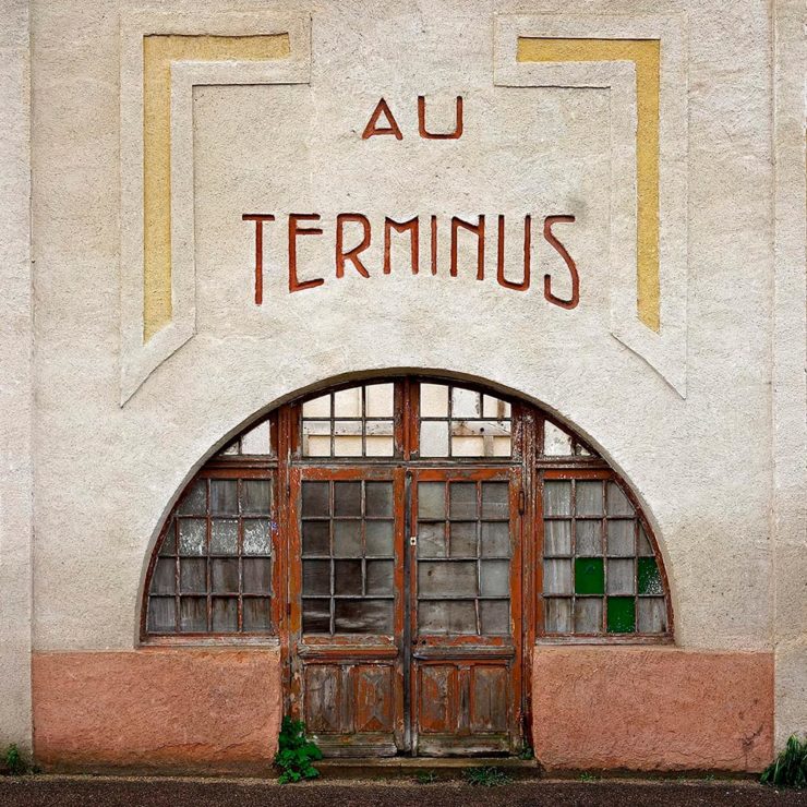
Aging Facades of France
“Shuttered blinds, peeling paint, and aging doors don’t usually indicate an invitation, but for French photographer Thibaut Derien, the fading facades of long-closed shops are well worth a stop,” This is Colossal says.
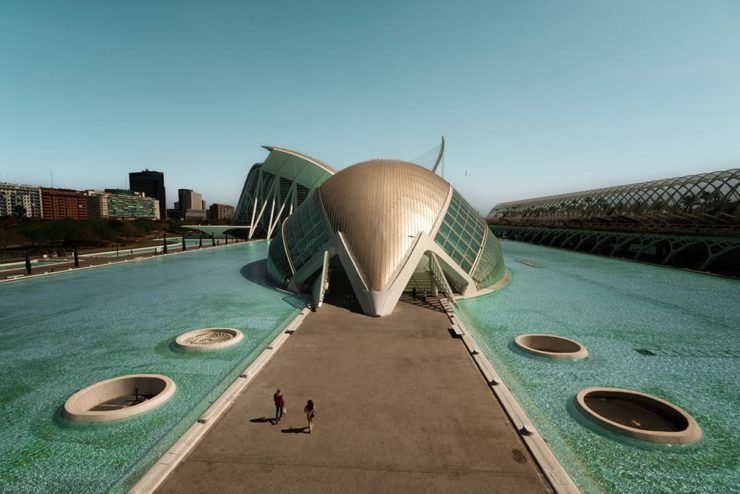
Sony Photography Awards: Architecture
The Ciudad de las Artes y las Ciencias (City of Arts and Sciences) in Valencia, Spain: “Hemispheric,” by Eng Tong Tan, Malaysia.
ArchDaily‘s coverage of the annual Sony awards shortlist announcement was an insta-click.
New Bull: Now Flat. (And a BMW.)
Lamborghini practically defines flamboyant. So it’s worth a link when their logo gets less interesting:
Old logo, left, new, right.
Late at following the industry trend of flat-is-better, because, well, Volkswagen. (Okay, I undersell. Perhaps.) Read the lack of news at Motor11Motor1 also has a decent roundup of new car logos, from 2016-present, which underscores the “flatness” trend. or The Drive, where they manage to convey the brand’s use of the phrase “digital touchpoints.”
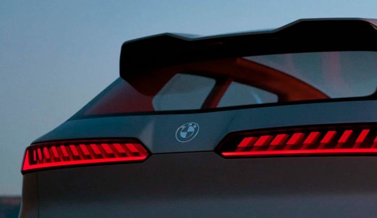
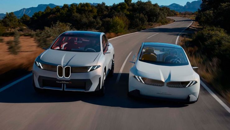
I don’t know whether this will make any more sense in a few or even many months — which is relevant because of BMW. Four years ago, one of the industry’s design leaders expressed strong this new style, and I didn’t get it. But it’s worn better than most, and superlatively on occasion — check out the logo’s use on the Vision Neue Klasse X:
Rather than a standalone, plastic part sitting on the paint, it’s etched into the finish. Man, I hope that makes it into production.
Neue Klasse: do like. Bull? No so much.
Update, 2 April:BrandNew, itself sporting a new look, has weighed in on the new Lambo style, calling it “not good.” (FYI, BrandNew is a subscription, quite possibly the best $20/year someone interested in design can spend.)
1
Motor1 also has a decent roundup of new car logos, from 2016-present, which underscores the “flatness” trend.
A selection of diverse items for this entry in the series: a new publication from The Guardian, open source fonts for your 2023 goodness (along with more for ’24), and the Natural Landscape Photography Award winners. Also: DAK. Let’s get into it.
The Long Read
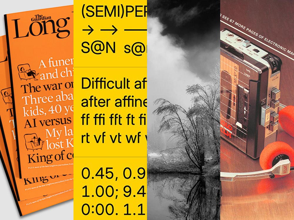
Regular readers will know that I’m a big fan of The Guardian, including its unusual-for-journalism payment model (that, frankly, some outlets in the US would be wise to copy). Now, they’re on newsstands with a “bookazine” called The Long Read.
The back cover. (See the front cover at the left in the header image.)
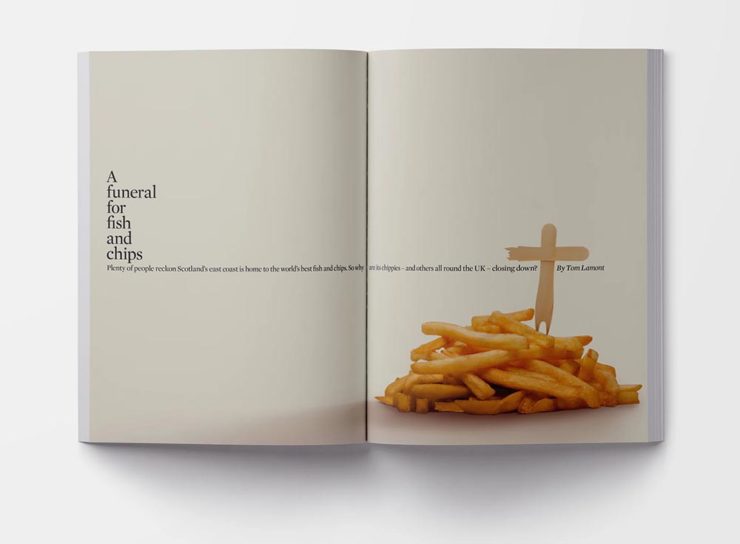
“We know that for many people, myself included, when it comes to long, immersive pieces, reading in print […] is still the most satisfying reading experience, and one that should be cherished in a climate so saturated by disturbance,” quotes It’s Nice That. With most of these more evergreen stories taking months or even years to build, hardy print felt the best way for them to live. [A] ‘bookazine’, it balances all the things we love about magazines (“the drama, the pace, the energy”) with the considered typesetting of a book. A lot of attention was given to packaging its large volume of text – clocking in at 55,000 words – to make the reading experience as relaxing as possible, from body type size to column widths.
As a self-confessed font junkie, I’m always interested when a new one comes across the bow — but there are so many these days, they’ve unfortunately become almost commodities. (That’s a huge shame, but also a discussion for another time.) So it’s interesting when I see ones that are not only good but also available for everyone, free and open source.
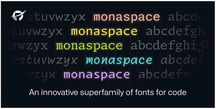
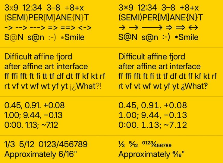
Monaspace is the first of three I want to highlight, “a monospaced type superfamily with some modern tricks up its sleeve.” Designed for code — hence the monospace — it’s a successful answer to the question, “Letters on a grid is how we see our code. Why not make those letters better?”
B612 is designed for — get this — the screens on Airbus commercial planes. “[T]he challenge was to improve the display of information on the cockpit screens, in particular in terms of legibility and comfort of reading, and to optimize the overall homogeneity of the cockpit.” Read the back story here.
Inter is described as, “The 21st century standard,” “a workhorse of a typeface carefully crafted & designed for a wide range of applications, from detailed user interfaces to marketing & signage.” One of the world’s most-used font families, it’s perfect when readability is at the fore.
Brinca by In-House International. (Image via CreativeBoom.)
CreativeBoom has their annual compilation of 50 new fonts for the coming year up, “a comprehensive list of the best fonts that demand your attention in 2024. We’ve compiled this comprehensive list by asking the creative industry for their favourites, analysing work from the last 12 months, and taking on board the design trends emerging right now.”
National Museum in Gdańsk by Tofu Studio. Featuring Migra by Pangram Pangram. (Image via CreativeBoom.)
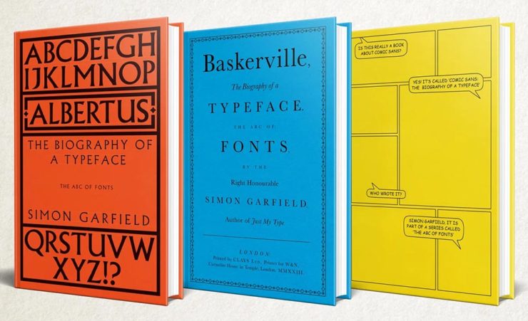
Special Bonus: Simon Garfield publishes biographies on Albertus, Baskerville and Comic Sans. Seriously:
The Natural Landscape Photography Awards
For once: a contest that demands more — like the original RAW files. (Literally the raw image from the camera, before processing, for those who don’t know — think film negatives, rather than the resulting prints.) Okay, sure, it’s not perfect; there are entry fees and it doesn’t have a long track record, but the rules are solid with respect to image integrity.
Of course, the quality of the subject chosen to photograph is, if you’ll pardon the expression, subjective. The overriding theme here seems to be the perfection of dramatic subtlety — not an easy thing to get right.
Photo: Adam GibbsPhoto: Adam Gibbs
The two photographs above are both by Adam Gibbs and reflect the judges’ desire to reward photographers who display a diverse portfolio of subjects.
Photo: Alberto Rodriguez Garcia“Once Upon a Time.” Photo: Matt Redfern
A winner from the “abstracts and details” category for the first and a great title for the second image that does indeed tell so many stories. Rounding it out, another beautiful black-and-white:
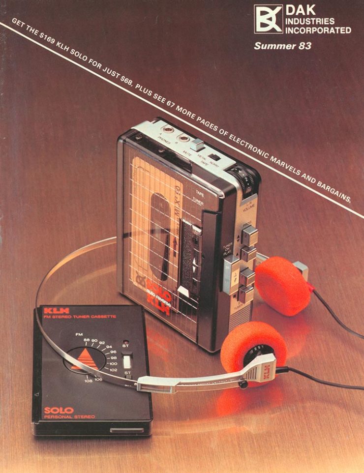
If you’re a certain age — that is, were around in the ’80s — the DAK catalog was a regular. (Give me one, together with a JC Whitney catalog, and a weekend was gone.) A recent post by Cabel Sasser brought it all back:
The catalog from Summer 1983.
Oh, the products. The explanations. The fun.
I’m not going to spoil the effort put into the story of Drew Alan Kaplan, a.k.a. DAK, Joseph Sugarman, Products That Think, or any of it: go enjoy for yourself.
Since its inception in 1923 as the Fifty Books of the Year competition, this annual event highlights AIGA’s continued commitment to uplifting powerful and compelling design in a familiar format we know and love. As book jackets became more prevalent, the competition evolved with the field to acknowledge excellence in cover design. Beginning in 1995, the competition became known as 50 Books | 50 Covers.
AIGA Press Release
The jury and I were very impressed with both the quantity and quality of the entries this year, which made choosing only 50 extremely difficult. Among the trending techniques this year were use of exposed bindings and elaborate page sequencing and mixed paper choices. For me, there was a greater overall sophistication in book design, with a mix of aesthetically beautiful and graphically brash approaches in the final choices.
Andrew Satake Blauvelt, Director, Cranbrook Art Museum (Chair)
As usual, there’s some overlap with various lists of “best of 2022” — here’s Foreword’s — but, as LitHub puts it, these are the best book [designs] of 2022 that you (probably) haven’t seen.
A selection of my favorites, in alphabetical order:
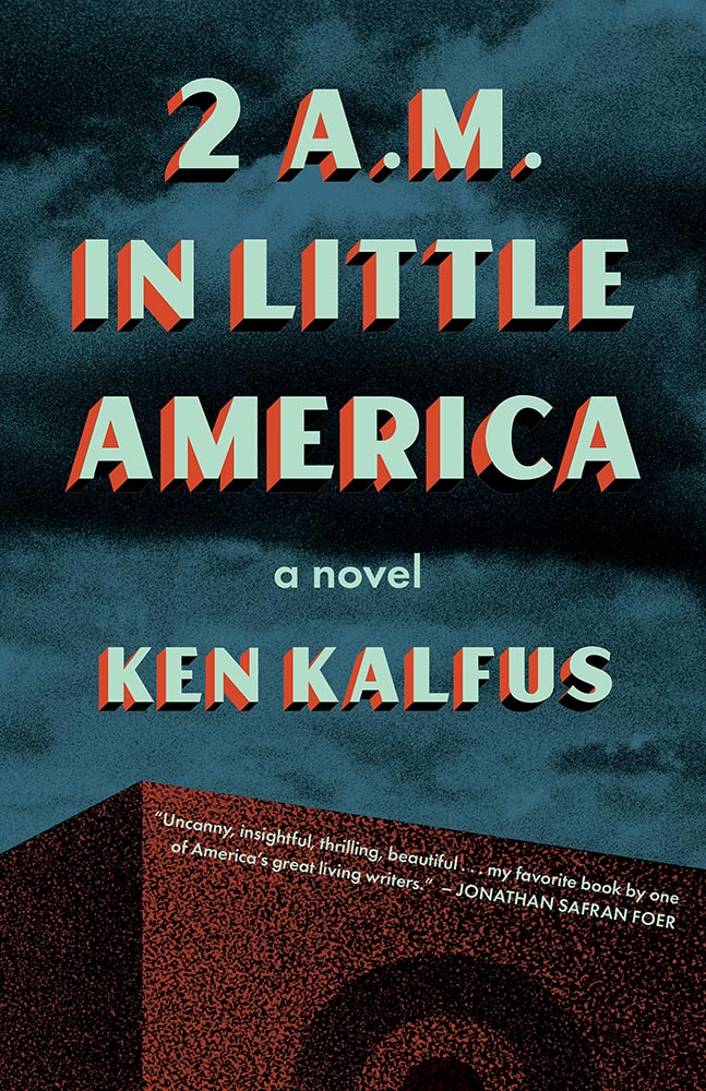
Cover design by Mary Austin Speaker
Simplicity itself — along with some awesome block type — add up to a great cover. (Love the angled blurb, too.)
Book design by Zack Robbins and Bentzion Goldman
One of the great things about this post is the “50 Books” part; this cover’s okay, and the spine more than okay, but it’s the interior design that really wins in my book (pardon the expression):
Book design by Zack Robbins and Bentzion GoldmanBook design by Zack Robbins and Bentzion Goldman
Kudos: the photography is great, but the spread above is artistic in wonderful way.
Book design by Kimberly Varella.
The trend, mentioned above, to mix paper stocks and styles is shown to full effect here. This book has too many great examples to post; see more.
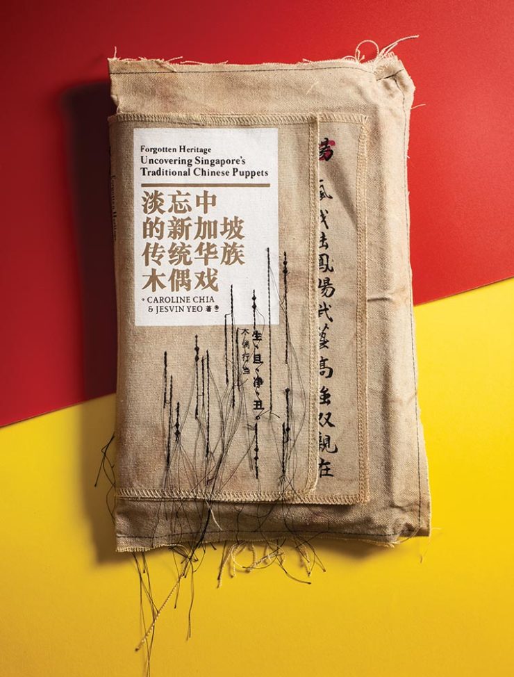
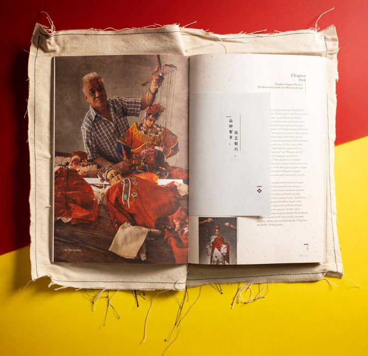
Meanwhile, Uncovering Singapore’s Traditional Chinese Puppets may not be a title you’d automatically reach for, but…:
Book design by Alvin Ng and Jesvin Yeo.Book design by Alvin Ng and Jesvin Yeo.
This is an interesting, compelling cover and jacket design as shown above. However, once again, rather than post it all here, I’m just hoping to whet your appetite — you need to see this one unfold (literally).
Cover design by Raúl Aguayo.
Great colors, great combinations, great cover.
Cover design by Vi An Nguyen.
I’m always a sucker for photographs of practical items used in ways that make book covers great, and this one’s a shining (pink) example.
Book design by Maria Elias.
There’s so much great design work done in the children’s book market it’s not even funny. The first of two great examples. (See more from this title.)
I’ve highlighted this design before, but every time I see it I like it more. Glad to see it as an AIGA 50 Covers winner.
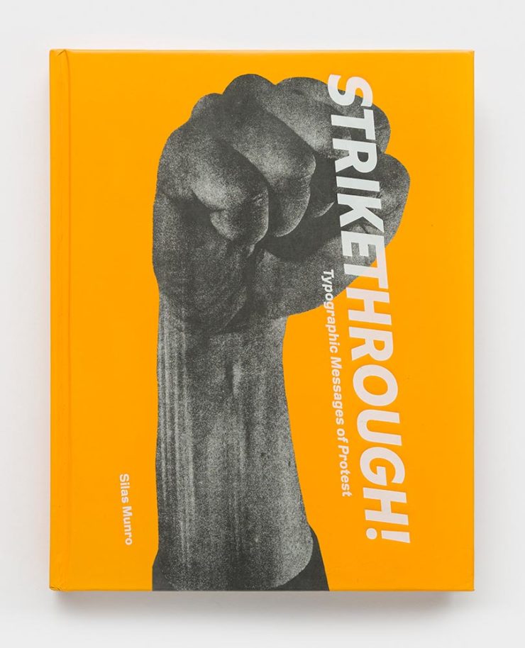
Book design by Brian Johnson, Michelle Lamb and SilasMunro.
Typographic Messages of Protest, indeed — done in an appropriately powerful way. The suggestion of motion is a great touch.
Cover design by Chris Allen.
“Block party,” defined. Excellent.
Book design by Jay Marvel.
The second children’s title on this list, including an interesting and distinctive style. (See the interior of this book.)
Again, these are only some of my favorites — there are many more, all of which deserve a look. Congrats to all the designers who made these title happen and thanks to the AIGA for this annual delight.
The mission for these posts is simple: independent, unrelated items which add up to something interesting. This time, it’s nifty type, aka NFTy.pe, photographic AI (or not), the 2023 Logo Trends Report, great London Review of Books illustrations, and a worthy art book list hijacked for a rant on stickers. Boom!
Better Than it Sounds: NFTy.pe
Typefaces have become, from this designer’s point of view, become commodities — perhaps even part of a broken system. Most clients don’t have a budget for unique type, there are too many spread across too many different sites, and, as Creative Boom puts it, “ownership has become poorly policed, if not non-existent.”
NFType really flips the script on all of that and attempts to reimagine the industry from creation to sale. In a nutshell, NFTy.pe uses a combination of modular type design and generative scripts to create fonts with unique visual attributes. The upshot is that no two character sets are exactly the same. And thanks to smart contracts and embedded metadata, ownership is quick and easy to verify.
— Craig Ward, NFTy.pe creator, via Creative Boom
Create a unique typeface that rewards, in more ways than one.
As pointed out, it’s not just for type users:
There’s a lot of work to be done to put some distance between the dumpster fire that represents much of the NFT space and projects – like this one – with actual utility. I wouldn’t vouch for the worth of a lot of what I’ve seen out there, but the underlying tech – the smart contracts themselves – [is] actually genius and will be a game changer for any industry where provenance is a key factor – agriculture, property, fashion etc.
This year has been centered around AI, it seems — and, as illustrations go, some of the results are indeed a new form of art. Take this one posted by Dezeen as part of their AItopia competition:
Created by Midjourney for Daniel Riopel.
Fantastic. Its creator, a production technician in the prefabricated housing industry, deserves major kudos for describing something to the Midjourney engine that’s intricate and, if I dare use the term with AI, creative. (Several of the images there are excellent — check ’em out.)
That said, I’m not a fan of articles like PetaPixel‘s recently-posted “Photographers May Have to Embrace AI, Whether They Want To or Not.” Simply put: no. I don’t have to embrace it, because nothing has changed — either I can get the photograph I want using the cameras and lenses I have or I can’t. I’m not going to “generate the fill,” pure and simple. (I don’t control the computational photography my phone produces, but Apple isn’t prone to creating what isn’t there.)
I’ve been trying to write on this subject for a while, without success. Possibly because I don’t need a longer version of the above paragraph, possibly because it’s something else I haven’t been able to articulate yet — even to myself.
The 2023 Logo Trends Report
It’s back! BrandNew points us to the latest in styles and, as advertised on the tin, trends:
“Sonics,” part of the 2023 Logo Trends Report.“Ritz,” as in the cracker, part of the 2023 Logo Trends Report.
Always an interesting read, including this fantastic tidbit directly related to the previous section:
“Don’t worry about AI stealing your job. To replace graphic designers with AI, clients will need to accurately describe what they want. We’re safe.”
— Bill Gardner, LogoLounge
Read the full report, “a whirlwind of ideas, symbols, and AI, evolving how creators like us create,” at LogoLounge.
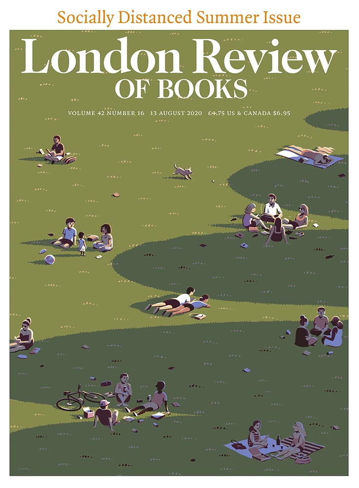
Illustrations at the London Review of Books
Because we cover books here often (pun intended), an article on Jon McNaught’s awesome illustrations for the London Review of Books absolutely caught my eye. “A collaborative relationship,” it’s called — and the results produced not only illustrate a huge variety of subjects in a consistent style, but do so in a way that delights:
A great illustration by Jon McNaught. Of the examples posted, there’s not a single one I don’t like. Copyright Jon McNaught.
Since 2011, Jon has been collaborating with the renowned literary journal, creating works that have a quietly mesmerising quality. His scenes breed comfort with their universality, but also their ability to evoke specific memories and feelings in the individual viewer. Through his covers, Jon artfully captures the essence of everyday life by representing the vastly contrasting nature of British weather, plus the uniqueness of London’s architecture, green spaces and public transport.
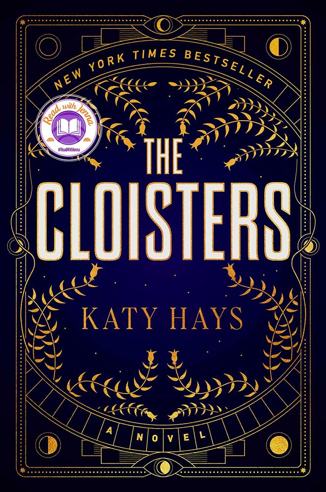
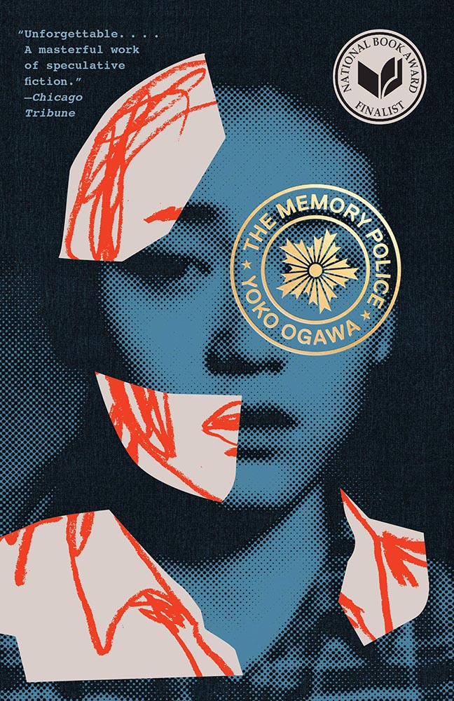
As usual, whenever I see something like this, I’m going to do something else at the same time: mine it for potentially great book design. Which, if you’ll indulge, leads to this short rant: I hate good covers marred by stickers.
“Read with Jenna?” Seriously?
Solid cover. Soooo, who’s Jenna? Is she important enough to mar the cover with? (I DuckDuckGo’d the answer: maybe … if you watch television. Not sure that’s the audience publishers should want to cater to.)
This time, the “sticker” is National Book Award Finalist. Better, but still.
Another solid cover — perhaps even really good, something that’s appropriate for a title up for the National Book Award. Real shame, then, that the sticker gets in the way, winding up completely distracting from the very nice circular title treatment (I’m sorry I don’t know either book designer to list here.)
I understand that it’s a little like trying to hold back the tide with a shovel, but it’s something I needed to express. [/rant]
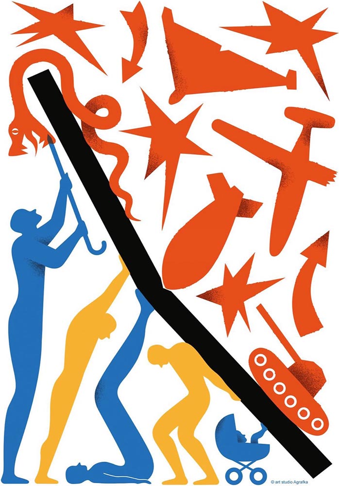
Bonus #2 (amazing):Via Kottke, a fantastic poster and perhaps better question:
Poster for the 2023 International Book Arsenal Festival, by Art Studio Agrafka
A book festival. During a war. In a city under martial law. While schools and legislatures here in the US ban books about Black and LGBTQ+ experiences based on bad faith complaints of tiny fundamentalist parent groups. Tell me, who’s doing democracy better right now?
— Jason Kottke, Kottke.org
That’s all for early July, folks. Go forth and make your summer a better place.
Look out, look up, look forward, and look through in this edition of brief, link-filled goodness.
“You May Now Enter”
PRINT covers, uh, covers:
While the book blob dominated the discourse for the last few years, we’ve recently identified another trend splashing its way across new releases: the recurring symbol of doorways, open windows, and mysterious portals.
—Charlotte Beach and Chloe Gordon, PRINT
A couple of the examples they cite:
Not only a portal but a shelf. Cool.Not only a portal but also stairs. Nice.
Unlike the blob, I’m in favor of this one — the hint of the unknown is appealing in a visceral way that offers more while simultaneously offering more sales by asking potential readers to speculate and, thus, engage. Nice call, PRINT.
Here’s a question you’ve been absolutely asking yourself: what are the origins of the infamous Lorem Ipsum?
The lack of placeholders on the shelf is remarkably appropriate. (Photo: Scott Keir.)
Turns out it’s not as simple as Aldus [known as Adobe these days —Ed.] — or the even-more-infamous annonymous. Tim Carmody, the very capable guest chair at Kottke.org, fills it in: it’s Cicero. No kidding: Slate says so.
De finibus, indeed.
Fourteen Fonts to Follow
Creative Boom, where having eyes on you is actually fun, celebrates “14 Fonts to Fall in Love With” for Valentine’s Day. While Foreword may be late to the party, a couple of the type choices are first rate:
Irregardless1I absolutely want to steal their website design: the menu system is brilliant. and Pastiche, in order. (And no, I didn’t put those two together to be funny.) Read the article and pick your faves.
Art of Building Photography
I wasn’t aware of the Chartered Institute of Building, or their Art of Building photography contest:2Their terms are good, too — something remarkably rare in contests.
“White Constellation,” by Francesca Pompei.
Since architecture and photography very much intersect in my camera, brain, and work, I’m glad to have found this great source of inspiration:
“House of God,” by Roman Robroek.“My own little cosmos within reach,” by Pati John.
Just like last year, this post took longer than expected due to the best possible circumstance: there were so many great book cover designs in 2022 that I had a hard time whittling down the list. Even as it is, we’re busting right through last year’s limit of 50. Good times!
If we take a step back and look at the trends this years’ favorites represent, it’s more and better illustration, custom and hand-painted type, and a sense of a single focus — one, dominant thing on a field of color. Also, the trend of fewer photographs continues — more evidence that photography has become so ubiquitous that something different is required to stand out. (Or, of course, a really great photograph.)
Please remember that these are my favorites — others might say “best,” but I’ve been in this business long enough to know that there’s always another great title you haven’t seen or read about, and I don’t want to disrespect any of the great book designers not on this list. I’ve tried to include design credit where I could (special thanks to the folks who answered emails with that information), and I wish to stress that any mistakes in the list below (incorrect attribution, for instance) are mine.
Note: If you’re on Foreword’s main page, please click on the post title, above, to view this list. You’ll get larger covers for your viewing pleasure.
My favorite book covers for 2022 (Three-way tie):
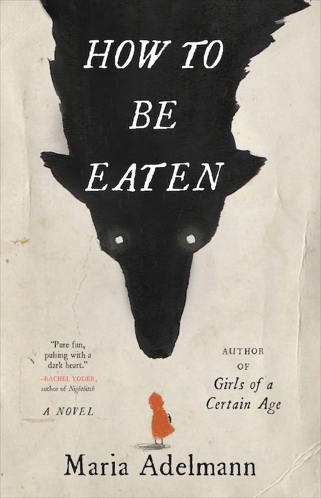
Design by Julianna Lee.
How to be Eaten combines an aged look, just a smidgen of pencil sketch, hand-drawn type, and those eyes to create something that just goes beyond. I’m certain the background wolf and creases are real, too, either photographed or scanned — bonus points for that all-too-rare practical effects — and all this in what amounts to two colors. Simply awesome.
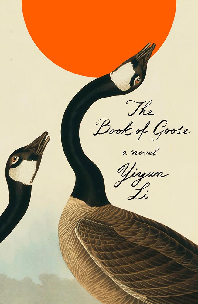
Design by Na Kim.
The Book of Goose defies use of the words “art form” — it’s the kind of cover that for many designers would be once-in-a-career good. However, Na’s work appears below, was here last year, and speaks to Na’s creativity being, well, a golden goose that just keeps on giving.
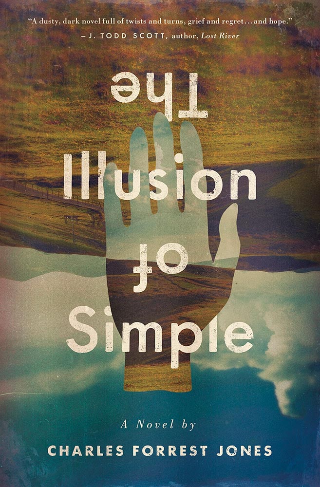
Design by Derek Thornton.
Simply put: there’s literally nothing about The Illusion of Simple that isn’t perfect. J’adore.
Other 2022 favorites, in alphabetical order:
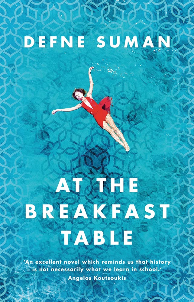
Design by Matt Bray.
This is striking not only for the beautifully-photographed woman in the pool, but the way the pool is extended out to make that woman even more striking. The pattern overlay is fantastic, too.
Design by Pete Garceau.
There’s nothing about this not to like: the frankly perfect illustration on a great background color, the head through the “O,” subtitle censorship bar, the sock, even the title. Enjoy-a-cigarette-after good.
SoHo Press didn’t return a request for cover design information.
Bunch of aged books with a little type, right? Yes, by so much more: striking colors, great hand-done supplementary text, perfect title treatment, style in spades.
Design by Jo Walker.
This is a UK cover — the American one is okay, but not on this list — that celebrates a minimalism that is rarely seen, let alone so well seen.
Design by Tyler Comrie.
What’s not to say about this cover? While faceless women are perhaps overused, this is a book I’d snatch off the shelf — and seemly catch something from — in an instant. Well. Done.
Design by Oliver Munday.
As simple illustrations go, this one in on track for the city of Superlative. Another Oliver Munday classic.
Illustration by Seb Agresti.
Along with “faceless woman” is “headless woman,” but the illustration here more than makes up for it. But it’s the expert, almost laugh-out-loud use of a void that makes it. Well done.
Design by Aleia Murawski and Sam Copeland.
Sure, the title and background colors are neat, the sky outside is cool, and “a novel” is a nice, subtle addition. However: I want to know how this photograph happened. (And a waffle hot dog.)
Design by Maddie Partner.
The first of a couple of titles with unexpected wrap-around type treatments, this one has great type choices, too. But the real treat for me is the plane knocked out the photograph. Fantastic.
Design by Suzanne Dean.
This title hides a secret: under the simple and wonderfully-die-cut jacket is a beautiful photo from René Groebli’s photoessay The Eye of Love.
Awesome. (Note that, once again, we celebrate the UK version of the book; the US hardcover has a design not on this list. Crumpets.)
Design by Mike Topping.
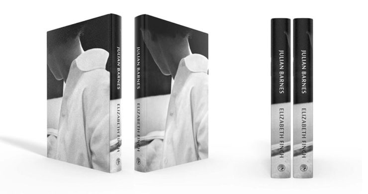
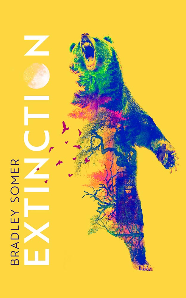
The moon as O. The birds. The graduation from fur to imagery. The yellow. Any would be good on their own, but are great together. Have to say: I’ve seen this in multiple shades of yellow. I prefer the darker — closer to the Barnes title, above — to the lighter, shown here.
Design by Anna Morrison.
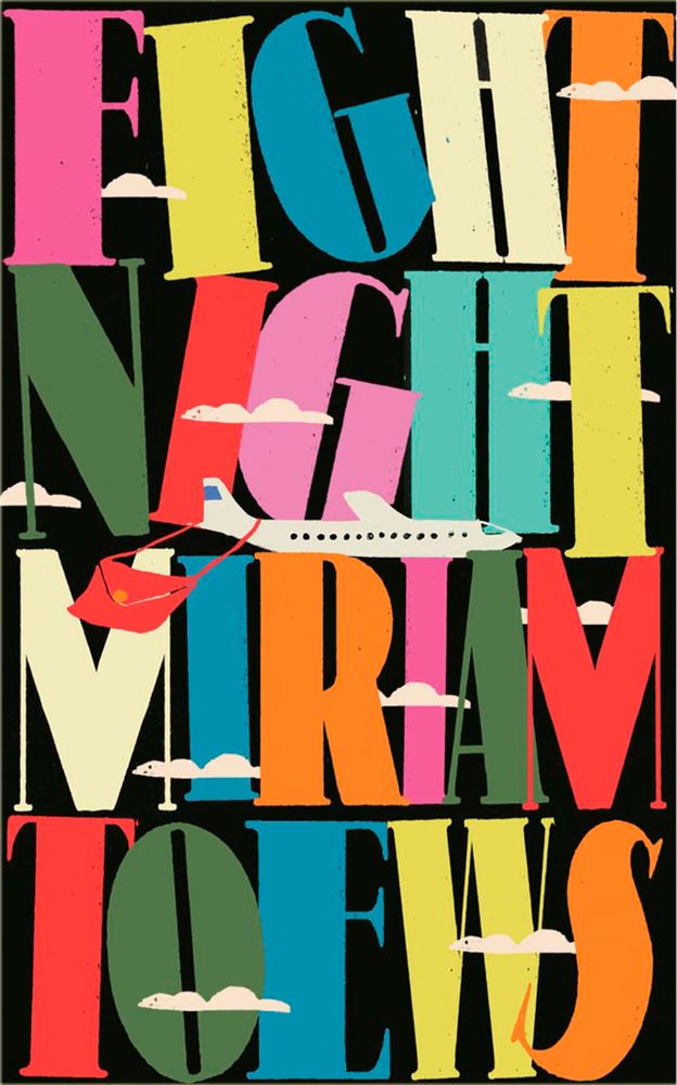
The typography, awesome little plane — the purse(r)! — the clouds, all of it: sky-high levels of good.
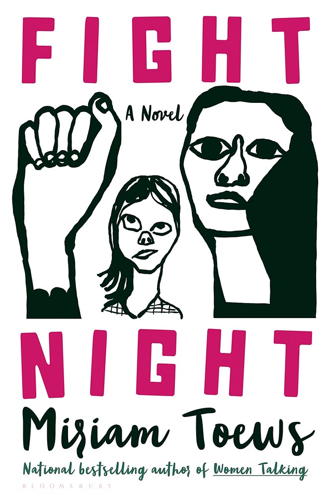
Interestingly, Fight Night‘s cover also had a 2021 version worthy of note:
Design by Patti Ratchford, illustration by Christina Zimpel.
I can’t begin to imagine what caused the redesign, or why it wound up being so radically — 180 degree! — different. The old design wound up on some “best covers” lists (here’s LitHub’s October 2021 post, for instance); both have wound up on mine.
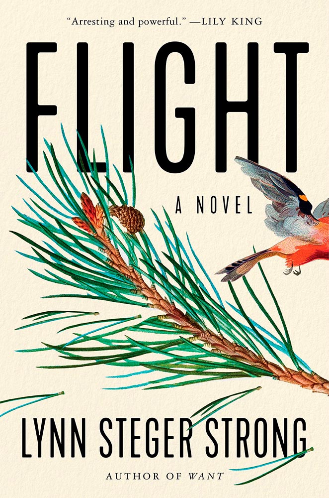
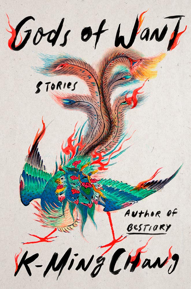
Design by Ploy Siripant.
The bird exiting the scene stage right makes this just right, with bonus points for the textured paper and slightly-rounded sans serif. I think the illustration is perfect — classically done, one could say — and also love that “author of Want” is in a different font.
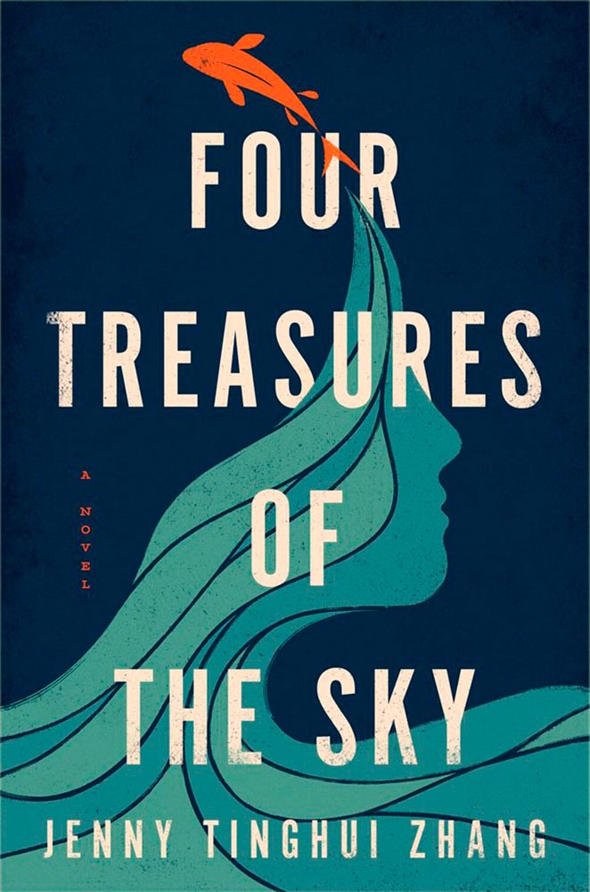
Design by Vi-An Nguyen.
Four Treasures to the Sky, mentioned in the May book cover design roundup, leaps into the best-of-the-best list. It features an aged look, but in a woodblock way that celebrates its limited palette. Add in the illustration’s interactions with the type and the vertical “a novel” — often an afterthought — and brilliance emerges.
W. W. Norton didn’t respond to a cover designer request. Apologies.
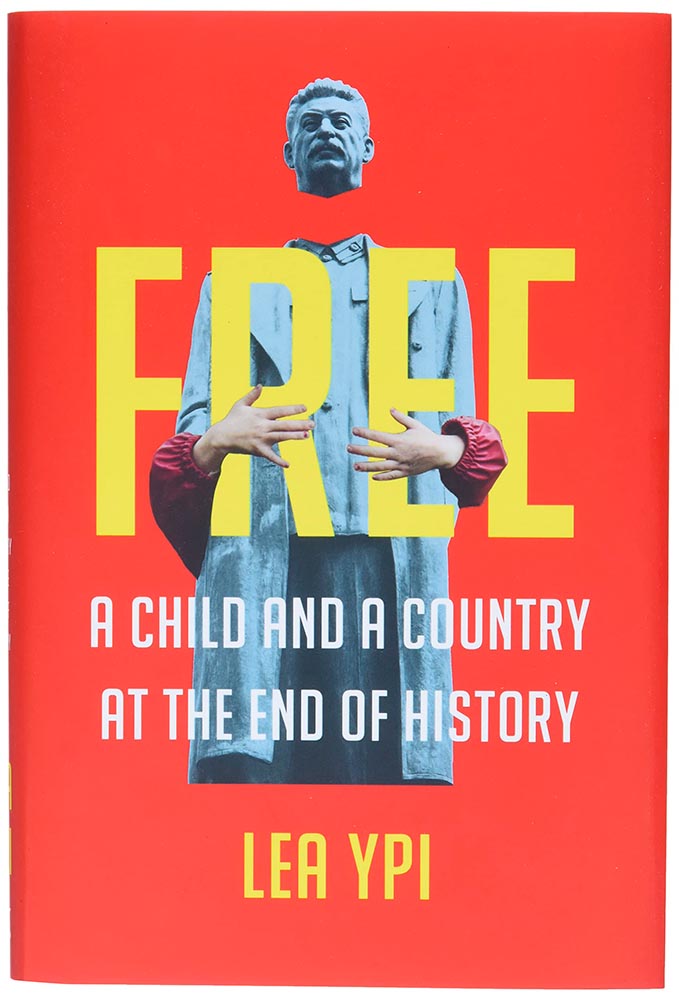
As photomontages go, this one is simple — yet simply powerful: red Albania meets (and hugs!) beheaded Stalin. Great choices.
Design by Alison Forner.
The quality of type and decorations on this “label” are beyond outstanding. This cover is candy for book design lovers and readers alike.
Design by Alex Merto.
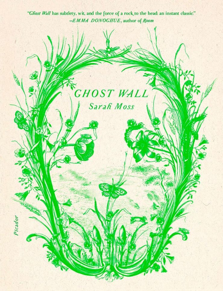
From It’s Nice That, we have a nice feature on Alex Merto — whose Ghost Wall cover is a great example of plant life adding so much more: “the force of a river to the head,” to paraphrase Emma Donoghue’s quote. Plus, one color! Win.
Design by Grace Han.
Nine parts awesome: type and illustration join to light a fire under the words “quality” and “imagination.” (Have I mentioned that I love a textured paper? Here’s a different one that’s also great.) This is one of several titles that’s not only a great book cover, but on a bunch of “best book” lists, too. Great books should have cover equal to their contents, and this one scores.
Design by Emily Mahon.
This isn’t here because of the attention Ukraine deserves these days, it’s here because of that illustration. Brilliant design needn’t be complicated, so ably proved here.
Design by Lucy Kim.
I mentioned at the top of the post that, these days, photographs have to bring something special to the table to stand out. And this cover does, from any table in any bookstore anywhere. (Lovely typography choices here, too.)
Design by Matthew Broughton.
One trend I didn’t mention at the top of the article is the montage-in-type, done here to absolute perfection.
Design by Andrea Ucini.
The woman in looking off the edge of the page at … something looking back. (Not only that, whatever it is casts a shadow.) The book is described as “subtle yet candid,” something that could equally be said about this brilliant cover.
Design by Holly Ovenden.
Another UK cover, this image doesn’t show the uncoated stock and debased type — but does show the jump-off-the-shelf color choices and awesome interaction of title with background. (The US cover, alas, resorted to stereotype. Perhaps we aren’t sophisticated enough?)
Yale Univ. Press didn’t respond to a request for the cover designer.
Choose a interesting texture, put some blocks of color on it, some type and … done. Hah! (Seriously, just look at the hands: they say it all.) Bonus to the hints of doily in heaven.
Design by Emma Ewbank.
The wrap-around title treatment makes another appearance here, with bonus second and third layers and a perfectly-done pull quote. With the aged ink fill and type accenting the striking illustration, this one is in that “wall-worthy” category.
Design by Matt Dorfman.
On our second Ukrainian title, both flower and umbrella work together here to force us to stop and look. (The stenciled type is a brilliant stroke, too.) Proof that genius often appears simple.
Design by Jenny Carrow.
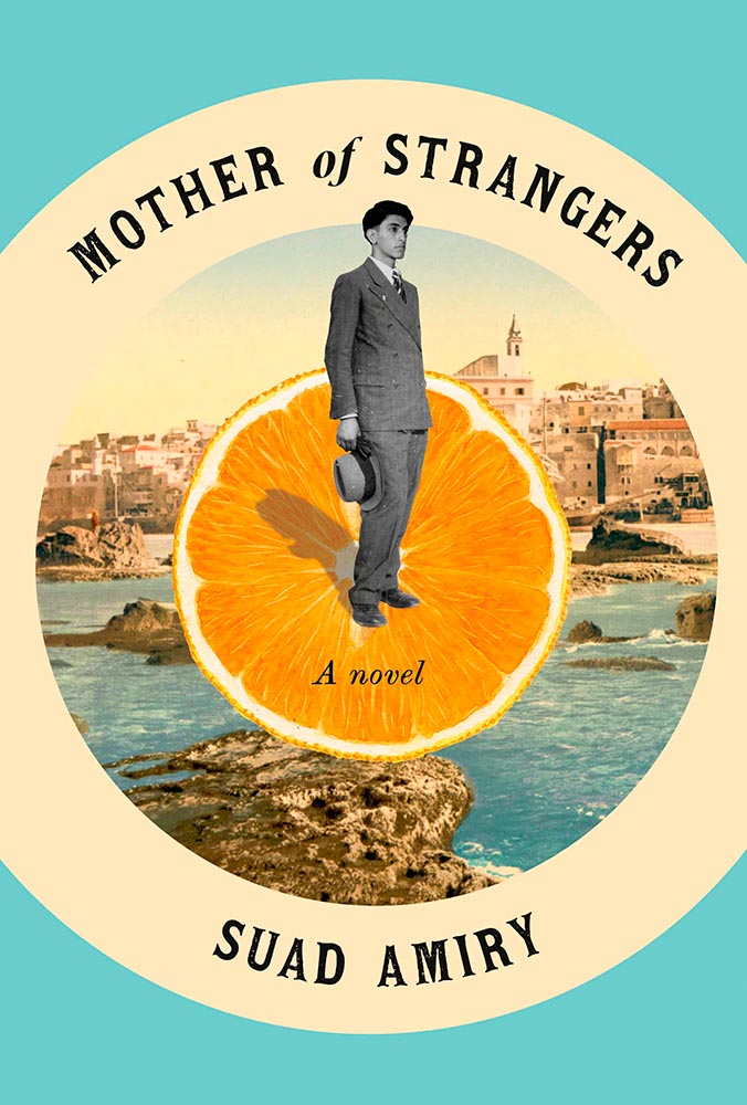
The montage, taken to the next level: Jaffa, orange exports, and an healthy serving of emotion. (Also: curved text is rarely so on-target.)
Design by John Gall.
So simple, yet it is precisely that reaching off the shelf, grabbing your attention. This book is described as “spare and monumental,” and no less can be said of the cover.
Design by June Park.
“Texture is key,” sure, but there’s texture and there’s this. The island’s brush strokes into what seem like a moon are whatever happens beyond perfection. I didn’t expect this cover for a novel about Pakistan, yet the emotion, the … evocation is perfect.
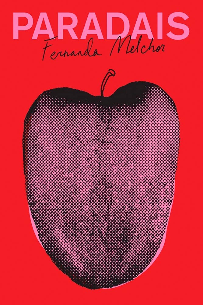
Design by Oliver Munday.
Apple? Tongue? Misfit teenager? Disturbed and distressed? Yes.
W. W. Norton didn’t respond to a request for cover design information.
Rarely are such seemingly “dry” subjects treated with such skill: the angled type set against an urgent red, the subtitle sticker-that’s-better, and the photo choices add up to something I’d grab off a shelf immediately.
Cover design: Christopher Sergio
LitHub says this one has a very high “hang on the wall” factor. I can’t think of a better description — great stuff.
Cover design: Na Kim
Na Kim just can’t help but design the best covers: a wonderful, antique background complimented by sheer brilliance. (Great typography, too.)
Cover design: Emily Mahon
It’s nigh-on impossible to look at this cover and not flip it around to read the text trisecting the leopard. Take something simple, add the elusive more, get this. Yeah.
Cover design: Jim Tierney
Another fantastic example of plants adding more than the sum of their parts. The mottled green background and watercolor-style falloff is perfectly complimentary. Great stuff.
Macmillan did not return my inquiry regarding a cover designer.
From the Banned Books Department, we have the 20th Anniversary edition of this difficult title rendered in a photo-based collage that’s nothing short of brilliant. Highest praise.
Very nearly the perfect black-and-white cover. Texture and shape combine with an incredible title treatment in a way that shrugs off the need for color. Fantastic.
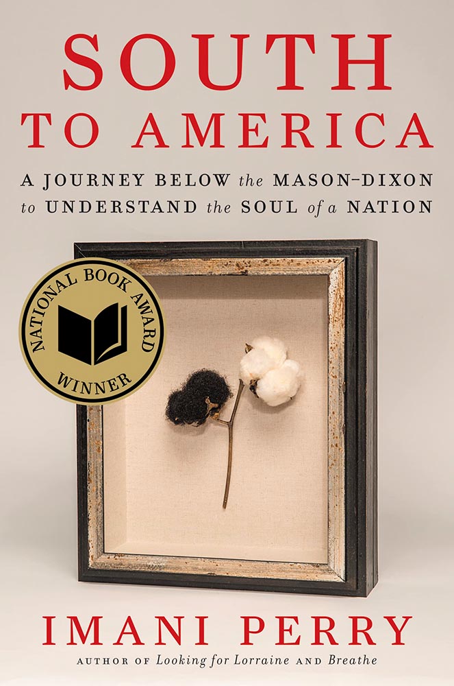
Design by Allison Saltzman, art by Sonya Clark.
I’ve said before that moving to the South was a bit of a shock — the racism still all-too-evident jars all-too-often. This cover takes a simple, elegant idea and, without any of the stereotypes so often reached for, delights with style and simplicity, absolutely earning its spot in this list. (This is another of those titles that’s on many “best of” book lists, too. It’s a genuine pleasure to see worthy books get great covers.)
Design by Holly Macdonald.
“Wow” is the only word here — a stunner of a photograph used in, if I may borrow from the cover, a breathtaking way. Simple, elevated to exquisite.
Design by Jamie Keenan.
Never mind that I never knew Cary Grant was once a stilt walker (or named Archie Leach), this is an exercise in using a famous face in an innovative way, with a cast of supporting characters that flow as naturally as lines on paper. A trip through the possible — fantastically well-done.
Design by Jamie Stafford-Hill.
Fantastic type and color treatments, yes, but it’s the way the photograph is handled that shines: where the eyes are, the color treatment implying front and side, all of it. A 2016 book reissued in hardcover with a cover guaranteed to attract new readers.
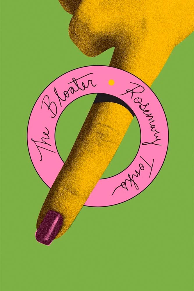
Design by Oliver Munday, or perhaps Erik Rieselbach (depending on who you ask).
This cover is the antithesis of a swelled, salted herring: it’s brisk, to the point (if I do say so), and throws a life ring out to inspire book designers everywhere.
Book design: David Drummond
Brilliant: actual text, printed (on a great color paper, too), with actual string, photographed on said print. Not only is it exactly right for the subject matter, it’s simply and beautifully done.
Cover design: Jack Smyth
Never mind the great brushed color blocks or boat-rowing-the-ocean above the title. This is here mainly for the overlap between color and island: shortlisted for the prize for intersection-of-the-year.
Design by Luke Bird.
“I’ll just do a little cropping,” designers say. Then there’s … genius.
Design by Mary Austin Speaker, art by Stacia Brady.
Another piece of art that’s absolutely wall-worthy — actually by the author’s mother — complimented by a tasteful type treatment with a wonderfully-offset “poems.”
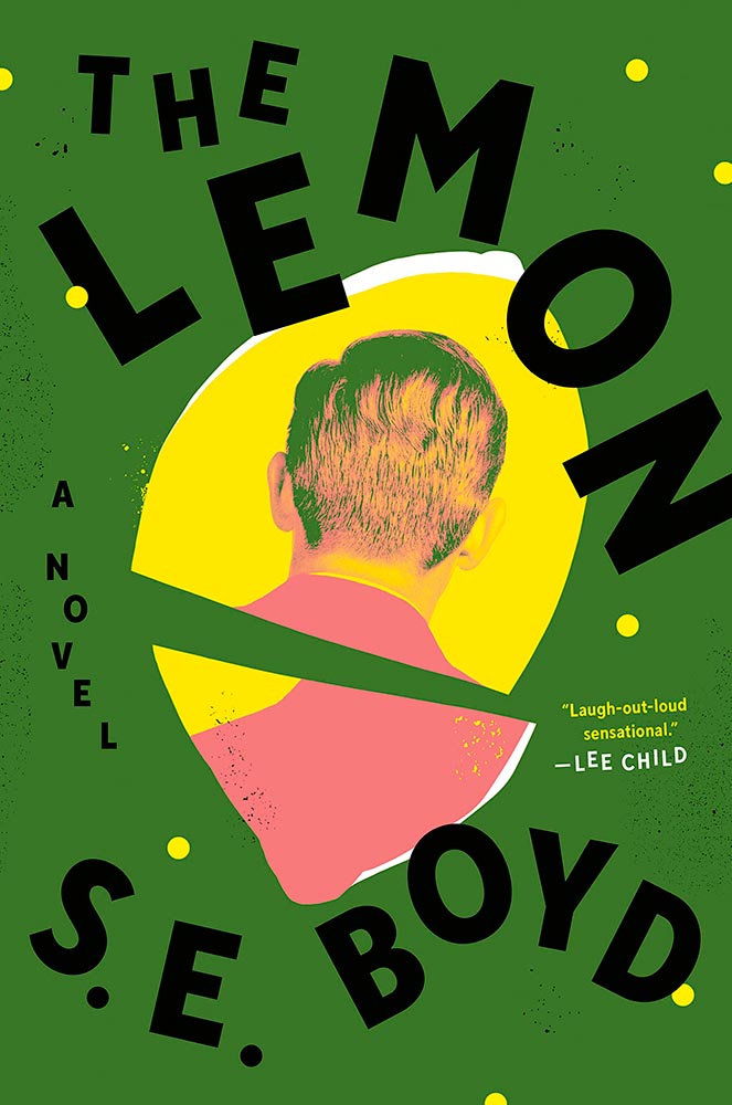
Design by Colin Webber.
“Great” can’t even begin to describe this cover — from the lemon shape, staggered type, green background, back-of-head portrait, to the slightly-aged treatment, we have ingredients that add up to that highest of achievements: a book I’d buy knowing nothing about, no hype [machine] needed.
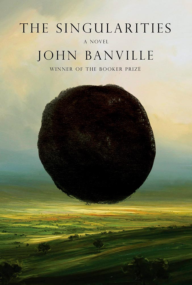
Design by John Gall.
Classical painting with a singularity. Sure. So easily pulled off … if you’re John Gall.
Graywolf Press didn’t respond to a request regarding cover design.
The title treatment is the winner here, using two translucent shades of orange to the best possible effect — taking a nice painting/illustration to the top floor.
Design by Alex Merto.
Describing this cover as “haunting” would be a cheat — but completely accurate. (Love the line of type down the right side, too.)
Design by Jamie Keenan.
The rare type-only treatment … taken to an entirely new level. Fantastic.
Design by Christina Vang.
A triumph of textures: one matchbook you never want to throw away.
Design by Lauren Peters-Collier.
Breaks through more than water and time: it’s thrust into your memory. (See a note from the designer at LitHub’s cover reveal.)
Design by Albon Fischer.
One of only two text-only treatments in this list, done in a ’70s style — yet taken to a clever and impressive level. (Love the stacked “lls.”)
Design by June Park.
I adore how the type and frankly fantastic illustration work together here. Wonderful!
Cookbooks rarely make an appearance on “best book covers” lists — yet this one earns its spot with an antithesis-of-the-stereotype approach. Ordinary it is not, in the best possible way.
Design by Jack Smyth.
Another UK version — the US version is good, more than most even, but it’s this one that shines with its great photo choices, cut lines, and great type treatment.
Design by Katie Tooke.
This one’s a two-fer, with the UK version, above, showing the book-edge treatment done really well, while the US version…
Design by … ?
…takes it to another level. Is there such a thing as a cloud globe? Or is that one of those old-fashioned stock-ticker covers? Either way, the subtle pattern — in front in some places, receding in others — adds a wonderful touch. Great stuff. (Great, too, to see the US version take one: a rare treat.)
Cover design by Roman Muradov.
Bellevue Literary Press scores a win here, with something immediately recognizable as about music, yet so much more. Performance art, indeed.
Note: I originally attributed this title to Yale University Press instead of Bellevue Literary Press. I regret the error.
Design by Na Kim.
Na Kim apparently not only did the design but the illustration, as well. The rest of us can only aspire to that level of talent.
Cover design: Leanne Shapton
This illustration being in grayscale is, at first, a little off. But, of course, that’s exactly the point. I overuse “brilliant,” but it’s the best description. (Again, see a note from the designer at LitHub‘s cover reveal.)
Design by Elizabeth Yaffe.
Family epics, climate change, dystopian futures, and Moon — all somehow included in this rich illustration. Two-color greatness. (Bonus: Another great use of “a novel,” something often “meh.”)
Design by Brian Moore.
A standout historical photograph is only the beginning: it’s really the coloration that’s the story here, for both book and cover — so well done.
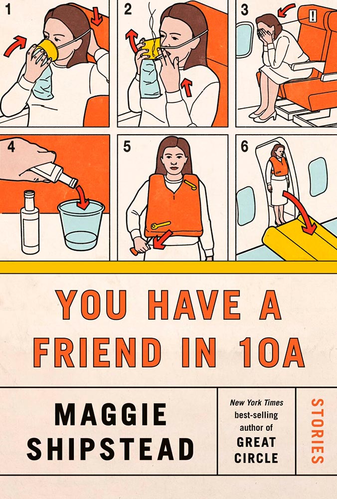
Design by Kelly Blair. Illustration by Toby Leigh.
Among the best book cover illustrations ever, perfectly inserted into the seatback in front of you. (Great Circle’s cover was in last year’s list, by the way.)
Design by Christopher Moisan.
There’s something about underwater photography, with its beautiful, soft light and fascinating reflections, that is evocative — and there’s nothing about this photograph that isn’t evocative. A triumph.
• • •
Whew. Seventy great book covers. 70!
Okay, let’s summarize: 2022’s crop of favorite covers not only surpass 2021’s, the quality of work here represent what I believe to be a new standard. To all the designers — and art directors that chose them — congratulations.
This time, we’ve got some great book design (with a bonus), Hoefler educates on typography (with a bonus), and two updated car company logos. Let’s get right to it!
Print Magazine on the design of Lyrics
The still-very-relevant-in-2022 Print Magazine brings us a great feature on the design of Paul McCartney’s book, Lyrics:
Front and back covers of Paul McCartney’s Lyrics, by Triboro Design.
Turns out it was designed by an outfit called Triboro Design, from Brooklyn (appropriately). Print brings us an interesting interview with David Heasty, the principal:
I […] found him to be sharp, quick, articulate, and modest. Below, we discuss Paul’s involvement with the project, the book’s gorgeous bespoke typeface, and the importance of staying true to a legend’s vision.
Ellen Shapiro, Print Mag
The “S” spread of Paul McCartney’s Lyrics, by Triboro Design.
Bonus: Looking at Triboro’s website, this lovely piece of typography stood out:
Triboro Design’s Zolo Jesus album typography creates desire.
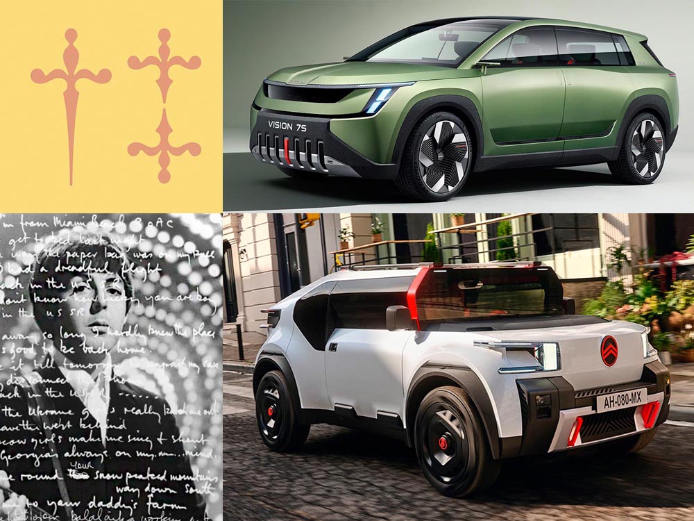
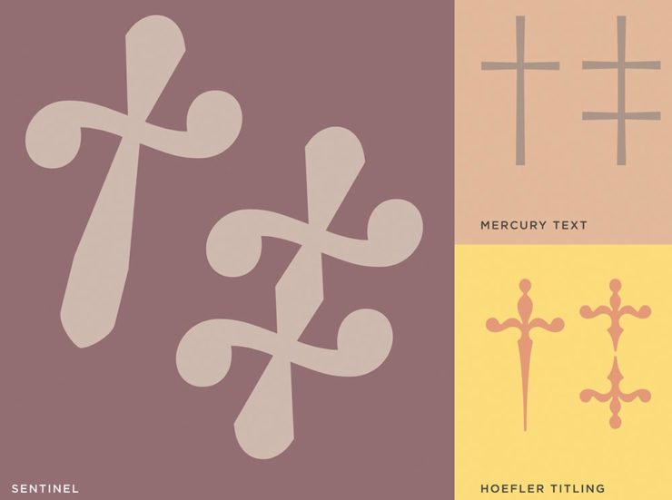
Hoefler Discusses Daggers
In “House of Flying Reference Marks,” Jonathan Hoefler talks about daggers, or, what you use when an asterisk isn’t enough:
Hoefler on daggers.
Beautiful examples, complete with a phrase you don’t hear everyday: “twisted quillon.” Read and enjoy. (If the opportunity presents, follow on with the ampersand article — which, uh, takes a stab at where the word came from. Nice.)
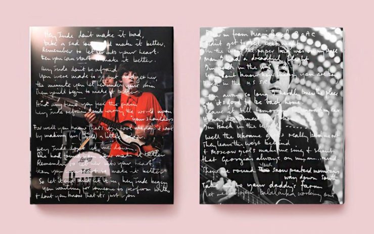
It seems like nearly all of the major car manufacturers have introduced a new logo in the past couple of years, but here are two more. One’s best described as “an update,” while the other … goes a little farther.
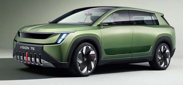
Skoda, for those that don’t know, is a Czech company and part of the massive VW Group. Frankly, it shows:
Skoda’s 2022 Kodiaq, a thoroughly VW Group product.
For 2023, they’re introducing a push to separate themselves from VW a little, resisting the downmarket image. As is (now) normal with updated car company identities, there’s a concept:
Skoda’s Vision 7s concept.
It’s … not inspiring. Maybe the actual updated logo will turn the corner:
Skoda’s 2022 logo.
Solid. (Pardon the pun.) But seriously, even an avid car nut like me didn’t know that represents a winged arrow — and I’m not sure the new version helps. At least they get points for consistency:
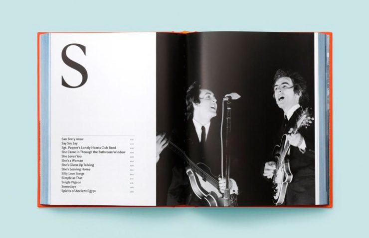
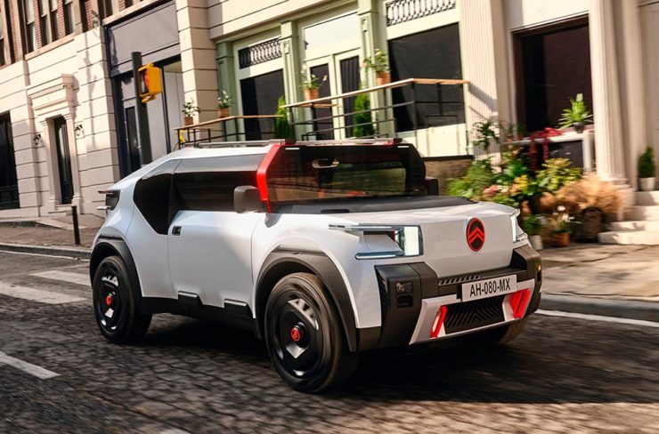
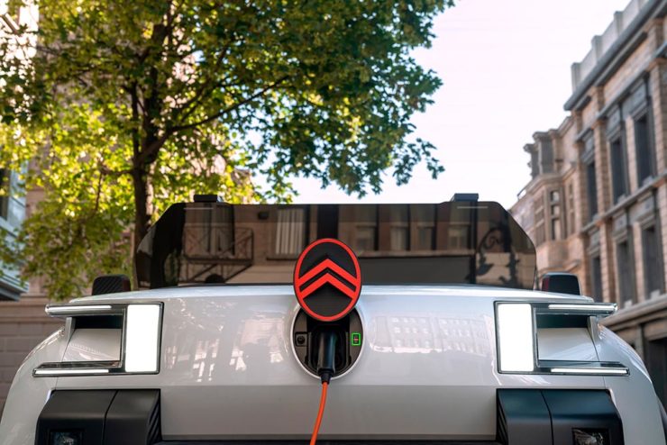
Then there’s Citroen. Even under the potentially-smothering corporate blanket that is Stellantis (there’s a name!), the pioneer of decades past still manages to actually thrive. First their new logo:
Citroen’s 2022 logo.
They’re not quite as consistent — the dual chevrons have varied a bit. This time, they’ve literally gone back to their roots, pulling the 1919/1921/1936 version out and dusting it off for modern use:
History of Citroen’s logos, 1919–2022.
Points to them for hinting at what’s to come, too:
Citroen’s 2022 logo, with just a slice of concept car showing.
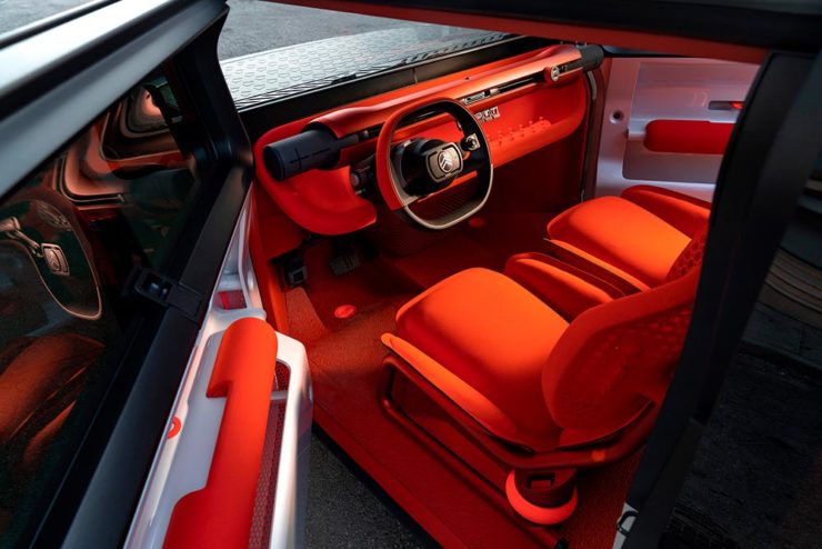
…Which turns out to be something with, ahem, Oli bits:
Citroen’s Oli: the antithesis of a Skoda.
“Nothing moves us like Citroen,” they say. The Oli moves me, to a point where I truly wish Citroen was once again available in the ’States. Cool and radically innovative, without losing sight of something VW has truly lost: fun. Well done.
Updated, 19 October, 2022:Brand New adds to Citroen’s new logo story, with a slightly-less-than-enthusiastic take on the logo and has frankly unkind things to say about the new, custom typeface (custom typefaces are now de rigueur — a policy as much related to rights ownership than creativity, alas).
I really like the cursive in this Vimeo screenshot:
YouTube? What YouTube? Citroen posts to Vimeo. Ahh, the French.
BN also includes a number of extra photographs of the simply awesome Oli, too. Here are a couple, for your enjoyment:
Plug-and-Citroen.
Note the removable Bluetooth speakers (the black tubes with “+” and “-“) and, especially, the seats:
A wide selection of items for the beginning of fall, from positive fonts to jolly cameras — with Adobe and Pantone pouring some cold water on things. Let’s get to it!
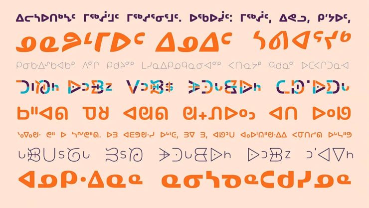
Indigenous Letterforms
As Americans, Europeans, or, more generally, Westerners, we take for granted that fonts will reflect the various pieces of individual type — that is, letterforms — that we’ll need. But not everyone falls into that category.
North American Indigenous fonts — with updated Unicode. Major Kudos. (Courtesy of Dezeen.)
“When [the Unicode Standard] doesn’t contain characters in a given language’s orthography, it is not possible for that community to accurately use their language on digital text platforms.”
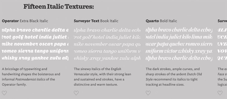
Italics can be the most colorful part of a type family, diverging dramatically from their roman cousins. Here’s a look at twelve kinds of italic typeface, with some notes on their cultural contexts, historical backgrounds, and practical applications.
Hoefler & Co.
Read the article, “Italics Examined,” at Hoefler & Co.’s Typography.com.
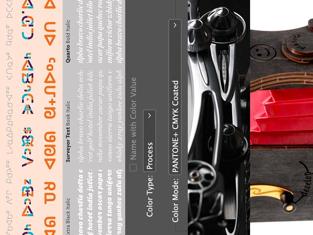
Adobe Types, “Stop.”
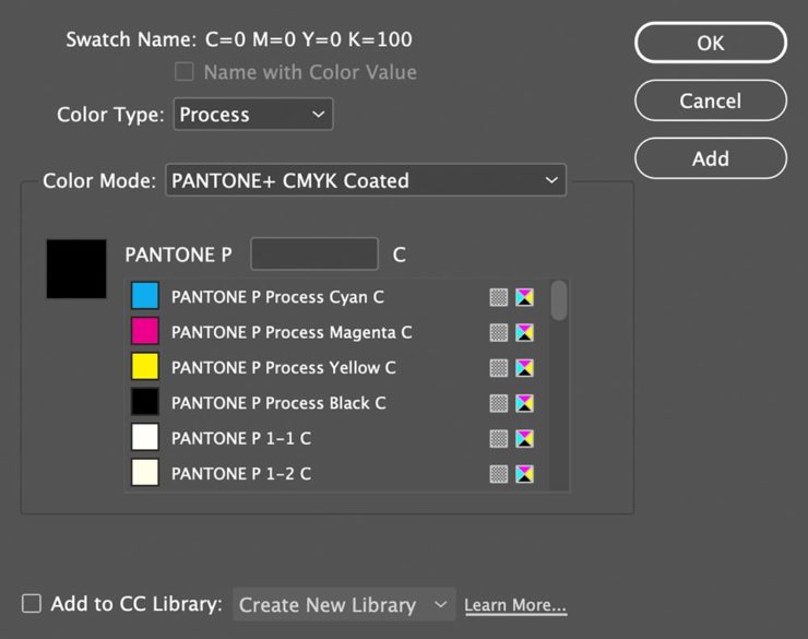
Adobe and Pantone are having a . . . thing. As a result, all Pantone spot libraries have been removed from Adobe products:
A classy move, completely in character for both companies, to reach into users’ machines and remove stuff they had paid for and may rely on because of some licensing spat.
Nick Heer, Pixel Envy
I didn’t get a notice in either InDesign or Photoshop, but a check in InDesign (the CC 2022, aka 17.4, version) shows only the CMYK libraries:
Adobe’s Pantone+ CMYK (Coated) color picker, from InDesign CC 2022
You can subscribe to the additional libraries from Pantone for $60/year. Book design is almost exclusively CMYK, so I won’t be . . . but grrrr.
Update, 28 September, 2022: Adobe got around to putting up a banner in my version of InDesign — blaming Pantone:
This notice showed up September 27th, 2022.
They’ve put up a “help” page. (I took a moment to fill in the feedback at the bottom of that page, too: “Removing features we’ve paid for is incredibly uncool, Adobe. Shame on you.”)
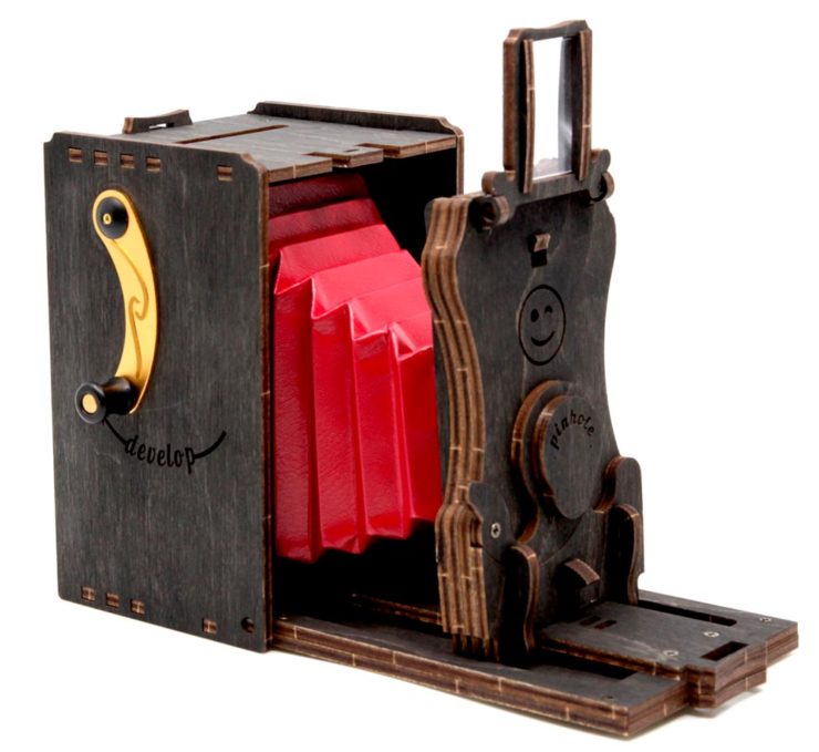
Two Awesome New Cameras, from $100 to $100,000
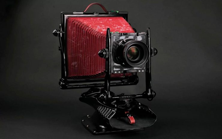
So Pagani, the multi-million-dollar sports car manufacturer, has decided to market large-format cameras. Okay!
One of Pagani’s new camera modelsA closeup of the (beautifully-detailed) tripod plate for Pagani’s new cameras.
Incredible, breathtaking detail and quality, based on Gibellini models but taken to 11. But like their cars, mere mortals need not apply: their cameras start over $100,000.
Mortals can dream, sure, but here on Earth, I encourage an order from this Ukrainian company instead:
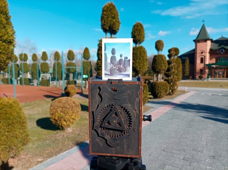
Jollylook’s Pinhole Instant Mini film cameraJollylook’s Pinhole Instant Mini in situ
They’re based on instant film cartridges, are made of recycled materials, look incredibly cool, and a kit starts at an incredibly-reasonable $99. Throw in a few extra dollars to support Ukraine and . . . feel Jolly.
Three interesting logo redesigns this month, plus a moment where venti has nothing to do with coffee. Oh, and a airy bonus.
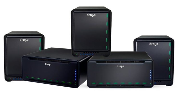
Drobo Declares Bankruptcy
Generally speaking, I’m not one to engage in schadenfreude, aka “enjoying the pain or suffering of another.” (Wiki. Anyone surprised that the Germans have a word for this … but I digress.)
A selection of expensive, unreliable junk.
Back in 2011, I lost two Drobos in short order — and with them, the majority of my back files. Project I’d worked on, photographs I’d taken, personal documents, years worth of stuff, just gone.
Drobo, the company, did nothing to help, offering neither solutions nor apologies. I wasn’t alone; forums across the ’net suggested that I should have chosen more carefully.
To call Rolling Stone‘s place in America culture iconic might be selling it short, and their logo plays a large role in that. In 2018, they flattened it — leading that trend, possibly — and it lost something.
However, this month, it’s back:
Rolling Stone’s 2022 logo redesign.
“The assignment was a paradox. How could we make the logo look like it did in the past, without making it feel dated? My hope is that loyal readers will believe the old logo is back, but on closer inspection will be surprised to notice how much it has been modernized.”
Jesse Ragan, XYZ Type
The “old logo” he’s referring to is the one that ran from 1981–2018, but there were others, too:
Rolling Stone’s lettering shapes through the years. See more at both links.
A great study in logo evolution: read more at the Type Network, and lettering specifics from XYZ Type. Awesome. (Hat tip to, as usual, Brand New.)
Aston Martin’s New Logo
On the subject of subtlety, Aston Martin usually isn’t the first thing that comes to mind. Their recent logo redesign, however, falls into that category:
Wings of Glory (so to speak)
The evolution of their logo emphasizes those small steps:
AM’s logo through the years.
Not a great amount of information on this one, but the accompanying photographs of the logomark being made are fantastic. See more at The Drive, with more at Brand New.
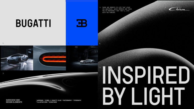
Bugatti’s New Logo
Subtlety and Bugatti rarely — if ever — fit in the same sentence. Aston is stratospheric as far as I’m concerned, so Bugatti would qualify as the antithesis of subtlety. But, but, but: there’s something about one.
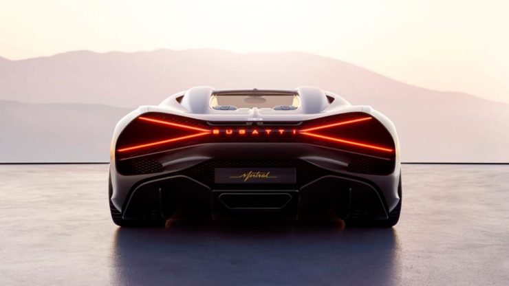
The new Mistral. (Sorry, it’s sold out.)
They have a new logo and marketing campaign to go with:
Specifics, courtesy of Interbrand.The Mistral from the back, showing the new type treatment.
It’s been a busy August, including having to make a lightning trip through the usually-not-fun Atlanta airport. But there’s always a bright spot at the end of that tunnel: being the little boy again, awed by the simple act of flying.
Better still, the flight was on a 757, the sports car of big planes. Everybody around me had their window shades pulled and noses in their phones, but I was looking out the window:
AIGA has announced their winners of the 2021 50 Books, 50 Covers competition:
With 605 book and cover design entries from 29 countries, this year’s competition recognizes and showcases excellence in book design from around the world. […] Eligible entries for the 2021 competition were open to books published and used in the marketplace in 2021.
AIGA Press Release
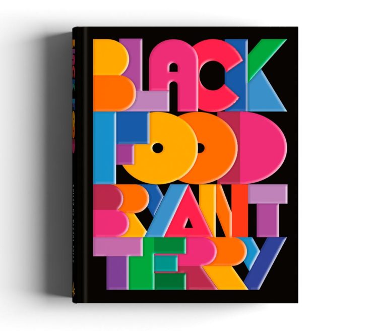
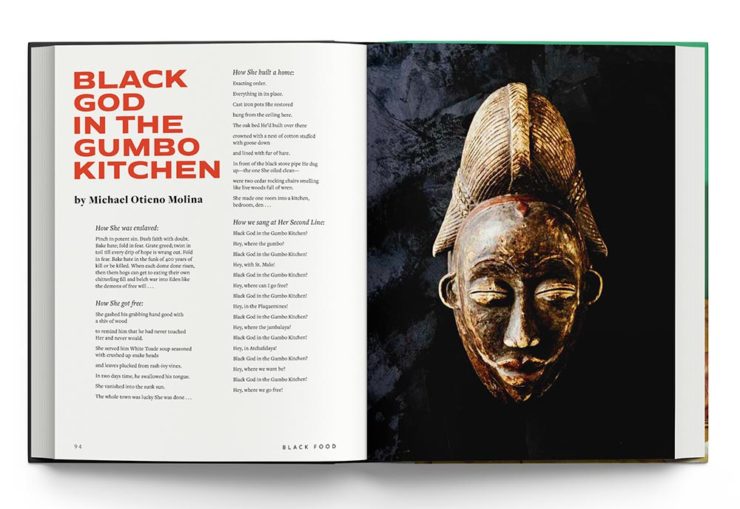
In this year’s competition, innovative book designs for topics ranging from designing and motherhood, African surf culture, stories of resistance, visual histories of Detroit, Black food traditions, and more all give our jury life, hope, and visible windows into new possible worlds. The covers and books we looked at had a diverse range of visual language and took aesthetic risks.
Silas Munro, AIGA [Competition] Chair
As usual, there are items here that I haven’t seen before, along with several that surfaced on others’ “best of 2021” book design lists (see that Foreword post for my faves). Also as usual, there are some excellent choices.
Further, there’s something in this competition that you don’t see in the usual “best of” posts: interiors. Half of the competition is covers, sure, but the other half considers the whole book design — and sometimes, as I can definitely attest, an underwhelming cover can lead to a treasure within.
But enough talking. My favorites, in no particular order:
Cover by George McCalman.Book design by George McCalman.
This is one from the 2021 “best of” finalists that I didn’t post about — but now that I’ve seen the interior…. So very worthy. (See more.)
Cover design by David Chickey and Mat Patalano.Book design by David Chickey and Mat Patalano.
This series of three books not only have striking covers I’d not seen before but exceptionally competent interiors done on matte paper, a personal favorite. (Click through for more examples.) Excellent.
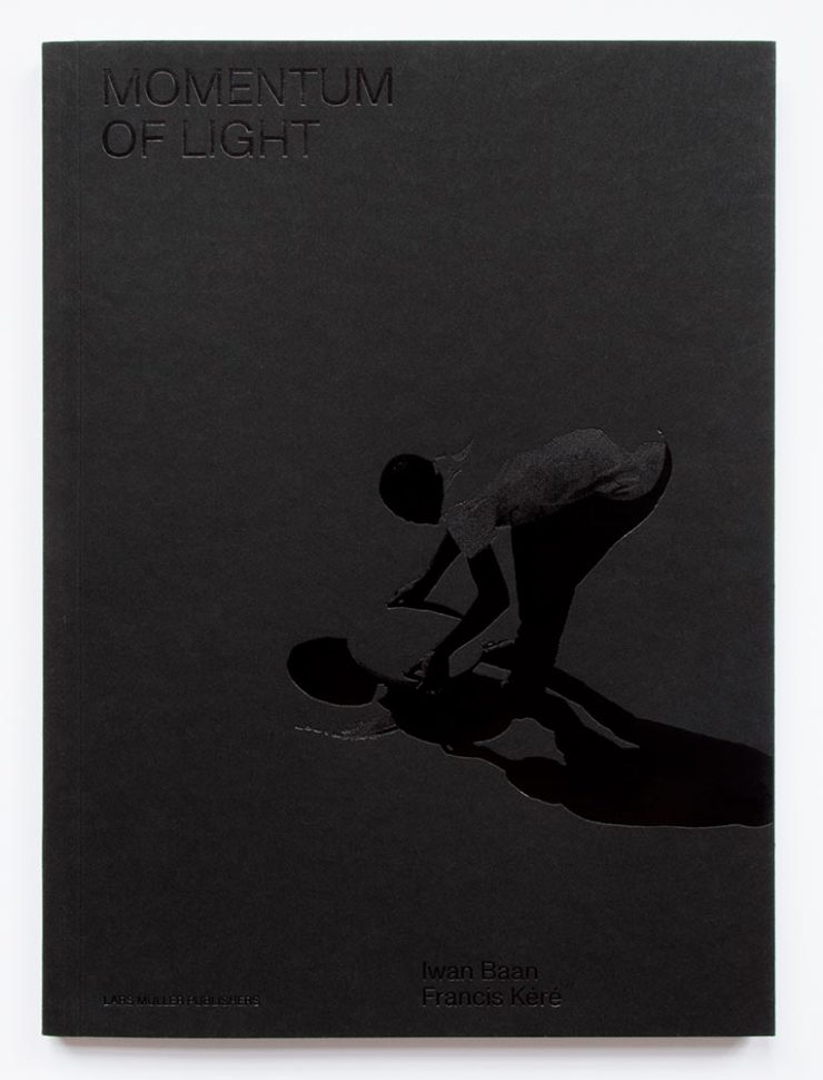
Design overseen by Haller Brun.Design overseen by Haller Brun.
In this fascinating book, architectural photographer Iwan Baan and (Pritzker-winning) architect Francis Kéré “set out to capture how the sun’s natural light cycle shapes vernacular architecture.” While I may be slightly biased in terms of architecture and photography, this one’s a winner. (Read the AIGA’s take.)
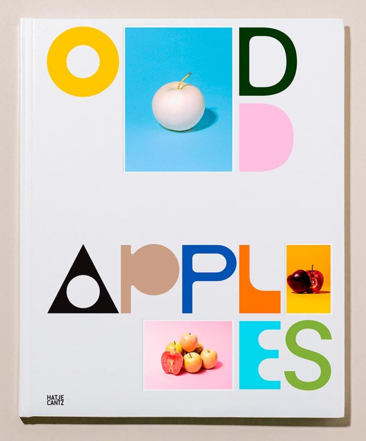
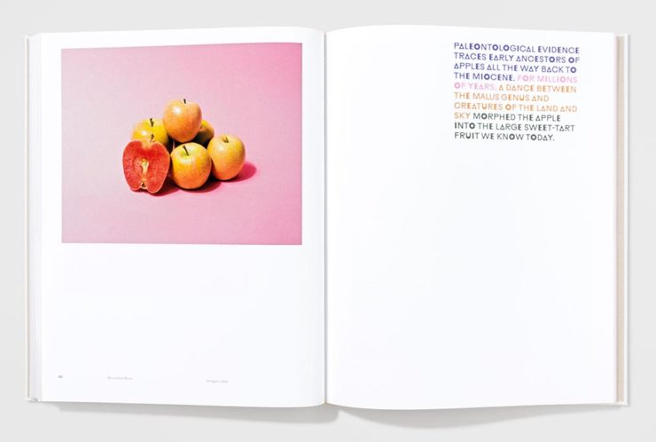
Cover by Andrea A. Trabucco-Campos.Book design by Andrea A. Trabucco-Campos.
“A little overly precious,” the AIGA says … while awarding it a prize. Completely fresh, I say, with interesting content presented in a way that does considerably more than interest. Well done. (See them apples.)
Cover by Gary Fogelson and Ryan Waller.Book design by Gary Fogelson and Ryan Waller.
“The type on the cover and in the body is perfect, in all ways and choices. The use of the gutter for captions is a great understanding of the art and a perfect way to save space. The page numbers too.”
Brian Johnson, AIGA Judge
This is one of those books that you have to say, “I wish I’d done that.” Great stuff. (See its individual entry.)
The Time Formula. Cover by Honza Zamojski.Book design by Honza Zamojski.
There always seems to be some projects that violate book design “rules” — this one doesn’t have a title on the cover, has page numbers in the gutters, and more. Yet this book, about a sculpture project, makes for interesting viewing indeed. (See more.)
Last, we have a couple that are only covers:
Cover by Janet Hansen.
This was considered for my favorites of 2021 (and made it onto others’ lists). I’m glad to have been given the chance to call it out. Excellent in its simplicity. (See the AIGA entry.)
Last, but certainly not least:
Cover by Lydia Ortiz.
Another advantage of this competition: seeing more than the front cover. And this cover, front, back, and spine, is so much more — especially in person: black plus four neon inks. Wow. (See the AIGA’s praise.)
Three items for the end of June, 2022: AIA Los Angeles announces photography awards, the 2022 edition of the Logo Lounge logo trends report is out, and Buick makes its new logo official. Let’s get into the details.
AIALA Photography Awards
The Los Angeles chapter of the American Institute of Architects (AIA|LA) has announced this year’s winners of the annual Architectural Photography Awards, and there’s some pretty great stuff:
Ryan Gobuty: Santa Fe (Santa Fe, NM)Taiyo Watanabe: C-Glass House (Dillon Beach, CA)Tim Griffith: Mission Bay (San Francisco, CA)
[W]hile there are still corporate-looking marks being crafted there is a stronger effort to find ways to identify products that are artisanal and handcrafted.
Bill Gardner, Logo Lounge
Corporations trying to be more human. (News at 11.) But then, my use of that particular phrase perhaps betrays my lack of being in touch with the modern corporate world; I think publishing is a different animal, and prefer being part of that world despite the regular influence of corporate entities there, too.
Nonetheless, following logo trends is, from a purely graphic design perspective, worthwhile — and this report summarizes beautifully. Read on.
Buick’s New Logo, Officially
We’ve touched upon it before, but Buick has, with the release of the Electra Wildcat concept, officially updated its logo:
Official: Buick’s new logo
Electra is Buick’s name for electric cars, simultaneously stating the obvious while giving a big nod to past models — and the Wildcat concept is, dare I say it, borderline cool:
Both Buick and Cadillac have hinted at more Art Deco in their upcoming products, perhaps best illustrated on this concept’s interior:
It’s a head rest, folks.
Nice. (Not even remotely possible on a production model, but still.) Read more on Buick’s new logo and transition to an electric car brand at Car and Driver or The Drive.
A book design treat for your Monday morning: four of my favorite new book covers from last month’s debuts.
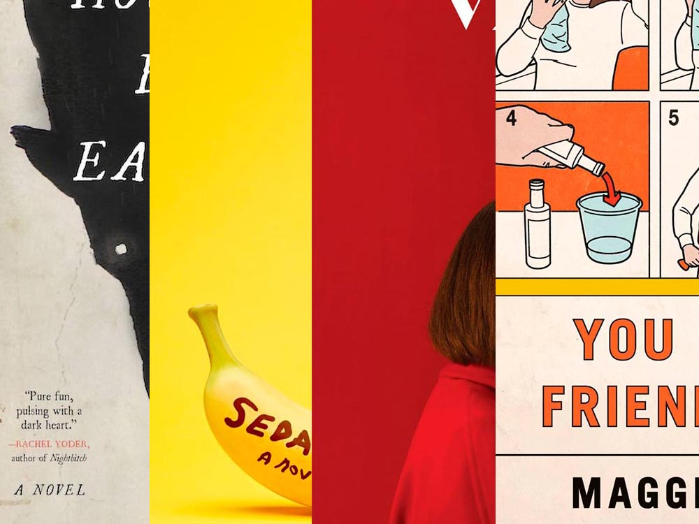
How To Be Eaten. Design by Julianna Lee.
Aged, distressed paper is a great look when done well, and this one hits all the right notes. The size relationship between the characters, the glow around the eyes, the two color choices, the type, all of it — great stuff.
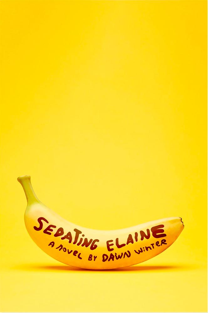
Sedating Elaine. Design by Janet Hansen.
A veritable how-to on less-is-more. Brilliant.
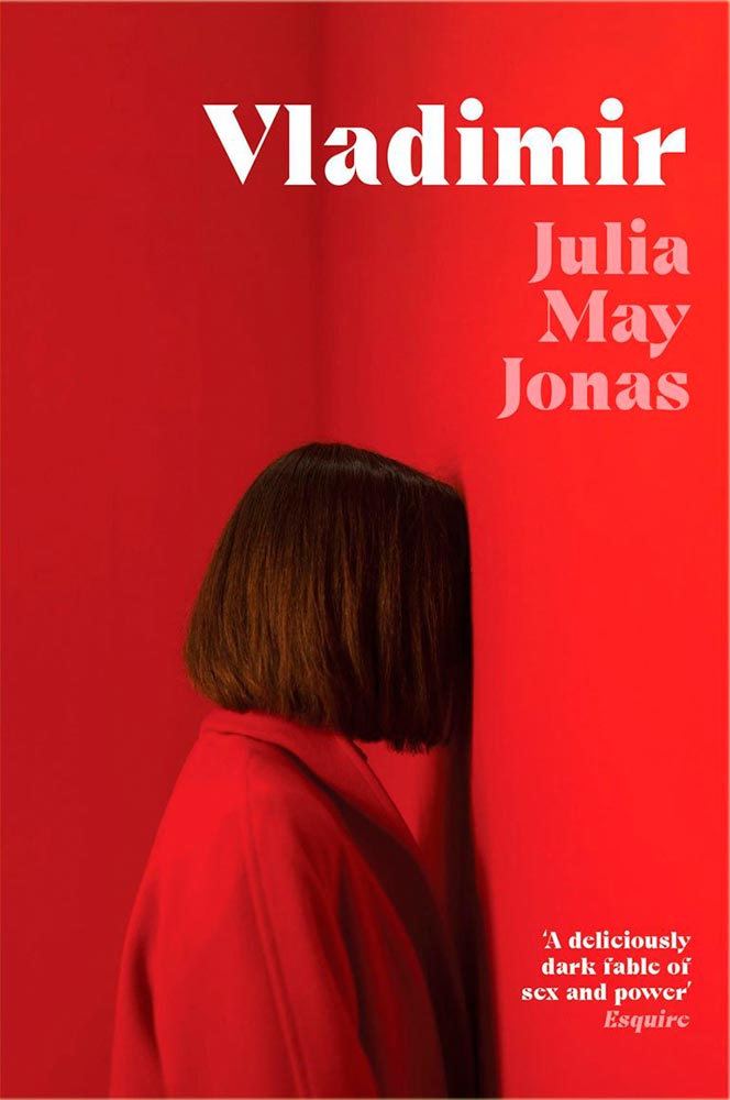
Vladimir. Design by Katie Tooke.
Another solid-color triumph. Great font choice here, too. Awesome.
I’ve saved the best for last:
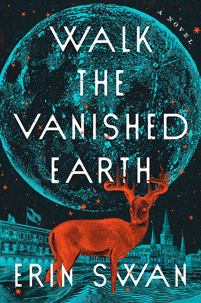
You Have a Friend in 10A. Design by Kelly Blair.
Great Circle has featured before, and this follow-up takes us inside the plane and into the safety brochure in the best possible way. Great, brilliant, and awesome wrapped into one.
Update, June 20th: WABE, Atlanta’s NPR station, has a summer reading list out, highlighting Georgia books and authors — and I’d like to include two of the covers here:
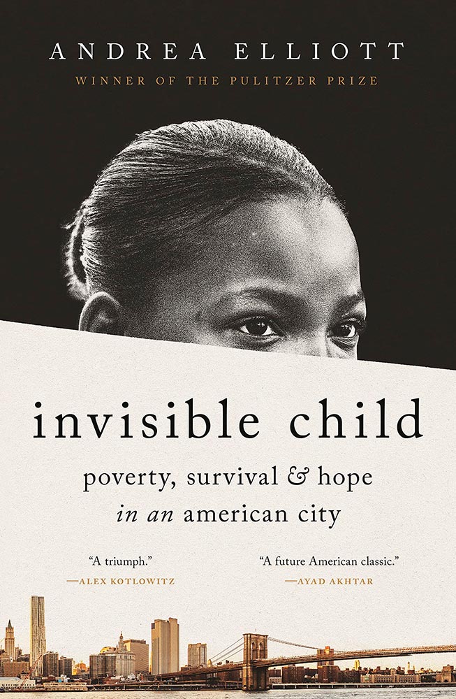
Invisible Child.
The grainy photograph, the wonderfully placed city skyline, and classic typography, combined with the diagonal cutline, elevate this title from mundane to eye-catching.
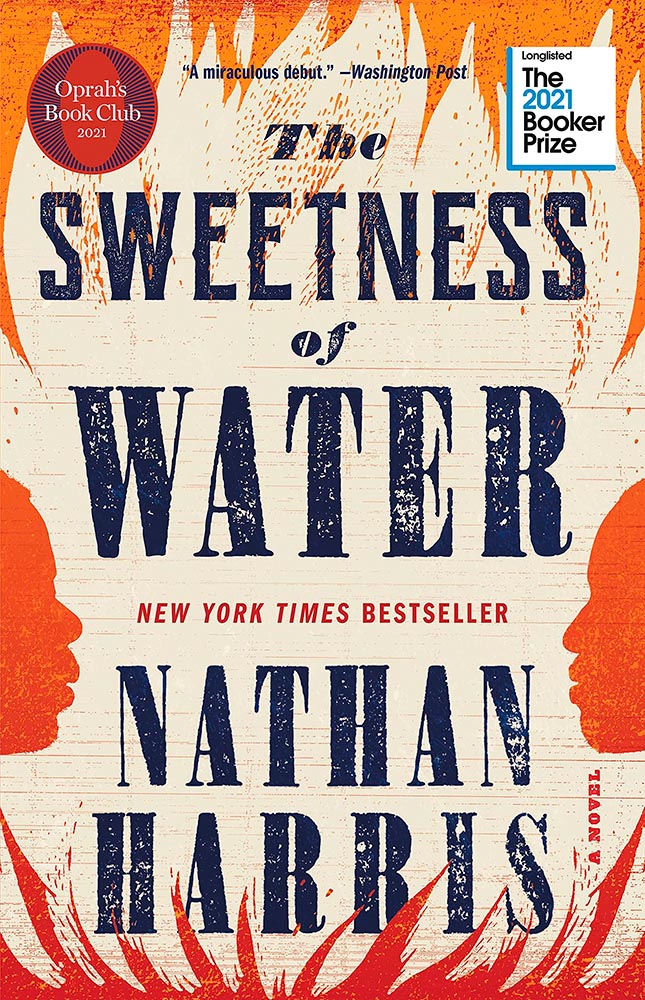
The Sweetness of Water.
Excellently distressed doesn’t begin to describe this, on many levels. Side note: it’s a terrible shame that the Oprah and Booker call-outs have been elevated to logo status in what can politely be described as a distraction (from a book designer’s point of view, at least).
This month’s favorites cover a delightful new extension of the typeface DaVinci, Google’s updated mega-font, Noto, photographs of a desert aircraft boneyard from above, and mega-photographs of the Milky Way.
Before we get there, however, I wanted to wish Jason Kottke — whose 24 years of web sleuthing has been a source for items here on Foreword dating back to its original iteration in the ’90s — good luck on his sabbatical:
“I need some space to think and live and have generative conversations and do things, and then I’ll make something, but I can’t tell you what it is just yet.”1Alexandra Bell, NYT That’s the sort of energy I need to tap into for a few months.
Hear, hear.
The Beautiful DaVinci Italic
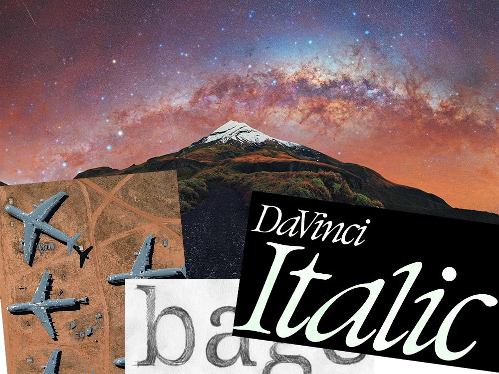
It’s Nice That points us to a new, extended version of the font DaVinci, done for Sydney’s Biennale:
“When you do this sort of type exercise — based on printed letters — it gives a very organic shape and form, in opposition to the very metallic sharp shape from type materials.” Furthering this organic look by pushing the fluidity curse at its maximum, Virgile ended with a design “which is very historical, yet with a contemporary twist.”
Just look at those glyphs!
Makes you want to find an excuse to use it. But that’s not all: Flores is an incredibly diverse artist whose work both challenges and inspires. See more.
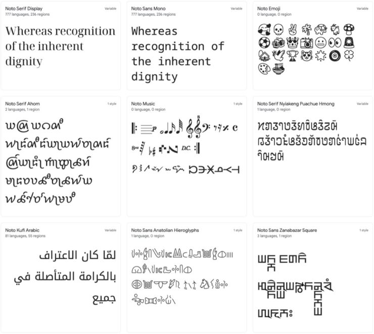
Google’s Noto
Called “A Typeface for the World,” Google’s Noto defines “megaproject.”
Noto is a collection of high-quality fonts with multiple weights and widths in sans, serif, mono, and other styles. The Noto fonts are perfect for harmonious, aesthetic, and typographically correct global communication, in more than 1,000 languages and over 150 writing systems.
Google’s Noto font collection.
According to Google,
“Noto” means “I write, I mark, I note” in Latin. The name is also short for “no tofu”, as the project aims to eliminate ‘tofu’: blank rectangles shown when no font is available for your text.
While the font itself has been around for a few years — 2013 seems like yesterday in so many ways! — it’s updated regularly, cover 150 out of the 154 scripts defined in Unicode, and deserves attention from every web designer and type nut. Read more at Google or Wikipedia. (Via Kottke.)
Aircraft Boneyard, From an Aircraft
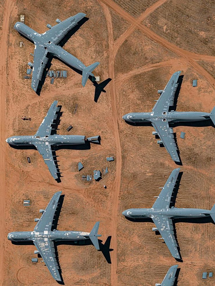
This is Colossal introduces us to Davis-Monthan Air Force Base in Tucson, Arizona, whose desert conditions are ideal for storing — and scrapping — aircraft:
What happens when the military’s aircraft are end-of-lifed
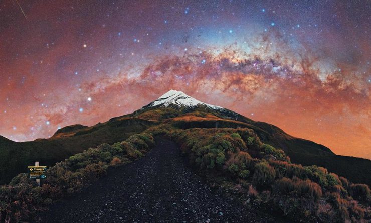
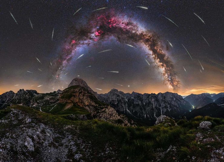
We don’t get many opportunities here in Middle Georgia, but in other, less populous (read: less light-polluted) places in the world, the Milky Way shines forth from the heavens:
Catching up with a few unrelated stories that I’ve been meaning to post — including one pretty significant failure on my part, one potentially significant failure, and because not everything should be about fail, an extremely interesting and thoughtful interview.
Tiny Type Museum Sold Out
I was cleaning up open Safari tabs on my phone the other day — the detritus that results from checking things on the fly when out and about, often or never closed — and noticed that I’d sort-of bookmarked something for action and … missed it. Crap!
The Tiny Type Museum & Time Capsule, with specimens and those beautiful drawer pulls.
The Tiny Type Museum & Time Capsule is a celebration by journalist and printing historian Glenn Fleishman of type and printing, and an effort at preserving history for future generations to re-discover. Each custom, handmade wood museum case holds several dozen genuine artifacts from the past and present, including a paper mold for casting newspaper ads in metal, individual pieces of wood and metal type, a phototype “font,” and a Linotype “slug” (set with a custom message), along with original commissioned art, a letterpress-printed book, and a few replicas of items found in printing shops.
The Tiny Type Museum. (Bottom drawer.)
The museum includes a letterpress-printed book written for the project, Six Centuries of Type & Printing, in which Fleishman traces the development of type and printing starting before Gutenberg printed his Bible around 1450 up through the present day. This book acts as “docent” for the museum, providing insight into the stages in technological and artistic development that took place, and explaining the importance and nature of the artifacts. It also slides out neatly as part of a sled from the top of the museum case, and provides the visible name.
The letterpress book is still available: get your copy, or subscribe to the podcast. But even if you don’t, take a moment to appreciate the work that went into this — well done, indeed.
Buick’s New Logo
This one … I dunno. The race to do car logos flat black-and-white has seemed like a race to the lowest common denominator. (See previous coverage of BMW, Volvo, Cadillac, and more.) Below, Buick’s old (left) and new (right) logos, courtesy of Motor1:
The trademark filing for Buick’s new logo.
Thankfully, there’s been a leak — Instagram, natch, so no link here — demonstrating that it’ll still be in color:
From Instagram (alas): The new Buick logo in living color.
Still, not sure. Will have to see the official announcement and package that goes with it; Motor Trend suggests that it might be part of an EV-only future. Stay tuned for Brand New’s take, I guess….
I think innovation doesn’t come in one huge leap. It’s a series of small steps. Accumulations of small discoveries, followed by incremental implementation. And then it all adds up. Innovation is not a single idea—it’s incredibly incremental and additive. Even these small discoveries can change the way we think about things very quickly. So I think every step of the way—problematizing “what are the issues?” and “what are the solutions?” filtering issues of sustainability, supply chain, accessibility, will eliminate many solutions which are not possible. And then you end up with small nuggets of potential. In a way it’s very systematic, innovation, and so is experimentation. It’s the elimination of what’s not possible and focusing on goals.
Toshiko Mori. Image courtesy of New Reader.
You know, history is not about the past, really. History is about the story of an individual interpreting history. Historians cannot be unbiased narrators. Every history is a story, and then yes, there are facts—which are important, but the way you connect facts and then make diverse narratives is super interesting.
As you can see, Fox News provides false narratives, and a lot of times they skew the facts, and that’s a problem. It can be used dangerously, but it can also be used productively. I think that’s what makes history rich. It’s not about the past, it’s about projecting into the future. So when I teach students, I ask them to make their own story based upon their research. But it’s a story—so that’s kind of their own reality. And based upon that reality, they can develop diverse narratives and then communicate the story to others. It’s not as if you have different opinions, but you have different stories to share. It’s not about controversial opinions, but about the way we each look at life very, very differently—and that enriches everybody.
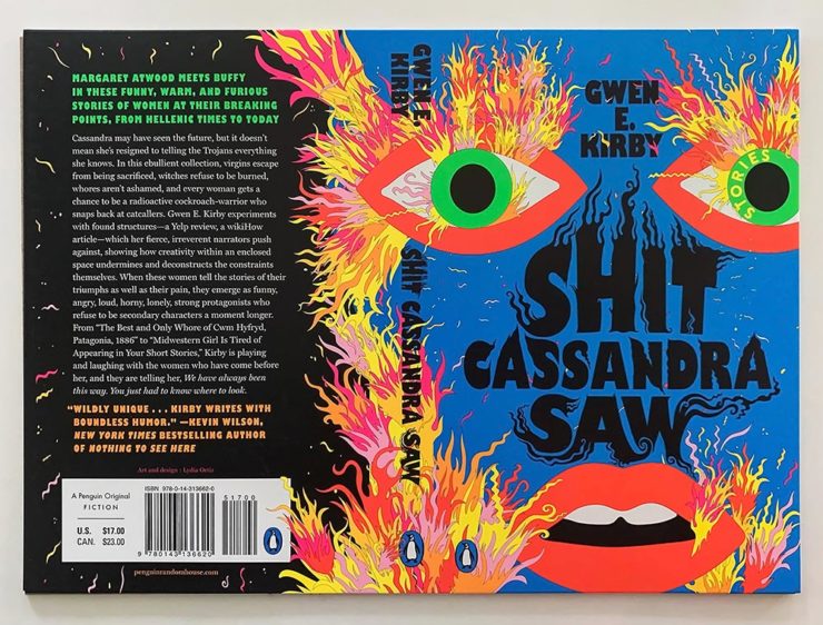
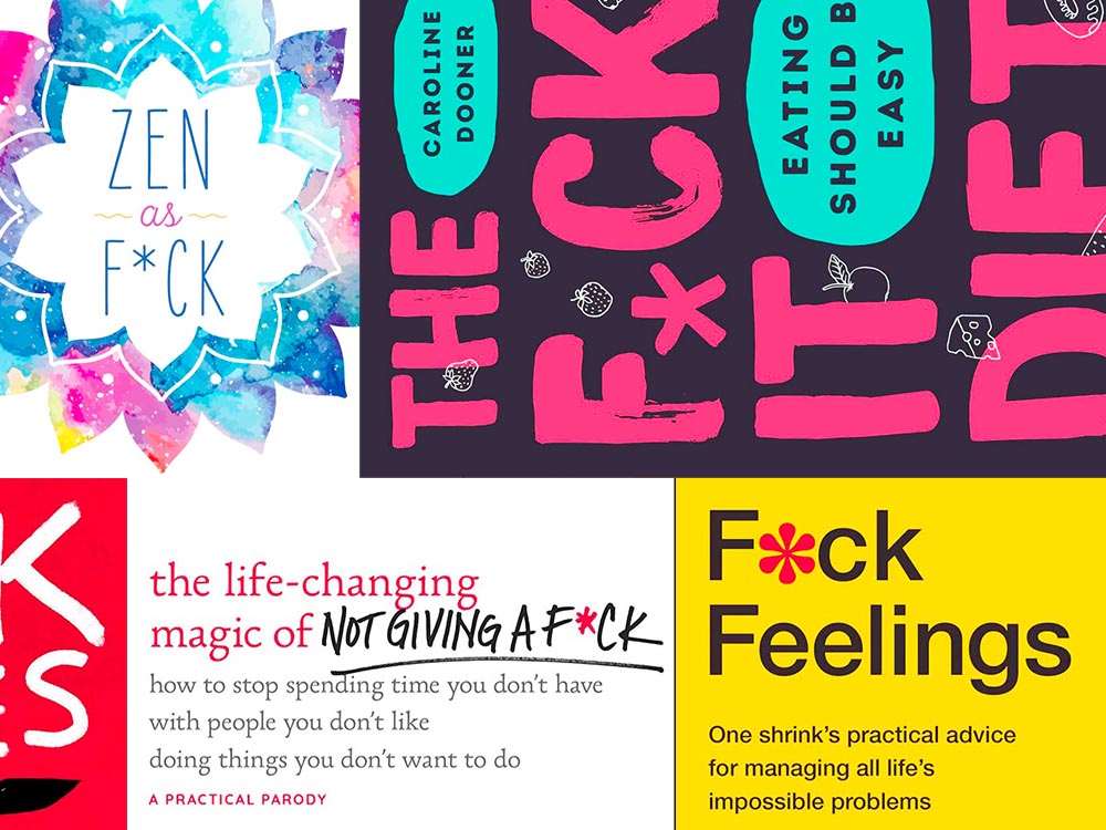
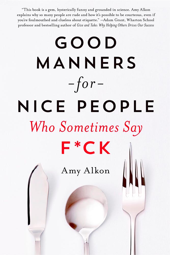
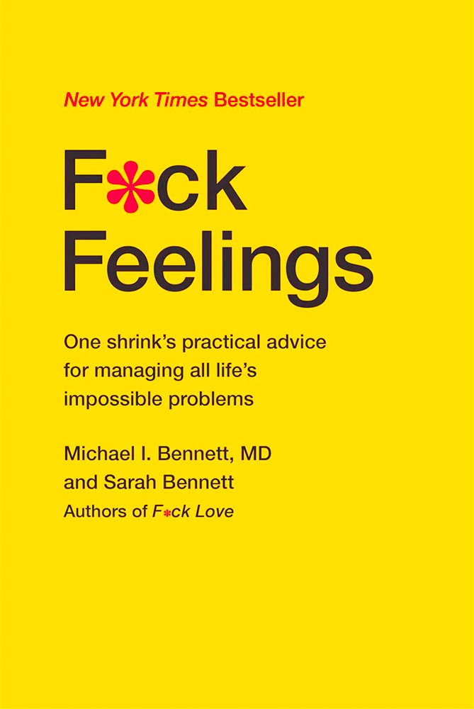
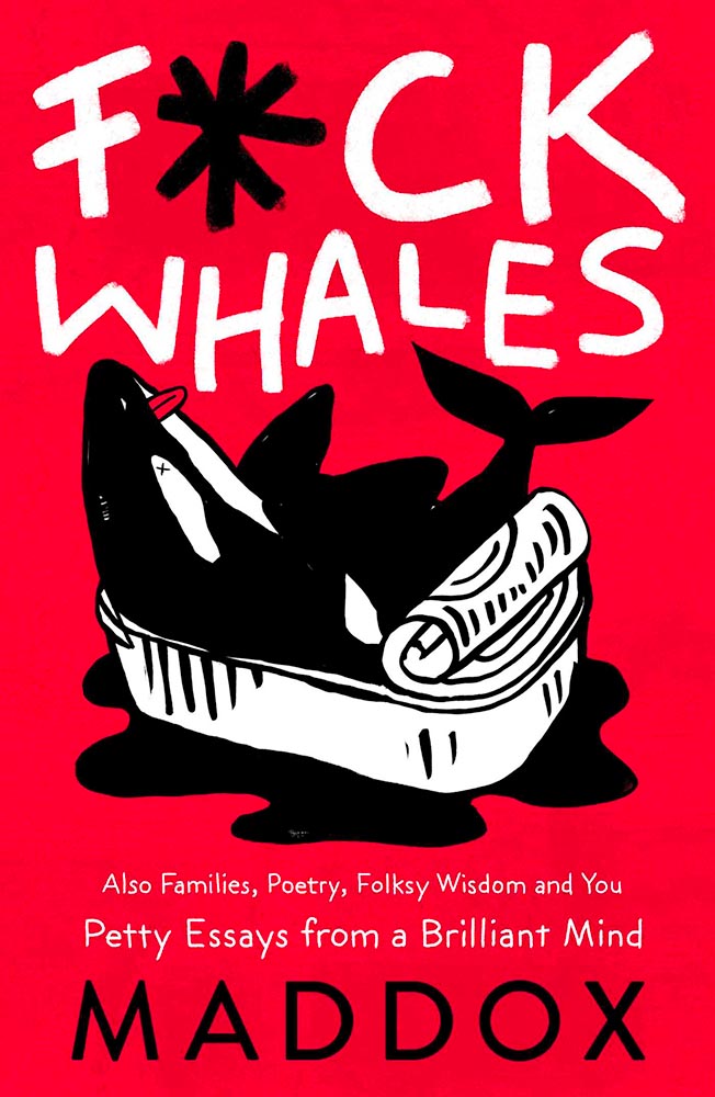
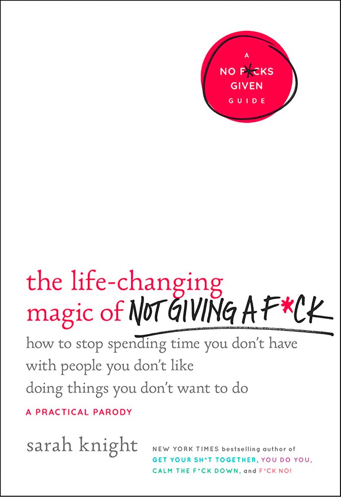
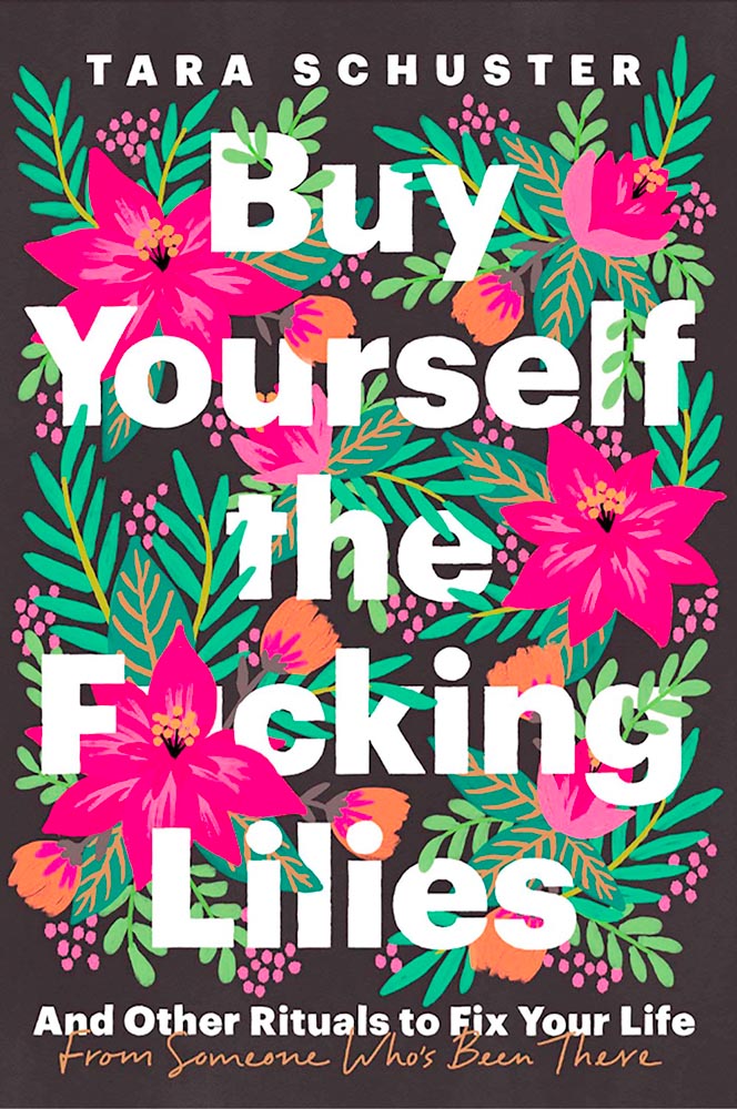
Kottke recently revisited a theme that’s been running for a few years now: titles with a swear — f*ck, in this case — in the title. According to Slate, the practice stems from the 2011 parenting title Go the F*ck to Sleep, and has accelerated over the years.
I’m more interested in the design of such a title. Bookstores, advertisers, and publicists demand that the swear never be completely spelled out, but that doesn’t restrict great design ideas. Here are a few of my favorites:
Love the fork. (So to speak.)The less-is-more approach.Whales as sardines.Interesting choice with the capitals, or lack thereof.
Note the over-arching theme: no, not that — the lack of photography. The vast majority of these titles are text based, supposedly because something competing with the swear would detract from the shock value. There’s a primary color thing going, too, probably for the same reason.