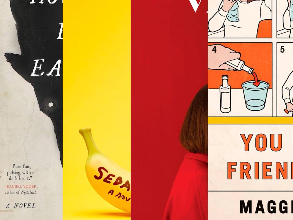
A book design treat for your Monday morning: four of my favorite new book covers from last month’s debuts.
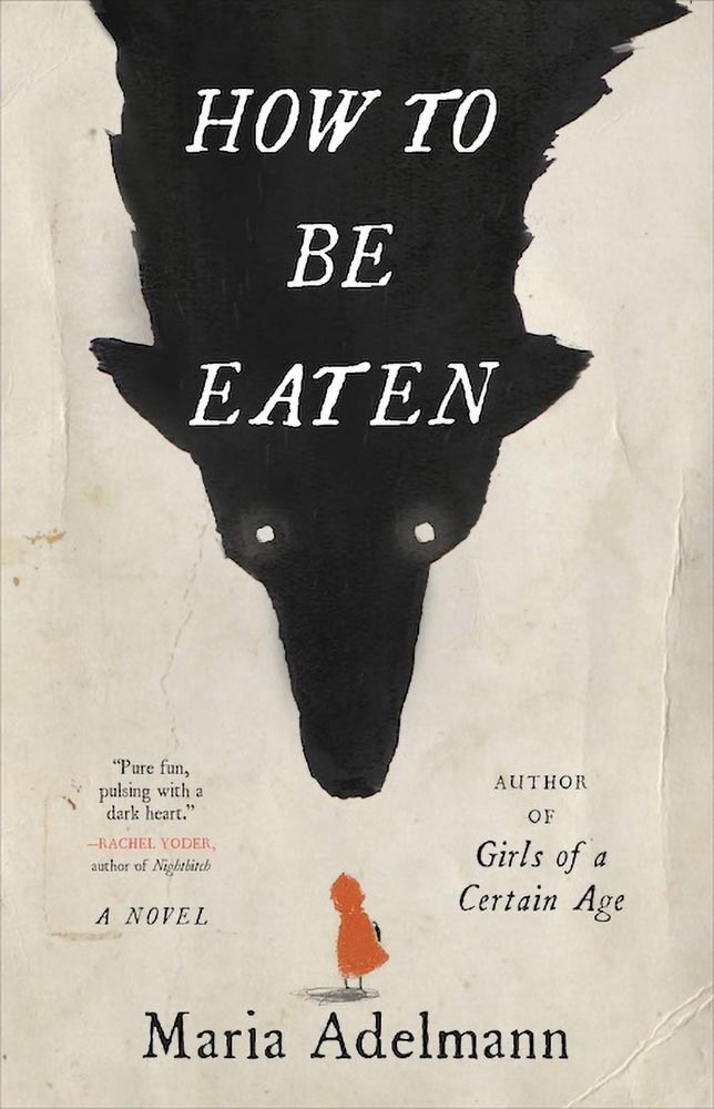
Aged, distressed paper is a great look when done well, and this one hits all the right notes. The size relationship between the characters, the glow around the eyes, the two color choices, the type, all of it — great stuff.
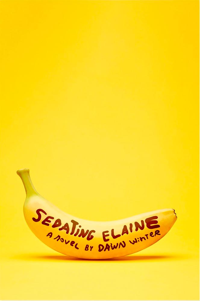
A veritable how-to on less-is-more. Brilliant.

Another solid-color triumph. Great font choice here, too. Awesome.
I’ve saved the best for last:
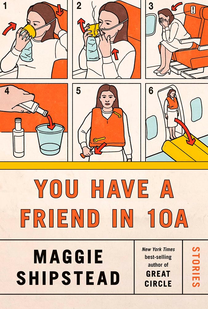
Great Circle has featured before, and this follow-up takes us inside the plane and into the safety brochure in the best possible way. Great, brilliant, and awesome wrapped into one.
Via LitHub and Spine, as usual. Have a good week!
Update, June 20th: WABE, Atlanta’s NPR station, has a summer reading list out, highlighting Georgia books and authors — and I’d like to include two of the covers here:
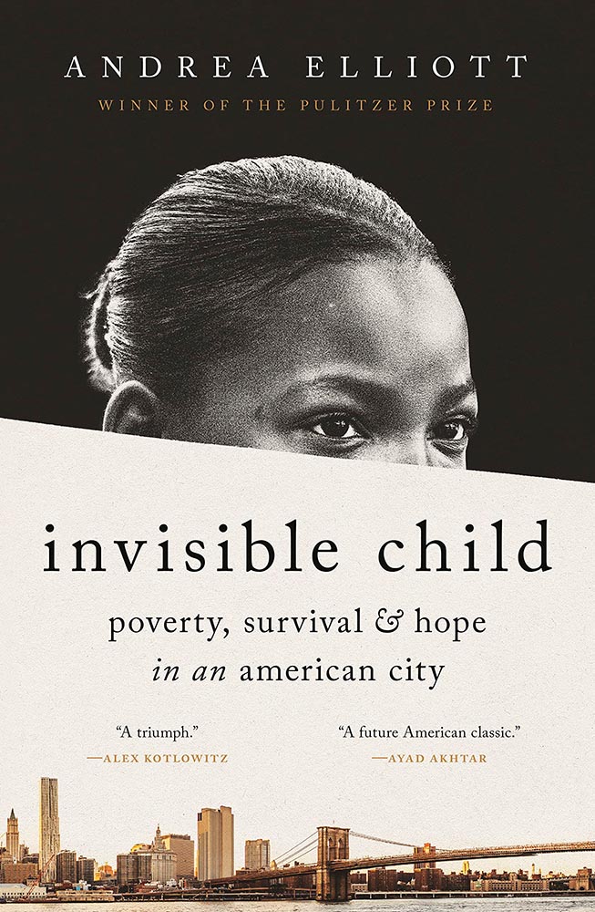
The grainy photograph, the wonderfully placed city skyline, and classic typography, combined with the diagonal cutline, elevate this title from mundane to eye-catching.
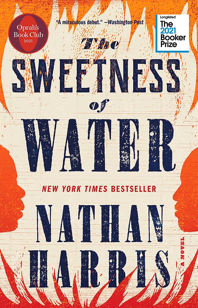
Excellently distressed doesn’t begin to describe this, on many levels. Side note: it’s a terrible shame that the Oprah and Booker call-outs have been elevated to logo status in what can politely be described as a distraction (from a book designer’s point of view, at least).

