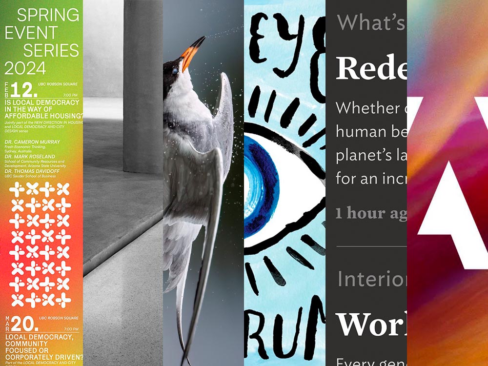
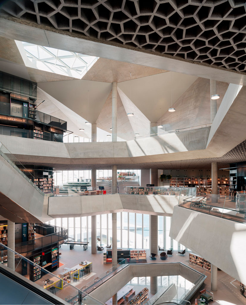
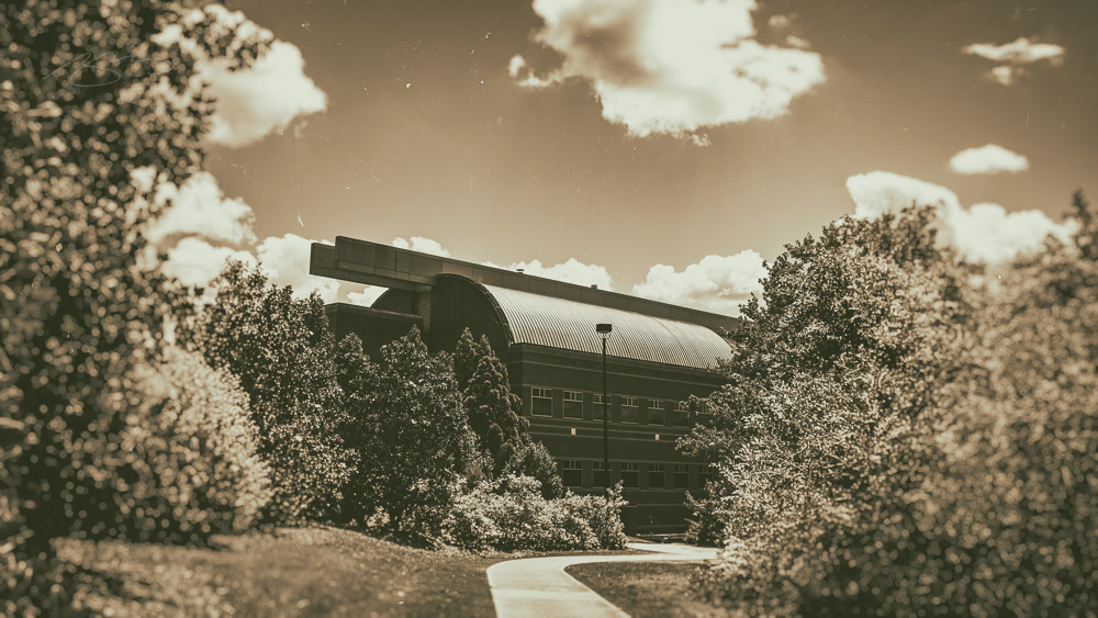
Beautifully Briefed 24.7: Generated

This time, another automaker logo, some automotive and architecture photography, and the special bonuses that have all become a regular part of the Beautifully Briefed standard. But we’re going to start with some generated content.

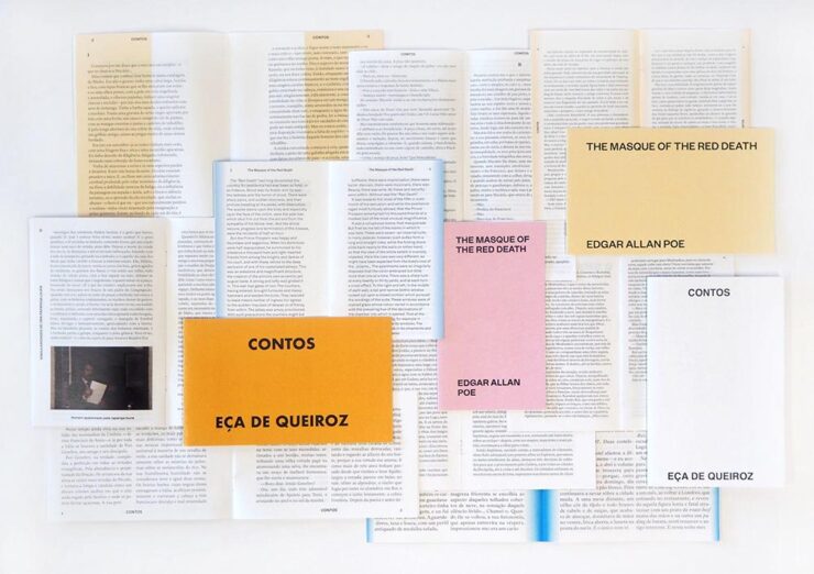
AI Book “Design”

From the “We knew this was going to happen” category, we have the first — that I’ve seen, anyway — “let AI do the work” research paper suggesting that book design is something that can be automated.

We have presented a novel approach to computationally design books. The presented system implements a generative design process which takes advantage of the scripting capabilities of Adobe InDesign to procedurally typeset books from content provided by the user. We have shown the ability of the system to (i) create book designs that consistently comply with a series of typographic rules, styles and principles identified in the literature; (ii) produce visually diversified books from the same input content; and (iii) produce visually coherent books with different contents.

Design by “AI.”

Let’s please remember that “AI” as the term is currently used is actually “applied machine learning;” in this case, specific rules within specific containers in a specific application. It’s a first step towards something, as most “AI” is in 2024.

But it’s absolutely not the only step. It’s inevitable that the necessary subsequent steps will be taken, probably sooner than later.

As usual where someone is seriously discussing replacing a human worker with a computer, there’s a pitch for the upside:

The work presented in the paper may challenge the typical roles of both the tool and the designer. First, by automatically creating and suggesting design alternatives, the tool ends up playing a more active role in the design process. Then, by modifying and developing custom tools, the designer is no longer a mere tool user and becomes the author of tools tailored to specific needs. We believe this shift can be fruitful since it enables the exploration and discovery of new technical and creative possibilities.

In other words, the designer is now responsible for creatively writing the rules then policing the output — like so many things in the machine-learning, or “AI” space — rather than the actual drudgery of directly designing the output. “Design great rules, get great design.”

And there is room for this. Amazon, especially, is going to jump on book design generated this way; never mind those folks in China or India earning (a paltry few) dollars a day, the computer can do it better for less . . . . Poof! With no human interaction whatsoever, your book is ready to publish. Indeed, for some, the bar to publish has just been lowered made easier. Perhaps even Adobe, who trumpets “AI” at every turn these days, they may choose to take this up. (Probably for a surcharge to the already-high subscription pricing.)

Let’s not even speculate about the major publishing houses for now.

But like AI-generated anything, getting actual art requires hand-tuning the input by an artist. For what amounts to “slop” — see this fantastic PixelEnvy discussion — the generated approach to book design might even be appropriate. But for book design that’s artistic, cared-for, or even “just” thoughtful, you’re going to need a human for a long time yet to come.

The paper is available on Cornell University’s arxiv under CC BY-NC-SA 4.0 DEED license. (Via Hackernoon.)

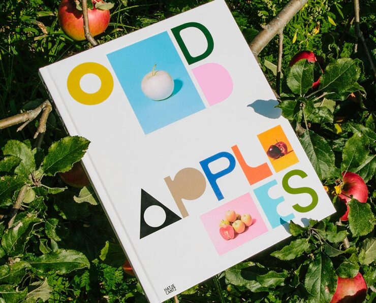
The excellent Odd Apples, which I’m sure I’ve highlighted before — but in a very human way, can’t find.

Special Bonus #1: I had the occasion to recently flip through Pentagram’s book design section. Some seriously interesting, seriously artistic work. (See the Odd Apples listing specifically.)

It could probably be argued that computers took book design jobs away, but….

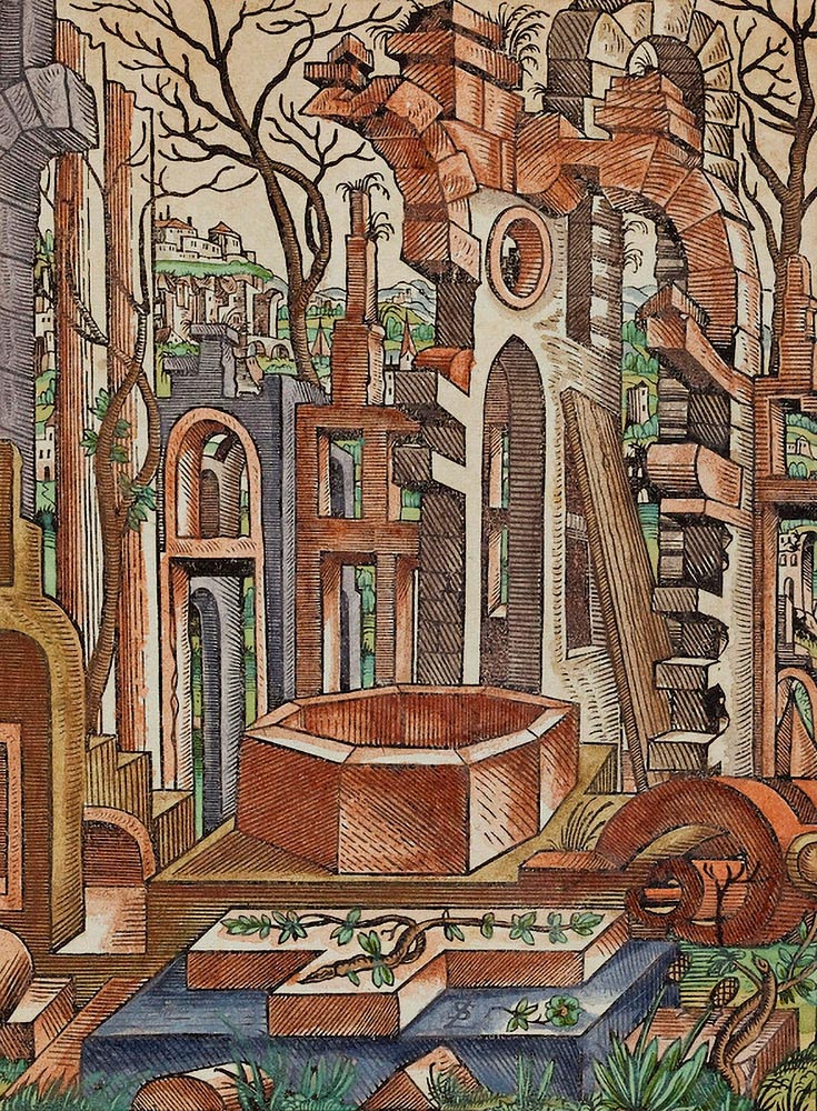
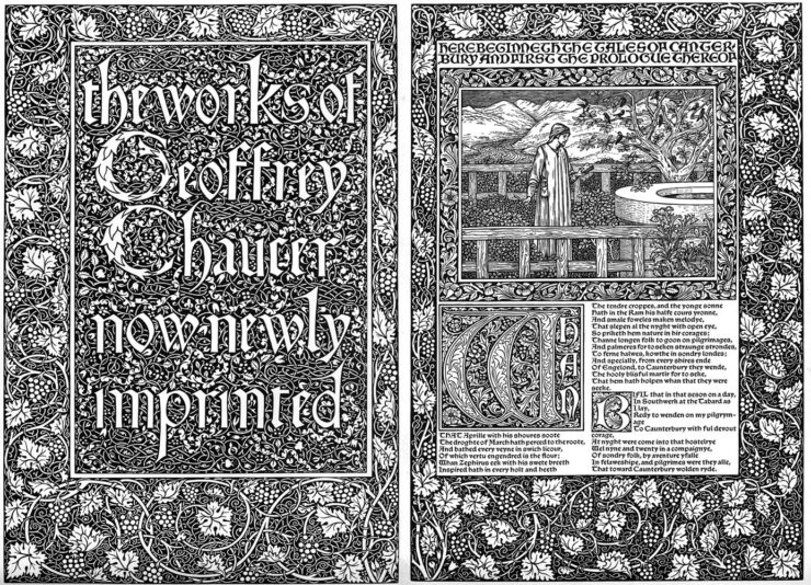
Special Bonus #2: CreativeBoom links to three free archives on Victorian illustration to inspire — or perhaps use creatively in a book.

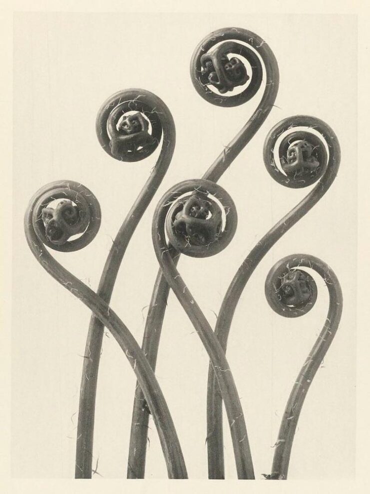
Untitled (Fiddleheads), 1928. Photo by Karl Blossfeldt.

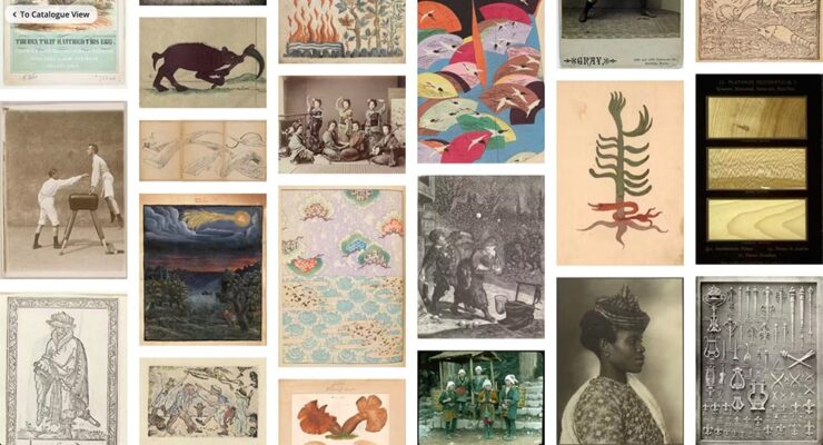
Special Bonus #3: The ever-great Kottke.org. points us at Public Work, “an image search engine that boasts 100,000 “copyright-free” images from institutions like the NYPL, the Met, etc. It’s fast with a relatively simple interface and uses AI to auto-categorize and suggest possibly related images (both visually and content-wise).” As Jason Kottke points out, not great in the attribution department, but good stuff nonetheless.

Mazda’s New Logo
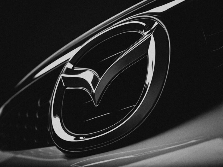
Mazda’s logo as of 2023, seen on one of its cars.

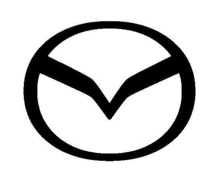
From the automotive logo thread (previously), we have to note Mazda’s new look, reduced from the current 3D-style grayscale to flat and black and white. This one gets some criticism from me: it lacks grace, pace, or space. (Hmph. That might be someone else.)

Angry Bird, anyone? (Pardon the artifacts — this image is enlarged from a Japanese trademark post.)

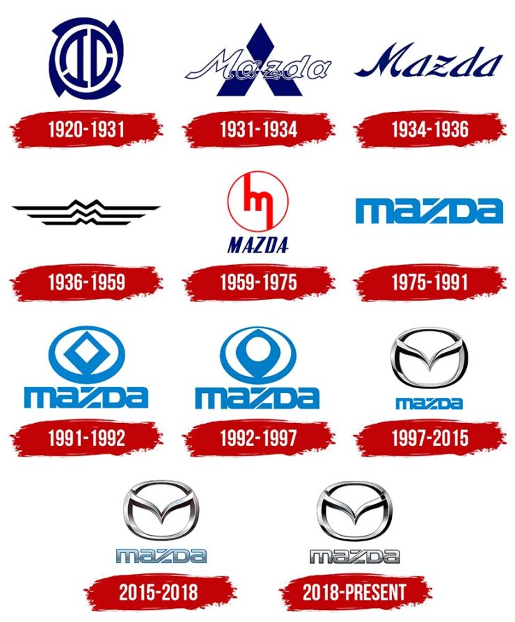
Then again, Mazda has not always been successful with logos. Anyone remember the 1991–1997 version?

Mazda’s complete logo history.

The 1931–1934 version lays the name over Mitsubishi’s logo, which was responsible for sales. The 1975–1991 version is the one I remember best, but that’s likely a youth/rose-colored glasses sort of thing. See Wiki for more information.

Meanwhile, Mazda is trying to move upmarket right now, and the new “look” isn’t really in keeping with that. Curious to see where this goes. (Via The Autopian.)

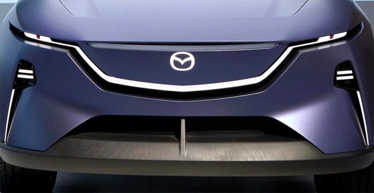
Mazda’s new electric concept, the Errata, sporting an interim, flattened version of the current logo. Wait, might have gotten something wrong there, too….

Special Bonus #3: BrandNew points us at the 2024 Logo Trends report, the annual fun item from Logo Lounge that looks at what’s hot in this year’s crop of — you guessed it!

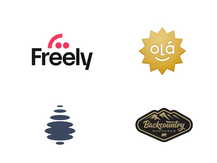
Freely (Smiley category) and Droplet (Elliptic category), left, and Olá and Backcountry Wanderer, right, from the Sticker category. (Olá could be in the Smiley category, too.)

Some of my favorites are above, but the whole report is worth a look. (Spoiler: more than flattening is on trend.)

Auto, Auto+Arch, Arch
Auto Photo Manual

Via Wallpaper*, we have Auto Photo Manual, a new monograph from Benedict Redgrove that “explores the art and science of photographing the world’s most striking cars:”

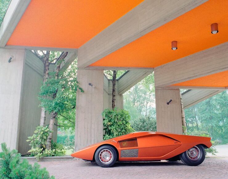
A very orange Lambo. Photo by Benedict Redgrove.

Always a sucker for a Saab, especially this concept:

The 2006 Saab Aero-X concept. Photo by Benedict Redgrove.

Auto Photo Manual is a Kickstarter item that could use some love — stop by if you can. Wallpaper* has the full story.

A Time • A Place (Vol. 1)

Also via Wallpaper*, we have a “celebration of the European Car of the Year and changing perceptions of modern design, pairing the best buildings of the age with their automotive contemporaries:”

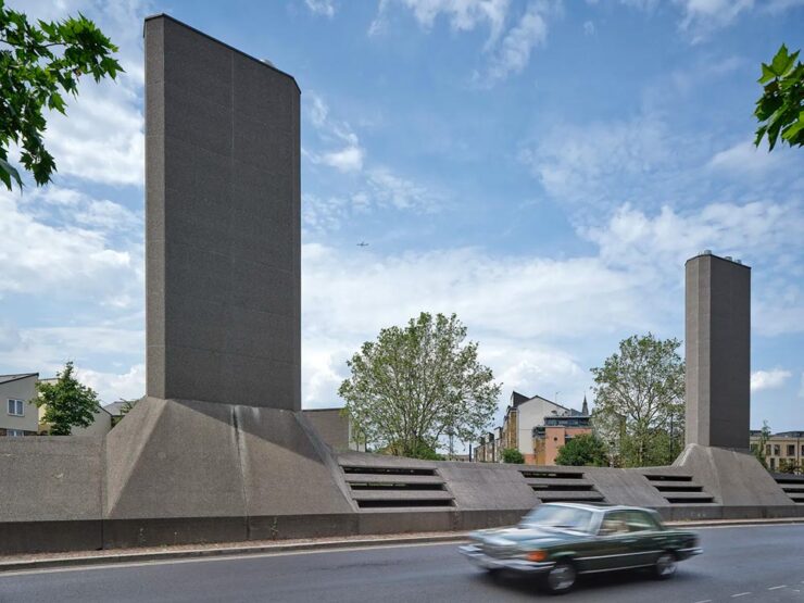
London’s Camberwell Subamarine and the Mercedes W116. Photo by Daniel Hopkinson.

“Through the lens of time, both [cars and buildings] have become highly symbolic of their eras and hindsight will allow us to trace the roots of each design to determine how it is viewed from a 21st century perspective,” says Holroyd, noting that over this period architecture underwent a stylistic retreat, just as car design became emboldened and more avant-garde.

Great stuff in this new title, available now from The Modernist. Read more at Wallpaper*.

World Architecture Festival 2024 Shortlist

Via The Guardian, we have The World Architecture Festival’s 2024 shortlist, revealing projects from around the world spanning categories such as childcare, energy, transport and science. A couple of faves:

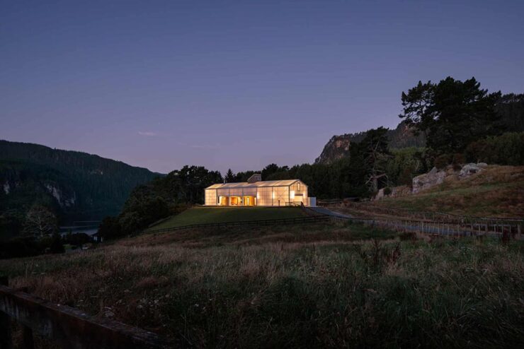
The Chodge by DCA Architects of Transformation — interesting name(s), surely — in Whakamaru, New Zealand. Photograph by Simon Devitt.

The live awards event will take place in Singapore from November 6-8. This year’s finalists represent 71 countries.

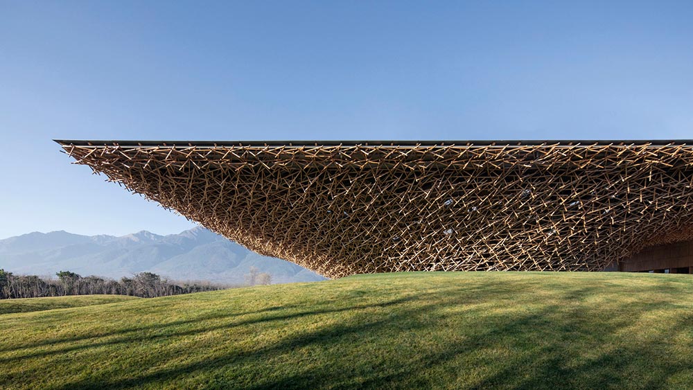
Woven Passage to Cloudy Peaks by line+ studio in Shaoxing, China. Photograph by line+studio.

See more at The Guardian, or the complete shortlist at The World Architect Festival.

Special Bonus #4: This is Colossal brings us the drone photography of Eric Waider, shot in Iceland:

As glaciers expand and recede, they have the capacity to grind rock so fine that geologists refer to the pulverized material as glacial flour. It slips down rivers and into lakes, carrying the otherworldly turquoise hue through a unique and resilient ecosystem. In Iceland, the blue-green color is complemented by rivers that flow yellow, thanks to sulfur from nearby volcanoes, or red from dissolved ferrous iron—also known as bog iron. Coursing over rock and black sand, the streams take on dazzling, rhythmic patterns.

Photograph by Erik Waider.

Brilliant. See his website (“Abstract Landscapes of the distant North”) and enjoy that series and more — including faves such as Ocean Blues and Glacial Macro.

Beautifully Briefed 24.6: Summer of Win (Mostly)

In this installment of Beautifully Briefed, let’s take a look at some great posters, great print items, and great photography. Plus, an update from Adobe’s continued campaign to lose friends and attract government attention. Fun stuff!

GET LECTURED (ON ARCHITECTURE)

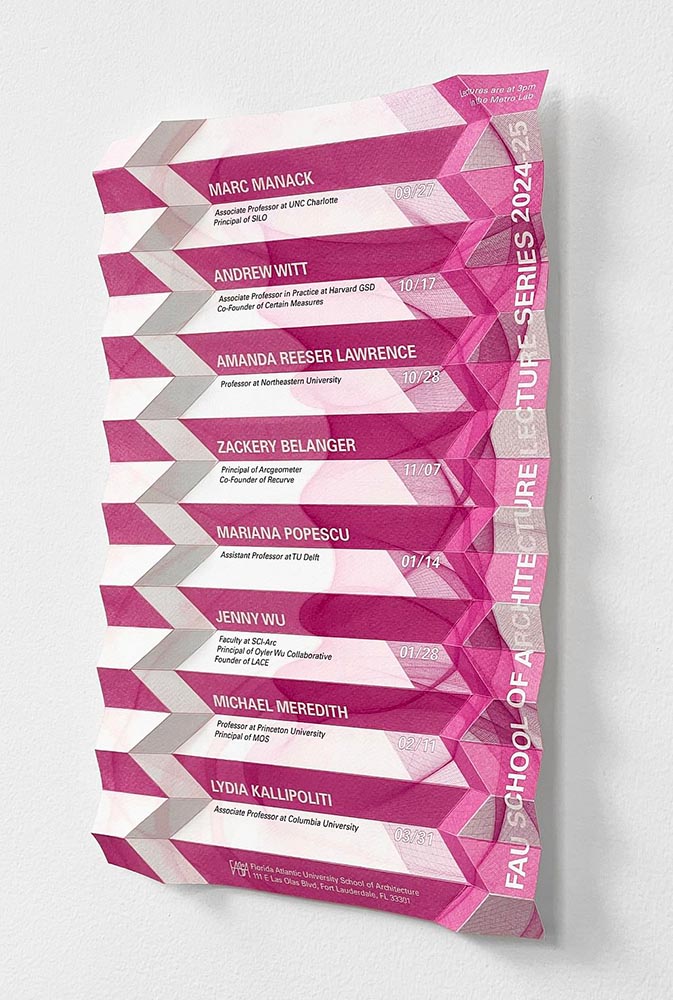
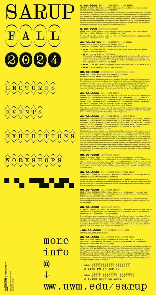
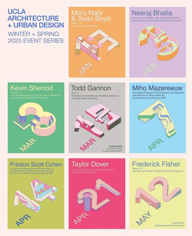
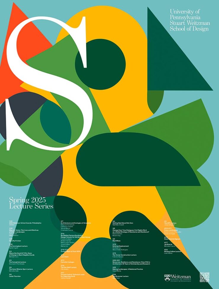
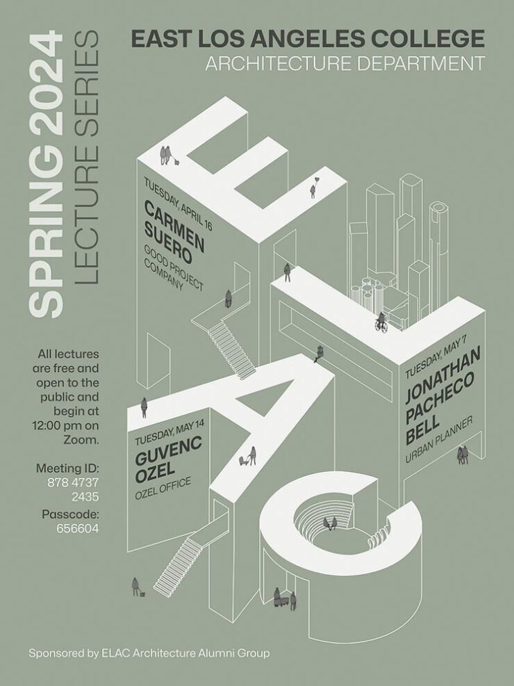
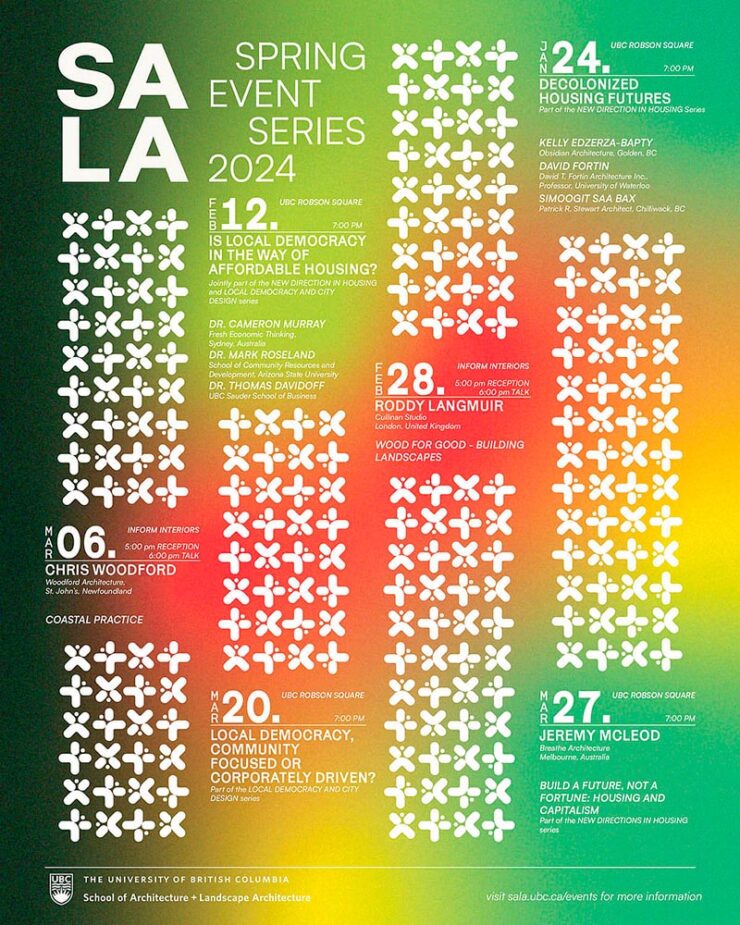
Back in September, I mentioned Archinect’s Get Lectured poster series. They’re back with the Spring 2024 winners, including these two faves:

ELAC lecture poster design by Tashfiah Ahmed.
Lecture poster from the University of British Columbia; designer not listed.

Great examples of design in a often difficult category. See the rest.

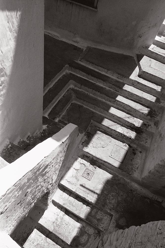
Architecture Photographs by Hélène Binet

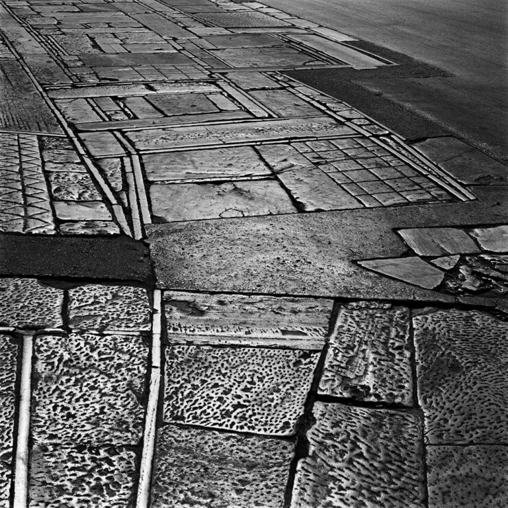
While we’re discussing architecture, let’s talk about a Dezeen post that caught my eye: photographer Hélène Binet has a new book out, adding to her long career capturing the old-school way — using film.

“A Sentimental Topography by Dimitris Pikionis, landscaping of the Acropolis, Athens, Greece.”

This series captures shadows and light with exceptional talent, including the above, where she’s praised for “captur[ing] in a single image the tactile and textured presence of tectonic form, both in built and natural environments.”

“Staircases in Sperlonga, Latina, Italy.”

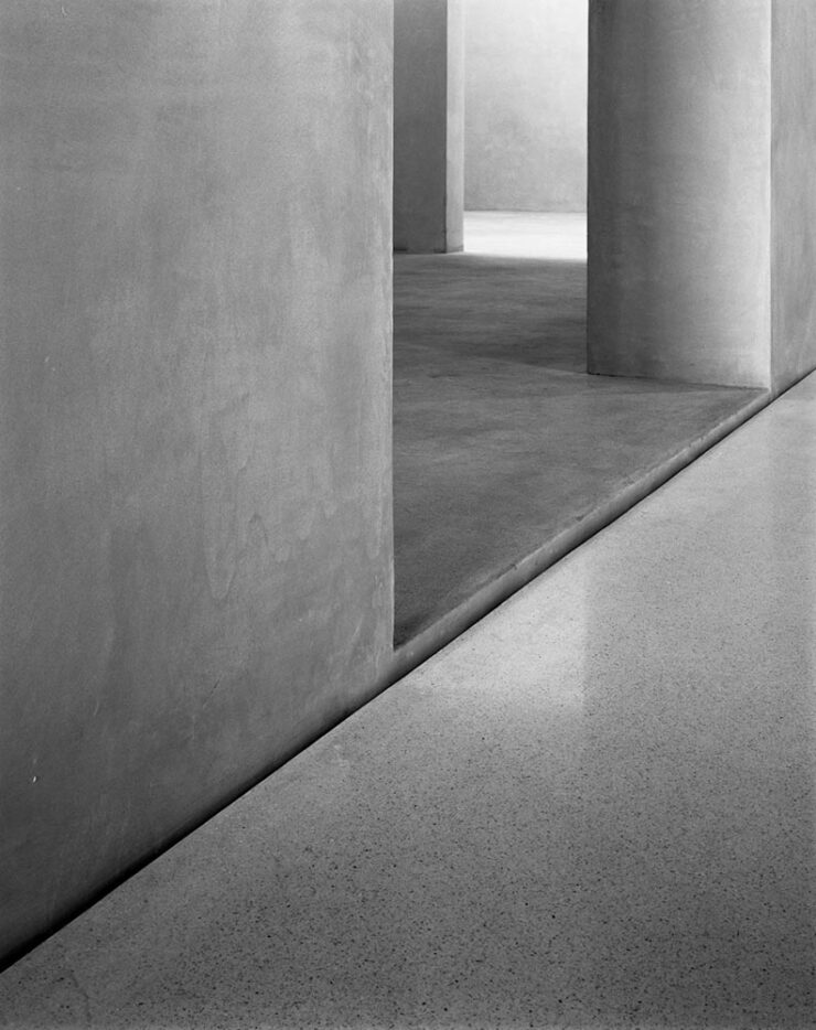
I love the softer shades of gray than shown in the previous image, and both this and the image below demonstrate a deep understanding of architectural expression.

“Kolumba Museum, Cologne, Germany, by Peter Zumthor.”

Read the post from Dezeen, see more examples of outstanding work on her website, or buy the book with 170 photographs, essays, and more.

2024 Audubon Photography Winners

This is Colossal posted about this a day before my Audubon magazine showed up with these prominently featured, and they’re all winners.

Wild Turkey, Female Bird Prize Winner, by Travis Potter.

Bird photography is a difficult skill requiring patience, perseverance, and specialized gear; those who excel at it deserve recognition. Plus, there’s this:

Audubon’s climate science report Survival by Degrees reveals that two-thirds of North American birds are threatened by extinction from climate change, including species featured in this year’s Audubon Photography Awards like the Blackburnian Warbler, California Quail, and Sedge Wren.

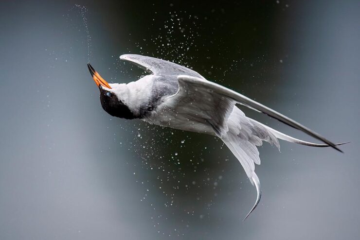
Forster’s Tern, Professional Honorable Mention, by Kevin Lohman.

Check out the Colossal post, or see the full story at the Audubon website.

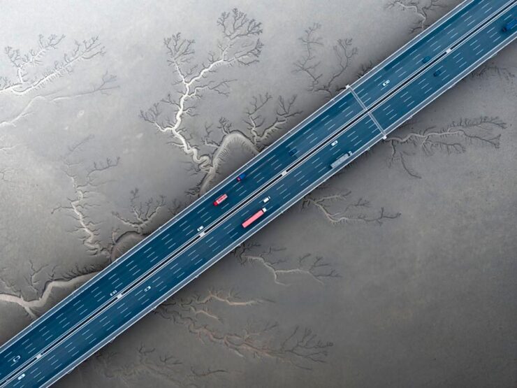
Special Bonus #1: Kottke points us towards the Siena 2024 Drone Photography Awards. “Look! Up in the sky! It’s … another contest!” Good stuff nonetheless:

“Jiashao Bridge” by Sheng Jiang, China.
PRINT 2024 Awards

The annual PRINT awards are out, featuring — natch — great items in print, including items like the Smithsonian’s annual report and a Naked Trails brochure. Here are a couple of items from the book design category:

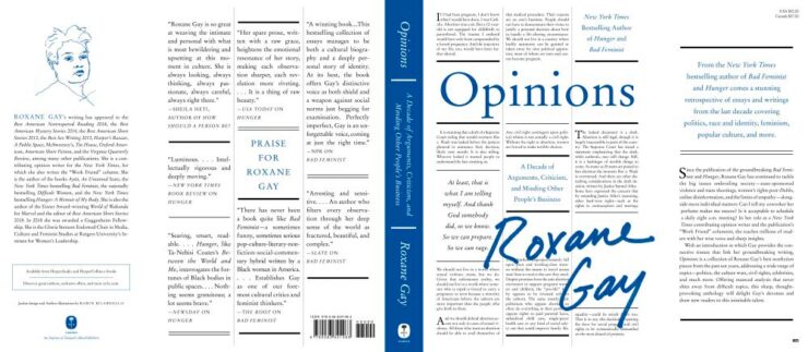
Jacket design by Robin Bilardello.

Author sketch and lettering by the author. Also, let’s get the . . . :

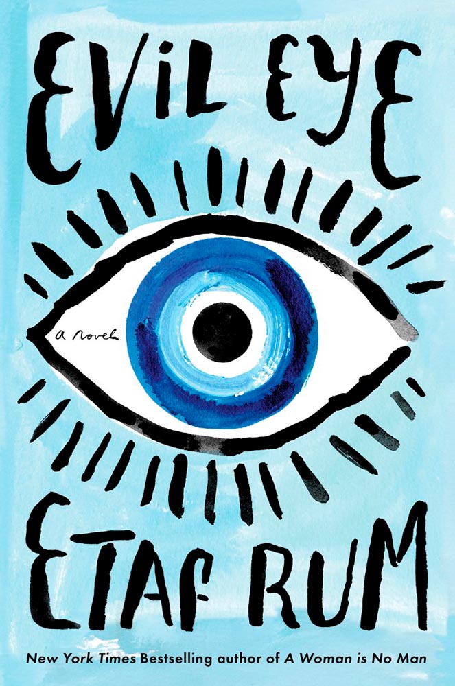
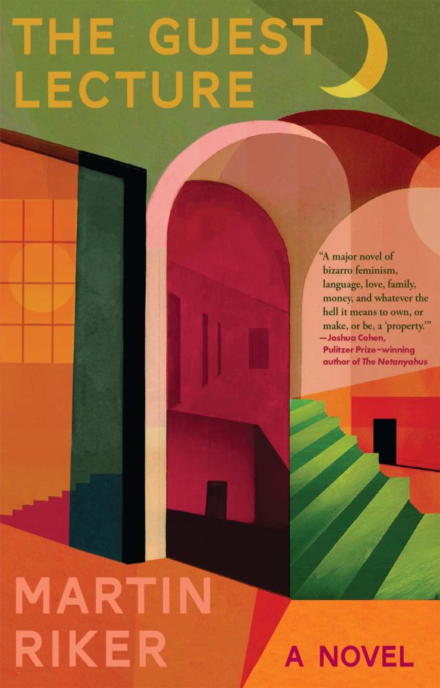
Cover design by Milan Bozic, with illustration and typography by Lauren Tamaki.

Fantastic.

Special Bonus #2: Hoefler & Co. brings us Typographic Doubletakes: “While good typefaces have prodigious families of carefully related styles, some of the best typography builds unexpected relationships between unrelated fonts.”

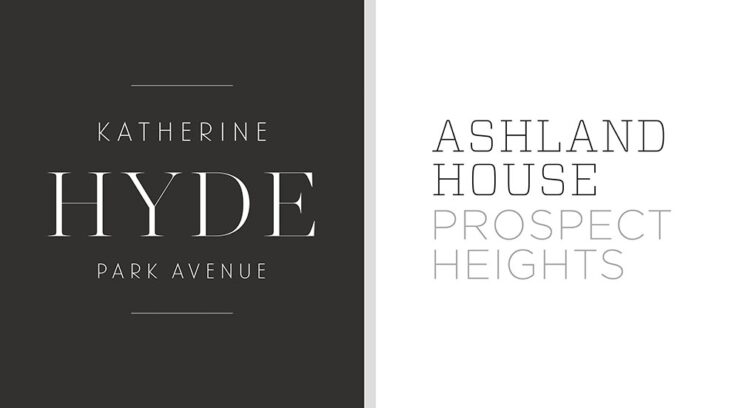
Left: Chronicle Hairline + Landmark. Right: Vitesse + Gotham.

Their blog refreshes as you scroll in more ways than one — enjoy.

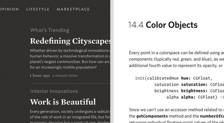
Left: Mercury Text + Ideal Sans SSm. Right: Whitney + Operator and Operator Mono.

Special Bonus #3: Kottke points us to a LitHub post arguing for adding full credit pages to books acknowledging everyone who worked on them. “How lovely it is to be seen and appreciated.”

Adobe “Too Easy to Hate,” Say Users, Employees

Adobe continues to score big with the public — in the best Boeing style, a formerly-great company has put profits before users and employees. While successful from the shareholders’ point of view (record profits, again), some are . . . upset. PetaPixel:

Just over a month ago, an Adobe exec called AI the “new digital camera.” Simultaneously, an Adobe marketing campaign chucked photographers under the bus, and not for the first time, which caught the attention of the American Society of Media Photographers (ASMP). At the very top of Adobe, there is a concerning and frustrating lack of understanding about art and the people who make it.

Even “exasperated employees implored leadership to not let it be the “evil” company customers think it is;” while that might be a stretch — “ignorant greed” is a better description — either is not a winning look.

The latest was a terms-of-service update that many saw as a rights grab, allowing the company to use users’ work to train its AI services. While those have been amended, the seemingly clear language — “We’ve never trained generative AI on customer content, taken ownership of a customer’s work, or allowed access to customer content beyond legal requirements” — comes from a company that has lost the trust of users, making those words just that — words. Time will tell if they are truth.

But there’s more: Adobe’s just been sued by the FTC (via PetaPixel, Pixel Envy) for hidden fees and difficult cancellations:

“For years, Adobe has harmed consumers by enrolling them in its default, most lucrative subscription plan without clearly disclosing important plan terms,” the lawsuit alleges. “Adobe fails to adequately disclose to consumers that by signing up for the ‘Annual, Paid Monthly’ subscription plan, they are agreeing to a yearlong commitment and a hefty early termination fee that can amount to hundreds of dollars. Adobe clearly discloses the early termination fee only when subscribers attempt to cancel, turning the stealth early termination fee into a powerful retention too that [redacted] by trapping consumers in subscriptions they no longer want.”

I’m actually glad for this, as I wasn’t aware that my $60+ monthly fee is a payment on an annual plan. (Ug.) Not too big an issue — I actually feel like there’s decent value in the plan and will continue to subscribe for the foreseeable future.

But I’d also be lying if I said I’m completely satisfied with our business arrangement: alternatives are few and far between. While Adobe does not have a monopoly legally or technically, in the publishing industry at least, they are, for all intents and purposes, the only game in town. It would be nice if they would at least demonstrate a modicum of respect for their users.

Update, 25 July 2024: “Adobe Exec Says Early Termination Fees Are ‘Like Heroin’ for the Company,” according to PetaPixel. Hmph.

Beautifully Briefed 23.9: Falling into Brilliance

As summer turns to fall, let’s take a look at Type 1 fonts, a library index, revolutionary posters, posters for “get lectured,” and two different photography contests. Let’s get right into it.

Adobe discontinues a standard: The Type 1 font

Back in the early days of desktop publishing — up to about the turn of the century, give or take — everything typographic used PostScript, a programming language by Adobe. (Other stuff, too, like Adobe’s vector program, Illustrator.) PostScript fonts were the so-called “Type 1” variety, made up of a bitmapped “suitcase” that housed the standard display sizes and an outline file used by the output device to print clean, what-you-see-is-what-you-get beauty.

The Apple LaserWriter Plus and some vintage Macs: nostalgia! (Note the book — heh.) Image: YouTube.

Companies from Apple to Microsoft didn’t want Adobe to hold a monopoly on output tech, so later fonts evolved into TrueType and then OpenType, the latter of which is the standard today.

So much so that Adobe has now discontinued Type 1, and they, along with Microsoft, have stopped being supported. Which is understandable and yet a shame: some of us still have hundreds of them.

Ars Technica has the best roundup.

Meanwhile, I’m going to investigate a conversion utility. Will report back.

All the Libraries in London

It’s Nice That has a post that reminds us of a library’s central purpose: to leave knowing more than you did when you entered. “The library, in our shared public imagination, is a special place,” the author argues — reminding us of what libraries were established to do, often distinctly different from the modern reality (especially in the United States).

In the library you begin to be convinced that language matters, that words have the power to clarify, to rouse, to make us feel something, to help us understand the political and cultural features of historical and contemporary moments.

Lola Olufemi, It’s Nice That
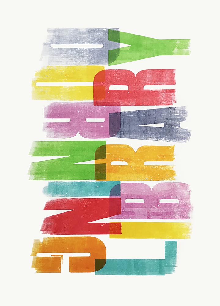
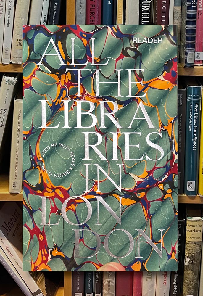
All the Libraries in London. Cover design: unknown. Image via It’s Nice That.

All the Libraries in London does something artistic with a simple listing, elevating it, reminding us how compelling the ideal that libraries represent really is:

This is a political and artistic listing, one that invites the reader to rediscover their own memories of their local library as a site of discovery. The book’s authors invite us to reflect on our personal relationship to libraries as well as the necessity of collectively securing their future existence.

Lola Olufemi, It’s Nice That
Alan Kitching, Durning Library. Image via It’s Nice That.

We need more of this everywhere, but especially here in the States. Meanwhile, check out this great item at It’s Nice That.

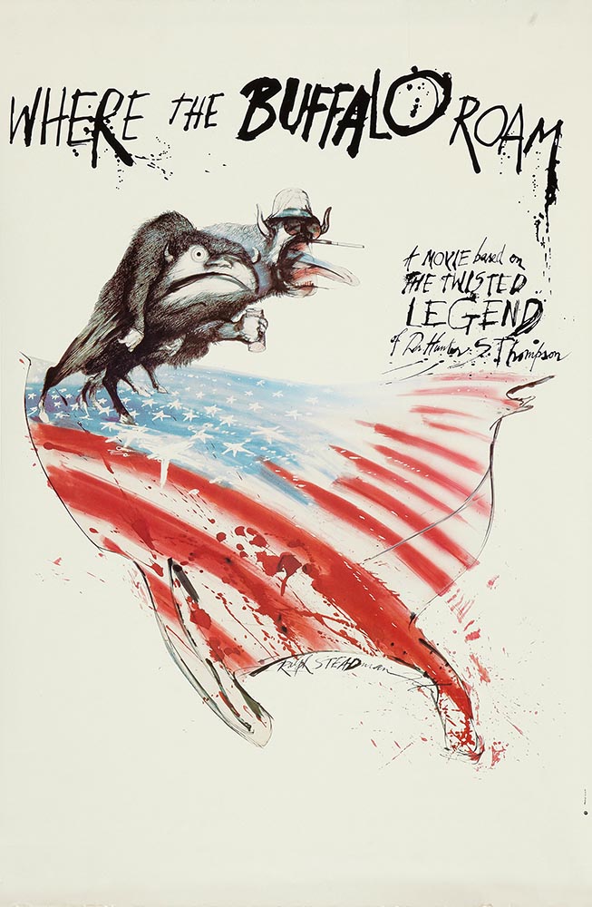
Special Bonus #1: Another British treasure, via the very British Antiques Roadshow (a British original, natch): this incredible poster by Ralph Steadman.

Ralph Steadman’s Where the Buffalo Roam (1980) poster. Image via Wikipedia.

Special Bonus #2: British book designer Steve Leard has launched a new book design podcast, Cover Meeting, featuring interviews between Leard and fellow book designers on the work, the industry, and more. The Bookseller has more.

Cuban Movie Posters. No, Really.

While we’re on the subject of great posters — and It’s Nice That — let’s talk about how Cuba’s revolution-era political posters transformed their poster design for films. Appropriately enough, a new film, El Cartel Cubano, highlights these amazing (and, likely, never seen before) items.

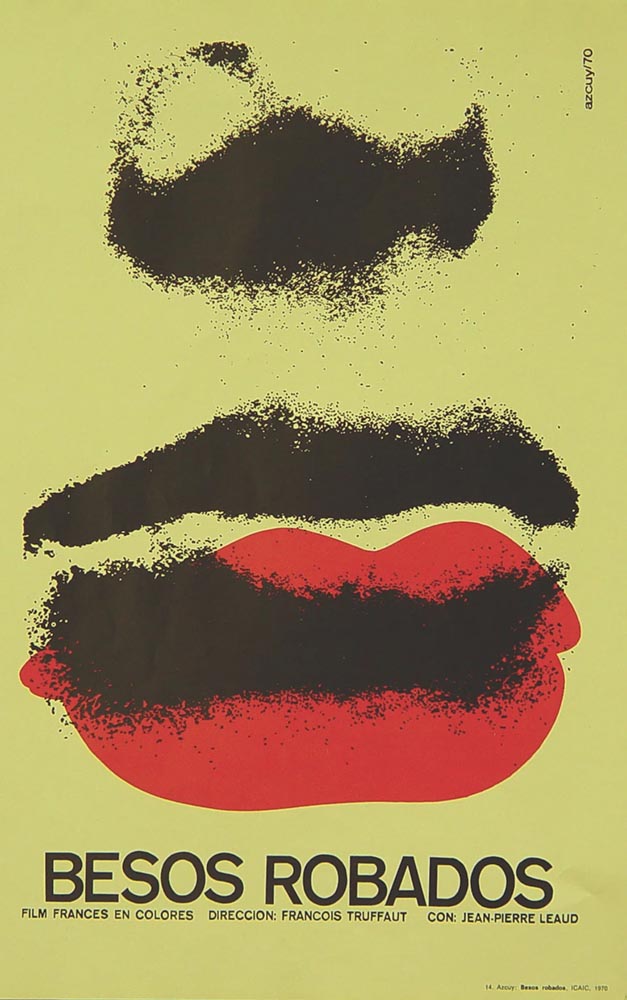
Besos Robados, ICAIC, by Sotolongo & Carole Goodman. Image via It’s Nice That.

How come our posters in the US aren’t this beautiful? What did this say about the priorities of the revolution? What did the medium or choices in the scarcity of materials used say about the economic situation in Cuba?” It’s these questions which form the bedrock of El Cartel Cubano, a fascinating and tender tribute to the artists on the island.

Adrienne Hall, co-director, El Cartel Cubano
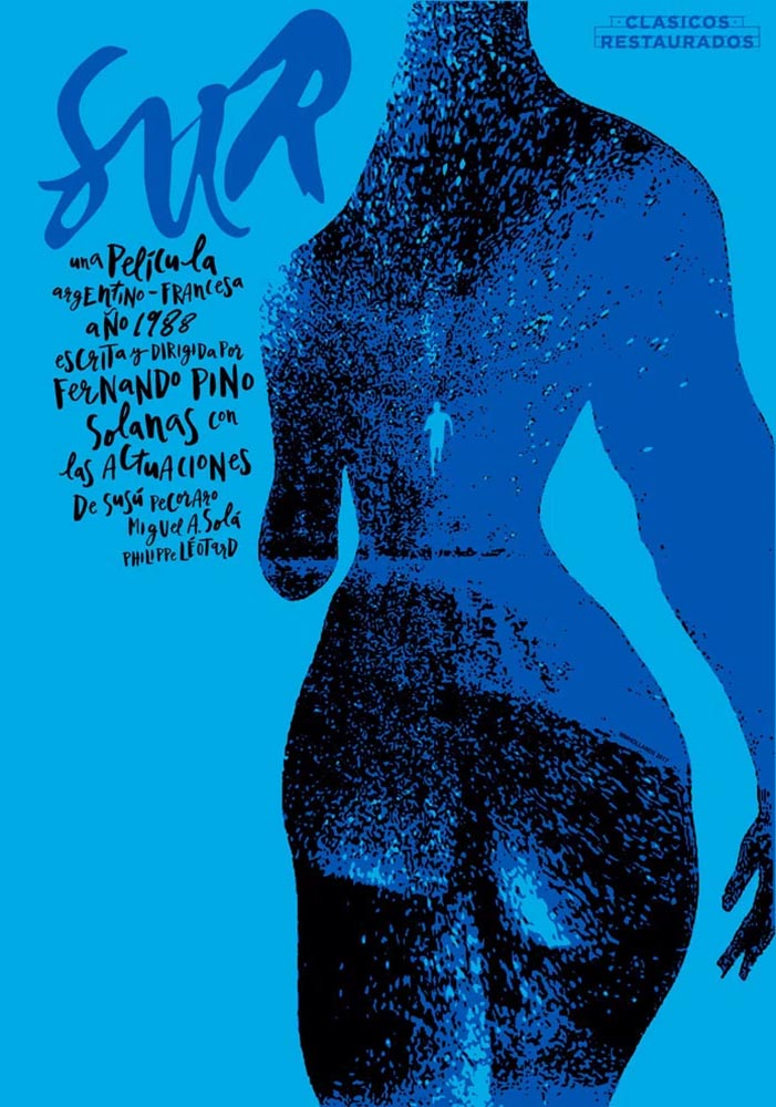
Sur, by Michael Myiares Holland. Image via It’s Nice That.

I have to admit: this isn’t a subject I would have leapt at, but It’s Nice That sold it. Awesome.

Get Lectured (on Architecture)

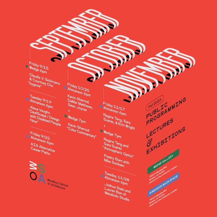
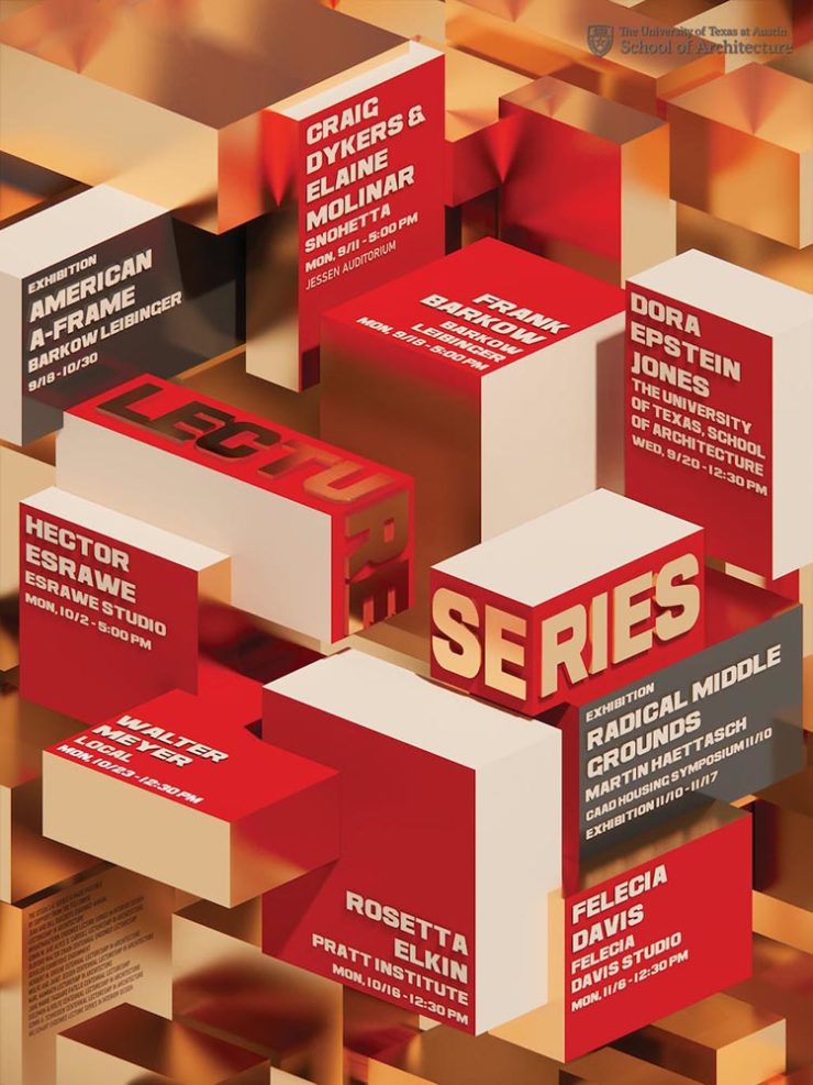
Closing out our trifecta of great posters, Archinect‘s Get Lectured series brings us these fantastic items from their Fall 2023 series:

Woodbury University School of Architecture’s Fall 2023 lecture series.
The University of Texas at Austin School of Architecture’s Fall 2023 lecture series

Some real gems: see more.

Finalists of the 2023 Urban Photography Awards

Going to soapbox a little here: pay-to-enter photo contests aren’t usually something I want to spread the word about. So ArchDaily‘s basically-a-press-release, “URBAN Photo Awards 2023 has announced its list of Finalist Photographers, marking the penultimate stage of the international contest,” was guaranteed a pass.

But there’s a problem: some of the photographs are really compelling.

Untitled, by Claudia Costantino

This one’s my fave:

Back to the 70s, by Stephane Navailles

See the contest website, or ArchDaily‘s post.

Winners of the 2023 Black and White Photography Awards

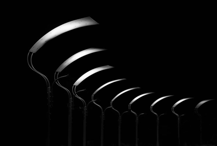
Another contest, yes. They’re everywhere. But … wow.

Street Lights – Ottawa, by Gareth Jones, category winner, architecture
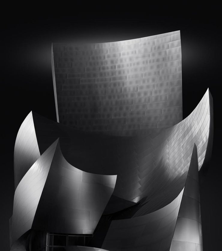
Another mushroom? By Hector Ballester Ballester. Silver mention, architecture.
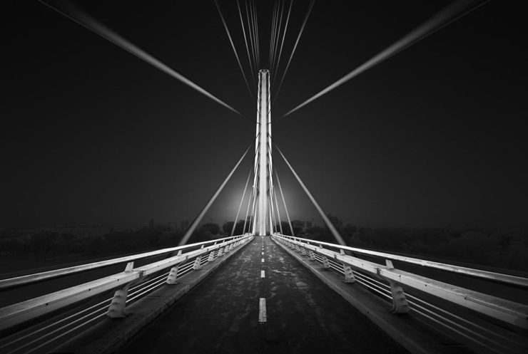
Alamillo bridge, by Manuel Ponce Luque. Finalist.
The concert, by Helena García Huertas. Finalist.
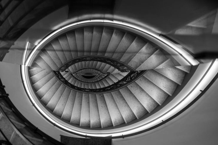
Reflections on the stairwell, by Max Dobens. Finalist.

And that’s just the buildings/architecture — there are portraits, street photography, landscapes, and more. A reminder to aspire, every day, with every image.

The Black and White Photo Awards (2023). (Via PetaPixel.)

Beautifully Briefed 23.2: Book Cover Portals, Lorem Ipsum, Favorite Fonts, and Building Photography

Look out, look up, look forward, and look through in this edition of brief, link-filled goodness.

“You May Now Enter”

PRINT covers, uh, covers:

While the book blob dominated the discourse for the last few years, we’ve recently identified another trend splashing its way across new releases: the recurring symbol of doorways, open windows, and mysterious portals.

—Charlotte Beach and Chloe Gordon, PRINT

A couple of the examples they cite:

Not only a portal but a shelf. Cool.
Not only a portal but also stairs. Nice.

Unlike the blob, I’m in favor of this one — the hint of the unknown is appealing in a visceral way that offers more while simultaneously offering more sales by asking potential readers to speculate and, thus, engage. Nice call, PRINT.

See more: Several of the covers on my Favorite Book Covers of 2022 follow this trend. (Some very enjoyable blobs, too.) Or, for another trend….

Dummy Text?

Here’s a question you’ve been absolutely asking yourself: what are the origins of the infamous Lorem Ipsum?

The lack of placeholders on the shelf is remarkably appropriate. (Photo: Scott Keir.)

Turns out it’s not as simple as Aldus [known as Adobe these days —Ed.] — or the even-more-infamous annonymous. Tim Carmody, the very capable guest chair at Kottke.org, fills it in: it’s Cicero. No kidding: Slate says so.

De finibus, indeed.

Fourteen Fonts to Follow

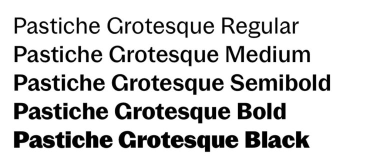
Creative Boom, where having eyes on you is actually fun, celebrates “14 Fonts to Fall in Love With” for Valentine’s Day. While Foreword may be late to the party, a couple of the type choices are first rate:

Irregardless1I absolutely want to steal their website design: the menu system is brilliant. and Pastiche, in order. (And no, I didn’t put those two together to be funny.) Read the article and pick your faves.

Art of Building Photography

I wasn’t aware of the Chartered Institute of Building, or their Art of Building photography contest:2Their terms are good, too — something remarkably rare in contests.

“White Constellation,” by Francesca Pompei.

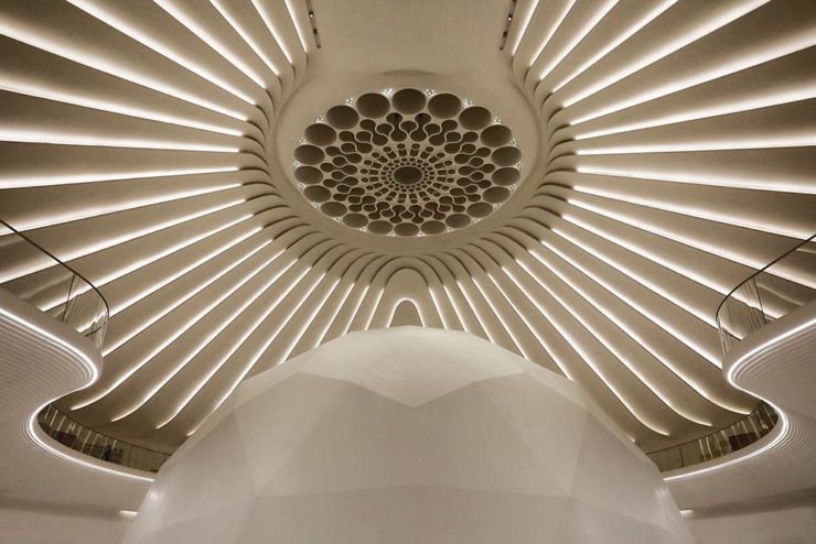
Since architecture and photography very much intersect in my camera, brain, and work, I’m glad to have found this great source of inspiration:

“House of God,” by Roman Robroek.
“My own little cosmos within reach,” by Pati John.

See many more, read some press coverage, and “celebrate the built environment,” as they put it. (Thanks to Archinect for the tip.)

Then, go outside, find some nature, and celebrate spring. See you in March.

  • 1
    I absolutely want to steal their website design: the menu system is brilliant.
  • 2
    Their terms are good, too — something remarkably rare in contests.

Architectural Photography 2022 Awards Shortlist

As most of you know, I’m not a huge fan of photography competitions. Like I did last year, though, there’s an exception for this one: not because it’s better than some — there’s still the problem with rights, methods of compensation, etc. — but because it’s so up my alley. (Pun intended.)

If you’ll pardon the cliché, great architectural photography is more than the sum of the building’s parts. These great shots show just that:

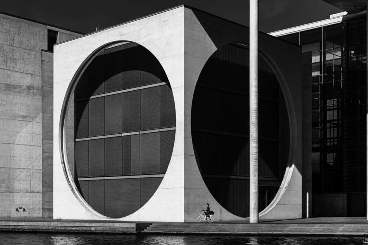
Cycling Under the Circles, Berlin, Germany, by Marco Tagliarino (Exterior)
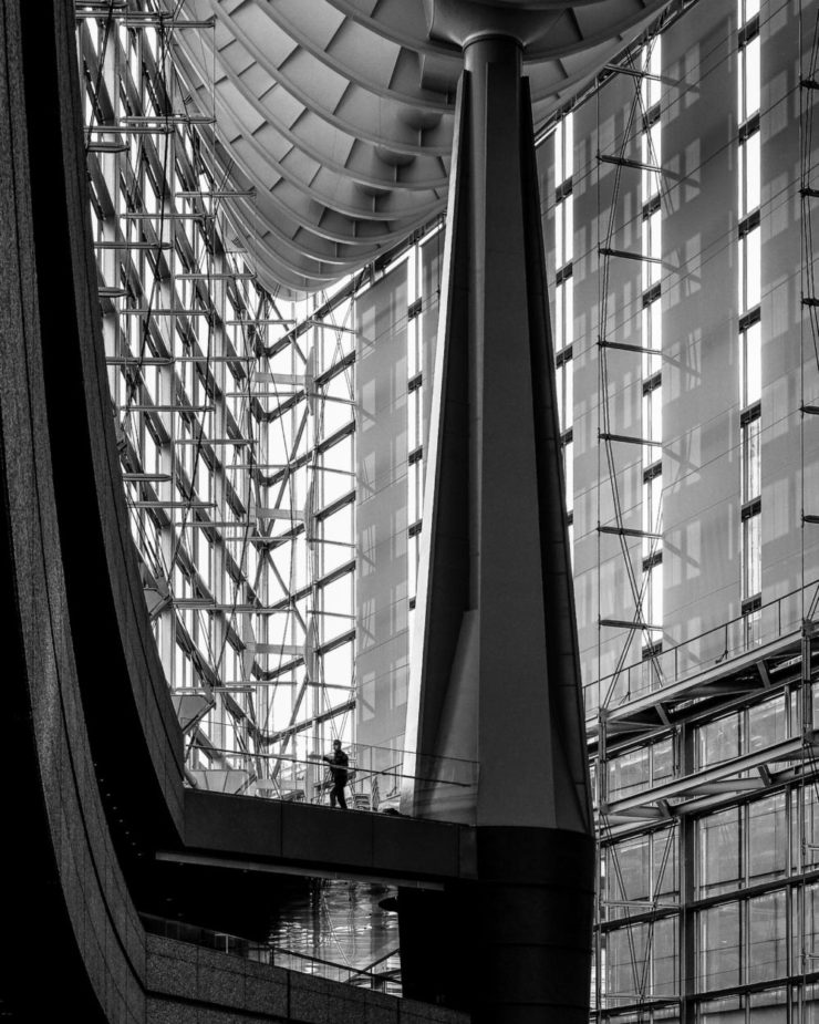
Shapes of Soul, Milan, Italy, also by Marco Tagliarino (Interior)

Entry photographs are divided into six categories: Exterior, Interior, Sense of Place, Buildings in Use, Mobile (with Bridges being this year’s theme), and Portfolio (focusing on the theme of Transport Hubs).

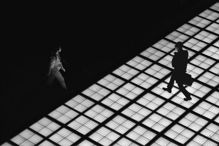
Glass Floor, Tokyo, Japan, by Tom Ponessa (Buildings in Use)
Architecture 1, location not listed (but pretty cool, IMHO), by Stephane Navailles (Bridges)
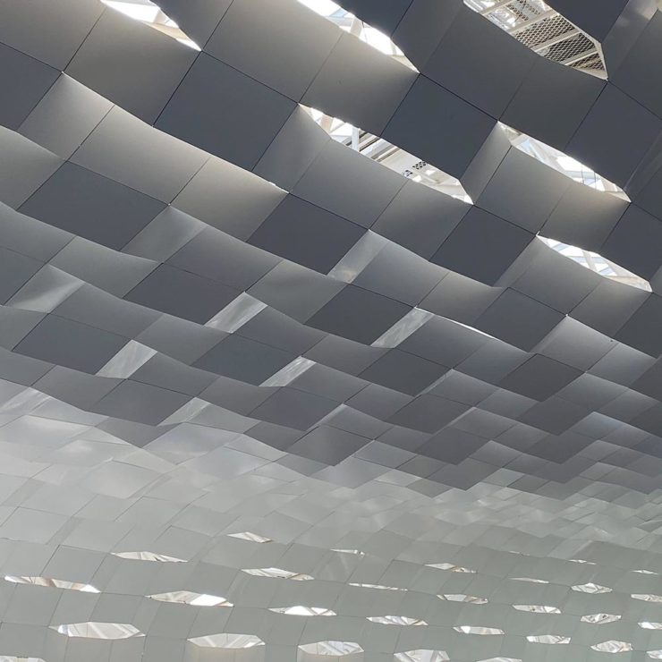
Shenzhen Bao’an International Airport, China, by Kangyu Hu (Transport Hubs)

There are many more to be enjoyed: ArchDaily has an article and gallery up, and the Guardian has a gallery, too. Enjoy.

The post’s featured photograph, top, is Nest, Dali, China, by Alex Chan, from the Exterior category.

Beautifully Briefed, Early July 2022: The Autopian, The Ford Heritage Vault, and an Eames Follow-Up

Car site The Autopian scores with book design, Ford posts old marketing material gold mine, and more on the Eames Institute of Infinite Curiosity in this edition of Beautifully Briefed.

Autopian suggests book design

The Autopian, founded by a couple of former Jalopnik writers, is a new automotive gem: in these days of more-of-the-sameism sites trying to make money of others’ ideas, the Autopian has a retro style and interesting, original content.

Including this short post from their Cold Start column:

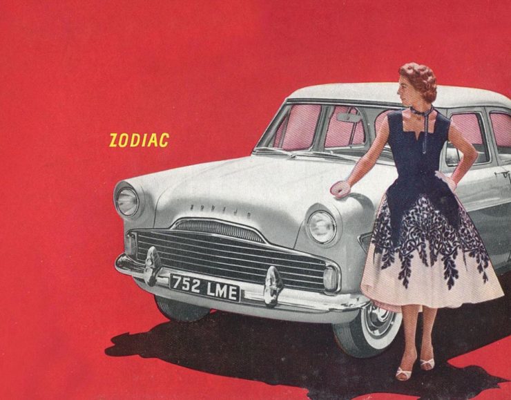
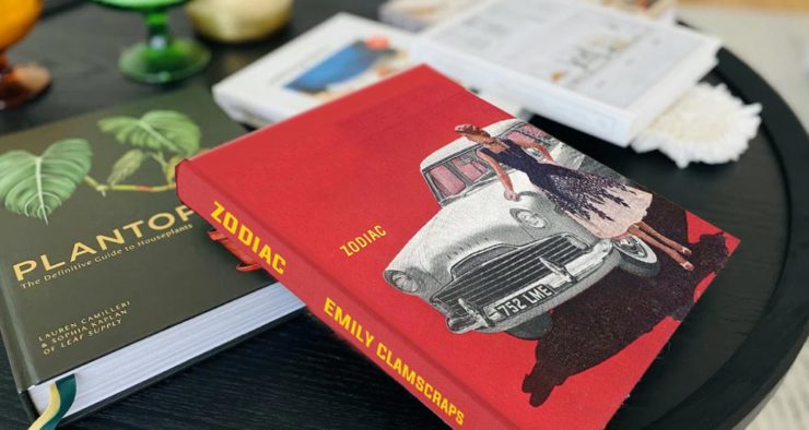
Sometimes you may encounter an old car ad and realize that the design of it could lend itself very well to something completely different. In this case, this 1958 Ford Zodiac ad, with its rich, saturated colors, striking dress on the model, and evocative name with understated typography just feel like something you’d see on modern book cover design.

Jason Torchinsky, Autopian Founder

The ad:

A 1958 Ford Zodiac (European)

His book design idea “realized”:

Jason’s book cover mock-up. Love the author name.

Nice.

The Ford Heritage Vault

Ford has taken the unusual step of posting a good chunk of their old — 1903 to 2003, their first 100 years — marketing materials online: “promotional materials, photographs, and all kinds of other historical goodies,” according to CarScoops.

“Our archives were established 70 years ago, and for the first time, we’re opening the vault for the public to see. This is just a first step for all that will come in the future,” says Ted Ryan, Ford archive and heritage brand manager.

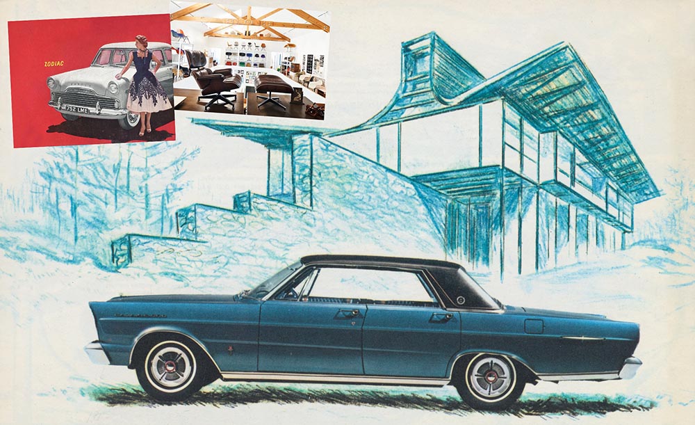
Here’s a personal favorite: the 1965 full line brochure, showing the cars set in architectural drawings — presumably, matching the car to the house:

The 1965 Ford Family of Cars brochure

Fancy a drive down memory lane?

More from the Eames Institute

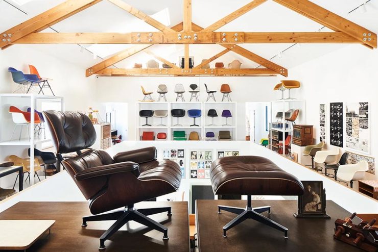
We discussed the Eames Institute of Infinite Curiosity back in April, but Metropolis magazine has published an extensive article covering a visit to the Institute.

Modernism has largely been diluted from a series of ideas rooted in social change to one of just style—Instagram moments, if you will. The Eameses insisted that they did not have a style or even an “ism.” […] Modernism was an idea, not a style. With the establishment of the Eames Institute, I hope Charles and Ray will be remembered most of all for their ideas and processes.

Kenneth Caldwell, Metropolis
An exhibit at the Eames Institute of Infinite Curiosity.

With our ongoing struggle to use materials more efficiently, many of the Eameses’ ideas and ideals need to be taken for the solutions that they are: style with incredible substance.

Read the whole article at Metropolis. (Via ArchDaily.)

Beautifully Briefed, Late June 2022: AIA’s Best Architectural Photography, 2022 Logo Trends, and … Buick!

Three items for the end of June, 2022: AIA Los Angeles announces photography awards, the 2022 edition of the Logo Lounge logo trends report is out, and Buick makes its new logo official. Let’s get into the details.

AIALA Photography Awards

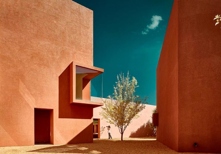
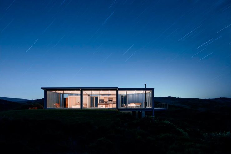
The Los Angeles chapter of the American Institute of Architects (AIA|LA) has announced this year’s winners of the annual Architectural Photography Awards, and there’s some pretty great stuff:

Ryan Gobuty: Santa Fe (Santa Fe, NM)
Taiyo Watanabe: C-Glass House (Dillon Beach, CA)
Tim Griffith: Mission Bay (San Francisco, CA)

See more at AIA|LA. (Via Archinect.)

2022 Logo Trends Report

The always-excellent Brand New points us at Logo Lounge’s 2022 Logo Trends report, it’s 20th annual look at what logos and branding, as a group, are looking like this year.

Logo Lounge 2022 Logo Trends Report

[W]hile there are still corporate-looking marks being crafted there is a stronger effort to find ways to identify products that are artisanal and handcrafted.

Bill Gardner, Logo Lounge

Corporations trying to be more human. (News at 11.) But then, my use of that particular phrase perhaps betrays my lack of being in touch with the modern corporate world; I think publishing is a different animal, and prefer being part of that world despite the regular influence of corporate entities there, too.

Nonetheless, following logo trends is, from a purely graphic design perspective, worthwhile — and this report summarizes beautifully. Read on.

Buick’s New Logo, Officially

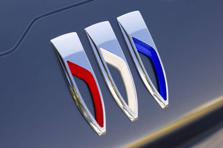
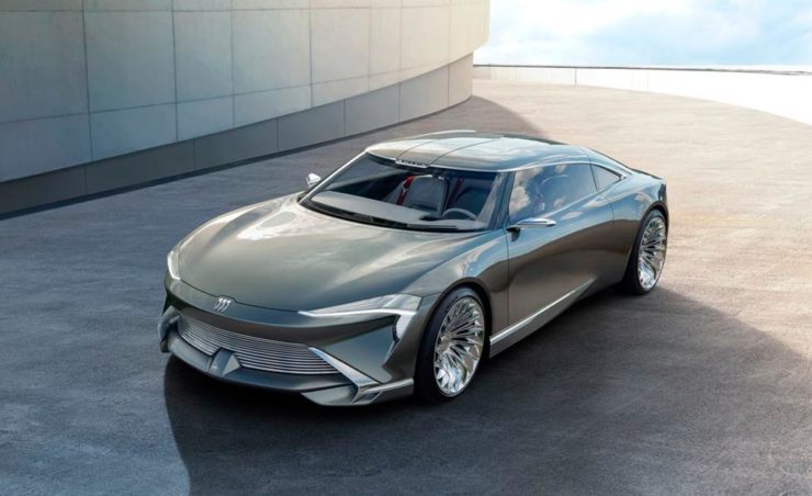
We’ve touched upon it before, but Buick has, with the release of the Electra Wildcat concept, officially updated its logo:

Official: Buick’s new logo

Electra is Buick’s name for electric cars, simultaneously stating the obvious while giving a big nod to past models — and the Wildcat concept is, dare I say it, borderline cool:

Scandinavian, American, Futuristic, Retro … Buick!

Both Buick and Cadillac have hinted at more Art Deco in their upcoming products, perhaps best illustrated on this concept’s interior:

It’s a head rest, folks.

Nice. (Not even remotely possible on a production model, but still.) Read more on Buick’s new logo and transition to an electric car brand at Car and Driver or The Drive.

See you in July!

Update, 12 August 2022: Brand New weighs in: A New Point of View… ick

Beautifully Briefed, Late March 2022: Type Museum, Toshiko Mori, and … Buick?

Catching up with a few unrelated stories that I’ve been meaning to post — including one pretty significant failure on my part, one potentially significant failure, and because not everything should be about fail, an extremely interesting and thoughtful interview.

Tiny Type Museum Sold Out

I was cleaning up open Safari tabs on my phone the other day — the detritus that results from checking things on the fly when out and about, often or never closed — and noticed that I’d sort-of bookmarked something for action and … missed it. Crap!

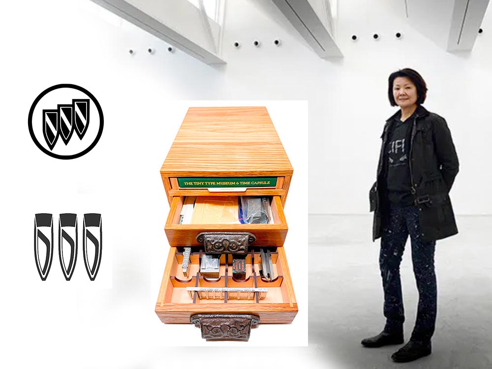
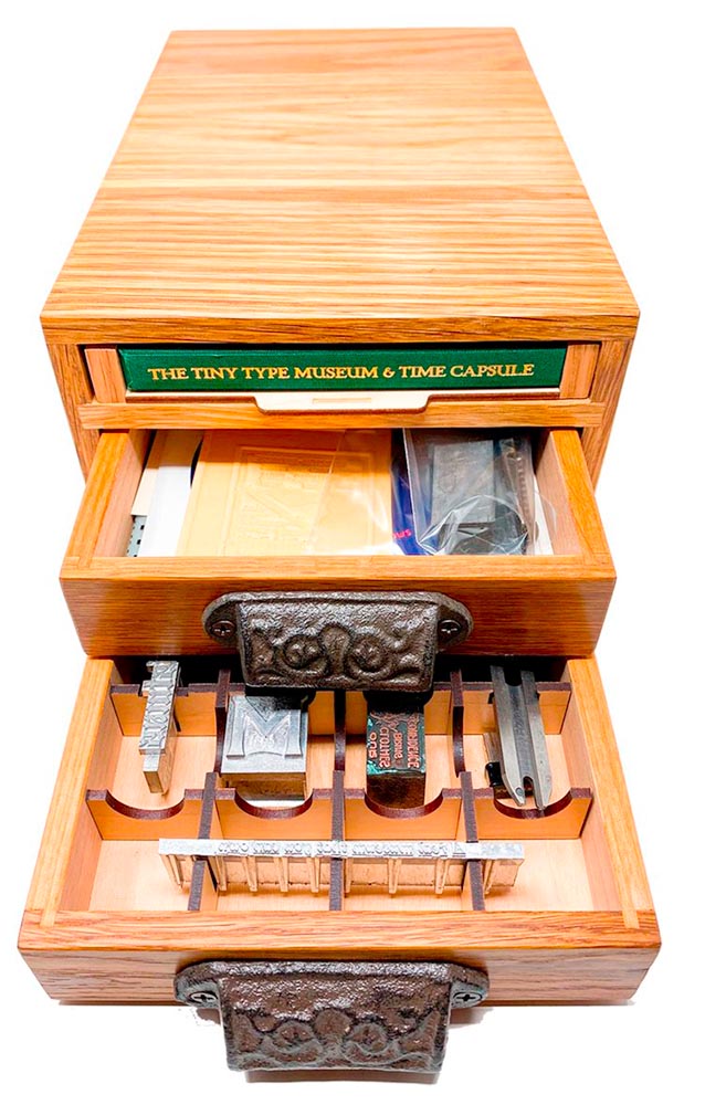
The Tiny Type Museum & Time Capsule, with specimens and those beautiful drawer pulls.

The Tiny Type Museum & Time Capsule is a celebration by journalist and printing historian Glenn Fleishman of type and printing, and an effort at preserving history for future generations to re-discover. Each custom, handmade wood museum case holds several dozen genuine artifacts from the past and present, including a paper mold for casting newspaper ads in metal, individual pieces of wood and metal type, a phototype “font,” and a Linotype “slug” (set with a custom message), along with original commissioned art, a letterpress-printed book, and a few replicas of items found in printing shops.

The Tiny Type Museum. (Bottom drawer.)

The museum includes a letterpress-printed book written for the project, Six Centuries of Type & Printing, in which Fleishman traces the development of type and printing starting before Gutenberg printed his Bible around 1450 up through the present day. This book acts as “docent” for the museum, providing insight into the stages in technological and artistic development that took place, and explaining the importance and nature of the artifacts. It also slides out neatly as part of a sled from the top of the museum case, and provides the visible name.

The letterpress book is still available: get your copy, or subscribe to the podcast. But even if you don’t, take a moment to appreciate the work that went into this — well done, indeed.

Buick’s New Logo

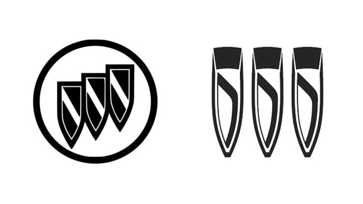
This one … I dunno. The race to do car logos flat black-and-white has seemed like a race to the lowest common denominator. (See previous coverage of BMW, Volvo, Cadillac, and more.) Below, Buick’s old (left) and new (right) logos, courtesy of Motor1:

The trademark filing for Buick’s new logo.

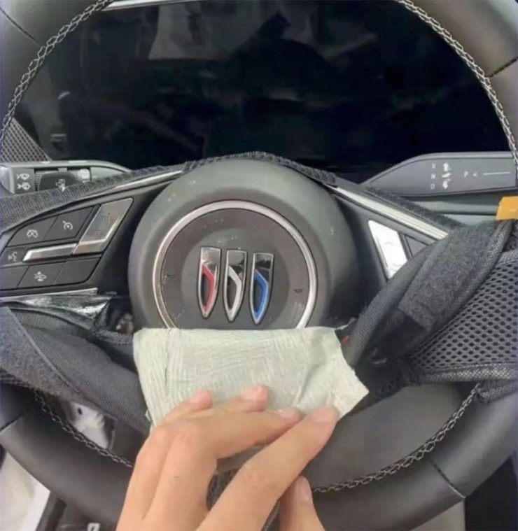
Thankfully, there’s been a leak — Instagram, natch, so no link here — demonstrating that it’ll still be in color:

From Instagram (alas): The new Buick logo in living color.

Still, not sure. Will have to see the official announcement and package that goes with it; Motor Trend suggests that it might be part of an EV-only future. Stay tuned for Brand New’s take, I guess….

Toshiko Mori

The former chair of Harvard’s graduate architecture program has given a great and wide-ranging interview to New Reader:

I think innovation doesn’t come in one huge leap. It’s a series of small steps. Accumulations of small discoveries, followed by incremental implementation. And then it all adds up. Innovation is not a single idea—it’s incredibly incremental and additive. Even these small discoveries can change the way we think about things very quickly. So I think every step of the way—problematizing “what are the issues?” and “what are the solutions?” filtering issues of sustainability, supply chain, accessibility, will eliminate many solutions which are not possible. And then you end up with small nuggets of potential. In a way it’s very systematic, innovation, and so is experimentation. It’s the elimination of what’s not possible and focusing on goals.

Toshiko Mori. Image courtesy of New Reader.

You know, history is not about the past, really. History is about the story of an individual interpreting history. Historians cannot be unbiased narrators. Every history is a story, and then yes, there are facts—which are important, but the way you connect facts and then make diverse narratives is super interesting. 

As you can see, Fox News provides false narratives, and a lot of times they skew the facts, and that’s a problem. It can be used dangerously, but it can also be used productively. I think that’s what makes history rich. It’s not about the past, it’s about projecting into the future. So when I teach students, I ask them to make their own story based upon their research. But it’s a story—so that’s kind of their own reality. And based upon that reality, they can develop diverse narratives and then communicate the story to others. It’s not as if you have different opinions, but you have different stories to share. It’s not about controversial opinions, but about the way we each look at life very, very differently—and that enriches everybody.

The whole thing is definitely worth a read: Archinect News called it a “nuanced interview,” and if anything, that’s an undersell. Please go, reflect, and appreciate.

Side note: New Reader‘s notes throughout the interview deserve special mention (see the red Greek letters and separate, well, sidenotes). Nice.

New and Updated Galleries: Woodland, Thomaston, and Yatesville

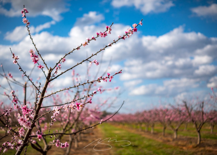
The end of winter here in Georgia means beautifully warm days, flowers and trees budding, and photography. Gerald and I took a road trip this weekend, enjoying almost 200 miles of driving — and four photostrolls.

We’ll cover three today, heading west from Middle Georgia:

Yatesville Peach Blossoms #1

See everything from Yatesville, pop. 408, here.

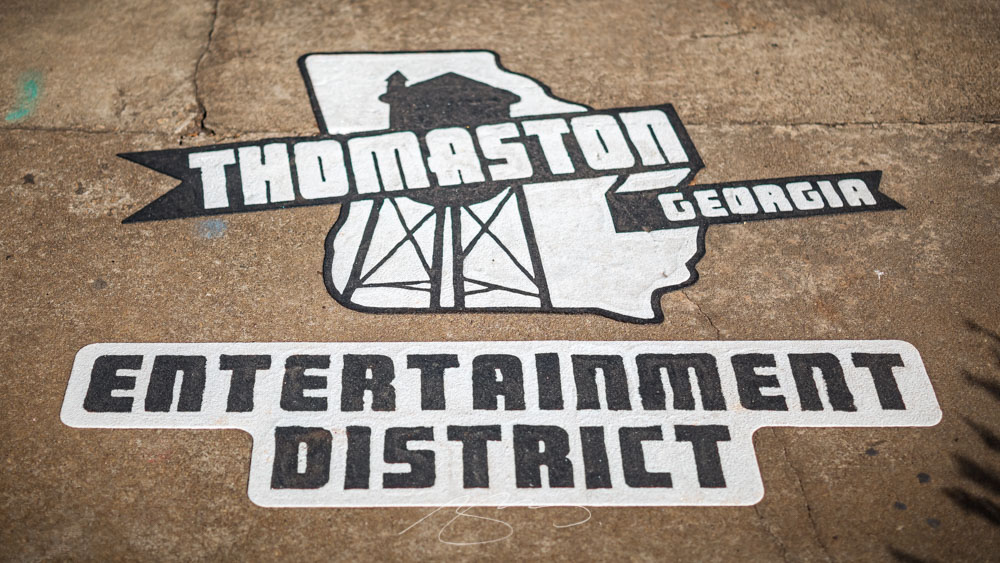
Next is an update from Thomaston, whose downtown square is typical of Georgia:

Upson County Courthouse (B&W Study #2), 2022

That gallery is available here.

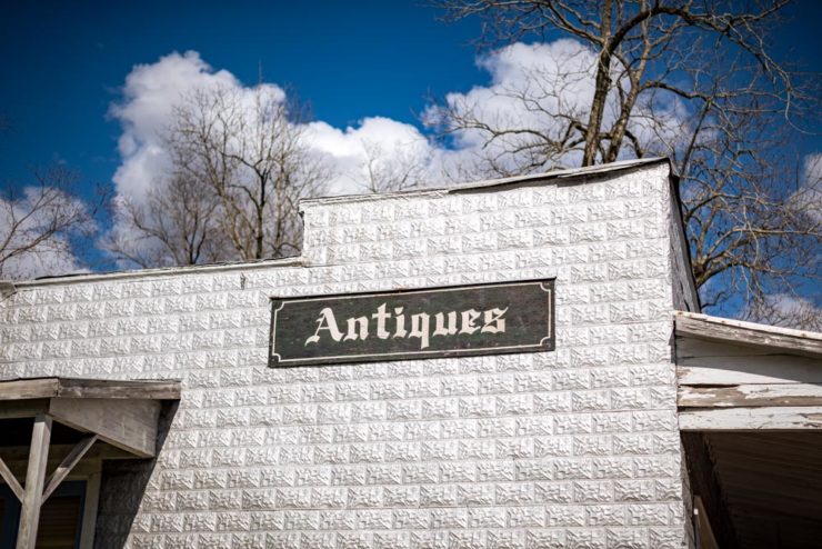
Lastly today is a new stop: Woodland, in west-central Georgia, near Pine Mountain and Warm Springs, northeast of Columbus.

Woodland Antiques
Postal Angel (Awning to be Free)

Woodland, whose population also happens to be 408, has a gallery here.

Many thanks to Gerald for the company and good day. Next up: FDR State Park, likely tomorrow.

Beautifully Briefed, December 2021: Holiday Edition

Beautifully Briefed, December 2021

It’s the yearly wrap-up and the holiday season! Recap and Rejoice!

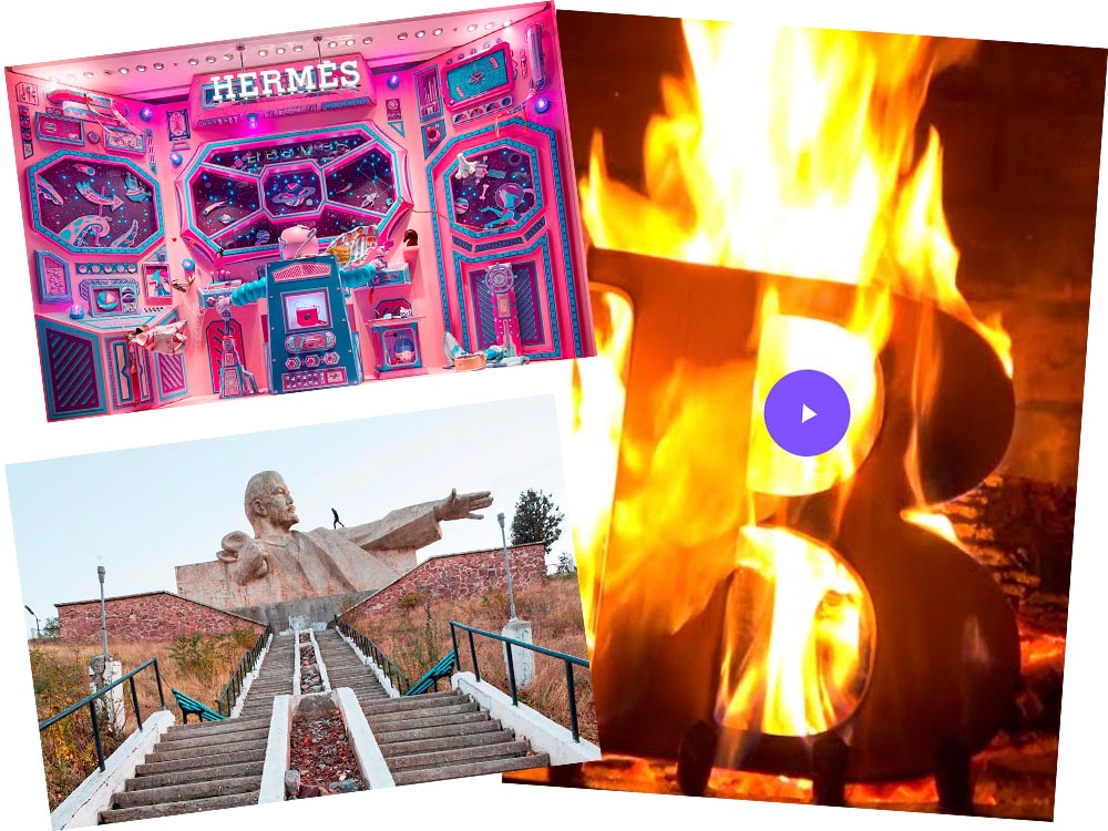
Hermès Does Windows

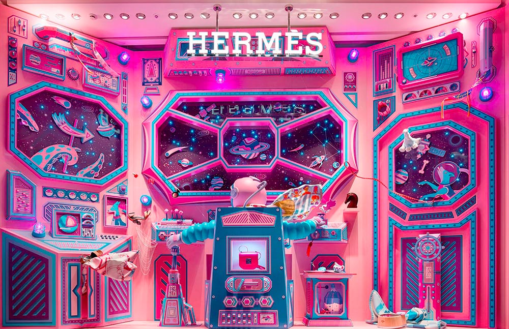
“Journey of a Lifetime” is this year’s window display for Hermès — yes, Hermès should have an accent, but I can’t seem to summon it today fixed! — so let’s go with a picture instead:

Hermes window display

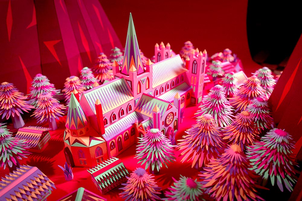
All in paper. No, let me repeat that: it’s all paper. (Well, perhaps some glue.) From artists Zim and Zou. Here’s another, one of their earlier works:

Zim and Zou, previously

Read more at This is Colossal about the window and the church. Nice.

Yule Ogg

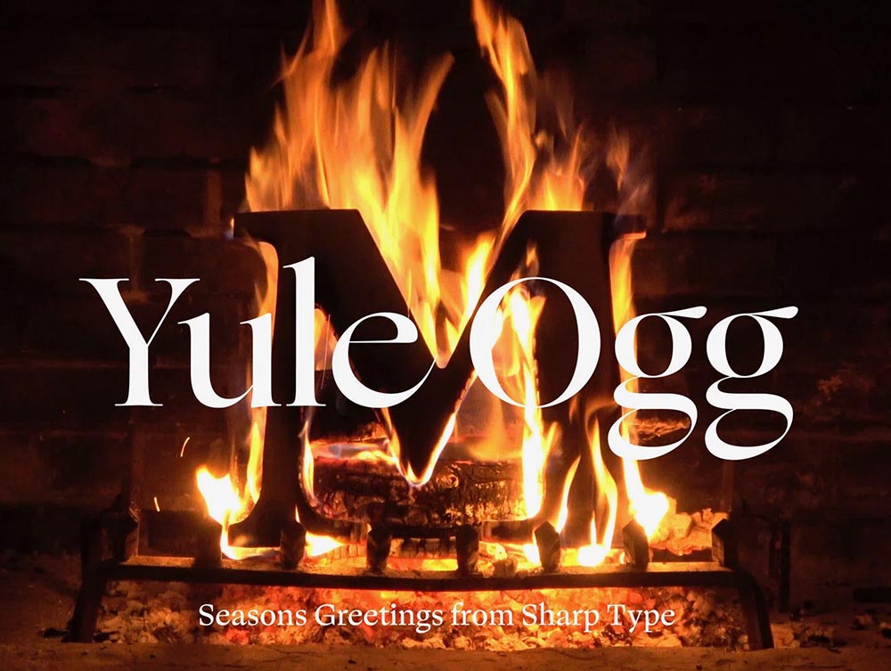
While we’re on the subject of the holidays, check this out:

Yule Ogg

That’s right, it’s one of those four-hour Yule log videos — but with a twist. Those are wooden type pieces going up the flame. Check it out, along with the backstory, at It’s Nice That.

Top Architectural Photography Projects

Closing out, we start the year’s “best of” round-ups, this one Dezeen’s top 10 architectural photography projects of 2021:

Soviet (Asia) Photography

Above, Soviet architecture, central Asia, by Roberto Conte and Stefano Perego. Below, Structure Photography by Nikola Olic:

"Poetic" Architecture Photography

The latter is called “poetic,” a description I’d completely agree with. The Mother Road, USA, by Hayley Eichenbaum (previously mentioned) is there, too. Enjoy.

That’s it until after the holiday. Around the first, stay tuned for my favorite book designs of 2021 and more. Take care!

Beautifully Briefed, October 2021: Architecture Photography

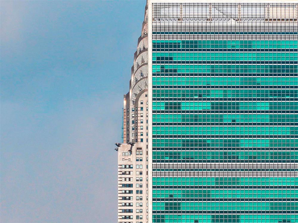
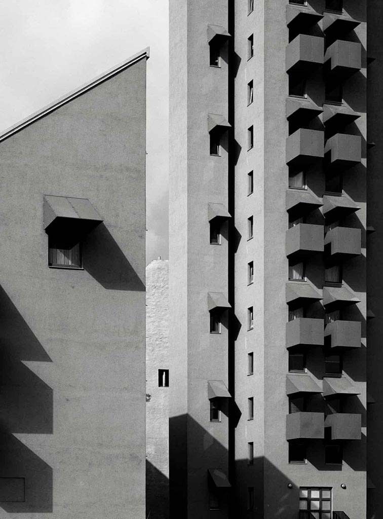
Arch Photo Oct 21

Two very different yet very impressive architectural photography items caught my eye this month.

Hélène Binet’s Architecture Photography

Let’s start with an article in the Guardian (UK) on Hélène Binet:

“It’s like being a musician in front a big audience. You can’t get it wrong. In that instant, you have to be the best of yourself, you bring your mind to a place, not to lose that unique moment.” Hélène Binet is explaining her commitment to working with the venerable techniques of analogue, as opposed to digital, photography[…].”

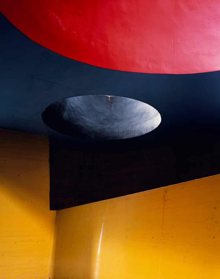
She manages to capture exactly the kind of thing I strive for — potentially abstract, detail-oriented, yet somehow . . . different:

HB3740

And:

HB3k

Beautiful. If you’re in the UK, check out Light Lines: The Architectural Photographs of Hélène Binet, at the Royal Academy, London W1, 23-October-23 January.
Romain Veillon’s Architecture Photography

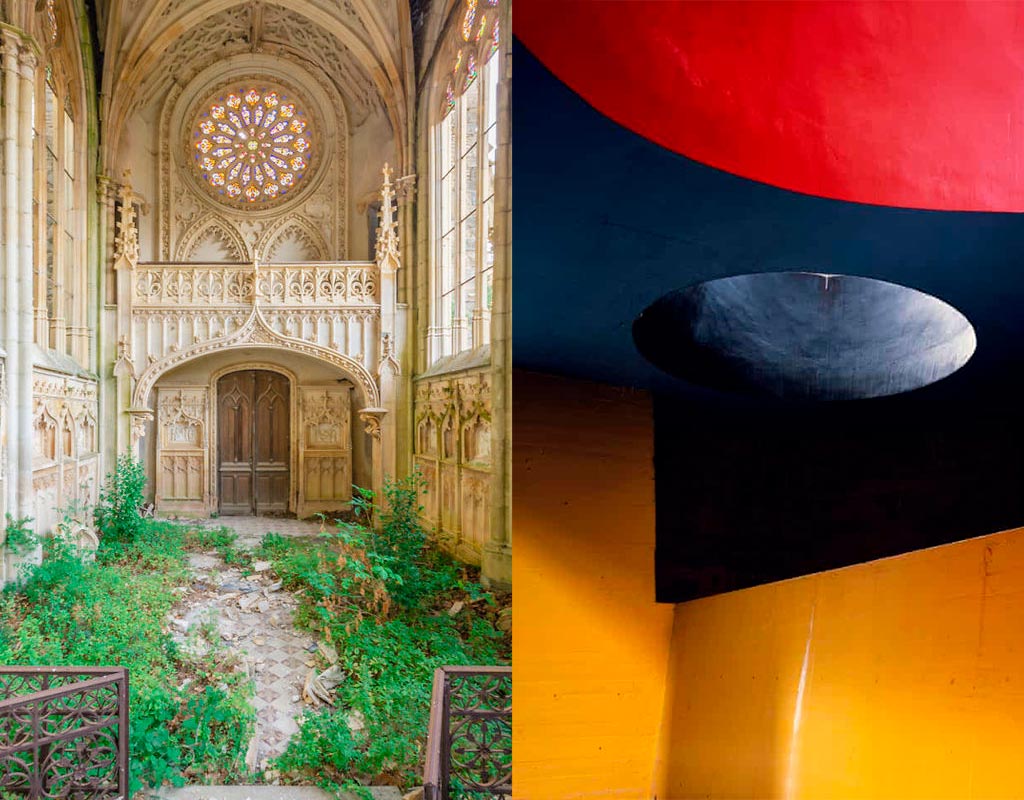
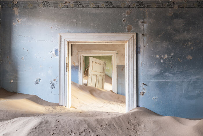
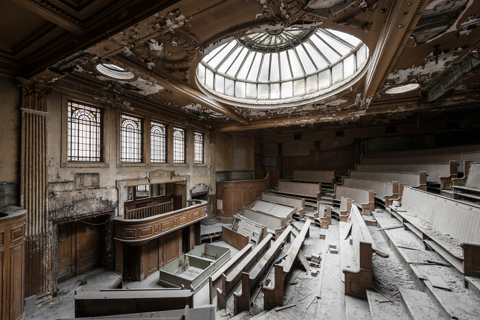
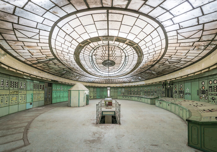
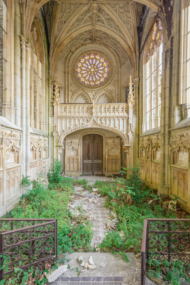
Meanwhile, from France, we have another: award-winning photographer Romain Veillon with architectural “decay:”

RV1

Brilliant. More:

RV5
RV2
RV4
RV3

He’s got a book out — Green Urbex: The World Without Us (French-language only, alas) — but the photographs don’t need translation. Learn more on ArchDaily.
New Gallery: Vassar College

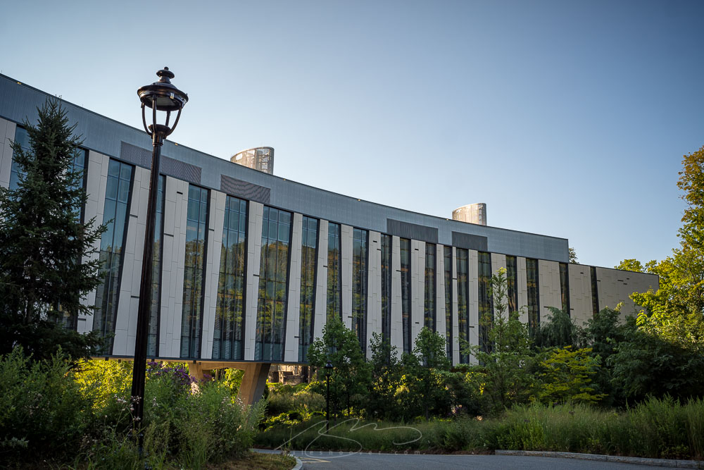
Vassar featured image

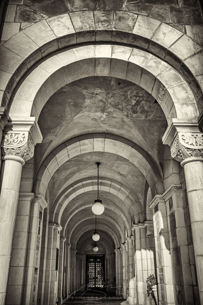
Many, many moons ago, my late sister attended Vassar College. I had an occasion to stay in Poughkeepsie, NY, where Vassar is located, and went over on a beautiful morning and spent some time wandering around with the Leica.
Chapel Hall, Vassar
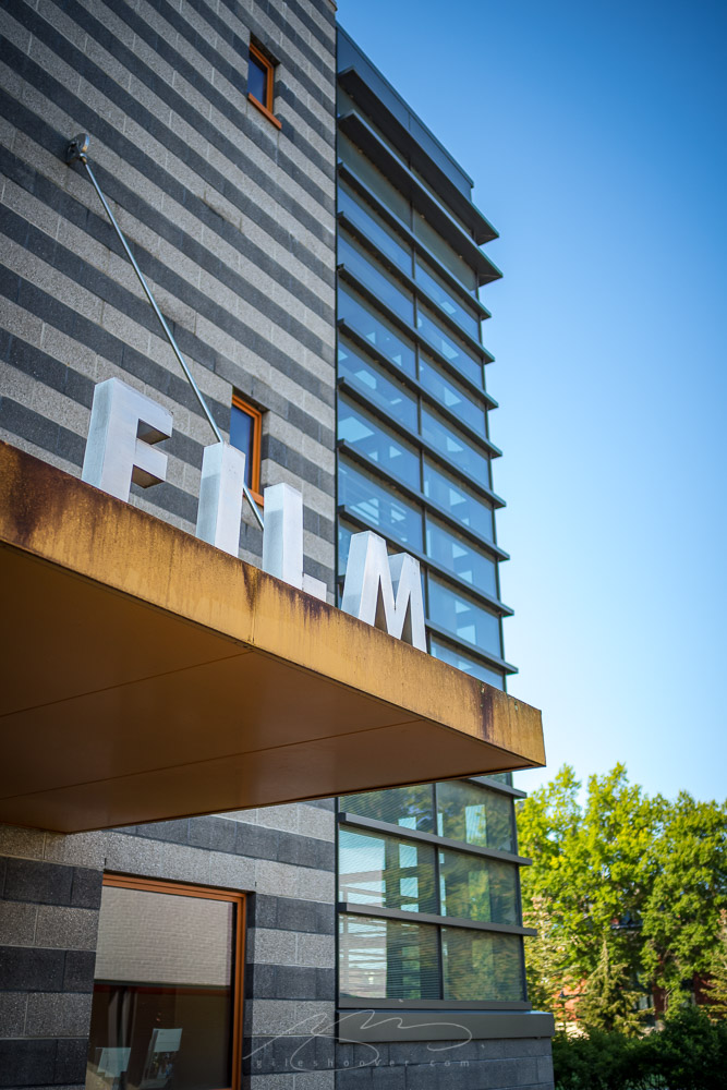
Film, Vassar

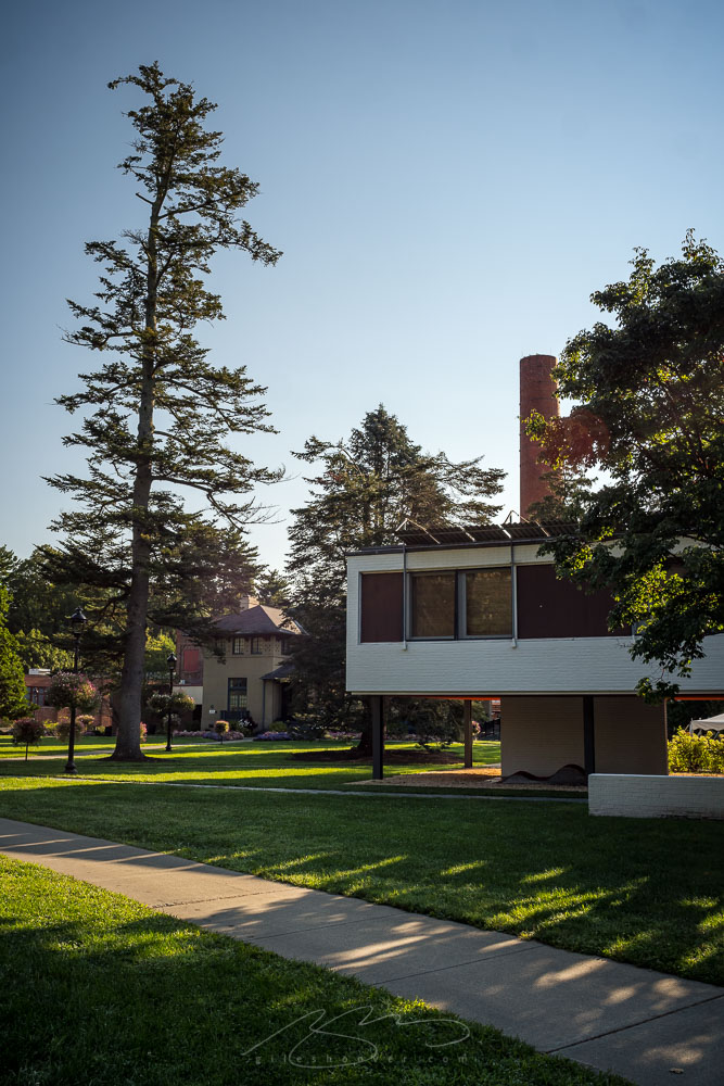
It’s a beautiful campus; a mix of modern, mid-century, and classic architecture — with a little mid-century thrown in:

Architecture mix, Vassar

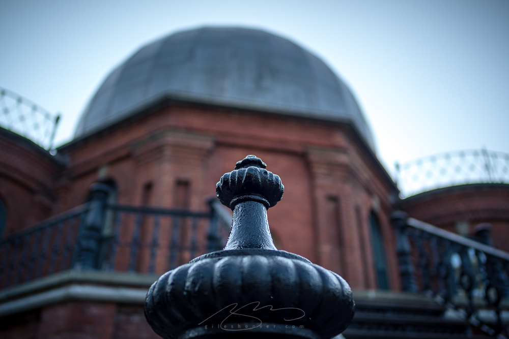
For many years, Vassar was a women’s (-only) college, and it was nice to find the National Landmark observatory building — a reminder that even in the 1800’s, women were doing scientific research:

Vassar Observatory

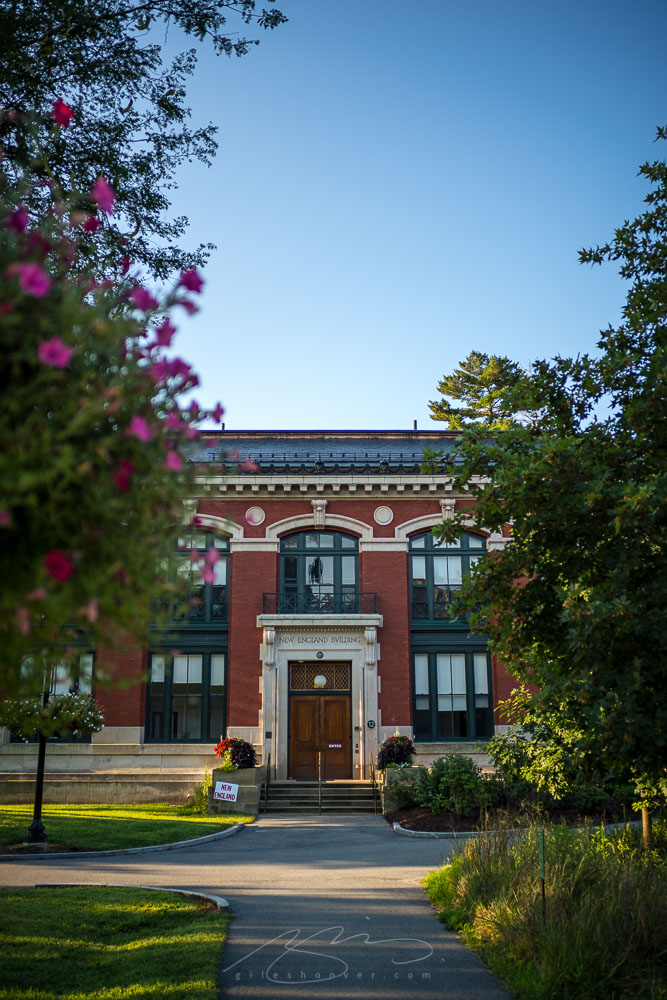
The New England building:

New England Building, Vassar

An enjoyable visit, a beautiful, incredibly well-tended campus, and a tranquil late summer morning at a renowned college. I was delighted to visit, and pleased with the resulting photographs. See the rest here.