
Lettuce first apologize for not having an update in a minute, but I’m going to try to make up for it with this word salad delicious selection of items I’ve been setting aside: ABCD book design, impossible book design, some thoughts on DPReview, Architecture in Music, Hoefler’s typographic illusions, and, because you deserve it, the Great Wave in 1-bit. Enjoy.
Book Design #1: ABCD
“Winner of All Winners,” says The Academy of British Cover Design (ABCD):
“Pearson’s design was judged to be the best book design to have won an ABCD award in its decade-long history,” says The Bookseller.
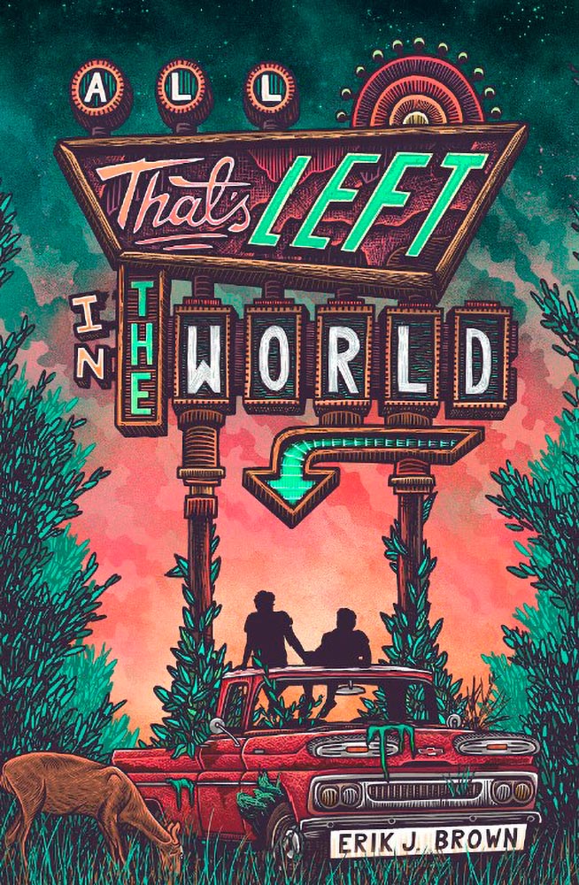
Meanwhile, their “Best of 2022” list included several I named as well, along with a few I hadn’t seen. The illustration that is the cover design for this young adult title, for instance:
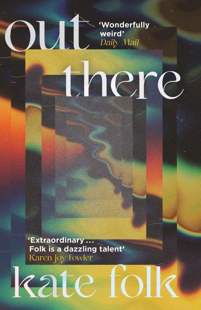
Out There fills its “wonderfully weird” billing incredibly well, too:
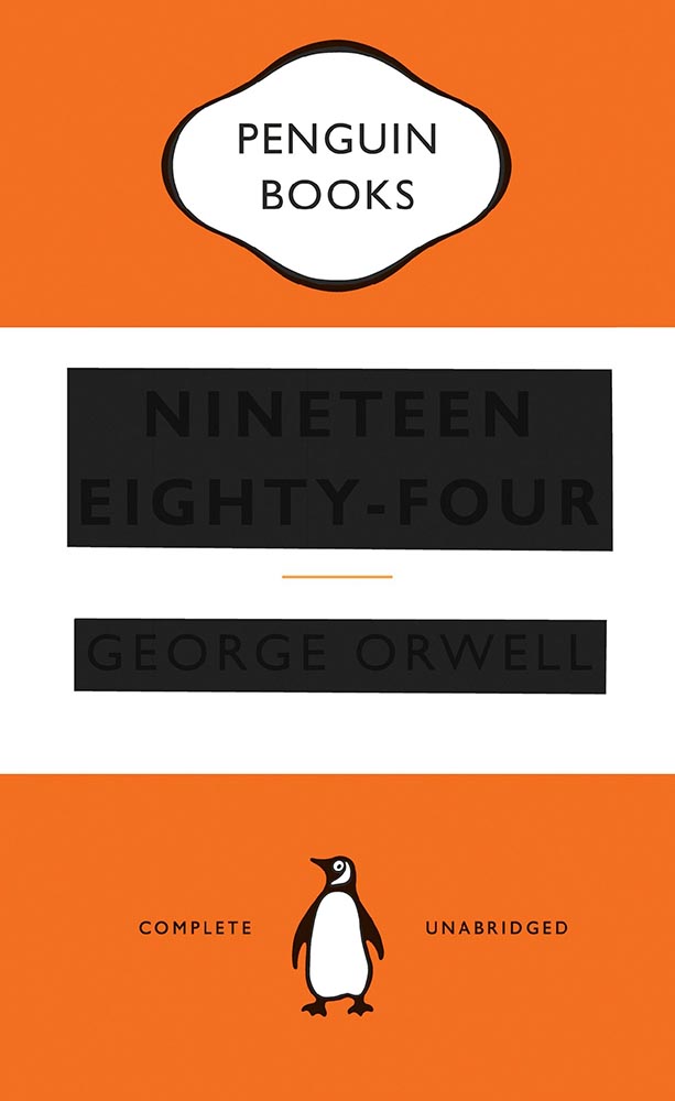
Alas, the US version:
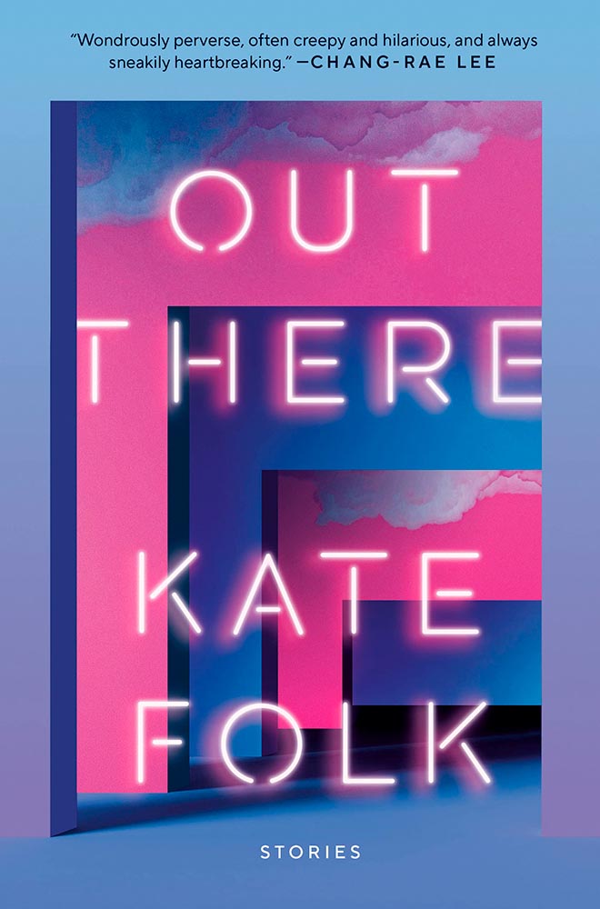
I often discuss UK covers when they’re pointed out somewhere, but as a general rule, my book design coverage, for lack of a better term, is US-based. Some other time, I do want to discuss why the UK covers are, generally, better than their US counterparts — as the above illustrates.
Anyway, read Design Week‘s excellent article on those and all the Academy of British Cover Design winners of 2022.
Bonus: I ran across Penguin Galaxy’s 2016 version of an Ursula Le Guin title I’ve got on my read-that-someday list — and love the cover design:
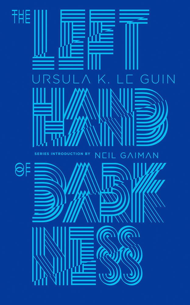
The whole series is awesome, in fact. Check it out.
Book Design #2: The Impossible Bamboo Hardback
The Eyes & the Impossible the first-ever book to be published in two editions, for two readerships, and from two publishers: Knopf has one, in standard form, for the young adult audience.
The other one, however…:
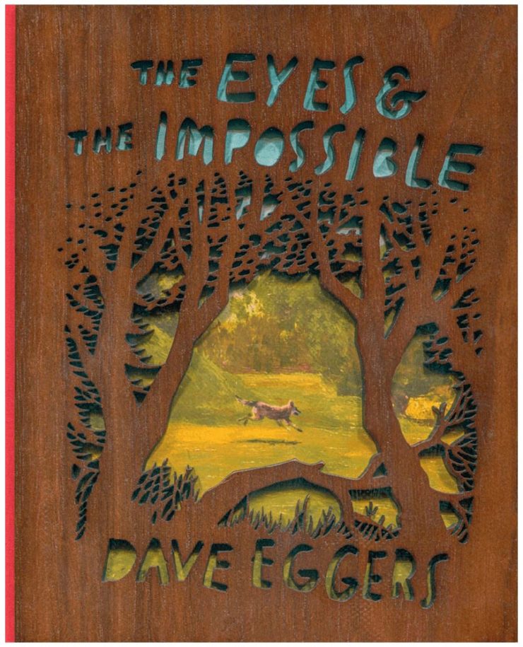
Yes, that’s an illustration showing through laser-cut bamboo, with a glimpse at the red cloth spine. There’s no way to summarize this design story in a way that does it justice, so just go to PRINT and read the whole article. Great stuff.
Photography #1: DPReview Shuttering
Digital Photography Review, long known as just DPReview, is being shut down. Started in 1998 by Phil Askey, it’s currently part of Amazon and is arguably the internet’s leading camera database — with over a thousand reviews of cameras, lenses, and related items, 24,000 articles, some 2.7 million comments, and more.
Perhaps most valuable, and something that will be missed by many, is their large selection of galleries: lenses and cameras, all in a way that can be compared side-by-side, an invaluable tool for those looking to purchase a new toy essential item for their photography bag.
Askey, who left in 2010 (three years after the Amazon acquisition) blasted Amazon’s short-sightedness:
I meant to write about this long before now, but there’s an interesting thing commenting more than a month later: they’re still there. Like many corporate decisions these days (ahem, Twitter), something changed — but it doesn’t matter. The damage has been done, foot shot, whatever. The reporters have moved on, the articles have slowed to a trickle, and updates have been greeted with skepticism.
What a shame.
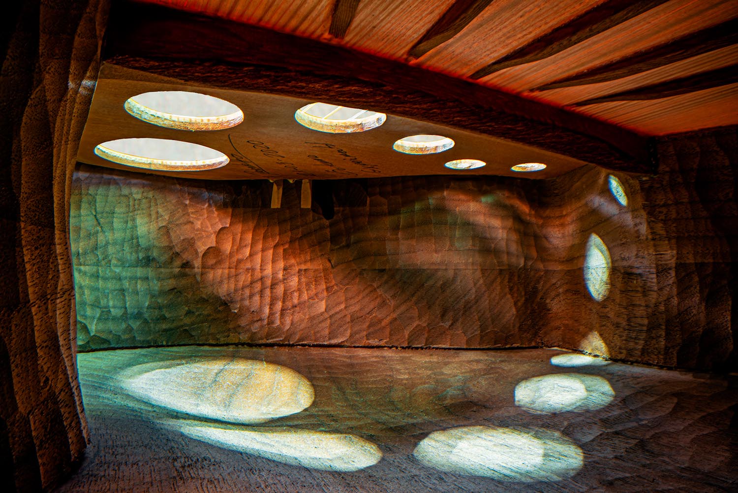
Photography #2: Architecture in Music
I somehow didn’t write on this one last time I saw it — so when a new series was covered by This is Colossal, there’s no way it wasn’t going to be celebrated here:
Recognize it? No? How about this one:
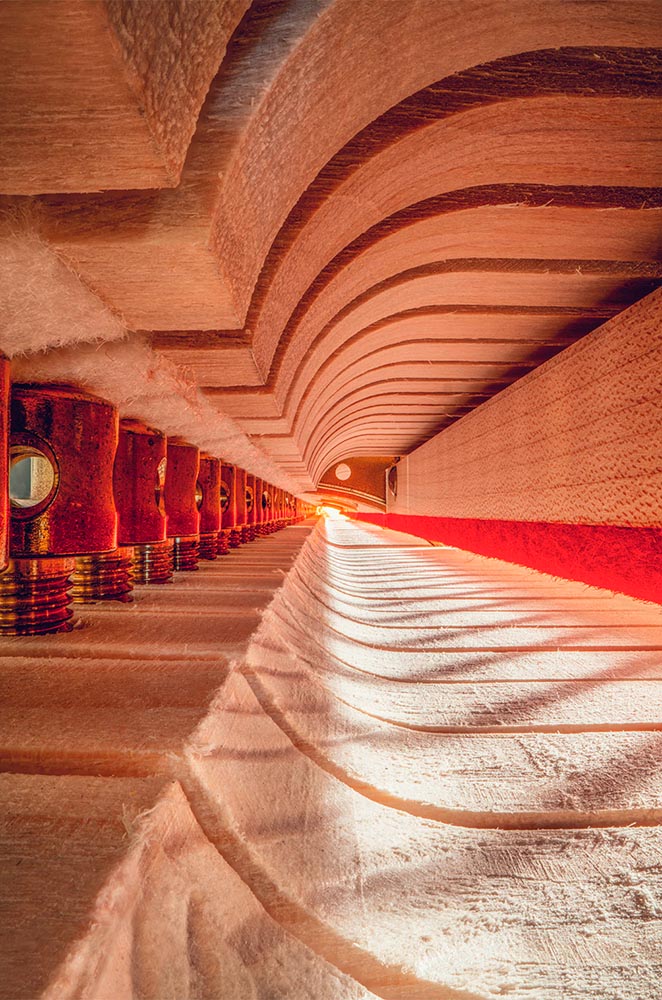
Charles Brooks, a twenty-plus-year overran of orchestras around the world and a cellist since childhood, has taken a probe lens and put it inside some of the world’s amazing instruments. The results are magical:
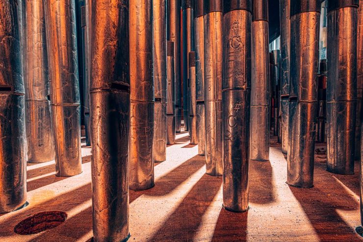
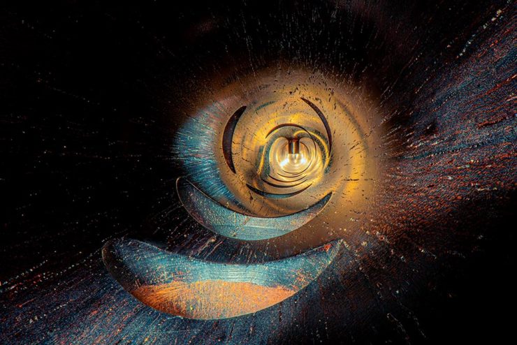
See many more here (2023) and here (2022). (See also this post’s header image, “Siete Lunas’ Guitar by Roberto Hernandez.”)
Typographic Illusions
Hoefler & Co. points us at necessary illusions in typography:
Highlighted on Netflix’s Abstract: The Art of Design, these “cheats” show us that letterforms are so much more than just shapes drawn to stylize characters.
Since a number of people who teach design have suggested that we manufacture these for use in the classroom, I thought I’d take the more direct approach, and make them available as a free download, as a PDF that can be printed on transparencies. Whether you’re teaching typography, studying it, or just giving letters a closer look for the first time, I hope you’ll find these useful.
—Hoefler & Co.
Absolutely. Check ’em out.
One-Bit Wave
Last but not least this Monday morning, let’s please celebrate Great Wave Off Kanagawa — in glorious 1-bit greatness:
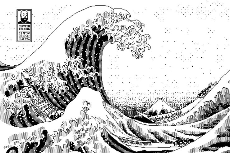
I usually use either my Quadra 700 or PowerBook 100, mostly because those are my reliable and easy to access computers (that run System 7, my favourite and most familiar OS of that era).
Software-wise I use Aldus SuperPaint 3.0, which is what my family had when I was a kid. Yes, I’d say that all of this is 99% nostalgia-driven…
—James Weiner
Incredible. There’s more info at his fantastic web site (done, naturally, in the style of a classic Mac system). Thanks to Kottke for the link.
Bonus: As I was writing this, he was posting 1-bit emoji. Sweet!
Have a great week!