It’s been thirty-two years, four months, and fourteen days since I hung out a shingle to announce that The Hoefler Type Foundry was open for business. What started as a sole proprietorship grew into the Hoefler&Co of today, a diversified design and technology practice with an international reach, still dedicated to the invention of original, thoughtful, and hard-working typefaces.
Meanwhile, “nothing will change,” Jonathan Hoefler (previously) says, except that he’ll be stepping down. That’s kind of a big change, IMHO — but after using typography to “help elect a president,” where do you go from there? Read more here.
In happier news, the much-delayed new Bond movie, No Time to Die, is finally in theaters next week.
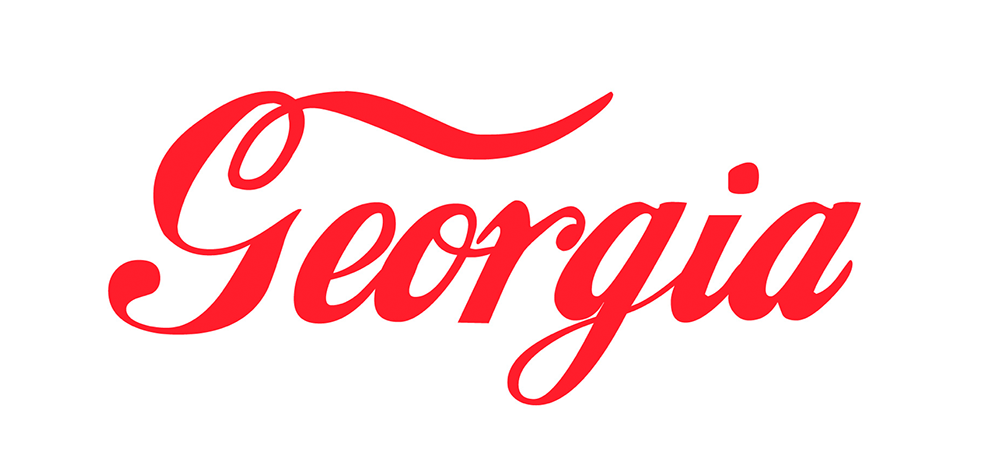
Keith Fleck has gotten a good deal of press for his Corporate States of America, but in case you haven’t seen it, it’s absolutely worth a look. Maine’s L.L. Bean, Florida’s Publix, and, of course, Georgia’s Coca-Cola are all winners. 51 bonus points!
Lastly for this month, some book design:
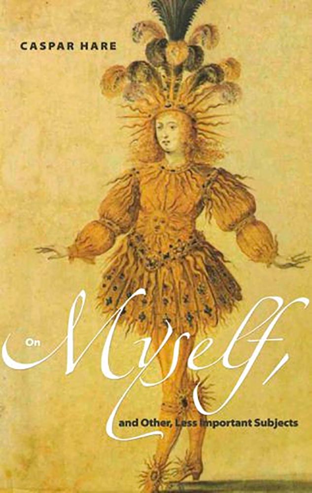
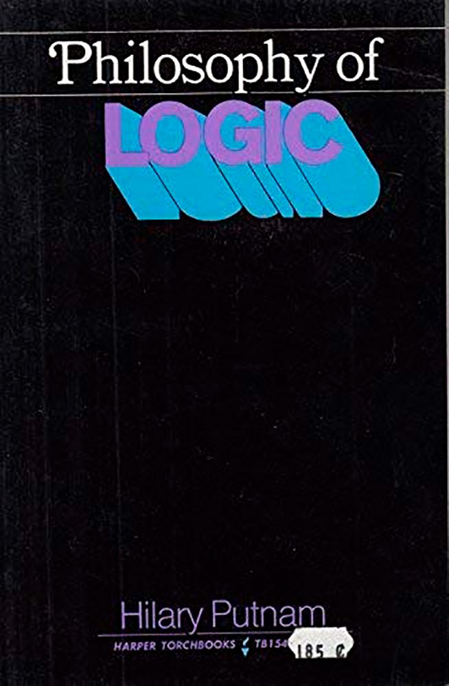
Daily Nous asks their readers to nominate the best philosophy book covers — Judging Philosophy Books By Their Covers — and there are some winners, some absolute losers, and a few funny moments, too:
“This always reminded me of a rejected Black Sabbath album cover or something,” says the poster. Nice. (And only 185 cents!)
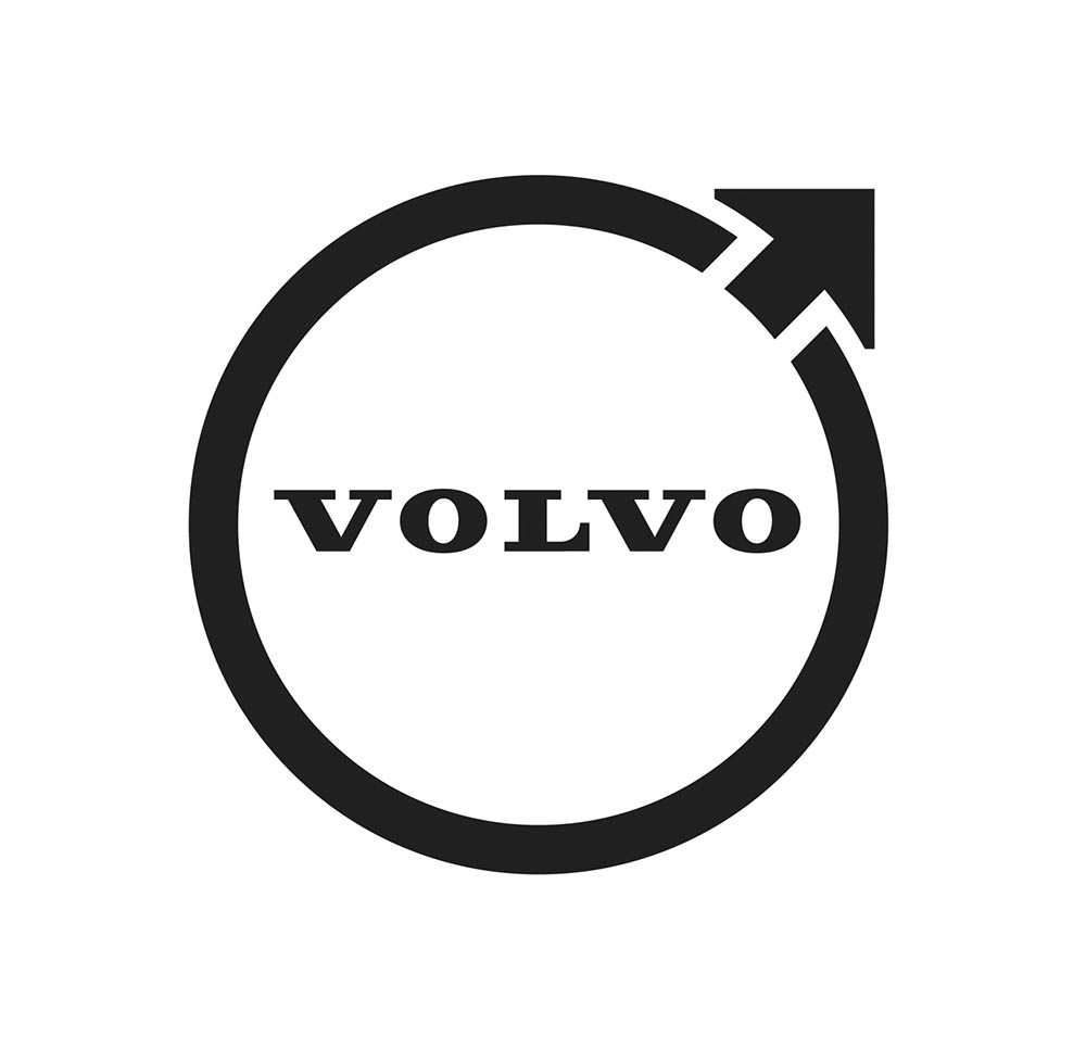
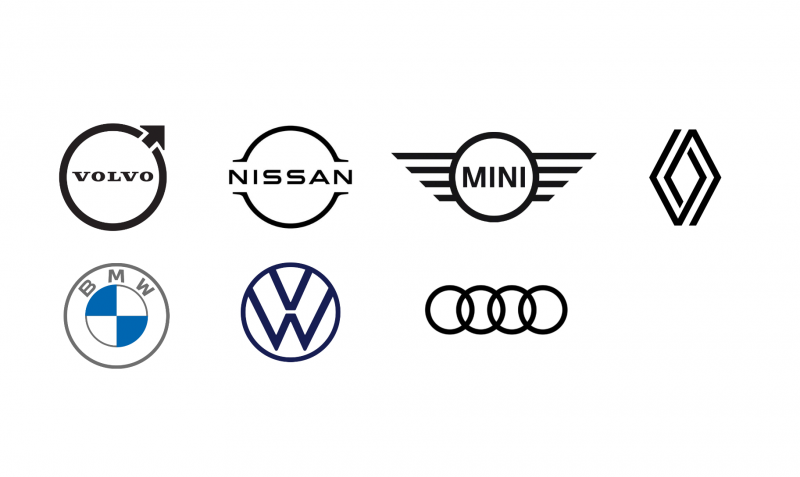
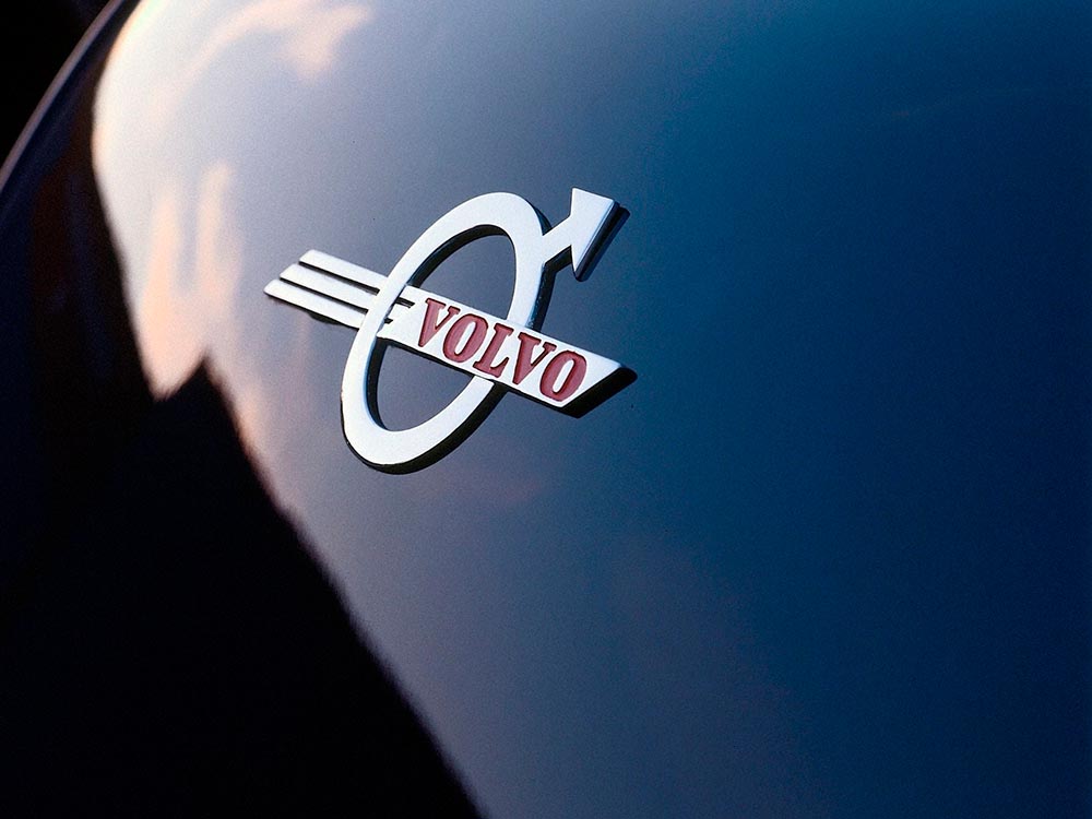
The “Iron Mark” has been given a makeover, and the result is … interesting. First, as a reminder, here’s the logo as it appeared previously — no, the one previous to that:
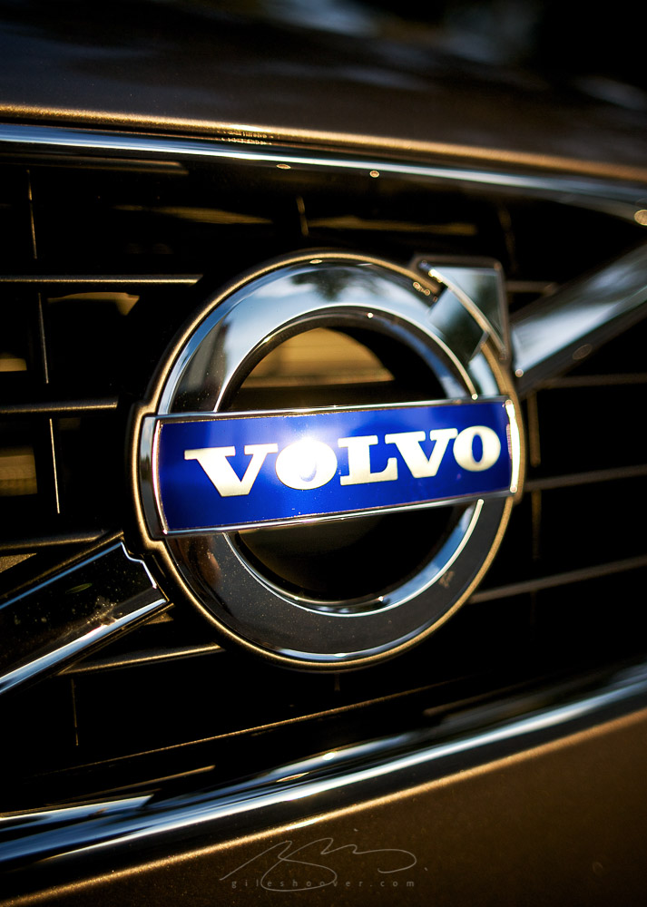
My mother’s 2010 Volvo S80
The blue has been associated with Volvo’s logo for a long while now, and it’s slowly been disappearing from the lineup (in favor of black in the same location). However, they’ve decided — they being both Volvo Cars and Volvo Group, two distinct entities (the latter including Volvo Trucks, the Volvo construction folks, Volvo Penta [marine], etc.) — to change to this new, more austere logo and word mark simultaneously. Aaaaaand:
See the previous coverage on Foreword. Can’t go, however, without a hat tip to Kristen Shaw at The Drive, who dug out this 1937 version — which, I’d argue, beats ’em all. Kudos.
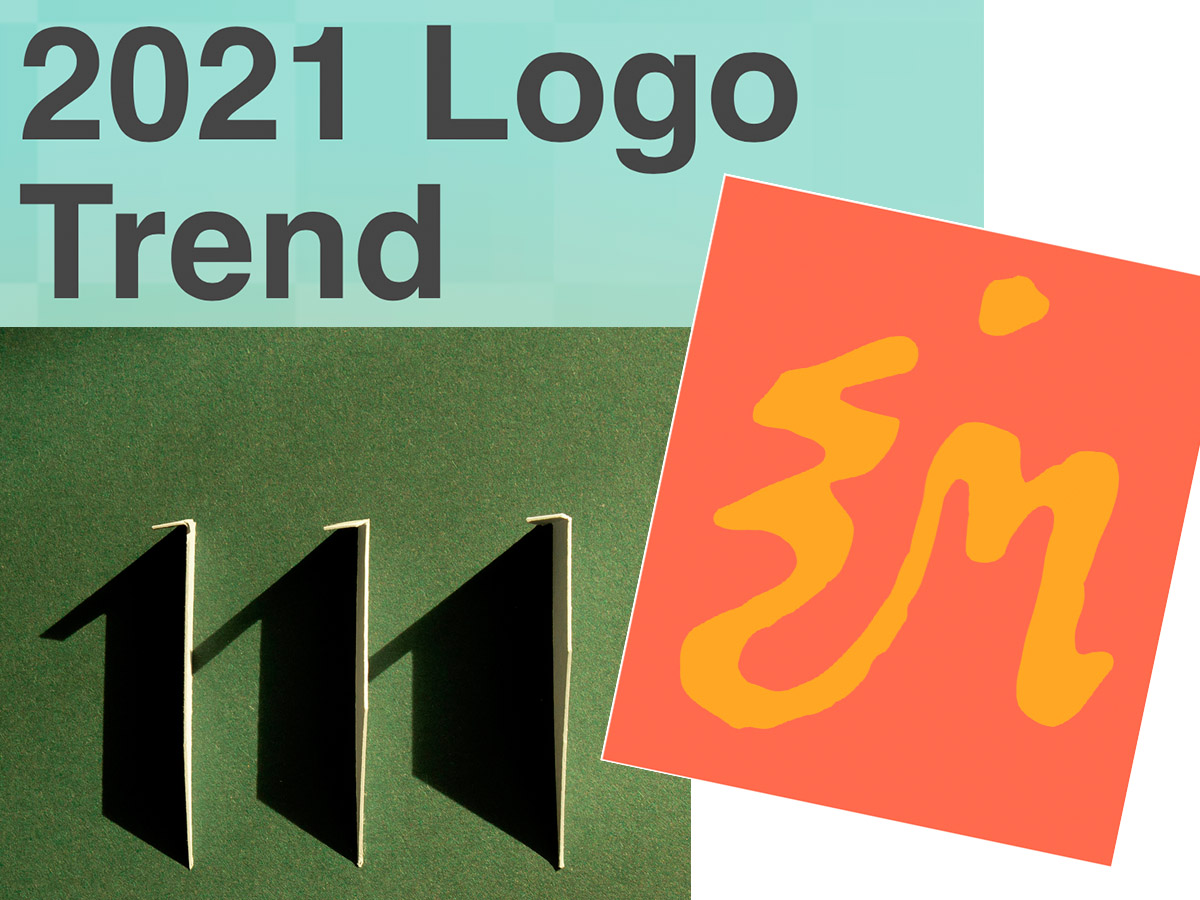
Three items for you here, starting off with the 2021 Logo Trend Report, from the Logo Lounge. From the Asterisk to Electric Tape, Quads, Chains, and more:
Bill Gardner discusses all fifteen different trends, with logos to back ’em up (naturally).
Next, “A Cabinet of Curiosities” from Hoefler & Co.
Printers once used the colorful term ‘nut fractions’ to denote vertically stacked numerators and denominators that fit into an en-space. (Compare the em-width ‘mutton fraction.’)
Now, let’s take a moment to celebrate the creator: Ken Garland. Not your typical graphic designer, he reached out, embraced the 1960’s and ’70s, and never looked back.
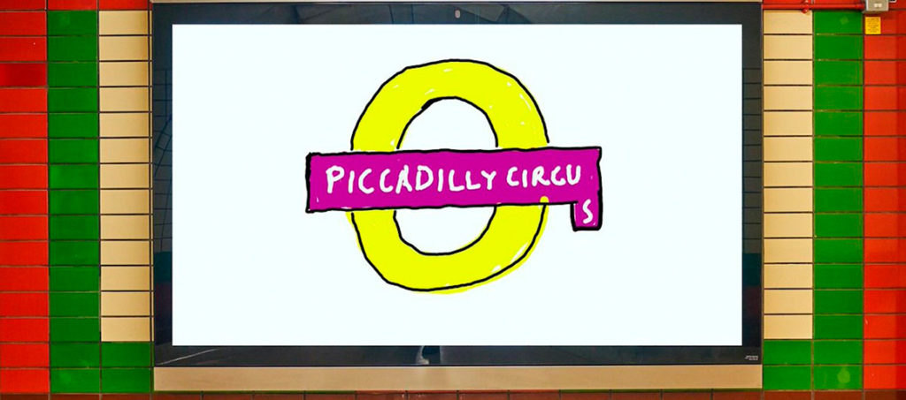
It’s been a minute since I’ve been in London — 2011, to be exact — and I’d love to go back. The food, the parks, the museums, the Thames, the short train rides to more interesting places (Hello, Cambridge?), and even the Tube. (We’ll leave the anti-Americanism aside for right now — we’re post-Trump and post-Covid, so traveling is at least an option!) Yet even the cultural masterpiece that is London is showing some cracks; from the New Statesman:
Hockney’s Piccadilly Circus has also drawn criticism for its simplistic approach. Over on the cesspit of arts criticism that is Twitter, anonymous accounts that decry all art made post-1920 as an abomination have ridiculed Hockney’s scrawl as indicative of the death of art. Other critics have rightly argued that the work feels like a red flag to a bull: fuelling culture-war debates about the legitimacy of public art, rather than encouraging the public to get onside.
I like it more every time I see it. Read more at It’s Nice That.
On the NYC subway map:
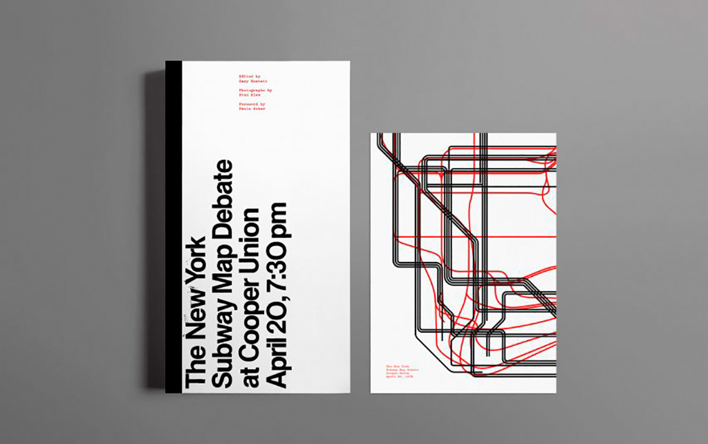
Speaking of It’s Nice That, an interesting new book from Gary Hustwit . . . on the debate over the New York City subway map. On the one side, the iconic Massimo Vignelli version, introduced in 1972, representing the less-is-more approach. On the other, the replacement version from John Tauranac, introduced in 1979, representing the more-accurate-is-more approach. (An updated version of the latter is still in use today.)
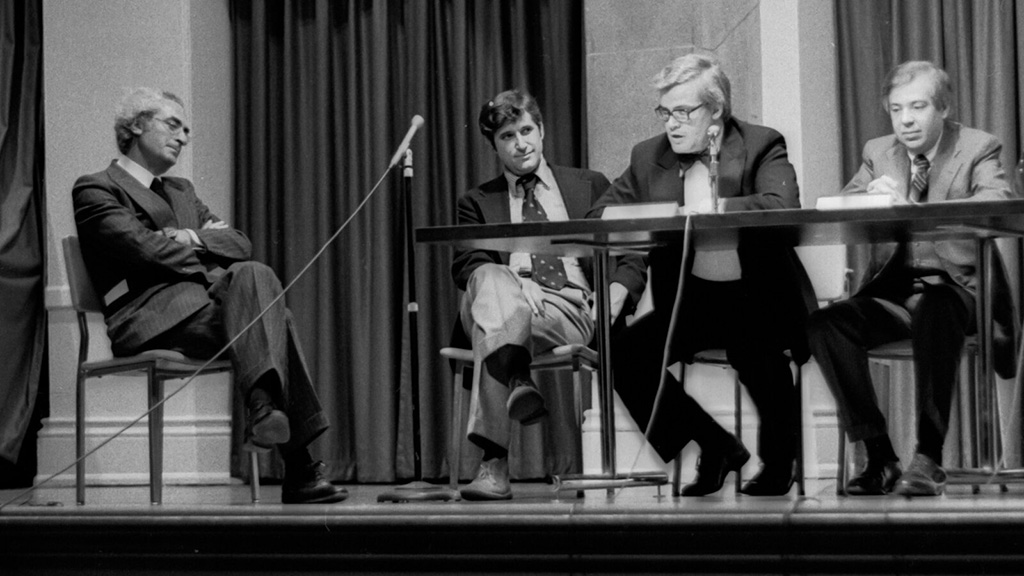
But back in 1978, the two got up on stage at Cooper Union’s Great Hall — home to debates of, among others, Abraham Lincoln — and pitched their case:
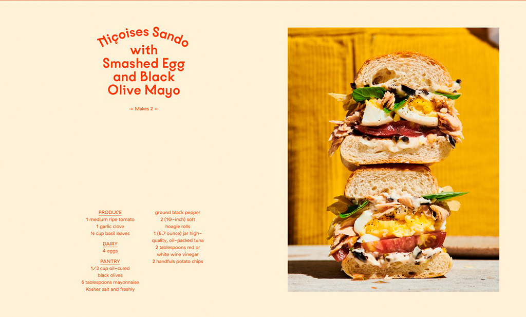
Nice new cookbook chock full o’ seventies-era design, “Violaine et Jérémy returns with a cookbook for Molly Baz, featuring three of the studio’s much-loved typefaces,” at — wait for it — It’s Nice That:
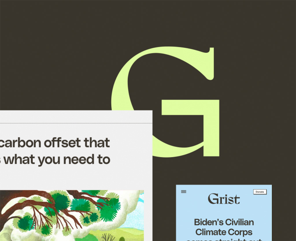
Four things for you in this edition of Briefed, starting with a redesign for Grist:
“Climate. Justice. Solutions,” now looking good. Still worth reading (and bookmarking). Love that shade of green, too. Read about the hows and whys at Upstatement. Kudos for the excellent work.
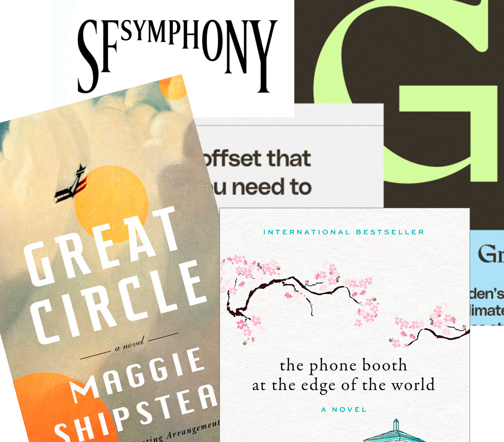
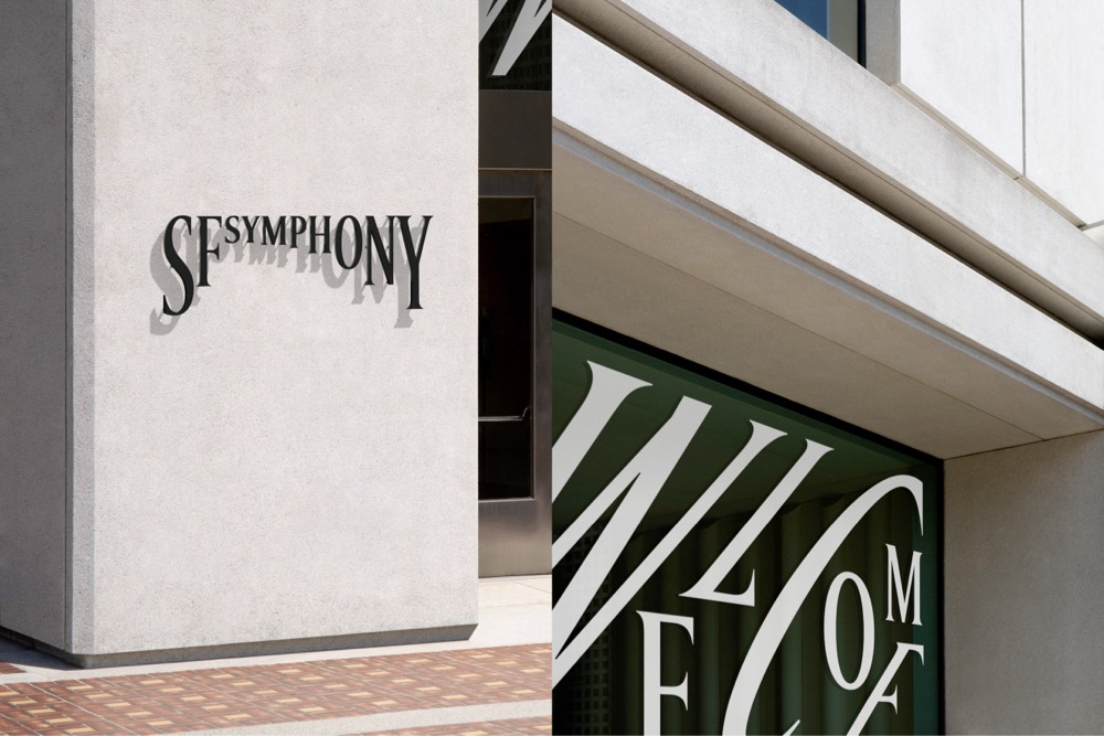
Next, from the regularly-brilliant Jason Kottke — which he got from Print magazine — winners of the 2021 Type Directors Club Design Awards, including this fave:
Read more about the SF Symphony redesign at the (also) regularly-brilliant Brand New (very worthy subscription required).
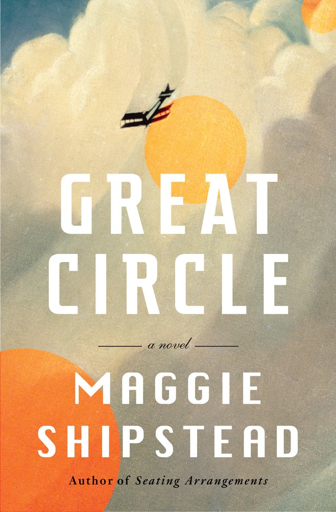
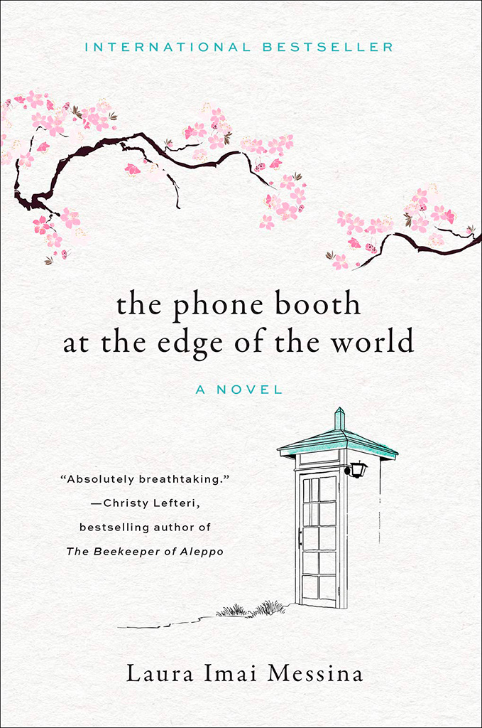
Lastly, a reminder that this blog originates in Middle Georgia, home of the Cherry Blossom Festival — which might explain why this title and its quite awesome cover design caught my eye:
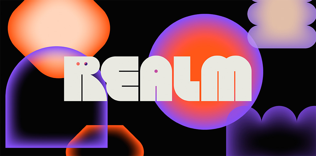
Three items for your update this month, starting with one of the best logos I’ve seen in a long while: Realm. Check this out:
Just … wow. Colors aplenty in the supporting materials, but the logo itself in beautiful black and white — and that GIF. (Update: the GIF isn’t working here, which lessens its appeal. CRAP. See it at either link below, but either way, see it. So worth it!) Congrats to Mother Design on this triumph.
Update, May 4: Brand New says, “A Nightmare on Realm Street.” Frankly, I’m surprised:
The animations for both the full wordmark and monogram are a little clunky. Maybe it’s on purpose, maybe not, but something about them feels half-cooked. Some killer animations would have really taken this to the next level.
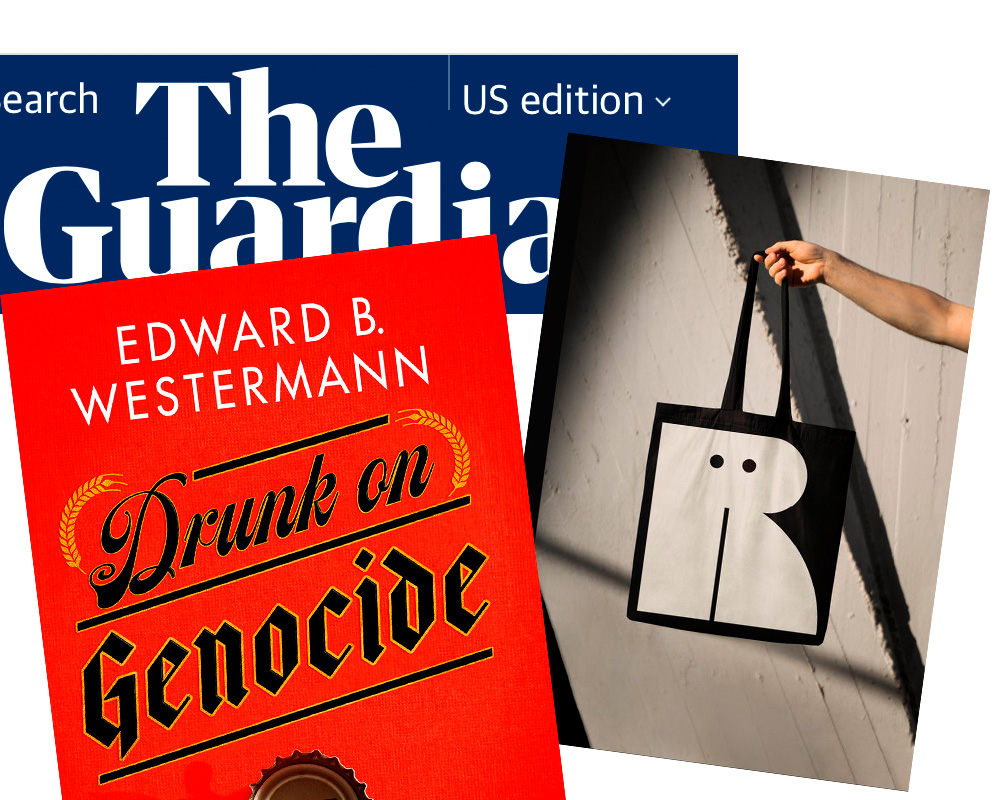
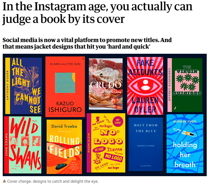
Next. a Guardian item on book covers — and how being “Instagrammable” is now, thanks to Covid and bookstores being less accessible, what’s expected:
I’ve famously chosen to boycott social media, so it’s probably not a surprise that I’m not 100% in agreement with the sentiment that Instagram is necessary for successful cover design. Nonetheless, supporting quality design — and acknowledging that more than a few do, in fact, judge a book by its cover — is a good thing. Read the rest.
Last but not least, from Spine’s fantastic University Press Cover Round-Up, this:
Check the shadow of the bottle cap. Now, go to Spine and check the texture in the background. Revel. Repeat.
Back in the ’90s and Aughts, my ex-wife and I ran a popular book design blog called Foreword. For a variety of reasons, from divorce to moving to Georgia and then deciding to do photography full-time, I got away from it. I even let the company name, ospreydesign, get away from me.
I’ve been seriously regretting losing Foreword for a while now — and its return one of the driving reasons for the new web site. Part of that has to do with a return to book design, and wanting to comment on the same, but also because I don’t do social media and have wanted a space to talk about — and get feedback on — items to do with book design, photography, and so much more. There’s no place better than your own web site. Thus, Foreword is back, this time as part of my personal site: gileshoover.com.
Memory Lane
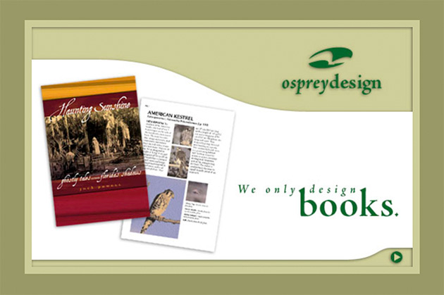
Here’s what ospreydesign looked like way back when:
ospreydesign as of February, 2001
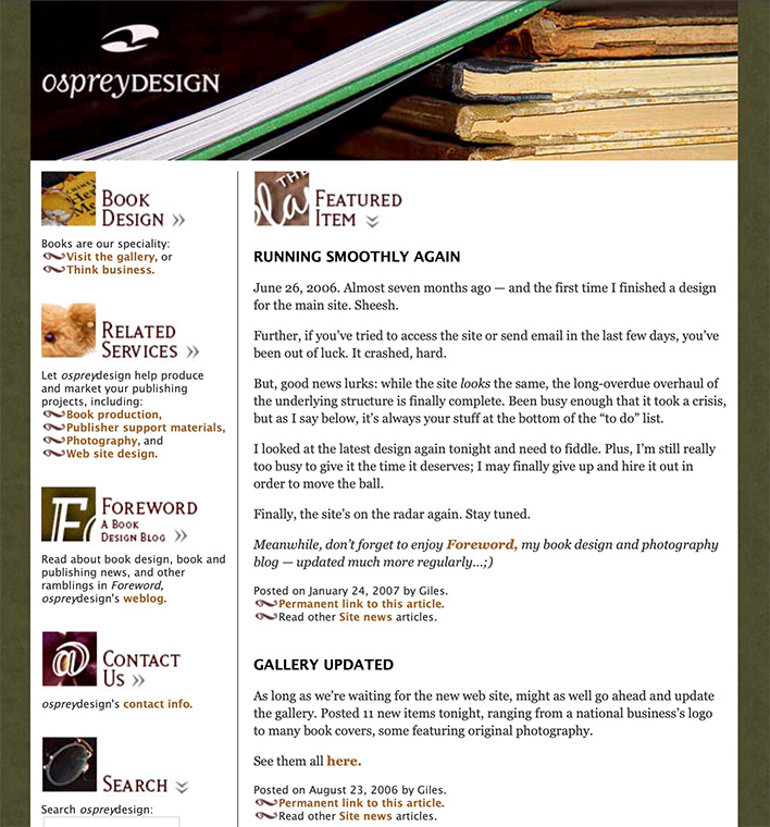
The site evolved, but only to a point — those were the days of having to pay attention to screen width. Remember: 15-17-inch screens were the new hotness; 13-inch was more normal. (Hence the small layout.) There was something comforting about it, though, and this look preserved for years. Here’s another screenshot:
ospreydesign’s home page, as of January, 2007
Foreword, a relatively new item called a weblog, or blog, was both a vehicle of discussion and publicity. And it worked — this little blog grew and gained followers, basically riding the early “wave” of blogs.
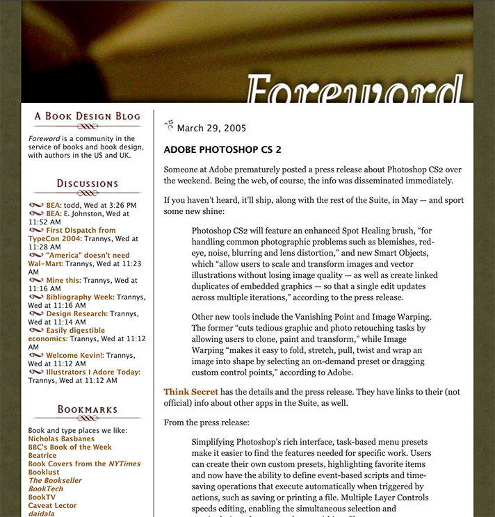
Here it is from 2005:
Foreword in March, 2005
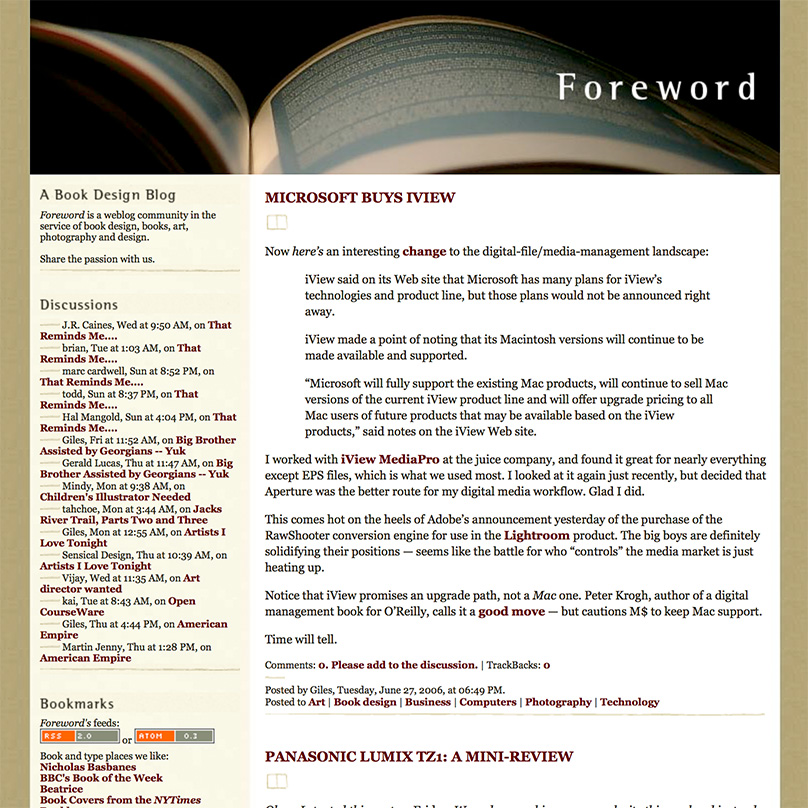
The “look” changed shortly after, while the popularity continued to grow. Here’s another, from fourteen months later:
Foreword‘s new, wider-columned look, from June, ’06
At this point, Foreword was at its utmost; thousands of readers, #1 in a Google search for “book design,” pretty much everything — and I, quite frankly, decided to throw it all away.
The Photography Era
Changing my priority to photography full-time was both awesome and a completely mixed bag. I absolutely loved the instant results of digital photography, and enjoyed the possibilities of editing them; filters, textures, black and white, and more. The creativity was more immediate, as well, in that I was my own “editor,” for lack of a better term, not answering to as many people as designing books can be.
Making money was more difficult than with book design, but somehow more exciting; in many ways, it’s a performance art — I had to get it right at the time (there are no redos — events move on!), then make it better in the edit. But, I quickly found that weddings and events were not my strong suit. Like many making a profession out of a passion, I too often clashed with the “vision” thing; what I wanted to do — architecture, landscapes, “things” more than people — wasn’t what you made money on.
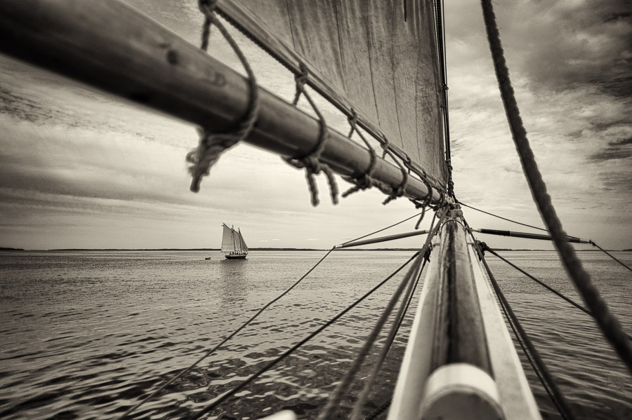
Maine Schooners, 2009
Worse, I was ahead of an extremely powerful wave: photography as something ubiquitous. With the rise of everything from a flood of new folks doing photography full-time to practically everyone “being” a photographer with just their cell phone, there was absolutely no way I could make the success out of it that I could have had I just stayed with book design first and photography second. Sure, I still did book design — I was early in the photography book genre — but photography as a career proved unsustainable.
Lesson learned.
New Memories
So, book design is again what I describe my profession as, with photography back to being a passion instead of a full-time job, and Foreword has returned. I’m better for it, frankly; so, hopefully, will my readers, as we can again share my love book design — along with why I’ve returned to it full-time.
Having a blog again also gives me a chance to talk about design, book production, photography and how they’ve changed in the intervening years, and recommit myself to regular posting; something I’ve missed and hope others have, too.