Category: Architecture

Posts that have substantial architecture content.

  • Beautifully Briefed 25.6: Spine

    Beautifully Briefed 25.6: Spine

    It’s hard to believe that 2025 is half over — but at the same time, the amount of water under the bridge in the first half of this year is quite astonishing. For those of us in the United States (indeed, worldwide), this year seems to rival the pandemic for necessary use of the word, “unprecedented.”

    Therefore, your monthly dose of sanity great design and photography awaits. Enjoy.

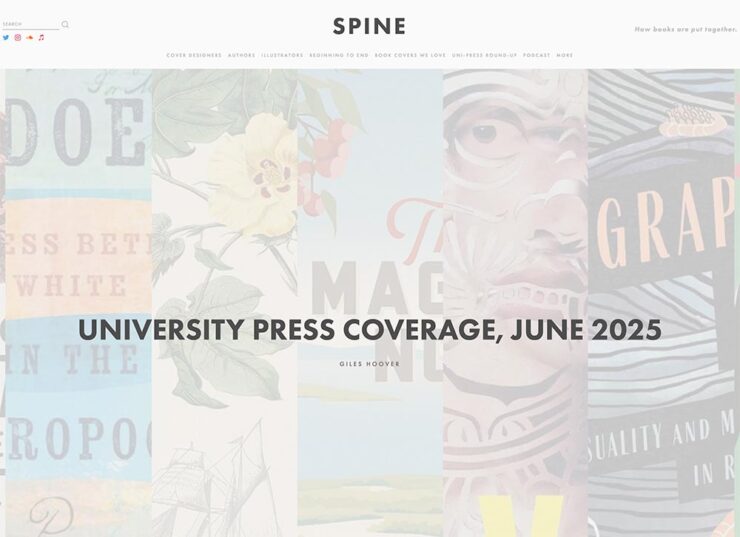
    University Presses Coverage on Spine

    Spine is a regular stop for book designers everywhere. The site’s interviews with designers, authors and illustrators and especially their monthly book design faves are all items not to be missed; they do, in fact, live up to the tagline, “how books are put together.”

    Unfortunately, their “Uni-Press Round Up” — Uni, of course, being English for University — has been MIA since the columnist left in 2021. So it was a great honor when Spine editor Vyki Hendy accepted my offer to republish my best of the Association of University Presses (AUPresses) Show 2025. (Indeed, Spine republished this year’s Foreword post in its entirety.) But that’s just the beginning: she asked me to take over the column, too.

    I said “yes” without a second thought.
    It’s important to me that I share a word or two about why: simply put, I believe that university presses worldwide deserve celebration. Part of it is the political atmosphere in the US recently, sure, but conservatives have been targeting higher education for a minute now. (See New College of Florida, “where education goes to die.”)

    It’s more that I feel that university presses are the unsung hero of the publishing world. Titles are often complicated and difficult to visualize, and limited budgets often make it difficult to attract talent for great book design. An opportunity to highlight the best is not to be ignored.

    Please head on over to Spine to enjoy the books I gathered for the first post, covering titles published in May and June of this year. But I’d like to call out a couple of favorites here:
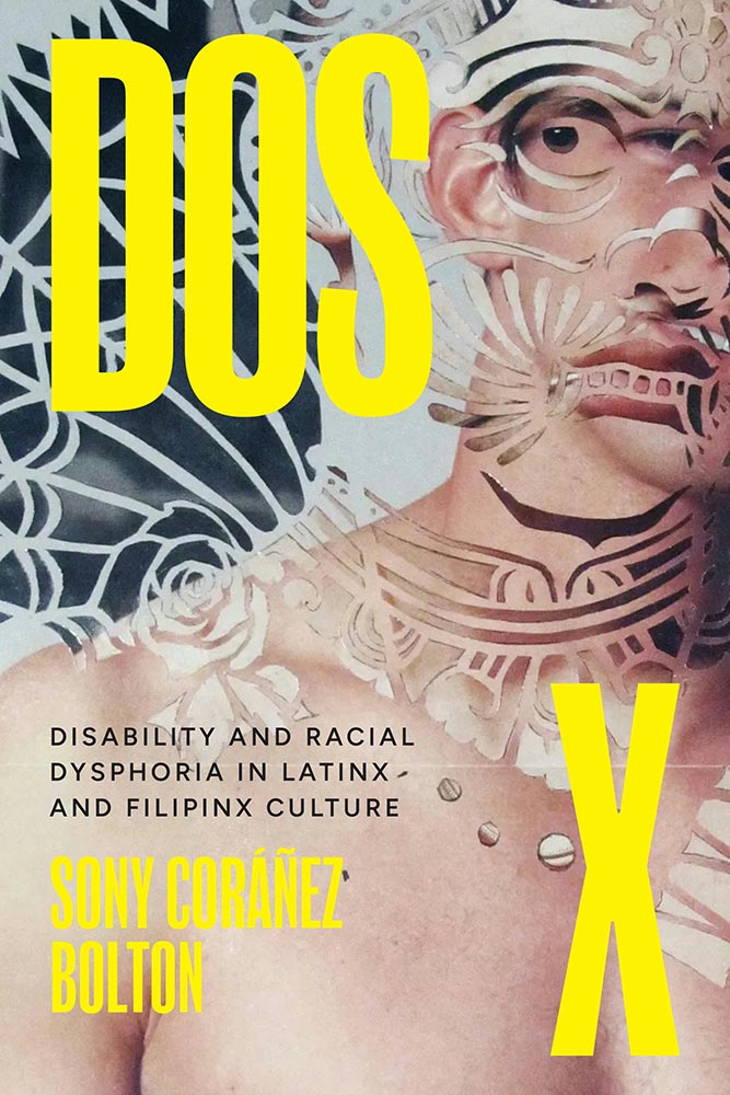
    University of Texas Press. Cover design by Lauren Michelle Smith, art director Derek George. Cover image, “Hybrid Paper Gods & Queens,” by Julius Poncelet Manapul.

    Extraordinary artwork, handled extremely well. Also:
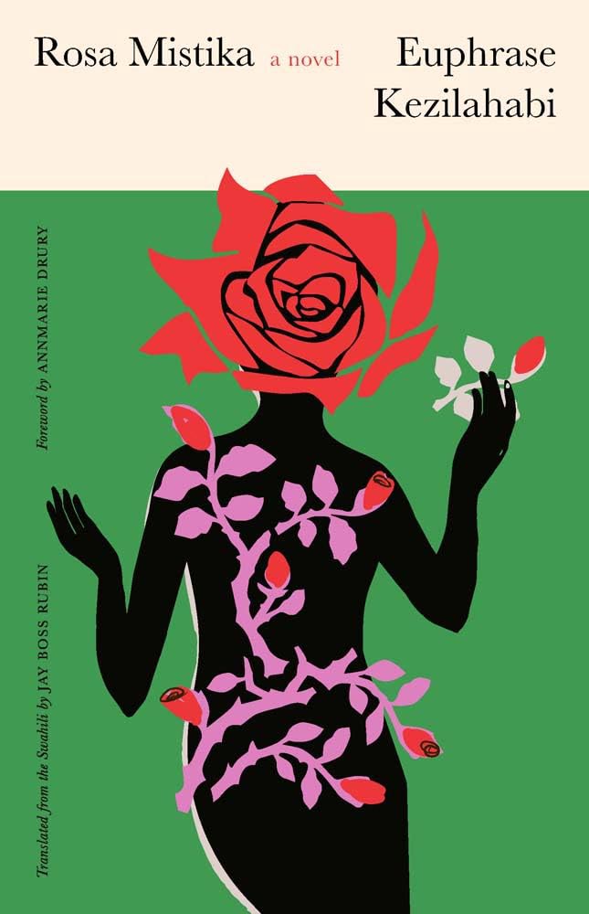
    Yale University Press. Cover design and illustration by Sarah Schulte, art director, Dustin Kilgore.

    A difficulty subject — and book design brief, surely — treated with classic style and an illustration showing an uncommon depth of meaning.

    It’ll be an incredible pleasure to keep a closer eye on the university press publications with monthly round-ups of the best new work. I hope you’ll read the column regularly.

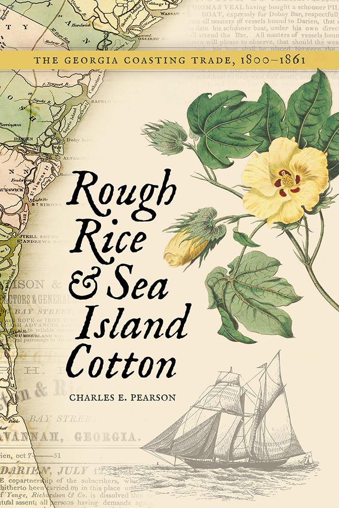
    Special mention: Macon’s Mercer University Press:
    It’s fulfilling to become more familiar with a great resource right here in town.
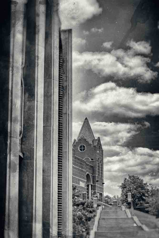
    University Center stairs (2021), Mercer University campus, Macon, Georgia.

    I’ve wandered around Mercer with a camera twice, and have just found an excuse to do it again. Stay tuned.

    The Creative Independent: “On Developing a Solid Foundation,” with Creative Director Arsh Raziuddin

    Book designer extraordinaire Arsh Raziuddin has been featured here before — this year’s Favorite Book Covers post, for instance — but it turns out she wears many hats indeed, as this interview at The Creative Independent proves.

    An insightful highlight:

    Book covers taught me how to pay attention to detail both in terms of the story and the design. What’s different between magazine work and book design is that with a book, you’re often condensing a 300-page story into a single cover; whereas editorial work might involve an 800- or 1,000-word essay that you need to visualize. It’s so difficult to capture the essence of an entire novel in one image — something really has to stand out. […] It feels a bit daunting to fit an entire novel in a 6×9-inch rectangle.

    — Arsh Raziuddin, wearing her book design hat

    Her cover design for Salman Rushdie’s Knife is discussed, an extraordinarily good example of, as she puts it, “not overcomplicating”:
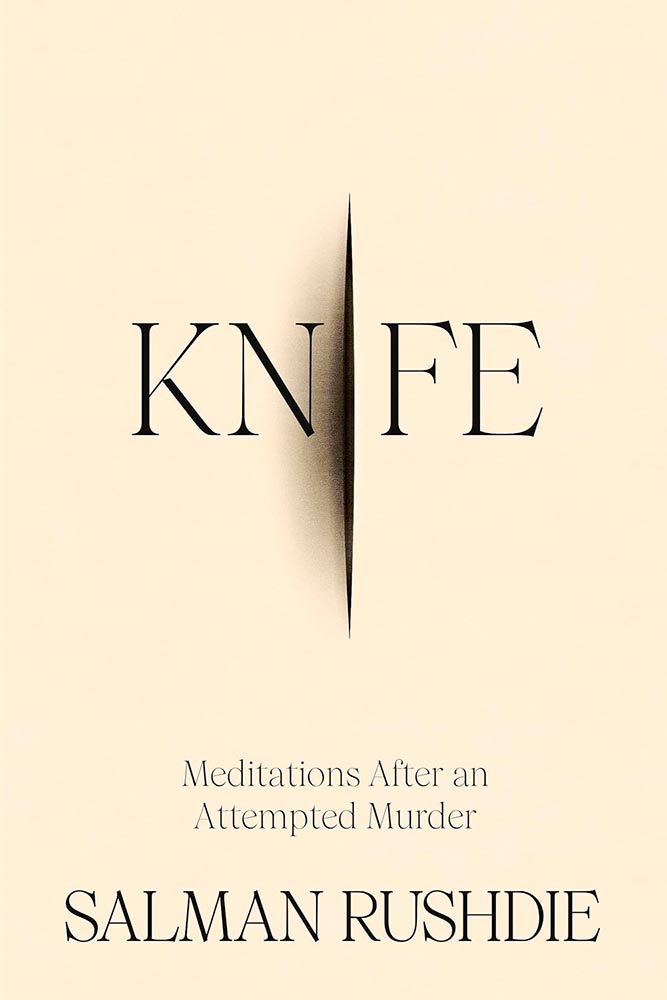
    Book design by Arsh Raziuddin.

    It’s a treat to see some rough drafts:
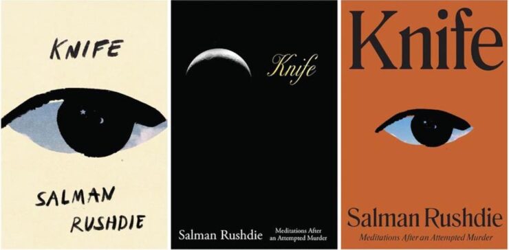
    Book design by Arsh Raziuddin.

    “We’re [that is, book designers] all trying to make something sexy or loud without a solid foundation,” she says. “We all need to collectively focus on craft.” Perhaps like this fantastic book cover, this time for a Pulitzer prize-winning poet:
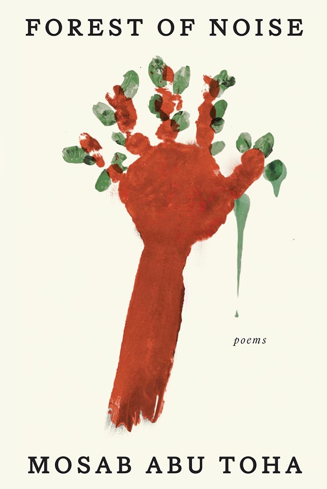
    Book design by Arsh Raziuddin.

    The entire interview is a gold mine. Read and enjoy.

    More Great Design Items, Briefly
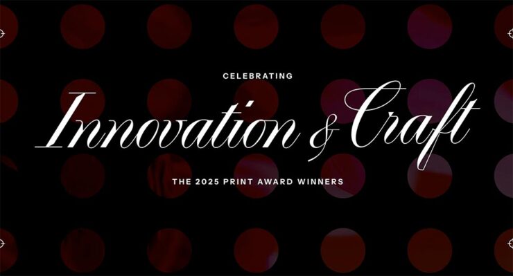
    “The 2025 PRINT Awards Honorees in Advertising & Editorial Cut Through the Noise,” the headline reads. Yes.
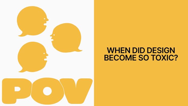
    It’s Nice That asks, “Are social media pile-ons stifling the creative industry?” Yes, I’d argue, and for more than just rebranding exercises. Read the article to see if you agree.

    “Jon McNaught has created more than forty covers for the LRB as well as artwork for books, diaries, posters and campaigns.” Follow his process.

    “Chris Ware, known for his New Yorker magazine covers, is hailed as a master of the comic art form.” Follow his process.
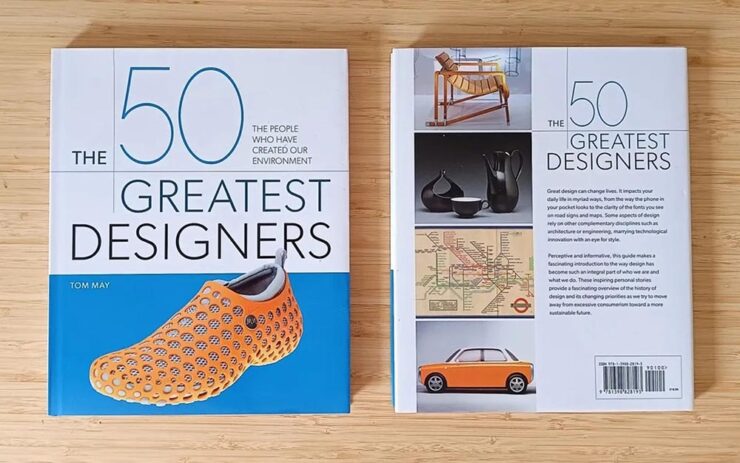
    “Designers needed a book about their history that didn’t exist… so I wrote it myself,” Tom May says at CreativeBoom.
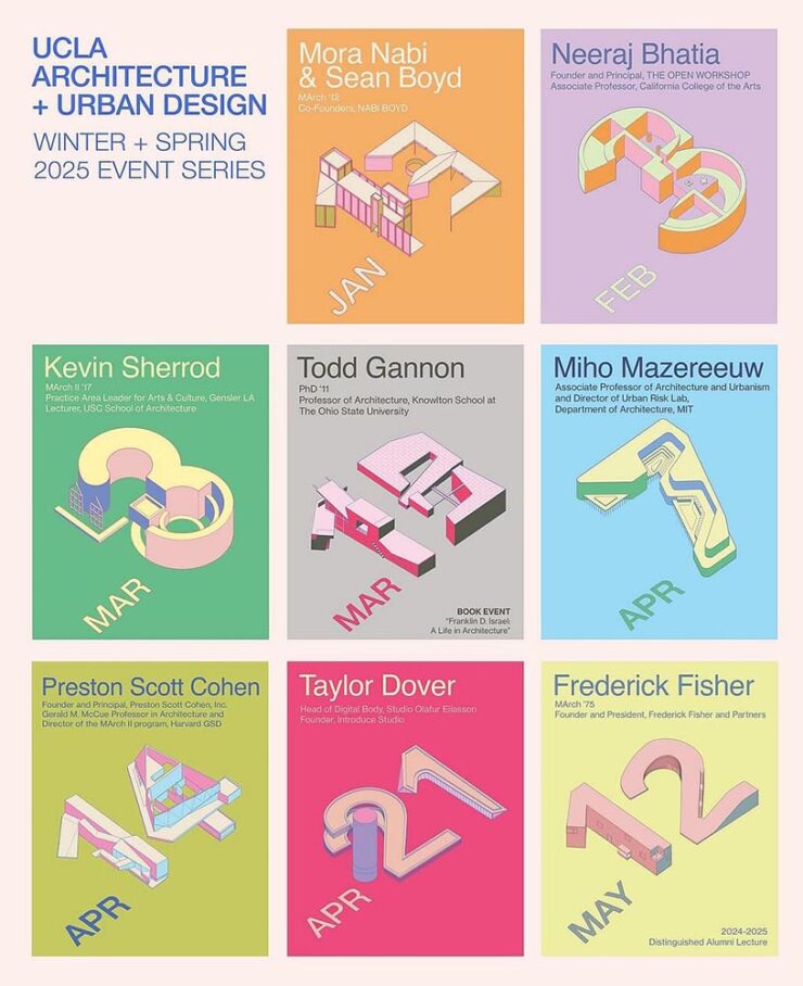
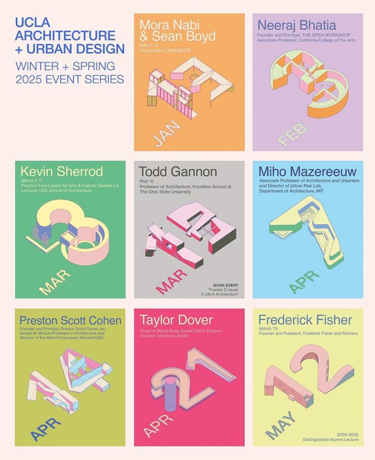
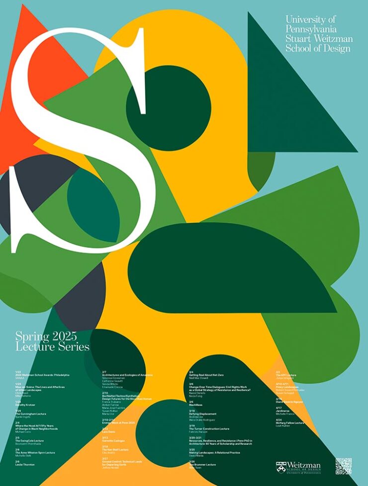
    Archinect covers the best of the spring lecture series posters. (Previously.) Building an intersection of design and architecture: when getting a lecture is a good thing.

    AI: Desctructive to Books — Literally
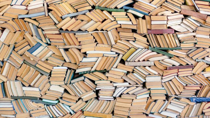
    Photograph: Alexander Spatari via Google Images.

    Anthropic destroyed millions of print books to build its AI models, Ars Technica reports.

    On Monday, court documents revealed that AI company Anthropic spent millions of dollars physically scanning print books to build Claude, an AI assistant similar to ChatGPT. In the process, the company cut millions of print books from their bindings, scanned them into digital files, and threw away the originals solely for the purpose of training AI[.]

    — Benj Edwards, Ars Technica

    “Buying used physical books sidestepped licensing entirely while providing the high-quality, professionally edited text that AI models need, and destructive scanning was simply the fastest way to digitize millions of volumes,” they continue.

    Sigh.

    Special Bonus #1: While the original reference has — annoyingly — disappeared, this Pixel Envy piece on AI Calvin and Hobbes still stands. Another example of link gold, including:
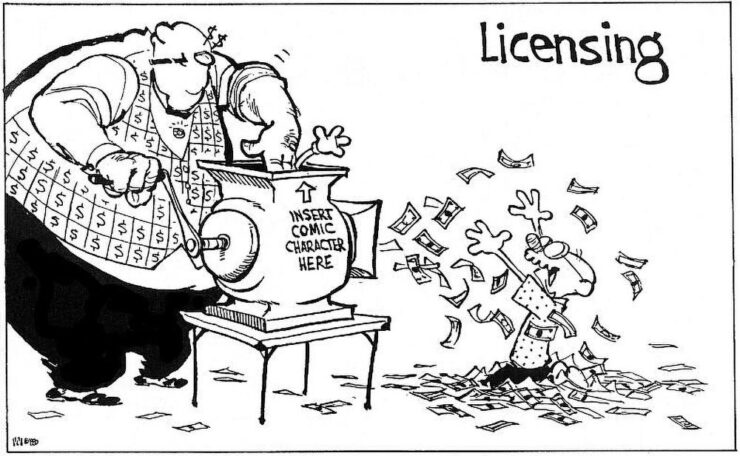
    “The glove,” he said.

    Special Bonus #2: Quentin Blake illustrates Animal Farm.
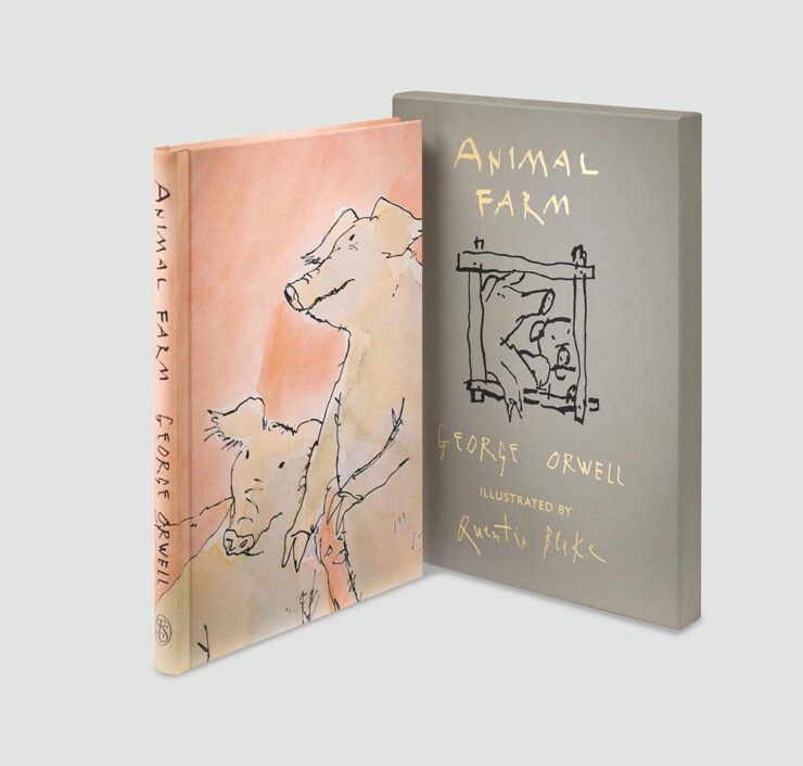
    Not sure what made me think to include this.
    Tech Corner: The Mac’s Finder Icon

    Stephen Hackett, 512 Pixels: “Something jumped out at me in the macOS Tahoe segment of the WWDC keynote today: the Finder icon is reversed.”

    Existing MacOS 15 (left), future MacOS 16/26 (right). Note also the change in title location.

    “I know I am going to sound old and fussy, but Apple needs to roll this back,” he writes — but then, being who he is, gives us an illustrated history of the Finder icon. Natch.

    Thankfully, Apple listened. Sort of.
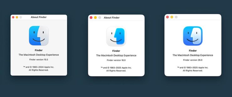
    The icon as of MacOS 16/26 Beta 2 (right). And the title, uh….

    Calling it only “slightly better” — something I agree with — John Gruber’s Daring Fireball makes a strong case for something that sticks closer to tradition, with this specific example:

    “Glasses it up but keeps it true to itself.” — Gruber. (Icon by Michael Flarup.)

    I have a feeling that Apple is going to keep the outline; generally, when it does these redesigns, the rules tend to overrule, if that makes sense.

    In other words: Liquid Glass > tradition.

    Special Bonus #3: In a word, “glasslighting.” (Also via DF.)

    Photographic Goodness
    Theibault Trebles

    This is Colossal: “Architectural Symmetry in Europe’s Subways,” Say no more.
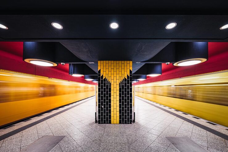
    Richard Wagner station, Berlin. Photograph by Theibault Drutel.

    Brilliant on many levels, but it’s the dual trains-in-motion that takes it over the top. Another:
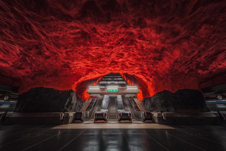
    Solna Centrum station, Stockholm. Photograph by Theibault Drutel.

    “Each city approaches underground architecture differently, mixing brutalism, futurism, minimalism, or sometimes unexpected touches of ornamentation,” the photographer says. Read the article or visit Theibault’s website.

    Nat Geo Traveler Photo Contest 2025

    PetaPixel covers the National Geographic Traveler (UK) contest, honoring the best travel images by photographers in the United Kingdom and Ireland. My favorite:
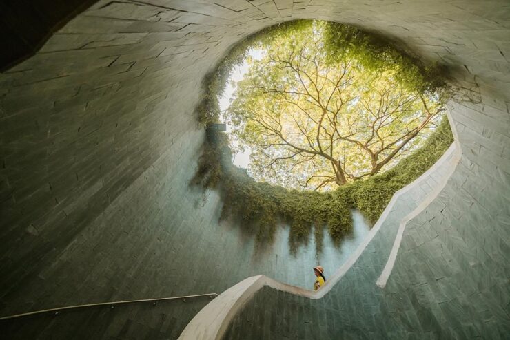
    “Tree Tunnel,” Singapore. Photograph by Scott Antcliffe.

    “I found this spot and was struck by the sheer density of the foliage — vines had completely enveloped the supporting walls, but the view of the Yellow Rain Tree at the top was simply stunning and utterly mesmerizing,” the photographer says.

    See more. (NatGeo’s website has an article, but it requires you to enter your email to read. Boo.)

    National Park Foundation Celebrates America the Beautiful

    The National Park Foundation has announced the winners of its 2024 Share the Experience photo contest — the official competition of America’s national parks, for amateurs only. Still:
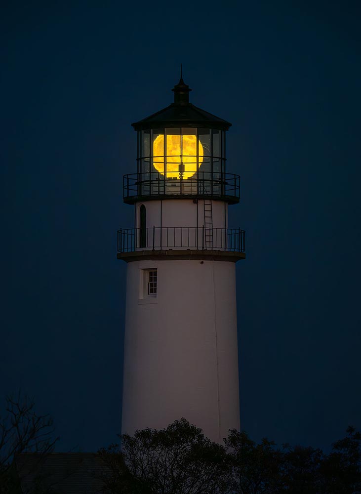
    History & Heritage category winner, Cape Cod National Seashore. Photograph by Matt Ley.

    See more at PetaPixel.

    Toy Miniatures, Cinematic Worlds
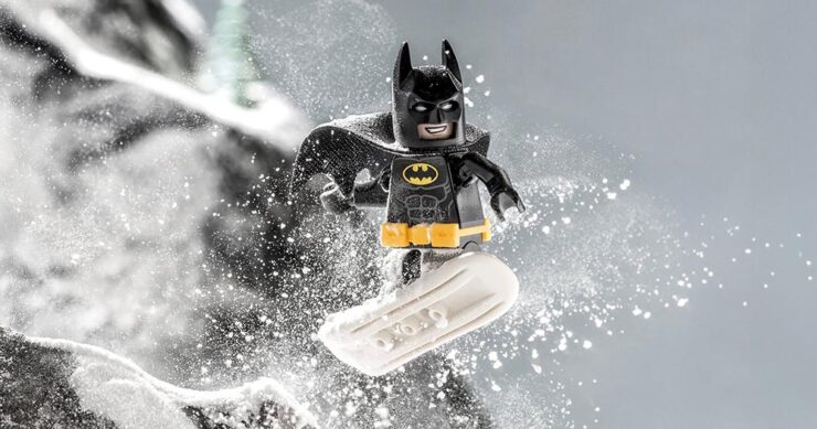
    Batman on a snowboard. Photograph by Alex Gusev.

    Doesn’t really require too much explanation: brilliant stuff. It may be little more than a fluff piece, but the photography makes it worth visiting this PetaPixel post. (Reminds me, on some level, of the tongue-in-cheek mentality of the ’60s TV series.)

    Full Circle: 2.1 Trillion

    Humanity is overflowing with imagery, according to research from Photutorial:

    162 billion photos are taken every month.
    That’s 5.3 billion photos per day.
    Or 221 million photos per hour.
    3.7 million photos per minute.
    61,400 photos per second.

    94 percent of those are taken on smartphones — itself a shocking number — but there’s an important statistic in the data:
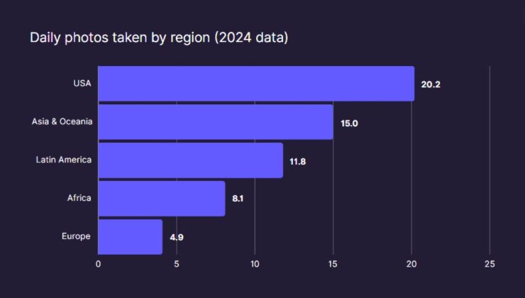
    Source: Photutorial

    It doesn’t take much to wonder why the US takes, on average, four times the number of photographs Europeans do.

    Special Bonus #4: An Adobe two-fer: AI-powered culling tools for Lightroom — see last month’s Beautifully Briefed regarding AI and Adobe’s recent price increases — and, because I refuse to leave y’all on a down note, info regarding Project Indigo, Adobe’s promising new computational camera app.

  • Updated Gallery: Forsyth, Georgia

    Updated Gallery: Forsyth, Georgia

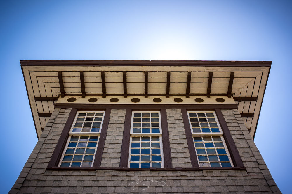
    It’s been a while — too long, in fact — but with a completely new storage and editing system in place, it’s time to get back to taking, editing, and posting photographs from Middle Georgia and beyond.

    This time, it’s the nearby city of Forsyth, specifically its historic train depot. Interestingly, Forsyth was the first city in Georgia to get passenger train service, in 1838, and the lovely station wears its years well.

    Tracks and Train Depot, E. Johnston St. and Railroad Ave., Forsyth

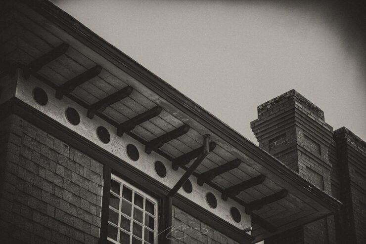
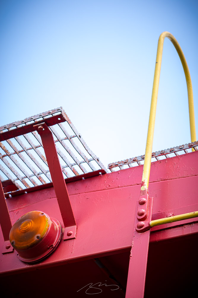
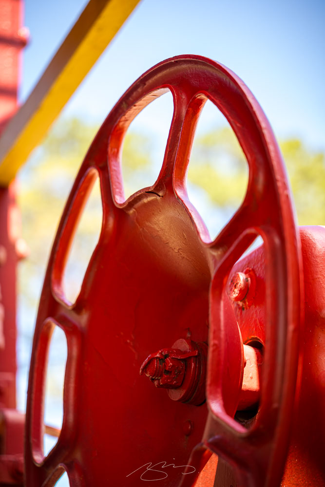
    Both the depot and its features are examined, in general and in detail:

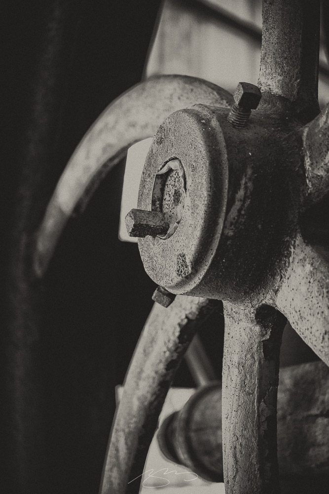
    Forsyth Train Depot (Roof and Chimneys), 104-114 E. Adams St., Forsyth
    Forsyth Train Depot (Train Car Detail #3), 104-114 E. Adams St., Forsyth
    Forsyth Train Depot (Train Car Detail #5), 104-114 E. Adams St., Forsyth
    Antique Fire Truck (Detail #7), 104-114 E. Adams St., Forsyth

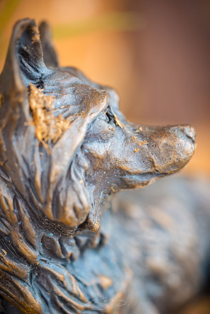
    And, ever watchful:

    Forsyth Train Depot (Bronze Dog Sculpture), 104-114 E. Adams St., Forsyth

    42 photographs have been added to the Forsyth gallery. Thanks for taking a look.

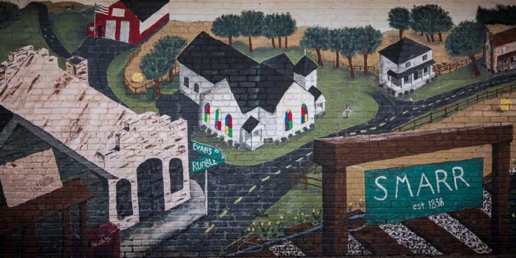
    Special Bonus: I’ve added a couple of photographs to the Bolingbroke gallery, and created a new gallery for 9 photographs from the unincorporated town of Smarr — including this shot of the town mural:

    Building Mural (Complete), Evans and Rumble Rds., Smarr
  • Beautifully Briefed 25.4: Showered

    Beautifully Briefed 25.4: Showered

    Please note: I sometimes add updates to previous posts; this happened with both the March and February posts, below. Thanks.

    In this edition of the Beautifully Briefed series: a little book and book design news, a couple of complaints, and, in celebration of April, a (gentle) shower of great photography.

    Books and Book Design
    LitHub 10th

    Happy Birthday to LitHub, the most popular editorial book site in the world — after Amazon’s Goodreads — and a continued source of great book cover content. 36,108 posts later, they’re better and stronger than ever. Congrats.

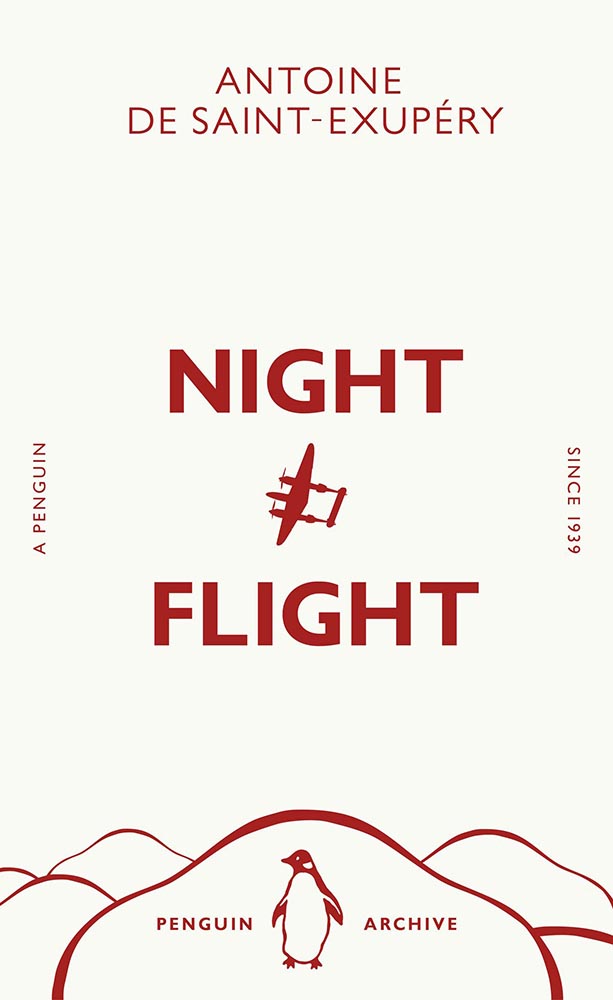
    Penguin’s 90th
    Art direction by Jim Stoddart.

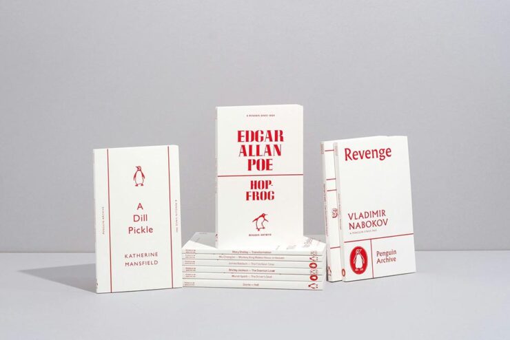
    Penguin’s story started in 1935 with the simple idea that quality literature shouldn’t cost more than a packet of cigarettes. Despite scepticism from publishers and booksellers, when founder Allen Lane launched his publishing company he sparked a paperback revolution in the UK. Within a year, three million Penguins had made it to readers’ shelves.

     — Aimee Mclaughlin, Creative Review (UK)

    To mark its milestone anniversary in 2025, the publisher’s new Penguin Archive series draws from its expansive archive with 90 short books — and interesting new covers for the same.

    May they enjoy another 90 years. Or many more.

    Some Colossal Notebooks

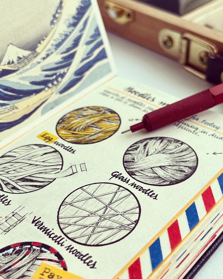
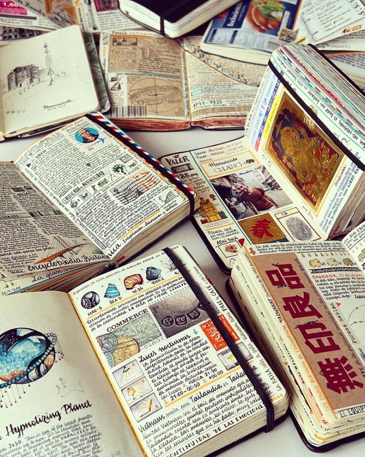
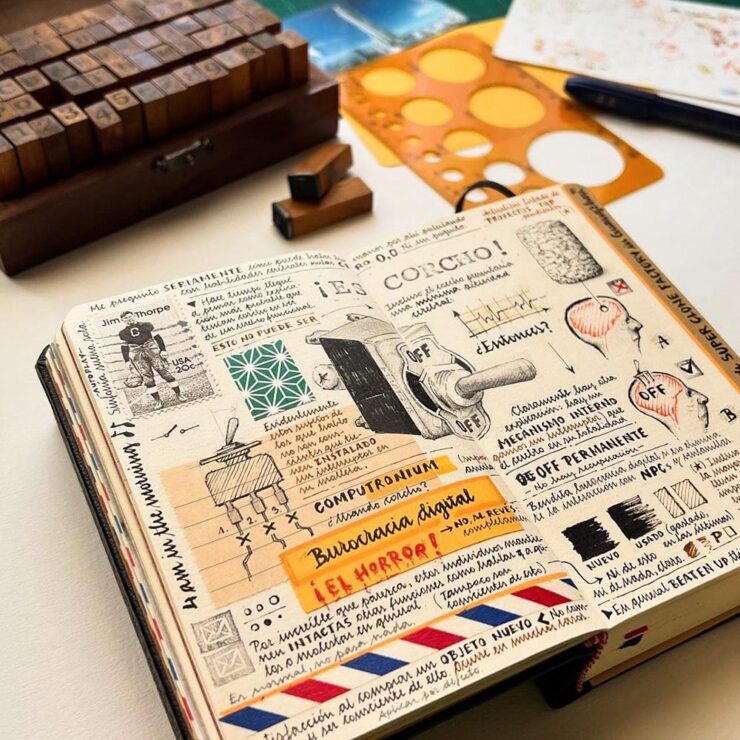
    From postage stamps to jetliner specifications to items he packed for the journey, José Naranja’s sketchbooks capture minute details of numerous international trips. “I’m lost in the intricate details, as always,” he tells Colossal. Everything from currency to noodle varieties to film references make their way into small books brimming with travel ephemera and observations.

    — Kate Mothes, This is Colossal

    “Sketchbook” does not do these things justice:

    Wow. Read — and see — more.

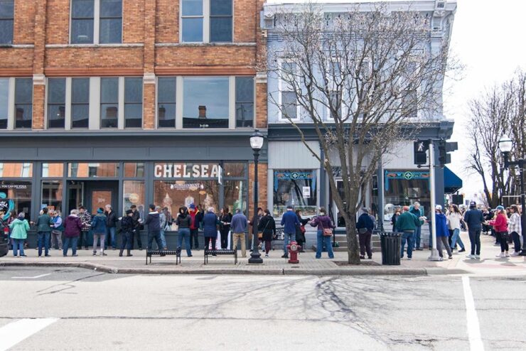
    Special Bonus #1: The Guardian has a wonderful story of a bookstore in downtown Chelsea, Michigan, moving about a block to a new location. Patrons helped … by forming a human chain and passing the books, one by one, to the correct location on the new shelves.

    Photograph by Burrill Strong for The Guardian/AP.

    Fantastic. Read the details.

    Facepalms and Footguns
    Anti-Piracy, Indeed
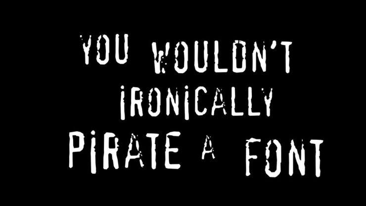
    Ars Technica illustration by Aurich Lawson.

    “Naturally, it would be hilarious if the anti-piracy campaign actually turned out to have used this pirated font…” is, in fact, not the opening line of a joke. Nick Heer caught wind of it and posted; Ars Technica followed up with the full story. Definitely worth the few moments of your time.

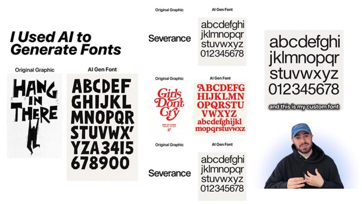
    Special Bonus #2: Use generative AI to create steal fonts, too: BrandNew, which is paywalled (alas), highlights an Instagram post — which I’m not going to link to — about a dude feeding pictures of fonts into ChatGPT and claiming the generated results, a “new” typeface, as free to use.

    My favorite of the comments summarizes perfectly: “That’s how humans work as well – we copy each other’s work like crazy; art history is rife with this in plain view. What AI misses, however, are the little innovations that happen over time that lead to new and incredible ideas.”

    Special Bonus #3: On the subject of piracy, Adobe’s previously-mentioned Content Authenticity Initiative have born fruit — both in their major applications like Photoshop and a new, standalone app now in public beta. This PetaPixel piece has more.

    The (New) Synology Tax

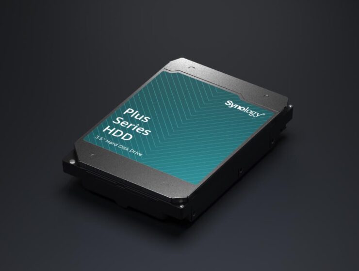
    Starting with the 2025 series of plus-level (and above) devices, Synology will now restrict drives — spinning or solid-state — to their own, branded items, which offer the “highest levels of security and performance, while also offering more efficient support.” The pitch:

    Without a Synology-branded or approved drive in a device that requires it, NAS devices could fail to create storage pools and lose volume-wide deduplication and lifespan analysis, Synology’s German press release stated.

    — Kevin Purdy, Ars Technica

    I’d seen this story go by on Ars, remembered that it had been predicted a while back when they restricted their enterprise-level items, and tried not to get upset about it. But it ground at me; at lunch with a friend this weekend, I went off on them a bit.

    I decided to vent publicly upon hearing part of this week’s ATP — that’s Accidental Tech Podcast — wherein Casey Liss introduced me to the term “footgun.” “Synology have turned off so many of their most ardent evangelists. Just so they can sell some overpriced hard drives,” he says, highlighting some other examples of companies (Eero, Sonos) doing precisely that … and mentioning Apple doing to opposite.

    But then I had a chance to hear the rest of that program. The other two guys on ATP, Marco Arment (Overcast, among others) and John Siracusa (long-time Mac guy, former Ars reviewer), had some excellent counter-arguments: 1) that we all pay the Apple Tax, sometimes begrudgingly but almost always willingly … because it’s worth it; 2) it’s a small price to pay to have the research of what to buy — what actually works best — done for you (plus the ease of support); and 3) that just because a company you’ve worked with for a long time changes their policies in a way that upsets or even angers, it’s not necessarily a betrayal: in other words, if you hadn’t been used to a specific approach with that company, the new setup would just be the way it works. We have to keep that in mind.

    I want to be upset with Synology. I should probably get over it.

    Photography, Showered
    2025 Sony Awards, Again

    Following up from last month, the 2025 Sony World Photography Awards winners have been announced. I erred last month in suggesting that the winners had been announced when it was, in fact, only the finalists; apologies.

    Photograph by Zed Nelson.

    British photographer Zed Nelson is “Photographer of the Year 2025” for his incredible series, The Anthropocene Illusion, an example of which is seen above. (See more.)

    Photograph by Ulana Switucha.

    Gotta give a shout out to some Canadian photographer Ulana Switucha, their overall winner in the Architecture & Design category, for The Public Toilet Project. “The distinctive buildings are as much works of art as they are a public convenience. These images are part of a larger body of work documenting the architectural aesthetics of these structures in their urban environment,” Switucha writes in a statement to Wallpaper*. (See more.)

    Some of these contests get to be a bit much. Sony’s is consistently interesting, challenging, and has earned its status as one to pay attention to.

    NASA Needs Our Support

    Like seemingly everything in the past few months, NASA has taken some major hits — and been forced to do something it should never have to: launch a campaign to remind folks what it is that they actually do. The ISS is one, yes, but arguably the tip of a very large iceberg.

    Talk about taking the long view.

    Oh, and one other NASA thing: it’s the Hubble Space Telescope’s 35th (!) birthday.

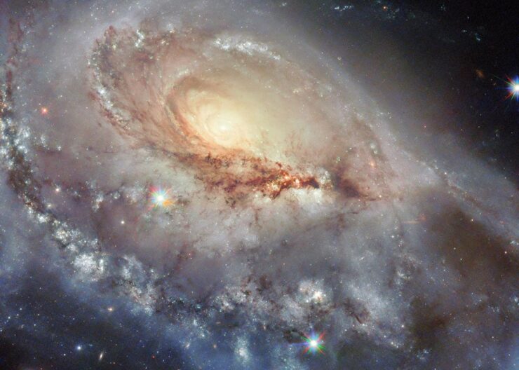
    “This skewed spiral galaxy, called Arp 184, is about 190 million light-years away from Earth; it earned its spot in the Peculiar Galaxies catalog thanks to its single broad, star-speckled spiral arm that appears to stretch toward us,” The Atlantic writes in this timely — and appreciated — edition of In Focus, their photo series.

    While NASA can provide us with wonderful images of many worlds, for now at least, we have only one pale blue dot to share. Let’s all do our part to make sure that NASA’s role in actually keeping America great — that is, at the forefront of science and research — is recognized and supported.

    See more at PetaPixel.

    Update, 7 May 2025: PetaPixel follows up on the Hubble image of Arp 184, seen above. Read more.

    Space for More

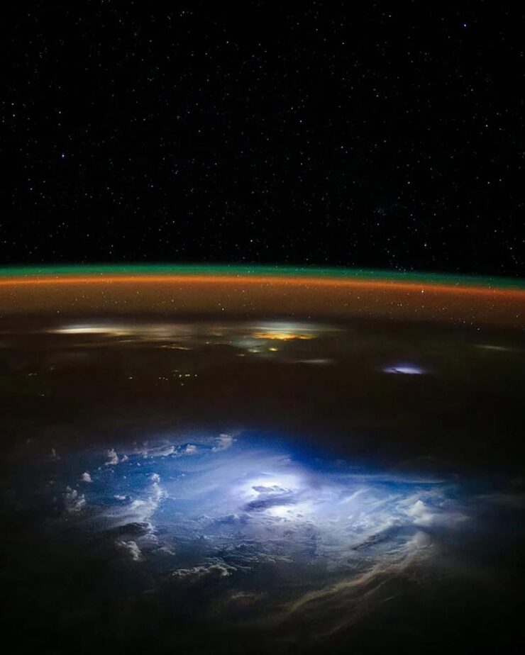
    In other NASA news, Don Petit recently returned to Earth, having spent a minute doing science giving us gifts. Like this one:

    Photograph by Don Petit.

    His photographs, taken from the International Space Station, showcase both his artistic talent and his desire to share with the wider world the beauty and fragility of this pale blue dot. (As if that isn’t enough, he touched down on his 70th birthday — fantastic.)

    Hungry?

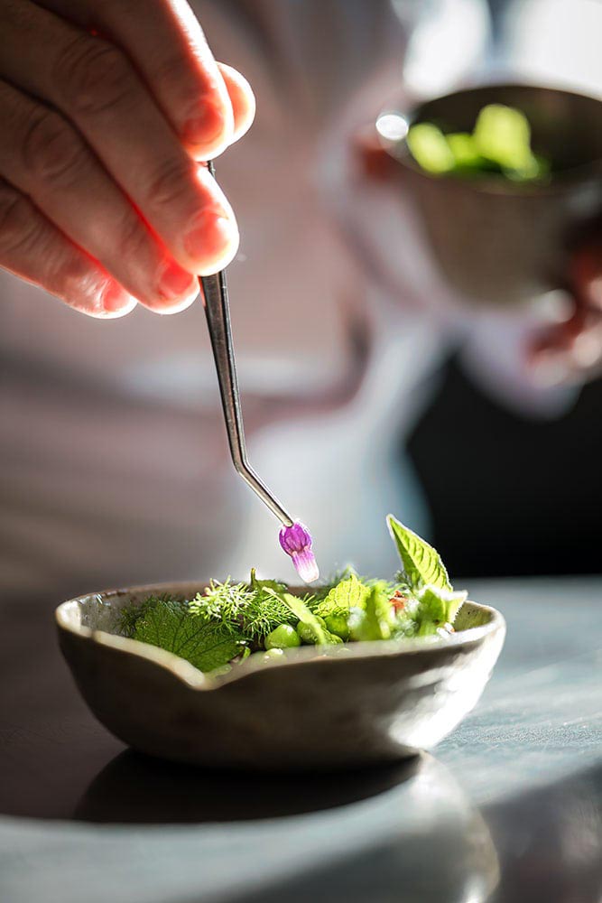
    While not one of the world’s leading photography contests, the shortlist for the World Food Photography Awards did its job: it celebrates some incredibly artistic work:

    “Nature’s Hand.” Photograph by Wim Demessemaekers.

    Okay, yes, it’s veggies in a bowl. But restaurant-quality or even Michelin-quality food presentation is its own thing — and it’s a thriving photographic specialty:

    “‘At Alchémille in Kaysersberg, Chef Jérôme Jaegle transforms ingredients into artistry. Bathed in natural sunlight, this moment captures the essence of his plant-forward philosophy — fresh flavors, wild botanicals, and pure craftsmanship. The light reveals every detail, turning this dish into a celebration of seasonality, taste and dedication,” the full caption for the above photograph reads.
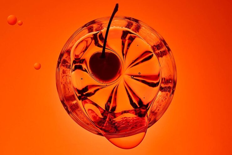
    It’s enough to make you want a drink:

    “Mr. Manhattan.” Photograph by Ben Cole.

    See more at PetaPixel … then enjoy a long lunch.

    Instrumental Macros

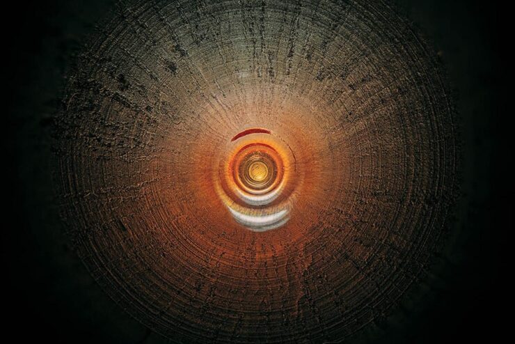
    Charles Brooks (previously) is back into it — literally:

    “Larilee Elkhart Oboe.” Photograph by Charles Brooks.

    “This formidable concept of capturing the unseen lies at the core of Charles Brooks’ work, as he photographs the small but vast interiors of musical — and most recently scientific — instruments,” This is Colossal writes.

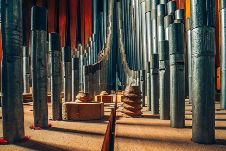
    “St. Marks Pipe Organ, Part 2.” Photograph by Charles Brooks.

    The behind-the-scenes photograph posted at the link tells much, but it’s the talent that the photographer brings to the table — screen, wall, wherever — that works so very well. Once again, sir, kudos.

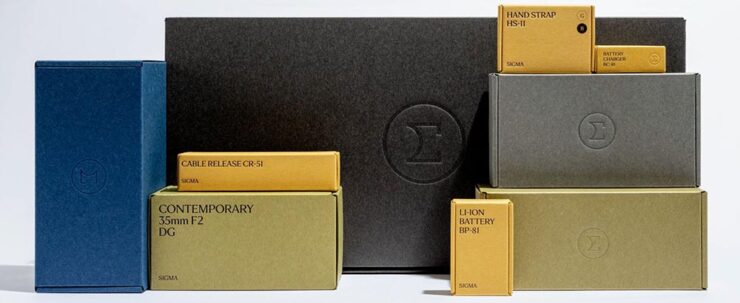
    Special Bonus #4: We’ve covered Sigma’s new branding. What wasn’t mentioned is their gorgeous and sophisticated new packaging:

    “Sigma’s cameras, lenses, and accessories are sure to arrive in style and come in simple, understated boxes with embossed type. Accessories, like straps, chargers, cables, and batteries, arrive in a lovely goldenrod yellow, while lenses will ship in black, beige, blue, or olive green containers. As for the Sigma BF camera, it is nestled in a classic medium gray,” PetaPixel‘s Jeremy Gray writes.

  • Beautifully Briefed 25.3: March Madness

    Beautifully Briefed 25.3: March Madness

    A huge stack of items for the March wrap-up, from libraries and type to a bunch of photography items, with a brief stop in the land of Jaguar that is … Paris. (Yes, the world’s gone all wonky. But you knew that already.) However, first, a quick discussion of what we’re not going to usually talk about.

    On Seriousness

    I’m going to keep my coverage of current events to a minimum; this is not the place, and I am not qualified to write about it with any authority (other than as a concerned citizen). But there are some items I think are worth sharing.

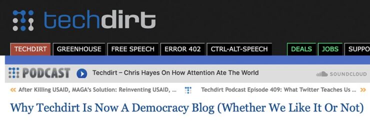
    Techdirt, for instance — like Kottke and others — have posted extensively on the political and culture shift in the United States, but in this case, specifically how it intersects with technology.

    TechDirt, March 2025.

    We’ve always covered the intersection of technology, innovation, and policy (27+ years and counting). Sometimes that meant writing about patents or copyright, sometimes about content moderation, sometimes about privacy. […] But there’s more to it than that. […] When you’ve spent years watching how some tech bros break the rules in pursuit of personal and economic power at the expense of safety and user protections, all while wrapping themselves in the flag of “innovation,” you get pretty good at spotting the pattern.

    — Mike Masnick, Techdirt

    “Connecting these dots is basically what we do here at Techdirt,” they argue, and I find it convincing. As some of us struggle with how to source actual news these days, Techdirt has earned a spot in my list of daily reads.

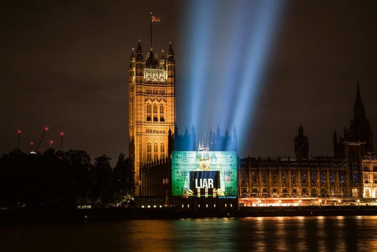
    Of course, it’s not just the United States. Arguably, the United Kingdom led with Brexit:

    “Boris Johnson, Liar.” Image by POW.

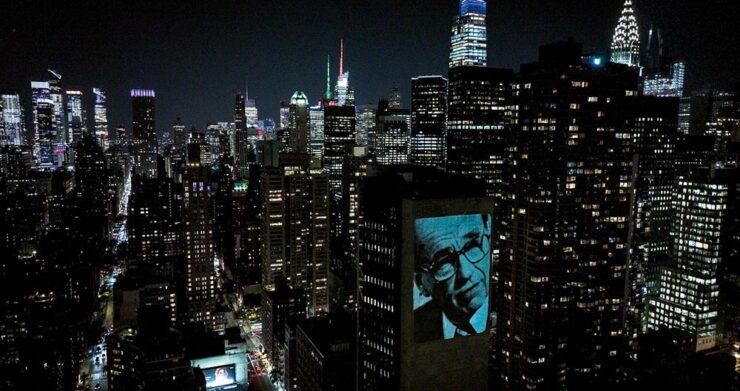
    ArchDaily brings us the story of Led by Donkeys, which started out “as a witty response to Brexit” and morphed into a visual tour de force. (Their name is a historical reference to World War I, where German commanders reportedly described British soldiers as “lions led by donkeys,” a critique of incompetent leadership — and not at all a reference to the U.S. Democratic party as it currently, uh, stands.)

    Rupert Murdoch, NYC. Photo by Fionn Guilfoyle.

    Light Matters, a column on light and space, is a regular item at ArchDaily.

    Then there’s AI and its current leap to the fore. While it’s been discussed here before, what hasn’t been is the effect on “the free.” What about the Wikis and free-as-in-beer intellect that isn’t property?

    From Citation Needed:

    But the trouble with trying to continually narrow the definitions of “free” is that it is impossible to write a license that will perfectly prohibit each possibility that makes a person go “wait, no, not like that” while retaining the benefits of free and open access. If that is truly what a creator wants, then they are likely better served by a traditional, all rights reserved model in which any prospective reuser must individually negotiate terms with them; but this undermines the purpose of free, and restricts permitted reuse only to those with the time, means, and bargaining power to negotiate on a case by case basis. […] The true threat from AI models training on open access material is not that more people may access knowledge thanks to new modalities. It’s that those models may stifle Wikipedia and other free knowledge repositories, benefiting from the labor, money, and care that goes into supporting them while also bleeding them dry. It’s that trillion dollar companies become the sole arbiters of access to knowledge after subsuming the painstaking work of those who made knowledge free to all, killing those projects in the process.

    — Molly White, Citation Needed

    The whole essay is excellent and absolutely worth a read. (Via Pixel Envy.)

    Update, 2 April 2025: ArsTechnica reports on a 50% rise in Wikimedia bandwidth usage as LLMs “vacuum up” terabytes of data for AI training purposes. “Wikimedia found that bots account for 65 percent of the most expensive requests to its core infrastructure despite making up just 35 percent of total pageviews.”

    Update, 10 April 2025: Nick Heer:

    Given the sheer volume of stuff scraped by A.I. companies, it is hard to say how much value any single source has in generating material in response to an arbitrary request. Wikimedia might be the exception, however. It is so central and its contents so expansive that it is hard to imagine many of these products would be nearly so successful without it.

    I do not see the names of any of the most well-known A.I. companies among the foundation’s largest donors. Perhaps they are the seven anonymous donors in the $50,000-and-up group. I suggest they, at the very least, give more generously and openly.
    Let’s assume it’s okay to say, “Heer, Heer!”

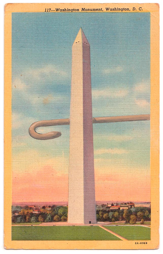
    Special Bonus #1: David Opdykes vintage postcard paintings, described at This is Colossal as “[o]ccasionally darkly humorous yet steeped in a sense of foreboding.”

    David Opdyke, “Main Stage” (2015-2020), gouache on vintage postcard, 6 x 4 inches.
    On Libraries, Type, and Type Libraries
    Museums and Libraries

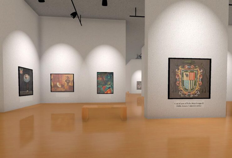
    Kottke isn’t just about politics, though; he’s tried to keep up with some of the things necessary in today’s world — the projects that bring light or even delight. So, while we’re on the subject of Wikipedia, let’s highlight his link to the Museum of All Things:

    A “nearly-infinite virtual museum generated from Wikipedia,” this program is made possible by the images associated with an article. Better still, there are exits from the galleries that follow the links in those articles, leading to … well, lots to see.

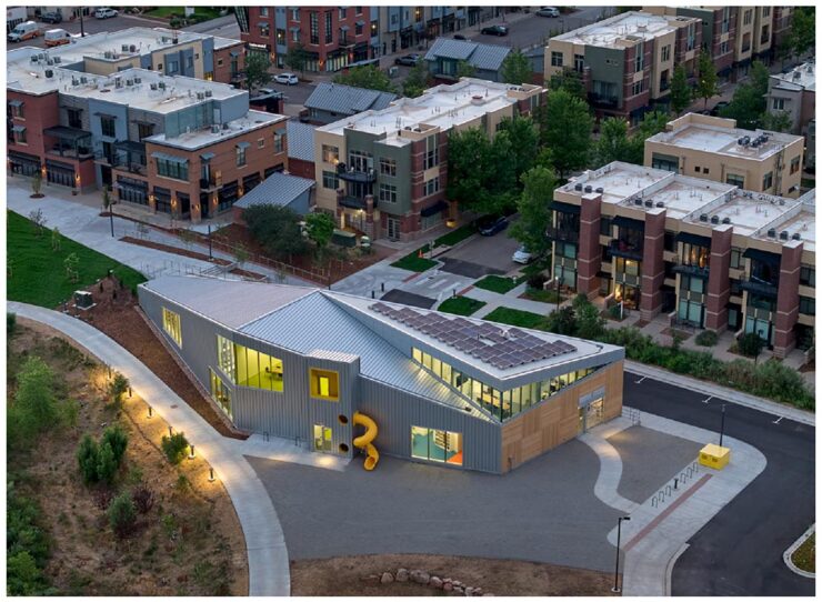
    Meanwhile, Cultured magazine brings us a great article on four great libraries in the U.S. — I mean, a slide!? Awesome:

    The North Boulder library. Photograph by Bruce Damonte.

    Visit Seattle, Scottsdale (AZ), Eastham (MA), and, as shown above, North Boulder, Colorado, and read a brief item with the architect that designed them.

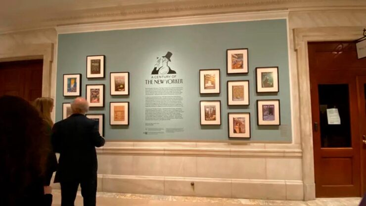
    Print magazine brings us an article the New York Public Library’s celebration of 100 years of the New Yorker magazine — another institution continuing to do great work in the face of today’s realities:

    Photograph by Amelia Nash.

    The exhibition, which “charts the magazine’s evolution from the roaring twenties to the digital age, drawing from NYPL’s vast archives and supplemented by treasures from The New Yorker itself,” is up through February 21st, 2026. Or, if you’re not able to make it to the Big Apple, check out the film on Vimeo.

    Type and Typography

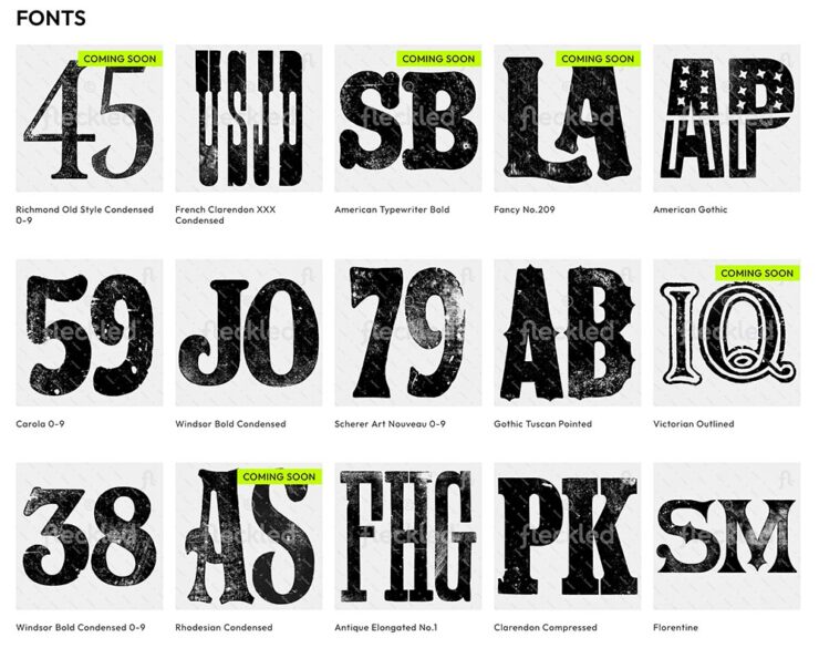
    Feckled offers “150+ hand-orinted letterpress fonts for digital download,” This is Colossal highlights, mentioning creative director Jason Pattinson’s new venture. It’s not perfect — those letterpress fonts are JPG files, not installable typefaces — but nonetheless, worth a look if you need something unique for a Photoshop project:

    Some of the typefaces offered at Feckled.

    CreativeBoom brings us their monthly feature on type, with two I’d like to highlight. Naancy, new from French foundry 205tf, is Art Nouveau in all the right ways:

    “Inspired by the French city of Nancy and its school of art and design,” 205tf says.

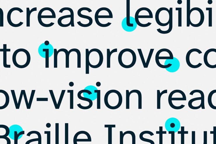
    But it’s Aktinson Hyperlegible Next that gets the prize from me:

    “The Atkinson Hyperlegible font uses special design principles to differentiate characters and make each one unique,” helping low-vision readers everywhere.

    First introduced in 2019, it’s now been expanded to different weights and styles, with new glyphs (individual characters, that is) for different languages and situations. As before, it’s free from the Braille Institute. Fantastic.

    On A Wild Jaguar

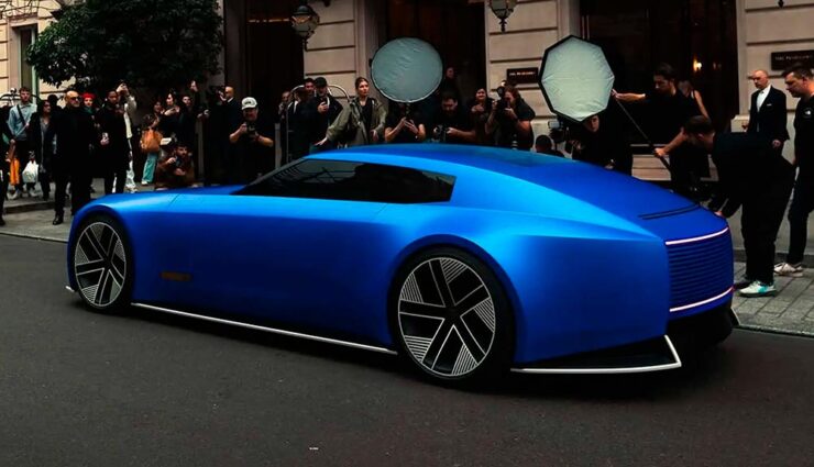
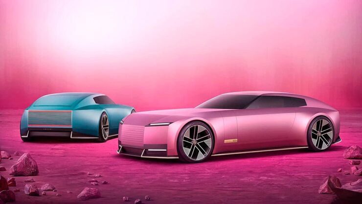
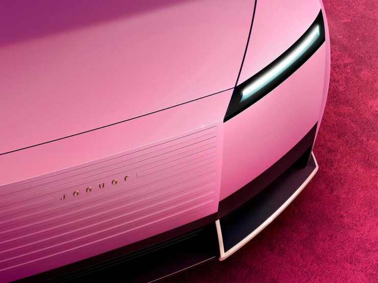
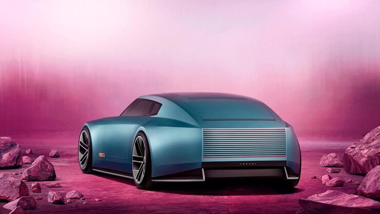
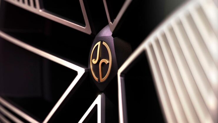
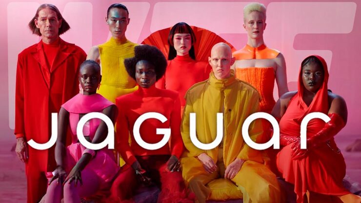
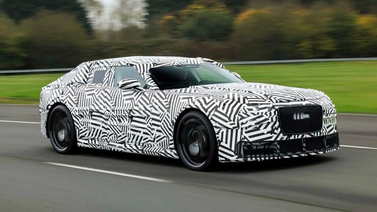
    Back in December, Jaguar made a huge splash — not necessarily the graceful skipping stone we think of from the glory days, but lots of waves nonetheless — with its Type 00 concept, highlighted here on Foreword (along with literally everywhere else).

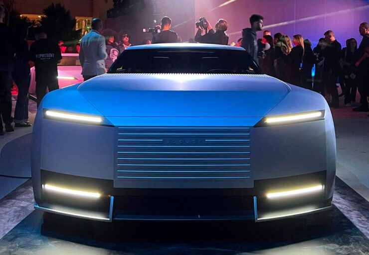
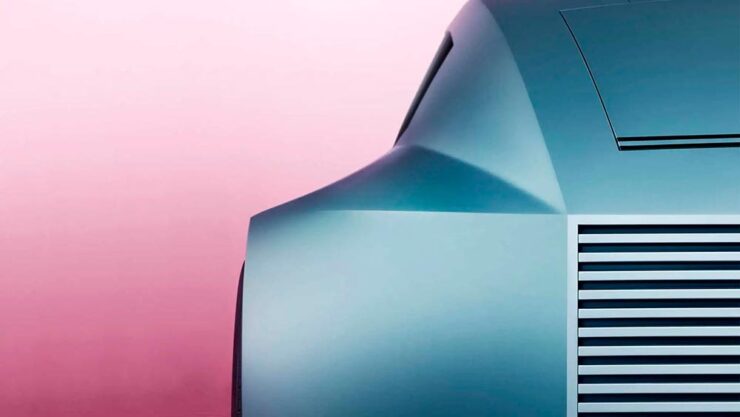
    The satin blue finish is only one of the striking things in this photograph.

    On March 10th, it was, um, spotted in the wild, in what was certainly a choreographed event — given the huge influencer paparazzi presence — but not gained a ton of traction (sorry) in the mainstream press. (Motor1 caught a whiff, and decided it “doesn’t even look real….”)

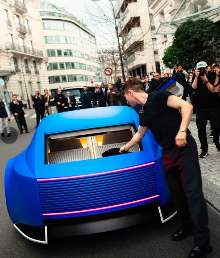
    However, I mentioned in December that it’s too early to call a strike — a position The Autopian‘s Jason Torchinsky almost agrees with: “Holy crap, I think I like it.” Shown in Paris, and described as “gliding around and looking like it somehow doesn’t exactly fully exist as part of our reality,” it might be starting to bring people around.

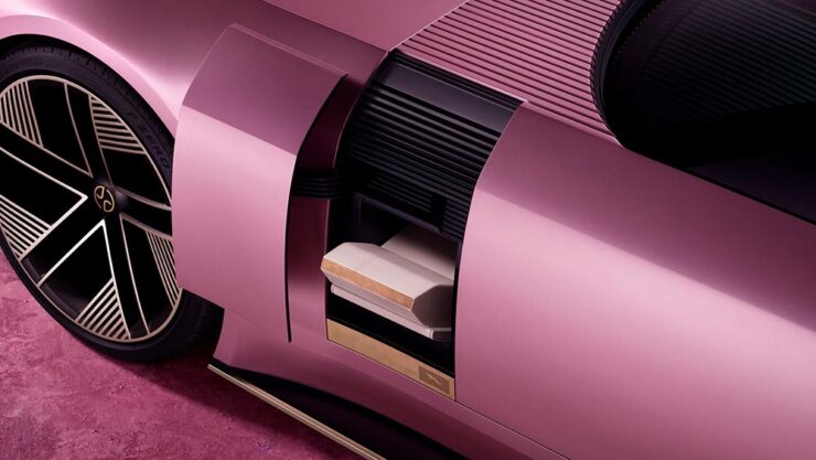
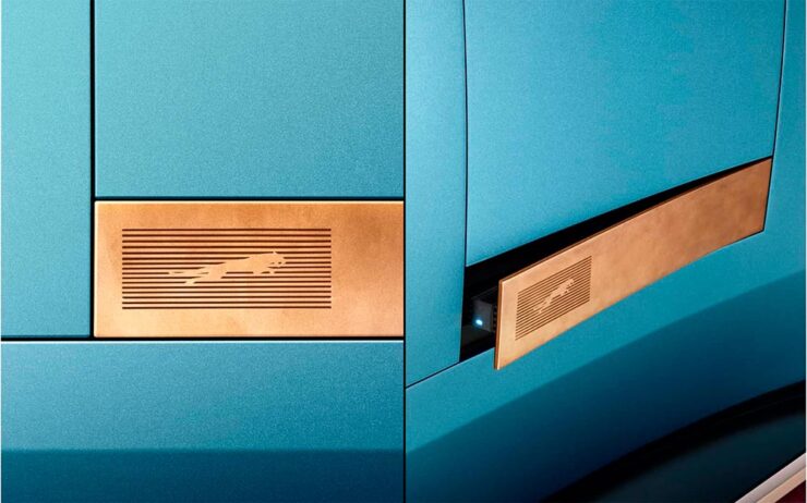
    There’s no rear window, but at least now we know how the trunk is accessed on the car.

    The sedan this concept previews will debut this year. Let’s see how it shakes out.

    On Wild Photography
    Leica Turns 100
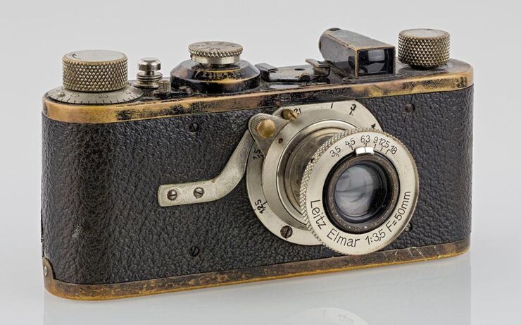
    The Leica I was unveiled 100 years ago: March 1, 1925. (Photo by Kameraprojekt Graz 2015. CC-BY-SA 4.0.)

    “The Leica I, the first mass-produced 35mm Leica camera, is widely celebrated for its influence on photography,” PetaPixel notes with dry understatement. (Thankfully, they use the word “revolutionary” farther down in the article.)

    “I hereby decide: we will take the risk,” Ernst Leitz II said in 1925 when he decided to mass-produce the famed Oskar Barnack’s Ur-Leica invention, and modern photography was born. From the front in World War II to the weblog you’re reading and literally everything in between, Leica has led in ways large and small.

    Their M system is a direct descendant of that Leica I and still produced today, to great acclaim; the Q all-in-one cameras are huge hits despite the luxury price tags; and even their missteps seem to find their place, as MacFolios highlights in “Two Leica digital cameras with legacies that defied initial criticism.”

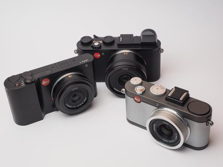
    Some of Leica’s APS-C camera systems: from left, the T, the CL, and the X-E.

    One of those, the CL, is my camera of choice — and despite being six years old and discontinued, is still getting software updates and a growing selection of lenses thanks to the L-Mount lens system. (Another is the T/TL mentioned last month when Sigma introduced the BF.) May it live for a good long while yet, as Leicas tend to do.

    Special Bonus #2: PetaPixel bring us another interview with Sigma’s personable CEO, Kazuto Yamaki, on why he is “so passionate and driven for the success of his family business.”

    Nature and Wildlife Photography Awards

    Highlighting the “endless wonders of our planet,” This is Colossal brings us the fantastic results of the 2025 World Nature Photography Awards, a contest whose photography can “influence people to see the world from a different perspective and change their own habits for the good of the planet.”

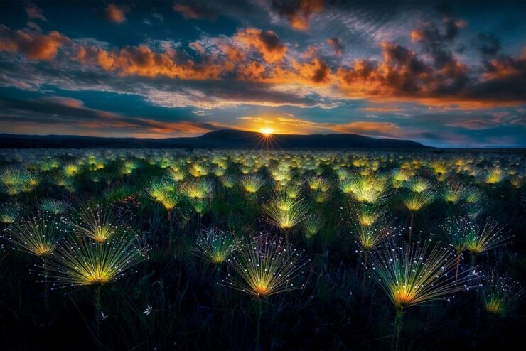
    Fireworks, Brazil. Photograph by Marcio Esteves Cabral.
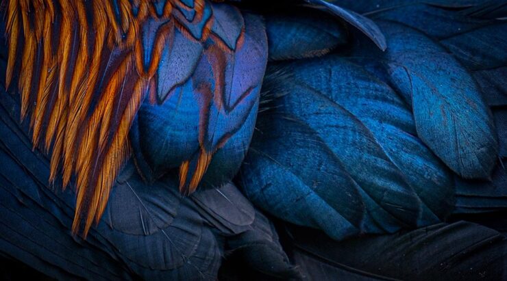
    Feathers, Sri Lanka. Photograph by Pandula Bandara.
    Devghali Beach, India. Photograph by Mantanu Majumder.

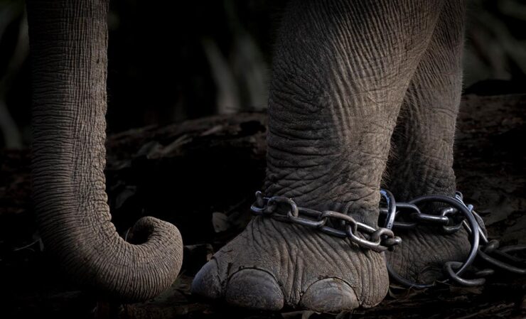
    Of course, it’s impossible to mention today’s wildlife without mentioning the “vulnerability of the earth’s inhabitants and juxtapositions between nature and the human-built environment,” as Colossal notes.

    Ankle Bracelets, United States. Photograph by Charlotte Keast.

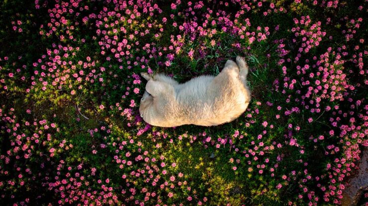
    Meanwhile, there’s also the (unrelated) 2024 Nature Photography Awards, as highlighted by PetaPixel:

    Polar Bear Amid Fireweed Blooms, unlisted Arctic location. Photograph by Christopher Paetkau.

    There are also the 2025 British Wildlife Photography Awards, as noted by This is Colossal:

    Street Cleaners, London. Photograph by Ben Lucas.

    We do, in fact, run into too many of these contests; while I can’t argue with that, I can suggest that nature and wildlife are worthy subjects. Even in fun:

    Declaration of Love. Photograph by Roland Kranitz.

    Crooning, almost — Squirrel Sinatra. See more of the Nikon Comedy Wildlife Awards at PetaPixel.

    2025 Sony Photography Awards

    Another contest, yes, but one that’s gained a stature — almost a half a million entries this year — and one that covers a huge variety of subjects:

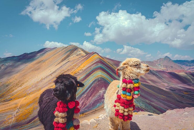
    The Colours of the Andes, Peru. Photograph by Kunal Gupta.

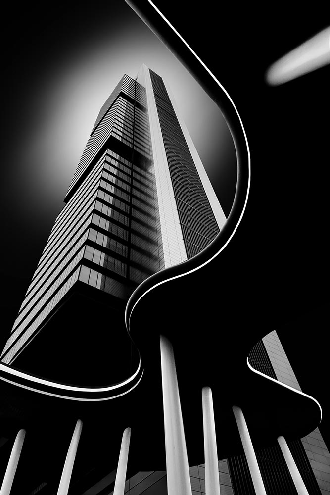
    Naturally, I gravitate towards the architecture category:

    Monochrome Majesty: Cuatro Torres Business Area, Spain. Photograph by Robert Fülöp.
    The Guard, Netherlands. Photograph by Max van Son.
    Centre of the Cosmos, China. Photograph by Xuecheng Liu.

    Read More at This is Colossal and Archinect or visit the World Photography Organisation.

    The Darkest Skies

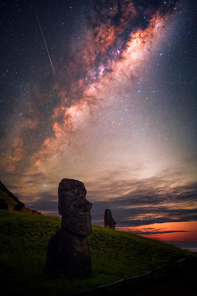
    PetaPixel also brings us photography from Mihail Minkov, who spent nearly six months traveling to “dark sky” locations — those not suffering from the ever-increasing effects of artificial light — and brought home some spectacular results:

    A Moai on Râpă Nui, or Easter Island, in the South Pacific. Photograph by Mihail Minkov.

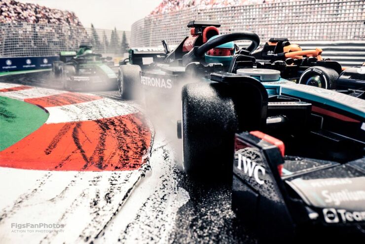
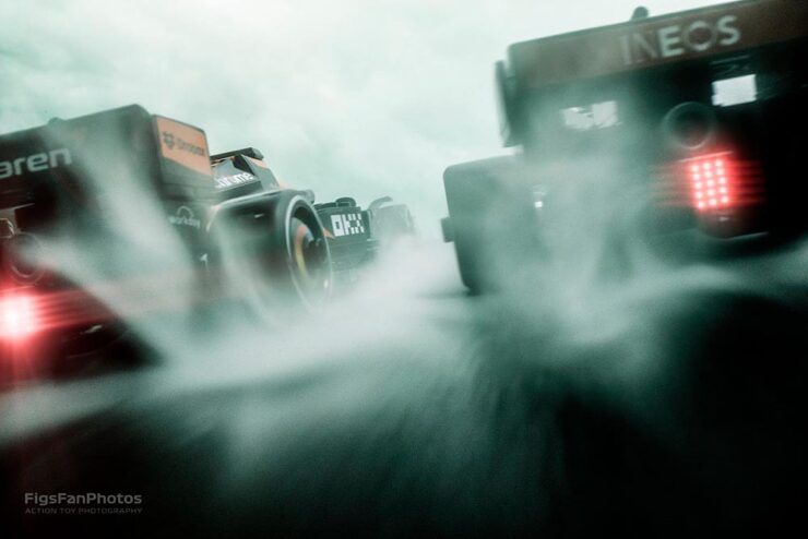
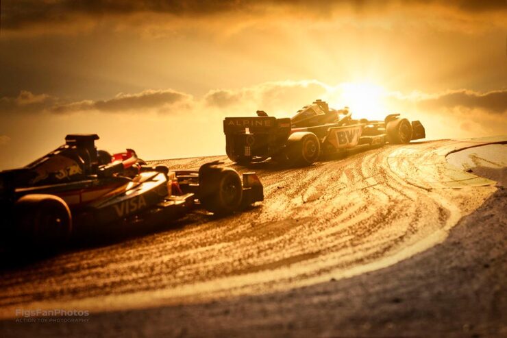
    Special Bonus #3: Lego F1 action photography!

    Great stuff from Hungarian photographer Benedek Lampert. (See his Star Wars Lego photographs, too.)

  • Beautifully Briefed 25.2: Late Winter Stew

    Beautifully Briefed 25.2: Late Winter Stew

    A bunch of tasty ingredients in this month’s post — from friendly identities and open-source typefaces to feel-good photography. Once past the minor rant we’re that covers the other meaning of stew, that is. Read on.

    It’s Nice That on Copyright and Reuse

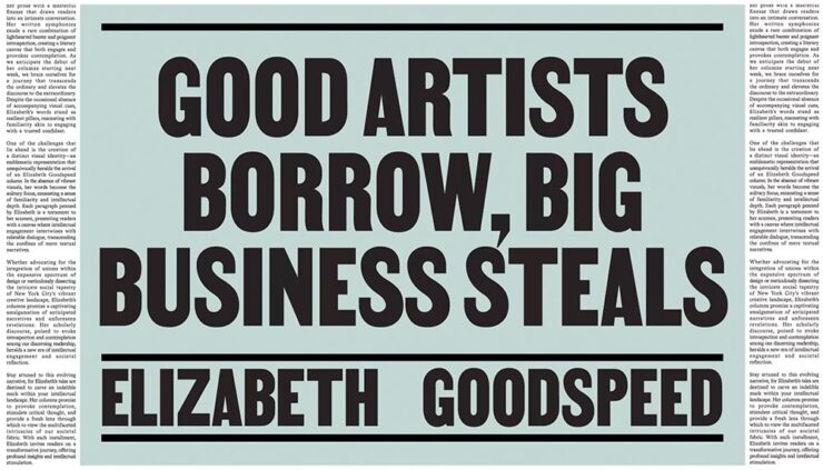
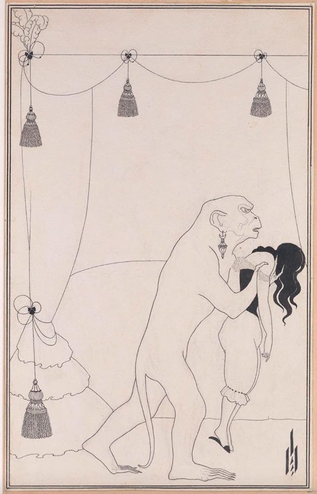
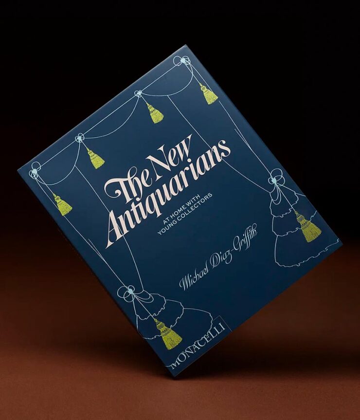
    Elizabeth Goodspeed, editor-at-large for It’s Nice That, has a great column up regarding copyright and the current — and trending — business climate, especially with regard to copyright: it’s become the norm, she argues, for companies to mine open-source and expired-copyright imagery instead of hiring an artist, a trend exacerbated by the rise of AI. “Instead of safeguarding creators, copyright now favors whoever has the resources to outlast their opponent in a legal battle,” she writes. “Since public domain material already looks polished, using it also eliminates the time, effort, and expense of creating something new from scratch (not to mention the time spent building its associative meaning from the ground up). But why would anyone ever commission an illustrator when they can just pull something free from an archive?”

    She’s done it herself:

    The Murders in the Rue Morgue, 1895 (public domain). Aubrey Beardsley.
    New Antiquarians, 2023. Book design by Elizabeth Goodspeed.

    She also points to a new UK proposal for a data mining exemption to be given to AI companies. “[I]t would lead to a “wholesale” transfer of wealth from the creative industries to the tech sector,” Sir Paul McCartney argues. (Source.) But isn’t that true of the larger picture these days, no matter the country?

    Not all borrowing is the same. Copying is often more about power than propriety. When working with archival material myself, I like to think in terms of the stand-up comedy rule: punching up vs. punching down. Picking up visual motifs from a billion-dollar corporation that’s built its empire on copyright hoarding? That’s punching up. Repackaging the work of a living artist from a marginalised background without credit or compensation? Likewise, using found material for an indie zine is a far cry from pulling from the same source for a corporate client that could easily afford to commission something new.

    — Elizabeth Goodspeed, It’s Nice That Editor-at-large

    It is most certainly a trend in book design — but the bigger question here is one she states as fact: “[r]ather than referencing the past, designers are stripping it for parts.” It’s worth stepping back, as designers, and consider how we source — and use — imagery.

    The entire article, only part of which is discussed above, is worth a read. And more than a moment’s thought.

    Okay, on to the fun stuff.

    An author on her own book design

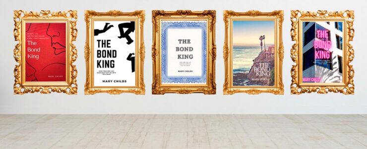
    Mary Childs, a co-host of the Planet Money podcast on NPR, writes on LitHub what it’s like to tackle the cover design for the book she’d written:

    LitHub’s great cover graphic — pun likely intended — for Mary’s attempts.

    “This very slight, low-stakes request for ‘inspiration’ became an all-consuming assignment. My brain started spitting out cover ideas. And then more cover ideas. I was sure I would break through and create the Great American Finance-book-that-reads-like-a-Novel Cover,” she writes — and, better still, backs up with illustrations.

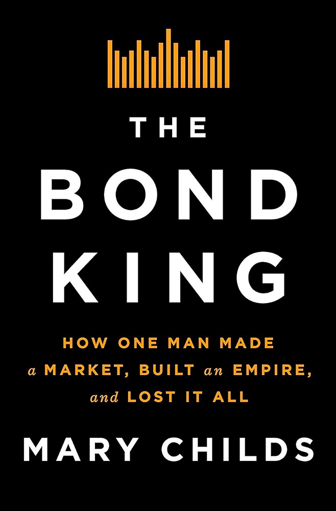
    Cover design by the Flatiron Books in-house art dept.

    In the end, she left it to the professionals — but the trip is absolutely worth the read. (Be sure to follow the Na Kim link, too.) Via Kottke.

    Special Bonus #1: Speaking of Na Kim, and also via Kottke, she’s somehow found time to start painting. “Be careful what you’re good at, you’re going to get stuck doing that.”

    The Fantastic Mr. Font (and other big Dahls)

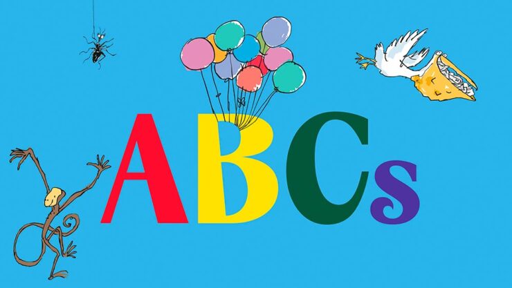
    “Pluckish and playful” is more than a description of the wonderfully-named Fantastic Mr. Font, it’s the description of the new identity for the Roald Dahl Story Company. (Which is, unfortunately, a division of Netflix — but we’ll leave that for another day.)

    Just right. So, too, it the font’s interaction with various illustration elements:

    Roald Dahl and Sir Quentin Blake — plus the new font.

    The typeface was “developed in collaboration with type foundry Pangram Pangram, the font is a customisation of its existing font PP Acma, turning its already unconventional characteristics into something ‘more mischievous,’” Ellis Tree — another great name — writes at It’s Nice That.

    Read the full, well-illustrated story.

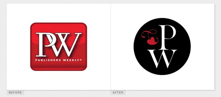
    Special Bonus #2: While we’re on the subject of branding, check out the new look for Publisher’s Weekly:

    BrandNew’s before-and-after of the PW logo.

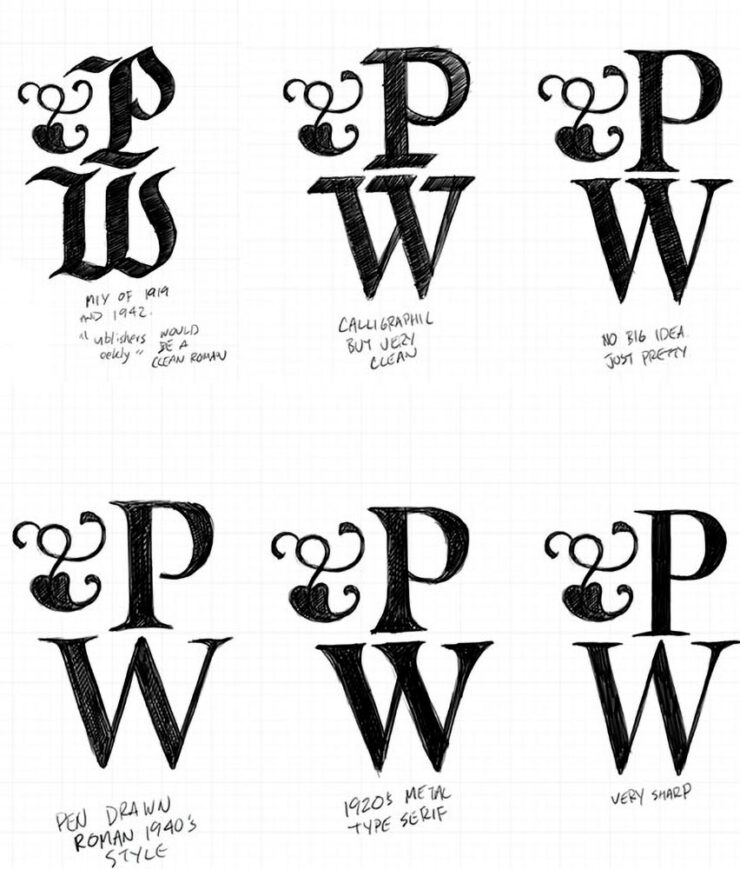
    It’s actually a return to an older form, but updated. Their website has a brief explanation. (Via BrandNew.)

    PW examines options for their new/old logo.
    Some Fantastic Fonts
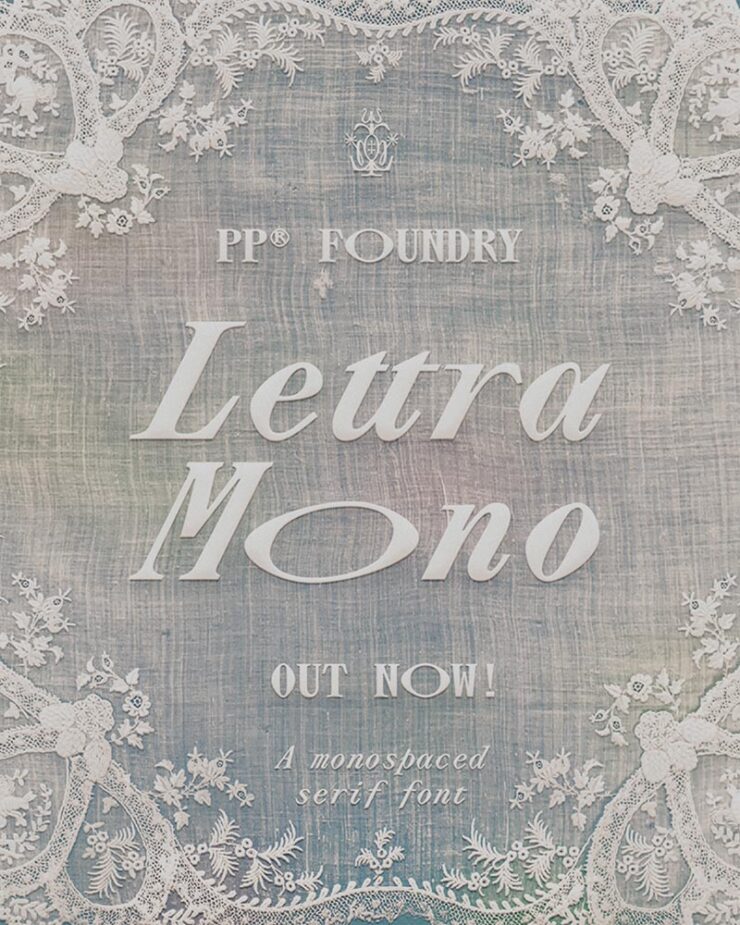
    Lettra Mono

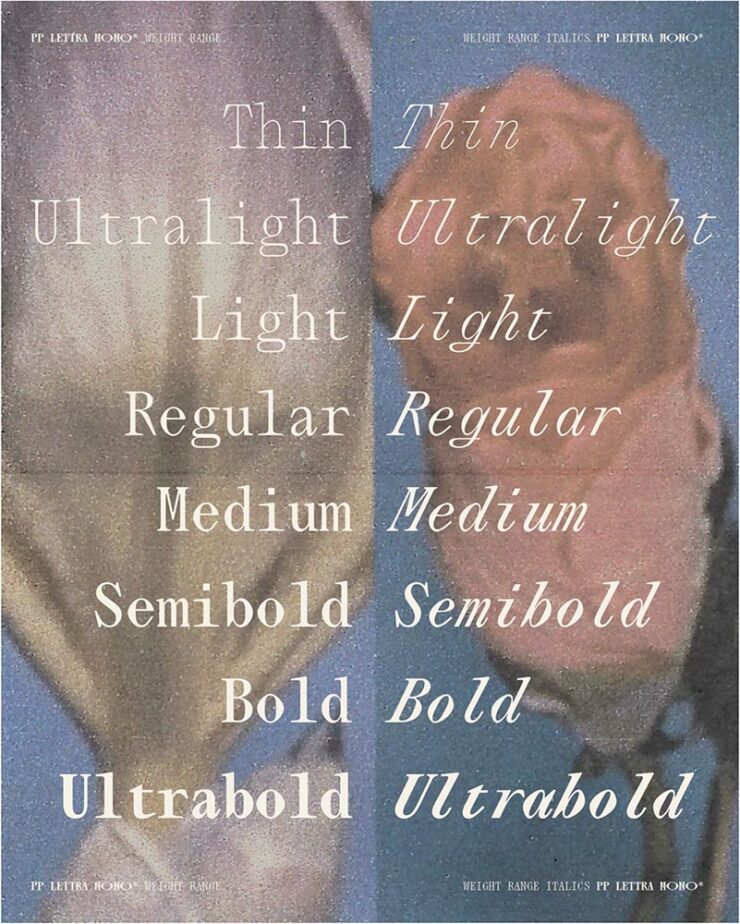
    Speaking of Pangram Pangram, let’s start there: their Lettra Mono was the standout of Creative Boom’s roundup of new fonts for February. Monospaced serif fonts are unusual, but good ones….

    The italics, especially.
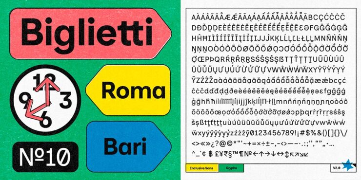
    Inclusive Sans

    CB also chose the incredible update to Inclusive Sans, which was also the subject of an article at It’s Nice That — and, better still, free, open-sourced, and now available in five-weight goodness at Google Fonts.

    Love the retro style of the supporting images.

    “Inclusive Sans is a new typeface from Olivia King that puts accessibility at the forefront,” It’s Nice That writes. “It’s arisen from the type designer’s research into typographic accessibility and readability – from highly regarded traditional guides and papers to more modern approaches to letterform legibility.”

    Available in a variable weight, too.
    Gorton

    Marcin Wichary — he of Shift Happens fame — pens (heh) an comprehensive and incredibly well-illustrated article on Gorton, a typeface you’re undoubtedly seen but don’t know.

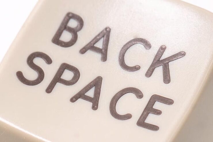
    Anyone who knows Shift Happens will recognize the illustrative style. Photograph by Marcin Wichary.

    “One day,” he writes, “I saw what felt like Gorton on a ferry traversing the waters Bay Area. A few weeks later, I spotted it on a sign in a national park. Then on an intercom. On a street lighting access cover. In an elevator. At my dentist’s office. In an alley.”

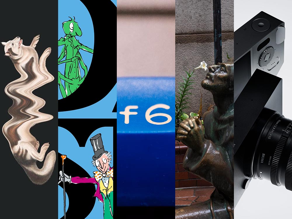
    See also the f6 in the title image, above. Photograph by Marcin Wichary.

    It’s a long post, so save it for when you’ve a minute to enjoy — but 110% worth it.

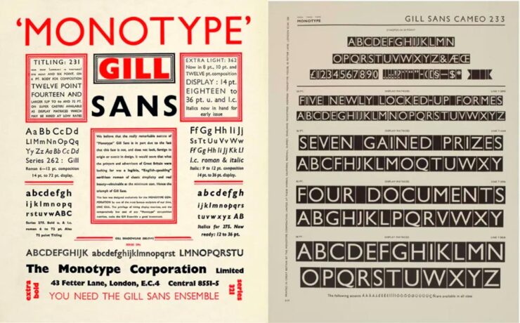
    Special Bonus #3: Creative Bloq has a list of the best typography of the 1920s — “from Futura to Industria Gravur” — as chosen by designers. My fave? Gill Sans, of course.

    Used in Saab’s advertising, amongst about a billion other examples.

    Special Bonus #4: Nick Heer at Pixel Envy comments on a list posted by Robb Knight: “Something very useful from the Atlas of Type: a huge list of type foundries.” A good Canadian citizen, he reminds us that Pangram Pangram is, in fact, Canadian. More: “I was particularly excited to learn about Tiro Typeworks. They have a vast library of type for scientific and scholarly works [… I]f you are reading this on MacOS, you probably have STIX Two installed.”

    Some Great Photography

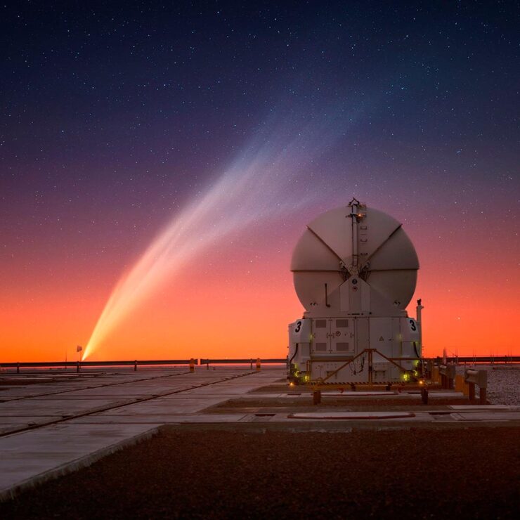
    Comet G3 visits every 600,000 years, they say. Hmph.

    Yuri Beletsky of the ESO caught G3 over the telescopes in Chile.

    Great stuff. See more at PetaPixel.

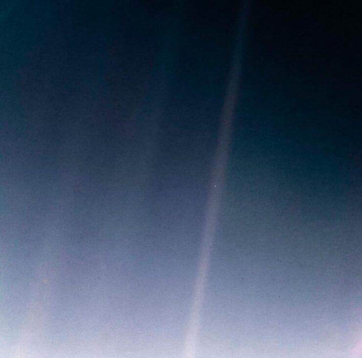
    Meanwhile, on the subject of space — and PetaPixel — a reminder that one of the most infamous photographs in history turned 35 on Valentine’s Day:

    The Pale Blue Dot. (2020 remastered edition.)

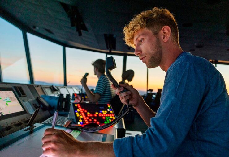
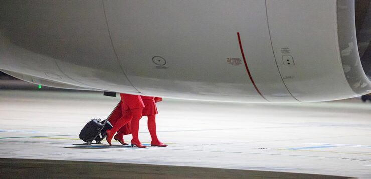
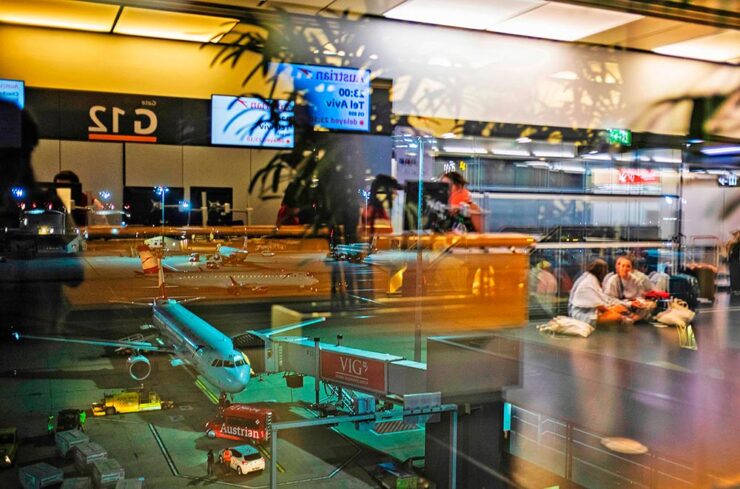
    Aaaand one more from PetaPixel: a book. Eight photographers documented 24 hours at the Vienna Airport, offering up more than a few behind-the-scenes shots — in celebration of its 70th anniversary:

    Photograph by Jérôme Gence.

    “The project was overseen by Lois Lammerhuber,” PetaPixel writes, “a publisher and photographer, who has since turned the collection of images into a book titled The Dream of Flying.”

    Photograph by Ulla Lohmann.

    The project was “about showing the people who use the airport as well as highlighting the staff who ensure all the airplanes depart and land safely.” My favorite shot:

    Photograph by Ana María Arévalo Gosen.

    I’m an airport and large/commercial plane junkie — and old enough to remember when all-access at the local airport wasn’t a big deal — so it was great to see these.

    Lastly, from This is Colossal, another round of the “coincidental” style of Eric Kogan:

    Photograph by Eric Kogan.

    All NYC this time. Check ’em out.

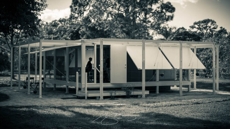
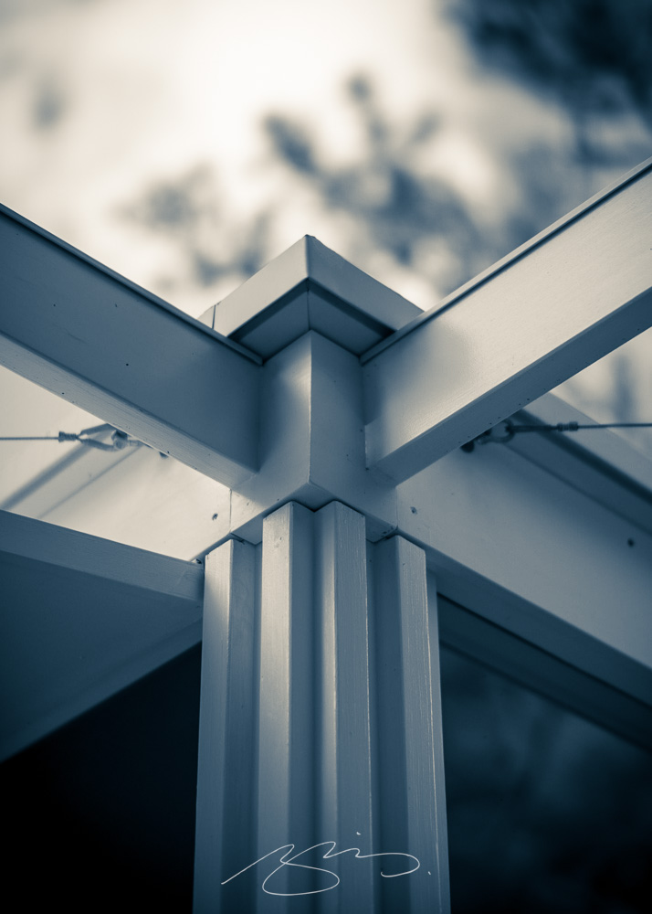
    Special Bonus #5: Art News notes that Paul Rudoph’s Walker Guest House is for sale for the bargain price of $2 million. It’s a kit home that’s been assembled in various places, including the grounds of the Ringling Museum in Sarasota, Florida. (It’s currently in storage in Rhinebeck, New York. Shipping is not included.)

    So why is in the photography section, you ask?

    Photograph by Giles Hoover.

    That’s why. Check out more of my photography from Ringling and Sarasota. (The Walker images are near the top.)

    Photograph by Giles Hoover.
    Sigma: a new BFF?

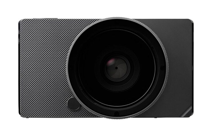
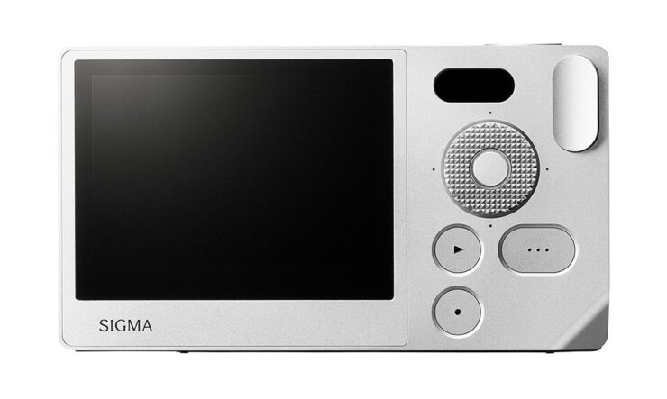
    No, that’s just BF — it stands for “beautiful foolishness,” after a line from a poem in Okura Tenshin’s The Book of Tea — but, as usual for them, something different. Something good.

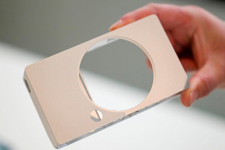
    Like the FP before it, there’s nothing you don’t need, bordering perhaps on a minimalism that’s … stark? No viewfinder, no stabilization, no mechanical shutter, built-in memory (so no card slot), haptic interface. But style for days, a great shape and texture, and absolutely the right size.

    It’s made at the rapid clip of nine per day, because it’s made from a single billet of aluminum — shades of the Leica T/TL/TL2 (something I maintain was before its time, and discontinued short-sightedly) — except full-frame. And, of course, supported by Sigma’s extensive catalog of L-mount lenses. (Another commonality with the TL.)

    At $2000, it’s the right price, too. Read more here or here or here.

    Oh, and one more thing: Sigma has a new identity to go with the BF:

    Slightly more formal, slightly on-trend typography, which is fine — but the logo is clever in being both a letter and a lens. More of that just right to close out the day.

    Special Bonus #6: Sigma’s CEO Kazuto Yamaki is charismatic, interesting, and dedicated, as seen in the videos PetaPixel has introducing their new HQ building in 2022. Love the library-wrapped staircase.

    Update, 4 March 2025: PetaPixel has posted a YouTube podcast/interview with Kazuto Yamaki, in which he talks about the BF and possibly a new, “serious” camera to compliment their 300-600mm lens. (This is probably a better intro to Sigma’s CEO than the above.)

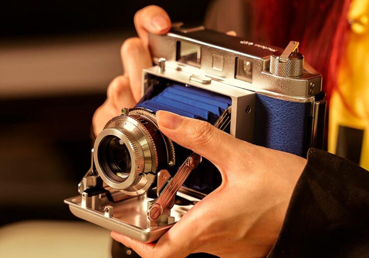
    Special Bonus #7: TTArtisan, the Chinese manufacturer making interesting L-mount lenses — I have two, both solidly in the cheap-and-cheerful category — is about to introduce their first camera … and “interesting” is, in fact, the best way to describe it:

    Purely mechanical, no batteries required, instant film camera that’s decidedly retro.

    See you in the spring!

  • Beautifully Briefed 25.1: A Different Year

    Beautifully Briefed 25.1: A Different Year

    This edition discusses new type, mergers and items set free, and visits with both some photo contest winners and winning poster designs. (And if you haven’t seen my annual Favorite Book Covers post, keep scrolling.) But first…:

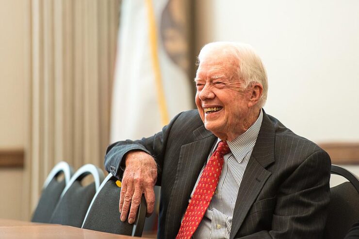
    Former President Carter
    Commonwealth Club, San Francisco, 2013. Photograph by Ed Ritger. (CC 2.0.)

    One of the strongest voices of reason left us on December 29th, 2024: former President Jimmy Carter. He’s the first president I actually remember, and one of the things I’ve appreciated about recent years is the growth of his stature from undeserved fill-in-label-here to treasured humanitarian.

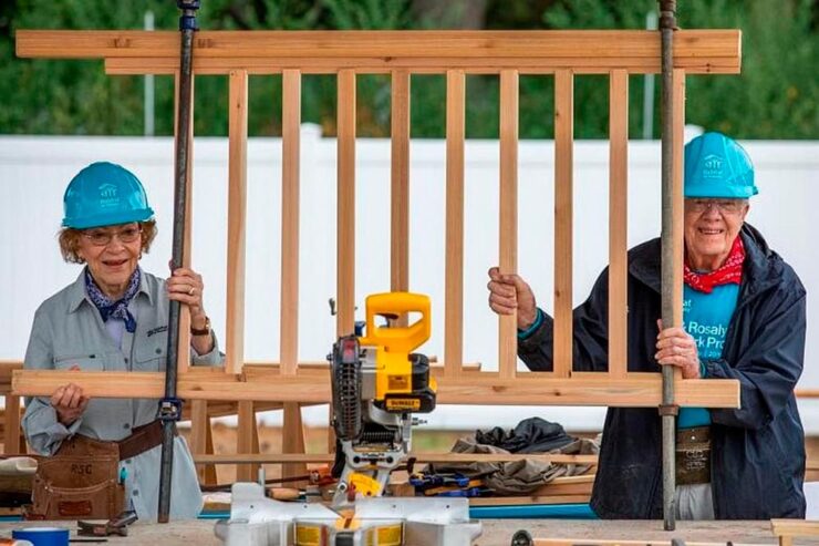
    I’d like to share a couple of items that are meaningful to me. First is his commitment to Habitat for Humanity — and not only as a speaker and fundraiser, but someone who contributed by actually swinging a hammer:

    Former President Jimmy Carter and former First Lady Rosalynn Carter. Photo via Habitat for Humanity.

    Into their 90s and still working. Take it from David Letterman:

    While we’re on the subject of David Letterman, this September, 1993 appearance shows both humanity and humor:

    Another quick item is this 60 Minutes tour of his office — something that always speaks volumes about a person:

    Plains, Carter’s lifelong residence, is a frequent sojourn for me, and a recommended way to both experience rural Georgia and learn more about his roots. (I had always intended to attend one of his regular Sunday school lessons and regret not having made the time.) Visit when you have the opportunity.

    Water Mill, Carter Farm, 2021. (Adobe Content Credentials applied.)

    May your influence of peace continue for another lifetime, Mr. President.

    New Type of Year

    Creative Boom brings us their roundup of new typefaces for January, and a couple caught my attention:

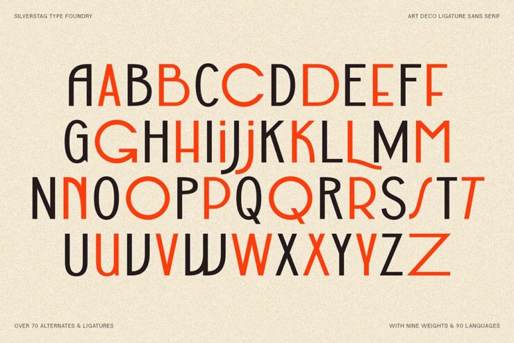
    Bergamot Grotesk.

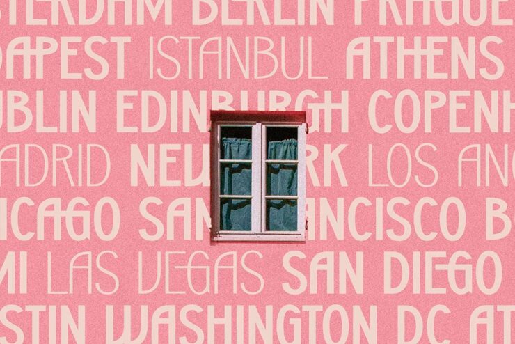
    SLTF Bergamot Grotesk, an Art Deco-style, all caps headline face is a striking new option from Silverstag. This is trendy, of course — Art Deco is in — but timeless at the same time, and something I hope I have an opportunity to use.

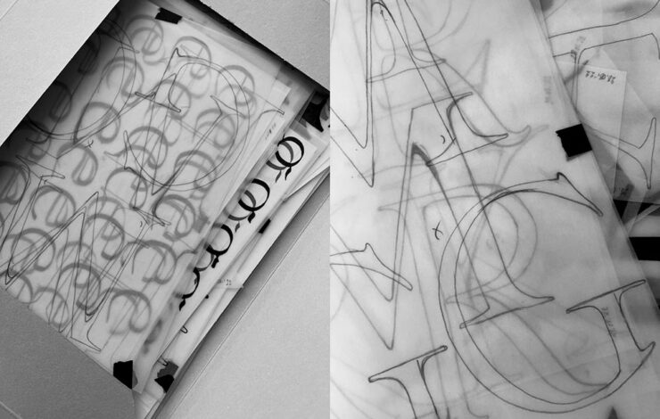
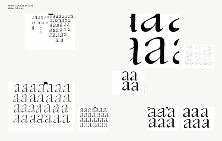
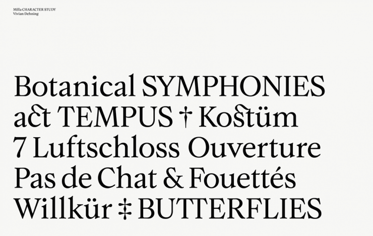
    Another is a new version that’s instantly a beautiful classic, Milla, hand-developed and a joy to look at:

    Hoping for the perfect book project for this one.

    Mergers … and Freedom

    If you’ve not heard, Getty and Shutterstock have proposed a merger. This is, put simply, both understandable and … not good.

    PetaPixel covers both the announcement, with the usual words from the greedy types CEOs, and a history of both companies and their role in how we got here. This is perhaps the most relevant, however:

    The rise of artificial intelligence has likely played a role in the merger; the combined assets of Shutterstock and Getty are a treasure trove of training data for AI companies. However, while AI licensing deals are an opportunity, it could also be an issue for stock photo companies as customers may decide to use AI image generators like Midjourney or DALL-E rather than pay for individual pictures.

    — Matt Growcoot, PetaPixel

    For the record, I completely agree with PetaPixel‘s Jason Schneider when he opines that it’s “yet another step in a race to the bottom.” The deal could possibly attract antitrust notice from the U.S. government; here’s hoping.

    But it’s also hopeful — and slightly wonderful — that it’s new year, which means a new crop of items are now freed from the constraints of copyright. Kottke lists some of his favorites, and points us to a fantastic post from Duke University’s Center for the Public Domain, which has lists and links aplenty. (My favorite: Tintin.)

    Image via This is Colossal.

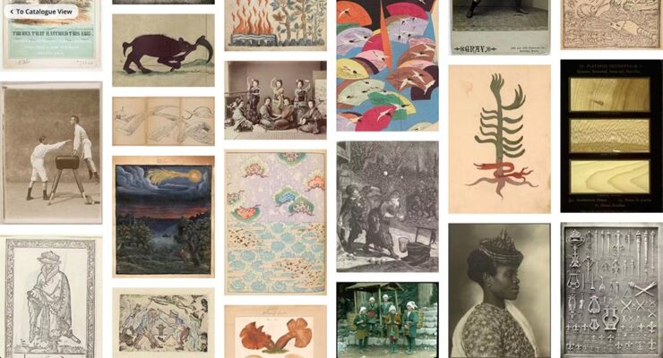
    But there’s more: This is Colossal points us to a new resource for items in the public domain: the Public Domain Image Archive, from the Public Domain Review, which hosts more than 10,000 images freely available to use, reuse, mix, or whatever. Awesome.

    Couple of faves:

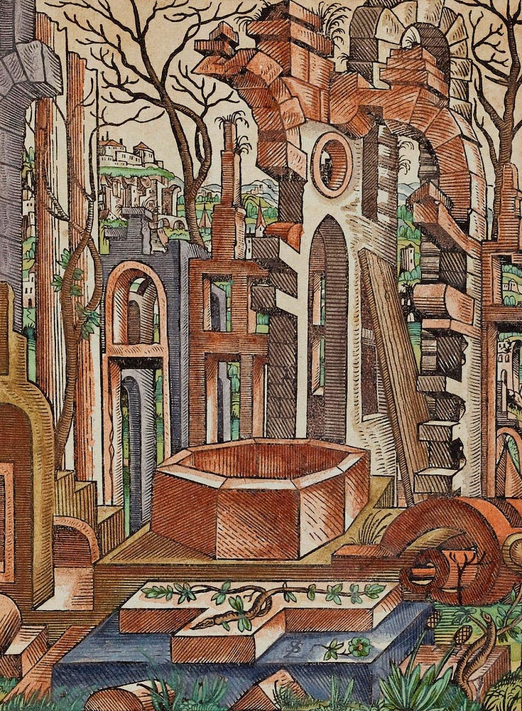
    Lorena Stoer, Geometric Landscapes, from 1567. (Yes, you read that right.)
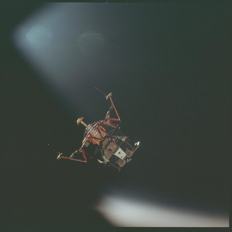
    Apollo 11, 1969, from NASA.

    Another NASA image is in the header, and we’ll see another from them in a minute.

    Meanwhile, Public Domain Review also has a list of items copyright-free as of the new year; check both resources — and use some newly-available items to your heart’s content.

    Special Bonus #1: This is Colossal, in 2016, also pointed us to another collection of freely-available items, this time from the New York Public Library. Great stuff.

    Special Bonus #2: In a three-fer for This is Colossal, they also highlight a new campaign from the U.S. National Archives asking those who can read cursive — no longer a requirement in school, a completely daft decision we’ll leave for another time — to contribute some time translating historical items. (And that’s not all you can do.) Become a Citizen Archivist today.

    Get Lectured

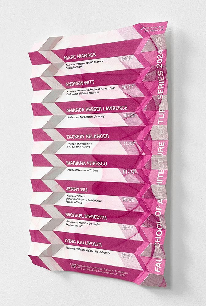
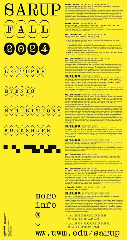
    No, not me: Archinect (previously) highlights their favorite architecture school lecture posters from Fall ’24, which I somehow didn’t mention. A couple of favorites:

    Florida Atlantic University.
    University of Wisconsin at Madison.

    The new year is off to a good start, too:

    UCLA.
    UPenn.

    UPenn’s fall ’24 poster is in the same vein and also rocks. Check out all the winners — and watch this space for more.

    Winning Photography

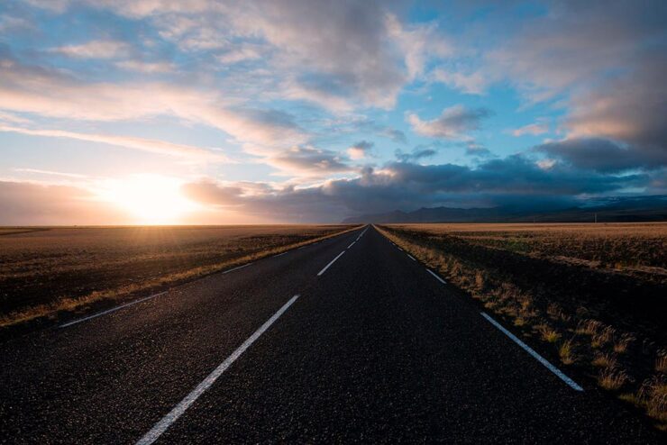
    I’m threatening to get a Raspberry Pi — the ol’ fashioned ad-blocker route is less and less effective, and a more robust alternative may be added — and was interested in this PetaPixel story about the desktop photos the system uses as standard: “[w]alking through a train station in New Zealand, Greg Annandale looks up to see his photo on an information screen. The Raspberry Pi computer powering the board has gone back to the desktop wallpaper which Annandale shot of a road in Iceland.”

    That would be this one:

    Road, Sólheimasandur, Iceland. Photo by Greg Annandale.

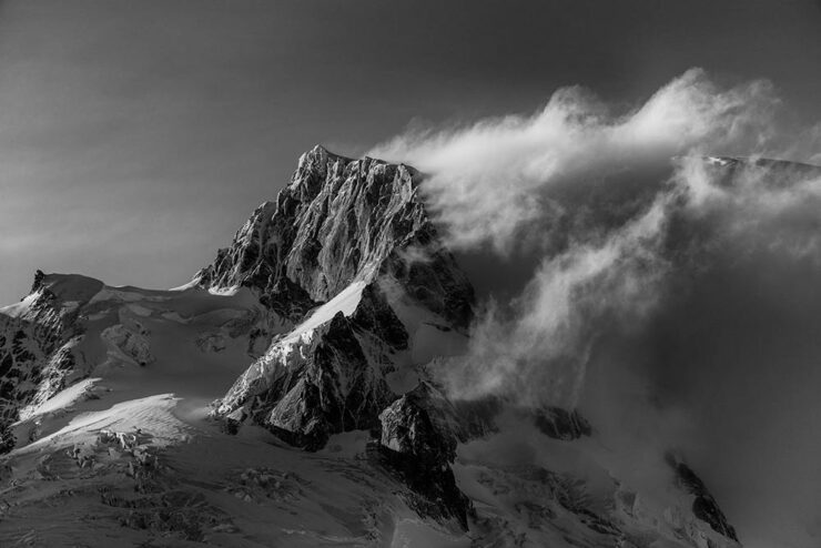
    Couple of others:

    Pia Fjord, Patagonia. Photo by Greg Annandale.
    Cordillera Darwin, Patagonia. Photo by Greg Annandale.

    Good stuff. Check out his website for more, and see the whole Pi here.

    Next, I promised NASA would put in another appearance. How’s this:

    Photo by Don Petit/NASA.

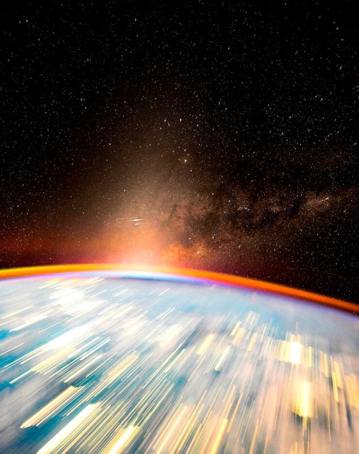
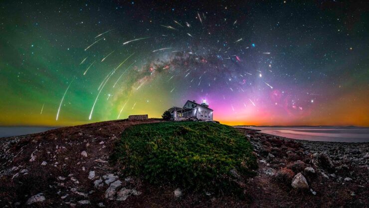
    In what Ars Technica senior space editor calls “the best picture ever taken from the International Space Station,” we have something special indeed. “In this image, one can see the core of the Milky Way galaxy, zodiacal light (sunlight diffused by interplanetary dust), streaks of SpaceX Starlink satellites, individual stars, an edge-on view of the atmosphere that appears in burnt umber due to hydroxide emissions, a near-sunrise just over the horizon, and nighttime cities appearing as streaks.”

    Wow.

    To round things out for January, we have a couple of photo contests whose winners caught my eye. We’ll start with The Society of Photographers and their photographer of the year 2024. My faves:

    Architectural Photographer of the Year award. Photograph by Andre Boto.
    Events Photographer of the Year award. Photograph by Mark Lynham.

    While I wish their selections were more extensively labeled and/or titled, it’s still awesome to see the raw talent highlighted with well-deserved accolades. See the PetaPixel story or the contests’ website for more.

    Lastly, some life in the wild, courtesy of the UK’s Natural History Museum People’s Choice Award:

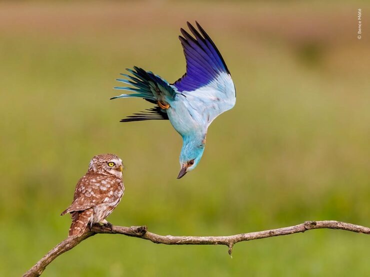
    Annoying Neighbour, Kiskunság National Park, Hungary. Photograph by Bence Máté.

    “Eyeing one another” fails to do this one justice. And then there’s the Villarrica volcano:

    Earth and Sky, Pucón, Chile. Photograph by Francisco Negroni.

    But it’s the patience of this shot that wins it for me:

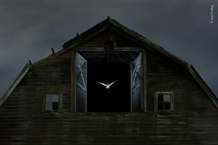
    Edge of Night, near Vancouver, BC, Canada. Photograph by Jess Findley.

    “Jess quietly watched the owl for several nights to understand its habits.

    “He set up an invisible beam that would trigger a flash when the owl flew out of the barn. Simultaneously, a slow shutter speed gathered ambient light cast on the clouds and barn.

    “On the tenth night, all the moving parts came together as the owl left to begin its hunt.”

    The winner of this contest will be announced on February 5th. Check the website. (Via This is Colossal.)

    See y’all in February.

  • Beautifully Briefed 24.12: New Year’s Eve Fireworks

    Beautifully Briefed 24.12: New Year’s Eve Fireworks

    Let’s continue a couple of discussions before closing out 2024, and send you into 2025 with some photographic and typographic goodness.

    More AI Book Design

    This was mentioned in another context in July, but is heading our way more aggressively as time goes by, with Microsoft and TikTok, among others, getting into the publishing arena.

    Cover design: unknown. (Human or machine: unknown.)

    While Microsoft’s new imprint, 8080 Books, plans “to test and experiment with the latest tech to accelerate and democratize book publishing.” They’re not entirely up-front about what that is — and might not know themselves yet, given the rapidly evolving tech and marketplace. That said, with the corporate giant’s name attached, we can be assured of some level of quality.

    Yes, I just wrote a sentence suggesting that Microsoft is a guardian of quality. (“Books matter. In a deluge of data. In a bloat of blogs, a sea of social, and a maelstrom of email. Books will always matter,” they write.)

    With others, the for-profit nature — TikTok’s engagement-before-all-else approach speaks volumes (or writes volumes, as the case might be) — assures that quality might come behind, say, slop. Publisher’s Weekly reports that 320 publishing startups have emerged just in the last two years, most in the AI space, adding to the 1,300 noted as of 2022. (PW also notes, “It is widely believed that each of the Big Five publishers has internal AI projects discreetly hidden from view.”)

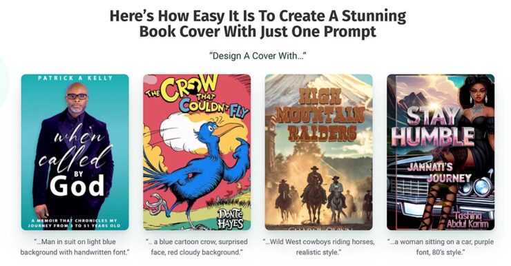
    And then there’s this: introducing Spams Spines, your AI book design and book completion service: “[f]rom manuscript to book in your readers’ hands – a single platform to help any author proofread, cover design, format, print, and distribute over global channels — zero tech know-how required.” Prices start at $1500 and promise a finished product in less than 30 days.

    Their goal is to release 8,000 books per year. AI is heavily involved:

    There’s a Sherlocked joke here somewhere….

    Because, yes, you want a machine to suggest that Sir Arthur Ignatius Conan Doyle needed assistance regarding a turn of phrase. (Never mind his expensive editor.)

    The first and third are really “only” bad. However, Dr. Seuss would like a word with Spines’ AI training dataset, please, and the cover for “Stay Humble” defies words.

    But it’s the book design that got my attention: these are apparently the good ones, the cited examples to which someone says, “Yes! Take my money!”

    The sad thing is that people will say that. Have already said that. And there’s much, much on the publishing industry’s horizon. Our horizon.

    Read more at The Conversation, “The tech world is ‘disrupting’ book publishing. But do we want its effortless art?” Shout out to the AV Club and the aforementioned PW article.

    The Cat Leaps

    Last month, we left off Jaguar’s continuing road trip with a teaser. Let’s get right to it. The car’s called the Type 00:

    Some details:

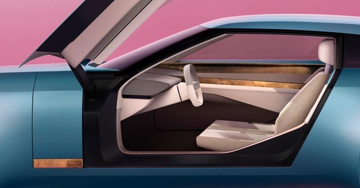
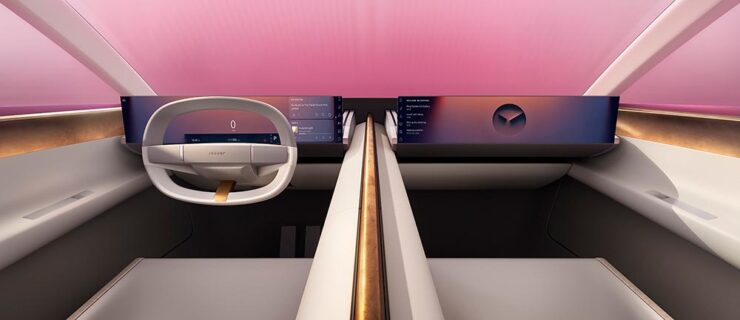
    The interior:

    The internet, predictably, has lost its collective … um, mind. However, amongst the melee, there are a few items worth mentioning.

    Creative Boom: “If the new logo seemed divisive in isolation, seeing it brought to life with Type 00’s design has brought much clarity. The flush surfaces, panoramic roof, and glassless tailgate – all adorned with the new Jaguar device mark and reimagined leaper – create a cohesive vision of modern luxury. Rawdon Glover, managing director of Jaguar, emphasised the importance of this shift: ‘We have forged a fearlessly creative new character for Jaguar that is true to the DNA of the brand but future-facing, relevant and one that really stands out.’”

    The quote there is something to pay attention to. Read those words again, and think about the actual choice of language; it’s this, exactly, that has struck some. Armin at Brand New, for instance: “[W]hat I dislike the most about the new Jaguar brand: its tone of voice is INSUFFERABLE. Everything from the platitudes in the campaign to the script of McGovern’s presentation to the press releases is obnoxiously over-confident and self-congratulatory.” (Brand New, while excellent, is subscription-only — alas without a sample article. Here’s a link anyway.)

    Meanwhile, Dezeen provides us some real-world images from the Miami launch:

    Wai Shin Li, via Dezeen

    But it’s The Autotopian that stands out. They have not one but two excellent articles by Adrian Clarke, an ex-JLR1That’s Jaguar Land Rover, before it was, um, initialized by owner Tata. designer, who has several important points to contribute:

    A couple of weeks ago, the cancelled X351 Jaguar XJ leaked onto the internet. During my time at Land Rover, I saw this car back in 2018 and can confirm this is indeed, or rather was the EV XJ. Back when Mr. Tata was still alive every six months or so there would be a big board level presentation for him on upcoming products. […] I was privy to all the future production Jaguars and concepts. There was a J-Pace SUV to sit above the F-Pace (no problem in revealing this as it’s common knowledge) and everything else was as you’d expect. These cars were then cancelled as part of the revamp and one absolutely incredibly beautiful and exceptional proposal aside, nothing of value was lost.

    It’s the first time I’d seen the cancelled-just-before-release XJ EV, and despite the incomplete body panels and obviously-on-the-sly phone shot, it’s incredibly disappointing. They made the right call.

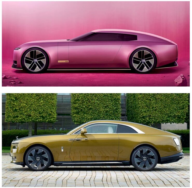
    Compare it next to a Rolls Royce Spectre, a car the production Type 00 will be a competitor for, and see how successfully it hides its bulk in profile. [I]n the side view, particularly in the bottom half, I’m seeing some Range Rover. The crisp shoulder line, the kick-up of the tail behind the rear wheel, and the feature line along the bottom of the bodyside all scream Range Rover. This is exacerbated by the verticality of the front and rear of the car – the new full-size Range Rover and Sport have sharply docked tails. I heard that the initial sketch of this car was done by Massimo Frascella before he departed for Audi. Frascella was McGovern’s right-hand man at Land Rover for decades before Ian Callum retired and McGovern used the opportunity to bring both the Jaguar and Land Rover studios together. So maybe that’s where this Range Rover influence comes from.

    The Jaguar Type 00, top, and Rolls-Royce Spectre, bottom, courtesy of The Autopian.

    We must remember this is only a concept. The actual production car will be a four-door GT. This is only a preview of the visual style of future Jaguar models. It’s certainly striking, but you’d struggle to call it beautiful. It’s also monolithic and slabby.

    Let’s hope this brutal revamp is […] successful, because there are a lot of jobs depending on it.

    — Adrian Clarke, ex-JLR designer

    There’s much more from those two articles, too much to quote here, so please go read them — the initial report is more on the design, while the second delves into the why: “Why Jaguar Had To Blow Up Its Brand In Order To Save It.“

    Meanwhile, I’ll actually be rooting for JLR to pull this one off. I’m not in the target audience — at all — but Jaguar needed to do something radical and, by God, they did just that. The concept is interesting. Some of the details are fantastic. Here’s hoping, indeed.

    Update, 15 Jan 2025: Turns out the Jaguar’s designers were a little worried about the outcome — or the outsourcing, in this case — and its effect on the brand. The Drive has the details.

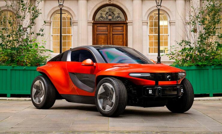
    Special Bonus #1: Motor1 has a feature on Ian Callum’s current whereabouts. There are too many hypercars these days, but the Skye looks cool:

    The Callum Skye concept. (An island buggy?)
    Some Extraordinary Items of “Normalcy”

    To close out 2024, let’s take a break, pour a beverage, and enjoy some of what you read Foreword for: great photography, typography, and design.

    Northern Lights

    I didn’t know — or didn’t remember — that amongst the glut of photography contests is one dedicated to the phenomenon known as the Northern Lights.

    Cosmic Explosion, Isteria, Croatia. Photograph by Uroš Fink.

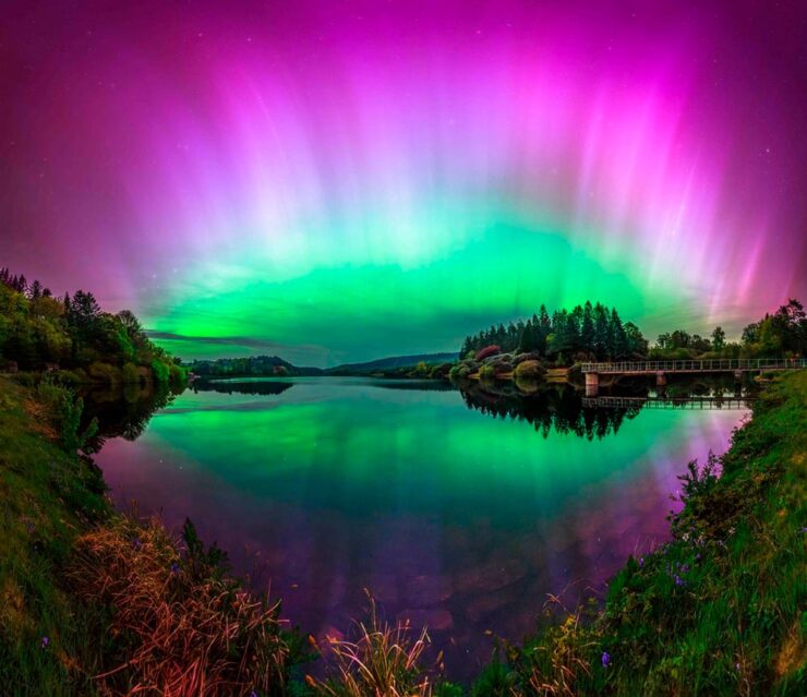
    PetaPixel reminds us that Capture the Atlas’ Northern Lights Photographer of the Year competition features some exceptional opportunities to make spectacular captures this year due to the solar maximum — the peak of its eleven-year cycle.

    Celestial Reflection, Dartmoor National Park, UK. Photograph by Max Trafford.

    The 2024 competition awards feature 25 winners, each with a narrative and each a striking example of the larger system we’re part of. Check it out. (Also via This is Colossal.)

    Nature

    PetaPixel is among several that point us to the Nature Photographer of the Year contest, with images both poignant and funny. Since it’s New Year, let’s go with the latter:

    Besties, Washington State, US. Photograph by Marcia Walters.

    Of course, there’s just “spectacular,” too:

    Cross to Bear, Talek River, Kenya. Photograph by Paul Goldstein.

    The contest’s winners page features many more, separated into categories; be sure to click on the individual photographs to get larger sizes and the story with each. Fantastic stuff.

    Frozen Prairie Landscapes

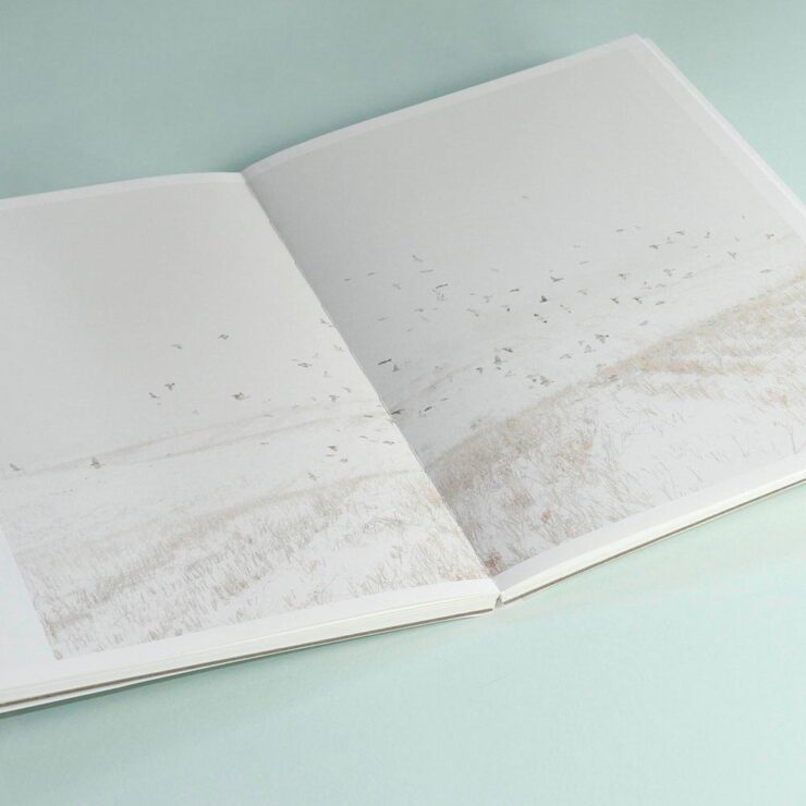
    Saskatchewan gets cold in the winter, but there’s a beauty to those temperatures, photographer Angela Boehm tells PetaPixel.

    Image from Minus Thirty. Photograph by Angela Boehm.

    “The frozen prairie landscapes, while a subject in their own right, serve as a powerful metaphor for the deeper themes the book explores: loss, memory, and resilience,” she says. […] “The loss is embodied in the emptiness and biting cold. The memory, or its gradual fading, is represented by the snow obscuring the horizon, softening and blurring the scenes. And the resilience is in the solitary tree — a steadfast survivor of countless storms in this unforgiving landscape.”

    — Angela Boehm, Minus Thirty

    Read more of PetaPixel‘s story of realization to publication or just check out the title.

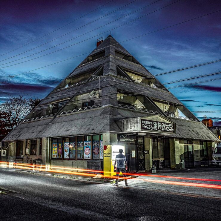
    Special Bonus #2: Another book on an interesting subject — Japan’s brutalist architecture, which somehow manages to bring an inherent quality to the cement:

    Mixed-use complex, 1994, by Kuniyoshi Design. Photograph by Paul Tulett.

    Dezeen has more.

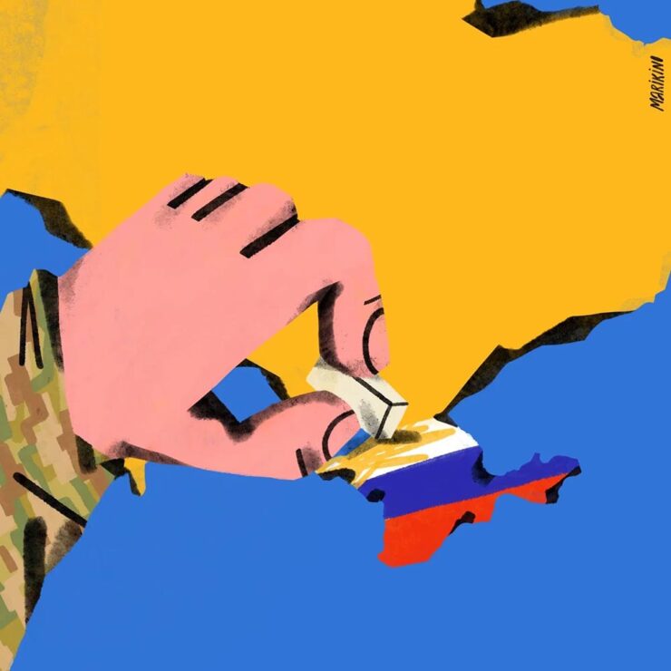
    Ukraine’s “Fight for Visual Identity”

    This PRINT piece is excellent: “A cultural gap persists in how history is organized and interpreted. I left the library without my requested images but with a lingering realization that how we organize history, even within the hallowed walls of an institution like the New York Public Library, can reflect the biases and oversights of a collective cultural perspective,” writes El. Stern.

    Home Soon, Dear. Image by Maria Kinovych, 2022.

    “Today, Ukrainian graphic design is rooted in national identification, in search of future needs, and in understanding the cultural influence of a painful past on a, once again, painful present.”

    Ukraine’s search for a future — and present, and past — in design. Great read.

    “A must-have manual for hot metal enthusiasts and linotype lovers”

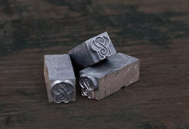
    Type Archived, a new book whose fundraising campaign I didn’t see in time: a “stunning visual tour of traditional typefounding and offers a definitive account of London’s legendary Type Archive,” writes Wallpaper*.

    Custom metal for the book project.

    The book “traces the origins of typography through the physical tools, objects and machinery that made the printed word possible. Full of rich photography, [it’s] a visual journey through the punches, matrices, presses, type and paper which tell the story of the UK’s preeminent typefounding industry.”

    Hopefully available at bookstores soon.

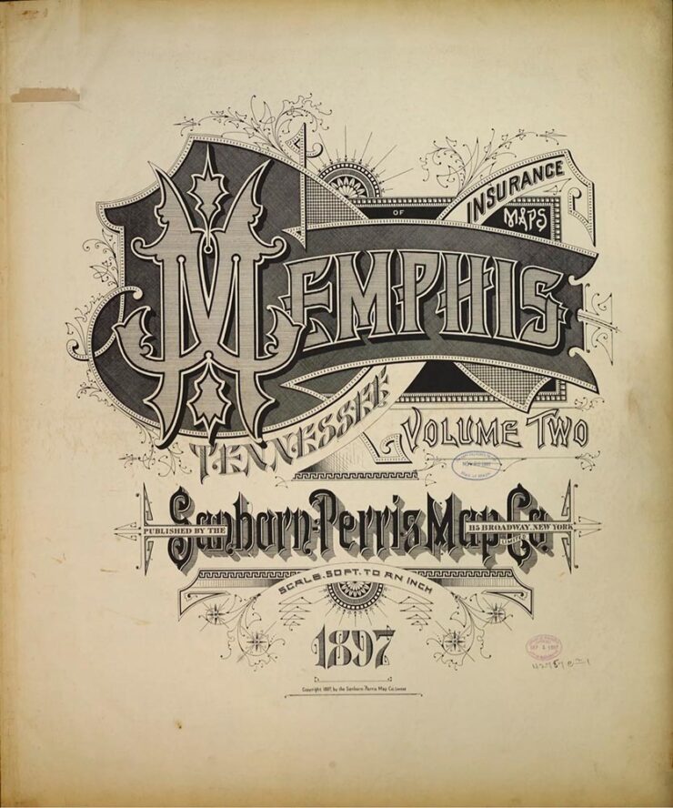
    “The Arresting Typography of the Sanborn Fire Insurance Maps”

    Jason Kottke writes, “Several years ago, Brandon Silverman become obsessed with the lettering and typography on the fire insurance maps published by the Sanborn Map Company in the late 19th and early 20th centuries.”

    Silverman’s launched an archive of the maps, an absolutely fantastic way to pass a few minutes hours.

    Special Bonus #3: Nick Heer, at the always-excellent Pixel Envy, has an essay on the essentials: “[E]fficiency and clarity are necessary elements, but are not the goal. There needs to be space for how things feel.” Delicious Wabi-Sabi is worth a few moments.

    Wishing you and yours a very happy New Year!