Category: Architecture

Posts that have substantial architecture content.

  • Beautifully Briefed 24.3: Bloomin’ Breadth

    Beautifully Briefed 24.3: Bloomin’ Breadth

    The end of March here in Middle Georgia means flowers aplenty, and usually with that, some photography — but I’ve not yet had a chance. (Stay tuned.) I have, however, been saving up links o’ interest: fonts, books, photography, and new(ish) car logos. Let’s go!

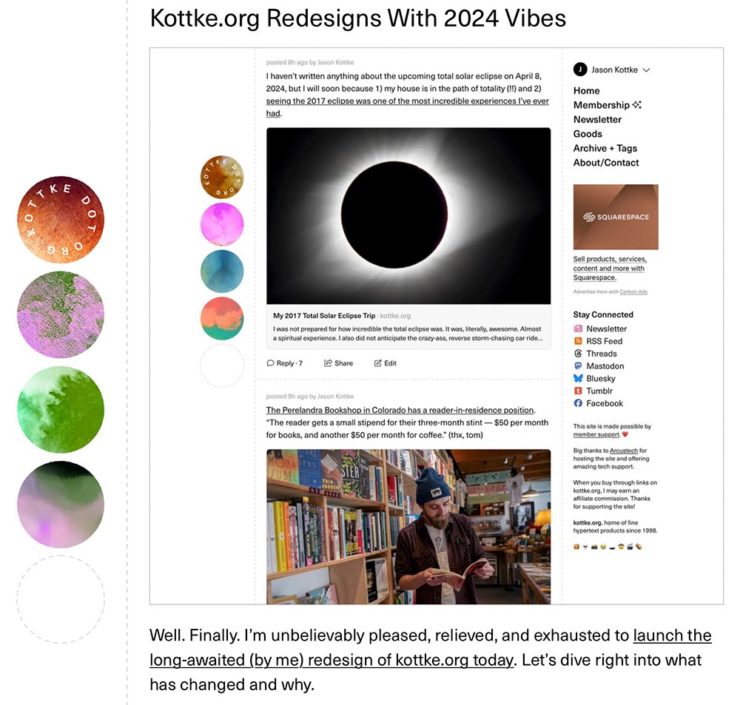
    Kottke Meets 2024

    Starting with one of the very few places that is still around from Foreword’s old days, the always-interesting Jason Kottke:

    2024 marks Kottke.org’s 26th year on the ’net.

    Great new looks for great content, with better Quick Links — the previews are ace — and incredibly-appreciated gift links to places like The New York Times and The Atlantic. If you haven’t been in a while, click and enjoy.

    Fab Spring Type

    With “a plethora of captivating new typefaces,” CreativeBoom celebrates spring with 11 new faces to tempt, inspire, and bring joy:

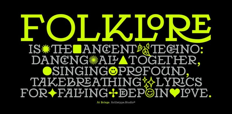
    Arillatype.Studio brings us a thousand glyphs of greatness.

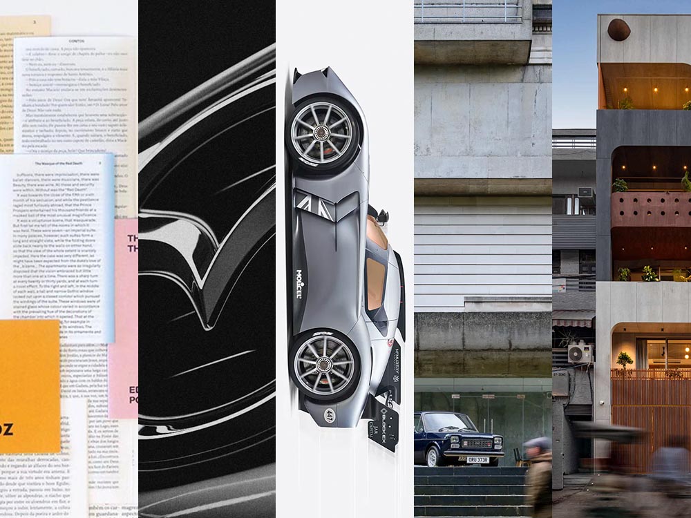
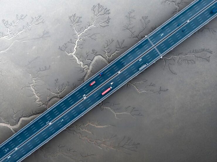
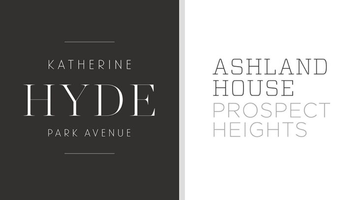
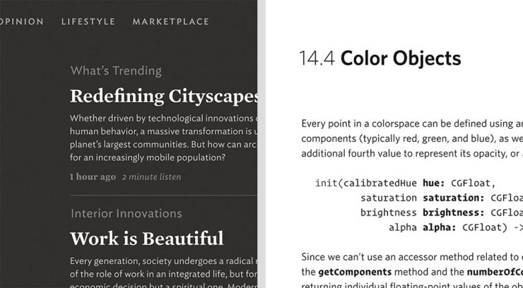
    Zanco, with its bell-bottom style; Seabirds, inspired by 1930s book covers; Module, a “fluke side hustle;” and Graffeur, improvised from gaffer tape and glimpsed in this post’s header image, are all great. My far-and-away favorite, though, is At Briega, “inspired by the concept of hybridisation” and shown above.

    See ’em all here.

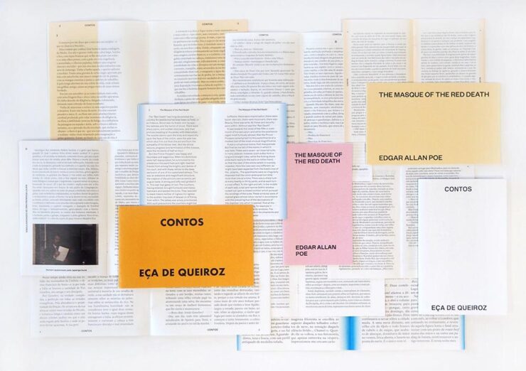
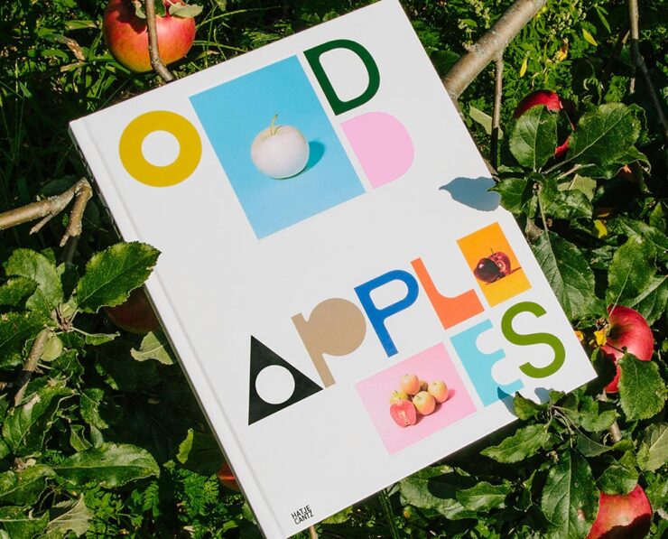
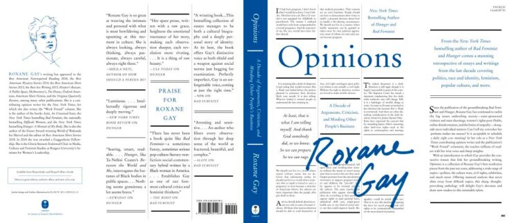
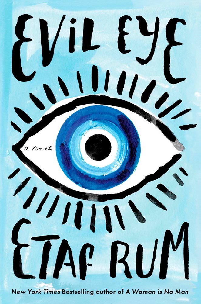
    Literary Three-Fer
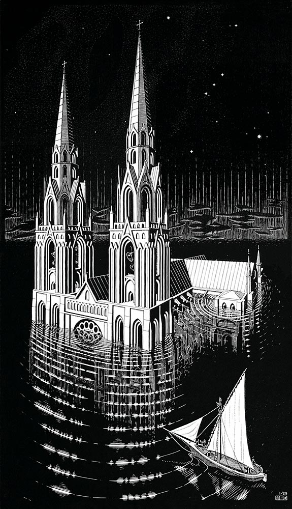
    M.C. Escher’s Lesser-Known Works
    “The Drowned Cathedral,” a 1929 woodcut.

    “Unique perspective” never does justice to someone whose name defines the term. See some never-before-seen images alongside old favorites in a new Escher book highlighted at Hyperallergic.

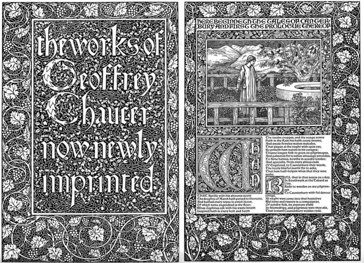
    Multidimensional Libri

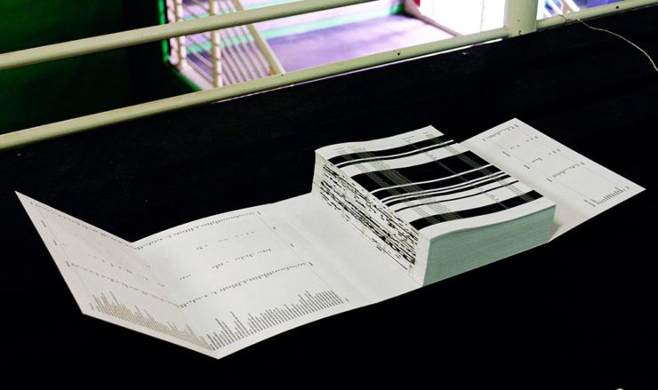
    “Experimental books are flourishing, [a]nd the evidence is seen” in this Daily Heller from PRINT: a traveling exhibition on three-dimensional books, all published titles.

    Oh, those Italians. Read on.
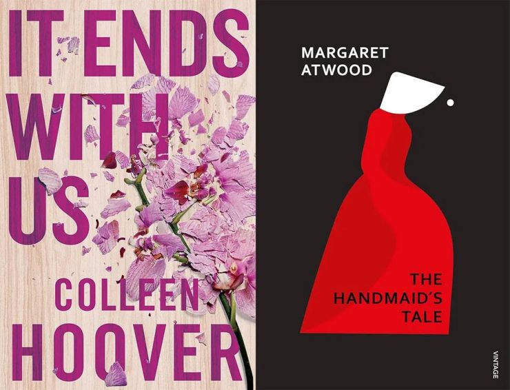
    Book Design Snobbery
    Hoover vs. Atwood — no joke.

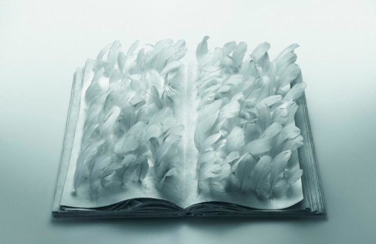
    “Don’t get held back from the simple pleasures of reading,” argues Natalie Fear at CreativeBloq, “not everything needs to be minimalist.” Justification for commercialism or a common-sense explanation for the bookshelves’ current look? You decide.

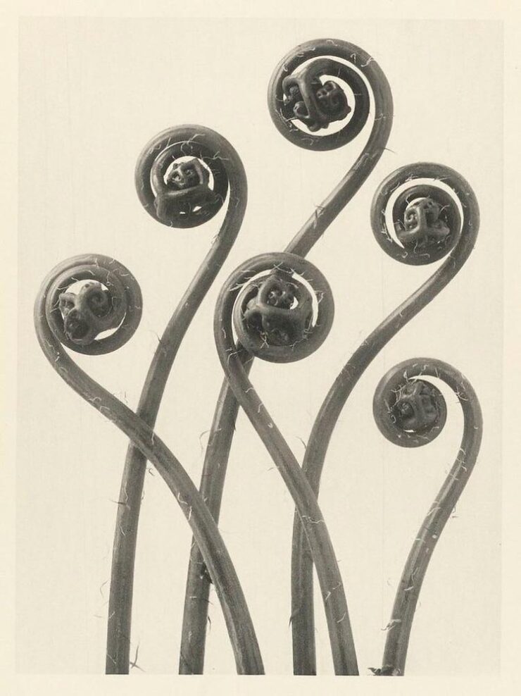
    Photography Three-Fer
    Winners of Monochromatic Minimalism
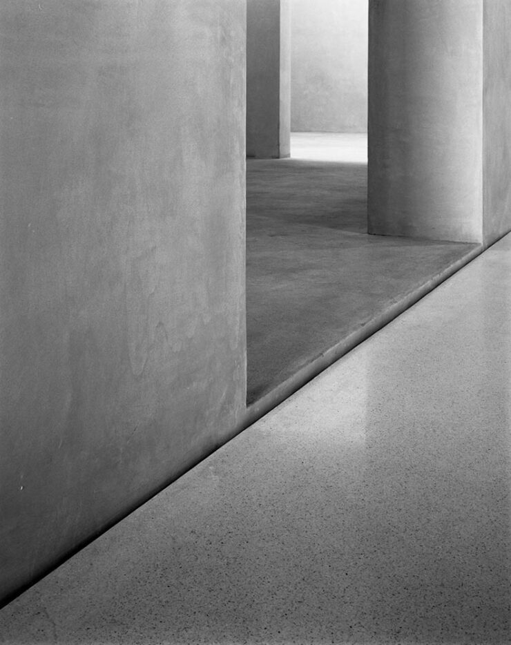
    “Black Pearl” by Sascha Kohne. An honorable mention for the magazine, but a winner for me.

    Some incredibly good stuff here — but perhaps more importantly, did you know of Black & White Minimalism Magazine? There’s no end to today’s continued diversification, methinks.

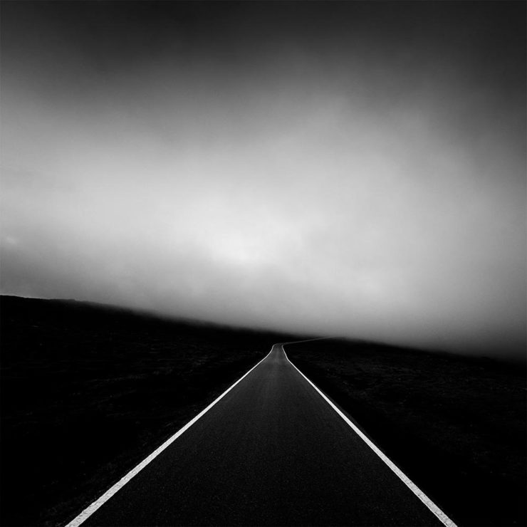
    “Traveling through Costa da Morte, Galicia. 600m above sea level where the mountains separate the Cantabria sea from the Atlantic Ocean,” explains third-place winner Alexandre Caetano.
    Aging Facades of France

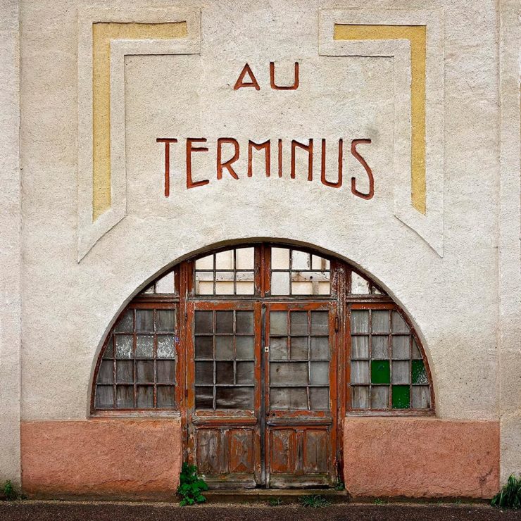
    “Shuttered blinds, peeling paint, and aging doors don’t usually indicate an invitation, but for French photographer Thibaut Derien, the fading facades of long-closed shops are well worth a stop,” This is Colossal says.

    Sony Photography Awards: Architecture
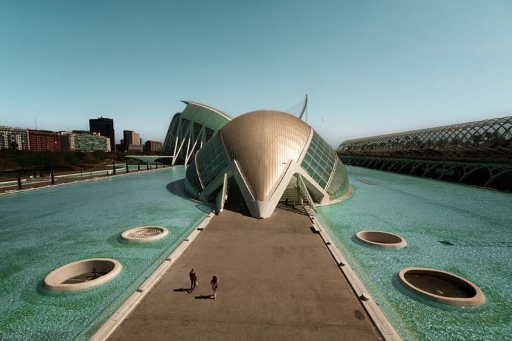
    The Ciudad de las Artes y las Ciencias (City of Arts and Sciences) in Valencia, Spain: “Hemispheric,” by Eng Tong Tan, Malaysia.

    ArchDaily‘s coverage of the annual Sony awards shortlist announcement was an insta-click.

    New Bull: Now Flat. (And a BMW.)

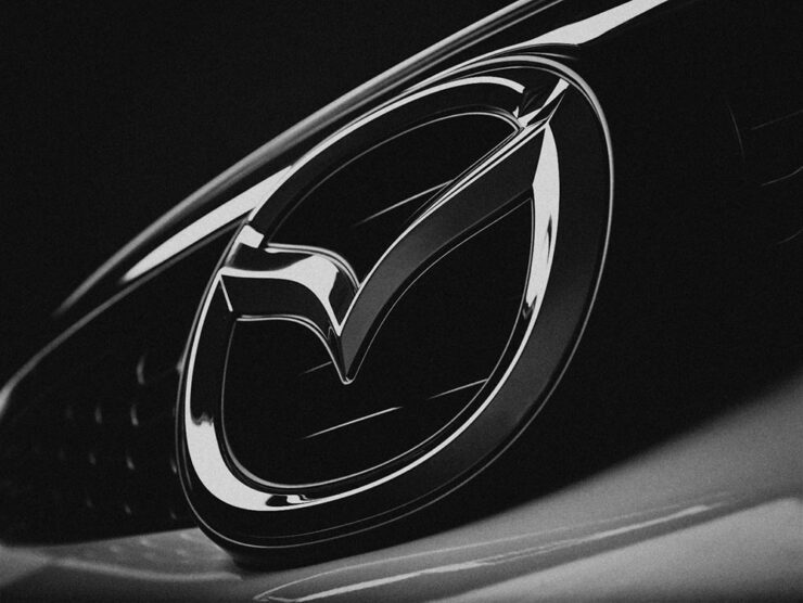
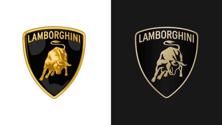
    Lamborghini practically defines flamboyant. So it’s worth a link when their logo gets less interesting:

    Old logo, left, new, right.

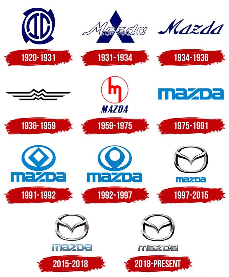
    Late at following the industry trend of flat-is-better, because, well, Volkswagen. (Okay, I undersell. Perhaps.) Read the lack of news at Motor11Motor1 also has a decent roundup of new car logos, from 2016-present, which underscores the “flatness” trend. or The Drive, where they manage to convey the brand’s use of the phrase “digital touchpoints.”

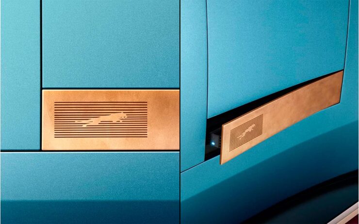
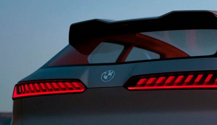
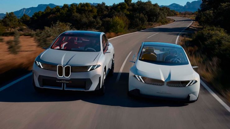
    I don’t know whether this will make any more sense in a few or even many months — which is relevant because of BMW. Four years ago, one of the industry’s design leaders expressed strong this new style, and I didn’t get it. But it’s worn better than most, and superlatively on occasion — check out the logo’s use on the Vision Neue Klasse X:

    Rather than a standalone, plastic part sitting on the paint, it’s etched into the finish. Man, I hope that makes it into production.

    Neue Klasse: do like. Bull? No so much.

    Update, 2 April: BrandNew, itself sporting a new look, has weighed in on the new Lambo style, calling it “not good.” (FYI, BrandNew is a subscription, quite possibly the best $20/year someone interested in design can spend.)

    • 1
      Motor1 also has a decent roundup of new car logos, from 2016-present, which underscores the “flatness” trend. ↩︎
  • Gallery Update: Helen, Georgia

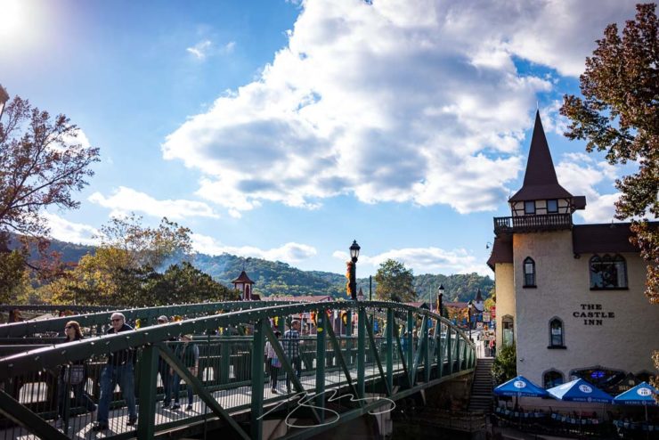
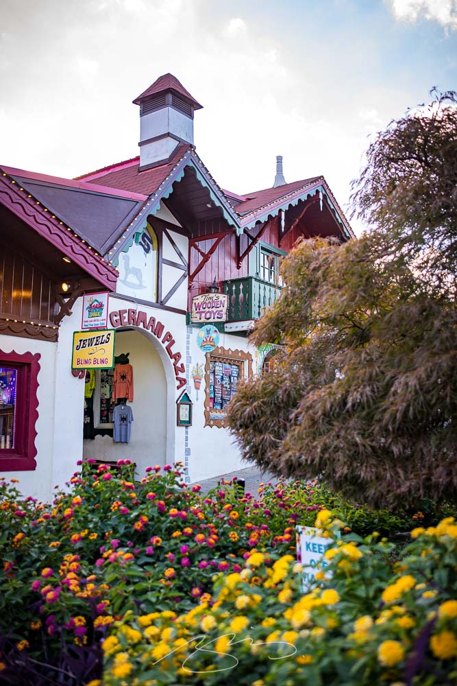
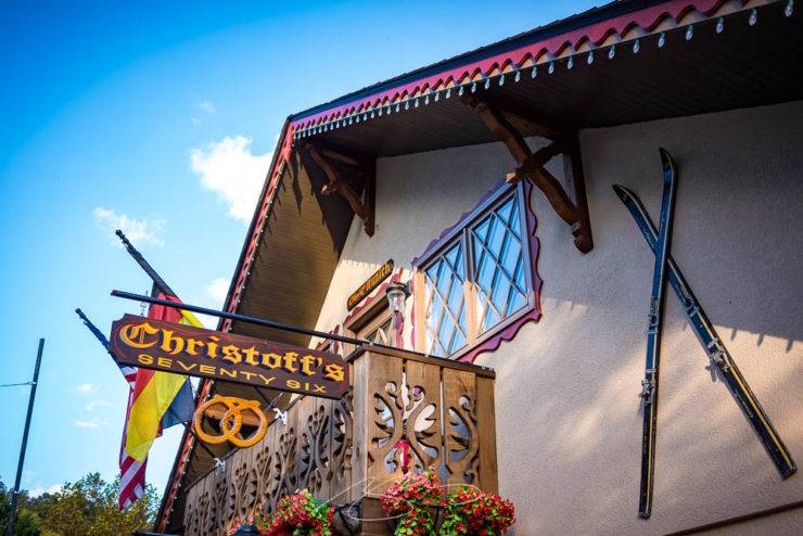
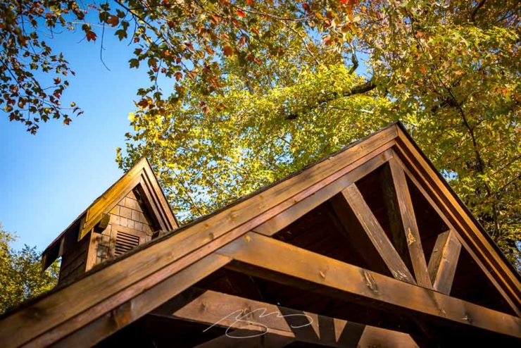
    This is my second try at a fall photostroll in Helen, a German-themed town in the Georgia mountains north of Athens, and I’ve got to tell you: Helen and I are not getting along.

    Technically, it’s my fault. But I feel the relationship may have soured; I just might neglect to make a third attempt.

    Unicoi Bridge into Helen, Georgia

    In late October, 2019, I was there with an unfamiliar lens and although I took a stack of photographs, the vast majority of them were junk. I got eight — eight! — worth putting up. Again, my fault. But not at all the results I’d wanted.

    This week, I was back. I had two beautiful fall days to make up the deficit.

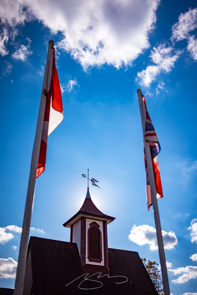
    Flags and (Brew) Decor
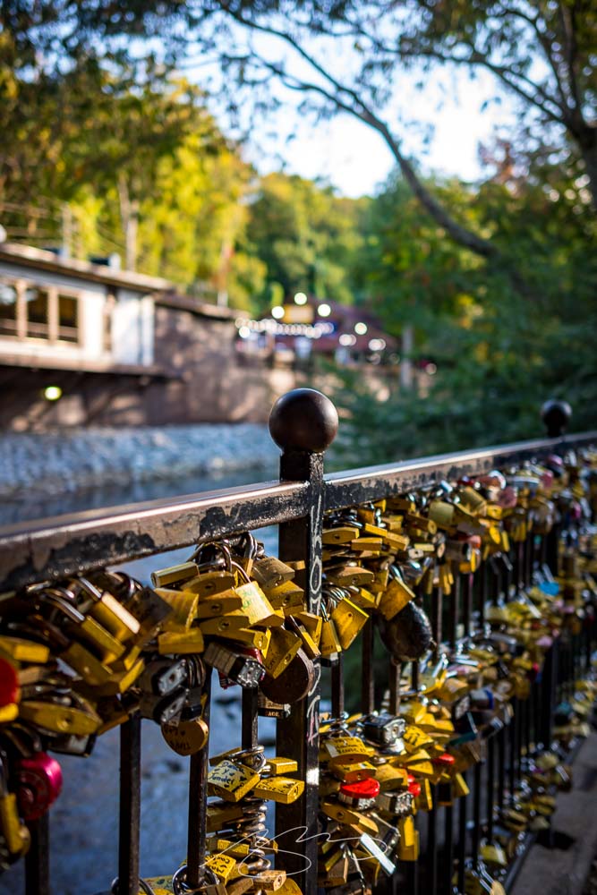
    Love Lock Bridge (Railing #1)

    Day one saw 68 photographs taken with my favorite 35mm, but I could tell almost immediately that it wasn’t going the way I wanted. It was flooded with tourists — expected and okay, frankly, but not built for wider shots. “No problem,” I said to myself. I’ll enjoy some schnitzel, have a good night’s sleep, and clean up with the detail shots in the morning.

    Bling Bling Blink Tourist Blind
    Christoff’s 76, Munich St.

    Alas, not only did I get out of the wrong side of the bed, my back somehow got out of the other side — I wasn’t walking anywhere. Crap.

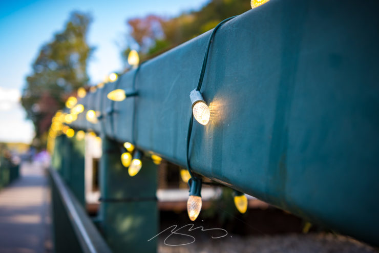
    Bridge Lights, Main St.
    River Overlook, Eidelweiss St.

    Worse, upon examination back in front of the big computer, I wound up with less than superlative results: only 30 of those 68 got posted.

    Have a look at the Helen gallery when you have a moment, with my wishes that your fall attempts at leafing don’t leave you behind.

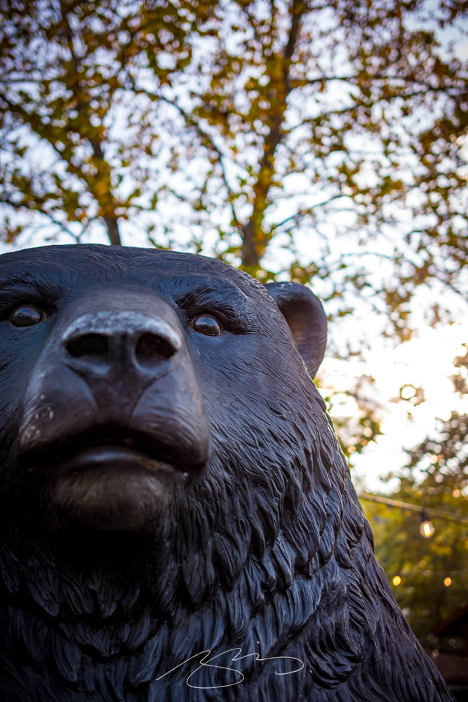
    Willie, The Friendly German Black Bear
  • New Gallery Bonus: Deepstep, Georgia. (Also, a New Georgia Gallery Setup.)

    New Gallery Bonus: Deepstep, Georgia. (Also, a New Georgia Gallery Setup.)

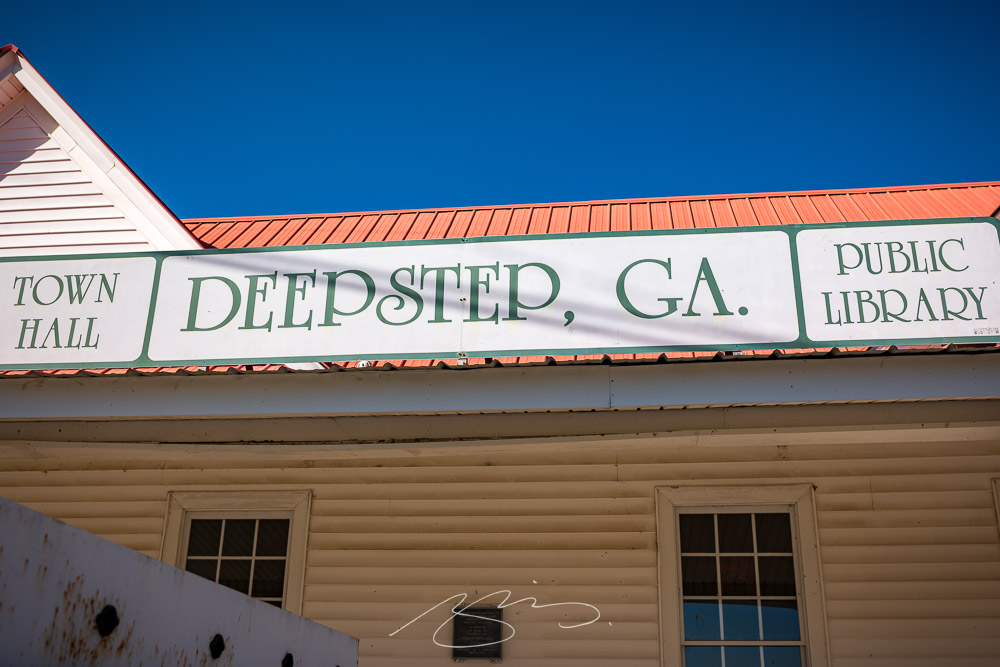
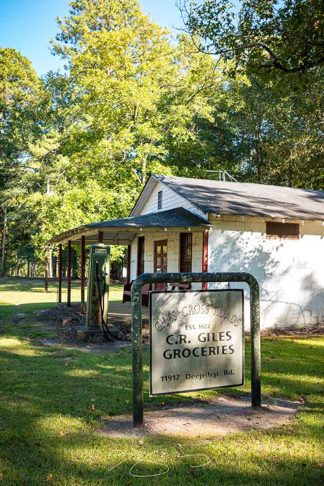
    A while back, on the road from Milledgeville to Sandersville, I spied a sign:

    Giles Cross Roads, 11917 Deepstep Rd.

    That little town — more a hamlet, really — is called Deepstep, and I’ve marked it for a stop since. On the way home from Augusta (part 1, part 2), I finally had the opportunity.

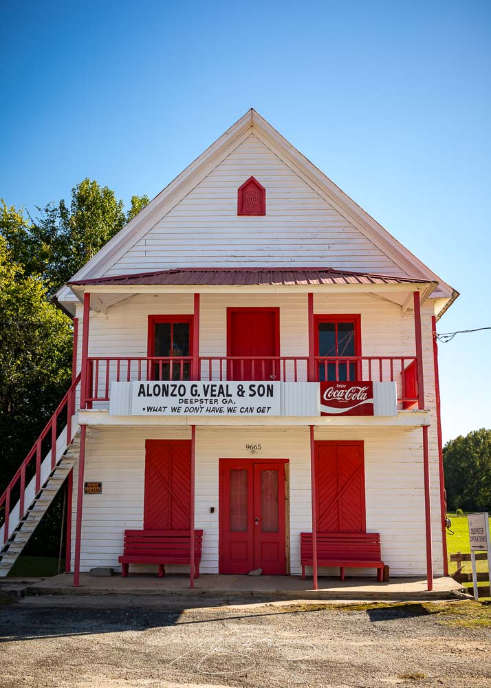
    Alonzo G. Veal & Son (What We Don’t Have, We Can Get), 9665 Deepstep Rd.
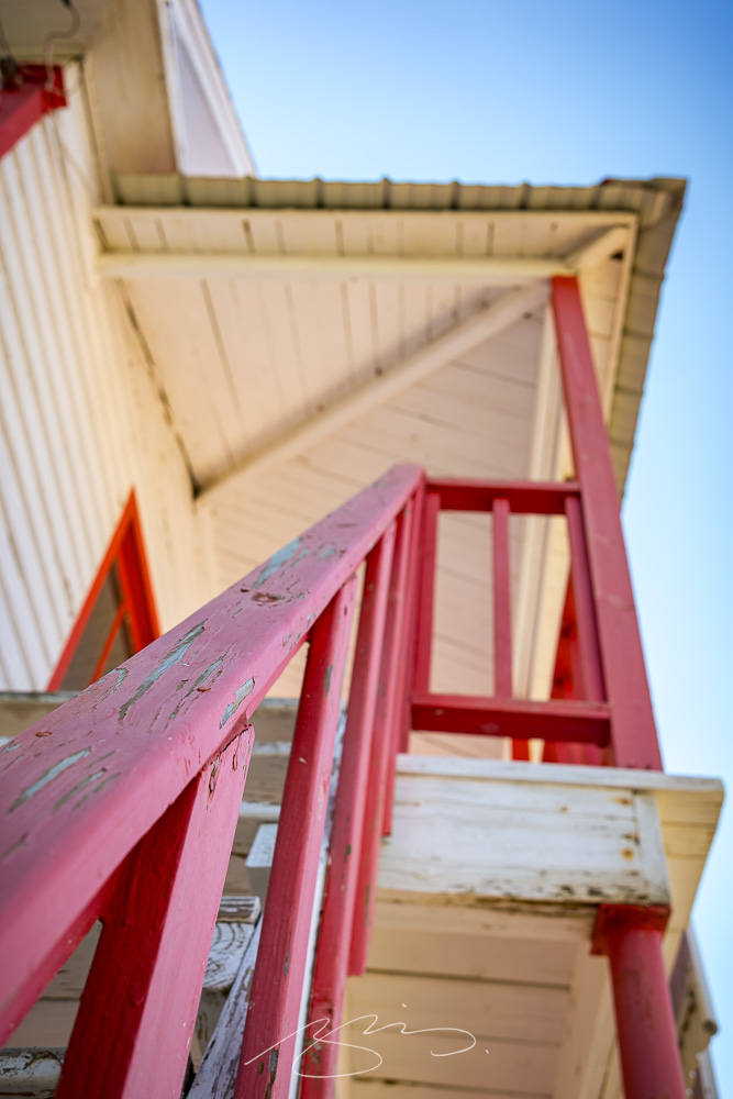
    Veal & Son Building Detail #1, 9665 Deepstep Rd.

    What a great little spot.

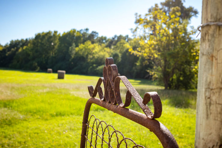
    Gate and Field, 9665 Deepstep Rd.
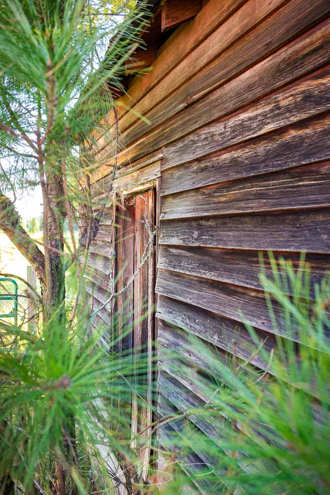
    Outbuilding and Pine, 9731 Deepstep Rd.

    The gallery’s only eighteen photographs, but absolutely a worthy addition to the newly revised Middle Georgia group. Those galleries cover everything from Pine Mountain in the west to Sandersville in the east, Madison in the north to Dublin in the south.

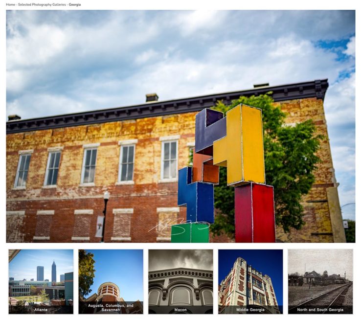
    Indeed, I’ve rearranged pretty much all of the Georgia galleries:

    The new Georgia gallery group: five items instead of three, all featuring rearranged contents.

    Atlanta gets its own (to be expanded soon, I hope); the cities of Augusta, Columbus and Savannah another; Macon, my home base, a third; the aforementioned Middle Georgia, a fourth; and finally North and South Georgia (Helen, St. Simon’s, etc.).

    As always, thanks for taking the time to stop by.

  • New Gallery: Augusta, Georgia (Part Two)

    New Gallery: Augusta, Georgia (Part Two)

    As mentioned yesterday, I’ve been meaning to get to downtown Augusta with a camera for years. Actually, that not correct: I’ve been meaning to get to downtown Augusta . . . period. I’d never been there, despite living 130 miles away for almost two decades, despite having been nearby, despite — well, you get the idea.

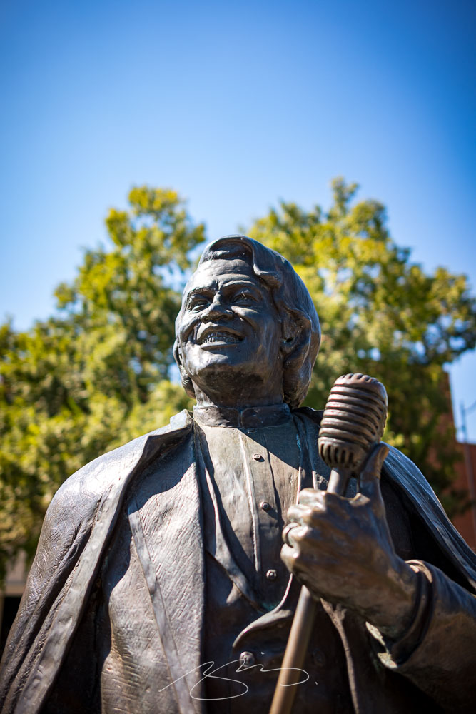
    Statue at James Brown Plaza, Broad St. and Augusta Common

    So it was a pleasure to get to the home of Woodrow Wilson, James Brown, Jessye Norman, and countless others — and see a city a lot like so many others in the American South, a city that’s struggling with identity, history, vacancy, gentrification, and so many other issues prevalent in the 2020s.

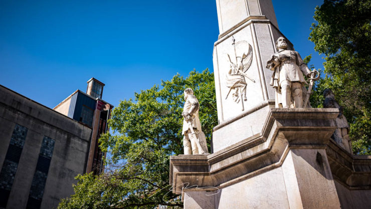
    The Confederates and the Albion, Broad St.

    One of them is the continued presence of a huge Confederate memorial, a shame in a majority-Black city — and just in front of the Lamar Building, soon to be luxury apartments. What message are Augusta, and its new luxury residents, sending?

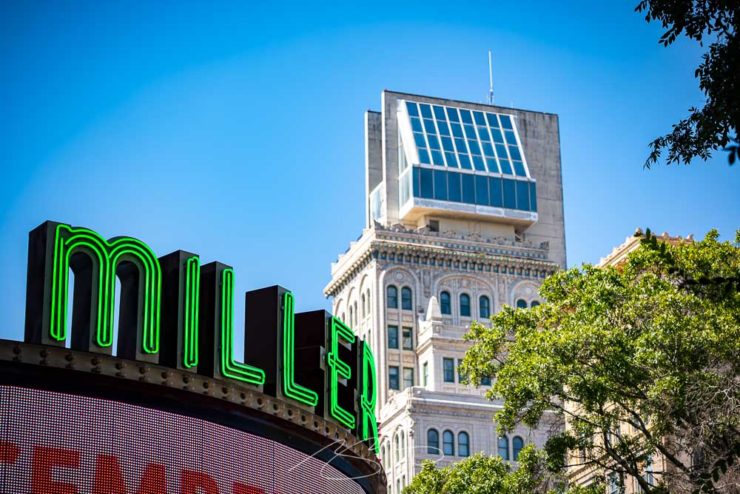
    Miller and Lamar, Broad St.

    Nonetheless, the day’s efforts resulted in some satisfying images, from architecture to neat details:

    Augusta Cotton Exchange Building #1, 32 8th St.
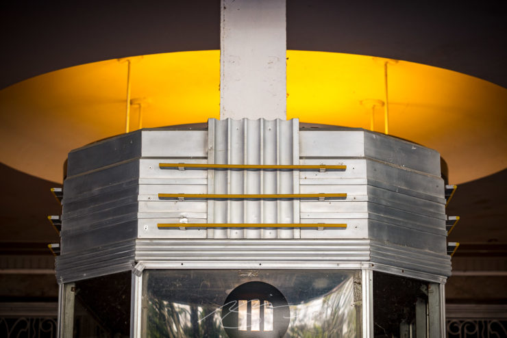
    Miller Theater (Entry Detail), 708 Broad St.
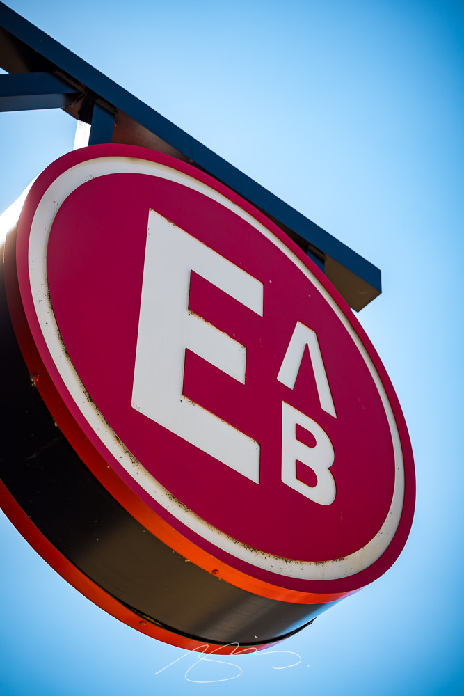
    Edgar’s Above Broad (Logo) Sign, 699 Broad St.

    Augusta is a riverfront city I’m looking forward to returning to. In the meantime, please enjoy a total of 128 photographs in the newly-posted gallery.

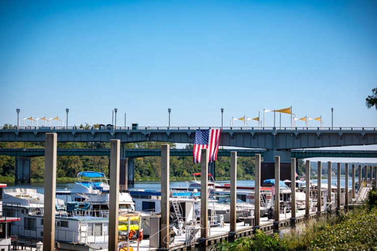
    Augusta Riverwalk Marina (with Freedom Bridge)
  • New Gallery: Augusta, Georgia (Part One)

    New Gallery: Augusta, Georgia (Part One)

    Together with Columbus and Macon, Augusta is one of Georgia’s “Fall Line” cities, and is home to more than 200,000 people. Located on the eastern edge of the state on the Savannah River, it was founded by James Oglethorpe in 1736 on the site of a Native American river crossing.

    Augusta has long been on the to-photograph list, but it’s just far enough away from Macon to make a quick, unplanned trip difficult — so this past weekend, when another trip was cancelled, I took advantage of the available time and made it happen.

    Blue Against Blue Against Blue, 943 Ellis St.

    Of course, rather than a quiet Sunday downtown, I ran headlong — no pun intended — into the Augusta Ironman marathon. There were crowded street corners, intersections closed aplenty, and a combination of competitors and supporters everywhere.

    Boll Weevil Cafe and Sweetery, 10 James Brown Blvd.

    Nonetheless, it was a beautiful early-fall day in Georgia, and over the course of several hours, I really enjoyed photography in downtown Augusta — as usual, without people in the shots.

    Decorative Facade, 103 Macartan St.

    Excepting, of course, The Godfather of Soul:

    Spirit of Funk Mural, 190 James Brown Blvd.

    The photostroll also included the Riverwalk, a stretch both at water level and atop the levee — doing my best to stay out of the runners’ way, moving around to the chants of “water!” and “ice!”

    Fountain at Riverwalk Enterance (#1), James Brown Blvd.
    Savannah River at Augusta, Georgia

    The first 64 photographs — part one of two — have been posted to the new Augusta gallery. Stay tuned for the second part, along with a bonus gallery and some housekeeping news, tomorrow.

    Slice of Primary Colors, 1102 Broad St.
  • Beautifully Briefed 23.9: Falling into Brilliance

    Beautifully Briefed 23.9: Falling into Brilliance

    As summer turns to fall, let’s take a look at Type 1 fonts, a library index, revolutionary posters, posters for “get lectured,” and two different photography contests. Let’s get right into it.

    Adobe discontinues a standard: The Type 1 font

    Back in the early days of desktop publishing — up to about the turn of the century, give or take — everything typographic used PostScript, a programming language by Adobe. (Other stuff, too, like Adobe’s vector program, Illustrator.) PostScript fonts were the so-called “Type 1” variety, made up of a bitmapped “suitcase” that housed the standard display sizes and an outline file used by the output device to print clean, what-you-see-is-what-you-get beauty.

    The Apple LaserWriter Plus and some vintage Macs: nostalgia! (Note the book — heh.) Image: YouTube.

    Companies from Apple to Microsoft didn’t want Adobe to hold a monopoly on output tech, so later fonts evolved into TrueType and then OpenType, the latter of which is the standard today.

    So much so that Adobe has now discontinued Type 1, and they, along with Microsoft, have stopped being supported. Which is understandable and yet a shame: some of us still have hundreds of them.

    Ars Technica has the best roundup.

    Meanwhile, I’m going to investigate a conversion utility. Will report back.

    All the Libraries in London

    It’s Nice That has a post that reminds us of a library’s central purpose: to leave knowing more than you did when you entered. “The library, in our shared public imagination, is a special place,” the author argues — reminding us of what libraries were established to do, often distinctly different from the modern reality (especially in the United States).

    In the library you begin to be convinced that language matters, that words have the power to clarify, to rouse, to make us feel something, to help us understand the political and cultural features of historical and contemporary moments.

    Lola Olufemi, It’s Nice That
    All the Libraries in London. Cover design: unknown. Image via It’s Nice That.

    All the Libraries in London does something artistic with a simple listing, elevating it, reminding us how compelling the ideal that libraries represent really is:

    This is a political and artistic listing, one that invites the reader to rediscover their own memories of their local library as a site of discovery. The book’s authors invite us to reflect on our personal relationship to libraries as well as the necessity of collectively securing their future existence.

    Lola Olufemi, It’s Nice That
    Alan Kitching, Durning Library. Image via It’s Nice That.

    We need more of this everywhere, but especially here in the States. Meanwhile, check out this great item at It’s Nice That.

    Special Bonus #1: Another British treasure, via the very British Antiques Roadshow (a British original, natch): this incredible poster by Ralph Steadman.

    Ralph Steadman’s Where the Buffalo Roam (1980) poster. Image via Wikipedia.

    Special Bonus #2: British book designer Steve Leard has launched a new book design podcast, Cover Meeting, featuring interviews between Leard and fellow book designers on the work, the industry, and more. The Bookseller has more.

    Cuban Movie Posters. No, Really.

    While we’re on the subject of great posters — and It’s Nice That — let’s talk about how Cuba’s revolution-era political posters transformed their poster design for films. Appropriately enough, a new film, El Cartel Cubano, highlights these amazing (and, likely, never seen before) items.

    Besos Robados, ICAIC, by Sotolongo & Carole Goodman. Image via It’s Nice That.

    How come our posters in the US aren’t this beautiful? What did this say about the priorities of the revolution? What did the medium or choices in the scarcity of materials used say about the economic situation in Cuba?” It’s these questions which form the bedrock of El Cartel Cubano, a fascinating and tender tribute to the artists on the island.

    Adrienne Hall, co-director, El Cartel Cubano
    Sur, by Michael Myiares Holland. Image via It’s Nice That.

    I have to admit: this isn’t a subject I would have leapt at, but It’s Nice That sold it. Awesome.

    Get Lectured (on Architecture)

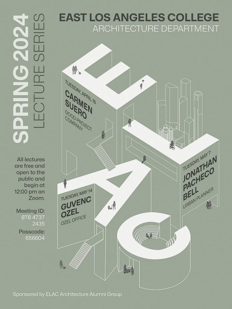
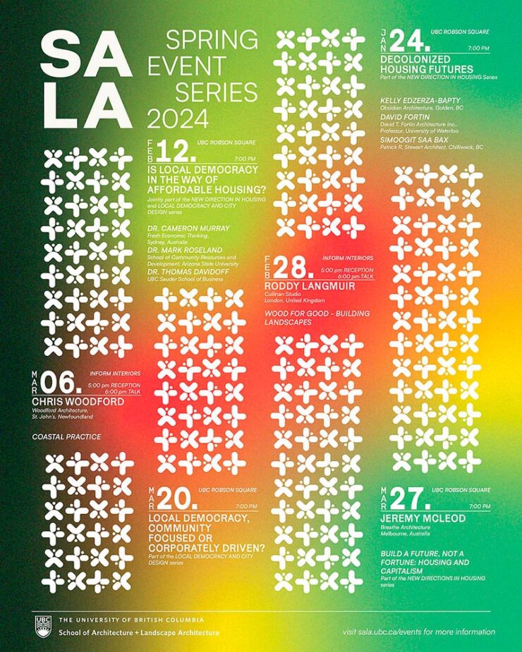
    Closing out our trifecta of great posters, Archinect‘s Get Lectured series brings us these fantastic items from their Fall 2023 series:

    Woodbury University School of Architecture’s Fall 2023 lecture series.
    The University of Texas at Austin School of Architecture’s Fall 2023 lecture series

    Some real gems: see more.

    Finalists of the 2023 Urban Photography Awards

    Going to soapbox a little here: pay-to-enter photo contests aren’t usually something I want to spread the word about. So ArchDaily‘s basically-a-press-release, “URBAN Photo Awards 2023 has announced its list of Finalist Photographers, marking the penultimate stage of the international contest,” was guaranteed a pass.

    But there’s a problem: some of the photographs are really compelling.

    Untitled, by Claudia Costantino

    This one’s my fave:

    Back to the 70s, by Stephane Navailles

    See the contest website, or ArchDaily‘s post.

    Winners of the 2023 Black and White Photography Awards

    Another contest, yes. They’re everywhere. But … wow.

    Street Lights – Ottawa, by Gareth Jones, category winner, architecture
    Another mushroom? By Hector Ballester Ballester. Silver mention, architecture.
    Alamillo bridge, by Manuel Ponce Luque. Finalist.
    The concert, by Helena García Huertas. Finalist.
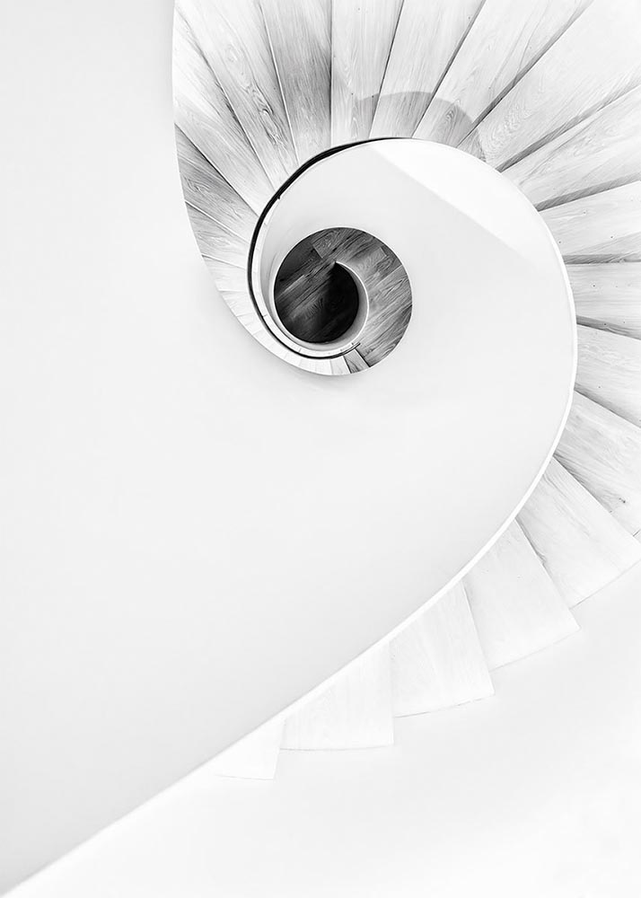
    Reflections on the stairwell, by Max Dobens. Finalist.

    And that’s just the buildings/architecture — there are portraits, street photography, landscapes, and more. A reminder to aspire, every day, with every image.

    The Black and White Photo Awards (2023). (Via PetaPixel.)

  • Beautifully Briefed 23.8: Summer Stew

    Beautifully Briefed 23.8: Summer Stew

    The August heat is met with some refreshingly cool items for you this time: beloved movies reimagined as vintage paperbacks, graphic design on the Internet Archive, and winners of the 2023 iPhone photography awards. Plus, a bit on social media that hopefully won’t leave an aftertaste. Let’s dig in.

    “Good Movies as Old Books”

    This is Colossal points us to an extraordinary personal project by graphic designer Matt Stevens: classic, acclaimed movies visualized as vintage paperback books. Everything about these spells “win.”

    From the aged look, illustration choices, and director-as-author to the logo and occasional price, these are all … perfect.

    Volume One is 100 titles, and while that book is sold out, prints are available at his website. The items in Volume Two, due this month, are guaranteed to be awesome.

    Graphic Design on the Internet Archive
    Emigre #20 – Expatriates. Courtesy of the Internet Archive via archive.digital.

    Another treasure via Jason Kottke:

    archives.design is a labor of love site run by Valery Marier where she collects graphic design related materials that are available to freely borrow, stream, or download from the Internet Archive. I’ve only scratched the surface in poking around, but so far I’ve found Olivetti brochures, a collection of theater programs from the 19th and early 20th centuries, several Apple thingsThe Vignelli Canona specimen book of wood type from the 1880s, and many issues of Emigre. What a resource!

    Jason Kottke, kottke.org
    An advertising brochure for the Olivetti Tetractys, circa 1956.

    Some of these are fantastic — set aside some time to explore and enjoy.

    2023 iPhone Photography Winners

    I don’t always link to these contests — it often seems like the publicity (and rights!) are all about the folks holding the contest rather than the people entering them — but I often look, and am always impressed with the quality coming out of a “simple” iPhone.

    Long Nguyen, France – 1st Place, Travel – “Last Night before Xmas”
    Scott Galloway, United States – 1st Place, Nature – “Wonder Wheel”

    And while both of the above are (relatively) recent phones, in the latter case showing the macro capabilities of an iPhone 12 Pro Max, even older phones can highlight the talent of the person using it:

    Derek Hager, United States – 3rd Place, Photographer of the Year – “Tucson Morning”

    Shot on a 2017 iPhone X. Nice.

    See all the winners, for 2023 and years past, at IPPAwards.com. (Via PetaPixel.)

    A Moment Regarding Social Media

    I’m not going to spend much time on this; I eschewed pretty much all forms of social media years ago now, and don’t regret it. That said, I do keep up with social media in the meta sense (a word that’s been stolen, as far as I’m concerned, by — wait for it — a social media company), and have noted the pain and concern associated with the implosion of Twitter.

    While this conversation started with Nick Heer and the always-excellent Pixel Envy, it’s obviously evolved as the year has seen one extraordinary cage fight event after another.

    Threads on Apple’s App Store, via the BBC.

    For the past decade, It’s been all but required for serious brands to maintain a social media presence […] yet instead of scrambling to claim digital real estate across all these newly emerging platforms, some companies are choosing to be more judicious about which platforms they choose to join. In some cases, they’re learning from brands who jumped the social media ship years ago.

    Chris Stokel-Walker, BBC

    The quote above, from the BBC, attempts to answer the question, “Why your favourite brand may be taking a social media break.” Short answer: it’s complicated. I’d argue there’s an even shorter answer — it’s smart! — but for people and brands that aren’t yet established, social media is often key to discoverability.

    This may be especially true for artists, designers, photographers, and others in the self- and small-business-employed creative field. Indeed, let’s go to a great source for those in the arena, Creative Boom, who recently spent a minute asking, “Creatives are saying social media is over… so what next?”

    Like any new craze, it was fun for a while. But there’s certainly nothing new about it any more. Facebook’s now been around for almost two decades. Twitter’s 17 years old. Even Instagram has reached its teens. And while many of us joined these platforms during their fun, “anything goes” eras, when everything was about the users, now it’s all about the algorithms and their use to make venture capitalists vast amounts of money.

    Tom May, Creative Boom

    While I agree that social media is a mess and has been for a while, I’m absolutely not going to tell you to give it up — only to remind you that I have given it up and continue to be completely okay with the decision.

    I do want to ask you, though, to choose wisely:

    Facebook’s “Threads (an Instagram app),” their answer to the Twitter/X debacle, as shown via Apple’s iOS App Store privacy report.
    Tapbot’s “Ivory,” available in Apple’s iOS App Store and showing that app’s privacy report, for the Mastodon social platform.

    Enough said. Turn off the computer, go forth, and enjoy a beautiful summer’s day.

  • Updated Gallery: Columbus, Georgia

    Updated Gallery: Columbus, Georgia

    Gerald and I were in Georgia’s lower Chattahoochee River valley yesterday, visiting the city of Columbus — and ran across a couple of treasures. Naturally, there was a camera handy.

    The first is the best restaurant I’ve enjoyed in a long while: The Animal Farm.

    The Animal Farm, 105 W. 12th St.

    If you’re in or going to be going to Columbus anytime soon, I cannot recommend it highly enough. The food was superlative, the service excellent, and the ambiance simultaneously upscale, casual, and fresh.

    The second — and no less tasty — stop was the Ma Rainey Museum of the Blues. This period house downtown is small but demonstrates a remarkable comeback from the (literal) wreckage they started with in the ’90s. I’d originally wanted to return to the Columbus Museum, but it’s being renovated; Gerald’s suggestion here was pitch-perfect.

    Ma Rainey House, 805 5th Ave.
    Ma Rainey House Marker, 805 5th Ave.
    Bust and Albums, Ma Rainey House, 805 5th Ave.
    Record Player Detail, Ma Rainey House, 805 5th Ave.

    Inside, Gerald and I enjoyed a lengthy conversation with Xavier, a guide who was knowledgeable and enthusiastic; he absolutely made us want to explore more blues history. (I’m also going to be listening to some Ma Rainey on Tidal.)

    Meanwhile, gallery of Columbus photographs is deep and varied, spanning almost fifteen years and 180 items — check it out.

    As always, thanks for visiting.

    Update: Gerald’s take on the day.