Beautifully Briefed 24.7: Generated

This time, another automaker logo, some automotive and architecture photography, and the special bonuses that have all become a regular part of the Beautifully Briefed standard. But we’re going to start with some generated content.
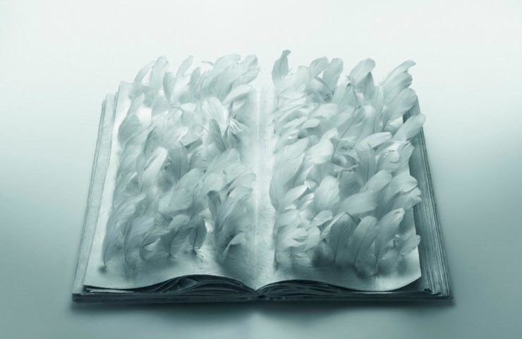
AI Book “Design”

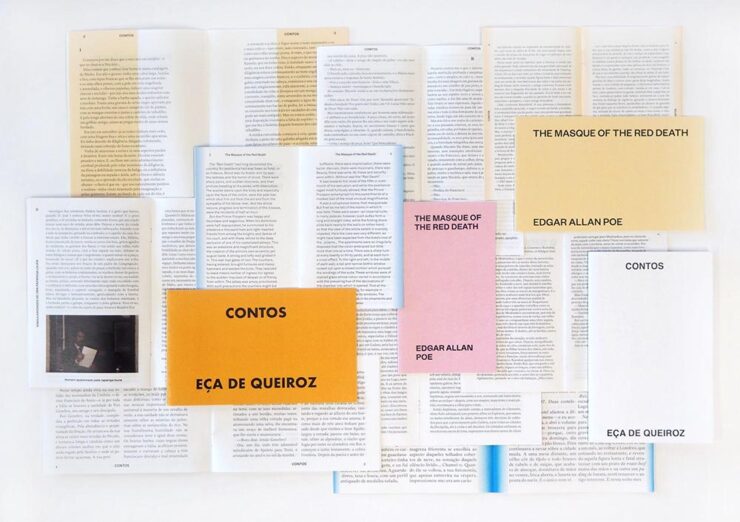
From the “We knew this was going to happen” category, we have the first — that I’ve seen, anyway — “let AI do the work” research paper suggesting that book design is something that can be automated.

We have presented a novel approach to computationally design books. The presented system implements a generative design process which takes advantage of the scripting capabilities of Adobe InDesign to procedurally typeset books from content provided by the user. We have shown the ability of the system to (i) create book designs that consistently comply with a series of typographic rules, styles and principles identified in the literature; (ii) produce visually diversified books from the same input content; and (iii) produce visually coherent books with different contents.

Design by “AI.”

Let’s please remember that “AI” as the term is currently used is actually “applied machine learning;” in this case, specific rules within specific containers in a specific application. It’s a first step towards something, as most “AI” is in 2024.

But it’s absolutely not the only step. It’s inevitable that the necessary subsequent steps will be taken, probably sooner than later.

As usual where someone is seriously discussing replacing a human worker with a computer, there’s a pitch for the upside:

The work presented in the paper may challenge the typical roles of both the tool and the designer. First, by automatically creating and suggesting design alternatives, the tool ends up playing a more active role in the design process. Then, by modifying and developing custom tools, the designer is no longer a mere tool user and becomes the author of tools tailored to specific needs. We believe this shift can be fruitful since it enables the exploration and discovery of new technical and creative possibilities.

In other words, the designer is now responsible for creatively writing the rules then policing the output — like so many things in the machine-learning, or “AI” space — rather than the actual drudgery of directly designing the output. “Design great rules, get great design.”

And there is room for this. Amazon, especially, is going to jump on book design generated this way; never mind those folks in China or India earning (a paltry few) dollars a day, the computer can do it better for less . . . . Poof! With no human interaction whatsoever, your book is ready to publish. Indeed, for some, the bar to publish has just been lowered made easier. Perhaps even Adobe, who trumpets “AI” at every turn these days, they may choose to take this up. (Probably for a surcharge to the already-high subscription pricing.)

Let’s not even speculate about the major publishing houses for now.

But like AI-generated anything, getting actual art requires hand-tuning the input by an artist. For what amounts to “slop” — see this fantastic PixelEnvy discussion — the generated approach to book design might even be appropriate. But for book design that’s artistic, cared-for, or even “just” thoughtful, you’re going to need a human for a long time yet to come.

The paper is available on Cornell University’s arxiv under CC BY-NC-SA 4.0 DEED license. (Via Hackernoon.)

The excellent Odd Apples, which I’m sure I’ve highlighted before — but in a very human way, can’t find.

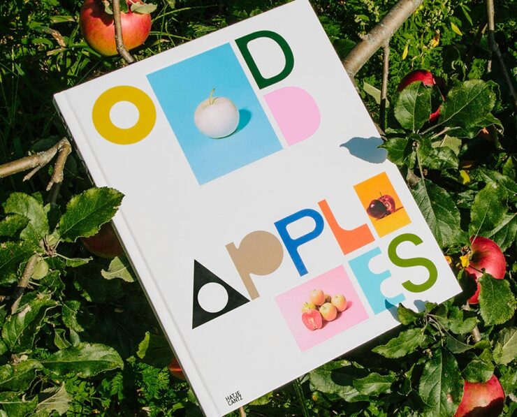
Special Bonus #1: I had the occasion to recently flip through Pentagram’s book design section. Some seriously interesting, seriously artistic work. (See the Odd Apples listing specifically.)

It could probably be argued that computers took book design jobs away, but….

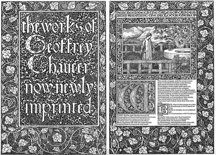
Special Bonus #2: CreativeBoom links to three free archives on Victorian illustration to inspire — or perhaps use creatively in a book.

Untitled (Fiddleheads), 1928. Photo by Karl Blossfeldt.

Special Bonus #3: The ever-great Kottke.org. points us at Public Work, “an image search engine that boasts 100,000 “copyright-free” images from institutions like the NYPL, the Met, etc. It’s fast with a relatively simple interface and uses AI to auto-categorize and suggest possibly related images (both visually and content-wise).” As Jason Kottke points out, not great in the attribution department, but good stuff nonetheless.
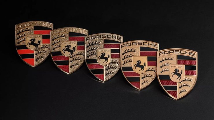
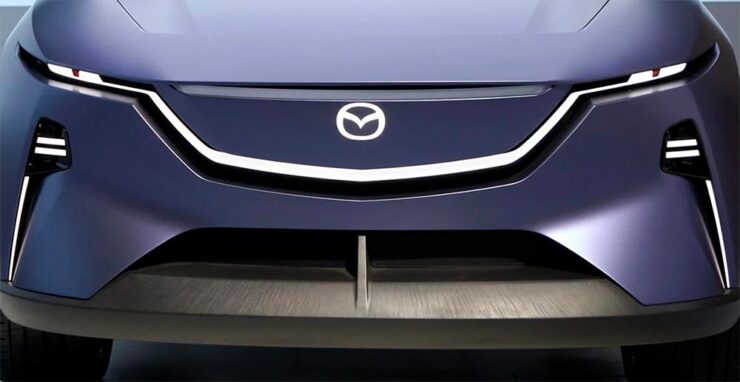
Mazda’s New Logo
Mazda’s logo as of 2023, seen on one of its cars.

From the automotive logo thread (previously), we have to note Mazda’s new look, reduced from the current 3D-style grayscale to flat and black and white. This one gets some criticism from me: it lacks grace, pace, or space. (Hmph. That might be someone else.)

Angry Bird, anyone? (Pardon the artifacts — this image is enlarged from a Japanese trademark post.)

Then again, Mazda has not always been successful with logos. Anyone remember the 1991–1997 version?

Mazda’s complete logo history.

The 1931–1934 version lays the name over Mitsubishi’s logo, which was responsible for sales. The 1975–1991 version is the one I remember best, but that’s likely a youth/rose-colored glasses sort of thing. See Wiki for more information.

Meanwhile, Mazda is trying to move upmarket right now, and the new “look” isn’t really in keeping with that. Curious to see where this goes. (Via The Autopian.)

Mazda’s new electric concept, the Errata, sporting an interim, flattened version of the current logo. Wait, might have gotten something wrong there, too….

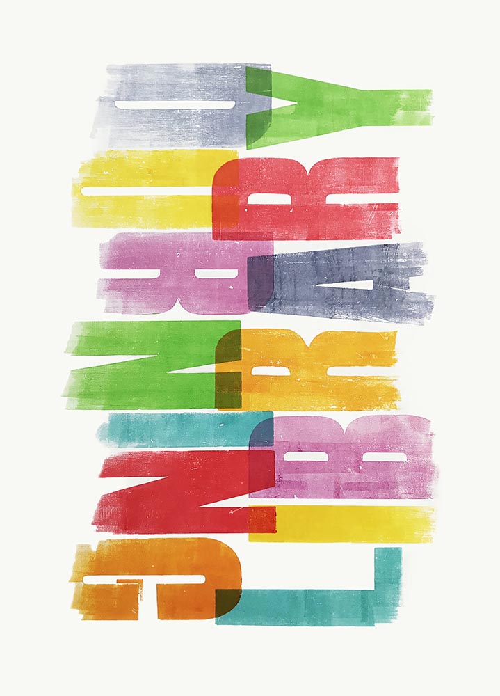
Special Bonus #3: BrandNew points us at the 2024 Logo Trends report, the annual fun item from Logo Lounge that looks at what’s hot in this year’s crop of — you guessed it!

Freely (Smiley category) and Droplet (Elliptic category), left, and Olá and Backcountry Wanderer, right, from the Sticker category. (Olá could be in the Smiley category, too.)

Some of my favorites are above, but the whole report is worth a look. (Spoiler: more than flattening is on trend.)

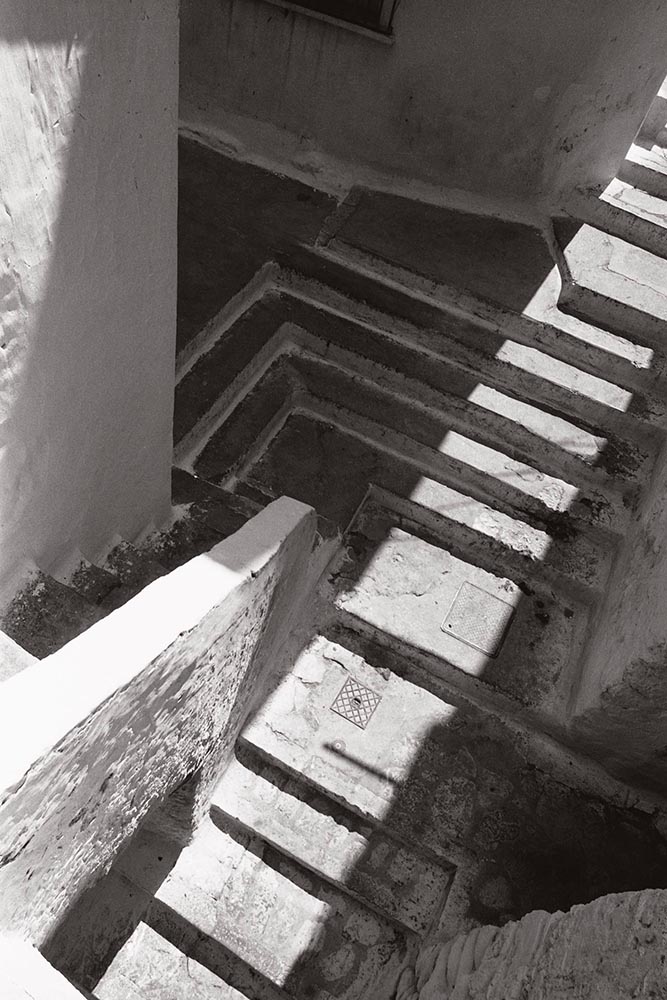
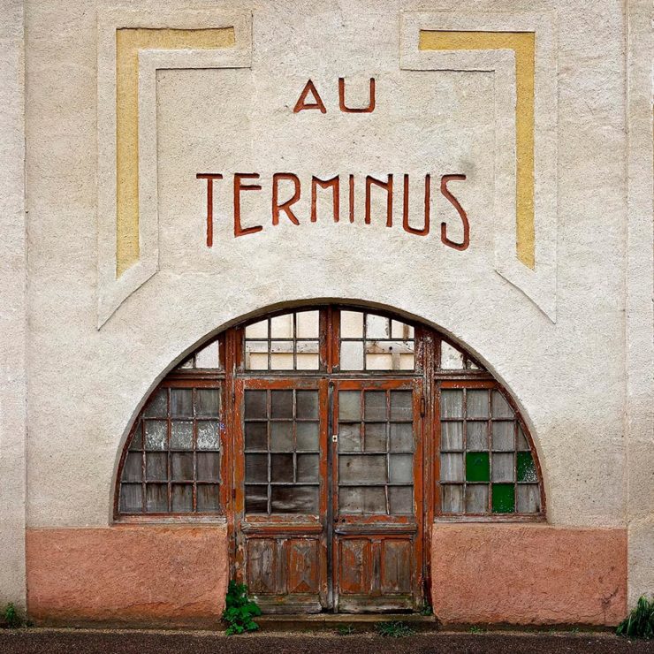
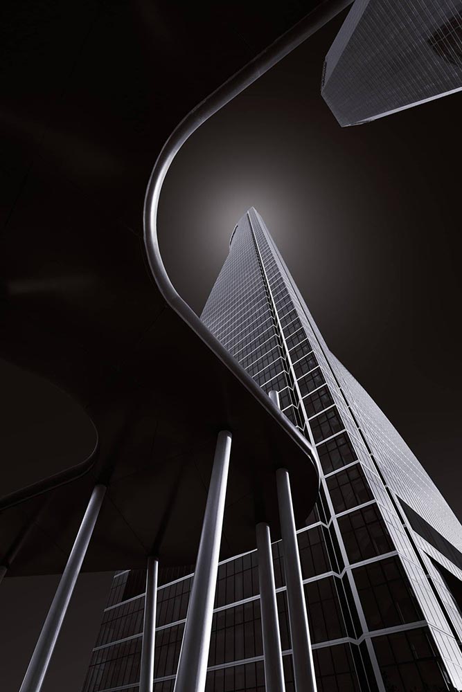
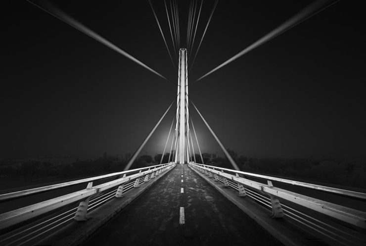
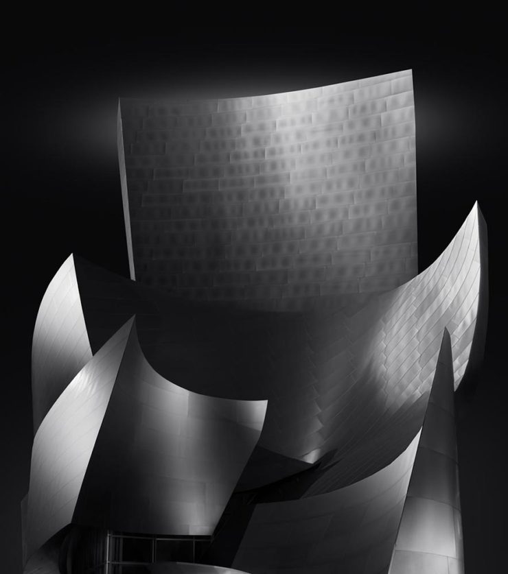
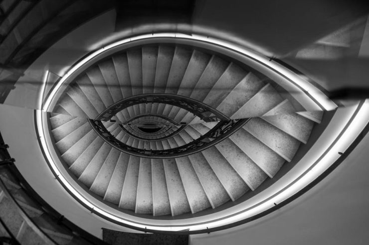
Auto, Auto+Arch, Arch
Auto Photo Manual

Via Wallpaper*, we have Auto Photo Manual, a new monograph from Benedict Redgrove that “explores the art and science of photographing the world’s most striking cars:”

A very orange Lambo. Photo by Benedict Redgrove.

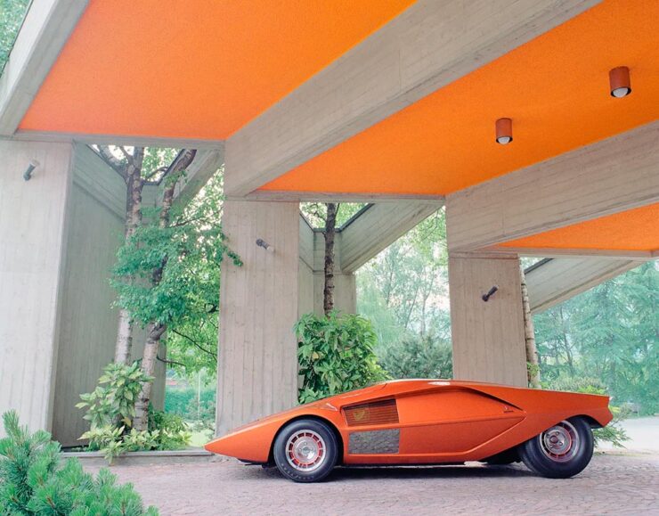
Always a sucker for a Saab, especially this concept:

The 2006 Saab Aero-X concept. Photo by Benedict Redgrove.

Auto Photo Manual is a Kickstarter item that could use some love — stop by if you can. Wallpaper* has the full story.

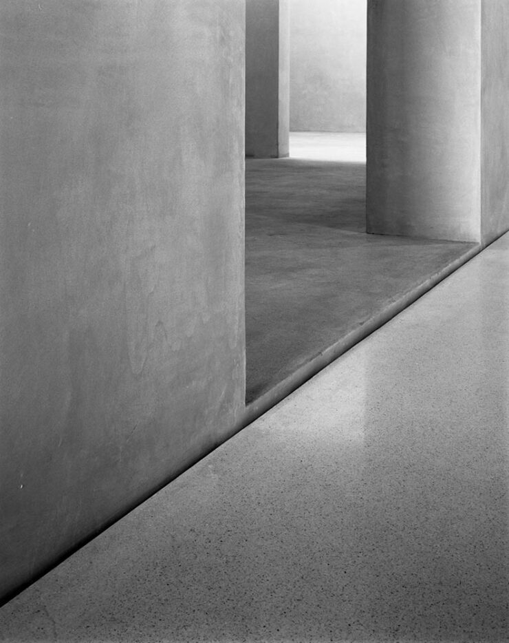
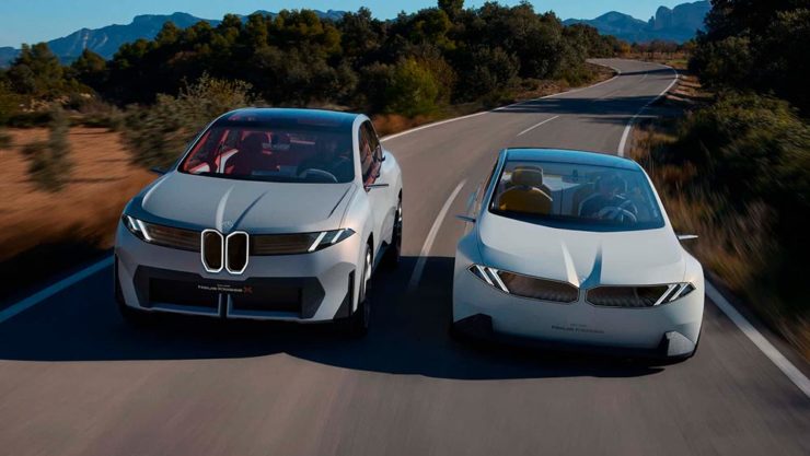
A Time • A Place (Vol. 1)

Also via Wallpaper*, we have a “celebration of the European Car of the Year and changing perceptions of modern design, pairing the best buildings of the age with their automotive contemporaries:”

London’s Camberwell Subamarine and the Mercedes W116. Photo by Daniel Hopkinson.

“Through the lens of time, both [cars and buildings] have become highly symbolic of their eras and hindsight will allow us to trace the roots of each design to determine how it is viewed from a 21st century perspective,” says Holroyd, noting that over this period architecture underwent a stylistic retreat, just as car design became emboldened and more avant-garde.

Great stuff in this new title, available now from The Modernist. Read more at Wallpaper*.

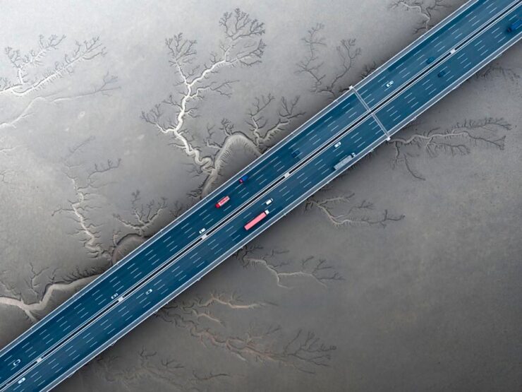
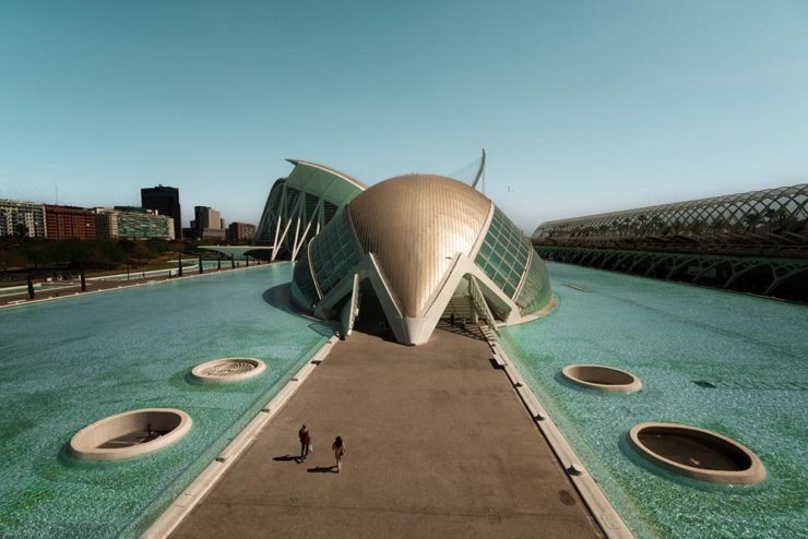
World Architecture Festival 2024 Shortlist

Via The Guardian, we have The World Architecture Festival’s 2024 shortlist, revealing projects from around the world spanning categories such as childcare, energy, transport and science. A couple of faves:

The Chodge by DCA Architects of Transformation — interesting name(s), surely — in Whakamaru, New Zealand. Photograph by Simon Devitt.

The live awards event will take place in Singapore from November 6-8. This year’s finalists represent 71 countries.

Woven Passage to Cloudy Peaks by line+ studio in Shaoxing, China. Photograph by line+studio.

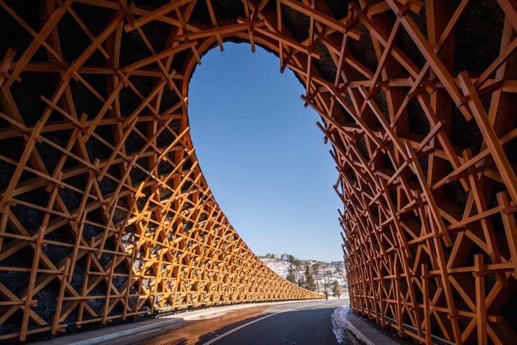
See more at The Guardian, or the complete shortlist at The World Architect Festival.

Special Bonus #4: This is Colossal brings us the drone photography of Eric Waider, shot in Iceland:

As glaciers expand and recede, they have the capacity to grind rock so fine that geologists refer to the pulverized material as glacial flour. It slips down rivers and into lakes, carrying the otherworldly turquoise hue through a unique and resilient ecosystem. In Iceland, the blue-green color is complemented by rivers that flow yellow, thanks to sulfur from nearby volcanoes, or red from dissolved ferrous iron—also known as bog iron. Coursing over rock and black sand, the streams take on dazzling, rhythmic patterns.

Photograph by Erik Waider.

Brilliant. See his website (“Abstract Landscapes of the distant North”) and enjoy that series and more — including faves such as Ocean Blues and Glacial Macro.

Beautifully Briefed 24.6: Summer of Win (Mostly)

In this installment of Beautifully Briefed, let’s take a look at some great posters, great print items, and great photography. Plus, an update from Adobe’s continued campaign to lose friends and attract government attention. Fun stuff!

GET LECTURED (ON ARCHITECTURE)

Back in September, I mentioned Archinect’s Get Lectured poster series. They’re back with the Spring 2024 winners, including these two faves:

ELAC lecture poster design by Tashfiah Ahmed.
Lecture poster from the University of British Columbia; designer not listed.

Great examples of design in a often difficult category. See the rest.

Architecture Photographs by Hélène Binet

While we’re discussing architecture, let’s talk about a Dezeen post that caught my eye: photographer Hélène Binet has a new book out, adding to her long career capturing the old-school way — using film.

“A Sentimental Topography by Dimitris Pikionis, landscaping of the Acropolis, Athens, Greece.”

This series captures shadows and light with exceptional talent, including the above, where she’s praised for “captur[ing] in a single image the tactile and textured presence of tectonic form, both in built and natural environments.”

“Staircases in Sperlonga, Latina, Italy.”

I love the softer shades of gray than shown in the previous image, and both this and the image below demonstrate a deep understanding of architectural expression.

“Kolumba Museum, Cologne, Germany, by Peter Zumthor.”

Read the post from Dezeen, see more examples of outstanding work on her website, or buy the book with 170 photographs, essays, and more.

2024 Audubon Photography Winners

This is Colossal posted about this a day before my Audubon magazine showed up with these prominently featured, and they’re all winners.

Wild Turkey, Female Bird Prize Winner, by Travis Potter.

Bird photography is a difficult skill requiring patience, perseverance, and specialized gear; those who excel at it deserve recognition. Plus, there’s this:

Audubon’s climate science report Survival by Degrees reveals that two-thirds of North American birds are threatened by extinction from climate change, including species featured in this year’s Audubon Photography Awards like the Blackburnian Warbler, California Quail, and Sedge Wren.

Forster’s Tern, Professional Honorable Mention, by Kevin Lohman.

Check out the Colossal post, or see the full story at the Audubon website.

Special Bonus #1: Kottke points us towards the Siena 2024 Drone Photography Awards. “Look! Up in the sky! It’s … another contest!” Good stuff nonetheless:

“Jiashao Bridge” by Sheng Jiang, China.
PRINT 2024 Awards

The annual PRINT awards are out, featuring — natch — great items in print, including items like the Smithsonian’s annual report and a Naked Trails brochure. Here are a couple of items from the book design category:

Jacket design by Robin Bilardello.

Author sketch and lettering by the author. Also, let’s get the . . . :

Cover design by Milan Bozic, with illustration and typography by Lauren Tamaki.

Fantastic.

Special Bonus #2: Hoefler & Co. brings us Typographic Doubletakes: “While good typefaces have prodigious families of carefully related styles, some of the best typography builds unexpected relationships between unrelated fonts.”

Left: Chronicle Hairline + Landmark. Right: Vitesse + Gotham.

Their blog refreshes as you scroll in more ways than one — enjoy.

Left: Mercury Text + Ideal Sans SSm. Right: Whitney + Operator and Operator Mono.

Special Bonus #3: Kottke points us to a LitHub post arguing for adding full credit pages to books acknowledging everyone who worked on them. “How lovely it is to be seen and appreciated.”

Adobe “Too Easy to Hate,” Say Users, Employees

Adobe continues to score big with the public — in the best Boeing style, a formerly-great company has put profits before users and employees. While successful from the shareholders’ point of view (record profits, again), some are . . . upset. PetaPixel:

Just over a month ago, an Adobe exec called AI the “new digital camera.” Simultaneously, an Adobe marketing campaign chucked photographers under the bus, and not for the first time, which caught the attention of the American Society of Media Photographers (ASMP). At the very top of Adobe, there is a concerning and frustrating lack of understanding about art and the people who make it.

Even “exasperated employees implored leadership to not let it be the “evil” company customers think it is;” while that might be a stretch — “ignorant greed” is a better description — either is not a winning look.

The latest was a terms-of-service update that many saw as a rights grab, allowing the company to use users’ work to train its AI services. While those have been amended, the seemingly clear language — “We’ve never trained generative AI on customer content, taken ownership of a customer’s work, or allowed access to customer content beyond legal requirements” — comes from a company that has lost the trust of users, making those words just that — words. Time will tell if they are truth.

But there’s more: Adobe’s just been sued by the FTC (via PetaPixel, Pixel Envy) for hidden fees and difficult cancellations:

“For years, Adobe has harmed consumers by enrolling them in its default, most lucrative subscription plan without clearly disclosing important plan terms,” the lawsuit alleges. “Adobe fails to adequately disclose to consumers that by signing up for the ‘Annual, Paid Monthly’ subscription plan, they are agreeing to a yearlong commitment and a hefty early termination fee that can amount to hundreds of dollars. Adobe clearly discloses the early termination fee only when subscribers attempt to cancel, turning the stealth early termination fee into a powerful retention too that [redacted] by trapping consumers in subscriptions they no longer want.”

I’m actually glad for this, as I wasn’t aware that my $60+ monthly fee is a payment on an annual plan. (Ug.) Not too big an issue — I actually feel like there’s decent value in the plan and will continue to subscribe for the foreseeable future.

But I’d also be lying if I said I’m completely satisfied with our business arrangement: alternatives are few and far between. While Adobe does not have a monopoly legally or technically, in the publishing industry at least, they are, for all intents and purposes, the only game in town. It would be nice if they would at least demonstrate a modicum of respect for their users.

Update, 25 July 2024: “Adobe Exec Says Early Termination Fees Are ‘Like Heroin’ for the Company,” according to PetaPixel. Hmph.

Beautifully Briefed 24.3: Bloomin’ Breadth

The end of March here in Middle Georgia means flowers aplenty, and usually with that, some photography — but I’ve not yet had a chance. (Stay tuned.) I have, however, been saving up links o’ interest: fonts, books, photography, and new(ish) car logos. Let’s go!

Kottke Meets 2024

Starting with one of the very few places that is still around from Foreword’s old days, the always-interesting Jason Kottke:

2024 marks Kottke.org’s 26th year on the ’net.

Great new looks for great content, with better Quick Links — the previews are ace — and incredibly-appreciated gift links to places like The New York Times and The Atlantic. If you haven’t been in a while, click and enjoy.

Fab Spring Type

With “a plethora of captivating new typefaces,” CreativeBoom celebrates spring with 11 new faces to tempt, inspire, and bring joy:

Arillatype.Studio brings us a thousand glyphs of greatness.

Zanco, with its bell-bottom style; Seabirds, inspired by 1930s book covers; Module, a “fluke side hustle;” and Graffeur, improvised from gaffer tape and glimpsed in this post’s header image, are all great. My far-and-away favorite, though, is At Briega, “inspired by the concept of hybridisation” and shown above.

See ’em all here.

Literary Three-Fer
M.C. Escher’s Lesser-Known Works
“The Drowned Cathedral,” a 1929 woodcut.

“Unique perspective” never does justice to someone whose name defines the term. See some never-before-seen images alongside old favorites in a new Escher book highlighted at Hyperallergic.

Multidimensional Libri

“Experimental books are flourishing, [a]nd the evidence is seen” in this Daily Heller from PRINT: a traveling exhibition on three-dimensional books, all published titles.

Oh, those Italians. Read on.

Book Design Snobbery
Hoover vs. Atwood — no joke.

“Don’t get held back from the simple pleasures of reading,” argues Natalie Fear at CreativeBloq, “not everything needs to be minimalist.” Justification for commercialism or a common-sense explanation for the bookshelves’ current look? You decide.

Photography Three-Fer
Winners of Monochromatic Minimalism
“Black Pearl” by Sascha Kohne. An honorable mention for the magazine, but a winner for me.

Some incredibly good stuff here — but perhaps more importantly, did you know of Black & White Minimalism Magazine? There’s no end to today’s continued diversification, methinks.

“Traveling through Costa da Morte, Galicia. 600m above sea level where the mountains separate the Cantabria sea from the Atlantic Ocean,” explains third-place winner Alexandre Caetano.
Aging Facades of France

“Shuttered blinds, peeling paint, and aging doors don’t usually indicate an invitation, but for French photographer Thibaut Derien, the fading facades of long-closed shops are well worth a stop,” This is Colossal says.

Sony Photography Awards: Architecture
The Ciudad de las Artes y las Ciencias (City of Arts and Sciences) in Valencia, Spain: “Hemispheric,” by Eng Tong Tan, Malaysia.

ArchDaily‘s coverage of the annual Sony awards shortlist announcement was an insta-click.

New Bull: Now Flat. (And a BMW.)

Lamborghini practically defines flamboyant. So it’s worth a link when their logo gets less interesting:

Old logo, left, new, right.

Late at following the industry trend of flat-is-better, because, well, Volkswagen. (Okay, I undersell. Perhaps.) Read the lack of news at Motor11Motor1 also has a decent roundup of new car logos, from 2016-present, which underscores the “flatness” trend. or The Drive, where they manage to convey the brand’s use of the phrase “digital touchpoints.”

I don’t know whether this will make any more sense in a few or even many months — which is relevant because of BMW. Four years ago, one of the industry’s design leaders expressed strong this new style, and I didn’t get it. But it’s worn better than most, and superlatively on occasion — check out the logo’s use on the Vision Neue Klasse X:

Rather than a standalone, plastic part sitting on the paint, it’s etched into the finish. Man, I hope that makes it into production.

Neue Klasse: do like. Bull? No so much.

Update, 2 April: BrandNew, itself sporting a new look, has weighed in on the new Lambo style, calling it “not good.” (FYI, BrandNew is a subscription, quite possibly the best $20/year someone interested in design can spend.)

  • 1
    Motor1 also has a decent roundup of new car logos, from 2016-present, which underscores the “flatness” trend.

New Gallery Bonus: Deepstep, Georgia. (Also, a New Georgia Gallery Setup.)

A while back, on the road from Milledgeville to Sandersville, I spied a sign:

Giles Cross Roads, 11917 Deepstep Rd.

That little town — more a hamlet, really — is called Deepstep, and I’ve marked it for a stop since. On the way home from Augusta (part 1, part 2), I finally had the opportunity.

Alonzo G. Veal & Son (What We Don’t Have, We Can Get), 9665 Deepstep Rd.
Veal & Son Building Detail #1, 9665 Deepstep Rd.

What a great little spot.

Gate and Field, 9665 Deepstep Rd.
Outbuilding and Pine, 9731 Deepstep Rd.

The gallery’s only eighteen photographs, but absolutely a worthy addition to the newly revised Middle Georgia group. Those galleries cover everything from Pine Mountain in the west to Sandersville in the east, Madison in the north to Dublin in the south.

Indeed, I’ve rearranged pretty much all of the Georgia galleries:

The new Georgia gallery group: five items instead of three, all featuring rearranged contents.

Atlanta gets its own (to be expanded soon, I hope); the cities of Augusta, Columbus and Savannah another; Macon, my home base, a third; the aforementioned Middle Georgia, a fourth; and finally North and South Georgia (Helen, St. Simon’s, etc.).

As always, thanks for taking the time to stop by.

New Gallery: Augusta, Georgia (Part Two)

As mentioned yesterday, I’ve been meaning to get to downtown Augusta with a camera for years. Actually, that not correct: I’ve been meaning to get to downtown Augusta . . . period. I’d never been there, despite living 130 miles away for almost two decades, despite having been nearby, despite — well, you get the idea.

Statue at James Brown Plaza, Broad St. and Augusta Common

So it was a pleasure to get to the home of Woodrow Wilson, James Brown, Jessye Norman, and countless others — and see a city a lot like so many others in the American South, a city that’s struggling with identity, history, vacancy, gentrification, and so many other issues prevalent in the 2020s.

The Confederates and the Albion, Broad St.

One of them is the continued presence of a huge Confederate memorial, a shame in a majority-Black city — and just in front of the Lamar Building, soon to be luxury apartments. What message are Augusta, and its new luxury residents, sending?

Miller and Lamar, Broad St.

Nonetheless, the day’s efforts resulted in some satisfying images, from architecture to neat details:

Augusta Cotton Exchange Building #1, 32 8th St.
Miller Theater (Entry Detail), 708 Broad St.
Edgar’s Above Broad (Logo) Sign, 699 Broad St.

Augusta is a riverfront city I’m looking forward to returning to. In the meantime, please enjoy a total of 128 photographs in the newly-posted gallery.

Augusta Riverwalk Marina (with Freedom Bridge)

New Gallery: Augusta, Georgia (Part One)

Together with Columbus and Macon, Augusta is one of Georgia’s “Fall Line” cities, and is home to more than 200,000 people. Located on the eastern edge of the state on the Savannah River, it was founded by James Oglethorpe in 1736 on the site of a Native American river crossing.

Augusta has long been on the to-photograph list, but it’s just far enough away from Macon to make a quick, unplanned trip difficult — so this past weekend, when another trip was cancelled, I took advantage of the available time and made it happen.

Blue Against Blue Against Blue, 943 Ellis St.

Of course, rather than a quiet Sunday downtown, I ran headlong — no pun intended — into the Augusta Ironman marathon. There were crowded street corners, intersections closed aplenty, and a combination of competitors and supporters everywhere.

Boll Weevil Cafe and Sweetery, 10 James Brown Blvd.

Nonetheless, it was a beautiful early-fall day in Georgia, and over the course of several hours, I really enjoyed photography in downtown Augusta — as usual, without people in the shots.

Decorative Facade, 103 Macartan St.

Excepting, of course, The Godfather of Soul:

Spirit of Funk Mural, 190 James Brown Blvd.

The photostroll also included the Riverwalk, a stretch both at water level and atop the levee — doing my best to stay out of the runners’ way, moving around to the chants of “water!” and “ice!”

Fountain at Riverwalk Enterance (#1), James Brown Blvd.
Savannah River at Augusta, Georgia

The first 64 photographs — part one of two — have been posted to the new Augusta gallery. Stay tuned for the second part, along with a bonus gallery and some housekeeping news, tomorrow.

Slice of Primary Colors, 1102 Broad St.

Beautifully Briefed 23.9: Falling into Brilliance

As summer turns to fall, let’s take a look at Type 1 fonts, a library index, revolutionary posters, posters for “get lectured,” and two different photography contests. Let’s get right into it.

Adobe discontinues a standard: The Type 1 font

Back in the early days of desktop publishing — up to about the turn of the century, give or take — everything typographic used PostScript, a programming language by Adobe. (Other stuff, too, like Adobe’s vector program, Illustrator.) PostScript fonts were the so-called “Type 1” variety, made up of a bitmapped “suitcase” that housed the standard display sizes and an outline file used by the output device to print clean, what-you-see-is-what-you-get beauty.

The Apple LaserWriter Plus and some vintage Macs: nostalgia! (Note the book — heh.) Image: YouTube.

Companies from Apple to Microsoft didn’t want Adobe to hold a monopoly on output tech, so later fonts evolved into TrueType and then OpenType, the latter of which is the standard today.

So much so that Adobe has now discontinued Type 1, and they, along with Microsoft, have stopped being supported. Which is understandable and yet a shame: some of us still have hundreds of them.

Ars Technica has the best roundup.

Meanwhile, I’m going to investigate a conversion utility. Will report back.

All the Libraries in London

It’s Nice That has a post that reminds us of a library’s central purpose: to leave knowing more than you did when you entered. “The library, in our shared public imagination, is a special place,” the author argues — reminding us of what libraries were established to do, often distinctly different from the modern reality (especially in the United States).

In the library you begin to be convinced that language matters, that words have the power to clarify, to rouse, to make us feel something, to help us understand the political and cultural features of historical and contemporary moments.

Lola Olufemi, It’s Nice That
All the Libraries in London. Cover design: unknown. Image via It’s Nice That.

All the Libraries in London does something artistic with a simple listing, elevating it, reminding us how compelling the ideal that libraries represent really is:

This is a political and artistic listing, one that invites the reader to rediscover their own memories of their local library as a site of discovery. The book’s authors invite us to reflect on our personal relationship to libraries as well as the necessity of collectively securing their future existence.

Lola Olufemi, It’s Nice That
Alan Kitching, Durning Library. Image via It’s Nice That.

We need more of this everywhere, but especially here in the States. Meanwhile, check out this great item at It’s Nice That.

Special Bonus #1: Another British treasure, via the very British Antiques Roadshow (a British original, natch): this incredible poster by Ralph Steadman.

Ralph Steadman’s Where the Buffalo Roam (1980) poster. Image via Wikipedia.

Special Bonus #2: British book designer Steve Leard has launched a new book design podcast, Cover Meeting, featuring interviews between Leard and fellow book designers on the work, the industry, and more. The Bookseller has more.

Cuban Movie Posters. No, Really.

While we’re on the subject of great posters — and It’s Nice That — let’s talk about how Cuba’s revolution-era political posters transformed their poster design for films. Appropriately enough, a new film, El Cartel Cubano, highlights these amazing (and, likely, never seen before) items.

Besos Robados, ICAIC, by Sotolongo & Carole Goodman. Image via It’s Nice That.

How come our posters in the US aren’t this beautiful? What did this say about the priorities of the revolution? What did the medium or choices in the scarcity of materials used say about the economic situation in Cuba?” It’s these questions which form the bedrock of El Cartel Cubano, a fascinating and tender tribute to the artists on the island.

Adrienne Hall, co-director, El Cartel Cubano
Sur, by Michael Myiares Holland. Image via It’s Nice That.

I have to admit: this isn’t a subject I would have leapt at, but It’s Nice That sold it. Awesome.

Get Lectured (on Architecture)

Closing out our trifecta of great posters, Archinect‘s Get Lectured series brings us these fantastic items from their Fall 2023 series:

Woodbury University School of Architecture’s Fall 2023 lecture series.
The University of Texas at Austin School of Architecture’s Fall 2023 lecture series

Some real gems: see more.

Finalists of the 2023 Urban Photography Awards

Going to soapbox a little here: pay-to-enter photo contests aren’t usually something I want to spread the word about. So ArchDaily‘s basically-a-press-release, “URBAN Photo Awards 2023 has announced its list of Finalist Photographers, marking the penultimate stage of the international contest,” was guaranteed a pass.

But there’s a problem: some of the photographs are really compelling.

Untitled, by Claudia Costantino

This one’s my fave:

Back to the 70s, by Stephane Navailles

See the contest website, or ArchDaily‘s post.

Winners of the 2023 Black and White Photography Awards

Another contest, yes. They’re everywhere. But … wow.

Street Lights – Ottawa, by Gareth Jones, category winner, architecture
Another mushroom? By Hector Ballester Ballester. Silver mention, architecture.
Alamillo bridge, by Manuel Ponce Luque. Finalist.
The concert, by Helena García Huertas. Finalist.
Reflections on the stairwell, by Max Dobens. Finalist.

And that’s just the buildings/architecture — there are portraits, street photography, landscapes, and more. A reminder to aspire, every day, with every image.

The Black and White Photo Awards (2023). (Via PetaPixel.)

Beautifully Briefed 23.8: Summer Stew

The August heat is met with some refreshingly cool items for you this time: beloved movies reimagined as vintage paperbacks, graphic design on the Internet Archive, and winners of the 2023 iPhone photography awards. Plus, a bit on social media that hopefully won’t leave an aftertaste. Let’s dig in.

“Good Movies as Old Books”

This is Colossal points us to an extraordinary personal project by graphic designer Matt Stevens: classic, acclaimed movies visualized as vintage paperback books. Everything about these spells “win.”

From the aged look, illustration choices, and director-as-author to the logo and occasional price, these are all … perfect.

Volume One is 100 titles, and while that book is sold out, prints are available at his website. The items in Volume Two, due this month, are guaranteed to be awesome.

Graphic Design on the Internet Archive
Emigre #20 – Expatriates. Courtesy of the Internet Archive via archive.digital.

Another treasure via Jason Kottke:

archives.design is a labor of love site run by Valery Marier where she collects graphic design related materials that are available to freely borrow, stream, or download from the Internet Archive. I’ve only scratched the surface in poking around, but so far I’ve found Olivetti brochures, a collection of theater programs from the 19th and early 20th centuries, several Apple thingsThe Vignelli Canona specimen book of wood type from the 1880s, and many issues of Emigre. What a resource!

Jason Kottke, kottke.org
An advertising brochure for the Olivetti Tetractys, circa 1956.

Some of these are fantastic — set aside some time to explore and enjoy.

2023 iPhone Photography Winners

I don’t always link to these contests — it often seems like the publicity (and rights!) are all about the folks holding the contest rather than the people entering them — but I often look, and am always impressed with the quality coming out of a “simple” iPhone.

Long Nguyen, France – 1st Place, Travel – “Last Night before Xmas”
Scott Galloway, United States – 1st Place, Nature – “Wonder Wheel”

And while both of the above are (relatively) recent phones, in the latter case showing the macro capabilities of an iPhone 12 Pro Max, even older phones can highlight the talent of the person using it:

Derek Hager, United States – 3rd Place, Photographer of the Year – “Tucson Morning”

Shot on a 2017 iPhone X. Nice.

See all the winners, for 2023 and years past, at IPPAwards.com. (Via PetaPixel.)

A Moment Regarding Social Media

I’m not going to spend much time on this; I eschewed pretty much all forms of social media years ago now, and don’t regret it. That said, I do keep up with social media in the meta sense (a word that’s been stolen, as far as I’m concerned, by — wait for it — a social media company), and have noted the pain and concern associated with the implosion of Twitter.

While this conversation started with Nick Heer and the always-excellent Pixel Envy, it’s obviously evolved as the year has seen one extraordinary cage fight event after another.

Threads on Apple’s App Store, via the BBC.

For the past decade, It’s been all but required for serious brands to maintain a social media presence […] yet instead of scrambling to claim digital real estate across all these newly emerging platforms, some companies are choosing to be more judicious about which platforms they choose to join. In some cases, they’re learning from brands who jumped the social media ship years ago.

Chris Stokel-Walker, BBC

The quote above, from the BBC, attempts to answer the question, “Why your favourite brand may be taking a social media break.” Short answer: it’s complicated. I’d argue there’s an even shorter answer — it’s smart! — but for people and brands that aren’t yet established, social media is often key to discoverability.

This may be especially true for artists, designers, photographers, and others in the self- and small-business-employed creative field. Indeed, let’s go to a great source for those in the arena, Creative Boom, who recently spent a minute asking, “Creatives are saying social media is over… so what next?”

Like any new craze, it was fun for a while. But there’s certainly nothing new about it any more. Facebook’s now been around for almost two decades. Twitter’s 17 years old. Even Instagram has reached its teens. And while many of us joined these platforms during their fun, “anything goes” eras, when everything was about the users, now it’s all about the algorithms and their use to make venture capitalists vast amounts of money.

Tom May, Creative Boom

While I agree that social media is a mess and has been for a while, I’m absolutely not going to tell you to give it up — only to remind you that I have given it up and continue to be completely okay with the decision.

I do want to ask you, though, to choose wisely:

Facebook’s “Threads (an Instagram app),” their answer to the Twitter/X debacle, as shown via Apple’s iOS App Store privacy report.
Tapbot’s “Ivory,” available in Apple’s iOS App Store and showing that app’s privacy report, for the Mastodon social platform.

Enough said. Turn off the computer, go forth, and enjoy a beautiful summer’s day.

Updated Gallery: Columbus, Georgia

Gerald and I were in Georgia’s lower Chattahoochee River valley yesterday, visiting the city of Columbus — and ran across a couple of treasures. Naturally, there was a camera handy.

The first is the best restaurant I’ve enjoyed in a long while: The Animal Farm.

The Animal Farm, 105 W. 12th St.

If you’re in or going to be going to Columbus anytime soon, I cannot recommend it highly enough. The food was superlative, the service excellent, and the ambiance simultaneously upscale, casual, and fresh.

The second — and no less tasty — stop was the Ma Rainey Museum of the Blues. This period house downtown is small but demonstrates a remarkable comeback from the (literal) wreckage they started with in the ’90s. I’d originally wanted to return to the Columbus Museum, but it’s being renovated; Gerald’s suggestion here was pitch-perfect.

Ma Rainey House, 805 5th Ave.
Ma Rainey House Marker, 805 5th Ave.
Bust and Albums, Ma Rainey House, 805 5th Ave.
Record Player Detail, Ma Rainey House, 805 5th Ave.

Inside, Gerald and I enjoyed a lengthy conversation with Xavier, a guide who was knowledgeable and enthusiastic; he absolutely made us want to explore more blues history. (I’m also going to be listening to some Ma Rainey on Tidal.)

Meanwhile, gallery of Columbus photographs is deep and varied, spanning almost fifteen years and 180 items — check it out.

As always, thanks for visiting.

Update: Gerald’s take on the day.

Updated Gallery: Downtown Macon

As is typical in July in Georgia, it was hot yesterday — but not so much that I didn’t spend a few minutes wandering around with the camera and superb 90mm. Especially since I was down on MLK, an area of downtown Macon I don’t frequent as much as, say, 2nd St.

Macon Rocks Mural (401 Cherry St.)
Music Marker (MLK and Mulberry)

Some detail shots (as usual):

Studio Door, Serenity Entertainment, Cherry St. Ln.
Visit Macon’s Keyboard Building Detail, 450 MLK Blvd.
Decorated Transit, MLK and Cherry

Side note: I was completely unaware that Steve Martin and Edie Brickell had teamed up for Bright Star, a musical set in the Appalachians. (I presume, unfortunately, that the 2020 season at Theatre Macon might not have shown.) It probably won’t surprise that I enjoy a musical now and than — and am a big fan of both Martin and Brickell — so was glad to find it on Tidal.

Bright Star (Painted) Poster, Theatre Macon, 3rd St. Ln.

In any case, 23 new photographs have been posted to the Downtown Macon (2022-2023) gallery. Peruse and enjoy — and thanks for visiting.

Beautifully Briefed 23.6: Welcome to Summer

This time, several items related to books and bookstores; two more — possibly the last two — from the automotive logo category; and PRINT Magazine’s 2023 roundup of great design.

Book Four-For
AI book covers? Here, now.

Creative Bloq, which I wasn’t familiar with, has a post up that’s only here because it’s the first I’ve seen of what is sure to be a trend: AI imagery on a book cover.

Image: Bloomsbury UK (Also: Where’s the body to go with the head?)

“Causing controversy,” they say, in that…:

[F]or a while now, with concerns over copyright and ethics plaguing text-to-image generators. Perhaps the most existential worry of all is the idea that AI could put human artists out of work – and while many still find the idea fanciful, we’re already seeing examples of AI-generated art being used commercially.

— Daniel Piper, Creative Bloq

The article itself has a hint of click-bait about it, what with Twitter users spotting a NY Times bestseller but complaining about the UK version of the cover design . . . but the larger question of AI coming for the book designers everywhere is valid.

Then again, AI imagery has the potential to reshape much of the creative landscape. Let’s hope — hope! — that it’s deployed ethically.

B&N’s Market Repositioning
Image: NYTimes (modified)

BookRiot asks whether Barnes & Noble’s new presentation as “a local bookstore” — something that’s part of the community in a way that Amazon can never be —is genuine, let alone successful. (We have a B&N here in Macon, which I visit infrequently, and which doesn’t feel “local.”)

Background: The BookRiot article (and the image) above ultimately stem, I believe, from a NY Times option piece from 2018.

Temples of Books

As regular readers know, I’m a huge fan of combining books and photography. Naturally, great photographs of great libraries strike just the right chord:

Cuypersbibliotheek, Amsterdam, Netherlands

As This is Colossal puts it, “Written by Marianne Julia StraussTemples of Books: Magnificent Libraries Around the World celebrates the stunning architecture and quietude associated with wandering the stacks.”

Phillips Exeter Academy Library, Exeter, New Hampshire

Positioning these spaces as intellectual havens, Temples of Books highlights their wide array of offerings, including botanic gardens, archival repositories, and of course, room to read. “As an institution that can curate knowledge, scrutinize the status quo, and encourage education, the library is more important today than ever,” a statement says. “This responsibility is only growing as the freedom to publish on all manner of channels increases.”

— Grace Ebert, This is Colossal

Instant wishlist item!

Take Action for Libraries
Image: everylibrary.org

Simple brilliance: a handy step-by-step guide on what to do if you don’t like a book at your local library.

Carmaker Logo Updates: Porsche and JLR
Jaguar Land Rover > JLR
No, that’s really it.

Formerly Jaguar Land Rover, but generally known in the industry as JLR, the British company1Technically, it’s an Indian company, as JLR is a subsidiary of the TATA conglomerate. decided to have a FedEx moment and rebranded. Alas, Paul Rand was unavailable, so there’s no brilliance in the execution. (We’ll absolutely leave whether walking away from Land Rover as a brand is a smart move for another, longer discussion.) Motor1 has the details.

Porsche > Almost all other mainstream car brands

There’s a new Porsche logo!

The new 2023 version of the Porsche logo. (Image: Porsche)

That’s right: it’s a very subtle change. But it’s a significant one, perhaps because it’s only the fifth in the company’s 75-year history:

All five Porsche badges. (Image: Porsche)

The biggest changes are the backgrounds and the prancing horse in the middle, which is completely redrawn. (And, yes, has more than a passing — heh — resemblance to Ferrari’s.)

Not-at-all-staged photograph by Porsche.

Wallpaper* has the best coverage I’ve seen.

Bonus: Motor1 has a roundup of every recent (2015+) automotive change in branding. Of course, I’ve covered most of ’em here, too.

Update: Nissan, already on the updated list above, might be up to something.

PRINT‘s Best of 2023

PRINT reminds us that not everything is digital these days — so much of the work still goes on paper or packaging — in their 2023 roundup of great stuff:

The 2023 PRINT Awards celebrated outstanding design in every shape and form, from the delicate texture and exquisite form of print to digital design that married technical skill with precise craftsmanship.

— PRINT Magazine

The best in show is a brilliant environmental design, the annual reports category is oddly satisfying (I didn’t know that Land O’ Lakes is a cooperative that owns Purina, for instance), the editorial category contains brilliance, and many, many more worthy of a design lover’s attention.

Sadly, their book design category is a bust. I like “The Every,” but pretty much any of my Best of 2022 picks run circles around it (and the other two choices):

The Every as photographed by PRINT.

But there are gems. I really like Bakemono, for instance, a winner in the fonts category and the best monospaced font I’ve seen:

Italian foundry Zetafonts brings us Bake Mono.

It’s a long article (they call it a 74-minute read!), but when you have a moment, grab a drink and an iPad and enjoy — hopefully as much as I did.

And that’s it! Settle into summer, and stay tuned for more soon.

Updated Gallery: Downtown Macon

It’s hard to understate how much downtown Macon has changed for the better in the last fifteen years: new residents (and lofts), new restaurants, new shops, a high-end hotel, and more — all without losing its feeling of an historic Southern city.

Balconies, 389 1st St.
(Sign of) Hotel Forty-Five, 401 Cotton Ave.

On the subject of Southern, I’m glad to see the completion of the new Cotton Avenue Plaza, a pocket park that replaces not only an awkward intersection but one that had, at its center, a Confederate celebratory statue. Something everyone can share is a big upgrade:

Cotton Avenue Plaza (with Lawrence Mayer Building)

Meanwhile, it wouldn’t be a gallery post without some of my signature detail photographs:

Flower Detail #2, Mulberry St.
Eyes on Cherry St. (Window)

The downtown gallery (2022–23) is now up to 132 photographs — check ’em out. (Once you’ve followed the link, click on any photograph for a larger, captioned version.) And, if you’re interested in the city’s downtown evolution, see also the 2020–21 and 2008–2018 galleries.

As always, thanks for stopping by.

New Gallery: Montezuma, Georgia

Macon County, Georgia, hosts Montezuma, a railroad crossroads on the Flint River. Officially dating to 1851, it was named after the Aztec leader by soldiers returning from the Mexican-American War.

Montezuma Sign (Crepe Myrtles), S. Dooly St.

I’ve been meaning to stop with a camera for a while, but it’s always been a pass-through on the way elsewhere — the route from Macon to Andersonville, Americus, and all points southwest go through Montezuma — but it’s taken until now to actually stop.

Bench Detail, Montezuma Methodist, N. Dooly St.

Like a substantial part of rural Georgia, Montezuma has fallen on increasingly hard times; the population continues to drop1See Wiki’s article., the empty storefronts multiply, and many of the beautiful old Southern houses need some attention:

Slight Repairs Needed, 510 S. Dooly St.

There’s an attractive downtown, though, with old brick buildings and a wonderful historic railroad depot:

Museum Sign, Old Railroad Depot, Dooly & E. Railroad Sts.
Bracket Detail #1, Old Railroad Depot, Dooly & E. Railroad Sts.

Did I mention that it’s a railroad crossing? There are two sets downtown:

Railroad Apparatus #4, Dooly & E. Railroad Sts.

Despite the population loss and storefronts marked “for rent,” however, all isn’t lost. There are some new businesses opening:

Sweet Window, 127 Cherry St.

I’ve posted 55 photographs in the new Montezuma gallery — peruse and enjoy. And, as always, thanks for stopping by.

Updated Gallery: Downtown Macon

I had the occasion to have lunch downtown yesterday, a day of simply beautiful spring weather — which I absolutely used as an excuse to take the camera for a spin.

The vast majority of the time, I use what I call my standard lens: 35mm. (Some would argue that 50mm is the “standard,” but I really prefer the wider angle of view due to its additional context.) This time, however, I was using Leica’s superb — and, sadly, no longer available — 90mm macro. The detail, the color, everything about this lens excels:

Leaves and Berries, Poplar & New Sts.
Veteran’s Flame and Flag, Macon-Bibb Government Center, 700 Poplar St.

It’s sometimes a challenge to be creative in an area you’ve photographed often, but I enjoy trying to spy new details:

L.C. Rick’s Place, D.T. Walton Sr. Way & Poplar St.
Kudzu Signs and Building Cornice, 512 Poplar St.

Or revisit favorite architectural items:

Post and Turret, 690 Poplar St.

23 new photographs have been added to the Macon Downtown (2022–2023) gallery, bringing the total to 110. (Don’t forget about the 2008–2018 and 2020–2021 galleries, either.)

Remember, once in a gallery, clicking on any photograph will start a slide show, with much larger images, titles, and more. Peruse and enjoy!

New Gallery: Eatonton, Georgia

Confession: For the last several years, I’ve been avoiding Eatonton. Its four-lane bypass is notorious as a revenue generator for Putnam County, so when heading north to Madison or Athens I have been taking the prettier Monticello route instead.

My mistake. In almost twenty years of living less than fifty miles from this gem — and perhaps because of that bypass — I’d not explored downtown. It’s definitely earned another visit.

Residence Above Maggie Lane (Mind Your Step)
Putnam County Courthouse (Tree)

I also wasn’t aware that Alice Walker (The Color Purple) and Joel Harris (Uncle Remus) were locals — the latter explaining the prevalence of rabbits hopping about:

Rabbit (Paper Jeff)

Interesting art, too:

The FolksArt, 119 S. Jefferson
Selz (The “Sole” of Honor), 107 N. Madison

Please enjoy the 30 photographs posted — and stay tuned: I’ll try to travel the Historic Piedmont Scenic Byway again soon.