
The AIGA’s book design competition has been around for 101 years now — and every year, it’s a pleasure to explore the great work featured within. This year, the jury “had the unique opportunity to view 523 entries from practitioners working in the book design field. It is encouraging that designers continue to be interested in this medium and are currently developing new ways of working with publishers and printers to push our discipline further,” said chair JP Haynie.
In order to be eligible, submitted designs had to have been published and used in the marketplace in 2024. Like last year, the winners were announced in October.
I’m sorry to be running late on this coverage, but as always with 50 Books | 50 Covers, it’s absolutely worth taking the time to go through the gallery and appreciate the dedication to craft shown within. (It just took a little longer than usual to share.)
Twenty titles are highlighted below. Taking a page from my Spine column, I’m including links to each book’s page so you can explore further. The titles are in alphabetical order.
Note: As with all posts here on Foreword, click the title to get to a dedicated page with a wider text column and, more importantly, bigger images.
Many layers of Flattery deserved here.
Unfortunately, several of the individual AIGA gallery pages contain nothing other than the book and some rudimentary information. This is one.
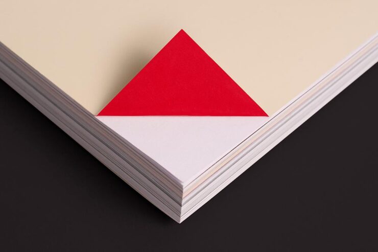
Two specific shout-outs here: this issue’s title, AlieNation, and those flaps. It’s not the first time I’ve seen those large reverse flaps, but here done oh-so-well; there’s useful text hidden in those areas and dynamic photography (art, really) on the “surface.”
It’s fantastic to see journals in these awards, too — an underrepresented category, to be sure.
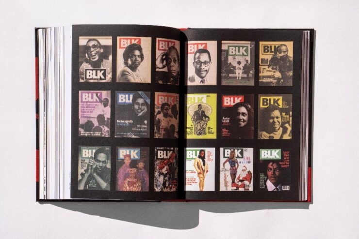
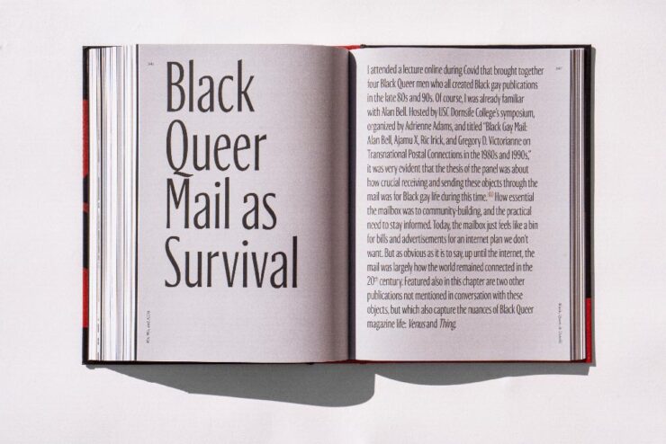
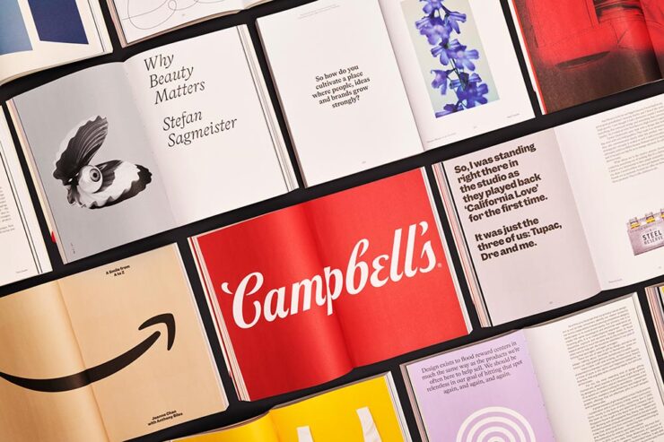
One of the best things about the 50 Books competition is that it’s about the whole project, not just the cover. We get to see interior designs like this one, designs that are interesting and contributory to the mission of the title — which, when the title is about a designer, a high bar indeed.

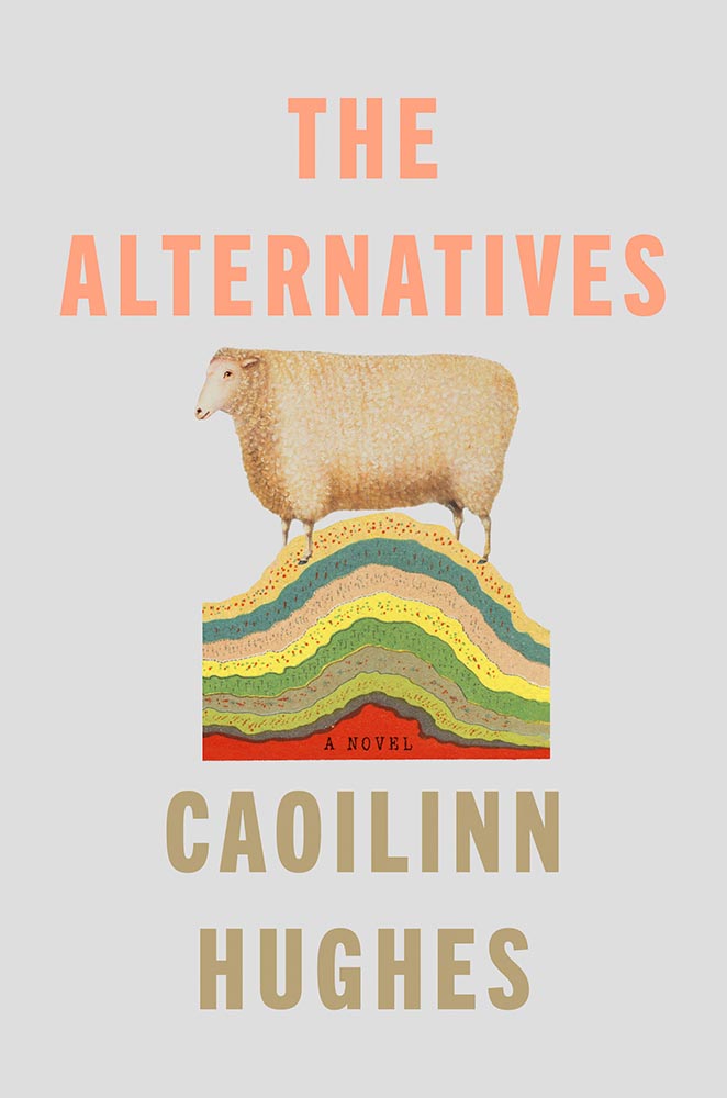
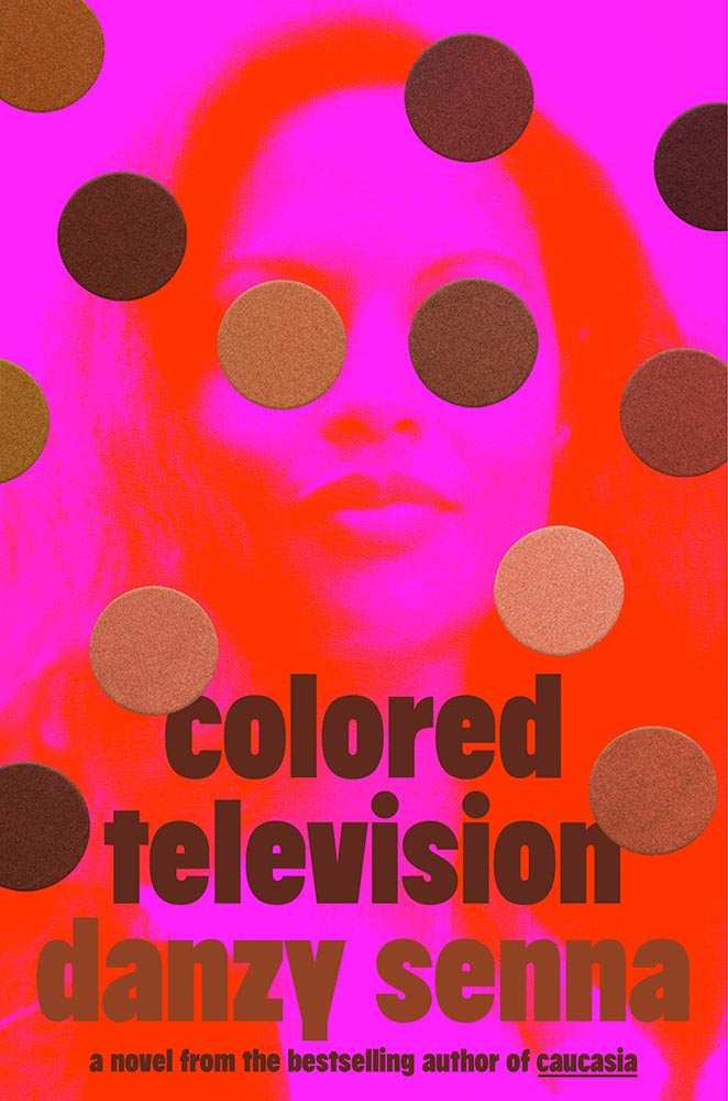
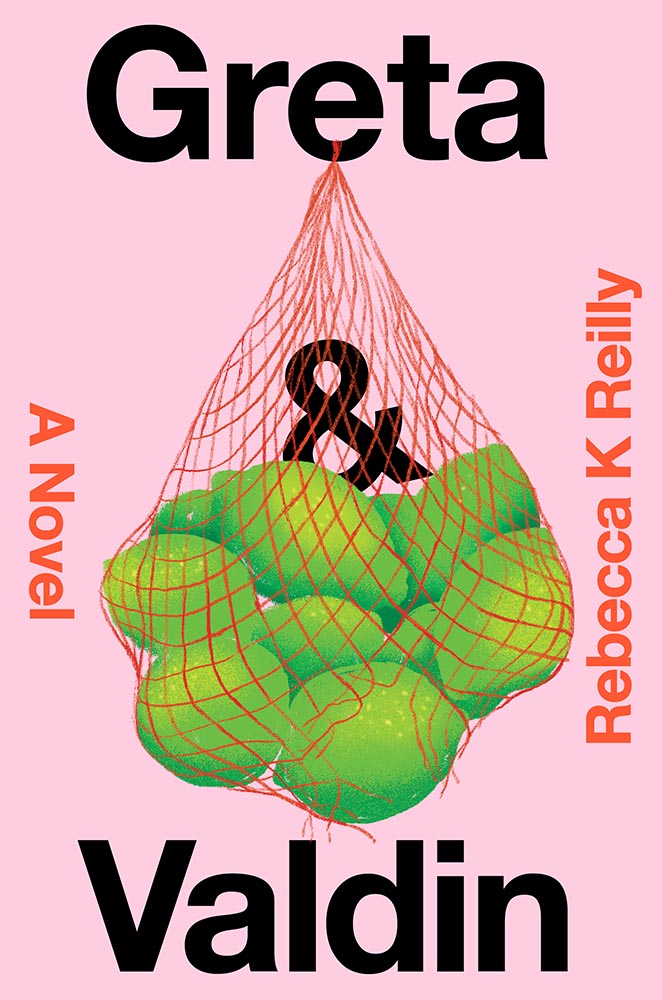
Wading into this minefield — even as a book designer — could be an issue, to put it mildly. This one’s got just the right character, leaning into the great (and perfectly cropped) image, simple-yet-effective use of color, and large text to, um, score a lot with a small input.
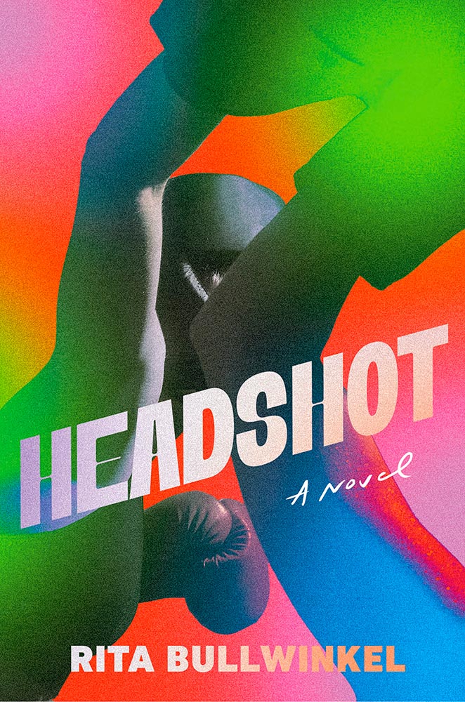
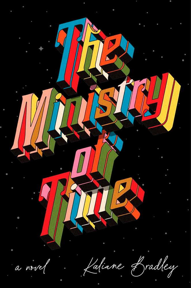
Billed by The Washington Post as “riding a unicycle up and down a set of Escher staircases,” this novel deserves a cover design that’s not quite what’s expected.
Delivered.

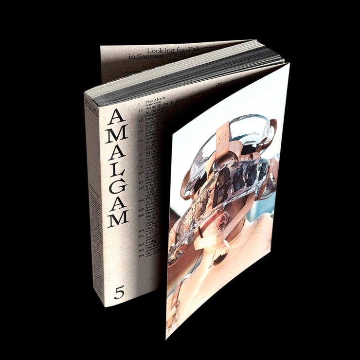
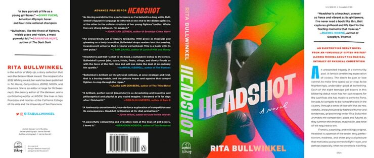
As I mentioned above regarding 50 Books, one of the great things about 50 Covers is that we often get to see not only the cover image but the jacket as a whole.
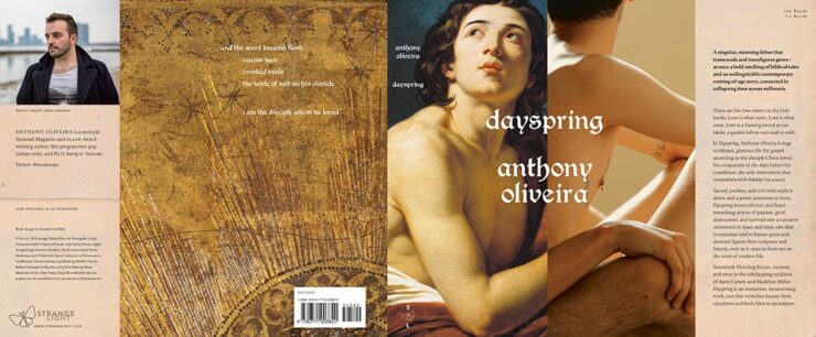
The cover is awesome, a juxtaposition in just the right way. But the jacket as a whole is more complete, more contextual, and in this case, calmly supportive of the more provocative front cover.
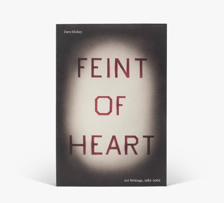
I’m surprised that this style of vignetting isn’t used more often, using both the light area to draw the viewer’s attention to the title and the dark areas as a holding area for other necessary text. Falls into what I like to call, “simply, elevated.”
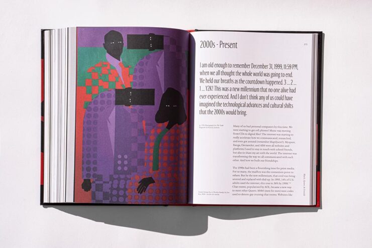
This title has an interesting cover, yes, but it’s the highly competent interior design that really caught my eye:
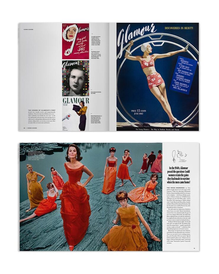
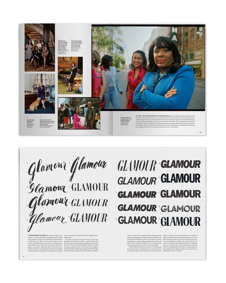
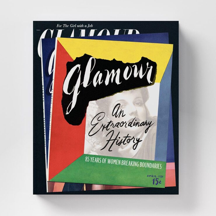
With the wealth that is Glamour‘s history to pull from, the designer here has wisely used that content to elevate this title beyond simple spreads to something truly compelling. Well done.
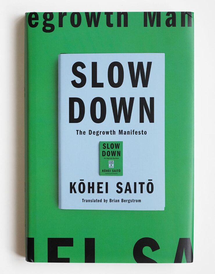
“The bag of sublime slowly unravels,” none of the reviews said.
Another great cover — the textures rock, the colors hit hard, the title text just right — backed up with a complimentary jacket:
It was probably tempting to load up the design, possibly even with visual puns as bad as my descriptions, but instead it supports perfectly. Nice.
There is a link for this title, but it’s another sadly lacking any description.
The only title to get four images in this post. “Simply right,” taken to the next level.
Oh, and the interior:
Books on graphic design can miss the mark surprisingly often, either through trying to hard and thus overwhelming the content or by attempting to let the content be the star in such a hands-off way that the book design winds up detracting. Here, every part of this supports with respect, with style, and with a smile. A real highlight.

This cover is one of those multi-layer surprise-and-delight things. A closeup:
Halftone is the perfect way to handle that overprint. Excellent.
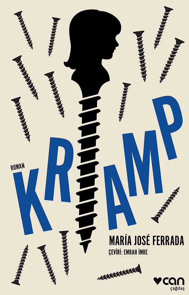
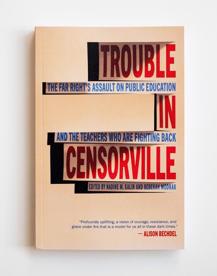
“Screw it, we’ll just make it awesome.” (The title is Chilean, by the way — and apparently awesomely-written, as it’s the first work to be awarded the three most prestigious Chilean literary awards.)
“‘Unexpected style,’ the Out-In-Left-Field department said. Overall pick, surely,” I said in a terribly-punny moment from my coverage of the 2025 Association of University Presses Show.
See AIGA’s page on this title.
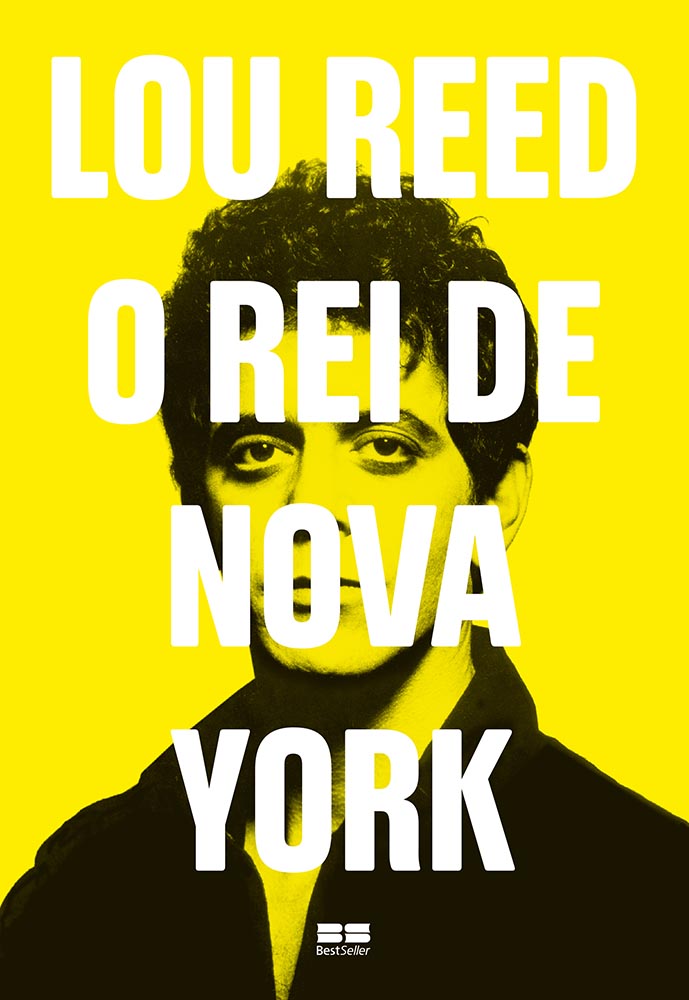
No, he doesn’t look like a New Yorker. Why do you ask?
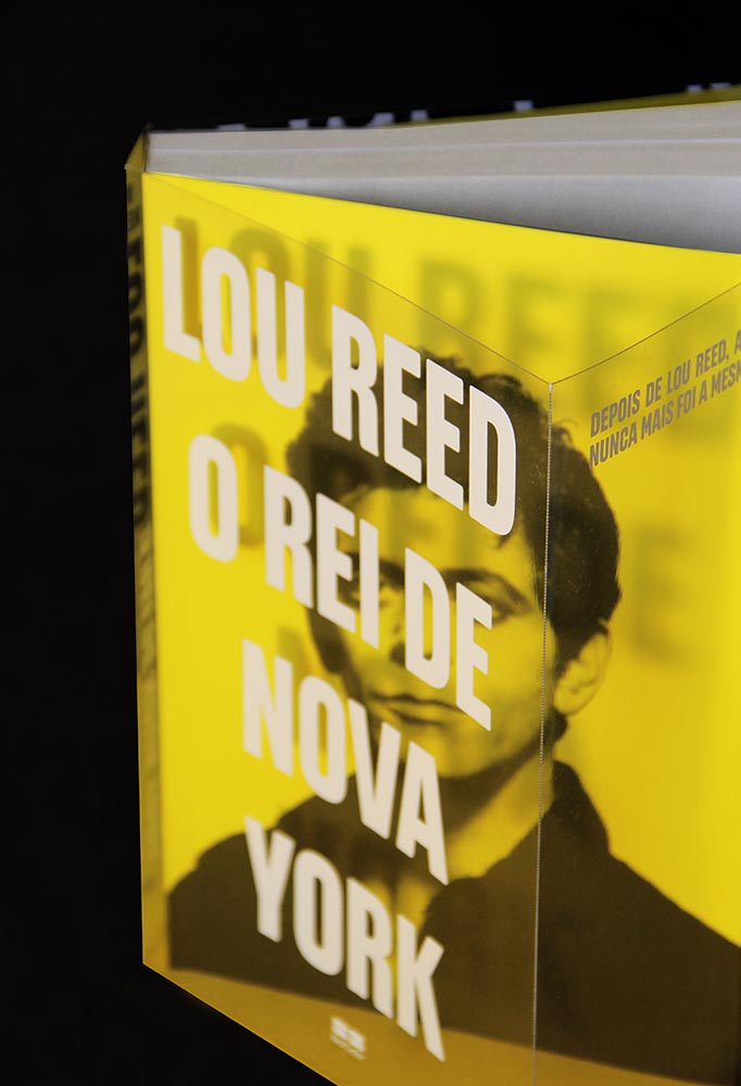
The secret revealed. Awesome in any language.
From another time, one of my four favorite cover designs of 2024 — and still fantastically transcendent.
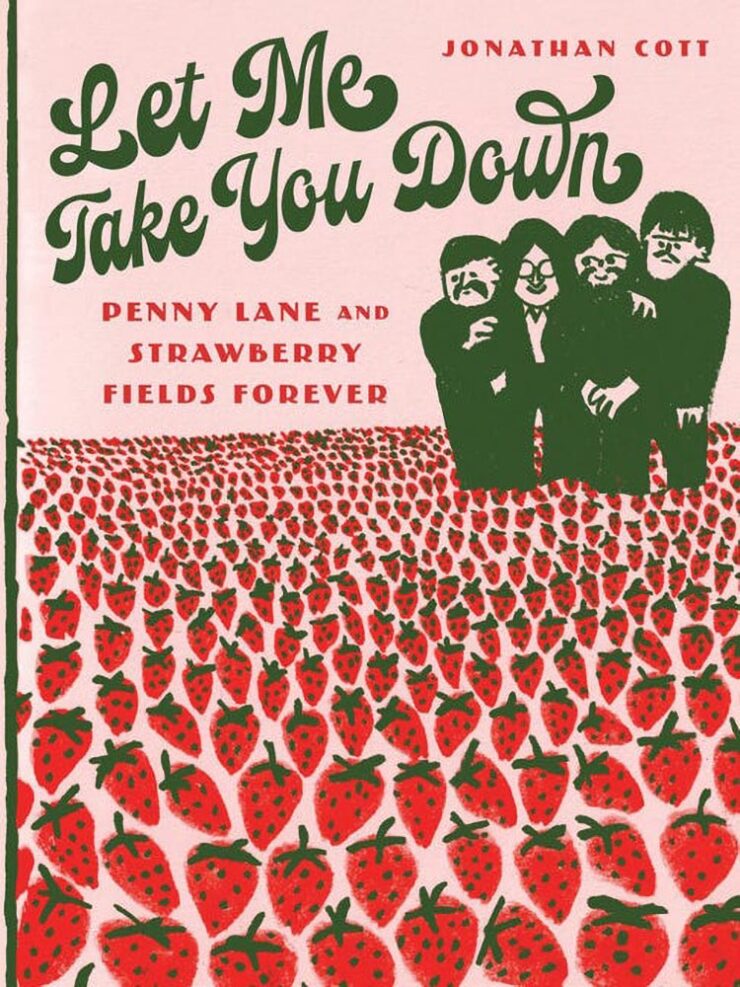
Another unfortunately-blank AIGA gallery page, but here’s a link in case it’s been temporally teleported somewhere important.

One of those photographs that doesn’t quite do justice. Exploring a little more yields rewards:
“Architecture is the perfect form on camouflage,” the description reads — and the book itself pulls a real varnishing act, inside and out.
The second journal on this list, by the way. Nice to see.
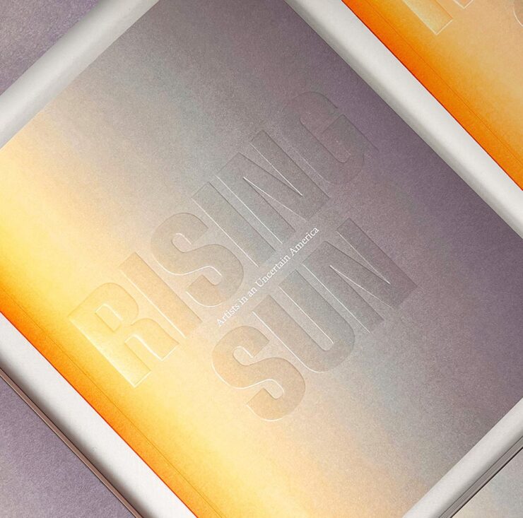
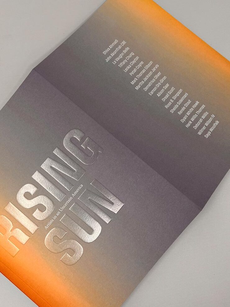
Treating the title (blind embossing and clear matte foil stamping) as reflective of the rising sun background is … genius. It’s also another entry from the awesome-flaps department:
It’s not necessary to slow down to appreciate the alternating, repeating covers — even at today’s drive-by speeds, it’s easily appreciated.
The becoming-familiar not-quite-blank gallery page at AIGA, but here’s a link anyway.
Two in a row for Ben, and in a completely different direction. Still, a simple concept done exceptionally well. (Rodrigo Corral Studio isn’t listed in the credits, by the way, hence the credit line here.)
• • •
All of the 2024 winners can be viewed through AIGA’s online gallery, and I’d like to congratulate all for another good year. The 2024 titles will also join the growing AIGA collection at the Rare Book and Manuscript Library at Columbia University’s Butler Library in New York, one of my favorite things about this competition.
Thanks for taking a moment to share these with me!
One Reply to “50 Books | 50 Covers (2024 Edition)”
Comments are closed.