Tag: logos

  • Beautifully Briefed, Holiday Edition (Late December, 2022): Nick Heer, Jason Kottke, Stealing Sheep, a Landscape Photograph, and Some Old Logos

    Beautifully Briefed, Holiday Edition (Late December, 2022): Nick Heer, Jason Kottke, Stealing Sheep, a Landscape Photograph, and Some Old Logos

    “The Bleak Cycle”

    I don’t usually think it’s fair to quote another blog post in its entirety, and I certainly won’t make a habit of it. With that out of the way, the always-interesting Pixel Envy, written by Nick Heer, hits us with a doozy — one that, due to its length and depth, requires the complete quote:

    The Bleak Cycle

    It’s a cycle. People create something, together, that reflects their energy and weird work; that thing becomes compelling as a result, and that makes it valuable, and at some point someone puts a price on it and someone else pays that price. It is at that moment that the thing begins to change. The new owner will almost always decide that what is most interesting about this thing is not the human essence that gave it value, but The Owner Himself, and will act accordingly. People will come back for the valuable stuff until the owner succeeds in crowding it out; when that crowding is done, the owned thing dies. Until then, what’s left is just what’s valuable—the humanity and brilliance and unpredictability and fun that all that cynical and idiotic and self-serving wealth is always and everywhere busy replacing with itself. There’s nothing to do but look for the good stuff until the looking becomes too challenging, or until it’s gone.

    David RothDefector

    Heer writes in response: “You may disagree with Roth’s headline thesis — ‘everything is Silicon Valley now’ — or his tie-in with the story du jour, Twitter, or his analysis of baseball’s problems. But the paragraph above? That is something to keep pinned in your brain. For most of us, it is a reminder to be wary of how things are changed in exploitative ways; for those in power, it should be seen as a cautionary pattern.”

    Pinned.

    Kottke is Back!

    After a few months off, Jason Kottke is back in the blogger’s seat to enrich all of our lives. As someone who’s been reading for years — he started in 1998, and I’m certain his site was in the blogroll of the old Foreword, back in the Aughts.

    Fine hypertext products indeed: Kottke.org, December, 2022.

    We might be waiting a while for his so-called “comically long what I did on sabbatical post,” but his Sabbatical Media Diet post is a gold mine of to-read and to-watch items.

    Welcome back, sir. May you blog for many seasons more.

    Stop Stealing [Free] Sheep

    No, not that — the type book:

    From Kottke, while we’re on the subject, one of his Quick Links from Dec 20th: “Google Fonts is offering a free download of the newly updated 4th edition of Erik Spiekermann’s Stop Stealing Sheep & Find Out How Type Works.” It’s a PDF, available now.

    9th Annual Landscape Photography Awards

    It’s fair criticism to say that I both decry photography contests and yet sometimes celebrate the results. But…:

    “The Winding Journey” by Max Rive, Border Between Chile And Argentina, Patagonia

    Wow. I couldn’t not highlight that photograph.

    Many more at the source. (Via DPReview.)

    Oldest Logos Still in Use

    Image Relay has an interesting item showing how long some familiar logos have been used — and, yeah, there’s a reason they’re familiar!

    The black triangle is when the company was founded, and the bar indicates how long a logo with elements still used today has been around.

    That’s but a sample of the complete listing; shown are nos. 3–8. Coca-Cola, the company I’d probably name if asked for the oldest logo, is no. 12. Click through for the rest.

    That’s it for this year

    Foreword will be back in January with our annual first-of-the-year best-of: my favorite book covers of 2022. Happy holidays, everyone!

    Top image: Tree Lights, December 2020, downtown Macon, Georgia.

  • Beautifully Briefed, Automotive Edition (December 2022): Audi, Lancia, Kia, and Mercedes-Benz

    Beautifully Briefed, Automotive Edition (December 2022): Audi, Lancia, Kia, and Mercedes-Benz

    This time, it’s three automotive logos . . . and Mercedes’ accounting department, plus a holiday bonus. Joy to the Auto!

    New Audi Logo Falls Flat

    Audi’s “Four Rings” have been around for a long time — since Auto Union was formed, ninety years ago:

    Now Audi follows the pack (see VW, Mini, Volvo, etc.) and converts their logo from three-dimensional to two; the rings now are either white and framed by a thin black border or dark grey with black borders.

    Four-ring closeup. (It’s hiding sensors, too.)

    Not an improvement, IMHO. One of the articles mentions the concept of “a consequence of digitalization,” and think that’s about as good a description as you’re gonna get.

    The change will roll out starting with the updated Q8 e-tron — which, thankfully, still looks good:

    Even better in Sportback form:

    Dezeen has the best coverage of Audi’s new logo, but see also Motor1 and CarScoops for more pictures.

    Lancia Debuts … a Mouse

    Okay, it’s not really — it’s a conceptual sculpture, titled “Pu+Ra Zero,” that represents their rebirth:

    They call it a “a three-dimensional manifesto,” and no, I don’t get it either. (The light signatures and, apparently, the circular sunroof will carry through to the new models, however.) The logo, their eighth in 116 years, is new as well:

    I didn’t know Lancia well (only in passing? Eh. —Ed.) until the famous Top Gear segment naming them “the Greatest Car Manufacturer of All Time,” although I knew of the Delta Integrale — and think that the Fulvia is one of the prettiest sedans ever:

    The 1972 Lancia Fulvia

    Let’s hope their new models, and conversion to an all-electric manufacturer, lives up to their past achievements. Meanwhile, The Autopian has the best roundup of the new Lancia.

    Kia, KN, and … Wait, What?

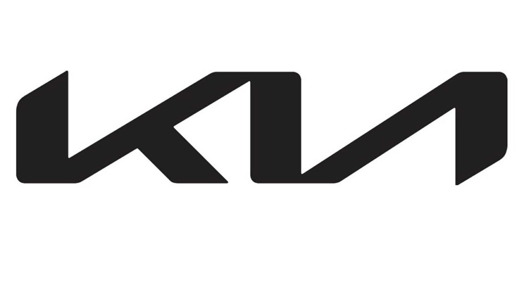
    30 thousand folks a year are doing Google searches for “the KN car.” Why? Kia’s logo, of course:

    Thankfully, the Autopian to the rescue:

    I’m not a huge fan of the new Kia logo — and can absolutely see the “KN problem” — but I think it speaks more to modern society that this is a news item than anything related to graphic design. Willing to be wrong.

    Mercedes: $1200/yr for Full Output

    This subscription thing has gotten seriously out of hand: Mercedes-Benz USA, in an effort to further bilk their customers — ’cause, y’know, MBs don’t cost enough — has decided that the last 60-110 horsepower available on their 2023 electric vehicles are only available for a yearly fee.

    The MB EQS gets even less attractive.

    Gak.

    Holiday Bonus: Free Online Automotive Design

    Interested in car design? Happy Holidays.

  • Beautifully Briefed, August 2022 [Updated]: Drobo, Rolling Stone, Aston Martin, and Bugatti

    Beautifully Briefed, August 2022 [Updated]: Drobo, Rolling Stone, Aston Martin, and Bugatti

    Three interesting logo redesigns this month, plus a moment where venti has nothing to do with coffee. Oh, and a airy bonus.

    Drobo Declares Bankruptcy

    Generally speaking, I’m not one to engage in schadenfreude, aka “enjoying the pain or suffering of another.” (Wiki. Anyone surprised that the Germans have a word for this … but I digress.)

    A selection of expensive, unreliable junk.

    Back in 2011, I lost two Drobos in short order — and with them, the majority of my back files. Project I’d worked on, photographs I’d taken, personal documents, years worth of stuff, just gone.

    Drobo, the company, did nothing to help, offering neither solutions nor apologies. I wasn’t alone; forums across the ’net suggested that I should have chosen more carefully.

    It turns out they should have, too. Good.

    Gloat Read more at DPReview or PopPhoto.

    Rolling Stone’s New Logo

    To call Rolling Stone‘s place in America culture iconic might be selling it short, and their logo plays a large role in that. In 2018, they flattened it — leading that trend, possibly — and it lost something.

    However, this month, it’s back:

    Rolling Stone’s 2022 logo redesign.

    “The assignment was a paradox. How could we make the logo look like it did in the past, without making it feel dated? My hope is that loyal readers will believe the old logo is back, but on closer inspection will be surprised to notice how much it has been modernized.”

    Jesse Ragan, XYZ Type

    The “old logo” he’s referring to is the one that ran from 1981–2018, but there were others, too:

    Rolling Stone’s lettering shapes through the years. See more at both links.

    A great study in logo evolution: read more at the Type Network, and lettering specifics from XYZ Type. Awesome. (Hat tip to, as usual, Brand New.)

    Aston Martin’s New Logo

    On the subject of subtlety, Aston Martin usually isn’t the first thing that comes to mind. Their recent logo redesign, however, falls into that category:

    Wings of Glory (so to speak)

    The evolution of their logo emphasizes those small steps:

    AM’s logo through the years.

    Not a great amount of information on this one, but the accompanying photographs of the logomark being made are fantastic. See more at The Drive, with more at Brand New.

    Bugatti’s New Logo

    Subtlety and Bugatti rarely — if ever — fit in the same sentence. Aston is stratospheric as far as I’m concerned, so Bugatti would qualify as the antithesis of subtlety. But, but, but: there’s something about one.

    The new Mistral. (Sorry, it’s sold out.)

    They have a new logo and marketing campaign to go with:

    Specifics, courtesy of Interbrand.
    The Mistral from the back, showing the new type treatment.

    Read up at It’s Nice That. Car and Driver has more information on the Mistral.

    Update, 20 Sept., 2022: Brand New weighs in on Bugatti’s updated logo.

    Bonus: In the Skies

    It’s been a busy August, including having to make a lightning trip through the usually-not-fun Atlanta airport. But there’s always a bright spot at the end of that tunnel: being the little boy again, awed by the simple act of flying.

    Better still, the flight was on a 757, the sports car of big planes. Everybody around me had their window shades pulled and noses in their phones, but I was looking out the window:

    Delta Ship 5654, Above Clouds and Sea

    See you in September!

  • Beautifully Briefed, Late June 2022: AIA’s Best Architectural Photography, 2022 Logo Trends, and … Buick!

    Beautifully Briefed, Late June 2022: AIA’s Best Architectural Photography, 2022 Logo Trends, and … Buick!

    Three items for the end of June, 2022: AIA Los Angeles announces photography awards, the 2022 edition of the Logo Lounge logo trends report is out, and Buick makes its new logo official. Let’s get into the details.

    AIALA Photography Awards

    The Los Angeles chapter of the American Institute of Architects (AIA|LA) has announced this year’s winners of the annual Architectural Photography Awards, and there’s some pretty great stuff:

    Ryan Gobuty: Santa Fe (Santa Fe, NM)
    Taiyo Watanabe: C-Glass House (Dillon Beach, CA)
    Tim Griffith: Mission Bay (San Francisco, CA)

    See more at AIA|LA. (Via Archinect.)

    2022 Logo Trends Report

    The always-excellent Brand New points us at Logo Lounge’s 2022 Logo Trends report, it’s 20th annual look at what logos and branding, as a group, are looking like this year.

    Logo Lounge 2022 Logo Trends Report

    [W]hile there are still corporate-looking marks being crafted there is a stronger effort to find ways to identify products that are artisanal and handcrafted.

    Bill Gardner, Logo Lounge

    Corporations trying to be more human. (News at 11.) But then, my use of that particular phrase perhaps betrays my lack of being in touch with the modern corporate world; I think publishing is a different animal, and prefer being part of that world despite the regular influence of corporate entities there, too.

    Nonetheless, following logo trends is, from a purely graphic design perspective, worthwhile — and this report summarizes beautifully. Read on.

    Buick’s New Logo, Officially

    We’ve touched upon it before, but Buick has, with the release of the Electra Wildcat concept, officially updated its logo:

    Official: Buick’s new logo

    Electra is Buick’s name for electric cars, simultaneously stating the obvious while giving a big nod to past models — and the Wildcat concept is, dare I say it, borderline cool:

    Scandinavian, American, Futuristic, Retro … Buick!

    Both Buick and Cadillac have hinted at more Art Deco in their upcoming products, perhaps best illustrated on this concept’s interior:

    It’s a head rest, folks.

    Nice. (Not even remotely possible on a production model, but still.) Read more on Buick’s new logo and transition to an electric car brand at Car and Driver or The Drive.

    See you in July!

    Update, 12 August 2022: Brand New weighs in: A New Point of View… ick

  • Beautifully Briefed, Early April 2022: Eames Institute, Loony Backgrounds, and … Condor!

    Beautifully Briefed, Early April 2022: Eames Institute, Loony Backgrounds, and … Condor!

    Three completely unrelated items for you this time, ranging from the serious and interesting through the loony and interesting to something of a whole different stripe.

    The Eames Institute of Infinite Curiosity

    Update 2, 25 Apr: Brand New discusses this logo, with the usual catchy title: The Fast and the Curious: Counterspace Drift

    Eames Institute’s “curious” logo variations, discussed at Brand New

    Update, 8 Apr: It’s Nice That has more: The Eames Institute launches with a curious, “Eamesian” identity, and a logo that observes

    Original post: Practically everyone has heard of an Eames Chair:

    A particularly awesome example of an Eames Chair (and ottoman).

    What you might not realize is that the legacy Charles and Ray Eames left behind enriches our lives to this day. It’s a shame, then, that while their house is a mid-century masterpiece (and museum), much of their lives have remained behind closed doors.

    For almost three decades, a barn-like building in Petaluma, California, contained remnants of one of the most iconic design legacies of the twentieth century. […] We created the Eames Institute because we want you to examine the archive of what you know—the collection of your experiences, understanding, memories, and questions—and connect to the provocations that call to you. We want you to tap into that same fount of relentless curiosity, and its power to shift your perception and open you to innovations and discoveries.

    Now, however, there’s the Eames Institute of Infinite Curiosity. Awesome name aside, it introduces us to the more personal side of one of design’s strongest partnerships.

    Items from the Charles and Ray Eames Institute.
    Drawings from the Charles and Ray Eames Institute.

    The website requires some interesting scrolling to get where you need, but the results are more than worth the time — and is one that earns (Eames?) its suggestion of satisfying infinite curiosity. Explore and enjoy. (Hat tip: ArchDaily, The Newly Launched Eames Institute Brings Insight into the Eameses’ Design Methodology.)

    Loony Toons Backgrounds

    Design You Trust: “Looney Tunes Without Looney Tunes: Existential, Surreal, And Creepy Backgrounds.” The post sends readers to an Instagram account, which I’m not going to link to, but the images themselves are fascinating:

    Crossed wires, anyone?
    Imagine who might run up to — or even get pushed off of — this cliff.
    A nice, innocent factory. Nothing could possibly go wrong.

    Next time I treat myself to a Loony break, I’m going to make sure to spend some time looking beyond the action and appreciate the backgrounds. Nice.

    Condor Airlines Rebrands

    Most of you have probably never heard of Condor Airlines; they’re mainly a European thing, a “leisure” airline associated with Thomas Cook, formerly owned and run by Lufthansa. (Here’s some history.)

    It doesn’t particularly matter. What does is the bravado exhibited by management. Before, a typical airline logo — dare I say, typically Germanic:

    Condor’s OLD livery.

    Then someone said yelled, “HEY. WE DO VACATIONS. LIKE BEACH TOWELS. LET’S DO STRIPES.” The result:

    Condor’s NEW livery. Wow.

    Armin Vit:

    The new livery has zero fucks to give and just plasters every plane with thick vertical stripes that go against pretty much every single assumed tenet of what makes a good livery. It doesn’t look speedy, it doesn’t look nimble, it requires a lot of paint, and by all other standards it is just plain ugly and I love it.

    Read more or see images at Condor, see the Brand New post, or even hear from the armchair pilots at Airliners.net. Now: anyone got a beach?

  • Cadillac and Mercedes Logos: New — or Not (Updated)

    Cadillac and Mercedes Logos: New — or Not (Updated)

    NOTE: See my previous car logo redesign coverage regarding BMW, Mini, etc., and more recently, Volvo.

    Update, 7 December, 2021: Brand New has, as usual, done a superlative job of discussing the new Cadillac logo. See their post here, remembering that they’re subscription now — possibly the best $20/year available.

    Original post follows:

    Cadillac has updated their logo, their first redesign since 2014. First, though, some history:

    Cadillac logo history

    The mid-century look, with the “crowned” logo, might be my favorite:

    Photo by Jill Refer
    Photo by Jill Reger

    As seen in the last line above, the 2014 logo is a simplification of the 2000 logo, sans the “old-person” wreath, and I thought quite successful:

    Fast-foreword (ahem) to 2021, and the monochromatic, flat-logo thing is in full swing. The latest “old-person” target is the Cadillac script, replaced with another trendy item, a custom “Cadillac Gothic” font.

    Cadillac Dealer, 2021

    Not only that, but there’s the new trend among luxury automobiles — mere cars aren’t good enough — of illuminated logos;

    Cadillac illuminated logo

    It’s Nice That has more on Mother Design’s new take on Cadillac.

    Mercedes, on the other hand, has just celebrated the 100th anniversary of the three-pointed star. Then:

    MB logo, historical

    Now:

    MB logo, now

    When it’s done right….

  • On Volvo’s New Logo

    On Volvo’s New Logo

    The “Iron Mark” has been given a makeover, and the result is … interesting. First, as a reminder, here’s the logo as it appeared previously — no, the one previous to that:

    2009 Volvo Iron Mark (on S80)
    My mother’s 2010 Volvo S80

    The blue has been associated with Volvo’s logo for a long while now, and it’s slowly been disappearing from the lineup (in favor of black in the same location). However, they’ve decided — they being both Volvo Cars and Volvo Group, two distinct entities (the latter including Volvo Trucks, the Volvo construction folks, Volvo Penta [marine], etc.) — to change to this new, more austere logo and word mark simultaneously. Aaaaaand:

    2021 Volvo Iron Mark

    Words fail me. Thankfully, there’s been plenty of coverage. See Brand New (subscription), CarScoops, and The Drive. What’s interesting — and largely gone under the radar — is that the logo debuted on a concept car back in June.

    Volvo Concept Recharge (2021)

    It’s part of a trend, too:

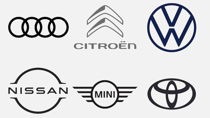
    2021 car logo redos

    See the previous coverage on Foreword. Can’t go, however, without a hat tip to Kristen Shaw at The Drive, who dug out this 1937 version — which, I’d argue, beats ’em all. Kudos.

    Volvo logo (1937)
  • Beautifully Briefed: Icons and Typography, Mid-June, 2021

    Beautifully Briefed: Icons and Typography, Mid-June, 2021

    Three items for you here, starting off with the 2021 Logo Trend Report, from the Logo Lounge. From the Asterisk to Electric Tape, Quads, Chains, and more:

    2021 Logo Trend Report

    Bill Gardner discusses all fifteen different trends, with logos to back ’em up (naturally).

    Next, “A Cabinet of Curiosities” from Hoefler & Co.

    Printers once used the colorful term ‘nut fractions’ to denote vertically stacked numerators and denominators that fit into an en-space. (Compare the em-width ‘mutton fraction.’)

    This is beautiful:

    Dutch Curio, H&Co

    A Dutch curio, representing the letters z-i-j.

    Read all of the rest.

    Lastly, these are amazing . . . and simple, the better form of “simply amazing.” Yeah:

    111 Shadow

    See the rest at This is Colossal.

    Happy June!