This time, we’ve got some great book design (with a bonus), Hoefler educates on typography (with a bonus), and two updated car company logos. Let’s get right to it!
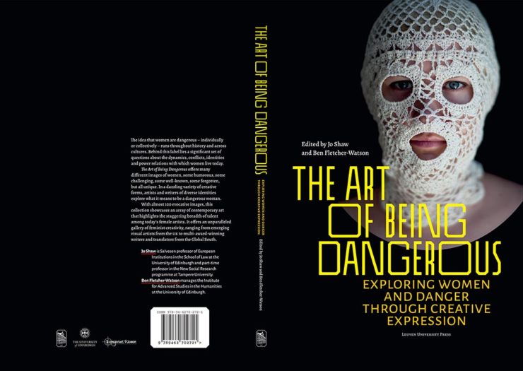
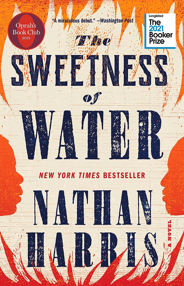
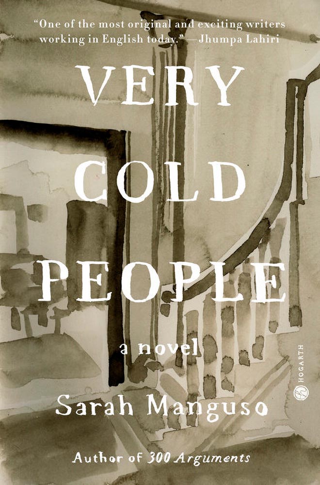
Print Magazine on the design of Lyrics
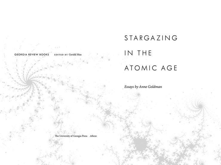
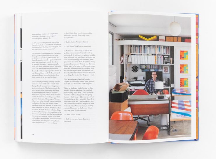
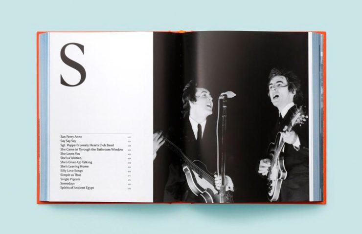
The still-very-relevant-in-2022 Print Magazine brings us a great feature on the design of Paul McCartney’s book, Lyrics:
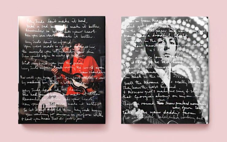
Turns out it was designed by an outfit called Triboro Design, from Brooklyn (appropriately). Print brings us an interesting interview with David Heasty, the principal:
I […] found him to be sharp, quick, articulate, and modest. Below, we discuss Paul’s involvement with the project, the book’s gorgeous bespoke typeface, and the importance of staying true to a legend’s vision.
Ellen Shapiro, Print Mag
Interesting and informative. Catch this interview when you can.
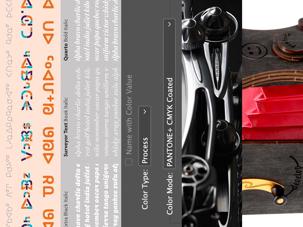
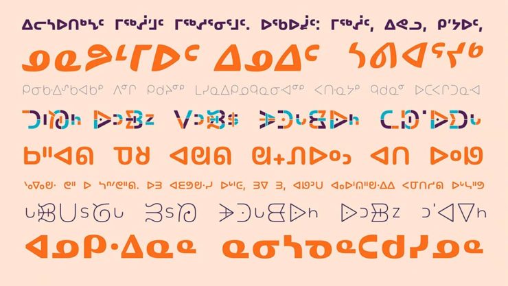
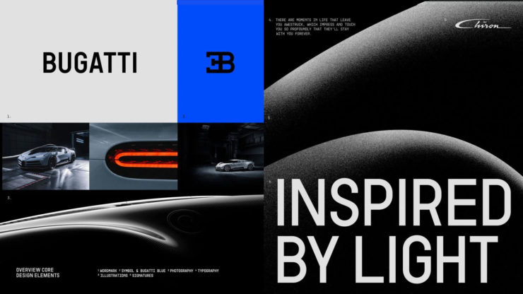
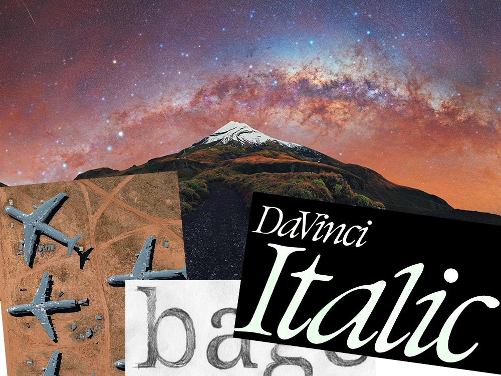
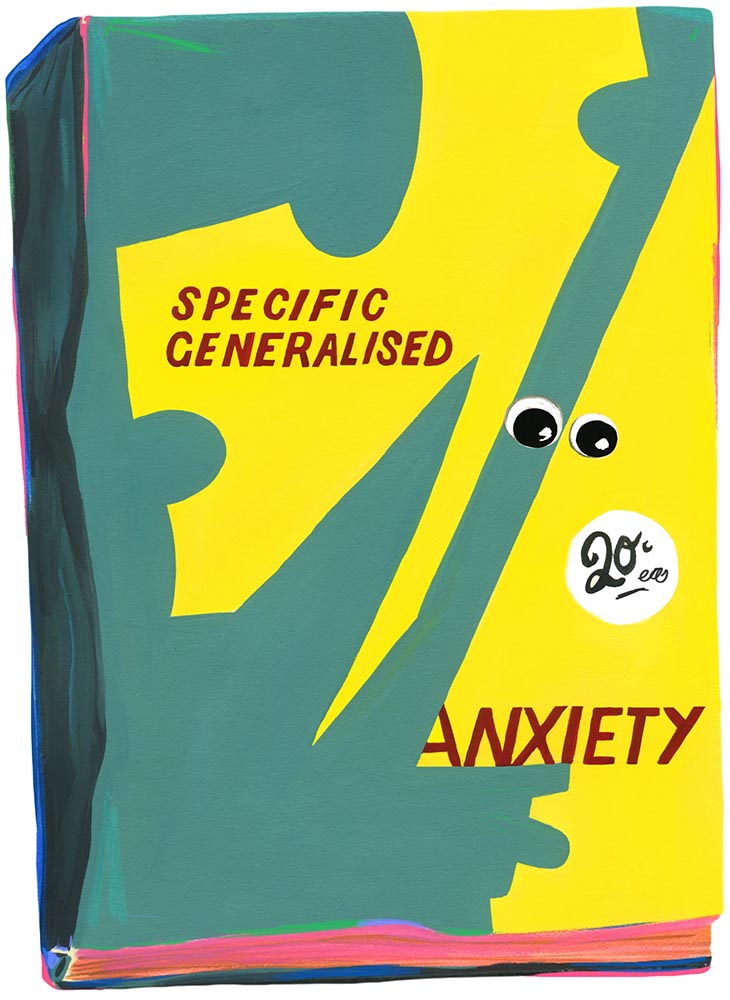
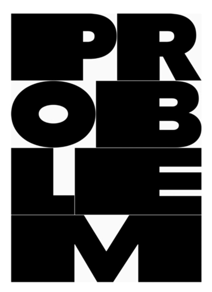
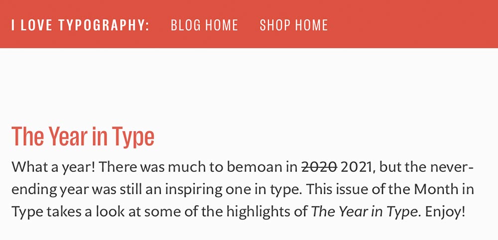
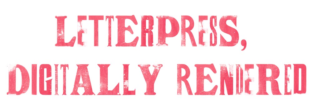
Bonus: Looking at Triboro’s website, this lovely piece of typography stood out:
Hoefler Discusses Daggers
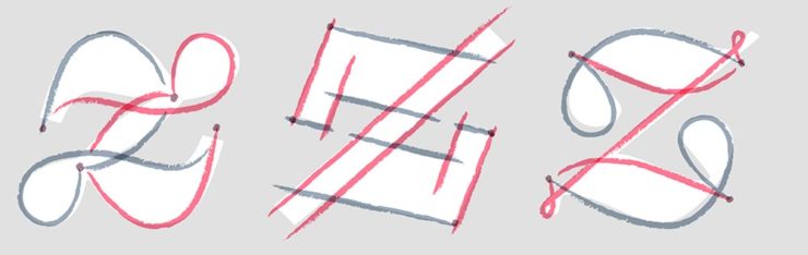
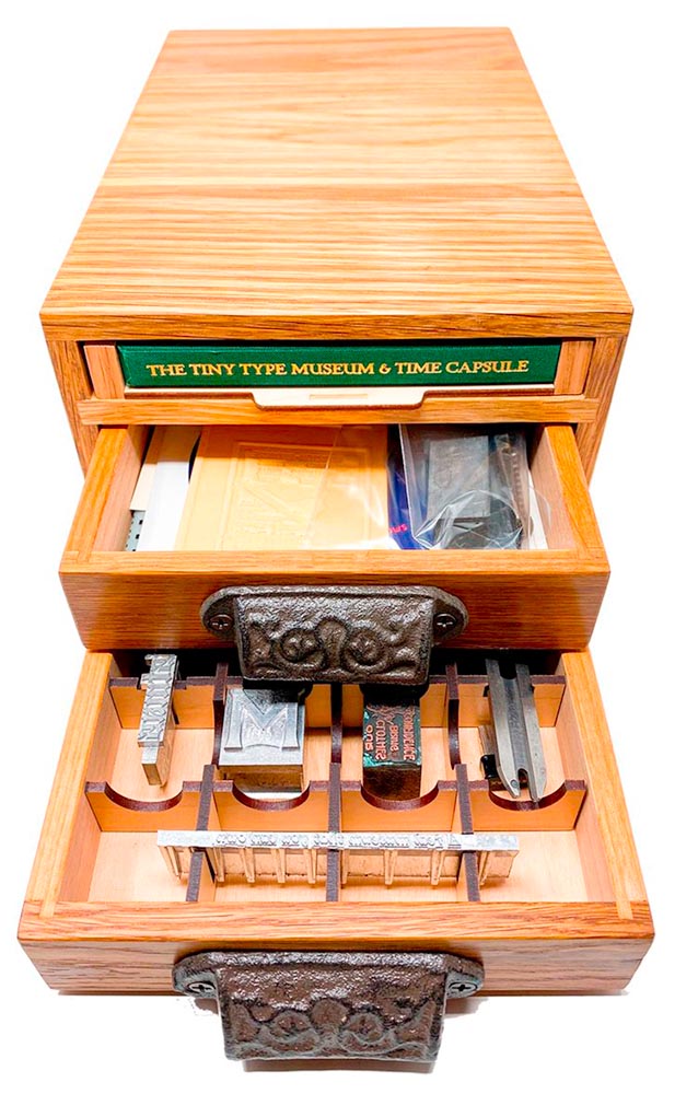
In “House of Flying Reference Marks,” Jonathan Hoefler talks about daggers, or, what you use when an asterisk isn’t enough:
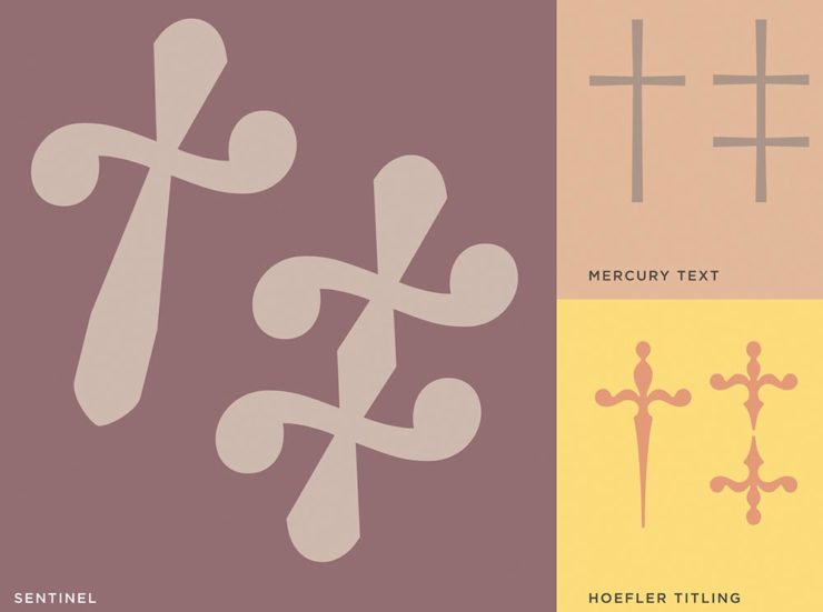
Beautiful examples, complete with a phrase you don’t hear everyday: “twisted quillon.” Read and enjoy. (If the opportunity presents, follow on with the ampersand article — which, uh, takes a stab at where the word came from. Nice.)
Bonus: Creative Boom’s article, “18 highly respected type foundries that remain fiercely independent.” (I guess you could say I’m still surprised Hoefler is now, well, Monotype.)
Skoda and Citroen have new logos
It seems like nearly all of the major car manufacturers have introduced a new logo in the past couple of years, but here are two more. One’s best described as “an update,” while the other … goes a little farther.
Skoda, for those that don’t know, is a Czech company and part of the massive VW Group. Frankly, it shows:

For 2023, they’re introducing a push to separate themselves from VW a little, resisting the downmarket image. As is (now) normal with updated car company identities, there’s a concept:
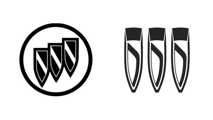
It’s … not inspiring. Maybe the actual updated logo will turn the corner:
Solid. (Pardon the pun.) But seriously, even an avid car nut like me didn’t know that represents a winged arrow — and I’m not sure the new version helps. At least they get points for consistency:
Read more at Brand New’s “Czech this Out,” or Carscoops’ more optimistic take, “Thriving Skoda Brand Forging Its Own Path Within The VW Group.”
Then there’s Citroen. Even under the potentially-smothering corporate blanket that is Stellantis (there’s a name!), the pioneer of decades past still manages to actually thrive. First their new logo:
They’re not quite as consistent — the dual chevrons have varied a bit. This time, they’ve literally gone back to their roots, pulling the 1919/1921/1936 version out and dusting it off for modern use:
Points to them for hinting at what’s to come, too:
…Which turns out to be something with, ahem, Oli bits:
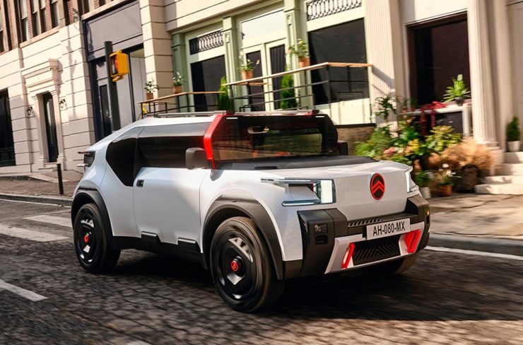
“Nothing moves us like Citroen,” they say. The Oli moves me, to a point where I truly wish Citroen was once again available in the ’States. Cool and radically innovative, without losing sight of something VW has truly lost: fun. Well done.
Read more on the logo: Motor1, “Citroen Unveils Updated Retro-Flavored Logo And New Slogan,” and Carscoops, “Citroen Unveils New Logo Inspired From Its Past, Teases New Concept.” Read more on the Oli at the excellent Autopian: “The Citroen Oli Concept Is An EV Made From Cardboard And Good Ideas.”
Updated, 19 October, 2022: Brand New adds to Citroen’s new logo story, with a slightly-less-than-enthusiastic take on the logo and has frankly unkind things to say about the new, custom typeface (custom typefaces are now de rigueur — a policy as much related to rights ownership than creativity, alas).
I really like the cursive in this Vimeo screenshot:
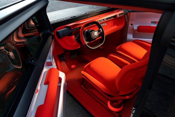
BN also includes a number of extra photographs of the simply awesome Oli, too. Here are a couple, for your enjoyment:

Note the removable Bluetooth speakers (the black tubes with “+” and “-“) and, especially, the seats:
Check the rest, and BN’s take, here.
Apologies to both Skoda and Citroen for the lack of language-correct accents. WordPress needs a glyph function.