Category: Typography

Design specifically regarding typography; that is, letterforms, type on a page, cover, or web site, and more.

  • Beautifully Briefed 24.10: Content with Worthwhile Content

    Beautifully Briefed 24.10: Content with Worthwhile Content

    “Content,” that is, the feeling of satisfaction — contentedness — is a word I’d much rather use than “content,” that which is required of folks who produce material for their website/YouTube channel/social media feed/whatever. It’s a shame the world favors the latter over the former.

    Or does it? We’ll get to that — right in the midst of the other content that caught my eye in October, 2024.

    Adobe Content Credentials, Continued

    Adobe’s positive messaging continues, saying “[it is] dedicated to responsibly developing tools that empower creators to express themselves and tell their stories while helping address their concerns.” It even carried out a study to get some feedback from creatives on generative AI and one of the standout insights was rising concerns over unauthorised sharing of their work or misattribution with 91% of creators seeking a reliable method to attach attribution to their work.

    Bring on Adobe Content Authenticity. It’s a “powerful new web application that helps creators protect and get recognition for their work.”
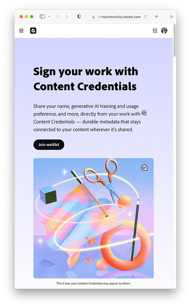
    A screenshot of Adobe Content Authenticity website.

    In today’s rapidly evolving digital landscape, creators are understandably concerned about safeguarding and gaining attribution for their work and having more control over how it’s used. That’s why we’re excited to introduce Adobe Content Authenticity, a new, free web app that allows creators to easily attach Content Credentials to their digital work — helping you protect your work, show attribution and better connect with your audiences online.

    —Andy Parson, Senior Director, Content Authenticity Initiative, Adobe

    For now, it’s limited to a beta Chrome extension, with a wider beta opening to the general public in spring 2025. (I don’t use Chrome, but have signed up to the waitlist, and will update Foreword readers when I hear back.) Content Credentials are already available in Photoshop and Lightroom — provided you’re using the latest versions, which may require the latest OS.

    Three on Book Design
    PBS on del Rey

    I’d known the publishing house since . . . well, as long as I can remember. What I’d not known is the story behind the publishing house:

    Set aside thirteen minutes when you can — absolutely worth it.

    Multi-Panel Book Covers

    I agree with Jason Kottke: “Bento Books” is the term. A great example:
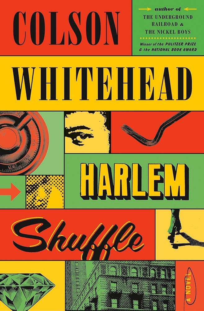
    Book design by Oliver Munday.

    Here’s the impetus discussing this latest book design trend, with many more examples.

    It’s Nice That: Book Design in Brazil
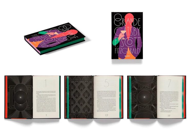
    Book design by Bloco Gráfico.

    Any foreigner entering a bookshop in São Paulo is likely to be impressed by the quality of the books on display. For a country with relatively few readers, few high quality printers and binders, and a very limited assortment of paper, the Brazilian publishing market shows remarkable graphic ingenuity[.]

    — Elaine Ramos, It’s Nice That

    Never mind the country, the great book design caught my attention: from The Great Gatsby, above, to the J.M. Coetzee series, Orwell’s 1984, even Melville — amongst others. A great read.

    Special Bonus #1: Life outside the internet . . . and physical books, please:

    “The whole internet social complex … and the way people use their computers to conduct life is doomed sooner than later,” said Justin Murphy, the founder of the media and education company Other Life. “The smartest people, the people who are the most cutting-edge, will increasingly live their lives outside of computers.”

    Whether or not that’s true — or even a potential — isn’t as relevant as an actual trend: physical book sales are up:

    Print, too, is on the rise, from books to magazines to newspapers. Print book sales had a pop with the pandemic in 2020, and have continued to maintain sales of more than 750 million units sold each year. Meanwhile, even though they’re cheaper, sales for ebooks are down slightly, which may be owed to the fact that younger readers, much like older generations, overwhelmingly prefer printed formats.

    — Zoë Bernard, Vox

    Flip phones, vinyl LPs, and . . . books: Read the whole article.

    See also: The Guardian: Bookstores are Suddenly Cool.

    50 Fonts for 2025

    CreativeBoom is out with their annual post on future type, “50 fonts that will be popular with creatives [next year].” Some of my favorites (links in captions):
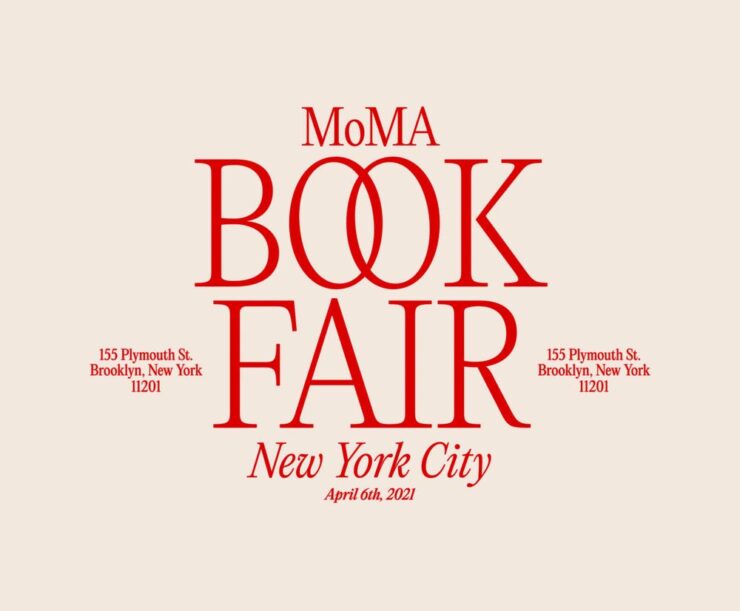
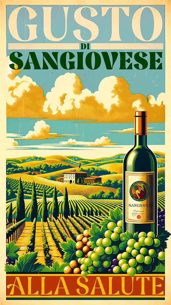
    Editorial New, by Pangram Pangram.
    Nave, by Jamie Clark Type. (Bonus points for the great illustration.)
    Right Grotesk, especially the Casual flavor, by Pangram Pangram.
    Canvas Inline, designed by Ryan Martinson from Yellow Design Studio. Available through Adobe Fonts.
    Ssonder, from Type of Feeling. (Easily the most on-trend of my highlighted items.)

    An honorable mention goes to Gamuth Sans, from Production Type. See CreativeBoom’s 2025 popular fonts list here. (Note: some are available through Google Fonts, and thus free-to-use. Nice.)

    See also: Two more from CreativeBoom on the 2025 type scene: font trends and independent foundries.

    Photography that causes content
    Forest Fireflies

    From This is Colossal, we have Kazuaki Koseki, who describes himebotaru — fireflies — as “artists who paint light on the forest.”

    From the series “Summer Faeries” by Kazuaki Koseki.

    Artistry, all right. See more.

    Epson International Pano Awards

    The 2024 Pano Awards have been announced, with a wealth of great wide-angle shots for your viewing pleasure. Two of my favorites:


    “Storm Dump,” by Tom Putt. Taken near Wyndham, Western Australia.
    “Uprooted,” by Nickolas Warner. Taken in Moab, Utah.

    Epson’s rules are a little looser than some, but don’t diminish the sheer creativity displayed by the entrants. See coverage from PetaPixel or This is Colossal, or go to the source for the full list.

    Siena Creative Photo Awards 2024

    Just one favorite to highlight here, but what a favorite it is:
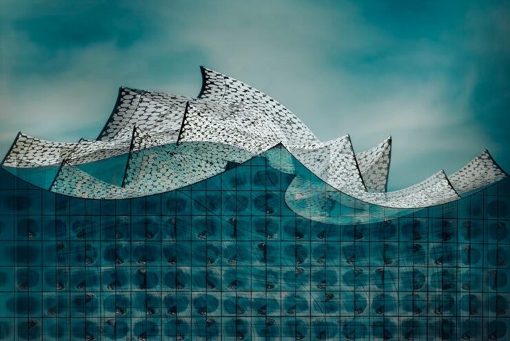
    “Storm on the Elbe,” by Anna Wacker. 1st Prize, Architecture.

    See some amazing sleeping bears — and much more — at the PetaPixel post or the full list at the Siena contest website.

    Architecture MasterPrize

    Few contests are more up my alley than this one, which inspires me to get back out there sooner rather than later:
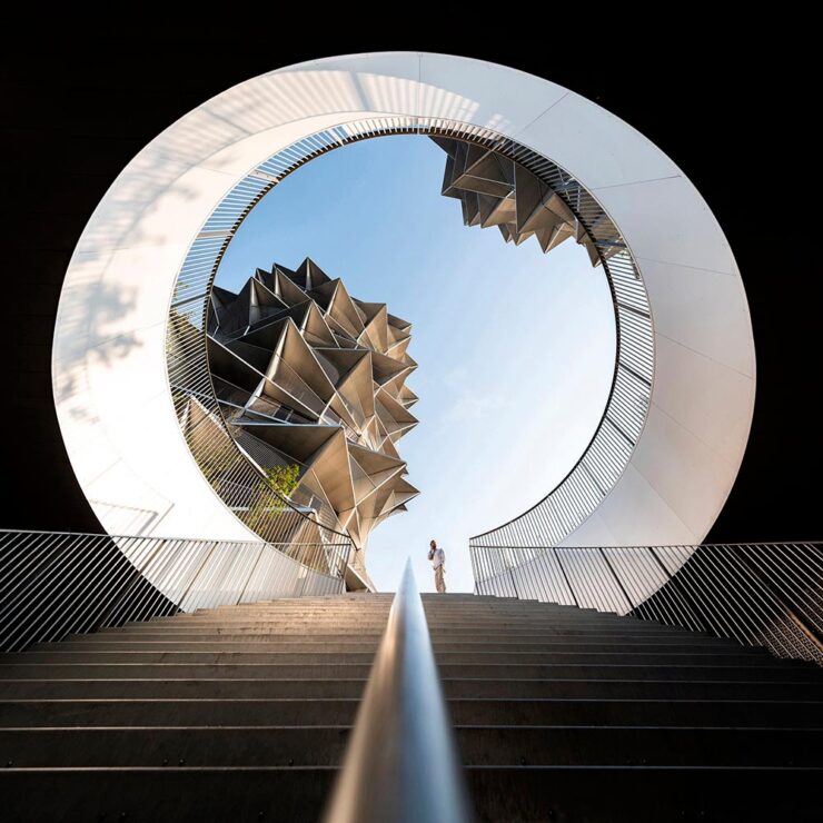
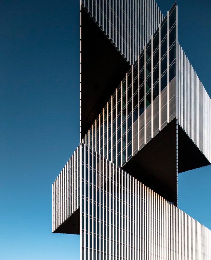
    Kaktus Tower, Copenhagen, by Shoayb Khattab. See more from this series.
    “Fragments,” taken at the Nhow Hotel, Amsterdam, by Max van Son. See larger.

    Awesome. Meanwhile, the below caught my attention not due to the striking photograph, but the striking content — which, indeed, caused contentedness. Such a huge change to anyone who might recognize this former hulk, now beautifully refurbished and in a new park setting:

    “Michigan Central Station,” Detroit, by Jason Keen. See the full series here.

    See the post from PetaPixel or the full list of 2024 winners at the Architecture Masterprize 2024 website.

    Special Bonus #2: To close us out on this Halloween, the moon:

    Photograph by Darya Kawa Mirza. See more.
  • University Press Design Show 2024

    University Press Design Show 2024

    Significantly behind on this for the second year in a row. Apologies. —Ed.

    The annual Association of University Presses (AUPresses) Book, Jacket, and Journal Show has announced its winners published during 2023. The show, now in its 59th year, “honors the university publishing community’s design and production professionals; recognizes achievement in design, production, and manufacture of print publications; and serves as a spark to conversations and source of ideas about intelligent, creative, and resourceful publishing.”

    It is a joy to be amid the rush of creativity and exuberance that is exemplified by the Book, Jacket, and Journal Show submissions. Our jurors were spoiled with the wide variety of visual and intellectual expressions that make our community so rich and diverse. The committee members really came through as a team, making this year’s efforts virtually seamless. Here’s to another great Show!

    — David Zielonka, Stanford University Press, Book, Jacket, and Journal Show Committee chair

    Entries are extensive — 507 worldwide — and the winners are separated into several categories, which I’ve drawn from below.

    Scholarly Typographic

    Academia’s titles are so often subjects that you only get from university presses. A great example:

    University of North Carolina Press. Book design by Lindsay Starr.

    When important titles are accompanied by compelling design, everyone benefits. Honorary mention to Horror and Harm, whose design invokes neither. See all the winning entries.

    Scholarly Illustrated

    Because these winning entries are from all over the globe, they run the risk of being difficult for us ’Muricans to understand. But design is a universal language:

    Aarhus University Press. Book design by Jørgen Sparre.

    The cover’s good, but one of the great things about this show is that you get more:

    Aarhus University Press. Book design by Jørgen Sparre.

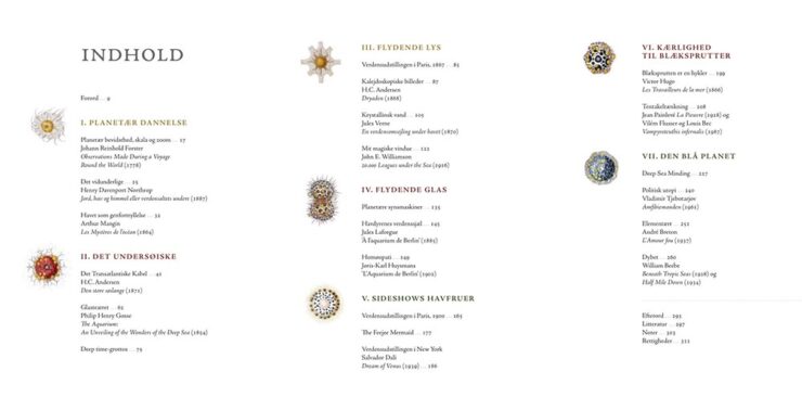
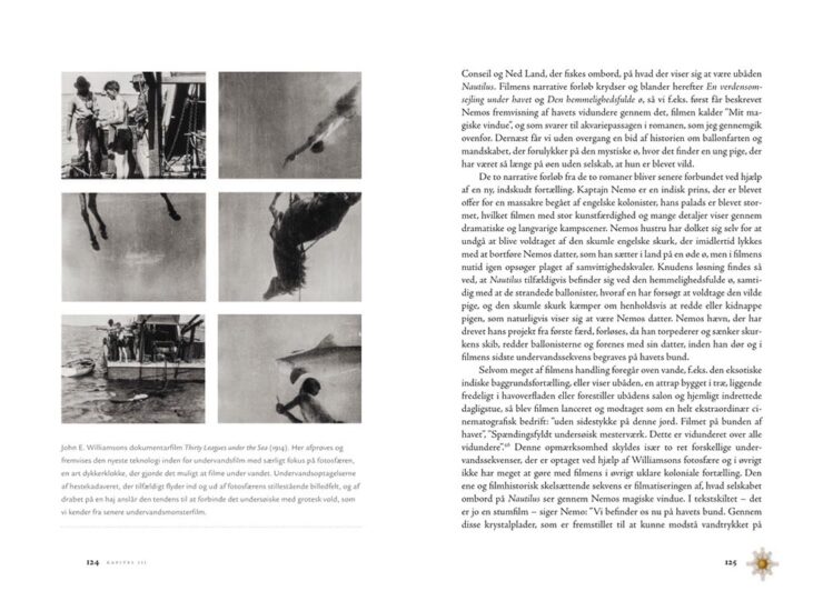
    I’m a sucker for an interesting content spread, as demonstrated here.

    Aarhus University Press. Book design by Jørgen Sparre.

    I love the dingbats next to the page numbers, too; a great way to instantly illustrate which section you’re in.

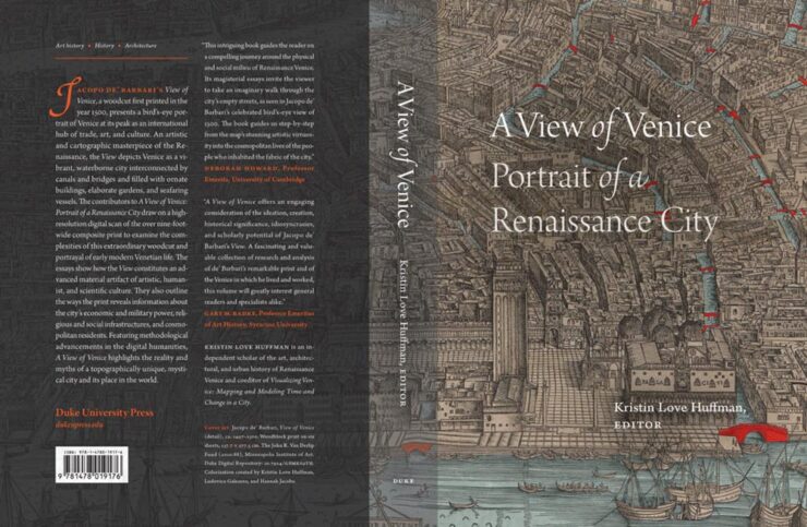
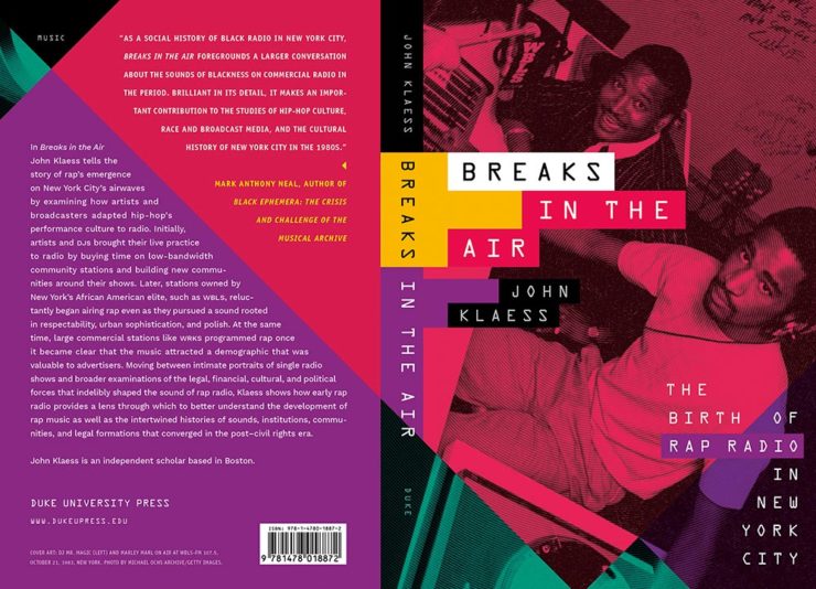
    Duke University Press. Book design by A. Mattson Gallagher.

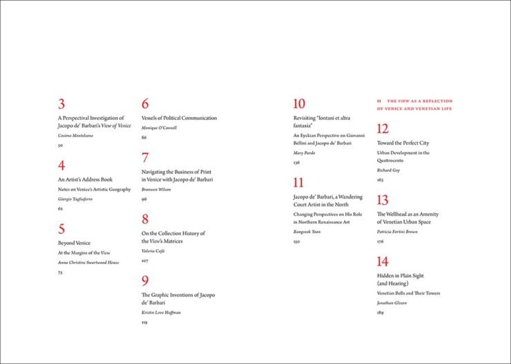
    Strong cover here, with the two shades of overlay really working in concert with the orange. Oh, and another — you guessed it — great content section, like this spread:

    Duke University Press. Book design by A. Mattson Gallagher.

    Nice. See all of the entries from the Scholarly Illustrated section.

    Trade Typographic and Poetry and Literature

    Honorable mention to the jacket for Rim to River in the former category and the illustrations in The Lamb Cycle in the latter. See all the Trade Typographic winners and the Poetry and Literature winners.

    Trade Illustrated

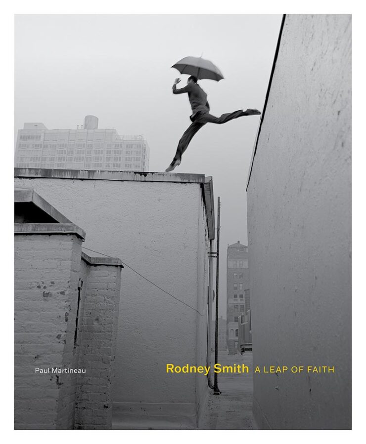
    Some incredibly talented photographers on display here, but one leapt ahead:

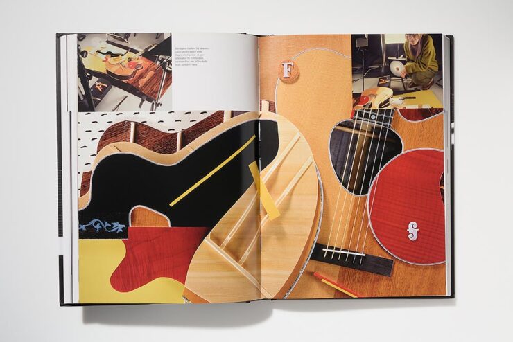
    Getty Publications. Book design by Jennifer Schuetz-Domer.
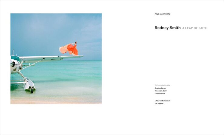
    Getty Publications. Book design by Jennifer Schuetz-Domer.
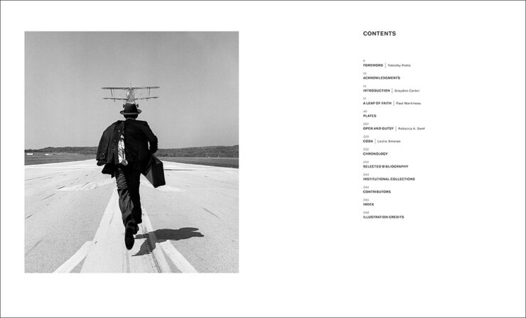
    Getty Publications. Book design by Jennifer Schuetz-Domer.

    More about the photography than design, admittedly, but still great stuff. Honorable mention to Looking at Venezuela, 1928-1978, which combines more-than-interesting photography with another eye-catching contents spread.

    See all the Trade Illustrated winners here.

    Reference

    Couple of titles to highlight:

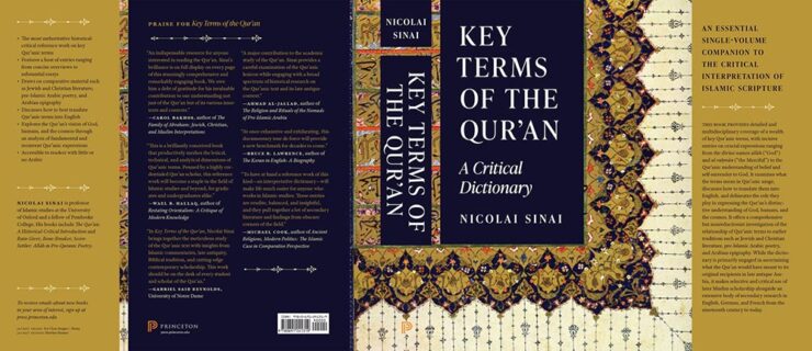
    Princeton University Press. Book design by Heather Hansen.

    A outstanding example of the cover being good, but the jacket in its entirely being more than the sum of its parts. Also:

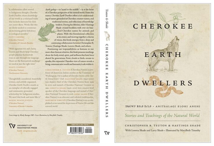
    University of Washington Press. Book design by Mindy Basinger Hill.

    Not resorting to stereotypes or tropes was absolutely the right move, and the strong interior design works well, too. Nice.

    See all the Reference winners here.

    Jacket and Cover

    This section is far and away the largest, and features some outstanding examples of book design — from any publisher — in subject areas that don’t always lend themselves to dynamic design. Some of my favorites, in alphabetical order:

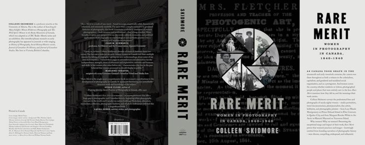
    McGill-Queen’s University Press. Book design by David Drummond.

    Simple concept, well executed.

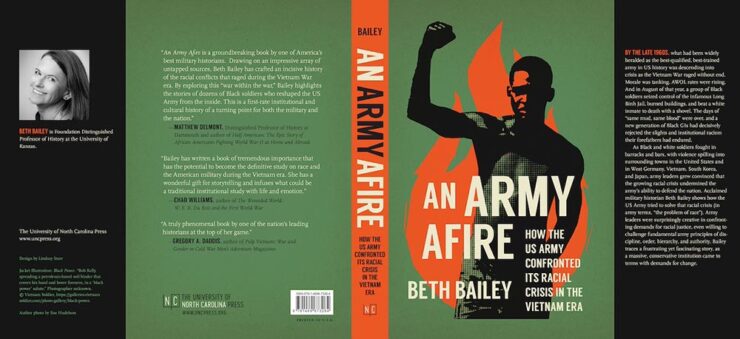
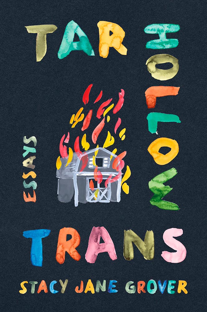
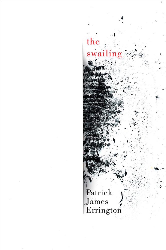
    University of North Carolina Press. Book design by Lindsay Starr.

    Strong image on this cover works extremely well with the green background and orange fire (and spine). Excellent.

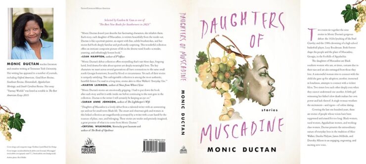
    University Press of Kentucky. Book design by Kathleen Lynch.

    Love the illustration choices on the cover, with exactly the right background and interesting hand-lettering-style title.

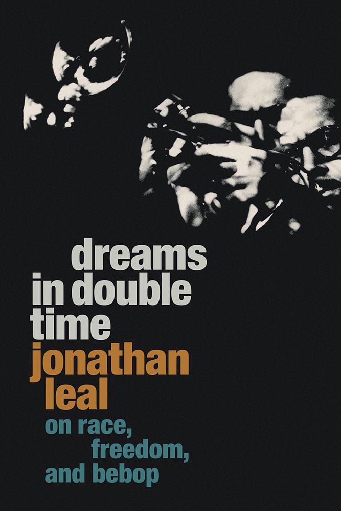
    Duke University Press. Book design by Matthew Tauch.

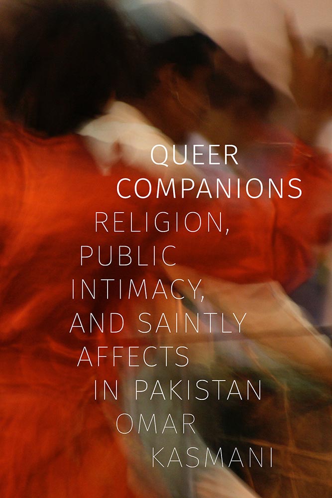
    Double-exposure, something hard to execute well and done perfectly here, is exactly the right choice on this strong cover.

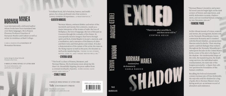
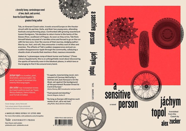
    Yale University Press. Book design by Jenny Volvovski.

    Simply put, excellent: a two-color jacket with fantastic lettering and great texture.

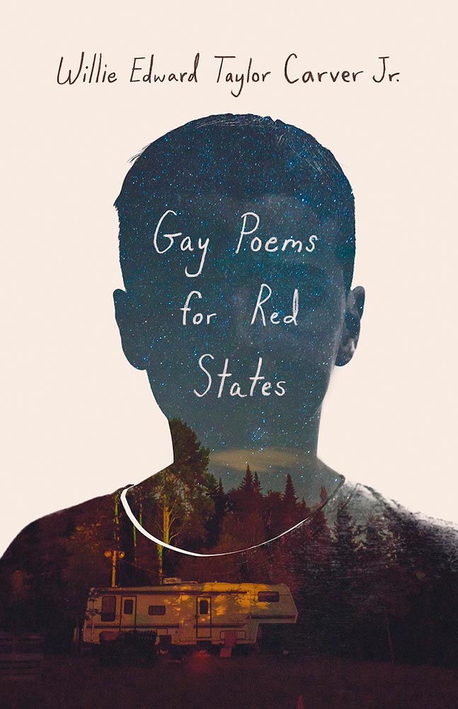
    University Press of Kentucky. Book design by Zoe Norvell.

    The hint of a face and the illustration within the outline combine to make this a winner on several levels.

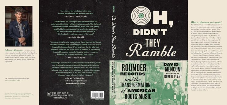
    University of North Carolina Press. Book design by Lindsay Starr.

    Oh, that O! (The rest of the type is awesome, too.) Aged to perfection.

    Yale University Press. Book design by Nathan Burton.

    Illustration and type combine to achieve a fantastic jacket.

    University Press of Kentucky. Book design by Jaya Miceli.

    This cover made an appearance on my 2023 Favorite Book Covers list, and I’m delighted to see AUPresses recognize it, too.

    Princeton University Press. Book design by Katie Osborne.

    Another example of simple-done-well. Love the orange.

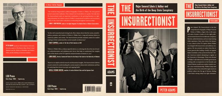
    Louisiana State University Press. Book design by Michelle A. Neustrom.

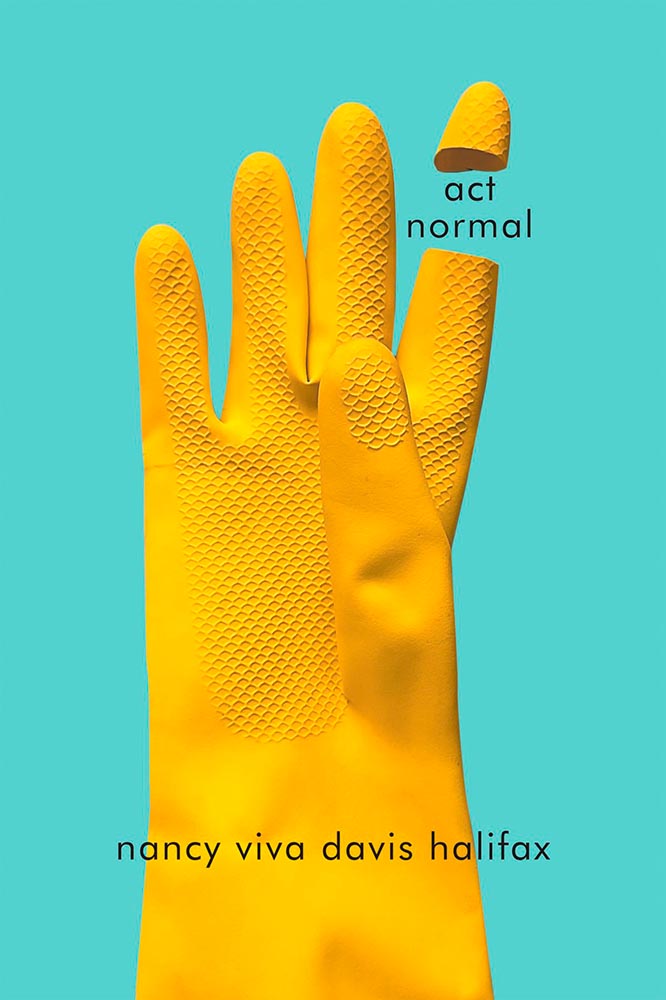
    Color blocking perfection: a lesson in how-to using limited color choices.
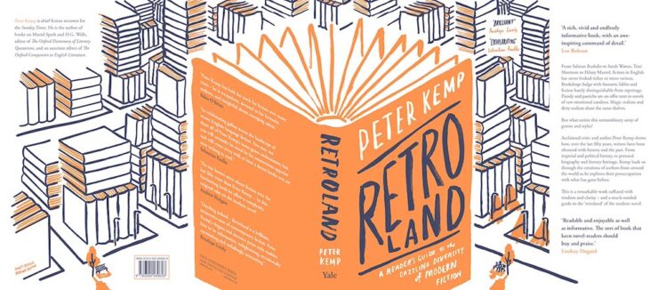
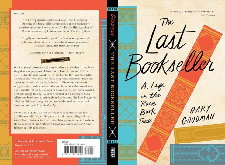
    University of Minnesota Press. Book design by Kimberly Glyder.

    Great illustration, strong type, fabulous colors. (Interestingly….)

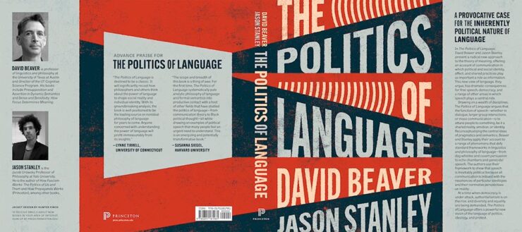
    Princeton University Press. Book design by Hunter Finch.

    Another that avoids stereotypes with a great background. The hint of megaphones is smartly done.

    McGill-Queen’s University Press. Book design by David Drummond.

    Brilliant: I love everything about this cover.

    Honorable mentions go to the type on Divine Days and the open book on Some Unfinished Chaos. See the whole category of winners here.

    Looking forward to next year! (Let’s hope I can post about it in a timely manner.)

    See also: Last year’s winners highlighted here on Foreword.

  • 50 Books | 50 Covers, 2023 Edition

    50 Books | 50 Covers, 2023 Edition

    AIGA’s annual deep dive into great book design is out — later this year, for some reason — and brings deep satisfaction with a huge variety of titles, foreign and domestic.

    “One hundred years into this competition, the book seems to be as protean and chimeric as ever. At times confounded and delighted, we asked ourselves [during the judging process], Is this a course packet or a manifesto? A sculpture or a monograph? A glossary or a guidebook? Is this book contemporary or retro? Gauche or chic? We debated books that blended the grotesque with the goofy alongside books that were delicate, subtle, and difficult to emotionally classify. In the end, we felt we found some of the best of this year’s offerings, books that in every case seem to show what design can do to bring the experience of reading to riskier-yet-more-rewarding places.”

    — Rob Giampietro, AIGA 50 Books | 50 Covers Chair

    As pointed out above, it’s the 100th year of the competition, this time with 542 book and cover designs entered from 28 countries. In order to be eligible, submitted designs had to have been published and used in the marketplace in 2023.

    Some of my favorites, in alphabetical order:

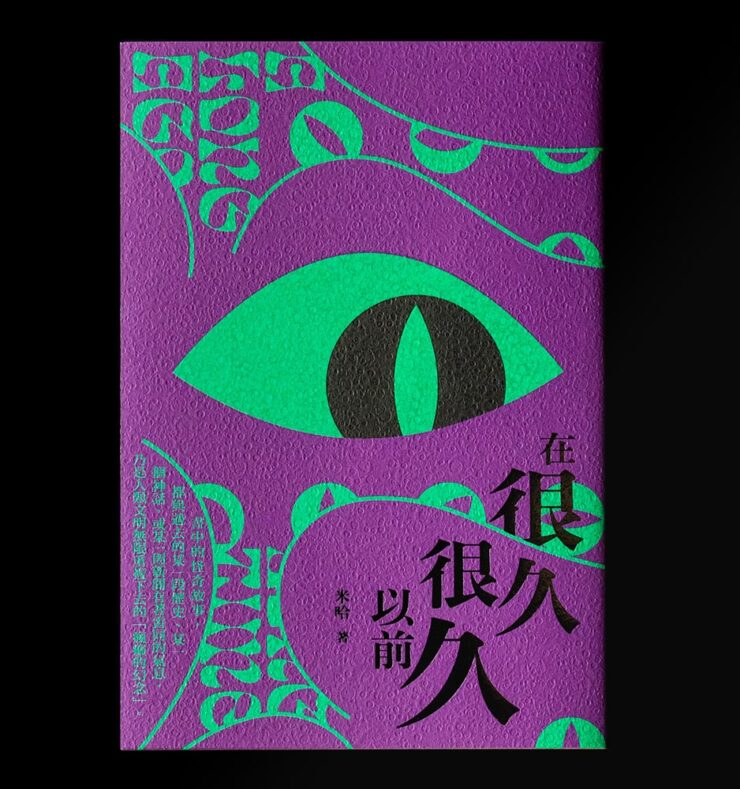
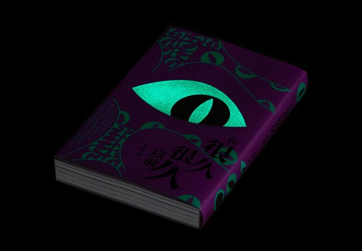
    A Long Long Time Ago. Book design by You Kwok Ho.

    Great texture, great graphics — on the theme of “observer.” Indeed.

    A Long Long Time Ago (glow-in-the-dark detail). Book design by You Kwok Ho.

    But wait: there’s more. This one observes more dramatically than it might seem, uh, at first glance.

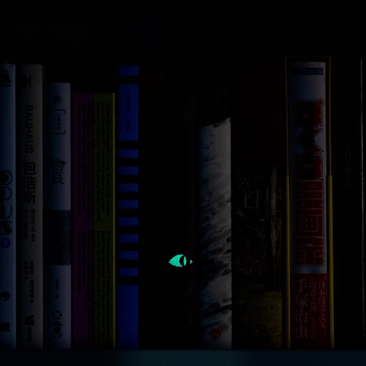
    A Long Long Time Ago (shelf detail). Book design by You Kwok Ho.

    I want to get a copy just so one of my bookshelves will have this moment. Fantastic.

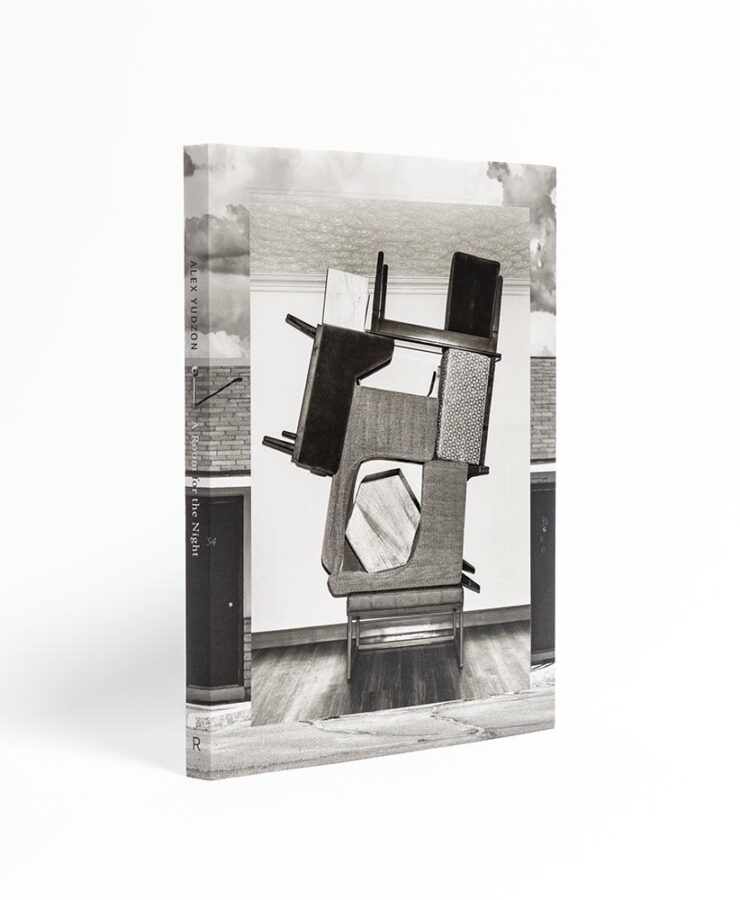
    Alex Yudzon: A Room for the Night. Book design by David Chickey and Mat Patalano.
    “Yudzon stacks, leans, and balances furniture [in the hotel rooms where he’s a guest] in configurations that transform these generic interiors into hallucinatory worlds where the laws of physics are suspended and dormant emotions released.” (After the installations are documented, crime-scene style, they are dismantled and the rooms returned to their original condition.) Really: who could resist? The compelling design isn’t even the icing on that cake — we’re well past that — it’s a fancy fork, ready to dig in.
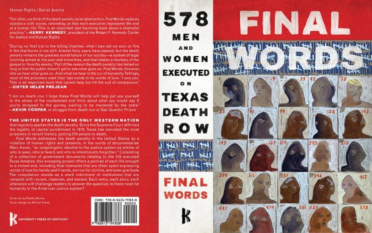
    Final Words: 578 Men and Women Executed on Texas Death Row. Book design by Michel Vrana.

    I’m glad we have the whole cover here; the spine definitely adds to the overall, and the illustrations on the front add so much.

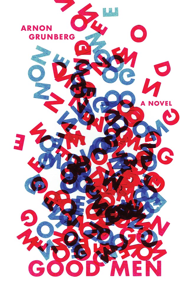
    Good Men. Book design by Anna Jordan.

    “I cut the letters of the title out of paper and arranged them in a way that is reminiscent of a fire – as if the words “GOOD MEN” are going up in flames. The letters rise up in a smoke-like form. Blue and red is used to emphasize the visual association with fire. The result is a visual metaphor for “GOOD MEN” blazing into entropic chaos,” designer Anna Jordan says of this novel about a firefighter, “an ordinary, sympathetic guy lost in a turbulent existence.”

    Good Men (lettering detail). Book design by Anna Jordan.

    Nice.

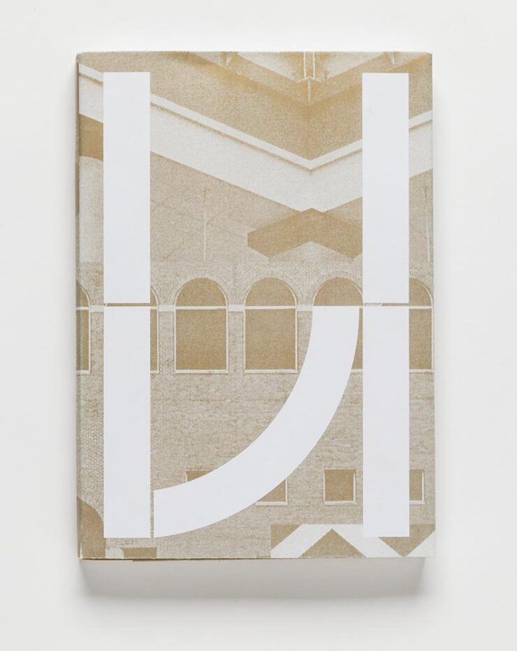
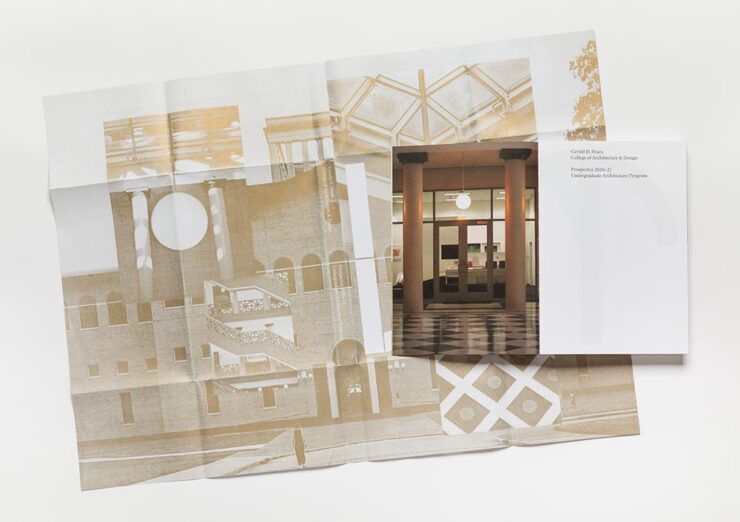
    The Gerald D. Hines College of Architecture and Design: 2020–21 Prospectus. Book design by Renata Graw and Lucas Reif.

    This prospectus for the University of Houston has a special bonus:

    The Hines College 2020–21 Prospectus, with its jacket casually tossed over its shoulder. Book design by Renata Graw and Lucas Reif.

    Design-driven impact, the dean says. Yep.

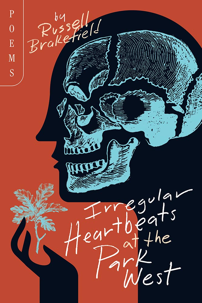
    Irregular Heartbeats at the Park West. Book design by Brad Norr.

    “Rural gothic,” they say. “Goodness,” I append.

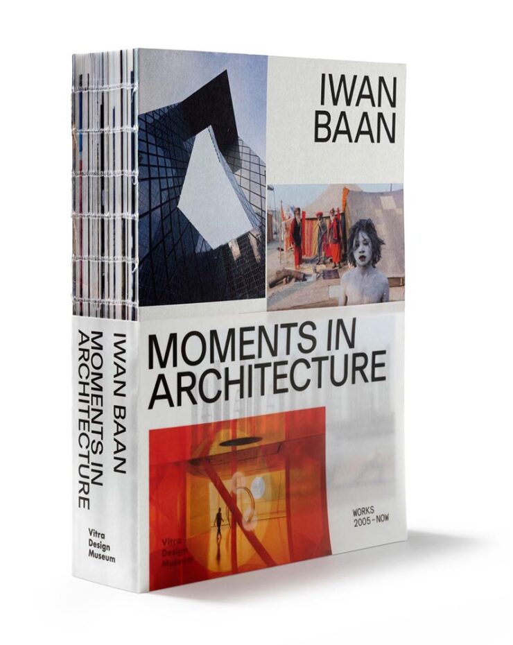
    Iwan Baan: Moments in Architecture. Book design by Haller Brun.

    Each year, 50 Books seems to latch onto a particular theme. Last year, it was irregular page sizes (often multiple sizes in the same book); this year, it’s irregular, often hand-sewn bindings, seen here with a slip jacket starring the other recurring theme this year: translucency.

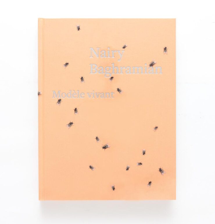
    Nairy Baghramian: Modèle vivant. Book design by Green Dragon Office with Nairy Baghramian.

    Speaking of translucency, this jacket is that … and something more, shall we say, eye-catching. Compelling, but does it make you want to pick it up?

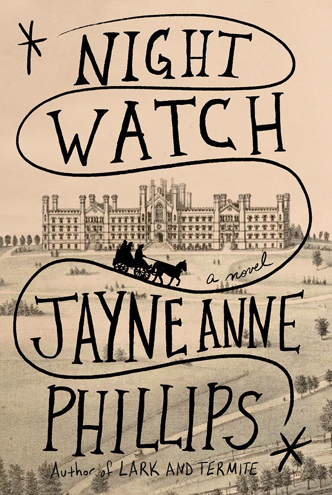
    Night Watch. Book design by Kelly Blair.

    This title was in my folder of finalists for Foreword‘s Favorite Book Covers of 2023 but ultimately not selected. Glad to see it get some recognition. (Note that The Guest Lecture and The Nursery, two other 50 Covers winners, did make my list.)

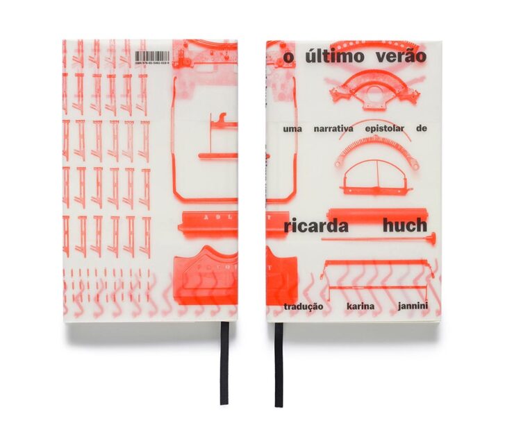
    The Last Summer. Book design by Gabriela Castro, Gustavo Marchetti and Paulo Chagas.

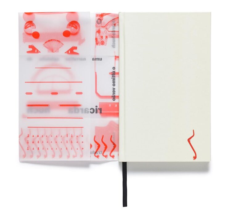
    The translucency is back, this time covering — well, jacketing — a newly-republished 1910 detective novel set in pre-revolutionary Russia.

    The Last Summer (jacket detail). Book design by Gabriela Castro, Gustavo Marchetti and Paulo Chagas.
    Only on Saturday. Book design by Chuck Byrne.

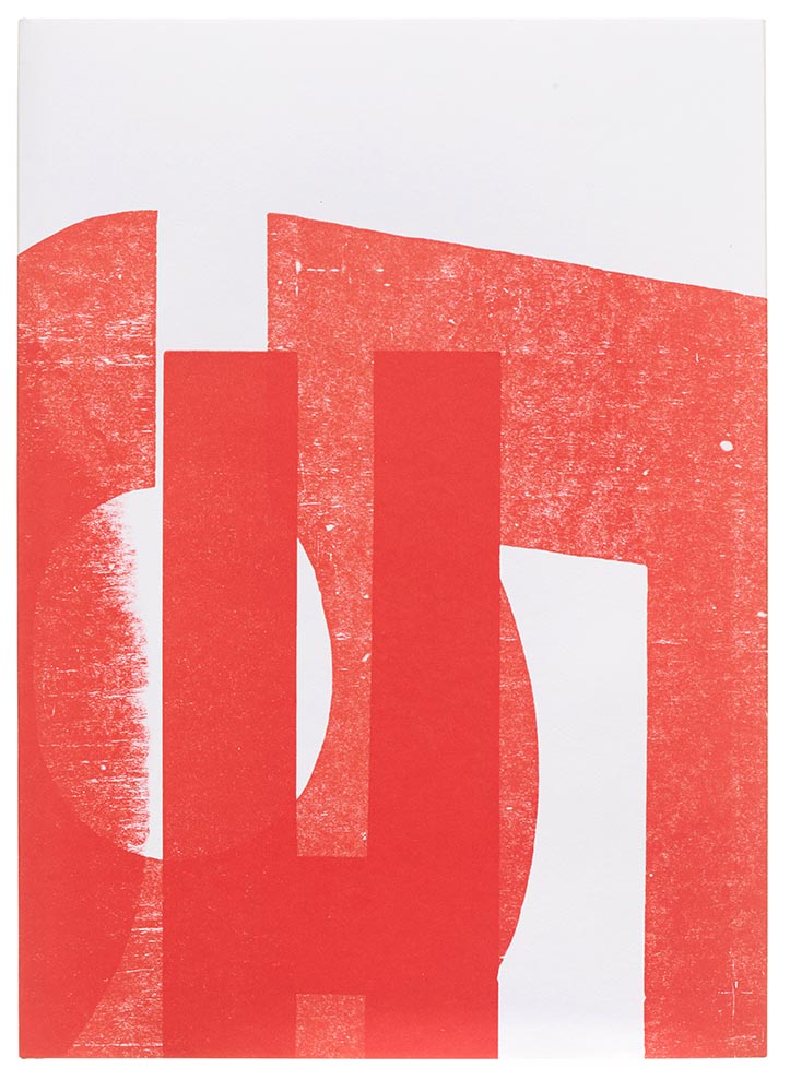
    “Printing legend Jack Stauffacher’s experimental make-ready sheets informed both the cover and the jacket for the regular edition,” 50 Books says, in another red-and-white triumph.

    Overlap/Dissolve. Book design by Nancy Skolos and Thomas Wedell.

    Great three-dimensionality on this cover, with an equally compelling interior:

    Overlap/Dissolve interior spread. Book design by Nancy Skolos.

    “We set up compositional frameworks to express harmony, conflict, resolution, or both,” the designers write. “For us there is never one perfect design solution, but the process generates one idea that overlaps and dissolves into the next.”

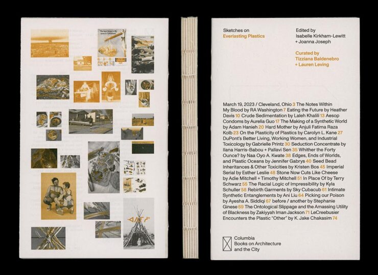
    Sketches on Everlasting Plastics. Book design by Renata Graw and Lucas Reif.

    Sketches on Everlasting Plastics, which “explores the infinite ways in which plastic permeates our bodies and our world,” accompanied the exhibition Everlasting Plastics at the 2023 Venice Architecture Biennale. (Note the binding.)

    Steel Like Paper. Book design by Wolfe Hall.

    Debossed type, linen spine, great photographs. Nice.

    And, last but certainly not least:

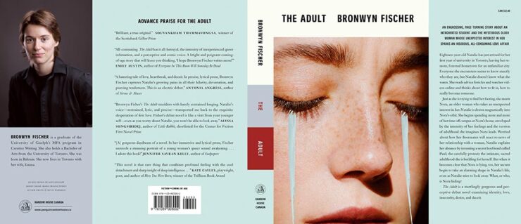
    The Adult (full jacket). Book design by Kate Sinclair.

    Simple at first glance, yet brings more on multiple levels. Great.

    Each of the 2023 winners can be viewed through AIGA’s online gallery, and will become part of the AIGA collection at the Rare Book and Manuscript Library at Columbia University’s Butler Library in New York.

    Via, as is often the case, PRINT Magazine.

  • Beautifully Briefed 24.6: Summer of Win (Mostly)

    Beautifully Briefed 24.6: Summer of Win (Mostly)

    In this installment of Beautifully Briefed, let’s take a look at some great posters, great print items, and great photography. Plus, an update from Adobe’s continued campaign to lose friends and attract government attention. Fun stuff!

    GET LECTURED (ON ARCHITECTURE)

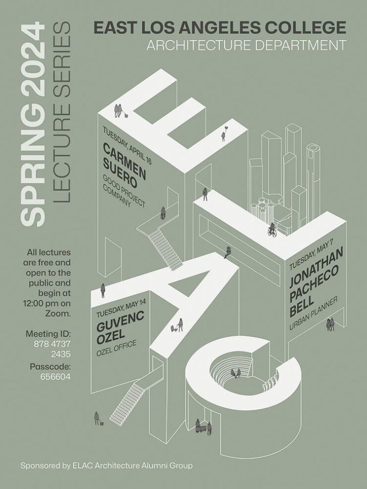
    Back in September, I mentioned Archinect’s Get Lectured poster series. They’re back with the Spring 2024 winners, including these two faves:

    ELAC lecture poster design by Tashfiah Ahmed.
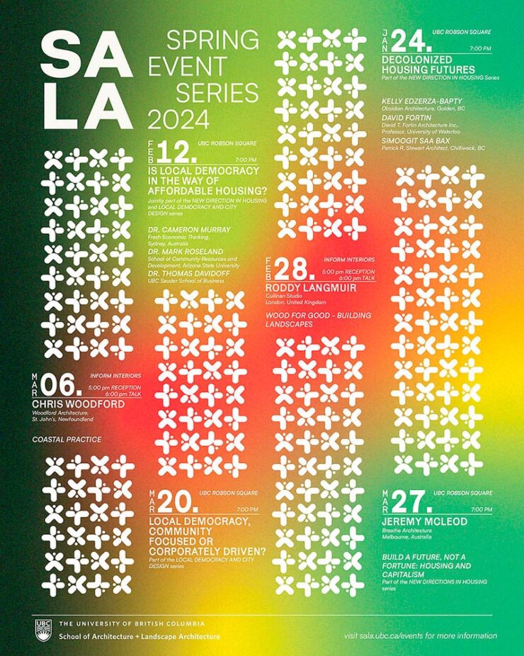
    Lecture poster from the University of British Columbia; designer not listed.

    Great examples of design in a often difficult category. See the rest.

    Architecture Photographs by Hélène Binet

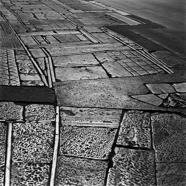
    While we’re discussing architecture, let’s talk about a Dezeen post that caught my eye: photographer Hélène Binet has a new book out, adding to her long career capturing the old-school way — using film.

    “A Sentimental Topography by Dimitris Pikionis, landscaping of the Acropolis, Athens, Greece.”

    This series captures shadows and light with exceptional talent, including the above, where she’s praised for “captur[ing] in a single image the tactile and textured presence of tectonic form, both in built and natural environments.”

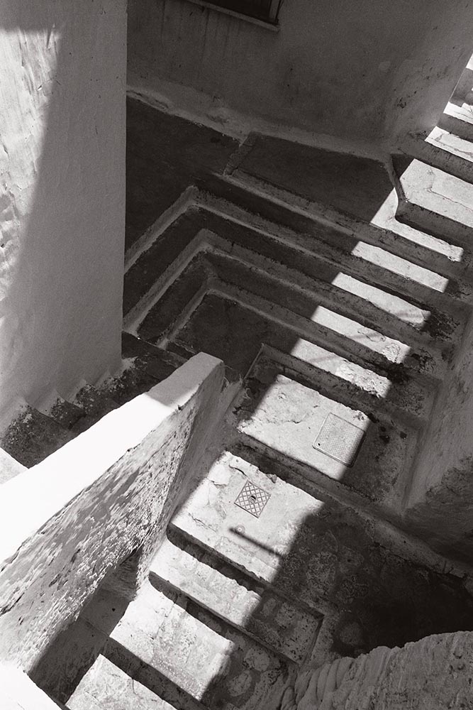
    “Staircases in Sperlonga, Latina, Italy.”

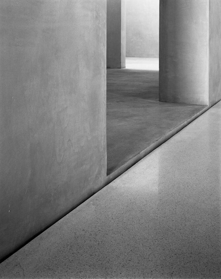
    I love the softer shades of gray than shown in the previous image, and both this and the image below demonstrate a deep understanding of architectural expression.

    “Kolumba Museum, Cologne, Germany, by Peter Zumthor.”

    Read the post from Dezeen, see more examples of outstanding work on her website, or buy the book with 170 photographs, essays, and more.

    2024 Audubon Photography Winners

    This is Colossal posted about this a day before my Audubon magazine showed up with these prominently featured, and they’re all winners.

    Wild Turkey, Female Bird Prize Winner, by Travis Potter.

    Bird photography is a difficult skill requiring patience, perseverance, and specialized gear; those who excel at it deserve recognition. Plus, there’s this:

    Audubon’s climate science report Survival by Degrees reveals that two-thirds of North American birds are threatened by extinction from climate change, including species featured in this year’s Audubon Photography Awards like the Blackburnian Warbler, California Quail, and Sedge Wren.

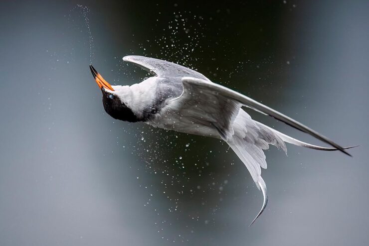
    Forster’s Tern, Professional Honorable Mention, by Kevin Lohman.

    Check out the Colossal post, or see the full story at the Audubon website.

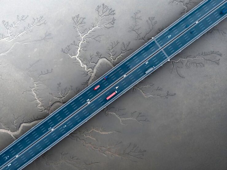
    Special Bonus #1: Kottke points us towards the Siena 2024 Drone Photography Awards. “Look! Up in the sky! It’s … another contest!” Good stuff nonetheless:

    “Jiashao Bridge” by Sheng Jiang, China.
    PRINT 2024 Awards

    The annual PRINT awards are out, featuring — natch — great items in print, including items like the Smithsonian’s annual report and a Naked Trails brochure. Here are a couple of items from the book design category:

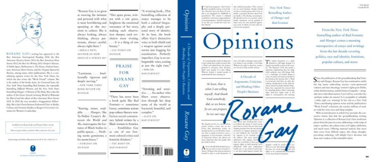
    Jacket design by Robin Bilardello.

    Author sketch and lettering by the author. Also, let’s get the . . . :

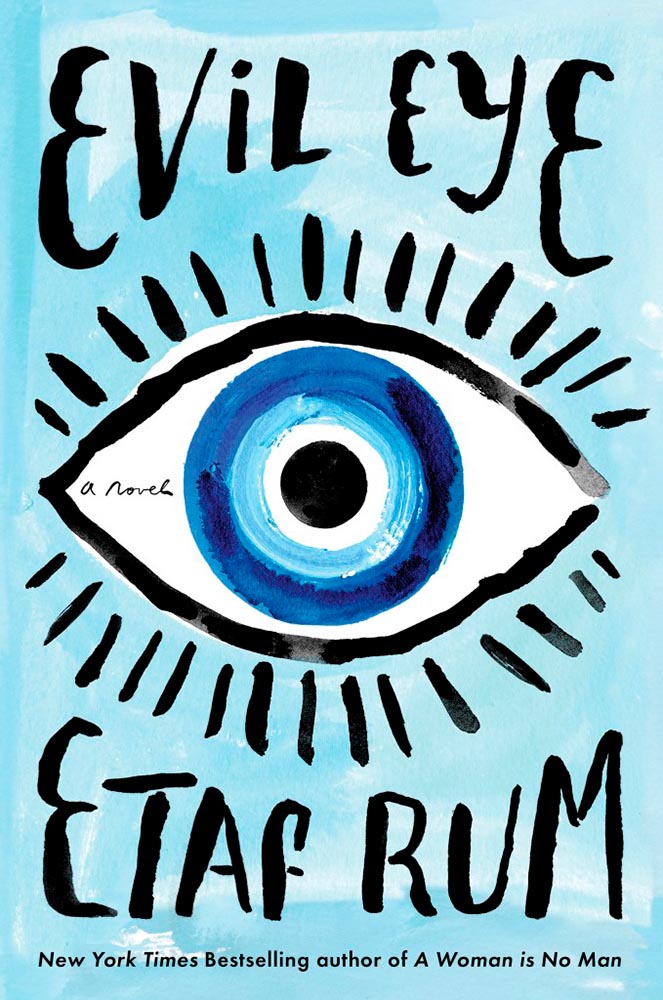
    Cover design by Milan Bozic, with illustration and typography by Lauren Tamaki.

    Fantastic.

    Special Bonus #2: Hoefler & Co. brings us Typographic Doubletakes: “While good typefaces have prodigious families of carefully related styles, some of the best typography builds unexpected relationships between unrelated fonts.”

    Left: Chronicle Hairline + Landmark. Right: Vitesse + Gotham.

    Their blog refreshes as you scroll in more ways than one — enjoy.

    Left: Mercury Text + Ideal Sans SSm. Right: Whitney + Operator and Operator Mono.

    Special Bonus #3: Kottke points us to a LitHub post arguing for adding full credit pages to books acknowledging everyone who worked on them. “How lovely it is to be seen and appreciated.”

    Adobe “Too Easy to Hate,” Say Users, Employees

    Adobe continues to score big with the public — in the best Boeing style, a formerly-great company has put profits before users and employees. While successful from the shareholders’ point of view (record profits, again), some are . . . upset. PetaPixel:

    Just over a month ago, an Adobe exec called AI the “new digital camera.” Simultaneously, an Adobe marketing campaign chucked photographers under the bus, and not for the first time, which caught the attention of the American Society of Media Photographers (ASMP). At the very top of Adobe, there is a concerning and frustrating lack of understanding about art and the people who make it.

    Even “exasperated employees implored leadership to not let it be the “evil” company customers think it is;” while that might be a stretch — “ignorant greed” is a better description — either is not a winning look.

    The latest was a terms-of-service update that many saw as a rights grab, allowing the company to use users’ work to train its AI services. While those have been amended, the seemingly clear language — “We’ve never trained generative AI on customer content, taken ownership of a customer’s work, or allowed access to customer content beyond legal requirements” — comes from a company that has lost the trust of users, making those words just that — words. Time will tell if they are truth.

    But there’s more: Adobe’s just been sued by the FTC (via PetaPixel, Pixel Envy) for hidden fees and difficult cancellations:

    “For years, Adobe has harmed consumers by enrolling them in its default, most lucrative subscription plan without clearly disclosing important plan terms,” the lawsuit alleges. “Adobe fails to adequately disclose to consumers that by signing up for the ‘Annual, Paid Monthly’ subscription plan, they are agreeing to a yearlong commitment and a hefty early termination fee that can amount to hundreds of dollars. Adobe clearly discloses the early termination fee only when subscribers attempt to cancel, turning the stealth early termination fee into a powerful retention too that [redacted] by trapping consumers in subscriptions they no longer want.”

    I’m actually glad for this, as I wasn’t aware that my $60+ monthly fee is a payment on an annual plan. (Ug.) Not too big an issue — I actually feel like there’s decent value in the plan and will continue to subscribe for the foreseeable future.

    But I’d also be lying if I said I’m completely satisfied with our business arrangement: alternatives are few and far between. While Adobe does not have a monopoly legally or technically, in the publishing industry at least, they are, for all intents and purposes, the only game in town. It would be nice if they would at least demonstrate a modicum of respect for their users.

    Update, 25 July 2024: “Adobe Exec Says Early Termination Fees Are ‘Like Heroin’ for the Company,” according to PetaPixel. Hmph.

  • Beautifully Briefed 24.3: Bloomin’ Breadth

    Beautifully Briefed 24.3: Bloomin’ Breadth

    The end of March here in Middle Georgia means flowers aplenty, and usually with that, some photography — but I’ve not yet had a chance. (Stay tuned.) I have, however, been saving up links o’ interest: fonts, books, photography, and new(ish) car logos. Let’s go!

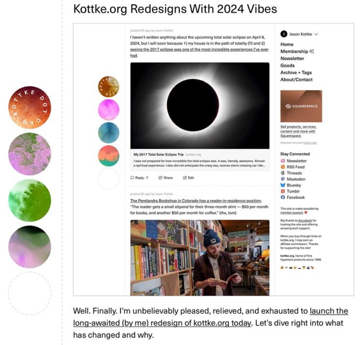
    Kottke Meets 2024

    Starting with one of the very few places that is still around from Foreword’s old days, the always-interesting Jason Kottke:

    2024 marks Kottke.org’s 26th year on the ’net.

    Great new looks for great content, with better Quick Links — the previews are ace — and incredibly-appreciated gift links to places like The New York Times and The Atlantic. If you haven’t been in a while, click and enjoy.

    Fab Spring Type

    With “a plethora of captivating new typefaces,” CreativeBoom celebrates spring with 11 new faces to tempt, inspire, and bring joy:

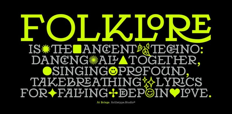
    Arillatype.Studio brings us a thousand glyphs of greatness.

    Zanco, with its bell-bottom style; Seabirds, inspired by 1930s book covers; Module, a “fluke side hustle;” and Graffeur, improvised from gaffer tape and glimpsed in this post’s header image, are all great. My far-and-away favorite, though, is At Briega, “inspired by the concept of hybridisation” and shown above.

    See ’em all here.

    Literary Three-Fer
    M.C. Escher’s Lesser-Known Works
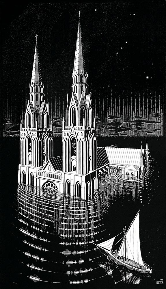
    “The Drowned Cathedral,” a 1929 woodcut.

    “Unique perspective” never does justice to someone whose name defines the term. See some never-before-seen images alongside old favorites in a new Escher book highlighted at Hyperallergic.

    Multidimensional Libri

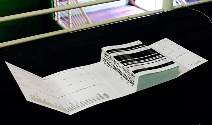
    “Experimental books are flourishing, [a]nd the evidence is seen” in this Daily Heller from PRINT: a traveling exhibition on three-dimensional books, all published titles.

    Oh, those Italians. Read on.

    Book Design Snobbery
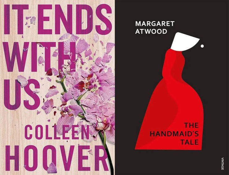
    Hoover vs. Atwood — no joke.

    “Don’t get held back from the simple pleasures of reading,” argues Natalie Fear at CreativeBloq, “not everything needs to be minimalist.” Justification for commercialism or a common-sense explanation for the bookshelves’ current look? You decide.

    Photography Three-Fer
    Winners of Monochromatic Minimalism
    “Black Pearl” by Sascha Kohne. An honorable mention for the magazine, but a winner for me.

    Some incredibly good stuff here — but perhaps more importantly, did you know of Black & White Minimalism Magazine? There’s no end to today’s continued diversification, methinks.

    “Traveling through Costa da Morte, Galicia. 600m above sea level where the mountains separate the Cantabria sea from the Atlantic Ocean,” explains third-place winner Alexandre Caetano.
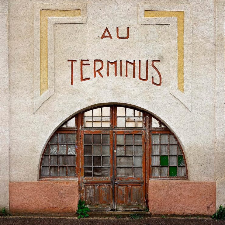
    Aging Facades of France

    “Shuttered blinds, peeling paint, and aging doors don’t usually indicate an invitation, but for French photographer Thibaut Derien, the fading facades of long-closed shops are well worth a stop,” This is Colossal says.

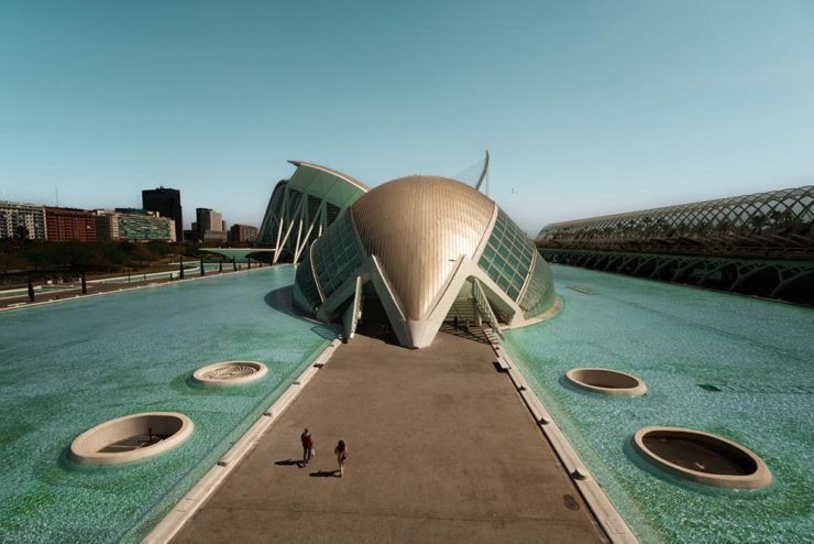
    Sony Photography Awards: Architecture
    The Ciudad de las Artes y las Ciencias (City of Arts and Sciences) in Valencia, Spain: “Hemispheric,” by Eng Tong Tan, Malaysia.

    ArchDaily‘s coverage of the annual Sony awards shortlist announcement was an insta-click.

    New Bull: Now Flat. (And a BMW.)

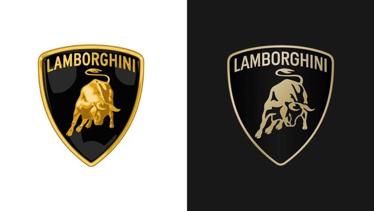
    Lamborghini practically defines flamboyant. So it’s worth a link when their logo gets less interesting:

    Old logo, left, new, right.

    Late at following the industry trend of flat-is-better, because, well, Volkswagen. (Okay, I undersell. Perhaps.) Read the lack of news at Motor11Motor1 also has a decent roundup of new car logos, from 2016-present, which underscores the “flatness” trend. or The Drive, where they manage to convey the brand’s use of the phrase “digital touchpoints.”

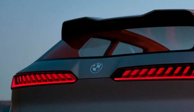
    I don’t know whether this will make any more sense in a few or even many months — which is relevant because of BMW. Four years ago, one of the industry’s design leaders expressed strong this new style, and I didn’t get it. But it’s worn better than most, and superlatively on occasion — check out the logo’s use on the Vision Neue Klasse X:

    Rather than a standalone, plastic part sitting on the paint, it’s etched into the finish. Man, I hope that makes it into production.

    Neue Klasse: do like. Bull? No so much.

    Update, 2 April: BrandNew, itself sporting a new look, has weighed in on the new Lambo style, calling it “not good.” (FYI, BrandNew is a subscription, quite possibly the best $20/year someone interested in design can spend.)

    • 1
      Motor1 also has a decent roundup of new car logos, from 2016-present, which underscores the “flatness” trend. ↩︎
  • University Press Design Show 2023

    University Press Design Show 2023

    As I mentioned in the recent Favorite Book Covers post, I totally missed the ’23 Association of University Presses Design Show in July, 2023 — which is their best-of from 2022 — and I’d like to highlight some of the great book design. Let’s catch up.

    “Our selections ended up evoking an array of responses,” said [Jayme] Yen, [Juror]. “As book designers, some books made us professionally jealous—we wish we had designed those! As designers-who-collect-books, we took notes about the books we wanted to purchase later. As readers, there were books that we lingered over for longer than absolutely necessary, the text and typography luring us in and making us forget all else.” 

    — Jayme Yen, AUPresses Design Show Juror

    This show is a favorite because more than just the covers are brought to the fore — interior design on books is, in my opinion, the unsung hero of print and publishing. Of course, there are more than a few covers to discuss, too.

    AUPresses lists designers in with their winning designs, which I’ve included in the captions below. Any errors are mine.

    They also separate the awards into categories. Let’s start with a couple from Scholarly Typographic:

    Duke University Press. Cover design by A. Mattson Gallagher.
    Duke University Press. Interior design by A. Mattson Gallagher.

    Great effect on the cover image — not an easy subject for that part of the world, handled with grace — and bonus points for a beautifully interesting contents page, an area often neglected.

    Also:

    Louisiana State University Press. Cover design by Andrew Shurtz.

    I haven’t seen this one in person, so not sure whether the texture is in the paper or the illustration (or both), but either way, this cover design delights.

    Let’s move on to Scholarly Illustrated, and this interesting title:

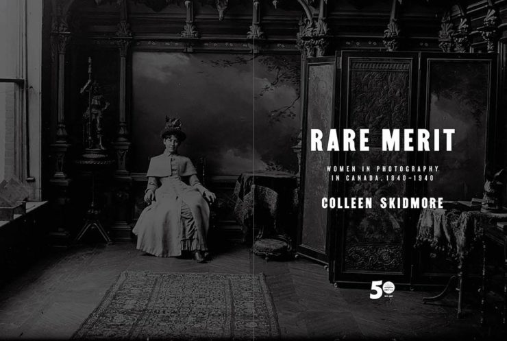
    University of British Columbia Press. Jacket design by Michel Vrana.
    University of British Columbia Press. Title page design by Michel Vrana.
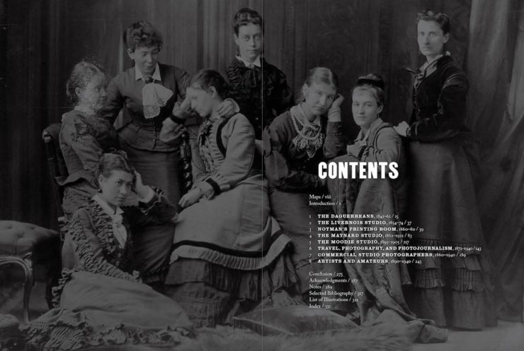
    University of British Columbia Press. Interior design by Michel Vrana.
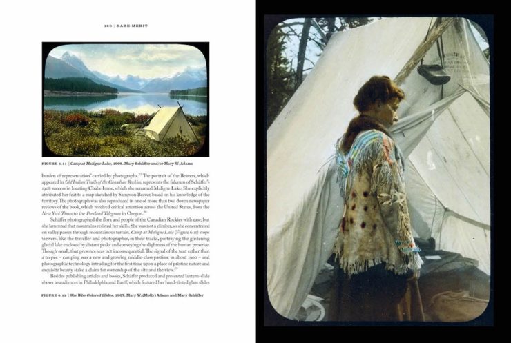
    University of British Columbia Press. Interior design by Michel Vrana.

    Another winning contents page — this time paired with an interesting cover, great title page, and interior design up to the standards set by these pioneering women. Only question: they couldn’t get a woman to design the title?
    From Trade Typographic, we have:

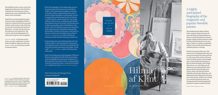
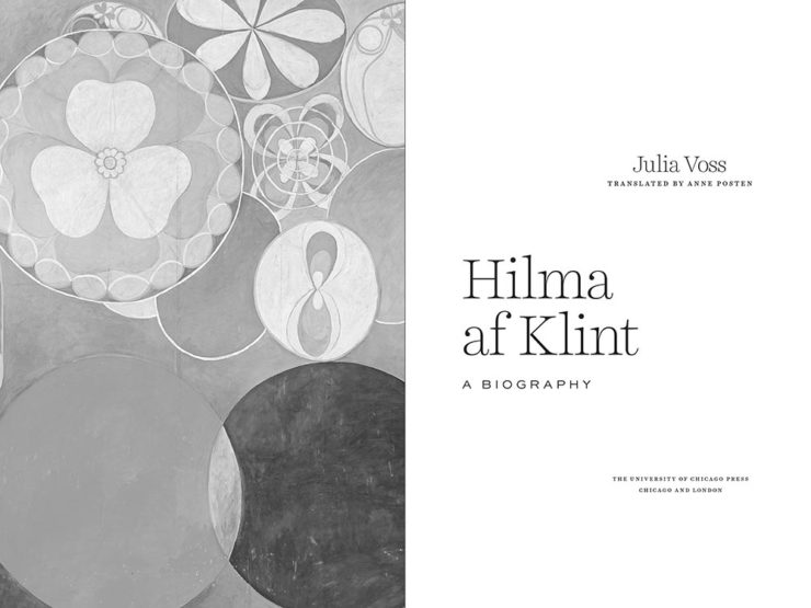
    University of Chicago Press. Jacket design by Jill Shimabukuro.
    University of Chicago Press. Title page design by Jill Shimabukuro.

    That jacket is fantastic: I love a design that wraps the spine onto the front (and, in this case, back) cover. Kudos.

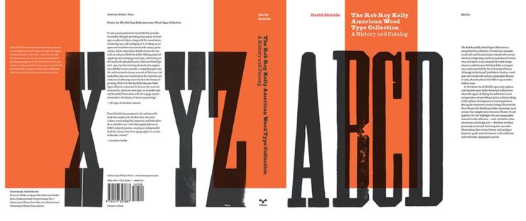
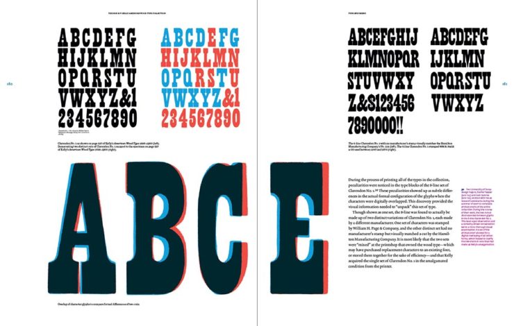
    From Trade Illustrated, some wooden type:

    University of Texas Press. Jacket design by David Shields.
    University of Texas Press. Interior design by David Shields.

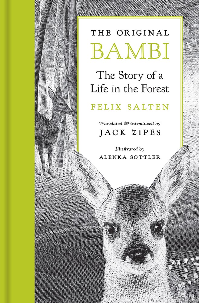
    From Poetry and Literature, we have an all-time favorite, redone with remarkable aplomb:

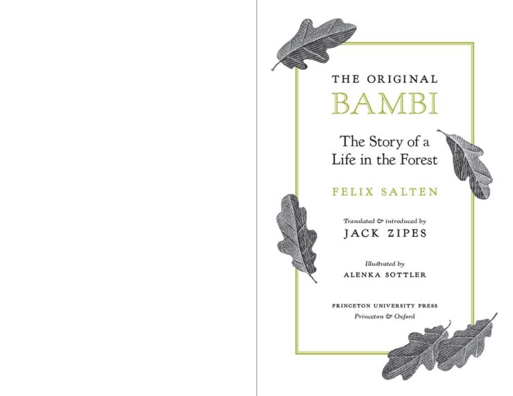
    Princeton University Press. Cover design by Chris Ferrante, illustrated by Alenka Sottler.
    Princeton University Press. Title page design by Chris Ferrante, illustrated by Alenka Sottler.
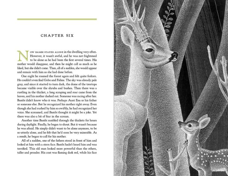
    Princeton University Press. Interior design by Chris Ferrante, illustrated by Alenka Sottler.
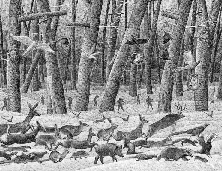
    Princeton University Press. Illustrated by Alenka Sottler.

    I can’t speak highly enough of the talent and style on display in these illustrations, complimented with great book design. Fantastic.

    From the Journals category:

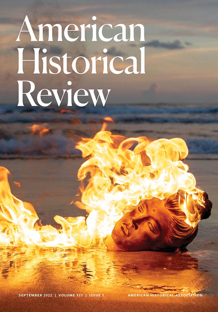
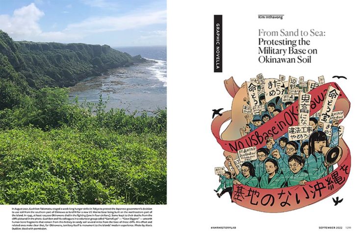
    American Historical Association. Cover design by Paul Carlos.
    American Historical Association. Interior design by Paul Carlos.

    That cover photograph — wow — combined with a full-color interior that’s really well done. Great stuff.

    From the Reference category, we have three, starting with a local favorite:

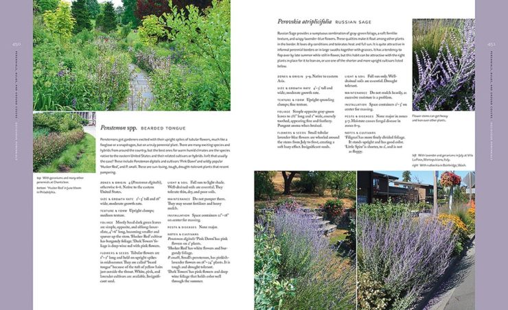
    University of Georgia Press. Interior design by Mindy Basinger Hill.
    University of Georgia Press. Interior design by Mindy Basinger Hill.
    University of Georgia Press. Interior design by Mindy Basinger Hill.

    The more data, the more charts, the more fuss, the harder it is to do well. Another title handled in a way that invites the reader to enjoy — nice.

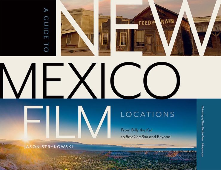
    University of New Mexico Press. Cover design by Mindy Basinger Hill.

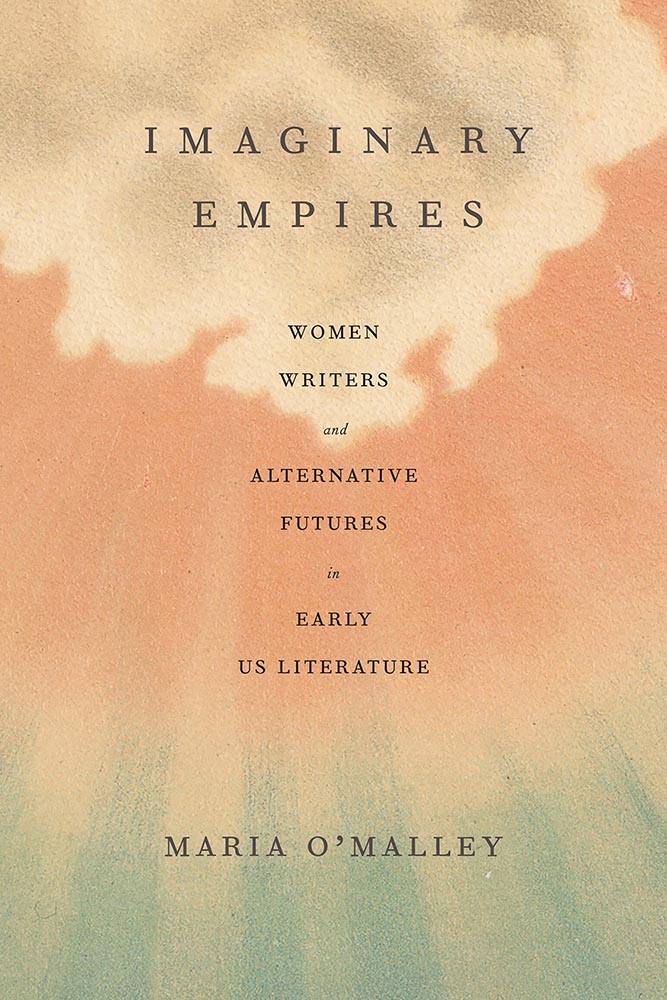
    The interior of this book is good, but the cover, with its natural-paper-as-sky really works for me. (I do wish the author’s name were a little more prominent.)

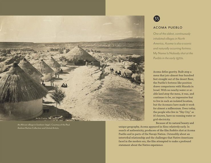
    University of New Mexico Press. Title page design by Mindy Basinger Hill.
    University of New Mexico Press. Interior design by Mindy Basinger Hill.

    Killer title page with aged, map-based listings. Nice.

    We round out with several selections from the big one: the Book Jackets and Covers category:

    Duke University Press. Cover design by Matthew Tauch.

    Great photograph complimented by fantastic use of color and geometry.

    Gallaudet University. Cover design by Eric Wilder.

    Next-level simple, with good typography and color.

    McGill and Queen’s University Press. Cover design by David Drummond.

    Next-next-level simple, with the best drop shadows I’ve seen recently. Great stuff.

    McGill and Queen’s University Press. Cover design by David Drummond.

    Same designer as the previous title, and perhaps similar in style, but handled well while still being distinctive.

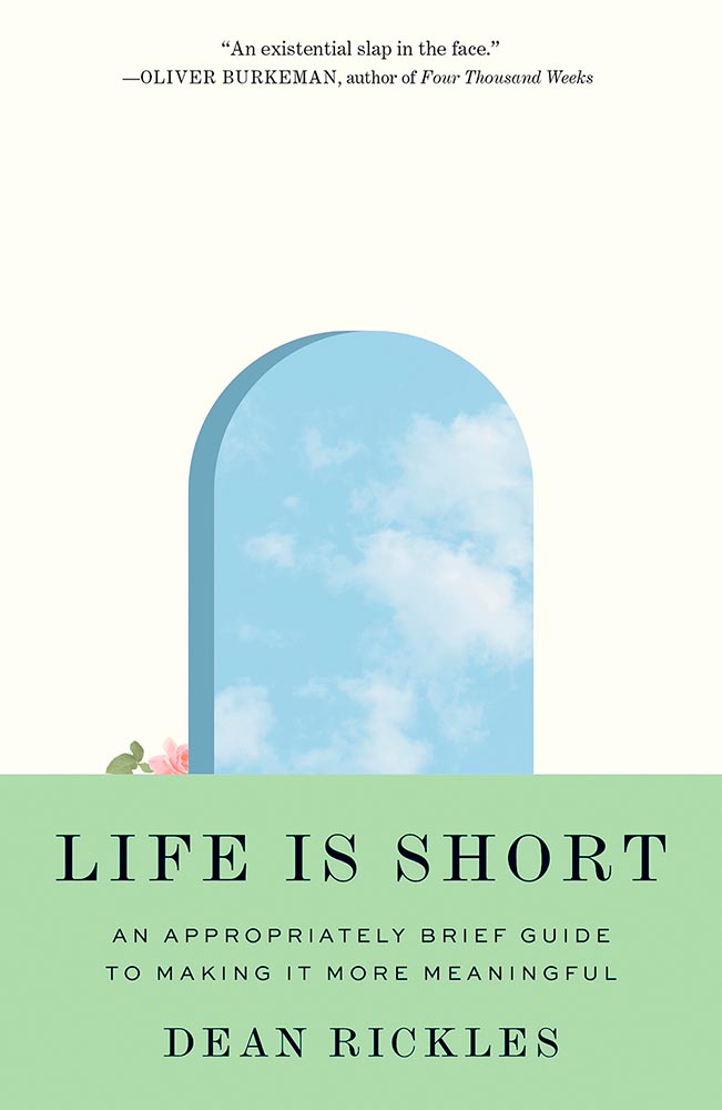
    Princeton University Press. Cover design by Kari Spurzem.

    Life is short. Go though the door while you can.

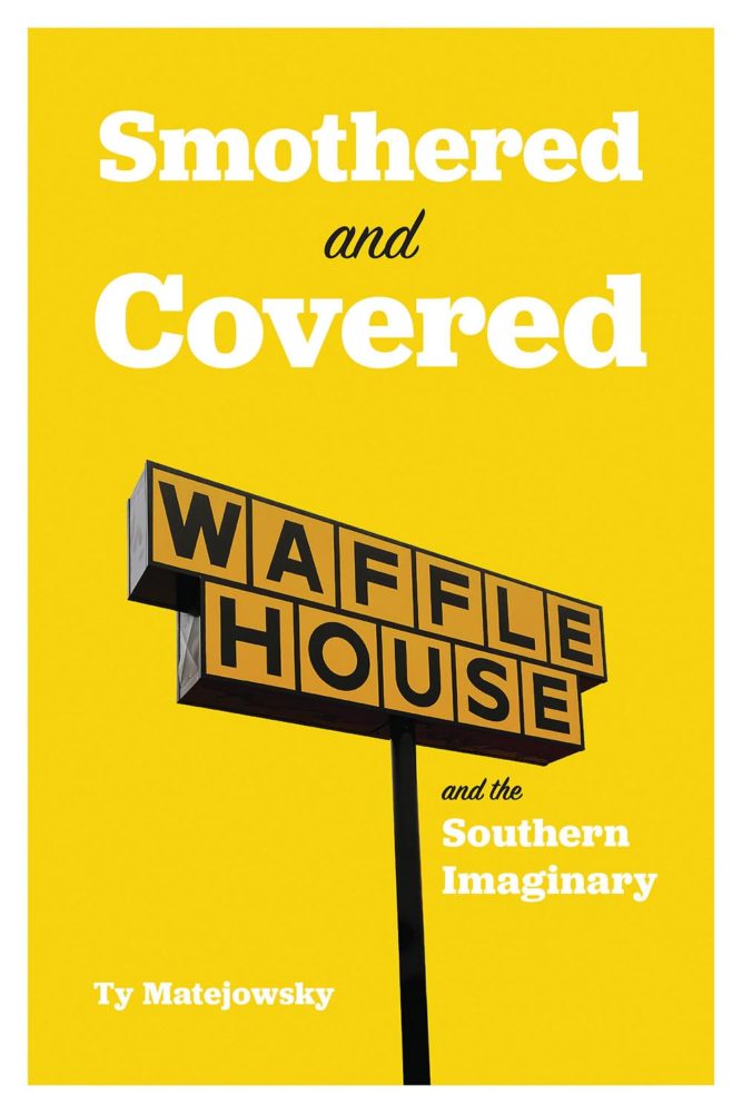
    University of Alabama Press. Cover design by Lori Lynch.

    This could have been handled any one of a trillion ways — ’bout the number of breakfasts served — but this one is interesting and respectful. Bonus points for the phrase, “Southern Imaginary.”

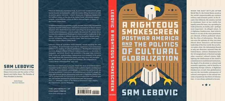
    University of Chicago Press. Jacket design by Rae Ganci Hammers.

    Love this, from background to foreground, with bonus points for a back flap not filled to the brim. As I recall, this one was a runner-up for last year’s favorite covers list.

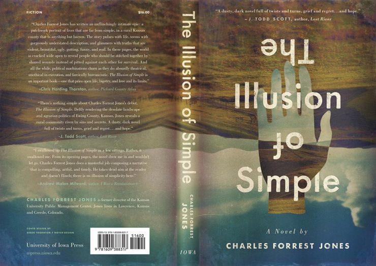
    University of Iowa Press. Jacket design by Derek Thornton.

    While we’re on the subject, this one not only made the cut for my 2022 Favorite Book Covers, but was in my top three. Great, great stuff, shown here both front and back.

    University of Minnesota Press. Cover design by Catherine Casalino.

    Jumping right off the top of the cover — perfect. (Great use of color, too.)

    University of Pittsburgh Press. Cover design by Joel W. Coggins.

    Interesting, compelling choice with the illustration. Bonus points for monospace, typewriter-style title, complimented with the callout. Nice.

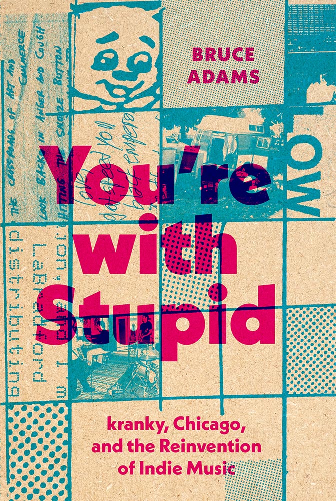
    University of Texas Press. Cover design by Lonny Hurley and Derek George.

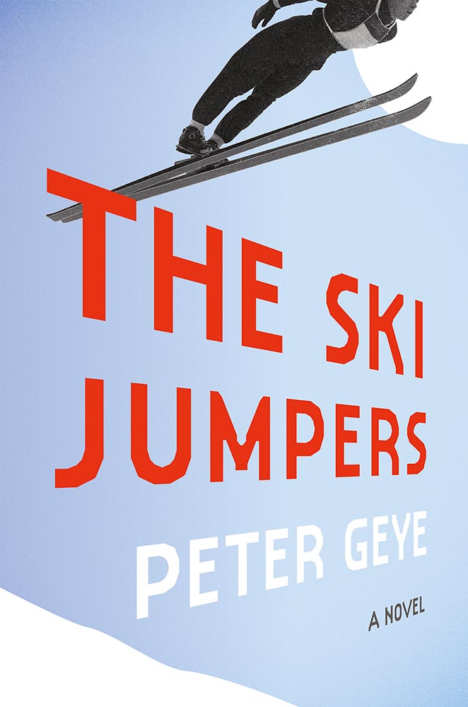
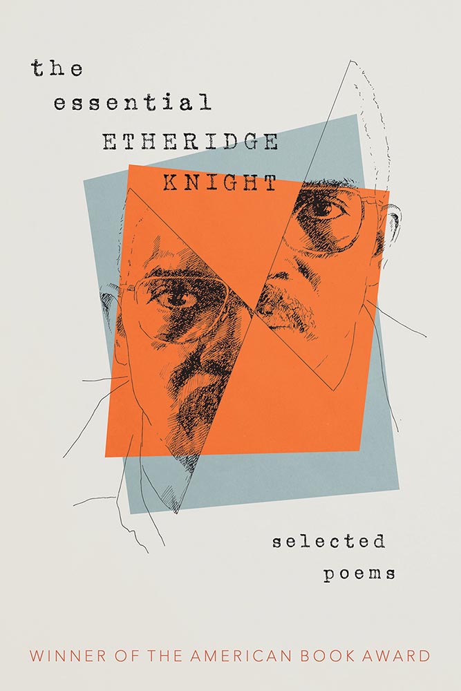
    A cover that’s neither cranky nor stupid. (Crafty, though….)

    Yale University Press. Cover design by Jennifer Volvovski.

    Face-off!

    “The printed book should be both a functional and a beautiful object,” said Mindy Basinger Hill, “and every year this community finds new and innovative ways to bring that vision to our books.” I couldn’t agree more, and despite my tardiness in sharing, I’m happy to have seen these titles — and hope you are, too. Looking forward to next year!

    See the entirety of the show’s winners here or read the overview. See also last year’s coverage.

  • Beautifully Briefed 23.11: Considerations

    Beautifully Briefed 23.11: Considerations

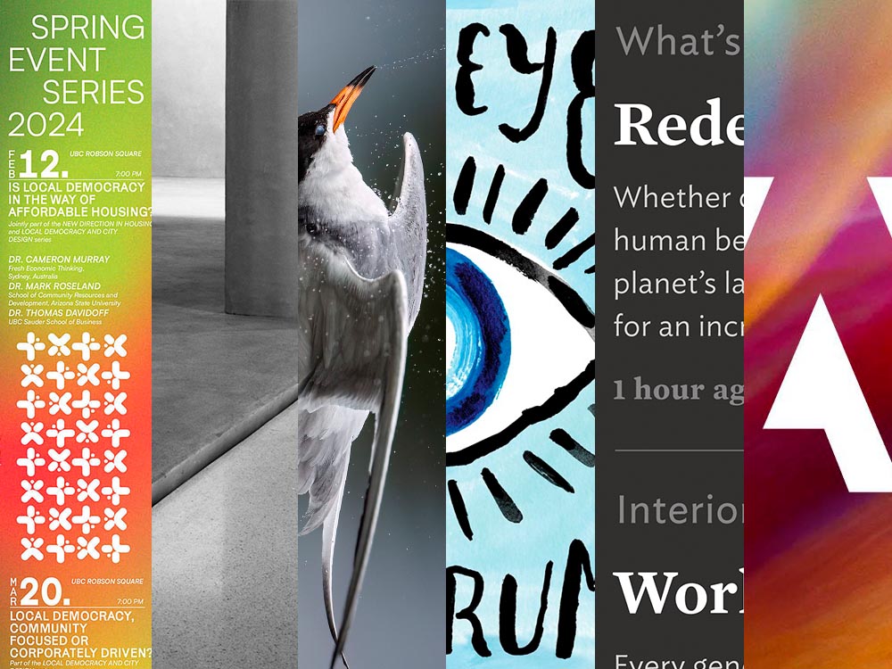
    A selection of diverse items for this entry in the series: a new publication from The Guardian, open source fonts for your 2023 goodness (along with more for ’24), and the Natural Landscape Photography Award winners. Also: DAK. Let’s get into it.

    The Long Read

    Regular readers will know that I’m a big fan of The Guardian, including its unusual-for-journalism payment model (that, frankly, some outlets in the US would be wise to copy). Now, they’re on newsstands with a “bookazine” called The Long Read.

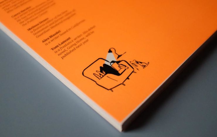
    The back cover. (See the front cover at the left in the header image.)

    “We know that for many people, myself included, when it comes to long, immersive pieces, reading in print […] is still the most satisfying reading experience, and one that should be cherished in a climate so saturated by disturbance,” quotes It’s Nice That. With most of these more evergreen stories taking months or even years to build, hardy print felt the best way for them to live. [A] ‘bookazine’, it balances all the things we love about magazines (“the drama, the pace, the energy”) with the considered typesetting of a book. A lot of attention was given to packaging its large volume of text – clocking in at 55,000 words – to make the reading experience as relaxing as possible, from body type size to column widths.

    Liz Gorny, It’s Nice That
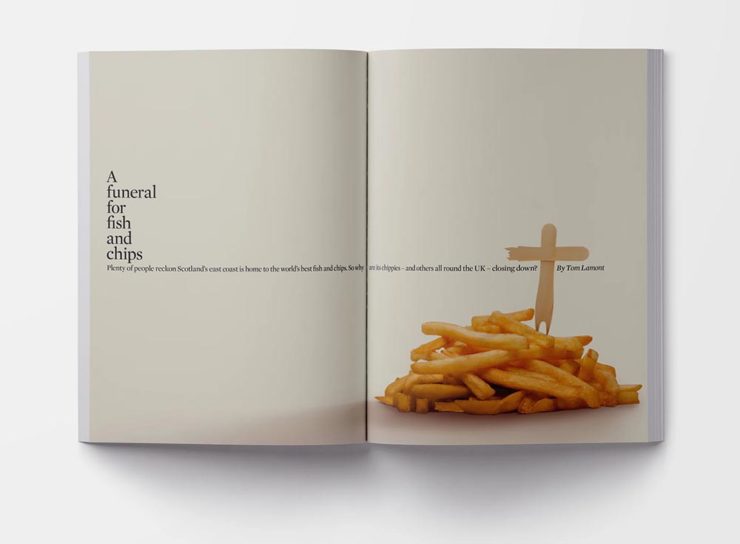
    An article title page — indeed, the best of a newspaper magazine in book form.

    Read more at It’s Nice That, and give The Long Read a look at The Guardian bookstore or a newsstand near you.

    Three Open Source Fonts for 2023, and 50 for ’24

    As a self-confessed font junkie, I’m always interested when a new one comes across the bow — but there are so many these days, they’ve unfortunately become almost commodities. (That’s a huge shame, but also a discussion for another time.) So it’s interesting when I see ones that are not only good but also available for everyone, free and open source.

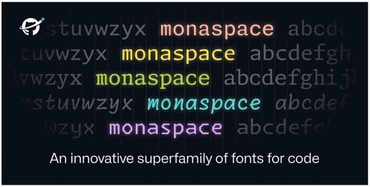
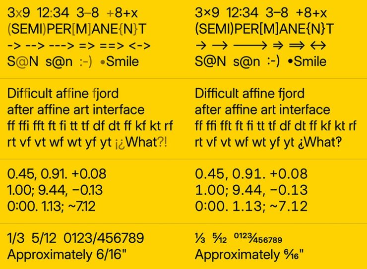
    Monaspace is the first of three I want to highlight, “a monospaced type superfamily with some modern tricks up its sleeve.” Designed for code — hence the monospace — it’s a successful answer to the question, “Letters on a grid is how we see our code. Why not make those letters better?”

    Get the full story or download from GitHub.

    B612 is designed for — get this — the screens on Airbus commercial planes. “[T]he challenge was to improve the display of information on the cockpit screens, in particular in terms of legibility and comfort of reading, and to optimize the overall homogeneity of the cockpit.” Read the back story here.

    B612 is available from Google or GitHub.

    Inter is described as, “The 21st century standard,” “a workhorse of a typeface carefully crafted & designed for a wide range of applications, from detailed user interfaces to marketing & signage.” One of the world’s most-used font families, it’s perfect when readability is at the fore.

    Inter is detailed and downloadable here.

    But there’s more!

    Brinca by In-House International. (Image via CreativeBoom.)

    CreativeBoom has their annual compilation of 50 new fonts for the coming year up, “a comprehensive list of the best fonts that demand your attention in 2024. We’ve compiled this comprehensive list by asking the creative industry for their favourites, analysing work from the last 12 months, and taking on board the design trends emerging right now.”

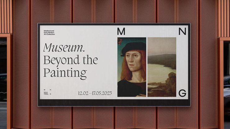
    National Museum in Gdańsk by Tofu Studio. Featuring Migra by Pangram Pangram. (Image via CreativeBoom.)

    Great stuff. Creative. Boom!

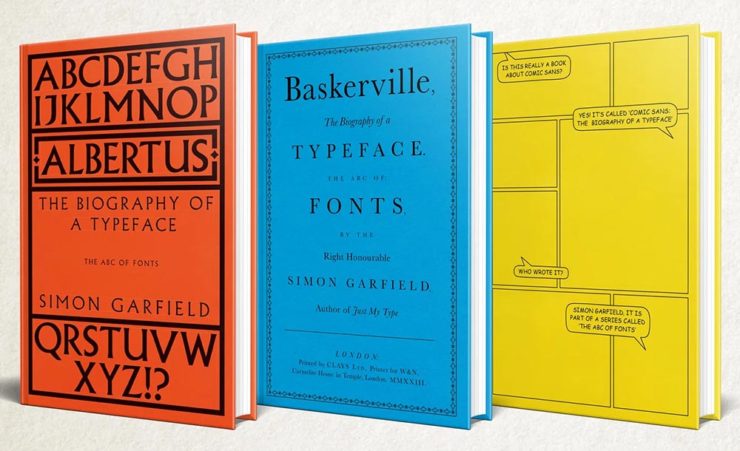
    Special Bonus: Simon Garfield publishes biographies on Albertus, Baskerville and Comic Sans. Seriously:

    The Natural Landscape Photography Awards

    For once: a contest that demands more — like the original RAW files. (Literally the raw image from the camera, before processing, for those who don’t know — think film negatives, rather than the resulting prints.) Okay, sure, it’s not perfect; there are entry fees and it doesn’t have a long track record, but the rules are solid with respect to image integrity.

    Of course, the quality of the subject chosen to photograph is, if you’ll pardon the expression, subjective. The overriding theme here seems to be the perfection of dramatic subtlety — not an easy thing to get right.

    Photo: Adam Gibbs
    Photo: Adam Gibbs

    The two photographs above are both by Adam Gibbs and reflect the judges’ desire to reward photographers who display a diverse portfolio of subjects.

    Photo: Alberto Rodriguez Garcia
    “Once Upon a Time.” Photo: Matt Redfern

    A winner from the “abstracts and details” category for the first and a great title for the second image that does indeed tell so many stories. Rounding it out, another beautiful black-and-white:

    Photo: Franka Gabler

    See the contest website for the complete selection of 2023 winners. (Via PetaPixel.)

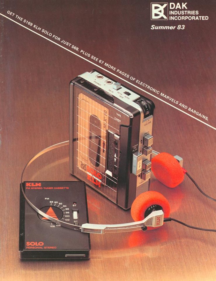
    Remember the DAK catalogs?

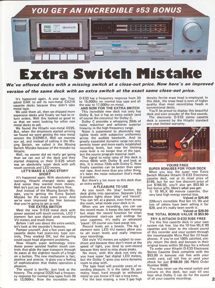
    If you’re a certain age — that is, were around in the ’80s — the DAK catalog was a regular. (Give me one, together with a JC Whitney catalog, and a weekend was gone.) A recent post by Cabel Sasser brought it all back:

    The catalog from Summer 1983.

    Oh, the products. The explanations. The fun.

    I’m not going to spoil the effort put into the story of Drew Alan Kaplan, a.k.a. DAK, Joseph Sugarman, Products That Think, or any of it: go enjoy for yourself.

  • 50 Books | 50 Covers, 2022 Edition

    50 Books | 50 Covers, 2022 Edition

    AIGA once again surprises and delights in their annual competition of book design.

    Since its inception in 1923 as the Fifty Books of the Year competition, this annual event highlights AIGA’s continued commitment to uplifting powerful and compelling design in a familiar format we know and love. As book jackets became more prevalent, the competition evolved with the field to acknowledge excellence in cover design. Beginning in 1995, the competition became known as 50 Books | 50 Covers. 

    AIGA Press Release

    The jury and I were very impressed with both the quantity and quality of the entries this year, which made choosing only 50 extremely difficult. Among the trending techniques this year were use of exposed bindings and elaborate page sequencing and mixed paper choices. For me, there was a greater overall sophistication in book design, with a mix of aesthetically beautiful and graphically brash approaches in the final choices.

    Andrew Satake Blauvelt, Director, Cranbrook Art Museum (Chair)

    As usual, there’s some overlap with various lists of “best of 2022” — here’s Foreword’s — but, as LitHub puts it, these are the best book [designs] of 2022 that you (probably) haven’t seen.

    A selection of my favorites, in alphabetical order:

    Cover design by Mary Austin Speaker

    Simplicity itself — along with some awesome block type — add up to a great cover. (Love the angled blurb, too.)

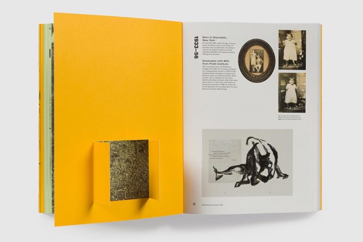
    Book design by Zack Robbins and Bentzion Goldman

    One of the great things about this post is the “50 Books” part; this cover’s okay, and the spine more than okay, but it’s the interior design that really wins in my book (pardon the expression):

    Book design by Zack Robbins and Bentzion Goldman
    Book design by Zack Robbins and Bentzion Goldman

    Kudos: the photography is great, but the spread above is artistic in wonderful way.

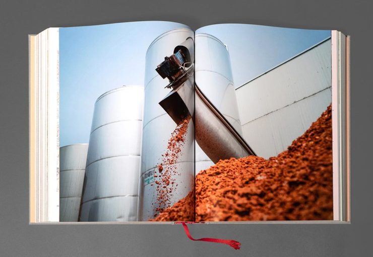
    Book design by Kimberly Varella.

    The trend, mentioned above, to mix paper stocks and styles is shown to full effect here. This book has too many great examples to post; see more.

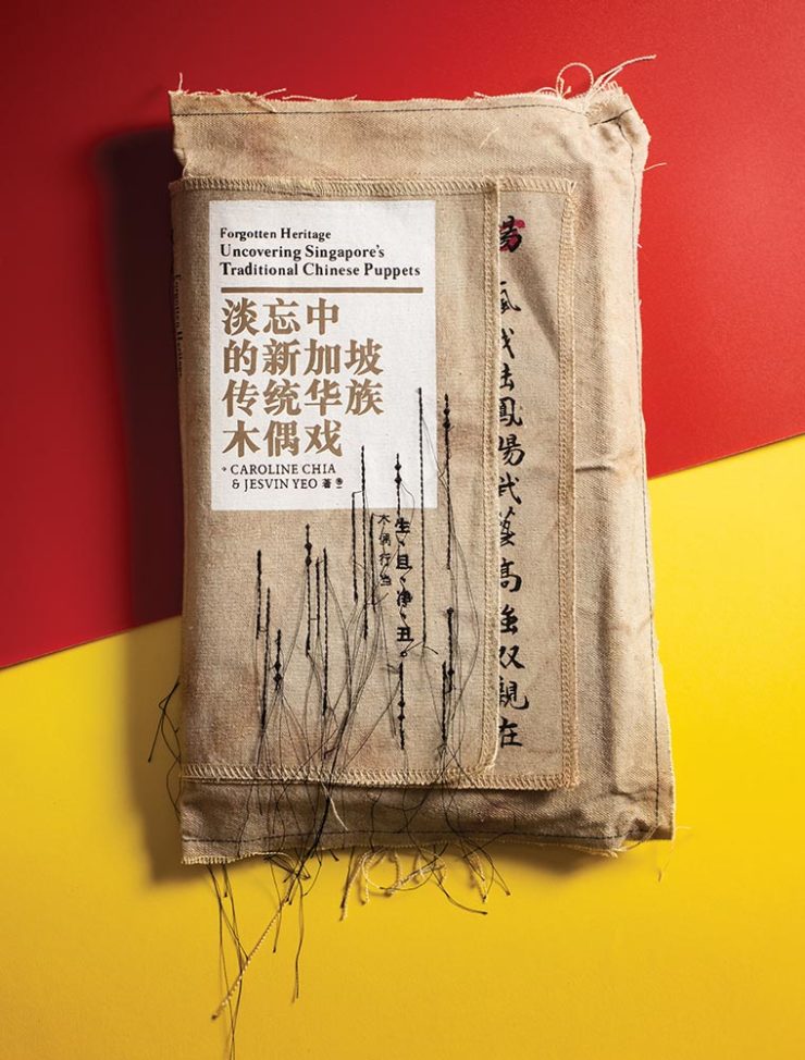
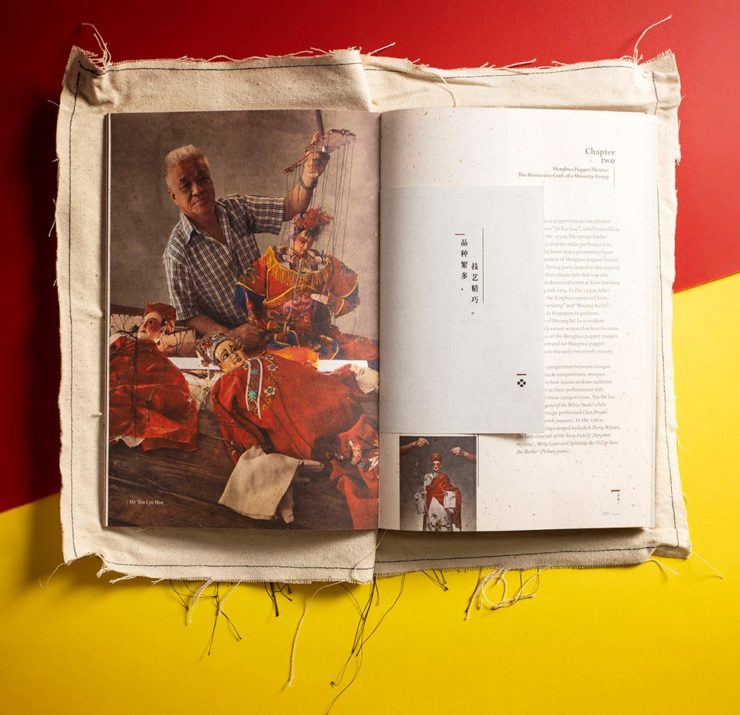
    Meanwhile, Uncovering Singapore’s Traditional Chinese Puppets may not be a title you’d automatically reach for, but…:

    Book design by Alvin Ng and Jesvin Yeo.
    Book design by Alvin Ng and Jesvin Yeo.

    More mixed papers (sizes, too), more great stuff. (See additional examples.)

    Cover and jacket design by Lindsay Starr.

    This is an interesting, compelling cover and jacket design as shown above. However, once again, rather than post it all here, I’m just hoping to whet your appetite — you need to see this one unfold (literally).

    Cover design by Raúl Aguayo.

    Great colors, great combinations, great cover.

    Cover design by Vi An Nguyen.

    I’m always a sucker for photographs of practical items used in ways that make book covers great, and this one’s a shining (pink) example.

    Book design by Maria Elias.

    There’s so much great design work done in the children’s book market it’s not even funny. The first of two great examples. (See more from this title.)

    Book design by Mỹ Linh Triệu Nguyễn.

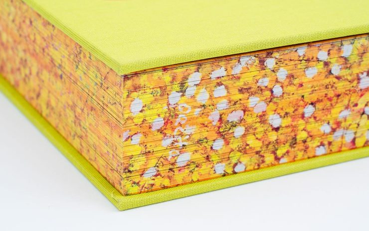
    A book’s edges are so often a canvas left unexplored. Not with this book, Pacita Abad. (See examples from this title’s wonderful interior, too.)

    Cover design by Christopher Sergio.

    I’ve highlighted this design before, but every time I see it I like it more. Glad to see it as an AIGA 50 Covers winner.

    Book design by Brian Johnson, Michelle Lamb and SilasMunro.

    Typographic Messages of Protest, indeed — done in an appropriately powerful way. The suggestion of motion is a great touch.

    Cover design by Chris Allen.

    “Block party,” defined. Excellent.

    Book design by Jay Marvel.

    The second children’s title on this list, including an interesting and distinctive style. (See the interior of this book.)

    Again, these are only some of my favorites — there are many more, all of which deserve a look. Congrats to all the designers who made these title happen and thanks to the AIGA for this annual delight.

    See also: Last year’s winners. Via: It’s Nice That.