Joe Biden’s Branding Was Both Traditional and Trippy, and It Looks Like the Future of Politics
AIGA’s Eye on Design takes a look at the beginnings and evolution of Joe Biden’s campaign branding. Great read.

Photography and design for print production
Design specifically regarding typography; that is, letterforms, type on a page, cover, or web site, and more.
Joe Biden’s Branding Was Both Traditional and Trippy, and It Looks Like the Future of Politics
AIGA’s Eye on Design takes a look at the beginnings and evolution of Joe Biden’s campaign branding. Great read.
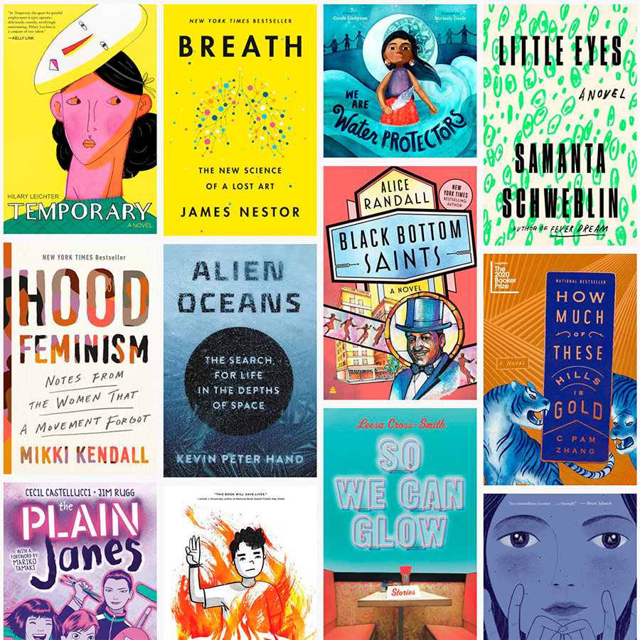
The 2020 edition of NPR’s Book Concierge is here! Take a look at recommended books by category or zoom out and enjoy at look at 2020 in book design, all 383 examples of it. Enjoy!
Bonus: Jason Kottke’s roundup o’ 2020 lists is comprehensive and intelligent, as usual.
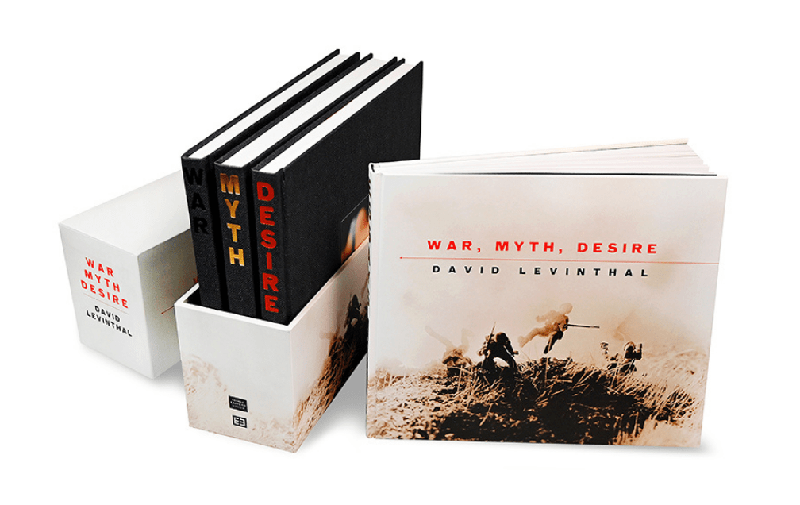
After reviewing hundreds of entries every year, the jury for AAM’s annual Museum Publications Design Competition awards only one publication with the Frances Smyth-Ravenel Prize for Excellence in Publication Design, recognizing it as the best submission overall. This year, the winner is David Levinthal: War, Myth, Desire, a publication of the George Eastman Museum in Rochester, New York, designed by Design Monsters studio. We recently talked to the book’s designer, George Corsillo,to learn more about the concept behind his prizeworthy design: a four-volume retrospective of the artist David Levinthal’s photographs which took two years to complete.
In fact, for all his acclaim in the field of book design, Mendelsund himself isn’t particularly fond of book covers, generally seeing them as an impediment that inevitably colors a reader’s perception of a book. “As much as I love book covers — I love making them, it’s fun — I don’t love the fact that there’s somebody between me and the text.”
These days, actually, the renowned book designer who never wanted to be a book designer tends to simply rip the covers off his books altogether. “If it’s a paperback, I’ll rip the cover off,” he says. “The books that are most important to me in my life don’t have covers on them.”
I didn’t know Peter Mendelsund’s name off the top of my head [Memory not what it used to be? —Ed.], but we’re sure familiar with his work, such as The Girl with the Dragon Tattoo and the Atlantic’s recent redesign. And what an interesting relationship with book design he has. Read more
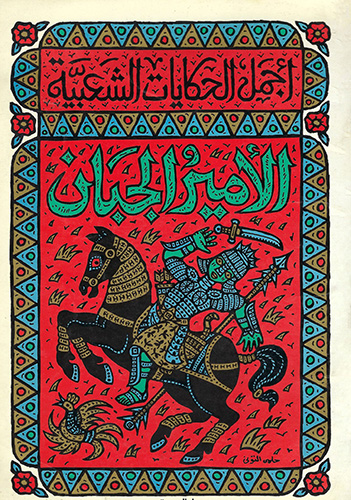
Egyptian designer Moe Elhossieny talks us through why he launched his Design Repository and what he’s already learned about Arabic book design from the collection.
The history of the album cover and show poster begins with jazz.
Lots and lots covered here, including things this huge fan of the movie never knew — including specifics on the fonts, type, and more. When you have a few minutes, grab a beverage and enjoy!
“At the Columbia Journalism Review, we capitalize Black, and not white, when referring to groups in racial, ethnic, or cultural terms. For many people, Blackreflects a shared sense of identity and community. White carries a different set of meanings; capitalizing the word in this context risks following the lead of white supremacists.”
Read more of this timely and appropriate article (from a great and authoritative source.)
“The digital Letterform Archive has made nearly 1,500 objects accessible to browse online through over 9,000 high-resolution images,” Hyperallergic notes. Some good background here, too. Check it out.
“Book design has become more important than ever – but what makes an iconic jacket, asks Clare Thorp.” BBC Culture takes a look.
Once again, it’s time for the annual 50 Books, 50 Covers awards!
My favorites: Blackness at MoMA, Specimen Days, 14 books by Gustavo Piqueira • 2012-2018), Jacob Lawrence: The American Struggle, and … not all of them, certainly. Interesting and challenging. Definitely worth checking out!
Type designers love a good pangram. Pangrams, of course, are sentences that contain each letter of the alphabet at least once, of which the quick brown fox jumps over the lazy dog is surely the most famous. […] I find them singularly useless in type design, and I don’t use them in my work.
Find out what does work over at Hoefler&Co. with another fantastic post on type design.
Washington Square News discusses NYU’s attempts to — like pretty much everything else — get book design online:
The studio course focuses on book art and teaches students about the production of books, from interior and exterior design to binding techniques. Without the physical studio space and the materials it provides, digital learning has paved an unprecedented pathway for the course to continue.
Five typography-adjacent books for indoor times, from Johnathan Hoefler:
All five share a sincerity, an attention to detail, and a sense of humor that has kept me smiling for weeks.
Way back in the day — that is, before the mid-nineties — publishing on the Mac consisted of Quark XPress. Okay, sure, there was Aldus Publisher and some bit players, but it was basically Quark or nothing. I used Quark in book design back then, and … basically hated it.
I was one of the early adopters of InDesign, dragging co-workers and companies along with me, as part of my time working at Tropicana. Not the juice cartons themselves — those were done in Illustrator — but the ancillary stuff, like marketing materials, sell sheets, and so on.
AppleInsider ran a piece a while ago (I’d missed it, initially), “How Adobe InDesign took over publishing with Steve Jobs’ help.” Good history for those of you who don’t know about those days or want a trip down memory lane, best summarized, in fact, by a commenter on the article: “This covers an interesting arc. Adobe went from an ambitious upstart trying to unseat an established, albeit arrogant, standard, to becoming the arrogant standard.”