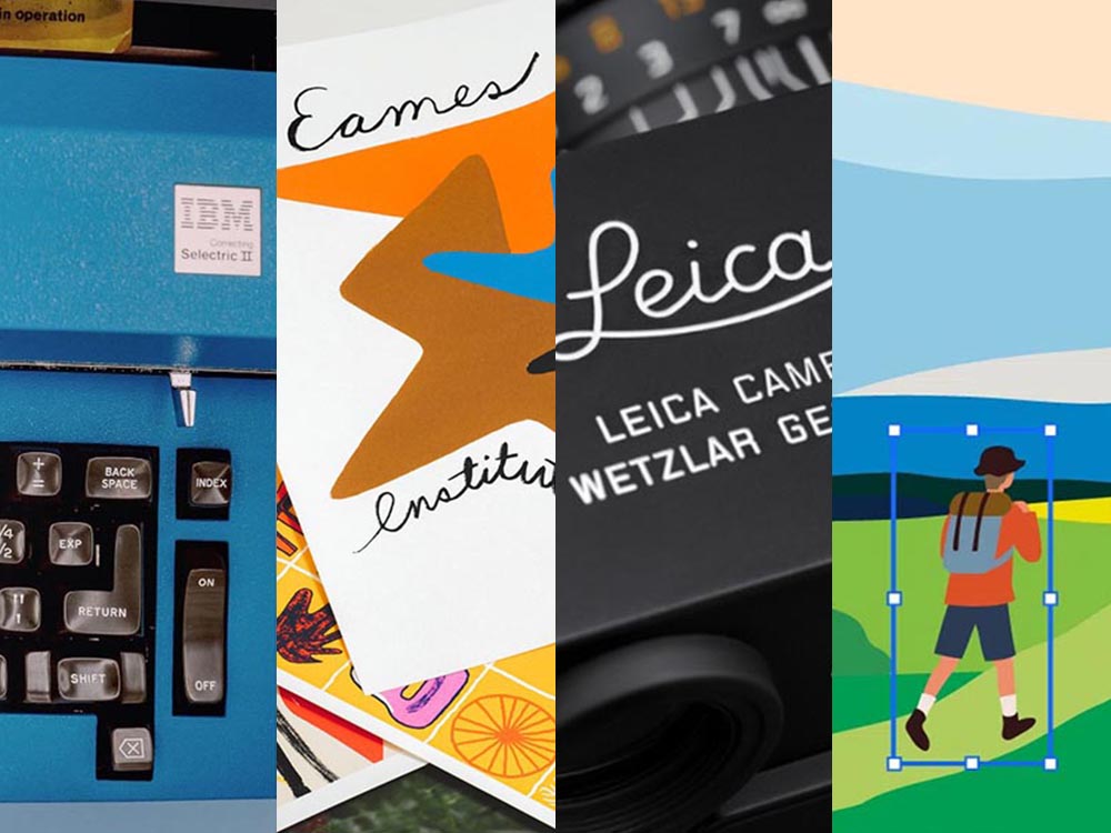
Category: Business

The business of design, whether books, book design, architecture, photography, technology, or any of the other subjects Foreword covers.

  • Beautifully Briefed 25.2: Late Winter Stew

    Beautifully Briefed 25.2: Late Winter Stew

    A bunch of tasty ingredients in this month’s post — from friendly identities and open-source typefaces to feel-good photography. Once past the minor rant we’re that covers the other meaning of stew, that is. Read on.

    It’s Nice That on Copyright and Reuse
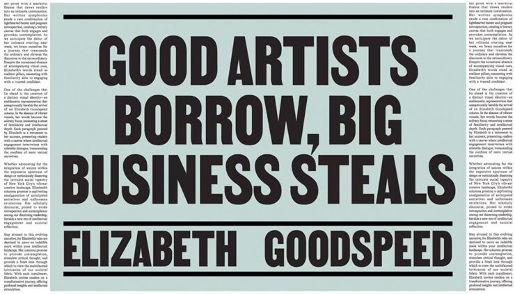
    Elizabeth Goodspeed, editor-at-large for It’s Nice That, has a great column up regarding copyright and the current — and trending — business climate, especially with regard to copyright: it’s become the norm, she argues, for companies to mine open-source and expired-copyright imagery instead of hiring an artist, a trend exacerbated by the rise of AI. “Instead of safeguarding creators, copyright now favors whoever has the resources to outlast their opponent in a legal battle,” she writes. “Since public domain material already looks polished, using it also eliminates the time, effort, and expense of creating something new from scratch (not to mention the time spent building its associative meaning from the ground up). But why would anyone ever commission an illustrator when they can just pull something free from an archive?”

    She’s done it herself:
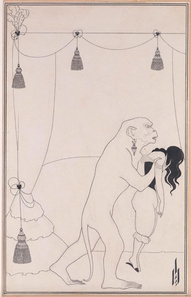
    The Murders in the Rue Morgue, 1895 (public domain). Aubrey Beardsley.
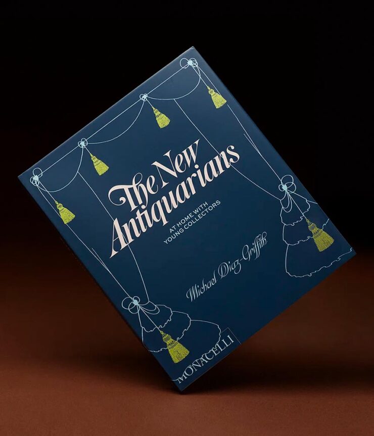
    New Antiquarians, 2023. Book design by Elizabeth Goodspeed.

    She also points to a new UK proposal for a data mining exemption to be given to AI companies. “[I]t would lead to a “wholesale” transfer of wealth from the creative industries to the tech sector,” Sir Paul McCartney argues. (Source.) But isn’t that true of the larger picture these days, no matter the country?

    Not all borrowing is the same. Copying is often more about power than propriety. When working with archival material myself, I like to think in terms of the stand-up comedy rule: punching up vs. punching down. Picking up visual motifs from a billion-dollar corporation that’s built its empire on copyright hoarding? That’s punching up. Repackaging the work of a living artist from a marginalised background without credit or compensation? Likewise, using found material for an indie zine is a far cry from pulling from the same source for a corporate client that could easily afford to commission something new.

    — Elizabeth Goodspeed, It’s Nice That Editor-at-large

    It is most certainly a trend in book design — but the bigger question here is one she states as fact: “[r]ather than referencing the past, designers are stripping it for parts.” It’s worth stepping back, as designers, and consider how we source — and use — imagery.

    The entire article, only part of which is discussed above, is worth a read. And more than a moment’s thought.

    Okay, on to the fun stuff.

    An author on her own book design

    Mary Childs, a co-host of the Planet Money podcast on NPR, writes on LitHub what it’s like to tackle the cover design for the book she’d written:
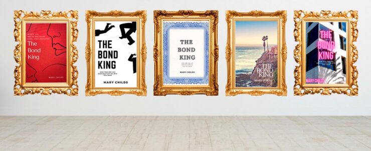
    LitHub’s great cover graphic — pun likely intended — for Mary’s attempts.

    “This very slight, low-stakes request for ‘inspiration’ became an all-consuming assignment. My brain started spitting out cover ideas. And then more cover ideas. I was sure I would break through and create the Great American Finance-book-that-reads-like-a-Novel Cover,” she writes — and, better still, backs up with illustrations.
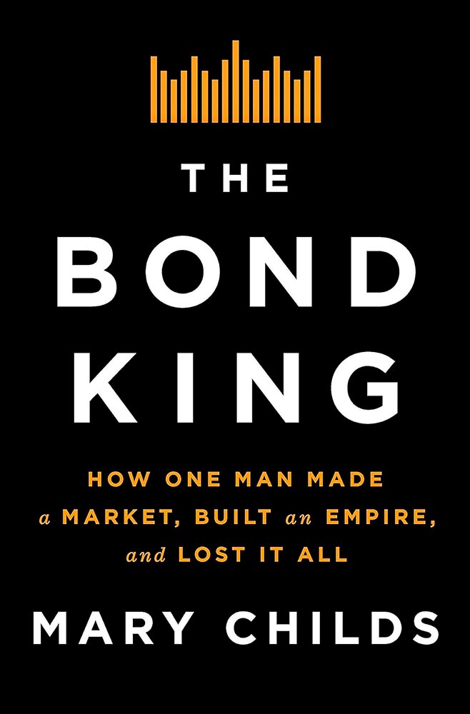
    Cover design by the Flatiron Books in-house art dept.

    In the end, she left it to the professionals — but the trip is absolutely worth the read. (Be sure to follow the Na Kim link, too.) Via Kottke.

    Special Bonus #1: Speaking of Na Kim, and also via Kottke, she’s somehow found time to start painting. “Be careful what you’re good at, you’re going to get stuck doing that.”

    The Fantastic Mr. Font (and other big Dahls)

    “Pluckish and playful” is more than a description of the wonderfully-named Fantastic Mr. Font, it’s the description of the new identity for the Roald Dahl Story Company. (Which is, unfortunately, a division of Netflix — but we’ll leave that for another day.)
    Just right. So, too, it the font’s interaction with various illustration elements:
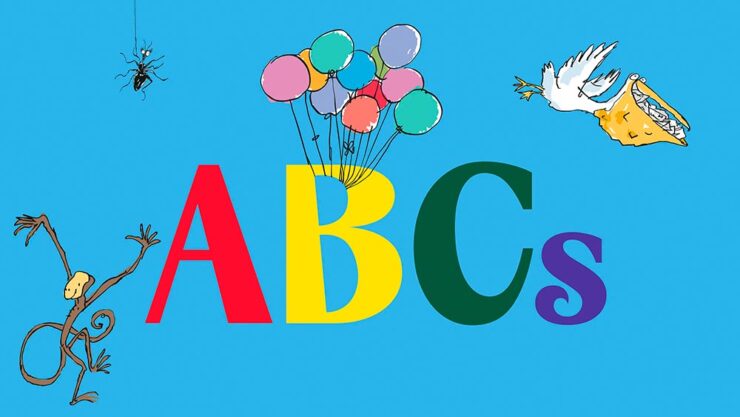
    Roald Dahl and Sir Quentin Blake — plus the new font.

    The typeface was “developed in collaboration with type foundry Pangram Pangram, the font is a customisation of its existing font PP Acma, turning its already unconventional characteristics into something ‘more mischievous,’” Ellis Tree — another great name — writes at It’s Nice That.

    Read the full, well-illustrated story.

    Special Bonus #2: While we’re on the subject of branding, check out the new look for Publisher’s Weekly:
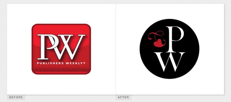
    BrandNew’s before-and-after of the PW logo.

    It’s actually a return to an older form, but updated. Their website has a brief explanation. (Via BrandNew.)
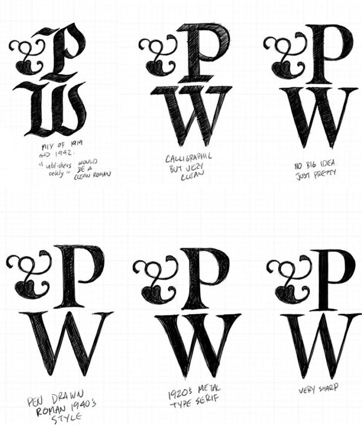
    PW examines options for their new/old logo.
    Some Fantastic Fonts
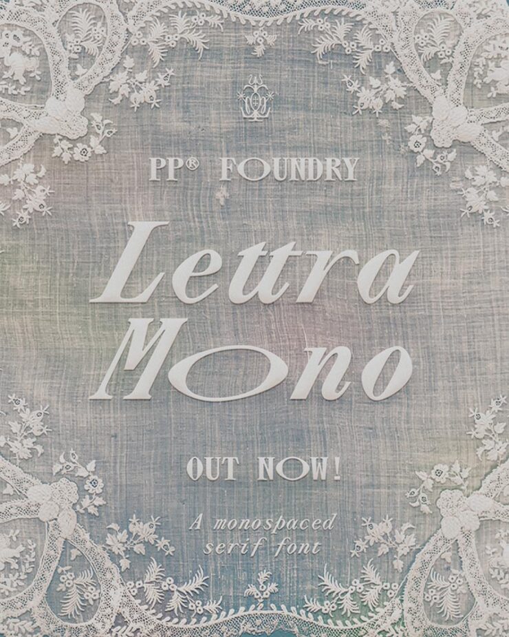
    Lettra Mono

    Speaking of Pangram Pangram, let’s start there: their Lettra Mono was the standout of Creative Boom’s roundup of new fonts for February. Monospaced serif fonts are unusual, but good ones….
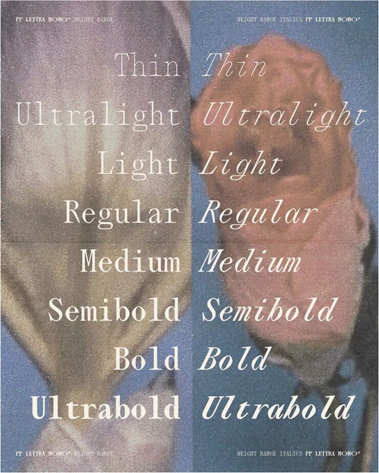
    The italics, especially.
    Inclusive Sans

    CB also chose the incredible update to Inclusive Sans, which was also the subject of an article at It’s Nice That — and, better still, free, open-sourced, and now available in five-weight goodness at Google Fonts.
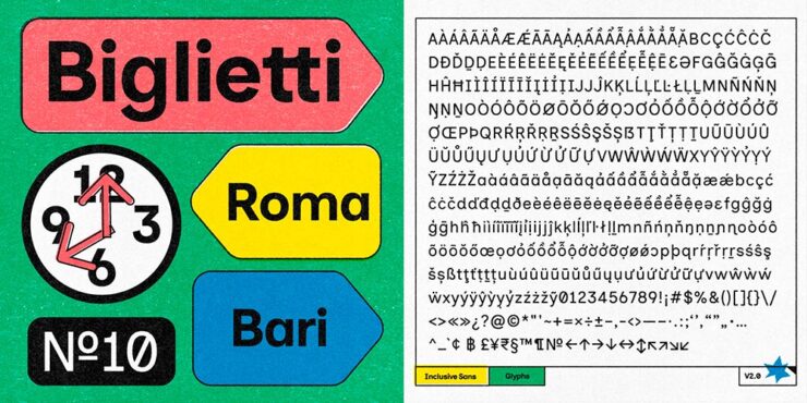
    Love the retro style of the supporting images.

    “Inclusive Sans is a new typeface from Olivia King that puts accessibility at the forefront,” It’s Nice That writes. “It’s arisen from the type designer’s research into typographic accessibility and readability – from highly regarded traditional guides and papers to more modern approaches to letterform legibility.”

    Available in a variable weight, too.
    Gorton

    Marcin Wichary — he of Shift Happens fame — pens (heh) an comprehensive and incredibly well-illustrated article on Gorton, a typeface you’re undoubtedly seen but don’t know.
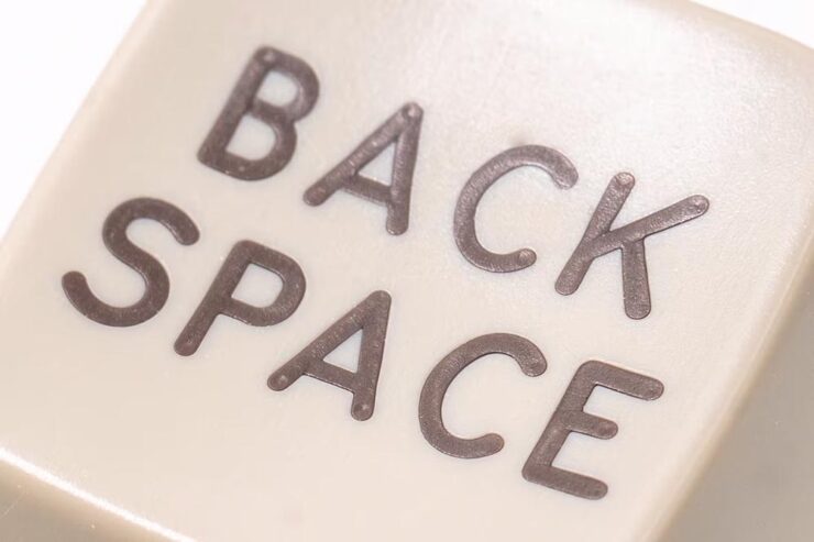
    Anyone who knows Shift Happens will recognize the illustrative style. Photograph by Marcin Wichary.

    “One day,” he writes, “I saw what felt like Gorton on a ferry traversing the waters Bay Area. A few weeks later, I spotted it on a sign in a national park. Then on an intercom. On a street lighting access cover. In an elevator. At my dentist’s office. In an alley.”
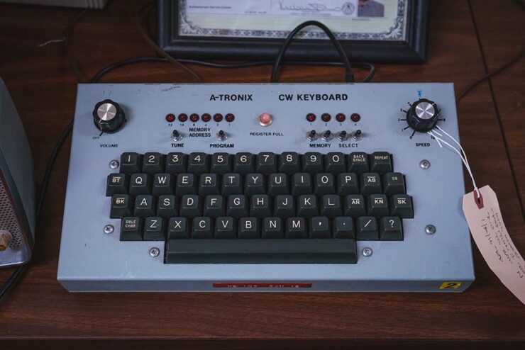
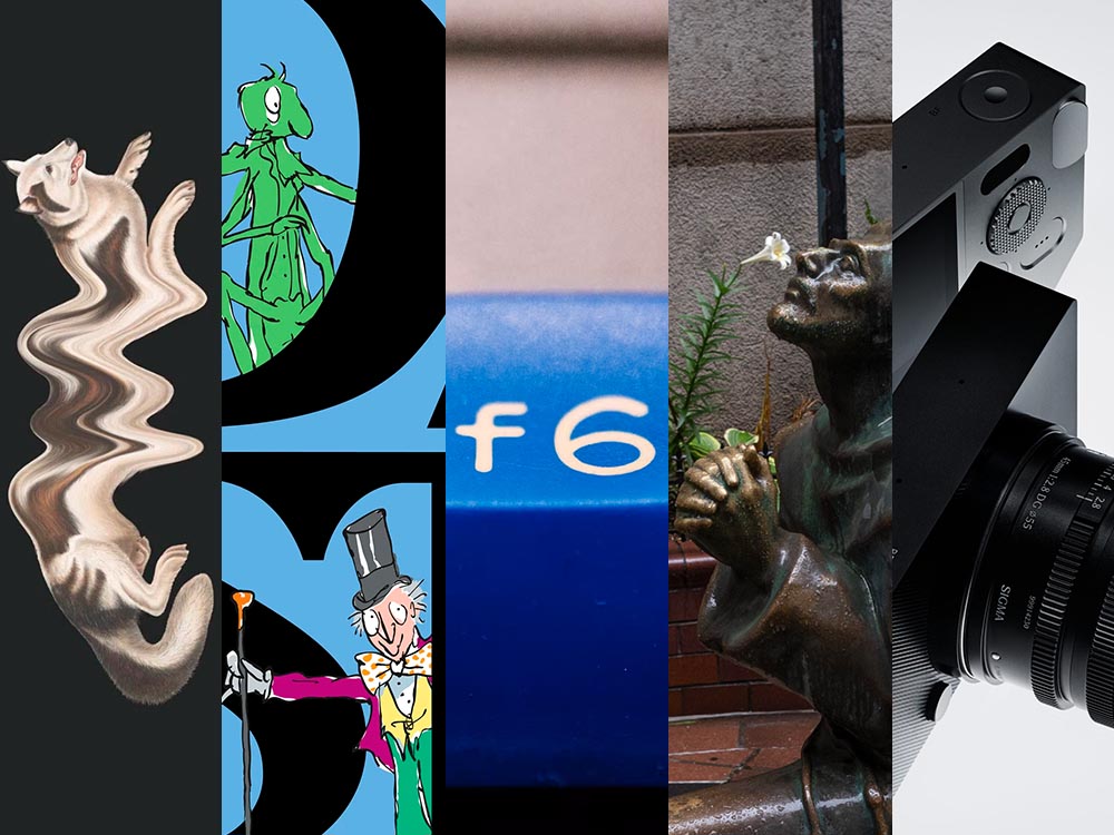
    See also the f6 in the title image, above. Photograph by Marcin Wichary.

    It’s a long post, so save it for when you’ve a minute to enjoy — but 110% worth it.

    Special Bonus #3: Creative Bloq has a list of the best typography of the 1920s — “from Futura to Industria Gravur” — as chosen by designers. My fave? Gill Sans, of course.
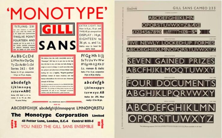
    Used in Saab’s advertising, amongst about a billion other examples.

    Special Bonus #4: Nick Heer at Pixel Envy comments on a list posted by Robb Knight: “Something very useful from the Atlas of Type: a huge list of type foundries.” A good Canadian citizen, he reminds us that Pangram Pangram is, in fact, Canadian. More: “I was particularly excited to learn about Tiro Typeworks. They have a vast library of type for scientific and scholarly works [… I]f you are reading this on MacOS, you probably have STIX Two installed.”

    Some Great Photography

    Comet G3 visits every 600,000 years, they say. Hmph.
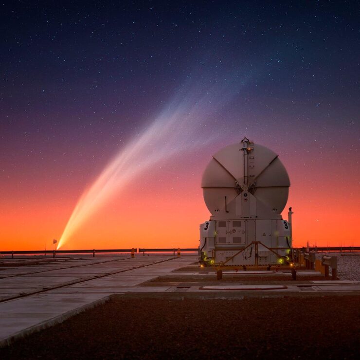
    Yuri Beletsky of the ESO caught G3 over the telescopes in Chile.

    Great stuff. See more at PetaPixel.

    Meanwhile, on the subject of space — and PetaPixela reminder that one of the most infamous photographs in history turned 35 on Valentine’s Day:
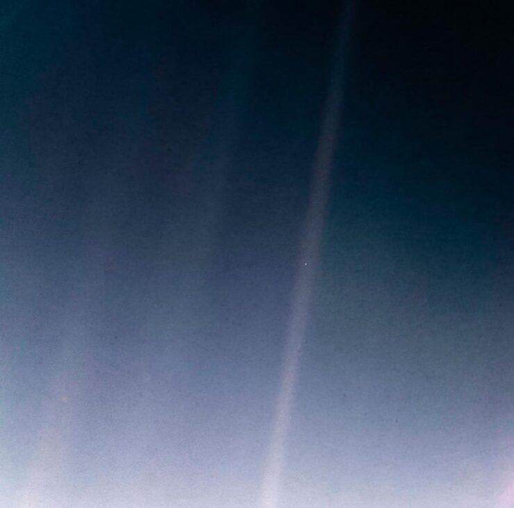
    The Pale Blue Dot. (2020 remastered edition.)

    Aaaand one more from PetaPixel: a book. Eight photographers documented 24 hours at the Vienna Airport, offering up more than a few behind-the-scenes shots — in celebration of its 70th anniversary:
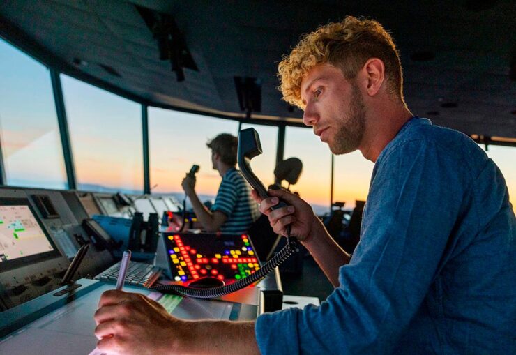
    Photograph by Jérôme Gence.

    “The project was overseen by Lois Lammerhuber,” PetaPixel writes, “a publisher and photographer, who has since turned the collection of images into a book titled The Dream of Flying.”
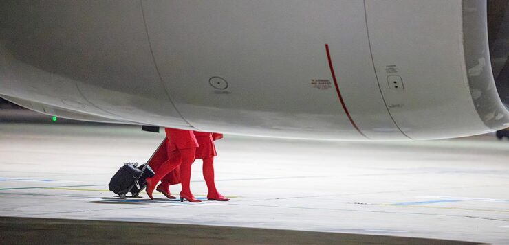
    Photograph by Ulla Lohmann.

    The project was “about showing the people who use the airport as well as highlighting the staff who ensure all the airplanes depart and land safely.” My favorite shot:
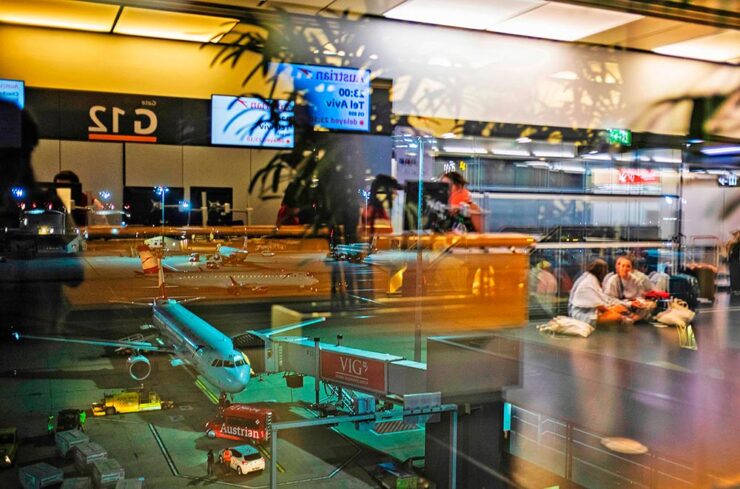
    Photograph by Ana María Arévalo Gosen.

    I’m an airport and large/commercial plane junkie — and old enough to remember when all-access at the local airport wasn’t a big deal — so it was great to see these.

    Lastly, from This is Colossal, another round of the “coincidental” style of Eric Kogan:
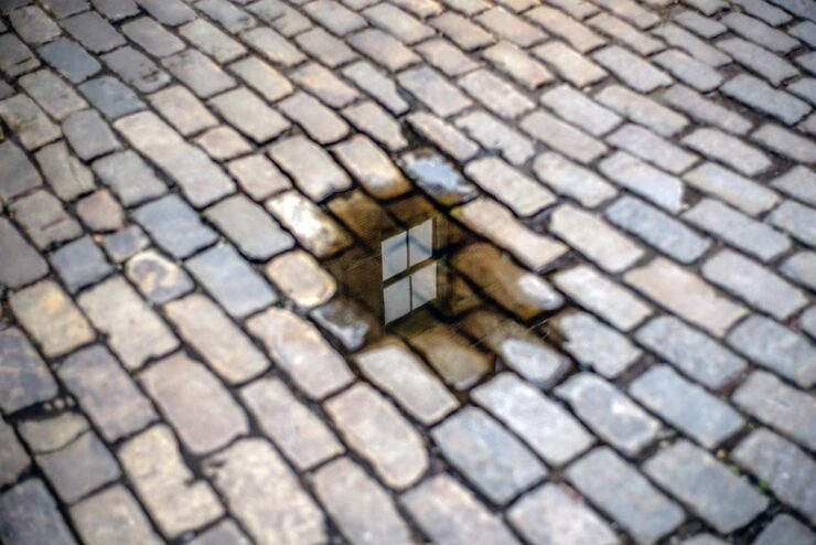
    Photograph by Eric Kogan.

    All NYC this time. Check ’em out.

    Special Bonus #5: Art News notes that Paul Rudoph’s Walker Guest House is for sale for the bargain price of $2 million. It’s a kit home that’s been assembled in various places, including the grounds of the Ringling Museum in Sarasota, Florida. (It’s currently in storage in Rhinebeck, New York. Shipping is not included.)

    So why is in the photography section, you ask?
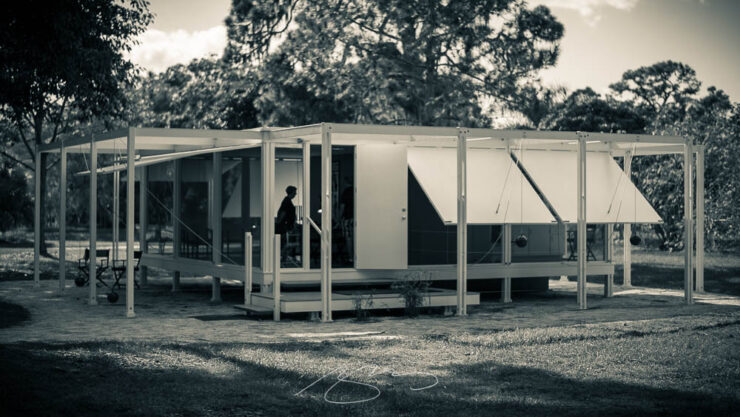
    Photograph by Giles Hoover.

    That’s why. Check out more of my photography from Ringling and Sarasota. (The Walker images are near the top.)
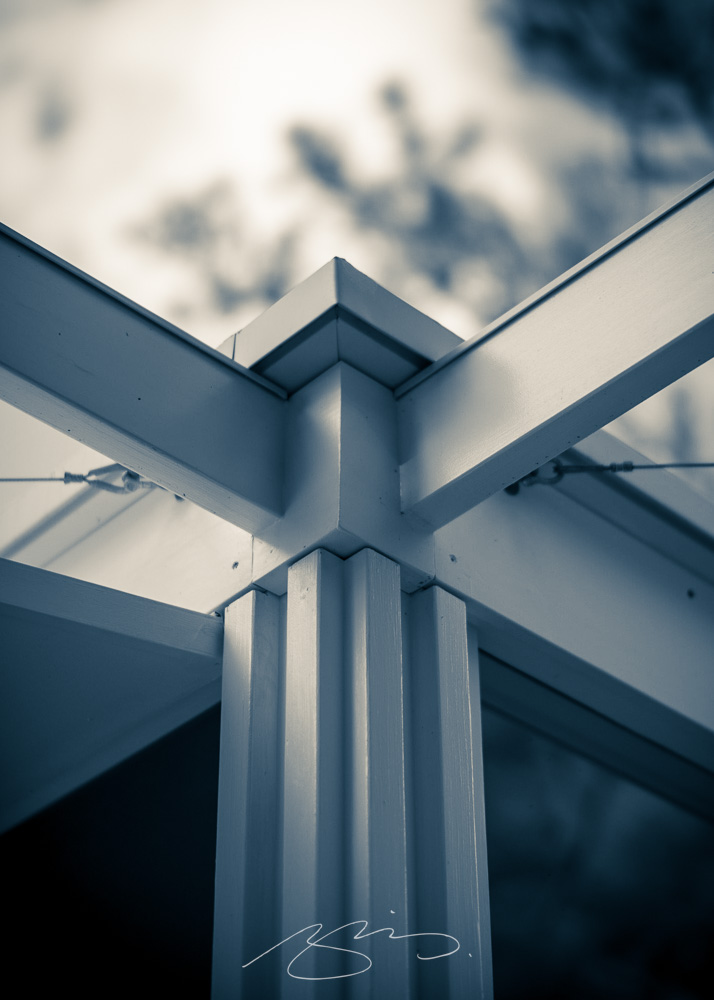
    Photograph by Giles Hoover.
    Sigma: a new BFF?

    No, that’s just BF — it stands for “beautiful foolishness,” after a line from a poem in Okura Tenshin’s The Book of Tea — but, as usual for them, something different. Something good.
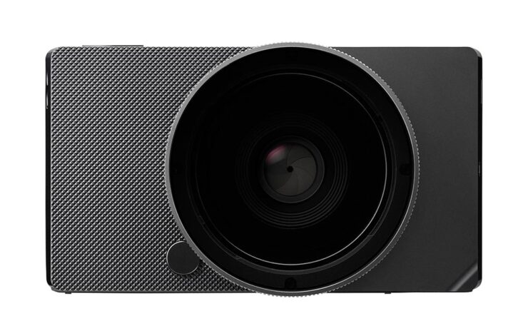
    Like the FP before it, there’s nothing you don’t need, bordering perhaps on a minimalism that’s … stark? No viewfinder, no stabilization, no mechanical shutter, built-in memory (so no card slot), haptic interface. But style for days, a great shape and texture, and absolutely the right size.
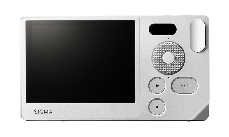
    It’s made at the rapid clip of nine per day, because it’s made from a single billet of aluminum — shades of the Leica T/TL/TL2 (something I maintain was before its time, and discontinued short-sightedly) — except full-frame. And, of course, supported by Sigma’s extensive catalog of L-mount lenses. (Another commonality with the TL.)
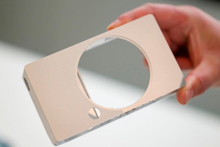
    At $2000, it’s the right price, too. Read more here or here or here.

    Oh, and one more thing: Sigma has a new identity to go with the BF:

    Slightly more formal, slightly on-trend typography, which is fine — but the logo is clever in being both a letter and a lens. More of that just right to close out the day.

    Special Bonus #6: Sigma’s CEO Kazuto Yamaki is charismatic, interesting, and dedicated, as seen in the videos PetaPixel has introducing their new HQ building in 2022. Love the library-wrapped staircase.

    Update, 4 March 2025: PetaPixel has posted a YouTube podcast/interview with Kazuto Yamaki, in which he talks about the BF and possibly a new, “serious” camera to compliment their 300-600mm lens. (This is probably a better intro to Sigma’s CEO than the above.)

    Special Bonus #7: TTArtisan, the Chinese manufacturer making interesting L-mount lenses — I have two, both solidly in the cheap-and-cheerful category — is about to introduce their first camera … and “interesting” is, in fact, the best way to describe it:
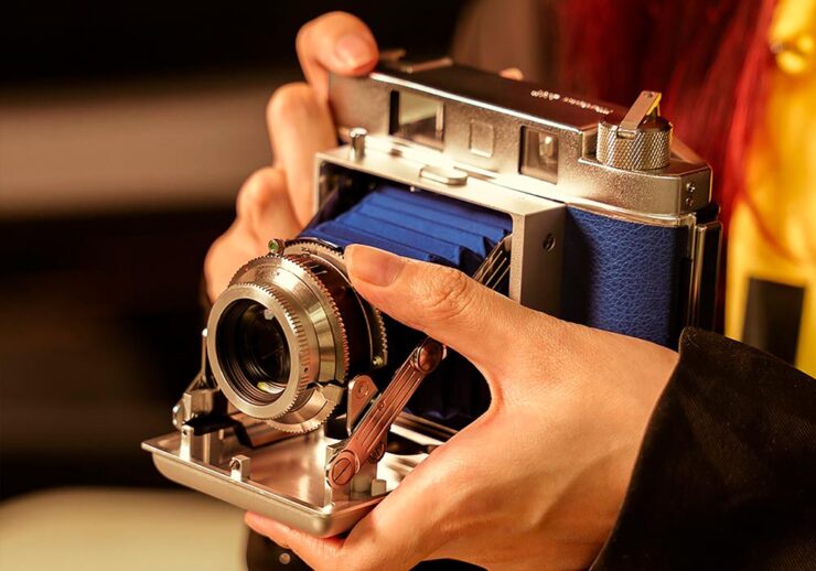
    Purely mechanical, no batteries required, instant film camera that’s decidedly retro.

    See you in the spring!

  • Beautifully Briefed 24.12: New Year’s Eve Fireworks

    Beautifully Briefed 24.12: New Year’s Eve Fireworks

    Let’s continue a couple of discussions before closing out 2024, and send you into 2025 with some photographic and typographic goodness.

    More AI Book Design

    This was mentioned in another context in July, but is heading our way more aggressively as time goes by, with Microsoft and TikTok, among others, getting into the publishing arena.

    Cover design: unknown. (Human or machine: unknown.)

    While Microsoft’s new imprint, 8080 Books, plans “to test and experiment with the latest tech to accelerate and democratize book publishing.” They’re not entirely up-front about what that is — and might not know themselves yet, given the rapidly evolving tech and marketplace. That said, with the corporate giant’s name attached, we can be assured of some level of quality.

    Yes, I just wrote a sentence suggesting that Microsoft is a guardian of quality. (“Books matter. In a deluge of data. In a bloat of blogs, a sea of social, and a maelstrom of email. Books will always matter,” they write.)

    With others, the for-profit nature — TikTok’s engagement-before-all-else approach speaks volumes (or writes volumes, as the case might be) — assures that quality might come behind, say, slop. Publisher’s Weekly reports that 320 publishing startups have emerged just in the last two years, most in the AI space, adding to the 1,300 noted as of 2022. (PW also notes, “It is widely believed that each of the Big Five publishers has internal AI projects discreetly hidden from view.”)

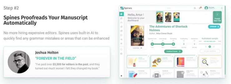
    And then there’s this: introducing Spams Spines, your AI book design and book completion service: “[f]rom manuscript to book in your readers’ hands – a single platform to help any author proofread, cover design, format, print, and distribute over global channels — zero tech know-how required.” Prices start at $1500 and promise a finished product in less than 30 days.

    Their goal is to release 8,000 books per year. AI is heavily involved:

    There’s a Sherlocked joke here somewhere….

    Because, yes, you want a machine to suggest that Sir Arthur Ignatius Conan Doyle needed assistance regarding a turn of phrase. (Never mind his expensive editor.)

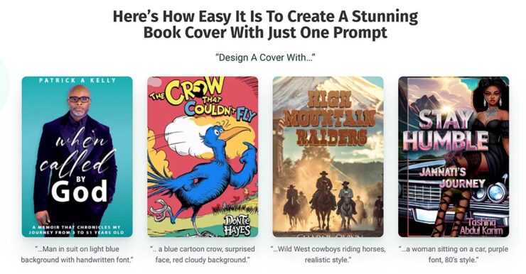
    The first and third are really “only” bad. However, Dr. Seuss would like a word with Spines’ AI training dataset, please, and the cover for “Stay Humble” defies words.

    But it’s the book design that got my attention: these are apparently the good ones, the cited examples to which someone says, “Yes! Take my money!”

    The sad thing is that people will say that. Have already said that. And there’s much, much on the publishing industry’s horizon. Our horizon.

    Read more at The Conversation, “The tech world is ‘disrupting’ book publishing. But do we want its effortless art?” Shout out to the AV Club and the aforementioned PW article.

    The Cat Leaps

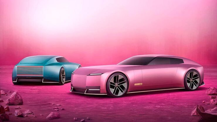
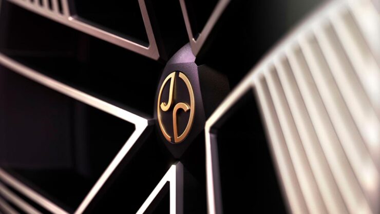
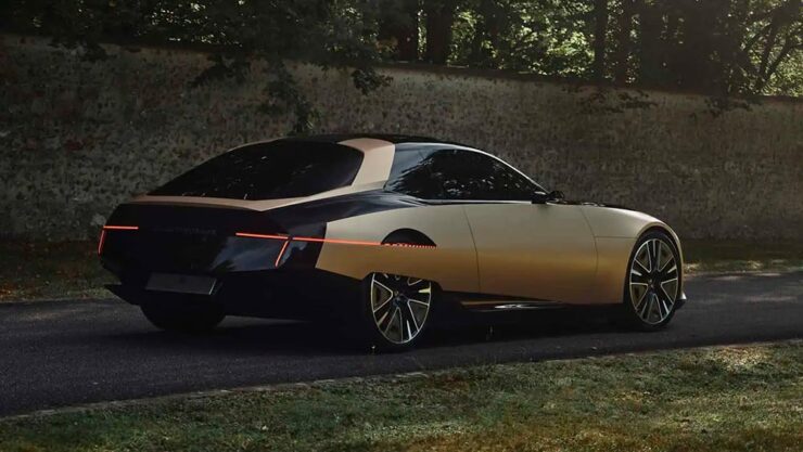
    Last month, we left off Jaguar’s continuing road trip with a teaser. Let’s get right to it. The car’s called the Type 00:

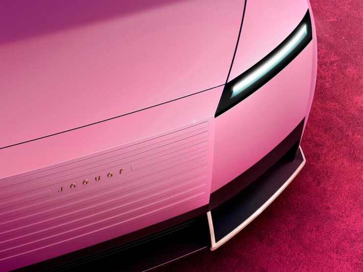
    Some details:

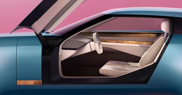
    The interior:

    The internet, predictably, has lost its collective … um, mind. However, amongst the melee, there are a few items worth mentioning.

    Creative Boom: “If the new logo seemed divisive in isolation, seeing it brought to life with Type 00’s design has brought much clarity. The flush surfaces, panoramic roof, and glassless tailgate – all adorned with the new Jaguar device mark and reimagined leaper – create a cohesive vision of modern luxury. Rawdon Glover, managing director of Jaguar, emphasised the importance of this shift: ‘We have forged a fearlessly creative new character for Jaguar that is true to the DNA of the brand but future-facing, relevant and one that really stands out.’”

    The quote there is something to pay attention to. Read those words again, and think about the actual choice of language; it’s this, exactly, that has struck some. Armin at Brand New, for instance: “[W]hat I dislike the most about the new Jaguar brand: its tone of voice is INSUFFERABLE. Everything from the platitudes in the campaign to the script of McGovern’s presentation to the press releases is obnoxiously over-confident and self-congratulatory.” (Brand New, while excellent, is subscription-only — alas without a sample article. Here’s a link anyway.)

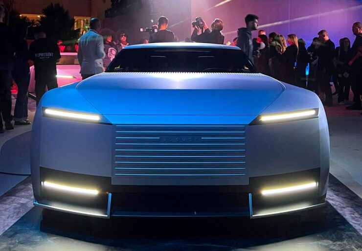
    Meanwhile, Dezeen provides us some real-world images from the Miami launch:

    Wai Shin Li, via Dezeen

    But it’s The Autotopian that stands out. They have not one but two excellent articles by Adrian Clarke, an ex-JLR1That’s Jaguar Land Rover, before it was, um, initialized by owner Tata. designer, who has several important points to contribute:

    A couple of weeks ago, the cancelled X351 Jaguar XJ leaked onto the internet. During my time at Land Rover, I saw this car back in 2018 and can confirm this is indeed, or rather was the EV XJ. Back when Mr. Tata was still alive every six months or so there would be a big board level presentation for him on upcoming products. […] I was privy to all the future production Jaguars and concepts. There was a J-Pace SUV to sit above the F-Pace (no problem in revealing this as it’s common knowledge) and everything else was as you’d expect. These cars were then cancelled as part of the revamp and one absolutely incredibly beautiful and exceptional proposal aside, nothing of value was lost.

    It’s the first time I’d seen the cancelled-just-before-release XJ EV, and despite the incomplete body panels and obviously-on-the-sly phone shot, it’s incredibly disappointing. They made the right call.

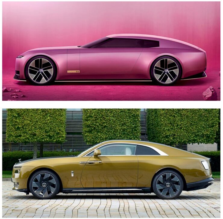
    Compare it next to a Rolls Royce Spectre, a car the production Type 00 will be a competitor for, and see how successfully it hides its bulk in profile. [I]n the side view, particularly in the bottom half, I’m seeing some Range Rover. The crisp shoulder line, the kick-up of the tail behind the rear wheel, and the feature line along the bottom of the bodyside all scream Range Rover. This is exacerbated by the verticality of the front and rear of the car – the new full-size Range Rover and Sport have sharply docked tails. I heard that the initial sketch of this car was done by Massimo Frascella before he departed for Audi. Frascella was McGovern’s right-hand man at Land Rover for decades before Ian Callum retired and McGovern used the opportunity to bring both the Jaguar and Land Rover studios together. So maybe that’s where this Range Rover influence comes from.

    The Jaguar Type 00, top, and Rolls-Royce Spectre, bottom, courtesy of The Autopian.

    We must remember this is only a concept. The actual production car will be a four-door GT. This is only a preview of the visual style of future Jaguar models. It’s certainly striking, but you’d struggle to call it beautiful. It’s also monolithic and slabby.

    Let’s hope this brutal revamp is […] successful, because there are a lot of jobs depending on it.

    — Adrian Clarke, ex-JLR designer

    There’s much more from those two articles, too much to quote here, so please go read them — the initial report is more on the design, while the second delves into the why: “Why Jaguar Had To Blow Up Its Brand In Order To Save It.

    Meanwhile, I’ll actually be rooting for JLR to pull this one off. I’m not in the target audience — at all — but Jaguar needed to do something radical and, by God, they did just that. The concept is interesting. Some of the details are fantastic. Here’s hoping, indeed.

    Update, 15 Jan 2025: Turns out the Jaguar’s designers were a little worried about the outcome — or the outsourcing, in this case — and its effect on the brand. The Drive has the details.

    Special Bonus #1: Motor1 has a feature on Ian Callum’s current whereabouts. There are too many hypercars these days, but the Skye looks cool:

    The Callum Skye concept. (An island buggy?)
    Some Extraordinary Items of “Normalcy”

    To close out 2024, let’s take a break, pour a beverage, and enjoy some of what you read Foreword for: great photography, typography, and design.

    Northern Lights

    I didn’t know — or didn’t remember — that amongst the glut of photography contests is one dedicated to the phenomenon known as the Northern Lights.

    Cosmic Explosion, Isteria, Croatia. Photograph by Uroš Fink.

    PetaPixel reminds us that Capture the Atlas’ Northern Lights Photographer of the Year competition features some exceptional opportunities to make spectacular captures this year due to the solar maximum — the peak of its eleven-year cycle.

    Celestial Reflection, Dartmoor National Park, UK. Photograph by Max Trafford.

    The 2024 competition awards feature 25 winners, each with a narrative and each a striking example of the larger system we’re part of. Check it out. (Also via This is Colossal.)

    Nature

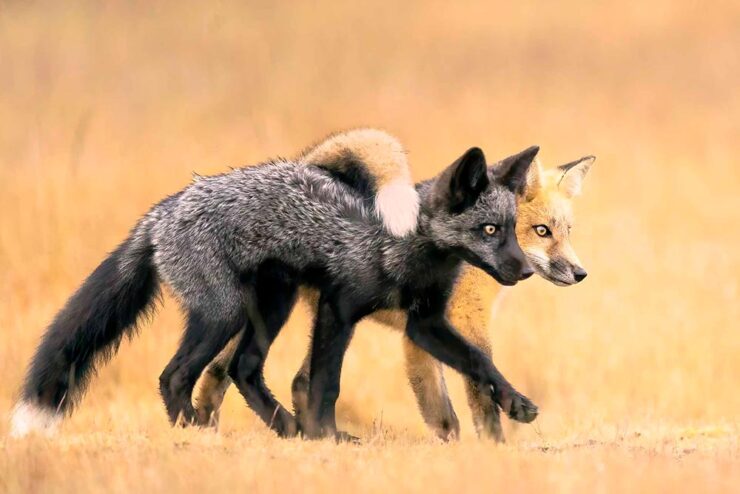
    PetaPixel is among several that point us to the Nature Photographer of the Year contest, with images both poignant and funny. Since it’s New Year, let’s go with the latter:

    Besties, Washington State, US. Photograph by Marcia Walters.

    Of course, there’s just “spectacular,” too:

    Cross to Bear, Talek River, Kenya. Photograph by Paul Goldstein.

    The contest’s winners page features many more, separated into categories; be sure to click on the individual photographs to get larger sizes and the story with each. Fantastic stuff.

    Frozen Prairie Landscapes

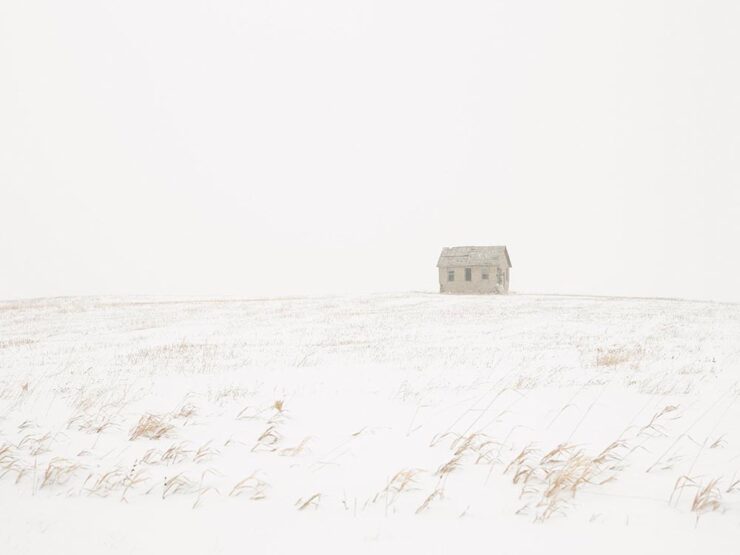
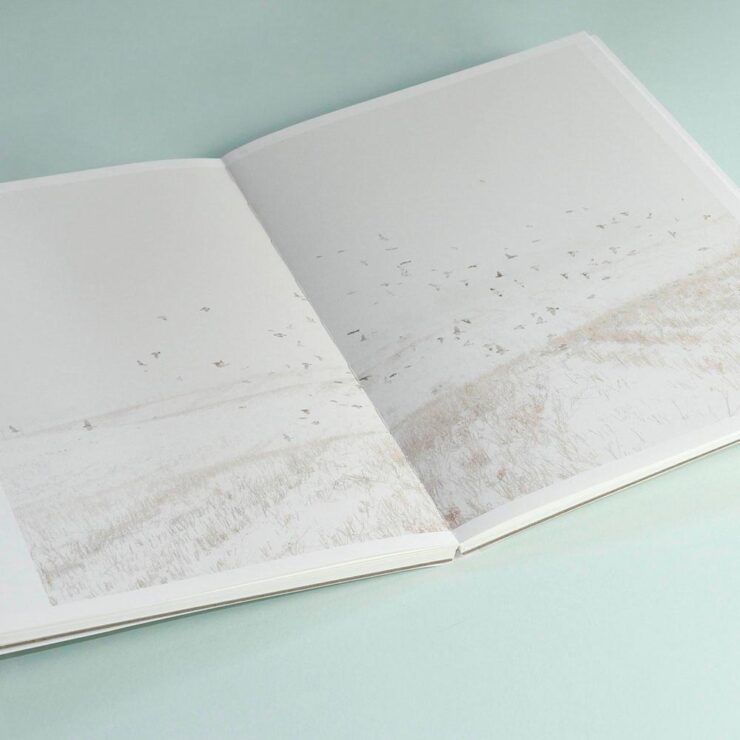
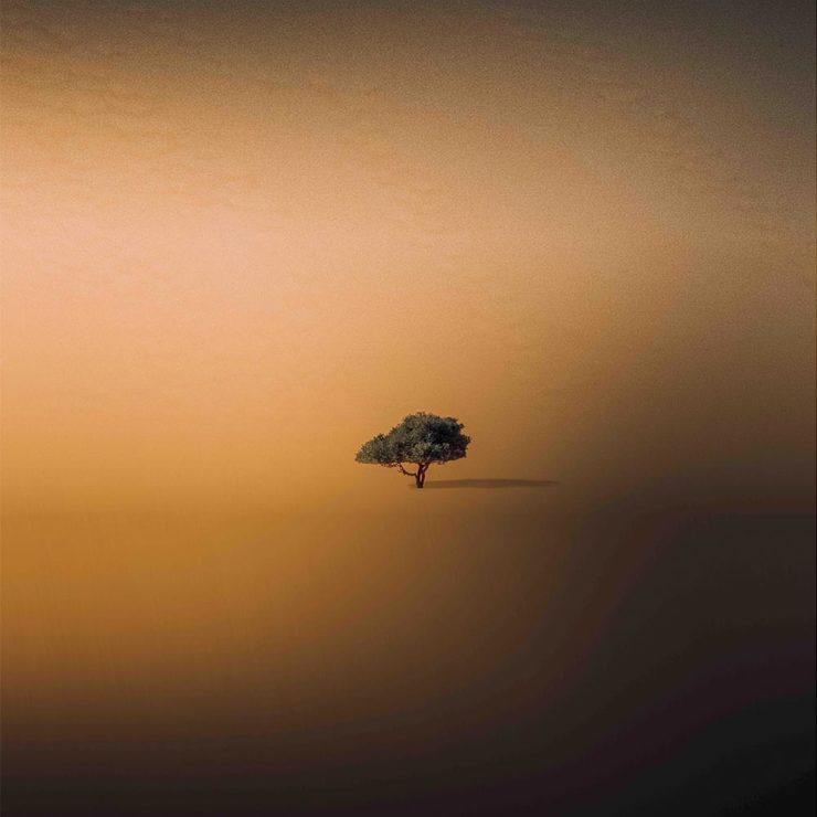
    Saskatchewan gets cold in the winter, but there’s a beauty to those temperatures, photographer Angela Boehm tells PetaPixel.

    Image from Minus Thirty. Photograph by Angela Boehm.

    “The frozen prairie landscapes, while a subject in their own right, serve as a powerful metaphor for the deeper themes the book explores: loss, memory, and resilience,” she says. […] “The loss is embodied in the emptiness and biting cold. The memory, or its gradual fading, is represented by the snow obscuring the horizon, softening and blurring the scenes. And the resilience is in the solitary tree — a steadfast survivor of countless storms in this unforgiving landscape.”

    — Angela Boehm, Minus Thirty

    Read more of PetaPixel‘s story of realization to publication or just check out the title.

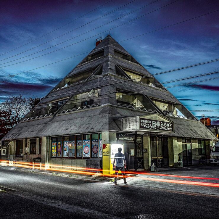
    Special Bonus #2: Another book on an interesting subject — Japan’s brutalist architecture, which somehow manages to bring an inherent quality to the cement:

    Mixed-use complex, 1994, by Kuniyoshi Design. Photograph by Paul Tulett.

    Dezeen has more.

    Ukraine’s “Fight for Visual Identity”

    This PRINT piece is excellent: “A cultural gap persists in how history is organized and interpreted. I left the library without my requested images but with a lingering realization that how we organize history, even within the hallowed walls of an institution like the New York Public Library, can reflect the biases and oversights of a collective cultural perspective,” writes El. Stern.

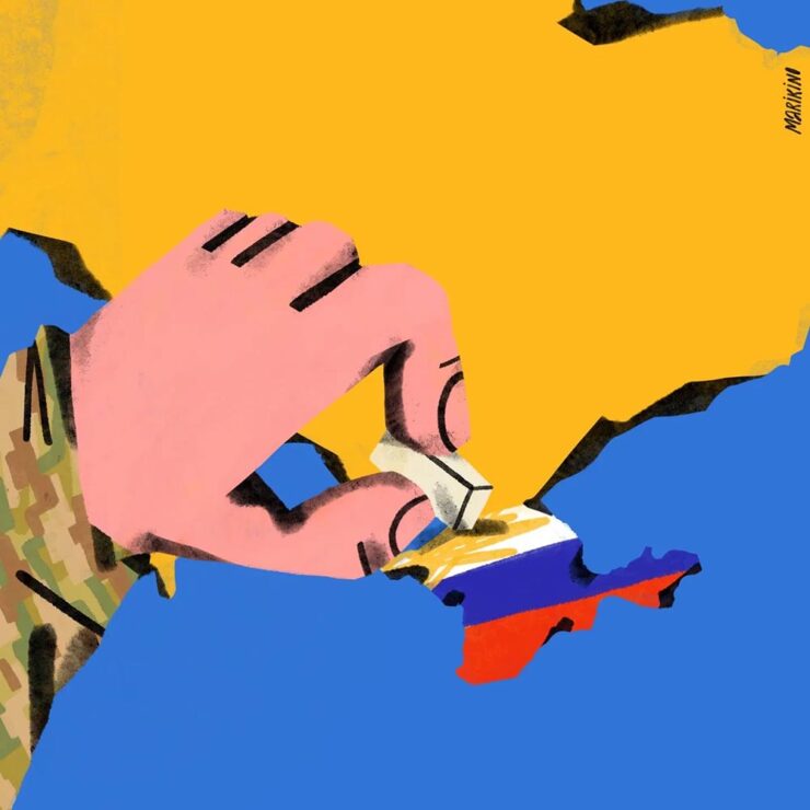
    Home Soon, Dear. Image by Maria Kinovych, 2022.

    “Today, Ukrainian graphic design is rooted in national identification, in search of future needs, and in understanding the cultural influence of a painful past on a, once again, painful present.”

    Ukraine’s search for a future — and present, and past — in design. Great read.

    “A must-have manual for hot metal enthusiasts and linotype lovers”

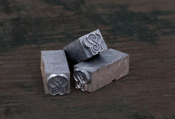
    Type Archived, a new book whose fundraising campaign I didn’t see in time: a “stunning visual tour of traditional typefounding and offers a definitive account of London’s legendary Type Archive,” writes Wallpaper*.

    Custom metal for the book project.

    The book “traces the origins of typography through the physical tools, objects and machinery that made the printed word possible. Full of rich photography, [it’s] a visual journey through the punches, matrices, presses, type and paper which tell the story of the UK’s preeminent typefounding industry.”

    Hopefully available at bookstores soon.

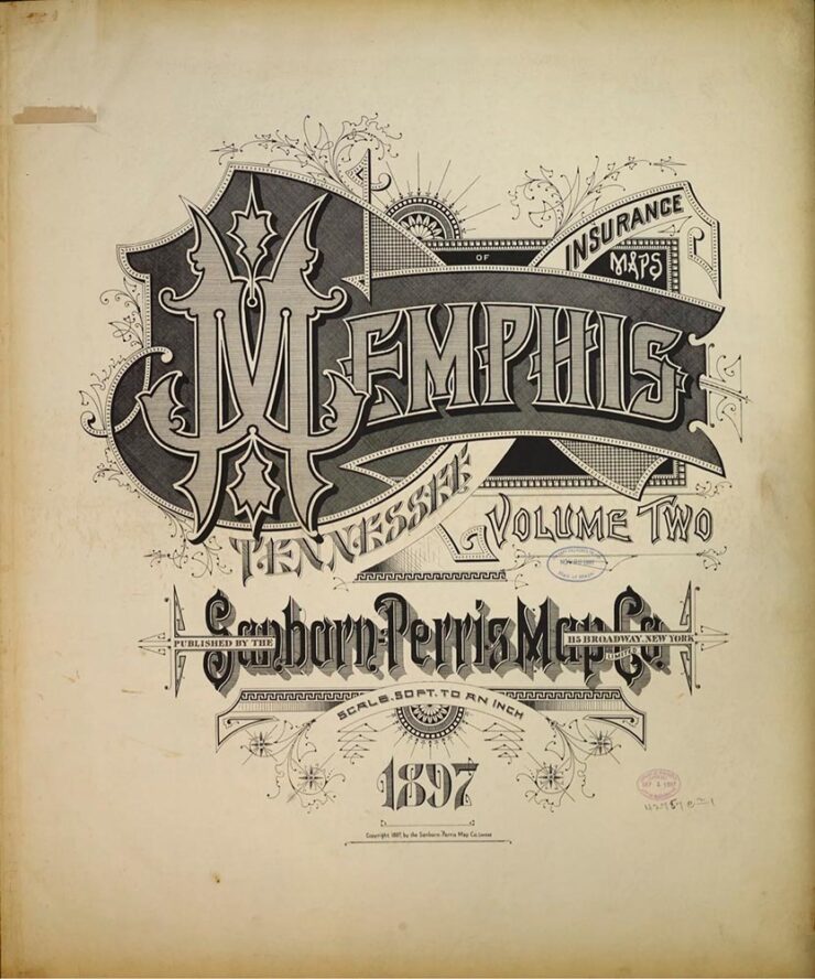
    “The Arresting Typography of the Sanborn Fire Insurance Maps”

    Jason Kottke writes, “Several years ago, Brandon Silverman become obsessed with the lettering and typography on the fire insurance maps published by the Sanborn Map Company in the late 19th and early 20th centuries.”

    Silverman’s launched an archive of the maps, an absolutely fantastic way to pass a few minutes hours.

    Special Bonus #3: Nick Heer, at the always-excellent Pixel Envy, has an essay on the essentials: “[E]fficiency and clarity are necessary elements, but are not the goal. There needs to be space for how things feel.” Delicious Wabi-Sabi is worth a few moments.

    Wishing you and yours a very happy New Year!

  • Beautifully Briefed 24.9: Falling Up

    Beautifully Briefed 24.9: Falling Up

    A long and diverse list this time, with a few thoughtful things and a ton of photography. Set aside a few minutes to get lost in links — and enjoy!

    Books and Values

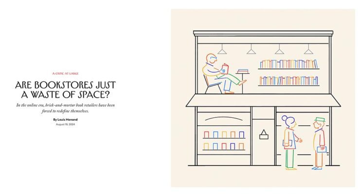
    This article from the New Yorker is highlighted a little behind schedule — it’s from August (although, in my defense, I get my NYers second-hand) — but worth the read for the phrase “practitioners of bibliotherapy” alone.

    Illustration by Pierre Buttin. © New Yorker.

    Before we get into the meat of it, though, a primer on the growth of available titles in the United States:

    • 1939: 10,640 (est.)
    • 1970: 36,000
    • 2020: 1,000,000 (est., including ebooks)

    The New Yorker article lists this last figure as three million, but various internet sources dispute this; either way, it’s a huge number that no store could ever hope to stock. But … on to the important stuff.

    The central question:

    Amazon offers something like thirty million different print titles. The company has deals with purveyors of used and remaindered books, who are linked to on the site. It owns AbeBooks, the leading site for rare and out-of-print books. And there are many other places online where you can buy books, including barnesandnoble.com. So why does the world need bookstores?

    — Louis Menand, New Yorker, August 29, 2024 issue

    The New Yorker is kind enough to let you read a few articles a month without crashing into a paywall, so go find out the answer, appropriately enough, in their book review of Evan Friss’ The Bookshop: A History of the American Bookstore.

    Meanwhile, Nick Heer of the always-excellent Pixel Envy cites another New Yorker article on pricing for non-physical books — “The Surprisingly Big Business of eBooks” — and comes up with a few spending figures of note regarding the New York Public Library and Barack Obama’s title, A Promised Land:

    • $29,450, for 310 perpetual audiobook licenses at ninety-five dollars each;
    • $22,512, for 639 one- and two-year licenses for the e-book; and,
    • $5,300, for 226 copies of the hardcover edition.

    If you want to know why publishers so aggressively fought the Internet Archive on its model of lending out scanned copies of physical books, this is the reason. Publishers have created a model which fundamentally upsets a library’s ability to function. There is no scarcity in bytes, so publishers have created a way to charge more for something limitless, weightless, with nearly no storage costs.

    — Nick Heer, Pixel Envy

    You know what you can’t do with an ebook license? Put it on a shelf for re-reading in ten years’ time. Or resell it. In other words: control what happens to it. “[I]t is hard not to see publishers as the real villains in this mess. They are consolidating power and charging even legitimate libraries unreasonable amounts of money for electronic copies of books which the publishers and their intermediaries ultimately still control,” Heer writes.

    Exactly.

    Special Bonus #1: Nick Heer gets something else right, too, by noting the sharply divergent goals of social media platforms and his own wishes — indeed, those of what we would idealize as “normal people.” “Guided by Vices” is excellent. Check it out.

    Book Design: Kafka
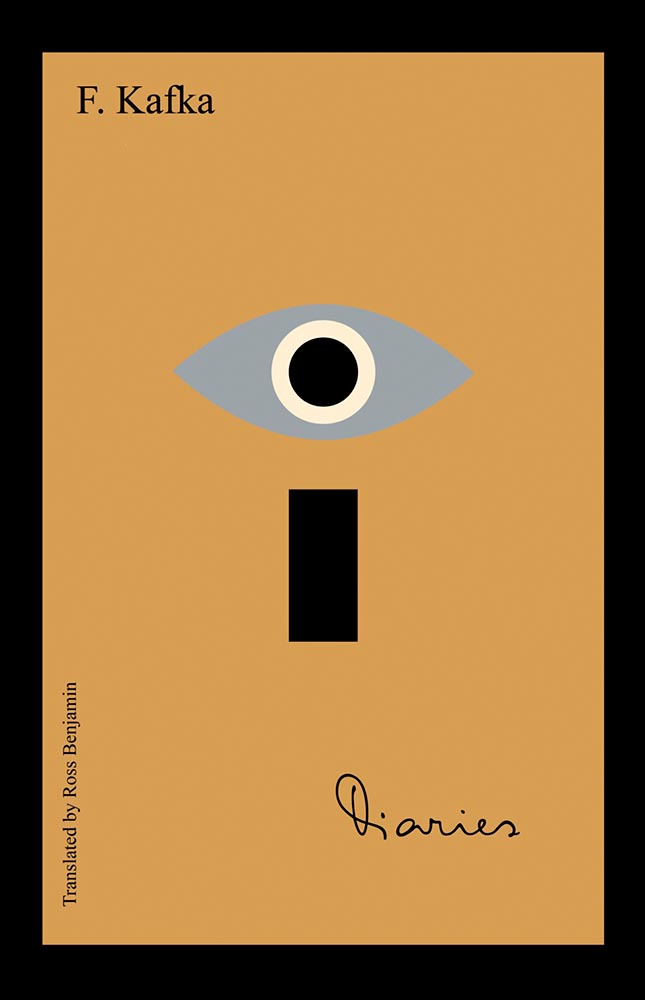
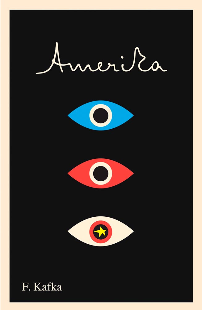
    Cover design by Peter Mendelsund.

    Few subjects could more appropriately follow the above, so it is with a certain sense of joy that I highlight these fantastic new covers Frank Kafka’s works, brought to us by the incredibly talented Peter Mendelsund1Get inside the mind of Peter Mendelsund, the pianist who went from Tchaikovsky to Tolstoy and became one of the best book cover designers working today, with editor Zac Petit’s interview in PRINT’s 75th Anniversary Issue,” with the link at the source article. via an interview with Steven Heller at PRINT:

    Cover design by Peter Mendelsund.

    The whole article, and especially, the whole series of title designs, are exactly why I treasure book design. Read on.

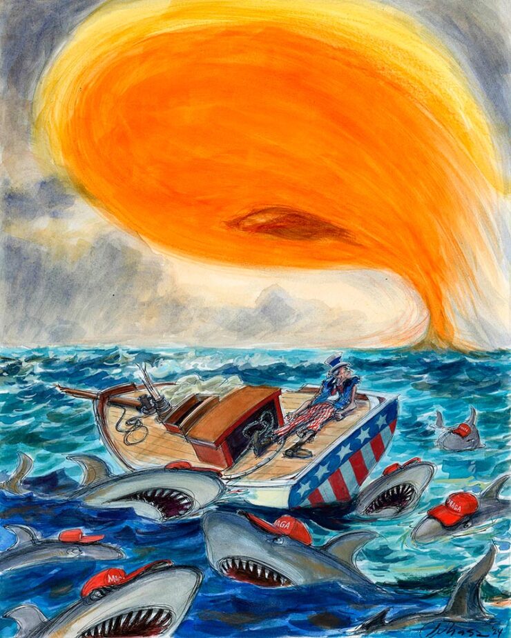
    Special Bonus #2: From Rolling Stone, an image reposted without comment (and absolutely not related to Kafka):

    Illustration by Victor Juhasz. © Rolling Stone.
    Colossally New

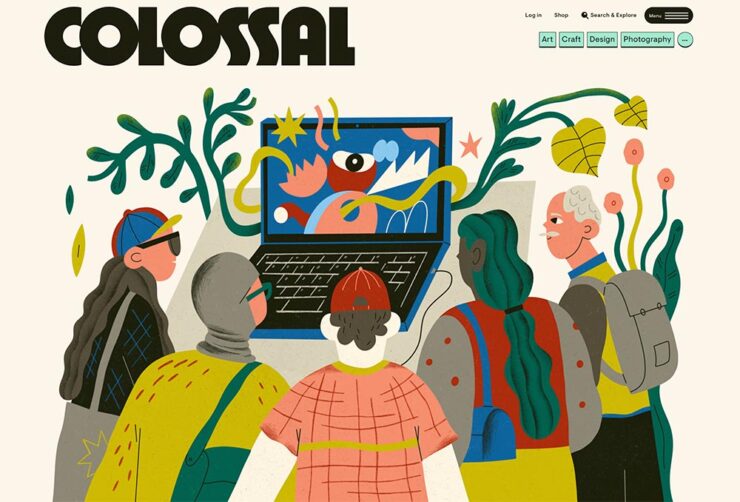
    This is Colossal, one of the very few sites elevated to “check daily” status and a frequent contributor to posts here on Foreword, has a new look:

    The new look of This is Colossal, September 2024.

    The last site, more than seven years old and designed by the great Armin Vit — he of Brand New fame — needed a refresh, mostly for technical reasons.

    Check it out. (And, separately, read the details.)

    Update, 4 Oct: More details from Firebelly. Great to see the progression of ideas.

    Update, 18 Oct: Part 3, “Crafting Colossal’s Whimsical Web.”

    SM[all] Majesté
    Photograph by DS Automobiles.

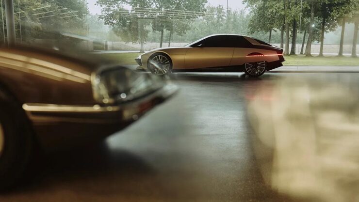
    I had to lead with an image there — even as concept cars go, wow. “DS’ tribute to the bewitching Citroën SM is the cure for concept car burnout,” The Autopian says, and I completely agree.

    The lights bleeding into the skirted rear wheels is, perhaps, perfection:

    Photograph by DS Automobiles.
    Photograph by DS Automobiles.

    Okay, it’s not even a Citroen, and the 1970’s are hot right now, but still, it’s an out-of-the-park home run from the staggering — perhaps even stumbling — juggernaut that is Stallantis. Read about it at Motor1 or Wallpaper*, or see one of these two YouTube videos from DS or YouCar.

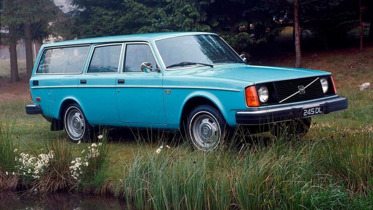
    Special Bonus #3: Another design icon, the Volvo 240 series, celebrates its 50th birthday this year. (I learned how to drive on a 145, the immediate predecessor, and was surrounded by 240s in my teens. I remember them fondly.)

    A 1974 Volvo 245 in the perfect shade of blue. Fabulous.
    Photography Turns 200

    According to an article in French photography publication Réponses Photo, quoted on PetaPixel, photography turned 200 on September 16. While that’s surely a conclusion rather than documented fact, it’s worth remembering and considering the journey photography has taken over the past two hundred years.

    Indeed, one need only glance at the “phone” we all carry around to realize how democratized photography has become; those of us who carry bigger, more professional gear have become the exception — and our reasons for doing do more varied. (More on that soon.)

    Meanwhile, let’s celebrate with some of the latest and greatest photography from September, 2024.

    Tahiti Waves

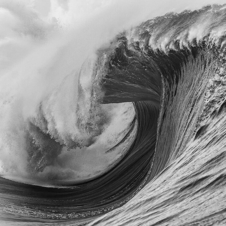
    Via Kottke and This is Colossal, a great series of ocean photographs from Tim McKenna:

    Heaving Waves (Tahiti). Photograph by Tim McKenna.
    2024 Wildlife Photographer of the Year

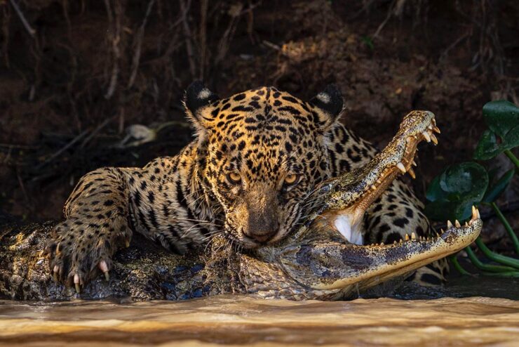
    Via This is Colossal, something quite, uh, jaw-dropping:

    “Deadly Bite.” Photograph by Ian Ford.

    “The 2024 Wildlife Photographer of the Year competition broke its 60-year record with a whopping 59,228 entries from 117 countries and territories,” and is connected with the Natural History Museum in London. (See also the 2024 Bird Photographer of the Year, via the BBC.)

    2024 Astronomy Photographer of the Year

    “The Royal Observatory Greenwich, in partnership with BBC Sky at Night Magazine, announced the beautiful winners of its 16th annual Astronomy Photographer of the Year competition. The images show some of the most incredible cosmic objects and events in the Universe,” PetaPixel writes. (Also noted via This is Colossal, just ’cause.)

    “Shadow Peaks of Sinus Iridum.” Photograph by Gábor Balázs.

    See all the winners at Royal Museums Greenwich.

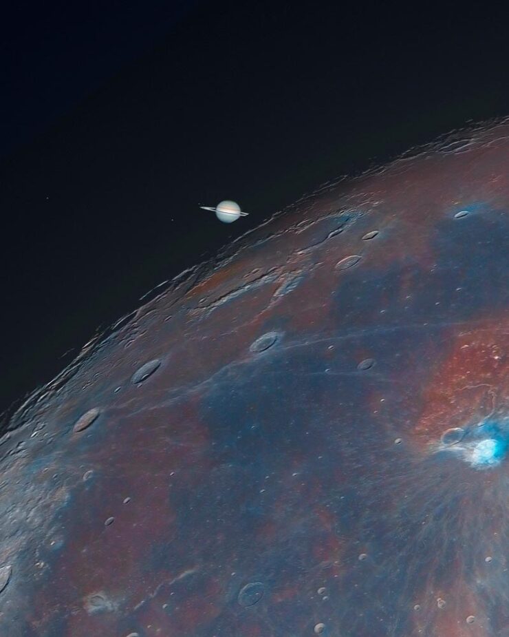
    Not included in that — taken too late to be entered, I understand — is this stunning photograph:

    “Saturn’s Ingress.” Photograph by Andrew McCarthy.
    2024 Natural Landscape Photography Awards

    Last but not least, some fantastic photography in this newish contest, now in its fourth year, set up to “promote the best landscape and nature photography by digital and film photographers who value realism and authenticity in their work.”

    Some of my favorites:

    “Waterton Lakes National Park in Alberta, Canada.” Photograph by Andrew Mielzynski.
    Guatemala Adventure Volcano Panorama. Photograph by Thomas Skinner.
    Nightscape, 3rd place. Photograph by Takeshi Kameyama.

    Via PetaPixel.

    Special Bonus #4: Phil Edwards brings us a history of one the most iconic photographs ever:

    • 1
      Get inside the mind of Peter Mendelsund, the pianist who went from Tchaikovsky to Tolstoy and became one of the best book cover designers working today, with editor Zac Petit’s interview in PRINT’s 75th Anniversary Issue,” with the link at the source article.
  • Beautifully Briefed 24.8: Picture This

    Beautifully Briefed 24.8: Picture This

    A trio of miscellany, a trio of space photography, more than a trio of great black and white photography, and a single, very serious photography question for you this time — let’s get right into it.

    Summer of Fun Miscellany
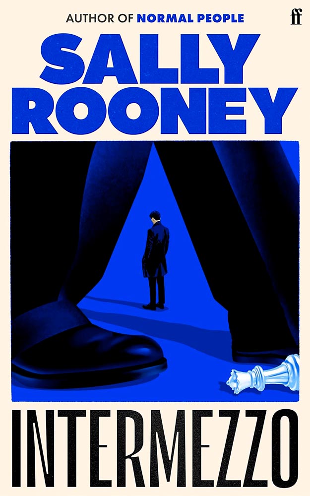
    Intermezzo, Explained
    The UK cover for Intermezzo. Book design by Kishan Rajani. (The US cover doesn’t compare.)

    GQ UK has an interview with Kishan Rajani, a senior designer at Faber, and Pete Adlington, the publisher’s art director, “about how the Intermezzo design came together, the role of social media in modern book design, and how to make books ‘as pickupable as possible.’”

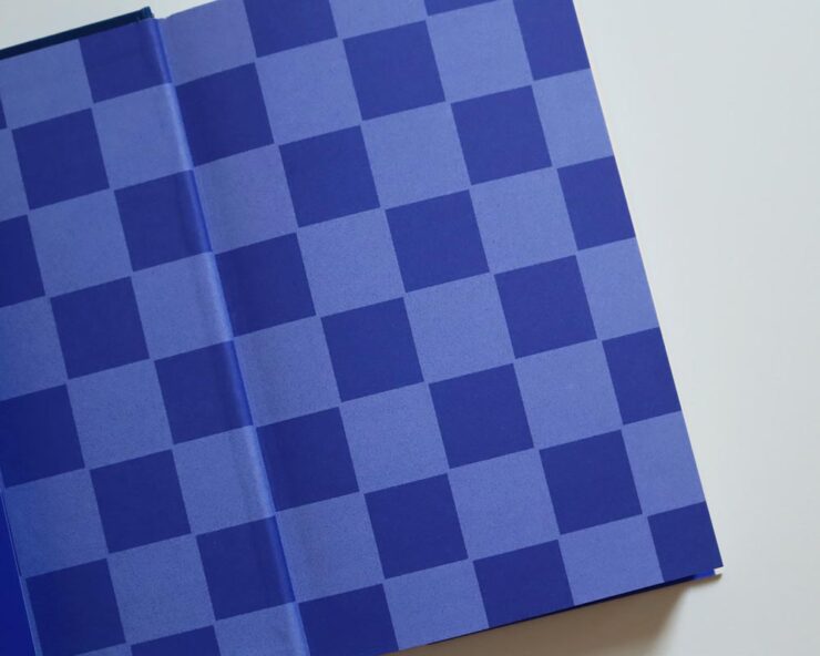
    The endpapers for Intermezzo (UK). I really like that they’ve sweated the little details.

    We can discuss “pickupable” as a word another time — your time is better spent, for now, reading the interview.

    WeTransfer Sold

    “Some of Bending Spoons’ most successful products are tools that serve creativity, therefore we are confident that this milestone will complement both businesses, supercharge our growth, and help us create even more value for creative industries at large,” says WeTransfer CEO Alexander Vassilev of the acquisition.

    I like and appreciate WeTransfer — unlike the corporatespeak above (but hey, we’re inventing words today … right?) — and hope that despite being corporatized, nothing substantive will change.

    PetaPixel: “The companies did not say whether or not all staff or leadership at WeTransfer would be maintained after the conclusion of the acquisition. That may come into question since Bending Spoons does have a track record of buying completed products, training its internal staff on their upkeep, and then releasing the original development team.”

    Crap.

    Update, 9 September, 2024: “Bending Spoons acquired file-sharing platform WeTransfer in July and has now laid off 75% of WeTransfer’s staff,” PetaPixel reports. “The Italian app company Bending Spoons has confirmed the layoffs to TechCrunch, which comprise at least 260 people based on WeTransfer’s employee headcount of around 350 people.”

    Adobe, Again
    The Adobe “World Headquarters” buildings in San Jose, California. Image via PetaPixel.

    Adobe (previously) recently sat down with PetaPixel to discuss the shambles where things stand — clearly, an attempt at damage control. PP published it … and got some feedback:

    Adobe couldn’t explain why it let its once excellent relationship with photographers and media lapse, only that it is sorry that happened. I do believe [their explanation], at least when I hear it from the people responsible for making the software. There is a big divide between the folks who code Photoshop and the C-level executives who are so out of touch with the end users. The thing is, it doesn’t matter what those people down in the trenches of development say or even how good Adobe’s software happens to be, some photographers just don’t like the feeling of giving money to the company because of the people at the helm.

    Jaron Schneider, PetaPixel

    The thing is: it’s less photography, really, than design. If you’re a photographer, how you get to the point of printing or publishing the photographs offers options in software — whether iPhoto, Affinity, Photoshop, or the Pixel 9 Magic Editor — Instagram doesn’t care, Zenfolio takes multiple file formats, and so on.

    But in design — that is, desktop publishing or especially book design — Adobe has a monopoly over the software used by the industry, full stop. I used to love working with their software. Today, not so much. (And for the record, it’s more than their fees, it’s the quality of the software.) It’s extremely frustrating and, at the moment, there is no alternative even on the horizon.

    Crap. (Again.)

    Extraordinary Astrophotography

    So, how many can place Kyrgyzstan on a map? It’s a former Soviet Republic in Central Asia, and, clearly, a great place to do some astrophotography.

    Star Trails Above Tash Rabat by Soumyadeep Mukherjee.

    PetaPixel highlights the work of Soumyadeep Mukherjee, who traveled there specifically for the purpose — and succeeded wildly. It’s awesome to see a country I’m not familiar with served so well. (My favorite, of course, is the short depth-of-field portrait — if you can call it that — of Yuri Gargarin, seen in the header image above.)

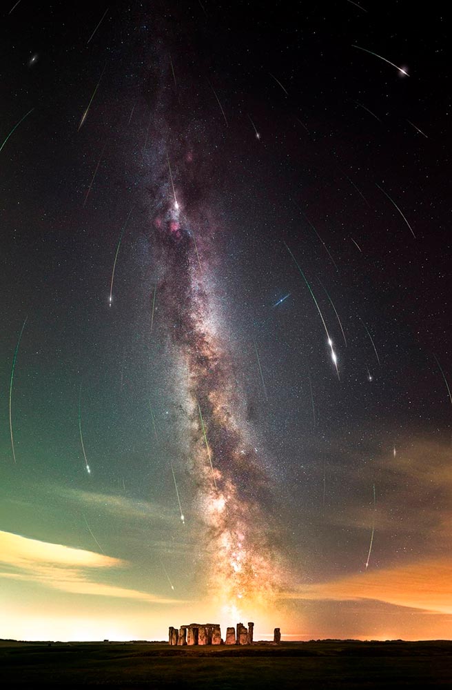
    Alternatively, This is Colossal points us at “Bisected by the Milky Way, a Stellar Image Captures the Perseid Meteor Shower Raining Down on Stonehenge“:

    Perseid Meteors over Stonehenge by Josh Dury.

    “Josh Dury, aka ‘Starman,’ is an award-winning landscape astrophotographer, presenter, speaker and writer from The Mendip Hills ‘Super National Nature Reserve’ in Somerset, United Kingdom,” his web site trumpets.

    The thing is … despite looking like he’s about 25, he’s earned it. Great stuff.

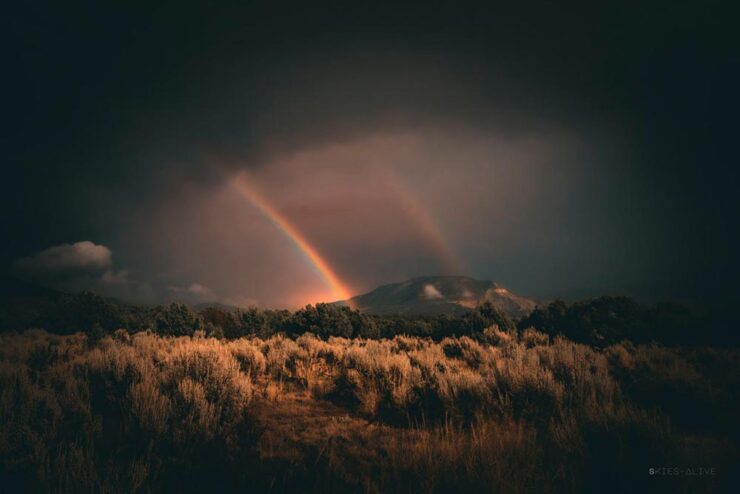
    Meanwhile, back at PetaPixel, “Photographer Aaron Watson, who goes by Skies Alive Photography, has seen many incredible things in the night sky. His latest sighting is a rare double ‘moonbow,’ a rainbow created by bright moonlight in precise conditions.”

    Double Moonbow by Aaron Watson.

    All three of these folks need special thanks for their patience. I have trouble standing still long enough to set up a tripod, let alone do long exposures under rarely-encountered combinations of time, weather, equipment and location — plus lots of good luck — in the middle of the night. Well done, all.

    “Majesty of Monochrome”

    The winners of the third annual Black and White Photo Awards have been unveiled, showcasing the best in monochrome photography across multiple categories.

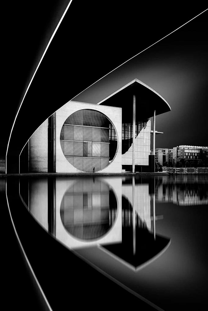
    Monochrome Majesty: Marie-Elisabeth-Lüders-Haus, by Robert Fulop. Bronze Mention from the Black and White Photo Awards 2024.

    Naturally, I gravitate towards architecture — and the winners (of the nearly 5000 entrants) demonstrate serious talent.

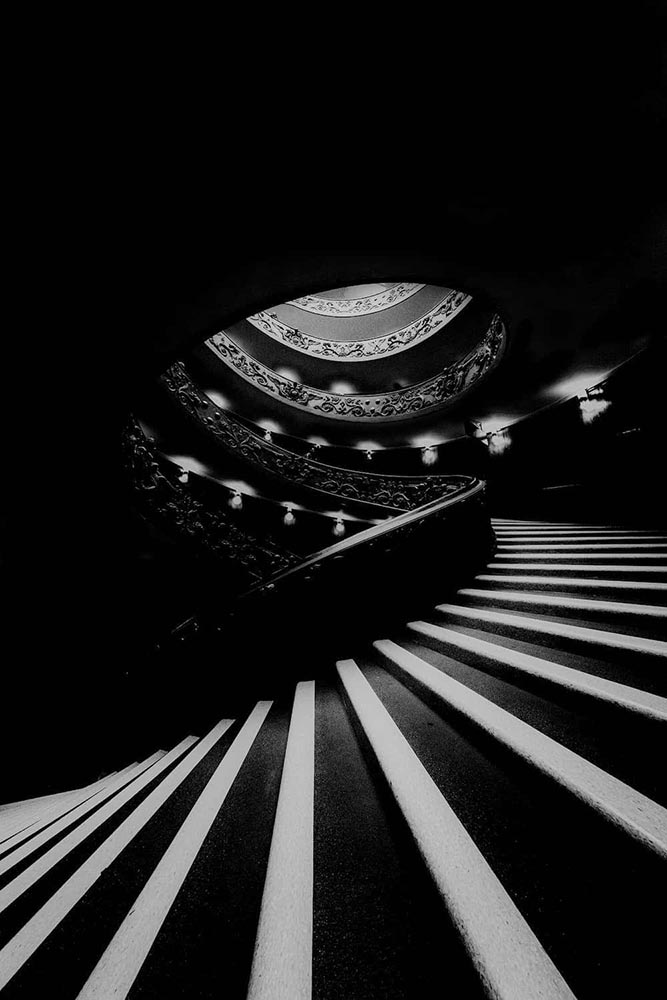
    Bench, by Colin Page. Finalist from the Black and White Photo Awards 2024.
    The Double Helix, by Md Tanveer Rohan. Finalist from the Black and White Photo Awards 2024.
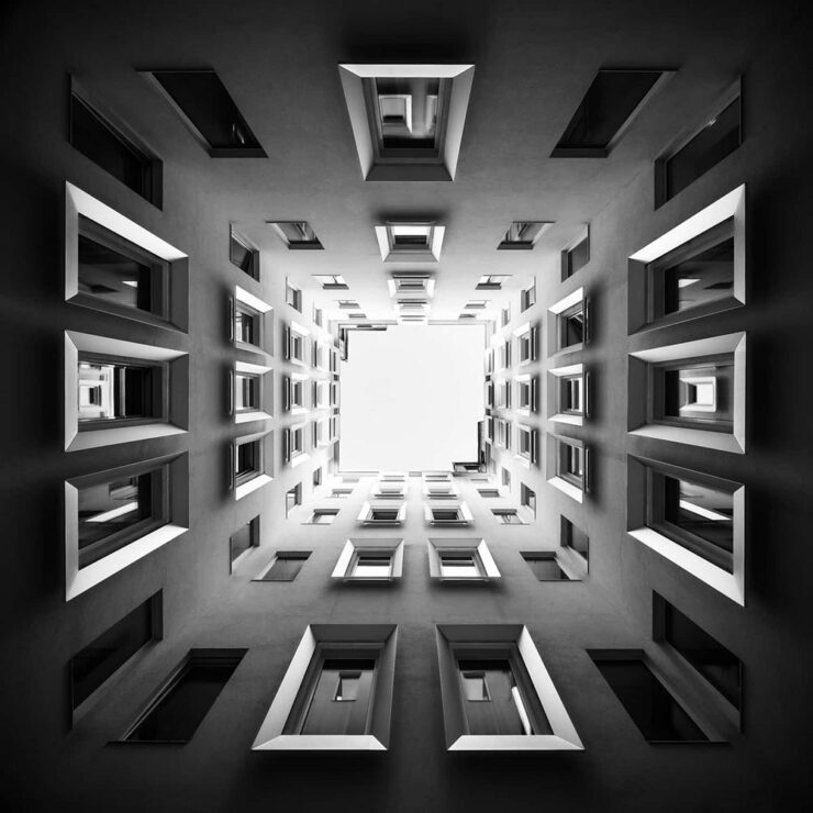
    Windows by Manfred Gruber. Finalist from the Black and White Photo Awards 2024.

    See the winners — and especially, take in the finalists, many of which I’d personally judge to be winners in their own right — at the contest’s web site.

    Special Bonus #1: It’s time once again for the annual iPhone Awards, “a powerful testament to the art of storytelling through photography.” I especially liked this one:

    Bicycle Forest by James Kittendorf. 3rd place in the Cityscape category, 2024 IPPAwards.

    It’s a great photograph, certainly, but it was taken by a now-quite-elderly iPhone X — proof, once again, that it’s the camera you have with you. See all the 2024 winning photographs, in multiple categories and taken worldwide, here. (Via PetaPixel.)

    So … What’s Next for Photography?

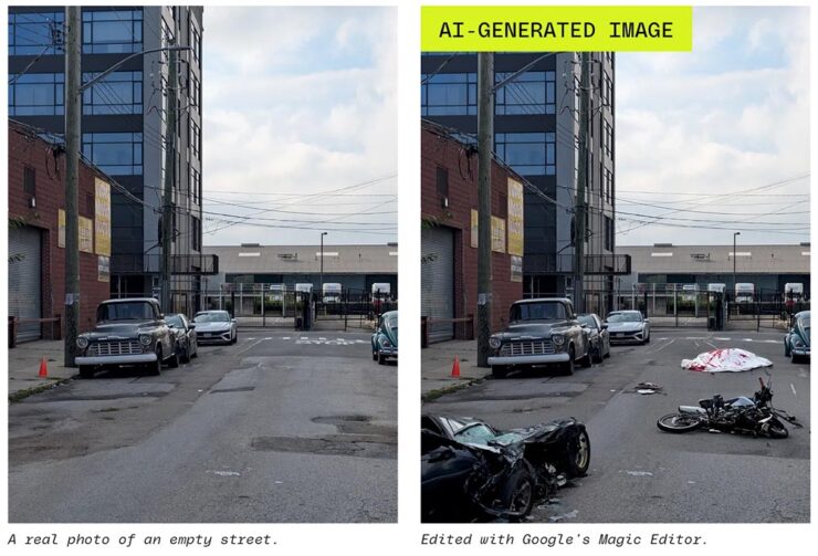
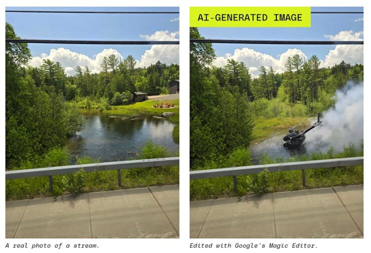
    The Verge: “Anyone who buys a Pixel 9 — the latest model of Google’s flagship phone, available starting this week — will have access to the easiest, breeziest user interface for top-tier lies, built right into their mobile device.”

    A montage from The Verge, thankfully clearly labeled.

    Life-changing moments have long been captured using photography, from Moonrise to George Floyd. But, generally, fakes were the exception, not the rule. We’re, unfortunately, arming the folks who cry foul.

    Another montage from The Verge. Note the woods filled in behind the helicopter less convincingly than the accident, above — but how many are going to notice?

    It does this article disrespect to summarize. Just go read: “No one’s ready for this.”

    Special Bonus #2: Nick Heer, at Pixel Envy, articulates what needs to be said: “anyone can now radically and realistically alter an entire scene within minutes of taking a photo. [O]ur expectations need to change.”

  • Beautifully Briefed 24.4: April Snow(ed Under)

    Beautifully Briefed 24.4: April Snow(ed Under)

    This April has been busy — meaning that I’ve not marked as many items for this column as usual. (I generally keep a browser tab group going throughout the month with items that could potentially be added, then weed them out/down as posting time gets near; usually, I aim for four or five diverse items.) This month, a great young Egyptian photographer and some details on what goes on, er, under the covers of book design.

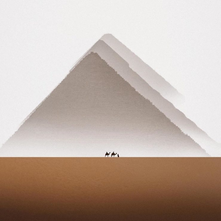
    Karim Emr, Photographer
    Infinity, Karim Emr, 2021. The print is 64×64 inches(!).

    Just look at that — awesome. The moment it appeared on Kottke, it got marked for posting. It’s fantastic to see a familiar locale taken with a fresh perspective, proving once again that no matter how many cameras exist in the world, it’s what you do with it that matters.

    This is great, too:

    “Water, Water, Water,” Karin Amr, 2021. (Forgive the color banding; that’s my fault, not the photographer’s.)

    I didn’t realize that was flooded at first — the desert plays many tricks. For more, check out his Instagram or order prints at 1stDibs.

    The Design of Books

    You’re reading Foreword, so it’s safe to assume at least a passing interest in book design. So this one’s a natural to highlight:

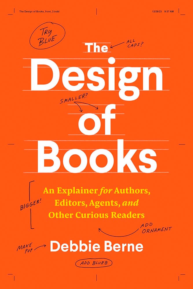
    New title by book designer Debbie Berne

    Professional book designer Berne debuts with her first self-authored (and designed) title that seemingly anticipates every question people curious about book production might ask, as well as many they probably hadn’t thought about. . . . This title illuminates all that goes into producing and designing a book.

    — Library Journal
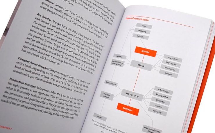
    Interior highlights from The Design of Books.

    From crop marks to the editorial workings, a worthy read for those in need of better understanding the process, those in the process (you’d be surprised: it’s more than authors and editors), and, as the author — and the LJ — say, “other curious readers.” Recommended.

    Special Bonus #1: The above is courtesy of another Kottke post, which has a comment regarding the redesign of the Book of Common Worship for the Church of England. It’s long and detailed, but it you have a minute: An account of the making of Common Worship: Services and Prayers for the Church of England. [PDF]

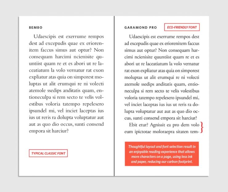
    Special Bonus #2: HarperCollins, one of the biggest publishers in the world, has something to tout: saving trees through “eco design.”

    It’s painfully clear which is easier to read: a change for the better . . . ?

    Fast Company reports on this, although to be honest I’m not sure it’s an improvement — while it’s impressive that, “so far, these subtle, imperceptible tweaks have saved 245.6 million pages, equivalent to 5,618 trees,” perhaps the startling statistic there is that a single tree can produce nearly forty-four thousand book pages. (Along with some bark mulch, presumably.)

    In any case, the VP of creative operations and production at HarperCollins — apparently an actual title — is proud of their “learnings.”

    Doctor? No, Book Designer

    The AIGA Eye on Design‘s book design category, always full of gems, highlights the career path of another book design professional, Jason Ramirez:

    One of the first in his family to attend college, he studied biological sciences and later religious studies at the University of Rochester, and after graduation he began taking night classes in typography, color theory, graphics, and web design. At nearly 30-years-old, he applied and was accepted into Parsons School of Design, where a course with cover designer Gabriele Wilson opened up a world of possibility.

    —Laura Feinstein, AIGA

    He’s done well:

    Cover design: Jason Ramirez

    A great read on the how’s and why’s of five worthy book cover designs when you have a moment.

    Special Bonus #3: CreativeBoom profiles another book designer, this time Leah Jacobs-Gordon, a freelancer in England.

    Cover design: Leah Jacobs-Gordon

    Enjoy your spring!
  • Beautifully Briefed 24.3: Bloomin’ Breadth

    Beautifully Briefed 24.3: Bloomin’ Breadth

    The end of March here in Middle Georgia means flowers aplenty, and usually with that, some photography — but I’ve not yet had a chance. (Stay tuned.) I have, however, been saving up links o’ interest: fonts, books, photography, and new(ish) car logos. Let’s go!
    Kottke Meets 2024

    Starting with one of the very few places that is still around from Foreword’s old days, the always-interesting Jason Kottke:

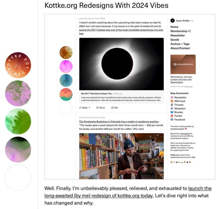
    2024 marks Kottke.org’s 26th year on the ’net.

    Great new looks for great content, with better Quick Links — the previews are ace — and incredibly-appreciated gift links to places like The New York Times and The Atlantic. If you haven’t been in a while, click and enjoy.

    Fab Spring Type

    With “a plethora of captivating new typefaces,” CreativeBoom celebrates spring with 11 new faces to tempt, inspire, and bring joy:

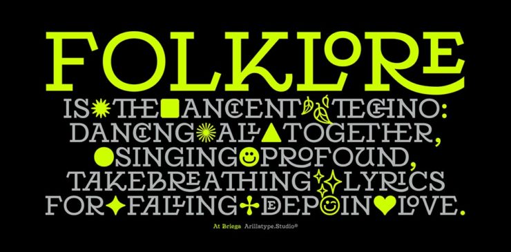
    Arillatype.Studio brings us a thousand glyphs of greatness.

    Zanco, with its bell-bottom style; Seabirds, inspired by 1930s book covers; Module, a “fluke side hustle;” and Graffeur, improvised from gaffer tape and glimpsed in this post’s header image, are all great. My far-and-away favorite, though, is At Briega, “inspired by the concept of hybridisation” and shown above.

    See ’em all here.

    Literary Three-Fer
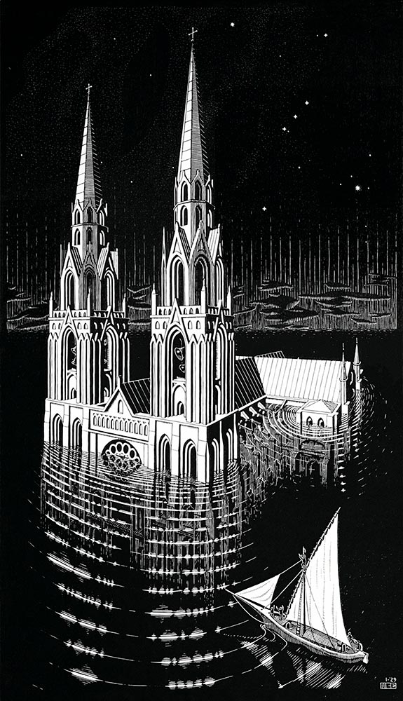
    M.C. Escher’s Lesser-Known Works
    “The Drowned Cathedral,” a 1929 woodcut.

    “Unique perspective” never does justice to someone whose name defines the term. See some never-before-seen images alongside old favorites in a new Escher book highlighted at Hyperallergic.

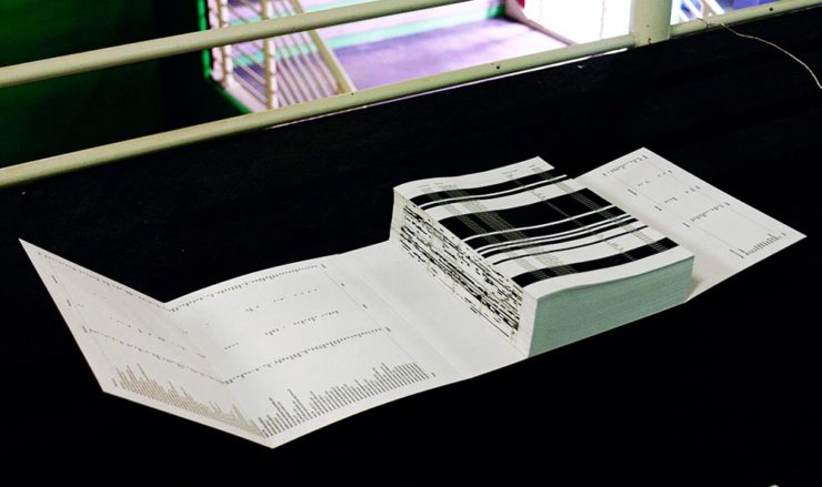
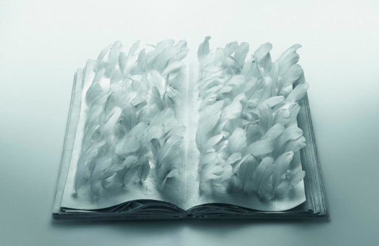
    Multidimensional Libri

    “Experimental books are flourishing, [a]nd the evidence is seen” in this Daily Heller from PRINT: a traveling exhibition on three-dimensional books, all published titles.

    Oh, those Italians. Read on.

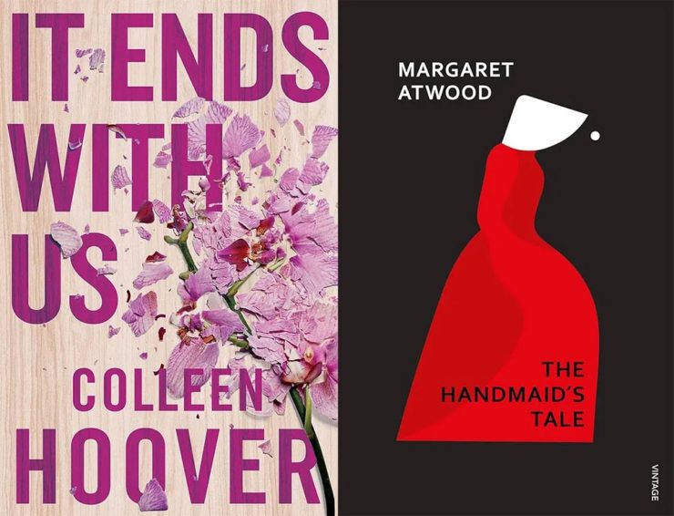
    Book Design Snobbery
    Hoover vs. Atwood — no joke.

    “Don’t get held back from the simple pleasures of reading,” argues Natalie Fear at CreativeBloq, “not everything needs to be minimalist.” Justification for commercialism or a common-sense explanation for the bookshelves’ current look? You decide.

    Photography Three-Fer
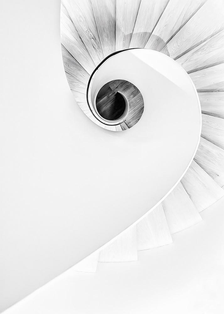
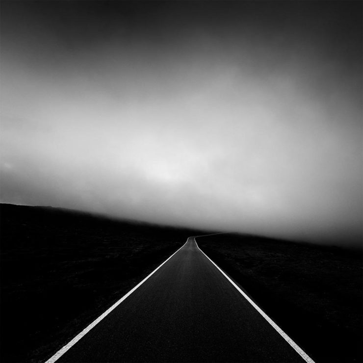
    Winners of Monochromatic Minimalism
    “Black Pearl” by Sascha Kohne. An honorable mention for the magazine, but a winner for me.

    Some incredibly good stuff here — but perhaps more importantly, did you know of Black & White Minimalism Magazine? There’s no end to today’s continued diversification, methinks.

    “Traveling through Costa da Morte, Galicia. 600m above sea level where the mountains separate the Cantabria sea from the Atlantic Ocean,” explains third-place winner Alexandre Caetano.
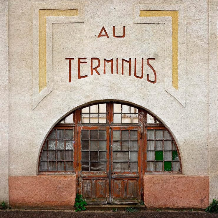
    Aging Facades of France

    “Shuttered blinds, peeling paint, and aging doors don’t usually indicate an invitation, but for French photographer Thibaut Derien, the fading facades of long-closed shops are well worth a stop,” This is Colossal says.

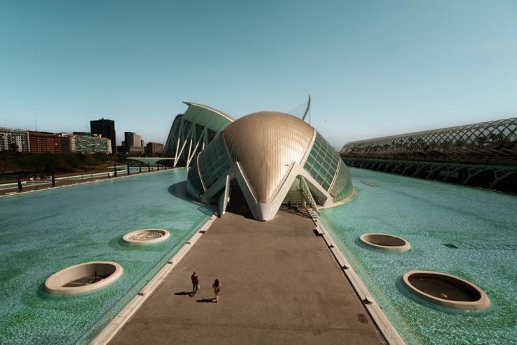
    Sony Photography Awards: Architecture
    The Ciudad de las Artes y las Ciencias (City of Arts and Sciences) in Valencia, Spain: “Hemispheric,” by Eng Tong Tan, Malaysia.

    ArchDaily‘s coverage of the annual Sony awards shortlist announcement was an insta-click.

    New Bull: Now Flat. (And a BMW.)

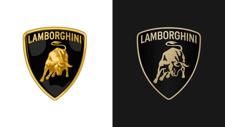
    Lamborghini practically defines flamboyant. So it’s worth a link when their logo gets less interesting:

    Old logo, left, new, right.

    Late at following the industry trend of flat-is-better, because, well, Volkswagen. (Okay, I undersell. Perhaps.) Read the lack of news at Motor11Motor1 also has a decent roundup of new car logos, from 2016-present, which underscores the “flatness” trend. or The Drive, where they manage to convey the brand’s use of the phrase “digital touchpoints.”

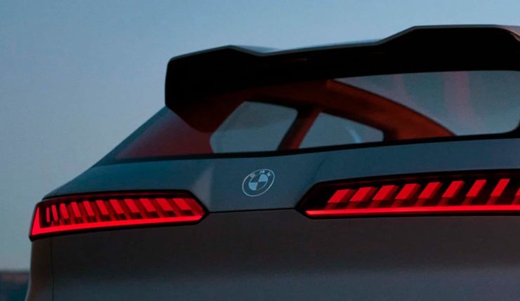
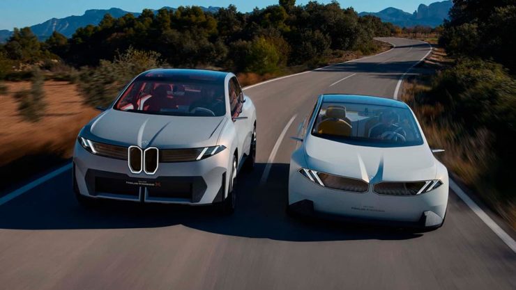
    I don’t know whether this will make any more sense in a few or even many months — which is relevant because of BMW. Four years ago, one of the industry’s design leaders expressed strong this new style, and I didn’t get it. But it’s worn better than most, and superlatively on occasion — check out the logo’s use on the Vision Neue Klasse X:

    Rather than a standalone, plastic part sitting on the paint, it’s etched into the finish. Man, I hope that makes it into production.

    Neue Klasse: do like. Bull? No so much.

    Update, 2 April: BrandNew, itself sporting a new look, has weighed in on the new Lambo style, calling it “not good.” (FYI, BrandNew is a subscription, quite possibly the best $20/year someone interested in design can spend.)

    • 1
      Motor1 also has a decent roundup of new car logos, from 2016-present, which underscores the “flatness” trend.
  • Beautifully Briefed 23.10: Shifting, Branding, and Creating

    Beautifully Briefed 23.10: Shifting, Branding, and Creating

    A variety of interests addressed this time: a bit on Shift Happens, a great question on branding, and Leica’s new M camera — and its content credentials. (Plus, bonuses.) Happy October!
    Booking a Keyboard

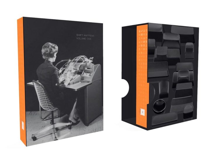
    We talked about this title back in January, but it’s worth the reminder:

    A 3D rendering of Shift Happens.

    Marcin Wichary has long been interested in keyboards. In his words,

    Keyboards fascinated me for years. But it occurred to me that a good, comprehensive, and human story of keyboards — starting with typewriters and ending with modern computers and phones — has never been written. How did we get from then to now? What were the steps along the way? And how on earth does QWERTY still look the same now as it did 150 years ago? I wanted a book like this for years. So I wrote it.

    Marcin Wichary, Shift Happens

    This title fascinates me, partially because it’s an interesting subject — one we’ve all interacted with, often without thinking about — and partially because it’s a great, well-covered exercise in book design.

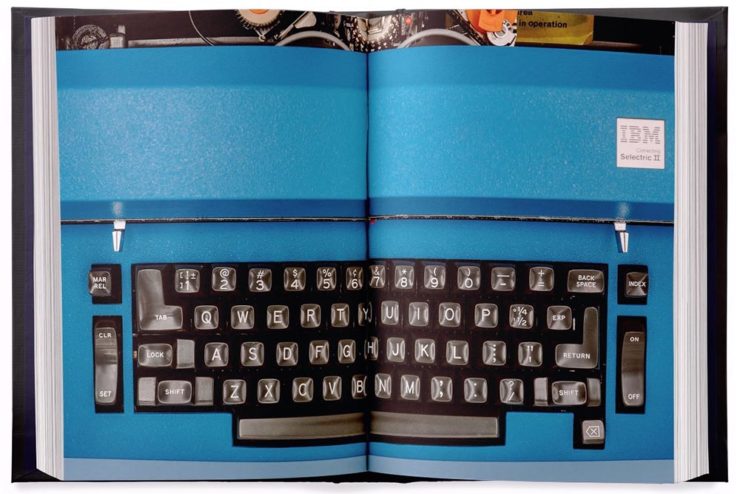
    A very cool photograph of an IBM Electric. Photo by Marcin Wichary.

    Further, Marcin has done a fantastic job in getting the word out. He’s designed a killer web site, written some great updates, and gotten some good press — including a recent interview with Ars Technica, in which he says:

    I am a web guy, and I used to think that the web (just like typewriters, once) took away a lot of hard-won typesetting nuance and tradition. But it turns out that the web also makes it much easier to do certain things. To have a word be surrounded by a rounded rectangle—a visual representation of a key—is a few lines of CSS or a few clicks in Figma. But for the book, I had to cut my own font and then write Python scripts to do typesetting inside the font-making software, which I’m pretty sure you are not supposed to do[.]

    Marcin Wichary, Shift Happens

    Really looking forward this title. Copies are, as of this writing, still available.

    Let’s Talk Branding.

    It’s Nice That asks a great question: “Are rebrands starting to look the same? The challenges facing commercial design,” in which author Elizabeth Goodspeed discusses whether “shortened turnarounds and economic tensions” are taking a toll on originality.

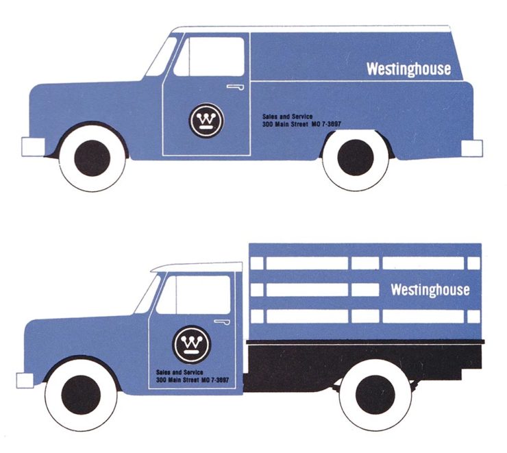
    Westinghouse branding guidelines from the ’60s.

    The answer might seem to be, “Well, duh,” but it’s nonetheless a thoughtful and insightful article that asks the correct question: “how does one define originality in an age saturated with visual stimuli?”

    [T]he digital applications more often associated with modern rebrands, while comparatively easy to update, may counter-intuitively promote less care and attention towards their making. [A]nother possible issue contributing to rebrand redundancy: lack of rollout support beyond rebrand launch. Even a unique identity may lose its spark when its primary consumer touchpoint is what a social media manager produces on Canva after skimming the brand guidelines once. Further still, many clients no longer approach design studios to harness their expertise but, instead, with preconceived notions of the result they expect; design studios may want to create original work, but sometimes clients are willing to pay more for a rebrand that mirrors their own preconceived ideas of what the work should look like.

    — Elizabeth Goodspeed, It’s Nice That
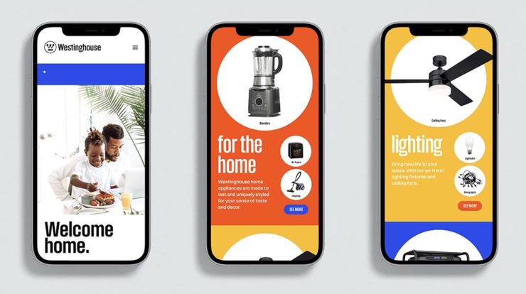
    The logo’s the same, but the applications vastly different.

    The whole article is great (and richly illustrated) — give it a few minutes of your time.

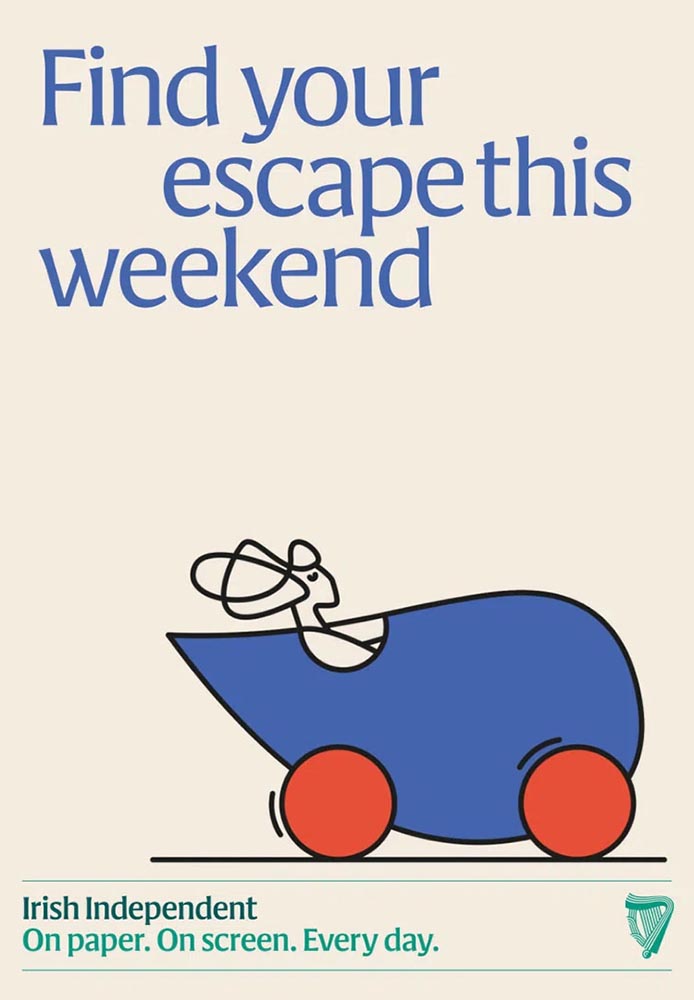
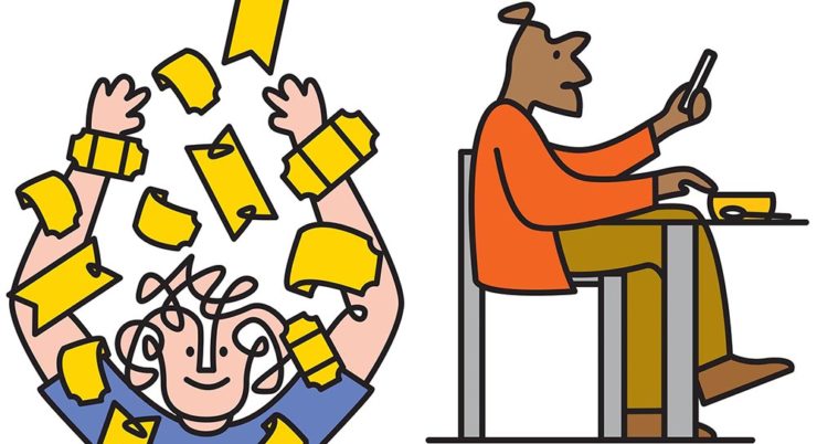
    Special Bonuses #1 & 2: Let’s look at a couple of places where branding has been in the news recently (pun intended). Also from It’s Nice That, an article on The Irish Independent rebrand. Here, as is often the case recently, it’s the custom illustrations that carry the day:

    Andy Goodman is the illustrator responsible for the lively work found throughout, which toe the line between measured and playful,” It’s Nice That writes. Agreed 100%.

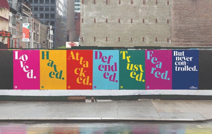
    Less successful is England’s The Guardian, whose ongoing campaign to raise money — they don’t have a paywall, relying instead on reader contributions — perhaps could have used more work:

    These ads don’t really have me on the fence: The Guardian deserves better.

    Meh. (And this from a huge fan of The Guardian.) Creative Boom is more positive.

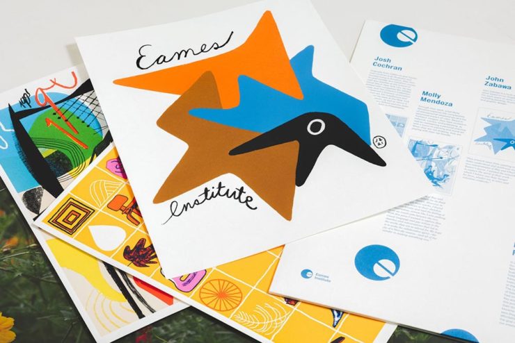
    Special Bonus #3: From the wildly successful, original branding department comes, of course, the brilliantly-named Eames Institute of Infinite Curiosity. They’ve been covered here twice before, but are back in the news with a new branding Manual. See why that’s capitalized at Dezeen.

    The Eames Institute branding oozes positivity, class, and — you guessed it — infinite curiosity. Nice.
    Leica, Adobe, and Content Authenticity

    One would assume that Leica users are the epitome of content authenticity — there’s nothing like the world’s best lenses (IMHO), attached to some incredible cameras, to provide photographers with all that’s needed to make the best possible images.

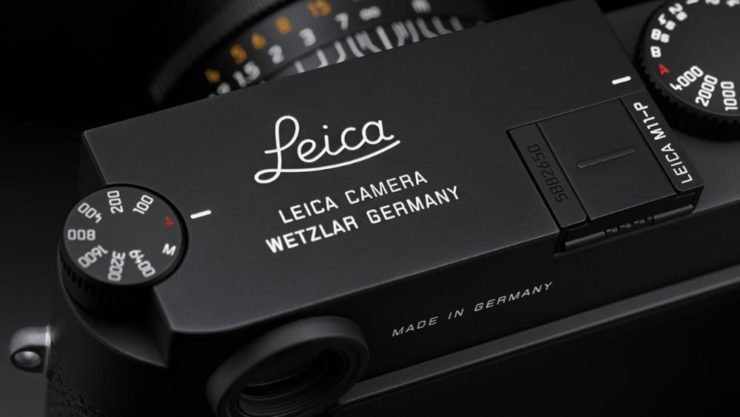
    Leica’s new M11-P, however, packs a world first: hardware encryption that supports a system called the “Content Authenticity Initiative (CAI).” In CAI corporate-speak, it’s “the future of photojournalism […] usher[ing] in a powerful new way for photojournalists and creatives to combat misinformation and bring authenticity to their work and consumers, while pioneering widespread adoption of Content Credentials.”

    Leica’s new M11-P. A bargain at $9,195. (Lenses extra, of course.)

    B&H puts it another way:

    The Content Authenticity Initiative (CAI) is a collaborative effort initiated by Adobe in partnership with various other organizations, including The New York Times and Leica, among others. Announced in late 2019, its primary goal is to develop a standard for digital content attribution. The rise in manipulated digital content, deep fakes, and misinformation has underlined the need for a more transparent system of content attribution, which the CAI seeks to address.

    The interesting thing here is Adobe’s initiative. What’s their goal?

    Adobe has been suffering a few hits recently. They’ve just raised prices — on the heels of record profits — and “monopoly” is not in any way a stretch. Photoshop? Entered the lexicon. InDesign? No credible alternatives. Illustrator? Professional standard across multiple industries. In other words, we’re stuck with ’em, and they know it.

    This line of thinking is expanded at CreativeBoom: “Is Adobe Becoming the Frenemy of Creatives? But that’s not all.

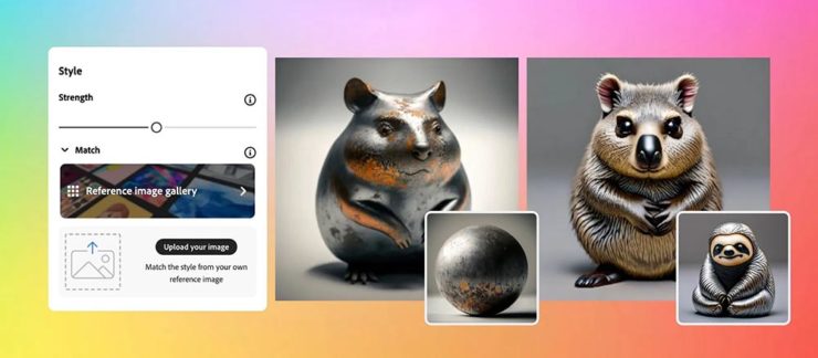
    Ignore’s Adobe’s unfailingly cute examples: AI + texture = exactly what some “creative director” needed. Seriously uncute.

    They’re pushing hard into AI, too, and surprisingly up-front about it changing creative work in ways potentially less creative:

    Firefly 2 was unveiled yesterday at the 2023 Adobe Max conference with the artificial intelligence (AI)-powered tool incorporated into Lightroom’s new lens blur feature that simulates depth of field along with a host of other tools. However, it was the new “Generative Match” tool that will allow users to upload a reference image to guide the AI image generator to a specific style that prompted Adobe to comment that the new tools could mean less work for photographers. 

    Adobe is appealing to companies who want a “consistent look across assets.” It is offering brands the chance to generate hundreds, if not thousands, of similar images for different uses such as websites, social media, and print advertisements.

    — Matt Growcoot, PetaPixel

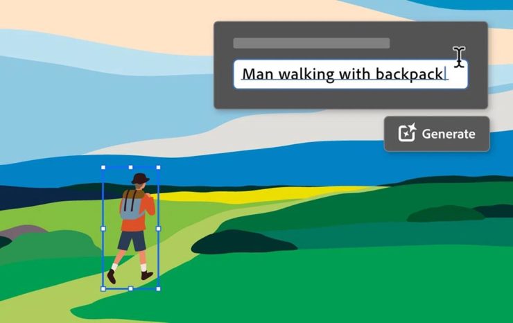
    Or how about this example: An agency or freelancer working on a vector image in Illustrator, and need to add something that they either don’t have the time or talent to do myself. Previously, they could find either a stock item — made by a human (who is paid, by the way) — or hire it out (again, to a human, and again, one who is paid for their work). Now? Just tell the computer what you need.

    Get more from Ars Technica’s Unlimited Barbarians Dept.

    All of which ties nicely back to the previous section on whether branding is beginning to homogenize. Is AI going to accelerate that process? You betcha.

    Value human creativity, folks. Artists, teachers, writers, thinkers: all the people pushing at the edges of the envelope will now have to push even harder, in an era when envelope-pushing is increasingly demonized.

    Special Bonus #4: Ars Technica argues that the U.S. Copyright Office’s blanket ban on the copyright-ability of AI-generated images isn’t going to age well, using photography as an argument.

    Special Bonus #5 (Updated 31 Oct): Via Nick Heer’s excellent Pixel Envy, we have a great explainer from Tim Bray regarding The Coalition for Content Provenance and Authenticity (C2PA), the actual implementation of CAI. Better than my brief description by a country mile.

    Special Bonus #6: To round out this post, from the department of envelope-pushing: PRINT Magazine put together the book covers of the 11 most-banned books in America. Dangerous, indeed!

  • Beautifully Briefed 23.8: Summer Stew

    Beautifully Briefed 23.8: Summer Stew

    The August heat is met with some refreshingly cool items for you this time: beloved movies reimagined as vintage paperbacks, graphic design on the Internet Archive, and winners of the 2023 iPhone photography awards. Plus, a bit on social media that hopefully won’t leave an aftertaste. Let’s dig in.

    “Good Movies as Old Books”

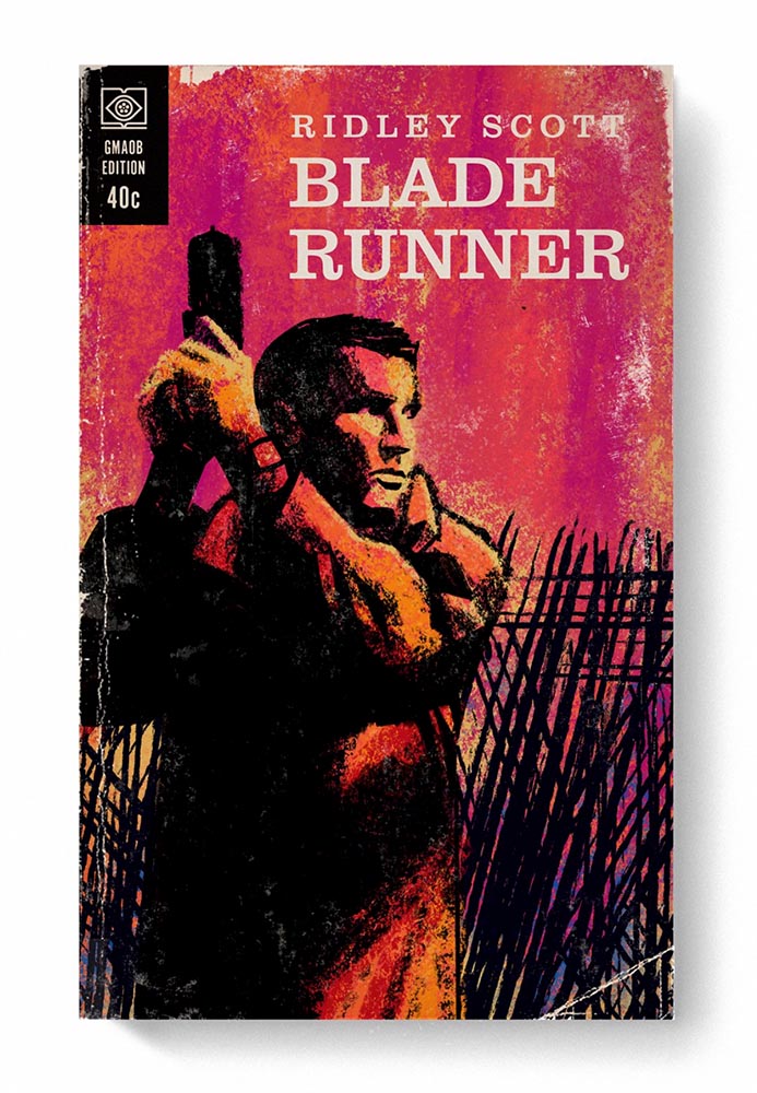
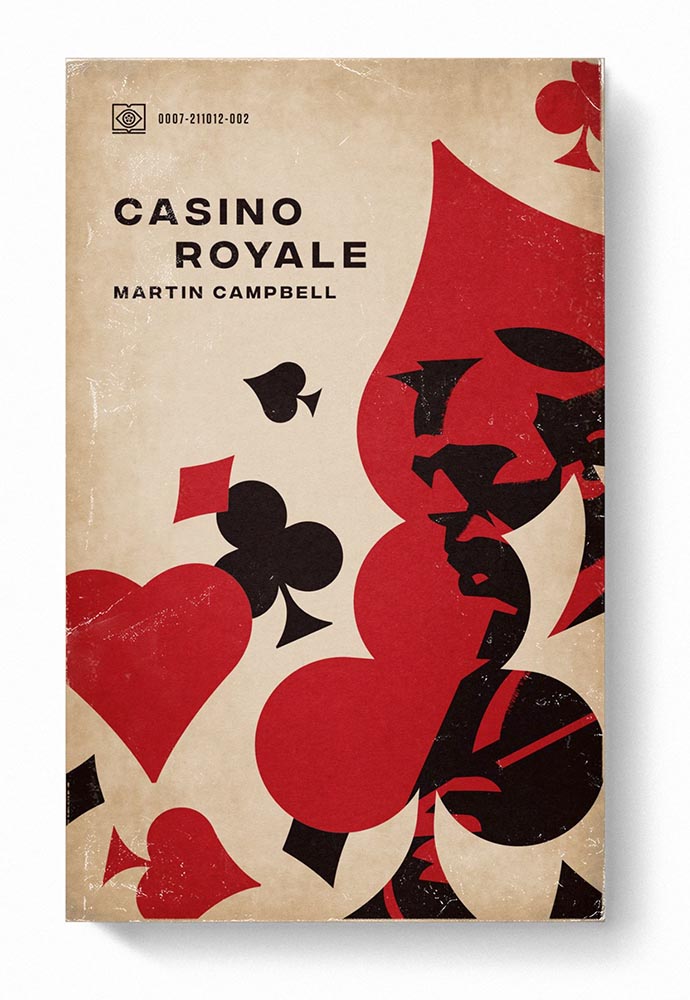
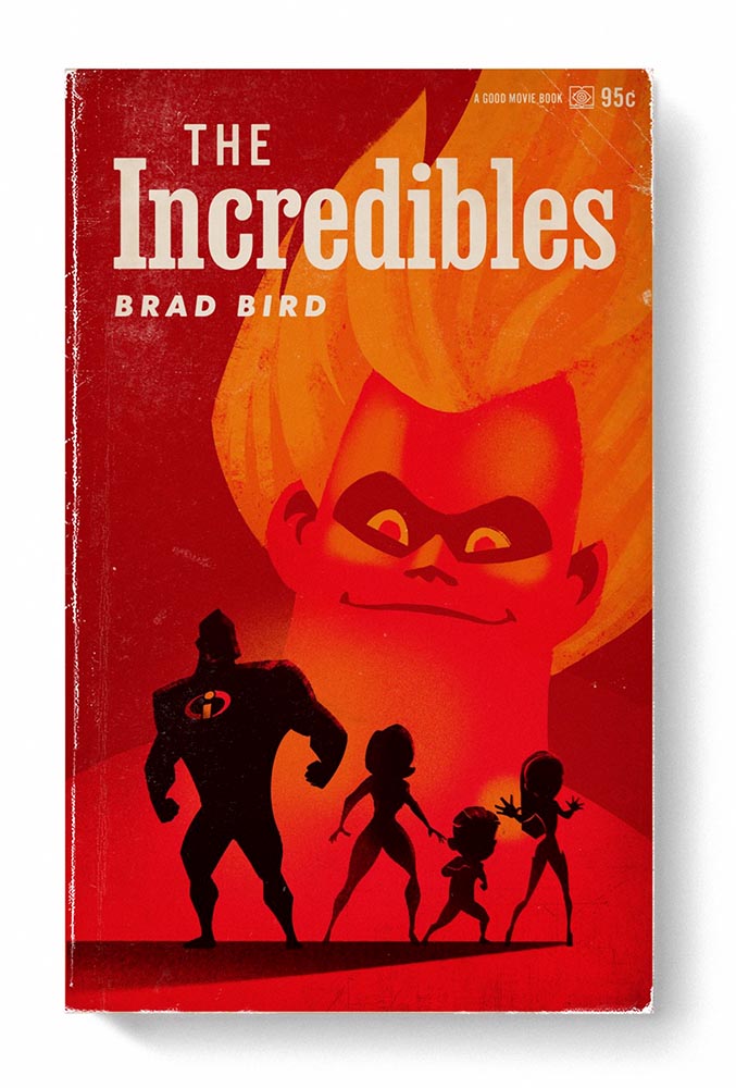
    This is Colossal points us to an extraordinary personal project by graphic designer Matt Stevens: classic, acclaimed movies visualized as vintage paperback books. Everything about these spells “win.”

    From the aged look, illustration choices, and director-as-author to the logo and occasional price, these are all … perfect.

    Volume One is 100 titles, and while that book is sold out, prints are available at his website. The items in Volume Two, due this month, are guaranteed to be awesome.

    Graphic Design on the Internet Archive
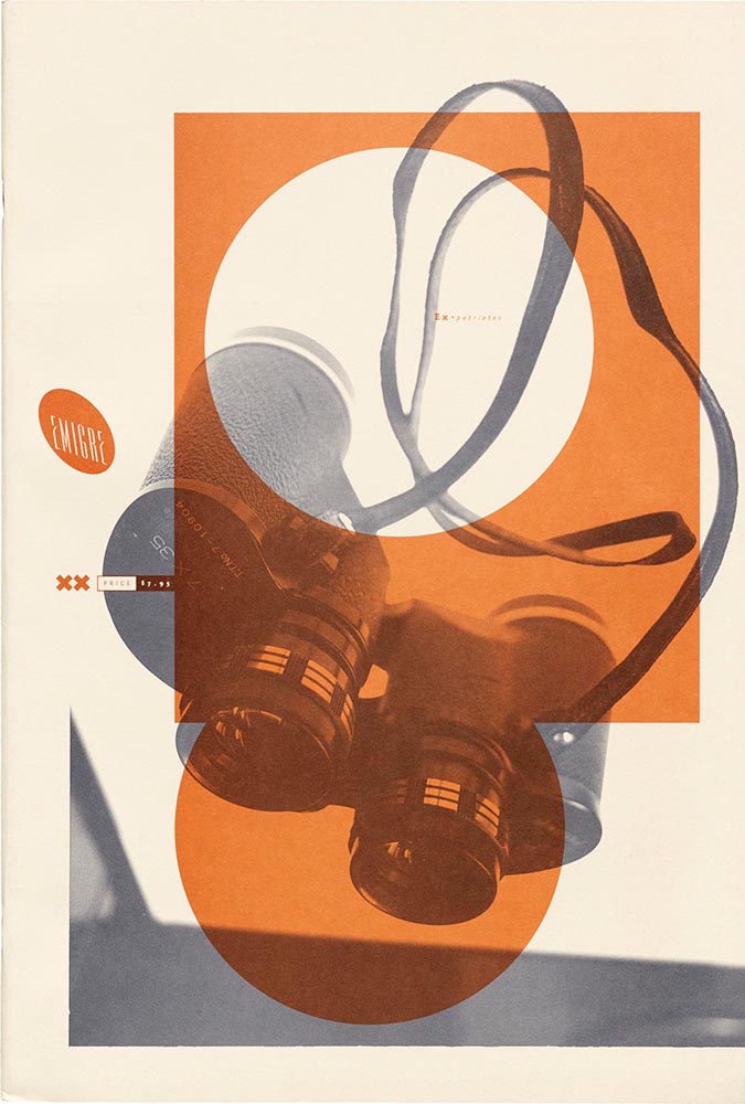
    Emigre #20 – Expatriates. Courtesy of the Internet Archive via archive.digital.

    Another treasure via Jason Kottke:

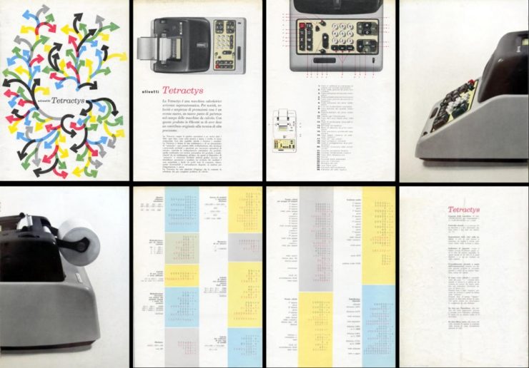
    archives.design is a labor of love site run by Valery Marier where she collects graphic design related materials that are available to freely borrow, stream, or download from the Internet Archive. I’ve only scratched the surface in poking around, but so far I’ve found Olivetti brochures, a collection of theater programs from the 19th and early 20th centuries, several Apple thingsThe Vignelli Canona specimen book of wood type from the 1880s, and many issues of Emigre. What a resource!

    Jason Kottke, kottke.org
    An advertising brochure for the Olivetti Tetractys, circa 1956.

    Some of these are fantastic — set aside some time to explore and enjoy.

    2023 iPhone Photography Winners

    I don’t always link to these contests — it often seems like the publicity (and rights!) are all about the folks holding the contest rather than the people entering them — but I often look, and am always impressed with the quality coming out of a “simple” iPhone.

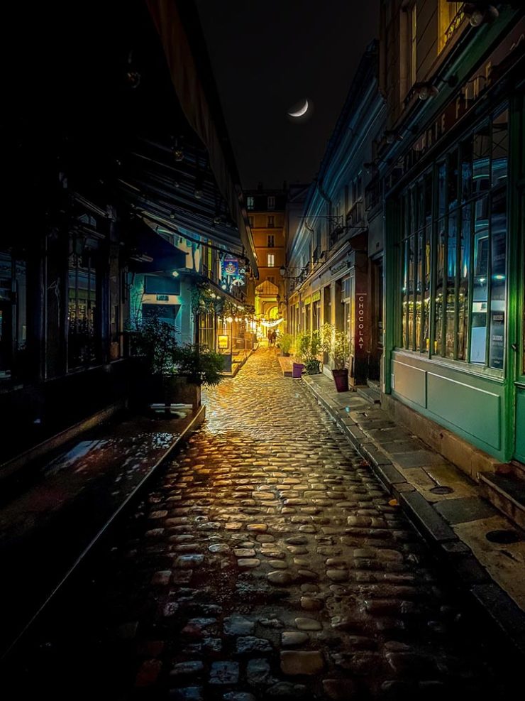
    Long Nguyen, France – 1st Place, Travel – “Last Night before Xmas”
    Scott Galloway, United States – 1st Place, Nature – “Wonder Wheel”

    And while both of the above are (relatively) recent phones, in the latter case showing the macro capabilities of an iPhone 12 Pro Max, even older phones can highlight the talent of the person using it:

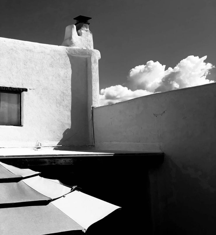
    Derek Hager, United States – 3rd Place, Photographer of the Year – “Tucson Morning”

    Shot on a 2017 iPhone X. Nice.

    See all the winners, for 2023 and years past, at IPPAwards.com. (Via PetaPixel.)

    A Moment Regarding Social Media

    I’m not going to spend much time on this; I eschewed pretty much all forms of social media years ago now, and don’t regret it. That said, I do keep up with social media in the meta sense (a word that’s been stolen, as far as I’m concerned, by — wait for it — a social media company), and have noted the pain and concern associated with the implosion of Twitter.

    While this conversation started with Nick Heer and the always-excellent Pixel Envy, it’s obviously evolved as the year has seen one extraordinary cage fight event after another.

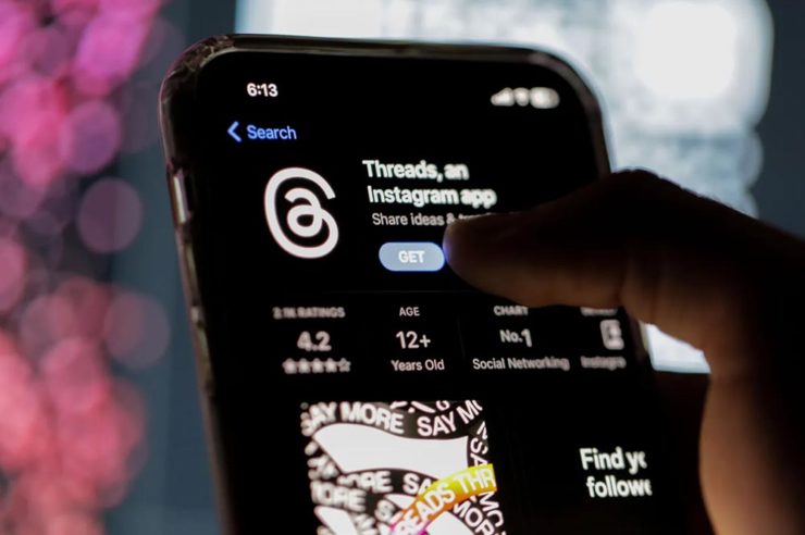
    Threads on Apple’s App Store, via the BBC.

    For the past decade, It’s been all but required for serious brands to maintain a social media presence […] yet instead of scrambling to claim digital real estate across all these newly emerging platforms, some companies are choosing to be more judicious about which platforms they choose to join. In some cases, they’re learning from brands who jumped the social media ship years ago.

    Chris Stokel-Walker, BBC

    The quote above, from the BBC, attempts to answer the question, “Why your favourite brand may be taking a social media break.” Short answer: it’s complicated. I’d argue there’s an even shorter answer — it’s smart! — but for people and brands that aren’t yet established, social media is often key to discoverability.

    This may be especially true for artists, designers, photographers, and others in the self- and small-business-employed creative field. Indeed, let’s go to a great source for those in the arena, Creative Boom, who recently spent a minute asking, “Creatives are saying social media is over… so what next?”

    Like any new craze, it was fun for a while. But there’s certainly nothing new about it any more. Facebook’s now been around for almost two decades. Twitter’s 17 years old. Even Instagram has reached its teens. And while many of us joined these platforms during their fun, “anything goes” eras, when everything was about the users, now it’s all about the algorithms and their use to make venture capitalists vast amounts of money.

    Tom May, Creative Boom

    While I agree that social media is a mess and has been for a while, I’m absolutely not going to tell you to give it up — only to remind you that I have given it up and continue to be completely okay with the decision.

    I do want to ask you, though, to choose wisely:

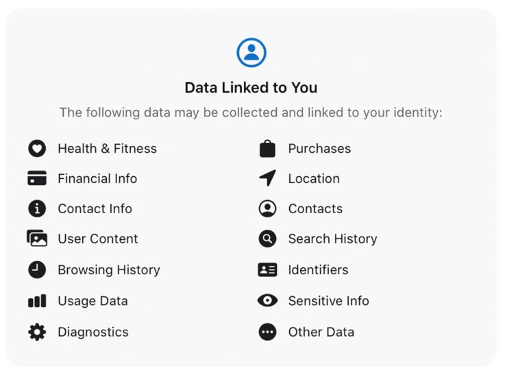
    Facebook’s “Threads (an Instagram app),” their answer to the Twitter/X debacle, as shown via Apple’s iOS App Store privacy report.
    Tapbot’s “Ivory,” available in Apple’s iOS App Store and showing that app’s privacy report, for the Mastodon social platform.

    Enough said. Turn off the computer, go forth, and enjoy a beautiful summer’s day.