Category: Business

The business of design, whether books, book design, architecture, photography, technology, or any of the other subjects Foreword covers.

  • Beautifully Briefed 23.6: Welcome to Summer

    Beautifully Briefed 23.6: Welcome to Summer

    This time, several items related to books and bookstores; two more — possibly the last two — from the automotive logo category; and PRINT Magazine’s 2023 roundup of great design.

    Book Four-For
    AI book covers? Here, now.

    Creative Bloq, which I wasn’t familiar with, has a post up that’s only here because it’s the first I’ve seen of what is sure to be a trend: AI imagery on a book cover.

    Image: Bloomsbury UK (Also: Where’s the body to go with the head?)

    “Causing controversy,” they say, in that…:

    [F]or a while now, with concerns over copyright and ethics plaguing text-to-image generators. Perhaps the most existential worry of all is the idea that AI could put human artists out of work – and while many still find the idea fanciful, we’re already seeing examples of AI-generated art being used commercially.

    — Daniel Piper, Creative Bloq

    The article itself has a hint of click-bait about it, what with Twitter users spotting a NY Times bestseller but complaining about the UK version of the cover design . . . but the larger question of AI coming for the book designers everywhere is valid.

    Then again, AI imagery has the potential to reshape much of the creative landscape. Let’s hope — hope! — that it’s deployed ethically.

    B&N’s Market Repositioning
    Image: NYTimes (modified)

    BookRiot asks whether Barnes & Noble’s new presentation as “a local bookstore” — something that’s part of the community in a way that Amazon can never be —is genuine, let alone successful. (We have a B&N here in Macon, which I visit infrequently, and which doesn’t feel “local.”)

    Background: The BookRiot article (and the image) above ultimately stem, I believe, from a NY Times option piece from 2018.

    Temples of Books

    As regular readers know, I’m a huge fan of combining books and photography. Naturally, great photographs of great libraries strike just the right chord:
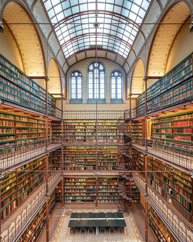
    Cuypersbibliotheek, Amsterdam, Netherlands

    As This is Colossal puts it, “Written by Marianne Julia StraussTemples of Books: Magnificent Libraries Around the World celebrates the stunning architecture and quietude associated with wandering the stacks.”
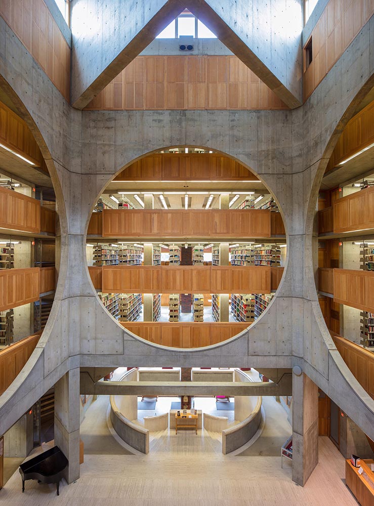
    Phillips Exeter Academy Library, Exeter, New Hampshire

    Positioning these spaces as intellectual havens, Temples of Books highlights their wide array of offerings, including botanic gardens, archival repositories, and of course, room to read. “As an institution that can curate knowledge, scrutinize the status quo, and encourage education, the library is more important today than ever,” a statement says. “This responsibility is only growing as the freedom to publish on all manner of channels increases.”

    — Grace Ebert, This is Colossal

    Instant wishlist item!

    Take Action for Libraries
    Image: everylibrary.org

    Simple brilliance: a handy step-by-step guide on what to do if you don’t like a book at your local library.

    Carmaker Logo Updates: Porsche and JLR
    Jaguar Land Rover > JLR

    No, that’s really it.

    Formerly Jaguar Land Rover, but generally known in the industry as JLR, the British company1Technically, it’s an Indian company, as JLR is a subsidiary of the TATA conglomerate. decided to have a FedEx moment and rebranded. Alas, Paul Rand was unavailable, so there’s no brilliance in the execution. (We’ll absolutely leave whether walking away from Land Rover as a brand is a smart move for another, longer discussion.) Motor1 has the details.

    Porsche > Almost all other mainstream car brands

    There’s a new Porsche logo!
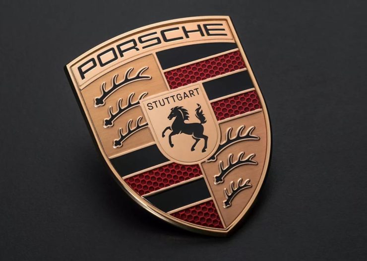
    The new 2023 version of the Porsche logo. (Image: Porsche)

    That’s right: it’s a very subtle change. But it’s a significant one, perhaps because it’s only the fifth in the company’s 75-year history:
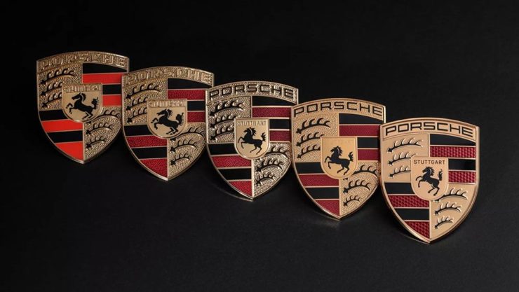
    All five Porsche badges. (Image: Porsche)

    The biggest changes are the backgrounds and the prancing horse in the middle, which is completely redrawn. (And, yes, has more than a passing — heh — resemblance to Ferrari’s.)
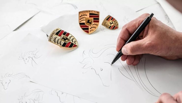
    Not-at-all-staged photograph by Porsche.

    Wallpaper* has the best coverage I’ve seen.

    Bonus: Motor1 has a roundup of every recent (2015+) automotive change in branding. Of course, I’ve covered most of ’em here, too.

    Update: Nissan, already on the updated list above, might be up to something.

    PRINT‘s Best of 2023
    PRINT reminds us that not everything is digital these days — so much of the work still goes on paper or packaging — in their 2023 roundup of great stuff:

    The 2023 PRINT Awards celebrated outstanding design in every shape and form, from the delicate texture and exquisite form of print to digital design that married technical skill with precise craftsmanship.

    — PRINT Magazine

    The best in show is a brilliant environmental design, the annual reports category is oddly satisfying (I didn’t know that Land O’ Lakes is a cooperative that owns Purina, for instance), the editorial category contains brilliance, and many, many more worthy of a design lover’s attention.

    Sadly, their book design category is a bust. I like “The Every,” but pretty much any of my Best of 2022 picks run circles around it (and the other two choices):
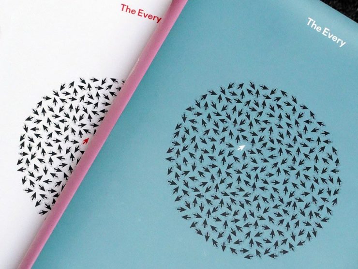
    The Every as photographed by PRINT.

    But there are gems. I really like Bakemono, for instance, a winner in the fonts category and the best monospaced font I’ve seen:
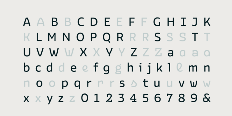
    Italian foundry Zetafonts brings us Bake Mono.

    It’s a long article (they call it a 74-minute read!), but when you have a moment, grab a drink and an iPad and enjoy — hopefully as much as I did.

    And that’s it! Settle into summer, and stay tuned for more soon.

  • Beautifully Briefed 23.3: Kottke’s 25, The Book Cover Review, B&N Back to its Roots, The End of Type 1 Fonts, and I Don’t Want to Log In

    Beautifully Briefed 23.3: Kottke’s 25, The Book Cover Review, B&N Back to its Roots, The End of Type 1 Fonts, and I Don’t Want to Log In

    This time, the twenty-fifth anniversary of one of my favorite websites, a new book cover review site, an interview with B&N’s CEO, the end of Type 1 fonts, and a world-class rant.

    Kottke Turns 25
    “Fine Hypertext Products,” indeed.

    Jason Kottke has been publishing a blog continuously for twenty-five years — more than half his life — and along the way, earned many an eye. (It’s been a full-time job since 2005.) Some of his thoughts from the anniversary post:

    My love for the web has ebbed and flowed, but mainly it’s persisted — so much so that as of today, I’ve been writing kottke.org for 25 years. A little context for just how long that is: kottke.org is older than Google. 25 years is more than half of my life, spanning four decades (the 90s, 00s, 10s, and 20s) and around 40,000 posts — almost cartoonishly long for a medium optimized for impermanence.

    I had a personal realization recently: kottke.org isn’t so much a thing I’m making but a process I’m going through. A journey. A journey towards knowledge, discovery, empathy, connection, and a better way of seeing the world. Along the way, I’ve found myself and all of you. I feel so so so lucky to have had this opportunity.

    — Jason Kottke, Kottke.org

    Cited here often, always brimming with interesting items, and a regular source of learning, Jason deserves massive congratulations. Happy 25! Here’s to many more.

    Bonus: Kottke was a guest on Daring Fireball’s The Talk Show. Check the links — Textism! — and enjoy a trip down blogging’s memory lane.

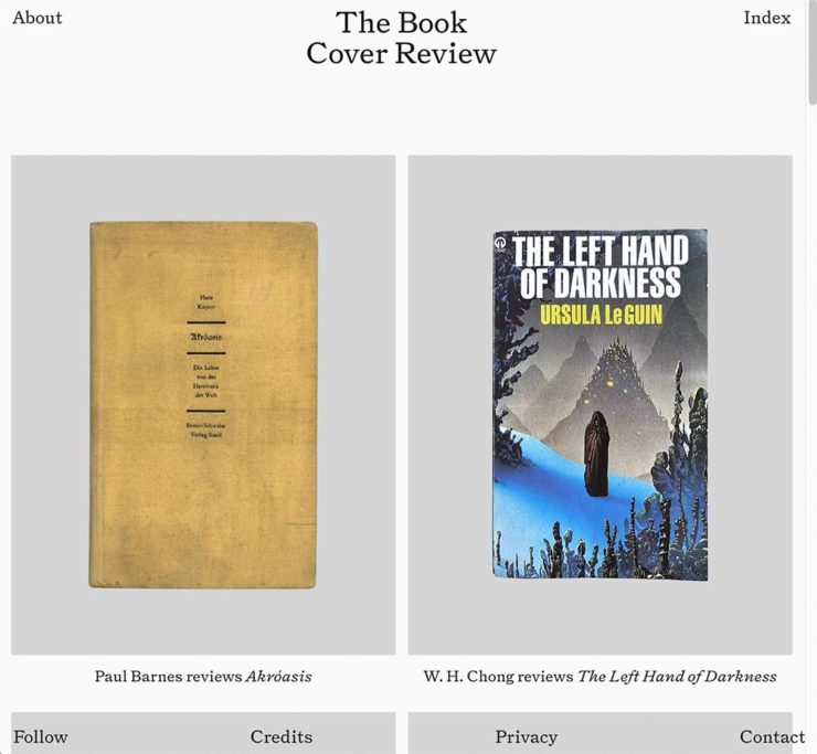
    The Book Cover Review
    NYT? No, English, actually.

    FastCompany points us to a new and interesting cover review site: mostly classic titles, covered in ~500 words “from a range of voices around the world.” Good stuff, with a NYT Book Review look and feel, updated regularly. Give it a try.

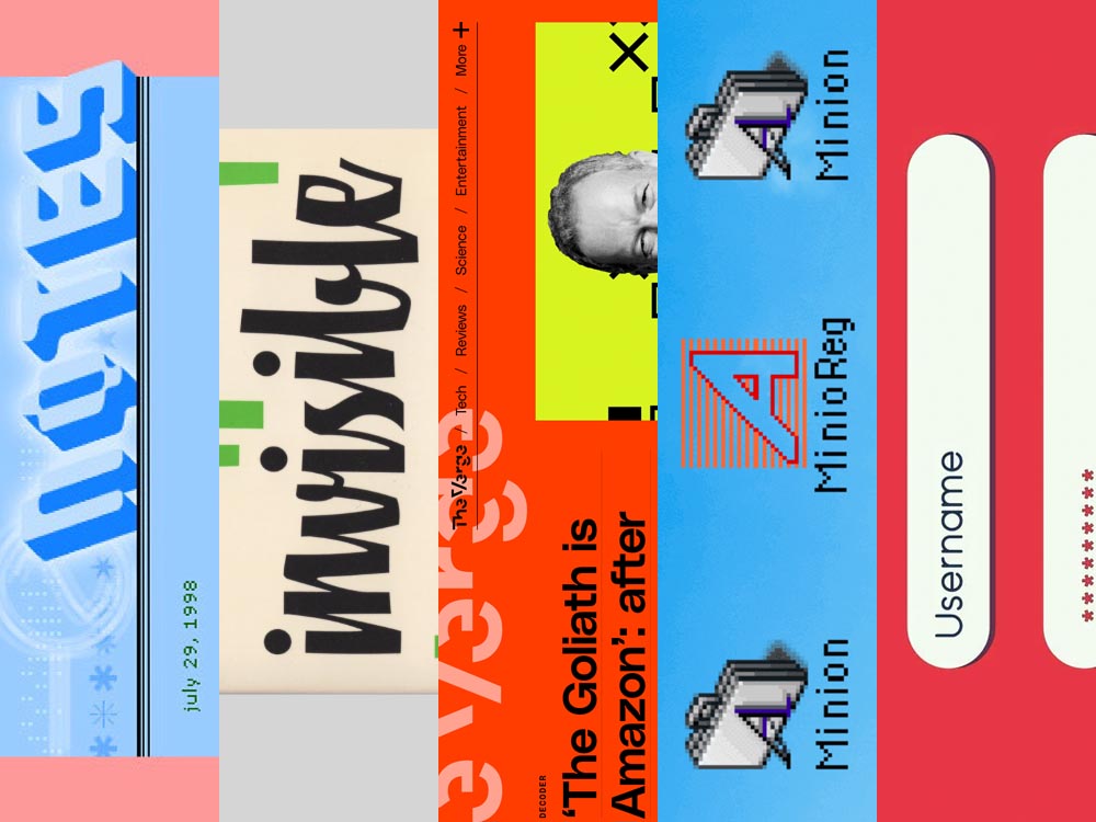
    The Verge interviews B&N’s CEO
    Decode B&N with James Daunt

    I’m not a regular listener of The Verge’s Decoder — it’s usually business-centric, going so far as to describe itself as secretly about org charts — but this one’s interesting: an interview between Nilay Patel and Barnes and Noble CEO James Daunt. They cover changes at B&N (with emphasis on why) and, of course, the elephant in any room:

    [Amazon is] really terrible at putting a book in front of you that you never thought you’d want to read, that you have no reason to read and no tether to at all. Whereas a bookstore is precisely the place that does that. You pick up the book that you never thought you would want to read, might read, or could even think about reading, by an author you’ve never even heard of until that moment. When a bookseller says, “Look at that,” “Read that when you next come in,” or “I love that,” or whatever it is, all those small, little recommendations are personal and able to attach themselves to books that otherwise have nothing going for them at all.

    James Daunt, CEO, B&N

    Props to The Verge for providing a full transcript, especially helpful for folks who would rather read the interview than listen to it. Whether you want to read or listen, though, book lovers in the US should take in this interview.

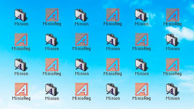
    Adobe Discontinues Type 1 Support
    Flying Suitcases.

    Back in the old days, Type 1 fonts were the backbone of desktop publishing. They were multi-part, often incomplete or corrupted, and always getting in the way of perfect print output — and yet beautiful and opening never-before-appreciated horizons of possibility for your projects.

    Now, in these days of OpenType, Google Fonts, and digital output, Adobe has taken the decision to discontinue support for the legacy Type 1 format. TypeNetwork has the full story, along with some options, and there are other converters if you need ’em.

    Bonus: TypeNetwork also has all of the Adobe Originals, from back when Adobe was your go-to instead of the corporate behemoth. Classy classics: see the list.

    The end of an era. (Via BrandNew.)

    The Perfect Rant: Solved
    There’s a park calling your name.

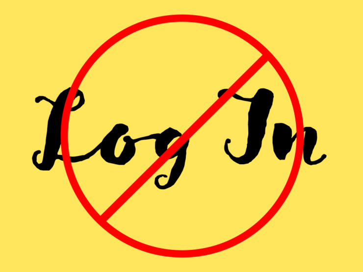
    One more from The Verge: “I don’t want to log in to your website.” The surge of login and email requests before being allowed to read “free” content is addressed brilliantly:

    So what we’re looking at here is creating a worse user experience in order to pursue a variety of scummy money-making schemes. And that sucks because there are no real public spaces on the internet. Here in reality, I can fuck off to a park and hug a tree and sit on a bench and do stuff without ads, without anyone trying to track me, and without having to pay a dime. There was a time within my memory when people tried to make websites feel like semipublic places — you could hang out on someone’s cool blog and enjoy yourself. 

    Elizabeth Lopatto, The Verge

    Read the whole thing, nod in agreement, and go enjoy that park.

  • Beautifully Briefed, Thanksgiving Edition (November 2022): Book Sculpture, Architectural Arcades, and Artists Sunday

    Beautifully Briefed, Thanksgiving Edition (November 2022): Book Sculpture, Architectural Arcades, and Artists Sunday

    This time, art from old encyclopedias, architectural art, and an appeal to add art to your post-holiday shopping and giving plans.

    Books as Art — In a Different Way

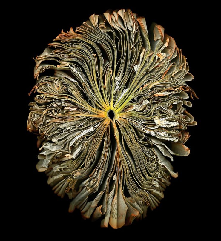
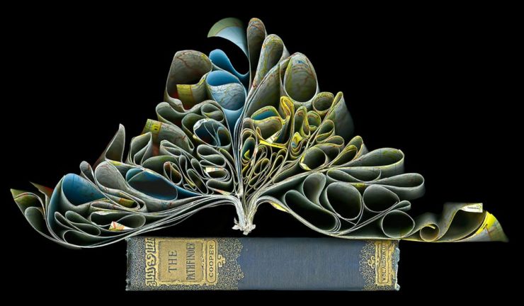
    Cara Barer says, “Books, physical objects and repositories of information, are being displaced by zeros and ones in a digital universe with no physicality.  Through my art, I document this and raise questions about the fragile and ephemeral nature of books and their future.”

    It’s more than that, though:

    As This is Colossal puts it: “With cracked spins and crinkled pages, the manipulated objects reference the relationship between the natural and human-made as they evoke flowers at peak bloom.”

    As a book designer, I’m glad that the titles used aren’t something a designers labored over but rather mostly instruction manuals and old encyclopedias. Either way, they’re a beautiful way to make commentary.

    See more at her website.

    “Photographic escapades in arcades and colonnades”
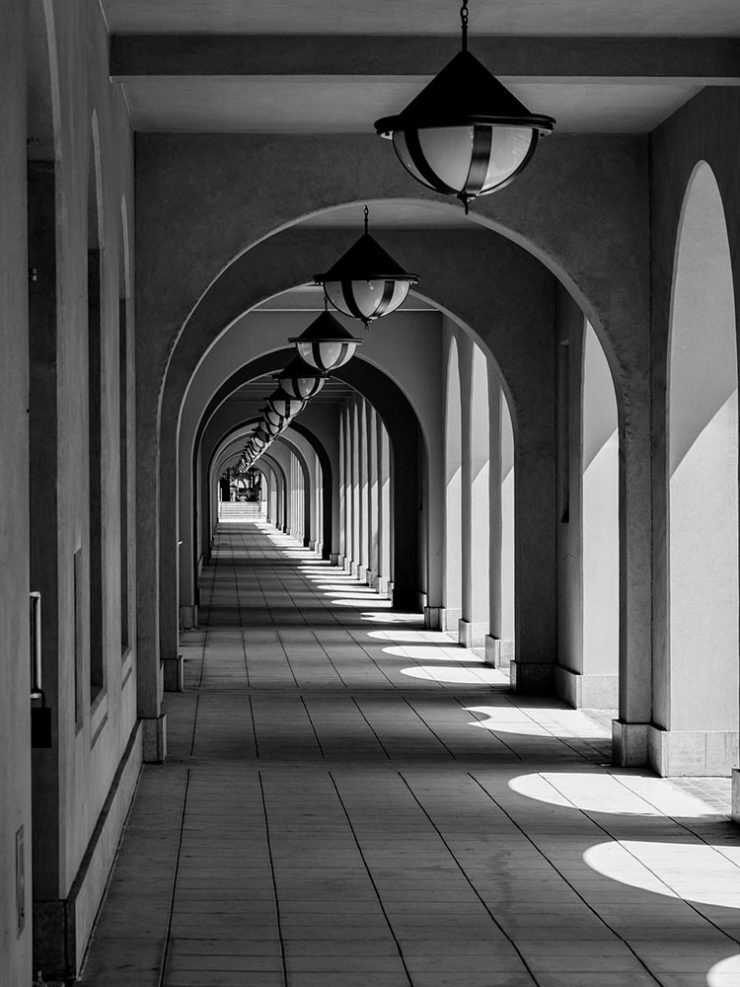
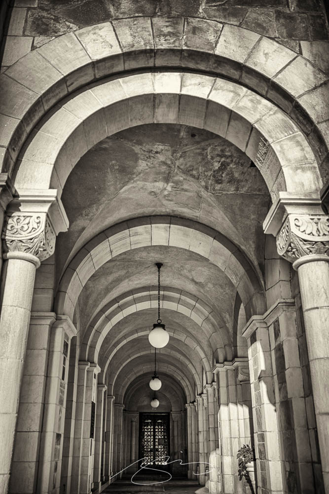
    Liberty Station, San Diego by Keith James

    Few scenes set my photographic heart aflutter as does the view down a long covered walkway towards a distant, barely visible vanishing point. As a self-confessed symmetry addict drawn to architectural images in black and white, photographing these vistas scratches a deep creative itch.

    Keith James, MacFolios

    His article is well-illustrated, informative, and speaks to my heart: I love a good arcade — although, in some cases, I feel like an entry or exit makes the point:

    Vassar College Chapel Arcade, September 2021

    This is not the first time I’ve admired Keith’s work. His “Architecture Meets Sculpture in Black and White: the Interplay of Light and Form” was great work. Both articles are highly recommended.

    Artist Sunday

    For those of you in the United States, this weekend is the Thanksgiving holiday. It’s also that most American of traditions: a shopping weekend. I have spent recent years boycotting Black Friday and Cyber Monday, and am encouraged by the emergence of Giving Tuesday. Here’s something to add to that list:

    Photographer Chris Sherman developed the concept of “Artists Sunday” in 2019, after noticing a bump in sales on that day in November. “The idea struck,” Sherman told Hyperallergic. “What a great time to patronize artists — during the busiest shopping weekend of the year.” 

    In 2020, Sherman launched the project alongside Cynthia Freese, a fellow artist who has also spent extensive time on the boards of arts nonprofits. On a dedicated website, Sherman and Freese provide artists and arts organizations with free marketing materials to promote the event. Now in its third year, over 4,000 artists and more than 600 towns and cities across the country have signed onto the initiative, which takes advantage of special events and partnerships (with nonprofits, individual artists, and businesses) to spread the message.

    Happy Thanksgiving.

  • University Press Design Show 2022

    University Press Design Show 2022

    Note: Click on the title above to see this post in one-column format, which includes larger graphics — helpful with some of these jackets especially. (This applies to any post here on Foreword, by the way.)

    It’s time once again to celebrate the unsung heroes of the book world: the best items published by university presses.

    The annual show, now in its 57th year, honors the university publishing community’s design and production professionals. The Association recognizes achievement in design, production, and manufacture of books, jackets, covers, and journals, and the Show serves as a spark to conversations and source of ideas about intelligent, creative, and resourceful publishing.

    Association of University Presses 2022

    This show, like the 50 Books, 50 Covers also announced around this time of the year, is cool in that it doesn’t just talk about a book’s exterior — there are covers and jackets, interior design, even awards for the quality of typography.

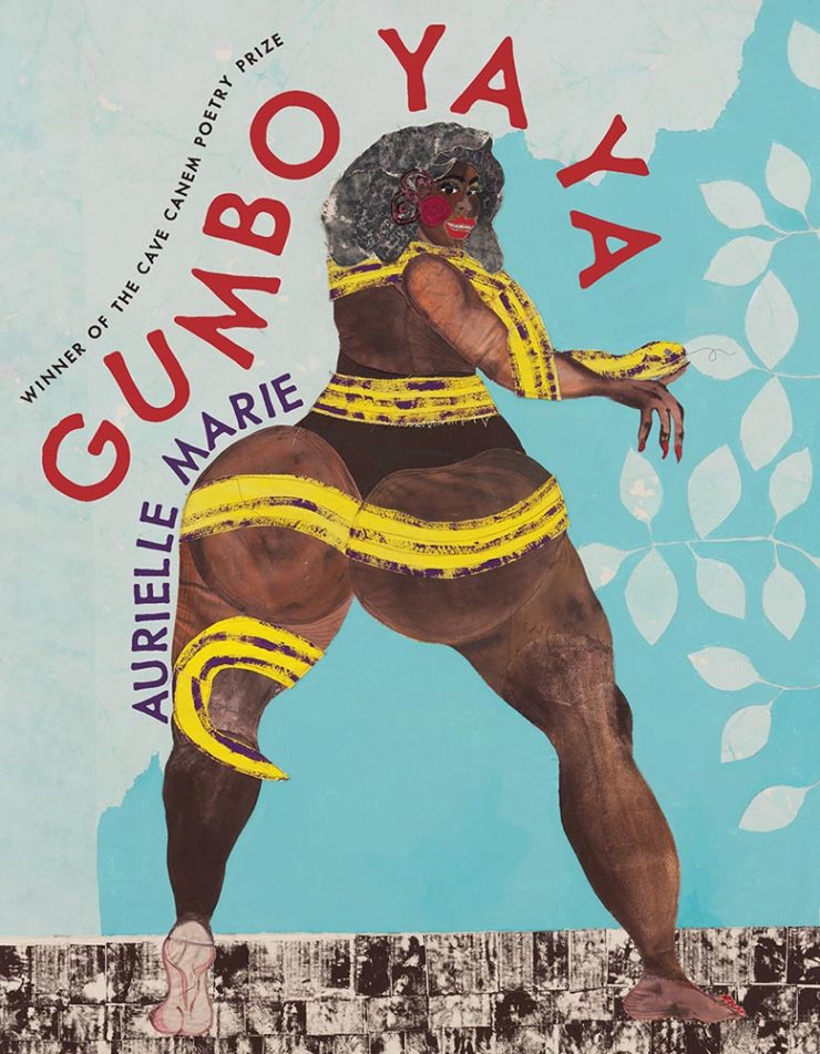
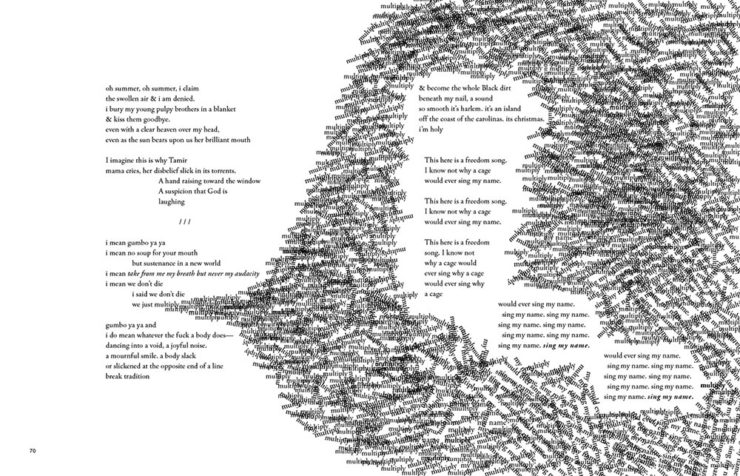
    Let’s talk about titles with both covers and interiors first, starting with the great Gumbo Ya Ya from the Poetry category:

    University of Pittsburg Press. Cover design by Alex Wolfe.
    University of Pittsburg Press. Interior design by Alex Wolfe.

    The strength of this design, inside and out, towers head and shoulders and whatever else above — designer Alex Wolfe deserves this win and many kudos from me.

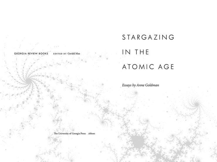
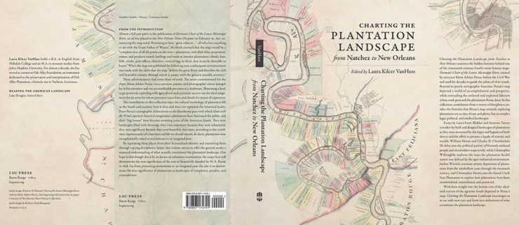
    Next, two from the Scholarly Typographic category:

    University of Georgia Press. Design by Erin Kirk.

    Fractals are a great choice on this title page. (Love the title, too.)

    LSU Press. Design by Barbara Neely Bourgoyne.

    This whole project is well done, with the jacket taking an old map and giving it just the right treatment.

    Three from the Scholarly Illustrated category:

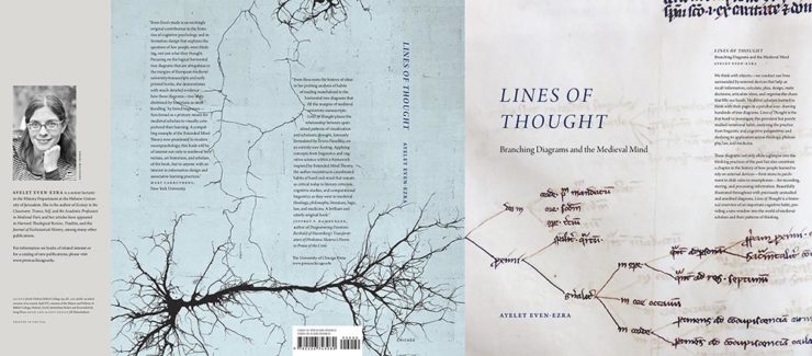
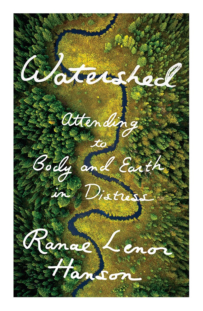
    Chicago University Press. Design by Jill Shimabukuro.

    Not dissimilar to the above when zoomed out, but so much more than a scribble when zoomed in. (Note that the blue wraps onto the front — nice choice.)

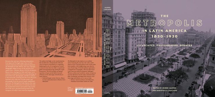
    Getty Publications. Cover design by Catherine Lorenz and Jim and Drobka.
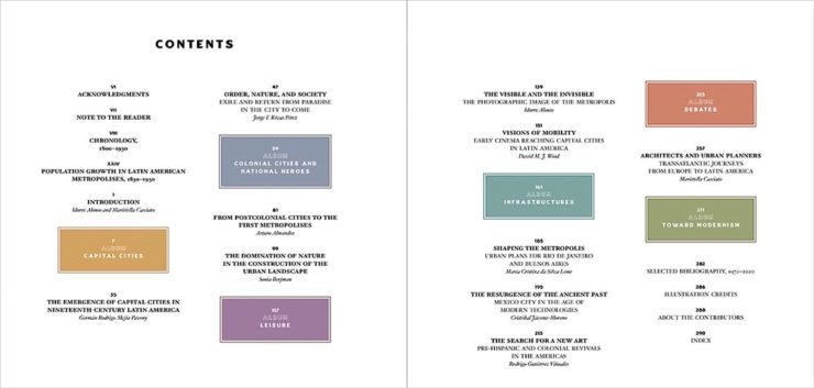
    Getty Publications. Interior design by Catherine Lorenz and Jim and Drobka.

    Great cover, and the contents pages are awesome! (I don’t get to say that very often.)

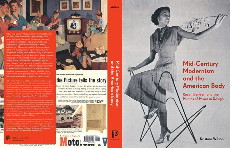
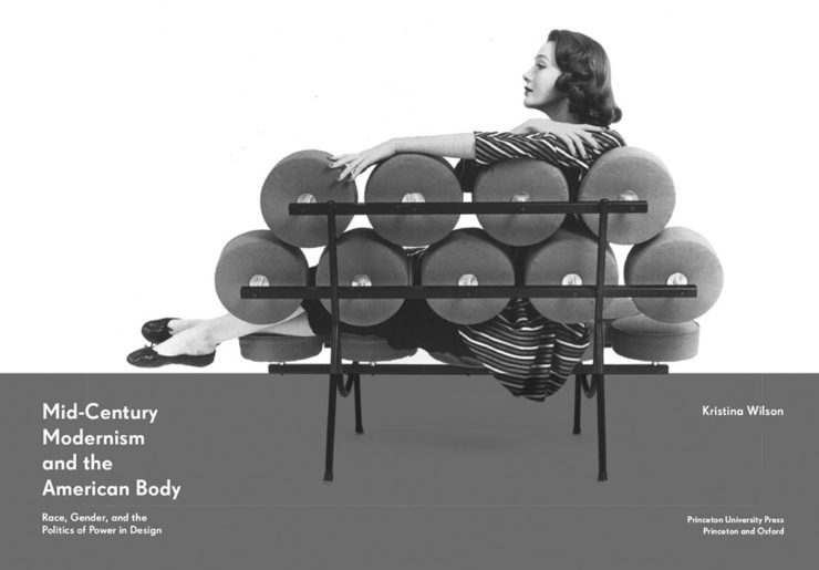
    Princeton University Press. Cover design by Roy Brooks.
    Princeton University Press. Interior design by Roy Brooks.

    This is not an easy title to design for, and here both the cover and title pages are extremely well done.

    Next, the Trade Typographic category:

    Johns Hopkins University Press. Design by Amy Ruth Buchanan.

    A one-color triumph.

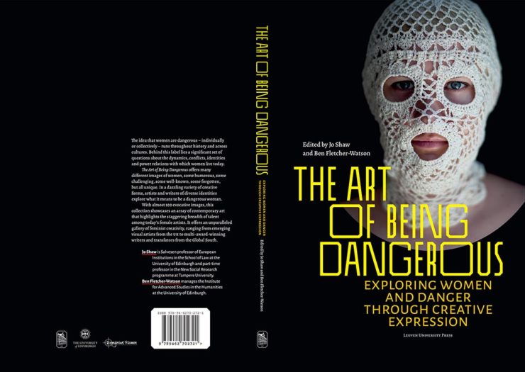
    Leuven University Press. Design by Stéphane de Schrevel.

    Great, great photograph with interesting typography grabs your attention here.

    One from the Trade Illustrated category:

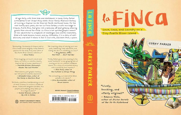
    Trinity University Press. Design by Janice Shay.

    It’s difficult not to appreciate a book with “Love, Loss, and Laundry” in the subtitle — but the book design does it justice.

    We finish up with several favorites from the Book Covers and Jackets category:

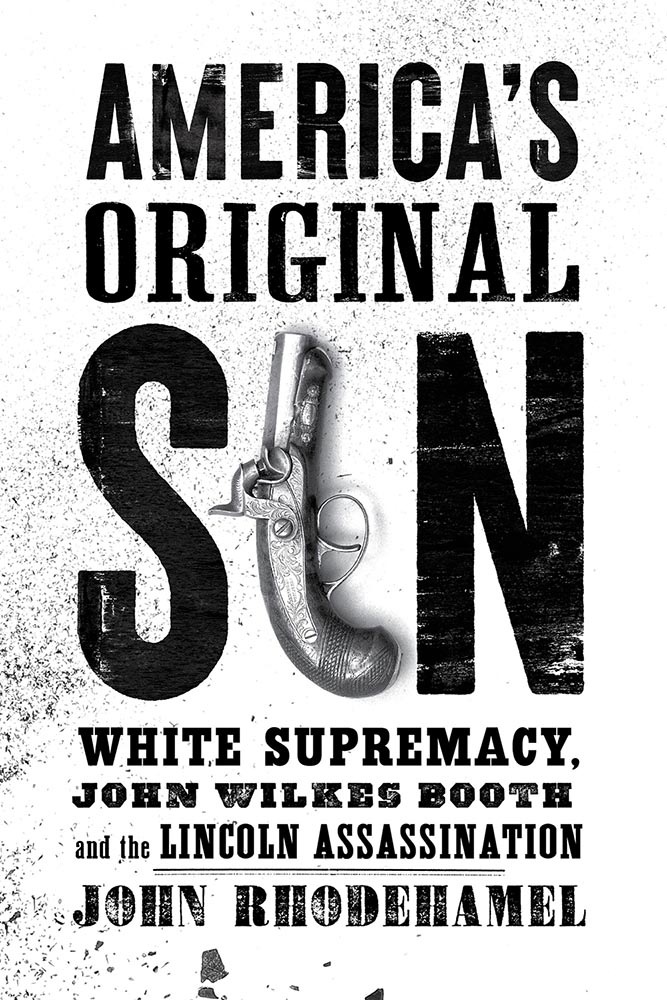
    Georgetown University Press. Design by Jeff Miller.

    Flag-as-fence. ’Nuff said.

    McGill-Queen’s University Press. Design by David Drummond.
    McGill-Queen’s University Press. Design by David Drummond.
    McGill-Queen’s University Press. Design by David Drummond.

    I don’t know that these are a series of titles as much as a style for the titles — but, in either case, they work.

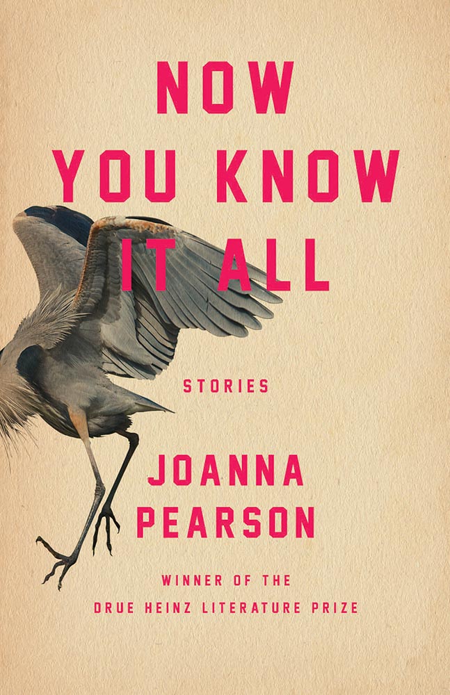
    University of Pittsburgh Press. Design by Henry Sene Yee.

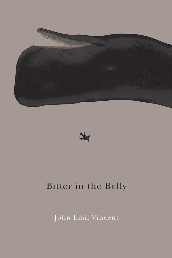
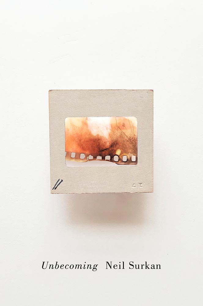
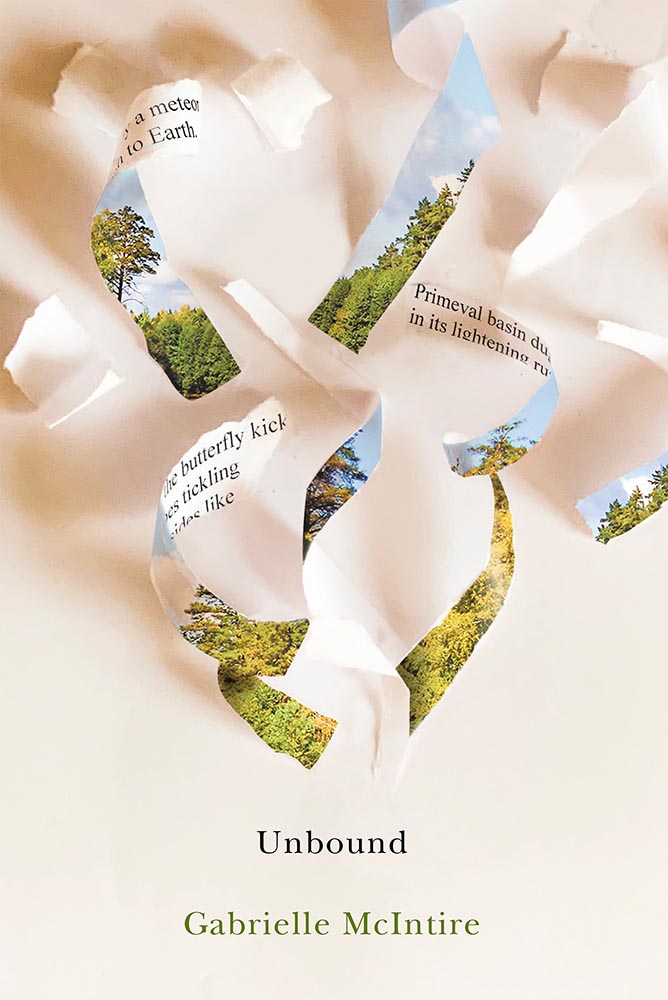
    Not the only title here with textured paper, the simple typography with a fantastic — and fantastically-placed — bird wins for more than literature.

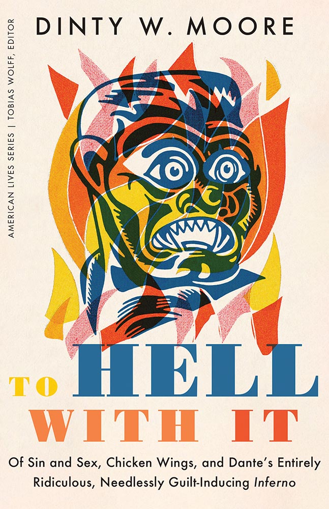
    University of Minnesota Press. Design by Casalino Design.

    The white border around this is difficult to see here, but adds to the overall in an interesting way; I also like the hand lettering over this amazing photograph.

    University of Nebraska Press. Design by Nathan Putens

    Additive color combined with the subtitle-of-the-year on this winner.

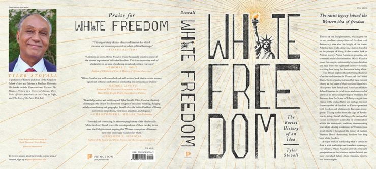
    Princeton University Press. Design by Derek Thornton.

    Great, great typography here. When combined with the radiating lines and provocative title, it makes for a title that I’d absolutely pick up.

    I’ve saved my favorite from the whole show for last:

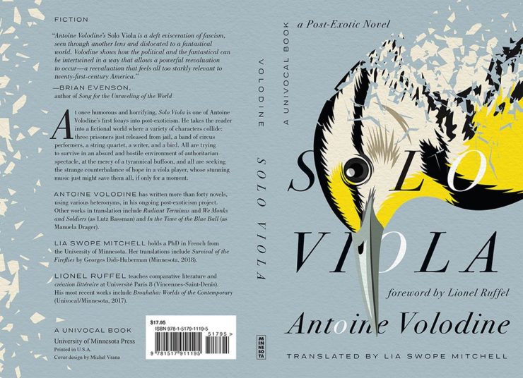
    University of Minnesota Press. Design by Michel Vrana.

    Another appearance of textured paper is just the start here, with that illustration rocking so hard indeed — the eye! Fantastic in every way. (Bonus points for “A Post-Exotic Novel.”)

    See all of the entries from this great Association of University Presses show here. (FYI, nothing from Spine yet, but kudos to the University of Chicago Press for blogging about their favorites.)

  • Beautifully Briefed, Early April 2022: Eames Institute, Loony Backgrounds, and … Condor!

    Beautifully Briefed, Early April 2022: Eames Institute, Loony Backgrounds, and … Condor!

    Three completely unrelated items for you this time, ranging from the serious and interesting through the loony and interesting to something of a whole different stripe.

    The Eames Institute of Infinite Curiosity

    Update 2, 25 Apr: Brand New discusses this logo, with the usual catchy title: The Fast and the Curious: Counterspace Drift

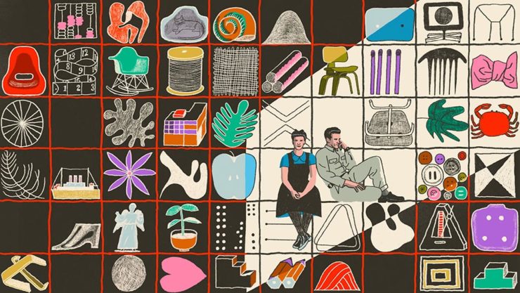
    Eames Institute’s “curious” logo variations, discussed at Brand New

    Update, 8 Apr: It’s Nice That has more: The Eames Institute launches with a curious, “Eamesian” identity, and a logo that observes

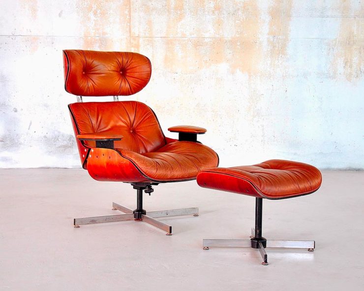
    Original post: Practically everyone has heard of an Eames Chair:

    A particularly awesome example of an Eames Chair (and ottoman).

    What you might not realize is that the legacy Charles and Ray Eames left behind enriches our lives to this day. It’s a shame, then, that while their house is a mid-century masterpiece (and museum), much of their lives have remained behind closed doors.

    For almost three decades, a barn-like building in Petaluma, California, contained remnants of one of the most iconic design legacies of the twentieth century. […] We created the Eames Institute because we want you to examine the archive of what you know—the collection of your experiences, understanding, memories, and questions—and connect to the provocations that call to you. We want you to tap into that same fount of relentless curiosity, and its power to shift your perception and open you to innovations and discoveries.

    Now, however, there’s the Eames Institute of Infinite Curiosity. Awesome name aside, it introduces us to the more personal side of one of design’s strongest partnerships.

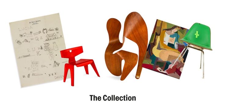
    Items from the Charles and Ray Eames Institute.
    Drawings from the Charles and Ray Eames Institute.

    The website requires some interesting scrolling to get where you need, but the results are more than worth the time — and is one that earns (Eames?) its suggestion of satisfying infinite curiosity. Explore and enjoy. (Hat tip: ArchDaily, The Newly Launched Eames Institute Brings Insight into the Eameses’ Design Methodology.)

    Loony Toons Backgrounds

    Design You Trust: “Looney Tunes Without Looney Tunes: Existential, Surreal, And Creepy Backgrounds.” The post sends readers to an Instagram account, which I’m not going to link to, but the images themselves are fascinating:

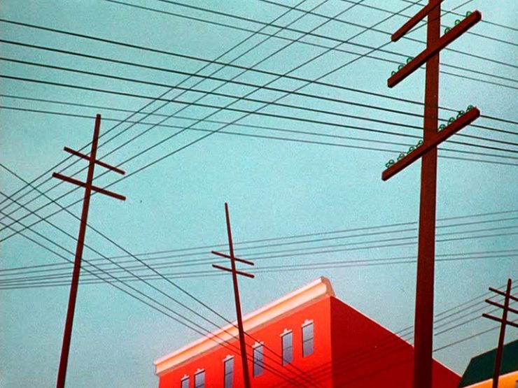
    Crossed wires, anyone?
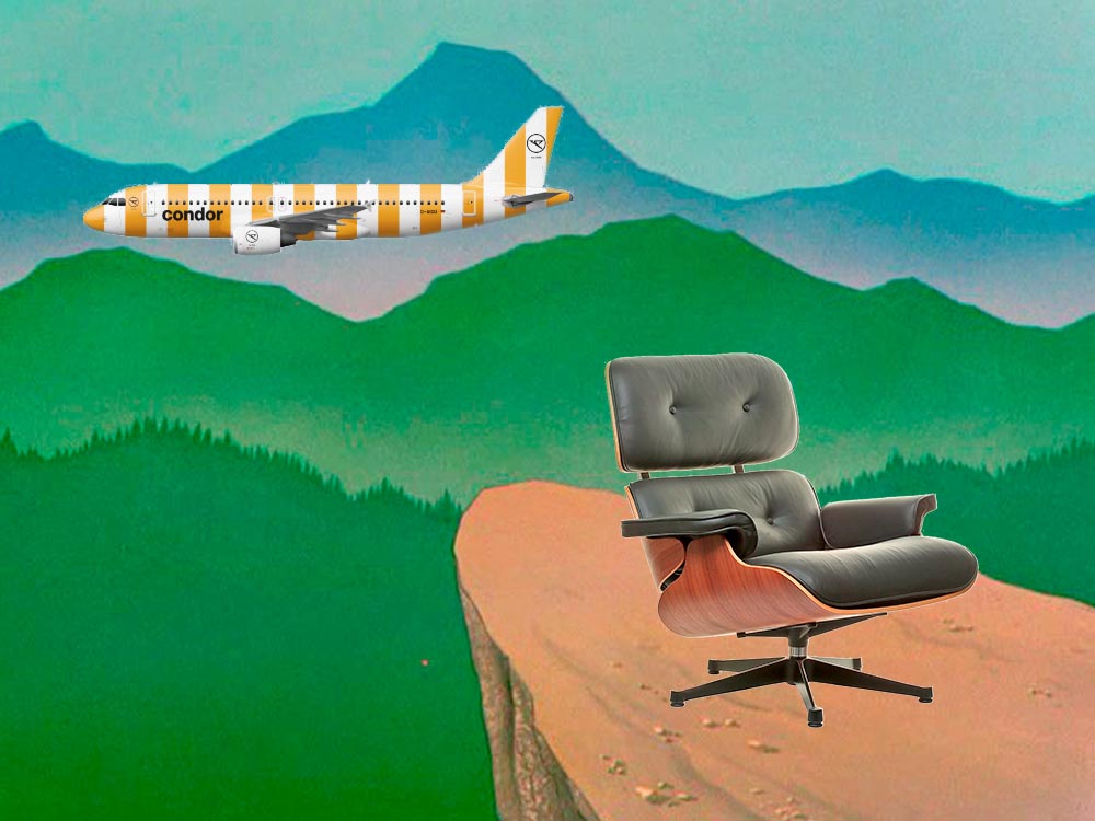
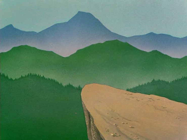
    Imagine who might run up to — or even get pushed off of — this cliff.
    A nice, innocent factory. Nothing could possibly go wrong.

    Next time I treat myself to a Loony break, I’m going to make sure to spend some time looking beyond the action and appreciate the backgrounds. Nice.

    Condor Airlines Rebrands

    Most of you have probably never heard of Condor Airlines; they’re mainly a European thing, a “leisure” airline associated with Thomas Cook, formerly owned and run by Lufthansa. (Here’s some history.)

    It doesn’t particularly matter. What does is the bravado exhibited by management. Before, a typical airline logo — dare I say, typically Germanic:

    Condor’s OLD livery.

    Then someone said yelled, “HEY. WE DO VACATIONS. LIKE BEACH TOWELS. LET’S DO STRIPES.” The result:

    Condor’s NEW livery. Wow.

    Armin Vit:

    The new livery has zero fucks to give and just plasters every plane with thick vertical stripes that go against pretty much every single assumed tenet of what makes a good livery. It doesn’t look speedy, it doesn’t look nimble, it requires a lot of paint, and by all other standards it is just plain ugly and I love it.

    Read more or see images at Condor, see the Brand New post, or even hear from the armchair pilots at Airliners.net. Now: anyone got a beach?

  • Beautifully Briefed, Early March 2022: Monograph Impresses, Monotype Trends, and Media Waste

    Beautifully Briefed, Early March 2022: Monograph Impresses, Monotype Trends, and Media Waste

    Three diverse items in this round-up, from illustration to typography to whether or not ad-blockers are actually environmentally-friendly — along with a response that reminds us to look at the bigger picture.

    Malika Favre (Expanded Edition)

    CreativeBoom:

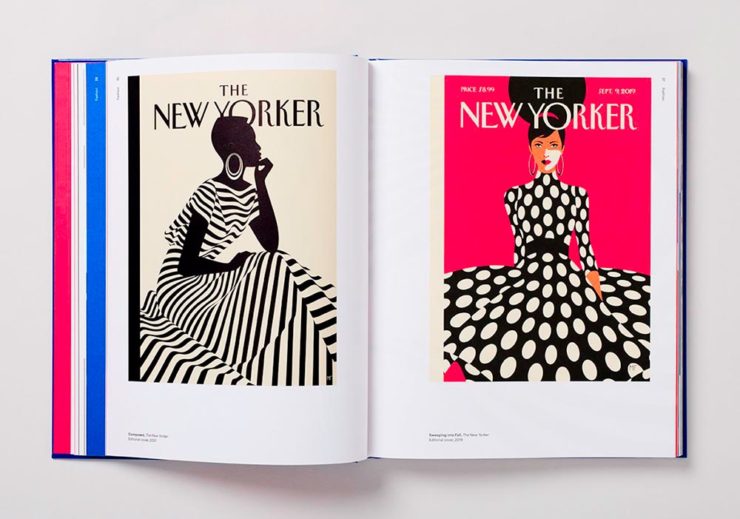
    French illustrator and graphic designer Malika Favre has been impressing audiences for years with her minimalist work for publications such as The New Yorker, Vogue, and Vanity Fair. Now over a decade’s worth of her work has been released in a new monograph from Counter-Print, which contains a suitably stripped-back aesthetic.

    Her style is distinctive; I’ve liked her New Yorker covers especially:

    Malika Favre (Expanded Edition) in English

    The book includes the illustrator’s own cover, and she had a big hand in designing the layout, too. CreativeBoom’s article is excellent — check it out.

    Monotype’s 2022 Trends

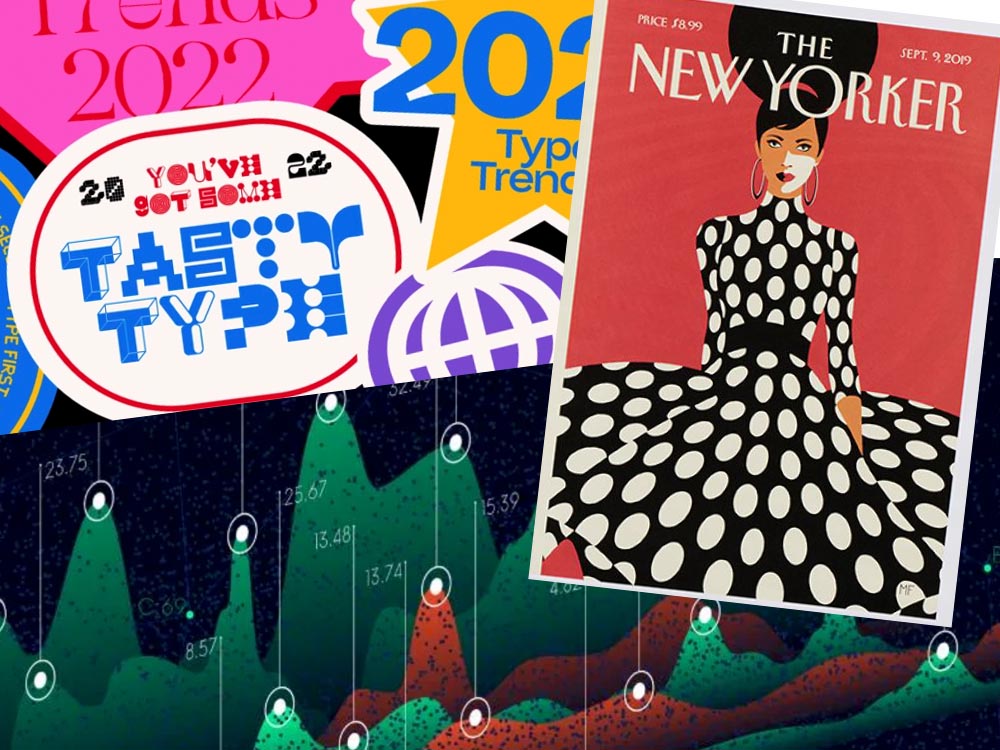
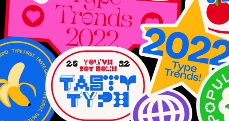
    It’s Nice That points us to the recently-released 2022 Type Trends Report from Monotype:

    Monotype’s 2022 Type Trends Report cover

    Throughout yet another “unprecedented year,” it’s safe to say that the macro trends influencing the type design community are nearly too long to list. Several socioeconomic, political, and cultural events continue to shape the way we approach creative work and how connect to each other online and offline.

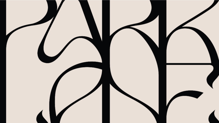
    Biodiversity’s relationship to type, varying type styles in a single logo, and thin serifs — the one I’m likely to use somewhere — are in this year.

    New York’s Park Lane Hotel

    The above example, from New York’s Park Lane Hotel, is but one they cite (see that whole, very lovely project at Brand New). Check out the whole report, and get trendy.

    Perhaps we can convince Apple to go back to its also-lovely Garamond…?

    Media, Trackers, Blockers, and the Environment: There’s a Problem

    Did it ever occur that using an ad blocker in your browser is actually an environmentally-friendly move? No, I hadn’t put it together, either.1More from MIT on ecological impacts of cloud computing here.

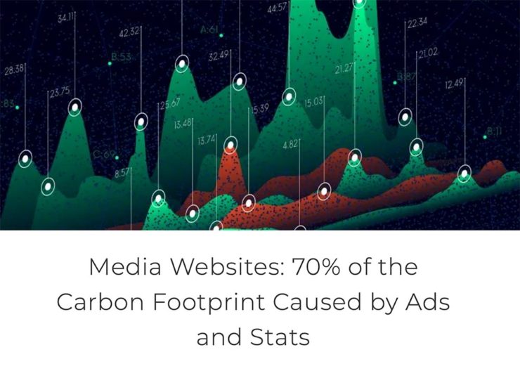
    70% junk. Surprise and shock (not really).

    [U]p to 70% of the electricity consumption (and therefore carbon emissions) caused by visiting a French media site is triggered by advertisements and stats. Therefore, using an ad blocker even becomes an ecological gesture. But we also suggest actions web editors could take to reduce this impact.

    An interesting study, certainly, with information that many of us already use and some suggestions for action in case we don’t. But…:

    Another of Monotype’s 2022 Type Trends, appropriated for use here

    Nick Heer:

    I have qualms with this. The idea of a “carbon footprint” was invented by British Petroleum to direct focus away from environmental policies that would impact its business, instead blaming individuals for not recycling correctly or biking to work more. A “carbon footprint” is also a simplistic view of how anything contributes to global warming, and that it seems to be used here as a synonym for bandwidth and CPU consumption.

    I’m not sure whether I’ve called out the excellent Pixel Envy2A sort-of Daring Fireball with Canadian roots, but this is an example of why I should.

    That is where I think this well-intentioned study falters. Even so, it is absurd that up to 70% of a media website’s CPU and bandwidth consumption is dedicated to web bullshit. Remember: the whole point of web bullshit is that it is not just the ads, it is about an entire network of self justifying privacy hostile infrastructure constructed around them.

    • 1
      More from MIT on ecological impacts of cloud computing here.
    • 2
      A sort-of Daring Fireball with Canadian roots
  • New Website. Finally.

    New Website. Finally.

    Housekeeping news: I went back to having an actual website in June, 2019; for a few years, I’d just used a photography hosting service, as photography was the vast majority of what I did. However, when book design again became an important-enough part of my work, I wanted to have a space to talk about it. I bought a WordPress template, added photographs, and posted it.

    …But I never really liked it. From the beginning, I felt y’all deserved more: better typography, better photography, better everything. Like so many, however, one’s own stuff is always at the bottom of the to-do list. No longer.

    I’d like to introduce the new version:

    The new gileshoover.com, January, 2022

    There were a few bumps getting here (naturally, I broke everything along the way; to say I don’t code is an understatement!), but with some tweaking notwithstanding, the new gileshoover.com is live. It’s got all-original photography, matched sans and serif font superfamily (Merriweather by Sorkin Type, a Google Font), much faster response time, open-source foundations, and so on.

    Note that entries on Foreword are best seen individually, as you’ll see bigger photographs (or illustrations, graphics, etc.). Click on entry titles to get there.

    Please explore.

  • Beautifully Briefed: September, 2021

    Beautifully Briefed: September, 2021

    Let’s get the shock news out of the way first:

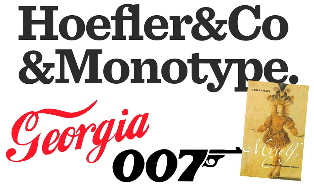
    Hoefler and Monotype

    It’s been thirty-two years, four months, and fourteen days since I hung out a shingle to announce that The Hoefler Type Foundry was open for business. What started as a sole proprietorship grew into the Hoefler&Co of today, a diversified design and technology practice with an international reach, still dedicated to the invention of original, thoughtful, and hard-working typefaces.

    Meanwhile, “nothing will change,” Jonathan Hoefler (previously) says, except that he’ll be stepping down. That’s kind of a big change, IMHO — but after using typography to “help elect a president,” where do you go from there? Read more here.

    In happier news, the much-delayed new Bond movie, No Time to Die, is finally in theaters next week.

    The 007 logo

    Ever wonder who was responsible for the above (slightly brilliant) graphic? Read Stephen Heller’s The Daily Heller: The Most Prolific Designer You’ve Never Known. Informative and great. Bang!

    Corp State of America: GA

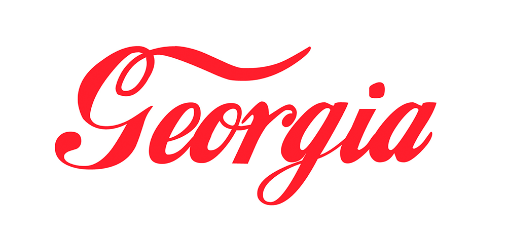
    Keith Fleck has gotten a good deal of press for his Corporate States of America, but in case you haven’t seen it, it’s absolutely worth a look. Maine’s L.L. Bean, Florida’s Publix, and, of course, Georgia’s Coca-Cola are all winners. 51 bonus points!

    Lastly for this month, some book design:

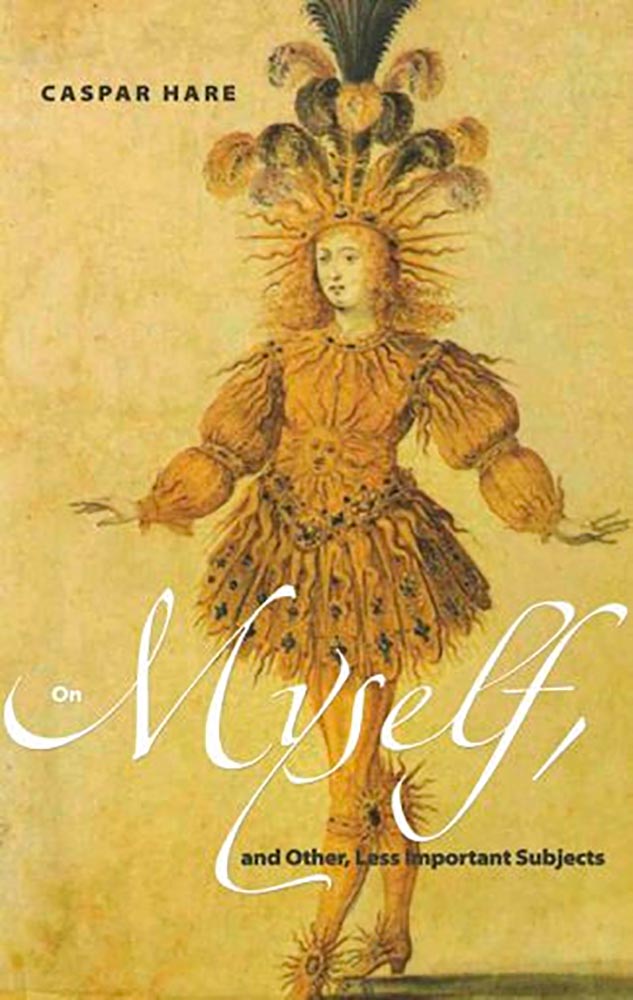
    On Myself

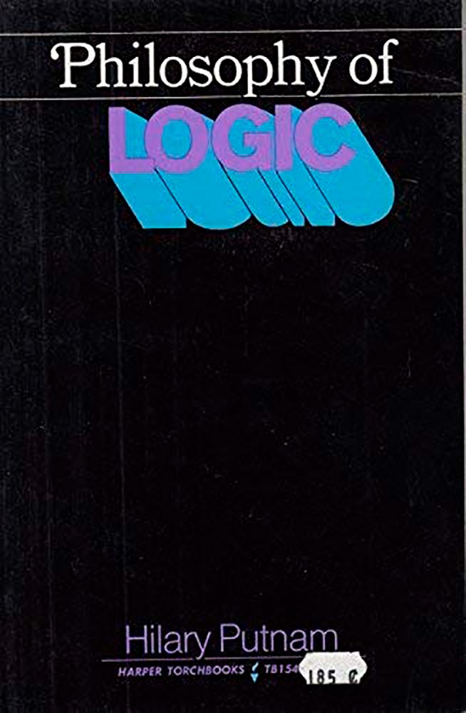
    Daily Nous asks their readers to nominate the best philosophy book covers — Judging Philosophy Books By Their Covers — and there are some winners, some absolute losers, and a few funny moments, too:

    Black Sabbath, except not

    “This always reminded me of a rejected Black Sabbath album cover or something,” says the poster. Nice. (And only 185 cents!)