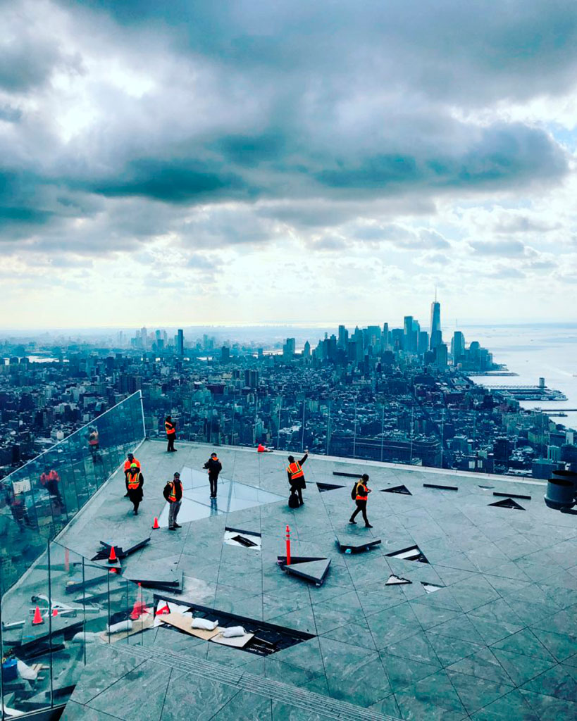
Many, many moons ago, my late sister attended Vassar College. I had an occasion to stay in Poughkeepsie, NY, where Vassar is located, and went over on a beautiful morning and spent some time wandering around with the Leica.
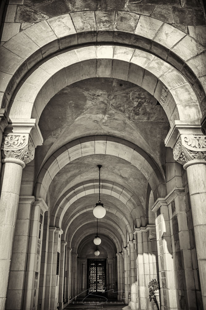
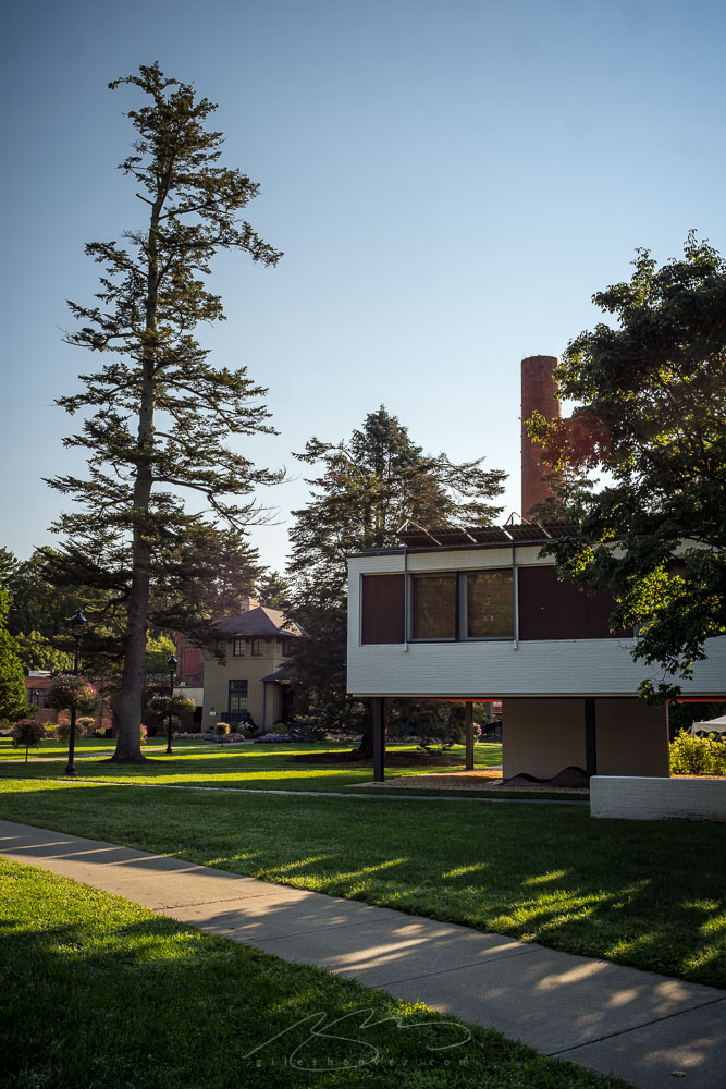
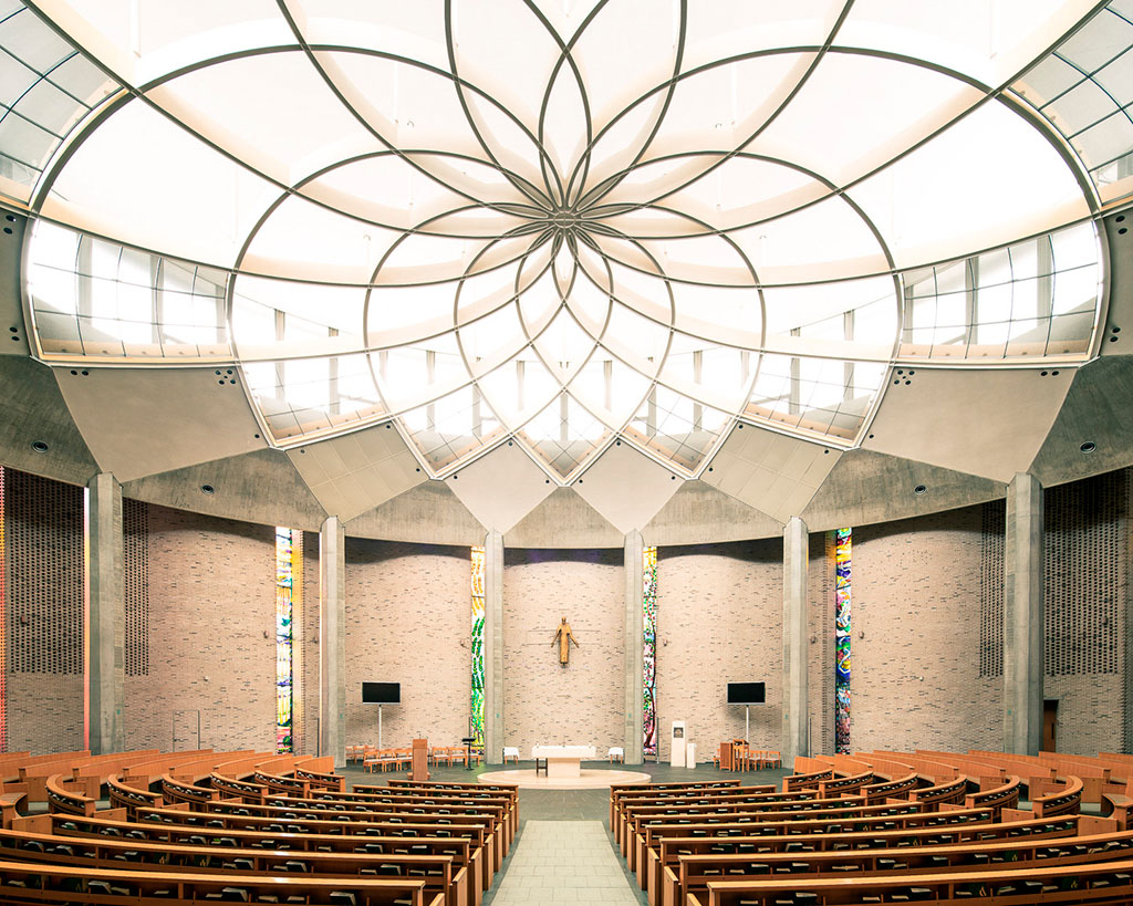
It’s a beautiful campus; a mix of modern, mid-century, and classic architecture — with a little mid-century thrown in:
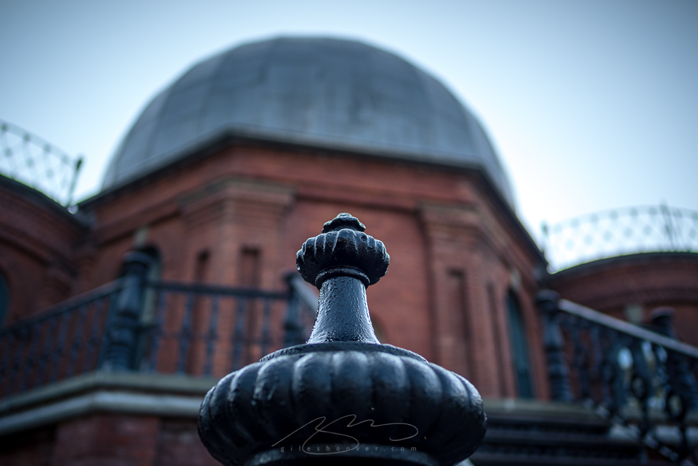
For many years, Vassar was a women’s (-only) college, and it was nice to find the National Landmark observatory building — a reminder that even in the 1800’s, women were doing scientific research:
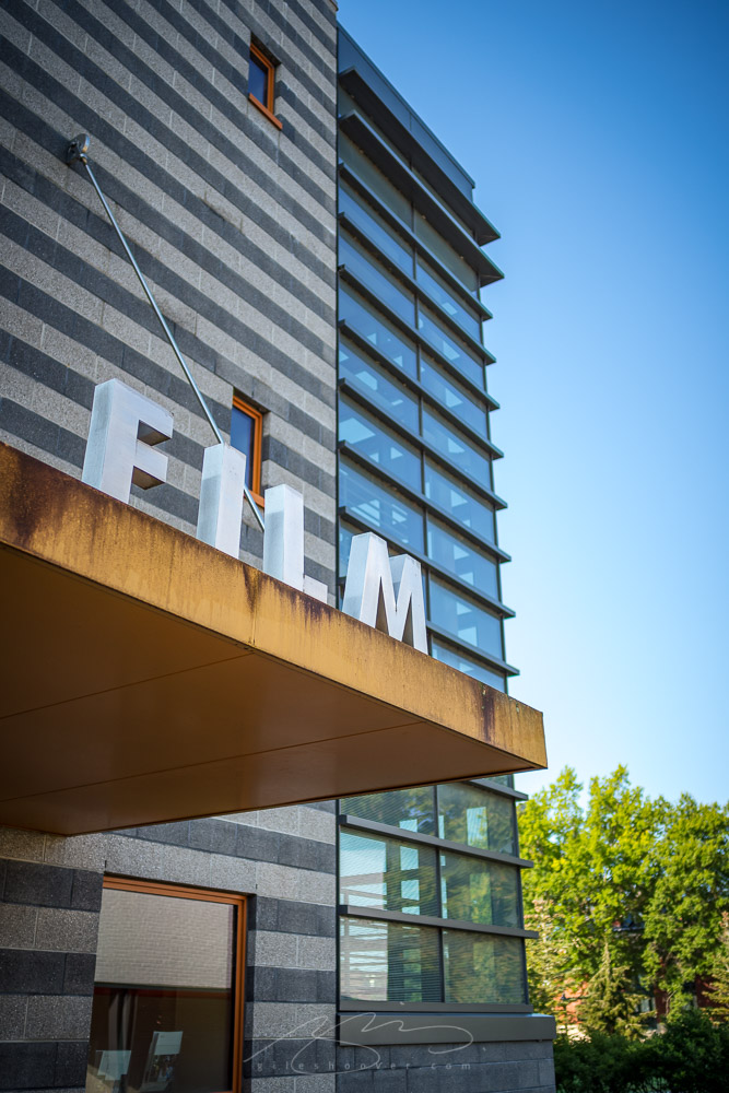
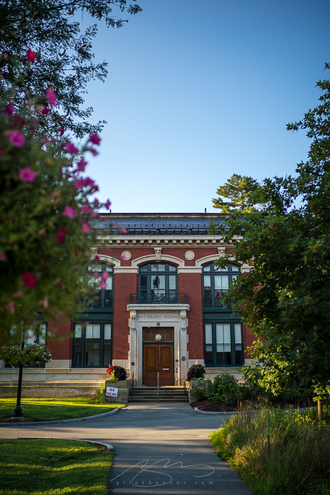
The New England building:
An enjoyable visit, a beautiful, incredibly well-tended campus, and a tranquil late summer morning at a renowned college. I was delighted to visit, and pleased with the resulting photographs. See the rest here.
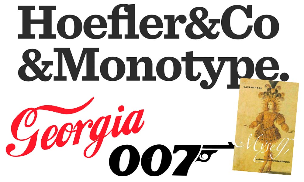
It’s been thirty-two years, four months, and fourteen days since I hung out a shingle to announce that The Hoefler Type Foundry was open for business. What started as a sole proprietorship grew into the Hoefler&Co of today, a diversified design and technology practice with an international reach, still dedicated to the invention of original, thoughtful, and hard-working typefaces.
Meanwhile, “nothing will change,” Jonathan Hoefler (previously) says, except that he’ll be stepping down. That’s kind of a big change, IMHO — but after using typography to “help elect a president,” where do you go from there? Read more here.
In happier news, the much-delayed new Bond movie, No Time to Die, is finally in theaters next week.
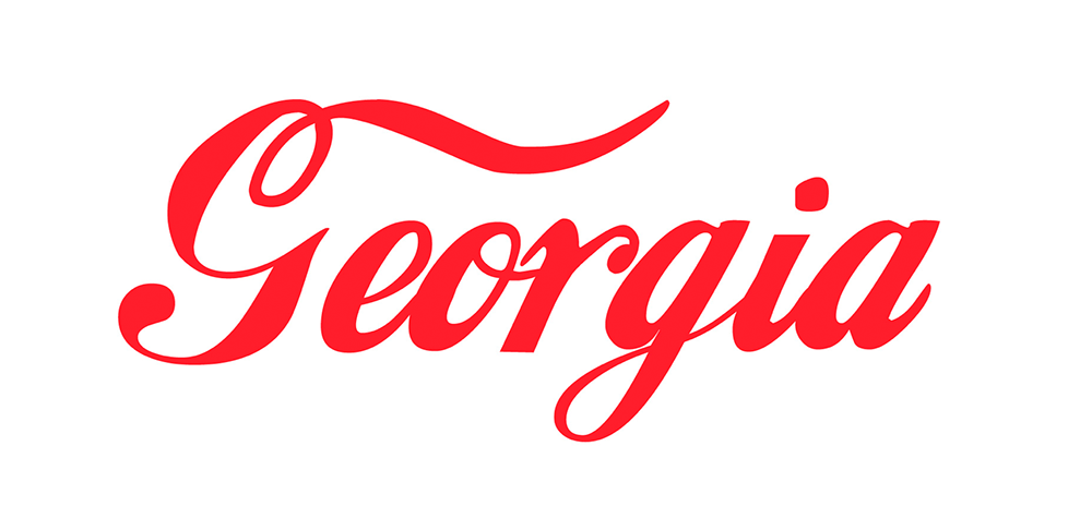
Keith Fleck has gotten a good deal of press for his Corporate States of America, but in case you haven’t seen it, it’s absolutely worth a look. Maine’s L.L. Bean, Florida’s Publix, and, of course, Georgia’s Coca-Cola are all winners. 51 bonus points!
Lastly for this month, some book design:
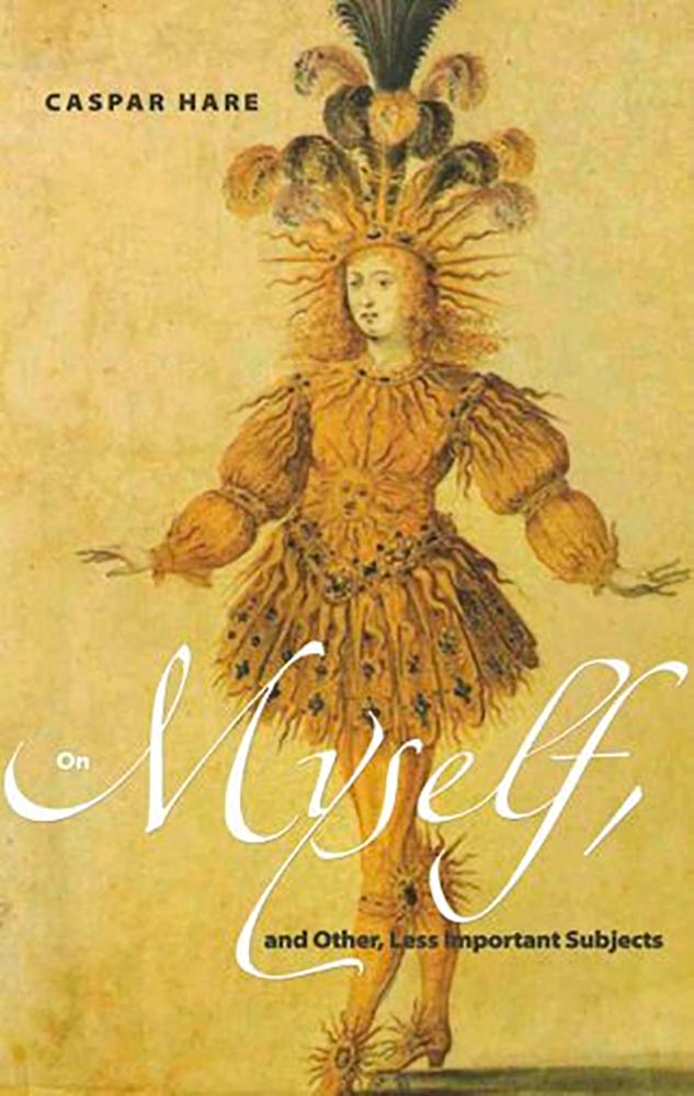
Daily Nous asks their readers to nominate the best philosophy book covers — Judging Philosophy Books By Their Covers — and there are some winners, some absolute losers, and a few funny moments, too:
“This always reminded me of a rejected Black Sabbath album cover or something,” says the poster. Nice. (And only 185 cents!)
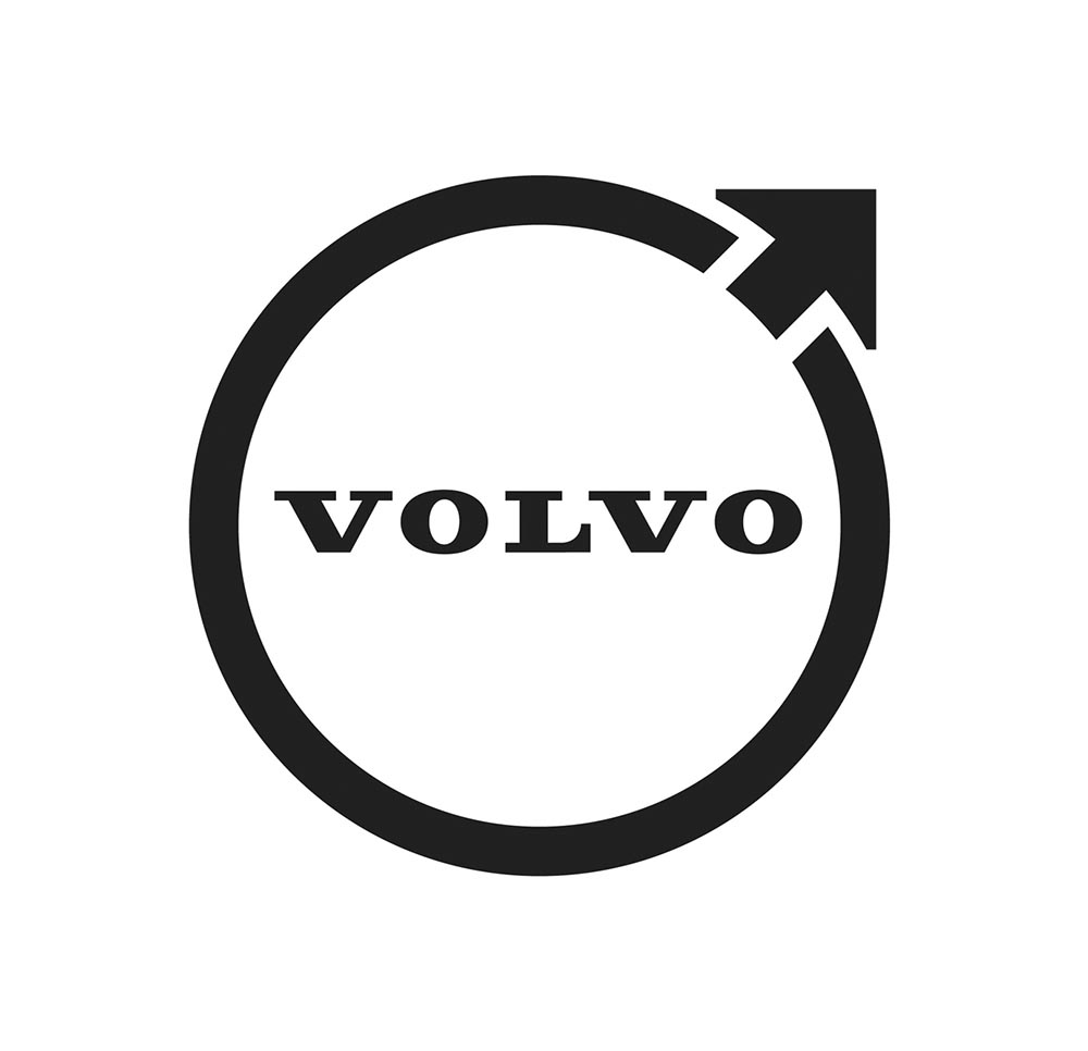
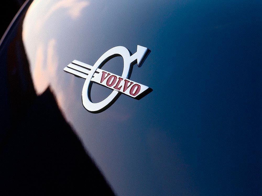
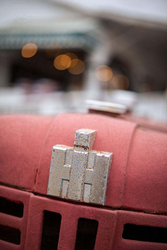
The “Iron Mark” has been given a makeover, and the result is … interesting. First, as a reminder, here’s the logo as it appeared previously — no, the one previous to that:
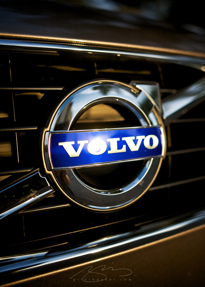
My mother’s 2010 Volvo S80
The blue has been associated with Volvo’s logo for a long while now, and it’s slowly been disappearing from the lineup (in favor of black in the same location). However, they’ve decided — they being both Volvo Cars and Volvo Group, two distinct entities (the latter including Volvo Trucks, the Volvo construction folks, Volvo Penta [marine], etc.) — to change to this new, more austere logo and word mark simultaneously. Aaaaaand:
See the previous coverage on Foreword. Can’t go, however, without a hat tip to Kristen Shaw at The Drive, who dug out this 1937 version — which, I’d argue, beats ’em all. Kudos.
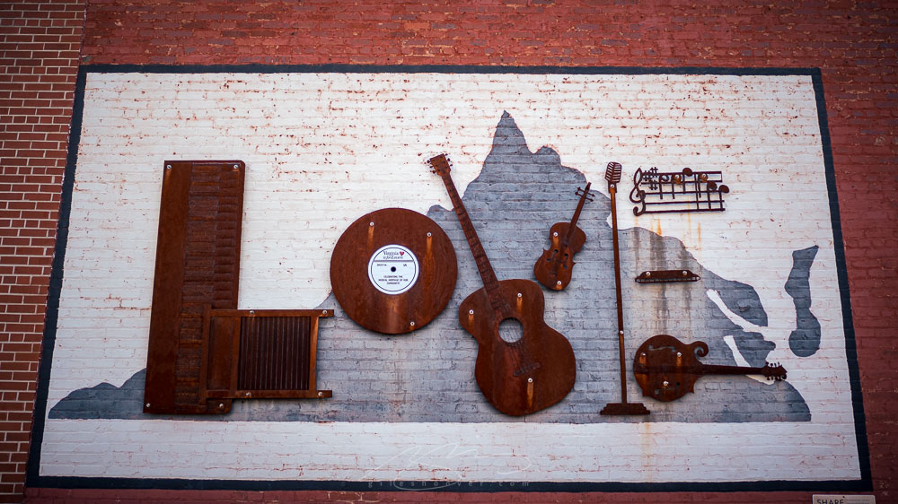
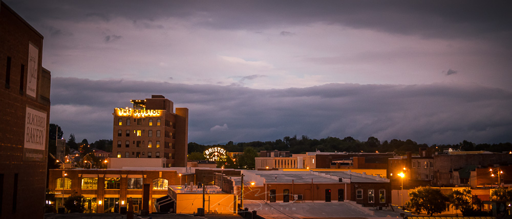
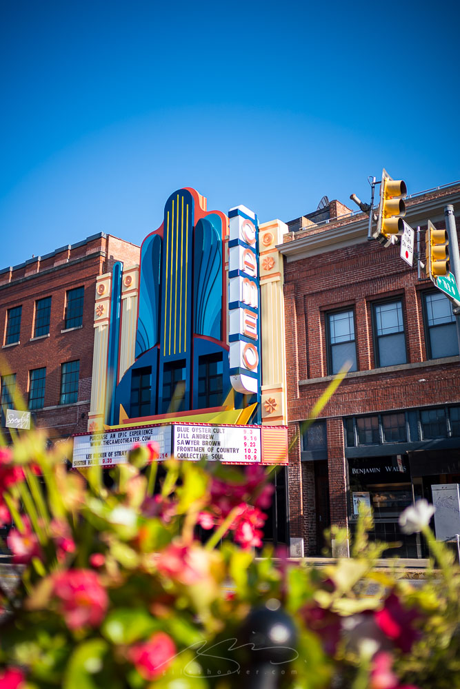
“Twice the city, twice the fun,” Bristol’s tourism web site says. While some might talk extensively about the Bristol Motor Speedway and its associated draws, I was only there to spend some time on the way to and from Maine. Using the superb Bristol Hotel as a base, I not only enjoyed the Blackbird Bakery and the Bristol Bagel & Bakery (no web site, alas) — both a great way to start a day — but also the excellent Vivian’s Table for dinner. That’s only the food; plenty more I didn’t get to, as well. Nice all around.
There were opportunities to take some photographs, too:
State Street downtown straddles the state line, meaning that this guy was in Virginia:
While this corner, two blocks down on the same street, is actually in Tennessee:
And here’s the best of both worlds: foreground in one state (TN) while background in another (VA):
It’s been a busy summer here in Middle Georgia; after regular updates to Foreword for several months, things have slowed down a little. Thus, some good items have piled up.
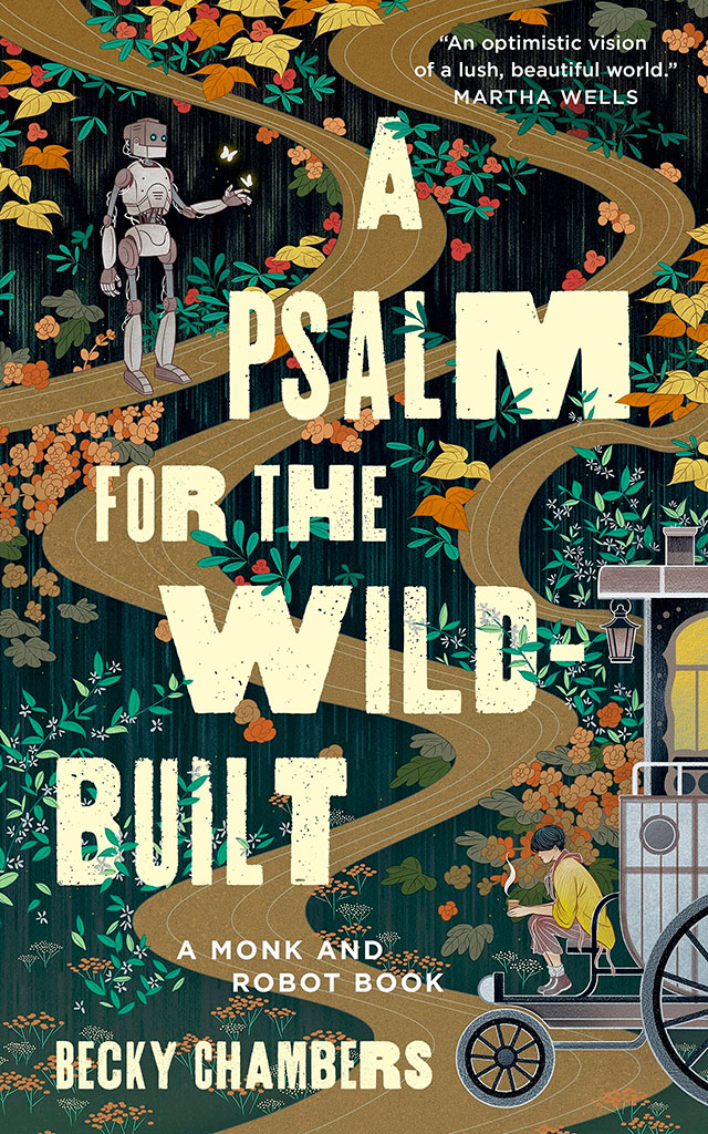
Starting with a book design I really like:
NPR describes it as, “A Monk And A Robot Meet In A Forest … And Talk Philosophy.” Interesting description, interesting design. I’d pick it up off a shelf.
Speaking of bookshelves, a notable quote from Andy Hunter, of Bookshop.org:
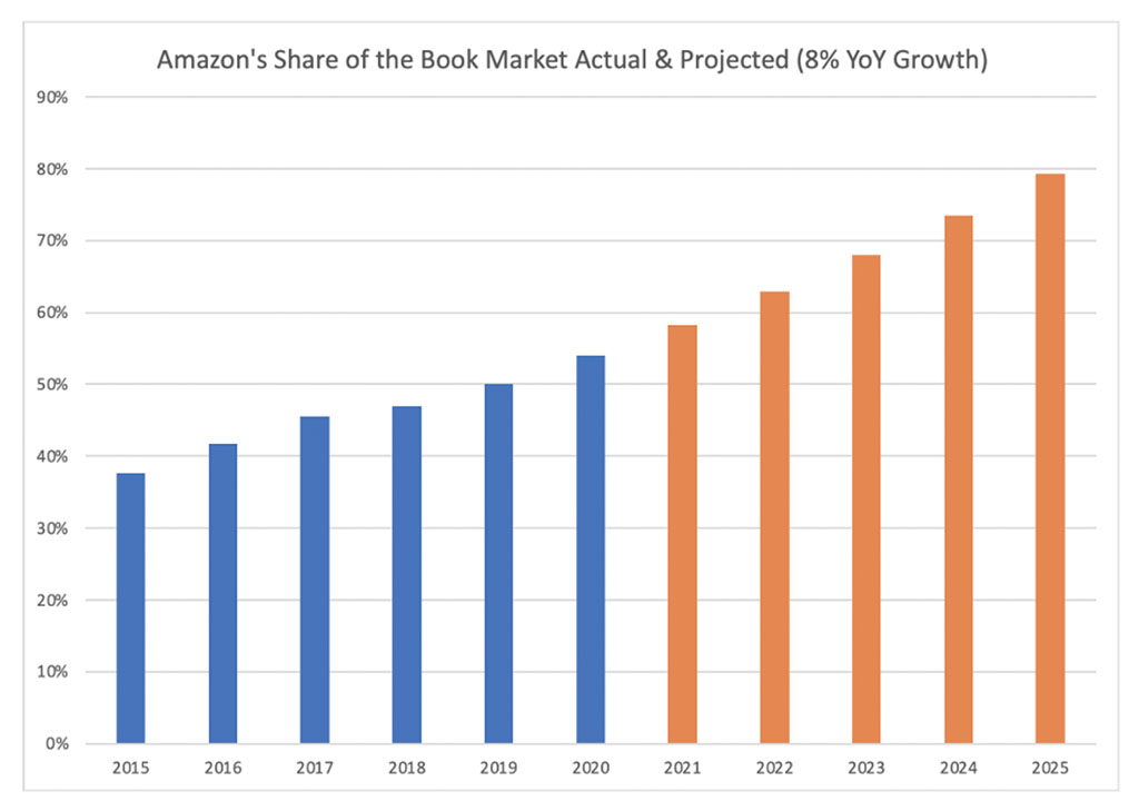
Take a look at this graph. The blue is Amazon’s share of book sales in the past six years. The orange is where we are headed if their average growth rate (8%) continues. If nothing slows their momentum, Amazon will control nearly 80% of the consumer book market by the end of 2025. Every single book lover should worry. After we’re done worrying, we must change the way we buy books.
The graph:
I’m not a fan of Medium — Andy, please choose a better place to post your very valid point — but it’s worth reading. Then change your book-buying habits if possible!
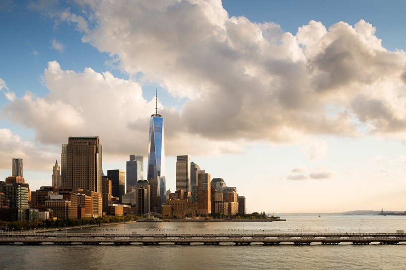
Also from the book category, check out Skidmore, Owings, and Merrill’s latest book of built work 2009-2019. Tons of great work here, but one example might tower over the others:
“Since 1965, the Association of University Presses (AUPresses) Book, Jacket, and Journal Show has fulfilled its mission to “honor and instruct”: honoring the design and production teams whose work furthers a long tradition of excellence in book design […]. The Book, Jacket, and Journal Show recognizes meritorious achievement in design, production, and manufacture of books, jackets, covers, and journals by members of the university press community. It also provides an evaluation of their work and serves as a focus of discussion and a source of ideas for intelligent, creative, and resourceful bookmaking.”
Credit where credit is due: Spine, in their excellent way, has already covered this. Head on over there, knowing that I largely agree with their post in its entirety. However, there are a number of covers I like that they didn’t talk about — and they didn’t talk about interior design at all.
So, without further ado, let’s start with the covers and jackets. Interiors follow, then items that are in both categories.
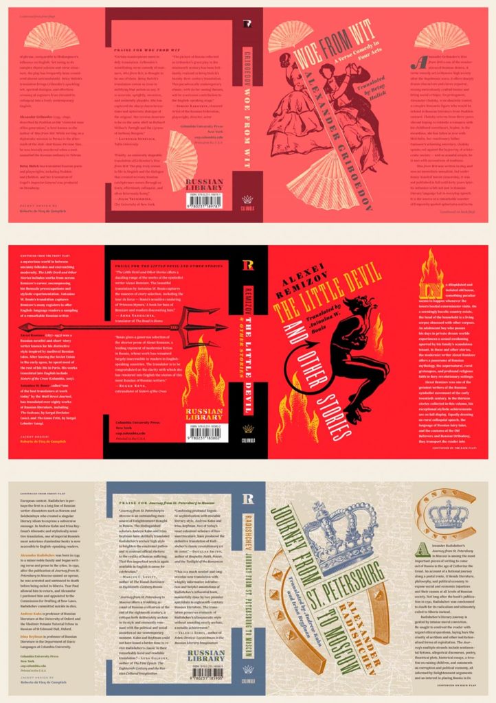
Columbia University Press with a series (in order, top to bottom): Woe from Wit, The Little Devil and Other Stories, and Journey from St. Petersburg to Moscow. Each is great on their own, but put ’em together and the series stands tall. Excellent design by Roberto de Vicq de Cumptich.
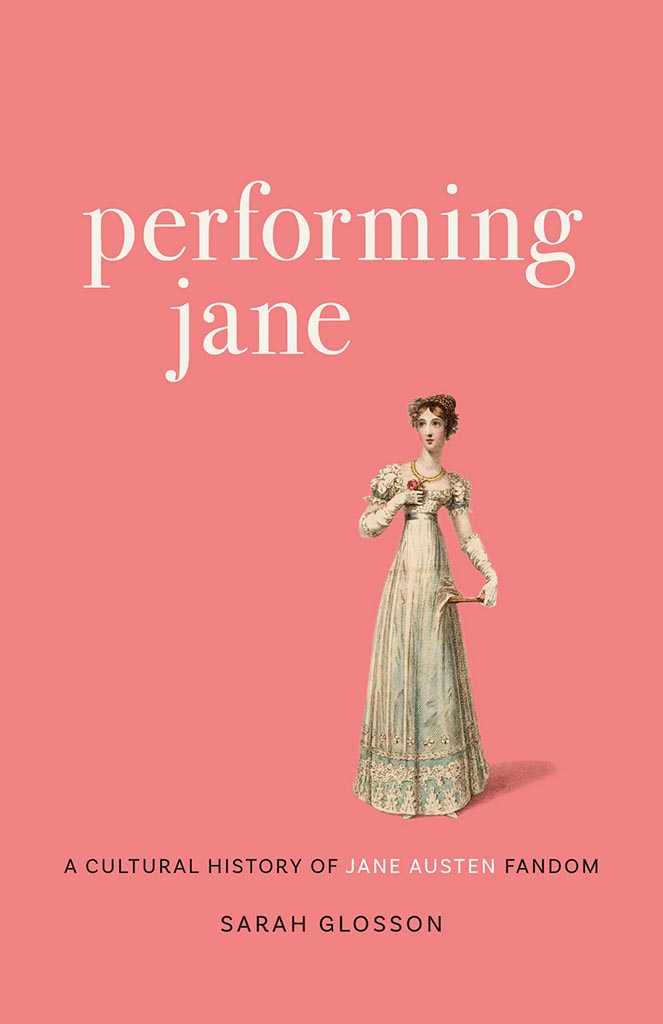
Louisiana State University brings us Performing Jane, with design by Barbara Neely Bourgoyne. Simplicity wins.
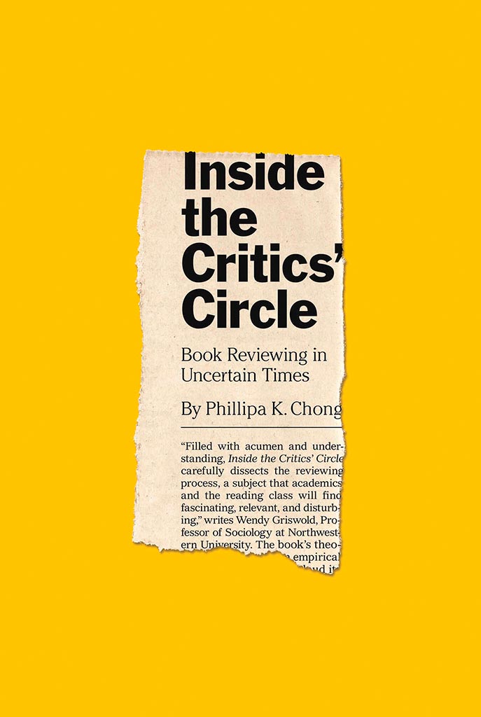
On the subject of simplicity, Inside the Critic’s Circle brings a seemingly-casual-yet-carefully-designed newspaper clipping onto a yellow background. Together, they’re attention-getting and just right. Nice. Design by Chris Ferrante for Princeton University Press.
Vénus Noire is about as far from a bust as can be — except not really:
Another example of simpler-is-better, yet something so much more. Design by Kaelin Chappell Broaddus.
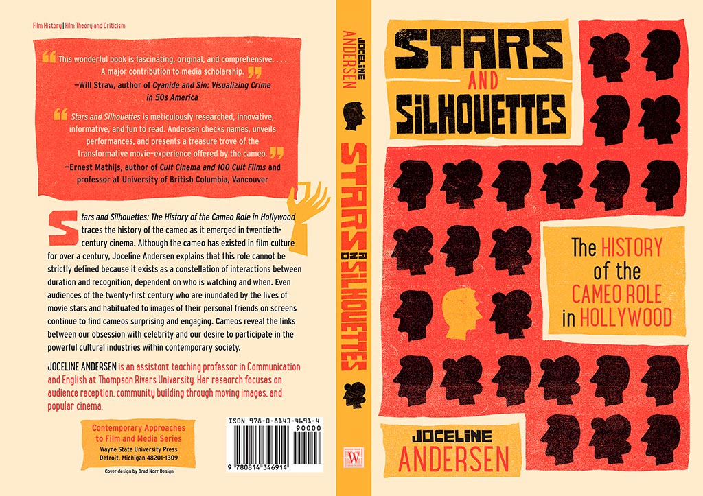
Wayne State University Press brings us Stars and Silhouettes, in all its hand-drawn glory. Love the design by Brad Norr.
My favorite of the stand-alone cover designs, however, contains a wrinkle or two:
Lovely. The illustration and paper photograph combine into something really special. Design by Derek Thornton — whose website, by the way, has a bunch of other great stuff. Nice!
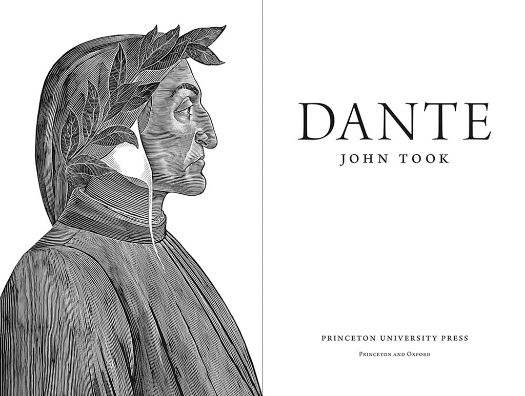
On to some interior design, with Pinceton’s Dante:
Puts “boring academic title [page]” to rest. Design by Chris Ferrante.
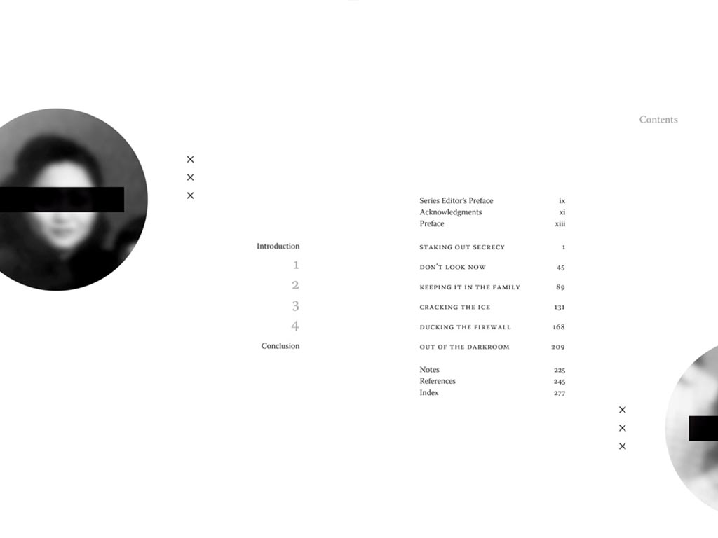
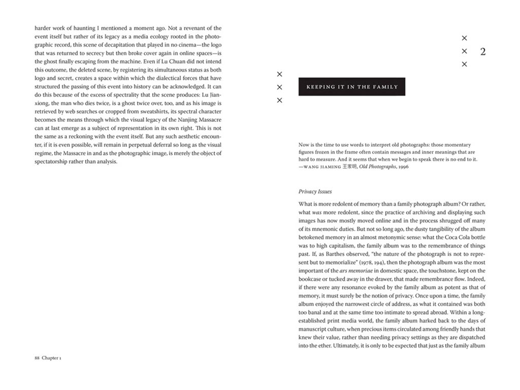
Next, a title on “knowing what not to know in contemporary China”, called Negative Spaces:
Design by Courtney Leigh Richardson for Duke University Press.
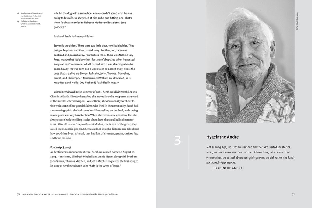
Next, stories from “the people of the land”:
Our Whole Gwich’in Way of Life Has Changed / Gwich’in K’yuu Gwiidandài’ Tthak Ejuk Gòonlih, with design by Alan Brownoff for the University of Alberta Press.
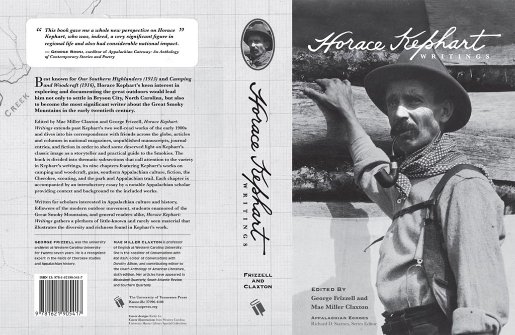
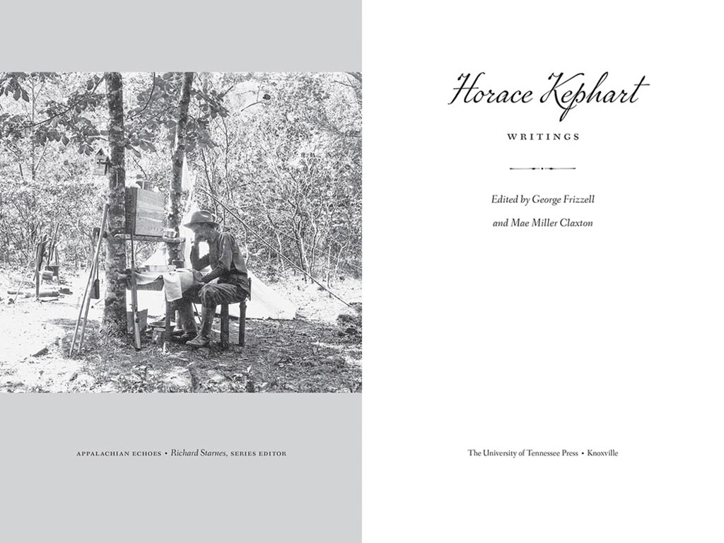
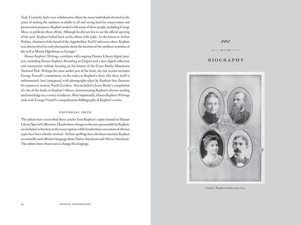
Next, a couple where both the cover and interior excel, starting with Horace Kephart from the University of Tennessee Press:
UTenn Press has a cool logo, too.
Lovely detailing in this design by Mindy Basinger Hill. Only one question here: Why doesn’t the script on the cover match that used inside? Both are nice — I prefer the one used on the cover — but either way, pick one!
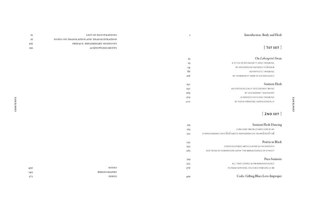
Last but certainly not least, perhaps the best designed of all the projects in the AUPresses 2021 Show, Duke’s Sentient Flesh:
Fantastic. And check the interior:
Kudos to designer Matthew Tauch for a “best in show,” at least as far as I’m concerned!