Foreword

  • Beautifully Briefed: Books, March 2021

    Beautifully Briefed: Books, March 2021

    Five book design items that caught my attention recently.

    First, from ArtNet News. Prior to basically everything, Andy Warhol did this:
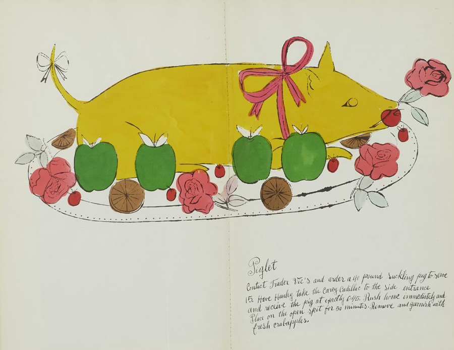
    “The whimsical book was a collaboration with interior decorator Suzie Frankfurt, who wrote the ridiculous recipes, and the artist’s mother, Julia Warhola, who provided the calligraphy, replete with charming misspellings. [It] was the last of a number of books Warhol designed in the 1950s, before he shot to fame in 1962 with Pop art compositions featuring Campbell’s soup and Coca-Cola. Book design offered him a valuable creative outlet during the years he worked as a commercial illustrator.” See more.

    The rest are from the New Yorker‘s “Briefly Noted” reviews — which, I’ll admit, inspired the title of this post. They pick four titles weekly, and while I’m sure many are great, actually great book design is rare. So to have four in two weeks … well, just had to say, “noted.” (The New Yorker is, of course, subscription — but there is a free account with limited options if you’d like to read their review.)

    The first three are from the March 8th, 2021, issue, starting with In Memory of Memory:
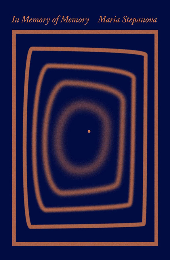
    The simplicity of the concentric rectangles — and “destination” dot — is mesmerizing.

    Next, Cathedral:
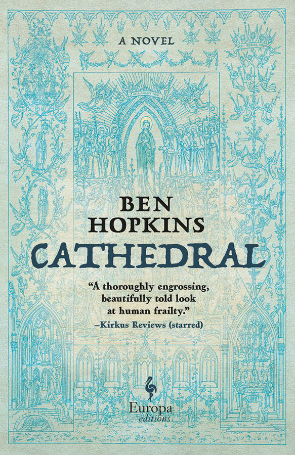
    Not a simple illustration in this case, and still an attention-getter in the background. Nice.

    Next, my favorite of this set, The Weak Spot:
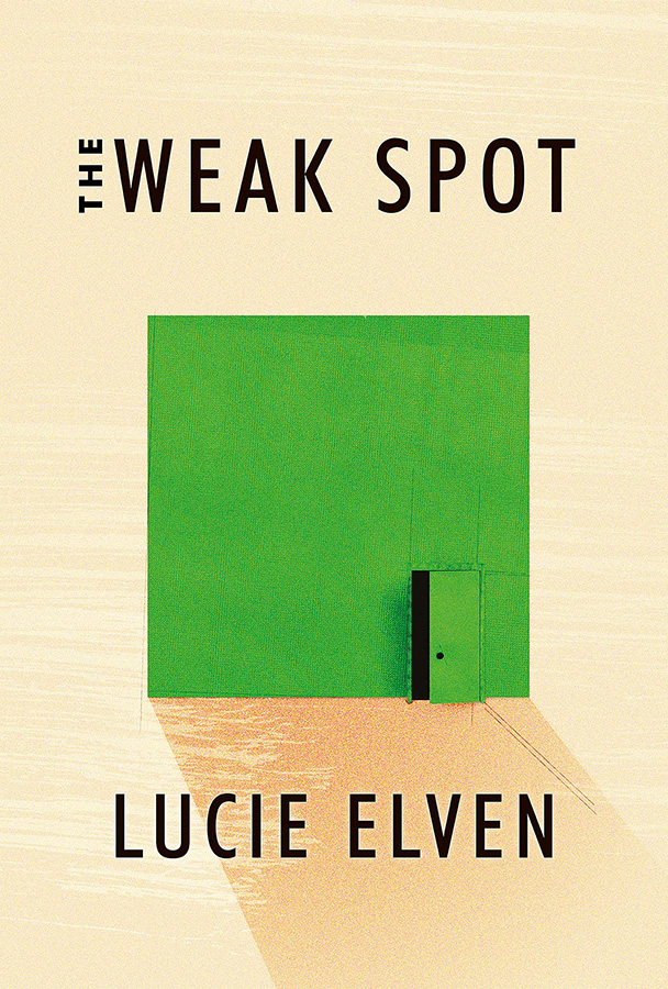
    A very brief (176 page!) debut novel with hits-above-its-weight cover design. (Content, too, presumably…;)

    Lastly, from the March 15th issue, Infinite Country:
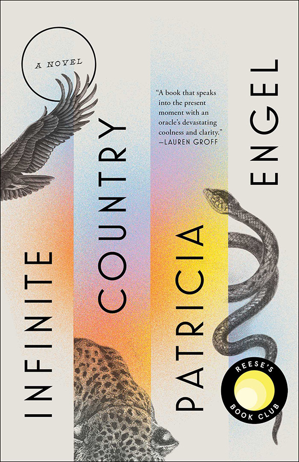
    Color and composition unite into something … infinitely good.

    Enjoy.
  • Penguin UK on the semicolon

    Penguin UK on the semicolon

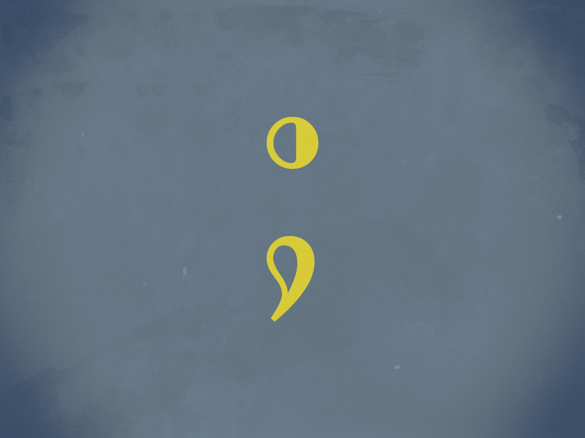
    “Do not use semicolons,” wrote Kurt Vonnegut; “All they do is show you’ve been to college.”

    I love a semicolon. (Perhaps a little too much, some might say.) Read more about this underutilized punctuation: Semi-colons; or, learning to love literature’s most misunderstood punctuation

  • Macon’s Miscellaneous Gallery Updated

    Macon’s Miscellaneous Gallery Updated

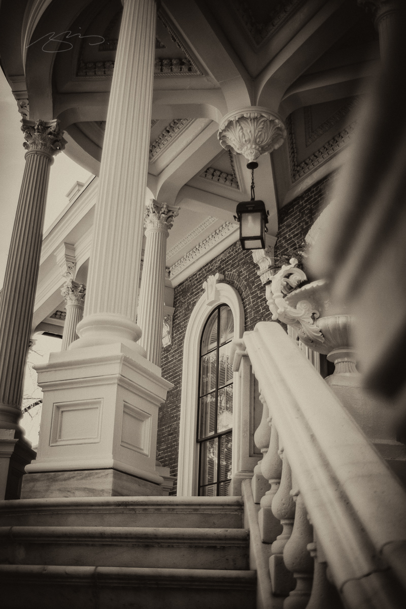
    The galleries for Macon on my Media site are subdivided by location, but some photography sets don’t really fit into a specific location. Today, I’ve updated the Macon – Miscellaneous gallery with photographs from Hay House, Coleman Hill and Mercer Law, and the Catholic and Baptist churches near downtown. Enjoy!

  • Gallery for Plains, Georgia updated

    Gallery for Plains, Georgia updated

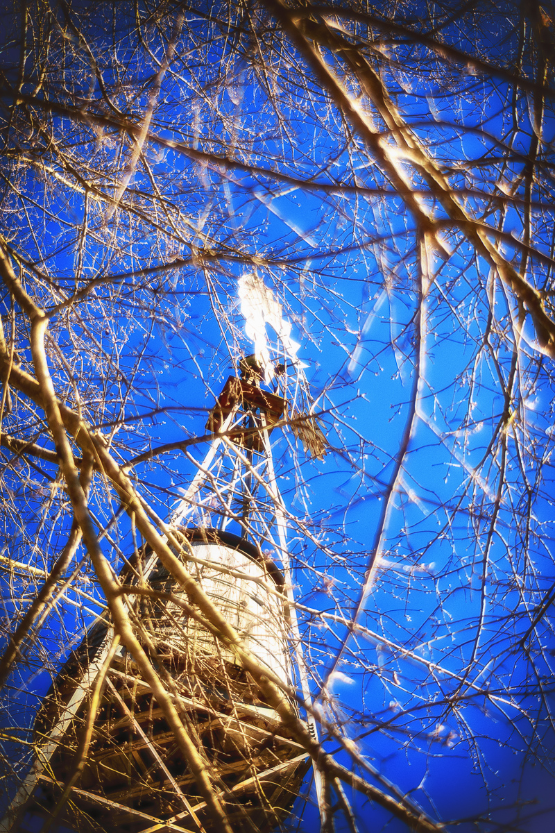
    Former President Carter’s hometown of Plains, Georgia, has a gallery now up to 70 photographs. I just added more from the Carter Boyhood Farm, taken March 4th, 2021. Enjoy!

  • Latest in Regular Sport: New Orwell Covers

    Latest in Regular Sport: New Orwell Covers

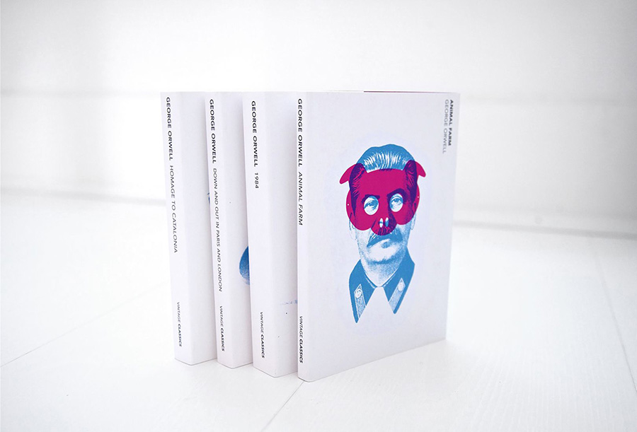
    Creativeboom points out that Heath Kane, not a citizen but in fact a subject of the Crown, has designed new covers for George Orwell’s classics Animal Farm, 1984, and more.

    Two interesting things about this: they call it the “final printed edition,” without further explanation. I somehow doubt there won’t be more editions in print — high schoolers everywhere would mourn, professors cry, and surveillance societies everywhere smile. Okay, overdramatic, but still.

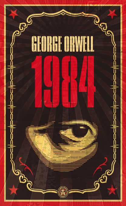
    And, I really preferred this one:

    More from Penguin on Orwells through the ages.

  • Macon Downtown Gallery Updated

    Macon Downtown Gallery Updated

    Gerald and I spent a lovely Sunday afternoon wandering around downtown Macon, resulting in an updated gallery. Take a look.

    Note: the gallery is arranged chronologically, with the oldest photographs at the top.

  • The Joy of Monochrome, from Spine

    The Joy of Monochrome, from Spine

    “A technicoloured cover can draw me to it like the proverbial moth to a flame. But as covers get more vivid, the buyers’ senses can become overwhelmed. They can’t see the books for the rainbow.”

    Spine’s Vyki Hendy argues that monochrome — by which she means black-and-white-or-shades-thereof — is powerful. I’d argue that single-color items should belong in this category, too, but her piece stands on its own. Take a look.

  • I Love Typography’s 2020 Favorites

    I Love Typography’s 2020 Favorites

    “It’s hard to believe that a decade has passed since I published one of these annual Favorite Fonts lists. A lot has happened in the interim: I now have less hair, more grey hairs, sometimes complain about my back, and now live in another country! Anyway, that’s quite enough about me. Here are, then, in no particular order, my favorite typefaces of 2020…”

    Some great choices here, especially:

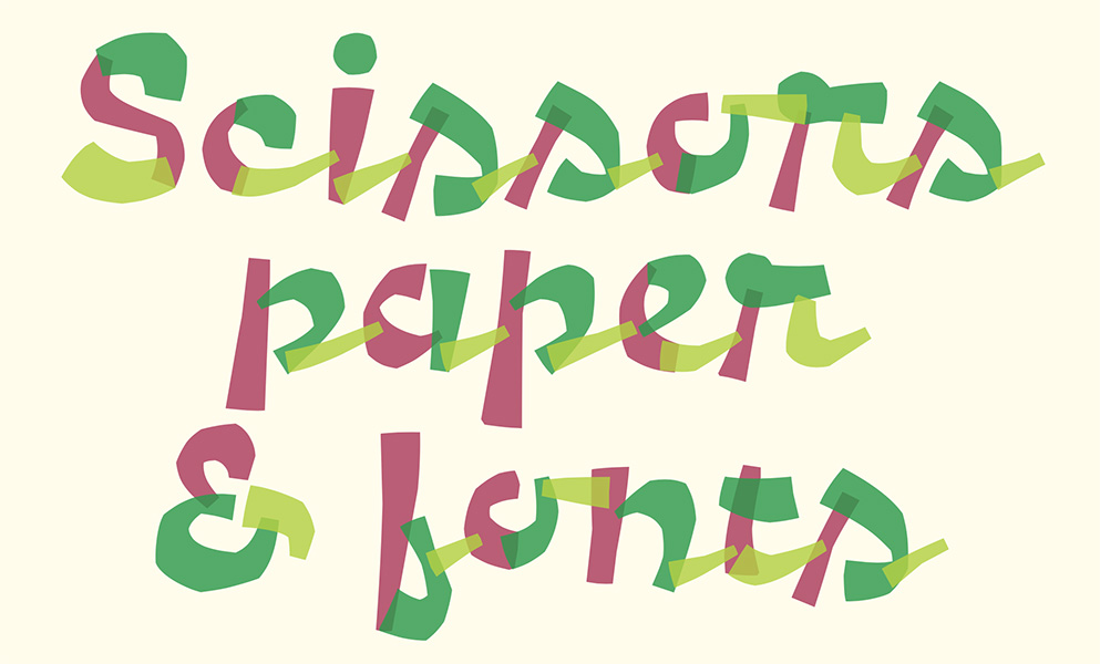
    A layer font — something described as “fashionable for a while” — this one deserves to be on a book cover.

    Special mention: ILT’s web design. This blog and this entry both are easy to look at, well put-together, and something that makes me a little envious.

    Read all of the 2020 favorites, or ILT’s main page.