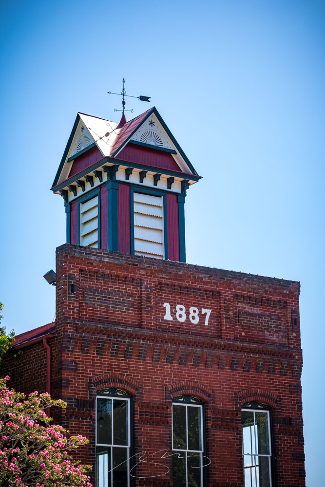
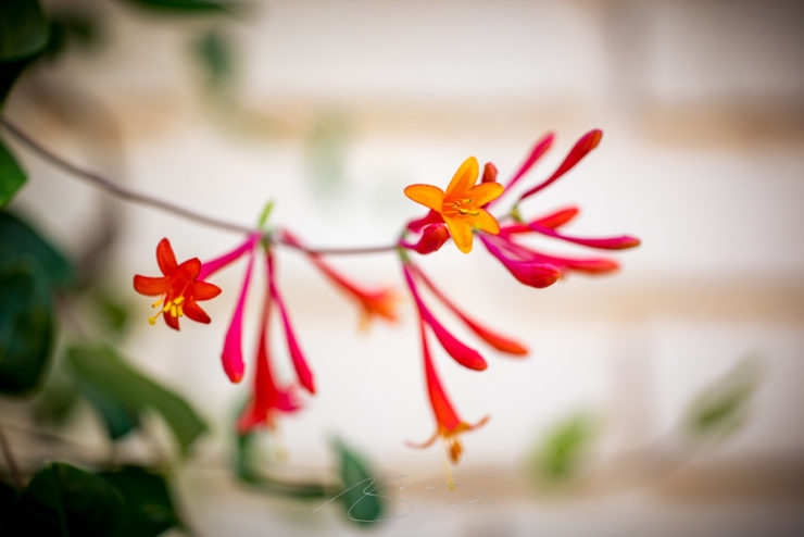
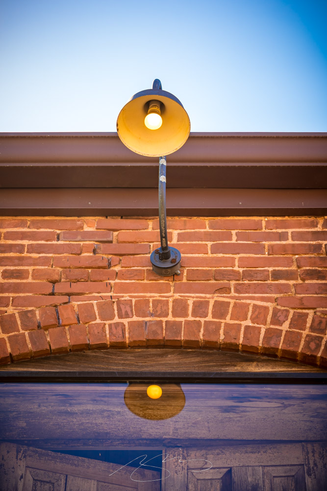
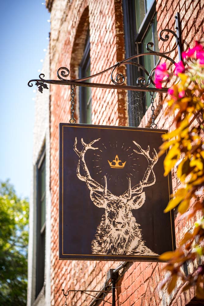
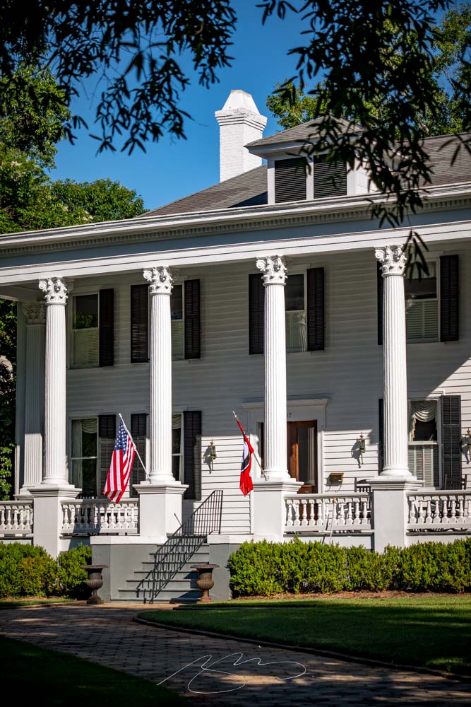
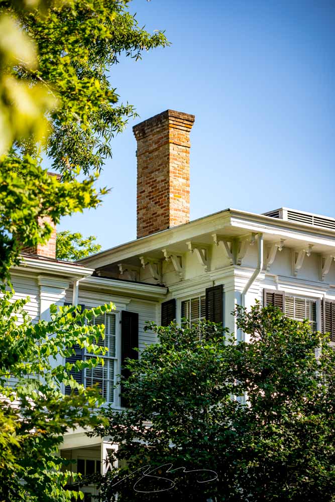
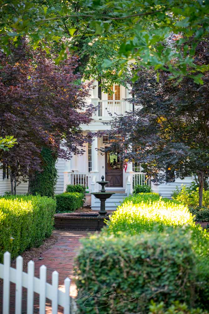
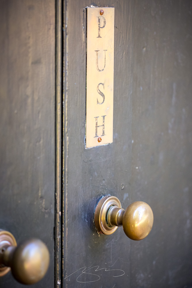
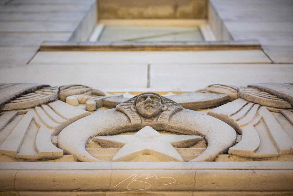
As promised, I returned to Madison, Georgia, to complete the gallery my camera battery didn’t permit last time. Special thanks to Gerald, who accompanied me around the beautiful downtown historic district and on the lovely drive from here to there.
This round is mostly details, taken with my stunning new Leica APO lens. (Introduced in this Macon post.) The whole line has been discontinued, so I am incredibly glad to have gotten one while they’re still available — every single photograph shows just how good this lens is. I’ll try to do it justice:
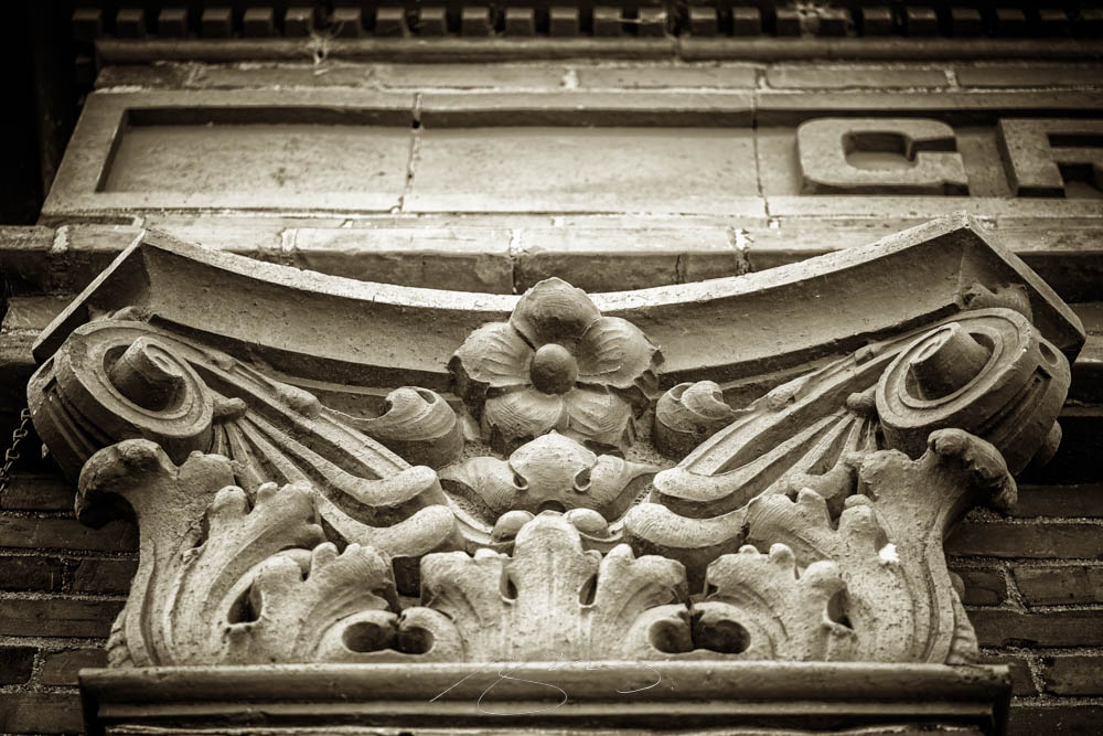
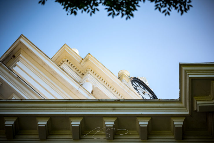
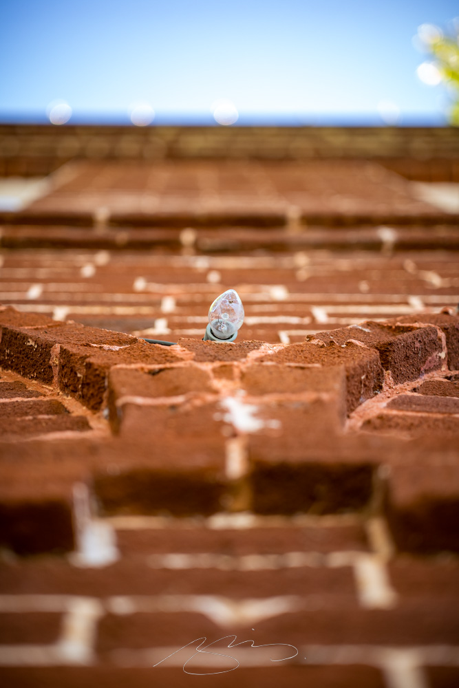
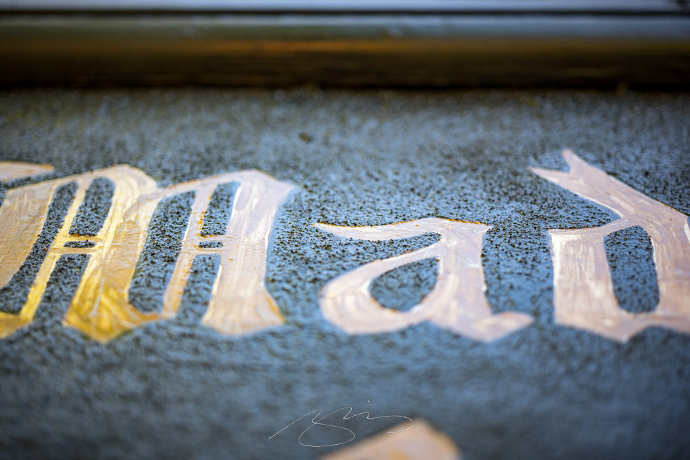
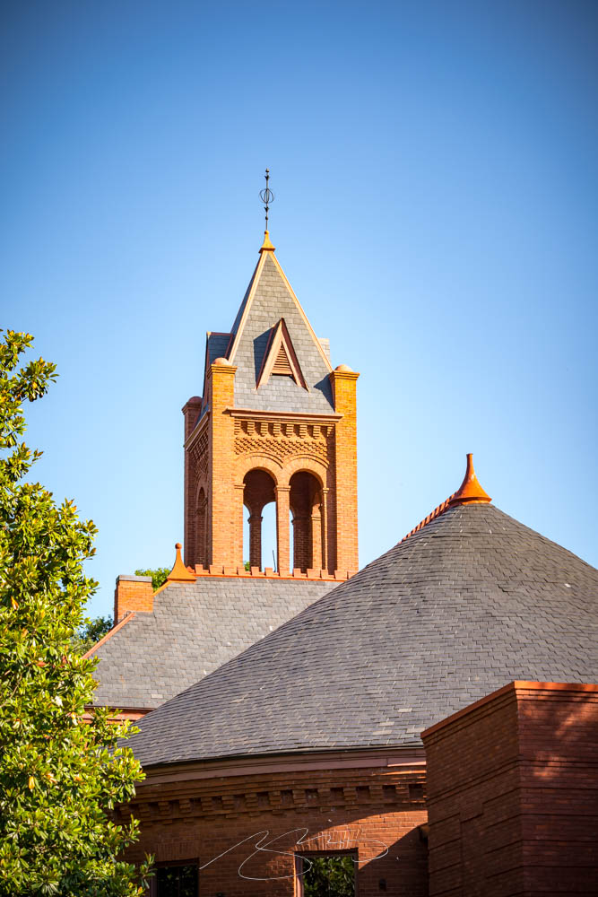
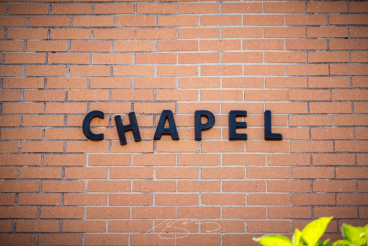
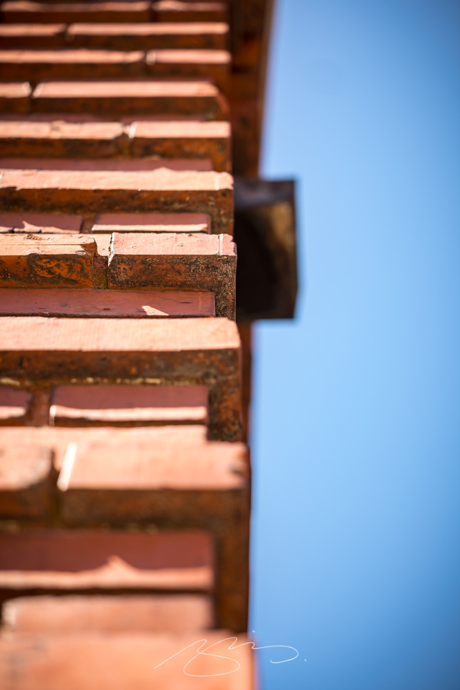
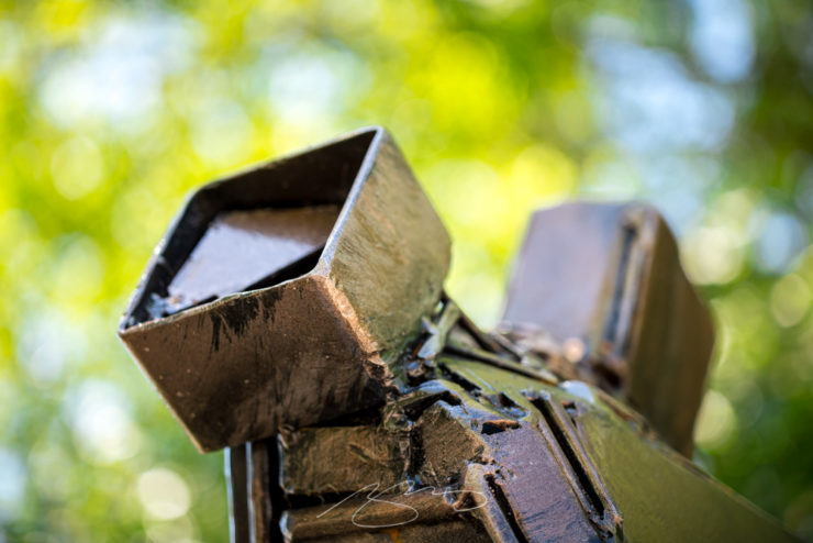
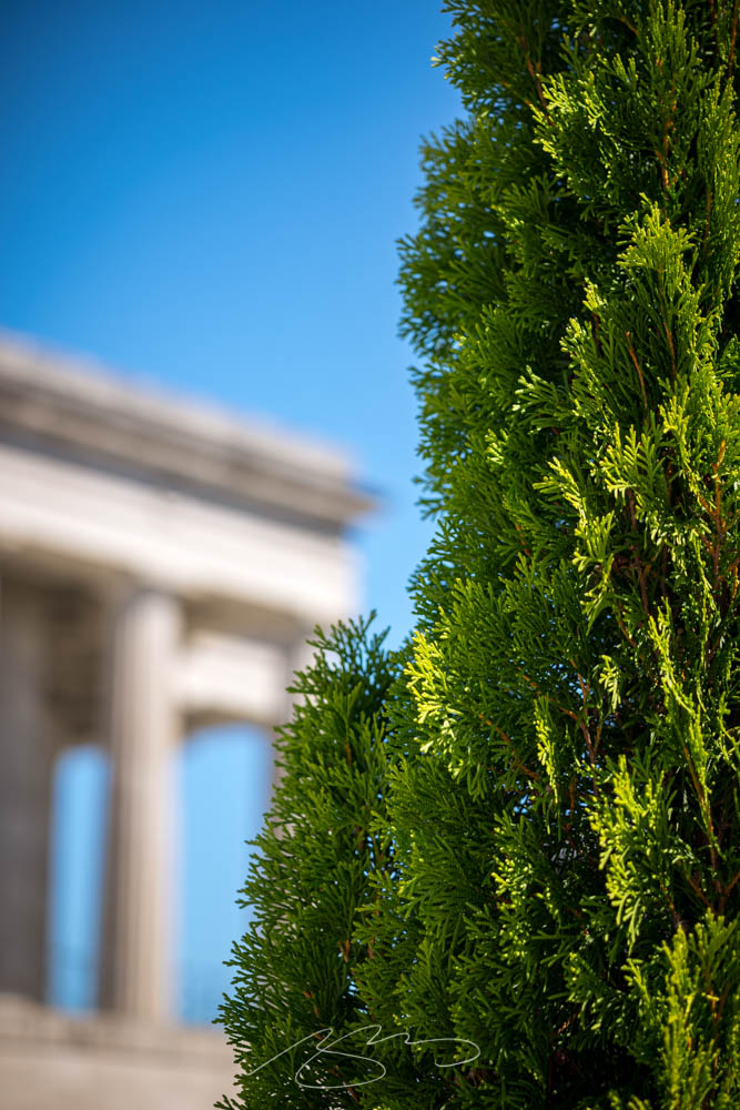
Morgan County Courthouse #6Light Detail, 131 E. Jefferson St.Madison Welcome Center, Madison SquareFlower Detail, Organic MarketBuilding and Light Detail #2, W. Washington St.Hart & Crown Sign, Madison Square
I’ve revamped the gallery with the new shots mixed in with the old. Several are improved versions of shots taken last time, meaning those were deleted in favor of the new ones.
132 Madison photographs have been posted in all. Peruse and enjoy; remember to click on any individual photograph to start a slide show, and if you’d like, click “buy” to get options for fine art prints in a variety of sizes and finishes. Thank you!
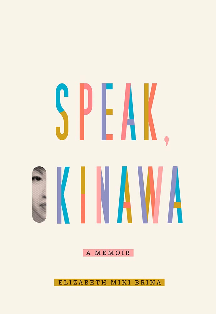
AIGA has announced their winners of the 2021 50 Books, 50 Covers competition:
With 605 book and cover design entries from 29 countries, this year’s competition recognizes and showcases excellence in book design from around the world. […] Eligible entries for the 2021 competition were open to books published and used in the marketplace in 2021.
AIGA Press Release
In this year’s competition, innovative book designs for topics ranging from designing and motherhood, African surf culture, stories of resistance, visual histories of Detroit, Black food traditions, and more all give our jury life, hope, and visible windows into new possible worlds. The covers and books we looked at had a diverse range of visual language and took aesthetic risks.
Silas Munro, AIGA [Competition] Chair
As usual, there are items here that I haven’t seen before, along with several that surfaced on others’ “best of 2021” book design lists (see that Foreword post for my faves). Also as usual, there are some excellent choices.
Further, there’s something in this competition that you don’t see in the usual “best of” posts: interiors. Half of the competition is covers, sure, but the other half considers the whole book design — and sometimes, as I can definitely attest, an underwhelming cover can lead to a treasure within.
But enough talking. My favorites, in no particular order:
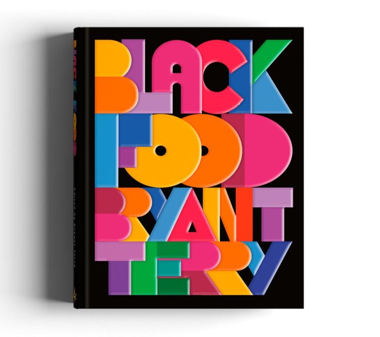
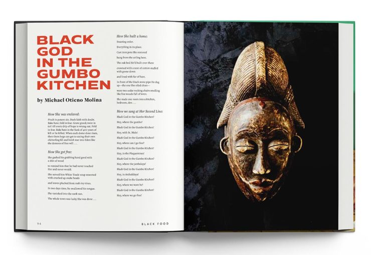
Cover by George McCalman.Book design by George McCalman.
This is one from the 2021 “best of” finalists that I didn’t post about — but now that I’ve seen the interior…. So very worthy. (See more.)
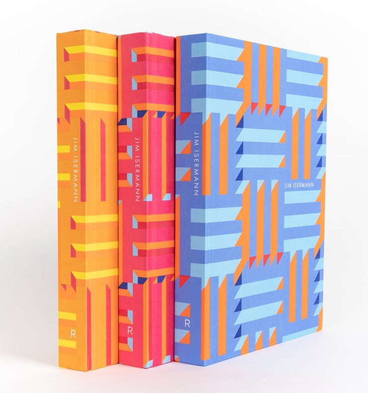
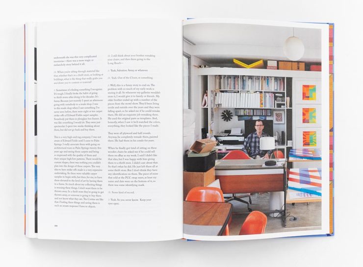
Cover design by David Chickey and Mat Patalano.Book design by David Chickey and Mat Patalano.
This series of three books not only have striking covers I’d not seen before but exceptionally competent interiors done on matte paper, a personal favorite. (Click through for more examples.) Excellent.
Design overseen by Haller Brun.Design overseen by Haller Brun.
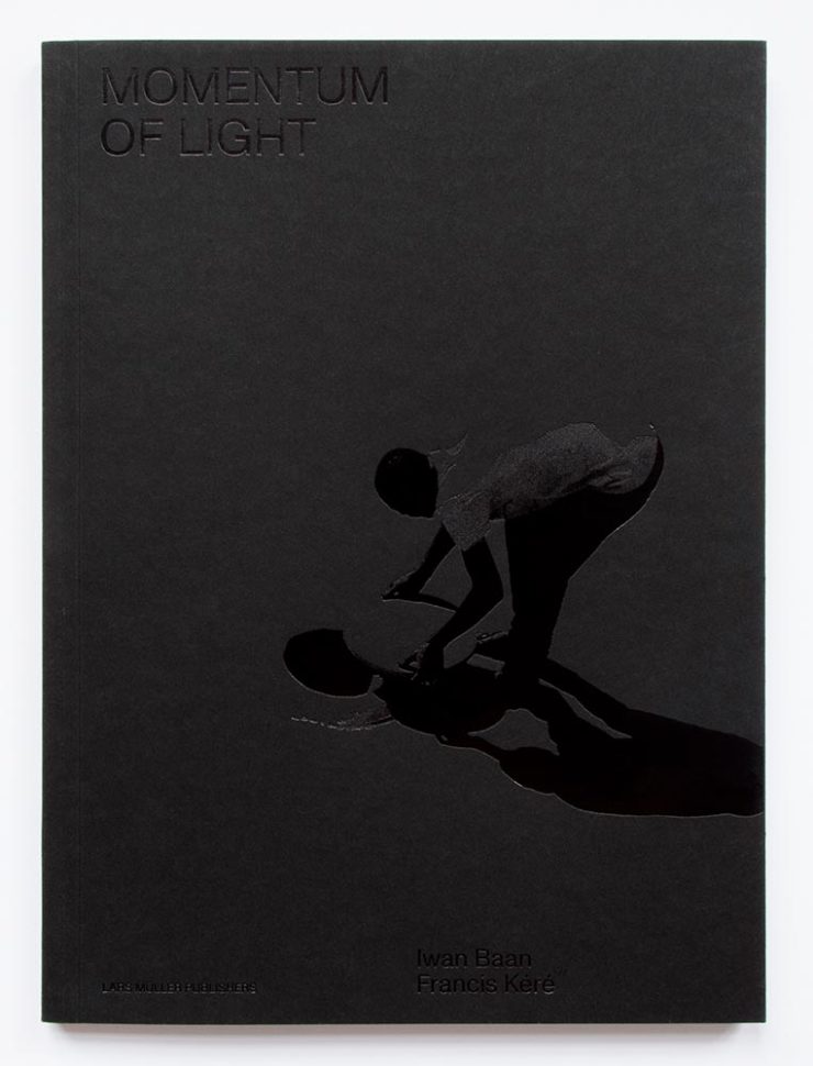
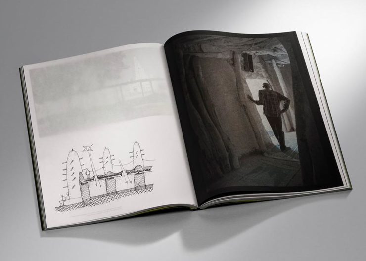
In this fascinating book, architectural photographer Iwan Baan and (Pritzker-winning) architect Francis Kéré “set out to capture how the sun’s natural light cycle shapes vernacular architecture.” While I may be slightly biased in terms of architecture and photography, this one’s a winner. (Read the AIGA’s take.)
Cover by Andrea A. Trabucco-Campos.Book design by Andrea A. Trabucco-Campos.
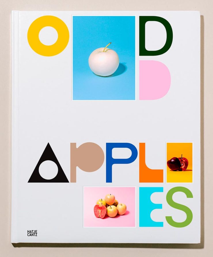
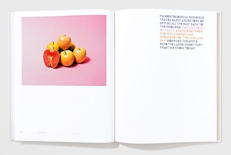
“A little overly precious,” the AIGA says … while awarding it a prize. Completely fresh, I say, with interesting content presented in a way that does considerably more than interest. Well done. (See them apples.)
Cover by Gary Fogelson and Ryan Waller.Book design by Gary Fogelson and Ryan Waller.
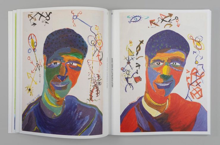
“The type on the cover and in the body is perfect, in all ways and choices. The use of the gutter for captions is a great understanding of the art and a perfect way to save space. The page numbers too.”
Brian Johnson, AIGA Judge
This is one of those books that you have to say, “I wish I’d done that.” Great stuff. (See its individual entry.)
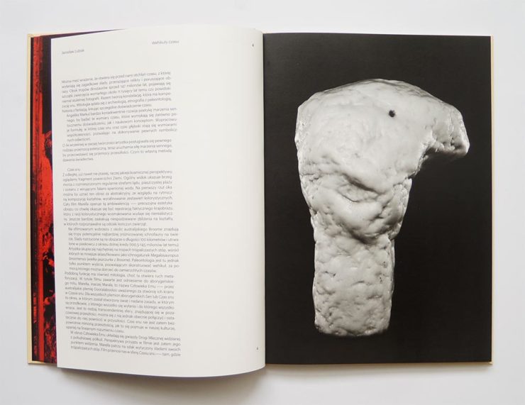
The Time Formula. Cover by Honza Zamojski.Book design by Honza Zamojski.
There always seems to be some projects that violate book design “rules” — this one doesn’t have a title on the cover, has page numbers in the gutters, and more. Yet this book, about a sculpture project, makes for interesting viewing indeed. (See more.)
Last, we have a couple that are only covers:
Cover by Janet Hansen.
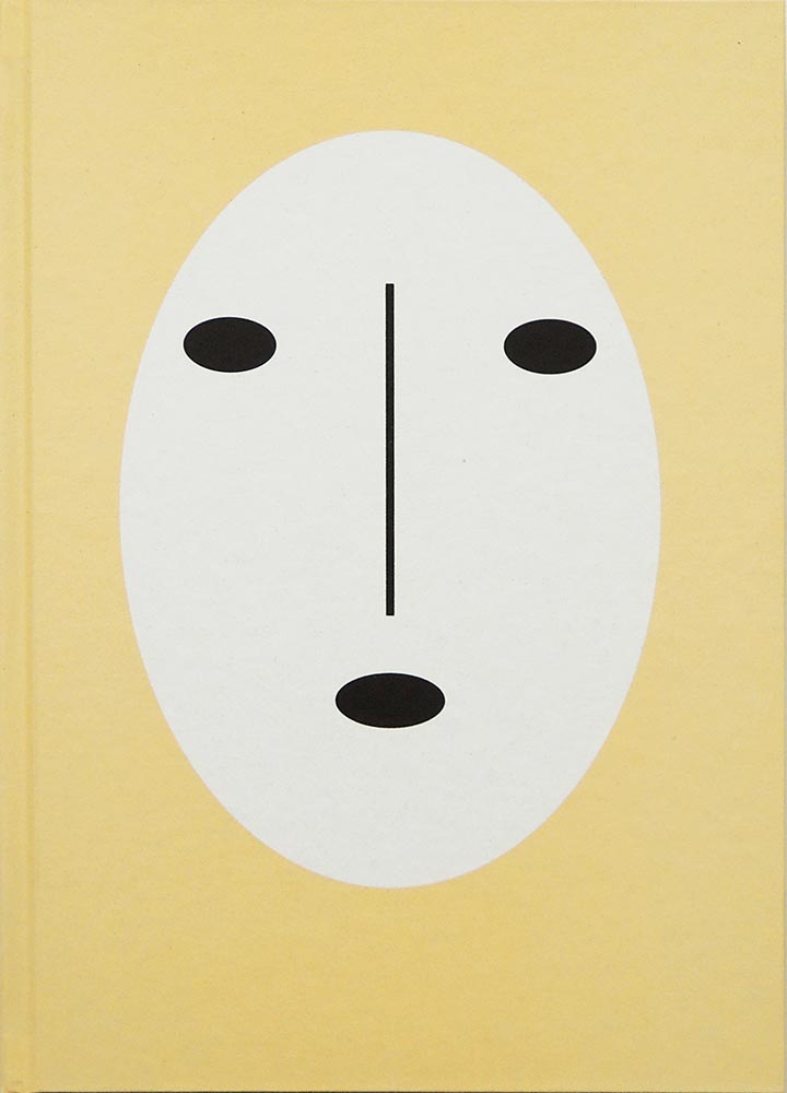
This was considered for my favorites of 2021 (and made it onto others’ lists). I’m glad to have been given the chance to call it out. Excellent in its simplicity. (See the AIGA entry.)
Last, but certainly not least:
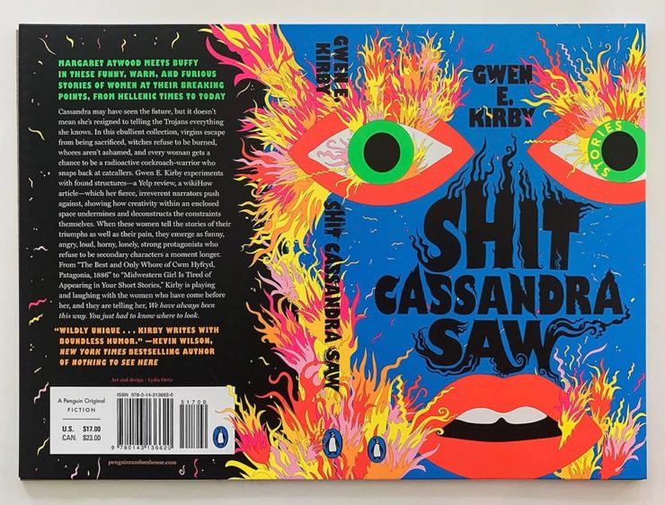
Cover by Lydia Ortiz.
Another advantage of this competition: seeing more than the front cover. And this cover, front, back, and spine, is so much more — especially in person: black plus four neon inks. Wow. (See the AIGA’s praise.)
Car site The Autopian scores with book design, Ford posts old marketing material gold mine, and more on the Eames Institute of Infinite Curiosity in this edition of Beautifully Briefed.
Autopian suggests book design
The Autopian, founded by a couple of former Jalopnik writers, is a new automotive gem: in these days of more-of-the-sameism sites trying to make money of others’ ideas, the Autopian has a retro style and interesting, original content.
Including this short post from their Cold Start column:
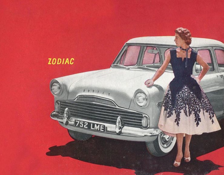
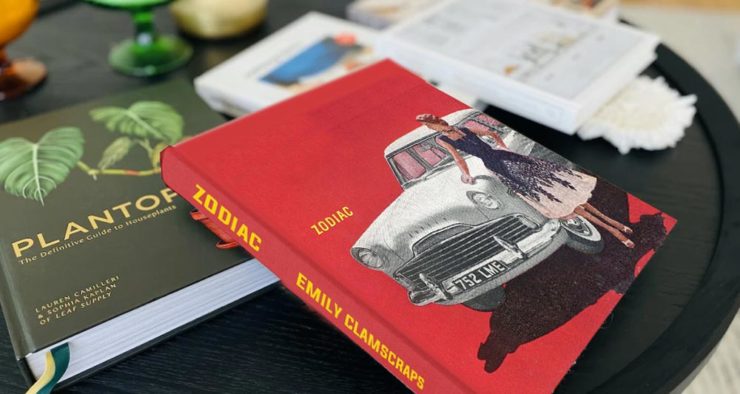
Sometimes you may encounter an old car ad and realize that the design of it could lend itself very well to something completely different. In this case, this 1958 Ford Zodiac ad, with its rich, saturated colors, striking dress on the model, and evocative name with understated typography just feel like something you’d see on modern book cover design.
Jason Torchinsky, Autopian Founder
The ad:
A 1958 Ford Zodiac (European)
His book design idea “realized”:
Jason’s book cover mock-up. Love the author name.
Nice.
The Ford Heritage Vault
Ford has taken the unusual step of posting a good chunk of their old — 1903 to 2003, their first 100 years — marketing materials online: “promotional materials, photographs, and all kinds of other historical goodies,” according to CarScoops.
“Our archives were established 70 years ago, and for the first time, we’re opening the vault for the public to see. This is just a first step for all that will come in the future,” says Ted Ryan, Ford archive and heritage brand manager.
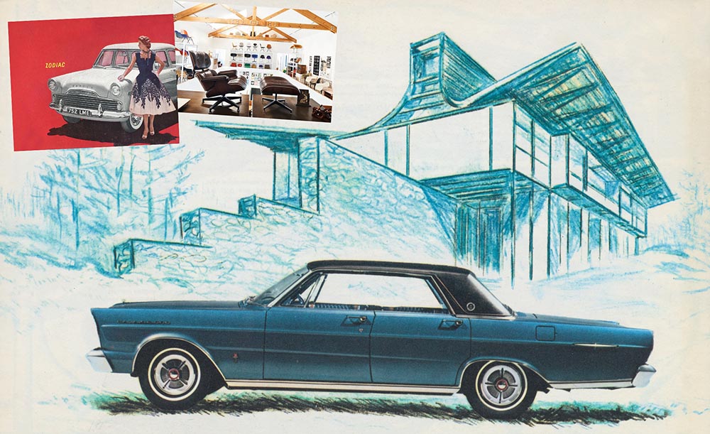
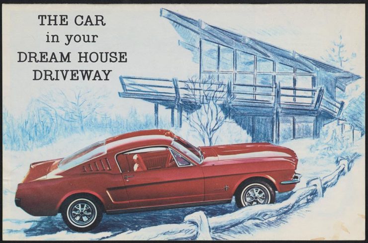
Here’s a personal favorite: the 1965 full line brochure, showing the cars set in architectural drawings — presumably, matching the car to the house:
We discussed the Eames Institute of Infinite Curiosity back in April, but Metropolis magazine has published an extensive article covering a visit to the Institute.
Modernism has largely been diluted from a series of ideas rooted in social change to one of just style—Instagram moments, if you will. The Eameses insisted that they did not have a style or even an “ism.” […] Modernism was an idea, not a style. With the establishment of the Eames Institute, I hope Charles and Ray will be remembered most of all for their ideas and processes.
Kenneth Caldwell, Metropolis
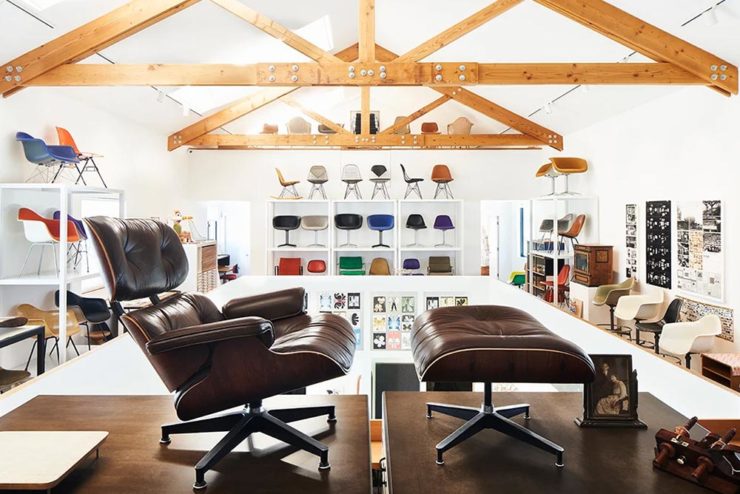
An exhibit at the Eames Institute of Infinite Curiosity.
With our ongoing struggle to use materials more efficiently, many of the Eameses’ ideas and ideals need to be taken for the solutions that they are: style with incredible substance.
Three items for the end of June, 2022: AIA Los Angeles announces photography awards, the 2022 edition of the Logo Lounge logo trends report is out, and Buick makes its new logo official. Let’s get into the details.
AIALA Photography Awards
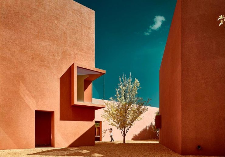
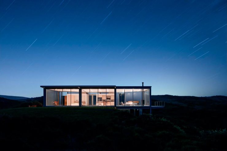
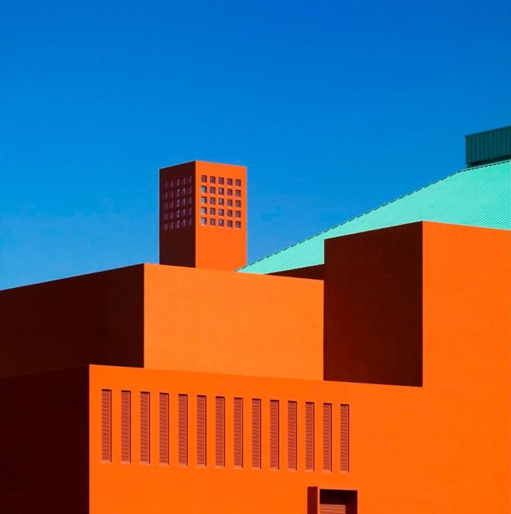
The Los Angeles chapter of the American Institute of Architects (AIA|LA) has announced this year’s winners of the annual Architectural Photography Awards, and there’s some pretty great stuff:
Ryan Gobuty: Santa Fe (Santa Fe, NM)Taiyo Watanabe: C-Glass House (Dillon Beach, CA)Tim Griffith: Mission Bay (San Francisco, CA)
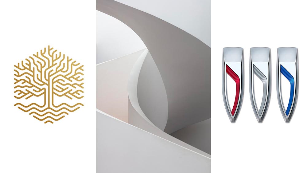
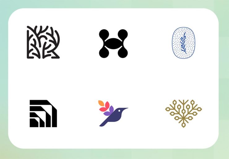
[W]hile there are still corporate-looking marks being crafted there is a stronger effort to find ways to identify products that are artisanal and handcrafted.
Bill Gardner, Logo Lounge
Corporations trying to be more human. (News at 11.) But then, my use of that particular phrase perhaps betrays my lack of being in touch with the modern corporate world; I think publishing is a different animal, and prefer being part of that world despite the regular influence of corporate entities there, too.
Nonetheless, following logo trends is, from a purely graphic design perspective, worthwhile — and this report summarizes beautifully. Read on.
Buick’s New Logo, Officially
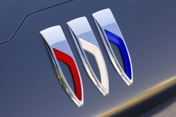
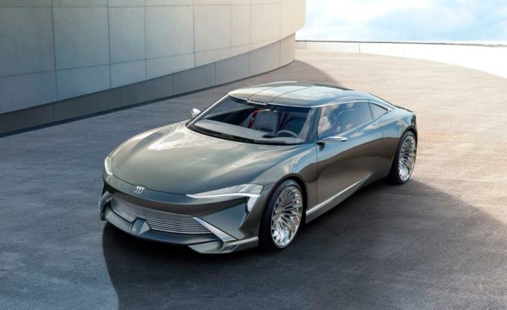
We’ve touched upon it before, but Buick has, with the release of the Electra Wildcat concept, officially updated its logo:
Official: Buick’s new logo
Electra is Buick’s name for electric cars, simultaneously stating the obvious while giving a big nod to past models — and the Wildcat concept is, dare I say it, borderline cool:
Both Buick and Cadillac have hinted at more Art Deco in their upcoming products, perhaps best illustrated on this concept’s interior:
It’s a head rest, folks.
Nice. (Not even remotely possible on a production model, but still.) Read more on Buick’s new logo and transition to an electric car brand at Car and Driver or The Drive.
According to Southern Living magazine, “In Madison, Georgia, you can witness the power of tireless historic preservation efforts and take in the glory of old Southern architecture — from Greek Revival to Victorian, this town showcases all the great architectural styles.” (Read their day trip advice.)
DAR Statue and Morgan County Courthouse, Downtown
It’s certainly worth taking some time to visit — and for this guy and his camera, the restaurants, shops, stroll-worthy streets, and simply spectacular historic district represent a great opportunity to add to the treasure trove of Georgia architectural photography.
Building Detail #2, Madison Welcome Center, E. Jefferson St.Building Detail #1, The James Madison InnGazebo and Stage, Madison Town ParkMetallic Sculpture, Madison Town ParkTrain and Silos, Madison
A total of 90 (!) photographs have been posted to the new Madison gallery. Once there, click on any photo to enlarge or start a slide show.
I’m not done, either: I had two lenses with me, but only one battery — which gave out before I could make a round downtown with the second lens. I’ve got another trip through the area scheduled, and will absolutely make the time to return, camera in-hand, to complete the gallery. Stay tuned.
The past couple of days represented a much-needed break from the recent heat wave — an opportunity to get out of the house and celebrate a stunning morning with camera in-hand.
I pass through Madison regularly (it’s along the route from Macon to Athens), and have been meaning to stop and take some photographs for literally years. Today, the first of two parts this week, with more to come soon.
We start at the Madison Morgan Cultural Center and loop through the historic district — and its many, frankly stunning buildings — south of downtown:
Madison Morgan Cultural Center (Detail #4)507 S. Main Street #1411 Old Post Road #1413 S. Main Street, Photographed from Old Post Road
There are a few detail shots mixed in, too, like this one from the Presbyterian Church:
Madison Presbyterian Church (Door Detail)
See the first 34 photographs in the new gallery. (Remember to double-click on a photograph to see larger.) Next time, downtown. Happy Monday!
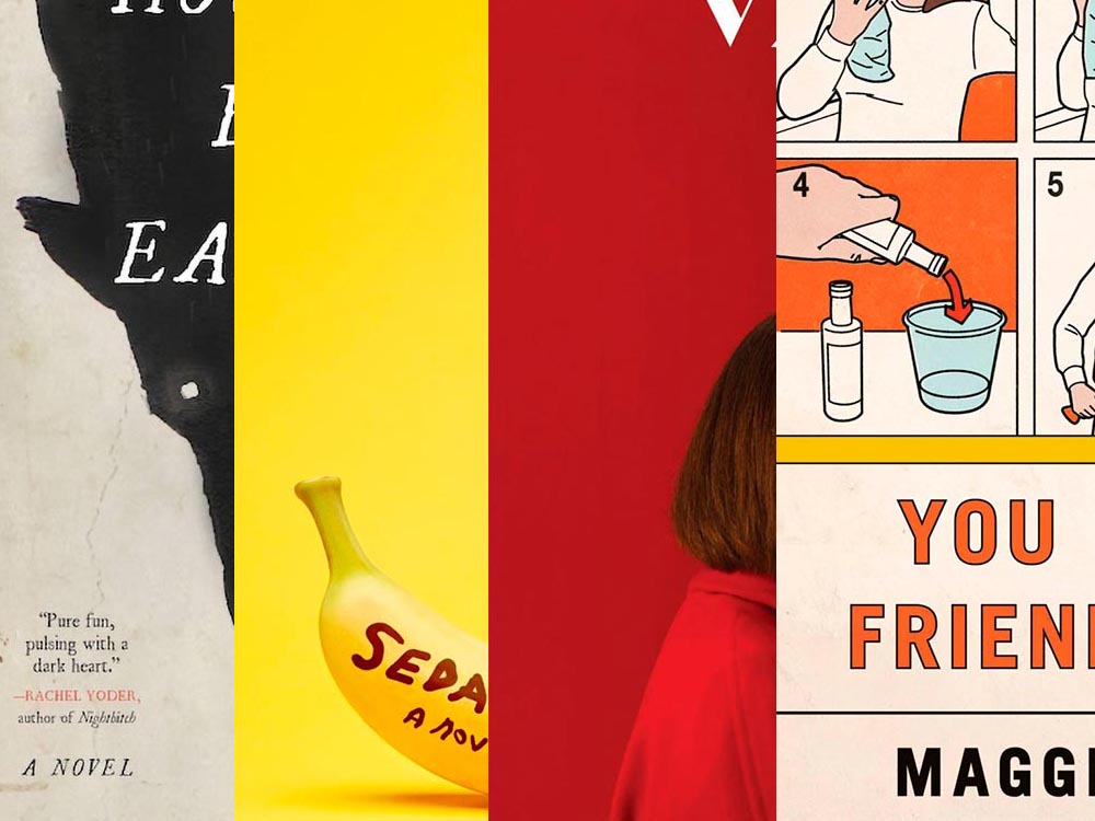
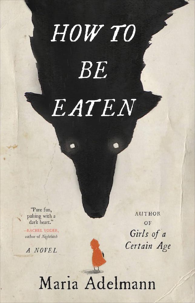
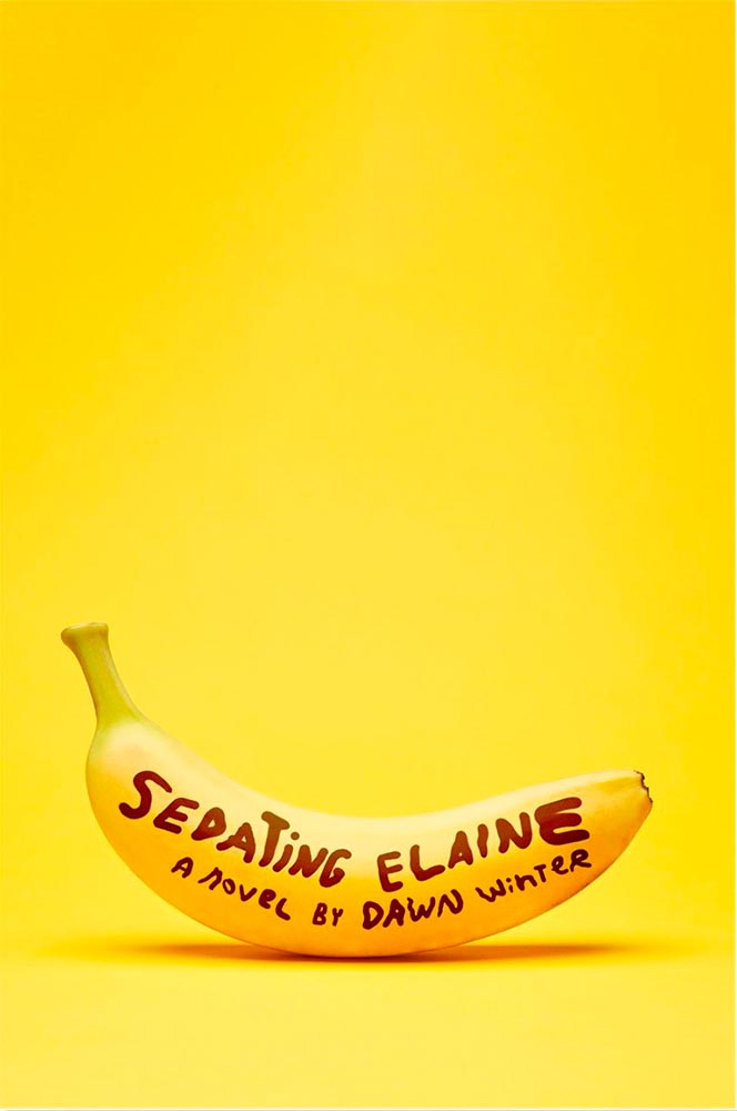
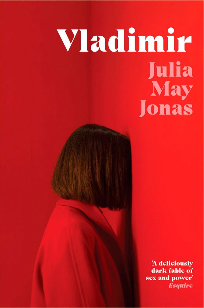
A book design treat for your Monday morning: four of my favorite new book covers from last month’s debuts.
How To Be Eaten. Design by Julianna Lee.
Aged, distressed paper is a great look when done well, and this one hits all the right notes. The size relationship between the characters, the glow around the eyes, the two color choices, the type, all of it — great stuff.
Sedating Elaine. Design by Janet Hansen.
A veritable how-to on less-is-more. Brilliant.
Vladimir. Design by Katie Tooke.
Another solid-color triumph. Great font choice here, too. Awesome.
I’ve saved the best for last:
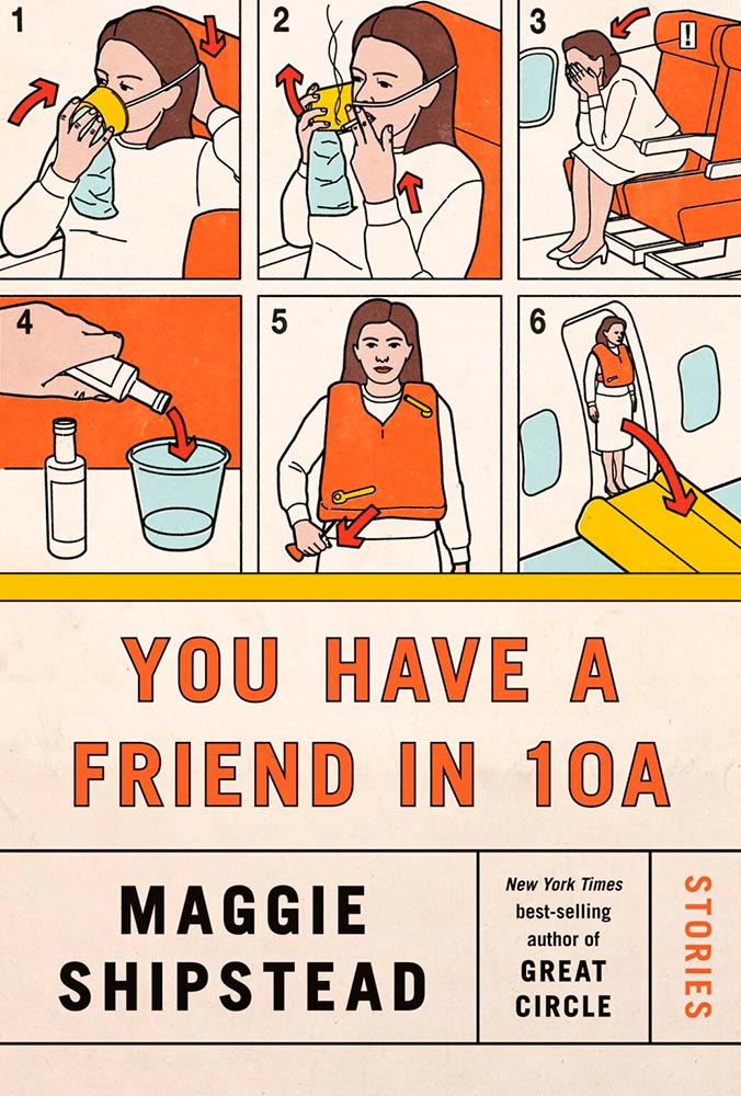
You Have a Friend in 10A. Design by Kelly Blair.
Great Circle has featured before, and this follow-up takes us inside the plane and into the safety brochure in the best possible way. Great, brilliant, and awesome wrapped into one.
Update, June 20th: WABE, Atlanta’s NPR station, has a summer reading list out, highlighting Georgia books and authors — and I’d like to include two of the covers here:
Invisible Child.
The grainy photograph, the wonderfully placed city skyline, and classic typography, combined with the diagonal cutline, elevate this title from mundane to eye-catching.
The Sweetness of Water.
Excellently distressed doesn’t begin to describe this, on many levels. Side note: it’s a terrible shame that the Oprah and Booker call-outs have been elevated to logo status in what can politely be described as a distraction (from a book designer’s point of view, at least).
FedEx pulled up around 8:30 this morning and dropped off a new lens. (It wasn’t due ’til Tuesday — bonus!) Given that it was an absolutely beautiful morning, I shelved my plans for the day, picked up the camera, and headed downtown.
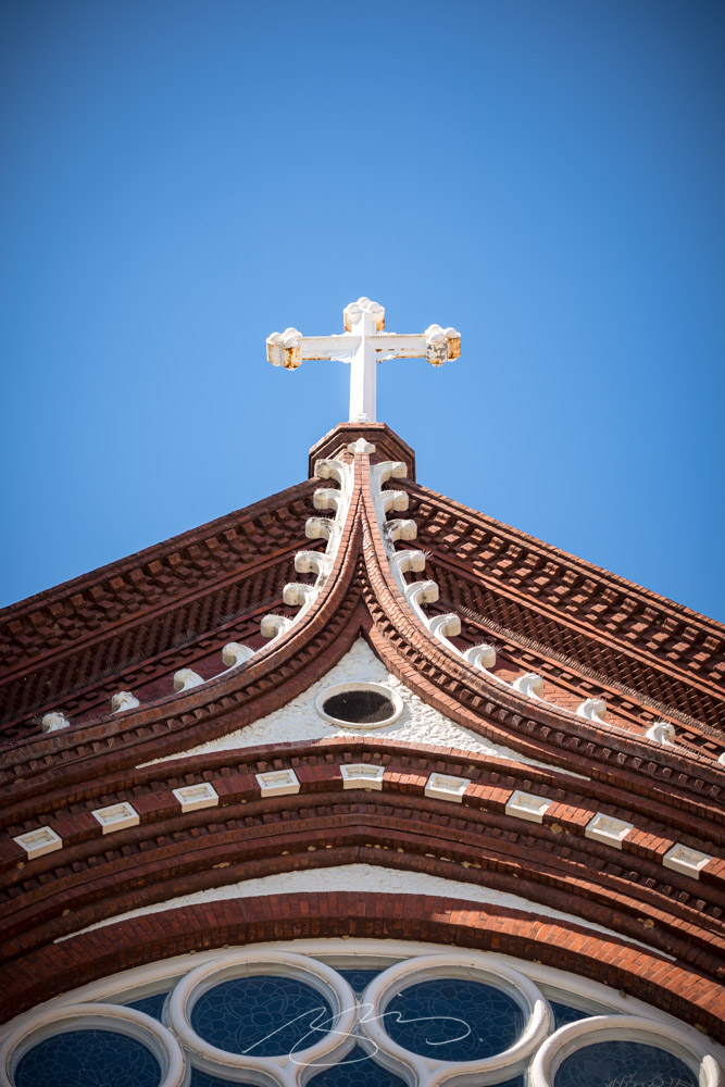
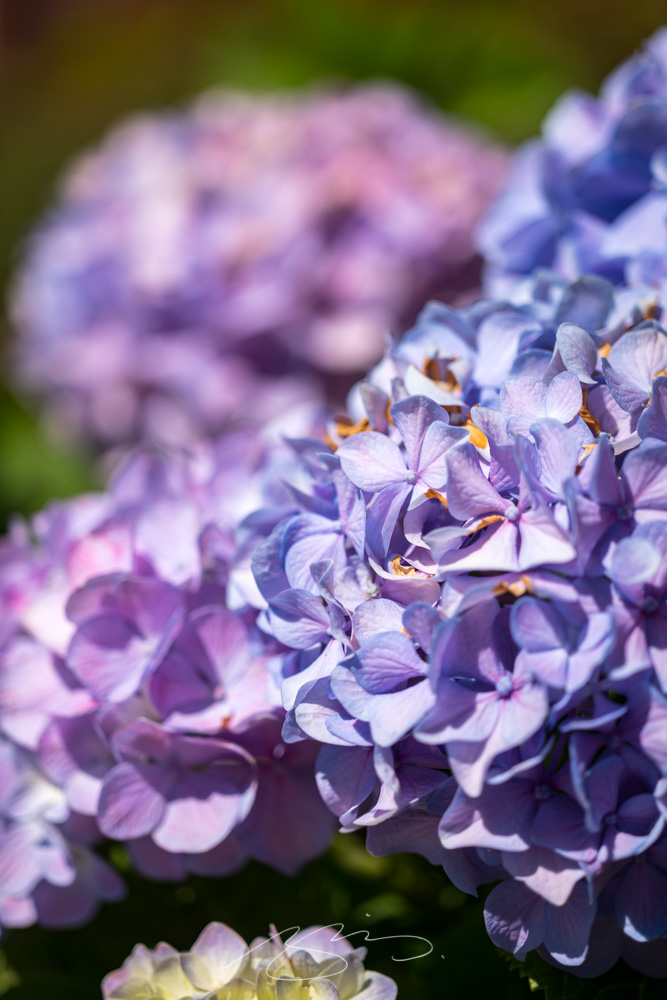
Verdict? It’s so a keeper. See for yourself:
Catholic Cross, St. Joseph’s, MaconPurple Hydrangea, St. Joseph’s, Macon(Funeral) Chapel, New St., Macon552 New St. (Brick Detail), MaconPublic Art (Detail #1), D T Walton Sr Way, MaconTree and City Auditorium, Macon
Wound up with sixty new items posted. However, the downtown Macon gallery was getting almost too big — confusing, even — so has been separated into three parts: