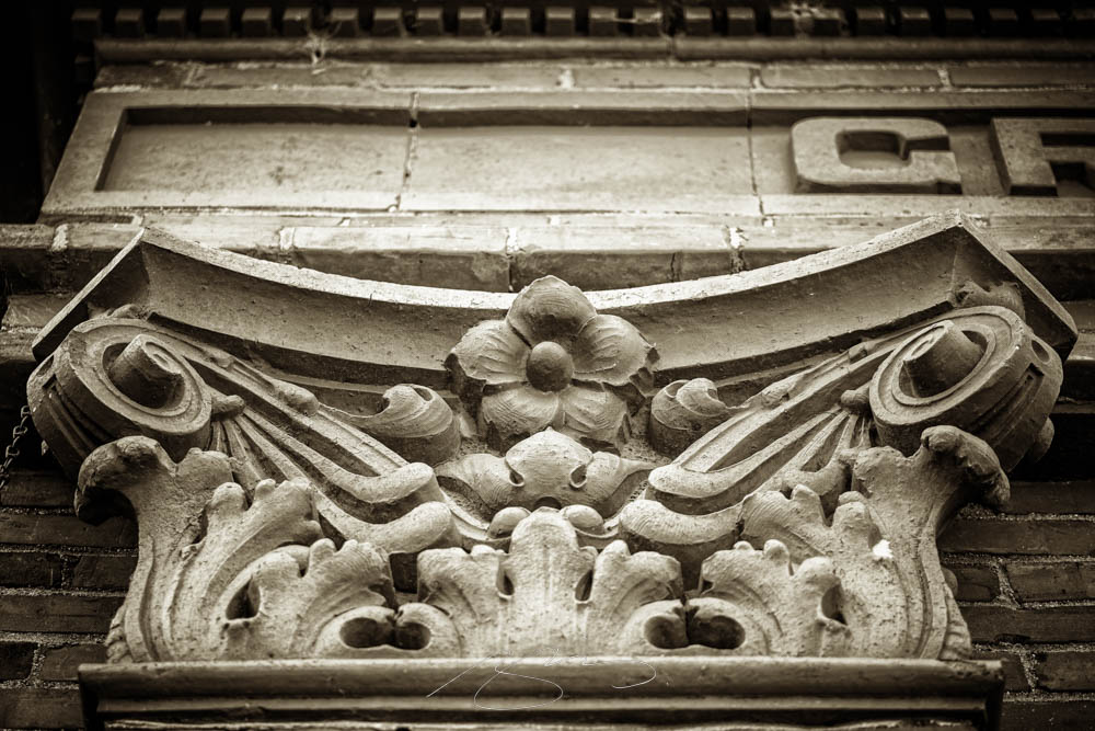
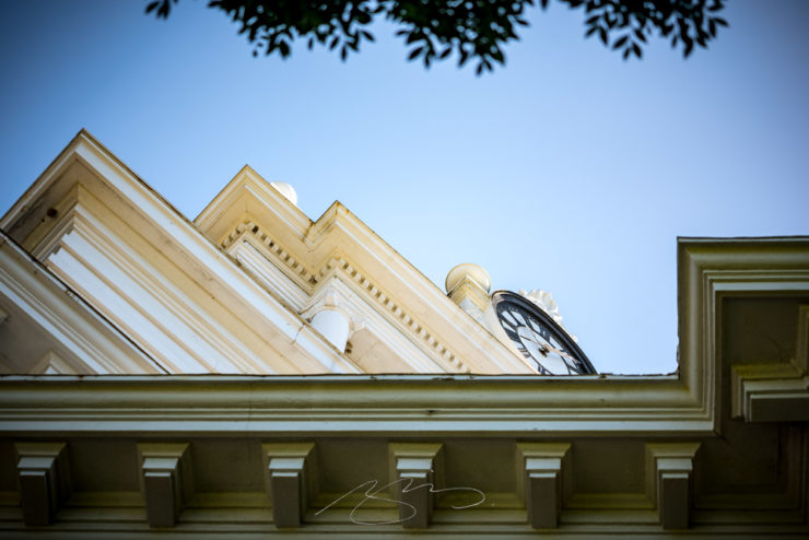
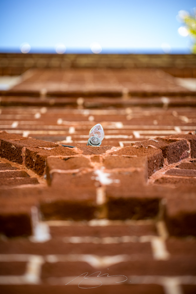
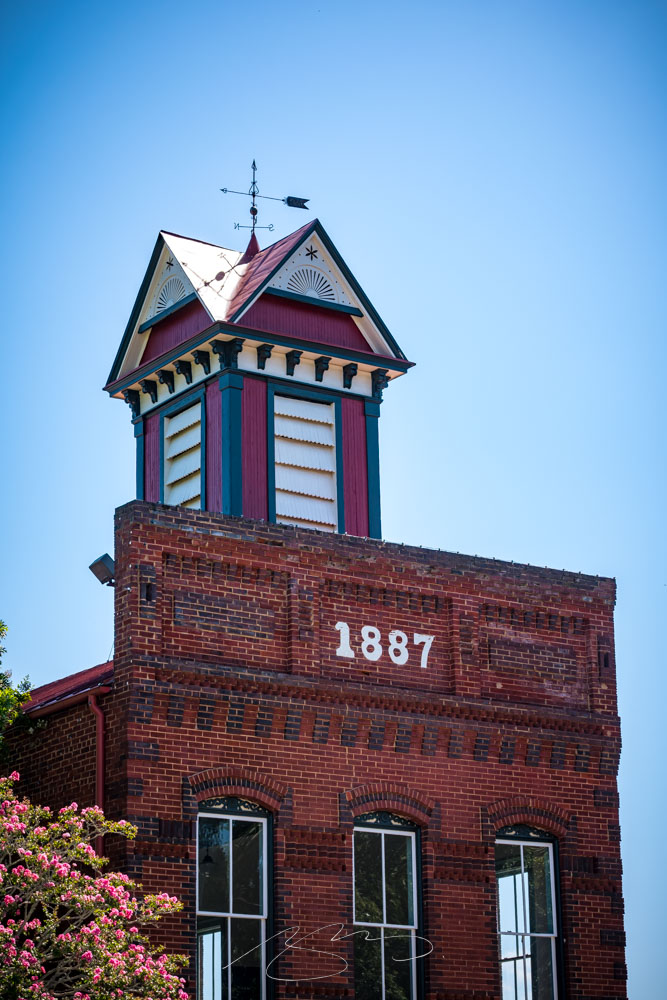
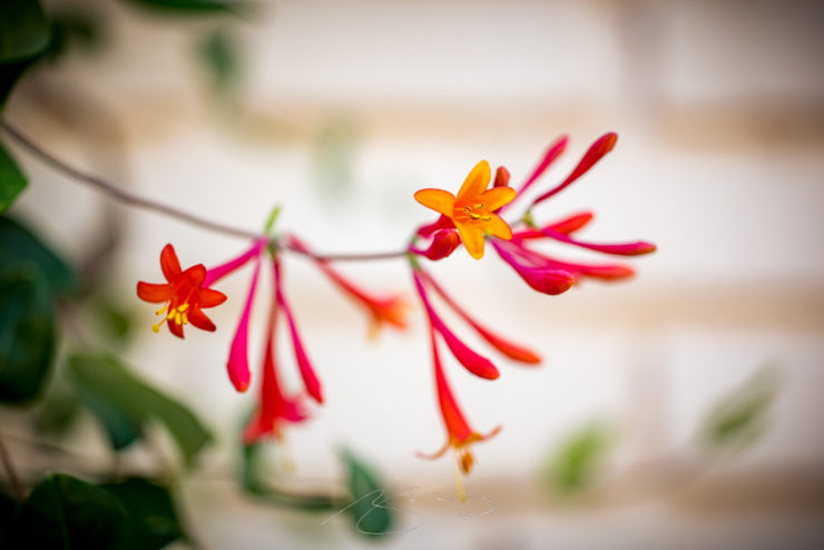
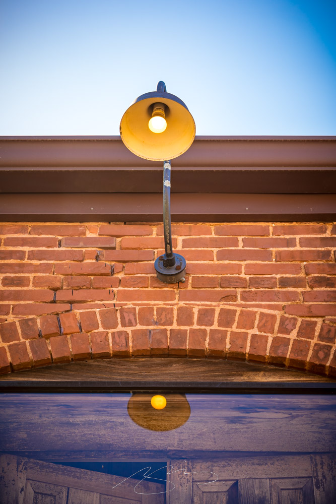
Sandersville, seat of Washington County, was the photography destination this past weekend. Gerald and I wanted to get out and enjoy this beautiful stretch of fall weather, and this small city — with its National Register-listed cemetery (more on that tomorrow) — hadn’t yet been explored.
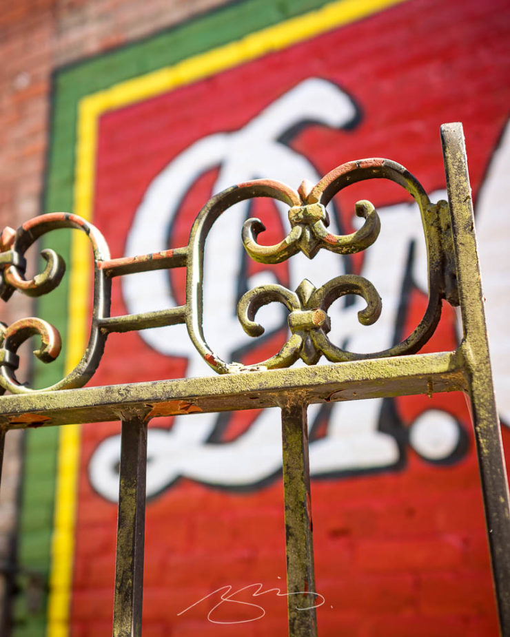
Dr. Gate, W. Haynes St.
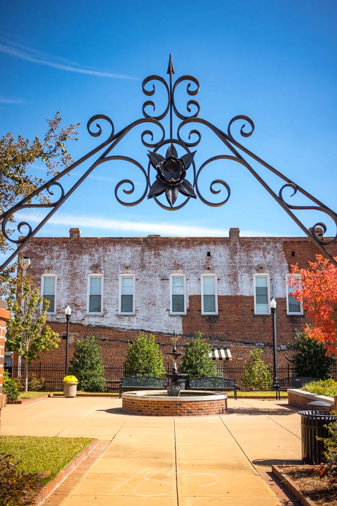
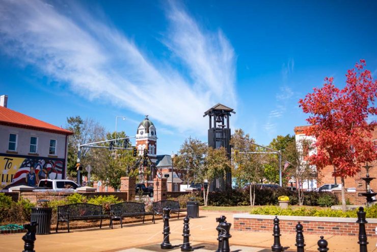
There was a pleasant little park off what I’m calling Courthouse Square (it doesn’t seem to actually be named that):
Park Arch, S. Harris St.Park in the Square, S. Harris St.
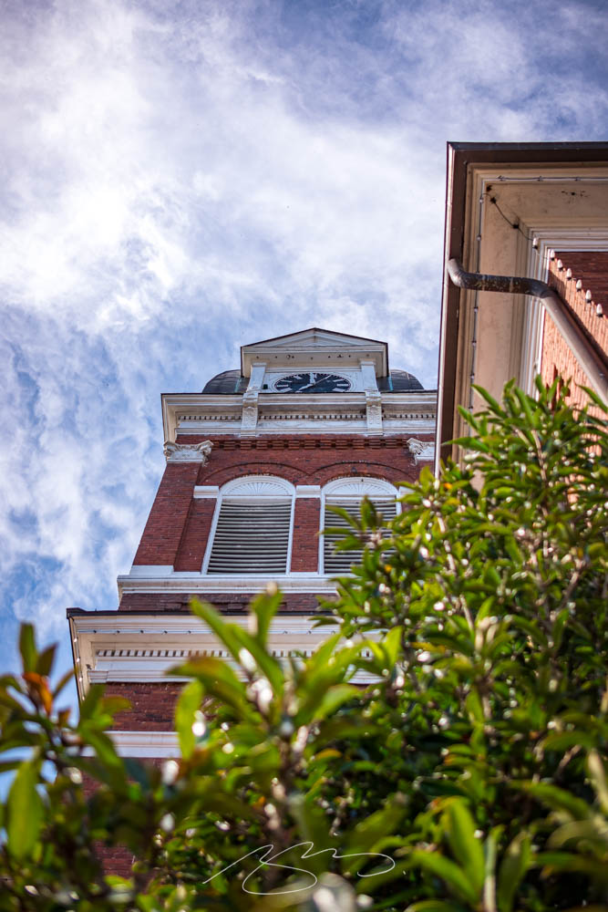
The Washington County Courthouse is a beautiful and historic building, like many here in Georgia:
This time, we’ve got some great book design (with a bonus), Hoefler educates on typography (with a bonus), and two updated car company logos. Let’s get right to it!
Print Magazine on the design of Lyrics
The still-very-relevant-in-2022 Print Magazine brings us a great feature on the design of Paul McCartney’s book, Lyrics:
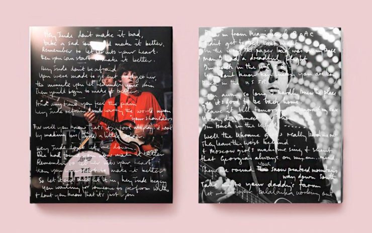
Front and back covers of Paul McCartney’s Lyrics, by Triboro Design.
Turns out it was designed by an outfit called Triboro Design, from Brooklyn (appropriately). Print brings us an interesting interview with David Heasty, the principal:
I […] found him to be sharp, quick, articulate, and modest. Below, we discuss Paul’s involvement with the project, the book’s gorgeous bespoke typeface, and the importance of staying true to a legend’s vision.
Ellen Shapiro, Print Mag
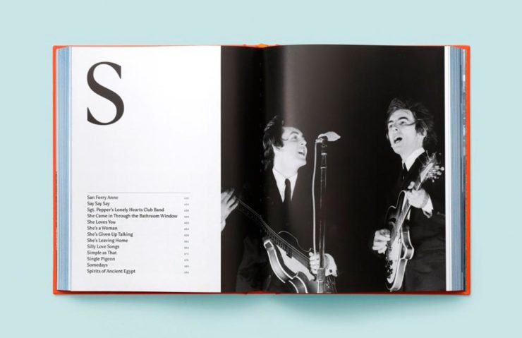
The “S” spread of Paul McCartney’s Lyrics, by Triboro Design.
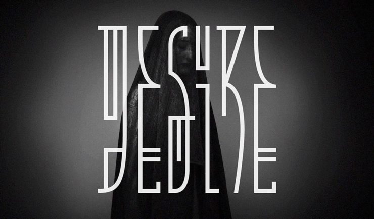
Bonus: Looking at Triboro’s website, this lovely piece of typography stood out:
Triboro Design’s Zolo Jesus album typography creates desire.
Hoefler Discusses Daggers
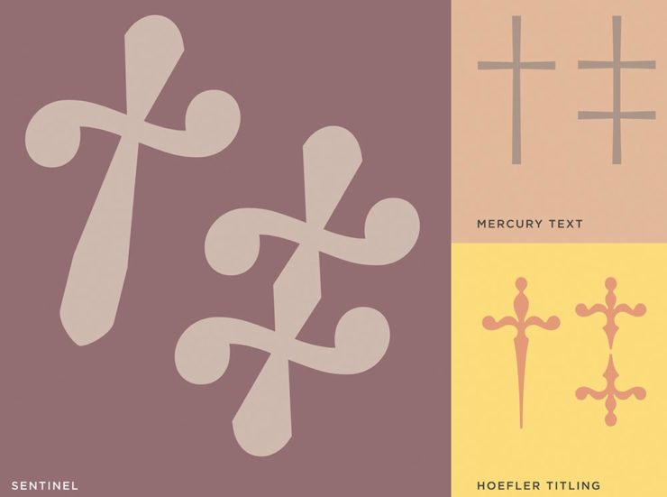
In “House of Flying Reference Marks,” Jonathan Hoefler talks about daggers, or, what you use when an asterisk isn’t enough:
Hoefler on daggers.
Beautiful examples, complete with a phrase you don’t hear everyday: “twisted quillon.” Read and enjoy. (If the opportunity presents, follow on with the ampersand article — which, uh, takes a stab at where the word came from. Nice.)
It seems like nearly all of the major car manufacturers have introduced a new logo in the past couple of years, but here are two more. One’s best described as “an update,” while the other … goes a little farther.
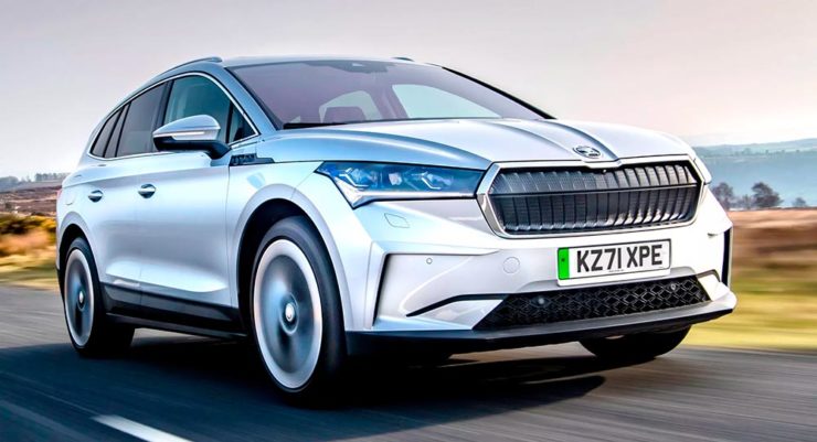
Skoda, for those that don’t know, is a Czech company and part of the massive VW Group. Frankly, it shows:
Skoda’s 2022 Kodiaq, a thoroughly VW Group product.
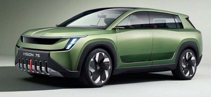
For 2023, they’re introducing a push to separate themselves from VW a little, resisting the downmarket image. As is (now) normal with updated car company identities, there’s a concept:
Skoda’s Vision 7s concept.
It’s … not inspiring. Maybe the actual updated logo will turn the corner:
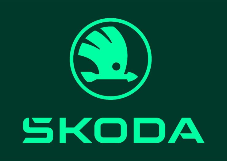
Skoda’s 2022 logo.
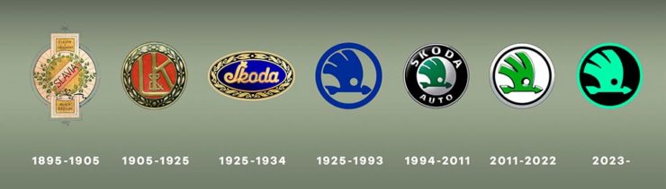
Solid. (Pardon the pun.) But seriously, even an avid car nut like me didn’t know that represents a winged arrow — and I’m not sure the new version helps. At least they get points for consistency:
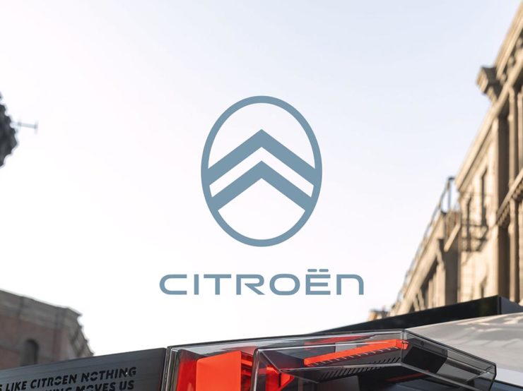
Then there’s Citroen. Even under the potentially-smothering corporate blanket that is Stellantis (there’s a name!), the pioneer of decades past still manages to actually thrive. First their new logo:
Citroen’s 2022 logo.
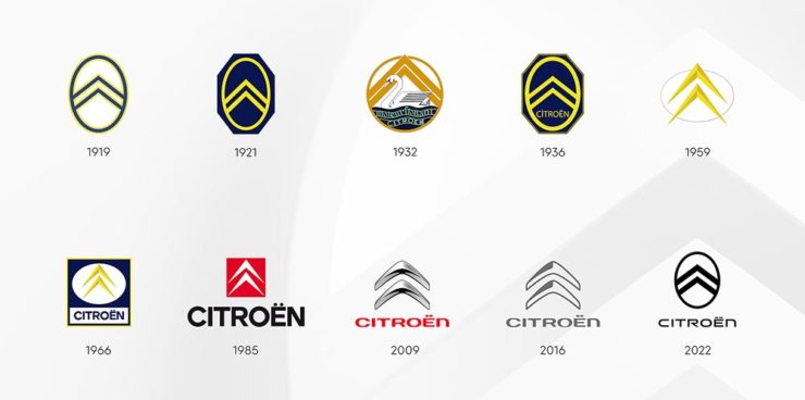
They’re not quite as consistent — the dual chevrons have varied a bit. This time, they’ve literally gone back to their roots, pulling the 1919/1921/1936 version out and dusting it off for modern use:
History of Citroen’s logos, 1919–2022.
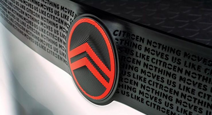
Points to them for hinting at what’s to come, too:
Citroen’s 2022 logo, with just a slice of concept car showing.
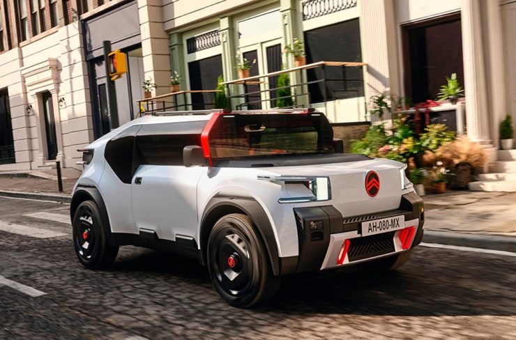
…Which turns out to be something with, ahem, Oli bits:
Citroen’s Oli: the antithesis of a Skoda.
“Nothing moves us like Citroen,” they say. The Oli moves me, to a point where I truly wish Citroen was once again available in the ’States. Cool and radically innovative, without losing sight of something VW has truly lost: fun. Well done.
Updated, 19 October, 2022:Brand New adds to Citroen’s new logo story, with a slightly-less-than-enthusiastic take on the logo and has frankly unkind things to say about the new, custom typeface (custom typefaces are now de rigueur — a policy as much related to rights ownership than creativity, alas).
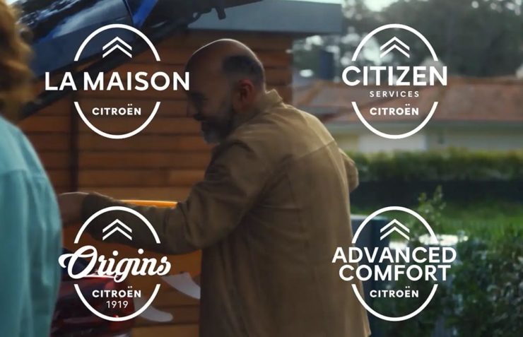
I really like the cursive in this Vimeo screenshot:
YouTube? What YouTube? Citroen posts to Vimeo. Ahh, the French.
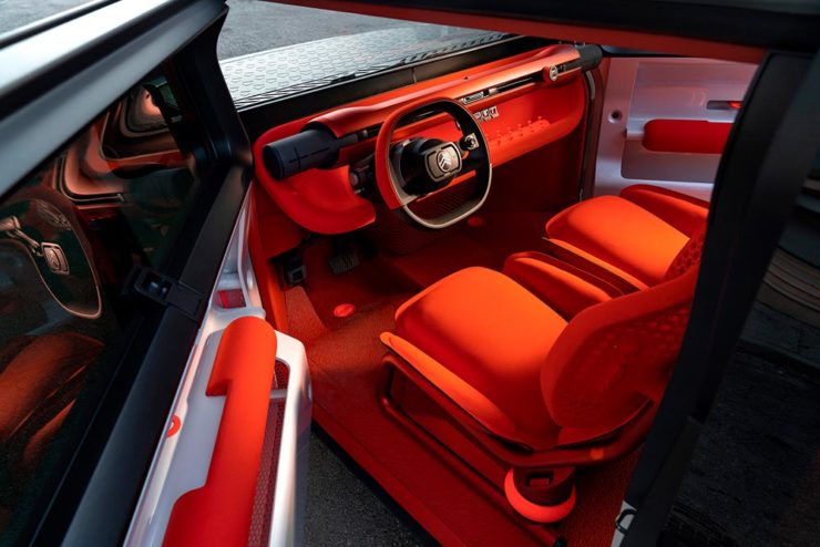
BN also includes a number of extra photographs of the simply awesome Oli, too. Here are a couple, for your enjoyment:
Plug-and-Citroen.
Note the removable Bluetooth speakers (the black tubes with “+” and “-“) and, especially, the seats:
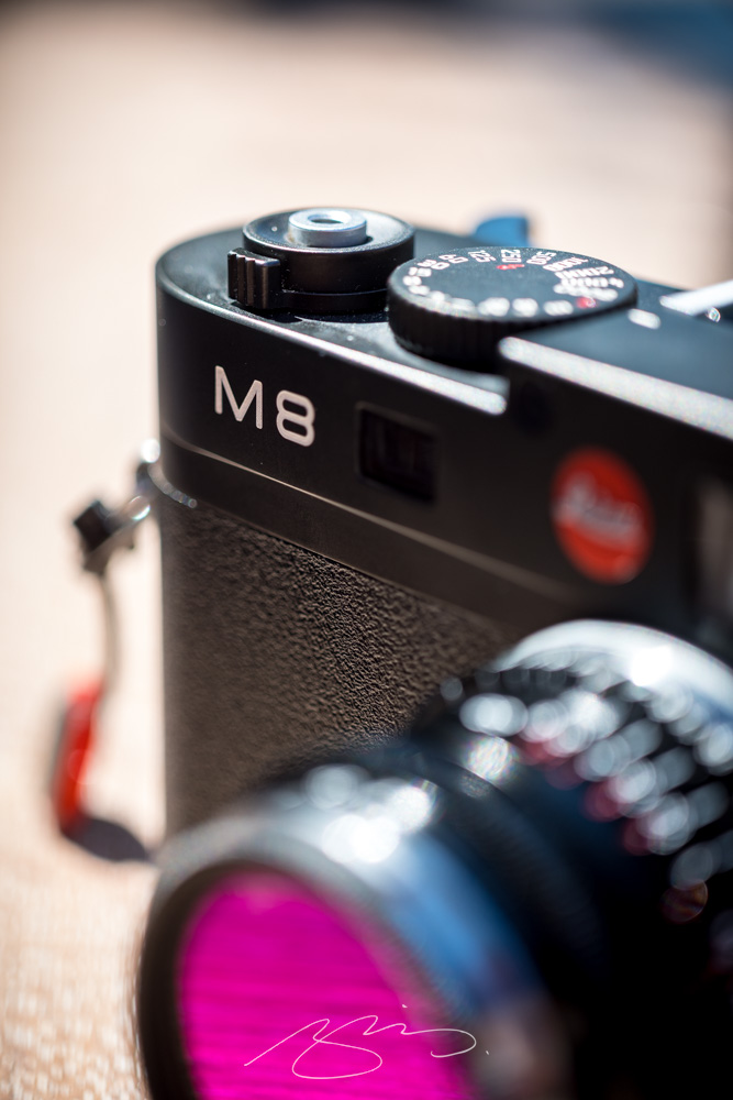
The first Friday of fall saw Gerald and I out celebrating the beautiful weather — and his new “creative camera,” a Leica M8 in pristine condition:
M8 @ Bearfoot (#3)
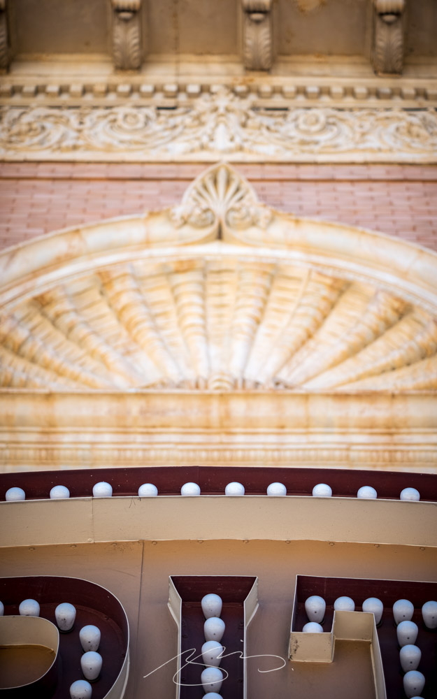
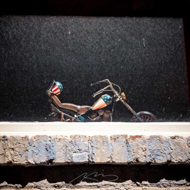
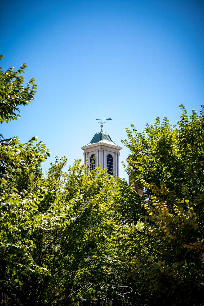
Which of course meant a quick spin around downtown. I was using my favorite lens, the 90mm macro, resulting in lots of detail shots:
Capitol (Theatre) Details, Second St.Windowmaker, Mulberry St. Ln.Peeking Across Third (Street), DowntownStreet Art Detail, Cherry & ThirdStreet Art Detail, Poplar & Third
A wide selection of items for the beginning of fall, from positive fonts to jolly cameras — with Adobe and Pantone pouring some cold water on things. Let’s get to it!
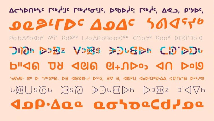
Indigenous Letterforms
As Americans, Europeans, or, more generally, Westerners, we take for granted that fonts will reflect the various pieces of individual type — that is, letterforms — that we’ll need. But not everyone falls into that category.
North American Indigenous fonts — with updated Unicode. Major Kudos. (Courtesy of Dezeen.)
“When [the Unicode Standard] doesn’t contain characters in a given language’s orthography, it is not possible for that community to accurately use their language on digital text platforms.”
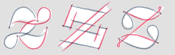
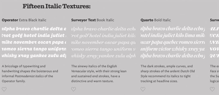
Italics can be the most colorful part of a type family, diverging dramatically from their roman cousins. Here’s a look at twelve kinds of italic typeface, with some notes on their cultural contexts, historical backgrounds, and practical applications.
Hoefler & Co.
Read the article, “Italics Examined,” at Hoefler & Co.’s Typography.com.
Adobe Types, “Stop.”
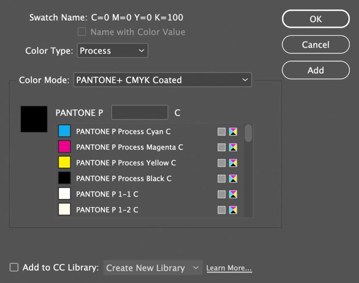
Adobe and Pantone are having a . . . thing. As a result, all Pantone spot libraries have been removed from Adobe products:
A classy move, completely in character for both companies, to reach into users’ machines and remove stuff they had paid for and may rely on because of some licensing spat.
Nick Heer, Pixel Envy
I didn’t get a notice in either InDesign or Photoshop, but a check in InDesign (the CC 2022, aka 17.4, version) shows only the CMYK libraries:
Adobe’s Pantone+ CMYK (Coated) color picker, from InDesign CC 2022
You can subscribe to the additional libraries from Pantone for $60/year. Book design is almost exclusively CMYK, so I won’t be . . . but grrrr.
Update, 28 September, 2022: Adobe got around to putting up a banner in my version of InDesign — blaming Pantone:
This notice showed up September 27th, 2022.
They’ve put up a “help” page. (I took a moment to fill in the feedback at the bottom of that page, too: “Removing features we’ve paid for is incredibly uncool, Adobe. Shame on you.”)
Two Awesome New Cameras, from $100 to $100,000
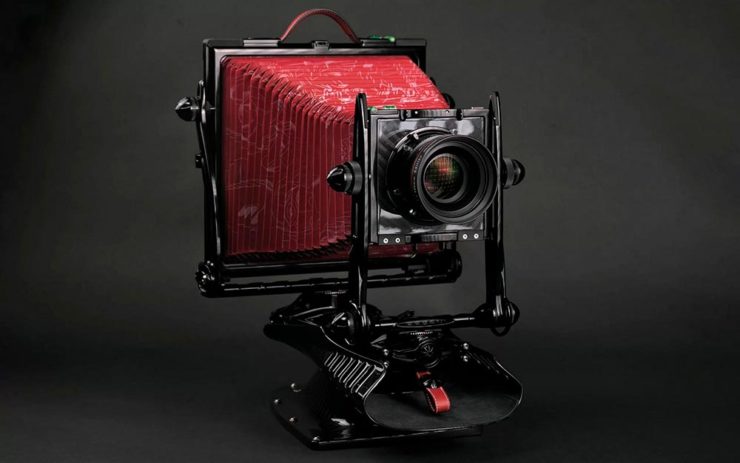
So Pagani, the multi-million-dollar sports car manufacturer, has decided to market large-format cameras. Okay!
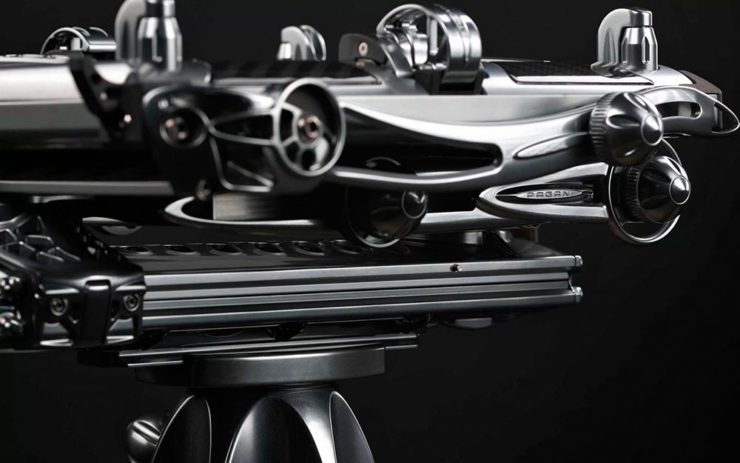
One of Pagani’s new camera modelsA closeup of the (beautifully-detailed) tripod plate for Pagani’s new cameras.
Incredible, breathtaking detail and quality, based on Gibellini models but taken to 11. But like their cars, mere mortals need not apply: their cameras start over $100,000.
Mortals can dream, sure, but here on Earth, I encourage an order from this Ukrainian company instead:
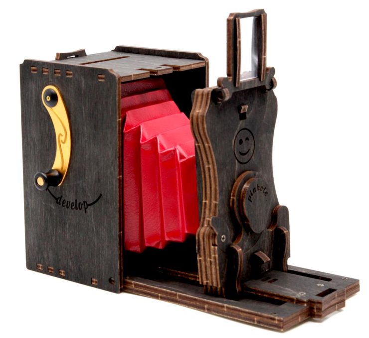
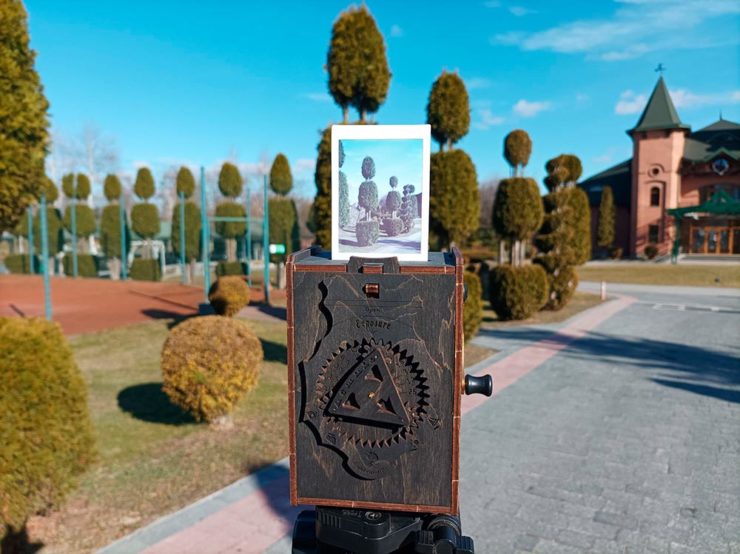
Jollylook’s Pinhole Instant Mini film cameraJollylook’s Pinhole Instant Mini in situ
They’re based on instant film cartridges, are made of recycled materials, look incredibly cool, and a kit starts at an incredibly-reasonable $99. Throw in a few extra dollars to support Ukraine and . . . feel Jolly.
Three interesting logo redesigns this month, plus a moment where venti has nothing to do with coffee. Oh, and a airy bonus.
Drobo Declares Bankruptcy
Generally speaking, I’m not one to engage in schadenfreude, aka “enjoying the pain or suffering of another.” (Wiki. Anyone surprised that the Germans have a word for this … but I digress.)
A selection of expensive, unreliable junk.
Back in 2011, I lost two Drobos in short order — and with them, the majority of my back files. Project I’d worked on, photographs I’d taken, personal documents, years worth of stuff, just gone.
Drobo, the company, did nothing to help, offering neither solutions nor apologies. I wasn’t alone; forums across the ’net suggested that I should have chosen more carefully.
To call Rolling Stone‘s place in America culture iconic might be selling it short, and their logo plays a large role in that. In 2018, they flattened it — leading that trend, possibly — and it lost something.
However, this month, it’s back:
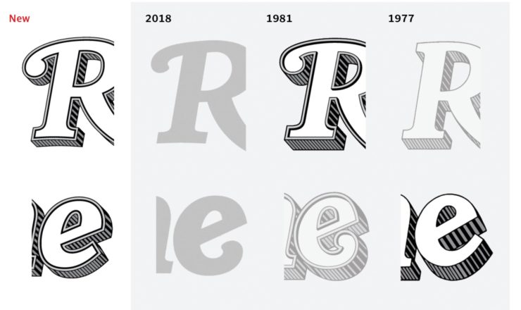
Rolling Stone’s 2022 logo redesign.
“The assignment was a paradox. How could we make the logo look like it did in the past, without making it feel dated? My hope is that loyal readers will believe the old logo is back, but on closer inspection will be surprised to notice how much it has been modernized.”
Jesse Ragan, XYZ Type
The “old logo” he’s referring to is the one that ran from 1981–2018, but there were others, too:
Rolling Stone’s lettering shapes through the years. See more at both links.
A great study in logo evolution: read more at the Type Network, and lettering specifics from XYZ Type. Awesome. (Hat tip to, as usual, Brand New.)
Aston Martin’s New Logo
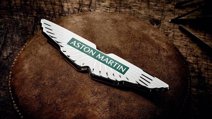
On the subject of subtlety, Aston Martin usually isn’t the first thing that comes to mind. Their recent logo redesign, however, falls into that category:
Wings of Glory (so to speak)
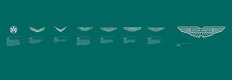
The evolution of their logo emphasizes those small steps:
AM’s logo through the years.
Not a great amount of information on this one, but the accompanying photographs of the logomark being made are fantastic. See more at The Drive, with more at Brand New.
Bugatti’s New Logo
Subtlety and Bugatti rarely — if ever — fit in the same sentence. Aston is stratospheric as far as I’m concerned, so Bugatti would qualify as the antithesis of subtlety. But, but, but: there’s something about one.
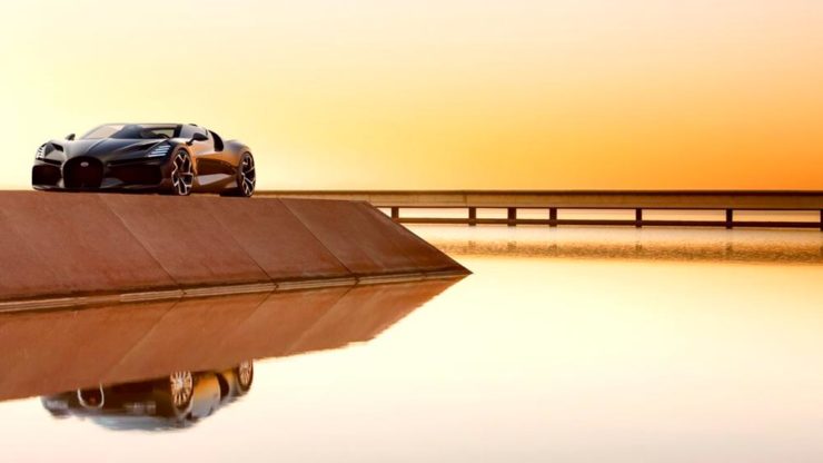
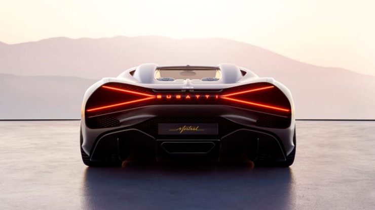
The new Mistral. (Sorry, it’s sold out.)
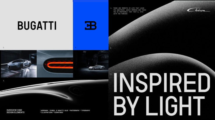
They have a new logo and marketing campaign to go with:
Specifics, courtesy of Interbrand.The Mistral from the back, showing the new type treatment.
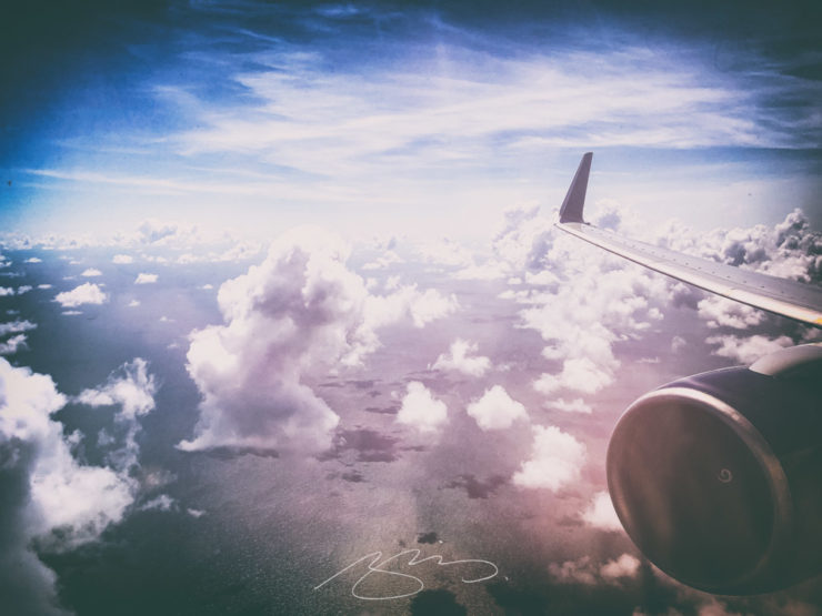
It’s been a busy August, including having to make a lightning trip through the usually-not-fun Atlanta airport. But there’s always a bright spot at the end of that tunnel: being the little boy again, awed by the simple act of flying.
Better still, the flight was on a 757, the sports car of big planes. Everybody around me had their window shades pulled and noses in their phones, but I was looking out the window:
Last weekend, Gerald and I took a summer road trip and photostroll through southwest Georgia — with stops in Andersonville and Americus.
Andersonville is a sobering place: “The deadliest ground of the American Civil War.” Further:
Nearly 13,000 men died on these grounds, a site that became infamous even before the Civil War ended. Their burial grounds became Andersonville National Cemetery, where veterans continue to be buried today. This place, where tens of thousands suffered captivity so others could be free, is also home to the National Prisoner of War Museum and serves as a memorial to all American prisoners of war.
National Park Service
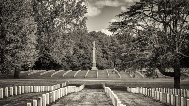
We just visited the National Cemetery section of the park, with its closely-spaced Civil War graves, memorials, and reminders that it’s still in use today.
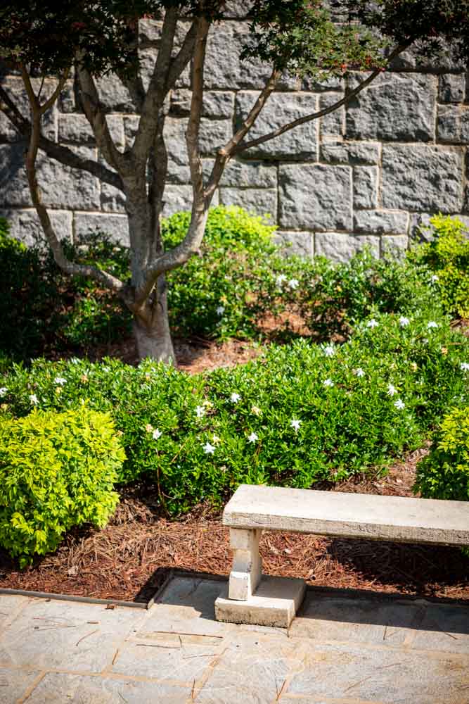
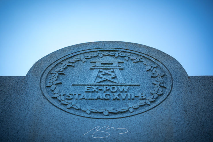
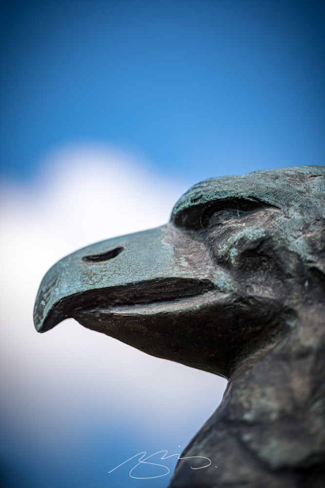
Bench and Garden, Andersonville National Cemetery RostrumStalag XVII Memorial Detail (WWII), Andersonville National CemeteryMaine Civil War Memorial Statue (Photo #2) Amongst Graves, Andersonville National CemeteryIllinois Civil War Memorial (Detail #2), Andersonville National Cemetery
Later, we headed just down the road to the small city of Americus:
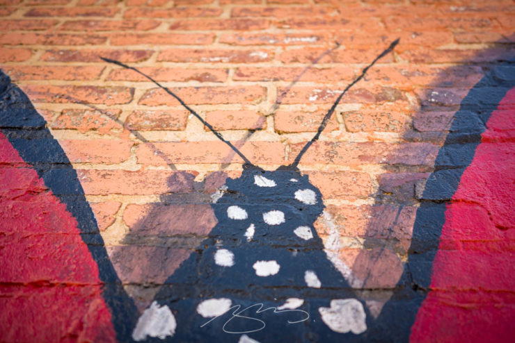
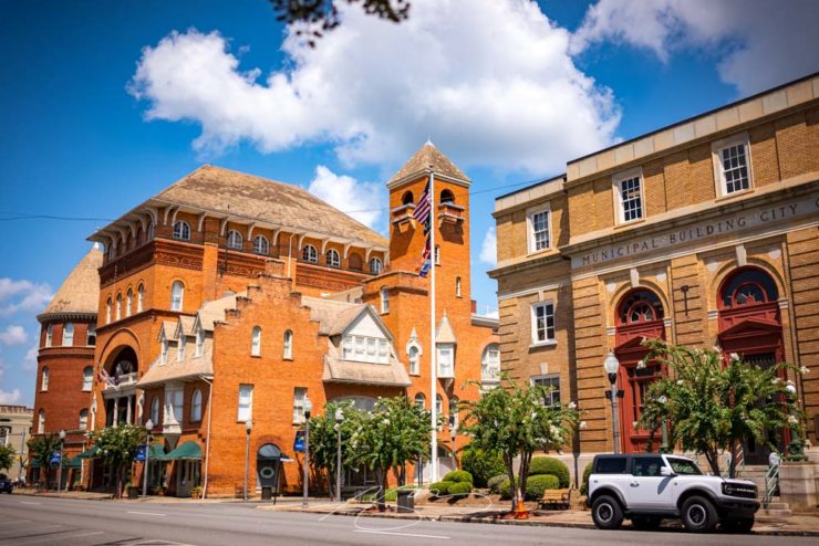
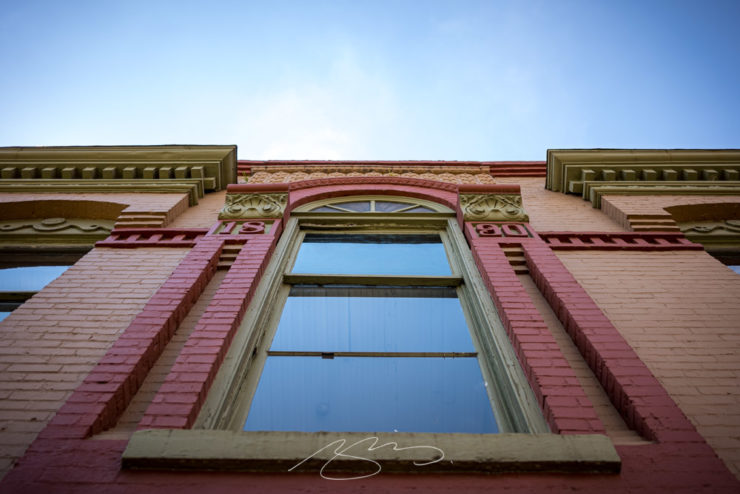
Wall Painting Detail #1, Sweet Georgia Bakery and Cafe, 134 W. Lamar St., AmericusCity Municipal Building and Windsor Hotel, W. Lamar St., AmericusWindow Arch #2, 106 W. Lamar St., Americus
Both galleries — Andersonville and Americus — have been updated with new photographs. The new items start with “2022,” and remember that clicking on any photograph starts a slide show for that gallery. Thank you!
Note: Click on the title above to see this post in one-column format, which includes larger graphics — helpful with some of these jackets especially. (This applies to any post here on Foreword, by the way.)
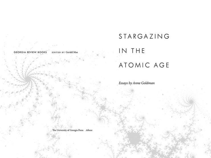
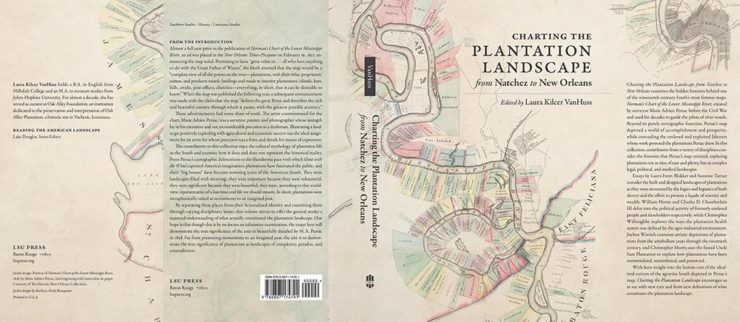
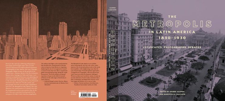
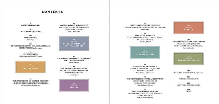
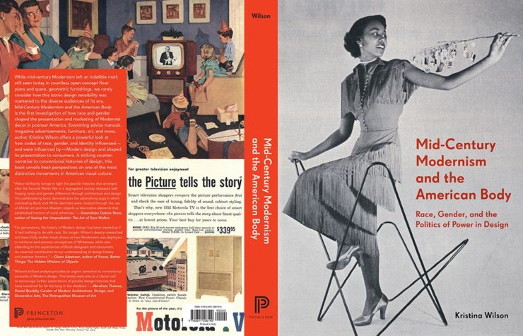
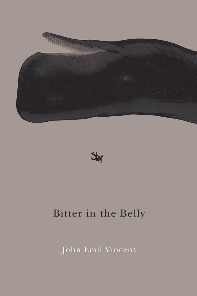
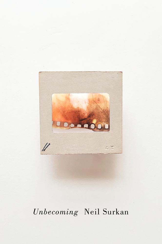
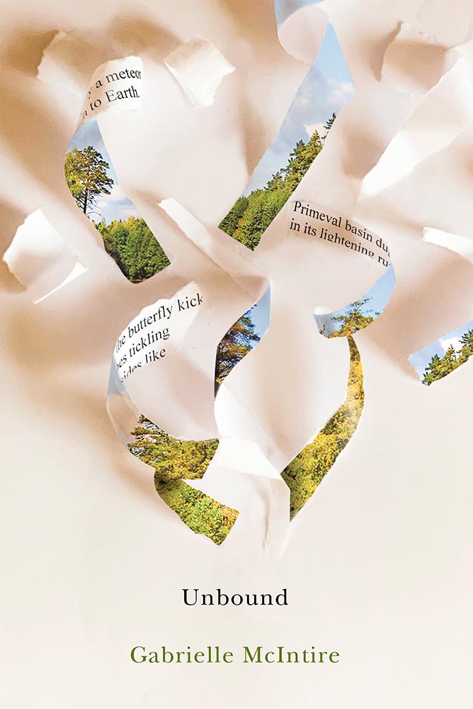
It’s time once again to celebrate the unsung heroes of the book world: the best items published by university presses.
The annual show, now in its 57th year, honors the university publishing community’s design and production professionals. The Association recognizes achievement in design, production, and manufacture of books, jackets, covers, and journals, and the Show serves as a spark to conversations and source of ideas about intelligent, creative, and resourceful publishing.
Association of University Presses 2022
This show, like the 50 Books, 50 Covers also announced around this time of the year, is cool in that it doesn’t just talk about a book’s exterior — there are covers and jackets, interior design, even awards for the quality of typography.
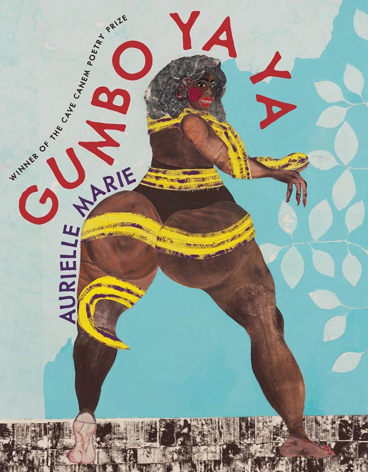
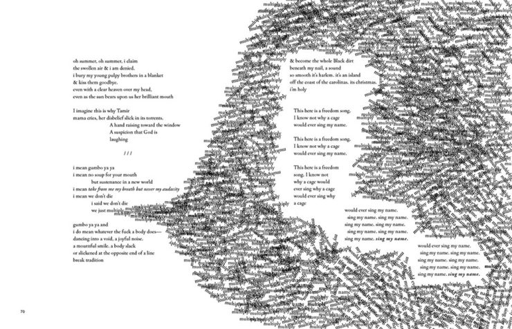
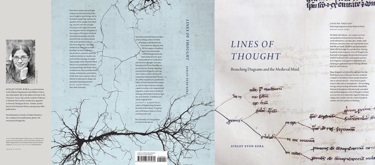
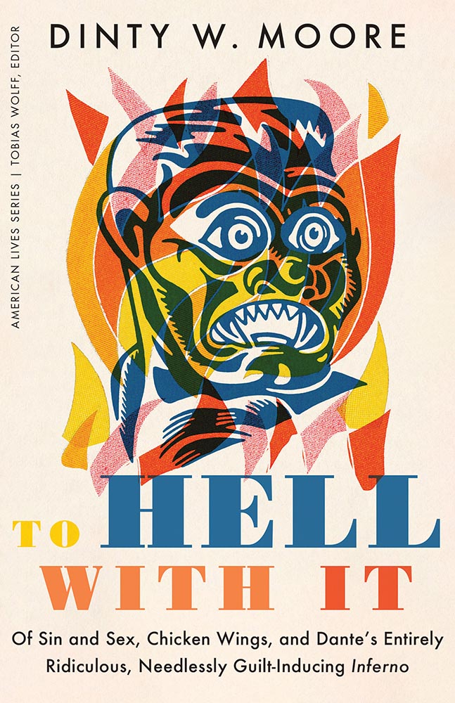
Let’s talk about titles with both covers and interiors first, starting with the great Gumbo Ya Ya from the Poetry category:
University of Pittsburg Press. Cover design by Alex Wolfe.University of Pittsburg Press. Interior design by Alex Wolfe.
The strength of this design, inside and out, towers head and shoulders and whatever else above — designer Alex Wolfe deserves this win and many kudos from me.
Georgetown University Press. Design by Jeff Miller.
Flag-as-fence. ’Nuff said.
McGill-Queen’s University Press. Design by David Drummond.McGill-Queen’s University Press. Design by David Drummond.McGill-Queen’s University Press. Design by David Drummond.
I don’t know that these are a series of titles as much as a style forthe titles — but, in either case, they work.
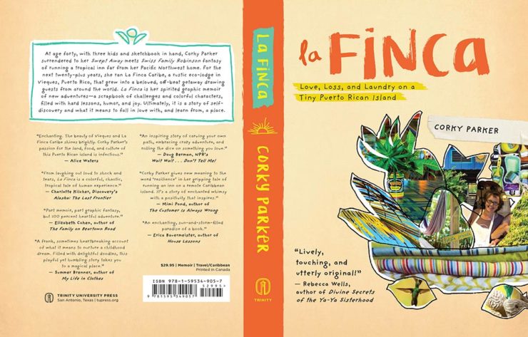
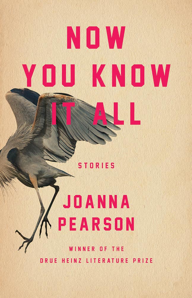
University of Pittsburgh Press. Design by Henry Sene Yee.
Not the only title here with textured paper, the simple typography with a fantastic — and fantastically-placed — bird wins for more than literature.
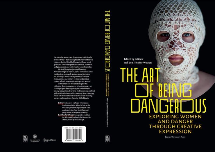
University of Minnesota Press. Design by Casalino Design.
The white border around this is difficult to see here, but adds to the overall in an interesting way; I also like the hand lettering over this amazing photograph.
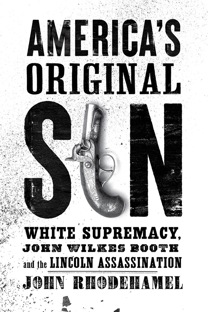
University of Nebraska Press. Design by Nathan Putens
Additive color combined with the subtitle-of-the-year on this winner.
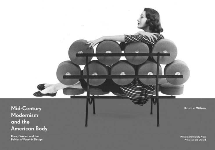
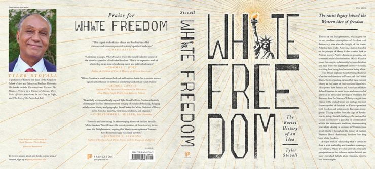
Princeton University Press. Design by Derek Thornton.
Great, great typography here. When combined with the radiating lines and provocative title, it makes for a title that I’d absolutely pick up.
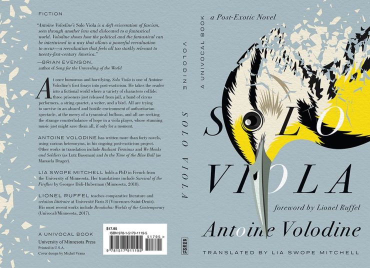
I’ve saved my favorite from the whole show for last:
University of Minnesota Press. Design by Michel Vrana.
Another appearance of textured paper is just the start here, with that illustration rocking so hard indeed — the eye! Fantastic in every way. (Bonus points for “A Post-Exotic Novel.”)
See all of the entries from this great Association of University Presses show here. (FYI, nothing from Spine yet, but kudos to the University of Chicago Press for blogging about their favorites.)
As promised, I returned to Madison, Georgia, to complete the gallery my camera battery didn’t permit last time. Special thanks to Gerald, who accompanied me around the beautiful downtown historic district and on the lovely drive from here to there.
This round is mostly details, taken with my stunning new Leica APO lens. (Introduced in this Macon post.) The whole line has been discontinued, so I am incredibly glad to have gotten one while they’re still available — every single photograph shows just how good this lens is. I’ll try to do it justice:
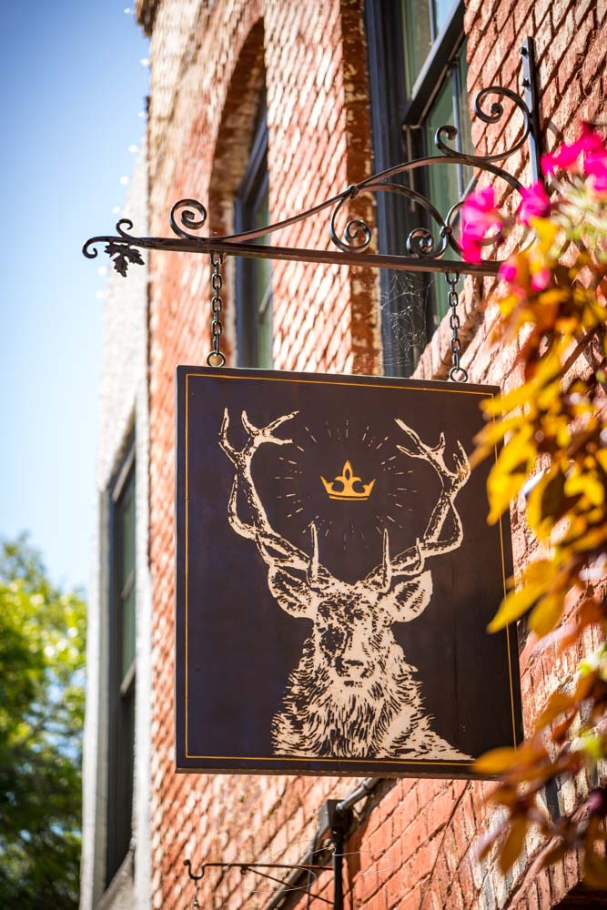
Morgan County Courthouse #6Light Detail, 131 E. Jefferson St.Madison Welcome Center, Madison SquareFlower Detail, Organic MarketBuilding and Light Detail #2, W. Washington St.Hart & Crown Sign, Madison Square
I’ve revamped the gallery with the new shots mixed in with the old. Several are improved versions of shots taken last time, meaning those were deleted in favor of the new ones.
132 Madison photographs have been posted in all. Peruse and enjoy; remember to click on any individual photograph to start a slide show, and if you’d like, click “buy” to get options for fine art prints in a variety of sizes and finishes. Thank you!

![Beautifully Briefed, Early October 2022 [Updated]: Triboro’s Lyrics, Hoefler’s Daggers, and Skoda and Citroen Provide Contrast](https://www.gileshoover.com/wp-content/uploads/2022/10/BB-2022-early-oct.jpg)

![Beautifully Briefed, Mid-September 2022 [Updated]: Indigenous Type, Italic Type, Adobe Types “Stop,” and Two Awesome New Cameras](https://www.gileshoover.com/wp-content/uploads/2022/09/bb_sept-22-1.jpg)

![Beautifully Briefed, August 2022 [Updated]: Drobo, Rolling Stone, Aston Martin, and Bugatti](https://www.gileshoover.com/wp-content/uploads/2022/08/bb_aug22.jpg)