Tag: favorites

  • Cadillac and Mercedes Logos: New — or Not (Updated)

    Cadillac and Mercedes Logos: New — or Not (Updated)

    NOTE: See my previous car logo redesign coverage regarding BMW, Mini, etc., and more recently, Volvo.

    Update, 7 December, 2021: Brand New has, as usual, done a superlative job of discussing the new Cadillac logo. See their post here, remembering that they’re subscription now — possibly the best $20/year available.

    Original post follows:

    Cadillac has updated their logo, their first redesign since 2014. First, though, some history:
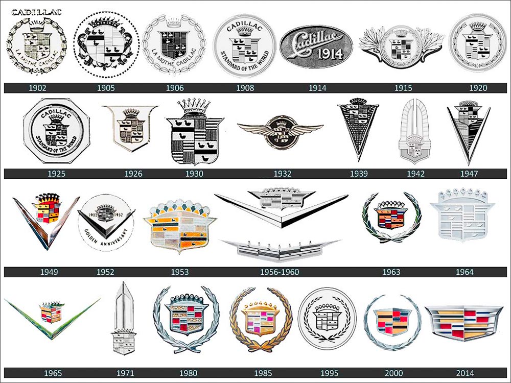
    Cadillac logo history

    The mid-century look, with the “crowned” logo, might be my favorite:
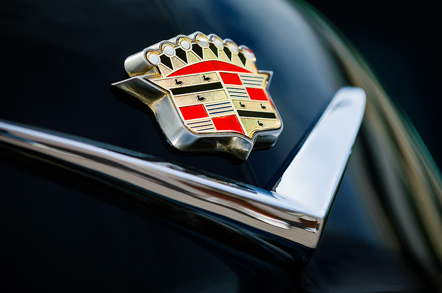
    Photo by Jill Refer
    Photo by Jill Reger

    As seen in the last line above, the 2014 logo is a simplification of the 2000 logo, sans the “old-person” wreath, and I thought quite successful:
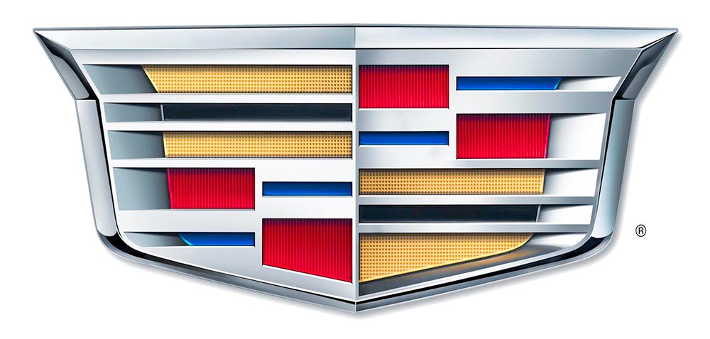
    Fast-foreword (ahem) to 2021, and the monochromatic, flat-logo thing is in full swing. The latest “old-person” target is the Cadillac script, replaced with another trendy item, a custom “Cadillac Gothic” font.
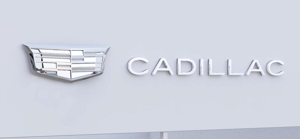
    Cadillac Dealer, 2021

    Not only that, but there’s the new trend among luxury automobiles — mere cars aren’t good enough — of illuminated logos;
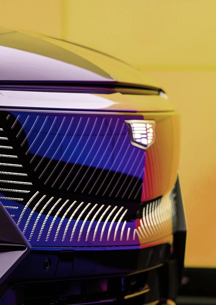
    Cadillac illuminated logo

    It’s Nice That has more on Mother Design’s new take on Cadillac.

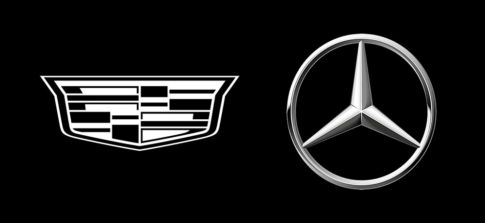
    Mercedes, on the other hand, has just celebrated the 100th anniversary of the three-pointed star. Then:
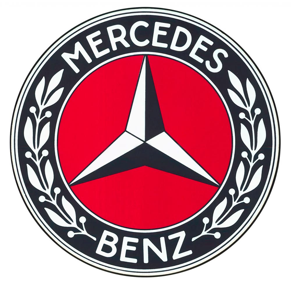
    MB logo, historical

    Now:

    MB logo, now

    When it’s done right….

  • On Volvo’s New Logo

    On Volvo’s New Logo

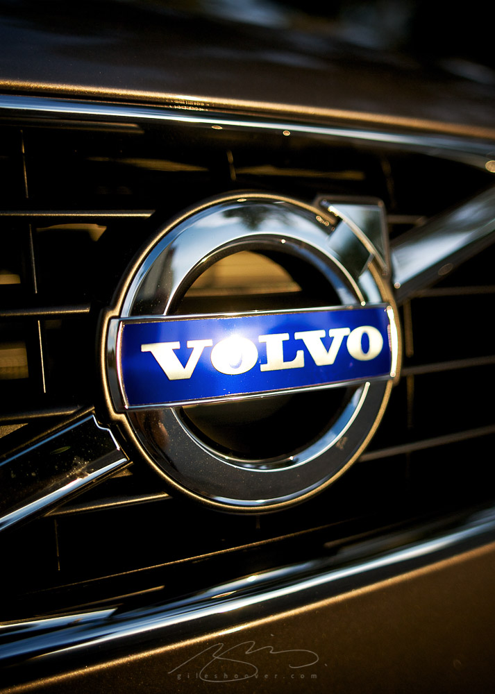
    The “Iron Mark” has been given a makeover, and the result is … interesting. First, as a reminder, here’s the logo as it appeared previously — no, the one previous to that:

    2009 Volvo Iron Mark (on S80)
    My mother’s 2010 Volvo S80

    The blue has been associated with Volvo’s logo for a long while now, and it’s slowly been disappearing from the lineup (in favor of black in the same location). However, they’ve decided — they being both Volvo Cars and Volvo Group, two distinct entities (the latter including Volvo Trucks, the Volvo construction folks, Volvo Penta [marine], etc.) — to change to this new, more austere logo and word mark simultaneously. Aaaaaand:

    2021 Volvo Iron Mark

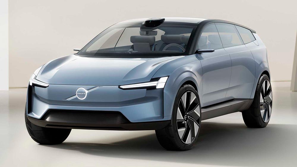
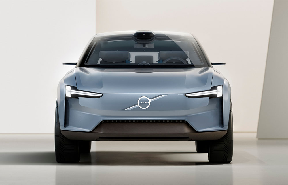
    Words fail me. Thankfully, there’s been plenty of coverage. See Brand New (subscription), CarScoops, and The Drive. What’s interesting — and largely gone under the radar — is that the logo debuted on a concept car back in June.

    Volvo Concept Recharge (2021)

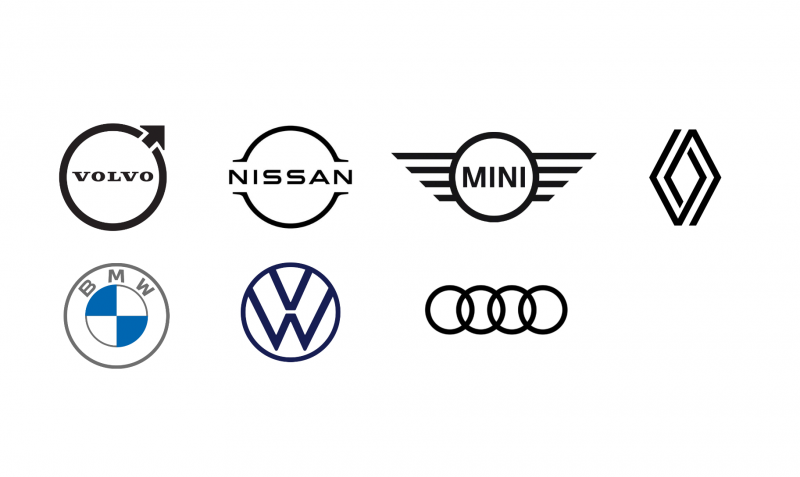
    It’s part of a trend, too:

    2021 car logo redos

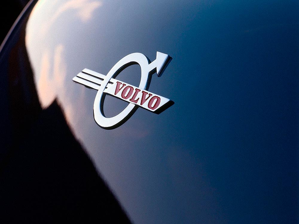
    See the previous coverage on Foreword. Can’t go, however, without a hat tip to Kristen Shaw at The Drive, who dug out this 1937 version — which, I’d argue, beats ’em all. Kudos.

    Volvo logo (1937)