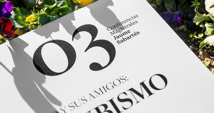
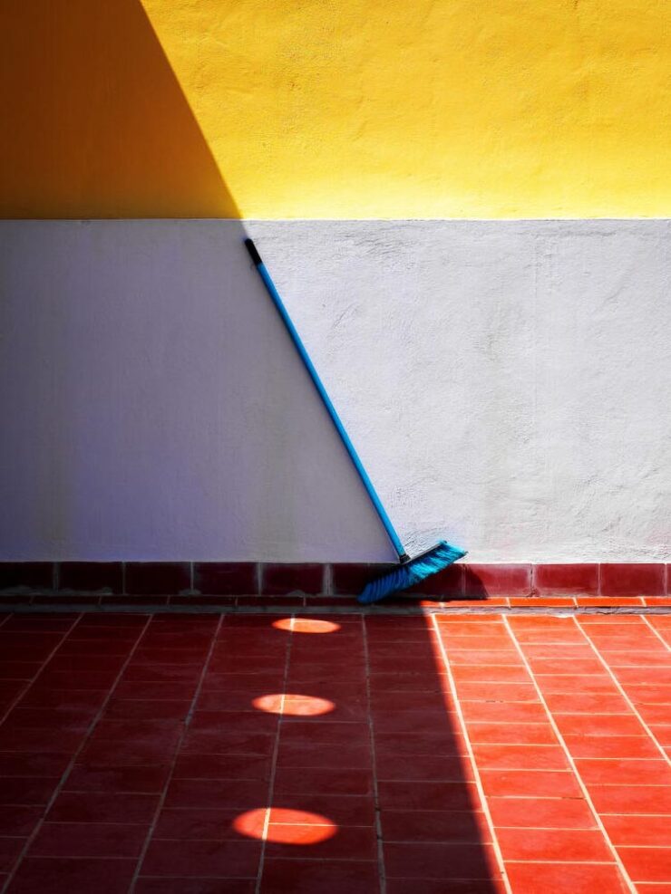
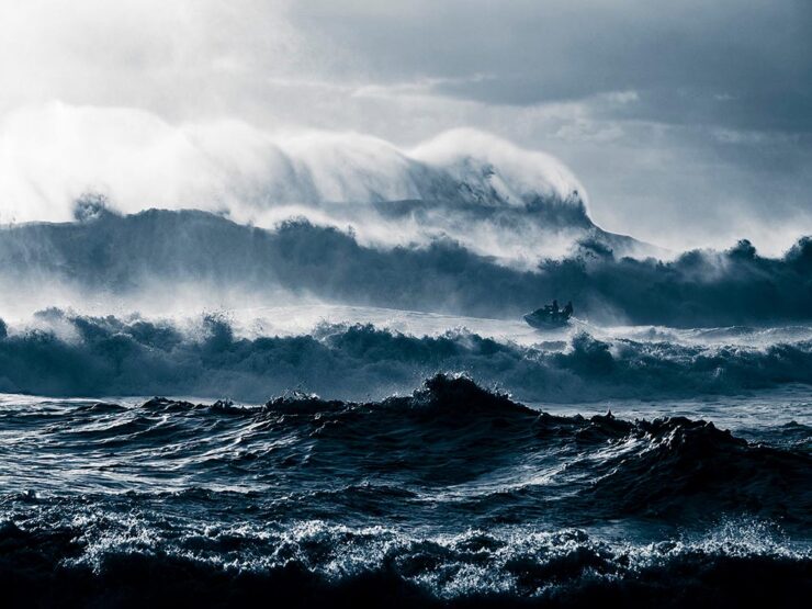
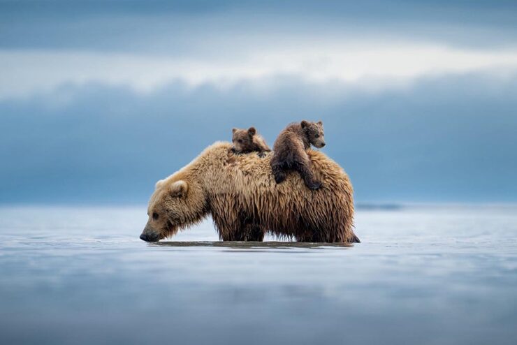
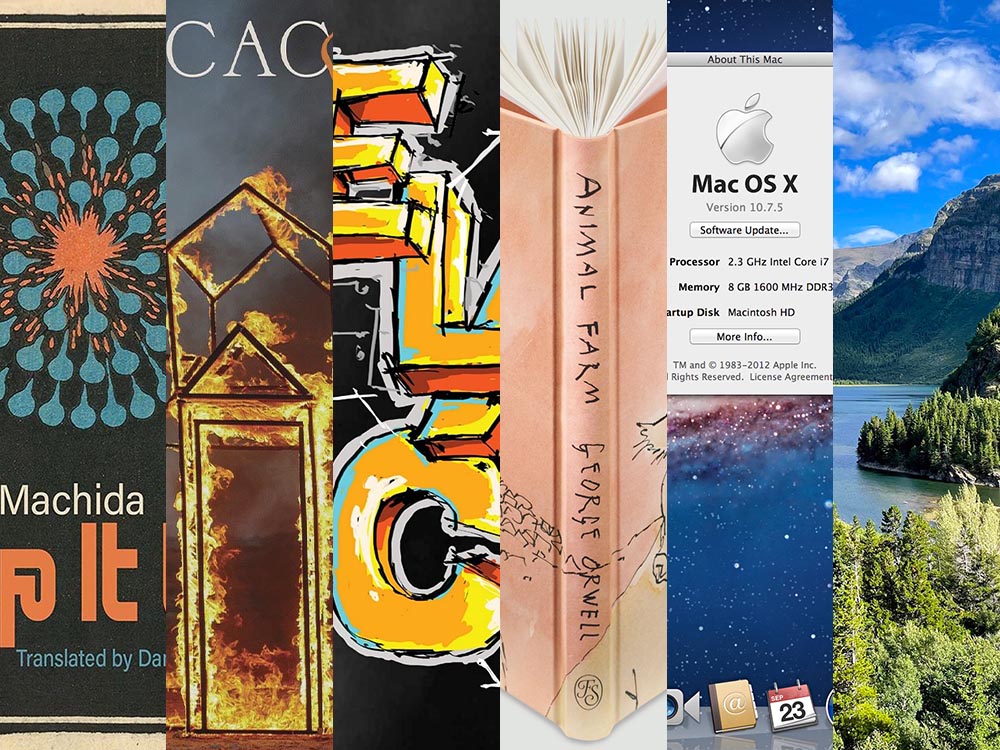
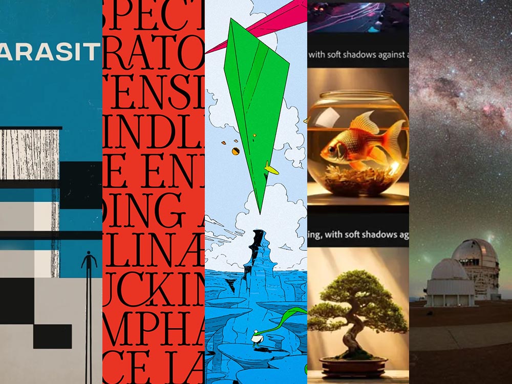
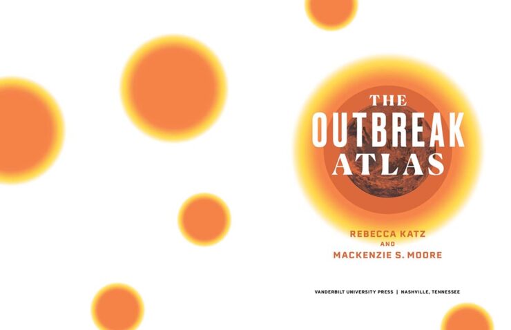
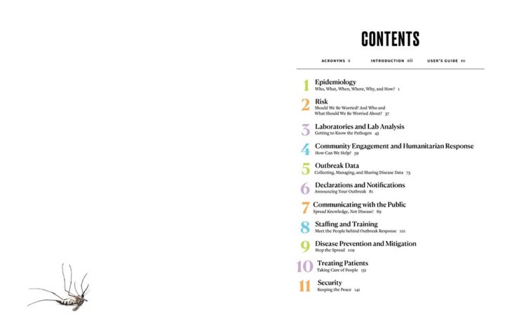
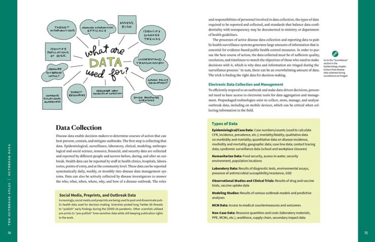
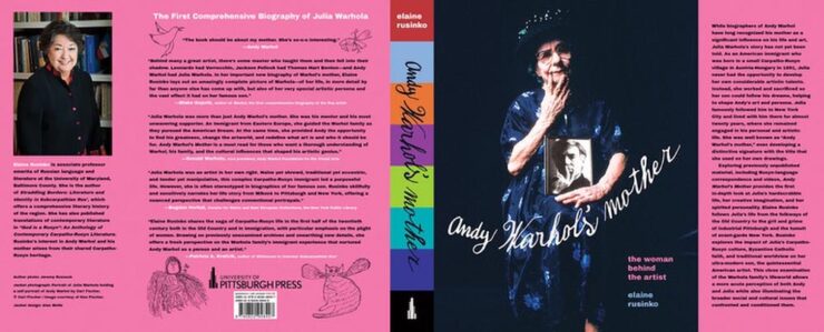
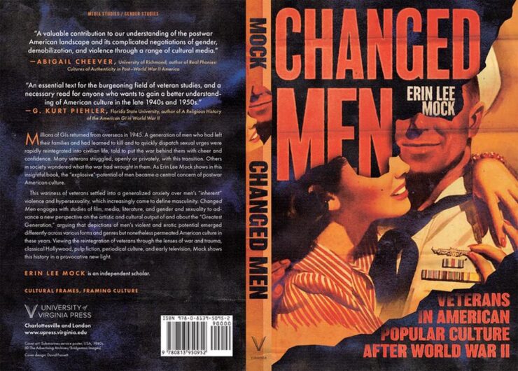
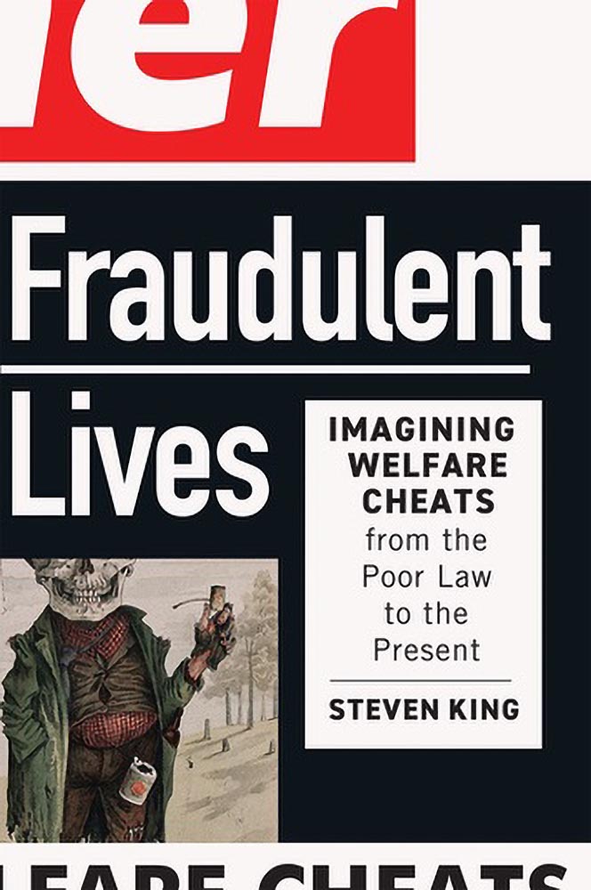
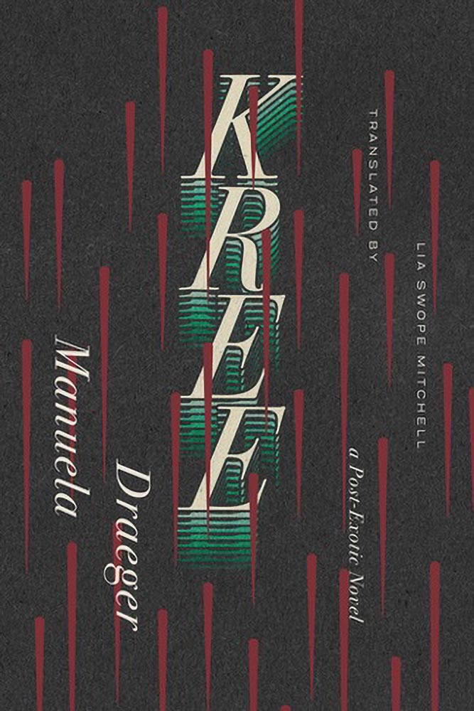
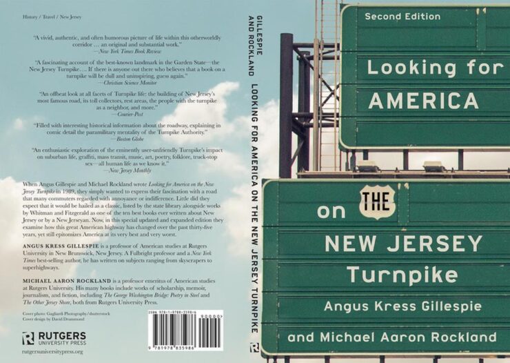
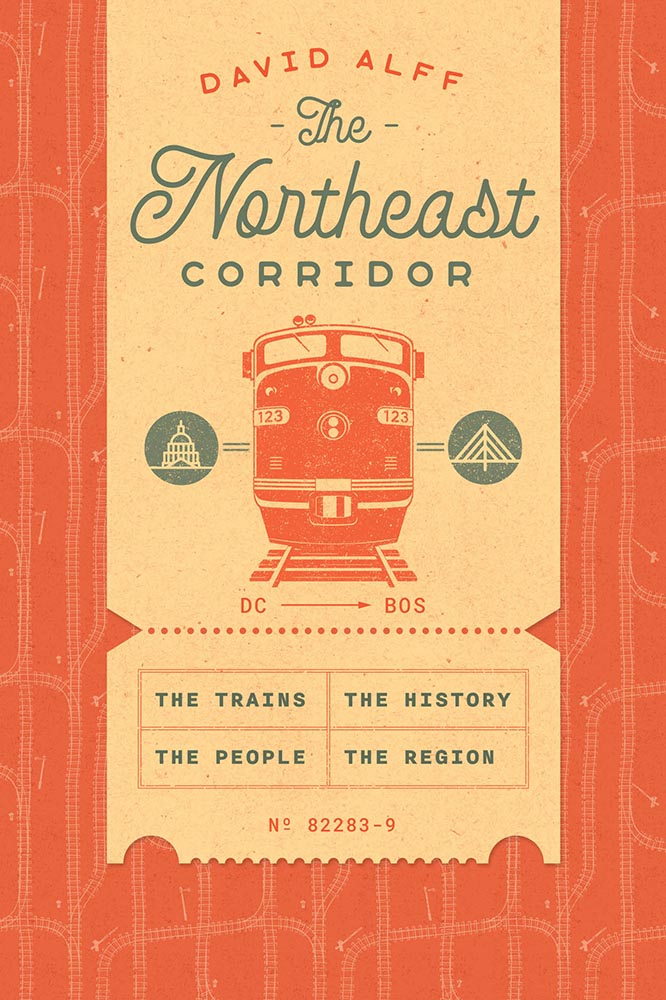
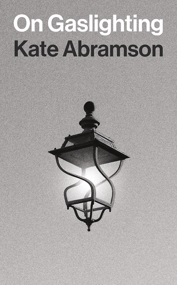
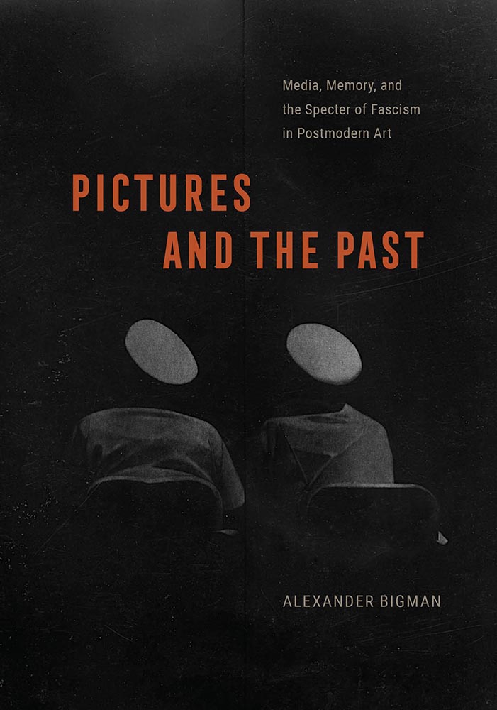
What we’d like to be part of the official agenda is an emphasis on design, an essential part of any publishing project in this age of visuals.
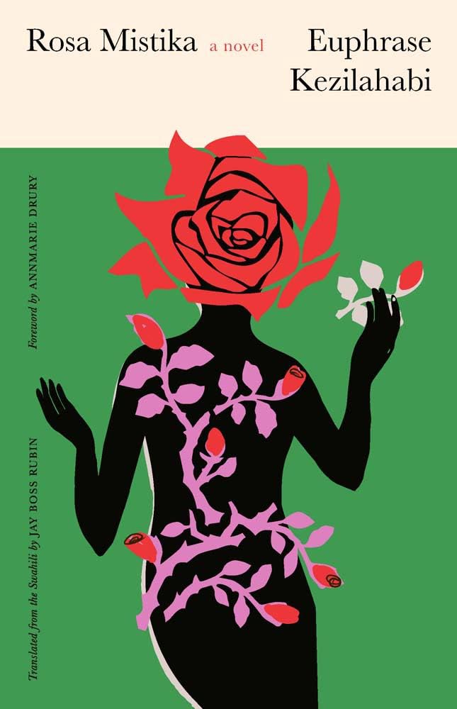
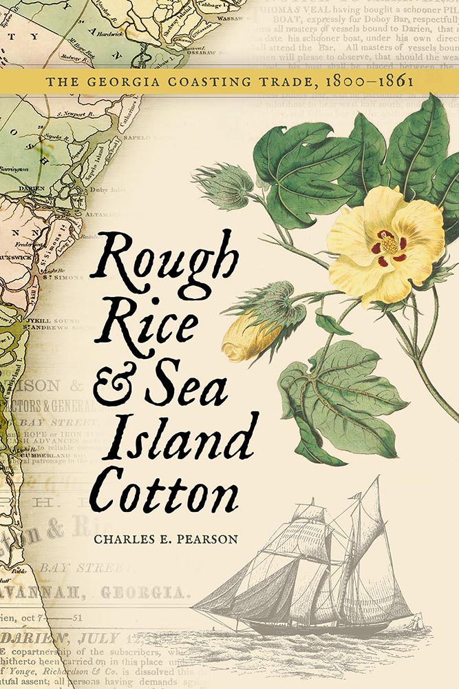
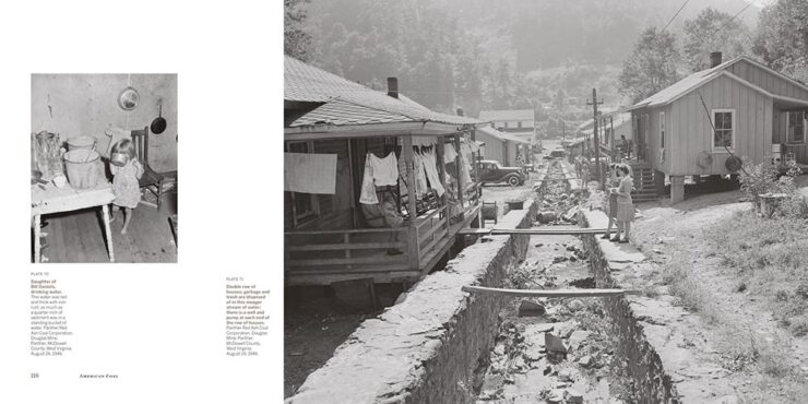
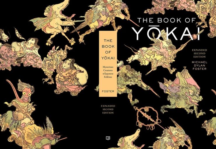
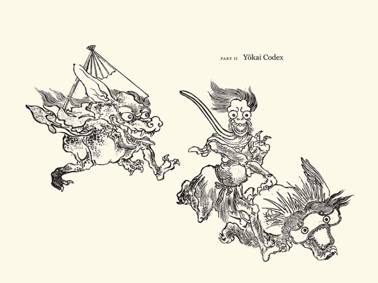
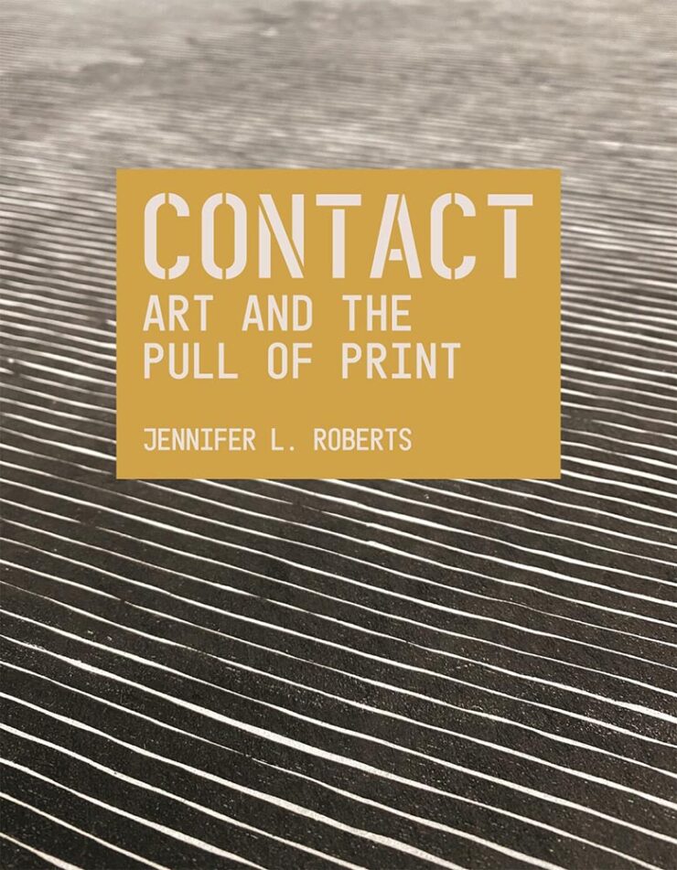
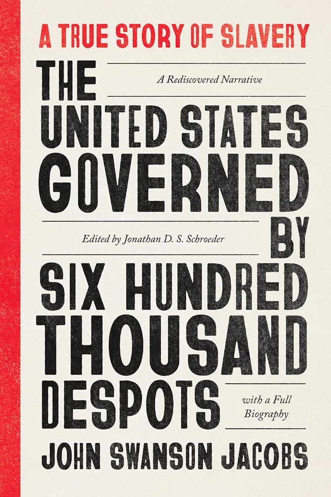
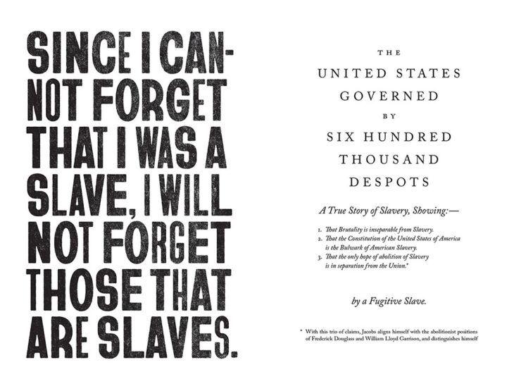
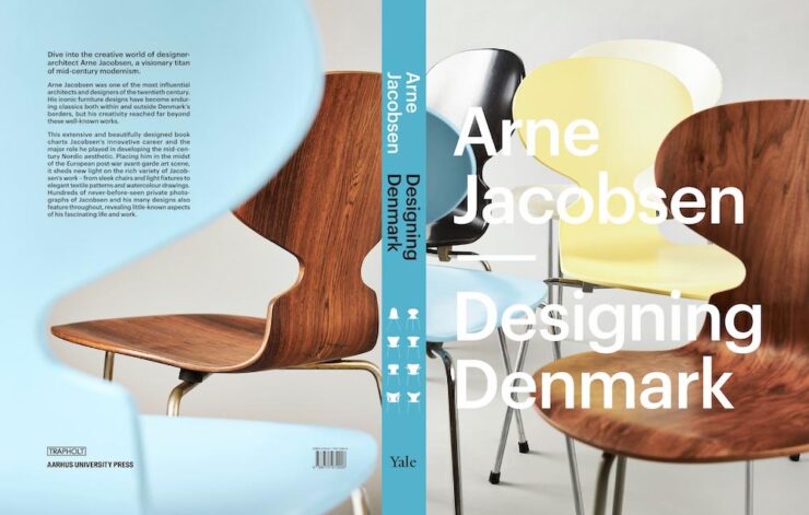
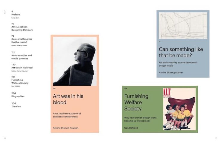
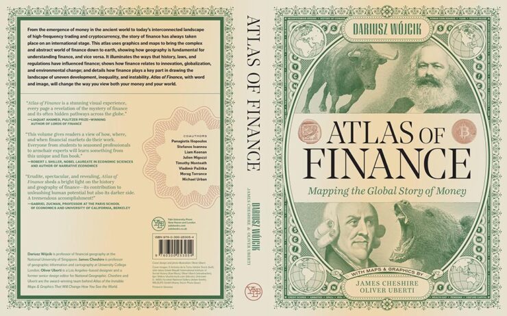
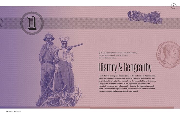
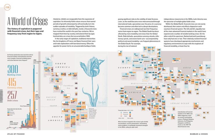
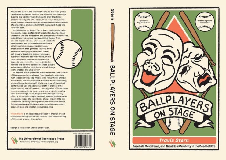
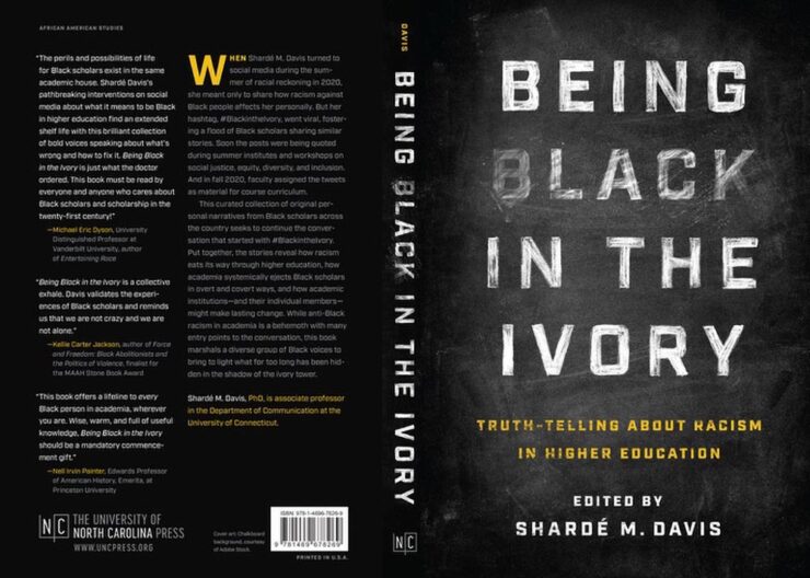
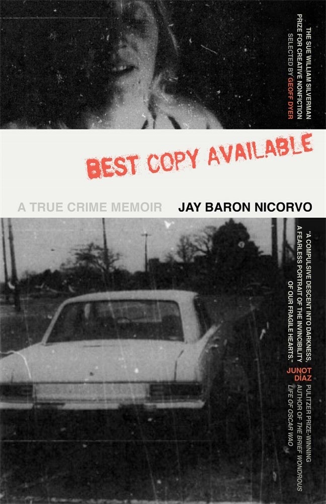
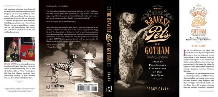
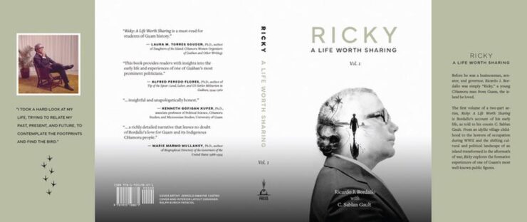
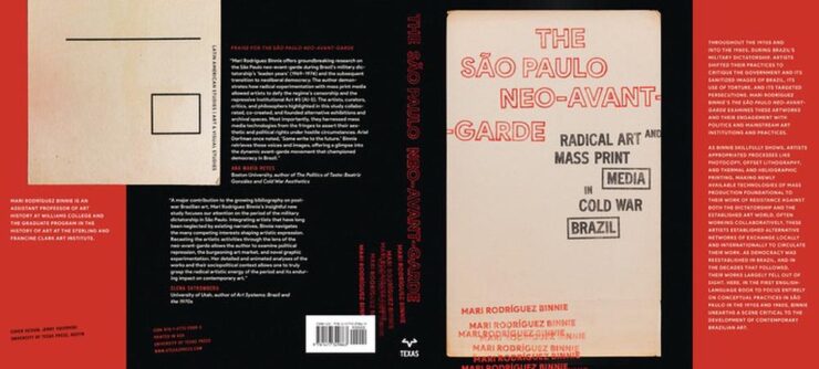
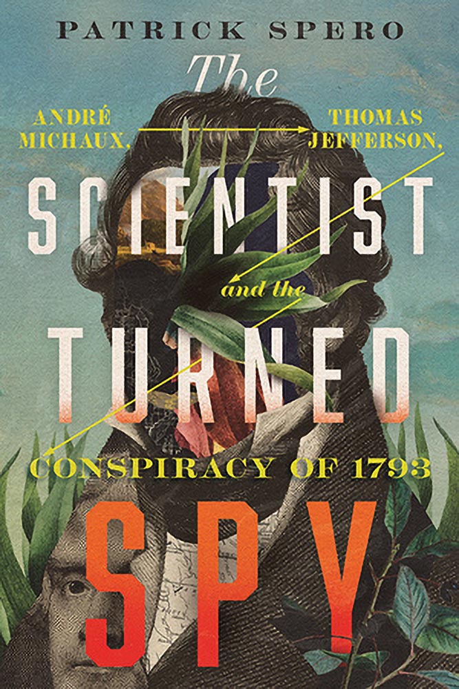
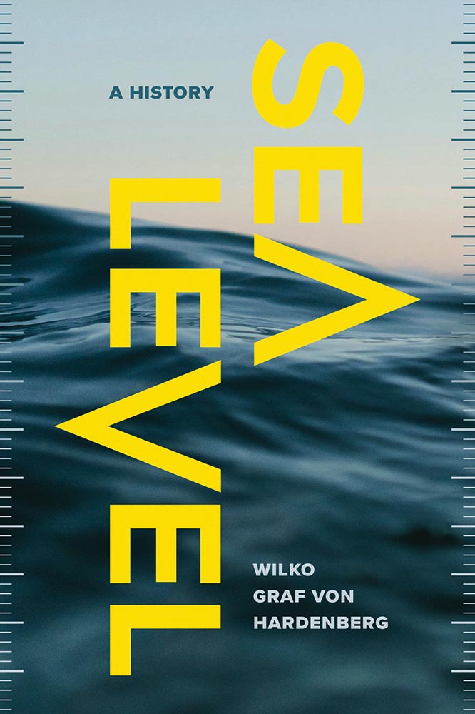
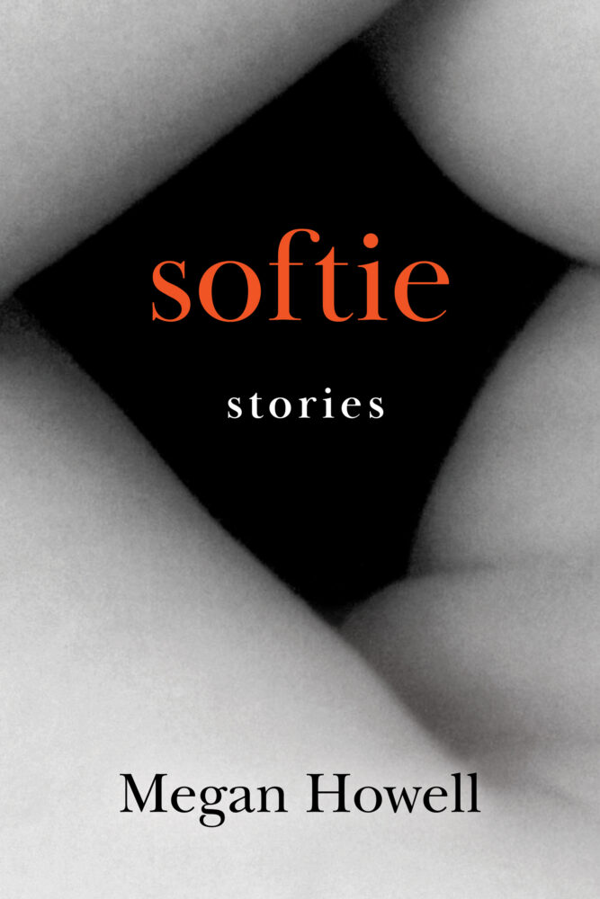
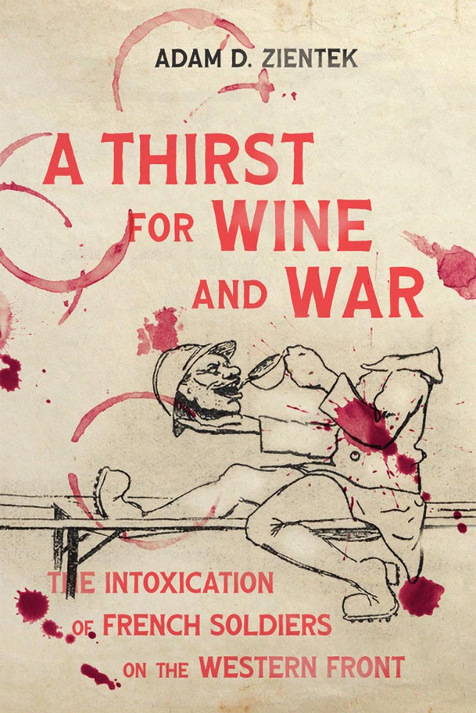
Our goal is to help highlight outstanding University press work. Since restarting the University Press Round-Up column this year, we’ve covered dozens of great designs; to contribute to University Press Week, we’re adding a special edition of 25 more great covers, all from 2025.
Spine’s University Press Week post, 10 November, 2025.
In this episode, design whims and wins, fontastic links, a Toyota Century, and the monthly round-up of great photography bracket some thoughts on — what else? — AI, especially as it relates to art. Grab a beverage, brush, or a comfy chair, and let’s dig in.
This Month’s Spine
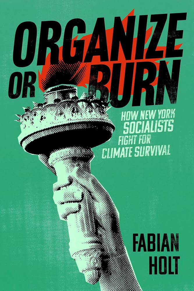
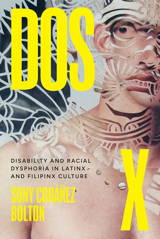
New York University Press. Cover design by Devon Manney, art director, Rachel Perkins.
One could argue that this cover — and title — could work well even if the word “climate” was removed. See the whole list of University Press goodness.
And check back for a special, mid-month post in honor of University Press week, Nov. 10–14.
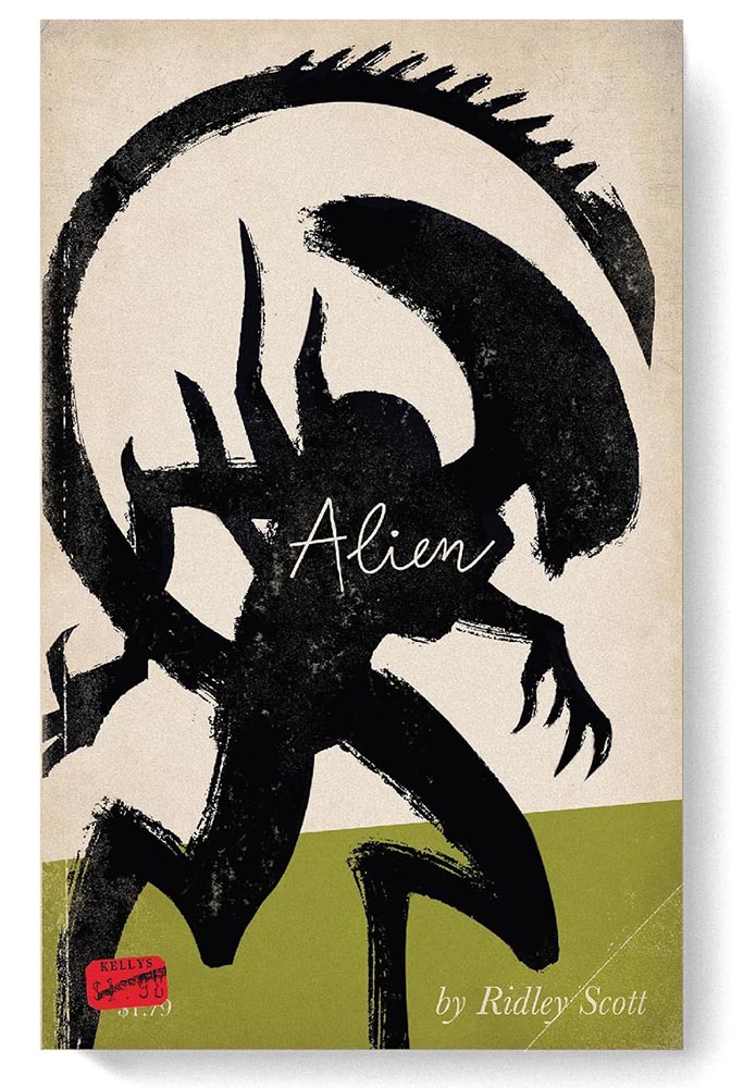
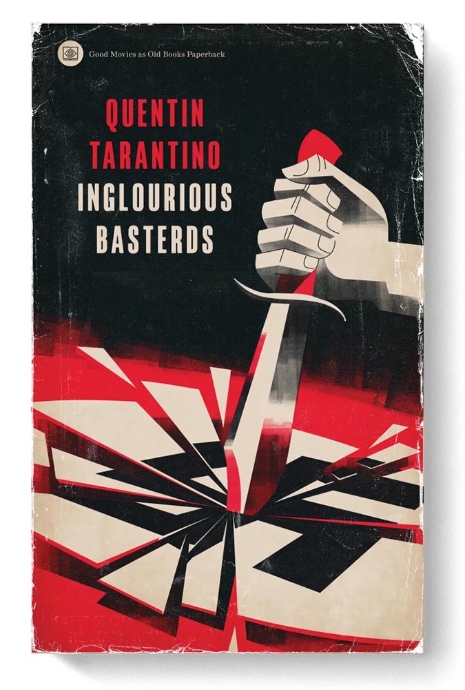
Good Movies as Old Books, Revisited
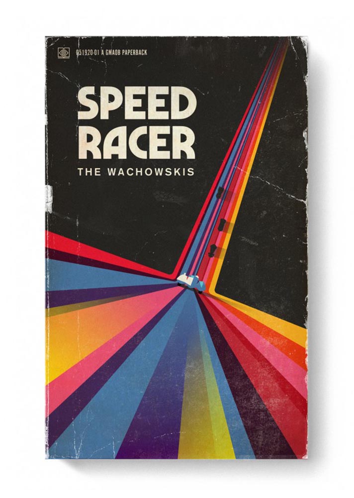
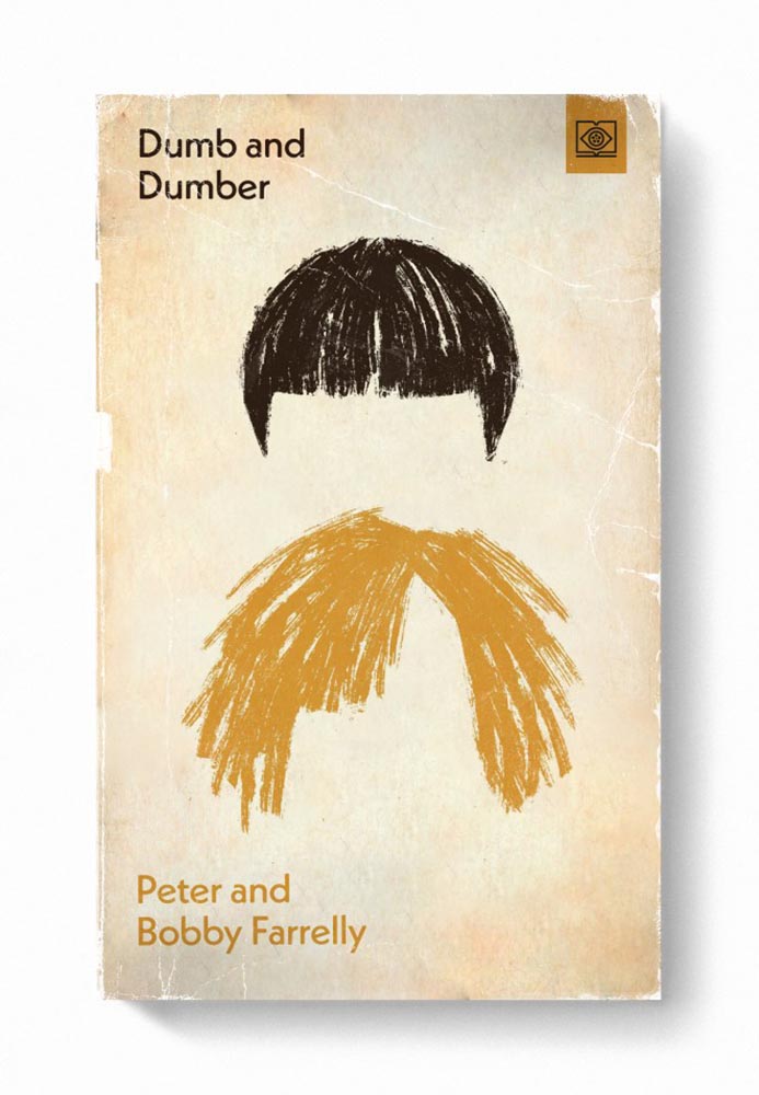
Let’s start with something great: Steven Heller highlights the “talent and imagination” of Matt Stevens (previously) as the paperback version of his book, Good Movies as Old Books, becomes available.
Cover design by Matt Stevens.Cover design by Matt Stevens.
“My goal with the style was to try new things and create interesting combinations. Oftentimes, I was trying to do something that had not been done for a particular film,” Stevens says. Short and fun, the PRINT interview is worth a few minutes of your time.
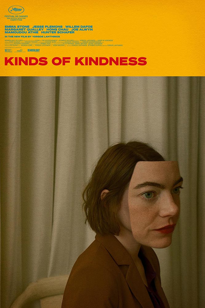
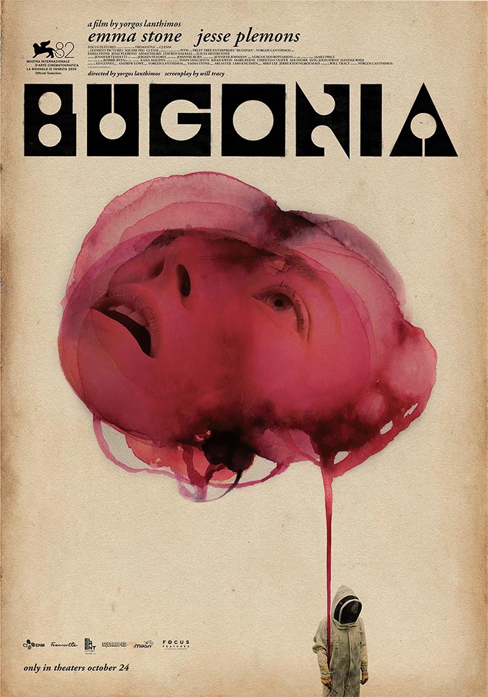
While we’re on the subject of movies, let’s slip closer to … well, what passes for reality these days: items “steeped in human anxieties and fever dreams.” It’s Nice That highlights poster and title design for films by Greek artist Vasilis Marmatakis.
Design by Vasilis Marmatakis.
With design, much like life itself, Vasilis says that his posters are his honest reactions to the films. The same approach runs like a red thread throughout his work, each poster leaning a little too heavily into one of the film’s themes. […] In Bugonia, Vasilis consciously restricts superfluous elements and allows the frames to breathe.
— Arman Kahn, It’s Nice That
Design by Vasilis Marmatakis.
Even the font — and how it’s used — is interesting: the freely-available Churchward Roundsquare, customized with brush and ink. That and much more is discussed in this great article.
New Vintage Classics Series
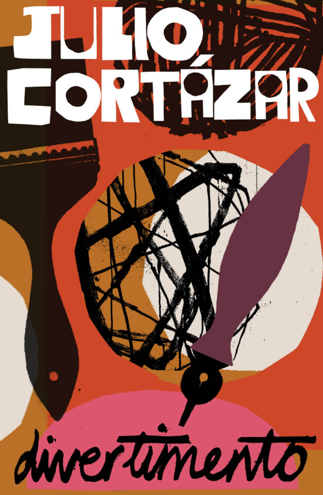
It’s unusual not to relish a new set of reissues from Vintage, and the new editions of Julio Cortázar are no exception:
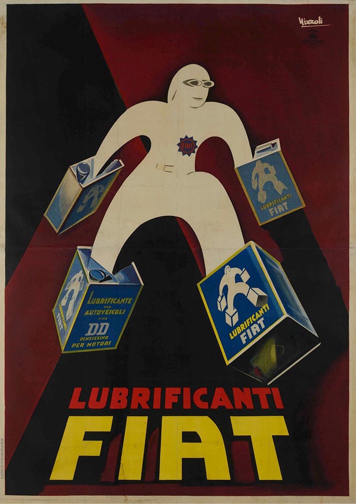
Also via Kottke are these posters, which evoke a certain … something:
In a fascist movement inspired by art, how does the fascist government influence the artists living in its grasp? This exhibition explores how Benito Mussolini’s government created a broad-reaching culture that grew with and into the Futurist movement to claw into advertising, propaganda, and the very heart of the nation he commanded.
The exhibit features “some of the best posters produced during the worst period in modern Italian history.” See more.
Special Bonus #2: While we’re perusing the poster department, Archinect‘s ongoing lecture series (previously) has another winner:
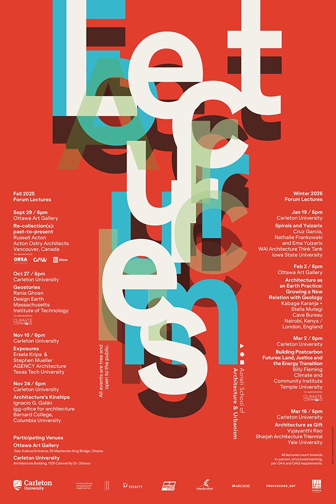
Fontastic Fall
New for October
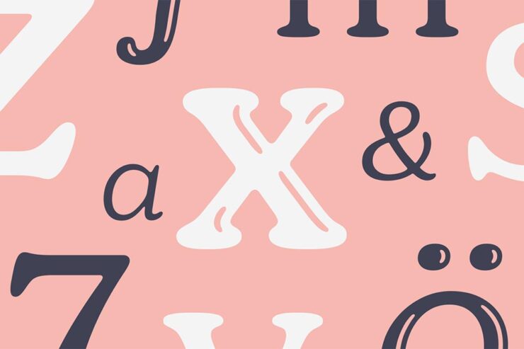
CreativeBoom‘s monthly roundup is out, and while Grundtvig is retrotastic and the three-axis variable Pranzo is accompanied by some great illustrations, it’s Jovie that I’d love to use in print project:
“Jovie’s character emerges through its soft-serif approach, which tempers traditional serif authority with contemporary approachability. Playful italics, expressive alternates, swashes, and ligatures provide designers with a rich typographic palette, whilst maintaining coherent family relationships across all variations,” they note. (Another variable-width item, too.) Great stuff.
Custom Type is Everywhere, It Seems
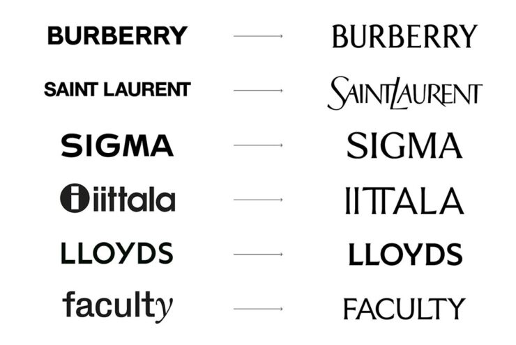
Meanwhile, custom type for branding is becoming the norm. In another article, CreativeBoom explains why: “Bespoke letterforms are no longer a “nice-to-have” and they are increasingly seen as a strategic necessity[.] Type has become the glue that holds their voice together,” they write.
Those letters are your brand’s voice. They do the heavy lifting, they carry personality, and they create instant recognition – sometimes without the need for any other distinctive assets. […] Typography is everywhere in a brand system – packaging, products, campaigns, interfaces. When you build your own, you’re not at the mercy of someone else’s design choices, and you get a voice that’s tuned to your values, your audiences, and your long-term ambitions.
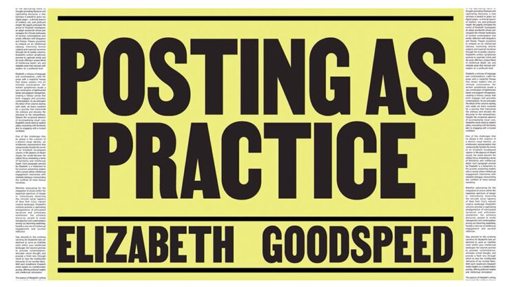
Elizabeth Goodspeed (previously) agrees, mostly. “For most of the 20th century, branding treated typography as background, not backbone,” she writes. But now, brands are recognizing that, “[a]s a primary container for meaning, typography inevitably carries an enormous share of that emotional load.”
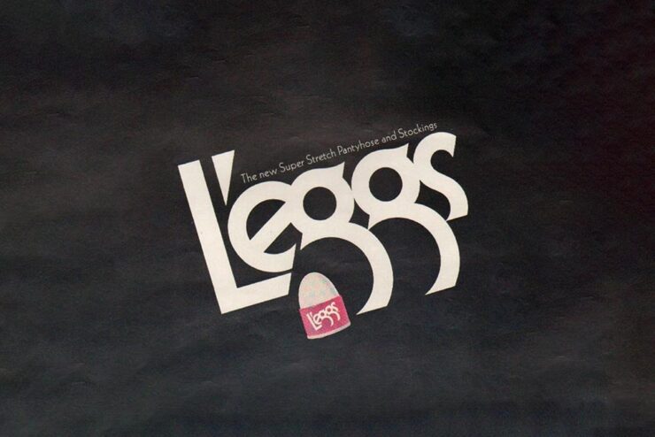
An exception to the rule: a type gem — with legs! — from 1971.
But, she cautions, “[s]peed also feeds a kind of conceptual shallowness. With so many studios drawing type, the market has been flooded with fonts that solve narrow visual problems but can’t stand up to long-term use. Too often, new brand fonts cling to a single gimmick while leaving the structure of the letters untouched.”
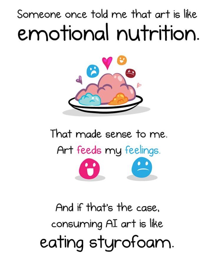
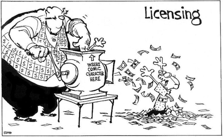
The Oatmeal, penned by Matthew Inman, has some thoughts on AI.
The new-to-me FlowingData — via Kottke’s rolodex feature — first pointed me to this piece, and it’s gotten a ton of press. In summary, Inman suggests that AI art causes a certain discomfort; that, perhaps, AI art even deserves air quotes around the word art because it’s somehow less than “actual” art.
Indeed, much of that press has been approving: a pile-on of people (not that such things happen on the internet) saying, “yes, AI art deserves those air quotes. It is less.”
One of my favorite reactions was from Nick Heer:
A good question to ask when looking at an artwork is “who made this?”, and learning more about what motivated them and what influences they had. This is a vast opportunity for learning about art of all mediums, and it even applies to commercial projects. Sometimes I look up the portfolios of photographers I find on stock image sites; their non-stock work is often interesting and different. There is potential for asking both questions of A.I.-assisted works in the hands of interesting artists. But it is too often a tool used to circumvent the process entirely, producing work that has nothing to offer beyond its technical accomplishment.
— Nick Heer, Pixel Envy
“Who made this?” is the right question — to start. But let’s take that a step further.
John Gruber, at Daring Fireball, quotes the piece: “[When] I find out that it’s AI art[,] I feel deflated, grossed out, and maybe a little bit bored. This feeling isn’t a choice.” Then says that he fundamentally disagrees with that premise:
I think it very much is a choice. If your opinion about a work of art changes after you find out which tools were used to make it, or who the artist is or what they’ve done, you’re no longer judging the art. You’re making a choice not to form your opinion based on the work itself, but rather on something else. […] Stanley Kubrick said, “The test of a work of art is, in the end, our affection for it, not our ability to explain why it is good.” If an image, a song, a poem, or video evokes affection in your heart, and then that affection dissipates when you learn what tools were used to create it, that’s not a test of the work of art itself. To me it’s no different than losing affection for a movie only upon learning that special effects were created digitally, not practically. Or whether a movie — or a photograph — was shot using a digital camera or on film. Or whether a novel was written using a computer or with pen and paper.
— John Gruber, Daring Fireball
“Good art is being made with AI tools, though, and more — much more — is coming,” he says. Over the next few days, he cited some examples, including David Hockney’s art made with a Xerox machine, and then this:
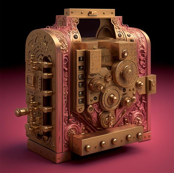
Jonathan Hoefler’s ongoing series, called Apocryphal Inventions.
The objects in the Apocryphal Inventions series are technical chimeras, intentional misdirections coaxed from the generative AI platform Midjourney. Instead of iterating on the system’s early drafts to create ever more accurate renderings of real-world objects, creator Jonathan Hoefler subverted the system to refine and intensify its most intriguing misunderstandings, pushing the software to create beguiling, aestheticized nonsense. Some images have been retouched to make them more plausible; others have been left intact, appearing exactly as generated by the software. The accompanying descriptions, written by the author, offer fictitious backstories rooted in historical fact, which suggest how each of these inventions might have come to be.
These images represent some of AI’s most intriguing answers to confounding questions — an inversion of the more urgent debate, in which it is humanity that must confront the difficult and existential questions posed by artificial intelligence.
“This is art,” Gruber says, with no other text. I don’t think any other is needed.
On a Related Note
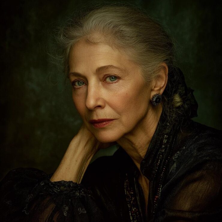
This is AI.
“The top 200 photographers requested by Midjourney users have been exclusively revealed to PetaPixel — and it’s a world-famous, still active photographer that tops the list.” I bet you can guess who that is.
This is, in fact, the majority of what Inman was thinking — or at least, feeling — when he drew out an argument on why AI art can be such a let-down, both intellectually and emotionally. The above “photograph” is both awesome and hugely disappointing at the same time.
Further Reading
I’m not qualified to speak with any authority on the state or potential future of AI, AGI (artificial general intelligence), or the continuing convergence of AI with … well, all the things. I will say that, to me, there’s a palpable sense of bubble going on; whether financial, material, or resource requirements, it feels like something is going to need to give fairly soon.
Below are several articles on the intersection of AI with life, culture, or art that I found valuable. If you can set aside a few minutes, the information provided could be helpful in the quest to stay informed:
Side Note: I’ve dropped the punctuation in “AI.” Not unlike capitalizing “Internet,” I think we’ve crossed that bridge.
Special Bonus #3: AI apparently overuses em dashes, something that has, frankly, caused me to use them less. Which is a good thing — I overuse them. But then, I am a professional. [That’s only funny if you’ve read the link. —Ed.]
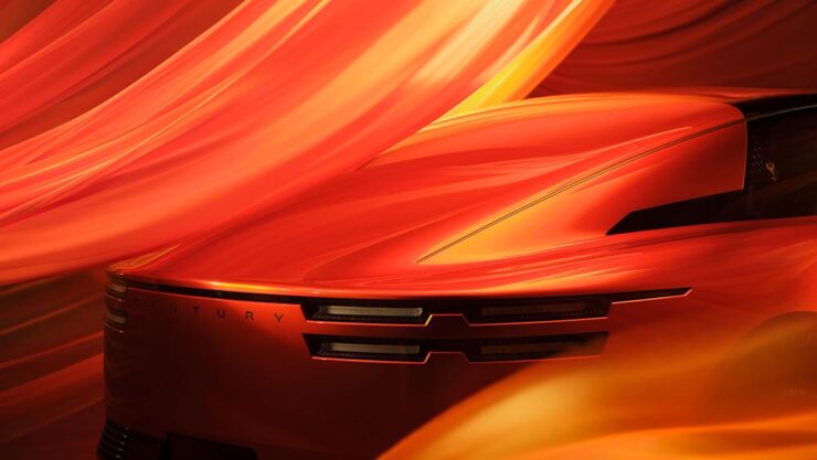
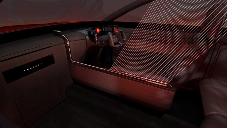
The Century Coupé Concept
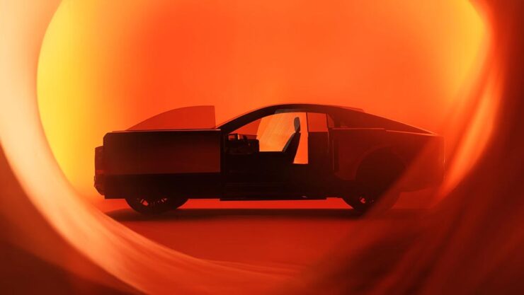
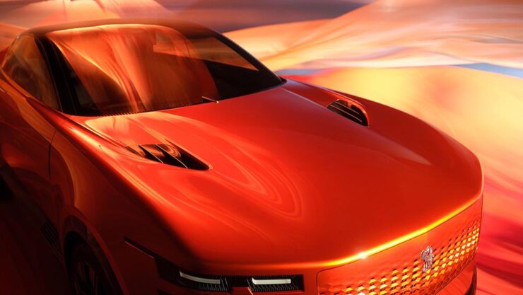
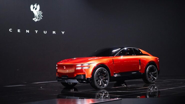
Toyota (the company) has reorganized: there are now three levels. There’s Toyota (the car line), for the mass market; Lexus, Japan’s first answer to BMW et al from the late ’80s and also very much mass market (if targeted differently); and now, to compete in the ultra-high-end market, Century:
Long hood, imposing “grille” — trend, recycling, or cliché, depending on outlook.The no-rear-window thing continues to grow in popularity. (For “cocooning.”) Hmph.
Powertrain is yet to be determined; the rumors suggest it’ll be available both with a combustion engine (possibly a V12) and electric drive. In the case of the latter, owners will, of course, be able to send their driver off to get the thing charged while they lunch or plot takeovers — no range anxiety here.
Century’s logo is a phoenix.
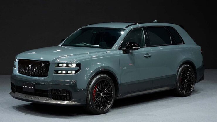
Car geeks will know that Toyota’s Century sedan model has been around forever. It’s always been badged as a Toyota, and is aimed at Japanese executives and members of state (and will, in fact, still be produced). It was joined a few years ago by a SUV that bears more than a passing resemblance to a Rolls-Royce Cullinan. Both existing Century models available only in Japan and China.
The 2025 Century SUV. That D-pillar absolutely “borrows” from the Cullinan.
Toyota has decided to make those three models into a new brand that’s just called, “Century.” It’s going to be set up with exclusive dealers, eventually be available worldwide, and compete with Bentley’s new EXP 15 (previously) and Rolls-Royce’s … everything.
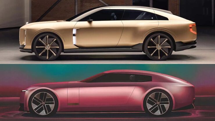
And, of course, Jaguar. The elephant in the room get a mention here because it’s looking more and more like JLR made the right call in targeting one-percenters with out-there, vaguely coupe-like designs. Because if the Century SUV resembles a Cullinan, the new coupé concept looks like a cross between the Jaguar Type 00 concept and said Bentley:
The Bentley EXP15, top, with the Jaguar Type 00, bottom.
Very much unlike the Jag, which is low and could possibly be described as “sleek,” the Toyota has a higher stance; a coupé/sedan and SUV mix seems to be a new answer to the so-called “death of the sedan.” Volvo’s ES 90 might also apply here.
Bear in mind that I’m not talking about the coupé-style SUVs (BMW’s X6, for instance), which are a different animal — at least for now. It’s possible the whole class of “coupe-like things” might converge in the not-too-distant future.
That being said, a member of that new class of vehicle being aimed at the chauffeur-driven market is new.
The glass divider is to allow the chauffeured their privacy.
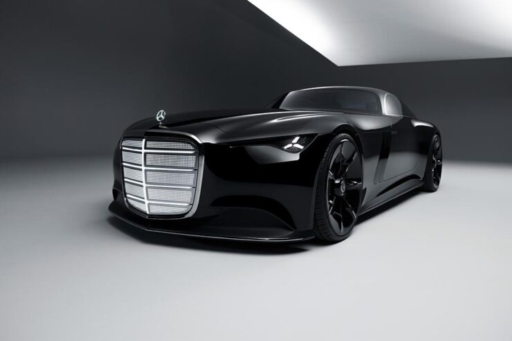
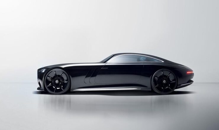
One more item: The old-school isn’t going quietly.
Did someone mention grille? (Lit, naturally.)Leaving the hood long behind.
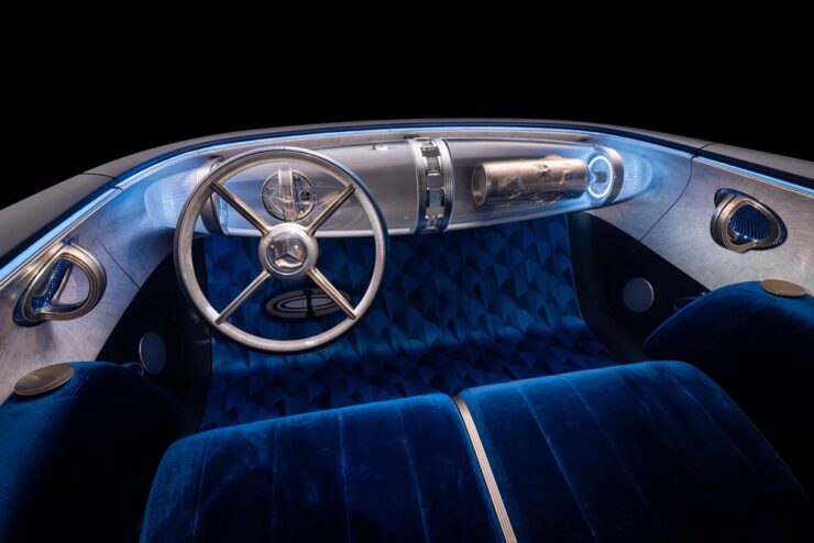
Mercedes is, arguably, the best (non-American manufacturer) at displaying “gangster” qualities. Oh, and check out the awesomely-retro interior:
Note the lack of screens amongst that vintage style. And yes, velour is “in.”
Special Bonus #4: Audi poached the Type 00’s designer. His first showing is the Concept C, Audi’s return to form, called “radical simplicity.” It’s a cross between their sports-driven R8 and designer-driver TT:
Love the wheels. The grille less so (there have been dictator comparisons), and the lack of rear window not at all.
October’s Photography Round-Up
2x Film
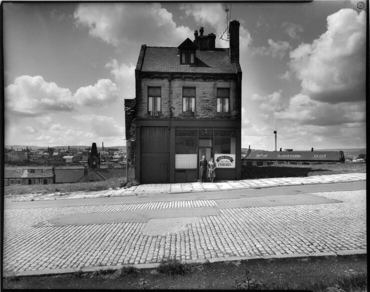
Grays Fisheries, Bradford (UK), left standing during inner city slum clearance. Photograph by Ian Beesley, 1977.
From an interesting and moving feature at MacFilos, “Capturing the decline of industries and communities with a Leica M6”:
At my recent career retrospective exhibition “Life” at Salt’s Mill, Saltaire (a world heritage centre near Bradford, West Yorkshire, England), a man came to talk to me. He said, “You won’t remember me, but I remember you. I worked in a camera shop in Bradford, and you were always coming in to buy rolls of black and white film. It makes me so proud to think that the film I sold you created some of these wonderful photographs.”
I take this as a great compliment and a very moving one. It is one of the reasons why I decided to donate my entire archive of negatives, prints, notebooks (over 200,000 items) to Bradford City Art Galleries and Museums. I am hanging on to my Leica M6 for a bit longer, but at some point, it will be re-united with all the negatives it created.
— Ian Beesley, MacFilos
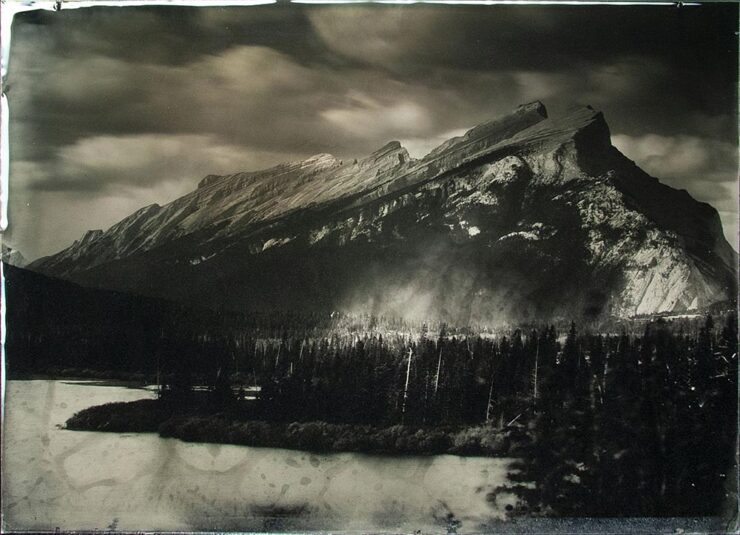
“Rocky Mountains On Wetplate Collodion,” Canada. Photograph by Bill Hao.
“The Analog Sparks 2025 International Film Photography Awards celebrate analog photography as a medium and elevate the best film photographers worldwide,” PetaPixel writes. Some excellent reminders that sometimes, the old ways are still the best ways.
Color and Pano
“Beholders No. 1.” Photograph by Li Sun.
“All About Photo Magazine unveiled the winners of its latest competition: Colors. The 25 prize-winning photographers demonstrate how powerful color can be in images, whether it’s vibrant, subtle, or minimal,” PetaPixel writes.
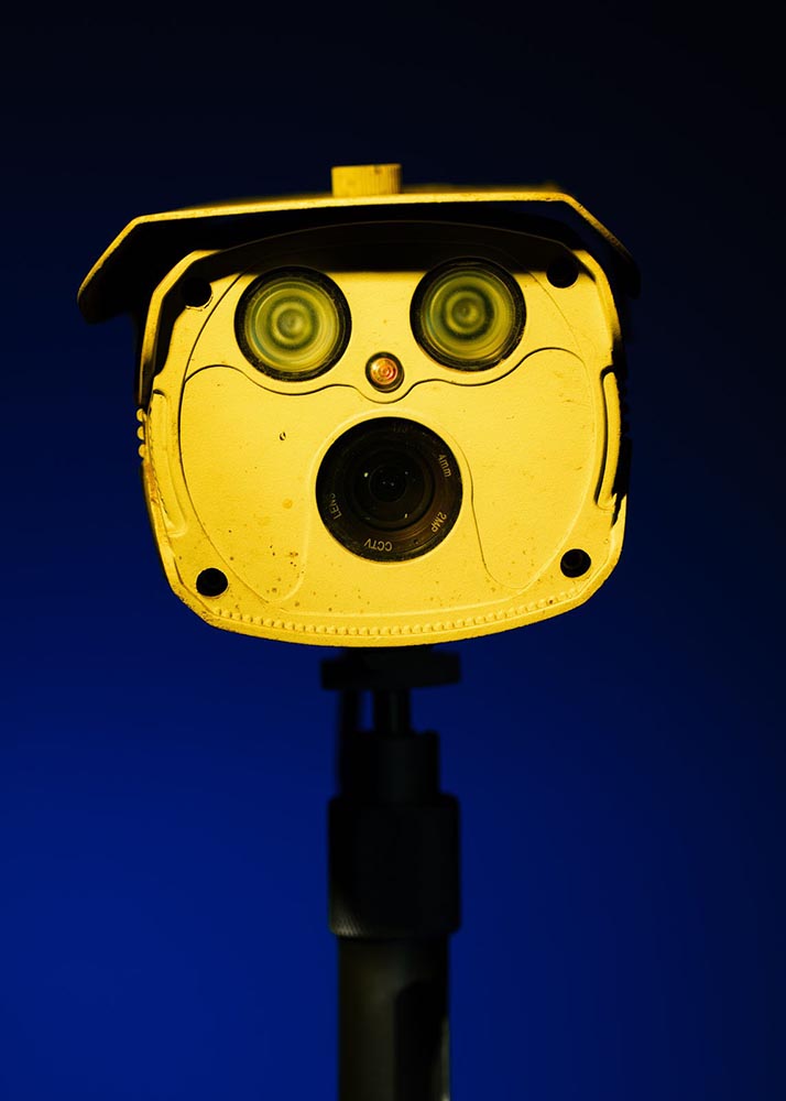
To be honest: at first, I thought this was a coin-operated binocular thing you see at attractions or overlooks, and laughed out loud. Alas, the laughter died away when I realized it was, in fact, CCTV — an overlook of an entirely different kind. I guess there’s a certain irony in the “face.”
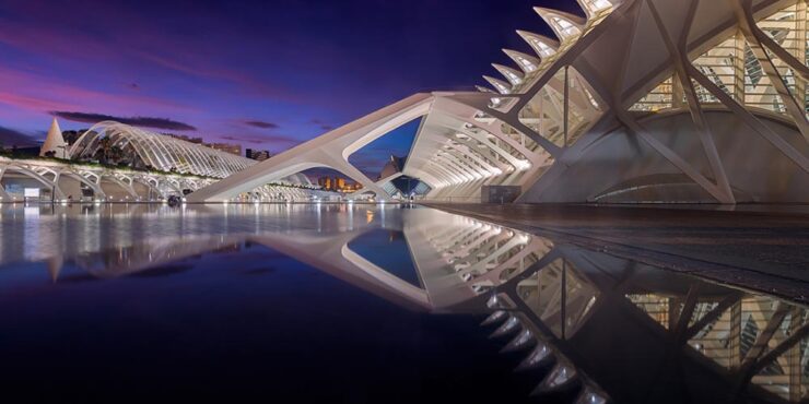
The Mirror, Valencia, Spain. Photograph by Anto Camacho Villaneuva.
It is possible to recognize a Santiago Calatrava building immediately, with its soaring, often winged structures. (The World Trade Center Transportation Hub in New York springs to mind, for instance.) This panoramic photograph captures two of them — nice.
A press release from Epson, the contest’s sponsor, notes that this year there was a “prevalence of ultra-wide panoramas and increasingly innovative perspectives, including very low angles, very close-up subjects, and aerial photography,” including the above. PetaPixel has more.
Birds and Wildlife
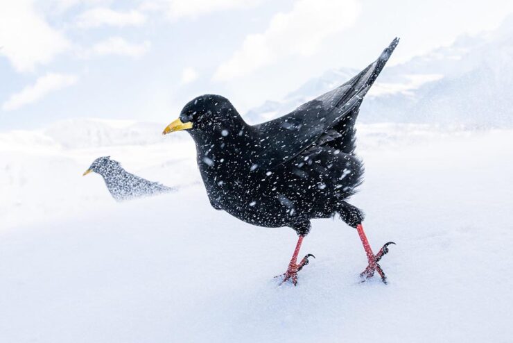
“Snowstorm,” Germany. Bronze Award, Best Portrait. Photograph by Luca Lorenz.
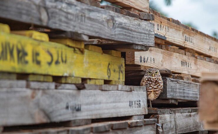
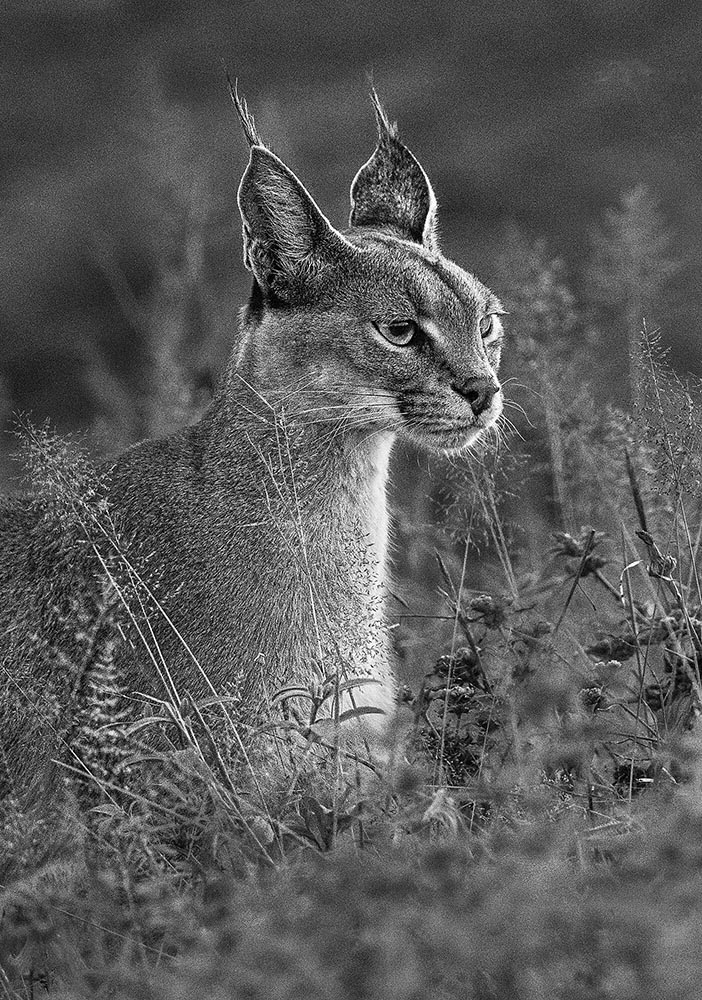
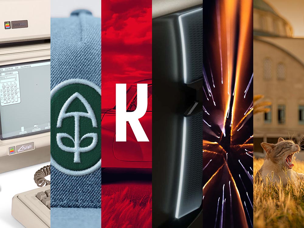
“The 2025 Bird Photographer of the Year gives a lesson in planning and patience,” This is Colossalwrites about this year’s contest winners (specifically, regarding the photo seen at the right in the header image) — but getting the cold shot, above, wasn’t an easy thing either. (See also: PetaPixel‘s plumagearticle.)
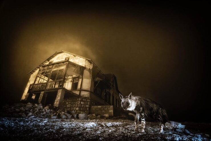
“Ghost Town Visitor,” Kolmanskop, Namibia. Winner, Urban Wildlife and Wildlife Photographer of the Year 2025. Photograph by Wim van den Heever.
From PetaPixel‘s coverage of the Wildlife Photographer of the Year 2025 contest: “Capturing the unusual intersection between nature and abandoned urban spaces, Wim’s photograph is a haunting yet captivating image of a brown hyena wandering through the skeletal remains of Kolmanskop, Namibia’s long-deserted diamond mining town. The shot was taken with a camera trap and is the result of a decade-long effort that began when Van den Heever first discovered the animal’s tracks at the site.” [Emphasis mine.] See This is Colossal‘s post, too.
Comedy and Dogs
To round out this month’s super-long post — thanks for bearing with me — something from the light-hearted department:
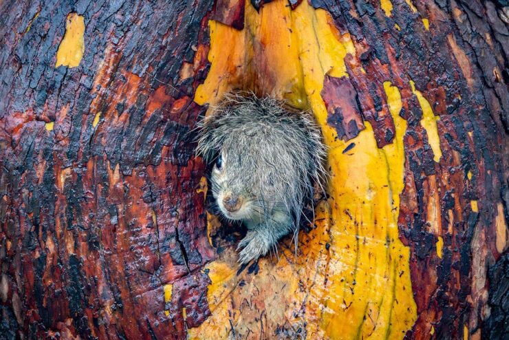
“It is tough being a duck.” Photograph by John Speirs.“Bad Hair Day!” Photograph by Christy Grinton.
The Nikon Comedy Wildlife Awards, 2025 edition, brings us 40 … um, moments. Awesome. PetaPixel has all the winners.
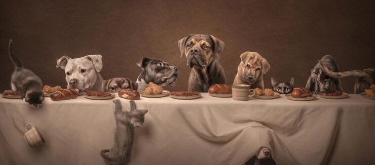
“Suppertime,” winner of the Open category. Photograph by Katie Brockman.
“Good Boys and Girls,” PetaPixel barks, regarding the 2025 Dog Photographer of the Year. (In the name of equal-opportunity pet celebration, I chose one that includes cats.)
Have a great Halloween. If you’re in the US, be sure to vote, Tuesday, Nov. 4th. And, don’t forget to check back for the special Spine post, Nov. 10th. Thank you!
It’s fontastic, illustrative, and full of imagery: your beginning-of-fall design round-up here on Foreword. (And A.I., because it’s everywhere.) Enjoy.
That was not a simple photograph to set up. Awesome.
Generative Book Cover Design
How 2 Shout Media presents a how-to: 20 cover design prompts for ChatGPT. “Creating the perfect book cover starts with the right vision — and that’s where ChatGPT transforms from a writing assistant into your creative design partner.” (Emphasis theirs.)
There are, for instance, specifics on “the anatomy of an effective prompt” and how to customize the provided templates; they even provide bonus templates to save and reuse, including one to quickly iterate on previous output.
The article contains some good advice, honestly, but the most relevant suggestion — to “[t]hink of ChatGPT as [a] creative director who provides vision and direction rather than final artwork” — is buried at the bottom of a fairly long page. I’m willing to get there are more than a few (especially in the self-publishing space) who read this as the definitive how-to . . . possibly without judging the output versus what a professional can create.
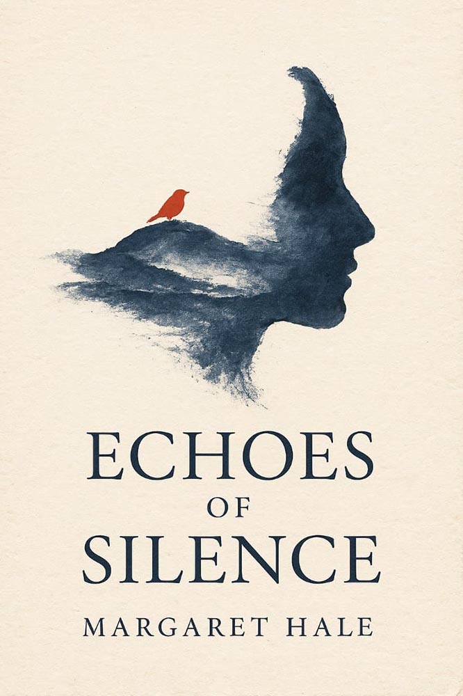
This cover sample is far and away the best of the eight illustrated options:
The prompt: “Design a literary fiction cover for ‘[Title]’ using a single continuous brushstroke that forms both an abstract landscape and a human profile when viewed differently—an optical illusion revealing loneliness and connection. Executed in indigo ink wash on cream paper texture. The brushstroke starts thick and confident, becoming increasingly fragmented and uncertain. Minimal color palette: indigo, cream, with one tiny spot of cadmium red as a focal point (perhaps a bird or flower). Title integrated into the negative space using a classic Garamond variant, appearing to be part of the original artwork. Author name in small, understated caps at bottom. Overall feeling: wistful, sophisticated, gallery-worthy.”
Take a moment to compare the output with the prompt, and you’ll see the generated output ignores several of the items, but overall, is kinda — sorta — close.
The other examples not so much. But I’m not going to spoil the whole thing: Go and see for yourself.
For now, I’d suggest that book design professionals — those that make a living from the art and science that is publishing excellence — are safe. Other professionals in the industry recognize what talent is and how valuable it is, and the designers themselves can take advantage of the power that some of these models offer to help brainstorm.
That said, today’s A.I. models are gaining quality at a rapid rate. In 5–10 years, at most, publishers (and authors self-publishing) that might not recognize that they’re best served by professionals — or those who don’t have the budget, despite the recognition — will have access to what might very well be “good enough.”
From Your Intelligence to Artificial Intelligence
So, where do the A.I. engines get their training material? From you and yours, of course; to quote a source we’ll get to in a moment, “[i]n writing this […] I am acutely aware it will become part of a training data set.” Some sites, such as Wikipedia and the Internet Archive, have seen an exponential upswing in traffic — all from the so-called “bots,” programs sweeping internet content into the never-satisfied regurgitation chamber that is today’s ChatGPT, Claude, and others.1One of the reasons my photography, as presented both here on Foreword and in the galleries, is both relatively lo-res and watermarked is to preserve a sense of ownership; likewise, one of the (many) reasons I no longer participate in social media is due to posts specifically being used to train A.I. — Instagram/Meta, for instance.
Ars Technica and Pixel Envy both highlight a new program, modeled on Really Simple Syndication (RSS), designed to “block bots that don’t fairly compensate creators for content.”
To quote Doug Leeds, the founder, “A.I. companies know that they need a constant stream of fresh content to keep their tools relevant and to continually innovate.” The “Really Simple Licensing” (RSL) standard evolves robots.txt instructions by adding an automated licensing layer that’s designed to block bots that don’t fairly compensate creators for content.
Free for any publisher to use starting today, the RSL standard is an open, decentralized protocol that makes clear to AI crawlers and agents the terms for licensing, usage, and compensation of any content used to train A.I[.] The new standard supports “a range of licensing, usage, and royalty models, including free, attribution, subscription, pay-per-crawl (publishers get compensated every time an AI application crawls their content), and pay-per-inference (publishers get compensated every time an AI application uses their content to generate a response).”
— RSL Press Release
But — and it’s a big “but” — RSL is only one response to the problem. Another is to wall content off entirely, breaking one of the most valuable qualities of the internet itself: its openness.
We’re watching the construction of a fundamentally different internet, one where access is controlled by gatekeepers and paywalls rather than governed by open protocols and user choice. And we’re doing it in the name of stopping AI companies, even though the real result will be to concentrate even more power in the hands of those same large tech companies while making the internet less useful for everyone else.
A.I. organizations have not created a bottom-up rebellious exploration of the limits of intellectual property law. They are big businesses with deep pockets exploiting decades of news, blogging, photography, video, and art. Nobody, as near as makes no difference, expected something they published online would one day feed the machines that now produce personalized Facebook slop.
— Nick Heer, Pixel Envy
“One thing that might help, not suggested by Masnick, is improving the controls available to publishers,” Heer writes, going on to discuss the new RSL standard proposal and what it might do to help. But, in the end, he’s not optimistic:
I simply do not know how much control I reclaim now will be relevant in the future, and I am sure the same is true of any real media organization. I write here for you, not for the benefit of building the machines producing a firehose of spam, scams, and slop. The artificial intelligence companies have already violated the expectations of even a public web. Regardless of the benefits they have created — and I do believe there are benefits to these technologies — they have behaved unethically. Defensive action is the only control a publisher can assume right now.
— Nick Heer, Pixel Envy
Yeah.
Special bonus #1: From the you’ve-trained-it-so-enjoy-A.I.-for-fun department,Kottke introduces us to generativ.design. “I wore out the “randomize” button on each of these,” he writes. (Via the new-to-me sidebar.)
Prefab Design
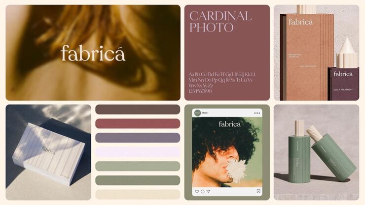
Meet fabricá, a new hair care company, whose identity ticks all the boxes: it’s trendy, eco-friendly, and well put-together:
But there’s a catch: fabricá doesn’t exist — at least not yet. It’s a fully-formed identity, available now at Brands Like These, a new prefab identity outfit from Lyon&Lyon.
Now I’ll admit: at first, this seemed like a Dewey, Cheetham, and Howe thing,2Yes, I grew up listening to Car Talk. something that we all had a chuckle over before allowing it to shuffle into the background, readily available for use as a pithy line whenever we needed it: “Ha, we got Lyin’ and Lyin’ selling your precious startup canned … stuff.”
Unfortunately, it’s not a joke.
When Elizabeth Goodspeed, of It’s Nice That, got thinking about it, she had lots to say. “In a good design engagement, the back-and-forth between company and designer pushes the company itself to sharpen what it is; the ‘friction’ people complain about is also the juice that makes the work exciting.” (I find this true in editorial and publishing work, certainly.) But there’s a warning, too:
If this cart-before-horse approach takes hold, it won’t just change how companies buy branding, but how designers make it. The skills a designer needs shift from listening and refining to cranking out polished shells that could plausibly fit anything. […] Even if sites like BLT only sell a brand once, the more ambiguous the design, the more it risks echoing a dozen others (and collapsing under trend fatigue). These models also threaten to hollow out the middle of the industry. We’ve seen this pattern before: bookstores went from indie shops and regional chains to Amazon or your local holdout; music from affordable CDs to either $50 LPs or all-you-can-stream. Branding may be headed for the same split – prefab kits at the low end, ultra-expensive bespoke at the high end, and little in between. And if prefab becomes the norm, it’s hard not to imagine the next step: why should these kits even be designed by humans? Once clients are trained to buy a look off the shelf, there’s little stopping A.I. from flooding the market with pre-packaged “brands” generated at scale.
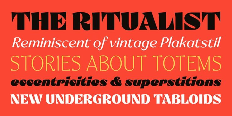
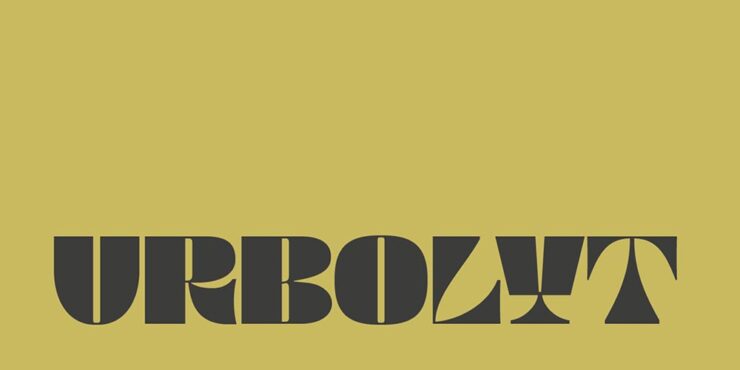
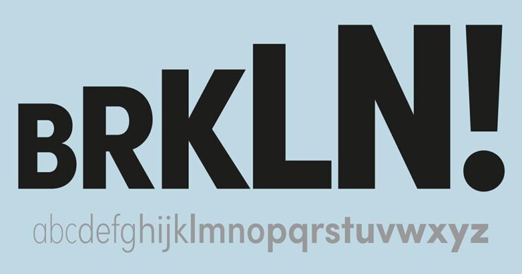
They have several, but my favorite is not dissimilar to the above, a new face called Urbolyt, a variable “that represents a clash between geometric rigor and organic forms.”
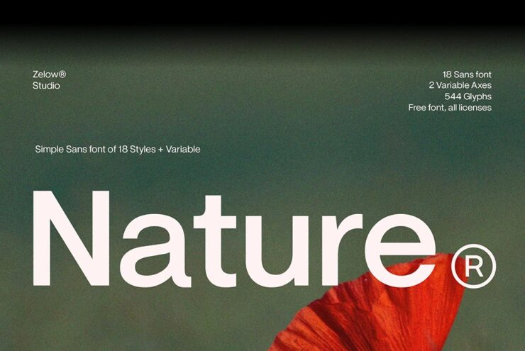
Zelow Studio’s Nature
Pixel Surplus brings us a new — and free! — variable grotesk typeface called Nature, available in a variety of styles.
CreativeBoom’s 50 for 2026
The vast majority of these are, basically, Helvetica; like Nature, the simple sans serifs are what’s in right now. (Sigh.) However, there are some gems on the list, and I’d like to take a moment to highlight an absolute favorite: Freight.
Freight is a collection of integrated typefaces ready to add unique style to any design project. What Joshua Darden started as a serif family inspired by the warmth and pragmatism found in 18th-century Dutch typefaces became The Freight Collection and now ranges across multiple weights, widths, and optical sizes — from Big to Display, Text, Micro, Macro, Sans, Neo, and Round — all of which include companion italics. That’s 192 fonts that have the ability to be bold and daring just as easily as they can be quiet and unassuming.
— freightcollection.com
I’ve used Freight in a variety of book projects and the breadth of options available always satisfies. It’s referred to as a superfamily: from the standard Text and beyond-excellent Neo (a sans with style), there’s an option for going Big and even two — Micro and Macro — best used at small sizes (readable footnotes!).
I cannot recommend more highly. Indeed, I could only take one font family with me to a desert island, I’d take Freight.
Illustrations Open Doors
Illustration Awards 2025
CreativeBoom: “From playful packaging to poignant explorations of identity, the World Illustration Awards 2025 showcase the breadth of contemporary illustration. With over 4,700 entries from 85 countries, this year’s winners reveal how artists are shaping how we see, think and connect.”
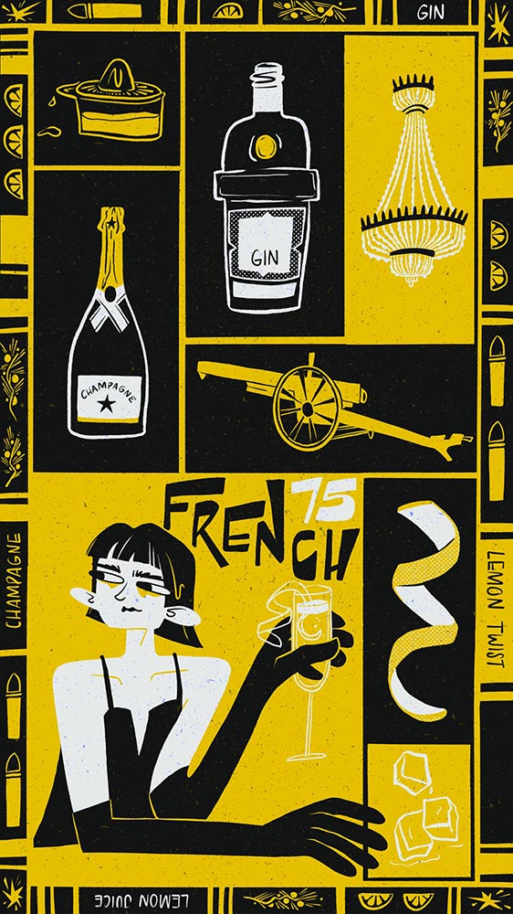
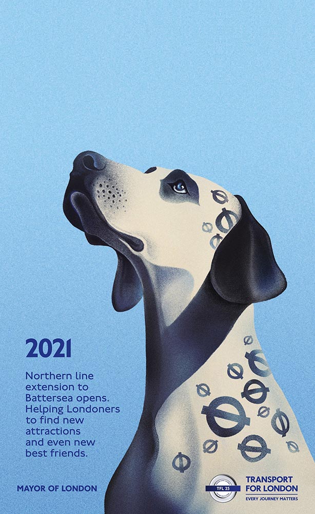
One of the overall winners is this great poster:
Léane Ruggli – RTD’s Cocktail Campaign
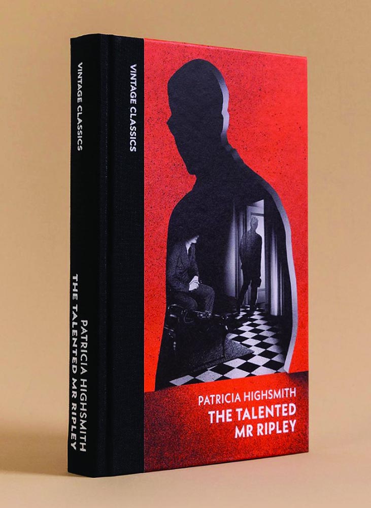
Book covers (adult and children’s):
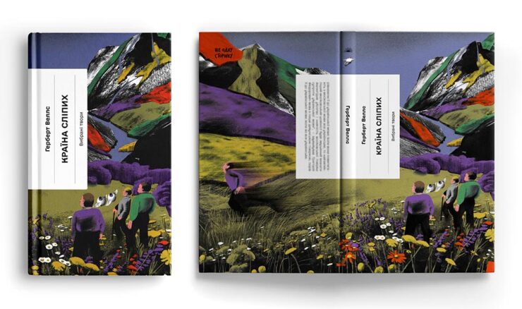
Jennifer Dionisio – The Talented Mr RipleyJenya Polosina – The Country of the BlindCamila Carrossine – The Girl, the Ghost and the Beetroot Forest
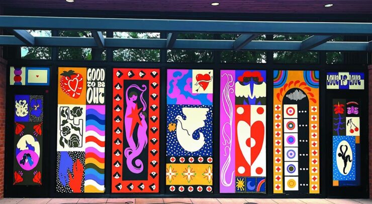
Site Specific:
Ren Kyles – Pride mural in Wilsonville, Oregon
The awards underline “how illustration continues to thrive as a medium of both beauty and urgency”: from packaging that delights to books that challenge taboos, the winning works reveal the versatility of illustrators working today.
See the whole list of winners and commended artists at the WIA 2025 Online Showcase, including interviews and insights into their creative process.
Illustration for Branding
Another CreativeBoom article suggests that, “[f]rom murals to motion, illustration is starting to reassert itself in advertising,” because “illustration still offers unique advantages. Distinctiveness is the obvious one because, in a sea of photography-led campaigns, an illustrated execution can […] cut through precisely because they are unexpected.”
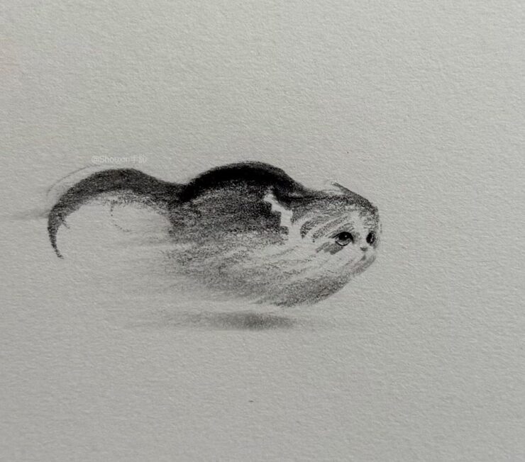
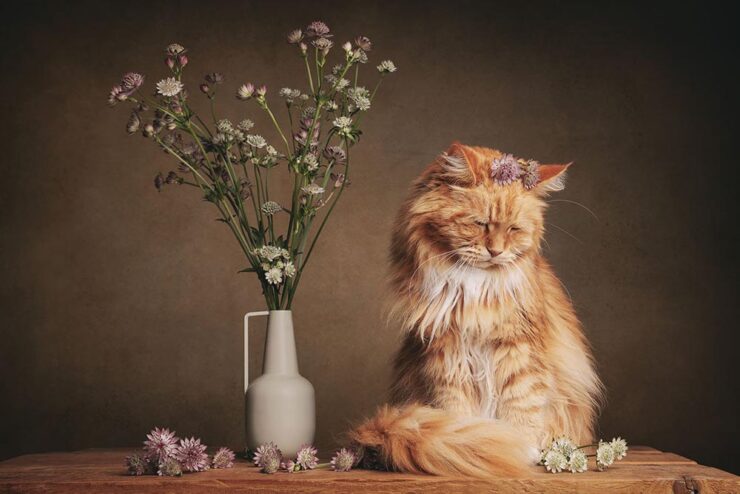
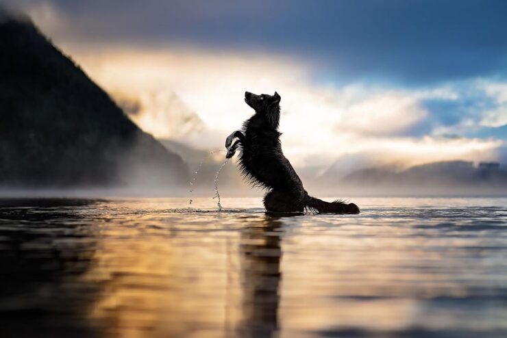
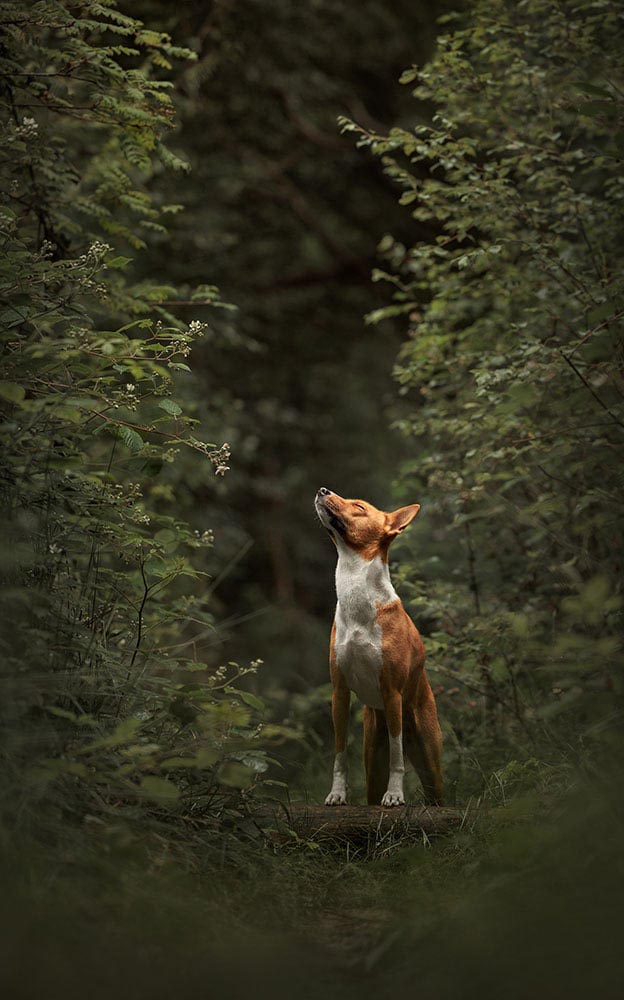
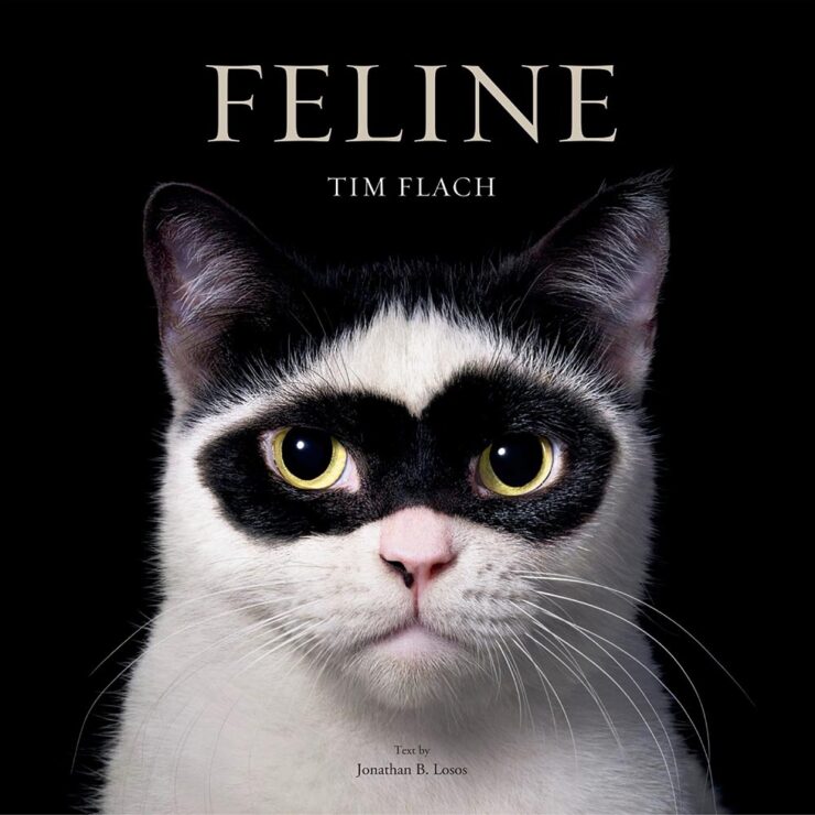
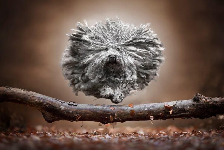
While we’re on the subject of cats — and dogs, whose entries far outstripped those for cats (and horses, rabbits, pigs, and all the other things folks keep for pets) — this year’s pet photography contest has some pretty spectacular results:
Photograph by Mirka Koot.Photograph by Shandess Griffin.Photograph by Janneke De Graaf.
Getting my dog to stand still long enough for a photograph is nigh-on impossible; some of the accomplishments shown in these winning photographs are fantastic. Kudos.
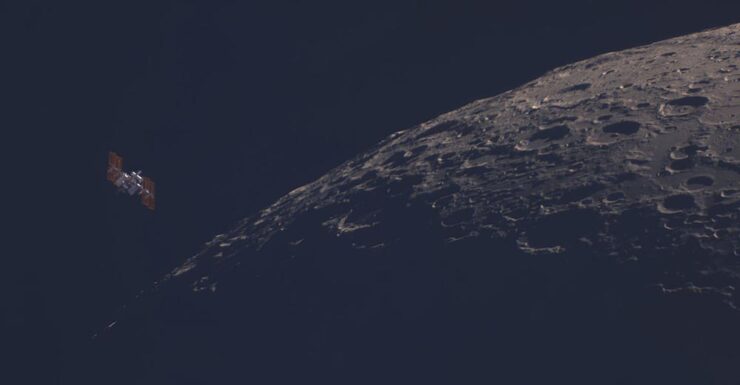
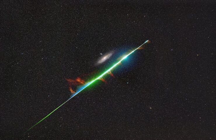
This is Colossal: “The universe’s workings may always remain a mystery. So it’s no surprise that when peering up at the night sky, whether it’s homing in on distant stellar clusters or simply watching the moon rise, photography helps us appreciate its enigmatic beauty.”
“ISS Lunar Flyby.” Photograph by Tom Williams.“Saturnrise.” Photograph by Tom Williams.
I didn’t realize until after I’d selected them that these were both from the same photographer, but unlike some that are just (amazing) night sky, these have an almost-science-fiction quality.
’Course, that’s only the tip of the iceberg: “The Royal Observatory Greenwich’s ZWO Astronomy Photographer of the Year 17 contest showcases the best astronomical and night sky images of the year, captured by exceptional photographers worldwide,” writes PetaPixel.
Two more that aren’t quite what you expect:
“Encounter Across Light-Years.” Photograph by Yurui Gong and Xizhen Ruan.“Fourth Dimension.” Photograph by Leonardo Di Maggio.
Special bonus #4: While we’re on the subject of Earth and sky, PetaPixelprofiles Italian photographer Gianluca Rubinacci:
Photograph by Gianluca Rubinacci.
Special bonus #5: The UK’s Weather Photographer of the Year 2025 Competition list of finalists has been announced, including this one:
Photograph by Lukáš Gallo.
See all of ’em — and vote (until October 16th) — here.
Natural Landscape Photography Awards
This one’s a little different, in that there can be no generative AI, no compositing of different photographs, and RAW files are checked by judges to ensure authenticity. (Refreshing, honestly.) “The competition is designed to promote photographers looking to work within the constraints of the natural landscape and traditional bounds of photography.”
From the Project of the Year, Sápmi (Lapland). Photograph by Hanneke Van Camp.
“Cyberpunk” and “Gotham” vs. “Otherworldly” and “Forgotten”
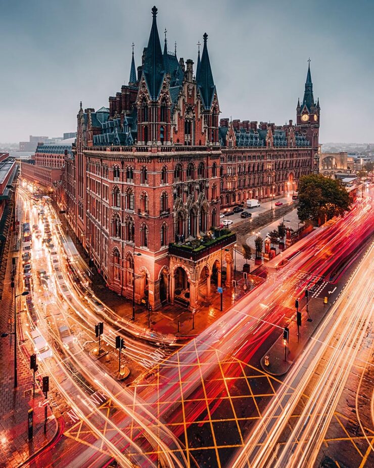
To close out this month, I’d like to mention a couple more book projects. Let’s start with Ben Moore, whose new photo book is titled Above & Across London. As the name suggests, he found high-up vantage spots: “I’ve always loved the look of a cool, urban, cyber-futuristic world, and at times I catch glimpses of that in London,” he writes.
Photograph by Ben Moore.
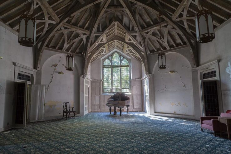
Meanwhile, photographer Bryan Sansivero feels a strong pull to document and explore forgotten dwellings; his new book, America the Abandoned, explores deserted homes around the country in 200 striking images — including this one:
“The Grand Room.” Photograph by Bryan Sansivero.
Have a great October, everyone.
1
One of the reasons my photography, as presented both here on Foreword and in the galleries, is both relatively lo-res and watermarked is to preserve a sense of ownership; likewise, one of the (many) reasons I no longer participate in social media is due to posts specifically being used to train A.I. — Instagram/Meta, for instance. ↩︎
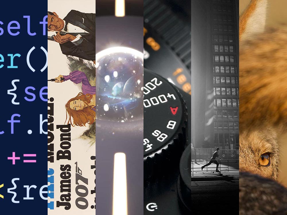
Type opens up, the best designer you’ve never heard of, and photography to admire and inspire: all this and more for your August edification and enjoyment.
August University Press Coverage on Spine
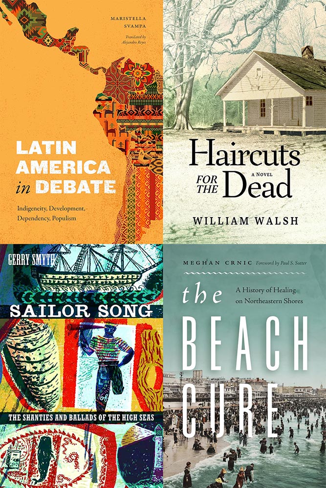
Rather than show my favorite this month, I thought I’d share four of the runners up:
My favorite of the covers not in the Spine post.
Clockwise from upper left: Duke University Press, Mercer University Press, and two from the University of Washington. These are all good, but just missed being in the post because another option offered a better design — or story.
I’m highlighting these to celebrate the strong design in university work; despite limited budgets — or whatever other, shall we say, challenges universities face these days — most have realized that great design is worth the extra. Long live the University Press!
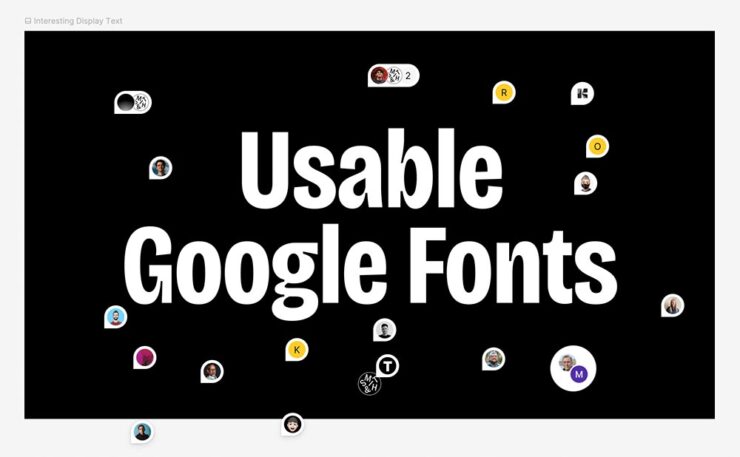
FYI, it’s at Figma, a site I’d heard of but not interacted with (it’s aimed at the collaborative market, aka “teams”); it took me a minute to orient myself. (Use the zoom in the upper right, then drag.)
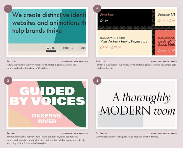
In the comments at BrandNew, several folks point to the two Typewolf lists on the subject, one for Google and one for Adobe/Typekit. (Interestingly, I was not familiar with Typewolf — it was good enough to earn an instant bookmark. Stay tuned for more from them.)
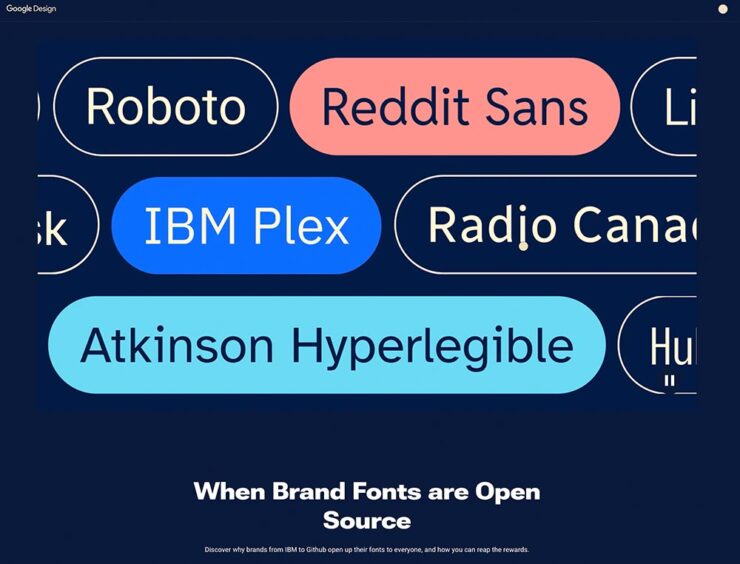
That was on the 7th. On the 8th, BrandNew linked to a Google Design article on “the benefits of brands — for the brands and for users — making their proprietary typefaces open source and available to all to use, modify, and tinker with.” Google Fonts currently has 17 of them.
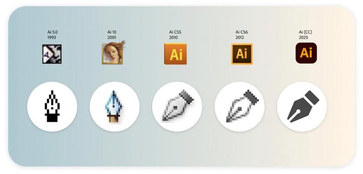
Lastly, on the 15th: Keep Calm and Icon. “Bettina Reinemann, Staff Experience Designer, Brand & Icons, at Adobe, offers an interesting and comprehensive deep dive into the evolution of a handful of Adobe’s most iconic, well, icons and how they have changed over the decades in style, meaning, and depiction.”
BrandNew is subscription, yes, but it’s one of the web’s subscription bargains at less than $25/year and packed with great stuff. I do wish they’d offer a free article or two within a given period of time so new folks can sample before purchasing, but that criticism aside, I can’t recommend them highly enough.
Many Thanks to … Double-Oh Who?
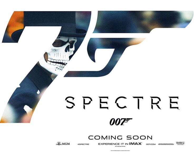
Joe Caroff, designer of so many things yet a so completely unknown personality, died on the 17th — one day short of his 104th (!) birthday. The Guardian has a nice obit … with this graphic:
The 2015 film by Sam Mendes, the 24th James Bond adventure.
That’s right, he’s the guy who designed that logo. John Gruber, at Daring Fireball, has a nice discussion of the logo and, specifically, its subtle evolution within the Bond franchise. (Did you know it was initially created for use on letterhead? Wow.)
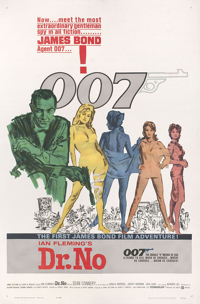
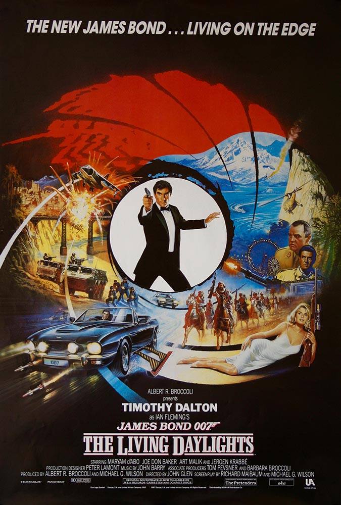
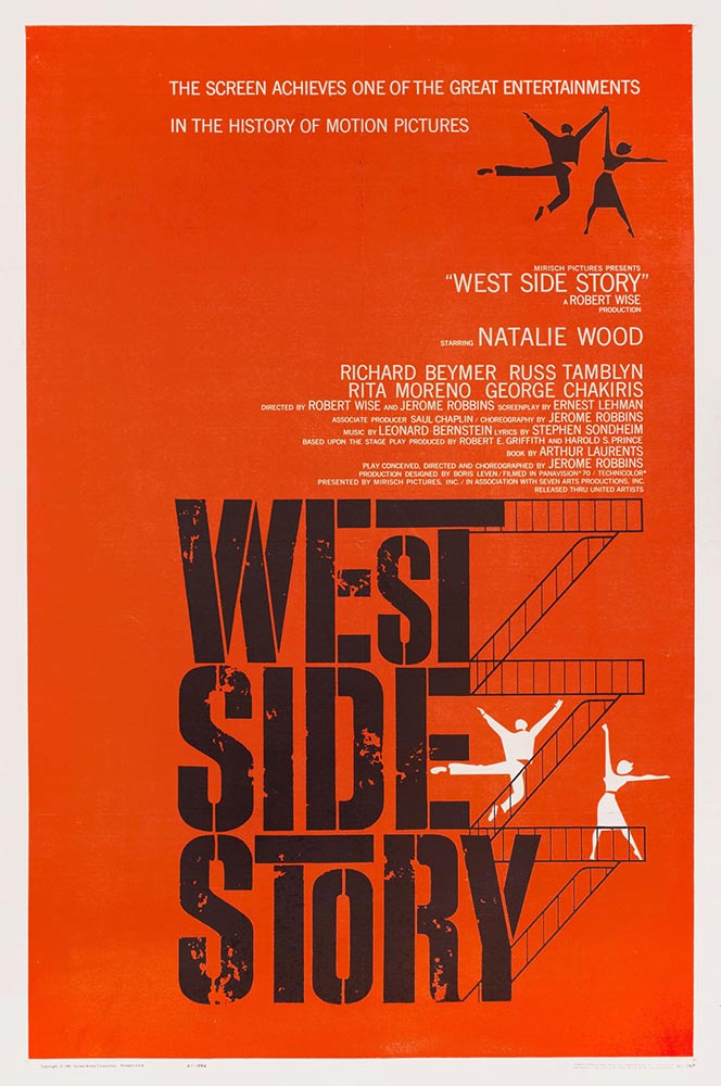
He also links to a bunch of Bond one-sheet posters, a couple of which I’d like to post:
The 1962 film by Terence Young, andThe 1987 film by John Glen, the 15th.
I’m of the age to have grown up with Roger Moore, and really liked Timothy Dalton’s first film — it’s a shame it crashed and burned with the second — whose portrayal of the character has an edge you don’t see again until Daniel Craig stepped into the role.
But I digress. Joe Caroff’s poster history covers some greats, including this one:
Original 1961 U.S. one sheet poster by Joe Caroff.
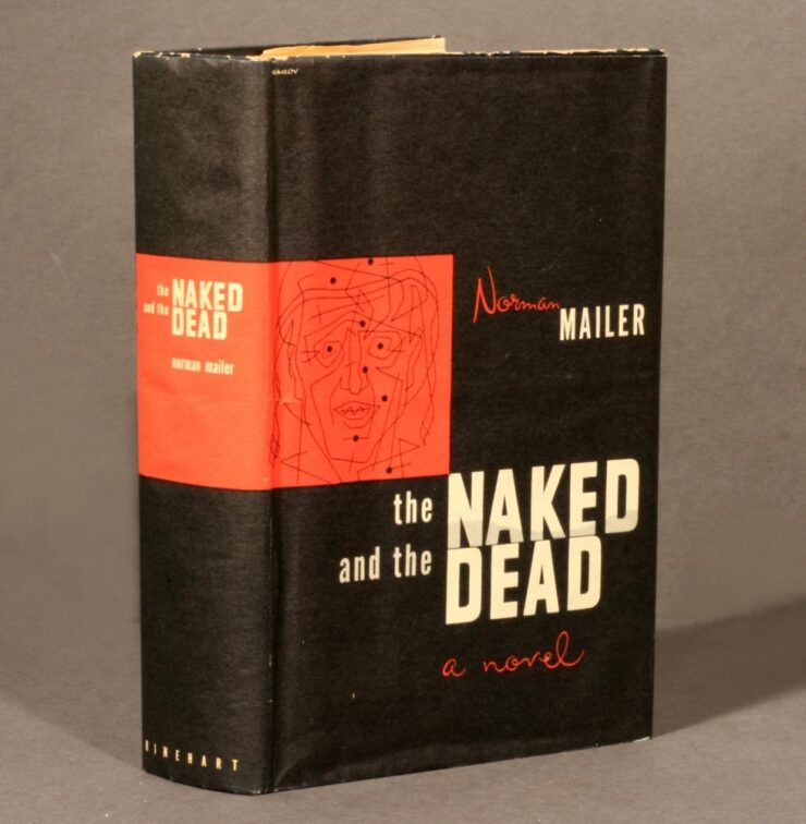
But it’s a tidbit on the Wiki entry that warrants my publicly spending a minute remembering Joe Caroff: he designed the original jacket for Norman Mailer’s The Naked and the Dead:
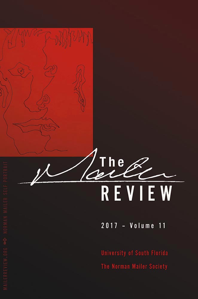
When I had the privilege of redesigning The Mailer Review in 2017, the first cover paid homage to the above design:
The illustration is a self-portrait by Norman Mailer. (See Wikipedia for the old design.)
Read more about Joe Caroff’s many accomplishments at Print (spoiler: Steven Heller hadn’t heard of him before 2016!) or DesignWeek.
And Now For Something Completely … Wait.
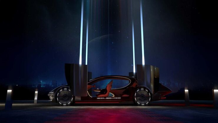
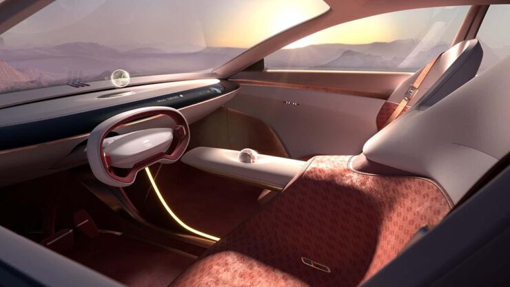
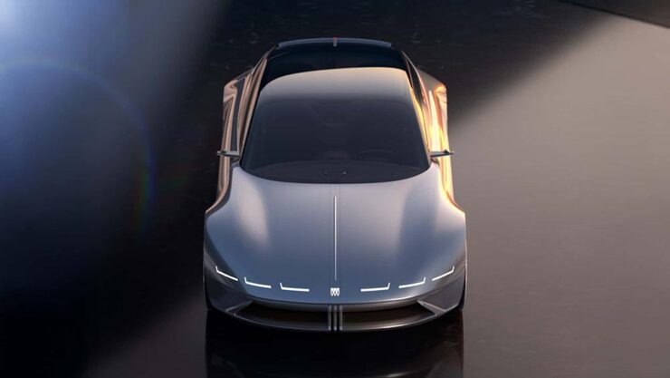
A quick drive-by here: this is a Buick.
It’s quite literally out of this world: the Electra Orbit Concept is only for the Chinese market — their biggest. The interior, especially, has more than a few overtones of the Jaguar Type 00 concept. (Which is looking more and more prescient, frankly; see previouscoverage.) Read more at Motor1 or the Autopian.
“Sedans are dead,” someone said. Hmph.
August’s Photography Faves
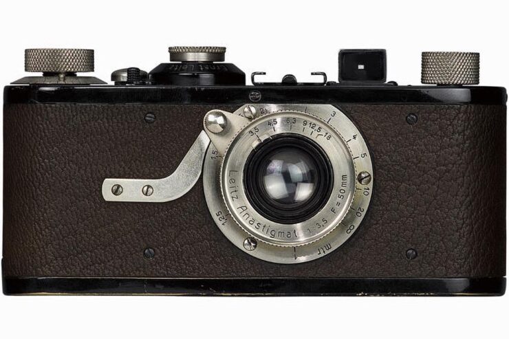
100 Years of the Leica 1
1925’s Leica 1, the world’s first mass-produced 35mm camera.
PetaPixel has a nice piece covering all of the many ways the Leica 1 — the first from “a tiny German camera company” — has had such an outsized influence on the huge world that is photography today.
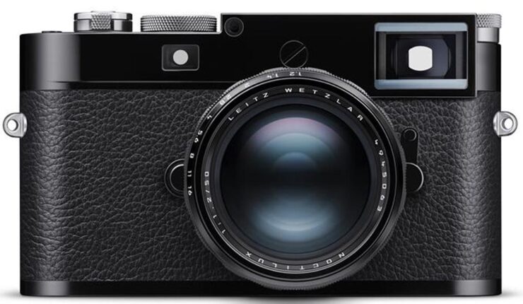
The 2025 M11 New York Edition. You can absolutely see the family resemblance.
2025 iPhone Photography Awards
It’s time for the annual iPhone Photography Awards — along with my annual observation that the camera you have with you is the most powerful of all. And since a substantial percentage of the world carries an iPhone, the possibilities are nearly endless.
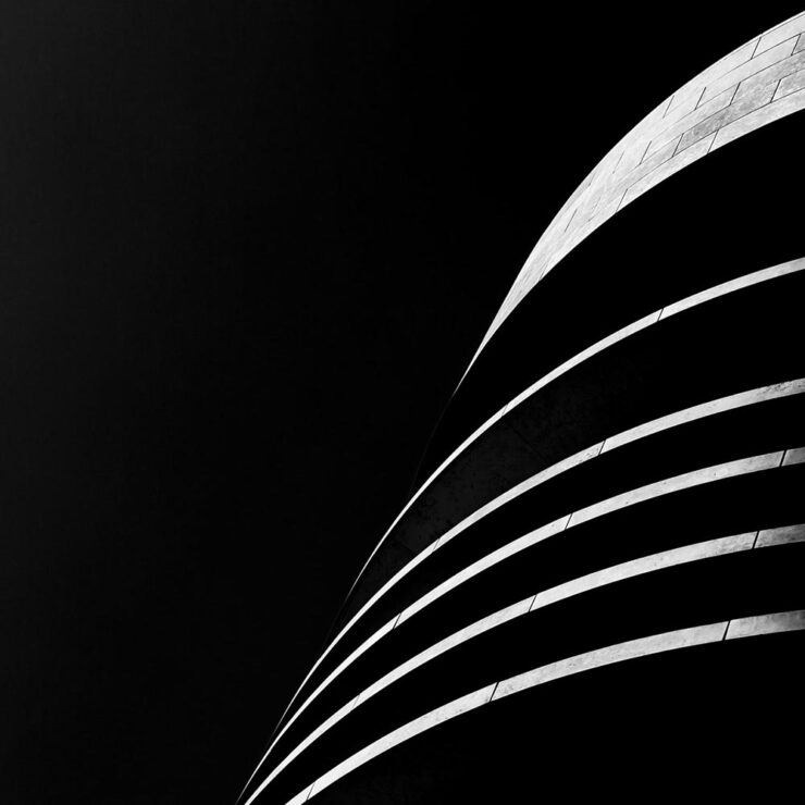
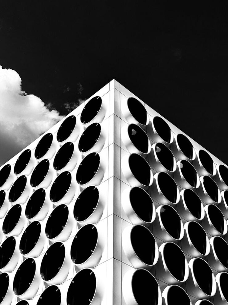
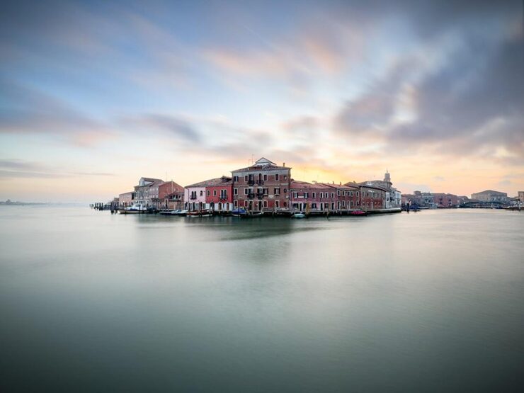
Architecture: Photograph by Adrian Beasley, United Kingdom.Architecture: Photograph by Vladyslav Vasylkevych, Ukraine.Cityscapes: A second from Adrian Beasley, United Kingdom. (I didn’t see that until after I’d selected ones to post — and decided to post it anyway.)
Special Bonus #1: “Perhaps no building in the world captures the early 20th-century art deco movement quite like the Chrysler Building, which has been an iconic fixture in the Manhattan skyline since 1930. Its grace and beauty have captivated photographers for decades. For one NYC shooter, the building has become his life’s work. Mitchell Funk has been photographing the Chrysler Building for 50 years; his images are vibrant, eye-catching, and extremely creative.”
2025 Ocean Photographer of the Year Awards, and Prints for Wildlife
“Fragility, beauty, and urgency characterize” this competition, with “an emphasis on ocean conservation and the outsize influence humans have on marine life,” This is Colossal says. (More at PetaPixel, too.)
From the Adventure category: photograph by Ben Thouard.Human Connections: photograph by Jianping Li.Impact: photograph by Henley Spiers.
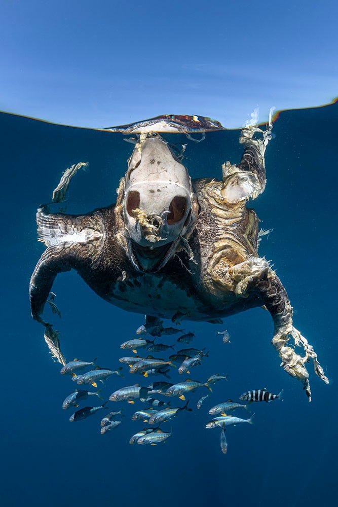
On that last one: “This green turtle was killed by a boat strike, an unnatural and unnecessary death for an endangered species,” says photographer Henley Spiers. “Only recently deceased, it is partly decomposed, with the haunting view of the bare skull in contrast to the skin, which remains on the rest of its body, and the juvenile fish which have adopted the turtle carcass as a form of safe refuge. We came across this turtle by chance, a dispiriting sight at the end of a long and fruitless day at sea. I can only hope that this image acts as a reminder of the enormous human burden placed on turtles and the ocean as a whole.”
“In 2025, the crisis isn’t a virus — it’s a withdrawal of critical funding for wildlife and conservation,” says program co-founder Pie Aerts. “Prints for Wildlife is more than a fundraiser; it’s a platform for connection, consciousness and hope in a time of crisis.” Browse photos by more than 200 photographers on the fundraiser’s website. The limited-edition prints will be available until September 21.
Special Bonus #2: “The Natural History Museum in London unveiled a first look at 15 of the breathtaking photos that are in the running to win the 61st Wildlife Photographer of the Year competition, including a lion staring down a cobra, a pack of Arctic wolves, and bats flying through the dark toward the camera; the 2025 Wildlife Photographer of the Year contest attracted 60,636 total entries, the most ever in the contest’s illustrious history.”
2025 Capture the Dark Sky Contest
DarkSky International announced the winners of its fifth annual Capture the Dark photography contest. Winners across eight main categories showcase the best in astrophotography and demonstrate why it is vital to protect dark skies worldwide; PetaPixel has a nice roundup.
In other words, I’m not going to let you go enjoy your Labor Day weekend (here in the US, at least) without once again closing with a photograph of two of my favorite things: lupines against a beautiful night sky.
“Celestial Dance over Lupine Fields,” New Zealand. Photograph by Lucy Yunxi Hu.
Take a break from the summer heat with a Mac delight, two interesting typefaces, a discussion of Bentley’s new concept — and updated flying “B,” with a quick mention of the other double-R — and, of course, some great photography. Better still, we close out with a guaranteed smile.
’Cause we need more smiles these days.
July’s Spine Post
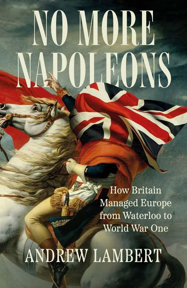
July’s University Press Coverage has already been posted. My personal favorite of the bunch:
Yale University Press. Cover design by Jonathan Pelham; art direction by Rachael Lonsdale; image is an adaptation of Jacques-Louis David’s Napoleon Crossing the Alps.
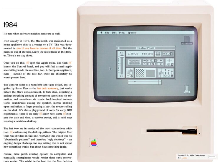
While we’re on the subject of darn near perfect, Marcin Wichary — he of the now-sold-out Shift Happens fame, not to mention The Hardest Working Font in Manhattan — has gifted the world with another absolute gem:
Frame of Preference (Screenshot)
If you’re a Mac geek, whether a software history buff, or a just grizzled veteran, set aside a few minutes to take this trip down memory lane. There are 150 tasks to complete (!), five extra Easter eggs, great Mac hardware and software, and some of the best web programming extant. Enjoy!
ATC Identity Program Upgraded
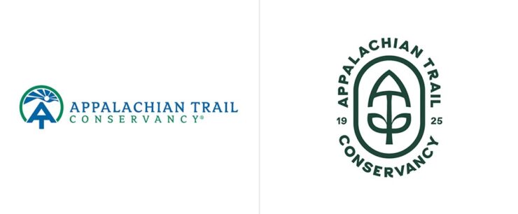
The Appalachian Trail Conservancy celebrates its hundredth anniversary this year, and took advantage of the occasion to update its logo and identity system for the next hundred years.
Previous logo (left) and new (right).
The logo is a combination of a mountain peak, the AT symbol, a trail shovel, leaves (“growth and diversity”), and a holding shape (“protected ecosystem”); while overcomplicated in explanation, in practice it’s warm and friendly at first glance yet has depth for folks who know the Trail.
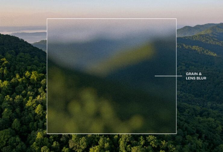
The blur and grain, highlighted against the beautiful scenery the AT is known for.The new logo against one of grain/blur backgrounds.
I’ll have to guess as to whether it’s actually “good for BookTok.”
July’s Font Finds
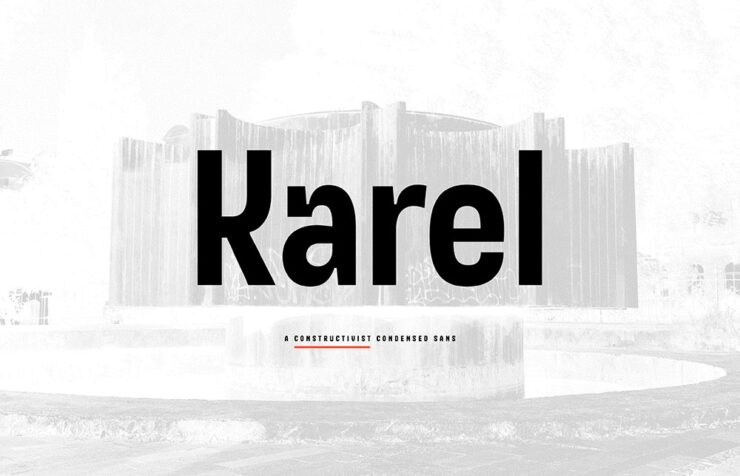
Karel, by Typonym
“Inspired by glyphs on a mid-century Prague plaque, Karel synthesises historical discovery with contemporary invention. Developed for brand messaging and retail identity, it includes alternate figures to vary the level of stylisation,” CreativeBoom writes.
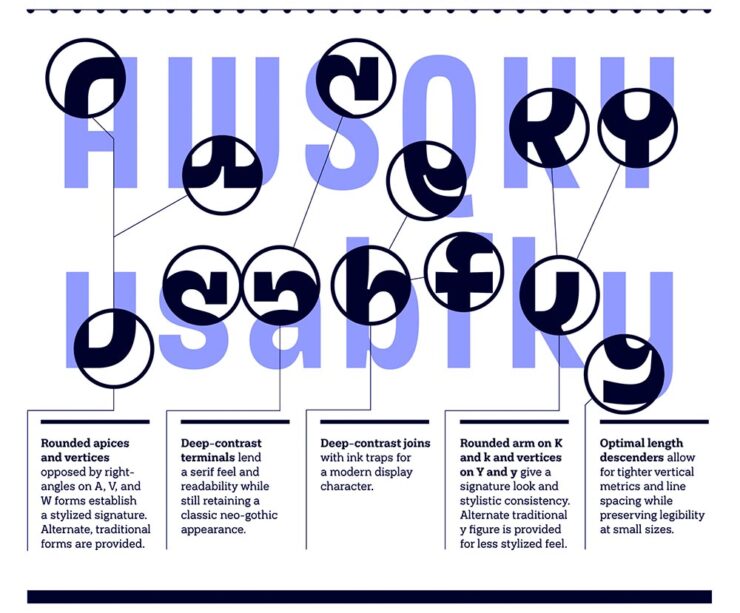
Details on some of the glyph choices.Different versions are available, allowing you to match style with project.
“A constructivist condensed sans, [that,] in every case stands apart from the multitude of neo-grotesque alternatives,” Typonym writes. (Great company name, by the way.)
Penguin Inclusive Sans, with Olivia King
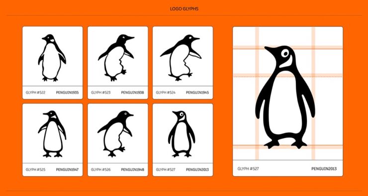
We’ve covered Inclusive Sans before, but to recap, it’s awesome, it’s free, it’s open-source, and as of February, it’s available at Google Fonts for anyone to use. So, guess who has adapted it into something new? (Okay, header spoiler, but still.) No one less than a publishing heavyweight: “A bespoke typeface for Penguin Books, uniting brand heritage, accessibility, and contemporary design to create a versatile typeface for its global publishing house,” creative director Olivia King writes.
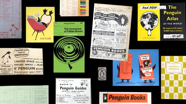
Some historical images, worth including just for the penguin reading in the chair — feet up, natch.
“For 90 years, Penguin has been committed to making books for everyone. Its iconic sixpenny paperbacks revolutionised access to stories and knowledge, making reading more inclusive and affordable. Staying true to this spirit of inclusion, Penguin commissioned a custom version of Inclusive Sans — an accessible typeface — to serve as its primary brand font across its global publishing house.”
— Olivia King, Creative Director
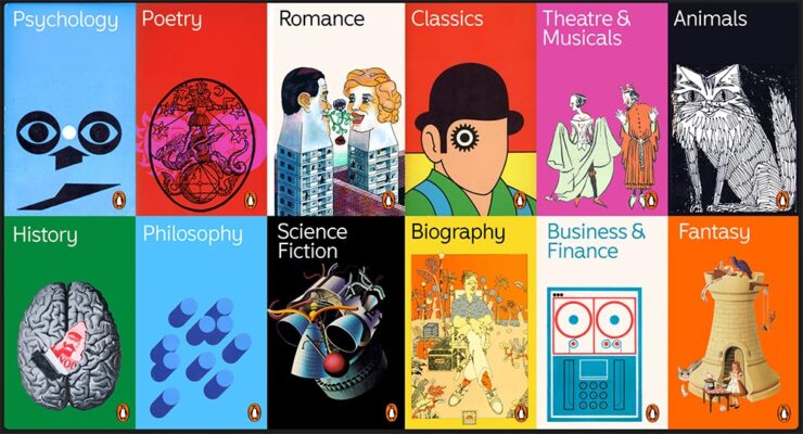
Another item included “just ’cause” — mostly for the science fiction illustration.Included in the character set are glyphs for the Penguin.
“We transitioned Inclusive Sans from a Grotesque to a Humanist foundation, adding playful flicks and flourishes to create a sense of movement and approachability[;] whether used in a refined, understated way or in strong, confident applications, the typeface offers flexibility and distinctiveness.” Marketing speak, sure, but speaking to the applications rather than past them.
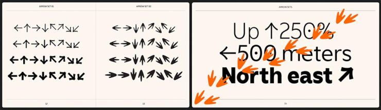
Penguin’s footprints as arrows: says something positive, I think.
The entire page is great: well put-together, well illustrated, and approachable. And wander around the site while you’re there — more than “O.K.,” it’s example after example of work the rest of us aspire to. (Via BrandNew.)
July’s Graphic Design Two-Fer
The World Illustration Awards 2025 Shortlist
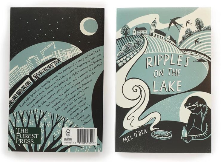
From the book covers category, Ripples on the Lake by Becca Thorne.
“The Association of Illustrators has unveiled those in the running for this year’s World Illustration Awards, featuring 200 standout projects from over 4,700 entries worldwide. From editorial brilliance to site-specific design, it’s a showcase of illustration at its most imaginative,” CreativeBoom writes. It’s books and editorial to animation and product design — a cornucopia of illustrative goodness. Check it out.
Designer as Influencer
More than slightly NSFW — while actually about work. Read wherever you’re comfortable.
“As social platforms reward visibility, creatives are increasingly expected to make their practice public. Designers are no longer just making work; they are the work. But what started as promotion now risks swallowing design itself,” It’s Nice That writes.
Yet another reason to avoid social media … says the old guy who reads web pages published by actual individuals (and sticks to blogging). Still, very much worth a read.
Special Bonus Two-Fer. #2: From PetaPixel, DuckDuckGo, my search engine of choice, can now filter out AI images from search results. (It’s a simple toggle.) Nice.
Let’s just get this out of the way: the brutalist automobile is officially a trend.
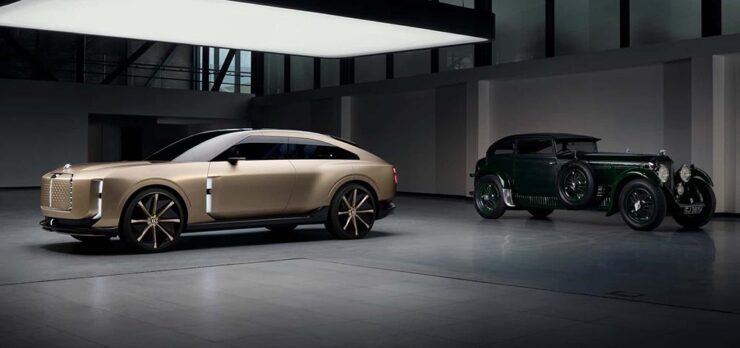
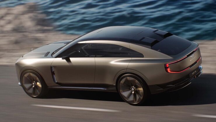
The new EXP15 with a 1930 Speed Six.
Yes, you’ve seen that shape before — and that time, I asked y’all to hang on see what happens. This time, I’m less confident it will turn out well:
The EXP15, top, with the Jaguar Type 00, bottom.
The Jaguar is both more compelling and fresh — it’s somehow more, yet with less detail. Interestingly, Jag is trying to reposition itself in the Bentley space (including comparative pricing), preferring to move upmarket rather than compete with the likes of BMW or Mercedes.
It’d be quite the coup for Jaguar to leap in (sorry) and take charge.
Enough about Jaguar. Some more photographs/renders of the Bentley:
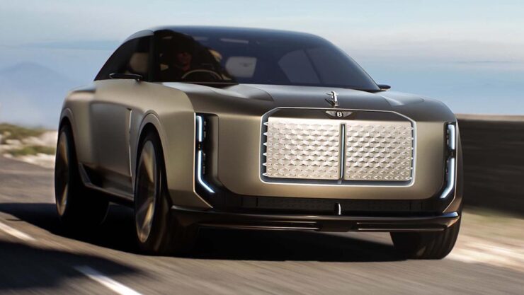
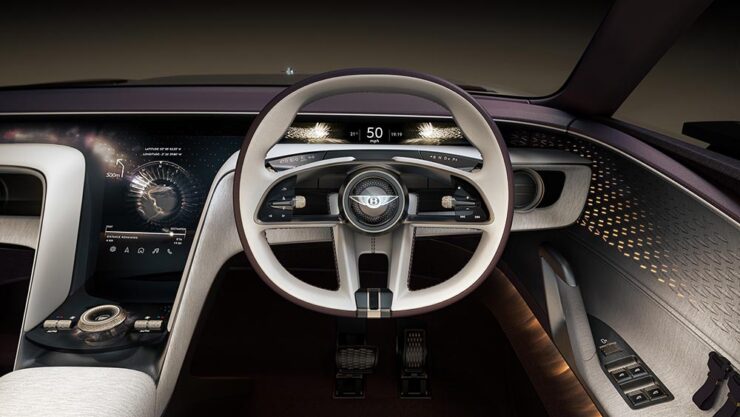
Arguably the best angle, somewhat hiding the EXP15’s SUV-esque size.The interior is better than the exterior, with some Bentley traditions intact. (Yes, the concept is a three-seater: the passenger seat was eliminated in favor of the pampered purebred.)The dash is all screens, yes, but not necessarily obviously so — something likely to age better than the iPad-on-dash approach.
Lastly, from the rear:
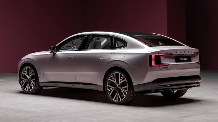
Wait. I’ve seen that look somewhere else.Oh, yeah, the Volvo ES90. (Itself riding at SUV height.)
I apologize for not being more positive on this one; I’ve been down on the Volkswagen Group in general for a while, and it makes me sad that, with their flagship brand, nothing in their new concept suggests they’re trying to reverse the trend.
Coverage: “This is What the Future of Bentley Will Look Like,” from Motor1; “The Bentley EXP 15 brings the bling and delves into tomorrow’s luxury automotive experience,” from Wallpaper*; and “Bentley Is Showing Jaguar How To Take A Luxury Brand Into The Future With The New EXP 15 (IPSO Fatso),” from The Autopian. (Apologies also for the three differing headline capitalization styles — blame the sources.)
Also worth reading: The Autopianquestions whether the new “Autobrutalist movement” — where I got the term — can be stopped; and Motor1 has not one but twoitems asking readers to give Jaguar a chance. (Probably unrelated.)
But wait: there’s another reason I’m down on Bentley right now.
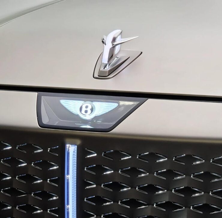
The New Bentley Logo: Style over Substance
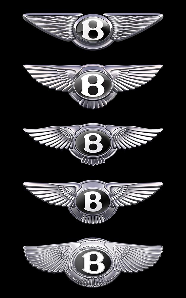
The five versions of the “winged B” logo, in order: 2025, 2002, 1996, 1931, and 1919.BMW called light “the new chrome.” Bentley absolutely gagged on it. At least the infamous Flying B is still there — hood ornaments are few-and-far-between these days.
When you’re Bentley, you shouldn’t be chasing trends, you should be leading them. Style over substance is nothing less than a mistake.
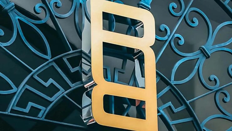
Also, because everyone else has one:
The flat version.
This new version was done in-house, the wrong choice on every level; this isn’t a time to save money. Another sad moment: the storied history of a brand like Bentley, running on the equivalent of a flat tire. (Perhaps even the rim. Trailing sparks.)
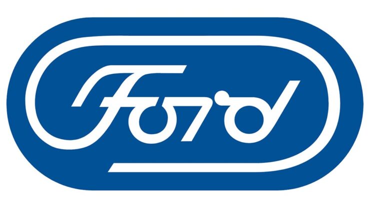
Special Bonus #5: In case you’ve never seen it, Paul Rand’s 1966 proposal for a redesign of the now-iconic Ford logo:
The Autopian has a nice piece on this.
July’s Photography Faves
Astronomy Photographer of the Year Shortlist
“Awe-inspiring scenes of the Milky Way, dancing aurorae, and serene galaxies all feature on the shortlist for this year’s ZWO Astronomy Photographer of the Year,” PetaPixel writes. Indeed:
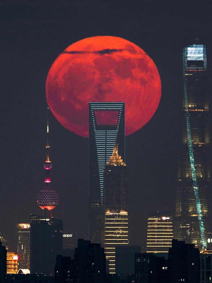
“Blood Moon Rising Behind the City Skyscrapers,” Shanghai. Photograph by Tianyao Yang.
The competition is run by Royal Observatory Greenwich, supported by ZWO and in association with BBC Sky at Night Magazine.
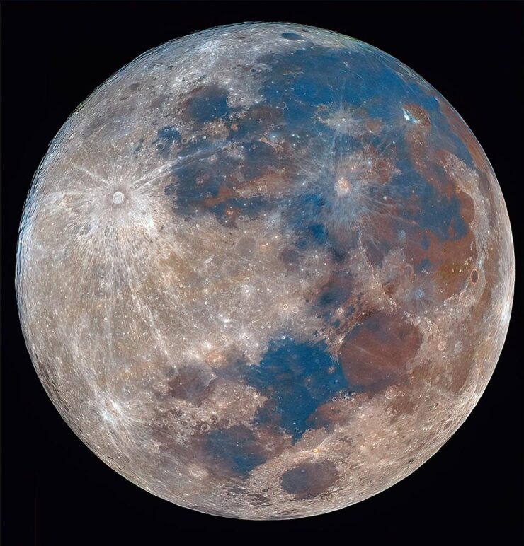
“The Last Mineral Supermoon of 2024,” Delhi. Photograph by Karthik Easvur.
See the other 28 on the shortlist here. The winners will be announced in September, so stay tuned.
Abstract Fireworks
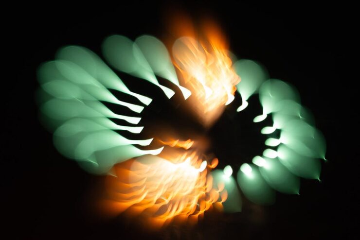
Every year, photographers across the world flock to fireworks displays, something that’s never interested me — until now:
Photograph by Bryan Szucs.
PetaPixel takes a moment to self-congratulate here, and I think they’ve earned it — although it’s good to note that the original post cites This is Colossal. (And that PetaPixel did a poor job with the cite in that original story, using only Colossal’s photography tag rather than an easily-found, specific link. Shame on them.)
Anyway, photographer Bryan Szucs took the defocusing idea and absolutely ran with it:
Special Bonus #6: Apple filed a fascinating image sensor technology patent last month, which describes a stacked image sensor with vast dynamic range and very low noise. PetaPixel has the story.
Unbuilt Frank Lloyd Wright
Okay, officially these are renders, not photographs. Still:
Trinity Chapel. Image by David Romero.
“Hooked on the Past emerged from the intersection of two personal passions: the history of architecture and the fascinating world of computer-generated imagery,” Romero tells This is Colossal.
Gordon Strong Automobile Objective. Image by David Romero.
Wright was ahead of his time in that he pushed material science to make a concept, shape, or cantilever work (often demonstrated in the maintenance and repair bills); his unbuilt projects demonstrate what could have been, and there’s nowhere better to imagine those than in generated imagery.
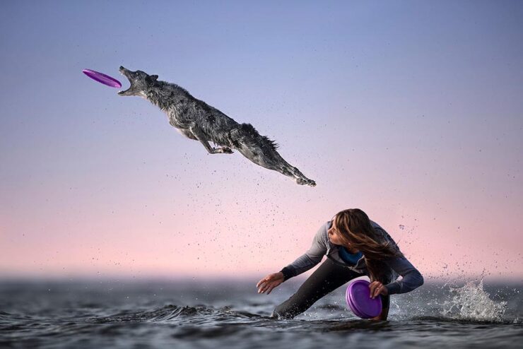
“Ultimately, it’s not the equipment that creates the magic. It’s the connection with the dog, the timing, the light, and the intention behind every shot. The gear just helps bring that vision to life,” photographer Caludio Piccoli tells PetaPixel.
Photograph by Caludio Piccoli.
I could easily repost every photograph from the story; they’re all great. Just go read it instead.
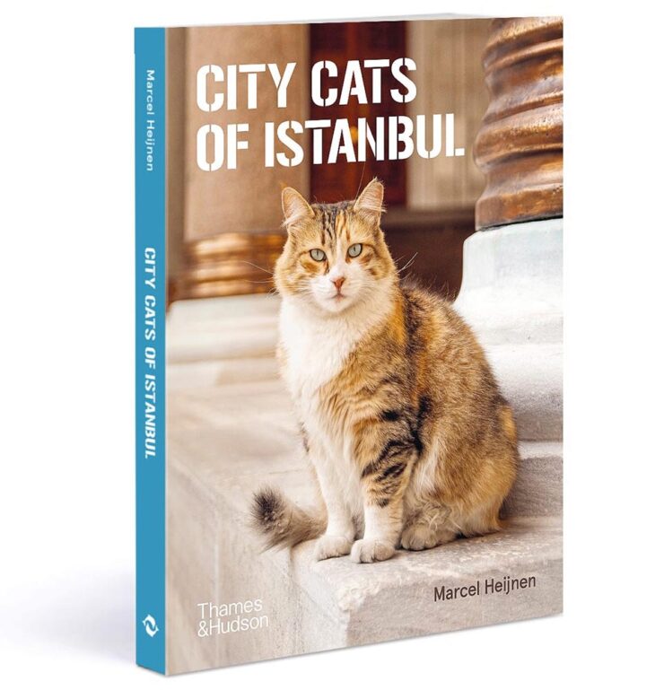
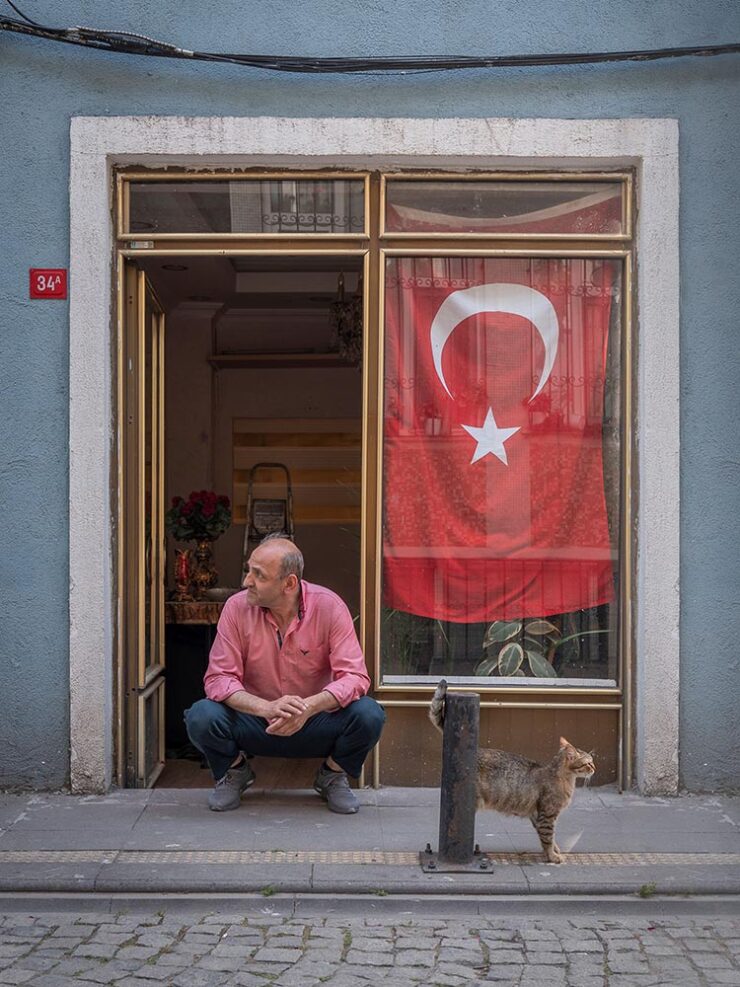
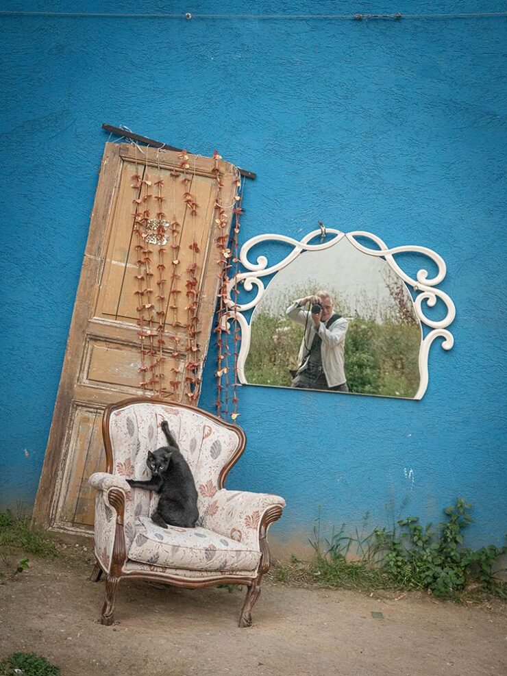
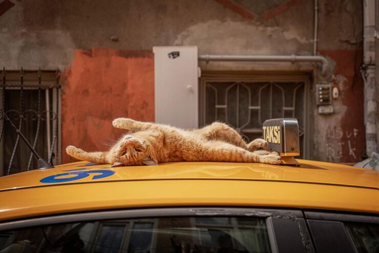
City Cats of Istanbul
To close out this month, well, the title says it all:
It’s hard to believe that 2025 is half over — but at the same time, the amount of water under the bridge in the first half of this year is quite astonishing. For those of us in the United States (indeed, worldwide), this year seems to rival the pandemic for necessary use of the word, “unprecedented.”
Therefore, your monthly dose of sanity great design and photography awaits. Enjoy.
University Presses Coverage on Spine
Spine is a regular stop for book designers everywhere. The site’s interviews with designers, authors and illustrators and especially their monthly book design faves are all items not to be missed; they do, in fact, live up to the tagline, “how books are put together.”
Unfortunately, their “Uni-Press Round Up” — Uni, of course, being English for University — has been MIA since the columnist left in 2021. So it was a great honor when Spine editor Vyki Hendy accepted my offer to republish my best of the Association of University Presses (AUPresses) Show 2025. (Indeed, Spinerepublished this year’s Foreword post in its entirety.) But that’s just the beginning: she asked me to take over the column, too.
I said “yes” without a second thought.
It’s important to me that I share a word or two about why: simply put, I believe that university presses worldwide deserve celebration. Part of it is the political atmosphere in the US recently, sure, but conservatives have been targeting higher education for a minute now. (See New College of Florida, “where education goes to die.”)
It’s more that I feel that university presses are the unsung hero of the publishing world. Titles are often complicated and difficult to visualize, and limited budgets often make it difficult to attract talent for great book design. An opportunity to highlight the best is not to be ignored.
Please head on over to Spine to enjoy the books I gathered for the first post, covering titles published in May and June of this year. But I’d like to call out a couple of favorites here:
University of Texas Press. Cover design by Lauren Michelle Smith, art director Derek George. Cover image, “Hybrid Paper Gods & Queens,” by Julius Poncelet Manapul.
Yale University Press. Cover design and illustration by Sarah Schulte, art director, Dustin Kilgore.
A difficulty subject — and book design brief, surely — treated with classic style and an illustration showing an uncommon depth of meaning.
It’ll be an incredible pleasure to keep a closer eye on the university press publications with monthly round-ups of the best new work. I hope you’ll read the column regularly.
The Creative Independent: “On Developing a Solid Foundation,” with Creative Director Arsh Raziuddin
Book designer extraordinaire Arsh Raziuddin has been featured here before — this year’s Favorite Book Covers post, for instance — but it turns out she wears many hats indeed, as this interview at The Creative Independent proves.
An insightful highlight:
Book covers taught me how to pay attention to detail both in terms of the story and the design. What’s different between magazine work and book design is that with a book, you’re often condensing a 300-page story into a single cover; whereas editorial work might involve an 800- or 1,000-word essay that you need to visualize. It’s so difficult to capture the essence of an entire novel in one image — something really has to stand out. […] It feels a bit daunting to fit an entire novel in a 6×9-inch rectangle.
— Arsh Raziuddin, wearing her book design hat
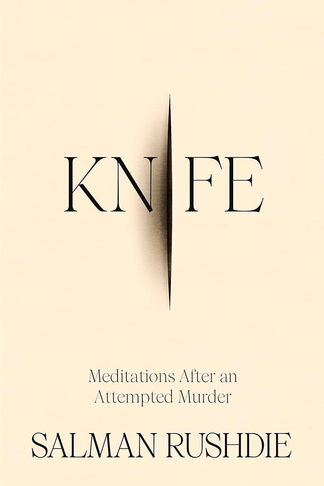
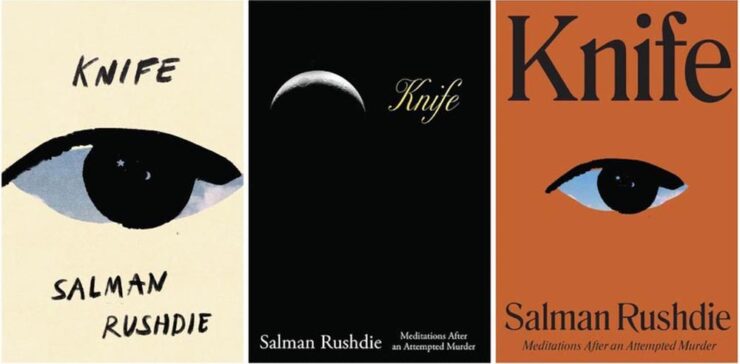
Her cover design for Salman Rushdie’s Knife is discussed, an extraordinarily good example of, as she puts it, “not overcomplicating”:
Book design by Arsh Raziuddin.
It’s a treat to see some rough drafts:
Book design by Arsh Raziuddin.
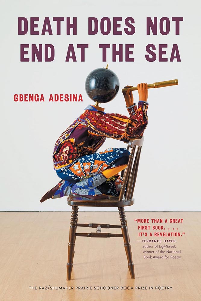
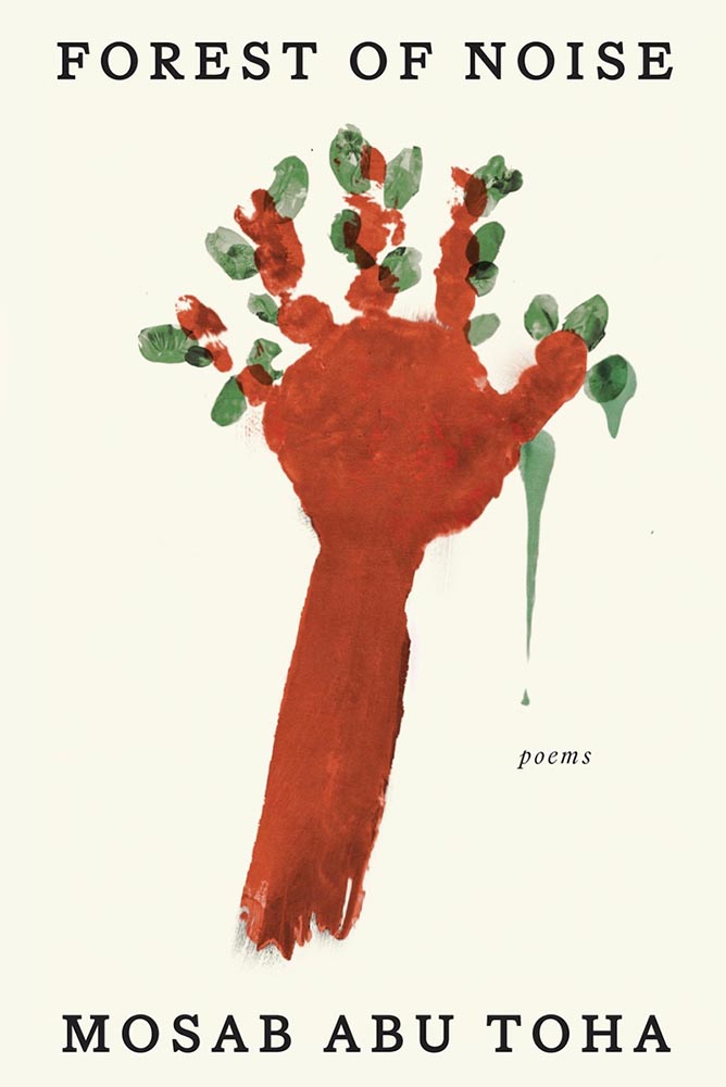
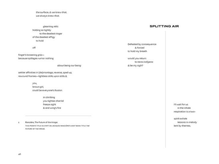
“We’re [that is, book designers] all trying to make something sexy or loud without a solid foundation,” she says. “We all need to collectively focus on craft.” Perhaps like this fantastic book cover, this time for a Pulitzer prize-winning poet:
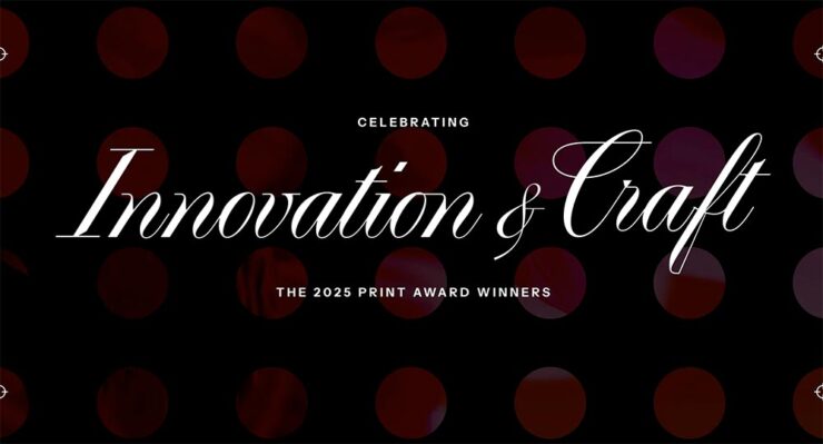
“The 2025 PRINT Awards Honorees in Advertising & Editorial Cut Through the Noise,” the headline reads. Yes.
It’s Nice That asks, “Are social media pile-ons stifling the creative industry?” Yes, I’d argue, and for more than just rebranding exercises. Read the article to see if you agree.
“Jon McNaught has created more than forty covers for the LRB as well as artwork for books, diaries, posters and campaigns.” Follow his process.
“Chris Ware, known for his New Yorker magazine covers, is hailed as a master of the comic art form.” Follow his process.
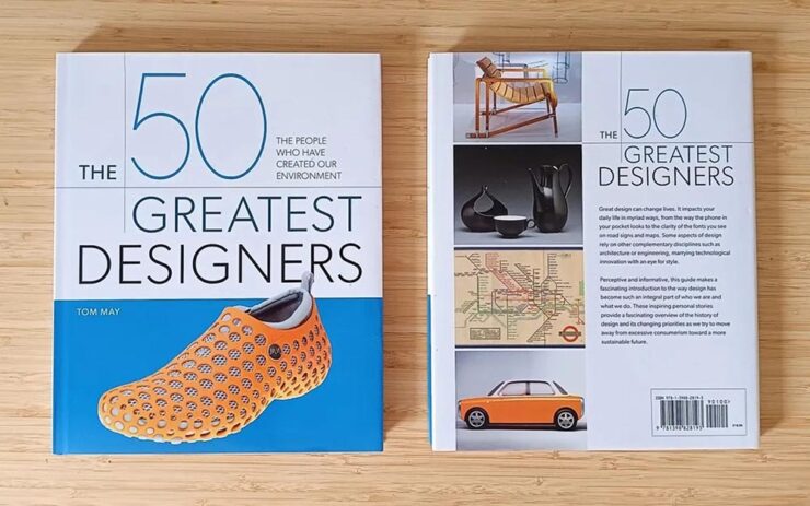
“Designers needed a book about their history that didn’t exist… so I wrote it myself,” Tom May says at CreativeBoom.
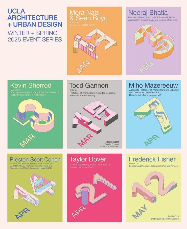
Archinect covers the best of the spring lecture series posters. (Previously.) Building an intersection of design and architecture: when getting a lecture is a good thing.
AI: Desctructive to Books — Literally
Photograph: Alexander Spatari via Google Images.
Anthropic destroyed millions of print books to build its AI models, Ars Technica reports.
On Monday, court documents revealed that AI company Anthropic spent millions of dollars physically scanning print books to build Claude, an AI assistant similar to ChatGPT. In the process, the company cut millions of print books from their bindings, scanned them into digital files, and threw away the originals solely for the purpose of training AI[.]
— Benj Edwards, Ars Technica
“Buying used physical books sidestepped licensing entirely while providing the high-quality, professionally edited text that AI models need, and destructive scanning was simply the fastest way to digitize millions of volumes,” they continue.
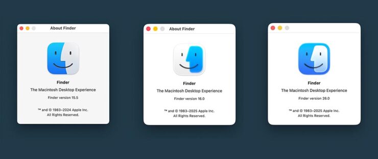
The icon as of MacOS 16/26 Beta 2 (right). And the title, uh….
Calling it only “slightly better” — something I agree with — John Gruber’s Daring Fireballmakes a strong case for something that sticks closer to tradition, with this specific example:
“Glasses it up but keeps it true to itself.” — Gruber. (Icon by Michael Flarup.)
I have a feeling that Apple is going to keep the outline; generally, when it does these redesigns, the rules tend to overrule, if that makes sense.
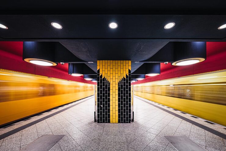
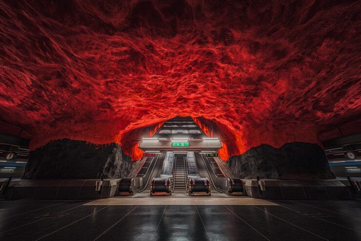
This is Colossal: “Architectural Symmetry in Europe’s Subways,” Say no more.
Richard Wagner station, Berlin. Photograph by Theibault Drutel.
Brilliant on many levels, but it’s the dual trains-in-motion that takes it over the top. Another:
Solna Centrum station, Stockholm. Photograph by Theibault Drutel.
“Each city approaches underground architecture differently, mixing brutalism, futurism, minimalism, or sometimes unexpected touches of ornamentation,” the photographer says. Read the article or visit Theibault’s website.
Nat Geo Traveler Photo Contest 2025
PetaPixel covers the National Geographic Traveler (UK) contest, honoring the best travel images by photographers in the United Kingdom and Ireland. My favorite:
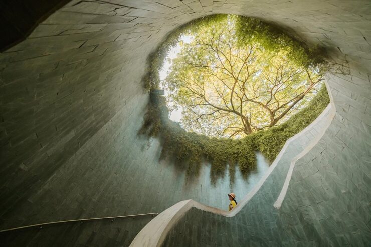
“Tree Tunnel,” Singapore. Photograph by Scott Antcliffe.
“I found this spot and was struck by the sheer density of the foliage — vines had completely enveloped the supporting walls, but the view of the Yellow Rain Tree at the top was simply stunning and utterly mesmerizing,” the photographer says.
See more. (NatGeo’s website has an article, but it requires you to enter your email to read. Boo.)
National Park Foundation Celebrates America the Beautiful
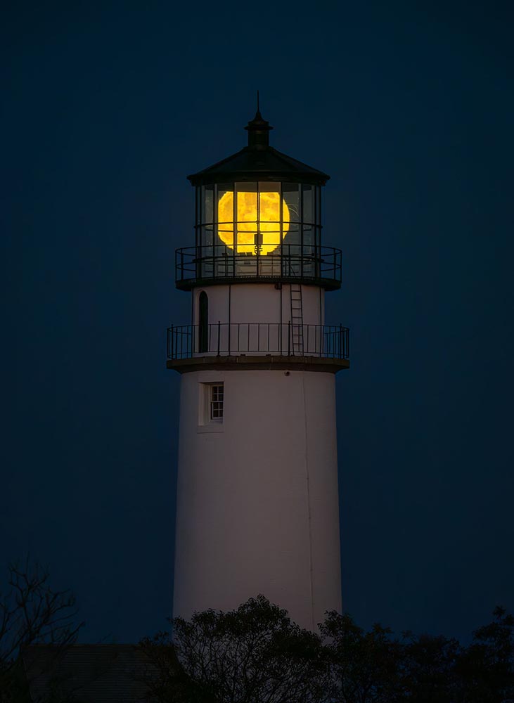
The National Park Foundation has announced the winners of its 2024 Share the Experience photo contest — the official competition of America’s national parks, for amateurs only. Still:
History & Heritage category winner, Cape Cod National Seashore. Photograph by Matt Ley.
Doesn’t really require too much explanation: brilliant stuff. It may be little more than a fluff piece, but the photography makes it worth visiting this PetaPixel post. (Reminds me, on some level, of the tongue-in-cheek mentality of the ’60s TV series.)
Full Circle: 2.1 Trillion
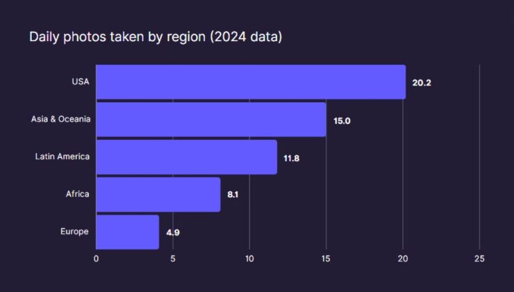
Humanity is overflowing with imagery, according to research from Photutorial:
162 billion photos are taken every month. That’s 5.3 billion photos per day. Or 221 million photos per hour. 3.7 million photos per minute. 61,400 photos per second.
94 percent of those are taken on smartphones — itself a shocking number — but there’s an important statistic in the data:
Source: Photutorial
It doesn’t take much to wonder why the US takes, on average, four times the number of photographs Europeans do.
It’s been a lovely, cool spring here in Middle Georgia; it seems that in the 2020s, springtime has had more rain and less of the dive from winter into hot that’s featured in years past. (Not to fear: we’ll be into summer soon enough.) Open window weather, we call it, to be enjoyed while we can.
That said, there’s been plenty of goodness gathering for this month’s posting: more movie/books, more album art, more typefaces, and more great photography. There’s also an excellent observation regarding design trends and a bit on Adobe.
This is the 200th post on the new Foreword, which I restarted six years ago today. It’s taken a bit to get back into regular blogging, but I’ve once again found my sea legs, really enjoy it and hope to continue for a long while yet.
Thanks very much for stopping by — genuinely appreciated.
“Good Movies as Old Books,” Again
I’ve featured the work of designer Matt Stevens before, but there’s an update to his fantastic personal project to make vintage paperback covers from movies.
Perfect — and still available as prints. They’re also now available in new book, which combines the best of the first two books (published via Kickstarter) and adds a few more … or as a set of 100 postcards, perfect for framing and scattering about on walls near you.
Special Bonus #1: Heading to Europe? It’s Nice That has “Where to book hunt in Amsterdam, a playground for contemporary book design,” listing “why the city is so known for its publishing prowess, and shares a comprehensive list of places for designers, printers, publishers, and enthusiasts alike, to check out.”
The History of Album Art
Album art didn’t always exist, Matt Ström-Awn reminds us. Utilitarian at first, it evolved.
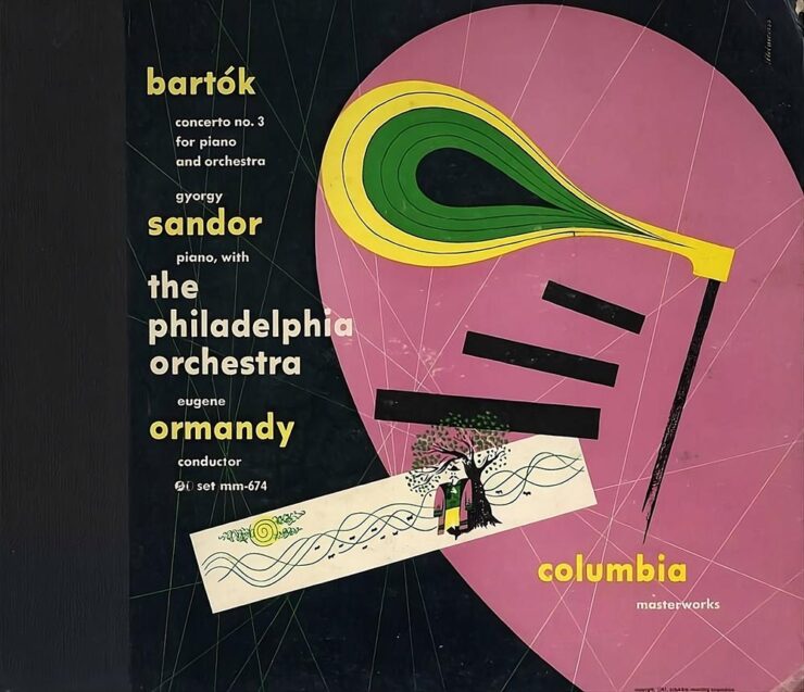
Alex Steinweiss’ cover art for Columbia’s recording of Bartók’s Concerto No. 3.
The invention of album art can get lost in the story of technological mastery. But among all the factors that contributed to the rise of recorded music, it stands as one of the few that was wholly driven by creators themselves. Album art — first as marketing material, then as pure creative expression — turned an audio-only medium into a multi-sensory experience.
This is the story of the people who made music visible.
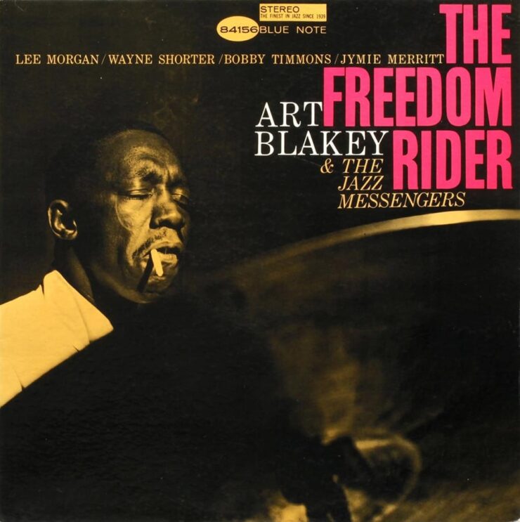
Reid Miles’ cover for Art Blakey’s The Freedom Rider
Well-written and informative. If, like me, you’re old enough to remember music on vinyl — or you’re one of the new generation of devotees — take a minute this weekend to appreciate the particular goodness that is album art.
I’m a sucker for fonts that have both serif and sans together in the same family — they’re incredibly flexible and perfectly complimentary in design projects. “Order Type Foundry’s first superfamily is a thoughtful homage to 19th-century Scottish typographic traditions, reimagined for contemporary design needs,” CreativeBoom writes. See more at Order.
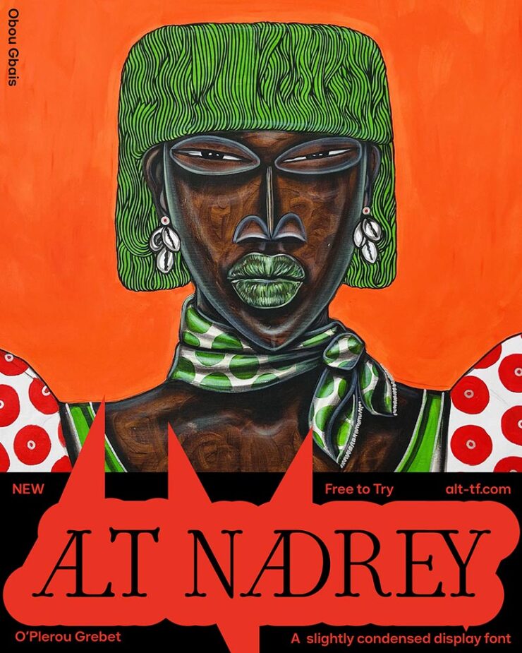
Nadrey means “My Heart” in Bété, the designer’s mother tongue. Artworks by Ivorian artist Obou Gbais.
Described by its creator as a “typographical rendition of love,” the beautiful letterforms “draw inspiration from 90s poster fonts, combining narrow-ish, rounded letterforms with a contemporary sensibility. Its gentle curves and subtle serifs create a sophisticated softness while maintaining refined elegance.” Côte d’Ivoire-based type designer O’Plérou does the world a favor, as far as I’m concerned. See more at ALT.
Sofia Pro by Mostardesign.
Up there with Futura, from which it’s descended (see what I did there?), Sofia is one of those faces you see everywhere: “a familiar presence in contemporary visual communication, even for those who can’t identify it by name,” CreativeBoom writes. Sofia’s been updated and expanded, now available in a variable format. Spread the Mostard.
Special Bonus #2: It’s not over the top: “[r]ather than uber-pragmatic, sterile fonts, Ornamental & Title Type (OTT) is dedicated to expressive display typefaces,” It’s Nice That writes in a profile of Eliott Grunewald’s foundry. Check it out.
“Fun Fatigue”
Branding agency Collins’ approach for RobinHood, an online investing and stock trading company.
DesignWeek asks, “Is formality returning in branding?” An article by Mother Design’s Alec Mezzetti covers how we got to casual in the first place — and why we might be turning a corner away from it.
Casual vs. not-so-much — and, of course, once corporate trends become a “new direction…..”
“In a landscape of homogenous casualised branding, widespread disillusion with the idealism that birthed it, and a growing sense of insecurity, these old codes hold power,” Mezzetti writes. The RobinHood investing/trading example, shown above, now looks like this:
RobinHood, as rebranded by Porto Rocha.
The money quote, if you’ll forgive the expression: “The extreme end of this trend towards symbols of old luxury, hierarchy and tradition has been labelled […] as ‘Boom Boom’ aesthetics, which overtly embrace past eras of excess such as the roaring 1920s or, the boom years of the 1980s.”
A two-parter, here. First, let’s start with more from Mother Design:1Oddly, Mother Design’s page on Adobe, mentioned in Google Search results, now nets a 404 error. I wonder what that’s about.
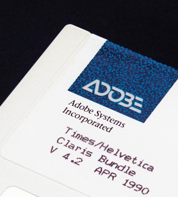
That’s right, Adobe has a new logo and branding. ’Course, some of us have been using Adobe’s software for a minute — and clearly remember this:
In any case, Adobe is ignoring the trend mentioned above and heavily embracing the current-thinking, very corporate-casual approach:
And hyping the value:
This leads directly to the second part: Adobe is, once again, both flouting its record profits and raising its prices. Why? AI, of course. (We’ll save the potential monopoly position for another discussion.)
Adobe has rewritten pretty much all of their apps to include AI, making it so that many functions are better; retouching power lines in Lightroom, for example, is now a one-click affair. Others seem to be there because Adobe believes the general public somehow demands it. (The AI “summaries” of the PDFs in Acrobat, for example, are being pushed so hard it’s actually annoying, although to be fair, that’s not unique to Adobe.)
In retrospect, it’s obvious that the new AI functions have been written in such a way that we’d get used to having them … and then be forced to pay extra to keep them. In other words, you’d think that, as customers of the Adobe ecosystem for decades now, we’d somehow get to the other side of the fishbowl and not be surprised at the wall.
Adobe has introduced a new “Standard” tier that’s actually slightly less pricy, but with the AI stuff — along with iPad functionality, online access, and other features — turned off. No one who already has a subscription and gotten used to what’s available is going to want that.
Firefly, shown above, is new, and AI from the ground up, and the generative fill options in Lightroom, Photoshop, and Illustrator, plus the always-useful access to the Adobe Font collection, mean that I’m going to continue to argue that the yearly subscription actually represents a value.
That said, it’s an increasing cost that has to get passed along. I don’t like it, and I’m going to continue to say — in public, on the record — that Adobe is putting profits before people. But this is 2025, and these days, sport contains blood.
Special Bonus #3: Apple, the most beloved of all motherships, is also taking fire these days. Longtime fans will know the name John Siracusa — and, thus, know instinctively what this essay represents.
Update, 9 June, 2025:Nick Heer, Pixel Envy: “It is hard to see how one could be a fan of a multi-trillion-dollar company. I am just a customer, like a billion-plus others.”
Special Bonus #4:The Onion, May 16. “[Today, we] announced today the launch of its in-house advertising venture, America’s Finest Creative Agency.” Chef’s kiss.
May Photography Round-up
As has become the norm, let’s end with some awesome photography posted around the ’net in May.
Just a little bit “off,” in the best way
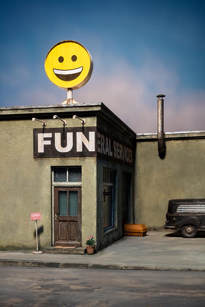
Putting the “fun” in funeral services. Photograph by Frank Kunert.
No, it’s not AI: it’s a fabulous series of miniatures, meticulously constructed and photographed for our viewing pleasure. This is Colossal has more. (The behind-the-scenes photo shows all: lots of work.)
The German Society of Nature Photographers
This annual competition is a members-only affair, but in no way, shape, or form is that a compromise:
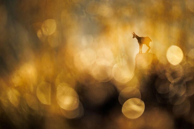
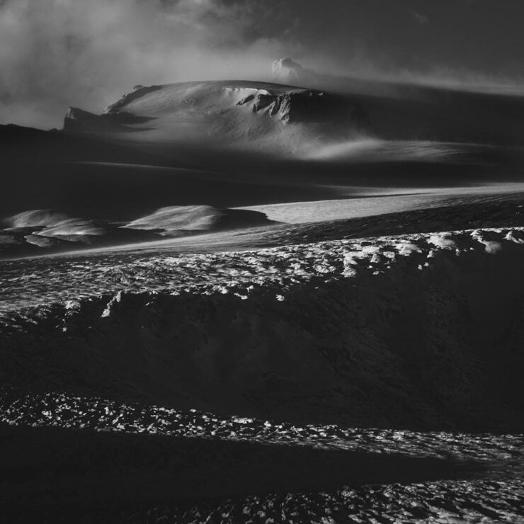
1st Place, Mammals: “Chamois.” Photograph by Radomir Jakubowski.1st Place, Landscape: “Deforestation.” Photograph by Hanneke Van Camp.
“Like a love letter to nature, Arild Heitman weaves images together as letters into words to create a visual narrative,” PetaPixel writes of the Norwegian photographer.
Photograph by Arild Heitman.
A style that’s “more fine art than sweeping vistas,” they argue; I agree. Of course, there are some vistas, too, but with an interesting quality:
Photograph by Arild Heitman.
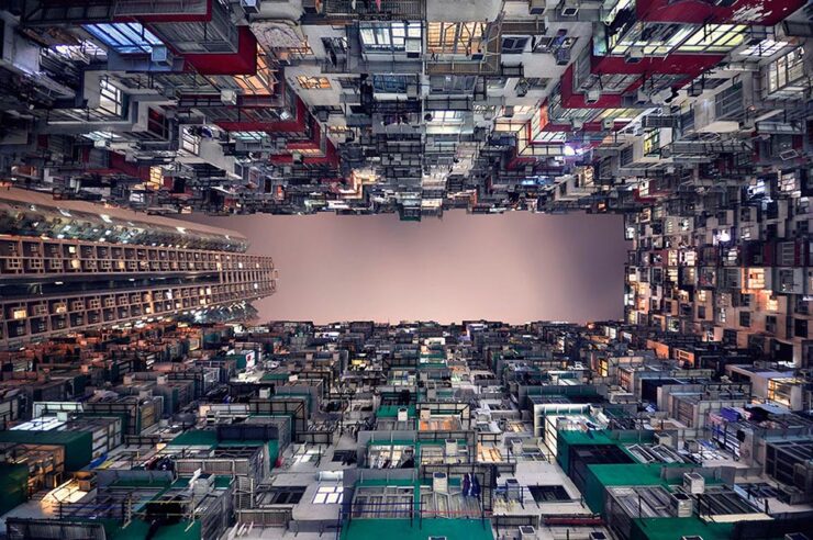
Architecture is another where details and point of view matter. French photographer Romain Jacquet-Lagrèze moved to Hong Kong in 2009, partially because of what he describes as “verticality,” something the Chinese city certainly has in abundance.
“44.” Photograph by Romain Jacquet-Lagrèze.
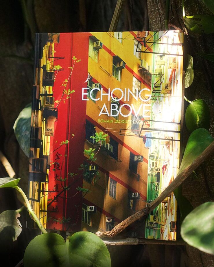
“I am especially proud of my latest body of work, Echoing Above. I started it by shooting trees growing wildly on residential buildings in the middle of the city. While looking up to find the trees, I spotted the men building scaffolding. And by looking for the men, I discovered the variety of birds that live in the heights of the city,” PetaPixel quotes.
“Flock Over Mong Kok.” Photograph by Romain Jacquet-Lagrèze.
“I find it beautiful to see how the presence of trees, men, and birds are taking turns above our heads, like an echo in a concrete canyon,” he tells This is Colossal. His latest collection has been gathered into a book, available on his website.
Paris in Color
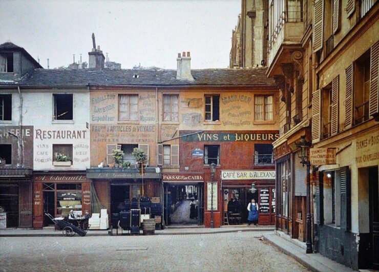
Jason Kottke brings us an incredible before-and-after, which I hope he won’t mind my reposting:
Photograph by Albert Kahn, 1914. (Color in original.)
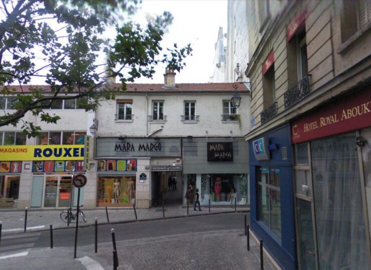
“That photo is of the entrance to the Passage du Caire at the corner of Rue d’Alexandrie and Rue Sainte-Foy in the 2nd arrondissement.” he writes. Here’s what it looks like today:
Google Street View, undated.
Is it just me, or is the photograph from 1914 infinitely more compelling? Click through for more.
Looking Up
In its sixth year, Nature‘s Scientist at Work competition invites readers to submit their best photos that show the “diverse, interesting, challenging, striking, and colorful work that scientists do around the world.”
Photograph by Aman Chokshi.
For scale, look closely: there are two people at the bottom of that dish. Awesome.
“Winter Fairy Tale,” Austria. Photograph by Uros Fink.
We finish up this month with one of the most beautiful sights in the night sky: the Milky Way. Travel photography blog Capture the Atlas has announced the winners of its annual Milky Way Photographer of the Year competition. (And getting these isn’t easy: the photographer shown above, Uros Fink, hiked through the snow for hours with a 22-kilogram backpack and sled.)
“It bridges the gap between science and art, giving us an awe-inspiring look at the galaxy that surrounds us — from both Earth and orbit,” Capture the Atlas explains, via PetaPixel. The competition site includes the winning photographs, a bit about each, and camera data. Using the word “awesome” somehow falls a little short here….
My favorite gets both the sky and, implausibly, my favorite flower — in an amazing location:
“A Sea of Lupines,” New Zealand. Photograph by Max Inwood.
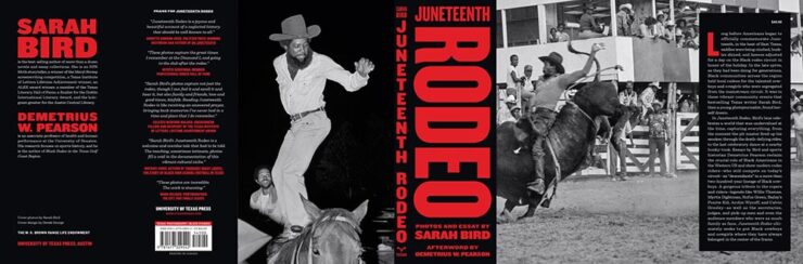
The annual Association of University Presses (AUPresses) Book, Jacket, and Journal Show has announced its winners for items published during 2024. The show, now in its 60th year, “honors the university publishing community’s design and production professionals. By recognizing achievement in design, production, and manufacture of print publications, it also sparks thoughtful, creative, and resourceful publishing design in the future.”
“The impressive compilation of this year’s award-winning books is evident of the commitment, skill, and craftsmanship alive and well in academic publishing. It has been an honor not only to witness this work, but to feel its impact.”
— AUPresses Show Judge Lara Minja, Lime Design Inc., Victoria, British Columbia
Entries are extensive — up to 575 this year, from universities all over the world — with the winners are separated into eight categories. Some of my favorites are listed below, but by no means all of them; this post is long enough as is.
Grab a refreshing beverage, pull up a chair, and enjoy.
Please note: This is one of those posts that’s better seen in full width. Please click on the title, above, to get there. Thanks.
Scholarly Typographic
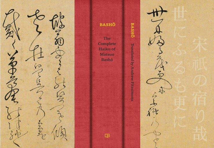
University of California Press. Book design by Kevin Barrett Kane.
Japanese … in cursive. Typography? Dunno, but the overall look is great.
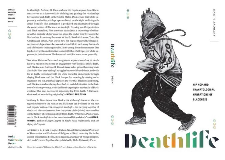
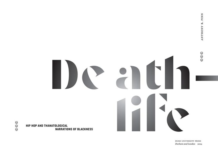
Duke University Press. Book design by Courtney Richardson.
One of the great things about this show is seeing an entire cover (or jacket). Note here the great treatment of filing/info in the upper left, the publisher in the lower left, and how well they tie in with the author info on the front. Love the skulls, too., and even the bar code is well-handled. Kudos all around.
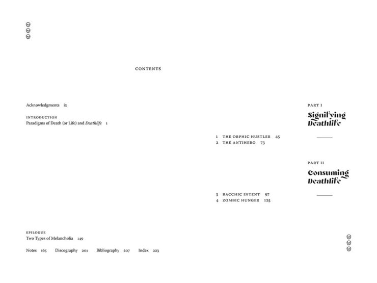
Duke University Press. Book design by Courtney Richardson.Duke University Press. Book design by Courtney Richardson.
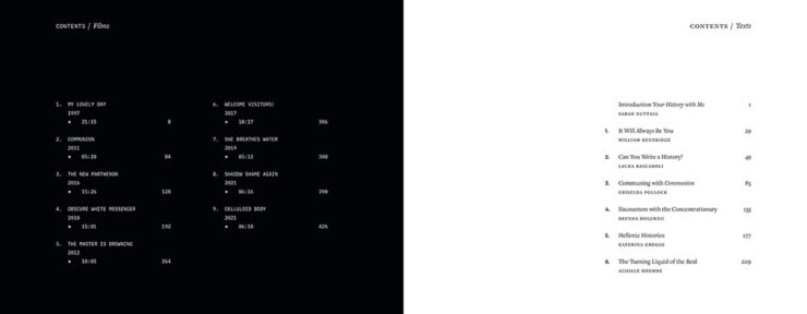
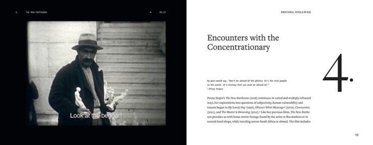
The goodness continues inside, too; the contents spread is fantastic. Nice.
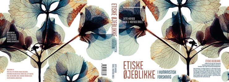
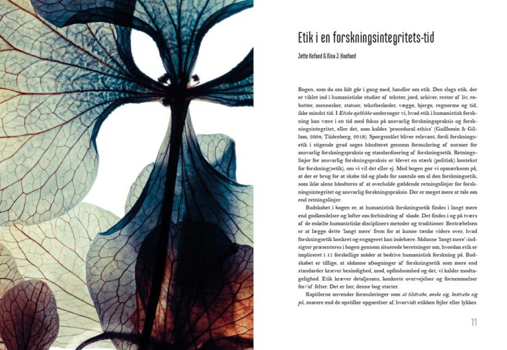
Aarhus University Press. Book design by Nina Lachmann Sinding.Aarhus University Press. Book design by Nina Lachmann Sinding.Aarhus University Press. Book design by Nina Lachmann Sinding.
Eye-catching and interesting illustrations that become an integral part of the design. Well done.
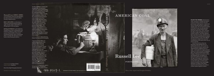
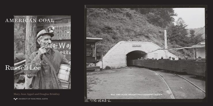
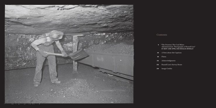
University of Texas Press. Book design by Erin Mayes. (See larger here.)University of Texas Press. Book design by Erin Mayes.University of Texas Press. Book design by Erin Mayes.University of Texas Press. Book design by Erin Mayes.
Essential American historical photographs, presented in exactly the right way.
University of California Press. Book design by Kevin Barrett Kane.University of California Press. Book design by Kevin Barrett Kane.
The cover is great, but that section title spread…!
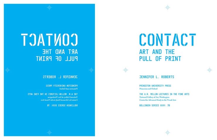
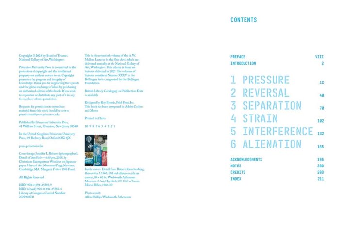
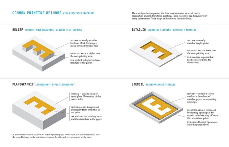
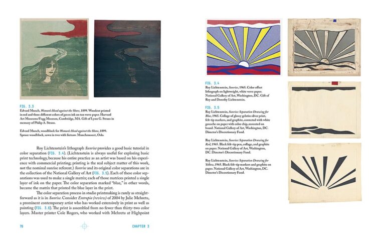
Princeton University Press. Book design by Roy Brooks.Princeton University Press. Book design by Roy Brooks.Princeton University Press. Book design by Roy Brooks.Princeton University Press. Book design by Roy Brooks.Princeton University Press. Book design by Roy Brooks.
I don’t suffer from insta-buy often, but a copy of this title was ordered for my library the moment I saw it. Excellent on every level.
University of Texas Press. Book design by Derek George.
Great to see this title from UTexas (another example of why university presses are essential — in every political environment.) The great design is deserved … and received.
Duke University Press. Book design by Courtney Richardson, from a design concept by Gabrielle Gay. (See larger here.)Duke University Press. Book design by Courtney Richardson, from a design concept by Gabrielle Gay.Duke University Press. Book design by Courtney Richardson, from a design concept by Gabrielle Gay.
Fabulous cover combined with well-handled interior design, the contents and chapter numbers especially.
Louisiana State University Press. Book design by Michelle A. Neustrom.
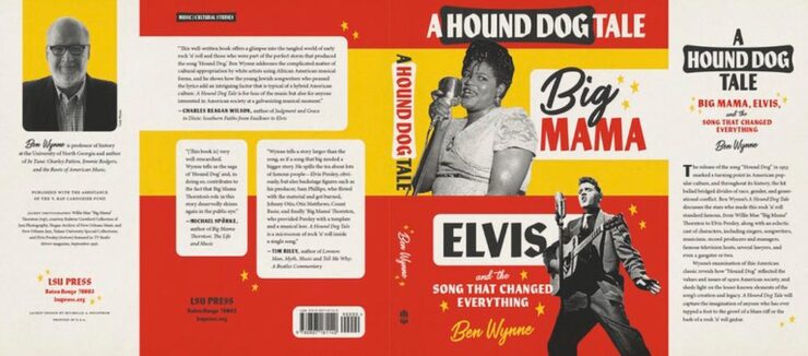
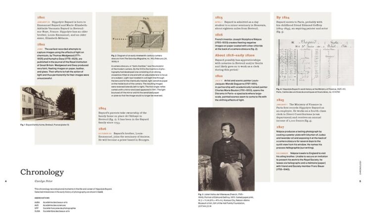
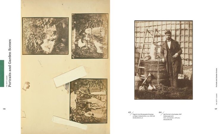
Love this jacket, from the type boxes and general typography to color choices; a great way to handle black-and-white photographs in a dynamic way. Special mention for the author’s photo.
University of Chicago Press. Book design by Rae Ganci Hammers.University of Chicago Press. Book design by Rae Ganci Hammers.
Perfect title, handled with aplomb — the juxtaposition of the two pages, above, is brilliant.
Aarhus University Press. Book design by AM Copenhagen.Aarhus University Press. Book design by AM Copenhagen.Aarhus University Press. Book design by AM Copenhagen.Aarhus University Press. Book design by AM Copenhagen.
Good cover — the shape of the chair on the back is used well — with a fab contents spread, well-done callout pages (love the yellow), and awesome timeline design. As pages on seating go, these do, in fact, stand out.
University of Chicago Press. Book design by Debbie Berne.University of Chicago Press. Book design by Debbie Berne.University of Chicago Press. Book design by Debbie Berne.
It’s only appropriate that a book on book design is laid out well — no pressure. It’s approachable for folks not familiar with the lingo and systems, and deserving of the selection.
University of Texas Press. Book design by Derek George, with illustrations by Caroline Brown.University of Texas Press. Book design by Derek George, with illustrations by Caroline Brown.
For the Bees’ subtitle reads, “A Handbook for Happy Beekeeping,” and the design and illustrations work hard to meet that goal. Get the buzz: another deserving title.
Getty Publications. Book design by Jeffrey Cohen.Getty Publications. Book design by Jeffrey Cohen.Getty Publications. Book design by Jeffrey Cohen.
The back cover rocks. There’s also good use of “the aged look” — with bonus points for “tape” — and great typography, especially the great layout from the chronology department. It all adds up to a very well-deserved selection. (Getty Publications is the educational arm of the Getty Museum, by the way.)
Princeton University Press. Book design by Chris Ferrante. Illustrated by Roberto Abbiati.Princeton University Press. Book design by Chris Ferrante. Illustrated by Roberto Abbiati.
The wide spine tape is definitely a look this year (because it works), but it’s the illustrations that carry the day here.
Duke University Press. Book design by Matthew Tauch.
Book design for poetry is a tough thing to do well. Left Turns in Brown Study does the work and earns this win.
Yale University Press. Book design by Oliver Uberti Creative.Yale University Press. Book design by Oliver Uberti Creative.Yale University Press. Book design by Oliver Uberti Creative.
I did not expect something with this title to have standout design, but taking inspiration from money — often the very definition of great design — was a genius move. The spread above, though, proves that the book was treated with thoughtfulness and thoroughness throughout. Kudos.
Princeton University Press. Book design by Heather Hansen.Princeton University Press. Book design by Heather Hansen.Princeton University Press. Book design by Heather Hansen.Princeton University Press. Book design by Heather Hansen.
Another insta-buy. (Score: 2–0, Princeton.) I’d like to make this title required reading for book design clients everywhere.
Vanderbilt University Press. Book design by Alissa Faden.Vanderbilt University Press. Book design by Alissa Faden.Vanderbilt University Press. Book design by Alissa Faden.
With the pandemic still visible in the rear-view mirror, this title should be on the shelf in every government department, in every location worldwide (and the shelves of a good chunk of the general public, too). Great layout and good use of color, with bonus points for the contents spread, add to this approachable book — well done.
There were a stack of books in this (largest) category; it was tough not to list more than I have. Let’s dig into it, in alphabetical order:
University of Pittsburgh Press. Book design by Alex Wolfe.
Great colors, great photograph, great script on the cover — basically, the whole thing.
University of Tennessee Press. Book design by Brian Fuson.
An unexpected combination handled well; the colors and style are right.
University of North Carolina Press. Book design by Lindsay Starr.
Erasure for the win. (Irony, too.)
University of Georgia Press. Book design by Erin Kirk.
Compelling combo of photographs and title, with a great type treatment running along the right edge. Perfect texture, too. “Best available,” indeed.
Rutgers University Press. Book design by TG Design.
“Feel good” in all the right ways, from photography to typography. Have a treat.
University of Virginia Press. Book design by David Fassett.
Scholarly title meets pop culture book design. Bonus points for texture.
McGill-Queen’s University Press. Book design by David Drummond.
Book design heavy hitter David Drummond nails it with a creative hint hit at the National Examiner, America’s poshest paper.
University of Minnesota Press. Book design by Michel Vrana.
Another from the cutting edge of book design trends, and another that feels “just right.”
University of Minnesota Press. Book design by Victor Mingovits.
“Unexpected style,” the Out-In-Left-Field department said. Overall pick, surely.
Rutgers University Press. Book design by David Drummond.
Signs of a design done well, especially “the” in a shield — nice. (I might just have to read this title to test out the theory of finding anything on the Jersey Turnpike.)
University of Minnesota Press. Book design by Sandra Friesen.
Familiar and compelling while simultaneously fresh and compelling, if that makes any sense. I like.
University of Chicago Press. Book design by Brian Chartier.
Tracks perfectly.
Princeton University Press. Book design by Karl Spurzem.
If there were ever a better illustration of gaslighting…. (Also, grain. And did I mention that it’s one color!?)
University of Chicago Press. Book design by Ryan Li.
Specter, indeed: those caps could be eyes, fingerprints, pick something. Great use of texture on this one, too.
Princeton University Press. Book design by Haley Jin Mee Chung.
The unexpected choice of pink here works together with the type and illustrations to make this potentially difficult title approachable.
University of Guam Press. Book design by Ralph Eurich Patacsil.
Front cover treatment for all the wins — awesome.
University of Texas Press. Book design by Jenny Volvovski.
Stamping out. (Also, color blocks.)
University of Virginia Press. Book design by David Fassett.
Chef’s kiss collage … and title treatment.
University of Chicago Press. Book design by Rae Ganci Hammers.
Yes. Seriously, just “yes.”
West Virginia University Press. Book design by Than Saffel.
Not sure what this is a photograph of, and that’s just right for the title. Props to both the designer and art director who approved it. (West Virginia. Just a reminder.)
McGill-Queen’s University Press. Book design by Jeremy Parker.
Splattered with drops of … brilliance.
Stanford University Press. Book design by Michele Wetherbee.
Title and treatment in perfect sync, this analysis says.
Honorable mentions to Just City and London for doing cities justice; Resistant Practices in Communities of Sound for the waves (and title, frankly); The Fenway Effect for The Wall; and the Phoenix Poets Series for illustration. See the whole Jackets and Covers category here.
• • •
That’s a bunch of book design — thanks for going through ’em with me — and a bunch of great titles from university and academic presses that so often go overlooked in a world that seems to value education less and less every day. Congratulations to all for their entries, wins, and effort. See you next year!

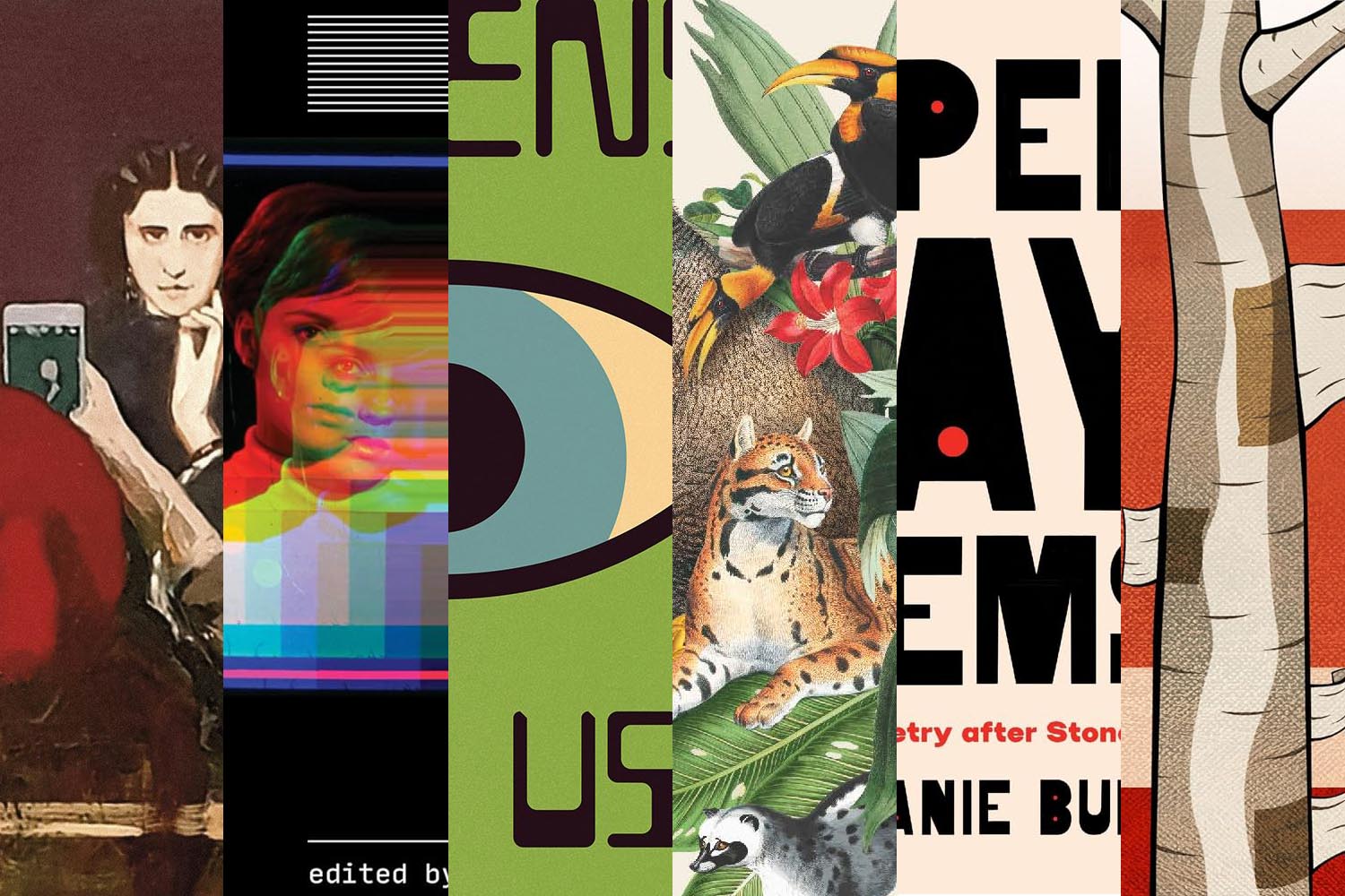
![Beautifully Briefed 25.10: [Blank] of the Century](https://www.gileshoover.com/wp-content/uploads/2025/10/bb-hdr-2510.jpg)