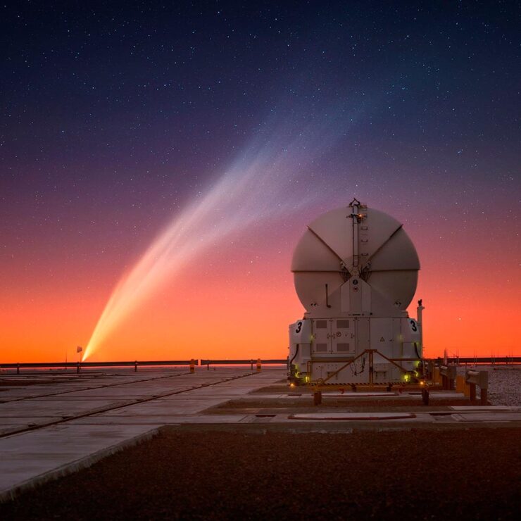
Please note: I sometimes add updates to previous posts; this happened with both the March and February posts, below. Thanks.
In this edition of the Beautifully Briefed series: a little book and book design news, a couple of complaints, and, in celebration of April, a (gentle) shower of great photography.
Books and Book Design
LitHub 10th
Happy Birthday to LitHub, the most popular editorial book site in the world — after Amazon’s Goodreads — and a continued source of great book cover content. 36,108 posts later, they’re better and stronger than ever. Congrats.
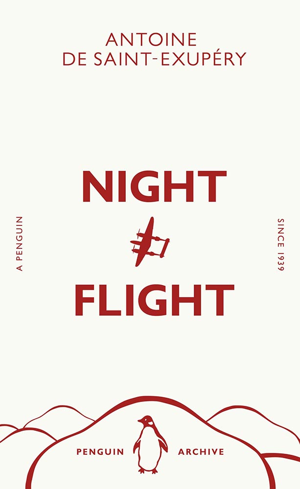
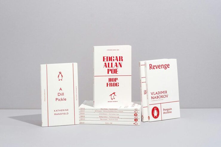
Penguin’s 90th
Art direction by Jim Stoddart.
Penguin’s story started in 1935 with the simple idea that quality literature shouldn’t cost more than a packet of cigarettes. Despite scepticism from publishers and booksellers, when founder Allen Lane launched his publishing company he sparked a paperback revolution in the UK. Within a year, three million Penguins had made it to readers’ shelves.
— Aimee Mclaughlin, Creative Review (UK)
To mark its milestone anniversary in 2025, the publisher’s new Penguin Archive series draws from its expansive archive with 90 short books — and interesting new covers for the same.
May they enjoy another 90 years. Or many more.
Some Colossal Notebooks
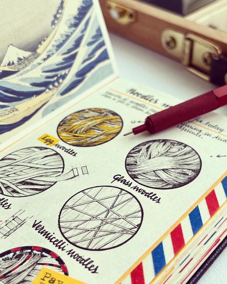
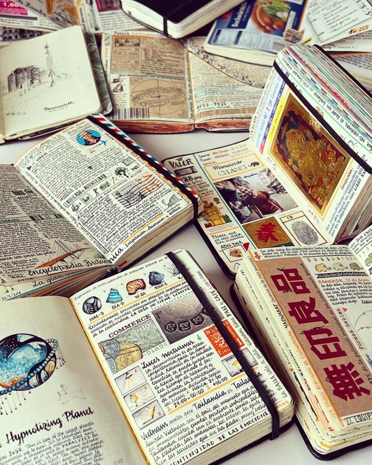
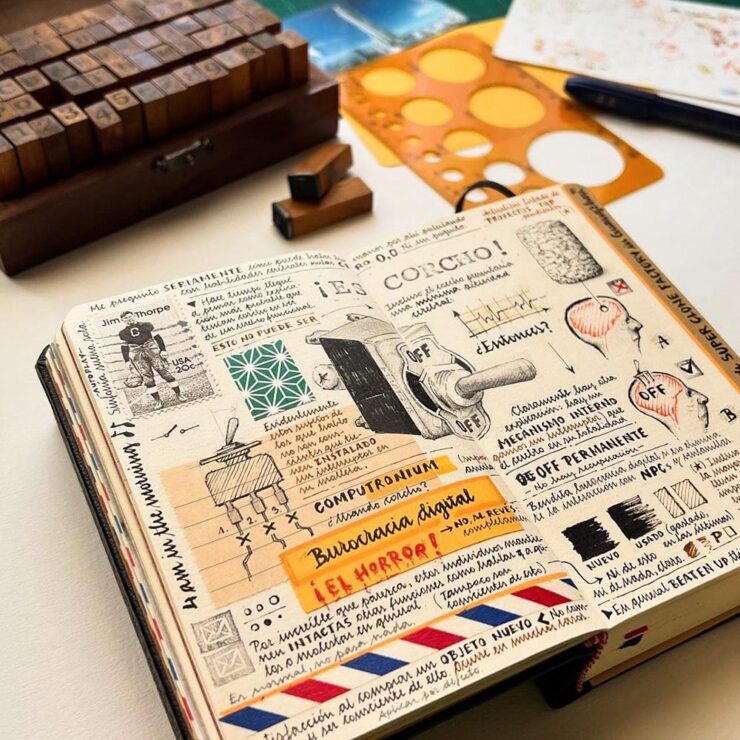
From postage stamps to jetliner specifications to items he packed for the journey, José Naranja’s sketchbooks capture minute details of numerous international trips. “I’m lost in the intricate details, as always,” he tells Colossal. Everything from currency to noodle varieties to film references make their way into small books brimming with travel ephemera and observations.
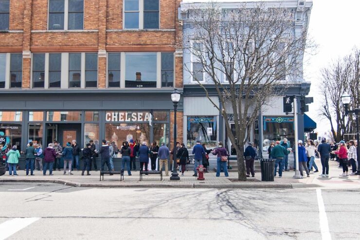
Special Bonus #1:The Guardian has a wonderful story of a bookstore in downtown Chelsea, Michigan, moving about a block to a new location. Patrons helped … by forming a human chain and passing the books, one by one, to the correct location on the new shelves.
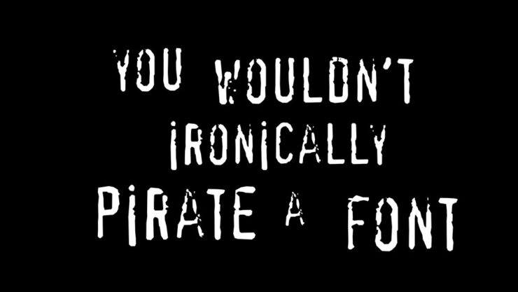
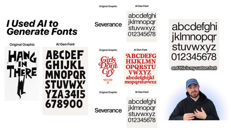
Special Bonus #2: Use generative AI to create steal fonts, too: BrandNew, which is paywalled (alas), highlights an Instagram post — which I’m not going to link to — about a dude feeding pictures of fonts into ChatGPT and claiming the generated results, a “new” typeface, as free to use.
My favorite of the comments summarizes perfectly: “That’s how humans work as well – we copy each other’s work like crazy; art history is rife with this in plain view. What AI misses, however, are the little innovations that happen over time that lead to new and incredible ideas.”
Special Bonus #3: On the subject of piracy, Adobe’s previously-mentioned Content Authenticity Initiative have born fruit — both in their major applications like Photoshop and a new, standalone app now in public beta. This PetaPixel piece has more.
The (New) Synology Tax
Starting with the 2025 series of plus-level (and above) devices, Synology will now restrict drives — spinning or solid-state — to their own, branded items, which offer the “highest levels of security and performance, while also offering more efficient support.” The pitch:
Without a Synology-branded or approved drive in a device that requires it, NAS devices could fail to create storage pools and lose volume-wide deduplication and lifespan analysis, Synology’s German press release stated.
— Kevin Purdy, Ars Technica
I’d seen this story go by on Ars, remembered that it had been predicted a while back when they restricted their enterprise-level items, and tried not to get upset about it. But it ground at me; at lunch with a friend this weekend, I went off on them a bit.
I decided to vent publicly upon hearing part of this week’s ATP — that’s Accidental Tech Podcast — wherein Casey Liss introduced me to the term “footgun.” “Synology have turned off so many of their most ardent evangelists. Just so they can sell some overpriced hard drives,” he says, highlighting some other examples of companies (Eero, Sonos) doing precisely that … and mentioning Apple doing to opposite.
But then I had a chance to hear the rest of that program. The other two guys on ATP, Marco Arment (Overcast, among others) and John Siracusa (long-time Mac guy, former Ars reviewer), had some excellent counter-arguments: 1) that we all pay the Apple Tax, sometimes begrudgingly but almost always willingly … becauseit’s worth it; 2) it’s a small price to pay to have the research of what to buy — what actually works best — done for you (plus the ease of support); and 3) that just because a company you’ve worked with for a long time changes their policies in a way that upsets or even angers, it’s not necessarily a betrayal: in other words, if you hadn’t been used to a specific approach with that company, the new setup would just be the way it works. We have to keep that in mind.
I want to be upset with Synology. I should probably get over it.
Photography, Showered
2025 Sony Awards, Again
Following up from last month, the 2025 Sony World Photography Awards winners have been announced. I erred last month in suggesting that the winners had been announced when it was, in fact, only the finalists; apologies.
Photograph by Zed Nelson.
British photographer Zed Nelson is “Photographer of the Year 2025” for his incredible series, The Anthropocene Illusion, an example of which is seen above. (See more.)
Photograph by Ulana Switucha.
Gotta give a shout out to some Canadian photographer Ulana Switucha, their overall winner in the Architecture & Design category, for The Public Toilet Project. “The distinctive buildings are as much works of art as they are a public convenience. These images are part of a larger body of work documenting the architectural aesthetics of these structures in their urban environment,” Switucha writes in a statement to Wallpaper*. (See more.)
Some of these contests get to be a bit much. Sony’s is consistently interesting, challenging, and has earned its status as one to pay attention to.
NASA Needs Our Support
Like seemingly everything in the past few months, NASA has taken some major hits — and been forced to do something it should never have to: launch a campaign to remind folks what it is that they actually do. The ISS is one, yes, but arguably the tip of a very large iceberg.
Talk about taking the long view.
Oh, and one other NASA thing: it’s the Hubble Space Telescope’s 35th (!) birthday.
“This skewed spiral galaxy, called Arp 184, is about 190 million light-years away from Earth; it earned its spot in the Peculiar Galaxies catalog thanks to its single broad, star-speckled spiral arm that appears to stretch toward us,” The Atlantic writes in this timely — and appreciated — edition of In Focus, their photo series.
While NASA can provide us with wonderful images of many worlds, for now at least, we have only one pale blue dot to share. Let’s all do our part to make sure that NASA’s role in actually keeping America great — that is, at the forefront of science and research — is recognized and supported.
Update, 7 May 2025:PetaPixel follows up on the Hubble image of Arp 184, seen above. Read more.
Space for More
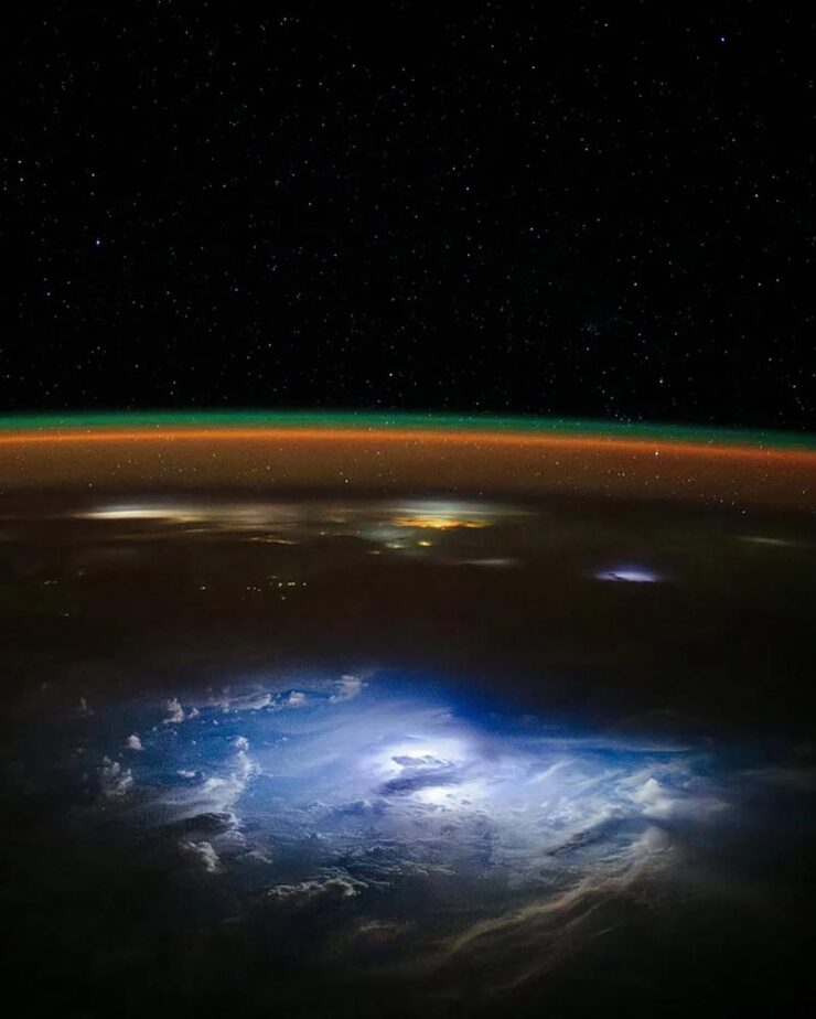
In other NASA news, Don Petit recently returned to Earth, having spent a minute doing science giving us gifts. Like this one:
Photograph by Don Petit.
His photographs, taken from the International Space Station, showcase both his artistic talent and his desire to share with the wider world the beauty and fragility of this pale blue dot. (As if that isn’t enough, he touched down on his 70th birthday — fantastic.)
Hungry?
While not one of the world’s leading photography contests, the shortlist for the World Food Photography Awards did its job: it celebrates some incredibly artistic work:
“Nature’s Hand.” Photograph by Wim Demessemaekers.
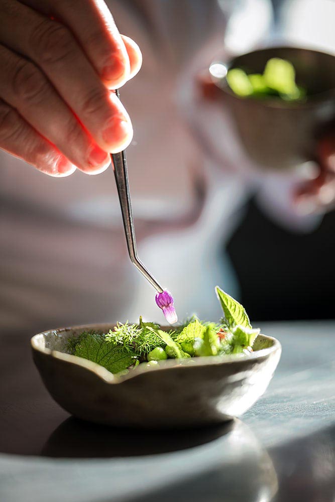
Okay, yes, it’s veggies in a bowl. But restaurant-quality or even Michelin-quality food presentation is its own thing — and it’s a thriving photographic specialty:
“‘At Alchémille in Kaysersberg, Chef Jérôme Jaegle transforms ingredients into artistry. Bathed in natural sunlight, this moment captures the essence of his plant-forward philosophy — fresh flavors, wild botanicals, and pure craftsmanship. The light reveals every detail, turning this dish into a celebration of seasonality, taste and dedication,” the full caption for the above photograph reads.
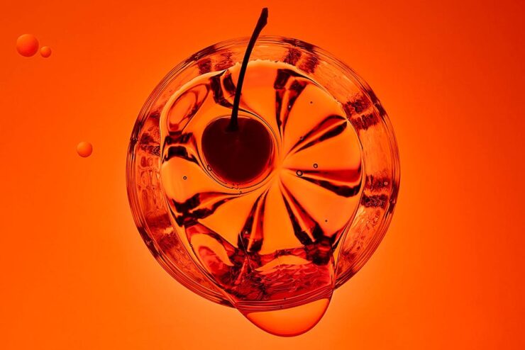
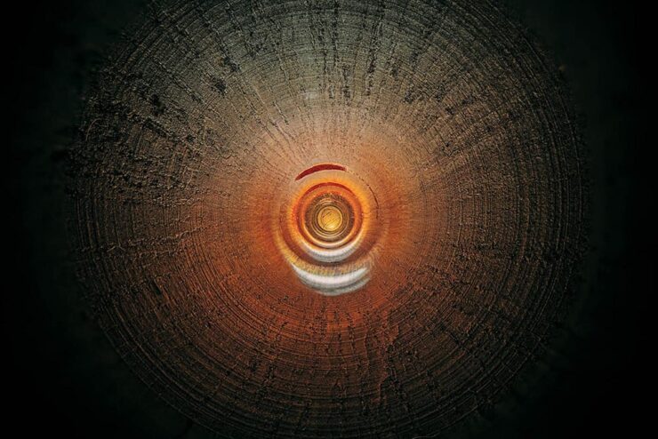
Charles Brooks (previously) is back into it — literally:
“Larilee Elkhart Oboe.” Photograph by Charles Brooks.
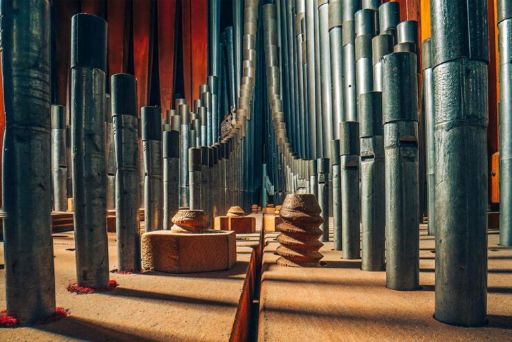
“This formidable concept of capturing the unseen lies at the core of Charles Brooks’ work, as he photographs the small but vast interiors of musical — and most recently scientific — instruments,” This is Colossal writes.
“St. Marks Pipe Organ, Part 2.” Photograph by Charles Brooks.
The behind-the-scenes photograph posted at the link tells much, but it’s the talent that the photographer brings to the table — screen, wall, wherever — that works so very well. Once again, sir, kudos.
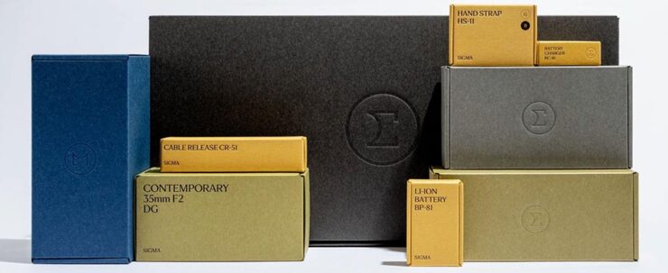
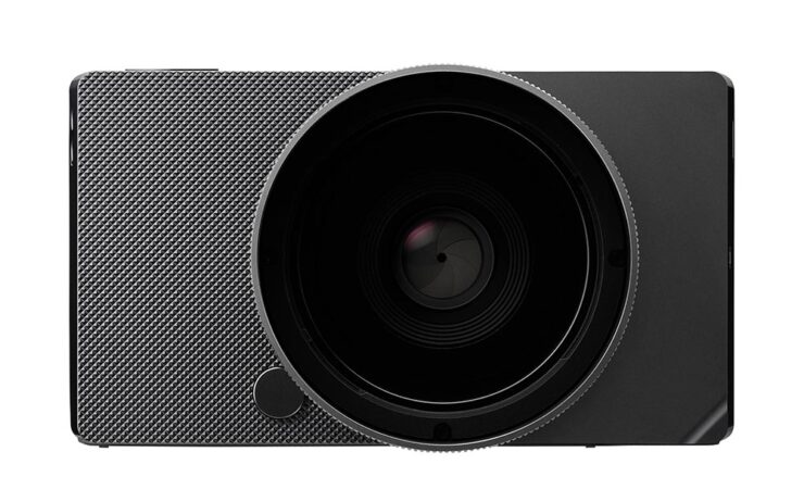
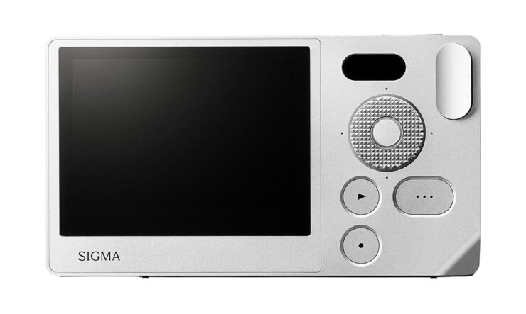
“Sigma’s cameras, lenses, and accessories are sure to arrive in style and come in simple, understated boxes with embossed type. Accessories, like straps, chargers, cables, and batteries, arrive in a lovely goldenrod yellow, while lenses will ship in black, beige, blue, or olive green containers. As for the Sigma BF camera, it is nestled in a classic medium gray,” PetaPixel‘s Jeremy Gray writes.
A bunch of tasty ingredients in this month’s post — from friendly identities and open-source typefaces to feel-good photography. Once past the minor rant we’re that covers the other meaning of stew, that is. Read on.
It’s Nice That on Copyright and Reuse
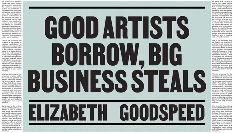
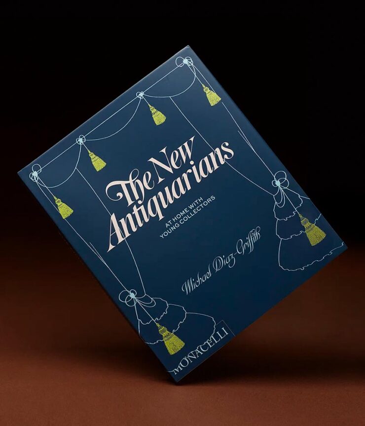
Elizabeth Goodspeed, editor-at-large for It’s Nice That, has a great column up regarding copyright and the current — and trending — business climate, especially with regard to copyright: it’s become the norm, she argues, for companies to mine open-source and expired-copyright imagery instead of hiring an artist, a trend exacerbated by the rise of AI. “Instead of safeguarding creators, copyright now favors whoever has the resources to outlast their opponent in a legal battle,” she writes. “Since public domain material already looks polished, using it also eliminates the time, effort, and expense of creating something new from scratch (not to mention the time spent building its associative meaning from the ground up). But why would anyone ever commission an illustrator when they can just pull something free from an archive?”
She’s done it herself:
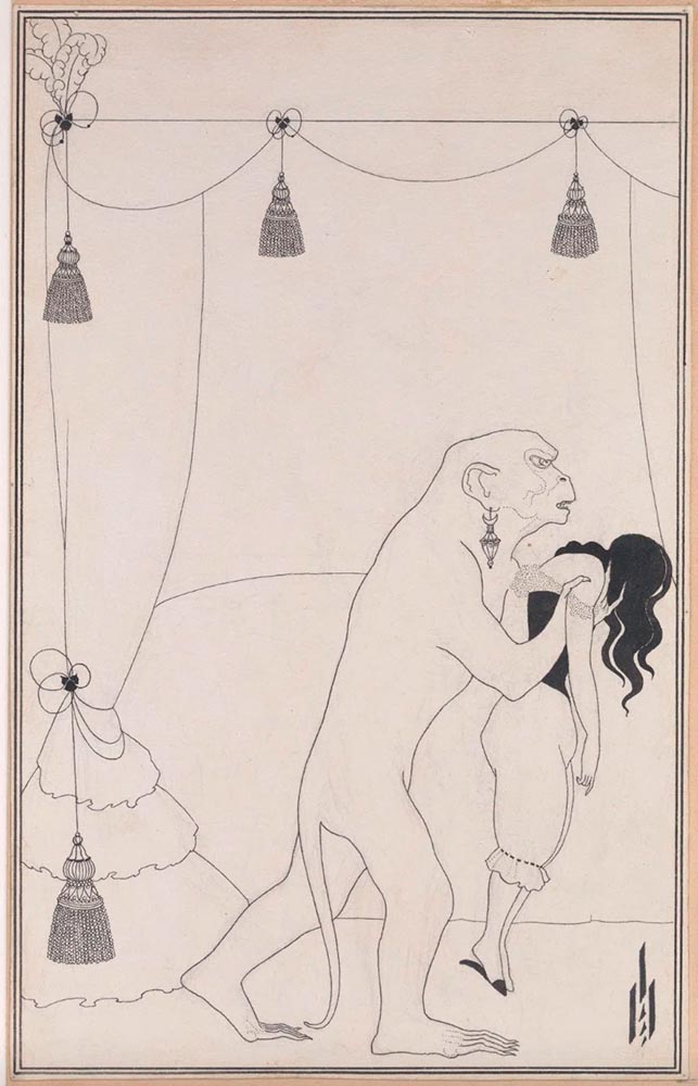
The Murders in the Rue Morgue, 1895 (public domain). Aubrey Beardsley.New Antiquarians, 2023. Book design by Elizabeth Goodspeed.
She also points to a new UK proposal for a data mining exemption to be given to AI companies. “[I]t would lead to a “wholesale” transfer of wealth from the creative industries to the tech sector,” Sir Paul McCartney argues. (Source.) But isn’t that true of the larger picture these days, no matter the country?
Not all borrowing is the same. Copying is often more about power than propriety. When working with archival material myself, I like to think in terms of the stand-up comedy rule: punching up vs. punching down. Picking up visual motifs from a billion-dollar corporation that’s built its empire on copyright hoarding? That’s punching up. Repackaging the work of a living artist from a marginalised background without credit or compensation? Likewise, using found material for an indie zine is a far cry from pulling from the same source for a corporate client that could easily afford to commission something new.
— Elizabeth Goodspeed, It’s Nice That Editor-at-large
It is most certainly a trend in book design — but the bigger question here is one she states as fact: “[r]ather than referencing the past, designers are stripping it for parts.” It’s worth stepping back, as designers, and consider how we source — and use — imagery.
The entire article, only part of which is discussed above, is worth a read. And more than a moment’s thought.
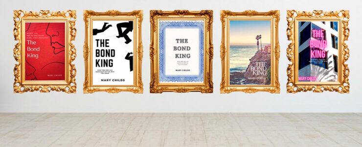
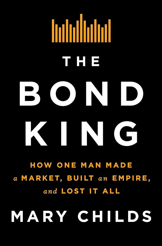
LitHub’s great cover graphic — pun likely intended — for Mary’s attempts.
“This very slight, low-stakes request for ‘inspiration’ became an all-consuming assignment. My brain started spitting out cover ideas. And then more cover ideas. I was sure I would break through and create the Great American Finance-book-that-reads-like-a-Novel Cover,” she writes — and, better still, backs up with illustrations.
Cover design by the Flatiron Books in-house art dept.
In the end, she left it to the professionals — but the trip is absolutely worth the read. (Be sure to follow the Na Kim link, too.) Via Kottke.
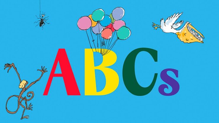
“Pluckish and playful” is more than a description of the wonderfully-named Fantastic Mr. Font, it’s the description of the new identity for the Roald Dahl Story Company. (Which is, unfortunately, a division of Netflix — but we’ll leave that for another day.)
Just right. So, too, it the font’s interaction with various illustration elements:
Roald Dahl and Sir Quentin Blake — plus the new font.
The typeface was “developed in collaboration with type foundry Pangram Pangram, the font is a customisation of its existing font PP Acma, turning its already unconventional characteristics into something ‘more mischievous,’” Ellis Tree — another great name — writes at It’s Nice That.
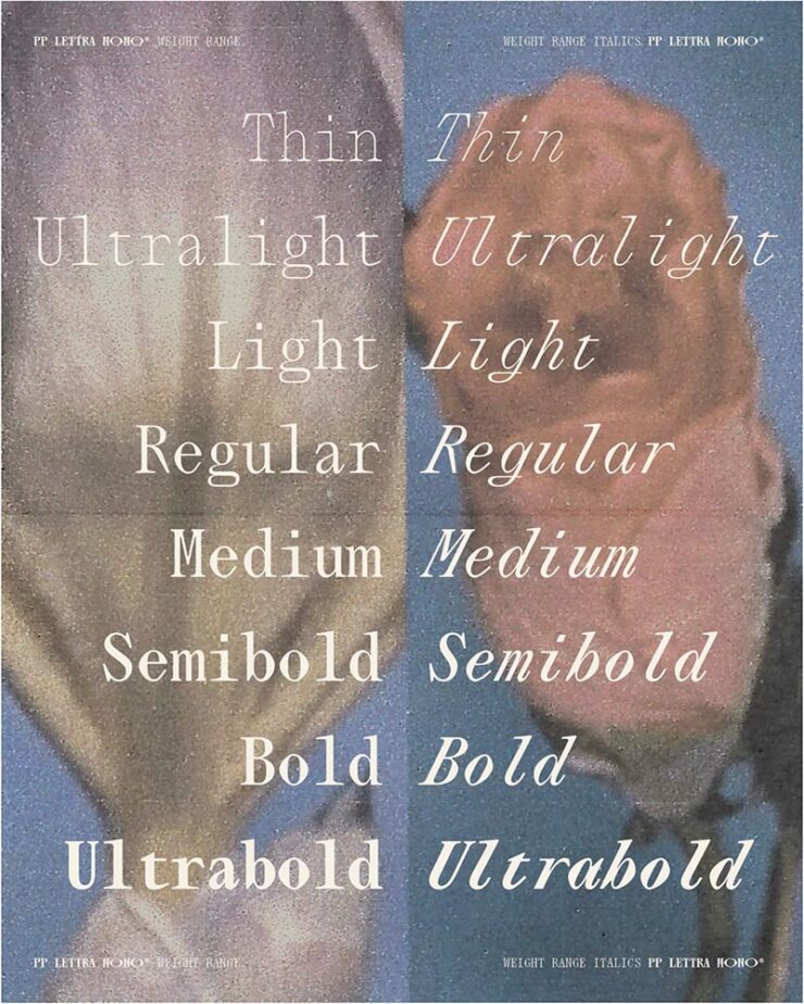
Speaking of Pangram Pangram, let’s start there: their Lettra Mono was the standout of Creative Boom’s roundup of new fonts for February. Monospaced serif fonts are unusual, but good ones….
The italics, especially.
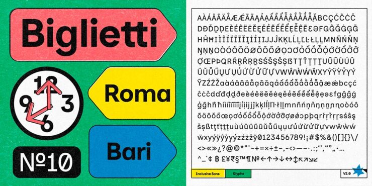
Inclusive Sans
CB also chose the incredible update to Inclusive Sans, which was also the subject of an article at It’s Nice That — and, better still, free, open-sourced, and now available in five-weight goodness at Google Fonts.
Love the retro style of the supporting images.
“Inclusive Sans is a new typeface from Olivia King that puts accessibility at the forefront,” It’s Nice That writes. “It’s arisen from the type designer’s research into typographic accessibility and readability – from highly regarded traditional guides and papers to more modern approaches to letterform legibility.”
Available in a variable weight, too.
Gorton
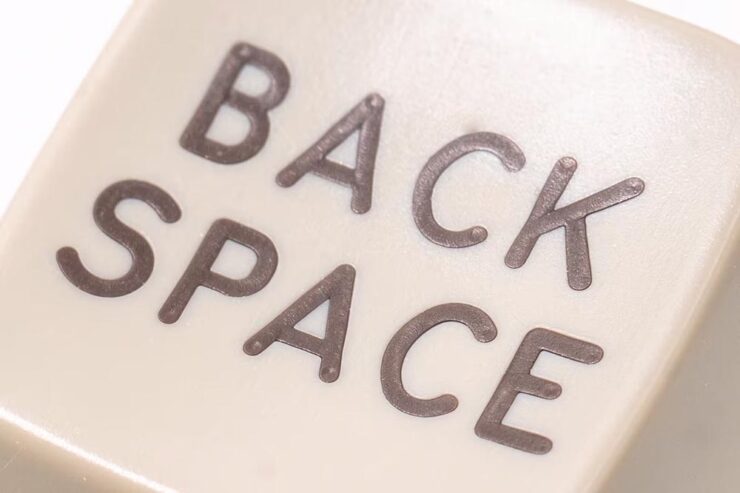
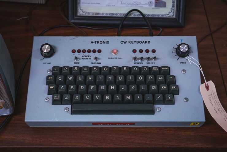
Marcin Wichary — he of Shift Happens fame — pens (heh) an comprehensive and incredibly well-illustrated article on Gorton, a typeface you’re undoubtedly seen but don’t know.
Anyone who knows Shift Happens will recognize the illustrative style. Photograph by Marcin Wichary.
“One day,” he writes, “I saw what felt like Gorton on a ferry traversing the waters Bay Area. A few weeks later, I spotted it on a sign in a national park. Then on an intercom. On a street lighting access cover. In an elevator. At my dentist’s office. In an alley.”
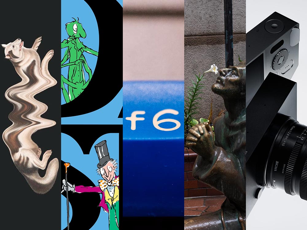
See also the f6 in the title image, above. Photograph by Marcin Wichary.
It’s a long post, so save it for when you’ve a minute to enjoy — but 110% worth it.
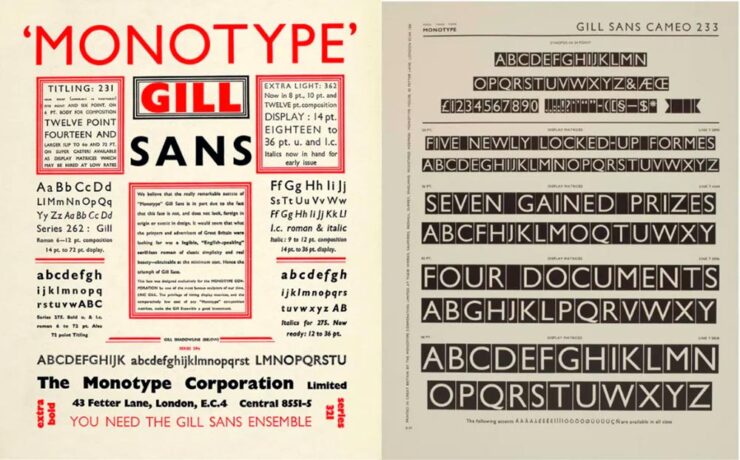
Special Bonus #3:Creative Bloq has a list of the best typography of the 1920s — “from Futura to Industria Gravur” — as chosen by designers. My fave? Gill Sans, of course.
Used in Saab’s advertising, amongst about a billion other examples.
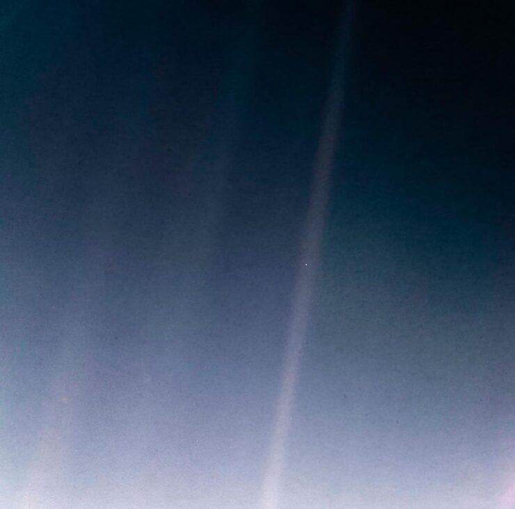
Meanwhile, on the subject of space — and PetaPixel — a reminder that one of the most infamous photographs in history turned 35 on Valentine’s Day:
The Pale Blue Dot. (2020 remastered edition.)
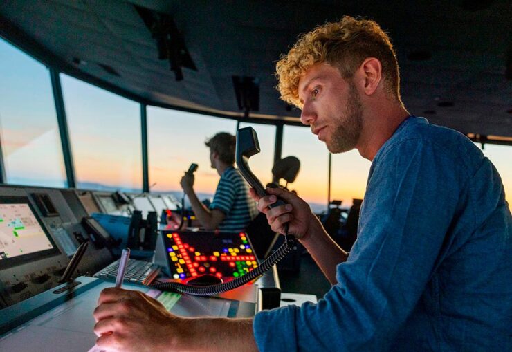
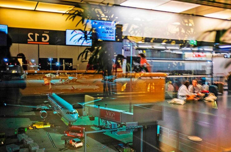
Aaaand one more from PetaPixel: a book. Eight photographers documented 24 hours at the Vienna Airport, offering up more than a few behind-the-scenes shots — in celebration of its 70th anniversary:
Photograph by Jérôme Gence.
“The project was overseen by Lois Lammerhuber,” PetaPixel writes, “a publisher and photographer, who has since turned the collection of images into a book titled The Dream of Flying.”
Photograph by Ulla Lohmann.
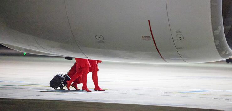
The project was “about showing the people who use the airport as well as highlighting the staff who ensure all the airplanes depart and land safely.” My favorite shot:
Photograph by Ana María Arévalo Gosen.
I’m an airport and large/commercial plane junkie — and old enough to remember when all-access at the local airport wasn’t a big deal — so it was great to see these.
Lastly, from This is Colossal, another round of the “coincidental” style of Eric Kogan:
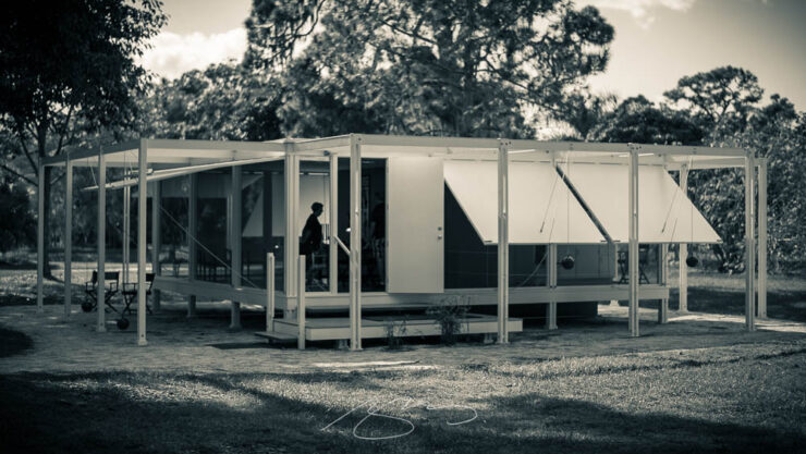
Special Bonus #5: Art News notes that Paul Rudoph’s Walker Guest House is for sale for the bargain price of $2 million. It’s a kit home that’s been assembled in various places, including the grounds of the Ringling Museum in Sarasota, Florida. (It’s currently in storage in Rhinebeck, New York. Shipping is not included.)
So why is in the photography section, you ask?
Photograph by Giles Hoover.
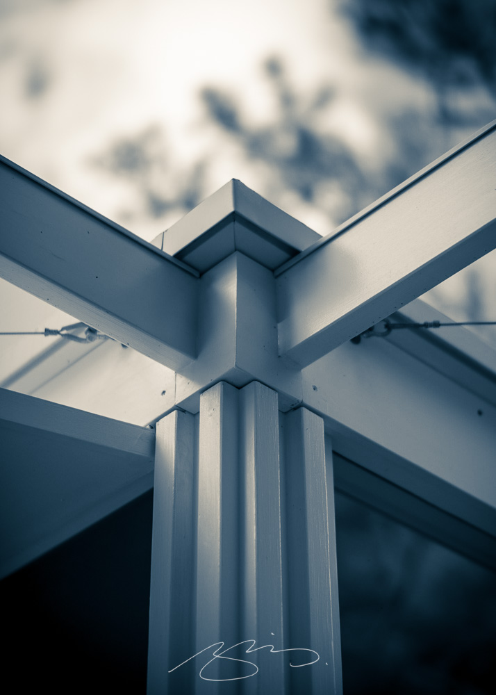
That’s why. Check out more of my photography from Ringling and Sarasota. (The Walker images are near the top.)
Photograph by Giles Hoover.
Sigma: a new BFF?
No, that’s just BF — it stands for “beautiful foolishness,” after a line from a poem in Okura Tenshin’s The Book of Tea — but, as usual for them, something different. Something good.
Like the FP before it, there’s nothing you don’t need, bordering perhaps on a minimalism that’s … stark? No viewfinder, no stabilization, no mechanical shutter, built-in memory (so no card slot), haptic interface. But style for days, a great shape and texture, and absolutely the right size.
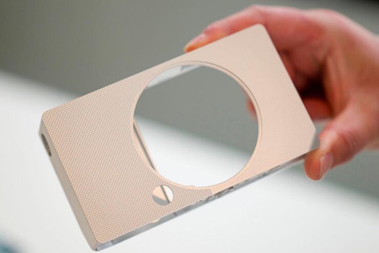
It’s made at the rapid clip of nine per day, because it’s made from a single billet of aluminum — shades of the Leica T/TL/TL2 (something I maintain was before its time, and discontinued short-sightedly) — except full-frame. And, of course, supported by Sigma’s extensive catalog of L-mount lenses. (Another commonality with the TL.)
At $2000, it’s the right price, too. Read more here or here or here.
Slightly more formal, slightly on-trend typography, which is fine — but the logo is clever in being both a letter and a lens. More of that just right to close out the day.
Special Bonus #6: Sigma’s CEO Kazuto Yamaki is charismatic, interesting, and dedicated, as seen in the videos PetaPixel has introducing their new HQ building in 2022. Love the library-wrapped staircase.
Update, 4 March 2025: PetaPixel has posted a YouTube podcast/interview with Kazuto Yamaki, in which he talks about the BF and possibly a new, “serious” camera to compliment their 300-600mm lens. (This is probably a better intro to Sigma’s CEO than the above.)
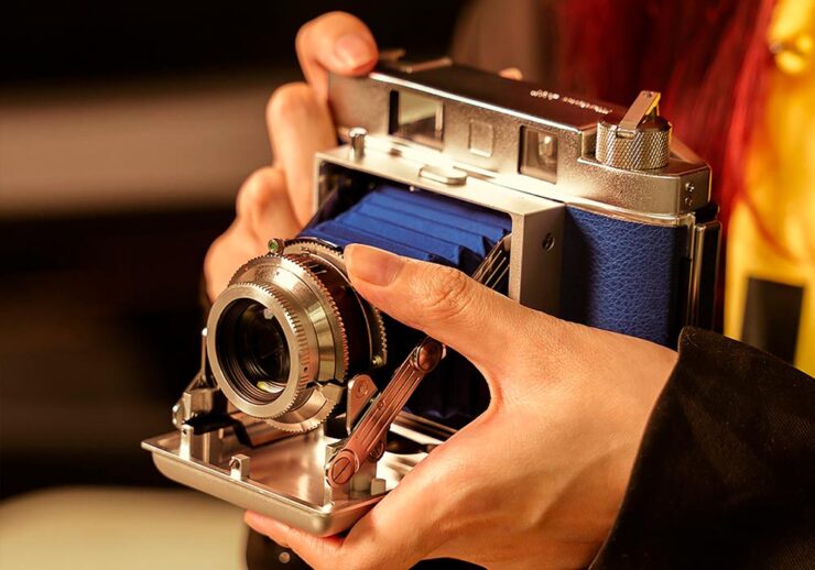
Special Bonus #7: TTArtisan, the Chinese manufacturer making interesting L-mount lenses — I have two, both solidly in the cheap-and-cheerful category — is about to introduce their first camera … and “interesting” is, in fact, the best way to describe it:
Purely mechanical, no batteries required, instant film camera that’s decidedly retro.
2024 was interesting in the way of the apocryphal Chinese curse: “May you live in interesting times.” Taking the time out to peruse the best of the new releases — for both book cover design and books in general — is tremendously enjoyable. Needed, even, now more than ever.
When it came time to do the years’ tally, summary, and post, the number of candidates in the favorites folder was well over three hundred: a third more than last year, more than double 2022’s.
It’s been argued that the increasing number of published titles is a reflection of publishers’ woes, including fighting back against publishing slop. (See my Beautifully Briefed series for more.) However, the increasing number of published titles means more work for the book designers among us — some of whom show, or continue to show, exceptional skill.
Consequently, this year’s list of favorite book design items has grown: up to one hundred and sixteen. Wow.
Fix a beverage and get comfy.
Please remember that the usual disclaimer applies: these are my favorites — others might say “best,” but I’ve been in this business long enough to know that there’s always another title you haven’t seen or read about. I don’t want to disrespect any of the talented book designers not on this list. I’ve tried to include design credit where I could — special thanks to the folks who answered emails with that information — and wish to stress that any mistakes in the list below are mine.
Note: If you’re on Foreword’s main page, please click on the post title, above, to view this list. You’ll get larger covers for your viewing pleasure.
• • •
My Four Faves for ’24
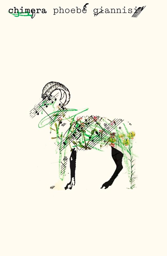
Cover design by Pablo Delcan.
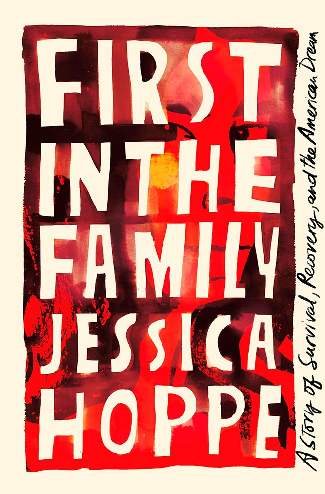
It’s no surprise that we’re leading with an example of minimalism-as-superlative. This UK title is described thusly: “The centre of Chimera engages with a three-year field research project on the goat-herding practices of the Vlachs, a nomadic people of Northern Greece and the Southern Balkans, who speak their own language. In these poems, day-to-day activities such as shearing and shepherding mix with snippets of conversations, oral tradition and song―locating a larger story in this ancient marriage between humans and animals.”
Aside from being visually arresting, I can’t think of a better visual summary — yet still in keeping with the style of Cicada, the previous title. Awesome.
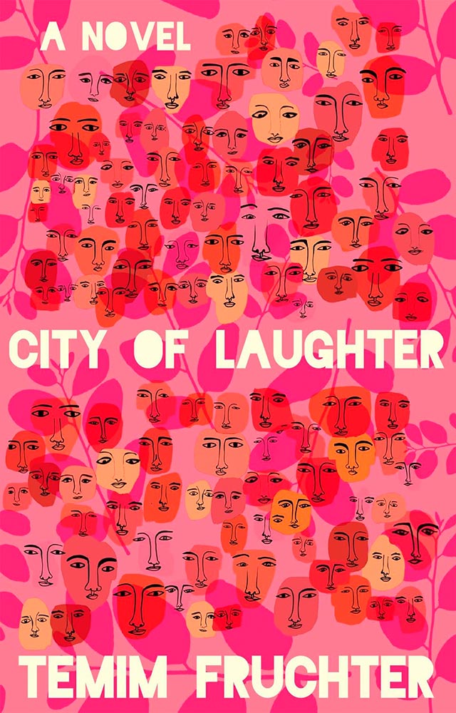
Cover design by Kelly Winton.
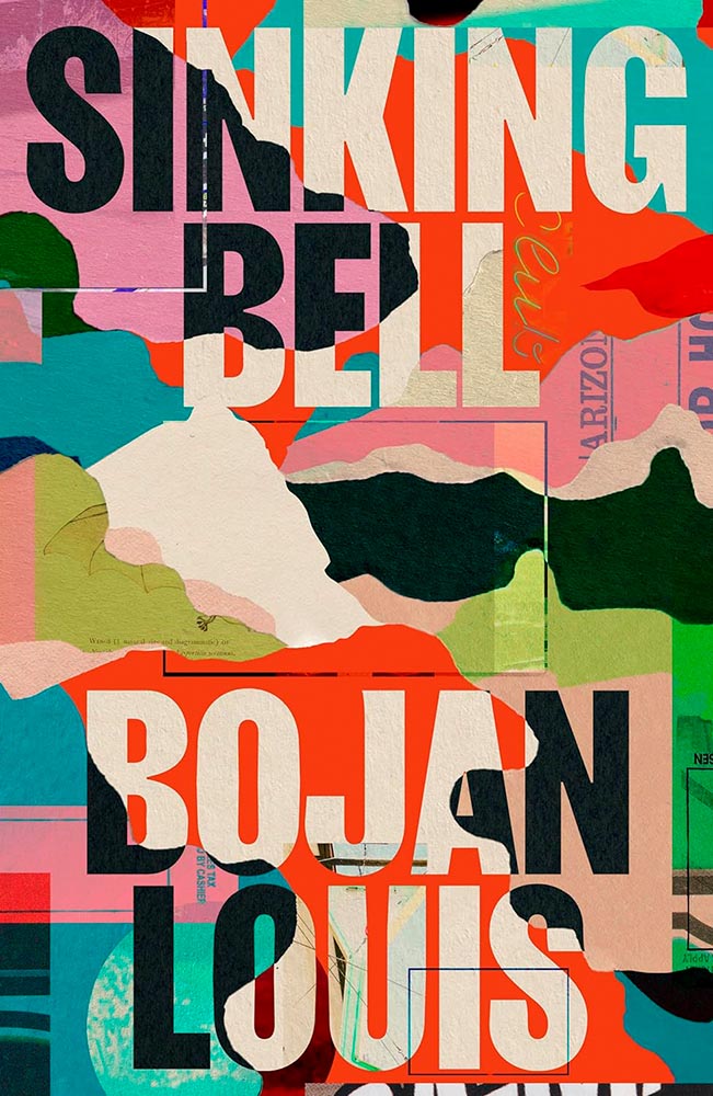
“[F]our generations of Eastern European Jewish women bound by blood, half-hidden secrets, and the fantastical visitation of a shapeshifting stranger over the course of 100 years,” all on a book cover, in a style that’s fresh and colorful with great lettering.
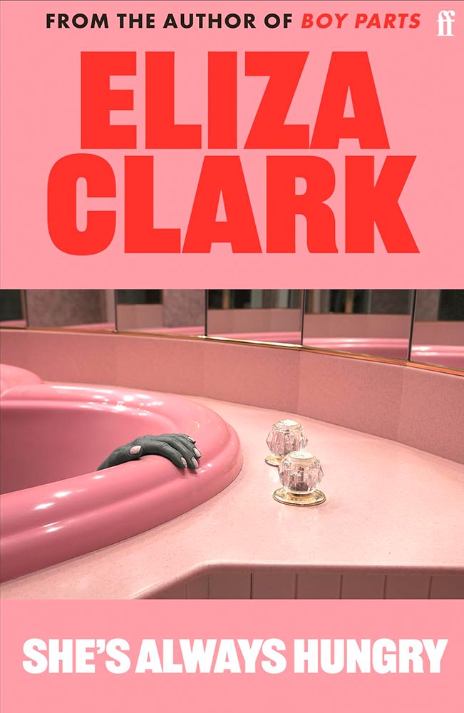
Cover design by Faber. Photograph by Juno Calypso.
Occasionally, a photograph just makes a cover — and this one vaults it to the top. (Sometimes, great book design is as “simple” as selecting great elements.) Part of a series called “the Honeymoon,” it’s absolutely the style of photographer Juno Calypso.
Cover design by Alison Forner. Typography by Andrew Footit.
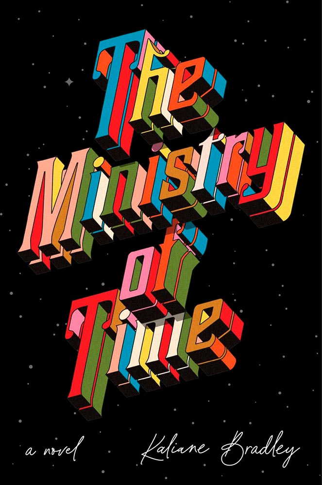
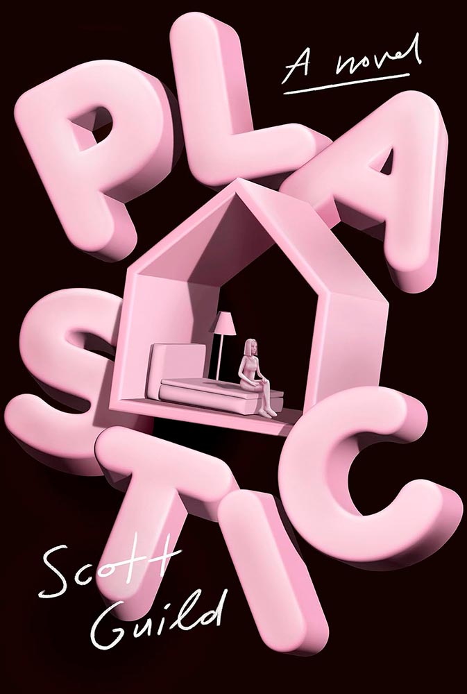
Never mind the “time travel romance, spy thriller, workplace comedy, and ingenious exploration of the nature of power and the potential for love to change it all” — it’s the oh-so-dimensional title that transcends. (All that other stuff is just a bonus.)
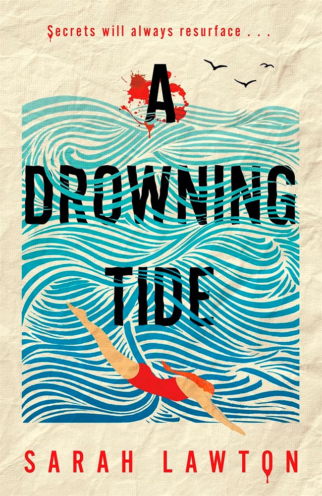
The paper is perfect, the title interleaved with the water superlative, and the blood, which can absolutely be done into the realm of cliché, drips rather than gushes.
Cover design by Jack Smyth.
The first of five appearances for Jack Smyth — tops this year — this cover speaks to solitude (and cats!) with fantastic expression.
This photographic subject is so strong, yet clearly speaks to the cloudy tenderness within. (Also, title placement.)
Cover design by Helen Yentus.
Another examples of typography-on-the-edge — but, really, the hero on this cover.
Cover design by Johnathan Pelham.
Fantastic title placement (with the perfect hint of wear), complimented by the unusual treatment of the author’s name and pull quote, this cover only hints at the story within yet holds it up.
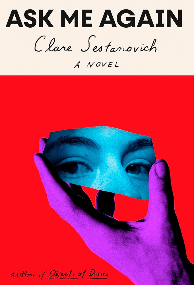
Cover design by Janet Hansen.
I’ll admit: it’s not immediately clear how this title and cover work together. Yet they do, and it’s not just because of the (male) hand and (female) face — or striking colors — it’s more the representation of reflection, something required in maturity.
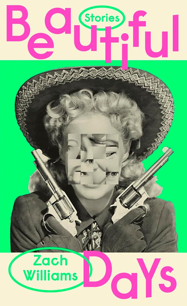
Cover design by Chris Bentham.
The rearrange-the-pieces treatment for faces has become a thing, but few do it so well. Special bonus for the selection of photograph for this UK version of the title — and great color choices.
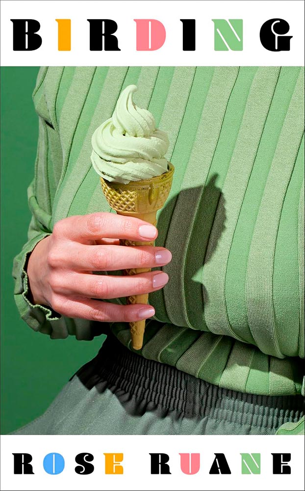
Cover design by Charlotte Stroomer. Photograph by Kelsey Mcclellan.
Another example of the photograph making the cover — but with simply awesome typography, too. (Huge fan of the overall color scheme, too.)
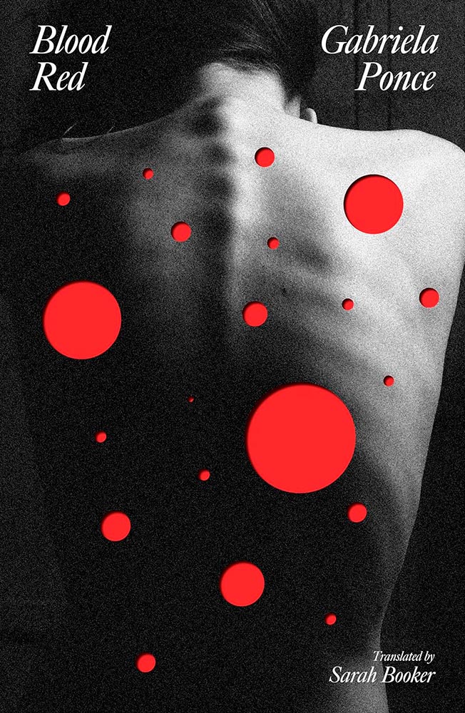
Cover design by Luke Bird.
This UK title shoots to kill, perfect for a story of shooting one’s self in the back. (The Irony Dept. reports that the publisher is Dead Ink, by the way.)
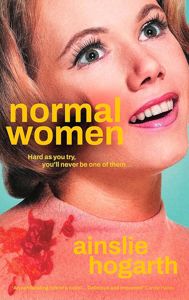
Cover design by Emma Pidsley.
Sticks it to ’em in the most compelling way. (Also: “There are two things that I simply cannot tolerate: feminists and margarine.”)
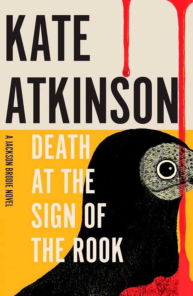
Cover design by Anna Morrison.
Another UK title, this one counters the too-much-blood thing with fabulous typography and an over-the-top — well, off-the-side, really — crop. (I especially love that the top of the rook’s head just peeks above the yellow.)
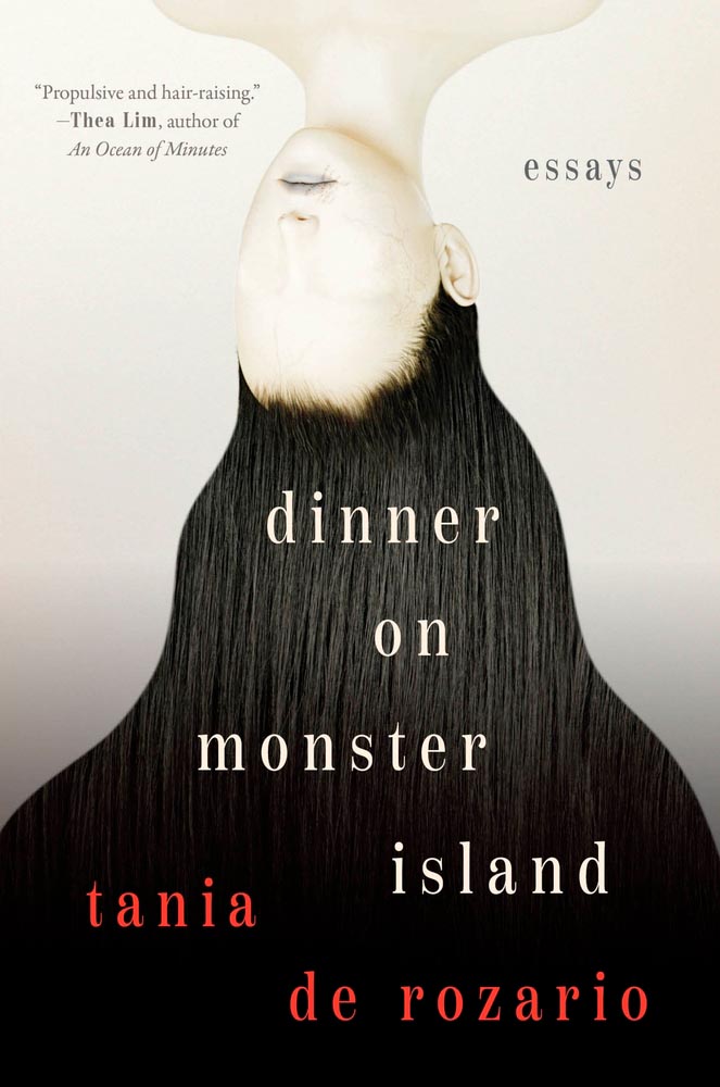
Cover design by Olivia Mcgiff.
“Hair-raising,” indeed. (Check out the veins.) The opposite of queer, brown, and fat — and yet, somehow, just right.
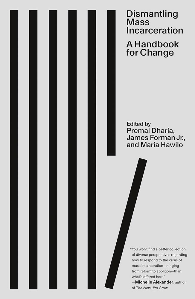
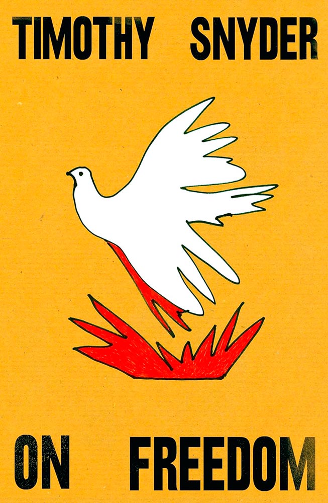
Cover design by Oliver Munday.
Few others can express so much with just a line. It sounds like a joke, something that treats the subject with something less than it deserves, but quite literally the lines on this gray background make all the difference.
Cover design by Suzanne Dean. Illusustion by Neue Gestaltung.
Greeks myths, contemporary dystopian narratives — never mind that, it’s the illustration on this cover that gets the “terrifyingly talented” label.
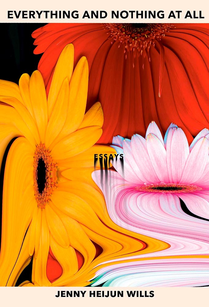
Cover design by Terri Nimmo.
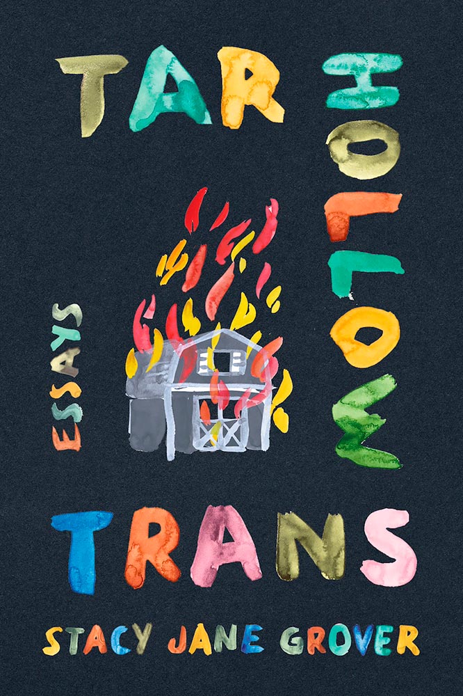
Subversive, surreal, yet “refuses to pander or be pinned down and possessed.” (Also, “Essays.”)
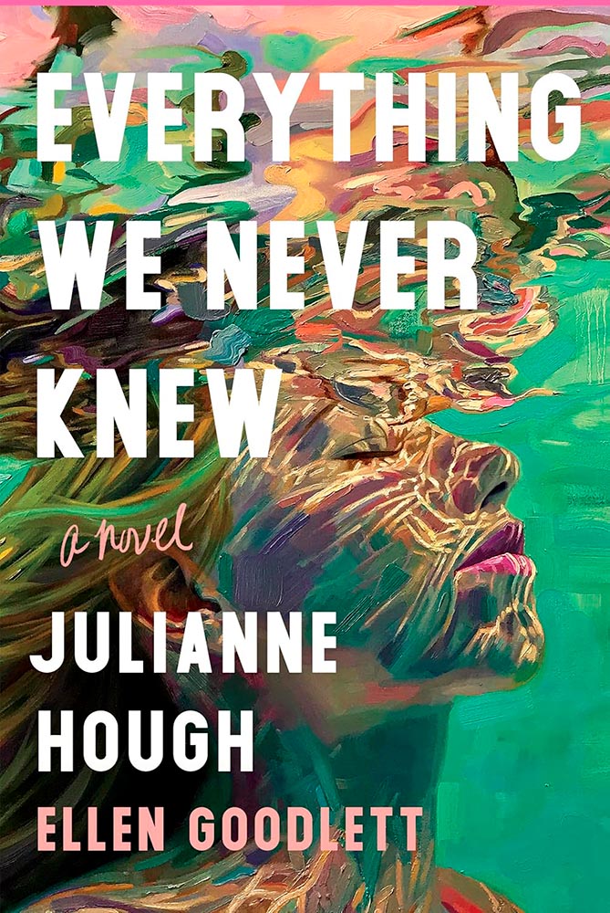
Cover design by Sara Wood. Art by Isabel Emrich.
Real estate agent Lexi senses a drowning, leading to … well, a novel — but it’s the artwork, by painter Isabel Emrich, that carries this cover to the next level.
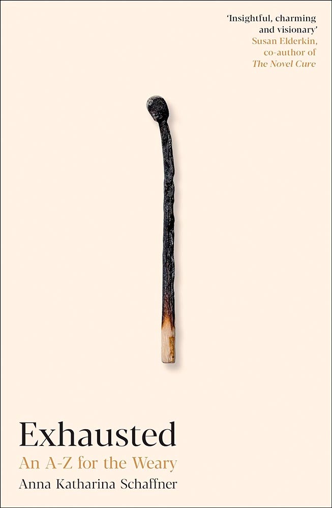
Cover design by Steve Coventry-Panton.
Minimalism exemplified. While some could argue cliché, I’d argue that it’s the perfect choice: for the weary, for the curious, for this cover.
Cover design by Isabel Urbina-Peña.
The eyes just grab you — “crackle like a bonfire,” to quote one of the reviews. (They were speaking of the text, not the cover, but better words….)
Cover design by Michael Salu.
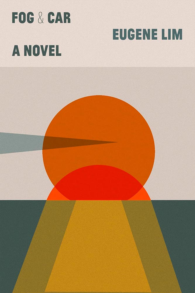
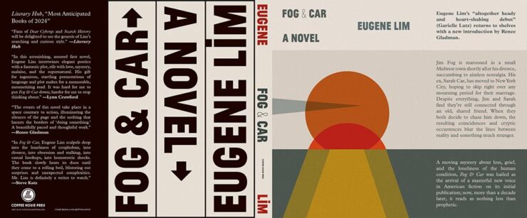
Simple and geometric, yet story-telling in the finest.
Also, the whole jacket wins. (The bar code space is below “a novel,” by the way.)
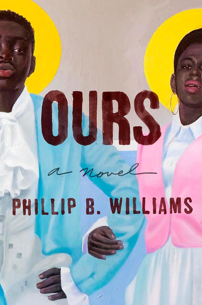
Cover design by Ssarahmay Wilkinson. Art by Day Brierre.
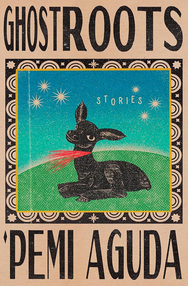
Containing short stories set in Lagos, Nigeria, this cover speaks to African roots yet does so in a way that causes both admiration and upset in equal measure. “Brilliant” is overused, but….
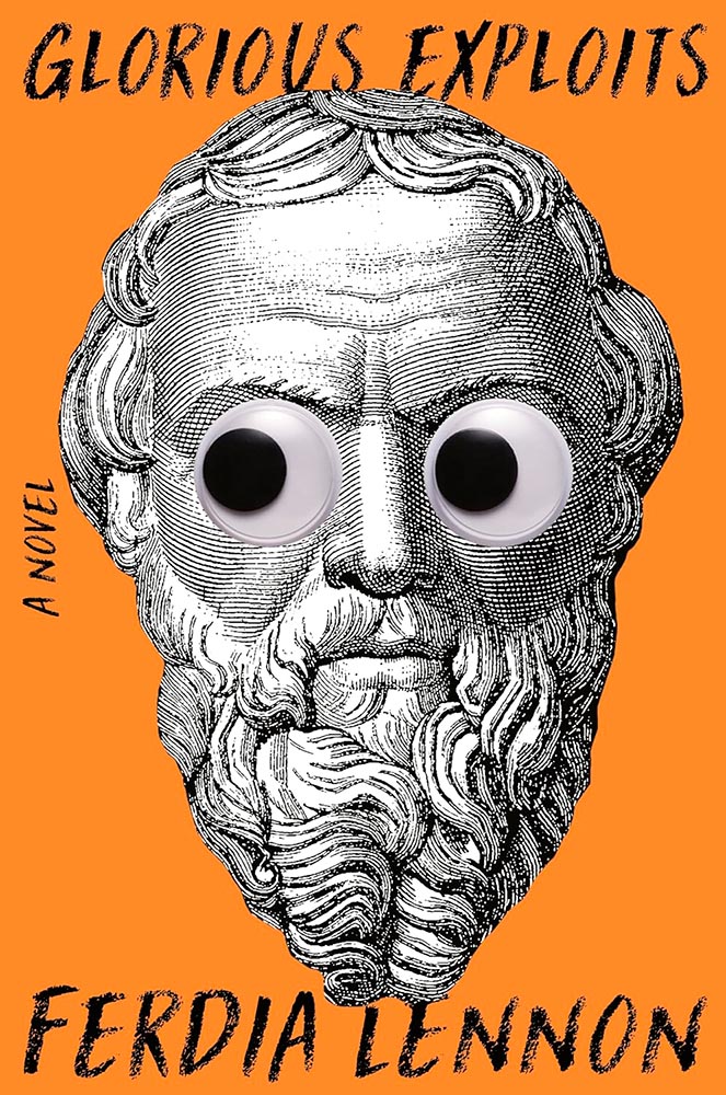
Cover design by Gregg Kulick.
“Glorious Exploits,” indeed.
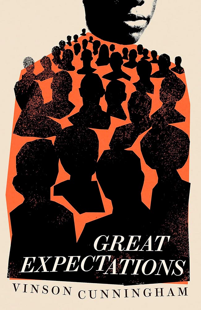
Cover design by Jack Smyth.
It’s, oddly, the UK version of this cover that does it for me: the US version relies on art, while Smyth’s version relies on talent. (Perhaps a metaphor for the bestseller within…?)
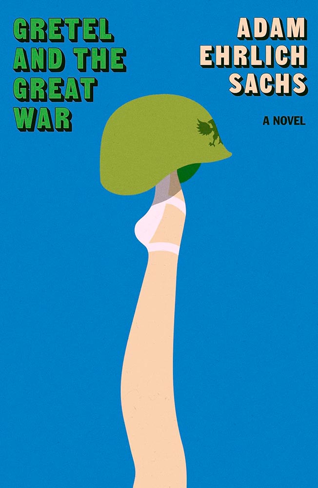
Cover design by Alex Merto.
Shades of M*A*S*H, certainly, yet brilliant on its own: lunatics is war.
Cover design by Anna Morrison.
“Playful demotic,” writ large.
Cover design by Olivia McGiff.
“A novel” is King. (Sorry.) Most haunting in exactly the right way.
Cover design by Anna Morrison.
The paper, the lines, all perfect — but it’s the crop that, well, sends it over the top.
Cover design by Robin Bilardello.
Labeled “perfect.”
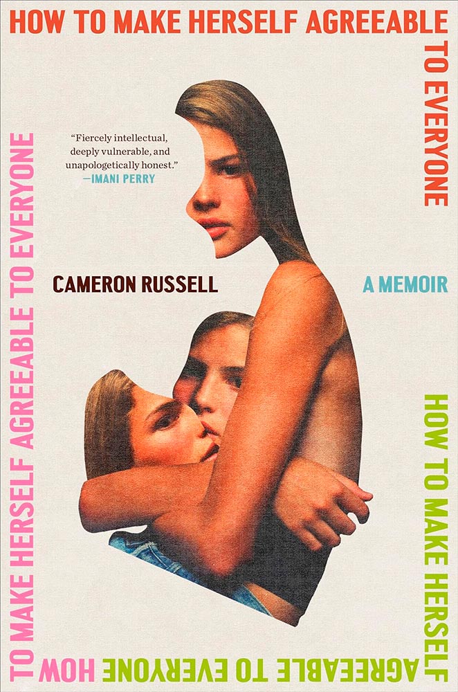
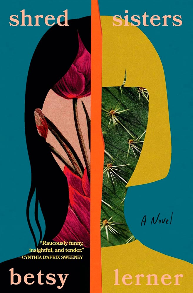
Cover design by Arsh Raziuddin.
This girl represents the appropriate reaction to an image-based culture, a cut-apart look in the mirror that shouldn’t necessarily be limited to the fashion industry. (That the collage is vaguely heart-shaped probably ins’t a coincidence.) Bonus points for the title repeating around the edge.
Cover design by Oliver Munday.
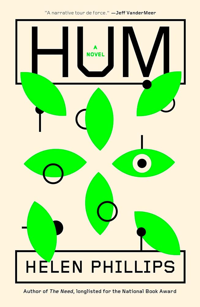
“In a near-future world addled by climate change and inhabited by intelligent robots called ‘hums,’ May loses her job to artificial intelligence,” the description reads. Yes.
Cover design by Edward Bettison.
The illustration and type work so very well together. (Also, color.)
Cover design by Erik Carter.
Movie poster! (Also, color.)
Cover design by Emily Mahon.
With a title like that, it’s tempting to let it carry the day. Uh … no.
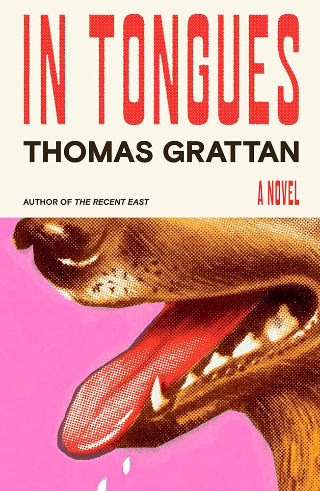
Cover design by Alex Merto.
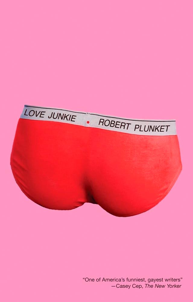
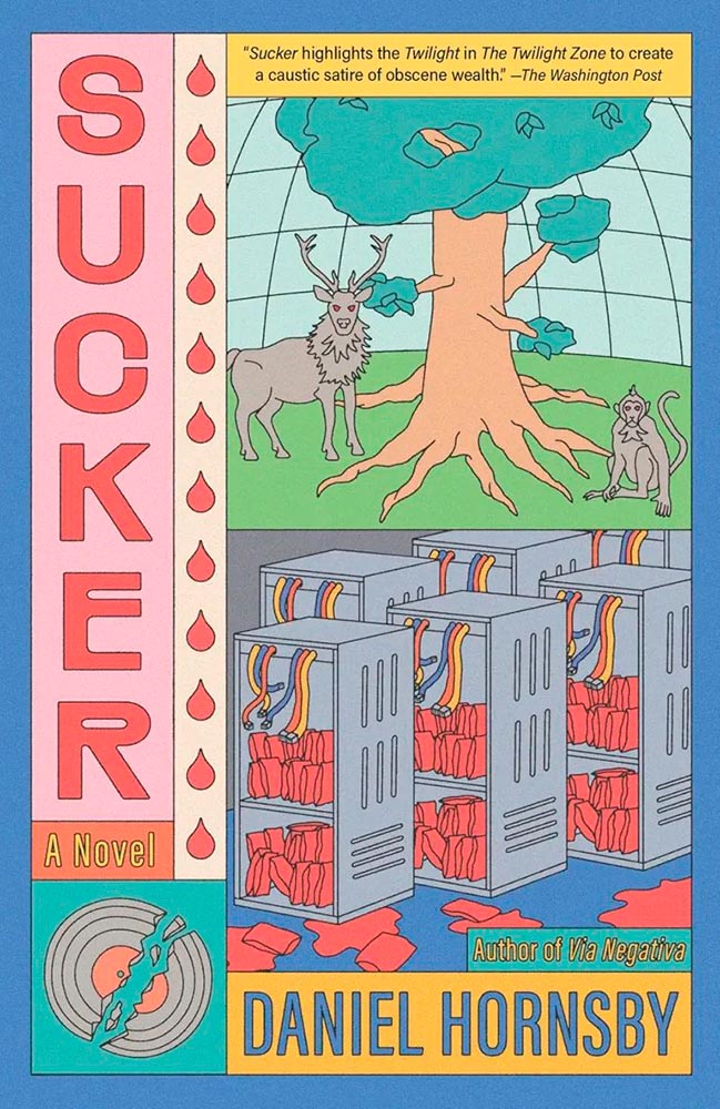
The pink isn’t in halftone. (Also, the drops of drool.)
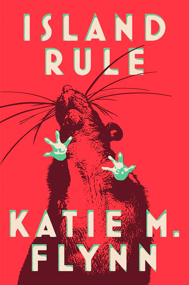
Cover design by Adriana Tonell.
A red, red rat is awesome. But it’s the way the green works — in the feet, yes, but especially the type — defines “win.”
Cover design by Arsh Raziuddin.
Not an easy title, handled with absolute skill.
Cover design by Jack Smyth.
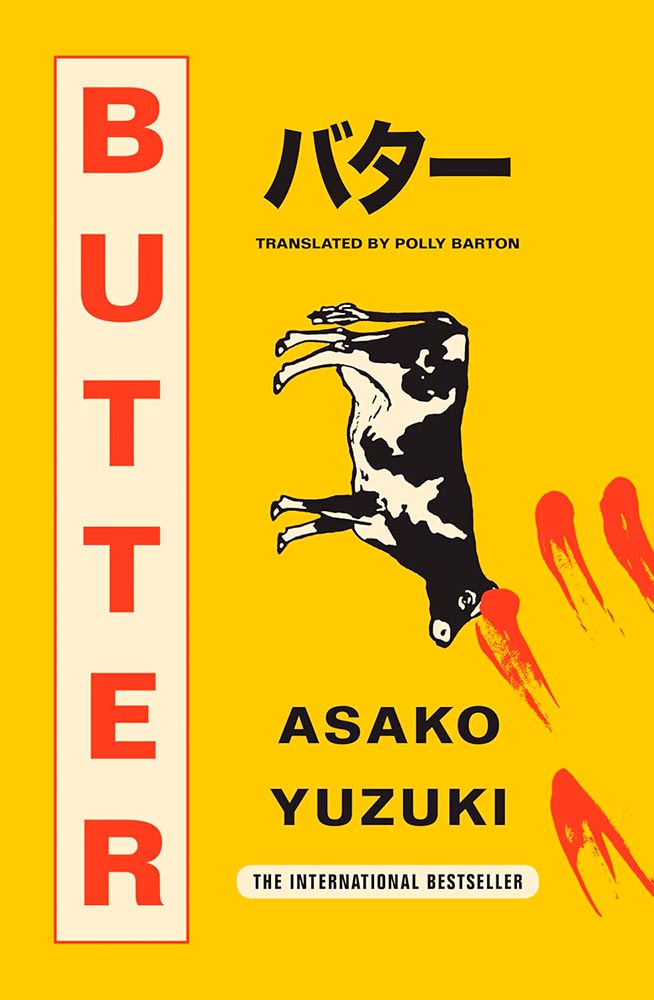
“This book is written out of both love and hate for the world.” Nuthin’ but love for the cover from me.
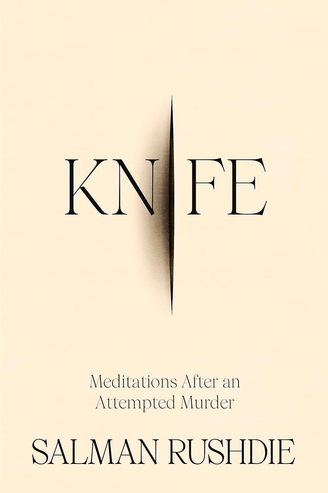
Cover design by Emily Mahon.
Sometimes, the literal approach works. (Pardon the expression.) But it’s the added burn mark that makes it.
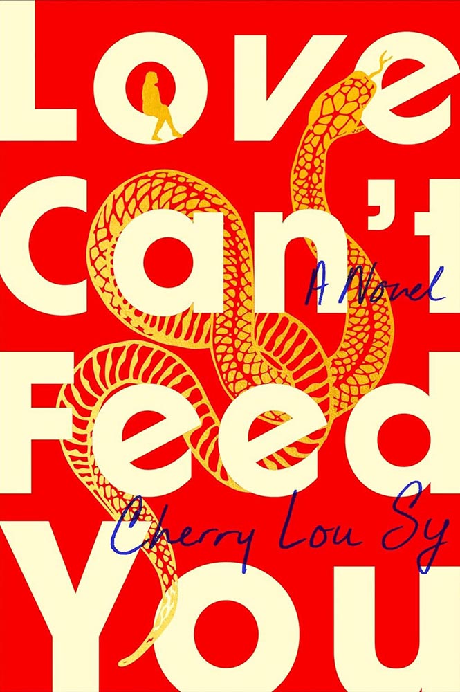
Cover design by Dominique Jones.
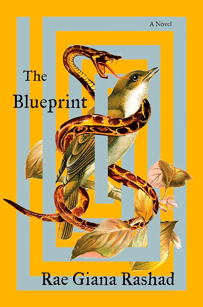
The red and gold, the title treatment, the complimentary blue ink, and the woman in the “o” are all fantastic. The snake, though, from scales to bite, is superlative.
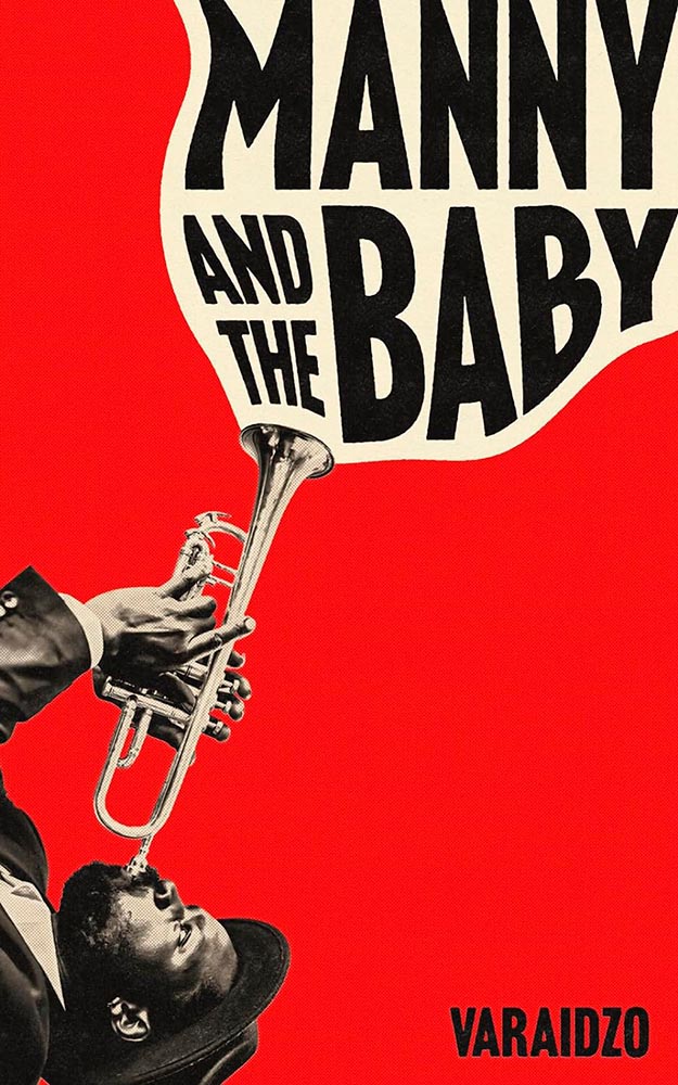
“British and Black, with Jazz and Character” is a tough brief, handled here in a way that makes the title incredibly appealing.
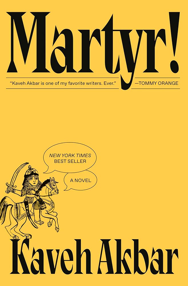
Cover by Linda Huang.
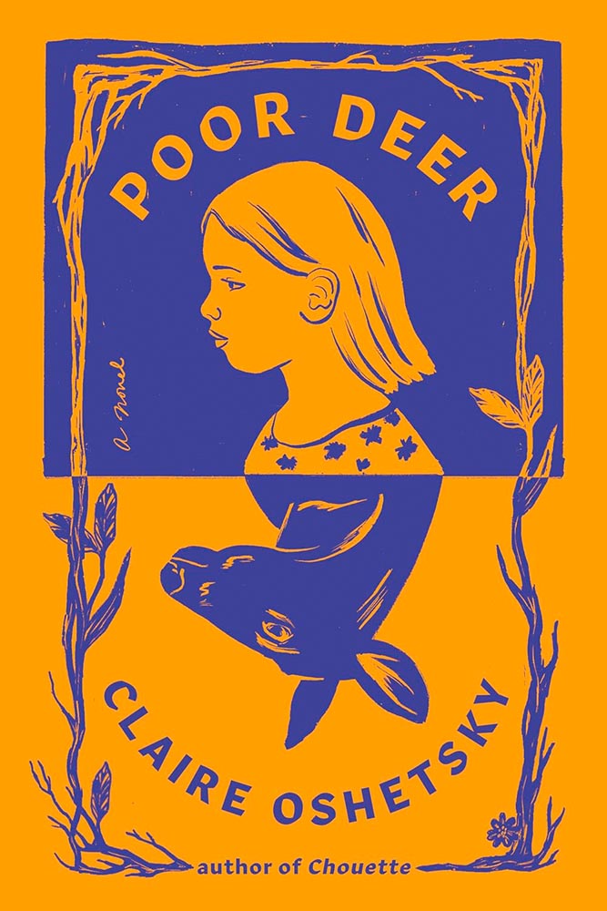
Unusual color choice, eye-catching type, the explanation point! But, of course, it’s the illustration — and the accompanying speech bubbles — that take it to the next level. Bonus points for both the hooves balanced on the “K” and the treatment for the pull quote.
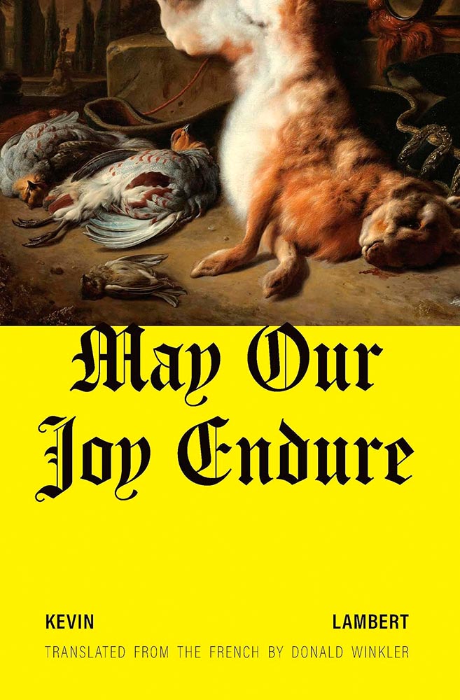
Cover design by Zoe Norvell.
That yellow, the blackletter title and unusually-spaced author play perfect — and curiosity-peaking — supporting roles to that painting. Purity, indeed.
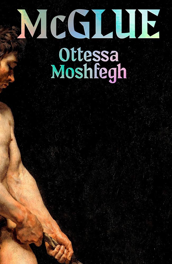
Cover design by Jonathan Pelham.
What’s he pulling on, now? (Also, the title/author treatment.)
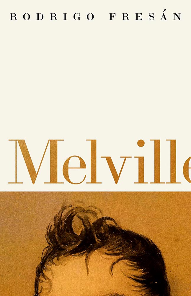
Cover design by Daniel Beneworth-Gray based on a concept by Daniel Fresán.
Cropped to perfection.
Cover by Suzanne Dean.
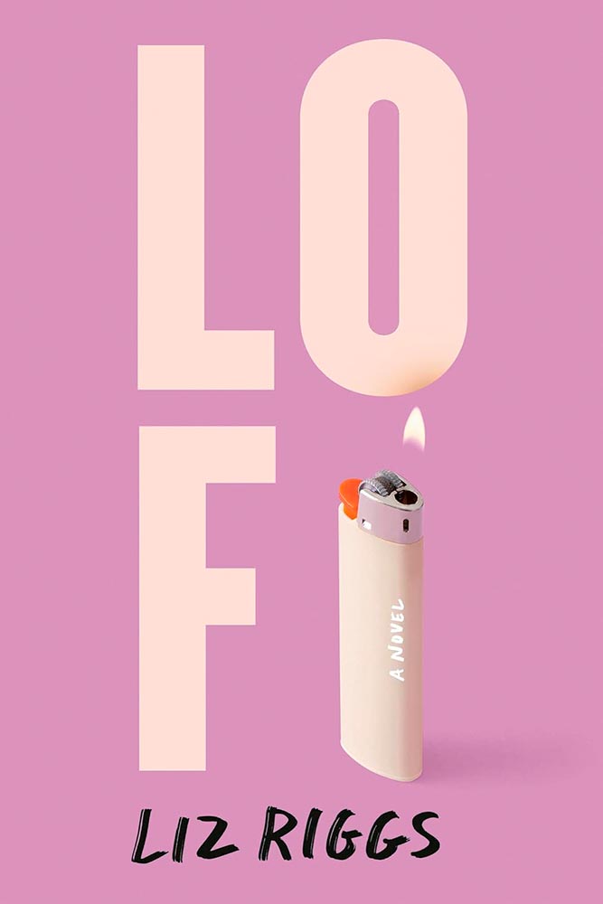
The first of three UK versions in a row: this title lights it up.
Cover design by Tom Etherington.
The US version of this title was in last year’s list, but this UK version is equally strong — in an entirely different way.
Cover design by Kate Sinclair.
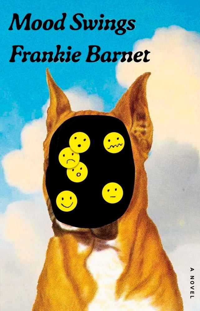
Another UK version, another winner. Love the typography. Bonus points for the homemade emoji.
Cover design by Arsh Raziuddin.
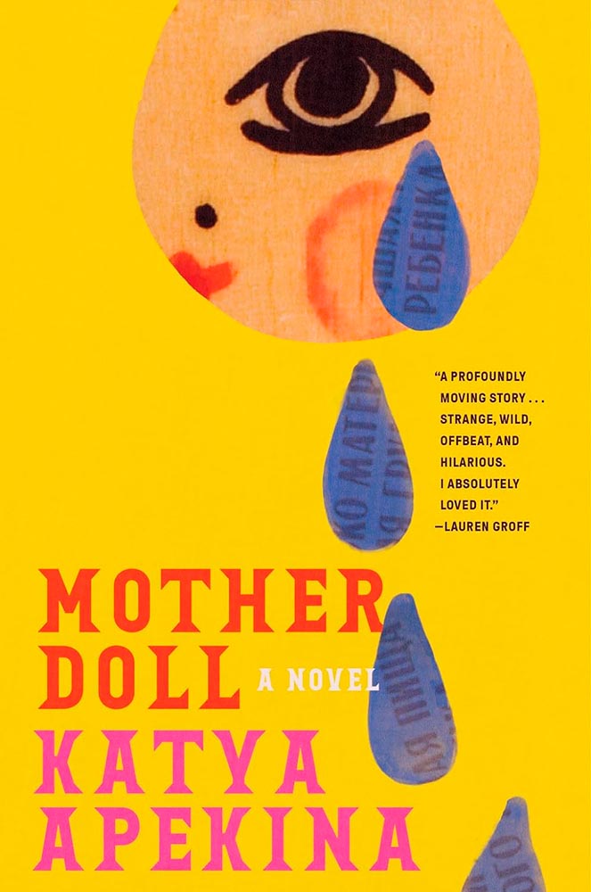
All kinds of goodness nested into this one, from the title treatment to the slight fading in the tears (which continue on the back cover).
Cover design by Jon Gray.
From the green to the typography to — especially — the illustration, this cover weaves a tale from 1434 straight into our brains.
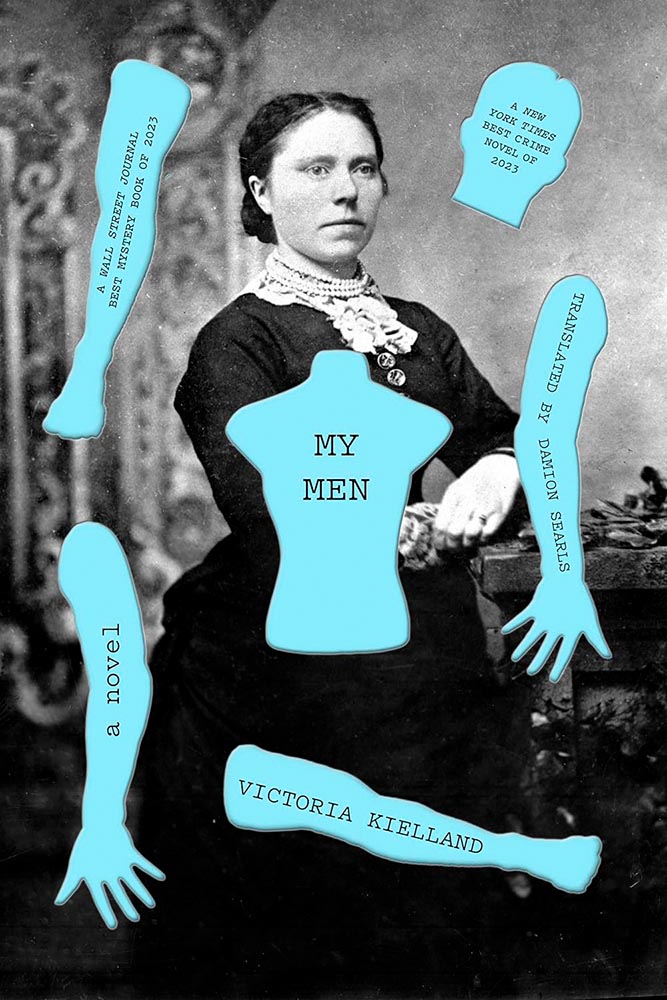
Cover design by Adriana Tonello.
The disembodied bits. ’Nuff said.
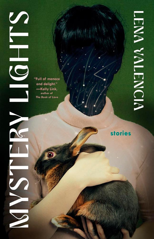
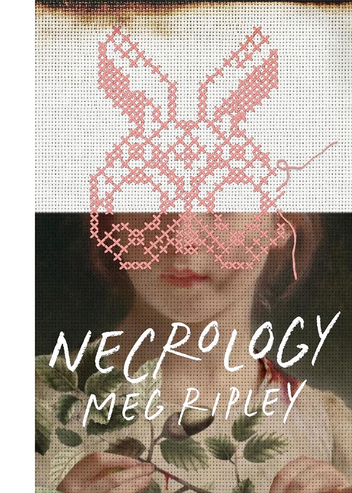
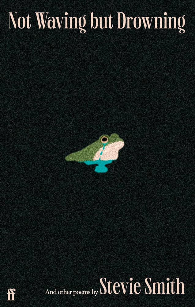
Cover design by Beth Steidle.
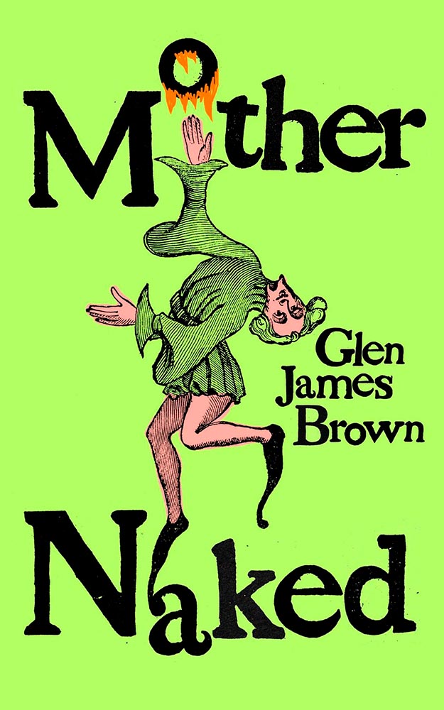
I feel for the rabbit.
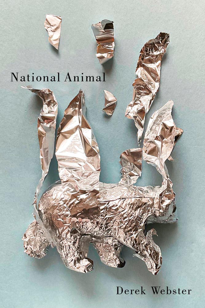
Cover by David Drummond.
Speaking of empathy for the animal: this slim volume of poetry is perhaps an all-too-real sign of the times. (The cover, too.)
Cover by Luisa Dias.
Pink Rabbit, slightly dirty: there’s a quality to this that grabs on and won’t let go. (Thankfully, it’s the first in a series….)
Cover by William Ruoto.
The opposite of the above, yet still bloody good at capturing attention.
Cover by Jack Smyth.
1968 called, with the perfect cover original of the moment.
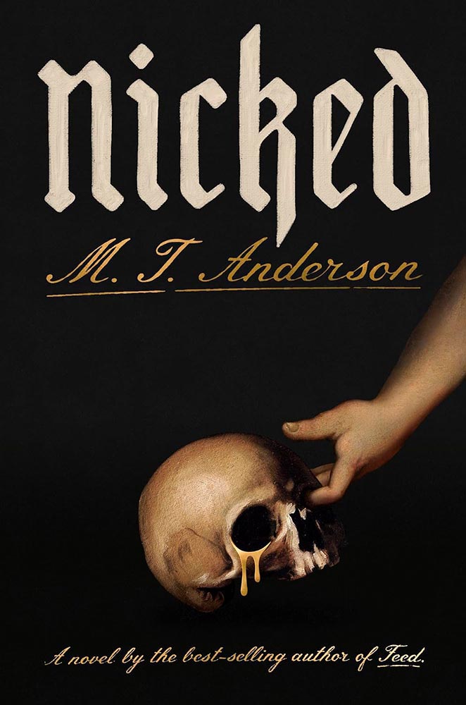
Cover by Zak Tebbal.
“Do a cover on sacrilegious theft,” someone said. Saint Nick brought us a gift.
Cover by Holly Battle.
Hard as one might try, topping this might never be possible.
Cover by Pete Adlington.
This UK title’s cover does so much more than it has any right to. Brilliant. (Bonus points for the grain.)
Cover design by Suzanne Dean. Art by Anton Logov.
Another gem from the less-is-more department. (Also, the paper texture and slight aging on the lettering.)
Cover design by Lynn Buckley. Art by Damilola Opedun.
There’s something about this that just works. Take a moment to read this LitHub intro instead of listening to me.
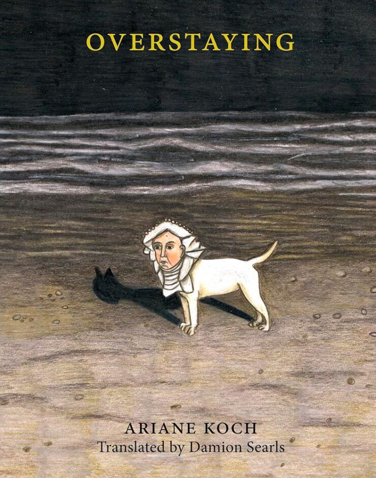
Cover design by Lucie Kohler.
Overstays … in your brain. Very nearly put this at the top of the pile.
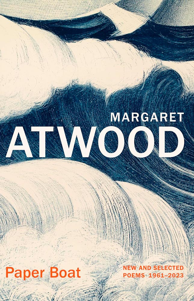
Cover design by Suzanne Dean.
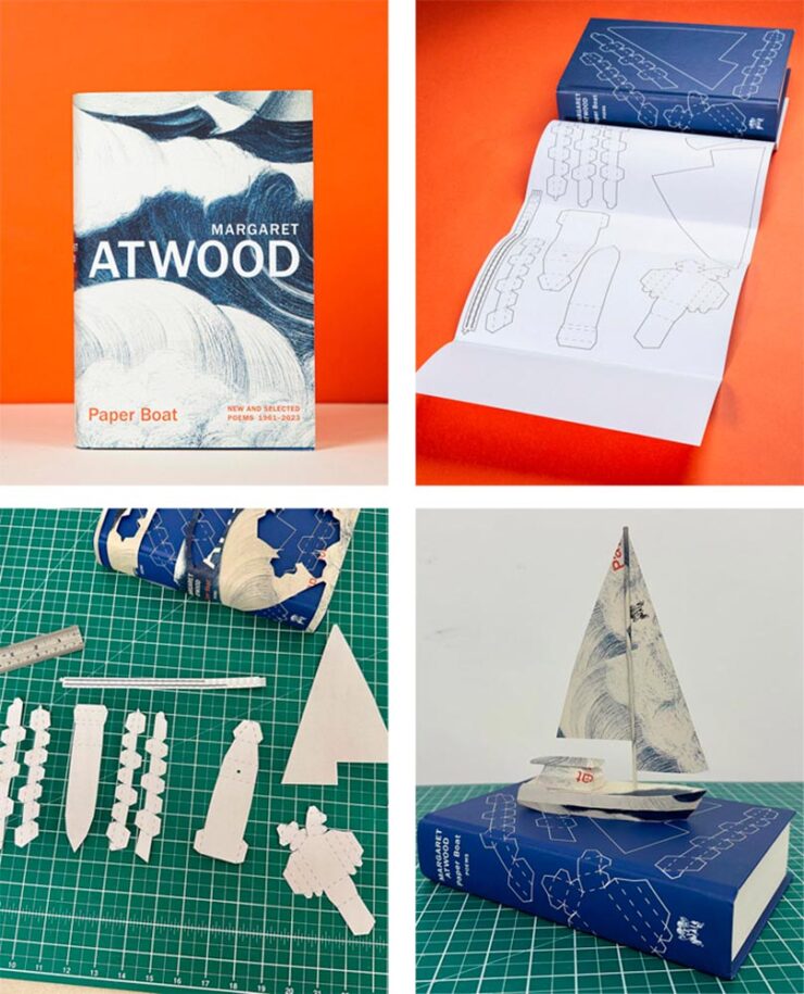
The energy in this cover is fantastic. But it’s what’s under the cover:
Paper art by Nathan Ward. Photos courtesy of LitHub.
The printed cover, too. Awesome.
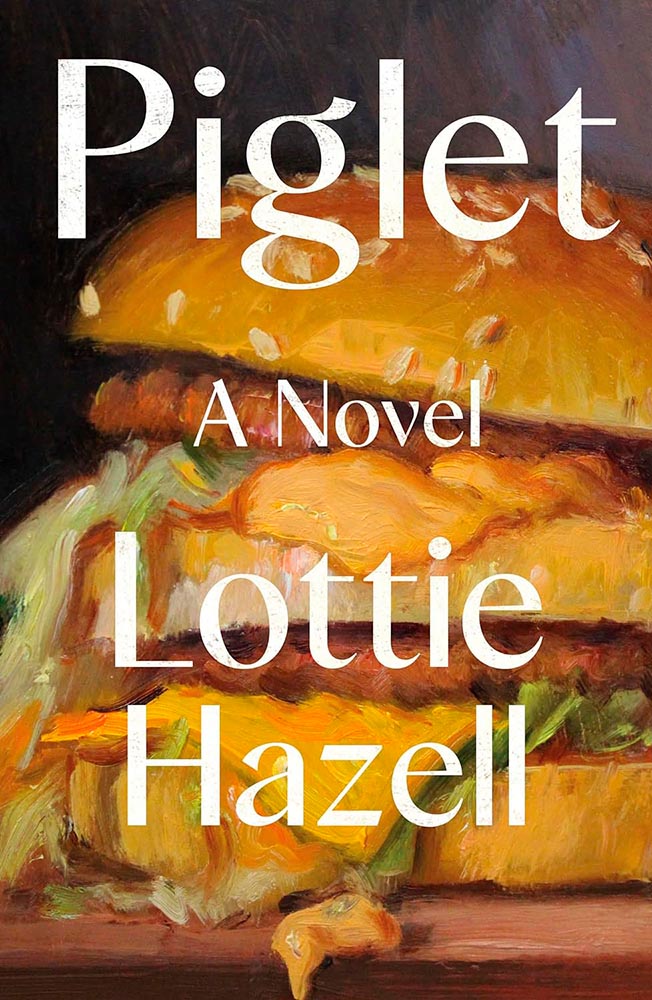
Cover design by Jenni Oughton. Art by Noah Verrier.
Leaving aside the notion that Americans can recognize a Big Mac on sight, even when idealized/stylized — beautifully — like this, it’s the perfect compliment to this title.
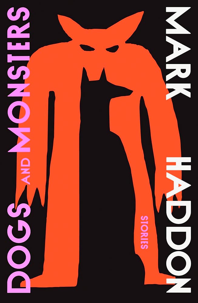
Cover design by Tyler Comrie.
Farcical dystopia, embodied.
Cover design by Tom Etherington.
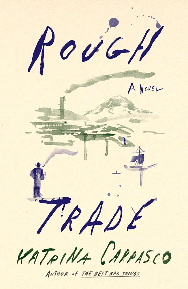
Unsee the face! (Bonus points for superlative typography.) Battled with Chimera and Rough Trade for one of the top spots.
Cover design and illustration by Vivian Lopez Rowe.
Reflections, indeed. (Also, color.)
Cover design by Sukruti Anah Staneley.
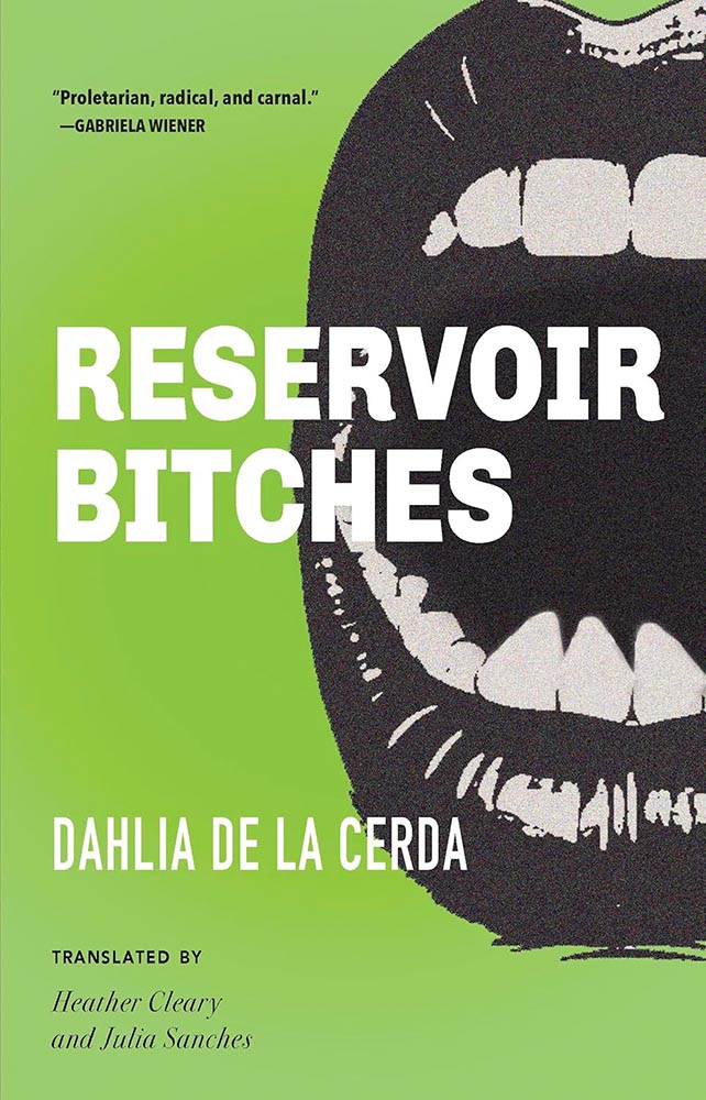
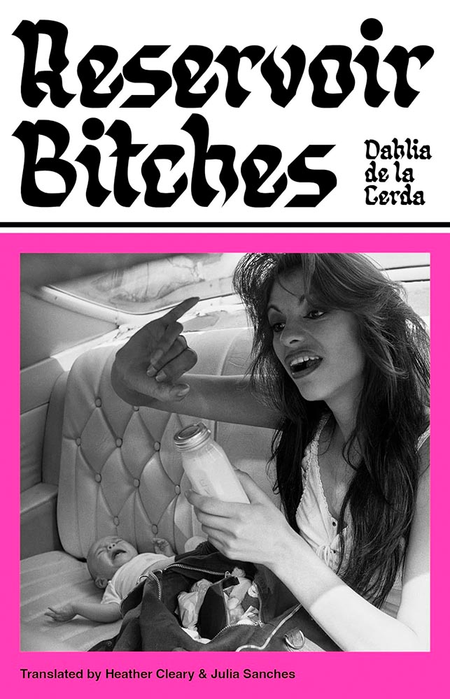
“Prod the bitch that is Life and become her.” These thirteen linked stories demand a cover that leaps off the shelf and grabs you.
Every year, there’s at least one title that so incredibly well illustrates how that notion works here in the US versus in the UK, and this year, it’s this one. I really like the above — the color’s awesome, and those teeth! — and believe it’s exactly right for the US market.
Cover design by Luke Bird. Photography by Graciela Iturbide.
But for the UK market … that photograph. (Bonus points for the title treatment.)
Cover design by Na Kim.
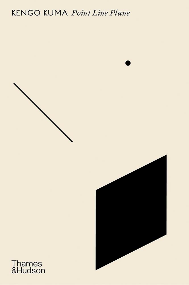
Watercolor perfection. Competed with Chimera and Point Line Plane for the one of the top spots. (I felt only one illustration-against-plain-background cover should be at the top. Might have been wrong.)
Cover design by Jamie Keenan.
The title treatment, the ink author’s name, and the photograph alone would be compelling. But … wow.
Cover design by Amanda Hudson.
From the illustration-makes-it dept. (Bonus points for the not-quite-halves.)
Cover design by Tom Etherington.
Paper and color, oh my.
Cover design by Luke Bird.
Yeah, it’s a cookbook. Who knew? Also:
Quadrille unfortunately didn’t return a request for the photographer’s name.
Bonus points for the fantastic photography within.
Cover design by Sarahmay Wilkins.
This would work perfectly well on the vertical. But it’s so much more this way.
Cover design by Perry De Le Vega.
Definitely amongst the 1%.
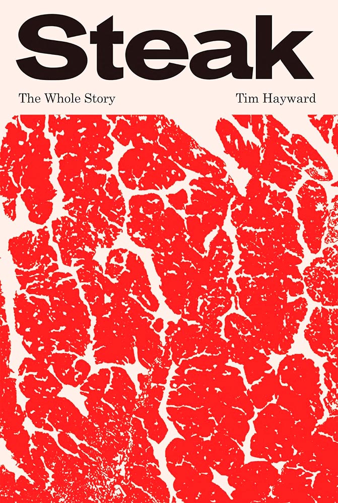
Cover design by Jamie Keenan.
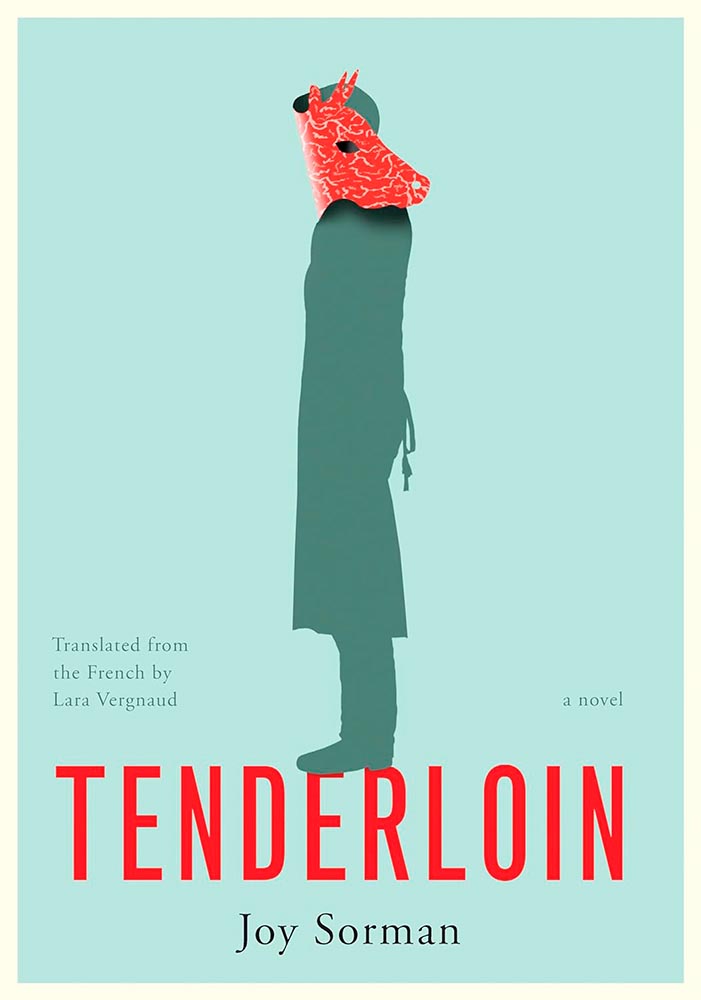
Someone chose not to butcher. Except…. (Extra points for the apron strings.)
Cover design by Kelly Winton.
I’m a huge fan of a photorealistic collage, but this, interleaved with the title, defines superlative.
Cover design by Robin Bilardello.
In a world of algorithms, proof that creativity and talent are so very human. (Also, color.)
Cover design by Jaya Miceli.
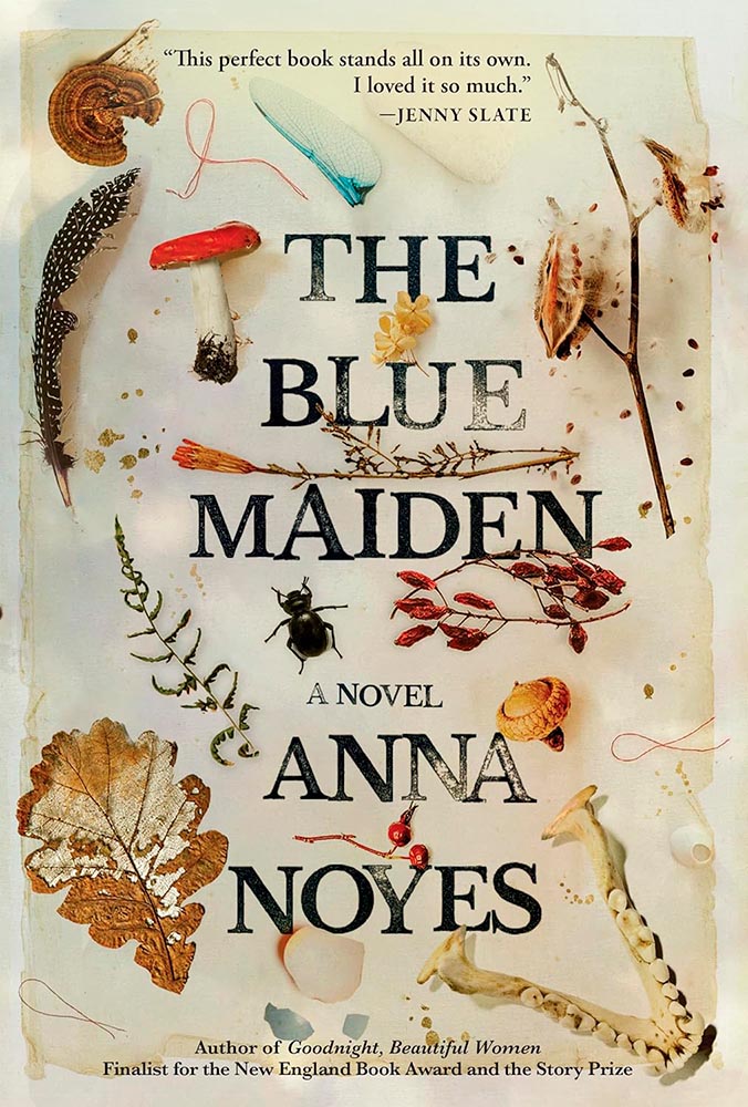
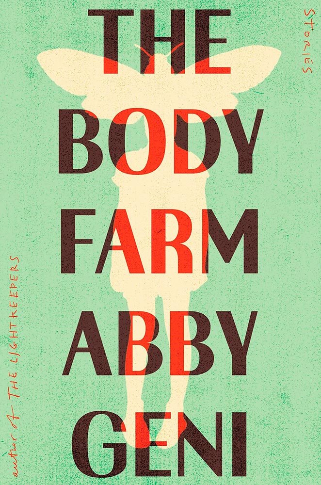
That awesome green, the color-burned title treatment, the hand lettering, the texture — all add up to top-flight attention-getting. (Bonus points for the entomology illustration/hint.)
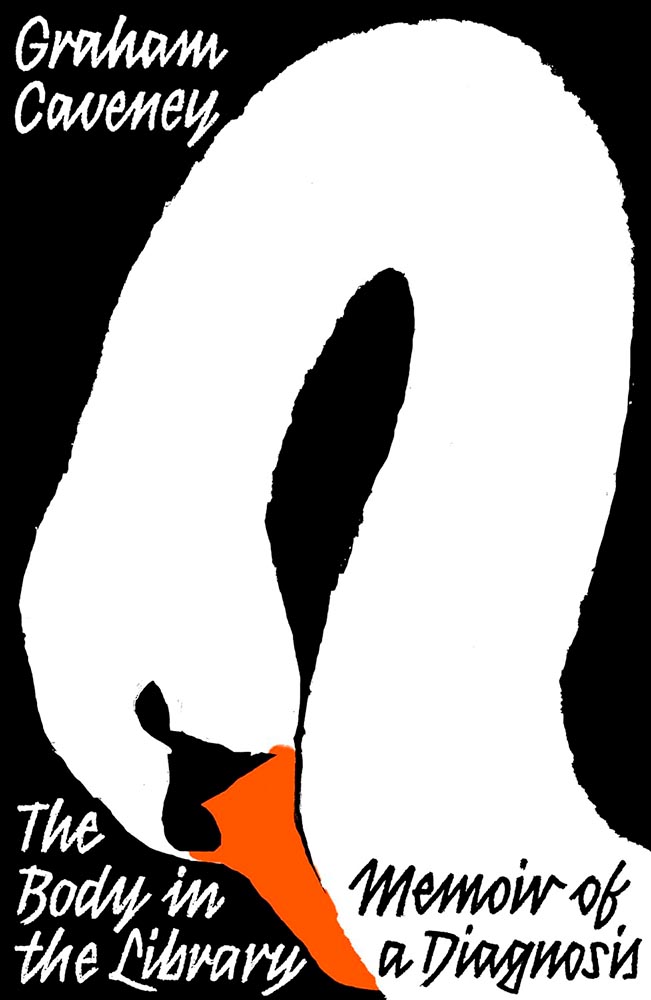
Cover design by David Pearson.
The swan’s pose of contemplation, indeed. (Also, color — perfect.)
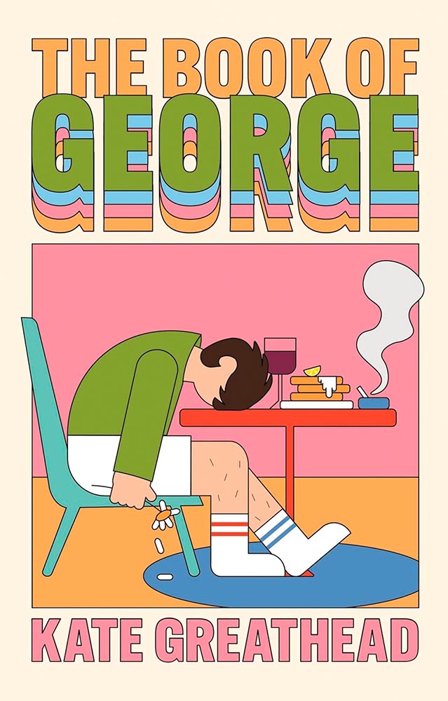
Cover design by Holly Battle.
We all know a George.
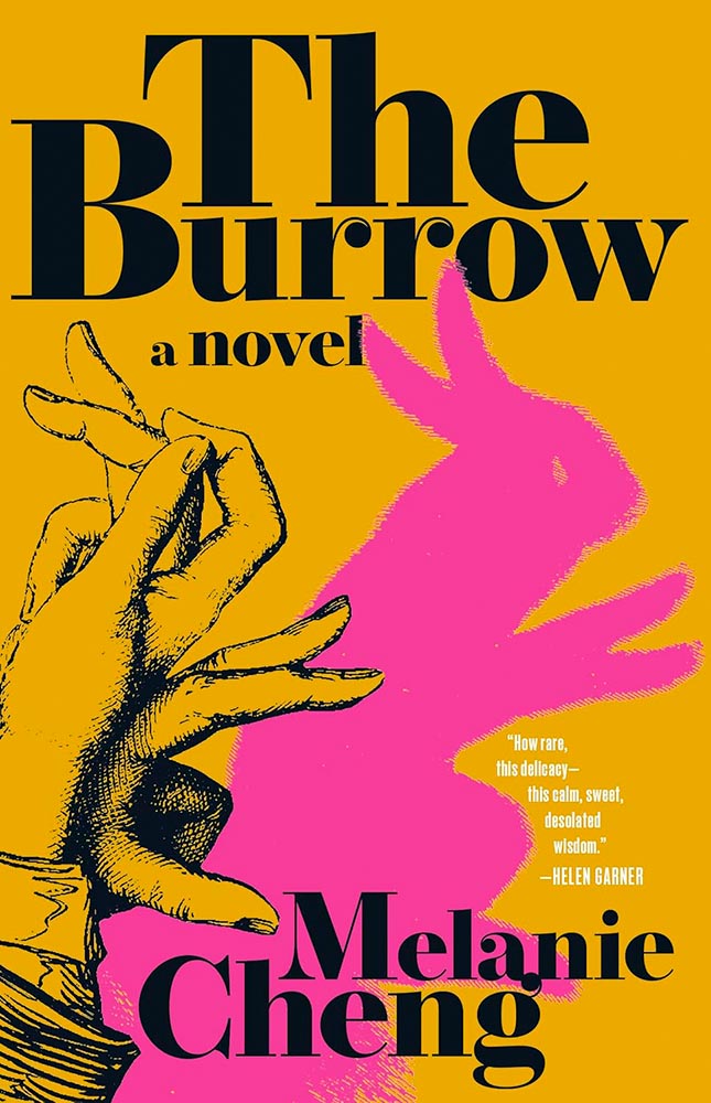
Cover design by Beth Steidle.
So much more than just a pet rabbit. (Also, color.)
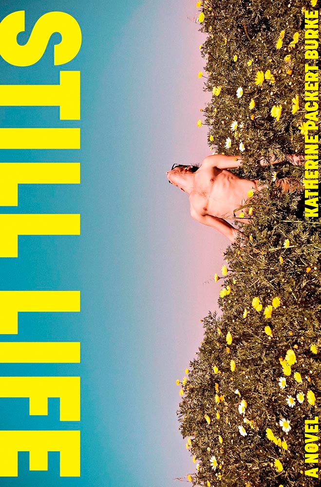
Cover design by Suzanne Dean. Illustration by Jialun Deng. Painting by Takaya Katsuragawa.
Never mind that this shade of yellow seems to be having a moment, let’s talk about that photograph: the goal of any cover is to peak your curiosity. And we have … win.
Cover design by Diego Becas.
A collection, indeed. (Also, color.)
Cover design by Lauren Peters-Collaer.
Ink gets blotted out. (Also, paper.)
Cover design by Jack Smyth.
Never mind the brilliance in the middle — the four pull quotes are, quite literally, the end of the rainbow.
Cover design by Derek Thornton.
Cultural and emotional shifts through technology, as expressed in (cover) art.
Cover design by Oliver Munday.
At the risk of repeating myself, no one does more with less than Oliver Munday: this level of white space deserves an award.
Cover design by Luisa Dias.
The eyes are eclipsed only by the rising magic dust. (Also, screening.)
Cover design by Jonathan Pelham.
Another where the US and UK express things differently; the UK’s, above, is brilliantly simple and simple in its brilliance.
Cover design by Sarah Schulte.
While the US version is more while still “less” in the big scheme of things. A two-fer.
Cover design by Kelli McAdams.
Text blocks do. (Also, awesome art.)
Cover design by Arsh Raziuddin.
Get lost in it. (Also, the article peeking out on the left.)
Cover design by Beth Steidle.
Reflections, torn asunder yet so lovingly smoothed out and preserved for posterity.
Cover design by Tom Etherington.
Two-color, geometric brilliance, given center stage.
Cover design by Ben Prior.
“Self-seeding wind / is a wind of ever-replenishing breath,” the title poem reads, but it’s the cover that drops the ultimate clipping. (Also, placement of “poems,” appropriately.)
Cover design by Jaya Miceli.
“Heavily textured” has never read so well.
Cover design by Alica Tatone.
I’m not sure what the illustration on this cover stands for — desert, sea, paths taken or not, or something I don’t or even can’t understand — and perhaps that’s why this design works on so many levels: an enigma that requires further exploration.
Cover design by Beth Steidle.
Cuddly in just the right way.
Cover design by Kimberly Glider. Illustration by Cory Feder.
“An affair with an arborist could result in a cutting,” I chose not to say. Wait. (Also, the accompanying cover.)
Cover design by Emily Mahon.
Geometry, color, content: this cover’s been promoted to the actual story.
Cover design by Tyler Comrie. Photograph by Matt Eich.
Photograph, texture, photograph, title treatment, photograph. (Also, the subtle shadowing in the author’s name and previous title.) Another very nearly at the top.
Cover design by Kaitlin Kall.
From color to art choice, this is a masterpiece. But those bite marks … aaaah!
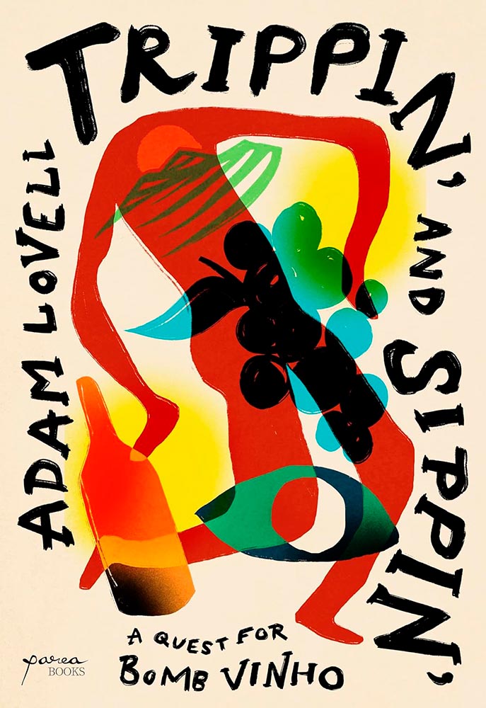
Cover design by Holly Ovenden.
Tripping on a quest for a Bomb: yes.
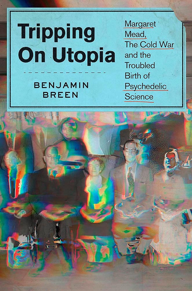
Cover design by Tyler Comrie.
Tripping on a quest for Utopia: yes.
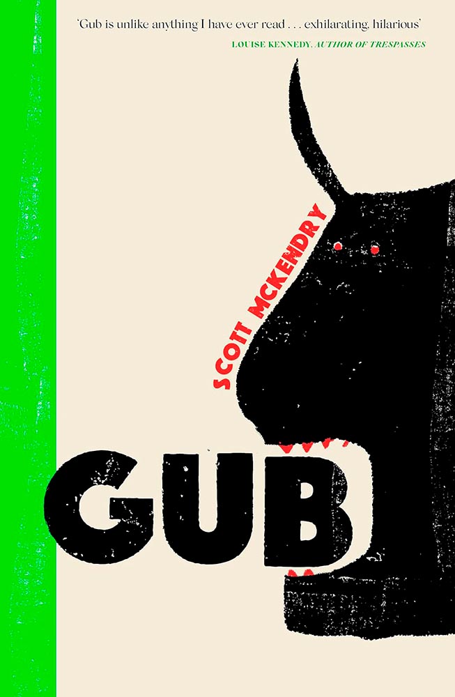
Cover design by Alex Merto.
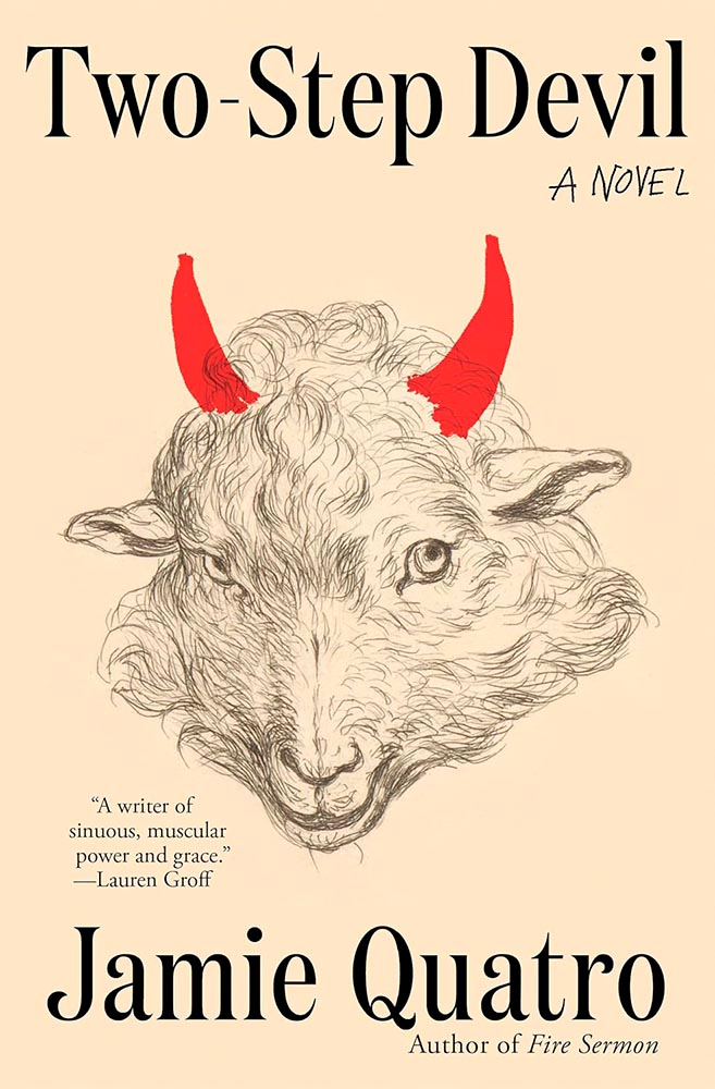
The eyes, the fur … and the horns. Transcendent.
Cover design by David Mann.
Something not to talk about … yet, so remarkably expressive.
Cover design by Angela Maasalu.
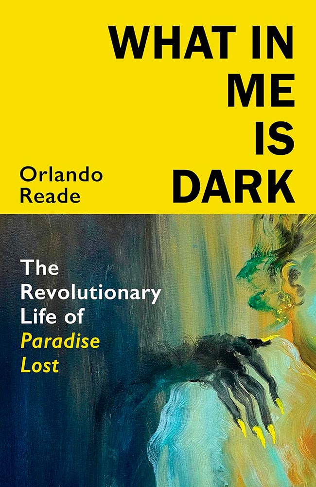
Never mind anything else: it’s the fingernails.
Cover design by Nicole Caputo.
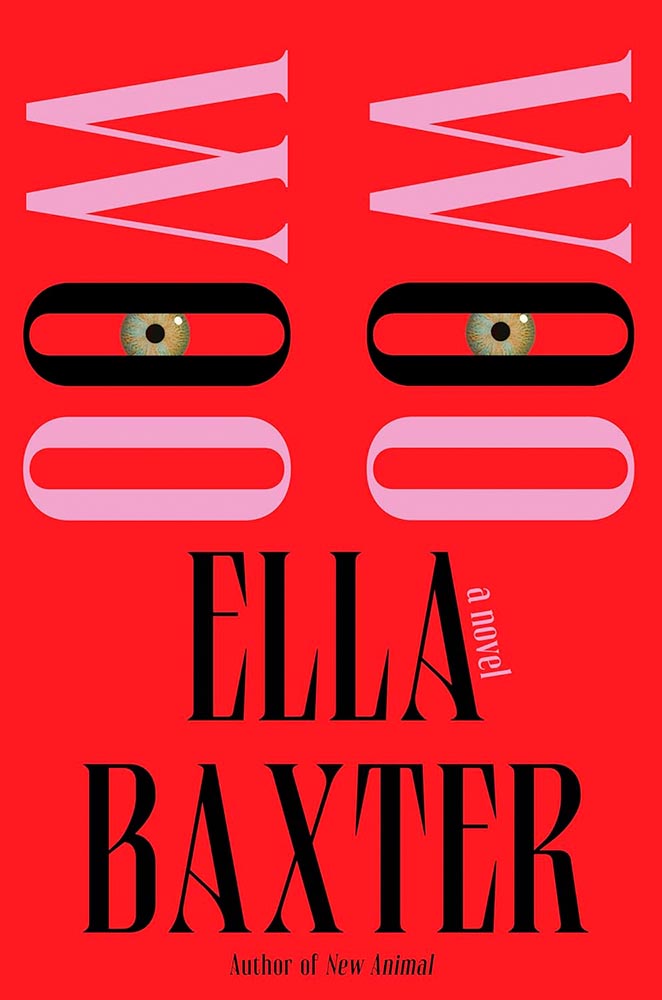
Just when you think these eyes have seen it all…. (Also, the typography.)
Cover design by Alicia Tatone. Art by Shannon Cartier Lucy.
“Dryly witty” describes more than just the text within. (Also, the title treatment … and “Mormon mommy bloggers.”)
Cover design by Mary Austin Speaker.
Surround yourself, feel, and bring great typography.
• • •
A moment of self-criticism, if I may: comparing this year’s list to the 2023 favorites, I can’t help but notice there’s a bit too much of the same. For myself, for my clients, and for my readers, I need to work on being too much inside a comfort zone. (Apparently hypocritically, in the 2023 summary, I commented on “sameism” being a thing.)
Meanwhile, again like last year, I’d like to highlight Dan Wagstaff’s comments over at The Casual Optimist:
A recent article on Spine argued that there is a battle between minimalism and maximalism going on. I think that could be true. Different approaches work for different audiences. But I also think it’s messier than that. I get the sense that publishers are less sure of what they want and what sells (certain genres notwithstanding).
It has been a rough year for a lot of publishers, so there is undoubtedly a lot of uncertainty, and no small amount of anxiety. I could go on about why that it is (and the publishing’s self-inflicted wounds) but, in short, what I think we’re also seeing with book covers is more meddling and less direction.
— Dan Wagstaff, The Casual Optimist
I’d read that Spine article, too, and generally agree with their argument that, “This is not just because designers have different ideas about the best way to cut through the noise, but because they are ultimately trying to appeal to two different types of readers. […] It is the designer’s job to know how to grab the attention of the specific readership that the author is trying to reach.”1I have point out: one of their minimalist examples, One Day, Everyone Will Have Always Been Against This, is a 2025 title already in the favorites folder. Stay tuned.
The buyers that minimalist and the maximalist covers appeal to don’t always overlap. But they do appear next to one another on shelves, actual or virtual. For one just perusing, it’s possible for the volume, whether minimalist or maximalist, to dissolve into noise. Dan’s right to caution.
Thankfully, the designers on this list have battled the committees bent on mediocrity and overcome with great talent, great design, and great perseverance.
My best wishes to them — indeed, all of us — in 2025. It has all the hallmarks of another interesting year.
Let’s continue a couple of discussions before closing out 2024, and send you into 2025 with some photographic and typographic goodness.
More AI Book Design
This was mentioned in another context in July, but is heading our way more aggressively as time goes by, with Microsoft and TikTok, among others, getting into the publishing arena.
Cover design: unknown. (Human or machine: unknown.)
While Microsoft’s new imprint, 8080 Books, plans “to test and experiment with the latest tech to accelerate and democratize book publishing.” They’re not entirely up-front about what that is — and might not know themselves yet, given the rapidly evolving tech and marketplace. That said, with the corporate giant’s name attached, we can be assured of some level of quality.
Yes, I just wrote a sentence suggesting that Microsoft is a guardian of quality. (“Books matter. In a deluge of data. In a bloat of blogs, a sea of social, and a maelstrom of email. Books will always matter,” they write.)
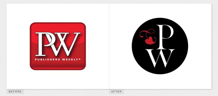
With others, the for-profit nature — TikTok’s engagement-before-all-else approach speaks volumes (or writes volumes, as the case might be) — assures that quality might come behind, say, slop. Publisher’s Weeklyreports that 320 publishing startups have emerged just in the last two years, most in the AI space, adding to the 1,300 noted as of 2022. (PW also notes, “It is widely believed that each of the Big Five publishers has internal AI projects discreetly hidden from view.”)
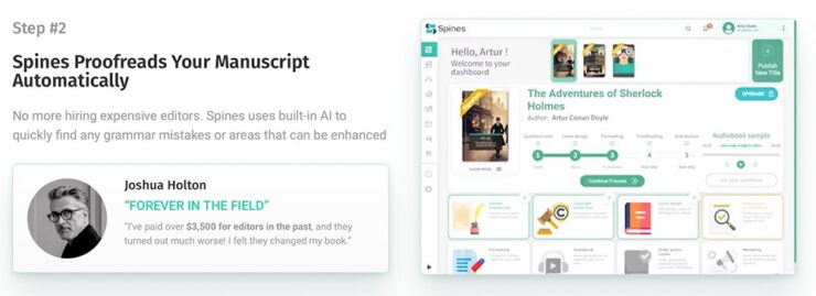
And then there’s this: introducing SpamsSpines, your AI book design and book completion service: “[f]rom manuscript to book in your readers’ hands – a single platform to help any author proofread, cover design, format, print, and distribute over global channels — zero tech know-how required.” Prices start at $1500 and promise a finished product in less than 30 days.
Their goal is to release 8,000 books per year. AI is heavily involved:
There’s a Sherlocked joke here somewhere….
Because, yes, you want a machine to suggest that Sir Arthur Ignatius Conan Doyle needed assistance regarding a turn of phrase. (Never mind his expensive editor.)
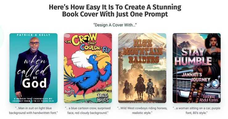
The first and third are really “only” bad. However, Dr. Seuss would like a word with Spines’ AI training dataset, please, and the cover for “Stay Humble” defies words.
But it’s the book design that got my attention: these are apparently the good ones, the cited examples to which someone says, “Yes! Take my money!”
The sad thing is that people will say that. Have already said that. And there’s much, much on the publishing industry’s horizon. Our horizon.
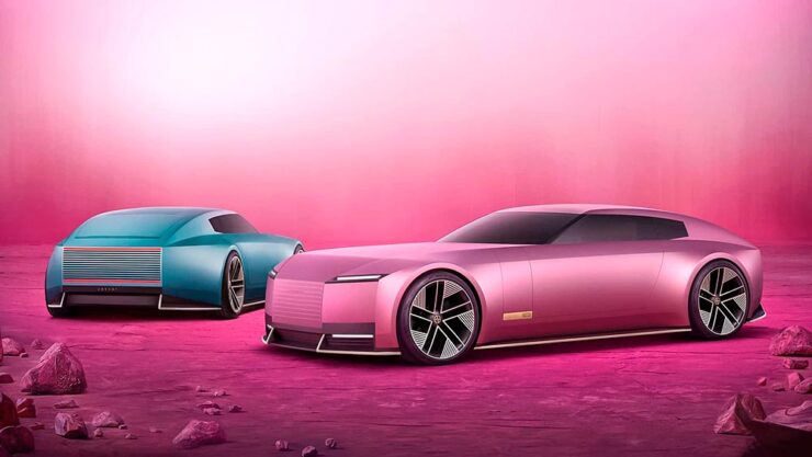
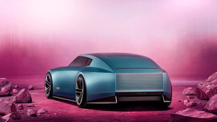
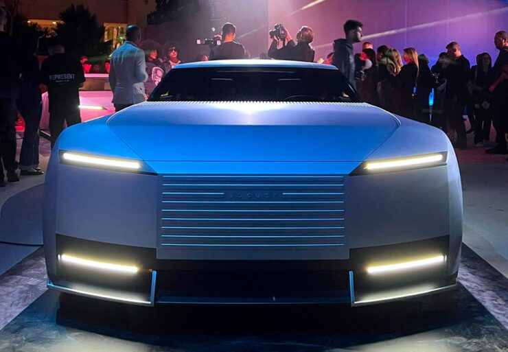
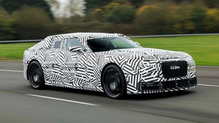
Last month, we left off Jaguar’s continuing road trip with a teaser. Let’s get right to it. The car’s called the Type 00:
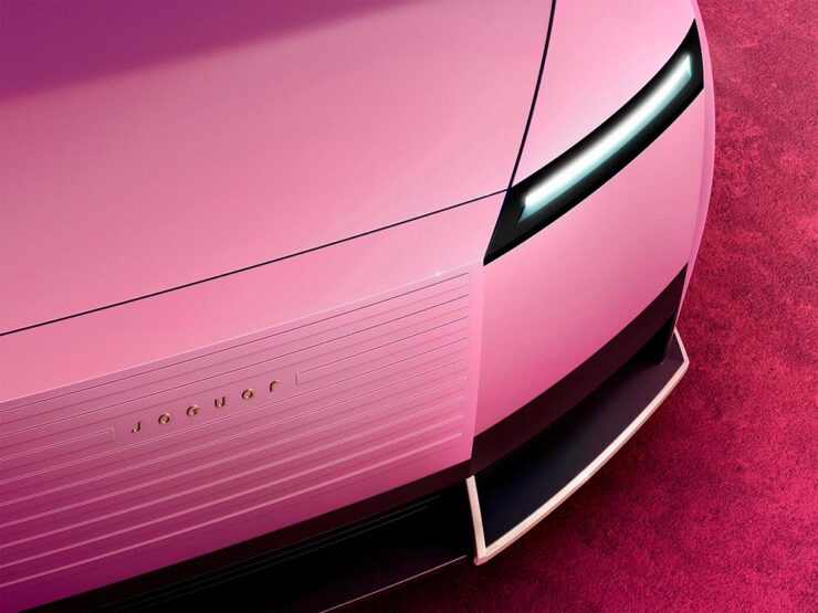
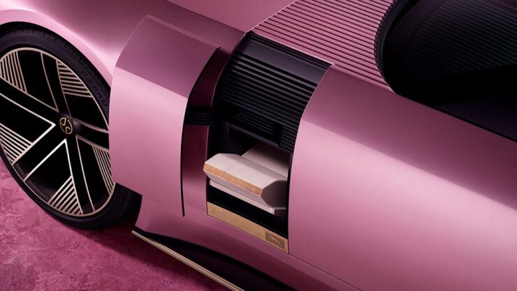
Some details:
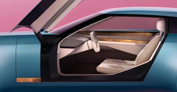
The interior:
The internet, predictably, has lost its collective … um, mind. However, amongst the melee, there are a few items worth mentioning.
Creative Boom: “If the new logo seemed divisive in isolation, seeing it brought to life with Type 00’s design has brought much clarity. The flush surfaces, panoramic roof, and glassless tailgate – all adorned with the new Jaguar device mark and reimagined leaper – create a cohesive vision of modern luxury. Rawdon Glover, managing director of Jaguar, emphasised the importance of this shift: ‘We have forged a fearlessly creative new character for Jaguar that is true to the DNA of the brand but future-facing, relevant and one that really stands out.’”
The quote there is something to pay attention to. Read those words again, and think about the actual choice of language; it’s this, exactly, that has struck some. Armin at Brand New, for instance: “[W]hat I dislike the most about the new Jaguar brand: its tone of voice is INSUFFERABLE. Everything from the platitudes in the campaign to the script of McGovern’s presentation to the press releases is obnoxiously over-confident and self-congratulatory.” (Brand New, while excellent, is subscription-only — alas without a sample article. Here’s a link anyway.)
But it’s The Autotopian that stands out. They have not one but two excellent articles by Adrian Clarke, an ex-JLR1That’s Jaguar Land Rover, before it was, um, initialized by owner Tata. designer, who has several important points to contribute:
A couple of weeks ago, the cancelled X351 Jaguar XJ leaked onto the internet. During my time at Land Rover, I saw this car back in 2018 and can confirm this is indeed, or rather was the EV XJ. Back when Mr. Tata was still alive every six months or so there would be a big board level presentation for him on upcoming products. […] I was privy to all the future production Jaguars and concepts. There was a J-Pace SUV to sit above the F-Pace (no problem in revealing this as it’s common knowledge) and everything else was as you’d expect. These cars were then cancelled as part of the revamp and one absolutely incredibly beautiful and exceptional proposal aside, nothing of value was lost.
It’s the first time I’d seen the cancelled-just-before-release XJ EV, and despite the incomplete body panels and obviously-on-the-sly phone shot, it’s incredibly disappointing. They made the right call.
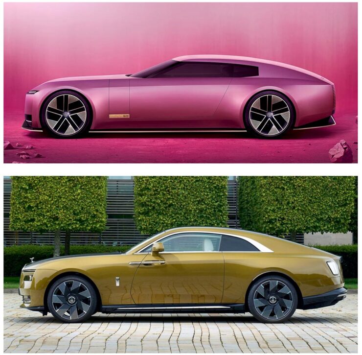
Compare it next to a Rolls Royce Spectre, a car the production Type 00 will be a competitor for, and see how successfully it hides its bulk in profile. [I]n the side view, particularly in the bottom half, I’m seeing some Range Rover. The crisp shoulder line, the kick-up of the tail behind the rear wheel, and the feature line along the bottom of the bodyside all scream Range Rover. This is exacerbated by the verticality of the front and rear of the car – the new full-size Range Rover and Sport have sharply docked tails. I heard that the initial sketch of this car was done by Massimo Frascella before he departed for Audi. Frascella was McGovern’s right-hand man at Land Rover for decades before Ian Callum retired and McGovern used the opportunity to bring both the Jaguar and Land Rover studios together. So maybe that’s where this Range Rover influence comes from.
The Jaguar Type 00, top, and Rolls-Royce Spectre, bottom, courtesy of The Autopian.
We must remember this is only a concept. The actual production car will be a four-door GT. This is only a preview of the visual style of future Jaguar models. It’s certainly striking, but you’d struggle to call it beautiful. It’s also monolithic and slabby.
Let’s hope this brutal revamp is […] successful, because there are a lot of jobs depending on it.
Meanwhile, I’ll actually be rooting for JLR to pull this one off. I’m not in the target audience — at all — but Jaguar needed to do something radical and, by God, they did just that. The concept is interesting. Some of the details are fantastic. Here’s hoping, indeed.
Update, 15 Jan 2025: Turns out the Jaguar’s designers were a little worried about the outcome — or the outsourcing, in this case — and its effect on the brand. The Drive has the details.
To close out 2024, let’s take a break, pour a beverage, and enjoy some of what you read Foreword for: great photography, typography, and design.
Northern Lights
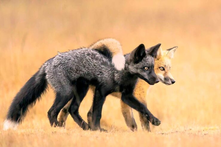
I didn’t know — or didn’t remember — that amongst the glut of photography contests is one dedicated to the phenomenon known as the Northern Lights.
Cosmic Explosion, Isteria, Croatia. Photograph by Uroš Fink.
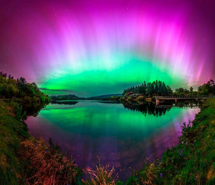
PetaPixel reminds us that Capture the Atlas’ Northern Lights Photographer of the Year competition features some exceptional opportunities to make spectacular captures this year due to the solar maximum — the peak of its eleven-year cycle.
Celestial Reflection, Dartmoor National Park, UK. Photograph by Max Trafford.
The 2024 competition awards feature 25 winners, each with a narrative and each a striking example of the larger system we’re part of. Check it out. (Also via This is Colossal.)
Nature
PetaPixel is among several that point us to the Nature Photographer of the Year contest, with images both poignant and funny. Since it’s New Year, let’s go with the latter:
Besties, Washington State, US. Photograph by Marcia Walters.
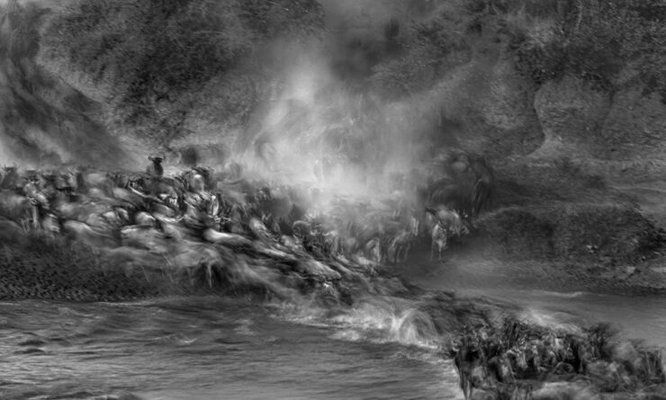
Of course, there’s just “spectacular,” too:
Cross to Bear, Talek River, Kenya. Photograph by Paul Goldstein.
The contest’s winners page features many more, separated into categories; be sure to click on the individual photographs to get larger sizes and the story with each. Fantastic stuff.
Frozen Prairie Landscapes
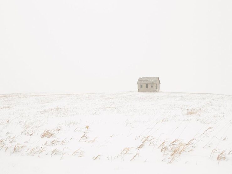
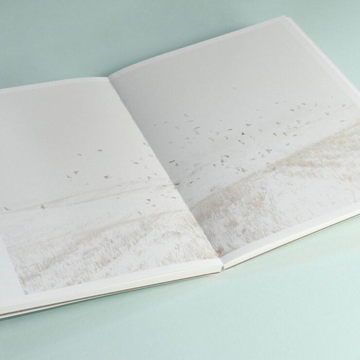
Saskatchewan gets cold in the winter, but there’s a beauty to those temperatures, photographer Angela Boehm tells PetaPixel.
Image from Minus Thirty. Photograph by Angela Boehm.
“The frozen prairie landscapes, while a subject in their own right, serve as a powerful metaphor for the deeper themes the book explores: loss, memory, and resilience,” she says. […] “The loss is embodied in the emptiness and biting cold. The memory, or its gradual fading, is represented by the snow obscuring the horizon, softening and blurring the scenes. And the resilience is in the solitary tree — a steadfast survivor of countless storms in this unforgiving landscape.”
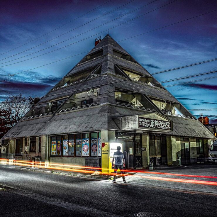
Special Bonus #2: Another book on an interesting subject — Japan’s brutalist architecture, which somehow manages to bring an inherent quality to the cement:
Mixed-use complex, 1994, by Kuniyoshi Design. Photograph by Paul Tulett.
This PRINT piece is excellent: “A cultural gap persists in how history is organized and interpreted. I left the library without my requested images but with a lingering realization that how we organize history, even within the hallowed walls of an institution like the New York Public Library, can reflect the biases and oversights of a collective cultural perspective,” writes El. Stern.
Home Soon, Dear. Image by Maria Kinovych, 2022.
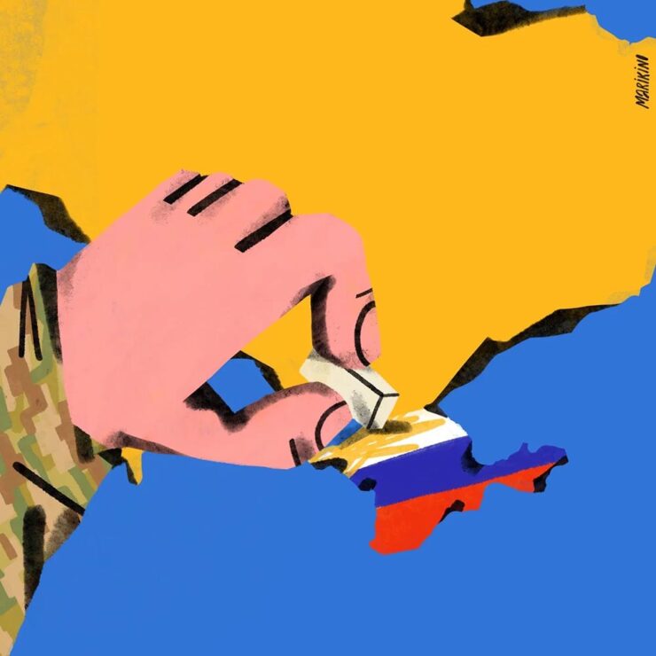
“Today, Ukrainian graphic design is rooted in national identification, in search of future needs, and in understanding the cultural influence of a painful past on a, once again, painful present.”
Ukraine’s search for a future — and present, and past — in design. Great read.
“A must-have manual for hot metal enthusiasts and linotype lovers”
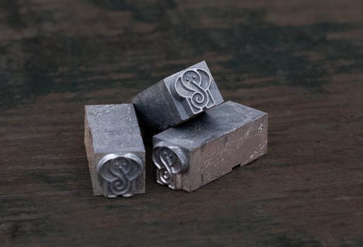
Type Archived, a new book whose fundraising campaign I didn’t see in time: a “stunning visual tour of traditional typefounding and offers a definitive account of London’s legendary Type Archive,” writes Wallpaper*.
Custom metal for the book project.
The book “traces the origins of typography through the physical tools, objects and machinery that made the printed word possible. Full of rich photography, [it’s] a visual journey through the punches, matrices, presses, type and paper which tell the story of the UK’s preeminent typefounding industry.”
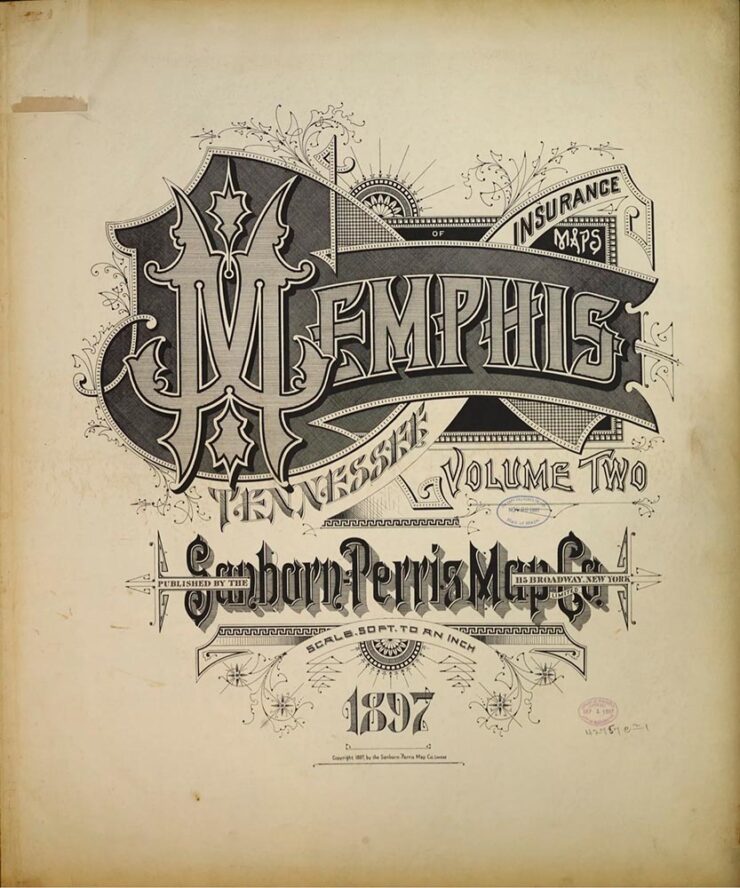
“The Arresting Typography of the Sanborn Fire Insurance Maps”
Jason Kottke writes, “Several years ago, Brandon Silverman become obsessed with the lettering and typography on the fire insurance maps published by the Sanborn Map Company in the late 19th and early 20th centuries.”
Special Bonus #3: Nick Heer, at the always-excellent Pixel Envy, has an essay on the essentials: “[E]fficiency and clarity are necessary elements, but are not the goal. There needs to be space for how things feel.” Delicious Wabi-Sabi is worth a few moments.
Wishing you and yours a very happy New Year!
1
That’s Jaguar Land Rover, before it was, um, initialized by owner Tata.
As we celebrate the Thanksgiving holiday here in the US, a reminder that there’s a ton of things to be thankful for. One of the things about which I’m grateful is that folks actually read these posts — not a ton of people, to be sure, but enough.
So, before we get to the sort of items I usually post in this series, a request: don’t forget to click through on the links. Indeed, most of what’s here are links, and the originals are interesting — great book design, typography, or photography worth the extra moment of your time. (And remember to click on the post titles if you’d prefer larger photos/illustrations.)
Thank you.
Now, back to our regularly scheduled programming.
Photography
International Landscape Photographer of the Year 2024
As usual, the entries here are inspiration for professionals and aspiring photographers — folks have submitted some excellent work:
“Let Down,” Highlands of Iceland. Photograph by Jabi Sanz.“Spiritual Grip,” Italian Dolomites. Photograph by Yuriy Garnaev.“Poisoned Beauty,” Apuseni Mountains in Romania. Photograph by Gheorghe Popa.“Striking,” Utah. Photograph by David Swindler.
Standard Chartered Weather Photographer of the Year 2024
Meanwhile, over in the UK, the Royal Meteorological Society has attracted some talent, as well
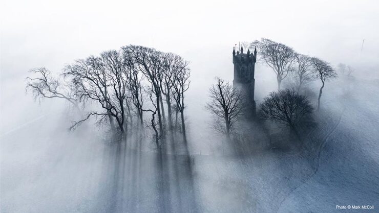
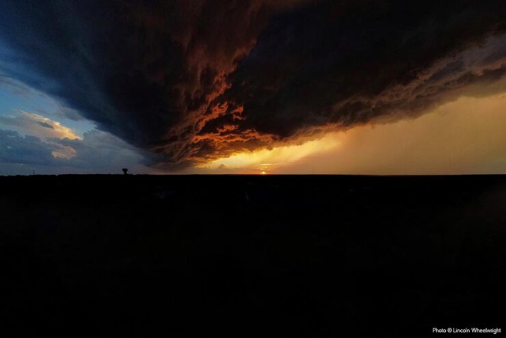
“Freezing Mist,” Barnweil Monument, UK. Photograph by Mark McColl.“Fire and Ice,” Austin, Texas. Photograph by Lincoln Wheelwright.
Of course, given the nature of the contest (ahem), each photograph includes an explanation of the weather phenomenon. See the contest website for a few more. (Another hat tip to PetaPixel.)
Iceland Forces of Nature
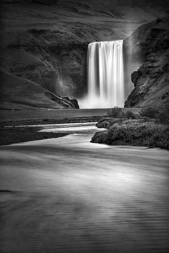
This is Colossalhighlights a series by Gary Wagner, whose “striking photos pare dramatic landscapes down to their essential shapes, lines, and tones.”
“Dream Falls.” Photograph by Gary Wagner.“Skogafoss.” Photograph by Gary Wagner.
His work is all in black and white and similarly moody — dramatic, even — and absolutely worth the perusal. (Be sure to check his archives, too.)
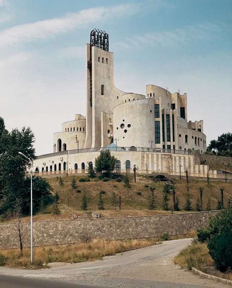
Palace of Ceremonies, Tbilisi, Georgia. (No photographer listed.)
More a (very) brief history than a stack of photographs, this Wallpaper* article nonetheless highlights some strangely wonderful buildings.
Typography and Design
Graphic Design for Television
Design by Leah Spencer.
As a Graphic Designer for Film & TV, I work in the art department and create anything that is seen on screen with text and or imagery, such as storefront signs, food packaging, patterned wallpaper, stacks of bills, newspapers, lost cat flyers, or even children’s drawings.
While the piece is from last year, I’d not seen it — or the Alphabettes website — and appreciated its in-depth explanations, especially with respect to typography. Great for fans of The Marvelous Mrs. Maisel, of course, but demonstrates the level of detail required for getting any show design right. (Another gem from Jason Kottke, and be sure to check Leah’s web site, too — it’s excellent.)
Special Bonus #3: Emigre Type Specimens, 1986–2024
We are happy to partner with San Francisco-based Letterform Archive on a reissue of our first volume of type specimens, an ample tome first published in 2016. But this time, we nearly doubled its already impressive extent to more than 1,200 pages containing 40 type specimens and spanning 38 years. We also added new texts by Letterform Archive associate curator Stephen Coles and longtime Emigre collaborator Jeffery Keedy. In addition to specimens not included in the first volume, we also revisited our type design process files to create a special behind-the-scenes section, offering readers a look at photos, sketches, and hand-written correspondence.
This perhaps-ironically-sized book — letterhalf, natch — is awesome. Order while you can.
Cornucopia of Book Design
A huge variety of interesting book design items this month, starting with ShoutoutLA:
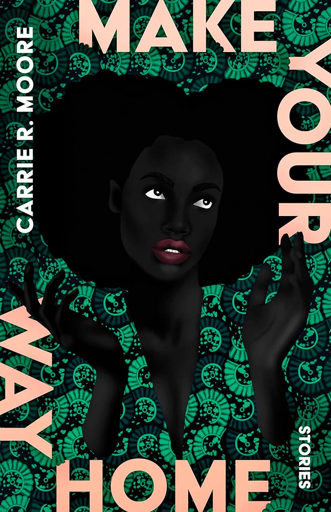
Finally, we have Debutful discussing Make Your Way Home‘s cover design:
Another great cover by Beth Steidle, but it’s the art from Uzo Njoko, a piece titled “Higher Calling,” that impresses. Read more.
Special Bonus #4:It’s Nice That brings us a piece on Malou Messien, her obsession with display type, secondhand book covers and Estonian design. “This Paris-based graphic designer uses archival finds to inspire her alternative approach to typography and composition.”
Special Bonus #5:Hyperallergic highlights how the Women’s Studio Workshop, in the Hudson Valley, “Shakes up the art of bookmaking: what started as a small feminist arts collective has grown to host hundreds of residents and publish countless books under its own imprint.”
Special Bonus #6: “Read Between the Lines: Forget drop-shipping — America’s new favorite side hustle is … republishing classic literature?” Get this sad — bizarre? — item over at Slate.
Jaguar Relaunch
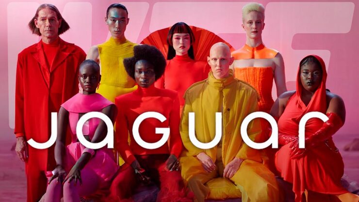
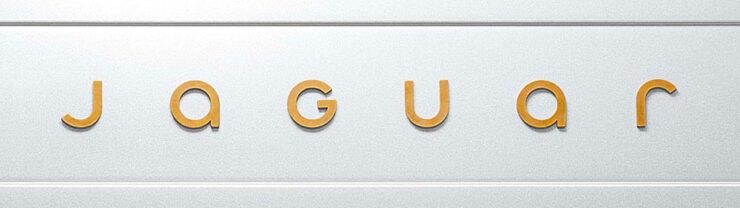
“A Jaguar should be a copy of nothing,” said company founder, Sir William Lyons. The 2024 version, “copy nothing,” includes marketing lines like “delete ordinary” and “live vivid” … well, just look at this header image:
The branding — which is all we have until December 2nd or 3rd, depending on the source — is designed to provoke, and it certainly accomplishes that goal, albeit with the typically-unfortunate-for-2024 levels of internet reaction vitriol.
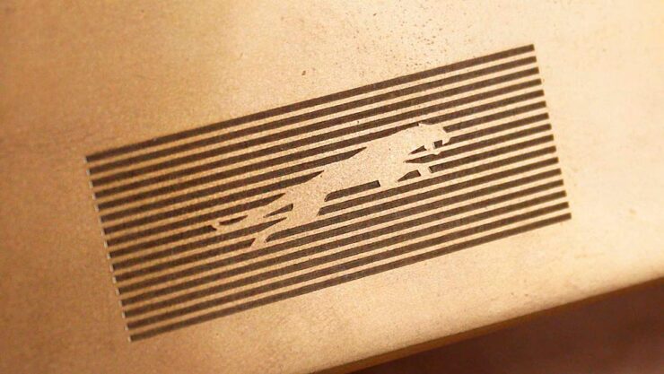
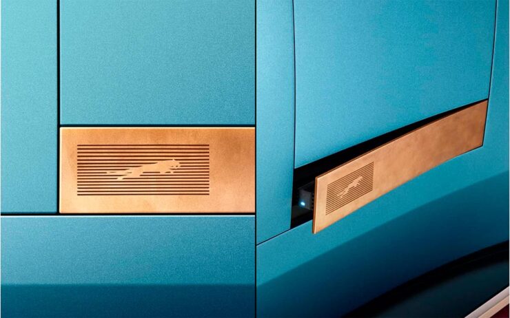
Some of the details are nice:
Leaping cat.You can sort of see what they’re going for here….
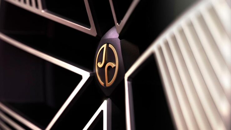
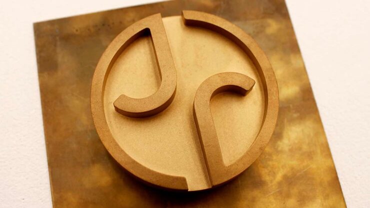
Here’s another look at the logo, against a metal background — note the matching “J” and “R”:
As for the new cars themselves … well, here’s their preview image of what is presumably the new sedan, designed to compete with the likes of Bentley or Maybach (as opposed to BMW, for instance):
Meant to invoke “space, grace, and pace” … ?
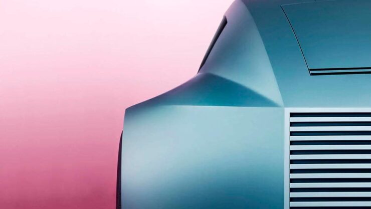
A couple of teasers have been posted. One of the (lack of) a rear window:
And one that’s just details:
Jaguar’s new lineup, all EVs, could be really interesting. Jaguar Land Rover’s design department does not slouch.
“Content,” that is, the feeling of satisfaction — contentedness — is a word I’d much rather use than “content,” that which is required of folks who produce material for their website/YouTube channel/social media feed/whatever. It’s a shame the world favors the latter over the former.
Or does it? We’ll get to that — right in the midst of the other content that caught my eye in October, 2024.
Adobe Content Credentials, Continued
Adobe’s positive messaging continues, saying “[it is] dedicated to responsibly developing tools that empower creators to express themselves and tell their stories while helping address their concerns.” It even carried out a study to get some feedback from creatives on generative AI and one of the standout insights was rising concerns over unauthorised sharing of their work or misattribution with 91% of creators seeking a reliable method to attach attribution to their work.
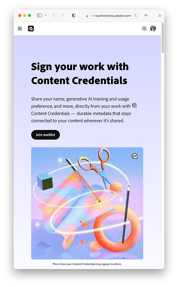
Bring on Adobe Content Authenticity. It’s a “powerful new web application that helps creators protect and get recognition for their work.”
A screenshot of Adobe Content Authenticity website.
In today’s rapidly evolving digital landscape, creators are understandably concerned about safeguarding and gaining attribution for their work and having more control over how it’s used. That’s why we’re excited to introduce Adobe Content Authenticity, a new, free web app that allows creators to easily attach Content Credentials to their digital work — helping you protect your work, show attribution and better connect with your audiences online.
For now, it’s limited to a beta Chrome extension, with a wider beta opening to the general public in spring 2025. (I don’t use Chrome, but have signed up to the waitlist, and will update Foreword readers when I hear back.) Content Credentials are already available in Photoshop and Lightroom — provided you’re using the latest versions, which may require the latest OS.
Three on Book Design
PBS on del Rey
I’d known the publishing house since . . . well, as long as I can remember. What I’d not known is the story behind the publishing house:
Set aside thirteen minutes when you can — absolutely worth it.
Multi-Panel Book Covers
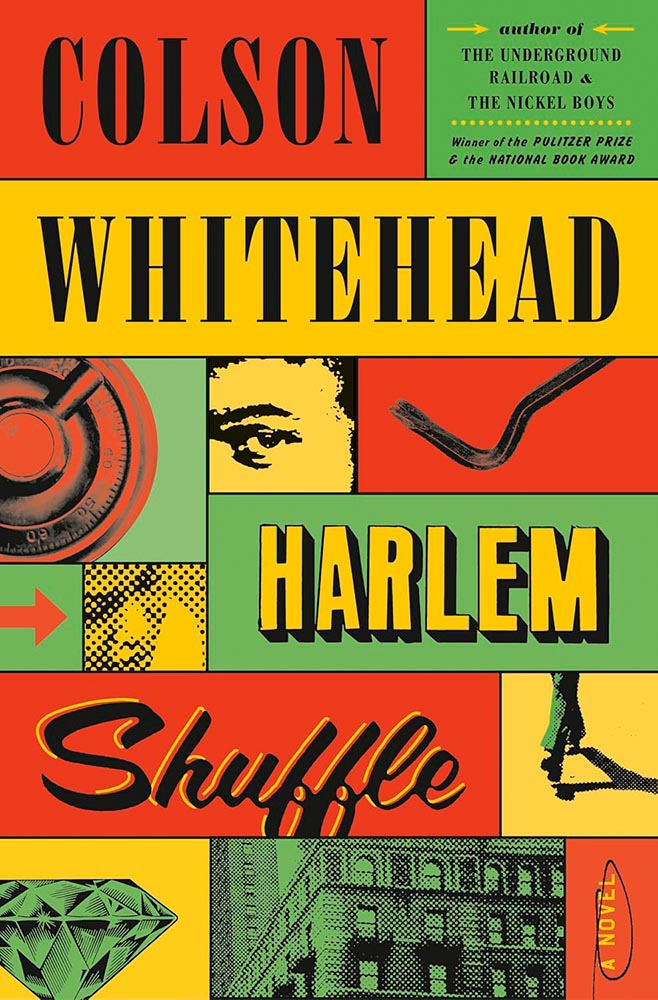
I agree with Jason Kottke: “Bento Books” is the term. A great example:
Book design by Oliver Munday.
Here’s the impetus discussing this latest book design trend, with many more examples.
It’s Nice That: Book Design in Brazil
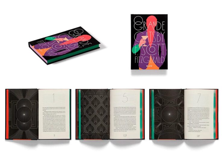
Book design by Bloco Gráfico.
Any foreigner entering a bookshop in São Paulo is likely to be impressed by the quality of the books on display. For a country with relatively few readers, few high quality printers and binders, and a very limited assortment of paper, the Brazilian publishing market shows remarkable graphic ingenuity[.]
— Elaine Ramos, It’s Nice That
Never mind the country, the great book design caught my attention: from The Great Gatsby, above, to the J.M. Coetzee series, Orwell’s 1984, even Melville — amongst others. A great read.
Special Bonus #1: Life outside the internet . . . and physical books, please:
“The whole internet social complex … and the way people use their computers to conduct life is doomed sooner than later,” said Justin Murphy, the founder of the media and education company Other Life. “The smartest people, the people who are the most cutting-edge, will increasingly live their lives outside of computers.”
Whether or not that’s true — or even a potential — isn’t as relevant as an actual trend: physical book sales are up:
Print, too, is on the rise, from books to magazines to newspapers. Print book sales had a pop with the pandemic in 2020, and have continued to maintain sales of more than 750 million units sold each year. Meanwhile, even though they’re cheaper, sales for ebooks are down slightly, which may be owed to the fact that younger readers, much like older generations, overwhelmingly prefer printed formats.
CreativeBoom is out with their annual post on future type, “50 fonts that will be popular with creatives [next year].” Some of my favorites (links in captions):
Editorial New, by Pangram Pangram.Nave, by Jamie Clark Type. (Bonus points for the great illustration.)Right Grotesk, especially the Casual flavor, by Pangram Pangram.Canvas Inline, designed by Ryan Martinson from Yellow Design Studio. Available through Adobe Fonts.Ssonder, from Type of Feeling. (Easily the most on-trend of my highlighted items.)
An honorable mention goes to Gamuth Sans, from Production Type. See CreativeBoom’s 2025 popular fonts list here. (Note: some are available through Google Fonts, and thus free-to-use. Nice.)
Awesome. Meanwhile, the below caught my attention not due to the striking photograph, but the striking content — which, indeed, caused contentedness. Such a huge change to anyone who might recognize this former hulk, now beautifully refurbished and in a new park setting:
The annual Association of University Presses (AUPresses) Book, Jacket, and Journal Show has announced its winners published during 2023. The show, now in its 59th year, “honors the university publishing community’s design and production professionals; recognizes achievement in design, production, and manufacture of print publications; and serves as a spark to conversations and source of ideas about intelligent, creative, and resourceful publishing.”
It is a joy to be amid the rush of creativity and exuberance that is exemplified by the Book, Jacket, and Journal Show submissions. Our jurors were spoiled with the wide variety of visual and intellectual expressions that make our community so rich and diverse. The committee members really came through as a team, making this year’s efforts virtually seamless. Here’s to another great Show!
— David Zielonka, Stanford University Press, Book, Jacket, and Journal Show Committee chair
Entries are extensive — 507 worldwide — and the winners are separated into several categories, which I’ve drawn from below.
Scholarly Typographic
Academia’s titles are so often subjects that you only get from university presses. A great example:
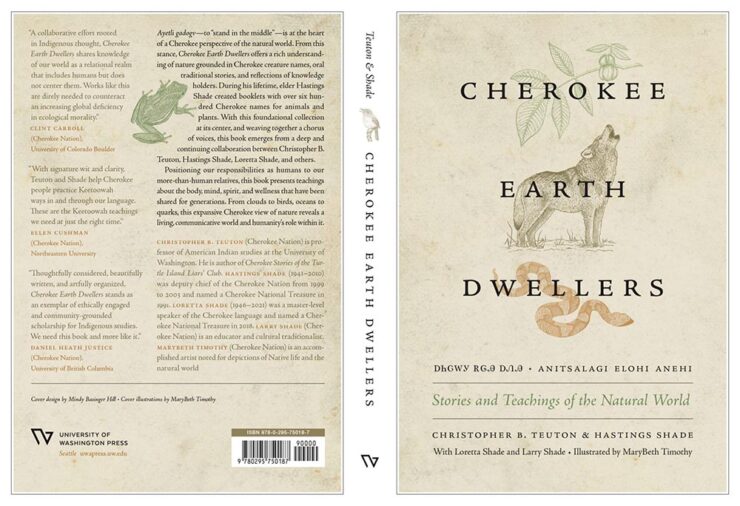
University of North Carolina Press. Book design by Lindsay Starr.
When important titles are accompanied by compelling design, everyone benefits. Honorary mention to Horror and Harm, whose design invokes neither. See all the winning entries.
Scholarly Illustrated
Because these winning entries are from all over the globe, they run the risk of being difficult for us ’Muricans to understand. But design is a universal language:
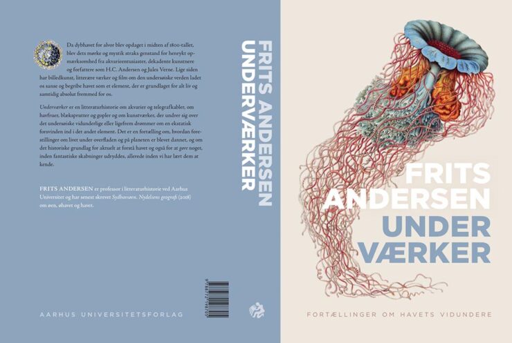
Aarhus University Press. Book design by Jørgen Sparre.
The cover’s good, but one of the great things about this show is that you get more:
Aarhus University Press. Book design by Jørgen Sparre.
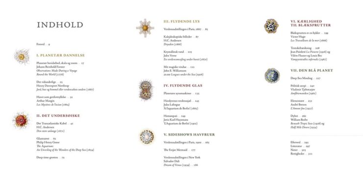
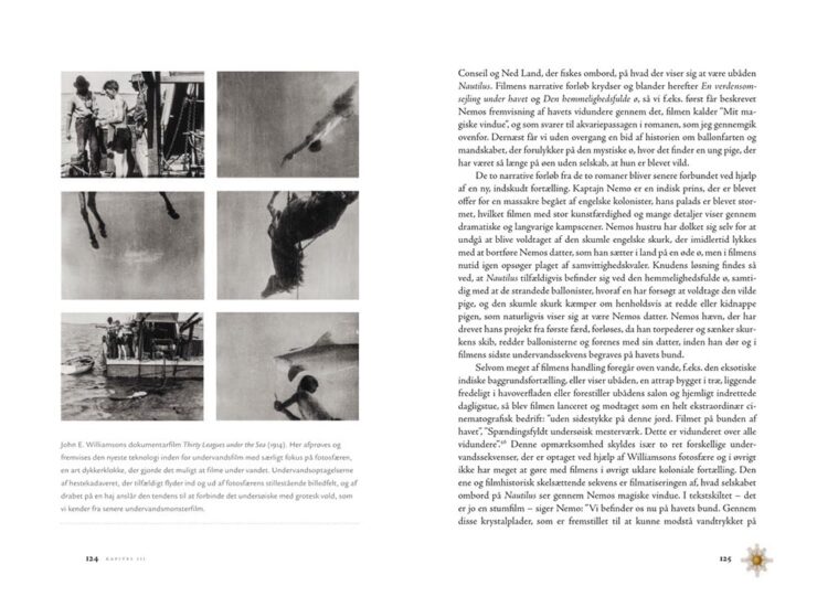
I’m a sucker for an interesting content spread, as demonstrated here.
Aarhus University Press. Book design by Jørgen Sparre.
I love the dingbats next to the page numbers, too; a great way to instantly illustrate which section you’re in.
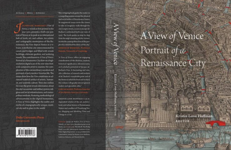
Duke University Press. Book design by A. Mattson Gallagher.
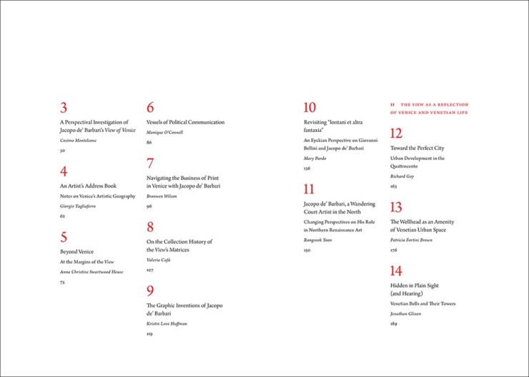
Strong cover here, with the two shades of overlay really working in concert with the orange. Oh, and another — you guessed it — great content section, like this spread:
Duke University Press. Book design by A. Mattson Gallagher.
Some incredibly talented photographers on display here, but one leapt ahead:
Getty Publications. Book design by Jennifer Schuetz-Domer.Getty Publications. Book design by Jennifer Schuetz-Domer.Getty Publications. Book design by Jennifer Schuetz-Domer.
More about the photography than design, admittedly, but still great stuff. Honorable mention to Looking at Venezuela, 1928-1978, which combines more-than-interesting photography with another eye-catching contents spread.
This section is far and away the largest, and features some outstanding examples of book design — from any publisher — in subject areas that don’t always lend themselves to dynamic design. Some of my favorites, in alphabetical order:
McGill-Queen’s University Press. Book design by David Drummond.
Simple concept, well executed.
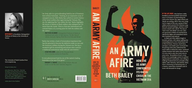
University of North Carolina Press. Book design by Lindsay Starr.
Strong image on this cover works extremely well with the green background and orange fire (and spine). Excellent.
University Press of Kentucky. Book design by Kathleen Lynch.
Love the illustration choices on the cover, with exactly the right background and interesting hand-lettering-style title.
Duke University Press. Book design by Matthew Tauch.
Double-exposure, something hard to execute well and done perfectly here, is exactly the right choice on this strong cover.
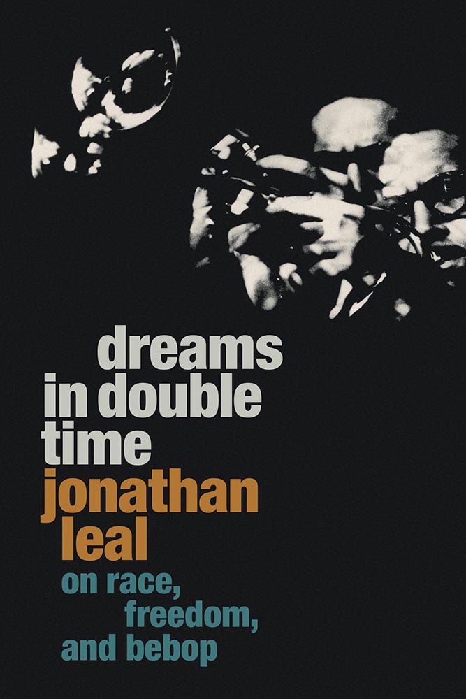
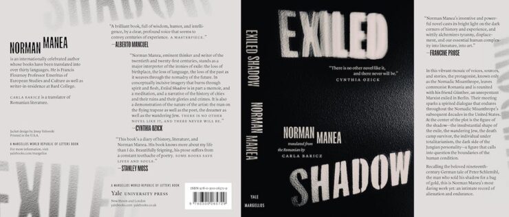
Yale University Press. Book design by Jenny Volvovski.
Simply put, excellent: a two-color jacket with fantastic lettering and great texture.
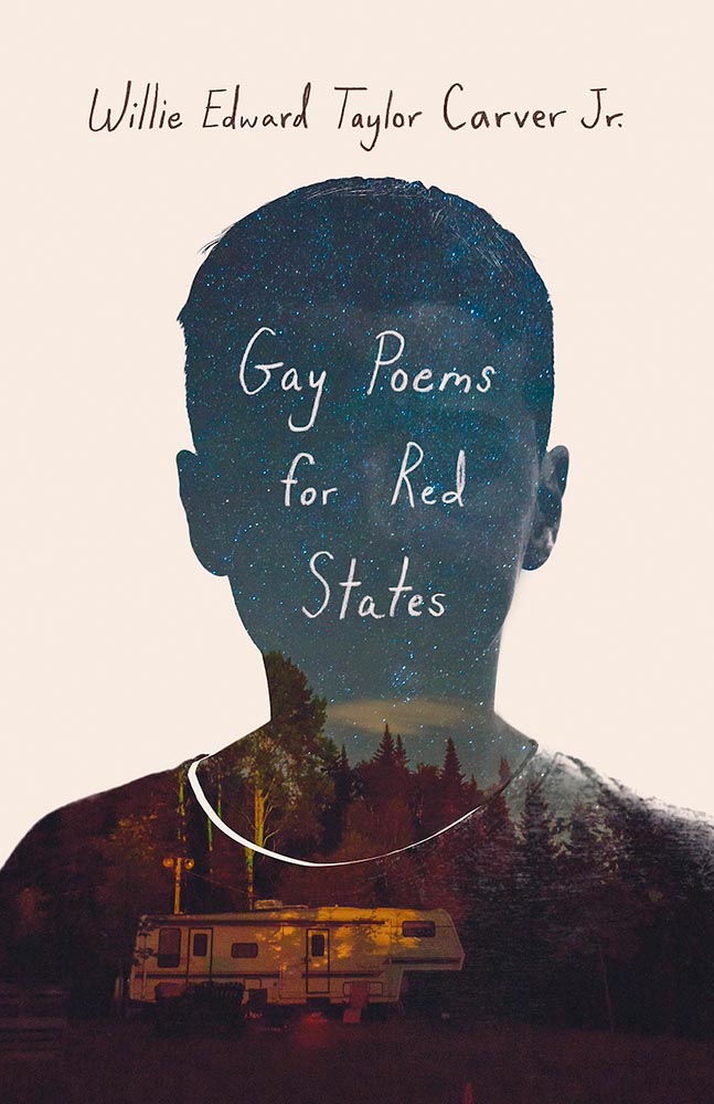
University Press of Kentucky. Book design by Zoe Norvell.
The hint of a face and the illustration within the outline combine to make this a winner on several levels.
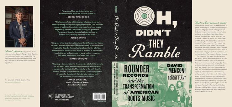
University of North Carolina Press. Book design by Lindsay Starr.
Oh, that O! (The rest of the type is awesome, too.) Aged to perfection.
Yale University Press. Book design by Nathan Burton.
Illustration and type combine to achieve a fantastic jacket.
University Press of Kentucky. Book design by Jaya Miceli.
This cover made an appearance on my 2023 Favorite Book Covers list, and I’m delighted to see AUPresses recognize it, too.
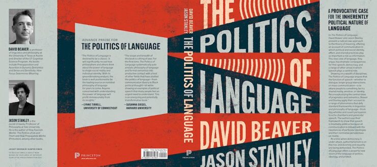
Princeton University Press. Book design by Katie Osborne.
Another example of simple-done-well. Love the orange.
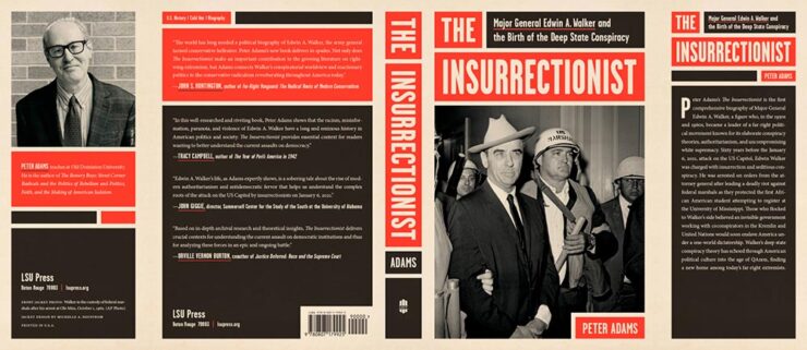
Louisiana State University Press. Book design by Michelle A. Neustrom.
Color blocking perfection: a lesson in how-to using limited color choices.
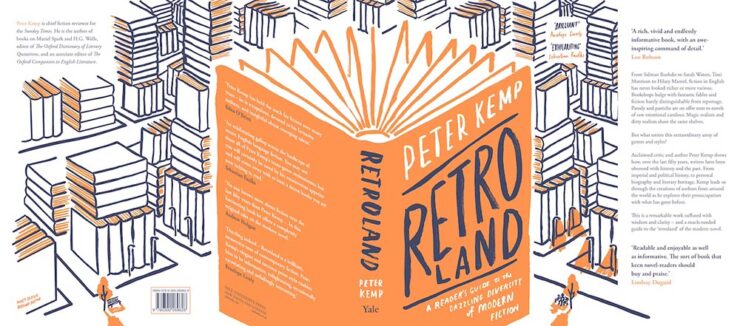
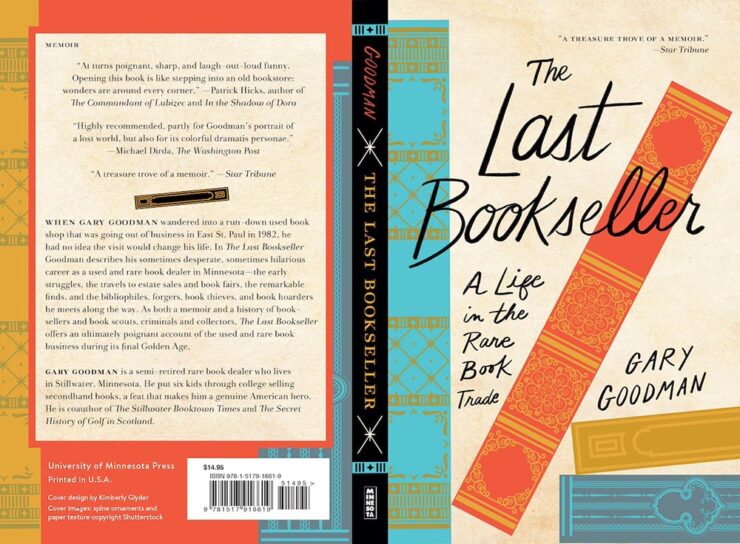
University of Minnesota Press. Book design by Kimberly Glyder.
Great illustration, strong type, fabulous colors. (Interestingly….)
Princeton University Press. Book design by Hunter Finch.
Another that avoids stereotypes with a great background. The hint of megaphones is smartly done.
McGill-Queen’s University Press. Book design by David Drummond.
Brilliant: I love everything about this cover.
Honorable mentions go to the type on Divine Days and the open book on Some Unfinished Chaos. See the whole category of winners here.
Looking forward to next year! (Let’s hope I can post about it in a timely manner.)
AIGA’s annual deep dive into great book design is out — later this year, for some reason — and brings deep satisfaction with a huge variety of titles, foreign and domestic.
“One hundred years into this competition, the book seems to be as protean and chimeric as ever. At times confounded and delighted, we asked ourselves [during the judging process], Is this a course packet or a manifesto? A sculpture or a monograph? A glossary or a guidebook? Is this book contemporary or retro? Gauche or chic? We debated books that blended the grotesque with the goofy alongside books that were delicate, subtle, and difficult to emotionally classify. In the end, we felt we found some of the best of this year’s offerings, books that in every case seem to show what design can do to bring the experience of reading to riskier-yet-more-rewarding places.”
— Rob Giampietro, AIGA 50 Books | 50 Covers Chair
As pointed out above, it’s the 100th year of the competition, this time with 542 book and cover designs entered from 28 countries. In order to be eligible, submitted designs had to have been published and used in the marketplace in 2023.
Some of my favorites, in alphabetical order:
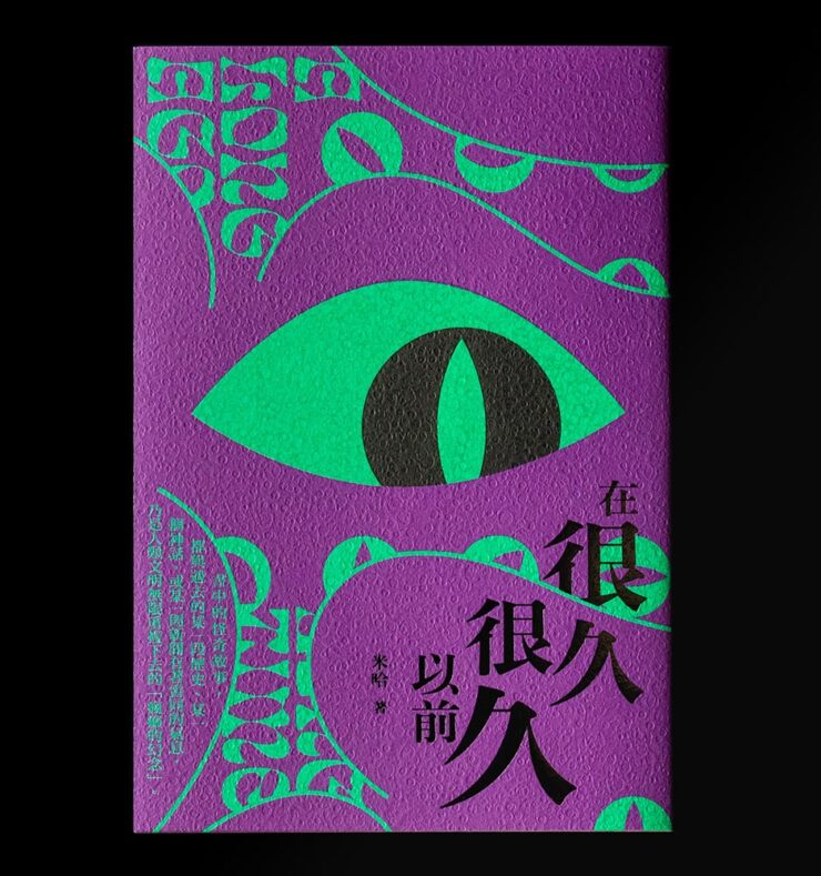
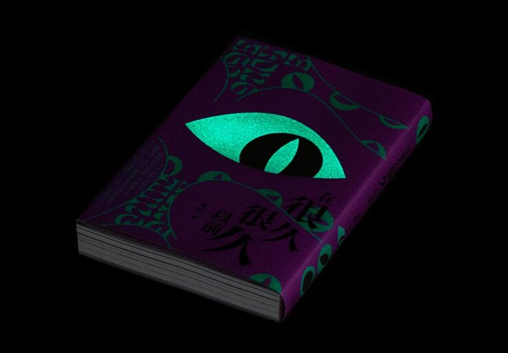
A Long Long Time Ago. Book design by You Kwok Ho.
Great texture, great graphics — on the theme of “observer.” Indeed.
A Long Long Time Ago (glow-in-the-dark detail). Book design by You Kwok Ho.
But wait: there’s more. This one observes more dramatically than it might seem, uh, at first glance.
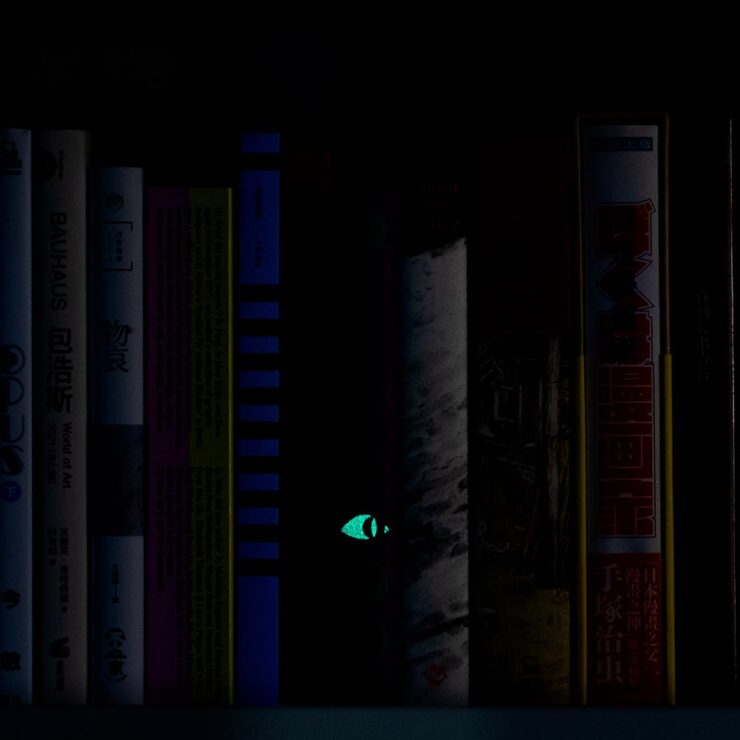
A Long Long Time Ago (shelf detail). Book design by You Kwok Ho.
I want to get a copy just so one of my bookshelves will have this moment. Fantastic.
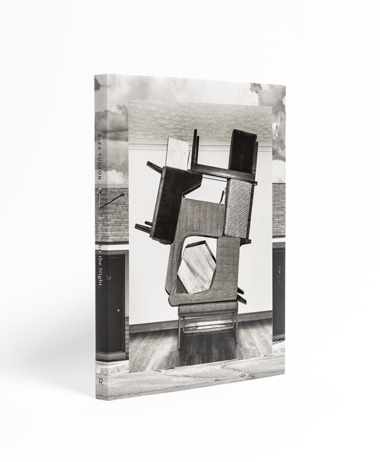
Alex Yudzon: A Room for the Night. Book design by David Chickey and Mat Patalano.
“Yudzon stacks, leans, and balances furniture [in the hotel rooms where he’s a guest] in configurations that transform these generic interiors into hallucinatory worlds where the laws of physics are suspended and dormant emotions released.” (After the installations are documented, crime-scene style, they are dismantled and the rooms returned to their original condition.) Really: who could resist? The compelling design isn’t even the icing on that cake — we’re well past that — it’s a fancy fork, ready to dig in.
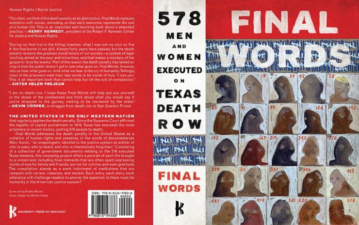
Final Words: 578 Men and Women Executed on Texas Death Row. Book design by Michel Vrana.
I’m glad we have the whole cover here; the spine definitely adds to the overall, and the illustrations on the front add so much.
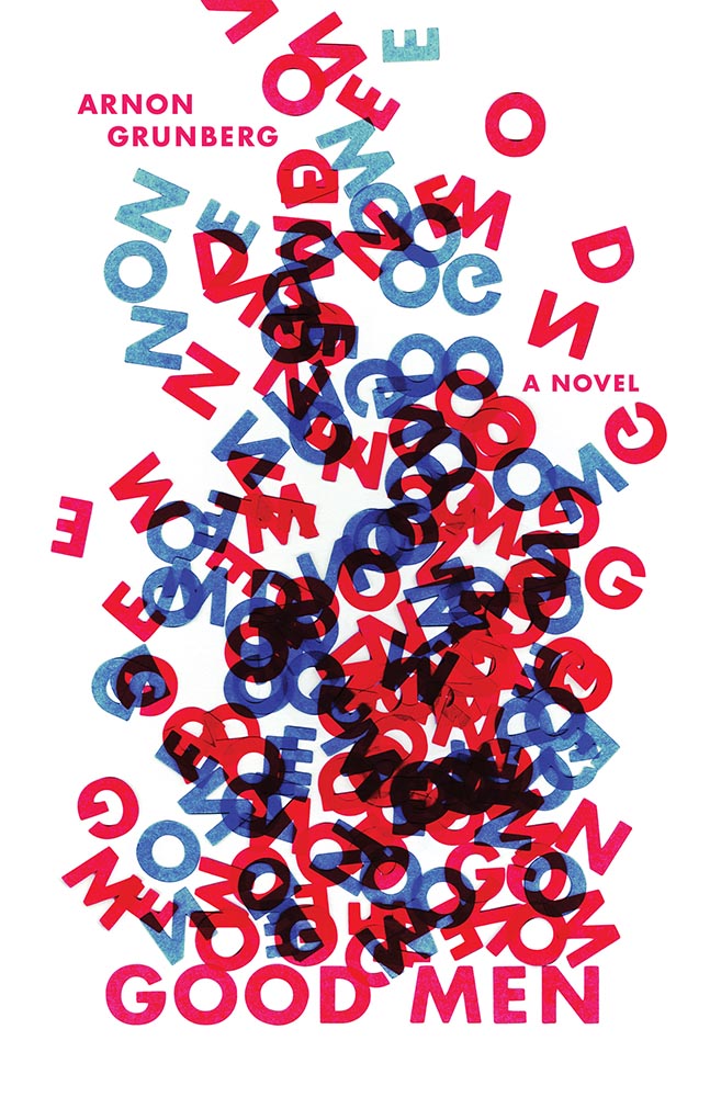
Good Men. Book design by Anna Jordan.
“I cut the letters of the title out of paper and arranged them in a way that is reminiscent of a fire – as if the words “GOOD MEN” are going up in flames. The letters rise up in a smoke-like form. Blue and red is used to emphasize the visual association with fire. The result is a visual metaphor for “GOOD MEN” blazing into entropic chaos,” designer Anna Jordan says of this novel about a firefighter, “an ordinary, sympathetic guy lost in a turbulent existence.”
Good Men (lettering detail). Book design by Anna Jordan.
Nice.
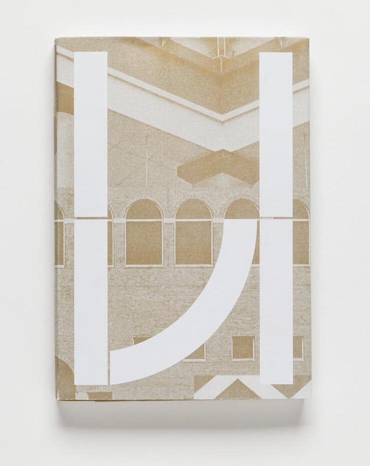
The Gerald D. Hines College of Architecture and Design: 2020–21 Prospectus. Book design by Renata Graw and Lucas Reif.
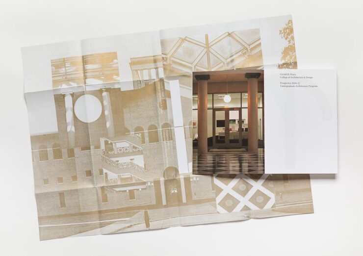
This prospectus for the University of Houston has a special bonus:
The Hines College 2020–21 Prospectus, with its jacket casually tossed over its shoulder. Book design by Renata Graw and Lucas Reif.
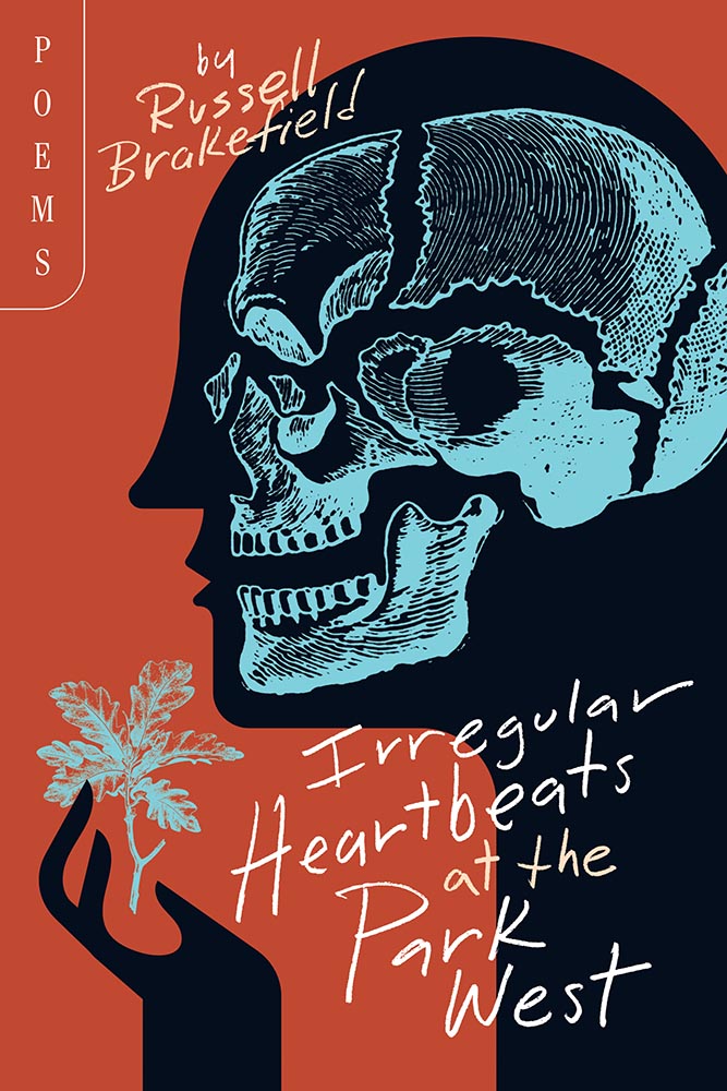
Irregular Heartbeats at the Park West. Book design by Brad Norr.
“Rural gothic,” they say. “Goodness,” I append.
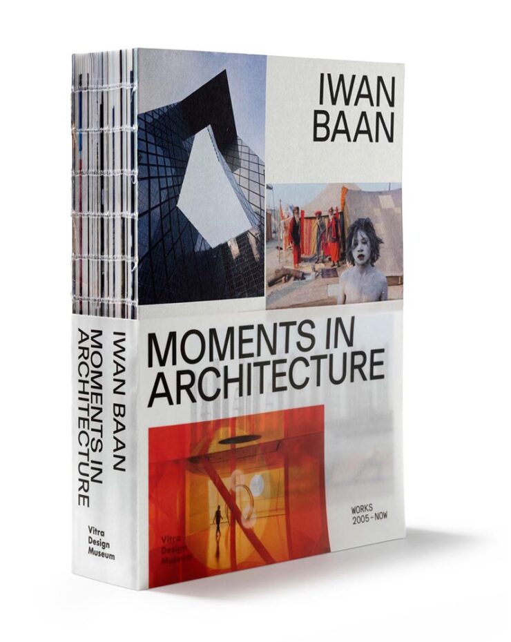
Iwan Baan: Moments in Architecture. Book design by Haller Brun.
Each year, 50 Books seems to latch onto a particular theme. Last year, it was irregular page sizes (often multiple sizes in the same book); this year, it’s irregular, often hand-sewn bindings, seen here with a slip jacket starring the other recurring theme this year: translucency.
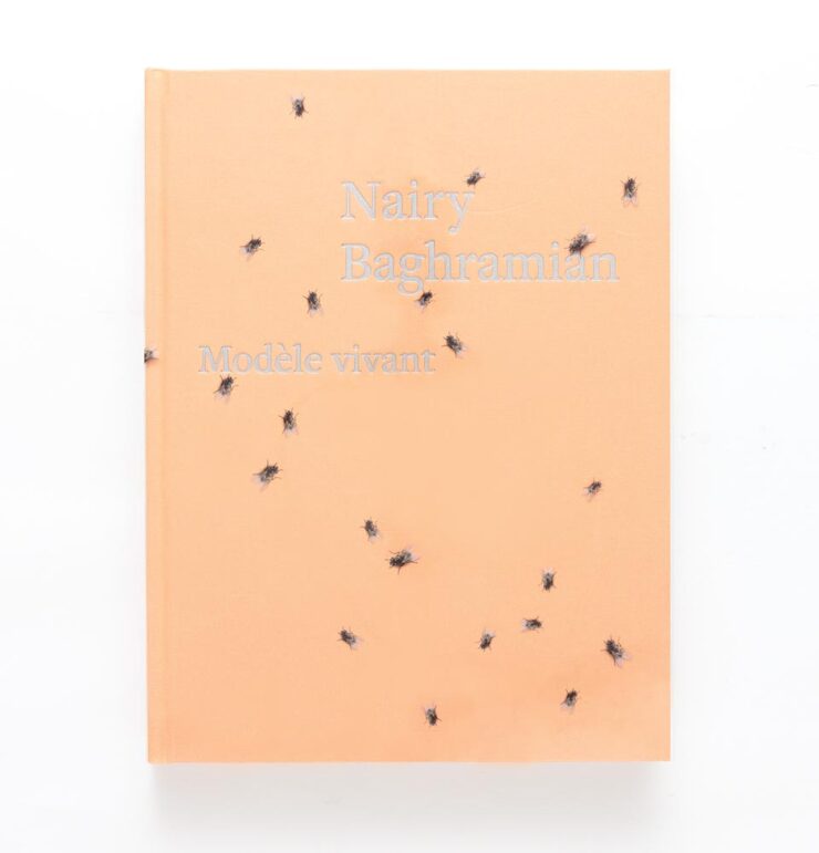
Nairy Baghramian: Modèle vivant. Book design by Green Dragon Office with Nairy Baghramian.
Speaking of translucency, this jacket is that … and something more, shall we say, eye-catching. Compelling, but does it make you want to pick it up?
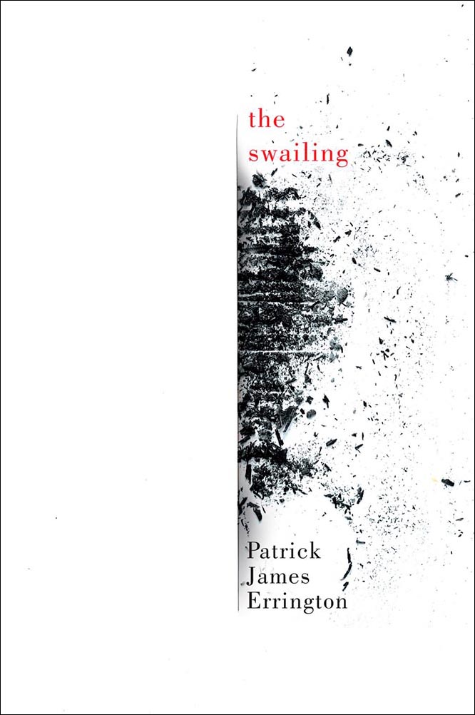
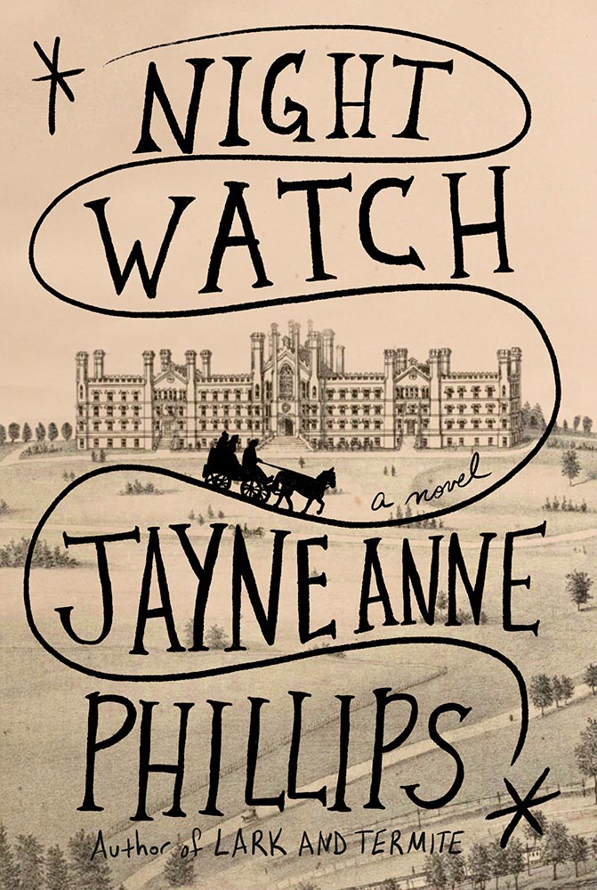
Night Watch. Book design by Kelly Blair.
This title was in my folder of finalists for Foreword‘s Favorite Book Covers of 2023 but ultimately not selected. Glad to see it get some recognition. (Note that The Guest Lecture and The Nursery, two other 50 Covers winners, did make my list.)
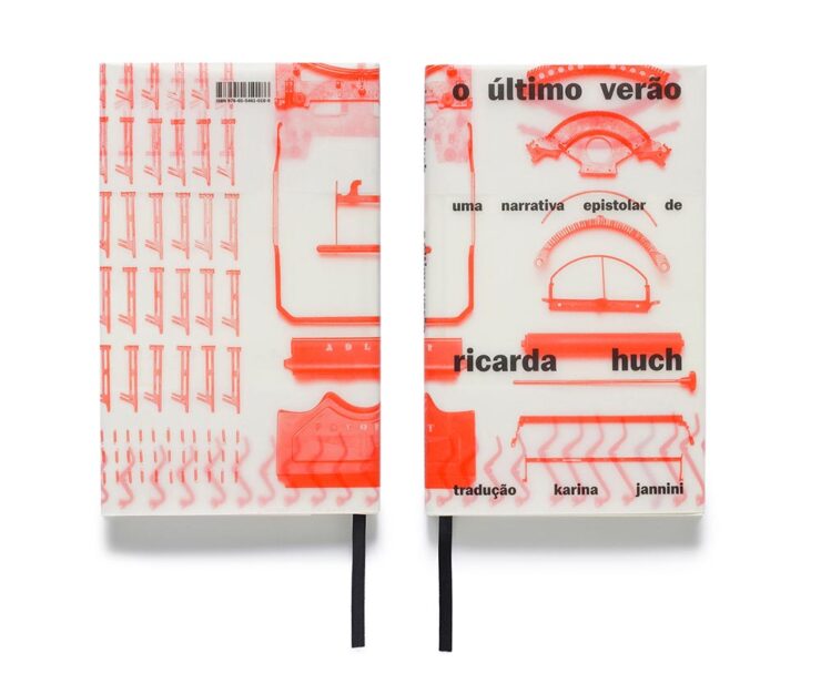
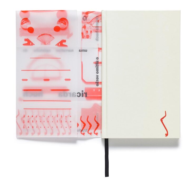
The Last Summer. Book design by Gabriela Castro, Gustavo Marchetti and Paulo Chagas.
The translucency is back, this time covering — well, jacketing — a newly-republished 1910 detective novel set in pre-revolutionary Russia.
The Last Summer (jacket detail). Book design by Gabriela Castro, Gustavo Marchetti and Paulo Chagas.Only on Saturday. Book design by Chuck Byrne.
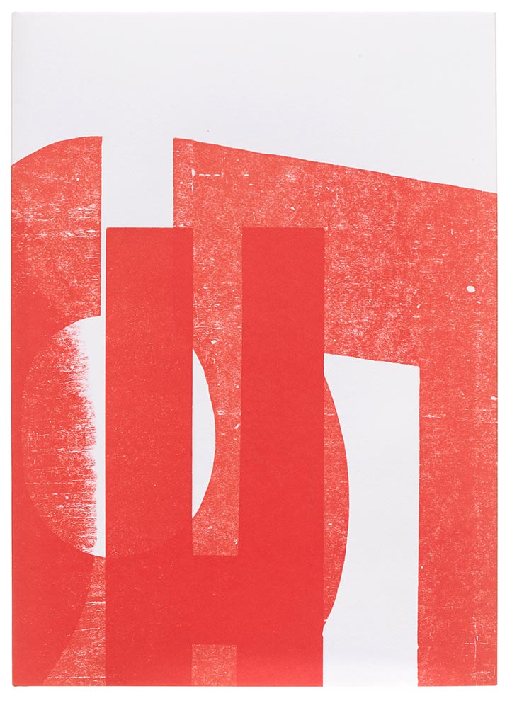
“Printing legend Jack Stauffacher’s experimental make-ready sheets informed both the cover and the jacket for the regular edition,” 50 Books says, in another red-and-white triumph.
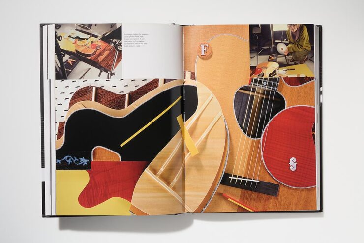
Overlap/Dissolve. Book design by Nancy Skolos and Thomas Wedell.
Great three-dimensionality on this cover, with an equally compelling interior:
Overlap/Dissolve interior spread. Book design by Nancy Skolos.
“We set up compositional frameworks to express harmony, conflict, resolution, or both,” the designers write. “For us there is never one perfect design solution, but the process generates one idea that overlaps and dissolves into the next.”
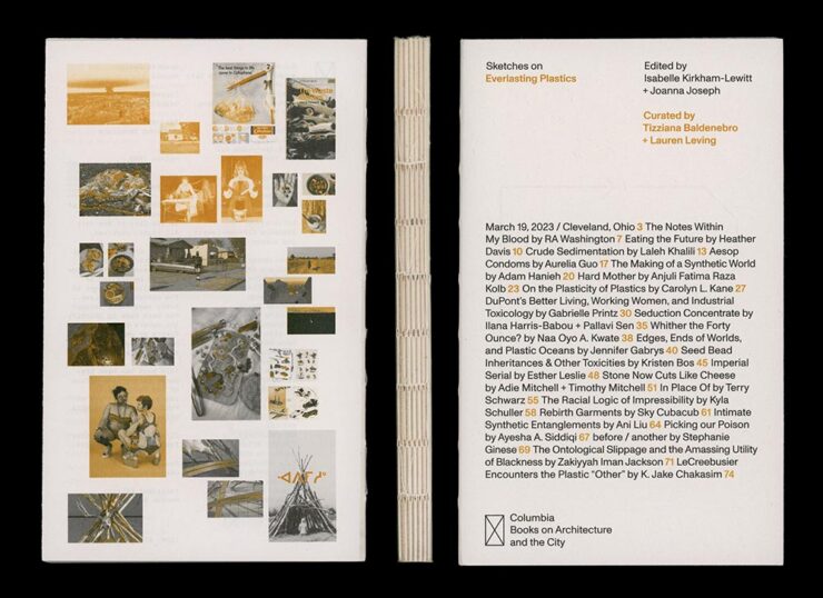
Sketches on Everlasting Plastics. Book design by Renata Graw and Lucas Reif.
Sketches on Everlasting Plastics, which “explores the infinite ways in which plastic permeates our bodies and our world,” accompanied the exhibition Everlasting Plastics at the 2023 Venice Architecture Biennale. (Note the binding.)
Steel Like Paper. Book design by Wolfe Hall.
Debossed type, linen spine, great photographs. Nice.
And, last but certainly not least:
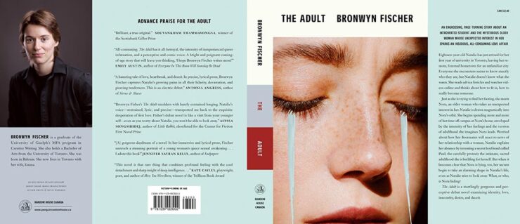
The Adult (full jacket). Book design by Kate Sinclair.
Simple at first glance, yet brings more on multiple levels. Great.