Tag: beautifully briefed

  • Beautifully Briefed 23.10: Shifting, Branding, and Creating

    Beautifully Briefed 23.10: Shifting, Branding, and Creating

    A variety of interests addressed this time: a bit on Shift Happens, a great question on branding, and Leica’s new M camera — and its content credentials. (Plus, bonuses.) Happy October!

    Booking a Keyboard

    We talked about this title back in January, but it’s worth the reminder:
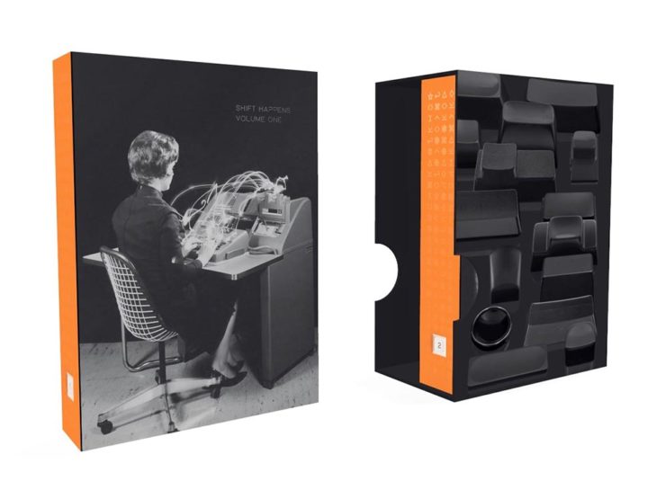
    A 3D rendering of Shift Happens.

    Marcin Wichary has long been interested in keyboards. In his words,

    Keyboards fascinated me for years. But it occurred to me that a good, comprehensive, and human story of keyboards — starting with typewriters and ending with modern computers and phones — has never been written. How did we get from then to now? What were the steps along the way? And how on earth does QWERTY still look the same now as it did 150 years ago? I wanted a book like this for years. So I wrote it.

    Marcin Wichary, Shift Happens

    This title fascinates me, partially because it’s an interesting subject — one we’ve all interacted with, often without thinking about — and partially because it’s a great, well-covered exercise in book design.
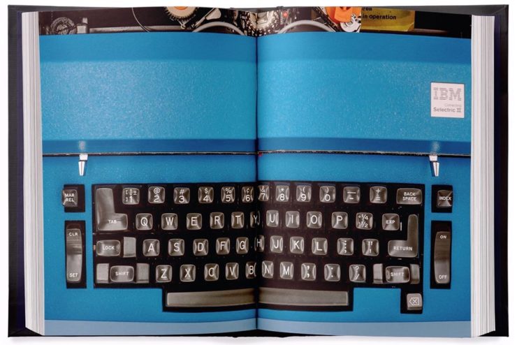
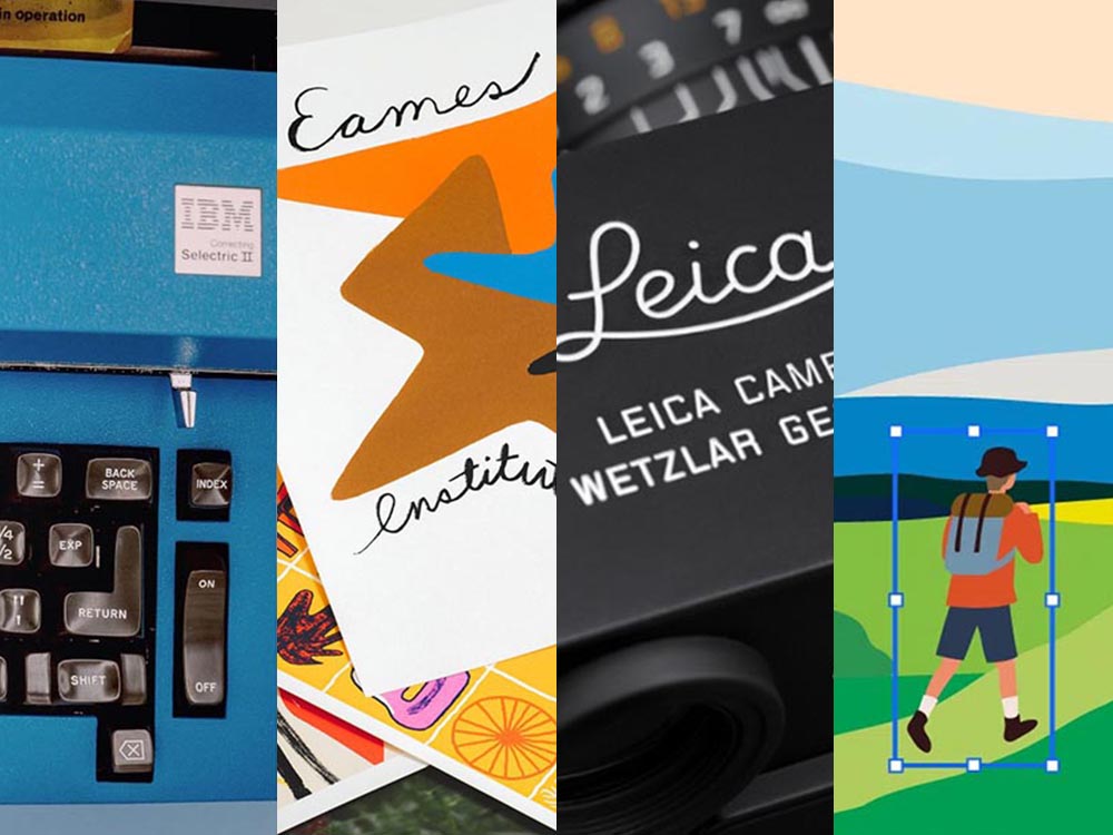
    A very cool photograph of an IBM Electric. Photo by Marcin Wichary.

    Further, Marcin has done a fantastic job in getting the word out. He’s designed a killer web site, written some great updates, and gotten some good press — including a recent interview with Ars Technica, in which he says:

    I am a web guy, and I used to think that the web (just like typewriters, once) took away a lot of hard-won typesetting nuance and tradition. But it turns out that the web also makes it much easier to do certain things. To have a word be surrounded by a rounded rectangle—a visual representation of a key—is a few lines of CSS or a few clicks in Figma. But for the book, I had to cut my own font and then write Python scripts to do typesetting inside the font-making software, which I’m pretty sure you are not supposed to do[.]

    Marcin Wichary, Shift Happens

    Really looking forward this title. Copies are, as of this writing, still available.

    Let’s Talk Branding.

    It’s Nice That asks a great question: “Are rebrands starting to look the same? The challenges facing commercial design,” in which author Elizabeth Goodspeed discusses whether “shortened turnarounds and economic tensions” are taking a toll on originality.
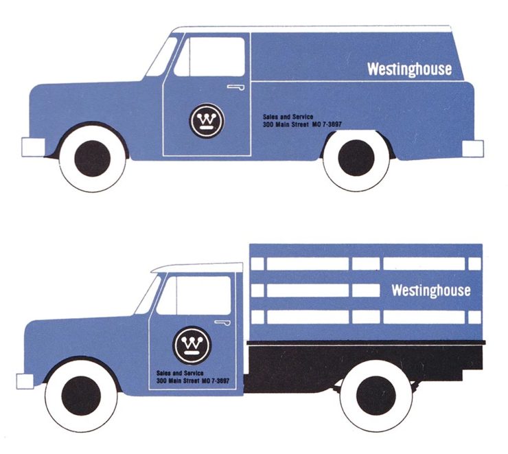
    Westinghouse branding guidelines from the ’60s.

    The answer might seem to be, “Well, duh,” but it’s nonetheless a thoughtful and insightful article that asks the correct question: “how does one define originality in an age saturated with visual stimuli?”

    [T]he digital applications more often associated with modern rebrands, while comparatively easy to update, may counter-intuitively promote less care and attention towards their making. [A]nother possible issue contributing to rebrand redundancy: lack of rollout support beyond rebrand launch. Even a unique identity may lose its spark when its primary consumer touchpoint is what a social media manager produces on Canva after skimming the brand guidelines once. Further still, many clients no longer approach design studios to harness their expertise but, instead, with preconceived notions of the result they expect; design studios may want to create original work, but sometimes clients are willing to pay more for a rebrand that mirrors their own preconceived ideas of what the work should look like.

    — Elizabeth Goodspeed, It’s Nice That
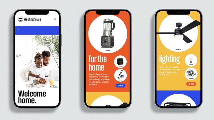
    The logo’s the same, but the applications vastly different.

    The whole article is great (and richly illustrated) — give it a few minutes of your time.

    Special Bonuses #1 & 2: Let’s look at a couple of places where branding has been in the news recently (pun intended). Also from It’s Nice That, an article on The Irish Independent rebrand. Here, as is often the case recently, it’s the custom illustrations that carry the day:
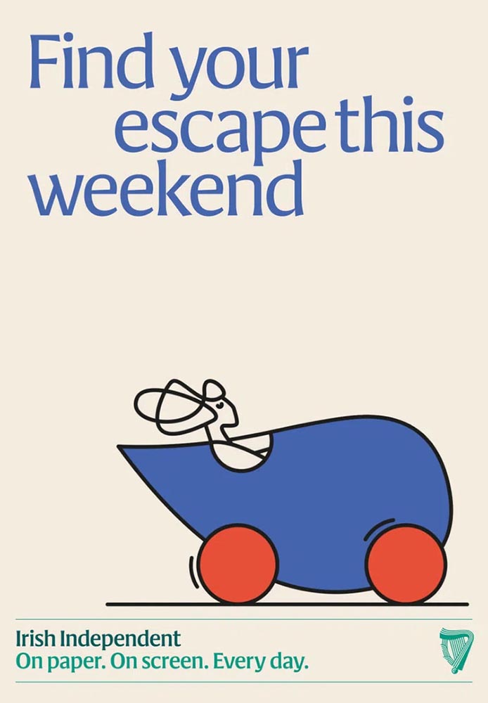
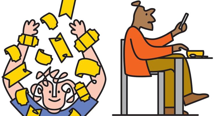
    Andy Goodman is the illustrator responsible for the lively work found throughout, which toe the line between measured and playful,” It’s Nice That writes. Agreed 100%.

    Less successful is England’s The Guardian, whose ongoing campaign to raise money — they don’t have a paywall, relying instead on reader contributions — perhaps could have used more work:
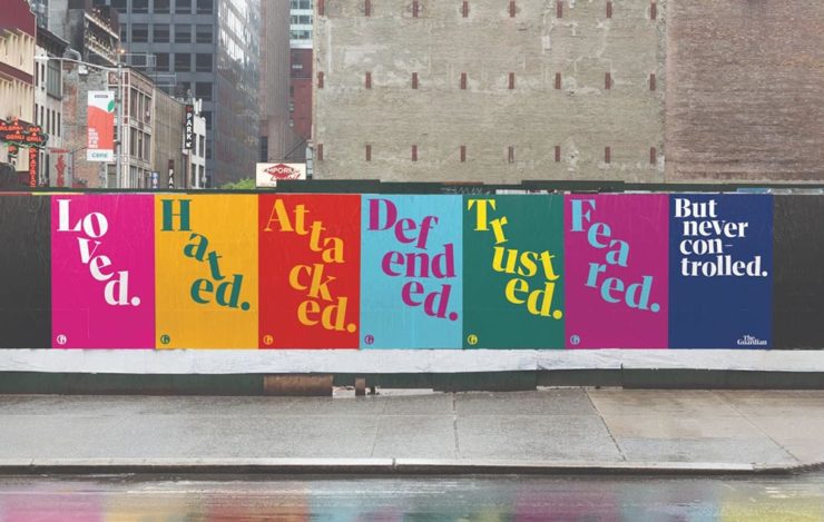
    These ads don’t really have me on the fence: The Guardian deserves better.

    Meh. (And this from a huge fan of The Guardian.) Creative Boom is more positive.

    Special Bonus #3: From the wildly successful, original branding department comes, of course, the brilliantly-named Eames Institute of Infinite Curiosity. They’ve been covered here twice before, but are back in the news with a new branding Manual. See why that’s capitalized at Dezeen.
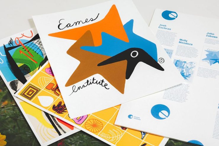
    The Eames Institute branding oozes positivity, class, and — you guessed it — infinite curiosity. Nice.
    Leica, Adobe, and Content Authenticity

    One would assume that Leica users are the epitome of content authenticity — there’s nothing like the world’s best lenses (IMHO), attached to some incredible cameras, to provide photographers with all that’s needed to make the best possible images.

    Leica’s new M11-P, however, packs a world first: hardware encryption that supports a system called the “Content Authenticity Initiative (CAI).” In CAI corporate-speak, it’s “the future of photojournalism […] usher[ing] in a powerful new way for photojournalists and creatives to combat misinformation and bring authenticity to their work and consumers, while pioneering widespread adoption of Content Credentials.”
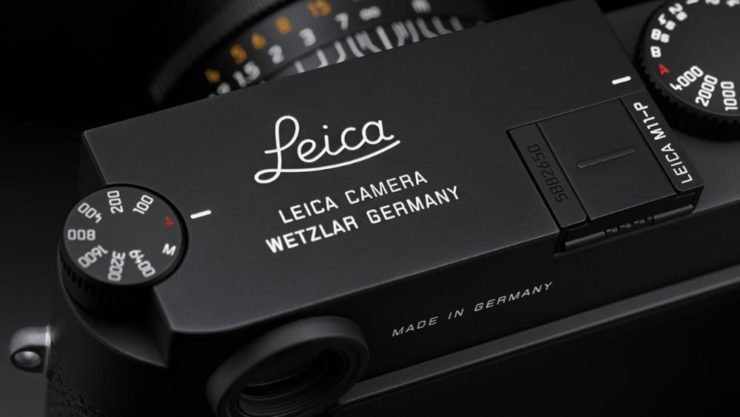
    Leica’s new M11-P. A bargain at $9,195. (Lenses extra, of course.)

    B&H puts it another way:

    The Content Authenticity Initiative (CAI) is a collaborative effort initiated by Adobe in partnership with various other organizations, including The New York Times and Leica, among others. Announced in late 2019, its primary goal is to develop a standard for digital content attribution. The rise in manipulated digital content, deep fakes, and misinformation has underlined the need for a more transparent system of content attribution, which the CAI seeks to address.

    The interesting thing here is Adobe’s initiative. What’s their goal?

    Adobe has been suffering a few hits recently. They’ve just raised prices — on the heels of record profits — and “monopoly” is not in any way a stretch. Photoshop? Entered the lexicon. InDesign? No credible alternatives. Illustrator? Professional standard across multiple industries. In other words, we’re stuck with ’em, and they know it.

    This line of thinking is expanded at CreativeBoom: “Is Adobe Becoming the Frenemy of Creatives? But that’s not all.
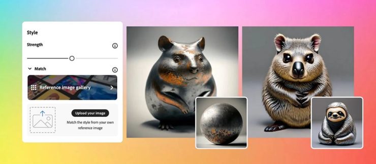
    Ignore’s Adobe’s unfailingly cute examples: AI + texture = exactly what some “creative director” needed. Seriously uncute.

    They’re pushing hard into AI, too, and surprisingly up-front about it changing creative work in ways potentially less creative:

    Firefly 2 was unveiled yesterday at the 2023 Adobe Max conference with the artificial intelligence (AI)-powered tool incorporated into Lightroom’s new lens blur feature that simulates depth of field along with a host of other tools. However, it was the new “Generative Match” tool that will allow users to upload a reference image to guide the AI image generator to a specific style that prompted Adobe to comment that the new tools could mean less work for photographers. 

    Adobe is appealing to companies who want a “consistent look across assets.” It is offering brands the chance to generate hundreds, if not thousands, of similar images for different uses such as websites, social media, and print advertisements.

    — Matt Growcoot, PetaPixel

    Or how about this example: An agency or freelancer working on a vector image in Illustrator, and need to add something that they either don’t have the time or talent to do myself. Previously, they could find either a stock item — made by a human (who is paid, by the way) — or hire it out (again, to a human, and again, one who is paid for their work). Now? Just tell the computer what you need.
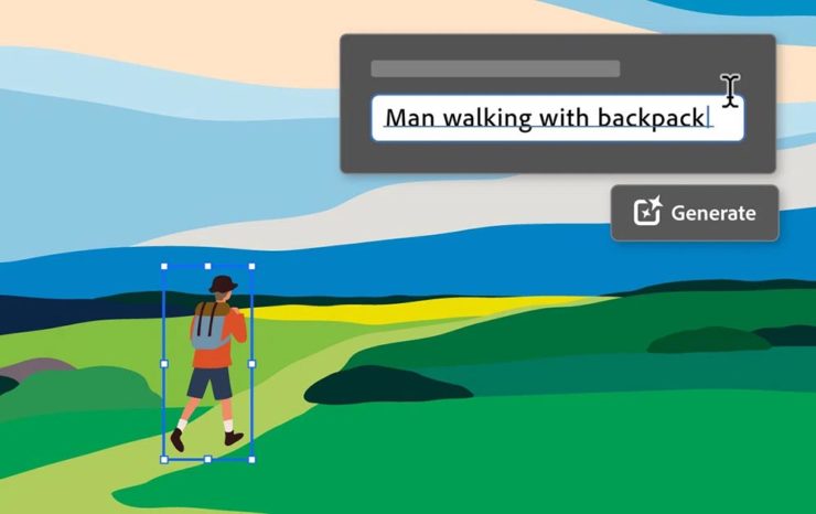
    Get more from Ars Technica’s Unlimited Barbarians Dept.

    All of which ties nicely back to the previous section on whether branding is beginning to homogenize. Is AI going to accelerate that process? You betcha.

    Value human creativity, folks. Artists, teachers, writers, thinkers: all the people pushing at the edges of the envelope will now have to push even harder, in an era when envelope-pushing is increasingly demonized.

    Special Bonus #4: Ars Technica argues that the U.S. Copyright Office’s blanket ban on the copyright-ability of AI-generated images isn’t going to age well, using photography as an argument.

    Special Bonus #5 (Updated 31 Oct): Via Nick Heer’s excellent Pixel Envy, we have a great explainer from Tim Bray regarding The Coalition for Content Provenance and Authenticity (C2PA), the actual implementation of CAI. Better than my brief description by a country mile.

    Special Bonus #6: To round out this post, from the department of envelope-pushing: PRINT Magazine put together the book covers of the 11 most-banned books in America. Dangerous, indeed!

  • Beautifully Briefed 23.5: Spring Mix

    Beautifully Briefed 23.5: Spring Mix

    Lettuce first apologize for not having an update in a minute, but I’m going to try to make up for it with this word salad delicious selection of items I’ve been setting aside: ABCD book design, impossible book design, some thoughts on DPReview, Architecture in Music, Hoefler’s typographic illusions, and, because you deserve it, the Great Wave in 1-bit. Enjoy.

    Book Design #1: ABCD

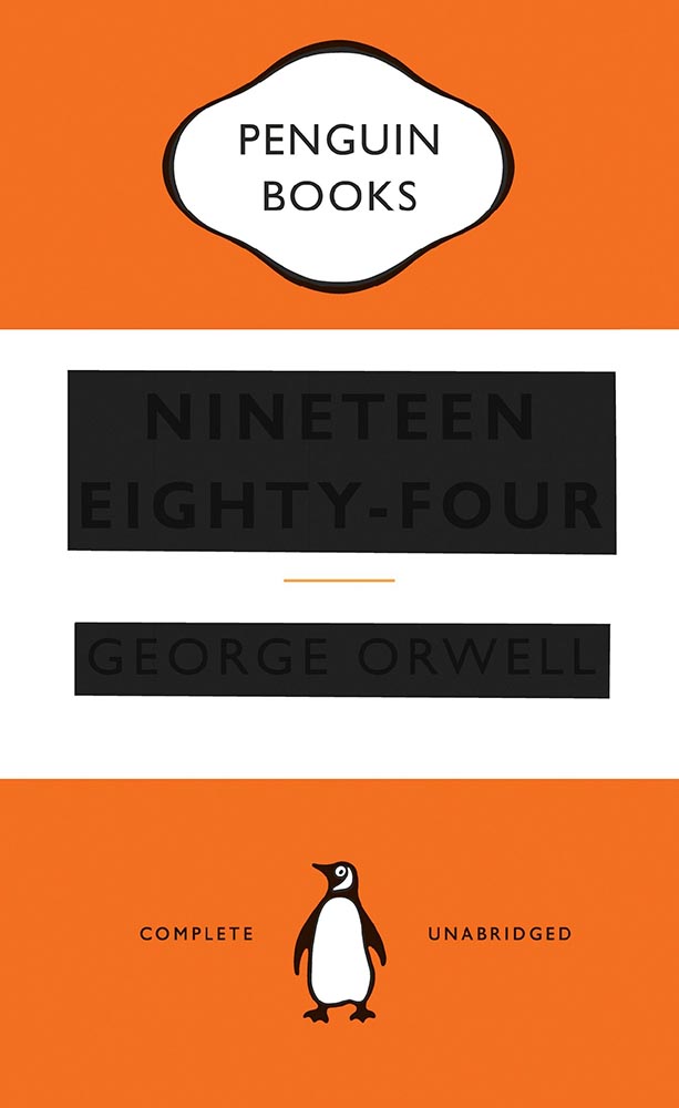
    “Winner of All Winners,” says The Academy of British Cover Design (ABCD):

    Cover design by David Pearson.

    “Pearson’s design was judged to be the best book design to have won an ABCD award in its decade-long history,” says The Bookseller.

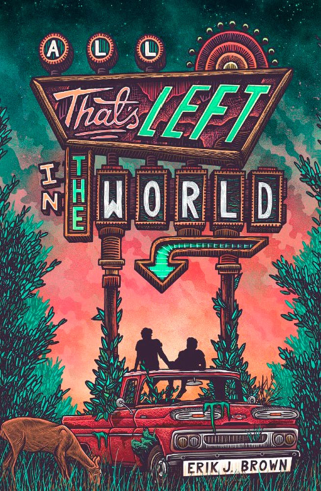
    Meanwhile, their “Best of 2022” list included several I named as well, along with a few I hadn’t seen. The illustration that is the cover design for this young adult title, for instance:

    Cover design by Michelle Brackenborough.

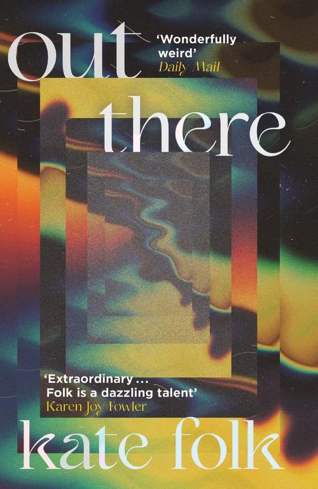
    Out There fills its “wonderfully weird” billing incredibly well, too:

    Cover design by Lydia Blagden.

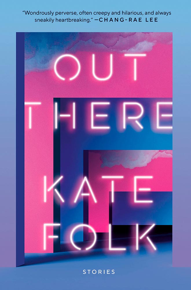
    Alas, the US version:

    Cover designer unknown. (Probably just as well.)

    I often discuss UK covers when they’re pointed out somewhere, but as a general rule, my book design coverage, for lack of a better term, is US-based. Some other time, I do want to discuss why the UK covers are, generally, better than their US counterparts — as the above illustrates.

    Anyway, read Design Week‘s excellent article on those and all the Academy of British Cover Design winners of 2022.

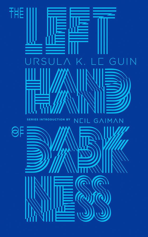
    Bonus: I ran across Penguin Galaxy’s 2016 version of an Ursula Le Guin title I’ve got on my read-that-someday list — and love the cover design:

    Cover designer unknown — I’ll look into it and update this post if possible.

    The whole series is awesome, in fact. Check it out.

    Book Design #2: The Impossible Bamboo Hardback

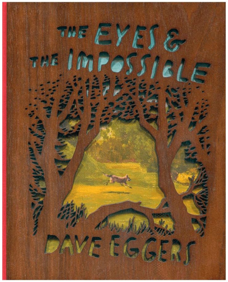
    The Eyes & the Impossible the first-ever book to be published in two editions, for two readerships, and from two publishers: Knopf has one, in standard form, for the young adult audience.

    The other one, however…:

    Cover design concept by the author.

    Yes, that’s an illustration showing through laser-cut bamboo, with a glimpse at the red cloth spine. There’s no way to summarize this design story in a way that does it justice, so just go to PRINT and read the whole article. Great stuff.

    Photography #1: DPReview Shuttering

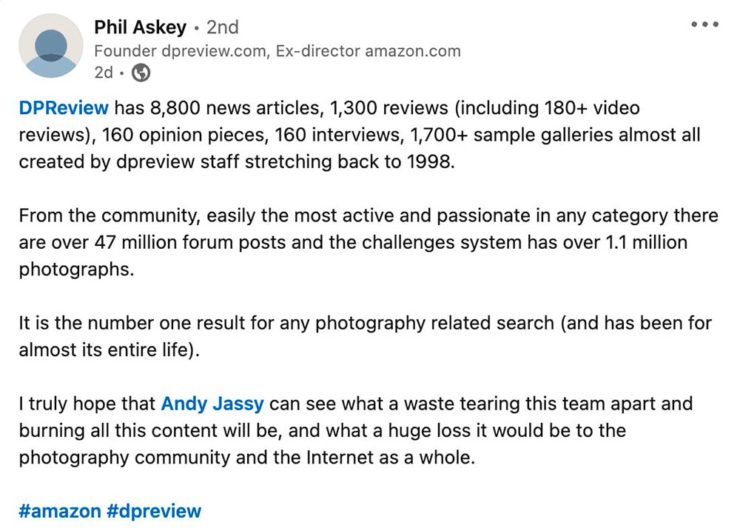
    Digital Photography Review, long known as just DPReview, is being shut down. Started in 1998 by Phil Askey, it’s currently part of Amazon and is arguably the internet’s leading camera database — with over a thousand reviews of cameras, lenses, and related items, 24,000 articles, some 2.7 million comments, and more.

    Perhaps most valuable, and something that will be missed by many, is their large selection of galleries: lenses and cameras, all in a way that can be compared side-by-side, an invaluable tool for those looking to purchase a new toy essential item for their photography bag.

    Askey, who left in 2010 (three years after the Amazon acquisition) blasted Amazon’s short-sightedness:

    I meant to write about this long before now, but there’s an interesting thing commenting more than a month later: they’re still there. Like many corporate decisions these days (ahem, Twitter), something changed — but it doesn’t matter. The damage has been done, foot shot, whatever. The reporters have moved on, the articles have slowed to a trickle, and updates have been greeted with skepticism.

    What a shame.

    Photography #2: Architecture in Music

    I somehow didn’t write on this one last time I saw it — so when a new series was covered by This is Colossal, there’s no way it wasn’t going to be celebrated here:

    “1995 Low C Prestige Bass Clarinet,” by Charles Brooks

    Recognize it? No? How about this one:

    “The Exquisite Architecture of Steinway, Part 8,” Steinway Spirio R piano, by Charles Brooks

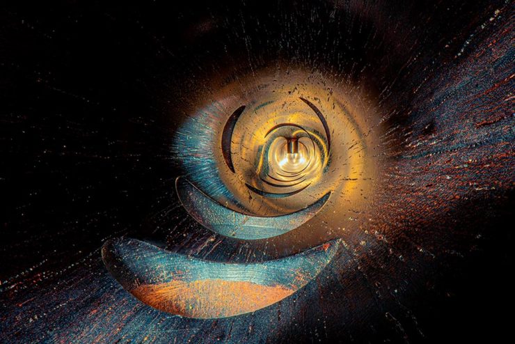
    Charles Brooks, a twenty-plus-year overran of orchestras around the world and a cellist since childhood, has taken a probe lens and put it inside some of the world’s amazing instruments. The results are magical:

    “St. Marks Pipe Organ, Part 1,” by Charles Brooks

    See many more here (2023) and here (2022). (See also this post’s header image, “Siete Lunas’ Guitar by Roberto Hernandez.”)

    Typographic Illusions

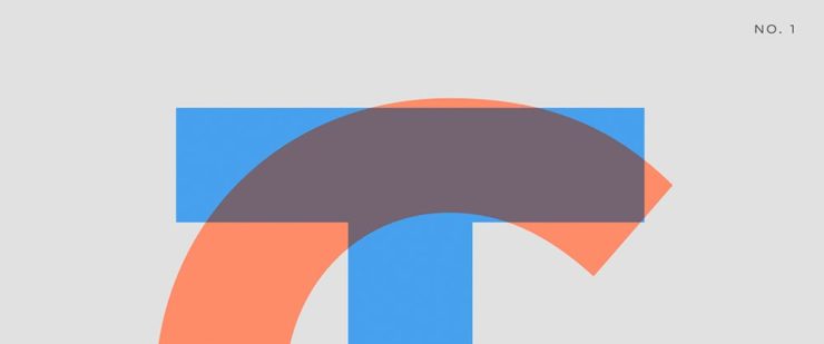
    Hoefler & Co. points us at necessary illusions in typography:

    Highlighted on Netflix’s Abstract: The Art of Design, these “cheats” show us that letterforms are so much more than just shapes drawn to stylize characters.

    Since a number of people who teach design have suggested that we manufacture these for use in the classroom, I thought I’d take the more direct approach, and make them available as a free download, as a PDF that can be printed on transparencies. Whether you’re teaching typography, studying it, or just giving letters a closer look for the first time, I hope you’ll find these useful.

    —Hoefler & Co.

    Absolutely. Check ’em out.

    One-Bit Wave

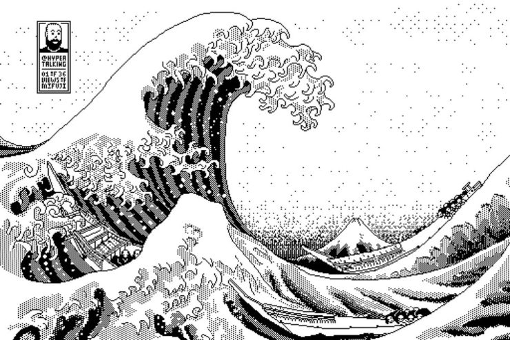
    Last but not least this Monday morning, let’s please celebrate Great Wave Off Kanagawa — in glorious 1-bit greatness:

    I usually use either my Quadra 700 or PowerBook 100, mostly because those are my reliable and easy to access computers (that run System 7, my favourite and most familiar OS of that era).

    Software-wise I use Aldus SuperPaint 3.0, which is what my family had when I was a kid. Yes, I’d say that all of this is 99% nostalgia-driven…

    —James Weiner

    Incredible. There’s more info at his fantastic web site (done, naturally, in the style of a classic Mac system). Thanks to Kottke for the link.

    Bonus: As I was writing this, he was posting 1-bit emoji. Sweet!
    Have a great week!

  • Beautifully Briefed 23.3: Kottke’s 25, The Book Cover Review, B&N Back to its Roots, The End of Type 1 Fonts, and I Don’t Want to Log In

    Beautifully Briefed 23.3: Kottke’s 25, The Book Cover Review, B&N Back to its Roots, The End of Type 1 Fonts, and I Don’t Want to Log In

    This time, the twenty-fifth anniversary of one of my favorite websites, a new book cover review site, an interview with B&N’s CEO, the end of Type 1 fonts, and a world-class rant.

    Kottke Turns 25
    “Fine Hypertext Products,” indeed.

    Jason Kottke has been publishing a blog continuously for twenty-five years — more than half his life — and along the way, earned many an eye. (It’s been a full-time job since 2005.) Some of his thoughts from the anniversary post:

    My love for the web has ebbed and flowed, but mainly it’s persisted — so much so that as of today, I’ve been writing kottke.org for 25 years. A little context for just how long that is: kottke.org is older than Google. 25 years is more than half of my life, spanning four decades (the 90s, 00s, 10s, and 20s) and around 40,000 posts — almost cartoonishly long for a medium optimized for impermanence.

    I had a personal realization recently: kottke.org isn’t so much a thing I’m making but a process I’m going through. A journey. A journey towards knowledge, discovery, empathy, connection, and a better way of seeing the world. Along the way, I’ve found myself and all of you. I feel so so so lucky to have had this opportunity.

    — Jason Kottke, Kottke.org

    Cited here often, always brimming with interesting items, and a regular source of learning, Jason deserves massive congratulations. Happy 25! Here’s to many more.

    Bonus: Kottke was a guest on Daring Fireball’s The Talk Show. Check the links — Textism! — and enjoy a trip down blogging’s memory lane.

    The Book Cover Review
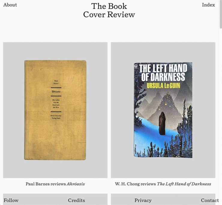
    NYT? No, English, actually.

    FastCompany points us to a new and interesting cover review site: mostly classic titles, covered in ~500 words “from a range of voices around the world.” Good stuff, with a NYT Book Review look and feel, updated regularly. Give it a try.

    The Verge interviews B&N’s CEO
    Decode B&N with James Daunt

    I’m not a regular listener of The Verge’s Decoder — it’s usually business-centric, going so far as to describe itself as secretly about org charts — but this one’s interesting: an interview between Nilay Patel and Barnes and Noble CEO James Daunt. They cover changes at B&N (with emphasis on why) and, of course, the elephant in any room:

    [Amazon is] really terrible at putting a book in front of you that you never thought you’d want to read, that you have no reason to read and no tether to at all. Whereas a bookstore is precisely the place that does that. You pick up the book that you never thought you would want to read, might read, or could even think about reading, by an author you’ve never even heard of until that moment. When a bookseller says, “Look at that,” “Read that when you next come in,” or “I love that,” or whatever it is, all those small, little recommendations are personal and able to attach themselves to books that otherwise have nothing going for them at all.

    James Daunt, CEO, B&N

    Props to The Verge for providing a full transcript, especially helpful for folks who would rather read the interview than listen to it. Whether you want to read or listen, though, book lovers in the US should take in this interview.

    Adobe Discontinues Type 1 Support
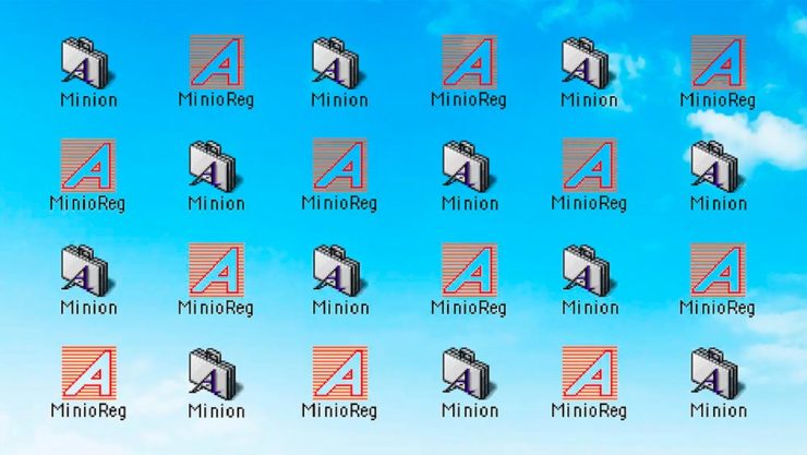
    Flying Suitcases.

    Back in the old days, Type 1 fonts were the backbone of desktop publishing. They were multi-part, often incomplete or corrupted, and always getting in the way of perfect print output — and yet beautiful and opening never-before-appreciated horizons of possibility for your projects.

    Now, in these days of OpenType, Google Fonts, and digital output, Adobe has taken the decision to discontinue support for the legacy Type 1 format. TypeNetwork has the full story, along with some options, and there are other converters if you need ’em.

    Bonus: TypeNetwork also has all of the Adobe Originals, from back when Adobe was your go-to instead of the corporate behemoth. Classy classics: see the list.

    The end of an era. (Via BrandNew.)

    The Perfect Rant: Solved
    There’s a park calling your name.

    One more from The Verge: “I don’t want to log in to your website.” The surge of login and email requests before being allowed to read “free” content is addressed brilliantly:

    So what we’re looking at here is creating a worse user experience in order to pursue a variety of scummy money-making schemes. And that sucks because there are no real public spaces on the internet. Here in reality, I can fuck off to a park and hug a tree and sit on a bench and do stuff without ads, without anyone trying to track me, and without having to pay a dime. There was a time within my memory when people tried to make websites feel like semipublic places — you could hang out on someone’s cool blog and enjoy yourself. 

    Elizabeth Lopatto, The Verge

    Read the whole thing, nod in agreement, and go enjoy that park.

  • Beautifully Briefed, Holiday Edition (Late December, 2022): Nick Heer, Jason Kottke, Stealing Sheep, a Landscape Photograph, and Some Old Logos

    Beautifully Briefed, Holiday Edition (Late December, 2022): Nick Heer, Jason Kottke, Stealing Sheep, a Landscape Photograph, and Some Old Logos

    “The Bleak Cycle”

    I don’t usually think it’s fair to quote another blog post in its entirety, and I certainly won’t make a habit of it. With that out of the way, the always-interesting Pixel Envy, written by Nick Heer, hits us with a doozy — one that, due to its length and depth, requires the complete quote:

    The Bleak Cycle

    It’s a cycle. People create something, together, that reflects their energy and weird work; that thing becomes compelling as a result, and that makes it valuable, and at some point someone puts a price on it and someone else pays that price. It is at that moment that the thing begins to change. The new owner will almost always decide that what is most interesting about this thing is not the human essence that gave it value, but The Owner Himself, and will act accordingly. People will come back for the valuable stuff until the owner succeeds in crowding it out; when that crowding is done, the owned thing dies. Until then, what’s left is just what’s valuable—the humanity and brilliance and unpredictability and fun that all that cynical and idiotic and self-serving wealth is always and everywhere busy replacing with itself. There’s nothing to do but look for the good stuff until the looking becomes too challenging, or until it’s gone.

    David RothDefector

    Heer writes in response: “You may disagree with Roth’s headline thesis — ‘everything is Silicon Valley now’ — or his tie-in with the story du jour, Twitter, or his analysis of baseball’s problems. But the paragraph above? That is something to keep pinned in your brain. For most of us, it is a reminder to be wary of how things are changed in exploitative ways; for those in power, it should be seen as a cautionary pattern.”

    Pinned.

    Kottke is Back!

    After a few months off, Jason Kottke is back in the blogger’s seat to enrich all of our lives. As someone who’s been reading for years — he started in 1998, and I’m certain his site was in the blogroll of the old Foreword, back in the Aughts.

    Fine hypertext products indeed: Kottke.org, December, 2022.

    We might be waiting a while for his so-called “comically long what I did on sabbatical post,” but his Sabbatical Media Diet post is a gold mine of to-read and to-watch items.

    Welcome back, sir. May you blog for many seasons more.

    Stop Stealing [Free] Sheep

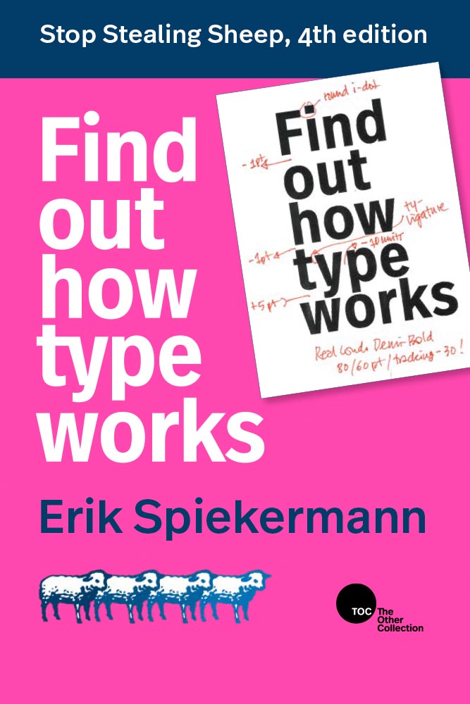
    No, not that — the type book:

    From Kottke, while we’re on the subject, one of his Quick Links from Dec 20th: “Google Fonts is offering a free download of the newly updated 4th edition of Erik Spiekermann’s Stop Stealing Sheep & Find Out How Type Works.” It’s a PDF, available now.

    9th Annual Landscape Photography Awards

    It’s fair criticism to say that I both decry photography contests and yet sometimes celebrate the results. But…:

    “The Winding Journey” by Max Rive, Border Between Chile And Argentina, Patagonia

    Wow. I couldn’t not highlight that photograph.

    Many more at the source. (Via DPReview.)

    Oldest Logos Still in Use

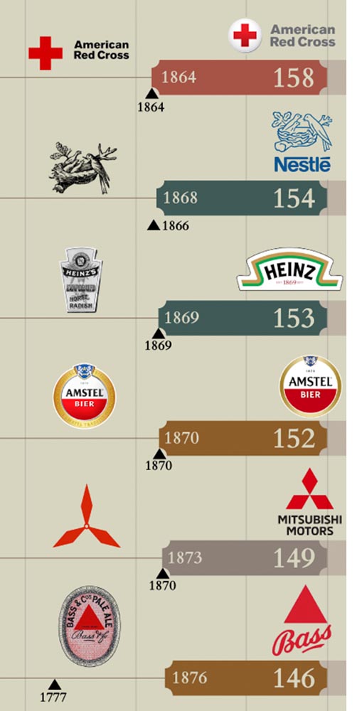
    Image Relay has an interesting item showing how long some familiar logos have been used — and, yeah, there’s a reason they’re familiar!

    The black triangle is when the company was founded, and the bar indicates how long a logo with elements still used today has been around.

    That’s but a sample of the complete listing; shown are nos. 3–8. Coca-Cola, the company I’d probably name if asked for the oldest logo, is no. 12. Click through for the rest.

    That’s it for this year

    Foreword will be back in January with our annual first-of-the-year best-of: my favorite book covers of 2022. Happy holidays, everyone!

    Top image: Tree Lights, December 2020, downtown Macon, Georgia.

  • Beautifully Briefed, Automotive Edition (December 2022): Audi, Lancia, Kia, and Mercedes-Benz

    Beautifully Briefed, Automotive Edition (December 2022): Audi, Lancia, Kia, and Mercedes-Benz

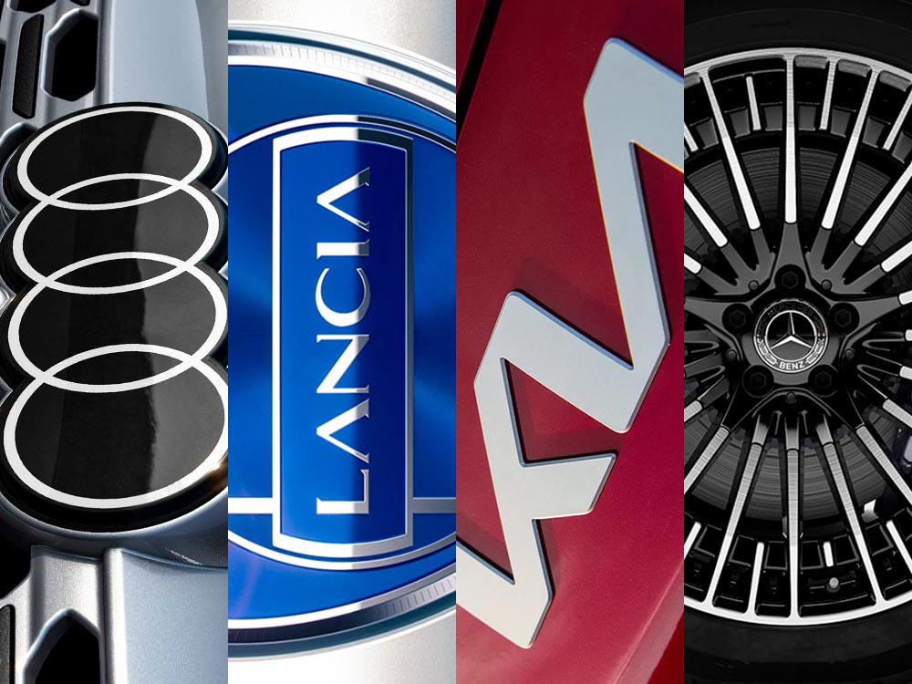
    This time, it’s three automotive logos . . . and Mercedes’ accounting department, plus a holiday bonus. Joy to the Auto!

    New Audi Logo Falls Flat

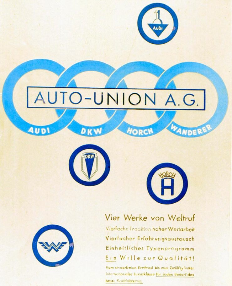
    Audi’s “Four Rings” have been around for a long time — since Auto Union was formed, ninety years ago:

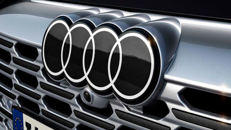
    Now Audi follows the pack (see VW, Mini, Volvo, etc.) and converts their logo from three-dimensional to two; the rings now are either white and framed by a thin black border or dark grey with black borders.

    Four-ring closeup. (It’s hiding sensors, too.)

    Not an improvement, IMHO. One of the articles mentions the concept of “a consequence of digitalization,” and think that’s about as good a description as you’re gonna get.

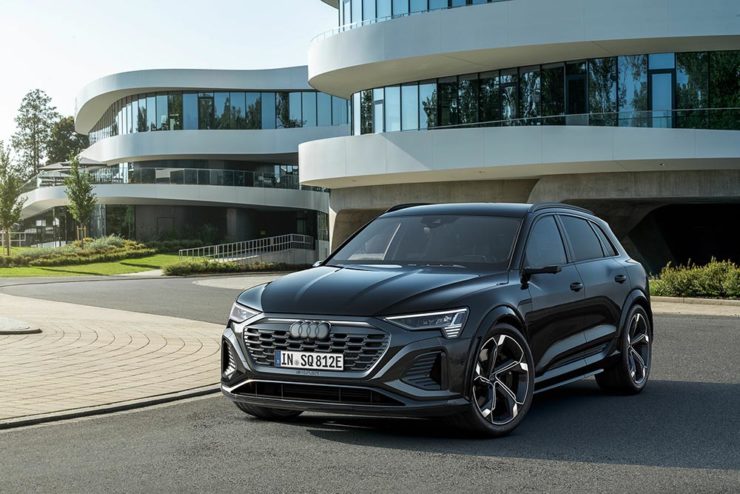
    The change will roll out starting with the updated Q8 e-tron — which, thankfully, still looks good:

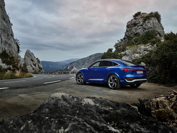
    Even better in Sportback form:

    Dezeen has the best coverage of Audi’s new logo, but see also Motor1 and CarScoops for more pictures.

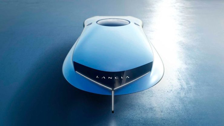
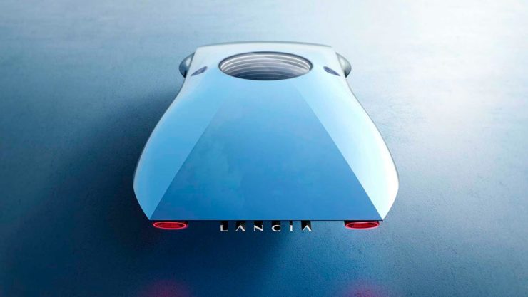
    Lancia Debuts … a Mouse

    Okay, it’s not really — it’s a conceptual sculpture, titled “Pu+Ra Zero,” that represents their rebirth:

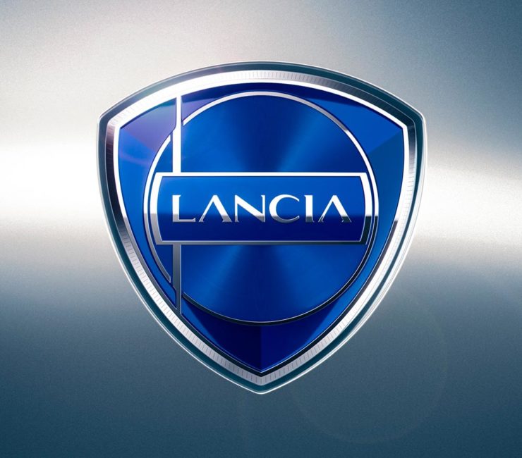
    They call it a “a three-dimensional manifesto,” and no, I don’t get it either. (The light signatures and, apparently, the circular sunroof will carry through to the new models, however.) The logo, their eighth in 116 years, is new as well:

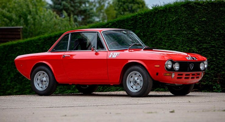
    I didn’t know Lancia well (only in passing? Eh. —Ed.) until the famous Top Gear segment naming them “the Greatest Car Manufacturer of All Time,” although I knew of the Delta Integrale — and think that the Fulvia is one of the prettiest sedans ever:

    The 1972 Lancia Fulvia

    Let’s hope their new models, and conversion to an all-electric manufacturer, lives up to their past achievements. Meanwhile, The Autopian has the best roundup of the new Lancia.

    Kia, KN, and … Wait, What?

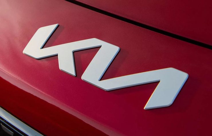
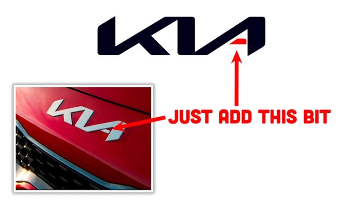
    30 thousand folks a year are doing Google searches for “the KN car.” Why? Kia’s logo, of course:

    Thankfully, the Autopian to the rescue:

    I’m not a huge fan of the new Kia logo — and can absolutely see the “KN problem” — but I think it speaks more to modern society that this is a news item than anything related to graphic design. Willing to be wrong.

    Mercedes: $1200/yr for Full Output

    This subscription thing has gotten seriously out of hand: Mercedes-Benz USA, in an effort to further bilk their customers — ’cause, y’know, MBs don’t cost enough — has decided that the last 60-110 horsepower available on their 2023 electric vehicles are only available for a yearly fee.

    The MB EQS gets even less attractive.

    Gak.

    Holiday Bonus: Free Online Automotive Design

    Interested in car design? Happy Holidays.

  • Beautifully Briefed, Thanksgiving Edition (November 2022): Book Sculpture, Architectural Arcades, and Artists Sunday

    Beautifully Briefed, Thanksgiving Edition (November 2022): Book Sculpture, Architectural Arcades, and Artists Sunday

    This time, art from old encyclopedias, architectural art, and an appeal to add art to your post-holiday shopping and giving plans.

    Books as Art — In a Different Way

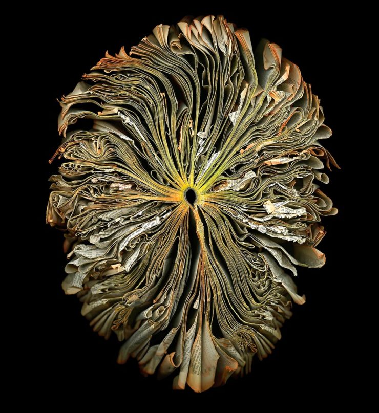
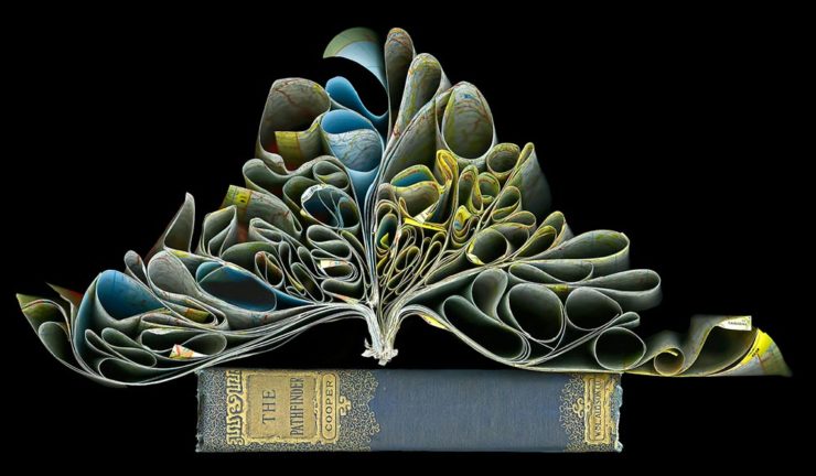
    Cara Barer says, “Books, physical objects and repositories of information, are being displaced by zeros and ones in a digital universe with no physicality.  Through my art, I document this and raise questions about the fragile and ephemeral nature of books and their future.”

    It’s more than that, though:

    As This is Colossal puts it: “With cracked spins and crinkled pages, the manipulated objects reference the relationship between the natural and human-made as they evoke flowers at peak bloom.”

    As a book designer, I’m glad that the titles used aren’t something a designers labored over but rather mostly instruction manuals and old encyclopedias. Either way, they’re a beautiful way to make commentary.

    See more at her website.

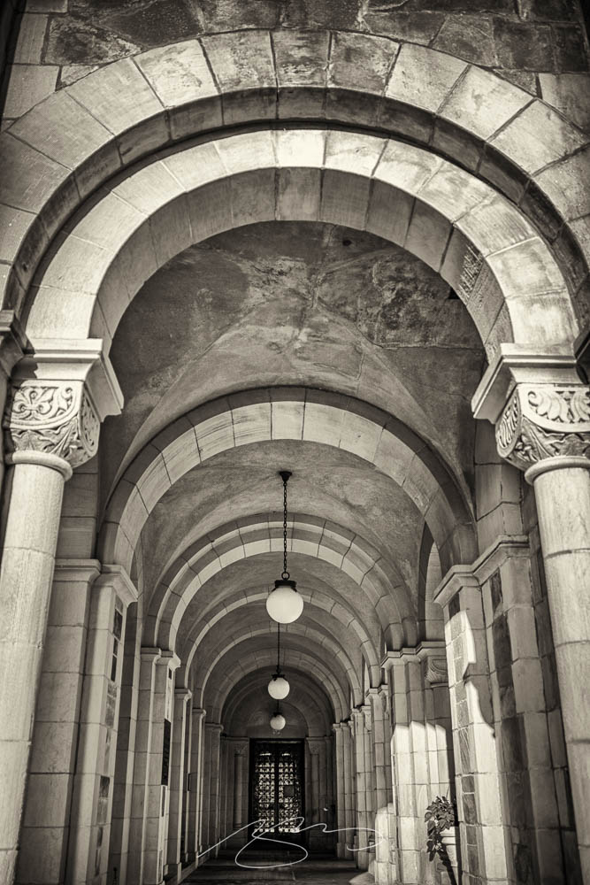
    “Photographic escapades in arcades and colonnades”
    Liberty Station, San Diego by Keith James

    Few scenes set my photographic heart aflutter as does the view down a long covered walkway towards a distant, barely visible vanishing point. As a self-confessed symmetry addict drawn to architectural images in black and white, photographing these vistas scratches a deep creative itch.

    Keith James, MacFolios

    His article is well-illustrated, informative, and speaks to my heart: I love a good arcade — although, in some cases, I feel like an entry or exit makes the point:

    Vassar College Chapel Arcade, September 2021

    This is not the first time I’ve admired Keith’s work. His “Architecture Meets Sculpture in Black and White: the Interplay of Light and Form” was great work. Both articles are highly recommended.

    Artist Sunday

    For those of you in the United States, this weekend is the Thanksgiving holiday. It’s also that most American of traditions: a shopping weekend. I have spent recent years boycotting Black Friday and Cyber Monday, and am encouraged by the emergence of Giving Tuesday. Here’s something to add to that list:

    Photographer Chris Sherman developed the concept of “Artists Sunday” in 2019, after noticing a bump in sales on that day in November. “The idea struck,” Sherman told Hyperallergic. “What a great time to patronize artists — during the busiest shopping weekend of the year.” 

    In 2020, Sherman launched the project alongside Cynthia Freese, a fellow artist who has also spent extensive time on the boards of arts nonprofits. On a dedicated website, Sherman and Freese provide artists and arts organizations with free marketing materials to promote the event. Now in its third year, over 4,000 artists and more than 600 towns and cities across the country have signed onto the initiative, which takes advantage of special events and partnerships (with nonprofits, individual artists, and businesses) to spread the message.

    Happy Thanksgiving.

  • Beautifully Briefed, Early October 2022 [Updated]: Triboro’s Lyrics, Hoefler’s Daggers, and Skoda and Citroen Provide Contrast

    Beautifully Briefed, Early October 2022 [Updated]: Triboro’s Lyrics, Hoefler’s Daggers, and Skoda and Citroen Provide Contrast

    This time, we’ve got some great book design (with a bonus), Hoefler educates on typography (with a bonus), and two updated car company logos. Let’s get right to it!

    Print Magazine on the design of Lyrics

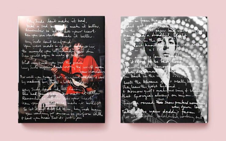
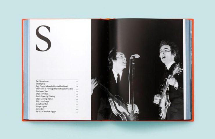
    The still-very-relevant-in-2022 Print Magazine brings us a great feature on the design of Paul McCartney’s book, Lyrics:

    Front and back covers of Paul McCartney’s Lyrics, by Triboro Design.

    Turns out it was designed by an outfit called Triboro Design, from Brooklyn (appropriately). Print brings us an interesting interview with David Heasty, the principal:

    I […] found him to be sharp, quick, articulate, and modest. Below, we discuss Paul’s involvement with the project, the book’s gorgeous bespoke typeface, and the importance of staying true to a legend’s vision.

    Ellen Shapiro, Print Mag
    The “S” spread of Paul McCartney’s Lyrics, by Triboro Design.

    Interesting and informative. Catch this interview when you can.

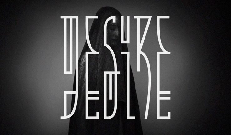
    Bonus: Looking at Triboro’s website, this lovely piece of typography stood out:

    Triboro Design’s Zolo Jesus album typography creates desire.
    Hoefler Discusses Daggers

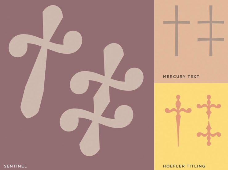
    In “House of Flying Reference Marks,” Jonathan Hoefler talks about daggers, or, what you use when an asterisk isn’t enough:

    Hoefler on daggers.

    Beautiful examples, complete with a phrase you don’t hear everyday: “twisted quillon.” Read and enjoy. (If the opportunity presents, follow on with the ampersand article — which, uh, takes a stab at where the word came from. Nice.)

    Bonus: Creative Boom’s article, “18 highly respected type foundries that remain fiercely independent.” (I guess you could say I’m still surprised Hoefler is now, well, Monotype.)

    Skoda and Citroen have new logos

    It seems like nearly all of the major car manufacturers have introduced a new logo in the past couple of years, but here are two more. One’s best described as “an update,” while the other … goes a little farther.

    Skoda, for those that don’t know, is a Czech company and part of the massive VW Group. Frankly, it shows:

    Skoda’s 2022 Kodiaq, a thoroughly VW Group product.

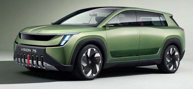
    For 2023, they’re introducing a push to separate themselves from VW a little, resisting the downmarket image. As is (now) normal with updated car company identities, there’s a concept:

    Skoda’s Vision 7s concept.

    It’s … not inspiring. Maybe the actual updated logo will turn the corner:

    Skoda’s 2022 logo.

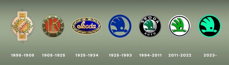
    Solid. (Pardon the pun.) But seriously, even an avid car nut like me didn’t know that represents a winged arrow — and I’m not sure the new version helps. At least they get points for consistency:

    Evolution of Skoda’s logo, 1895–2023.

    Read more at Brand New’s “Czech this Out,” or Carscoops’ more optimistic take, “Thriving Skoda Brand Forging Its Own Path Within The VW Group.”

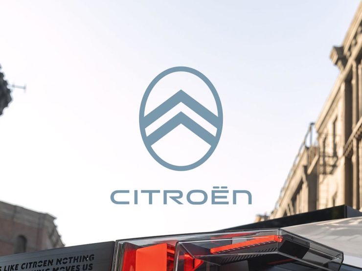
    Then there’s Citroen. Even under the potentially-smothering corporate blanket that is Stellantis (there’s a name!), the pioneer of decades past still manages to actually thrive. First their new logo:

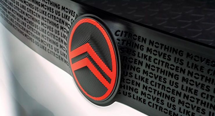
    Citroen’s 2022 logo.

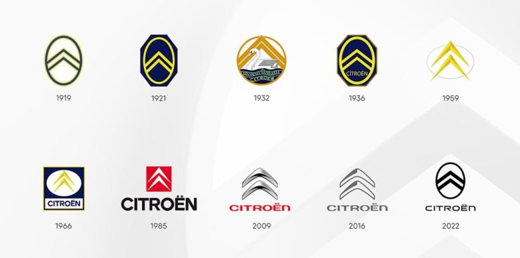
    They’re not quite as consistent — the dual chevrons have varied a bit. This time, they’ve literally gone back to their roots, pulling the 1919/1921/1936 version out and dusting it off for modern use:

    History of Citroen’s logos, 1919–2022.

    Points to them for hinting at what’s to come, too:

    Citroen’s 2022 logo, with just a slice of concept car showing.

    …Which turns out to be something with, ahem, Oli bits:

    Citroen’s Oli: the antithesis of a Skoda.

    “Nothing moves us like Citroen,” they say. The Oli moves me, to a point where I truly wish Citroen was once again available in the ’States. Cool and radically innovative, without losing sight of something VW has truly lost: fun. Well done.

    Read more on the logo: Motor1, “Citroen Unveils Updated Retro-Flavored Logo And New Slogan,” and Carscoops, “Citroen Unveils New Logo Inspired From Its Past, Teases New Concept.” Read more on the Oli at the excellent Autopian: “The Citroen Oli Concept Is An EV Made From Cardboard And Good Ideas.”

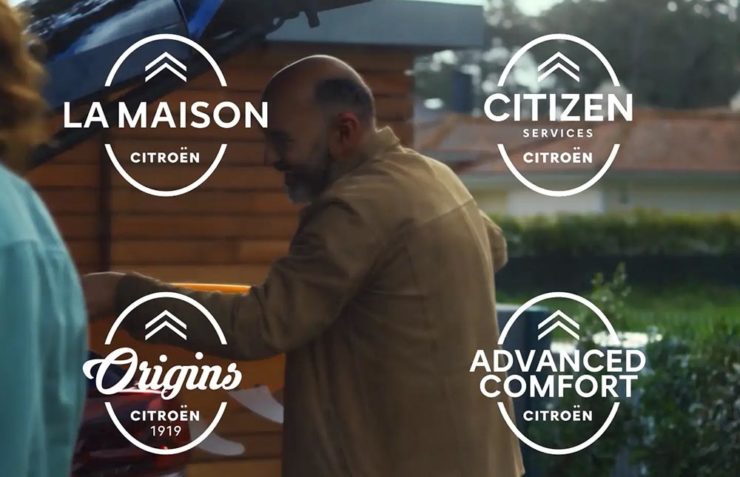
    Updated, 19 October, 2022: Brand New adds to Citroen’s new logo story, with a slightly-less-than-enthusiastic take on the logo and has frankly unkind things to say about the new, custom typeface (custom typefaces are now de rigueur — a policy as much related to rights ownership than creativity, alas).

    I really like the cursive in this Vimeo screenshot:

    YouTube? What YouTube? Citroen posts to Vimeo. Ahh, the French.

    BN also includes a number of extra photographs of the simply awesome Oli, too. Here are a couple, for your enjoyment:

    Plug-and-Citroen.

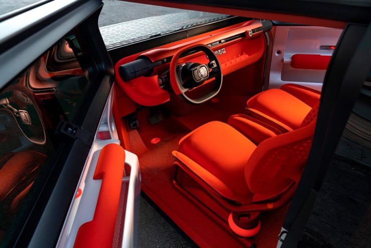
    Note the removable Bluetooth speakers (the black tubes with “+” and “-“) and, especially, the seats:

    I love everything about this interior.

    Check the rest, and BN’s take, here.

    Apologies to both Skoda and Citroen for the lack of language-correct accents. WordPress needs a glyph function.

  • Beautifully Briefed, August 2022 [Updated]: Drobo, Rolling Stone, Aston Martin, and Bugatti

    Beautifully Briefed, August 2022 [Updated]: Drobo, Rolling Stone, Aston Martin, and Bugatti

    Three interesting logo redesigns this month, plus a moment where venti has nothing to do with coffee. Oh, and a airy bonus.

    Drobo Declares Bankruptcy

    Generally speaking, I’m not one to engage in schadenfreude, aka “enjoying the pain or suffering of another.” (Wiki. Anyone surprised that the Germans have a word for this … but I digress.)

    A selection of expensive, unreliable junk.

    Back in 2011, I lost two Drobos in short order — and with them, the majority of my back files. Project I’d worked on, photographs I’d taken, personal documents, years worth of stuff, just gone.

    Drobo, the company, did nothing to help, offering neither solutions nor apologies. I wasn’t alone; forums across the ’net suggested that I should have chosen more carefully.

    It turns out they should have, too. Good.

    Gloat Read more at DPReview or PopPhoto.

    Rolling Stone’s New Logo

    To call Rolling Stone‘s place in America culture iconic might be selling it short, and their logo plays a large role in that. In 2018, they flattened it — leading that trend, possibly — and it lost something.

    However, this month, it’s back:

    Rolling Stone’s 2022 logo redesign.

    “The assignment was a paradox. How could we make the logo look like it did in the past, without making it feel dated? My hope is that loyal readers will believe the old logo is back, but on closer inspection will be surprised to notice how much it has been modernized.”

    Jesse Ragan, XYZ Type

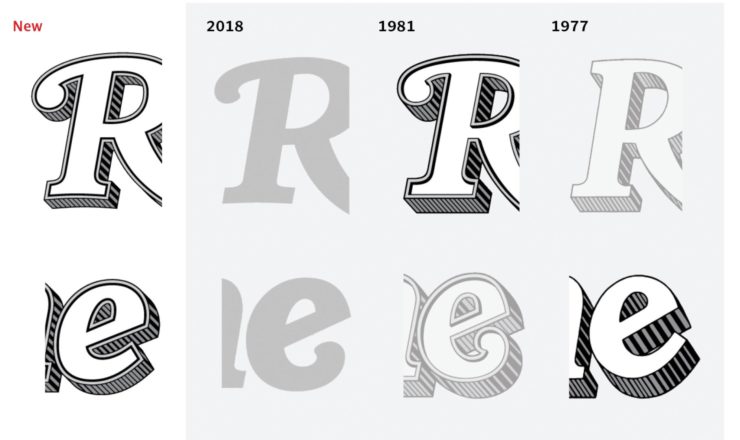
    The “old logo” he’s referring to is the one that ran from 1981–2018, but there were others, too:

    Rolling Stone’s lettering shapes through the years. See more at both links.

    A great study in logo evolution: read more at the Type Network, and lettering specifics from XYZ Type. Awesome. (Hat tip to, as usual, Brand New.)

    Aston Martin’s New Logo

    On the subject of subtlety, Aston Martin usually isn’t the first thing that comes to mind. Their recent logo redesign, however, falls into that category:

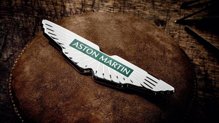
    Wings of Glory (so to speak)

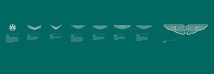
    The evolution of their logo emphasizes those small steps:

    AM’s logo through the years.

    Not a great amount of information on this one, but the accompanying photographs of the logomark being made are fantastic. See more at The Drive, with more at Brand New.

    Bugatti’s New Logo

    Subtlety and Bugatti rarely — if ever — fit in the same sentence. Aston is stratospheric as far as I’m concerned, so Bugatti would qualify as the antithesis of subtlety. But, but, but: there’s something about one.

    The new Mistral. (Sorry, it’s sold out.)

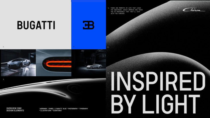
    They have a new logo and marketing campaign to go with:

    Specifics, courtesy of Interbrand.
    The Mistral from the back, showing the new type treatment.

    Read up at It’s Nice That. Car and Driver has more information on the Mistral.

    Update, 20 Sept., 2022: Brand New weighs in on Bugatti’s updated logo.

    Bonus: In the Skies

    It’s been a busy August, including having to make a lightning trip through the usually-not-fun Atlanta airport. But there’s always a bright spot at the end of that tunnel: being the little boy again, awed by the simple act of flying.

    Better still, the flight was on a 757, the sports car of big planes. Everybody around me had their window shades pulled and noses in their phones, but I was looking out the window:

    Delta Ship 5654, Above Clouds and Sea

    See you in September!