Tag: beautifully briefed

  • Beautifully Briefed, Early July 2022: The Autopian, The Ford Heritage Vault, and an Eames Follow-Up

    Beautifully Briefed, Early July 2022: The Autopian, The Ford Heritage Vault, and an Eames Follow-Up

    Car site The Autopian scores with book design, Ford posts old marketing material gold mine, and more on the Eames Institute of Infinite Curiosity in this edition of Beautifully Briefed.

    Autopian suggests book design

    The Autopian, founded by a couple of former Jalopnik writers, is a new automotive gem: in these days of more-of-the-sameism sites trying to make money of others’ ideas, the Autopian has a retro style and interesting, original content.

    Including this short post from their Cold Start column:

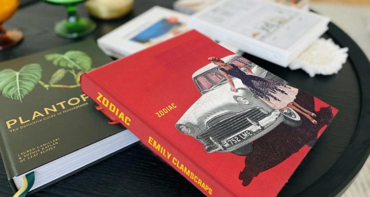
    Sometimes you may encounter an old car ad and realize that the design of it could lend itself very well to something completely different. In this case, this 1958 Ford Zodiac ad, with its rich, saturated colors, striking dress on the model, and evocative name with understated typography just feel like something you’d see on modern book cover design.

    Jason Torchinsky, Autopian Founder

    The ad:
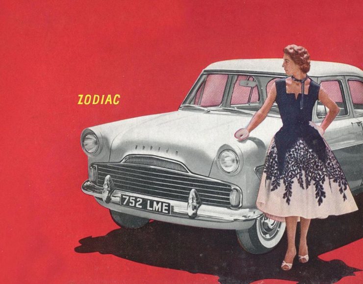
    A 1958 Ford Zodiac (European)

    His book design idea “realized”:

    Jason’s book cover mock-up. Love the author name.

    Nice.

    The Ford Heritage Vault

    Ford has taken the unusual step of posting a good chunk of their old — 1903 to 2003, their first 100 years — marketing materials online: “promotional materials, photographs, and all kinds of other historical goodies,” according to CarScoops.

    “Our archives were established 70 years ago, and for the first time, we’re opening the vault for the public to see. This is just a first step for all that will come in the future,” says Ted Ryan, Ford archive and heritage brand manager.

    Here’s a personal favorite: the 1965 full line brochure, showing the cars set in architectural drawings — presumably, matching the car to the house:
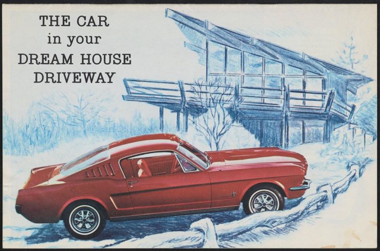
    The 1965 Ford Family of Cars brochure

    Fancy a drive down memory lane?

    More from the Eames Institute

    We discussed the Eames Institute of Infinite Curiosity back in April, but Metropolis magazine has published an extensive article covering a visit to the Institute.

    Modernism has largely been diluted from a series of ideas rooted in social change to one of just style—Instagram moments, if you will. The Eameses insisted that they did not have a style or even an “ism.” […] Modernism was an idea, not a style. With the establishment of the Eames Institute, I hope Charles and Ray will be remembered most of all for their ideas and processes.

    Kenneth Caldwell, Metropolis
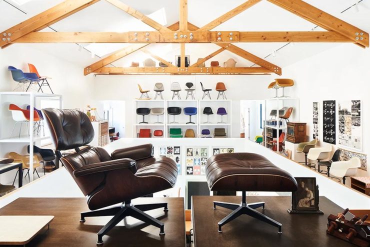
    An exhibit at the Eames Institute of Infinite Curiosity.

    With our ongoing struggle to use materials more efficiently, many of the Eameses’ ideas and ideals need to be taken for the solutions that they are: style with incredible substance.

    Read the whole article at Metropolis. (Via ArchDaily.)
  • Beautifully Briefed [Updated]: Book Six-Fer, June ’22

    Beautifully Briefed [Updated]: Book Six-Fer, June ’22

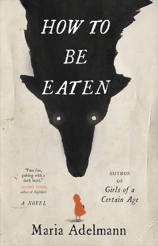
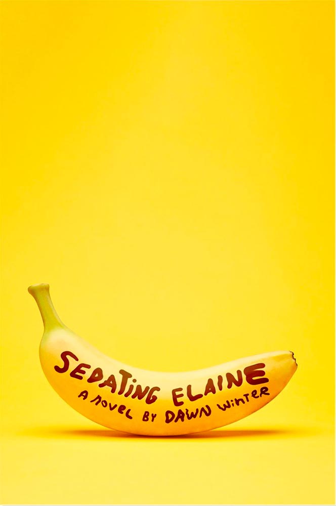
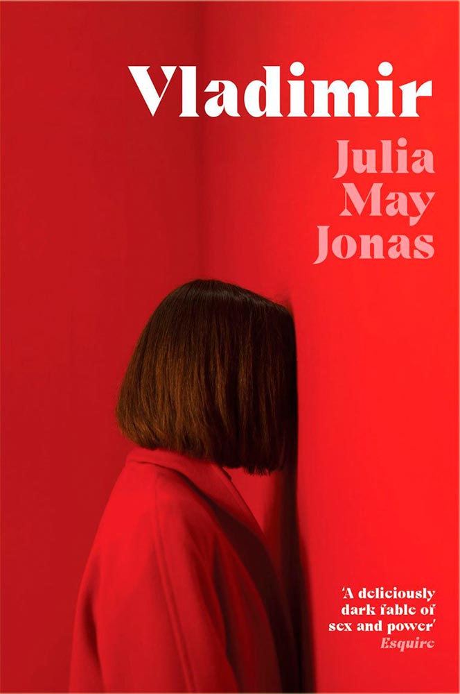
    A book design treat for your Monday morning: four of my favorite new book covers from last month’s debuts.

    How To Be Eaten. Design by Julianna Lee.

    Aged, distressed paper is a great look when done well, and this one hits all the right notes. The size relationship between the characters, the glow around the eyes, the two color choices, the type, all of it — great stuff.

    Sedating Elaine. Design by Janet Hansen.

    A veritable how-to on less-is-more. Brilliant.

    Vladimir. Design by Katie Tooke.

    Another solid-color triumph. Great font choice here, too. Awesome.

    I’ve saved the best for last:

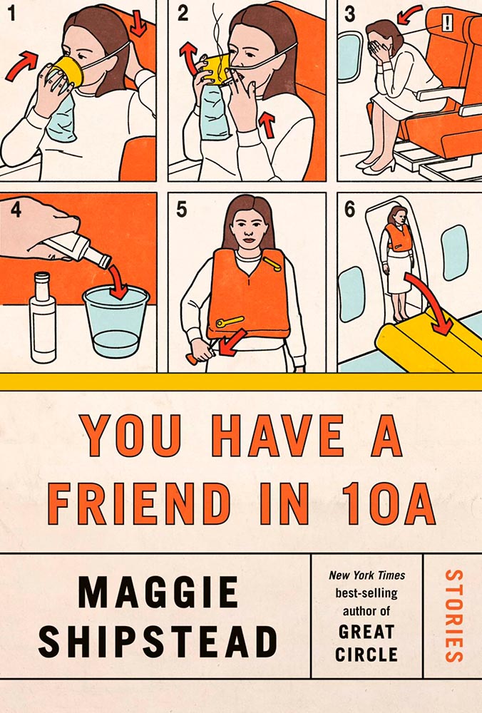
    You Have a Friend in 10A. Design by Kelly Blair.

    Great Circle has featured before, and this follow-up takes us inside the plane and into the safety brochure in the best possible way. Great, brilliant, and awesome wrapped into one.

    Via LitHub and Spine, as usual. Have a good week!

    Update, June 20th: WABE, Atlanta’s NPR station, has a summer reading list out, highlighting Georgia books and authors — and I’d like to include two of the covers here:

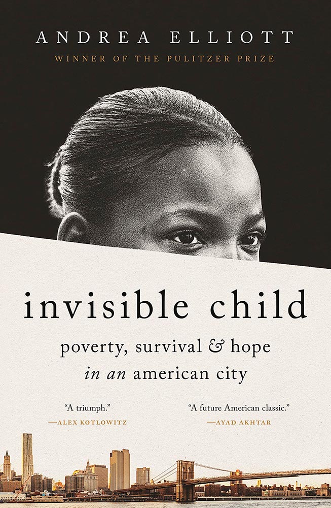
    Invisible Child.

    The grainy photograph, the wonderfully placed city skyline, and classic typography, combined with the diagonal cutline, elevate this title from mundane to eye-catching.

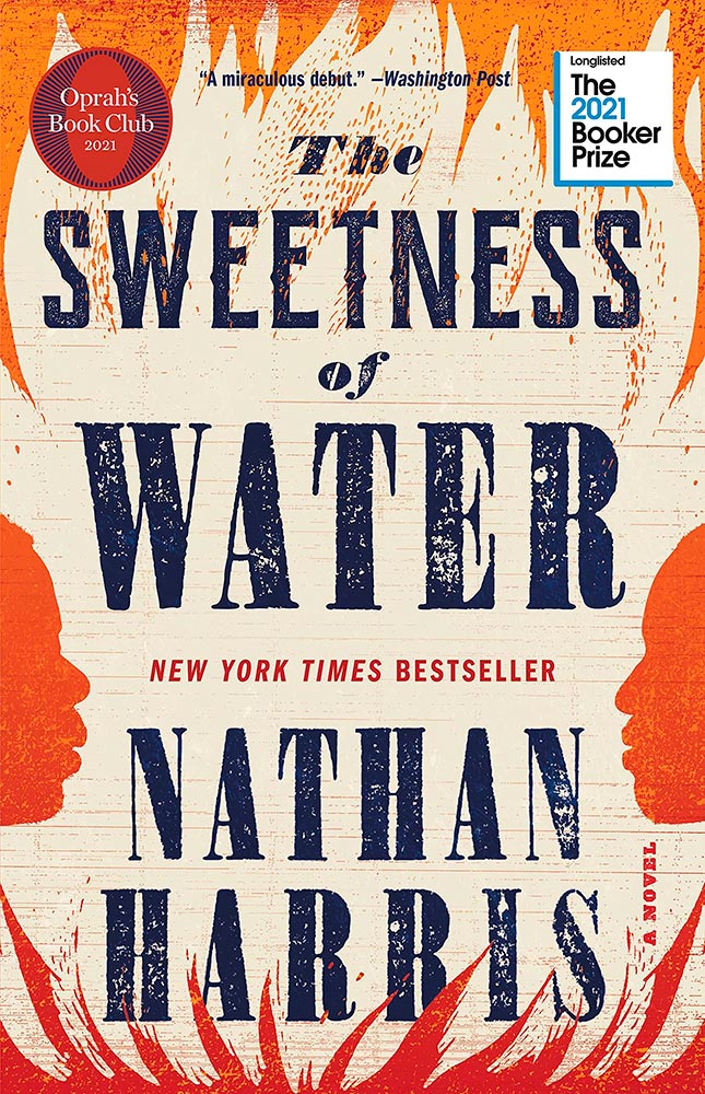
    The Sweetness of Water.

    Excellently distressed doesn’t begin to describe this, on many levels. Side note: it’s a terrible shame that the Oprah and Booker call-outs have been elevated to logo status in what can politely be described as a distraction (from a book designer’s point of view, at least).

  • Beautifully Briefed, May 2022: Two on Type, Two on Photography, and Kottke

    Beautifully Briefed, May 2022: Two on Type, Two on Photography, and Kottke

    This month’s favorites cover a delightful new extension of the typeface DaVinci, Google’s updated mega-font, Noto, photographs of a desert aircraft boneyard from above, and mega-photographs of the Milky Way.

    Before we get there, however, I wanted to wish Jason Kottke — whose 24 years of web sleuthing has been a source for items here on Foreword dating back to its original iteration in the ’90s — good luck on his sabbatical:

    “I need some space to think and live and have generative conversations and do things, and then I’ll make something, but I can’t tell you what it is just yet.”1Alexandra Bell, NYT That’s the sort of energy I need to tap into for a few months.

    Hear, hear.

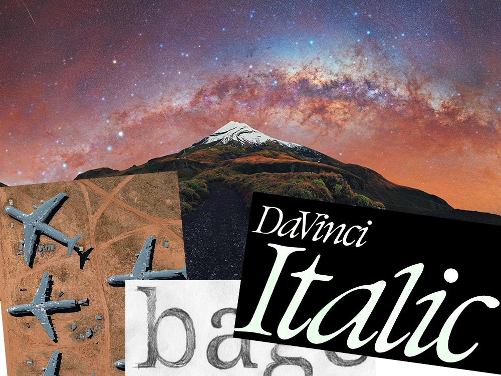
    The Beautiful DaVinci Italic

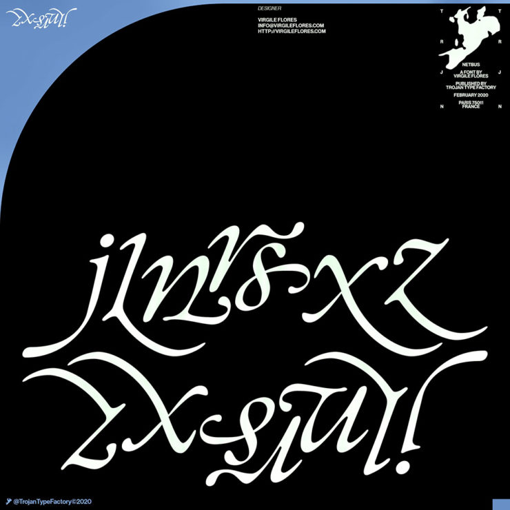
    It’s Nice That points us to a new, extended version of the font DaVinci, done for Sydney’s Biennale:

    “When you do this sort of type exercise — based on printed letters — it gives a very organic shape and form, in opposition to the very metallic sharp shape from type materials.” Furthering this organic look by pushing the fluidity curse at its maximum, Virgile ended with a design “which is very historical, yet with a contemporary twist.” 

    Just look at those glyphs!

    Makes you want to find an excuse to use it. But that’s not all: Flores is an incredibly diverse artist whose work both challenges and inspires. See more.

    Google’s Noto

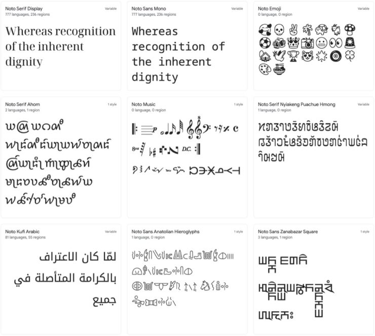
    Called “A Typeface for the World,” Google’s Noto defines “megaproject.”

    Noto is a collection of high-quality fonts with multiple weights and widths in sans, serif, mono, and other styles. The Noto fonts are perfect for harmonious, aesthetic, and typographically correct global communication, in more than 1,000 languages and over 150 writing systems. 

    Google’s Noto font collection.

    According to Google,

    “Noto” means “I write, I mark, I note” in Latin. The name is also short for “no tofu”, as the project aims to eliminate ‘tofu’: blank rectangles shown when no font is available for your text.

    While the font itself has been around for a few years — 2013 seems like yesterday in so many ways! — it’s updated regularly, cover 150 out of the 154 scripts defined in Unicode, and deserves attention from every web designer and type nut. Read more at Google or Wikipedia. (Via Kottke.)

    Aircraft Boneyard, From an Aircraft

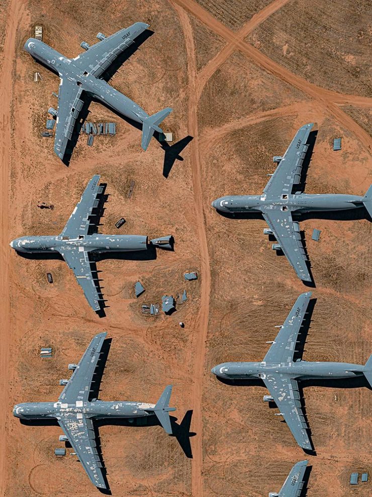
    This is Colossal introduces us to Davis-Monthan Air Force Base in Tucson, Arizona, whose desert conditions are ideal for storing — and scrapping — aircraft:

    What happens when the military’s aircraft are end-of-lifed

    The photographs are by Bernhard Lang — whom Colossal has highlighted before — and who has an incredible talent for finding patterns from above. See many more at his website.

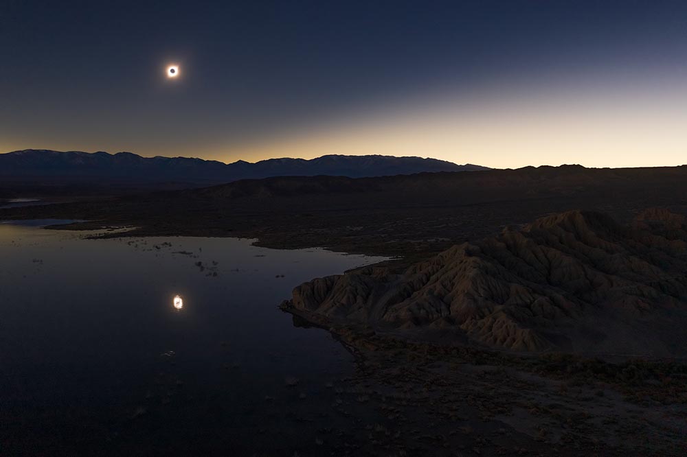
    Milky Way Photography

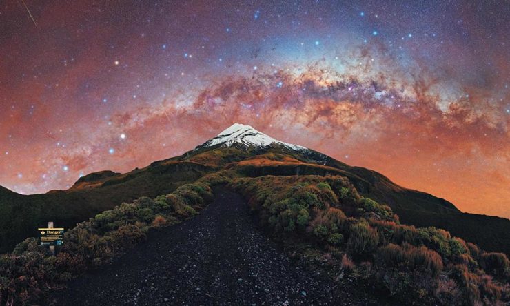
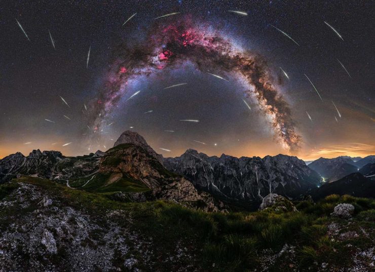
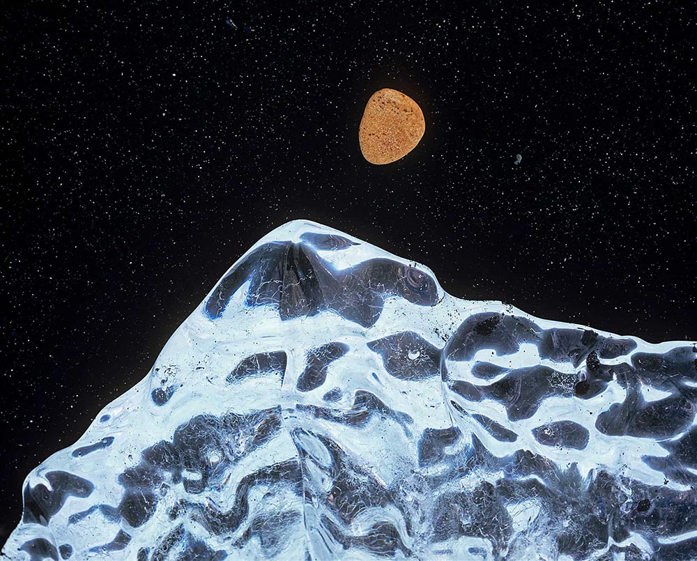
    We don’t get many opportunities here in Middle Georgia, but in other, less populous (read: less light-polluted) places in the world, the Milky Way shines forth from the heavens:

    Mountain, redefined.

    The Guardian points us to the 2022 Milky Way Photographer of the Year, and many just wow:

    Take cover . . . in awe!

    Check ’em all out, be inspired to take one of your own, or simply be reminded just how big this system we’re a part of is. Enjoy.

  • Beautifully Briefed, Early March 2022: Monograph Impresses, Monotype Trends, and Media Waste

    Beautifully Briefed, Early March 2022: Monograph Impresses, Monotype Trends, and Media Waste

    Three diverse items in this round-up, from illustration to typography to whether or not ad-blockers are actually environmentally-friendly — along with a response that reminds us to look at the bigger picture.

    Malika Favre (Expanded Edition)

    CreativeBoom:

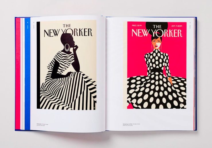
    French illustrator and graphic designer Malika Favre has been impressing audiences for years with her minimalist work for publications such as The New Yorker, Vogue, and Vanity Fair. Now over a decade’s worth of her work has been released in a new monograph from Counter-Print, which contains a suitably stripped-back aesthetic.

    Her style is distinctive; I’ve liked her New Yorker covers especially:

    Malika Favre (Expanded Edition) in English

    The book includes the illustrator’s own cover, and she had a big hand in designing the layout, too. CreativeBoom’s article is excellent — check it out.

    Monotype’s 2022 Trends

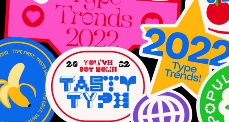
    It’s Nice That points us to the recently-released 2022 Type Trends Report from Monotype:

    Monotype’s 2022 Type Trends Report cover

    Throughout yet another “unprecedented year,” it’s safe to say that the macro trends influencing the type design community are nearly too long to list. Several socioeconomic, political, and cultural events continue to shape the way we approach creative work and how connect to each other online and offline.

    Biodiversity’s relationship to type, varying type styles in a single logo, and thin serifs — the one I’m likely to use somewhere — are in this year.

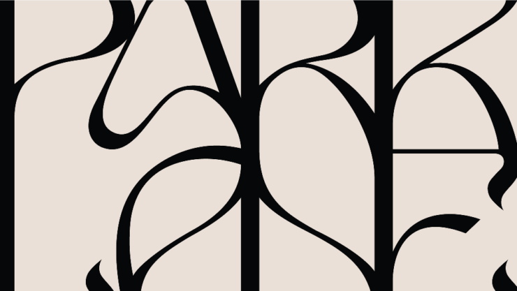
    New York’s Park Lane Hotel

    The above example, from New York’s Park Lane Hotel, is but one they cite (see that whole, very lovely project at Brand New). Check out the whole report, and get trendy.

    Perhaps we can convince Apple to go back to its also-lovely Garamond…?

    Media, Trackers, Blockers, and the Environment: There’s a Problem

    Did it ever occur that using an ad blocker in your browser is actually an environmentally-friendly move? No, I hadn’t put it together, either.1More from MIT on ecological impacts of cloud computing here.

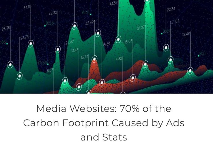
    70% junk. Surprise and shock (not really).

    [U]p to 70% of the electricity consumption (and therefore carbon emissions) caused by visiting a French media site is triggered by advertisements and stats. Therefore, using an ad blocker even becomes an ecological gesture. But we also suggest actions web editors could take to reduce this impact.

    An interesting study, certainly, with information that many of us already use and some suggestions for action in case we don’t. But…:

    Another of Monotype’s 2022 Type Trends, appropriated for use here

    Nick Heer:

    I have qualms with this. The idea of a “carbon footprint” was invented by British Petroleum to direct focus away from environmental policies that would impact its business, instead blaming individuals for not recycling correctly or biking to work more. A “carbon footprint” is also a simplistic view of how anything contributes to global warming, and that it seems to be used here as a synonym for bandwidth and CPU consumption.

    I’m not sure whether I’ve called out the excellent Pixel Envy2A sort-of Daring Fireball with Canadian roots, but this is an example of why I should.

    That is where I think this well-intentioned study falters. Even so, it is absurd that up to 70% of a media website’s CPU and bandwidth consumption is dedicated to web bullshit. Remember: the whole point of web bullshit is that it is not just the ads, it is about an entire network of self justifying privacy hostile infrastructure constructed around them.

  • Beautifully Briefed, January 2022: Airplanes, Architecture, and Typography

    Beautifully Briefed, January 2022: Airplanes, Architecture, and Typography

    Happy New Year! Stephen Colbert called it, “an unprecedented third year of 2020.” Let’s hope it turns out better than that.

    To that end, here are some neat things to catch your eye.

    Airliner Photography, to the nth degree
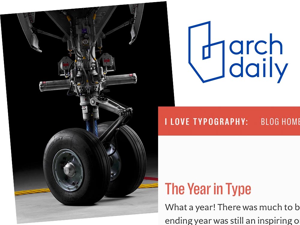
    MG - no bogies here

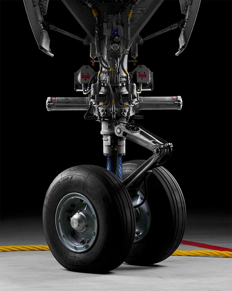
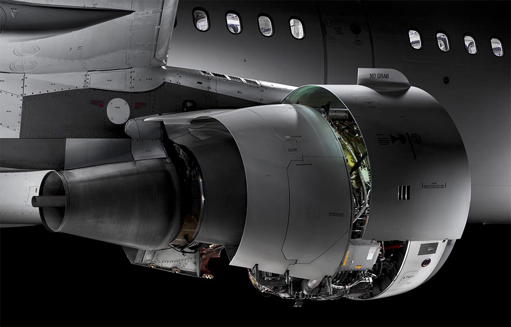
    I’ve been a plane junkie since, well, forever; to this day, I watch YouTube videos of things flying around, often the big ‘uns. I follow Airliners.net’s Civil Aviation forum, and can tell you at a glance whether something sitting at the gate is a Embraer 190 or Airbus 220. So this new title by photographer Maxime Guyon has my complete attention.

    MG engine

    Very much looking forward to getting my hands on. Beautifully done, sir. (Via a great article at It’s Nice That.)

    ArchDaily’s New Branding

    Meanwhile, another subject I follow:

    ArchDaily 2022

    Arch Daily has already teamed up with Architonic, a site for products, last year. For 2022, they’ve rebranded and both sites are now linked with DesignBoom, one of the web’s original sites for design and architecture (since 1999!). Dezeen has more.

    The Year in Type

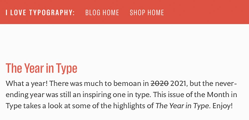
    Last but certainly not least, I Love Typography has a great roundup of 2021: The Year in Type.

    The Year in Type, 2021

    Enjoy, indeed.

  • Beautifully Briefed, December 2021: Holiday Edition

    Beautifully Briefed, December 2021: Holiday Edition

    It’s the yearly wrap-up and the holiday season! Recap and Rejoice!

    Hermès Does Windows

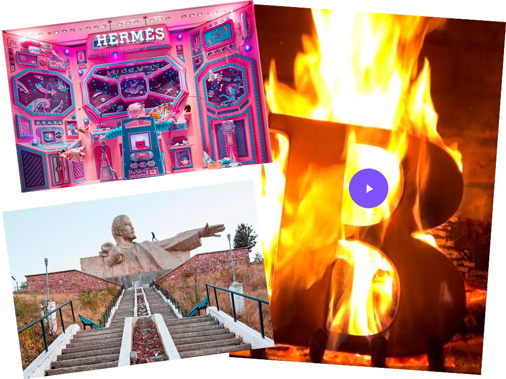
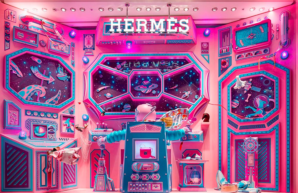
    “Journey of a Lifetime” is this year’s window display for Hermès — yes, Hermès should have an accent, but I can’t seem to summon it today fixed! — so let’s go with a picture instead:

    Hermes window display

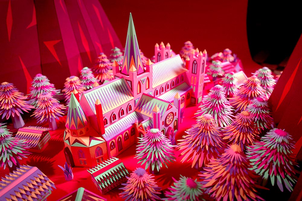
    All in paper. No, let me repeat that: it’s all paper. (Well, perhaps some glue.) From artists Zim and Zou. Here’s another, one of their earlier works:

    Zim and Zou, previously

    Read more at This is Colossal about the window and the church. Nice.

    Yule Ogg

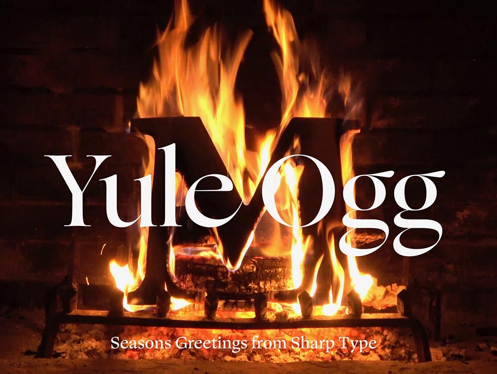
    While we’re on the subject of the holidays, check this out:

    Yule Ogg

    That’s right, it’s one of those four-hour Yule log videos — but with a twist. Those are wooden type pieces going up the flame. Check it out, along with the backstory, at It’s Nice That.

    Top Architectural Photography Projects

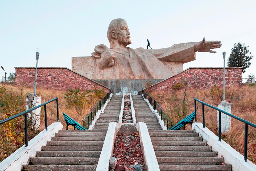
    Closing out, we start the year’s “best of” round-ups, this one Dezeen’s top 10 architectural photography projects of 2021:

    Soviet (Asia) Photography

    Above, Soviet architecture, central Asia, by Roberto Conte and Stefano Perego. Below, Structure Photography by Nikola Olic:

    "Poetic" Architecture Photography

    The latter is called “poetic,” a description I’d completely agree with. The Mother Road, USA, by Hayley Eichenbaum (previously mentioned) is there, too. Enjoy.

    That’s it until after the holiday. Around the first, stay tuned for my favorite book designs of 2021 and more. Take care!

  • Beautifully Briefed, November 2021: Four on Photography

    Beautifully Briefed, November 2021: Four on Photography

    Four different, yet valuable, interesting, and informative links to photography items heading into this Thanksgiving weekend.

    Architectural Photography Awards

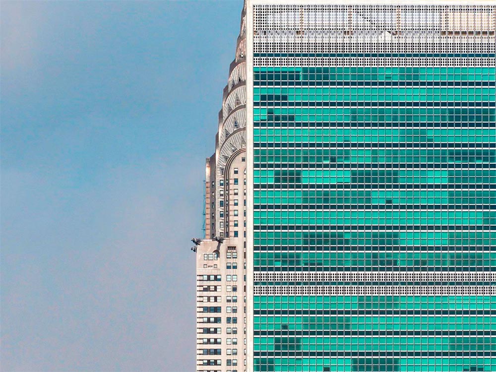
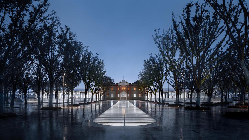
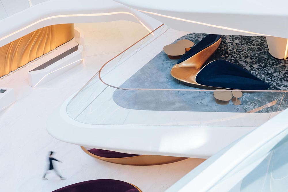
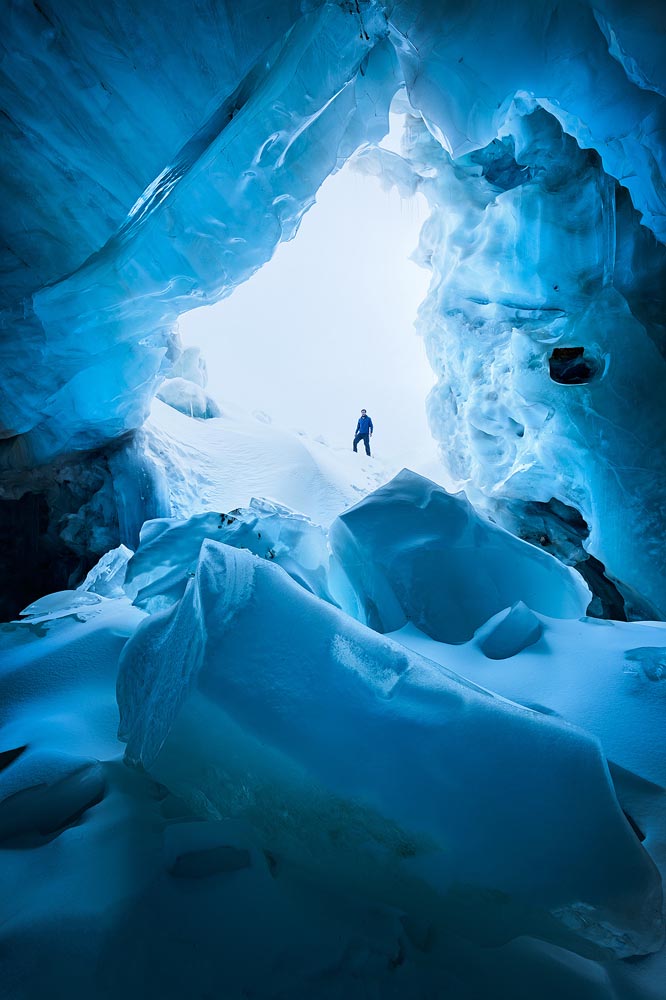
    Starting with ArchDaily: The Architectural Photography Awards 2021 Announces its Shortlist. Some great stuff here:

    ArchDaily 1
    ArchDaily 2
    ArchDaily 3
    ArchDaily 4
    ArchDaily 5

    All simple, yet so much more. Well done.

    Natural Landscape Photography Awards

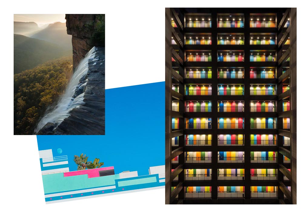
    Next, the Natural Landscape Photography Awards. Many here to choose from, as well, but a couple of faves:

    Nature Award 1
    Nature Award 2
    Landscape Photography Best of How-to

    So, we all ask ourselves, how to you get from the everyday stuff to the best-of-the-best? DPReview has answers, with Erez Marom: On Originality in Landscape Photography.

    It has been, and continues to be, a rough time for a nature photographer who makes a living shooting around the world. This kind of time period sometimes makes we artists think about our life missions and convictions, and delve deeper into our beliefs and the way we view our art and what makes it worthwhile. While some people don’t see photography as art, I definitely do, and for that reason I feel that a discussion is needed about what makes photography an art form rather than technical labor.

    Some examples:

    On Originality 1
    On Originality 2

    Read the whole essay. Excellent stuff.

    Route 66 Photography

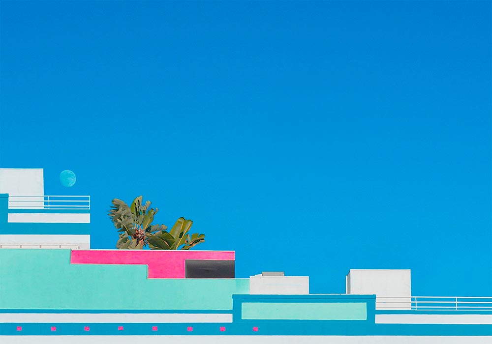
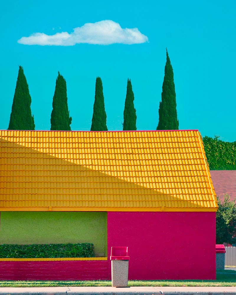
    Lastly, some art from Dezeen: Hayley Eichenbaum captures the “punchy absurdity” of Route 66 roadside architecture:

    Dezeen 1
    Dezeen 2

    Enjoy all four — and enjoy the turkey weekend! Happy (Photography) Thanksgiving.

  • Beautifully Briefed, October 2021: Architecture Photography

    Beautifully Briefed, October 2021: Architecture Photography

    Two very different yet very impressive architectural photography items caught my eye this month.

    Hélène Binet’s Architecture Photography

    Let’s start with an article in the Guardian (UK) on Hélène Binet:

    “It’s like being a musician in front a big audience. You can’t get it wrong. In that instant, you have to be the best of yourself, you bring your mind to a place, not to lose that unique moment.” Hélène Binet is explaining her commitment to working with the venerable techniques of analogue, as opposed to digital, photography[…].”

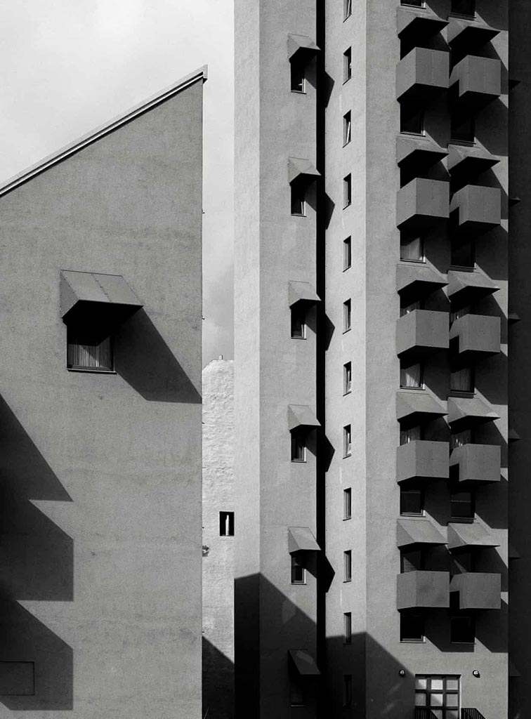
    She manages to capture exactly the kind of thing I strive for — potentially abstract, detail-oriented, yet somehow . . . different:

    HB3740

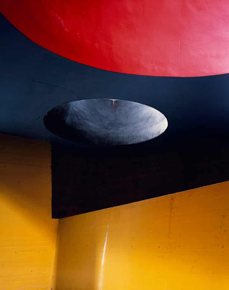
    And:

    HB3k

    Beautiful. If you’re in the UK, check out Light Lines: The Architectural Photographs of Hélène Binet, at the Royal Academy, London W1, 23-October-23 January.

    Romain Veillon’s Architecture Photography

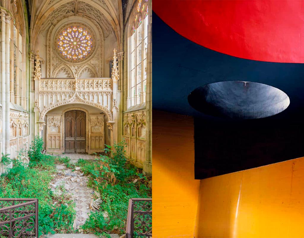
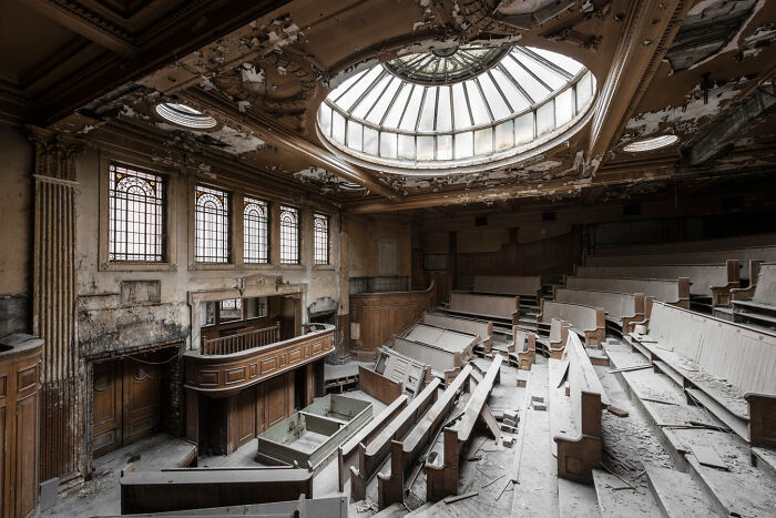
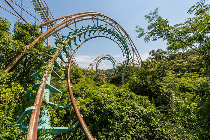
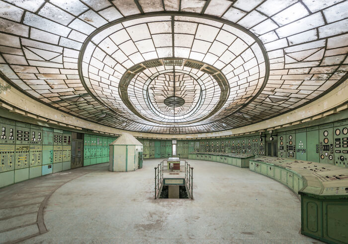
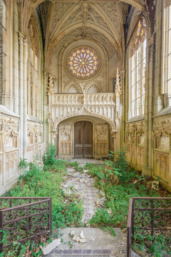
    Meanwhile, from France, we have another: award-winning photographer Romain Veillon with architectural “decay:”

    RV1

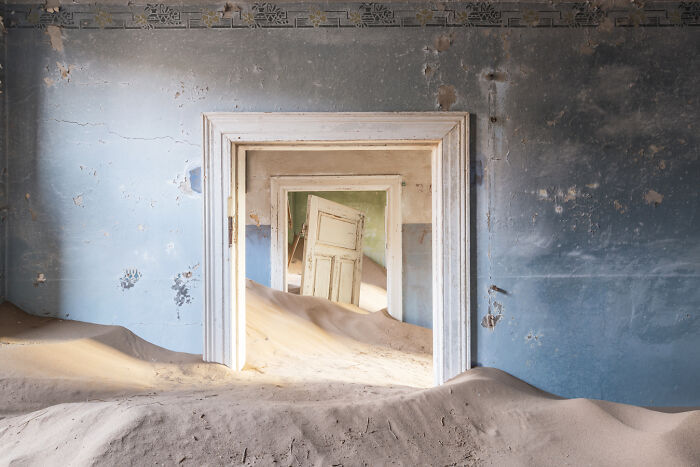
    Brilliant. More:

    RV5
    RV2
    RV4
    RV3

    He’s got a book out — Green Urbex: The World Without Us (French-language only, alas) — but the photographs don’t need translation. Learn more on ArchDaily.