Category: Technology

Technology covers a tremendous amount of territory, from computers to cameras to cars to audio to … well, so much of life these days.

  • Beautifully Briefed, Late February 2022: Photography, Font, and Furniture

    Beautifully Briefed, Late February 2022: Photography, Font, and Furniture

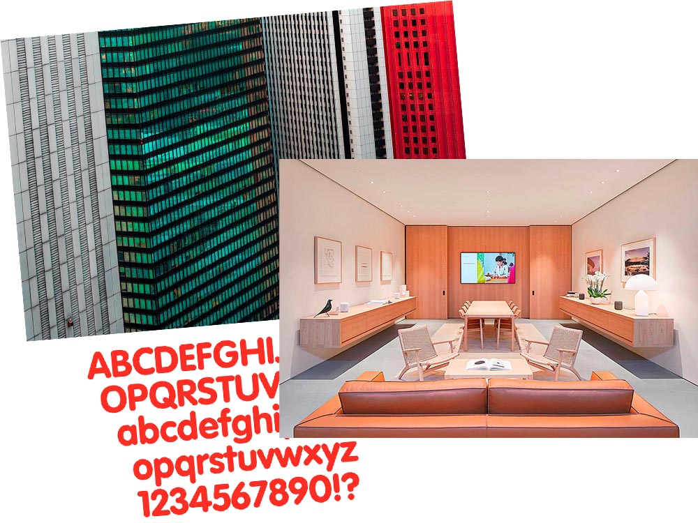
    A three-fer as we wind through this February: Peter Stewart, a really talented architecture photographer from Australia; VAG Rounded, Apple’s keyboard font and how it relates to Volkswagen; and a new site called The Apple Store Glossary leads to an interesting review of furniture in Apple Stores.

    Peter Stewart

    November’s Beautifully Briefed covered the 2021 Architecture Photography Awards shortlist, and one of the photographers is Peter Stewart, a self-taught Australian who wanders around Asia. Gotta say: he’s better than great.
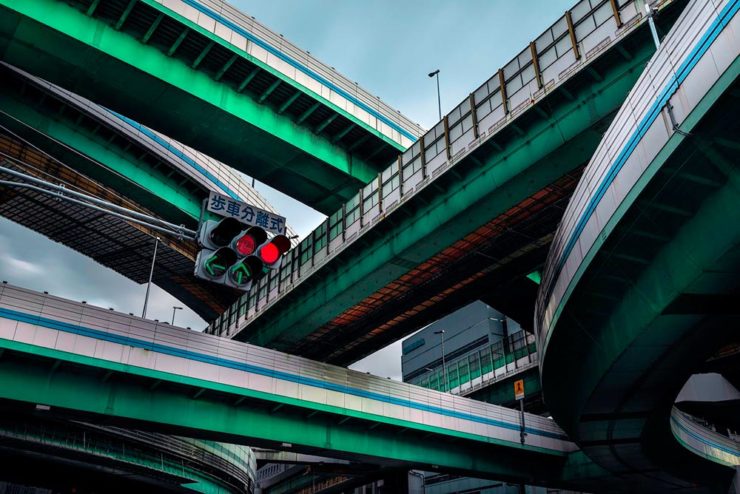
    “Hanshins Web” Osaka, Japan. 2019, by Peter Stewart

    His eye for pattern and color is spot-on:
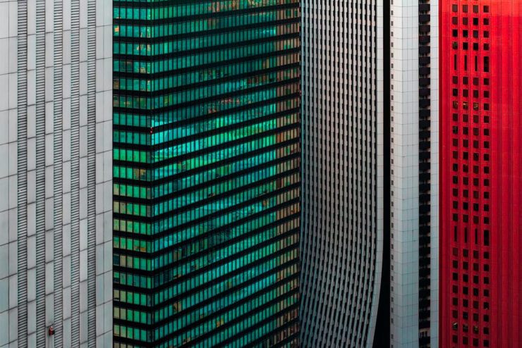
    “Four Columns” Tokyo, Japan. 2019, by Peter Stewart

    Archinect’s In Focus feature has a great 2019 interview that not only discusses the how and where, but also the why — including his thoughts on use of Photoshop and, perhaps most insightfully, how to thrive as a photographer in this crowded age:

    The hardest part of being a photographer today is finding a way to stand out among the crowd. In just the past few years Instagram has changed everything and given rise to a sizable number of highly talented new photographers. We are inherently influenced by the work we see from others, and as such has given rise to a lot of popular trends and styles of photography which has brought about a bit of a copycat culture. The point is, I think it’s important to find your own themes and ideas in order to progress, and not to simply emulate.

    Peter Stewart, Archinect Interview

    Check it out.

    VAG Rounded and Apple

    Daring Fireball is a daily stop for Apple geeks like me, but rarely does it cross into graphic design territory — except when it links to a Jalopnik article discussing how a Volkswagen font wound up on Apple’s keyboards.
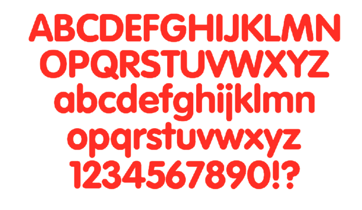
    Good stuff. (Bonus ’80s Dasher brochure siting, too.) Enjoy.

    Apple Store’s Boardroom Furniture

    Some Apple Stores have additional, not-usually-open-to-the-public spaces called boardrooms. And, as you might imagine, they’re filled with interesting stuff.

    A new (to me, at least) site called The Apple Store Glossary has information and photographs of all aspects of Apple Stores, from the new Pickup area to the behind-the-scenes Boardrooms.

    The latter started out as something called Briefing Rooms, intended for business customers and special events. However, they’ve evolved: more casual, more comfortable. And more interesting:
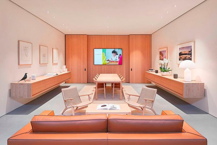
    Apple Boardroom (Passeig de Gràcia store, Barcelona, Spain)

    9to5Mac has a great roundup of these rooms we don’t see, from the accessories (bonus Eames Bird sightings) to the books, and perhaps most interestingly, the furniture.

    Grab a seat, get comfortable, and get info.
  • Beautifully Briefed, Early February 2022: A Car, a Photo, and a Book

    Beautifully Briefed, Early February 2022: A Car, a Photo, and a Book

    BMW i3 Discontinued

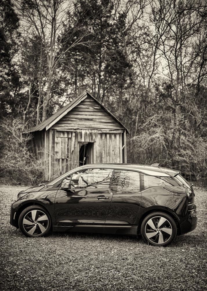
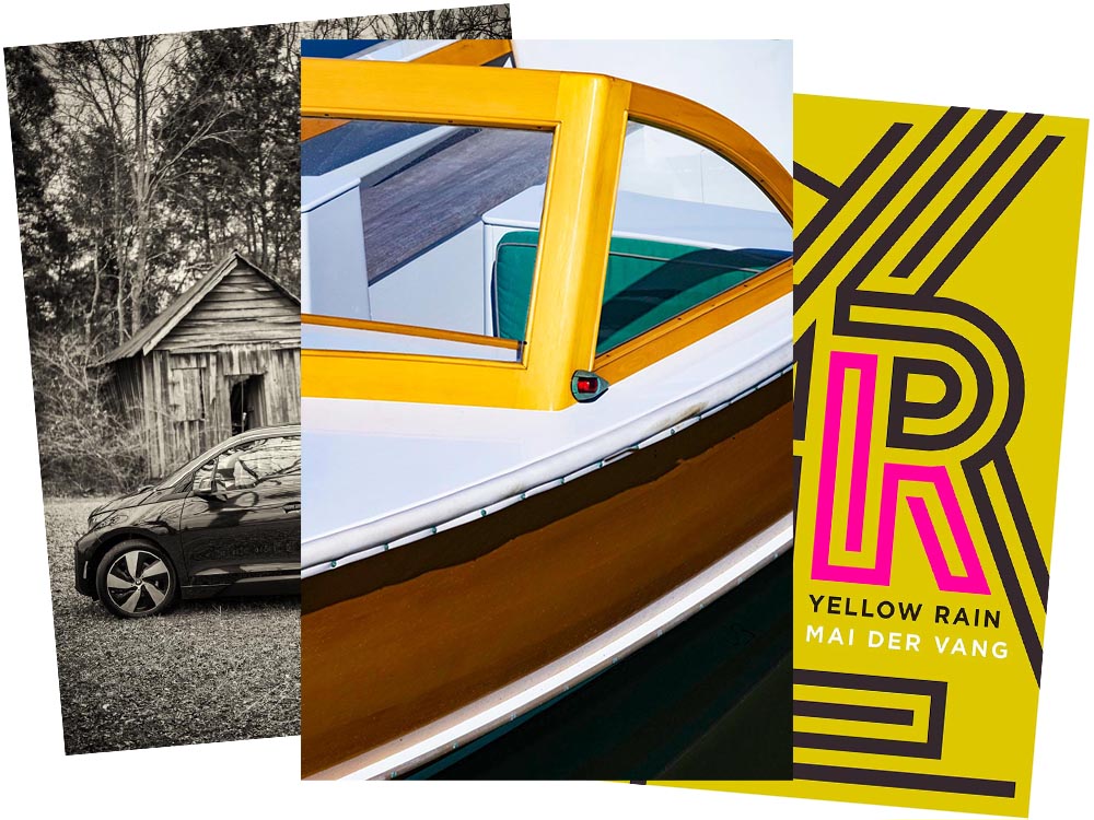
    As some of you know, for getting around town, I zip about in an electric BMW i3. The range isn’t great — 120 miles, give or take, meaning I’d have to recharge there if I went to Atlanta — but for Macon and pretty much all of Middle Georgia, it’s perfect. Grocery store? No problem. Park, for a walk? No warmup, no emissions. Enough range for an ice cream in Musella or lunch in Milledgeville? Easy.

    In fact, it’s not an understatement to say that I rave about my i3. Simply put, I love it.

    Electric Toolbox, Wooden Shed

    When introduced in 2014, it was hugely ahead of its time. Built on a bespoke platform with a carbon-fiber body and an eye-catching style (that somehow just looks electric), it was a huge change of pace for the “Ultimate Driving Machine” folks. And it’s done well for them, too: a quarter-million since.

    Alas, it’s just been discontinued: people want SUVs instead. Bah.

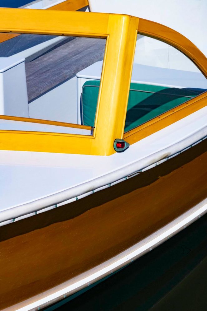
    From cars to boats

    Leica has announced their photograph of the year for 2021:

    Over the past ten years, Leica Camera AG has honoured twelve renowned photographers for their life’s work, by inducting them into the Leica Hall of Fame. A Leica Picture of the Year has now been designated for the first time, with the aim of sharing this success with all Leica enthusiasts. 

    Leica’s 2021 Photograph of the Year

    One of the things that makes photography so glorious is how many different ways the person behind the camera could approach a subject. So, I ask myself: would I have taken that photograph? Almost certainly not. That said, would I hang it on my wall? Yes. For $2000? Maybe another lens instead!

    LeicaRumors has more. Meanwhile, I’ll keep improving. Someday….

    Update: The official Leica page: Ralph Gibson and the M11.

    2021 Cover of the Year addition

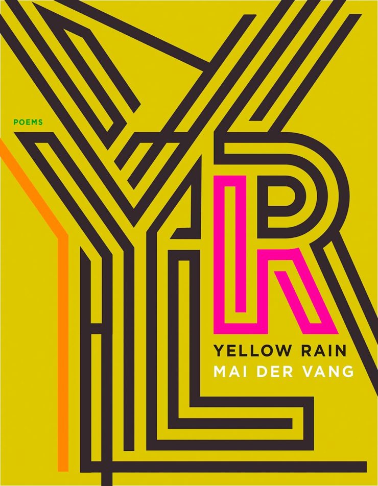
    Lastly, the New Yorker’s Briefly Noted book reviews (from 6 December — I get them second-hand, and subsequently, am a little behind) reveals a collection of poetry — a reinvestigation of chemical weapons dropped on Vietnam — whose cover is sublime:

    Yellow Rain, 7 x 9″ paperback, Graywolf Press, cover by Jeenee Lee Design

    Noted, indeed — I wish I’d seen this in time for my favorite covers of 2021. Belated Honorable Mention! (Thanks, Youa.)

  • New Website. Finally.

    New Website. Finally.

    Housekeeping news: I went back to having an actual website in June, 2019; for a few years, I’d just used a photography hosting service, as photography was the vast majority of what I did. However, when book design again became an important-enough part of my work, I wanted to have a space to talk about it. I bought a WordPress template, added photographs, and posted it.

    …But I never really liked it. From the beginning, I felt y’all deserved more: better typography, better photography, better everything. Like so many, however, one’s own stuff is always at the bottom of the to-do list. No longer.

    I’d like to introduce the new version:

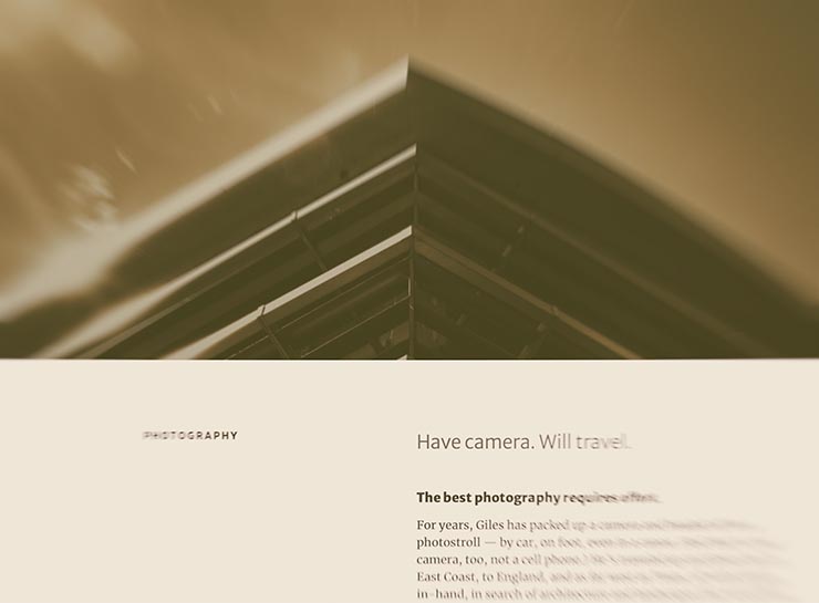
    The new gileshoover.com, January, 2022

    There were a few bumps getting here (naturally, I broke everything along the way; to say I don’t code is an understatement!), but with some tweaking notwithstanding, the new gileshoover.com is live. It’s got all-original photography, matched sans and serif font superfamily (Merriweather by Sorkin Type, a Google Font), much faster response time, open-source foundations, and so on.

    Note that entries on Foreword are best seen individually, as you’ll see bigger photographs (or illustrations, graphics, etc.). Click on entry titles to get there.

    Please explore.

  • Letterpress Typeface from Plymouth Press

    Letterpress Typeface from Plymouth Press

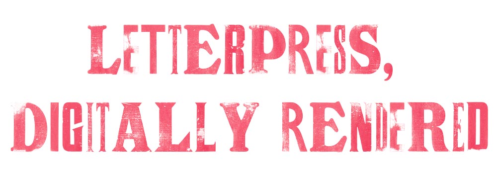
    James Brocklehurst is leading a new kind of innovation method for typography, harking back to the good old days of the letterpress. The technology uses scanned letterpress prints for each letter, and through scripting, randomly cycl[ing] through a range of alternate letterforms whilst you type.

    The font uses OpenType scripting to automatically cycle through a range of alternate glyphs for each character, giving a ‘random’ appearance as you type. (Alternates can also be chosen manually in supported applications.) Very nice, and if you jump through some hoops, some neat results:

    Letterpress type, digitally

    It’s display only — no numbers, limited punctuation — but absolutely worth the download. And did I mention it’s free? Go!

    (Via It’s Nice That. Thank you.)

  • Cadillac and Mercedes Logos: New — or Not (Updated)

    Cadillac and Mercedes Logos: New — or Not (Updated)

    NOTE: See my previous car logo redesign coverage regarding BMW, Mini, etc., and more recently, Volvo.

    Update, 7 December, 2021: Brand New has, as usual, done a superlative job of discussing the new Cadillac logo. See their post here, remembering that they’re subscription now — possibly the best $20/year available.

    Original post follows:

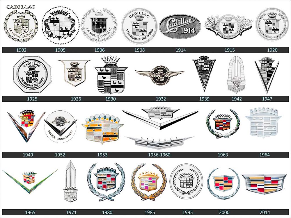
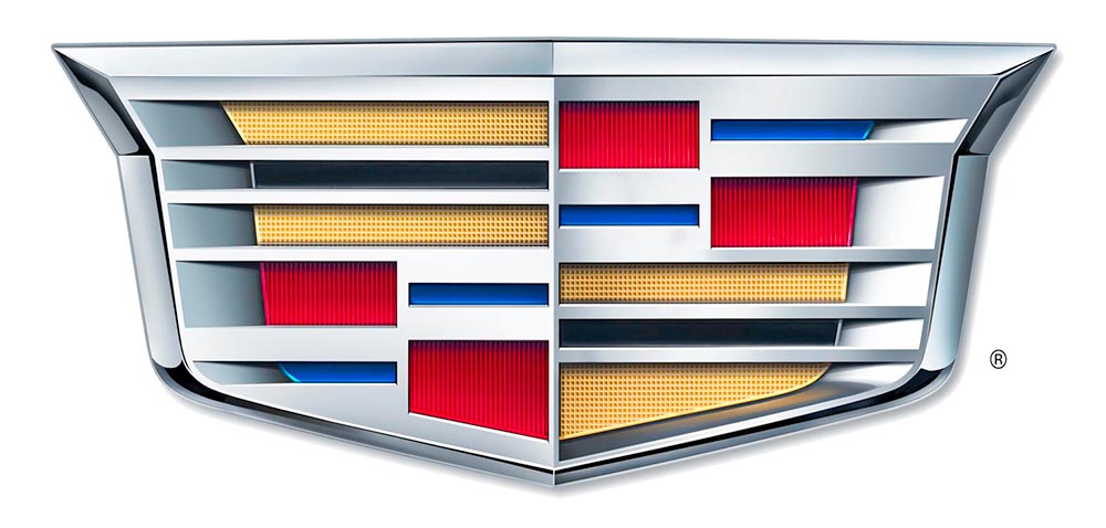
    Cadillac has updated their logo, their first redesign since 2014. First, though, some history:

    Cadillac logo history

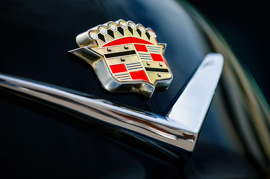
    The mid-century look, with the “crowned” logo, might be my favorite:

    Photo by Jill Refer
    Photo by Jill Reger

    As seen in the last line above, the 2014 logo is a simplification of the 2000 logo, sans the “old-person” wreath, and I thought quite successful:

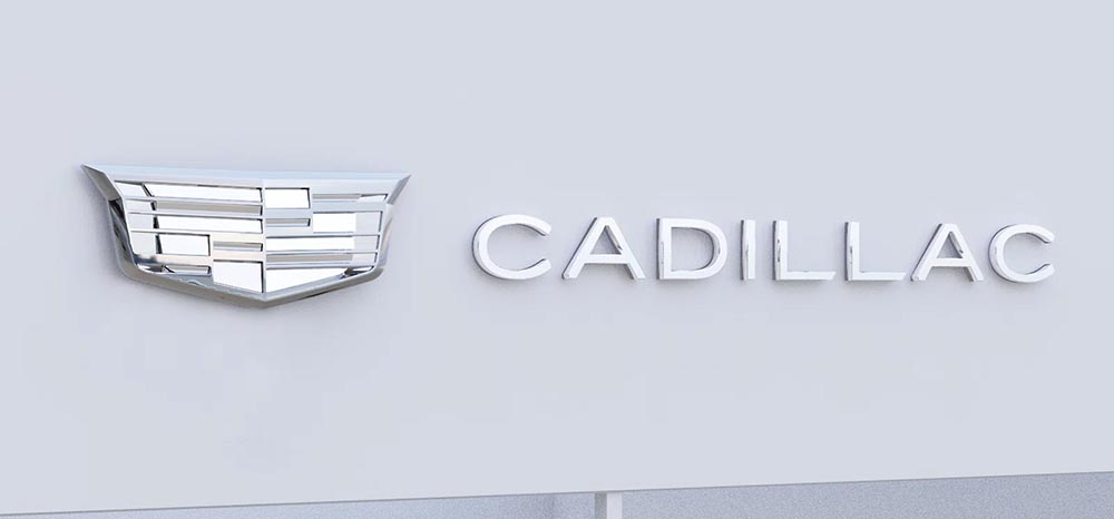
    Fast-foreword (ahem) to 2021, and the monochromatic, flat-logo thing is in full swing. The latest “old-person” target is the Cadillac script, replaced with another trendy item, a custom “Cadillac Gothic” font.

    Cadillac Dealer, 2021

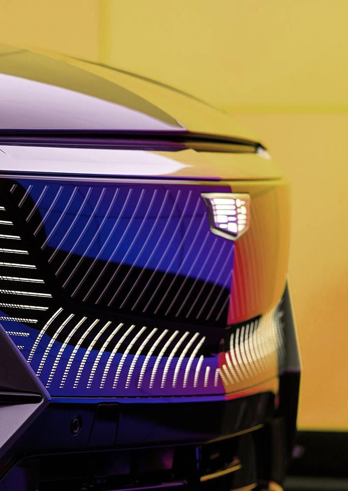
    Not only that, but there’s the new trend among luxury automobiles — mere cars aren’t good enough — of illuminated logos;

    Cadillac illuminated logo

    It’s Nice That has more on Mother Design’s new take on Cadillac.

    Mercedes, on the other hand, has just celebrated the 100th anniversary of the three-pointed star. Then:

    MB logo, historical

    Now:

    MB logo, now

    When it’s done right….

  • Neenah Swatch Pro

    Neenah Swatch Pro

    From Dieline:

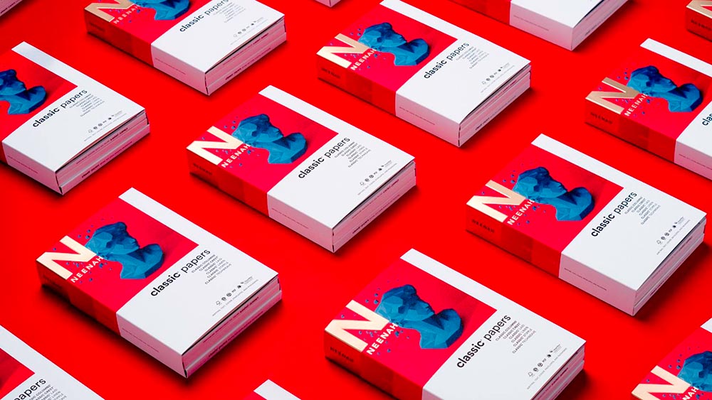
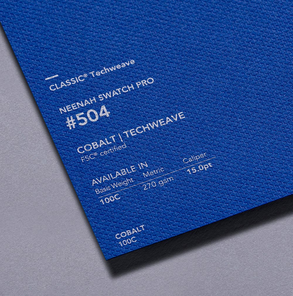
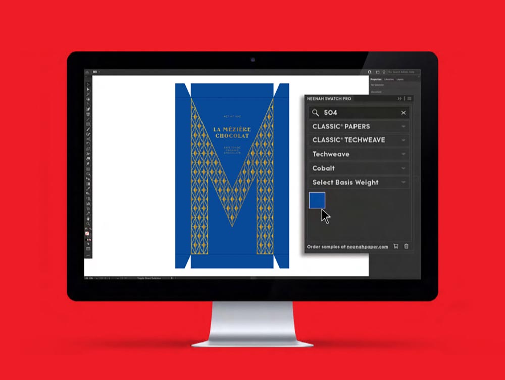
    Specialty paper manufacturer Neenah has announced a refresh to its Classic paper swatchbooks that makes bringing designs from digital workspaces to the physical world, including a significant revamping of the numbering system, optimized for the Neenah Swatch Pro extension for Adobe Illustrator, Photoshop, and InDesign.

    I’m a sucker for good paper — many of you know I started in print work, and to this day, prefer it over digital destinations. Neenah manufactures Classic Textures (think: linen, laid, etc.) that have been with us forever and are still very much appreciated when it comes time to put ink of paper. Literally. An extension that makes it easy to see what that looks like — something as simple as a number, like Pantone — is fantastic.

    Get more information from Neenah, or check the Adobe Extension Exchange (note: that page still lists a 2019 update).

  • On Volvo’s New Logo

    On Volvo’s New Logo

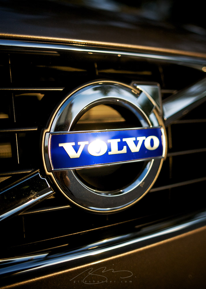
    The “Iron Mark” has been given a makeover, and the result is … interesting. First, as a reminder, here’s the logo as it appeared previously — no, the one previous to that:

    2009 Volvo Iron Mark (on S80)
    My mother’s 2010 Volvo S80

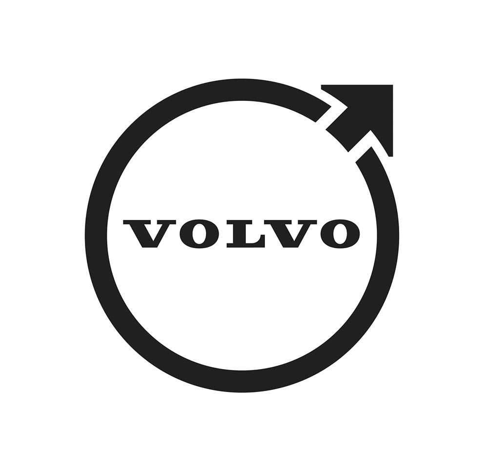
    The blue has been associated with Volvo’s logo for a long while now, and it’s slowly been disappearing from the lineup (in favor of black in the same location). However, they’ve decided — they being both Volvo Cars and Volvo Group, two distinct entities (the latter including Volvo Trucks, the Volvo construction folks, Volvo Penta [marine], etc.) — to change to this new, more austere logo and word mark simultaneously. Aaaaaand:

    2021 Volvo Iron Mark

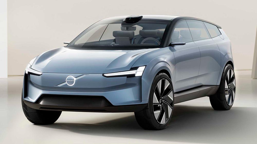
    Words fail me. Thankfully, there’s been plenty of coverage. See Brand New (subscription), CarScoops, and The Drive. What’s interesting — and largely gone under the radar — is that the logo debuted on a concept car back in June.

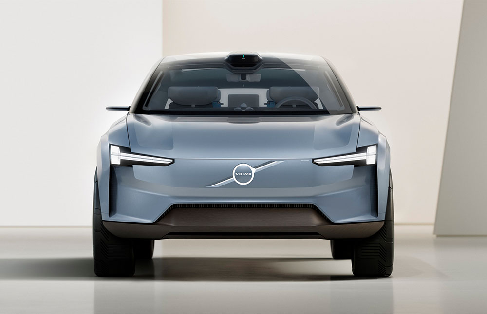
    Volvo Concept Recharge (2021)

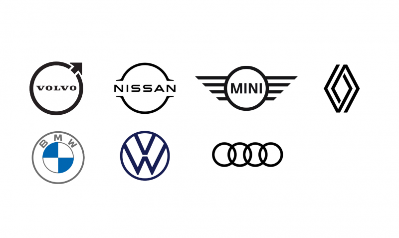
    It’s part of a trend, too:

    2021 car logo redos

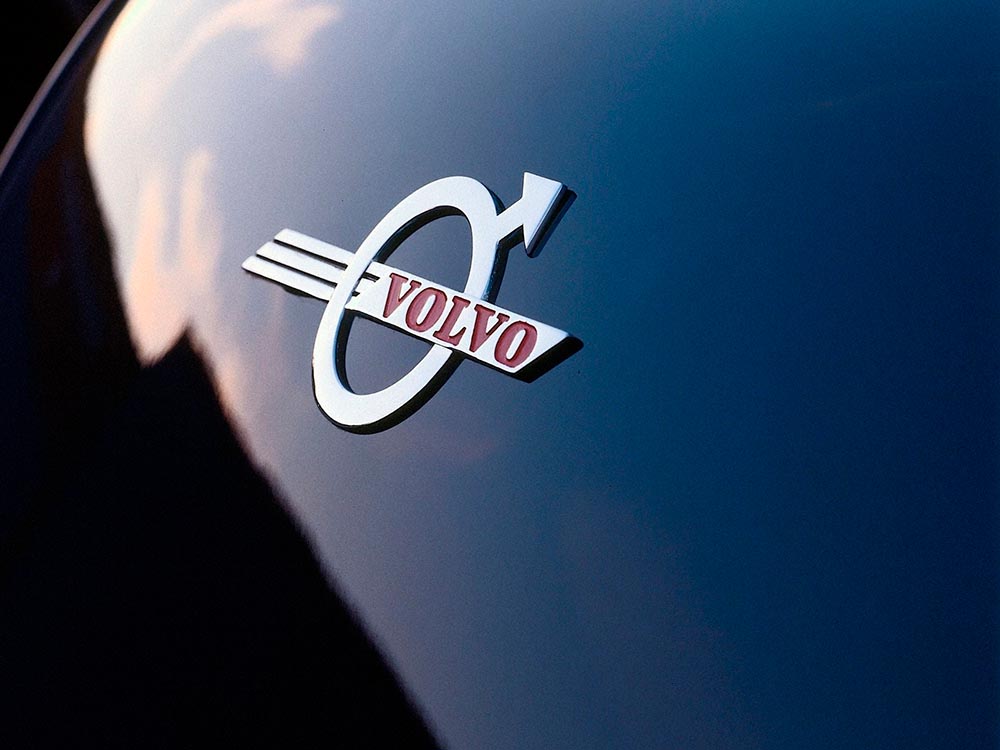
    See the previous coverage on Foreword. Can’t go, however, without a hat tip to Kristen Shaw at The Drive, who dug out this 1937 version — which, I’d argue, beats ’em all. Kudos.

    Volvo logo (1937)
  • Macon Downtown Gallery Updated

    Macon Downtown Gallery Updated

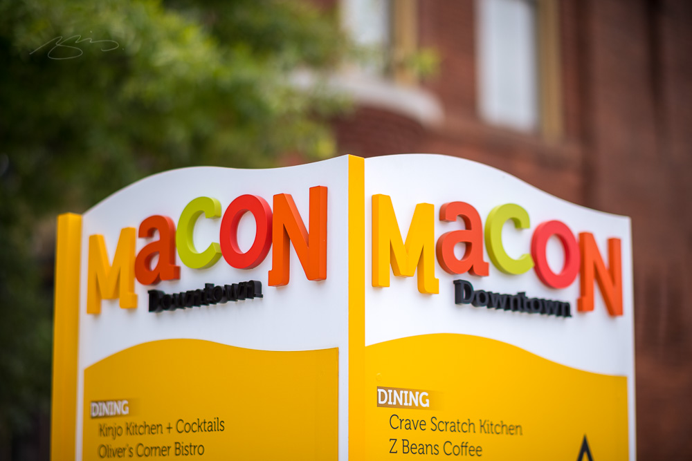
    Took the TTArtisans 50mm ƒ1.2 for a brief stroll today after lunch with Gerald. Gotta say: this thing is fun:

    Macon Downtown TT Sign

    Note how the sign is into the bokeh practically before you’re through the sign’s second letter. This, too:

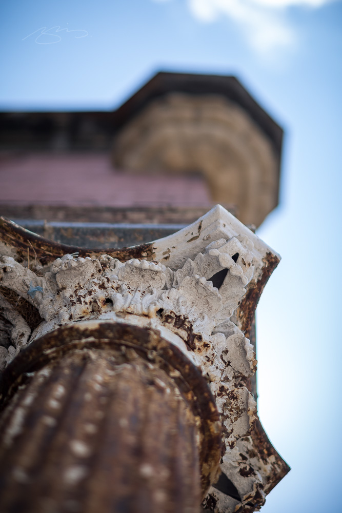
    Macon TT Downtown

    Does it begin to challenge Leica, or even Voigtlander? Certainly not — it’s a $98 (!) Chinese manual-focus crop lens shunned by almost all “real” Leica shooters. But for this short-depth-of-field fan, it’s worth the embracing the flaws. The updates are at the bottom of the page, marked, “Macon-Downtown_June-2021-x.” Enjoy.