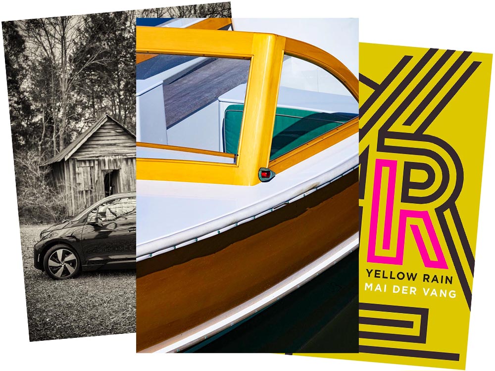
BMW i3 Discontinued
As some of you know, for getting around town, I zip about in an electric BMW i3. The range isn’t great — 120 miles, give or take, meaning I’d have to recharge there if I went to Atlanta — but for Macon and pretty much all of Middle Georgia, it’s perfect. Grocery store? No problem. Park, for a walk? No warmup, no emissions. Enough range for an ice cream in Musella or lunch in Milledgeville? Easy.
In fact, it’s not an understatement to say that I rave about my i3. Simply put, I love it.
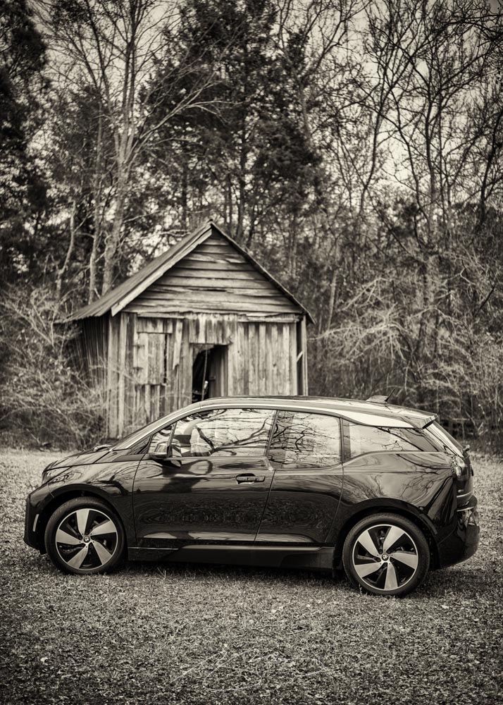
When introduced in 2014, it was hugely ahead of its time. Built on a bespoke platform with a carbon-fiber body and an eye-catching style (that somehow just looks electric), it was a huge change of pace for the “Ultimate Driving Machine” folks. And it’s done well for them, too: a quarter-million since.
Alas, it’s just been discontinued: people want SUVs instead. Bah.
From cars to boats
Leica has announced their photograph of the year for 2021:
Over the past ten years, Leica Camera AG has honoured twelve renowned photographers for their life’s work, by inducting them into the Leica Hall of Fame. A Leica Picture of the Year has now been designated for the first time, with the aim of sharing this success with all Leica enthusiasts.
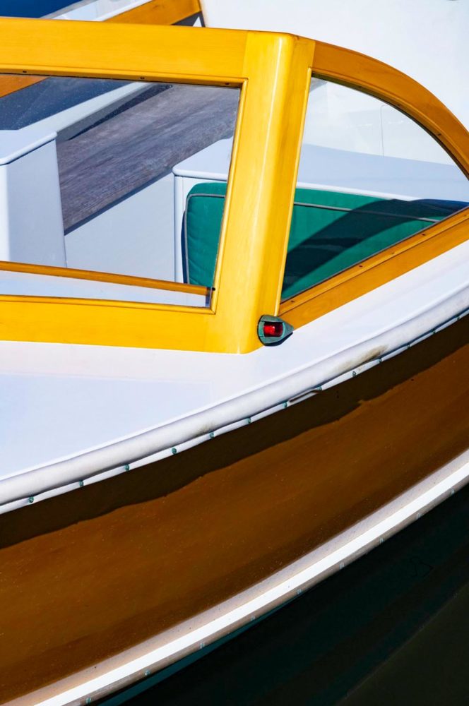
One of the things that makes photography so glorious is how many different ways the person behind the camera could approach a subject. So, I ask myself: would I have taken that photograph? Almost certainly not. That said, would I hang it on my wall? Yes. For $2000? Maybe another lens instead!
LeicaRumors has more. Meanwhile, I’ll keep improving. Someday….
Update: The official Leica page: Ralph Gibson and the M11.
2021 Cover of the Year addition
Lastly, the New Yorker’s Briefly Noted book reviews (from 6 December — I get them second-hand, and subsequently, am a little behind) reveals a collection of poetry — a reinvestigation of chemical weapons dropped on Vietnam — whose cover is sublime:
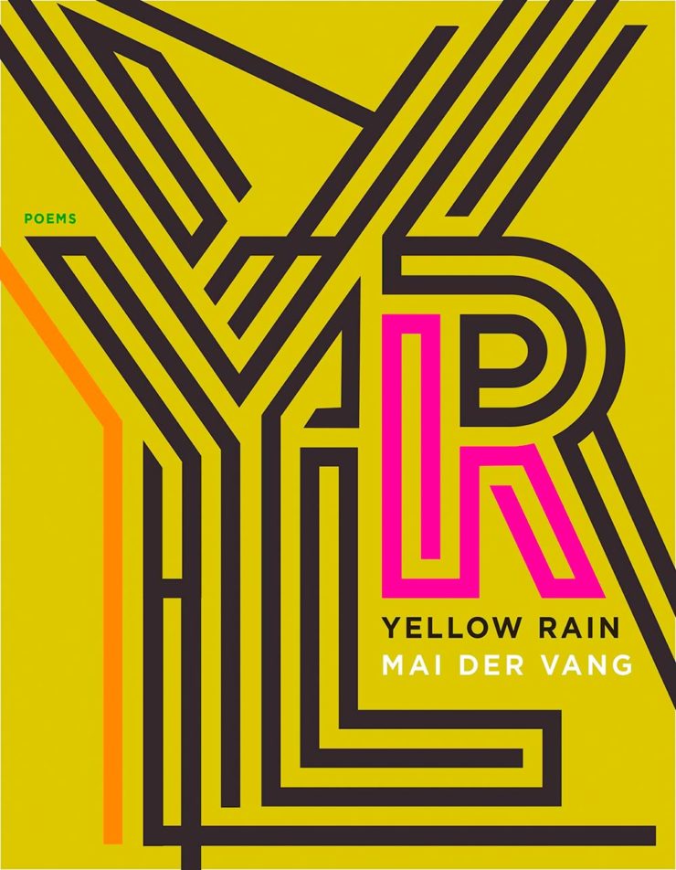
Noted, indeed — I wish I’d seen this in time for my favorite covers of 2021. Belated Honorable Mention! (Thanks, Youa.)