It’s the yearly wrap-up and the holiday season! Recap and Rejoice!
Hermès Does Windows
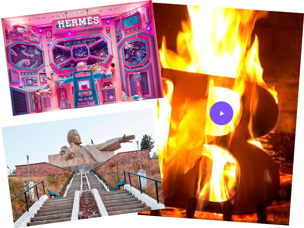
“Journey of a Lifetime” is this year’s window display for Hermès — yes, Hermès should have an accent, but I can’t seem to summon it today fixed! — so let’s go with a picture instead:
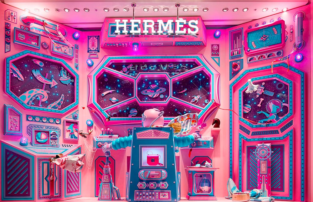
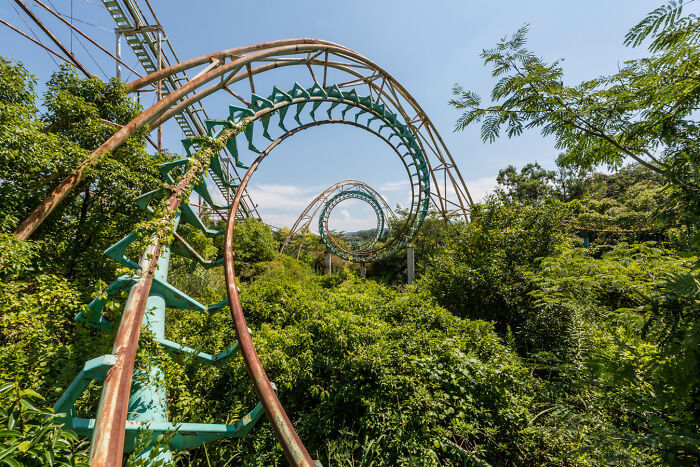
All in paper. No, let me repeat that: it’s all paper. (Well, perhaps some glue.) From artists Zim and Zou. Here’s another, one of their earlier works:
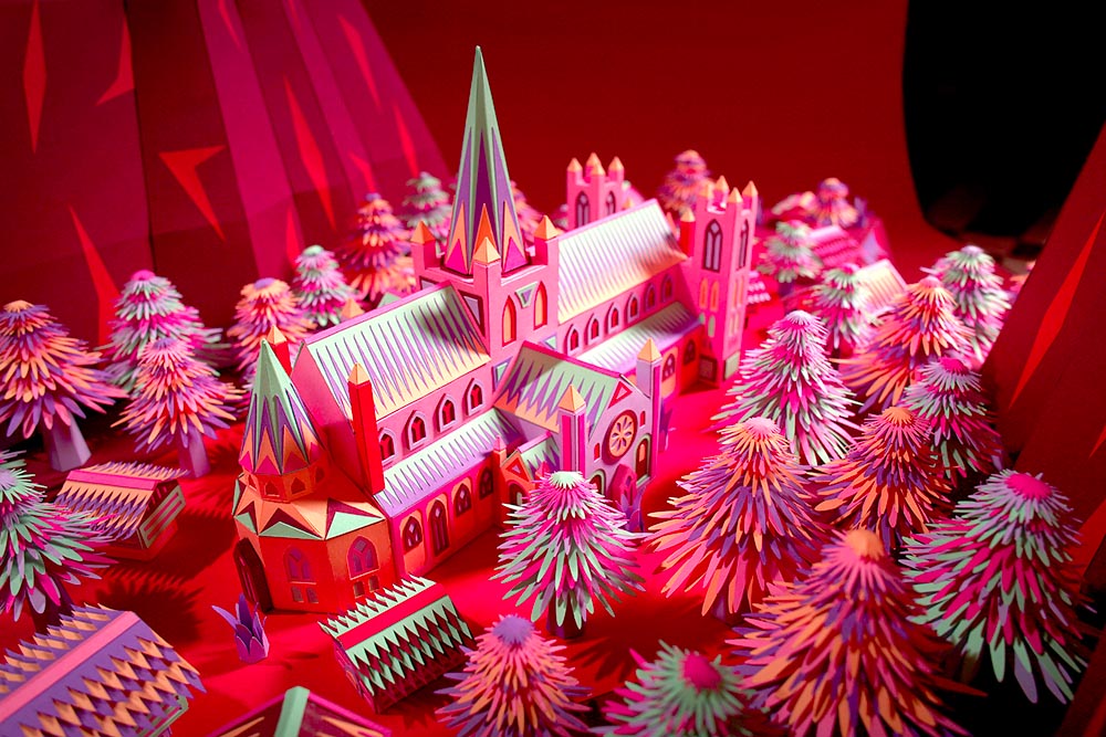
Read more at This is Colossal about the window and the church. Nice.
Yule Ogg
While we’re on the subject of the holidays, check this out:
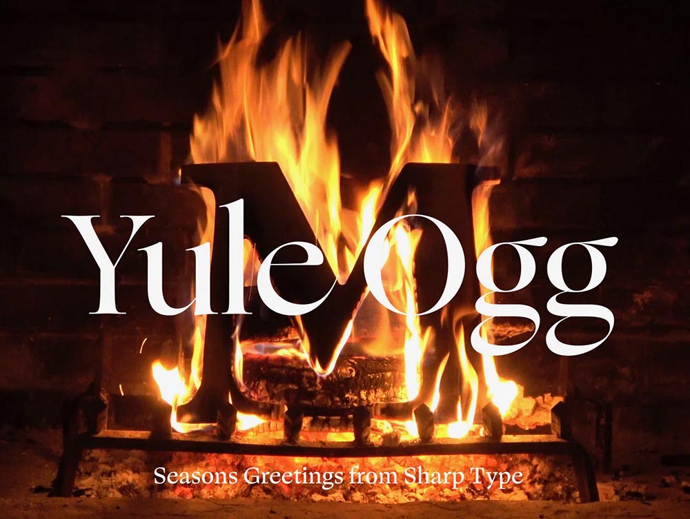
That’s right, it’s one of those four-hour Yule log videos — but with a twist. Those are wooden type pieces going up the flame. Check it out, along with the backstory, at It’s Nice That.
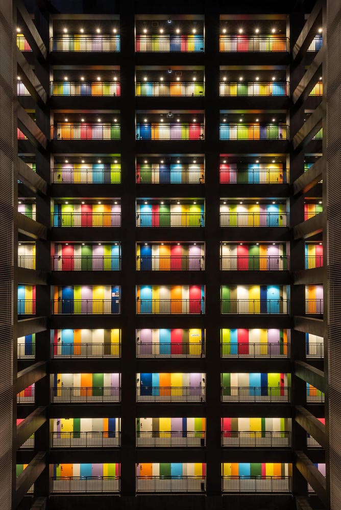
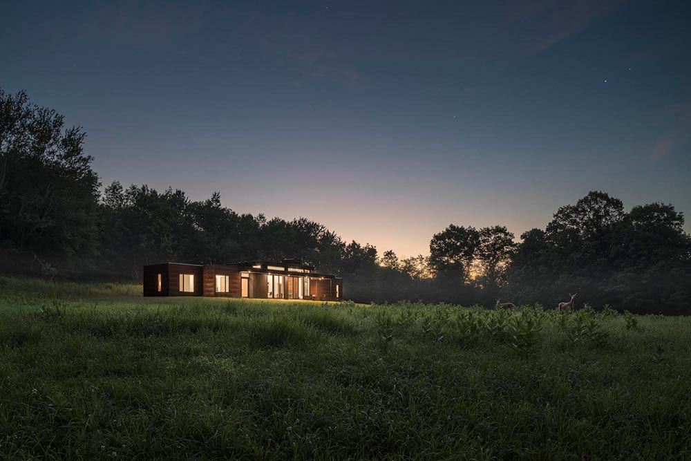
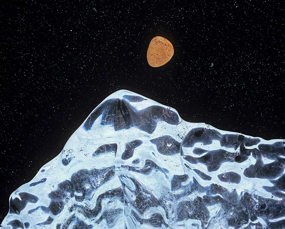
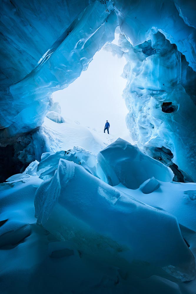
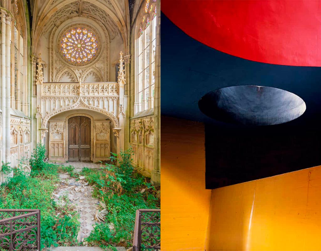
Top Architectural Photography Projects
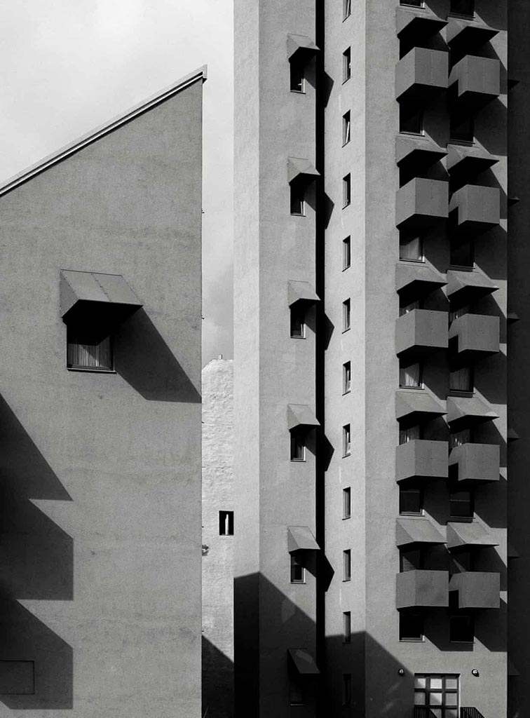
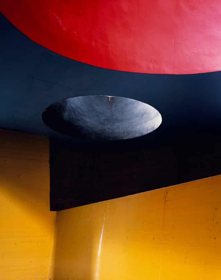
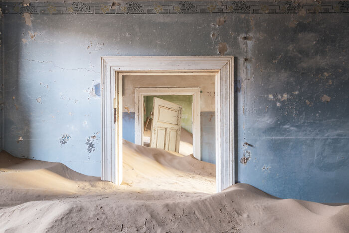
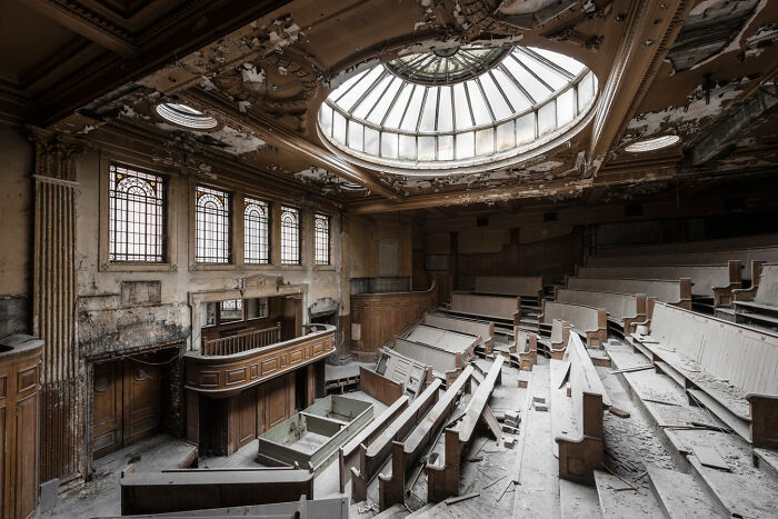
Closing out, we start the year’s “best of” round-ups, this one Dezeen’s top 10 architectural photography projects of 2021:
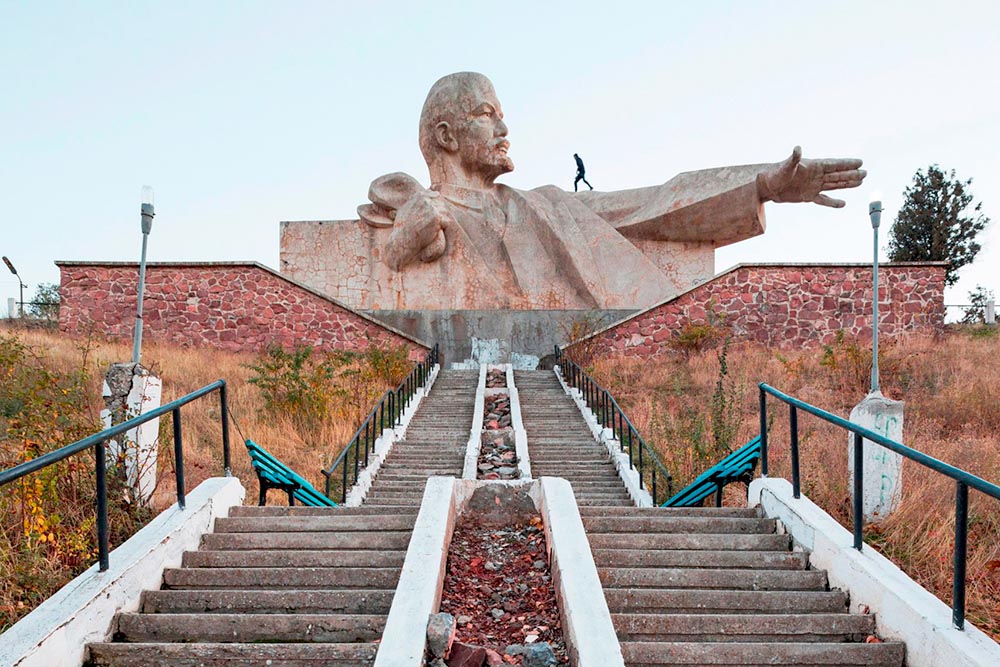
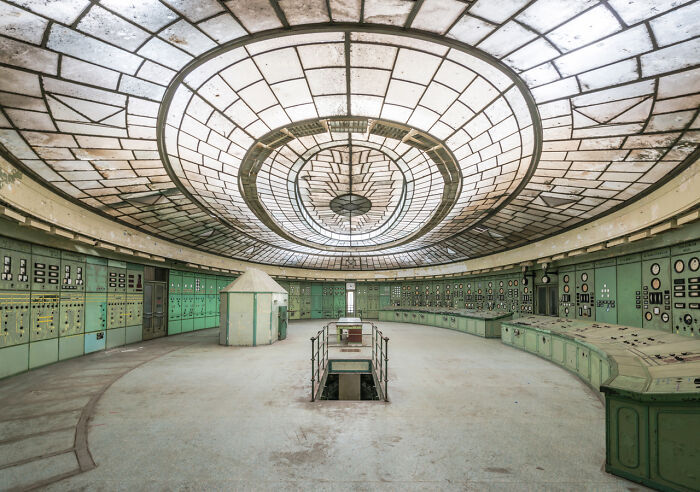
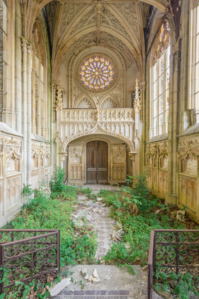
Above, Soviet architecture, central Asia, by Roberto Conte and Stefano Perego. Below, Structure Photography by Nikola Olic:
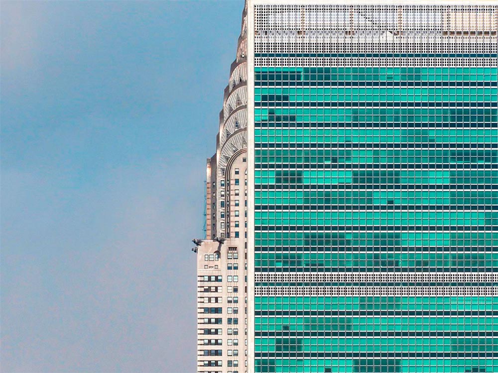
The latter is called “poetic,” a description I’d completely agree with. The Mother Road, USA, by Hayley Eichenbaum (previously mentioned) is there, too. Enjoy.
That’s it until after the holiday. Around the first, stay tuned for my favorite book designs of 2021 and more. Take care!