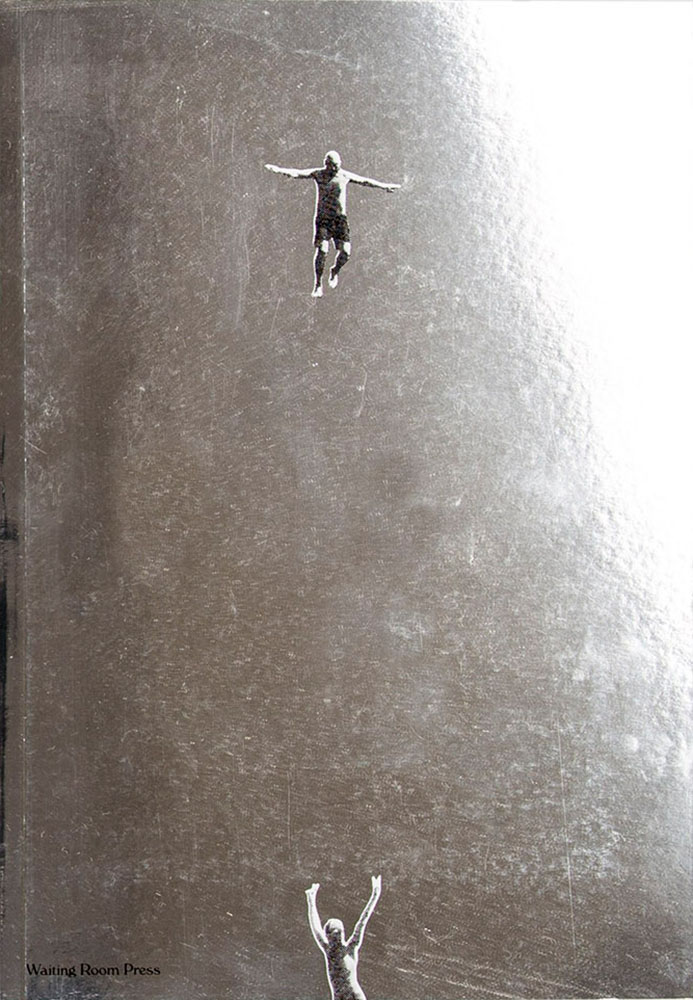
It’s been a busy summer here in Middle Georgia; after regular updates to Foreword for several months, things have slowed down a little. Thus, some good items have piled up.
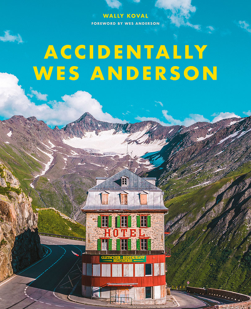
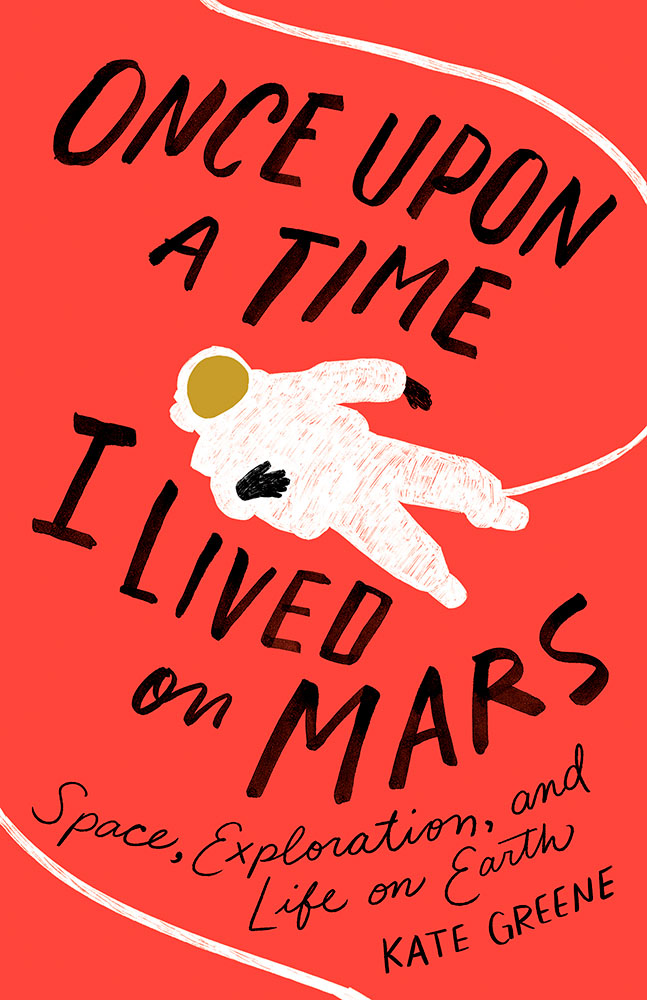
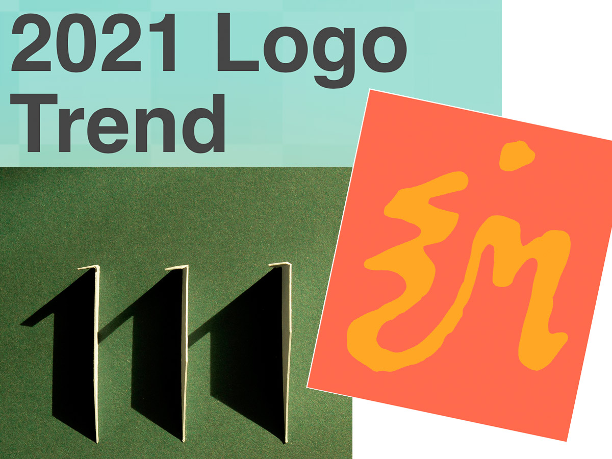
Starting with a book design I really like:
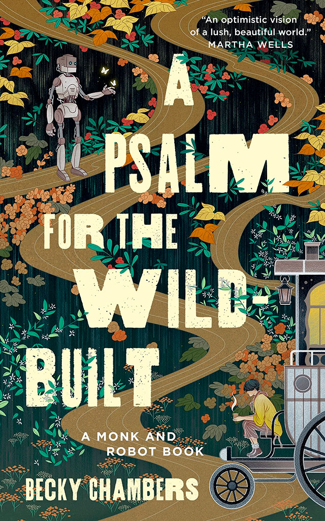
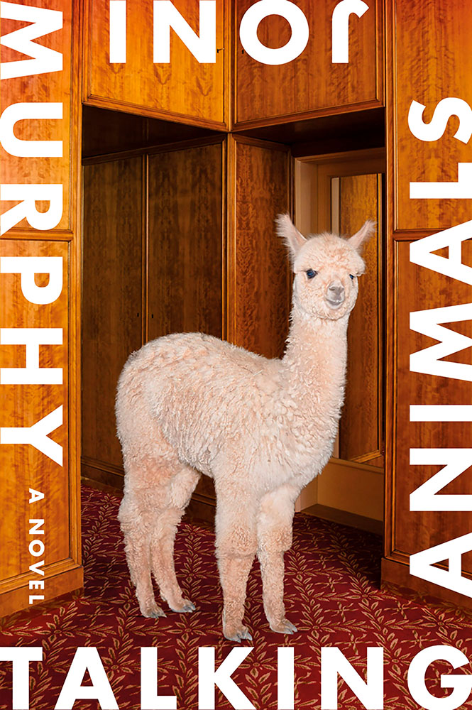
NPR describes it as, “A Monk And A Robot Meet In A Forest … And Talk Philosophy.” Interesting description, interesting design. I’d pick it up off a shelf.
Speaking of bookshelves, a notable quote from Andy Hunter, of Bookshop.org:
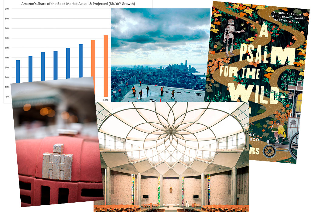
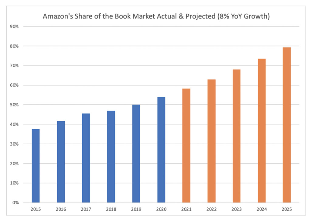
Take a look at this graph. The blue is Amazon’s share of book sales in the past six years. The orange is where we are headed if their average growth rate (8%) continues. If nothing slows their momentum, Amazon will control nearly 80% of the consumer book market by the end of 2025. Every single book lover should worry. After we’re done worrying, we must change the way we buy books.
The graph:
I’m not a fan of Medium — Andy, please choose a better place to post your very valid point — but it’s worth reading. Then change your book-buying habits if possible!
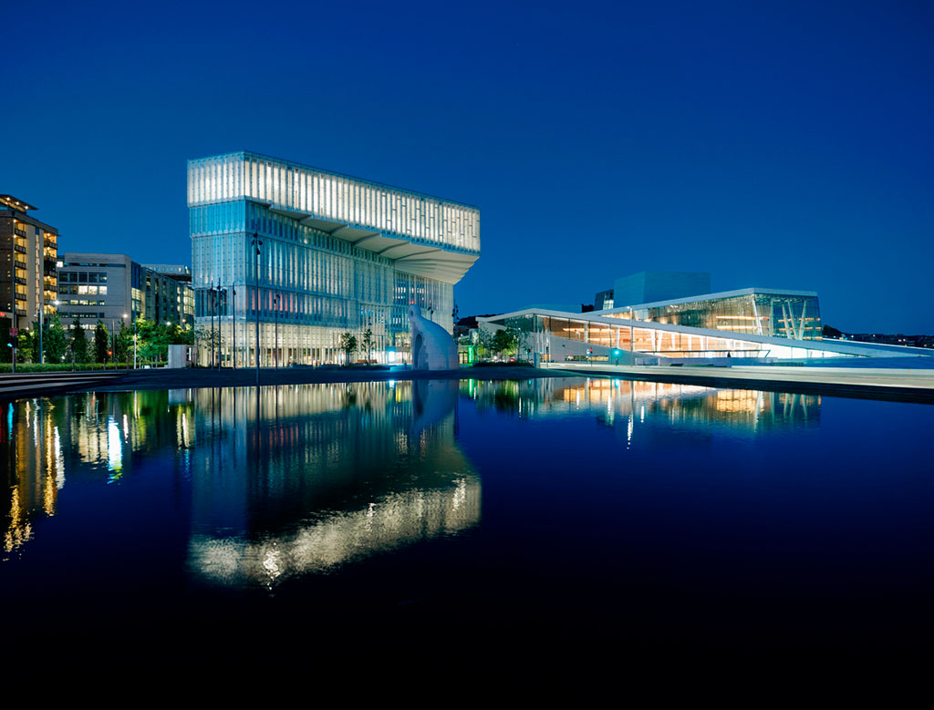
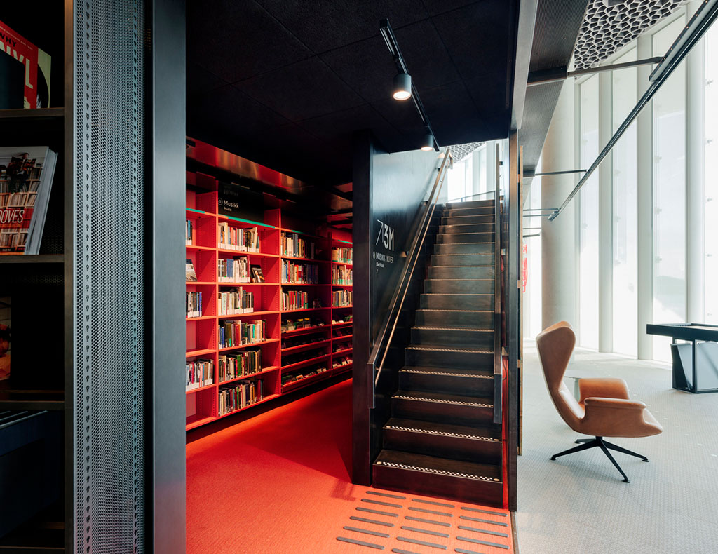
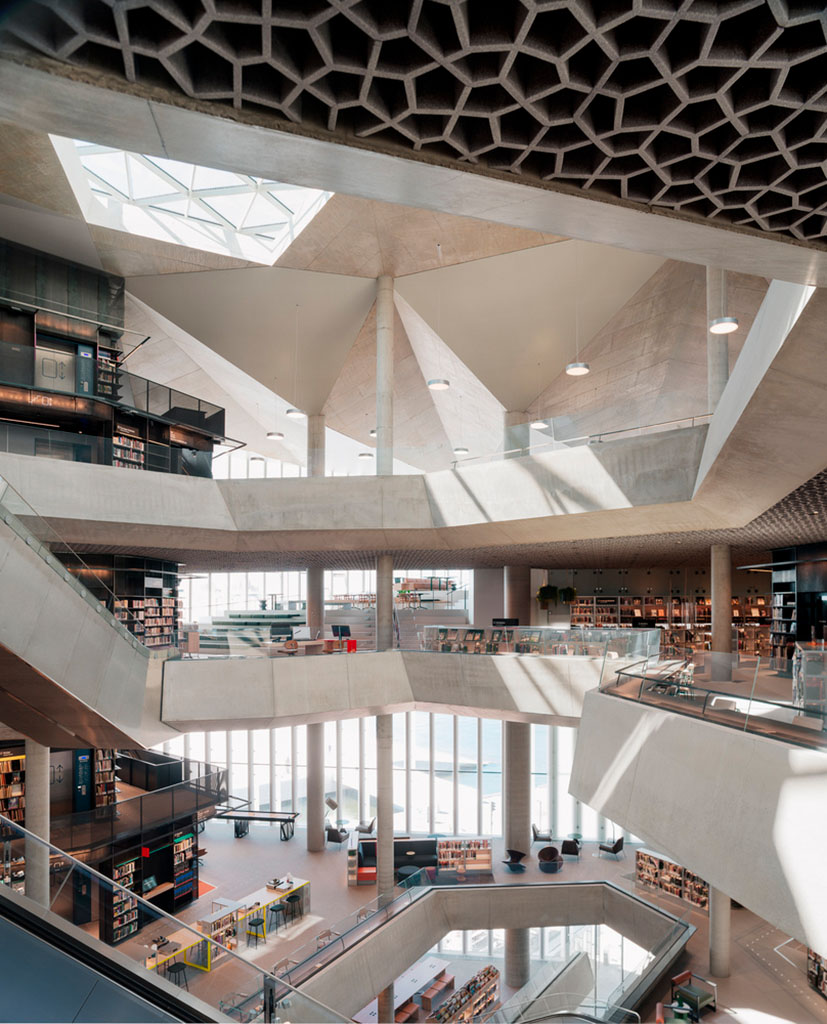
Also from the book category, check out Skidmore, Owings, and Merrill’s latest book of built work 2009-2019. Tons of great work here, but one example might tower over the others:
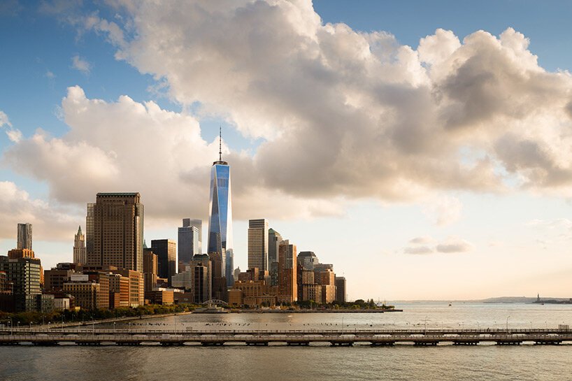
Great photography, too. designboom has more, in their famous all-lower-case style.
While we’re talking about great photographs of New York City, check this out — complete with 1WTC in the background:
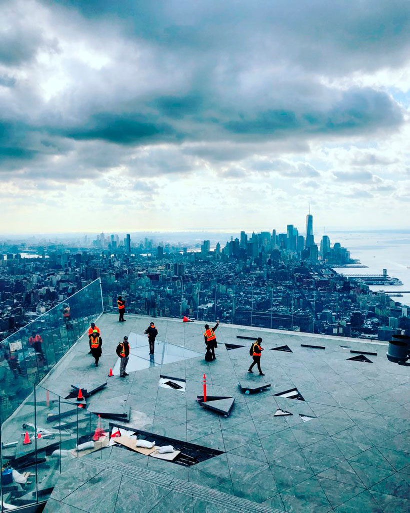
A winner from the recent 2021 iPhone Photography Awards, which I enjoyed … until I found out it’s just another contest, complete with entry fee. (Hey, at least they don’t reassign copyright.)
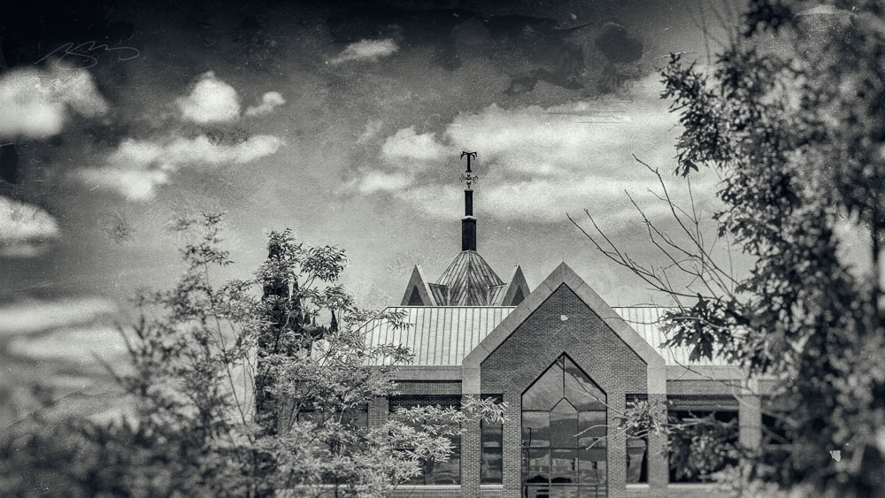
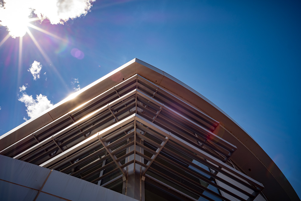
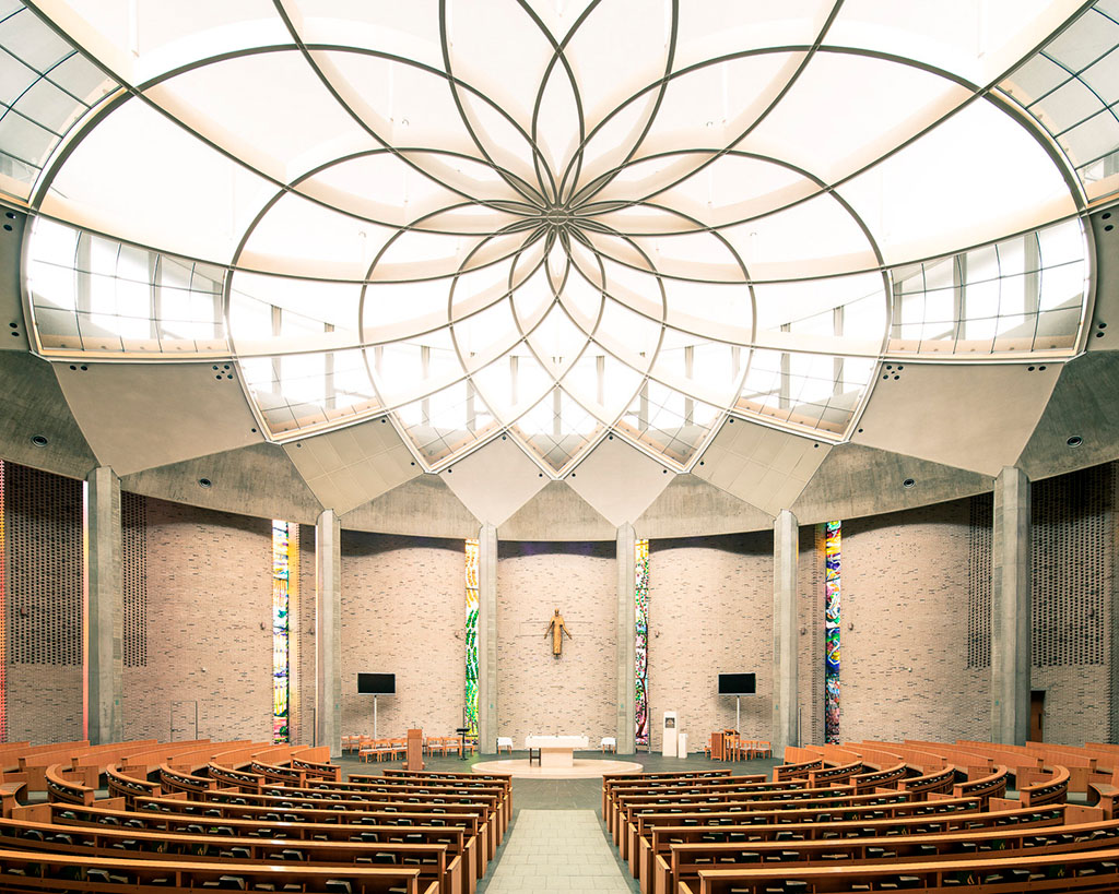
While we’re at the intersection of photography and architecture, these shots of modern churches across Europe are stunningly beautiful:
From the nearby intersection of photography and illustration:

The whole series is great, great stuff, and has very deservingly been used by the likes of Apple, The New Yorker, and more. Read on.
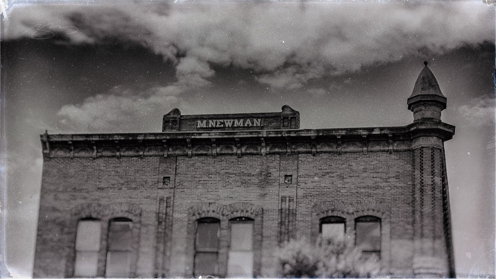
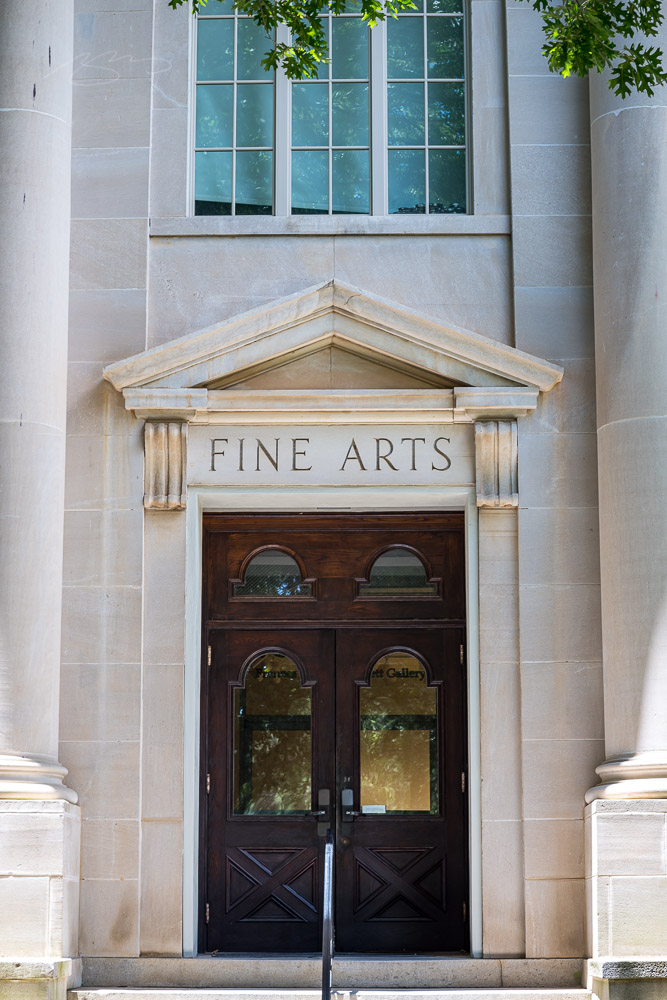
Last and almost certainly least, I’ve updated the Musella gallery:
Check that gallery out, look at the Middle Georgia collection, or peruse all my Georgia photographs on the road to purchasing a print or getting in touch to let me know you’d like to use something in a book or design project. Thank you.
On to September!