The past couple of days represented a much-needed break from the recent heat wave — an opportunity to get out of the house and celebrate a stunning morning with camera in-hand.
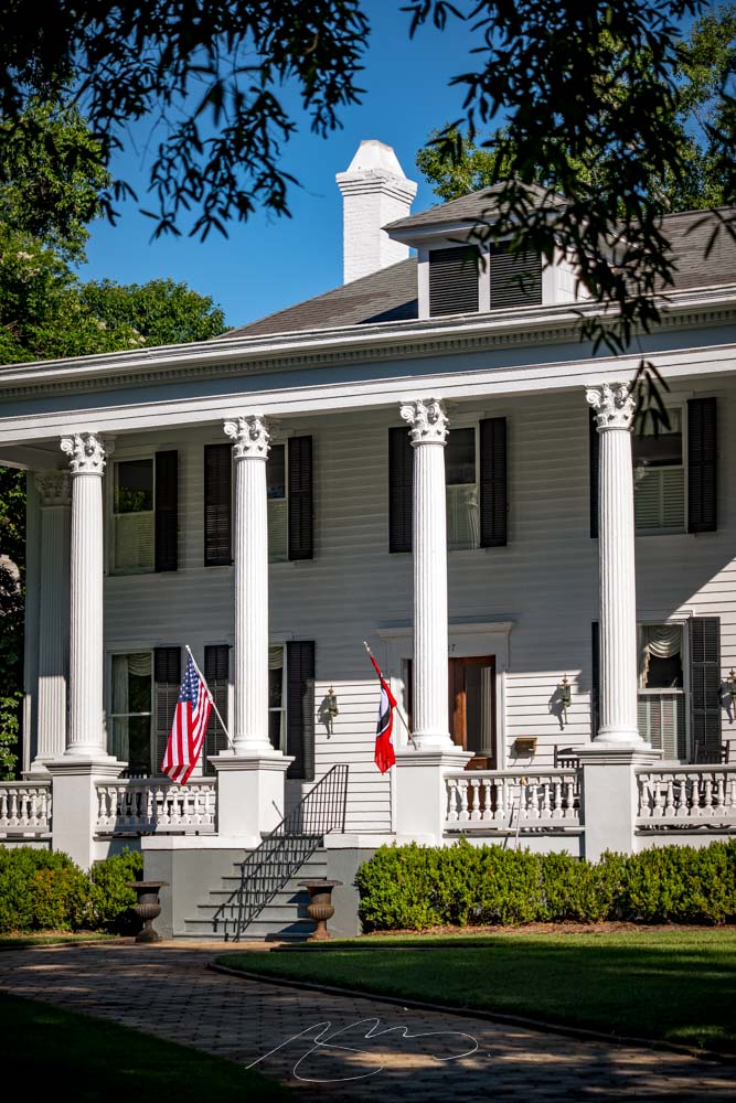
I pass through Madison regularly (it’s along the route from Macon to Athens), and have been meaning to stop and take some photographs for literally years. Today, the first of two parts this week, with more to come soon.
We start at the Madison Morgan Cultural Center and loop through the historic district — and its many, frankly stunning buildings — south of downtown:
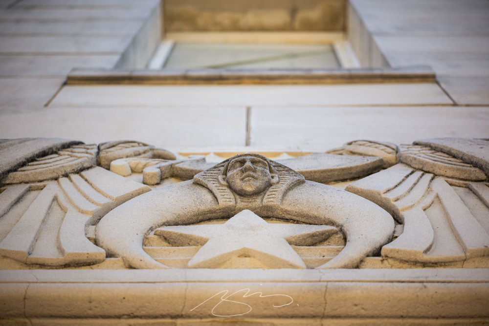
Madison Morgan Cultural Center (Detail #4)507 S. Main Street #1411 Old Post Road #1413 S. Main Street, Photographed from Old Post Road
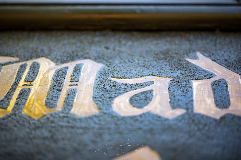
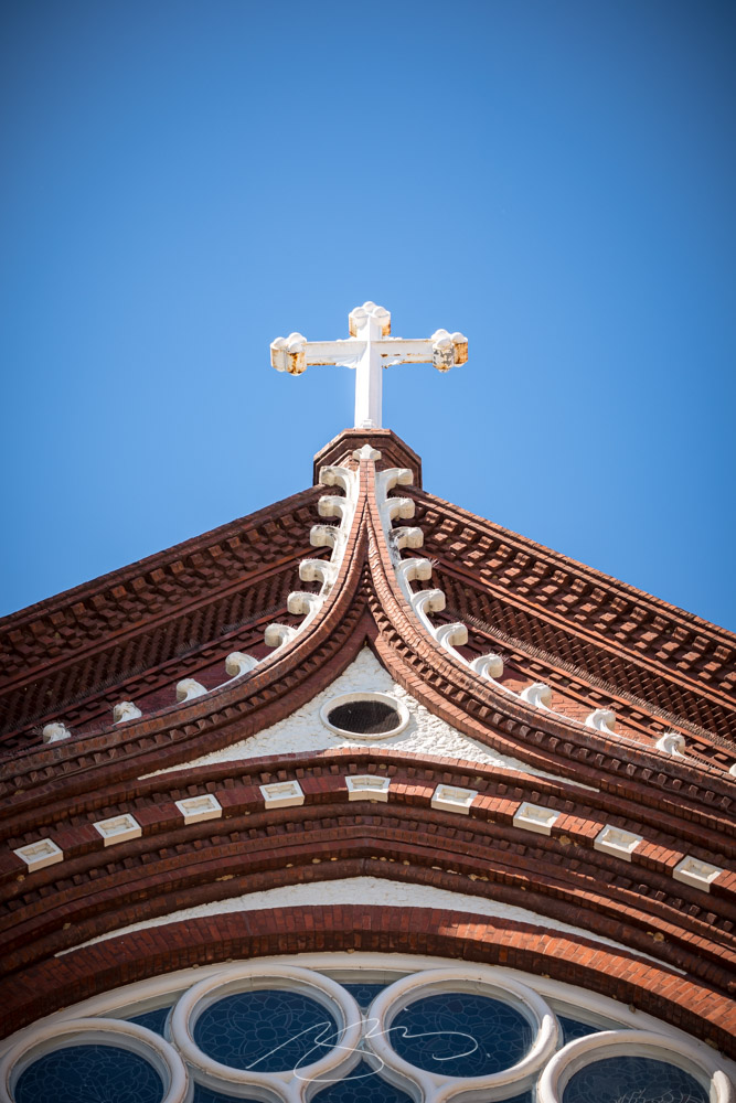
There are a few detail shots mixed in, too, like this one from the Presbyterian Church:
Madison Presbyterian Church (Door Detail)
See the first 34 photographs in the new gallery. (Remember to double-click on a photograph to see larger.) Next time, downtown. Happy Monday!
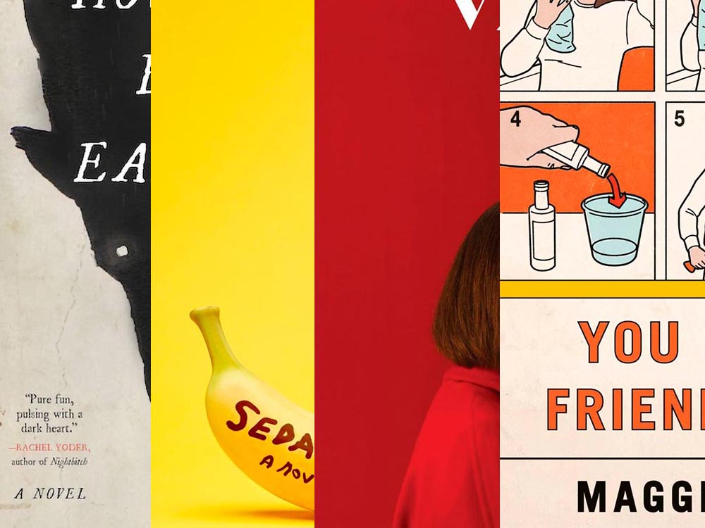
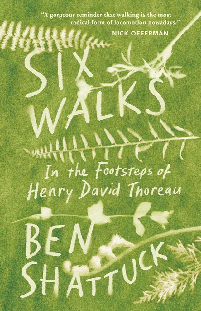
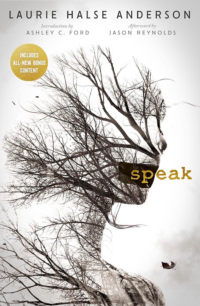
A book design treat for your Monday morning: four of my favorite new book covers from last month’s debuts.
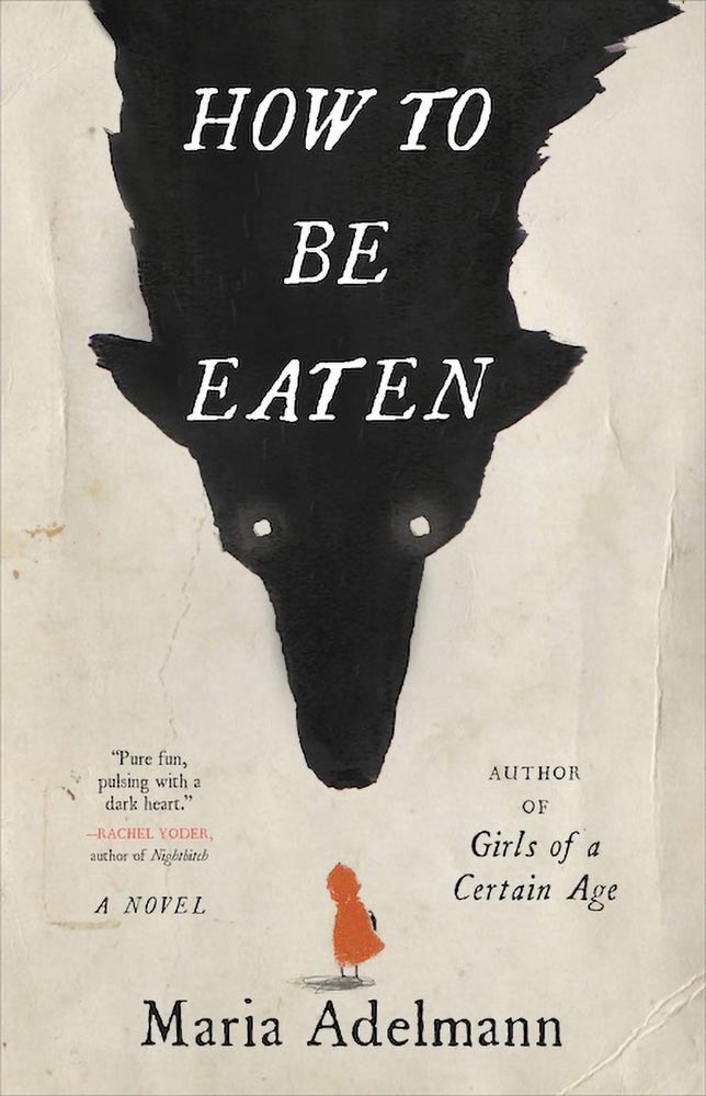
How To Be Eaten. Design by Julianna Lee.
Aged, distressed paper is a great look when done well, and this one hits all the right notes. The size relationship between the characters, the glow around the eyes, the two color choices, the type, all of it — great stuff.
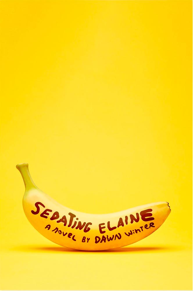
Sedating Elaine. Design by Janet Hansen.
A veritable how-to on less-is-more. Brilliant.
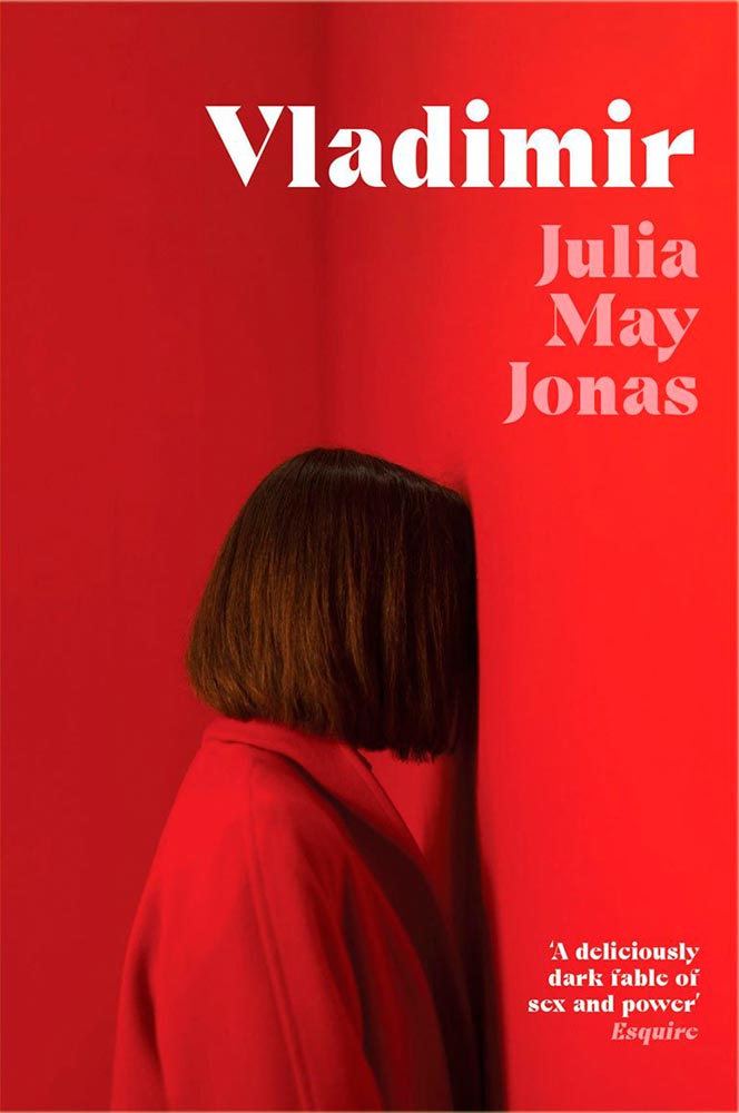
Vladimir. Design by Katie Tooke.
Another solid-color triumph. Great font choice here, too. Awesome.
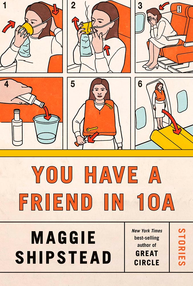
I’ve saved the best for last:
You Have a Friend in 10A. Design by Kelly Blair.
Great Circle has featured before, and this follow-up takes us inside the plane and into the safety brochure in the best possible way. Great, brilliant, and awesome wrapped into one.
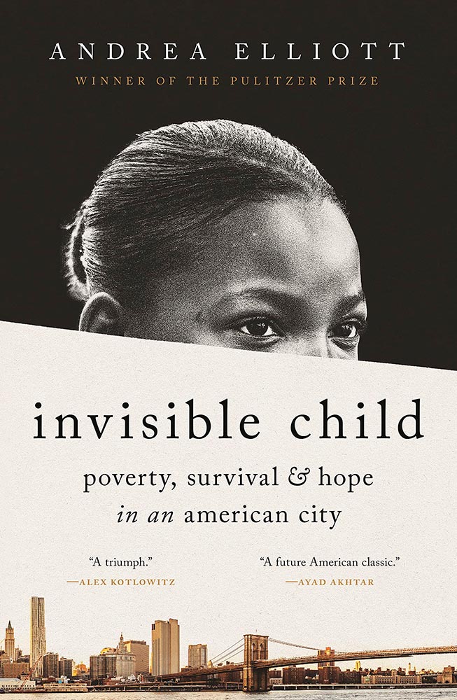
Update, June 20th: WABE, Atlanta’s NPR station, has a summer reading list out, highlighting Georgia books and authors — and I’d like to include two of the covers here:
Invisible Child.
The grainy photograph, the wonderfully placed city skyline, and classic typography, combined with the diagonal cutline, elevate this title from mundane to eye-catching.
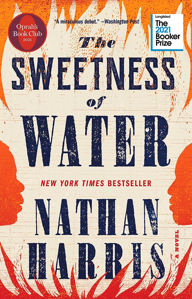
The Sweetness of Water.
Excellently distressed doesn’t begin to describe this, on many levels. Side note: it’s a terrible shame that the Oprah and Booker call-outs have been elevated to logo status in what can politely be described as a distraction (from a book designer’s point of view, at least).
FedEx pulled up around 8:30 this morning and dropped off a new lens. (It wasn’t due ’til Tuesday — bonus!) Given that it was an absolutely beautiful morning, I shelved my plans for the day, picked up the camera, and headed downtown.
Verdict? It’s so a keeper. See for yourself:
Catholic Cross, St. Joseph’s, MaconPurple Hydrangea, St. Joseph’s, Macon(Funeral) Chapel, New St., Macon552 New St. (Brick Detail), MaconPublic Art (Detail #1), D T Walton Sr Way, MaconTree and City Auditorium, Macon
Wound up with sixty new items posted. However, the downtown Macon gallery was getting almost too big — confusing, even — so has been separated into three parts:
This month’s favorites cover a delightful new extension of the typeface DaVinci, Google’s updated mega-font, Noto, photographs of a desert aircraft boneyard from above, and mega-photographs of the Milky Way.
Before we get there, however, I wanted to wish Jason Kottke — whose 24 years of web sleuthing has been a source for items here on Foreword dating back to its original iteration in the ’90s — good luck on his sabbatical:
“I need some space to think and live and have generative conversations and do things, and then I’ll make something, but I can’t tell you what it is just yet.”1Alexandra Bell, NYT That’s the sort of energy I need to tap into for a few months.
Hear, hear.
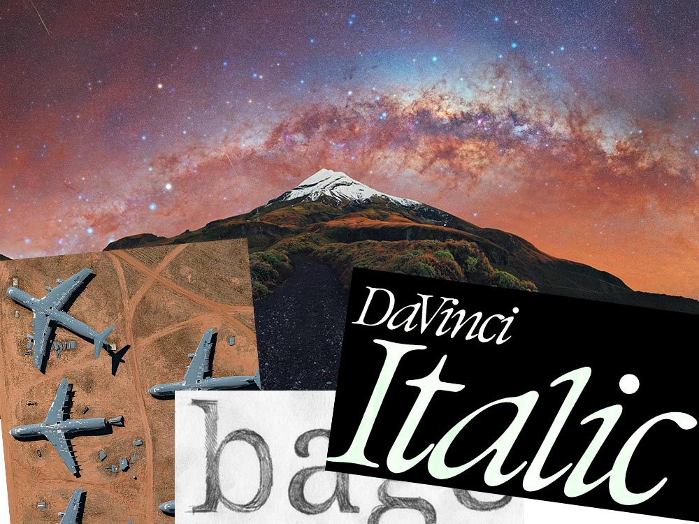
The Beautiful DaVinci Italic
It’s Nice That points us to a new, extended version of the font DaVinci, done for Sydney’s Biennale:
“When you do this sort of type exercise — based on printed letters — it gives a very organic shape and form, in opposition to the very metallic sharp shape from type materials.” Furthering this organic look by pushing the fluidity curse at its maximum, Virgile ended with a design “which is very historical, yet with a contemporary twist.”
Just look at those glyphs!
Makes you want to find an excuse to use it. But that’s not all: Flores is an incredibly diverse artist whose work both challenges and inspires. See more.
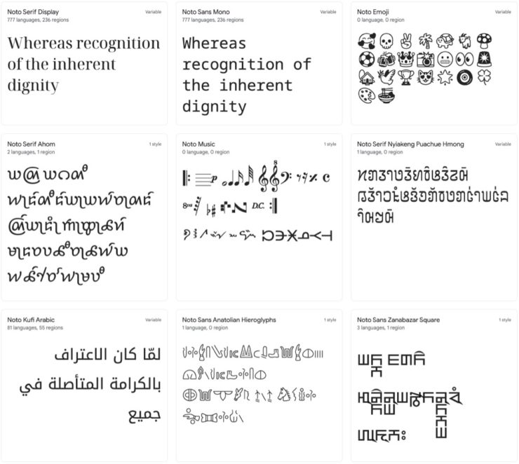
Google’s Noto
Called “A Typeface for the World,” Google’s Noto defines “megaproject.”
Noto is a collection of high-quality fonts with multiple weights and widths in sans, serif, mono, and other styles. The Noto fonts are perfect for harmonious, aesthetic, and typographically correct global communication, in more than 1,000 languages and over 150 writing systems.
Google’s Noto font collection.
According to Google,
“Noto” means “I write, I mark, I note” in Latin. The name is also short for “no tofu”, as the project aims to eliminate ‘tofu’: blank rectangles shown when no font is available for your text.
While the font itself has been around for a few years — 2013 seems like yesterday in so many ways! — it’s updated regularly, cover 150 out of the 154 scripts defined in Unicode, and deserves attention from every web designer and type nut. Read more at Google or Wikipedia. (Via Kottke.)
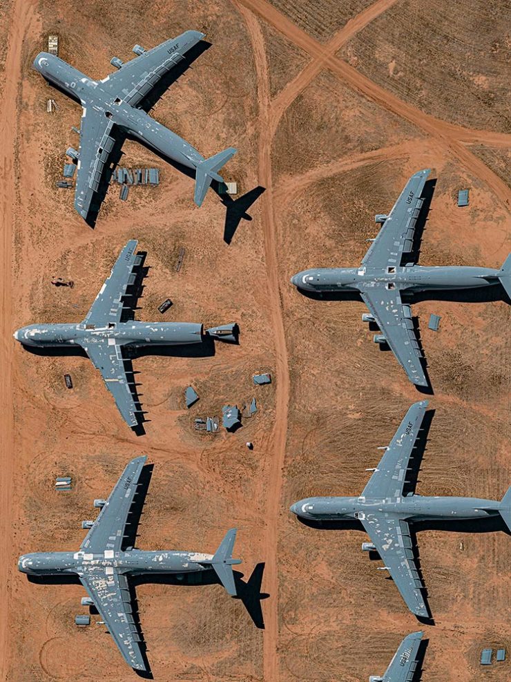
Aircraft Boneyard, From an Aircraft
This is Colossal introduces us to Davis-Monthan Air Force Base in Tucson, Arizona, whose desert conditions are ideal for storing — and scrapping — aircraft:
What happens when the military’s aircraft are end-of-lifed
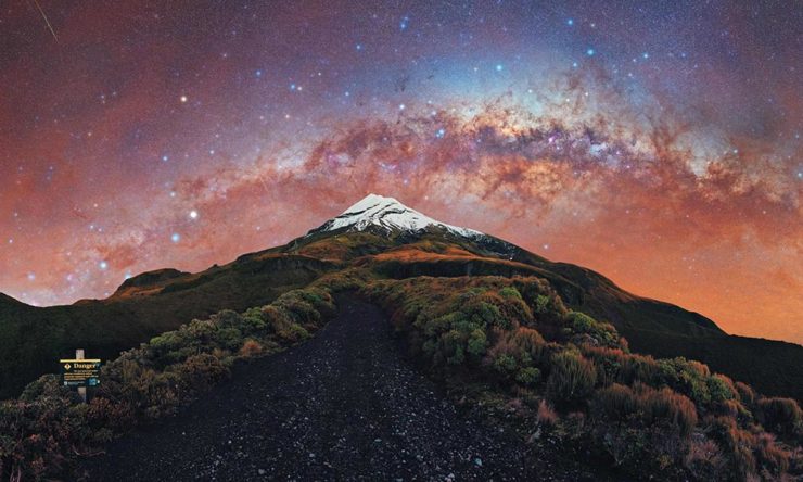
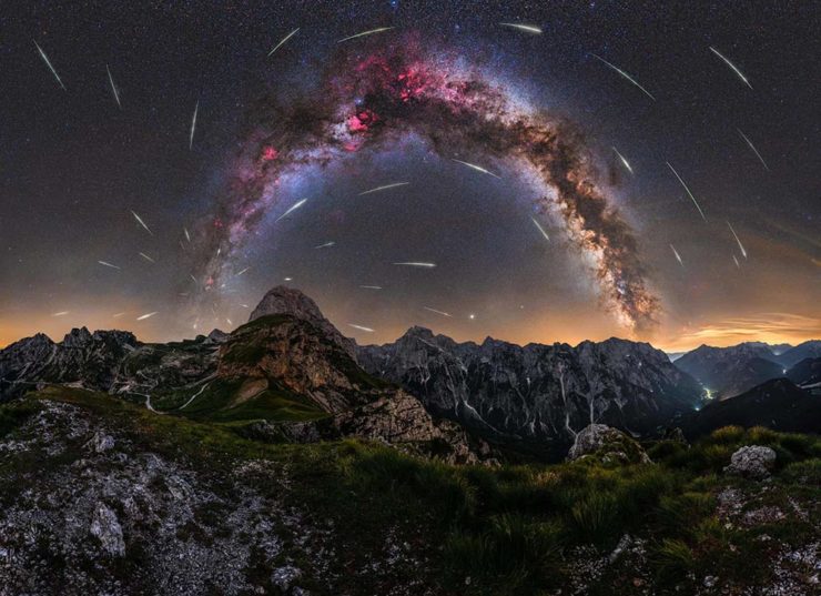
We don’t get many opportunities here in Middle Georgia, but in other, less populous (read: less light-polluted) places in the world, the Milky Way shines forth from the heavens:
As I mentioned in the last entry, Gerald and I were in Columbus, Georgia on Saturday, where our primary photographic mission was The Columbus Museum — specifically, its Olmsted Garden.
Celebrating the bicentennial of the birth of Frederick Law Olmsted, Sr., known as “the father of landscape architecture”, the Cultural Landscape Foundation has created an ever-growing digital guide of Olmsted’s most notable works.
Of course, the building’s interesting, too, so there’s a good mix of architecture, gardens, architecture from the garden, and — you guessed it — garden architecture:
The Columbus Museum (B&W #1)Urn, Columns and Bricks, The Columbus MuseumCrawford’s Kindred (B&W detail), The Columbus MuseumOlmsted Garden (Flower #3), The Columbus MuseumOld Pool House (B&W), Olmsted Garden, The Columbus Museum
I enjoyed the visit, and as a result of that visit, added 32 new photographs to the Columbus gallery. (They’re grouped together: “Columbus Museum – Mar22.”) Peruse anytime; purchase if you’d like. Thank you!
Gerald and I were in Columbus, Georgia, today, which included a delicious lunch at The Black Cow — no word whether the name is related to the Steely Dan song — and which meant a few photographs:
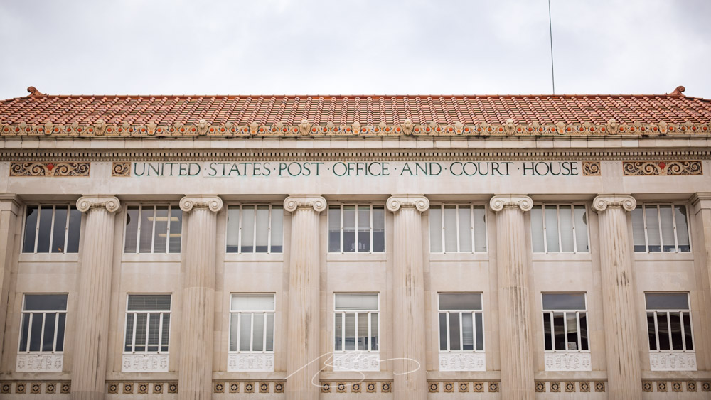
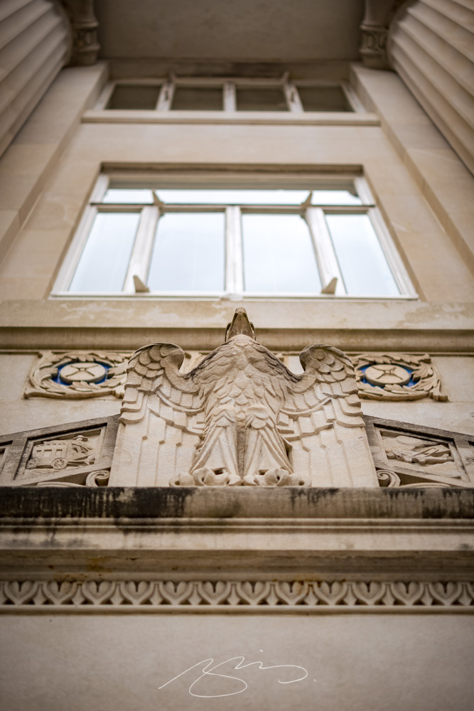
United States Post Office and Court House (Eagle Detail), Columbus, Georgia
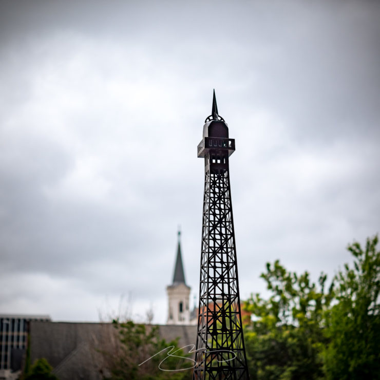
One of several of the Post Office and Court House (the header photograph is that building, too), along with a few others from downtown:
Lamp and Buildings, Downtown Columbus, GeorgiaArches, Planes, and Sky, Downtown Columbus, GeorgiaTower and Spire, Downtown Columbus, Georgia
Columbus is really well covered in its dedicated gallery: check it out. The majority of today’s photographs, however, were from the Columbus Museum; those will be posted Monday. Stay tuned.
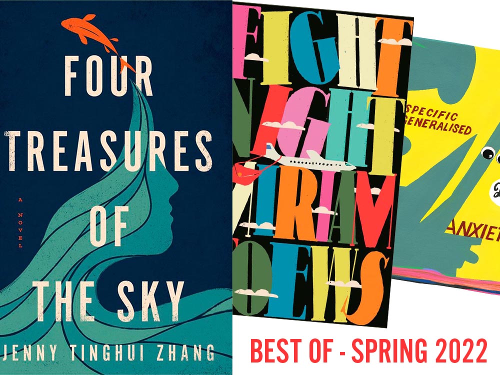
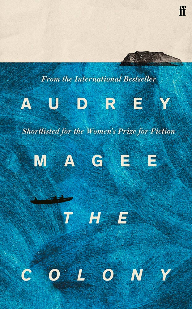
For your May Day, please take a closer look at twelve great book covers — and a bonus thirteenth! — spotted during the first four months of 2022.
In alphabetical order:
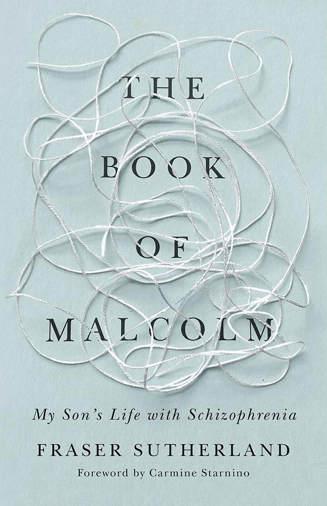
Book design: David Drummond
Brilliant: actual text, printed (on a great color paper, too), with actual string, photographed on said print. Not only is it exactly right for the subject matter, it’s simply and beautifully done.
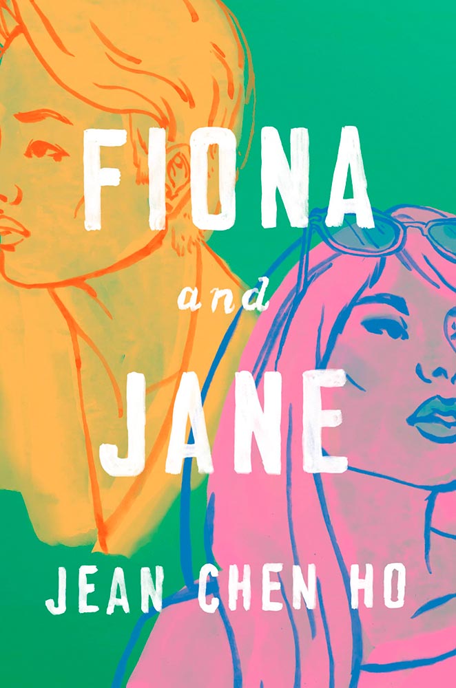
Cover design: Brianna Harden
Another great background color choice, this time highlighting the awesome colors chosen for Fiona and Jane’s illustrations. The hand-painted text is perfectly done.
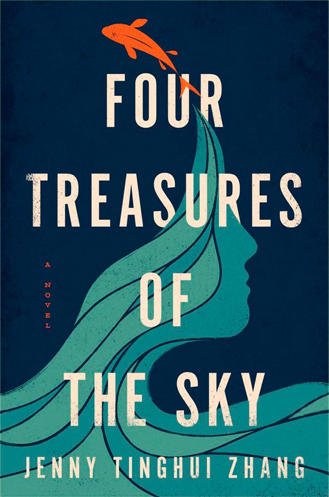
Cover design: Vi-An Nguyen
Woodcut or just aged? Doesn’t matter, as “brilliant” falls short when describing this title.
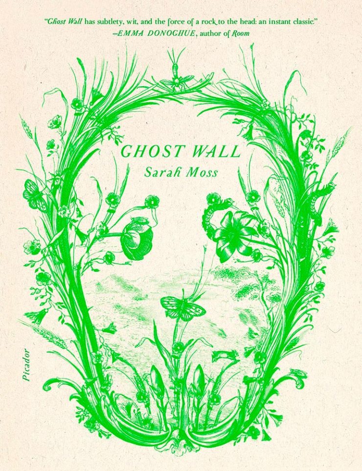
Cover design: Alex Merto
From It’s Nice That, we have a nice feature on Alex Merto — whose Ghost Wall cover is a great example of plant life adding so much more: “the force of a river to the head,” to paraphrase Emma Donoghue’s quote.
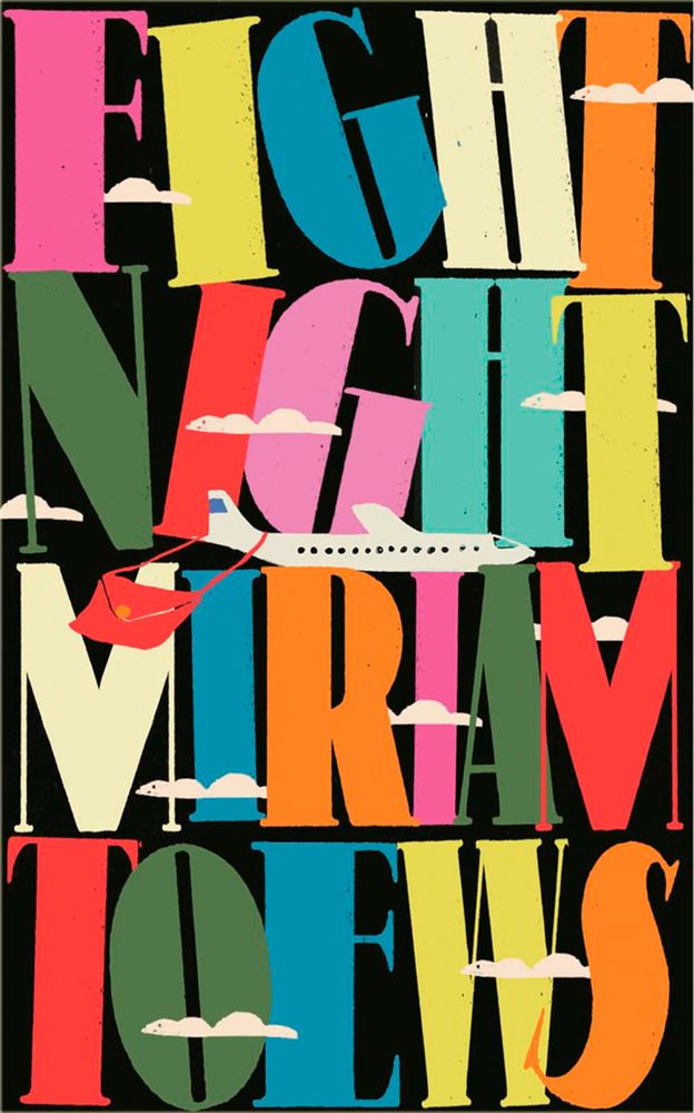
Cover design: Anna Morrison
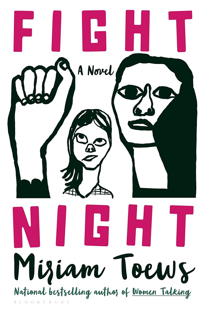
The typography, awesome little plane — the purse(r)! — the clouds, all of it: sky-high levels of good.
Interestingly, Fight Night‘s cover has gotten notice before:
Cover design: Patti Ratchford, illustration: Christina Zimpel
I can’t begin to imagine what caused the redesign, or why it wound up being so radically — 180 degree! — different. The old design wound up on some “best covers” lists (here’s LitHub’s October 2021 post, for instance); the new one has wound up on mine.
Cover design: Christopher Sergio
LitHub says this one has a very high “hang on the wall” factor. I can’t think of a better description — great stuff.
Cover design: Na Kim
Na Kim just can’t help but design the best covers: a wonderful, antique background complimented by brilliance. (Great typography, too.)
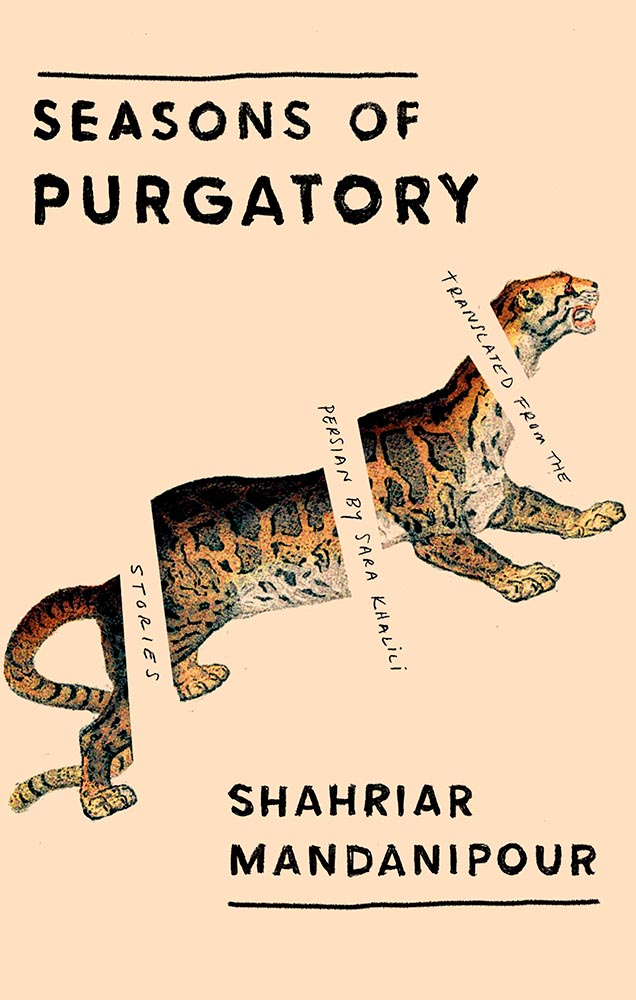
Cover design: Emily Mahon
It’s nigh-on impossibly to look at this cover and not flip it around to read the text trisecting the leopard. Take something simple, add the elusive more, get this. Yeah.
Cover design: Jim Tierney
Another fantastic example of plants adding more than the sum of their parts. The mottled green background and watercolor-style falloff is perfectly complimentary. Great stuff. (Except: This is one of those times when an editor or publicist somewhere says, “Hey, we need to add this quote at the top. Let’s do it without consulting the cover designer.”)
Cover designer … unknown. Credit where credit is due — when I can.
Never mind the great brushed color blocks or boat-rowing-the-ocean above the title. This is here for the overlap between color and island. Shortlisted for the prize for intersection-of-the-year.
Cover design: Leanne Shapton
This illustration being in grayscale is, at first, a little off. But, of course, that’s exactly the point. I overuse “brilliant,” but it’s the best description. (See a note from the designer at LitHub‘s cover reveal.)
So, the bonus. No, it’s not the extra Fight Night, above, it’s a fictitious cover. That’s right:
Cover design: Anna Hoyle
In another It’s Nice That post, we have Anna Hoyle: “Judge her fake books by their comical covers.” Okay!
More book design updates soon — ’cause, here in Georgia, USA, we’re done with spring. Summer starts . . . now.
This time: System Six, from Glider’s programmer; MacOS 8 — including Glider — in your browser; and a pictorial history of Apple monitors. Nostalgia for your enjoyment!
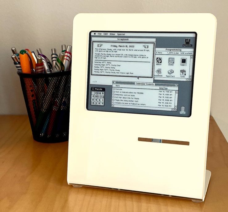
System Six
John Calhoun, who wrote one of my all-time favorite games for the classic Mac, Glider, has taken a Raspberry Pi, an e-ink screen, and a great deal of ingenuity to make this:
It’s only got the shape of a classic Mac — and yet….
Calendar events, the current moon phase, and more, in a form that can’t help but bring a smile. Better still, he’s written about the process so others can make one, too. (Ahem, Gerald.) Best desk accessory evah, to coin a phrase.
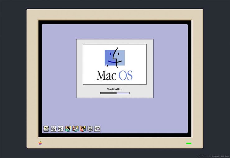
Infinite Mac
Fastest MacOS 8 startup times in history.
A project to have an easily browsable collection of classic Macintosh software from the comfort of a (modern) web browser. […S]ee what using a Mac in the mid-1990’s was like.
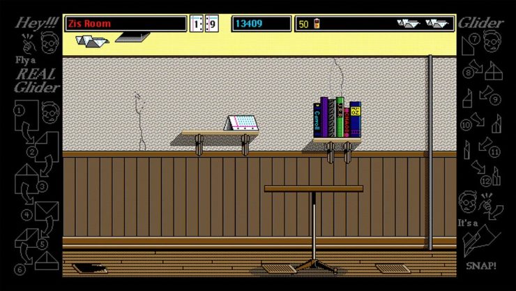
Well, naturally, I’ve been . . . here:
Glider works — and wastes time — just as well as on the original.
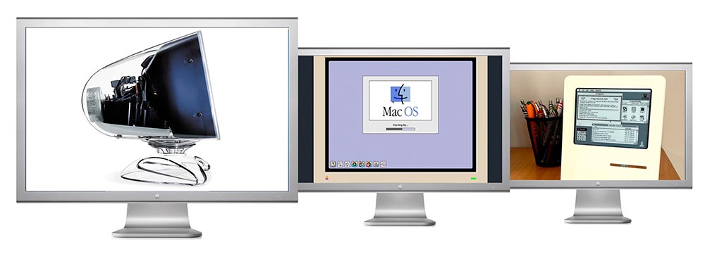
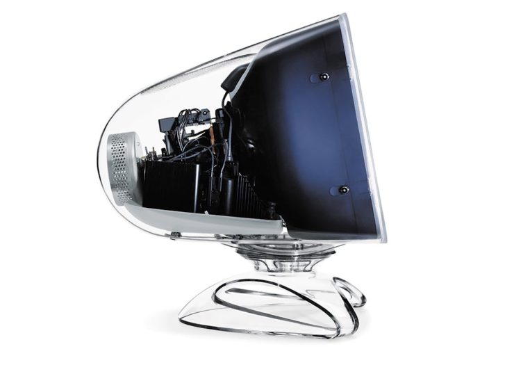
It takes a footnote — hmph — to get to what Steven and I both agree is a favorite, the last iteration of the CRT-based Apple Studio Display (you knew that name was familiar, right?):
The last great CRT monitor, IMHO.
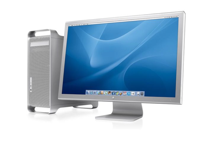
And then there’s the 30-inch Cinema Display, shown here with the G5 tower:
Awesome.
I had several of these monitors, including one of the 30-inchers, and have loved every one of them. And while I, like a lot of creatives, use a 27-inch iMac these days, thanks to Apple’s discontinuation of said iMac, the next iteration of my office setup will include a standalone Apple monitor. I’m glad Steven took the time to remind us what’s been — thanks.
Three completely unrelated items for you this time, ranging from the serious and interesting through the loony and interesting to something of a whole different stripe.
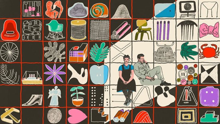
The Eames Institute of Infinite Curiosity
Update 2, 25 Apr:Brand New discusses this logo, with the usual catchy title: The Fast and the Curious: Counterspace Drift
Eames Institute’s “curious” logo variations, discussed at Brand New
Update, 8 Apr: It’s Nice That has more: The Eames Institute launches with a curious, “Eamesian” identity, and a logo that observes
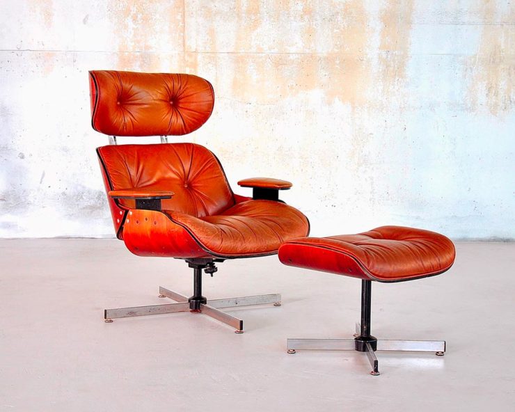
Original post: Practically everyone has heard of an Eames Chair:
A particularly awesome example of an Eames Chair (and ottoman).
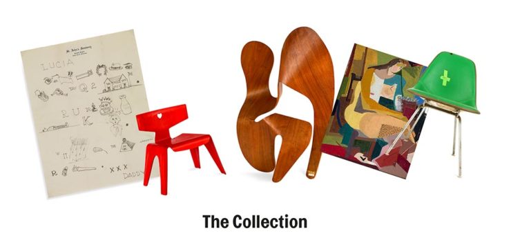
What you might not realize is that the legacy Charles and Ray Eames left behind enriches our lives to this day. It’s a shame, then, that while their house is a mid-century masterpiece (and museum), much of their lives have remained behind closed doors.
For almost three decades, a barn-like building in Petaluma, California, contained remnants of one of the most iconic design legacies of the twentieth century. […] We created the Eames Institute because we want you to examine the archive of what you know—the collection of your experiences, understanding, memories, and questions—and connect to the provocations that call to you. We want you to tap into that same fount of relentless curiosity, and its power to shift your perception and open you to innovations and discoveries.
Now, however, there’s the Eames Institute of Infinite Curiosity. Awesome name aside, it introduces us to the more personal side of one of design’s strongest partnerships.
Items from the Charles and Ray Eames Institute. Drawings from the Charles and Ray Eames Institute.
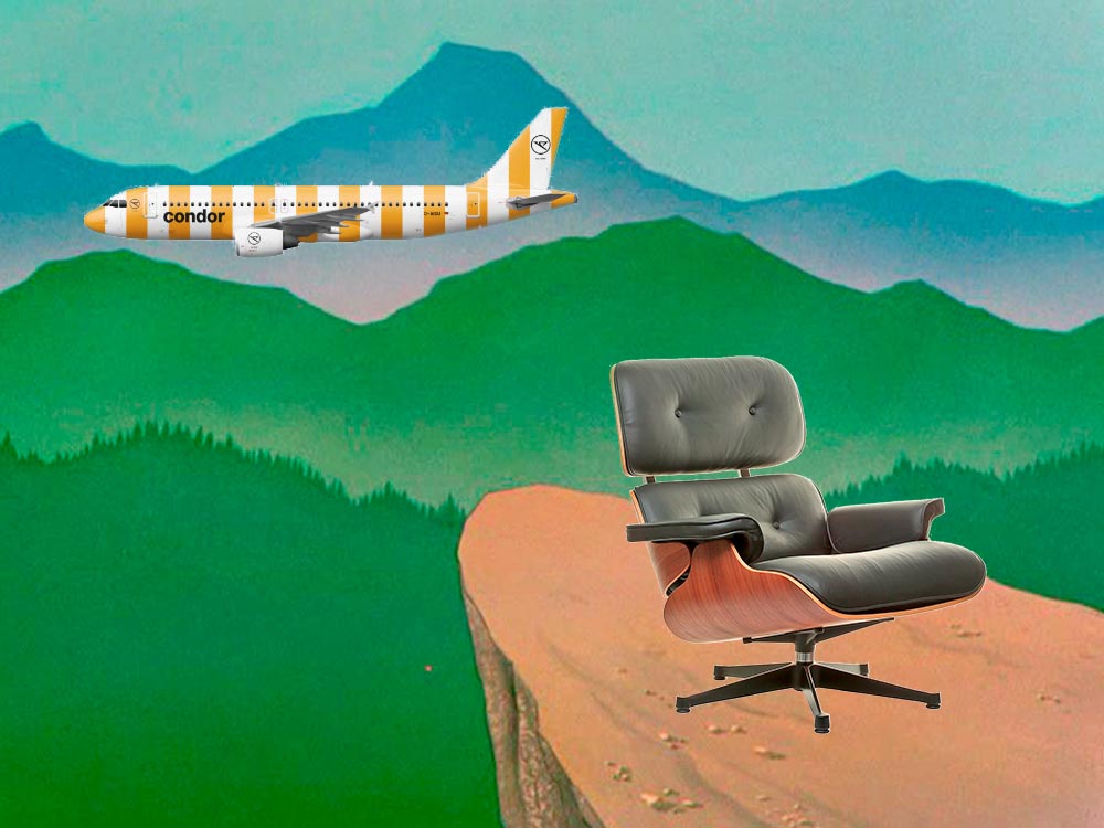
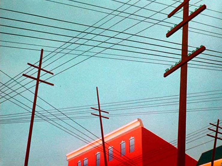
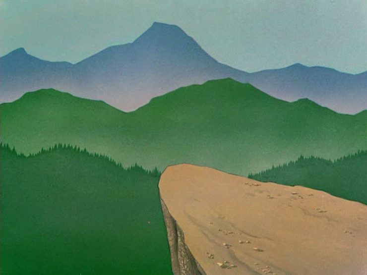
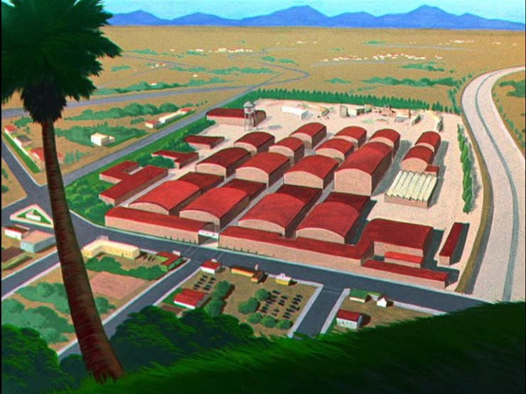
Crossed wires, anyone?Imagine who might run up to — or even get pushed off of — this cliff.A nice, innocent factory. Nothing could possibly go wrong.
Next time I treat myself to a Loony break, I’m going to make sure to spend some time looking beyond the action and appreciate the backgrounds. Nice.
Condor Airlines Rebrands
Most of you have probably never heard of Condor Airlines; they’re mainly a European thing, a “leisure” airline associated with Thomas Cook, formerly owned and run by Lufthansa. (Here’s some history.)
It doesn’t particularly matter. What does is the bravado exhibited by management. Before, a typical airline logo — dare I say, typically Germanic:
Condor’s OLD livery.
Then someone said yelled, “HEY. WE DO VACATIONS. LIKE BEACH TOWELS. LET’S DO STRIPES.” The result:
Condor’s NEW livery. Wow.
Armin Vit:
The new livery has zero fucks to give and just plasters every plane with thick vertical stripes that go against pretty much every single assumed tenet of what makes a good livery. It doesn’t look speedy, it doesn’t look nimble, it requires a lot of paint, and by all other standards it is just plain ugly and I love it.
Catching up with a few unrelated stories that I’ve been meaning to post — including one pretty significant failure on my part, one potentially significant failure, and because not everything should be about fail, an extremely interesting and thoughtful interview.
Tiny Type Museum Sold Out
I was cleaning up open Safari tabs on my phone the other day — the detritus that results from checking things on the fly when out and about, often or never closed — and noticed that I’d sort-of bookmarked something for action and … missed it. Crap!
The Tiny Type Museum & Time Capsule, with specimens and those beautiful drawer pulls.
The Tiny Type Museum & Time Capsule is a celebration by journalist and printing historian Glenn Fleishman of type and printing, and an effort at preserving history for future generations to re-discover. Each custom, handmade wood museum case holds several dozen genuine artifacts from the past and present, including a paper mold for casting newspaper ads in metal, individual pieces of wood and metal type, a phototype “font,” and a Linotype “slug” (set with a custom message), along with original commissioned art, a letterpress-printed book, and a few replicas of items found in printing shops.
The Tiny Type Museum. (Bottom drawer.)
The museum includes a letterpress-printed book written for the project, Six Centuries of Type & Printing, in which Fleishman traces the development of type and printing starting before Gutenberg printed his Bible around 1450 up through the present day. This book acts as “docent” for the museum, providing insight into the stages in technological and artistic development that took place, and explaining the importance and nature of the artifacts. It also slides out neatly as part of a sled from the top of the museum case, and provides the visible name.
The letterpress book is still available: get your copy, or subscribe to the podcast. But even if you don’t, take a moment to appreciate the work that went into this — well done, indeed.
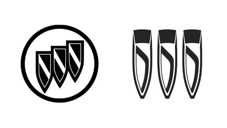
Buick’s New Logo
This one … I dunno. The race to do car logos flat black-and-white has seemed like a race to the lowest common denominator. (See previous coverage of BMW, Volvo, Cadillac, and more.) Below, Buick’s old (left) and new (right) logos, courtesy of Motor1:
The trademark filing for Buick’s new logo.
Thankfully, there’s been a leak — Instagram, natch, so no link here — demonstrating that it’ll still be in color:
From Instagram (alas): The new Buick logo in living color.
Still, not sure. Will have to see the official announcement and package that goes with it; Motor Trend suggests that it might be part of an EV-only future. Stay tuned for Brand New’s take, I guess….
I think innovation doesn’t come in one huge leap. It’s a series of small steps. Accumulations of small discoveries, followed by incremental implementation. And then it all adds up. Innovation is not a single idea—it’s incredibly incremental and additive. Even these small discoveries can change the way we think about things very quickly. So I think every step of the way—problematizing “what are the issues?” and “what are the solutions?” filtering issues of sustainability, supply chain, accessibility, will eliminate many solutions which are not possible. And then you end up with small nuggets of potential. In a way it’s very systematic, innovation, and so is experimentation. It’s the elimination of what’s not possible and focusing on goals.
Toshiko Mori. Image courtesy of New Reader.
You know, history is not about the past, really. History is about the story of an individual interpreting history. Historians cannot be unbiased narrators. Every history is a story, and then yes, there are facts—which are important, but the way you connect facts and then make diverse narratives is super interesting.
As you can see, Fox News provides false narratives, and a lot of times they skew the facts, and that’s a problem. It can be used dangerously, but it can also be used productively. I think that’s what makes history rich. It’s not about the past, it’s about projecting into the future. So when I teach students, I ask them to make their own story based upon their research. But it’s a story—so that’s kind of their own reality. And based upon that reality, they can develop diverse narratives and then communicate the story to others. It’s not as if you have different opinions, but you have different stories to share. It’s not about controversial opinions, but about the way we each look at life very, very differently—and that enriches everybody.
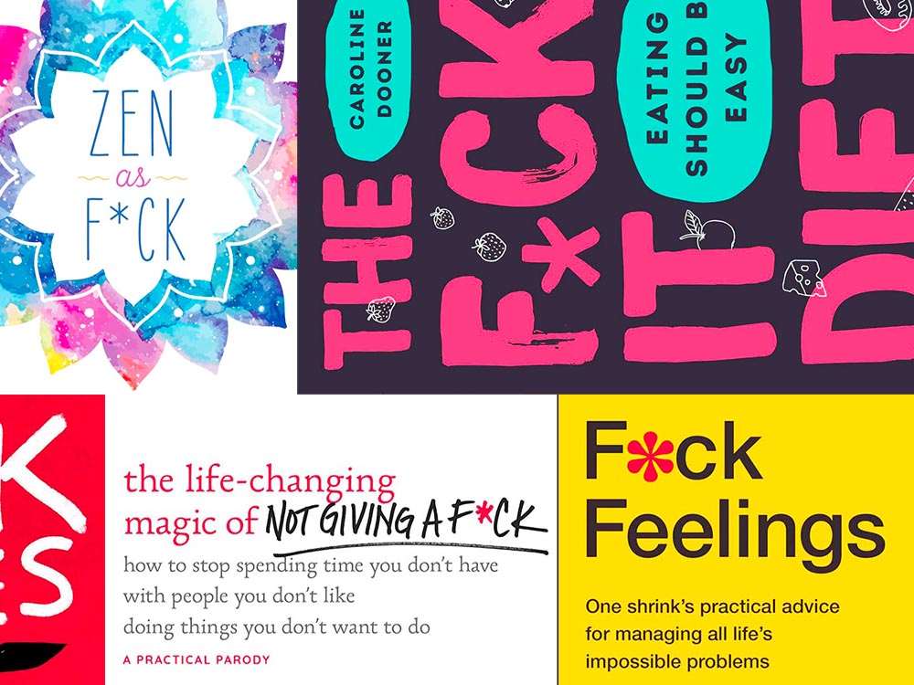
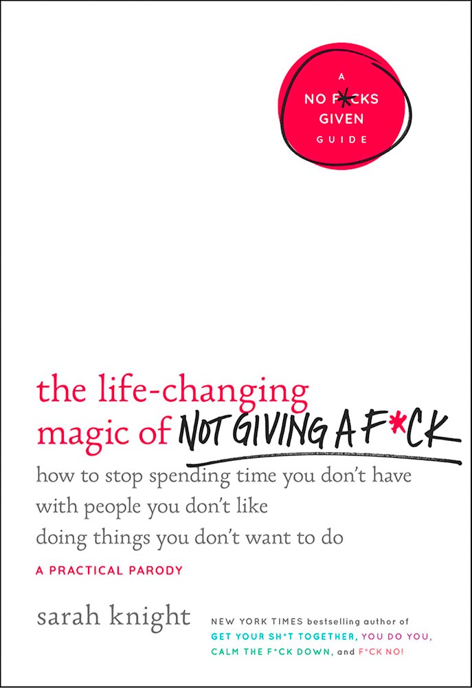
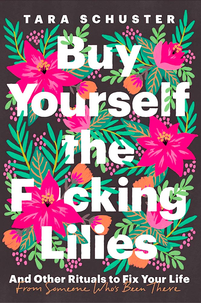
Kottke recently revisited a theme that’s been running for a few years now: titles with a swear — f*ck, in this case — in the title. According to Slate, the practice stems from the 2011 parenting title Go the F*ck to Sleep, and has accelerated over the years.
I’m more interested in the design of such a title. Bookstores, advertisers, and publicists demand that the swear never be completely spelled out, but that doesn’t restrict great design ideas. Here are a few of my favorites:
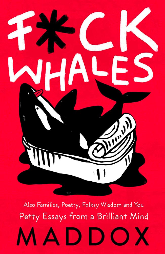
Love the fork. (So to speak.)The less-is-more approach.Whales as sardines.Interesting choice with the capitals, or lack thereof.
Note the over-arching theme: no, not that — the lack of photography. The vast majority of these titles are text based, supposedly because something competing with the swear would detract from the shock value. There’s a primary color thing going, too, probably for the same reason.
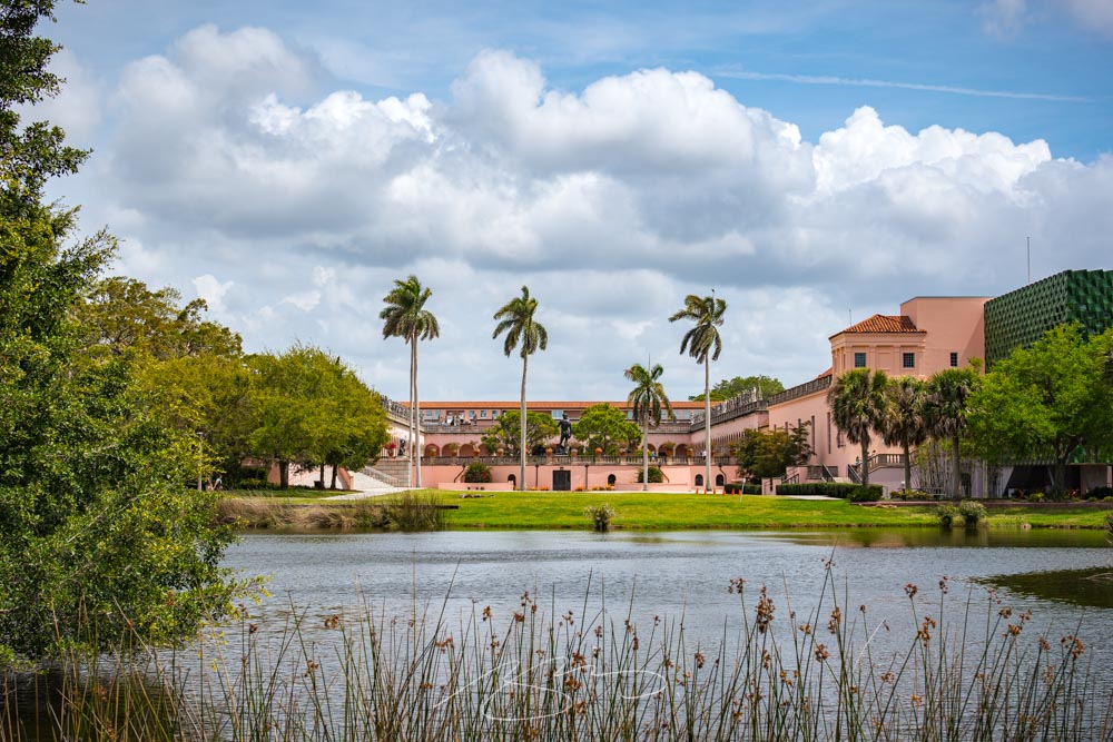
The Ringling Museum in Sarasota, Florida has been a place I’ve been taking photographs since I lived in the area, almost twenty years ago now — and a place where I continue to enjoy taking photographs whenever possible.
The grounds have these amazing banyan trees, with root systems larger than many houses:
Banyan (black and white, detail)
They’ve expanded over the years, adding buildings, a new entrance, and additions. This is the Chao Center for Asian Art:
Chao Center’s Asian Art Siding #3 (Detail)
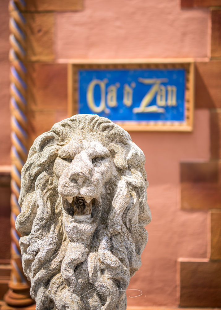
The old Ca d’Zan gate is the new main entrance:
Ca d’Zan Lion
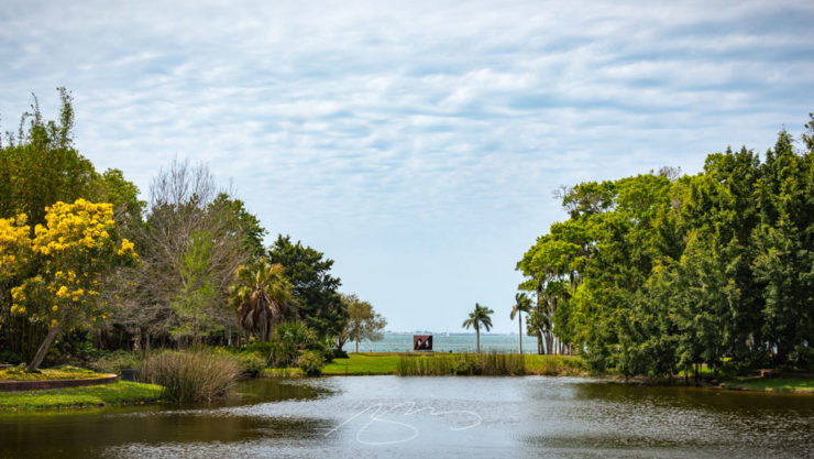
And, of course, the whole compound is right on Sarasota Bay:
Three diverse items in this round-up, from illustration to typography to whether or not ad-blockers are actually environmentally-friendly — along with a response that reminds us to look at the bigger picture.
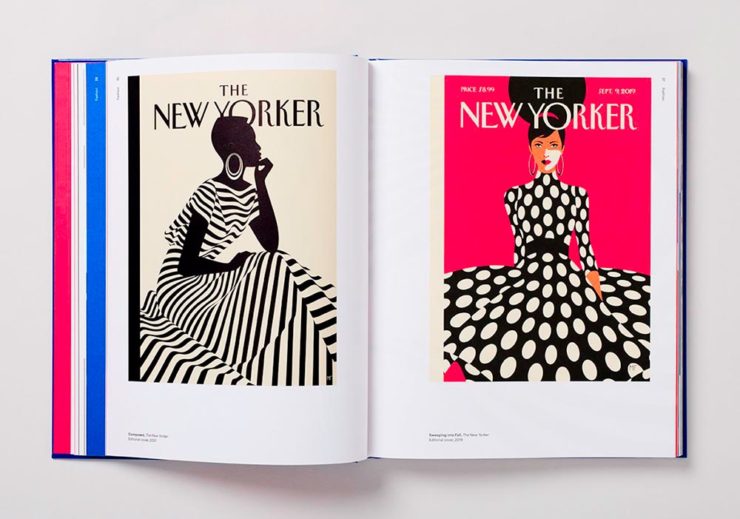
Malika Favre (Expanded Edition)
CreativeBoom:
French illustrator and graphic designer Malika Favre has been impressing audiences for years with her minimalist work for publications such as The New Yorker, Vogue, and Vanity Fair. Now over a decade’s worth of her work has been released in a new monograph from Counter-Print, which contains a suitably stripped-back aesthetic.
Her style is distinctive; I’ve liked her New Yorker covers especially:
Malika Favre (Expanded Edition) in English
The book includes the illustrator’s own cover, and she had a big hand in designing the layout, too. CreativeBoom’s article is excellent — check it out.
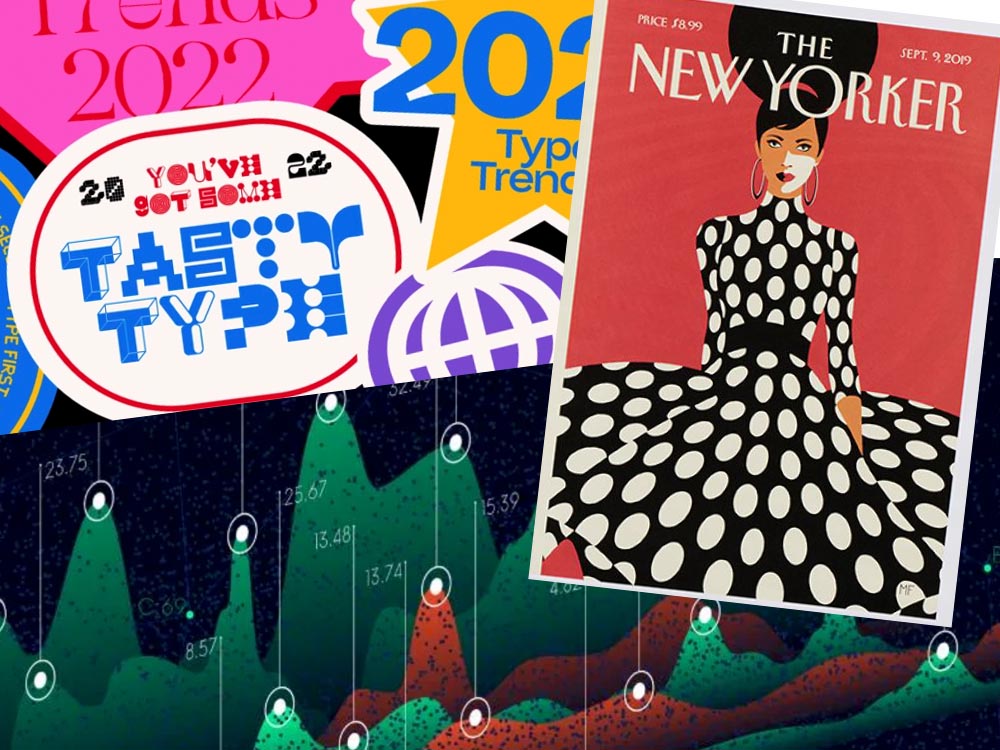
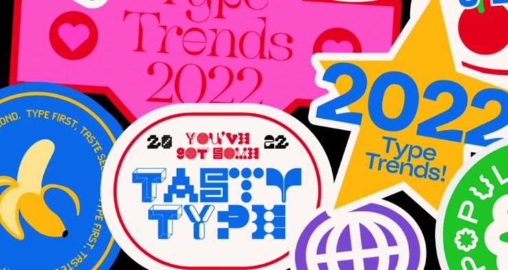
Throughout yet another “unprecedented year,” it’s safe to say that the macro trends influencing the type design community are nearly too long to list. Several socioeconomic, political, and cultural events continue to shape the way we approach creative work and how connect to each other online and offline.
Biodiversity’s relationship to type, varying type styles in a single logo, and thin serifs — the one I’m likely to use somewhere — are in this year.
Media, Trackers, Blockers, and the Environment: There’s a Problem
Did it ever occur that using an ad blocker in your browser is actually an environmentally-friendly move? No, I hadn’t put it together, either.1More from MIT on ecological impacts of cloud computing here.
70% junk. Surprise and shock (not really).
[U]p to 70% of the electricity consumption (and therefore carbon emissions) caused by visiting a French media site is triggered by advertisements and stats. Therefore, using an ad blocker even becomes an ecological gesture. But we also suggest actions web editors could take to reduce this impact.
An interesting study, certainly, with information that many of us already use and some suggestions for action in case we don’t. But…:
Another of Monotype’s 2022 Type Trends, appropriated for use here
Nick Heer:
I have qualms with this. The idea of a “carbon footprint” was invented by British Petroleum to direct focus away from environmental policies that would impact its business, instead blaming individuals for not recycling correctly or biking to work more. A “carbon footprint” is also a simplistic view of how anything contributes to global warming, and that it seems to be used here as a synonym for bandwidth and CPU consumption.
I’m not sure whether I’ve called out the excellent Pixel Envy2A sort-of Daring Fireball with Canadian roots, but this is an example of why I should.
That is where I think this well-intentioned study falters. Even so, it is absurd that up to 70% of a media website’s CPU and bandwidth consumption is dedicated to web bullshit. Remember: the whole point of web bullshit is that it is not just the ads, it is about an entire network of self justifying privacy hostile infrastructure constructed around them.
1
More from MIT on ecological impacts of cloud computing here.
As I mentioned yesterday, Gerald and I enjoyed a lovely first-of-spring drive out of middle Georgia. Our destination was Pine Mountain, home of F. D. Roosevelt State Park. Needless to say, there were cameras involved.
Starting on Dowdell Knob, FDR’s favorite picnic spot — with its amazing valley overlook:
Roosevelt’s Grill With a View, Dowdell Knob
Next was the park’s office and overlook complex:
FDR State Park Office (B&W Study), Pine MountainStone, Shutters, and Stars and StripesFDR State Park Overlook: Rocks
Peruse the entire gallery here. And when you have some extra time, all of FDR State Park is worth a visit; it’s got everything from hiking trails to cabins to the Callaway Gardens Country Kitchen in its 9049 acres. Enjoy!
Bonus: Georgia Public Broadcasting, at the premier of its film A President in Our Midst: Franklin Delano Roosevelt in Georgia, said:
Franklin Delano Roosevelt had a very special relationship with the State of Georgia. This compelling documentary spotlights the mutual benefits that the friendship provided to both the president and the people of Georgia. The film is based on the book, A President in Our Midst: Franklin Delano Roosevelt in Georgia.
It’s no Ken Burns, certainly, but if you’re not familiar with FDR’s extensive time spent in west Georgia, it might be worth your time. See it here.
The end of winter here in Georgia means beautifully warm days, flowers and trees budding, and photography. Gerald and I took a road trip this weekend, enjoying almost 200 miles of driving — and four photostrolls.
We’ll cover three today, heading west from Middle Georgia: