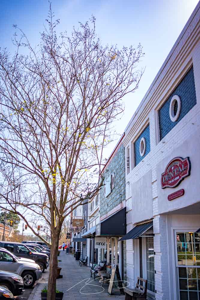
After leaving Zebulon (see below) last Thursday, I continued northeast into the beautiful spring morning. My destination was Senoia, a town of about 5,000 that has a lovely, old-time feel, and is usually busy due to its “touristy” nature. There’s a film studio (!), and major productions like Driving Miss Daisy and The Walking Dead have used it for a location. Plus, given its proximity to Atlanta, it’s a popular day trip for city dwellers looking for a getaway.
Gerald and I were there last April, and while I had a camera with me, I only took a few photographs and didn’t like any of them. But a church window had stuck in my head, we enjoyed the visit, and I determined to return.
This time: success. Starting with that church window:
Church of God of Prophesy (Window #1), Main and Johnson Sts.
Elsewhere in the historic district, fantastic Southern porches await:
The Veranda Historic Inn, 252 Seavy St.
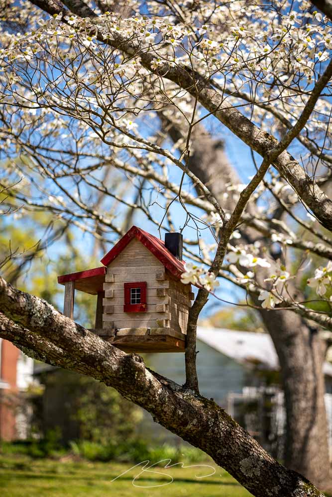
While amongst the dogwood blossoms, there was even a porch for our feathered friends:
Bird House, 128 Travis St.
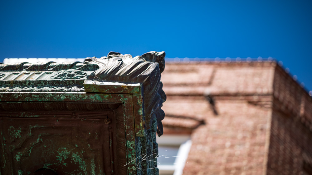
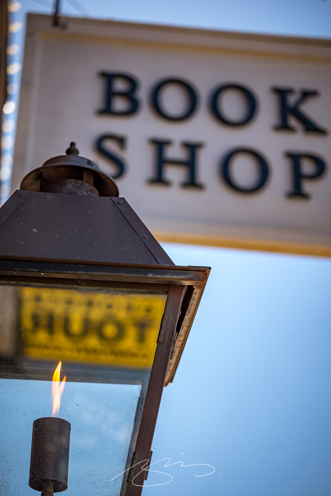
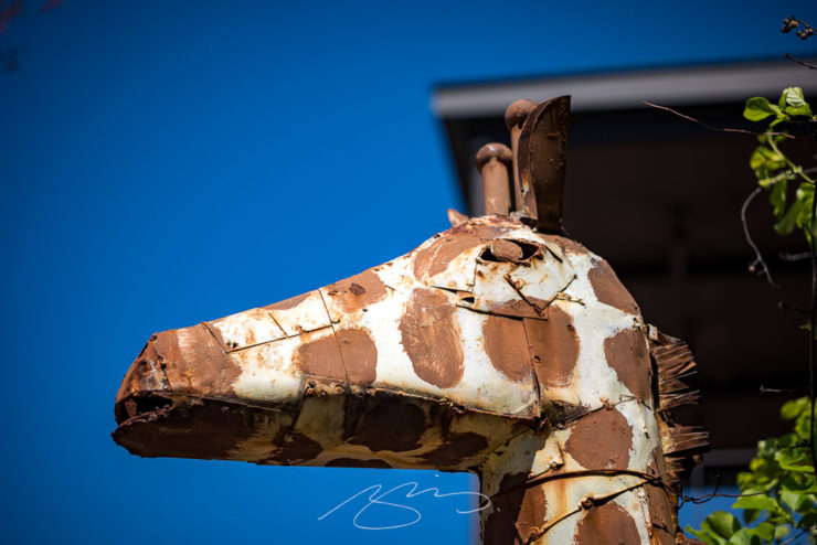
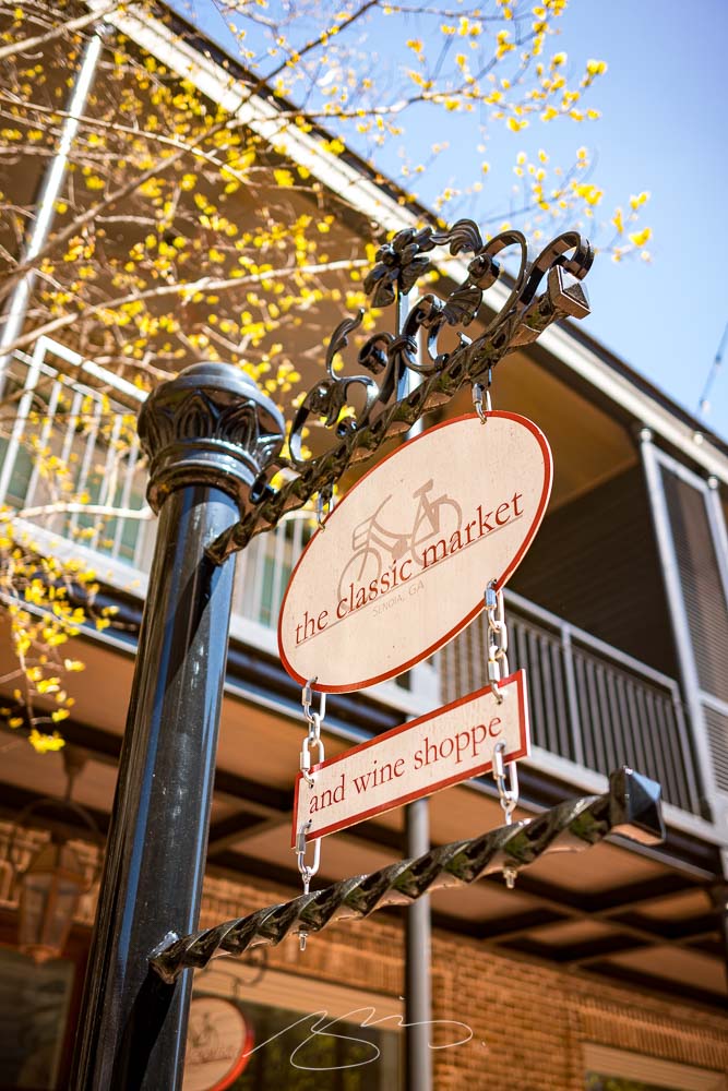
But it’s downtown that folks come to visit:
Shops and Eats on the Hill (#2), Main St.Book Light (Reflecting Tour), 53 Main St.Giraffe at Foxhollow, 7 Main St.The Classic Market, 30 Barnes St.
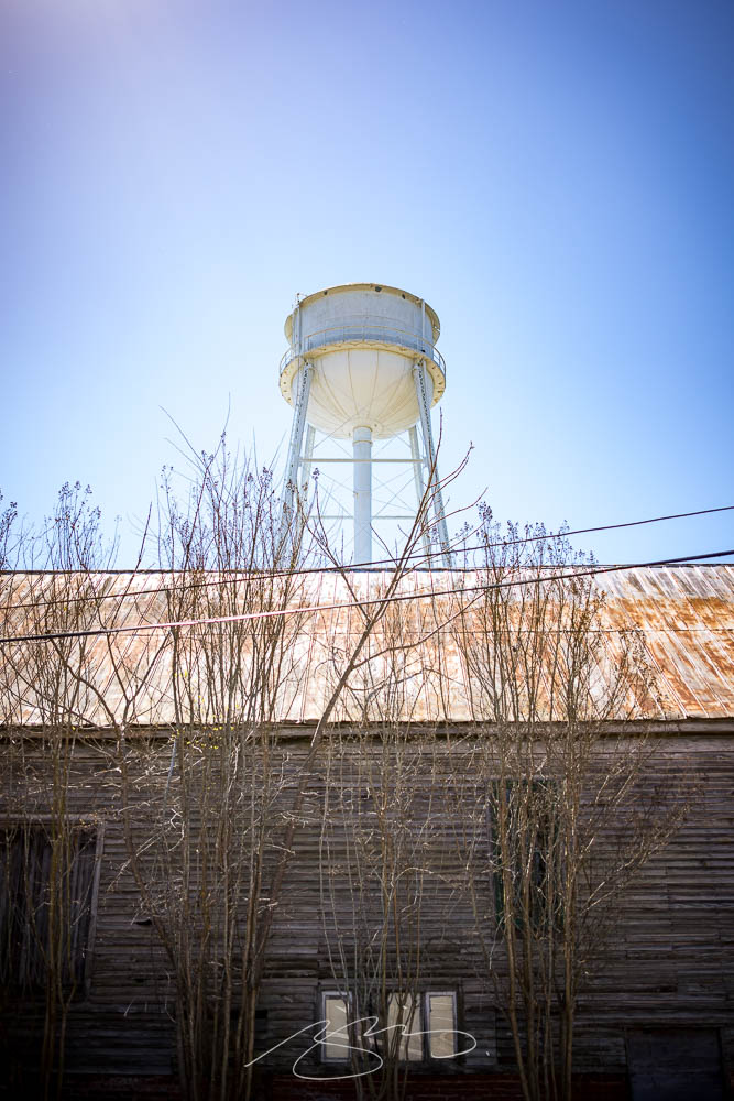
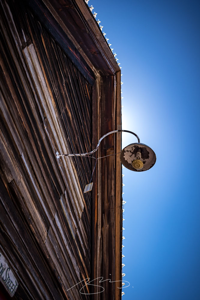
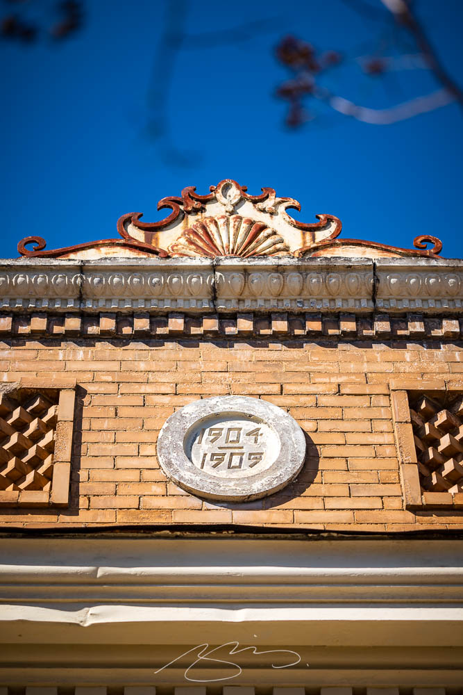
Plenty of history here, too:
The Museum and the Water Tower (From Baggarly Way)Light and Lights Detail, 61 Main St.
A total of 57 photographs — clearly, it was a good time — have been posted to the Senoia gallery. No matter the weather where you are, wander a picturesque small town on a beautiful spring day.
We’re having an absolutely beautiful March here in Georgia — apologies to places that absolutely aren’t — and I’ve been trying to take advantage by getting out and taking photographs.
The latest photostroll starts in the small town (pop. 1225) of Zebulon1Named for Zebulon Pike, the general and explorer (for whom Colorado’s Pike’s Peak is named, among other things), in Pike County, northwest of Macon, with the typical courthouse square:
Pike County Courthouse, Barnesville St.
The building, from 1895 and on the National Register of Historic Places, is wonderfully detailed, sporting columns aplenty and lots of Colonial Revival details:
Pike County Courthouse (Column Detail #1)Courthouse Square Composition, Barnesville and Thomaston
The small downtown is well-kept and bustling in a way that small downtowns should be:
This time, the twenty-fifth anniversary of one of my favorite websites, a new book cover review site, an interview with B&N’s CEO, the end of Type 1 fonts, and a world-class rant.
Kottke Turns 25
“Fine Hypertext Products,” indeed.
Jason Kottke has been publishing a blog continuously for twenty-five years — more than half his life — and along the way, earned many an eye. (It’s been a full-time job since 2005.) Some of his thoughts from the anniversary post:
My love for the web has ebbed and flowed, but mainly it’s persisted — so much so that as of today, I’ve been writing kottke.org for 25 years. A little context for just how long that is: kottke.org is older than Google. 25 years is more than half of my life, spanning four decades (the 90s, 00s, 10s, and 20s) and around 40,000 posts — almost cartoonishly long for a medium optimized for impermanence.
I had a personal realization recently: kottke.org isn’t so much a thing I’m making but a process I’m going through. A journey. A journey towards knowledge, discovery, empathy, connection, and a better way of seeing the world. Along the way, I’ve found myself and all of you. I feel so so so lucky to have had this opportunity.
— Jason Kottke, Kottke.org
Cited here often, always brimming with interesting items, and a regular source of learning, Jason deserves massive congratulations. Happy 25! Here’s to many more.
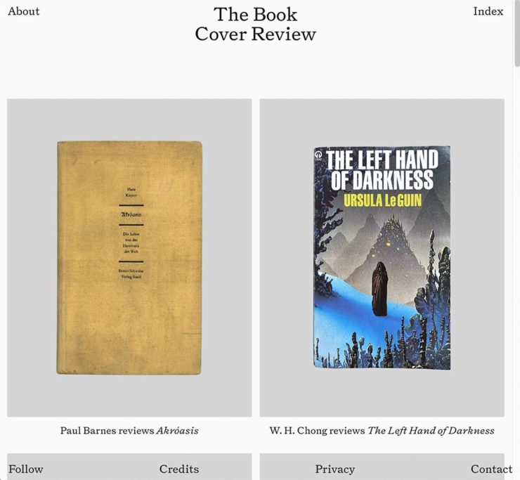
FastCompany points us to a new and interesting cover review site: mostly classic titles, covered in ~500 words “from a range of voices around the world.” Good stuff, with a NYT Book Review look and feel, updated regularly. Give it a try.
The Verge interviews B&N’s CEO
Decode B&N with James Daunt
I’m not a regular listener of The Verge’s Decoder — it’s usually business-centric, going so far as to describe itself as secretly about org charts — but this one’s interesting: an interview between Nilay Patel and Barnes and Noble CEO James Daunt. They cover changes at B&N (with emphasis on why) and, of course, the elephant in any room:
[Amazon is] really terrible at putting a book in front of you that you never thought you’d want to read, that you have no reason to read and no tether to at all. Whereas a bookstore is precisely the place that does that. You pick up the book that you never thought you would want to read, might read, or could even think about reading, by an author you’ve never even heard of until that moment. When a bookseller says, “Look at that,” “Read that when you next come in,” or “I love that,” or whatever it is, all those small, little recommendations are personal and able to attach themselves to books that otherwise have nothing going for them at all.
— James Daunt, CEO, B&N
Props to The Verge for providing a full transcript, especially helpful for folks who would rather read the interview than listen to it. Whether you want to read or listen, though, book lovers in the US should take in this interview.
Adobe Discontinues Type 1 Support
Flying Suitcases.
Back in the old days, Type 1 fonts were the backbone of desktop publishing. They were multi-part, often incomplete or corrupted, and always getting in the way of perfect print output — and yet beautiful and opening never-before-appreciated horizons of possibility for your projects.
Now, in these days of OpenType, Google Fonts, and digital output, Adobe has taken the decision to discontinue support for the legacy Type 1 format. TypeNetwork has the full story, along with some options, and there are other converters if you need ’em.
Bonus: TypeNetwork also has all of the Adobe Originals, from back when Adobe was your go-to instead of the corporate behemoth. Classy classics: see the list.
One more from The Verge: “I don’t want to log in to your website.” The surge of login and email requests before being allowed to read “free” content is addressed brilliantly:
So what we’re looking at here is creating a worse user experience in order to pursue a variety of scummy money-making schemes. And that sucks because there are no real public spaces on the internet. Here in reality, I can fuck off to a park and hug a tree and sit on a bench and do stuff without ads, without anyone trying to track me, and without having to pay a dime. There was a time within my memory when people tried to make websites feel like semipublic places — you could hang out on someone’s cool blog and enjoy yourself.
Confession: For the last several years, I’ve been avoiding Eatonton. Its four-lane bypass is notorious as a revenue generator for Putnam County, so when heading north to Madison or Athens I have been taking the prettier Monticello route instead.
My mistake. In almost twenty years of living less than fifty miles from this gem — and perhaps because of that bypass — I’d not explored downtown. It’s definitely earned another visit.
Residence Above Maggie Lane (Mind Your Step)Putnam County Courthouse (Tree)
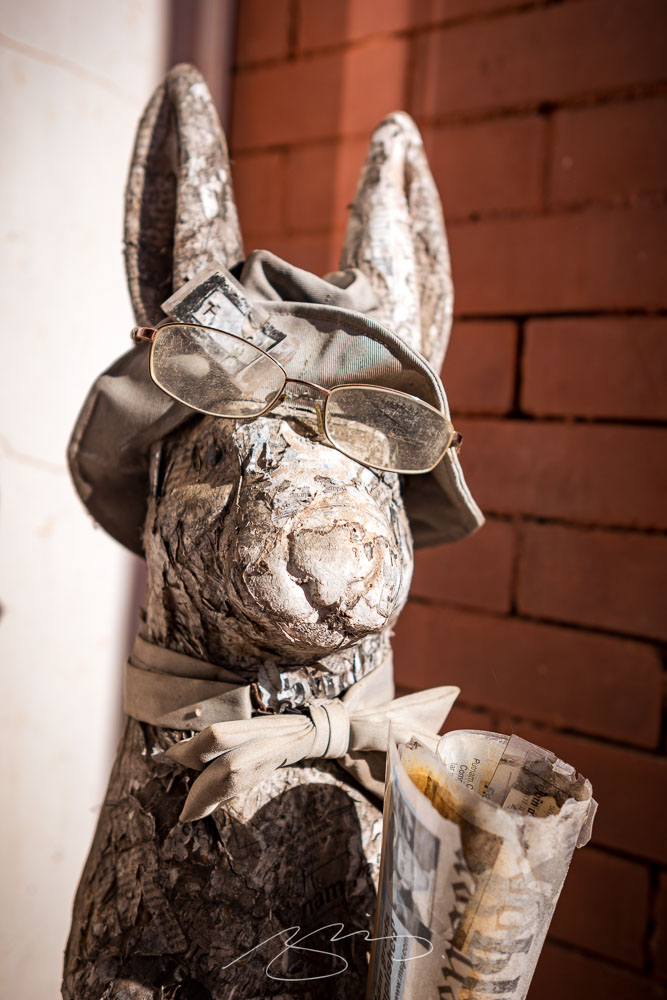
I also wasn’t aware that Alice Walker (The Color Purple) and Joel Harris (Uncle Remus) were locals — the latter explaining the prevalence of rabbits hopping about:
Rabbit (Paper Jeff)
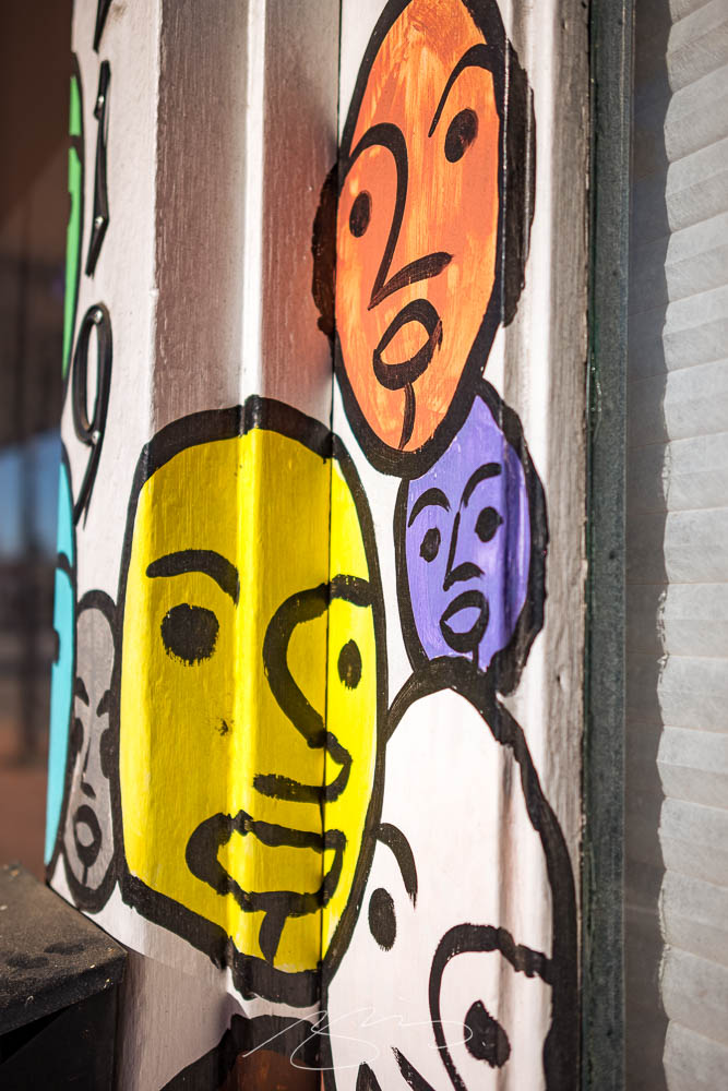
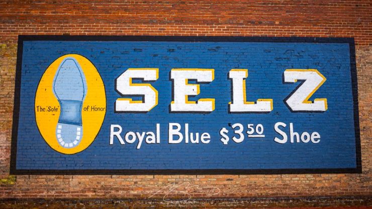
Interesting art, too:
The FolksArt, 119 S. JeffersonSelz (The “Sole” of Honor), 107 N. Madison
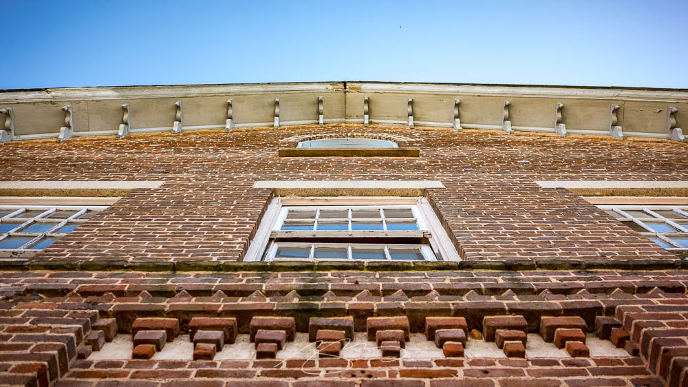
I’ve been meaning to take a camera to Sparta for a minute now; its downtown is small yet old and photogenic in a distinctly Southern way.
Confederate State of Hancock County
On that subject: let’s get the elephant in the room out front and center. Sparta is 85% Black, arguably economically and socially suffering, and yet this monument stands front and center. Why?
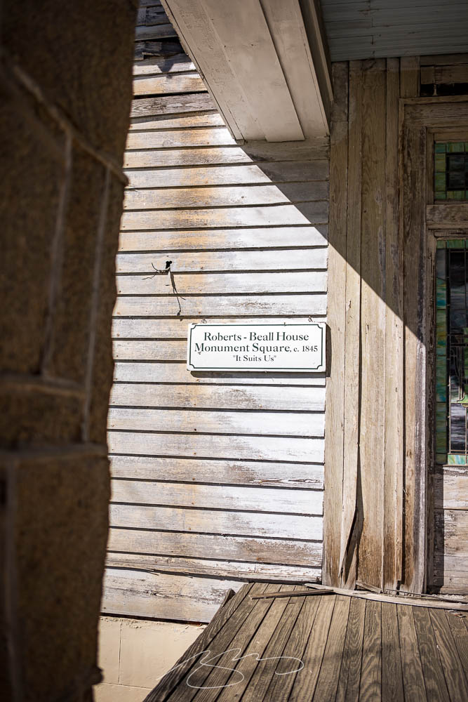
Neglect: “It Suits Us”Lightbulb Moment, 12745 Broad St.
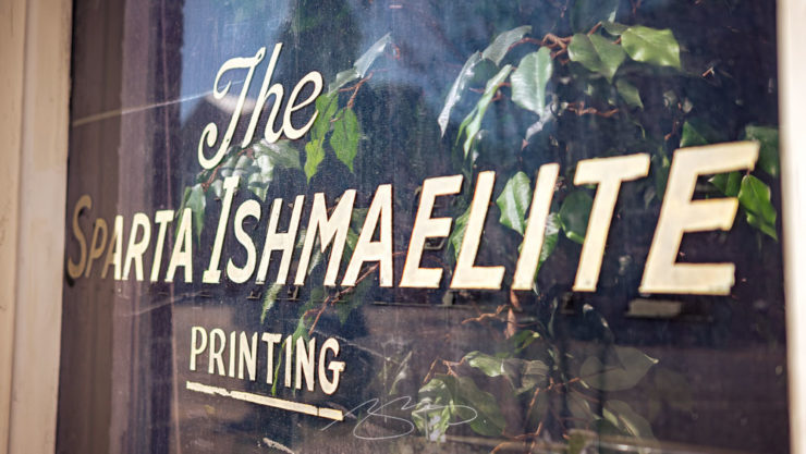
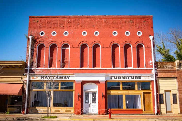
However, there are signs of hope. More than one building downtown is being refurbished, and there are at least a couple of businesses that are surviving — perhaps even thriving — by providing a sense of community:
The Sparta Ishmaelite (Printing)Hattaway Furniture, 12755 Broad St.
By the way, those old buildings often have beautiful cast iron details:
Gerald and I took advantage of a warm and cloudless March day for a lengthy photostroll which started in Milledgeville — lunch — and wandered northeast, starting at the nearby O’Quinn Mill:
Old O’Quinn Mill (Wheel)Old O’Quinn Mill (Siding Detail #2)
The old mill building is situated on, natch, O’Quinn pond — a man-made addition to Town Creek:
O’Quinn Pond Dam (Town Creek)
There’s a dock and old farm buildings in the complex, which these days is a picturesque event venue:
O’Quinn Mill on Town Creek
We continued on to Sparta, then returned through Eatonton, stopping in both towns for photographs. (Updates coming tomorrow and Wednesday: stay tuned.)
Meanwhile, take a look at the updated Milledgeville gallery, now up to 100 photographs spanning the last twelve years. Enjoy!
Look out, look up, look forward, and look through in this edition of brief, link-filled goodness.
“You May Now Enter”
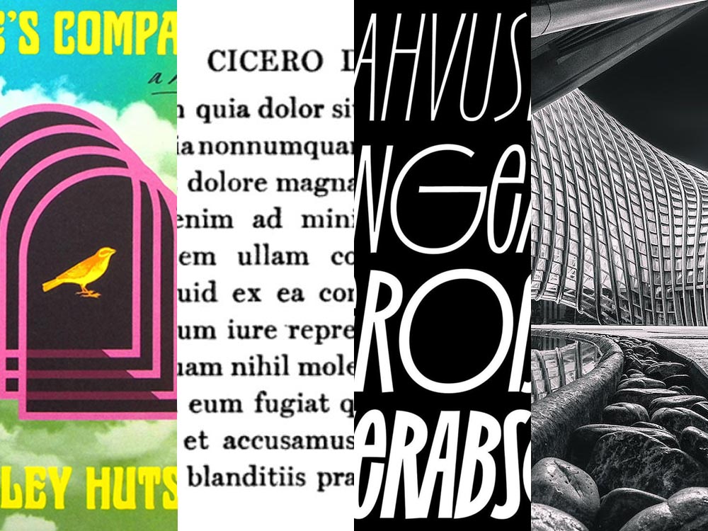
PRINT covers, uh, covers:
While the book blob dominated the discourse for the last few years, we’ve recently identified another trend splashing its way across new releases: the recurring symbol of doorways, open windows, and mysterious portals.
—Charlotte Beach and Chloe Gordon, PRINT
A couple of the examples they cite:
Not only a portal but a shelf. Cool.Not only a portal but also stairs. Nice.
Unlike the blob, I’m in favor of this one — the hint of the unknown is appealing in a visceral way that offers more while simultaneously offering more sales by asking potential readers to speculate and, thus, engage. Nice call, PRINT.
Here’s a question you’ve been absolutely asking yourself: what are the origins of the infamous Lorem Ipsum?
The lack of placeholders on the shelf is remarkably appropriate. (Photo: Scott Keir.)
Turns out it’s not as simple as Aldus [known as Adobe these days —Ed.] — or the even-more-infamous annonymous. Tim Carmody, the very capable guest chair at Kottke.org, fills it in: it’s Cicero. No kidding: Slate says so.
De finibus, indeed.
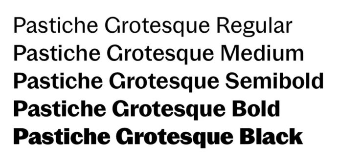
Fourteen Fonts to Follow
Creative Boom, where having eyes on you is actually fun, celebrates “14 Fonts to Fall in Love With” for Valentine’s Day. While Foreword may be late to the party, a couple of the type choices are first rate:
Irregardless1I absolutely want to steal their website design: the menu system is brilliant. and Pastiche, in order. (And no, I didn’t put those two together to be funny.) Read the article and pick your faves.
Art of Building Photography
I wasn’t aware of the Chartered Institute of Building, or their Art of Building photography contest:2Their terms are good, too — something remarkably rare in contests.
“White Constellation,” by Francesca Pompei.
Since architecture and photography very much intersect in my camera, brain, and work, I’m glad to have found this great source of inspiration:
“House of God,” by Roman Robroek.“My own little cosmos within reach,” by Pati John.
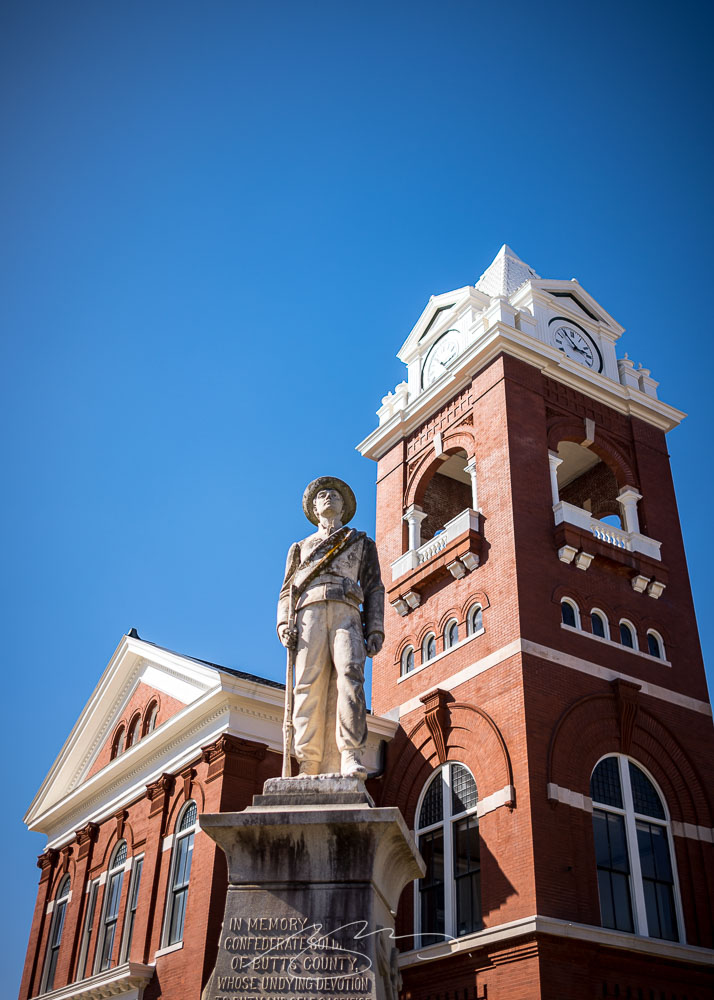
Spring is beginning to blossom here in Middle Georgia, which means it’s time to restart the traditional Sunday drive and photostroll. This week’s destination was the small city of Jackson, seat of Butts County, and home to a typically pretty downtown square:
Jackson Historic Square (20 Oak St.)
The courthouse, as is often the case in Georgia, takes center stage:
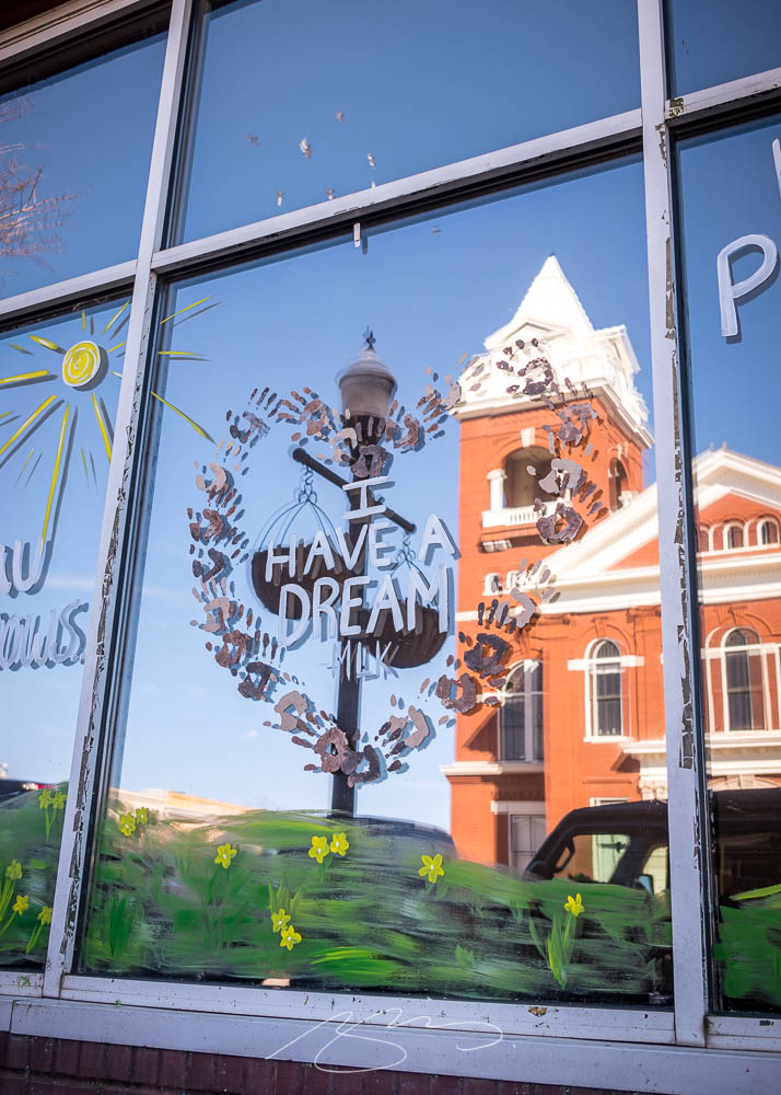
Confederate Butts Forever“Dream,” Not Necessarily Reflected
No, I usually don’t make political commentary. Why do you ask?
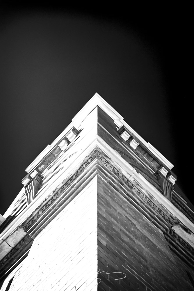
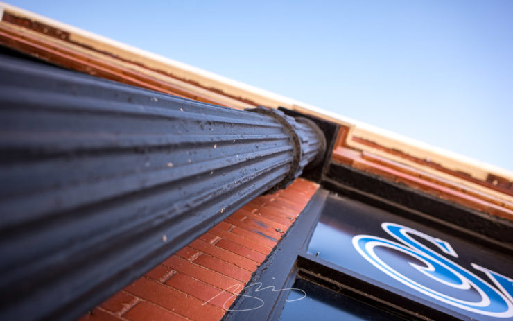
Anyway, there are several examples of my architectural studies, including these:
Butts County Courthouse Tower (B&W Study)Smoking Column Detail, 10 3rd St.
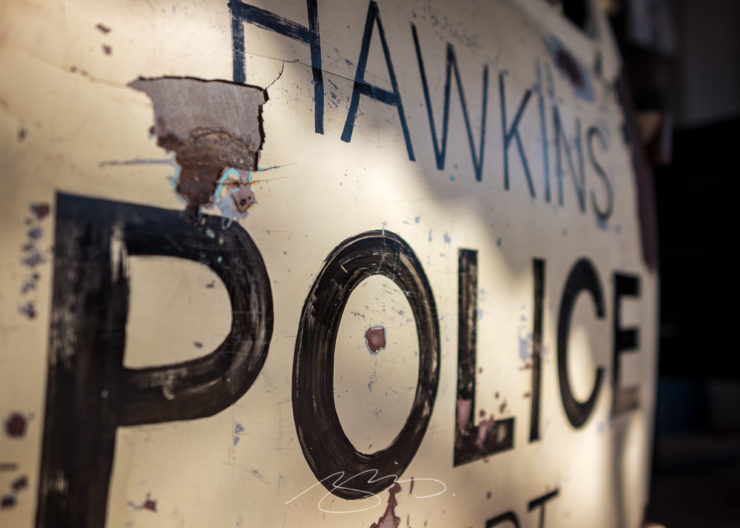
I didn’t realize that Jackson was the filming location for Stranger Things — a stand-in for Hawkins, Indiana:
Jackson is Hawkins (Police)
Check out the full gallery for Jackson, including yesterday’s photographs and those from last year, which include some from nearby Jackson Lake, in the updated gallery.
From book design and minimalist photography to … well, book design and what absolutely isn’t minimalist photography, plus some street signs and another warning about Adobe. Let’s dig in.
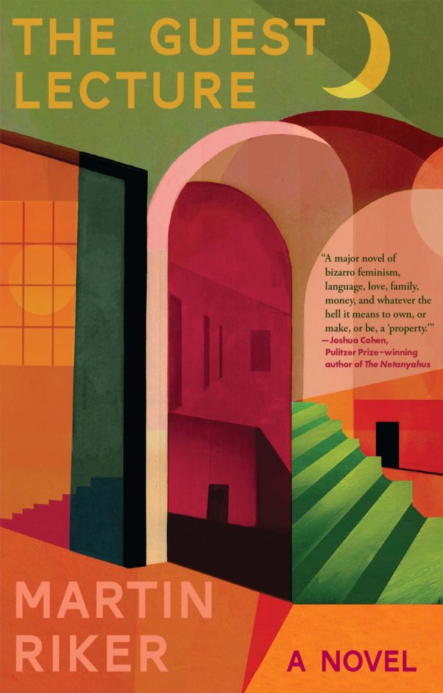
Book Design #1: People Really Do Judge a Book by its Cover
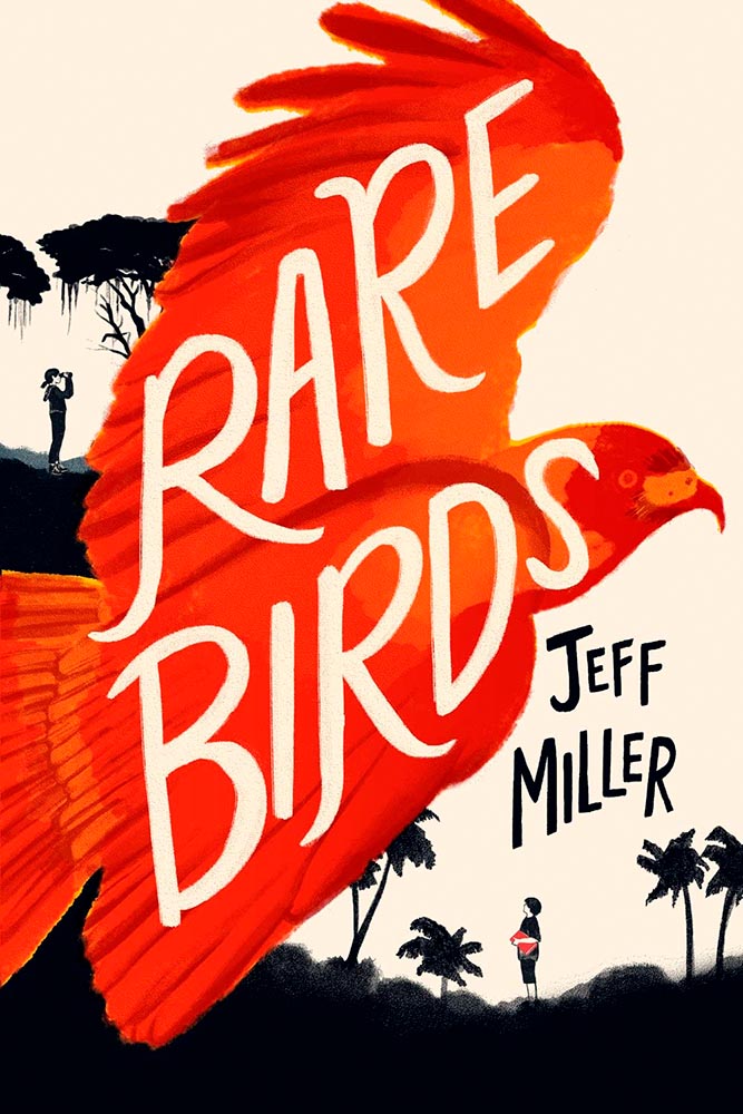
From University College Cork — that’s Ireland, folks — we have something that, on the surface, seems obvious: a book cover“is the most likely factor to convince a person to read a book if they are unfamiliar with the work or its author.” Maria Butler, a PhD candidate in the School of English and Digital Humanities at UCC, reminds us why.
Design by Kimberly Glyder.
You’re reading Foreword, so you likely agree — and shown above is one of those worth-a-thousand-words images: the first of the 2023 titles I’ve set aside for my favorites of the year, and absolutely something good enough to make me pluck it off the shelf without knowing anything about either the title or author.
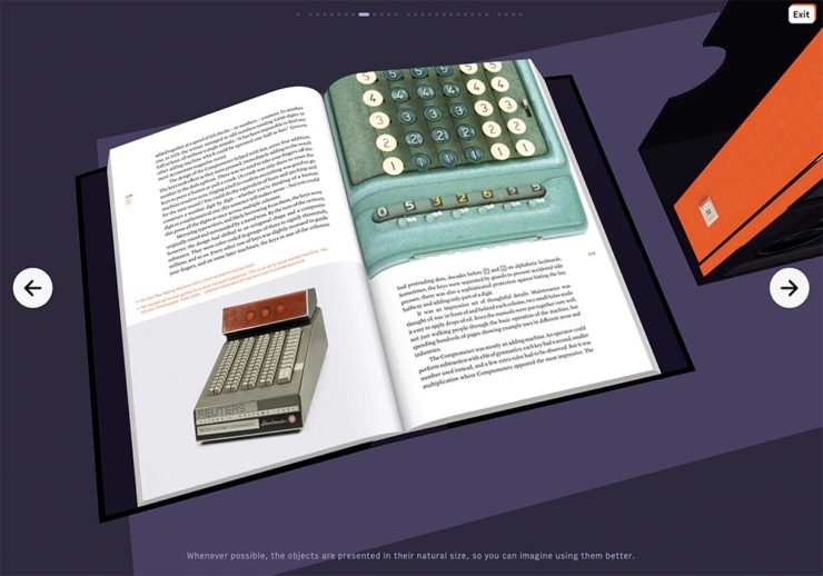
A screenshot from the Shift Happens website. Great stuff.
This project not only scores with great web design — check the interactive version of the book, pictured above — but what also seems like great book design. It’s a Kickstarter project (or will be, next month), so the usual cautions apply, but I might just go ahead and take the leap.
Couple of interesting book design items, by the way: the TOC is at the back, the endpapers are awesome, and the macro photography is tops. The book design reminds me of The Playmakers, still my favorite book design project ever.
Bonus: Tim Walsh, author of The Playmakers, is still going strong. Nice.
Photography #1: Minimalism
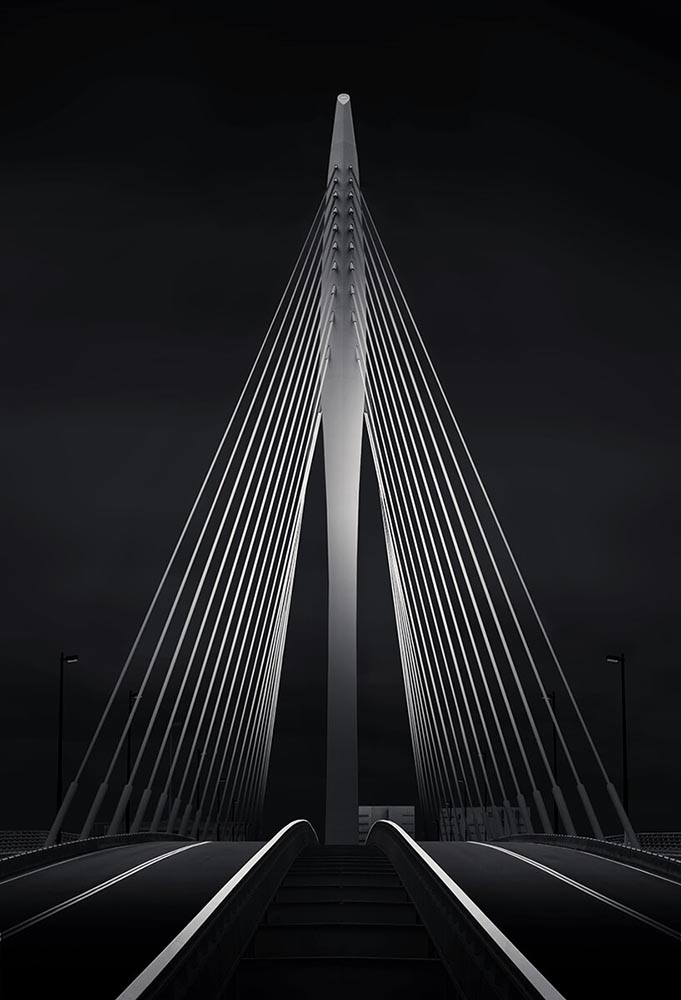
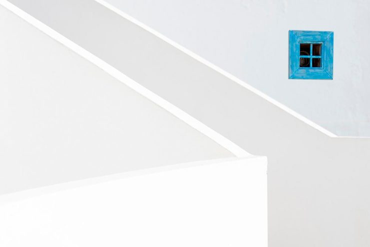
The winners of the Minimalist Photography of 2022 awards are in, some are fantastic. Here are a couple of favorites, from the architecture category:
“Prince Claus Bridge in the Netherlands,” by Arthur van Orden“Blue Window,” by Andrea Richey
The Minimalist Photography Award is the only foundation that deals extensively and professionally with minimalist photography as a branch of photography in which the photographic artistic vision takes the lead.
Milad Safabakhsh, President of Minimalist Photography Awards
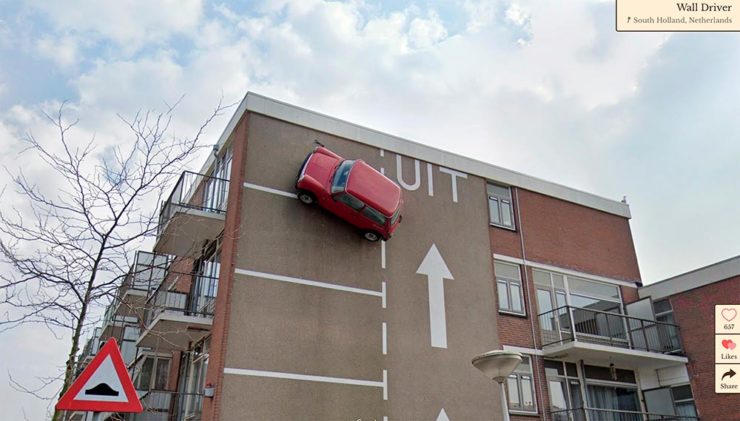
Direct quote, just because: “A man with three legs, a vintage car scaling a building, and an unsettling formation of people donning bird masks are a few of the scenarios highlighted in the terrifically bizarre Wonders of Street View.”
I didn’t know it was a thing to dress up and pose for the Google cameras. Perfect.
Street Sign Style Guide
Speaking of street views, did you know there’s a style guide for highway signs? Would you believe that I’m a fan?
Interestingly, there is an I-42/I-17 interchange in Phoenix, but this ain’t it: these signs are representational.
As with most things government, there’s confusion, too many regulations, and yet it’s based around good ideas. Beautiful Public Data has a guide to the guide.
Adobe Steps in it, Again
From DPReview: “If you’re an Adobe Creative Cloud subscriber, you might want to go and turn off a new setting immediately. It’s been discovered that Adobe has automatically opted users into a ‘Content analysis’ program that allows Adobe to analyze your media files […] for use in its machine learning training programs.”
It’s important to note that Adobe only uses the files saved in the “Creative Cloud,” something I don’t do as a matter of course, but even still, this is yet another example of Adobe using its monopoly position in the creative field to take advantage of its paying customers.
Adobe, unsurprisingly, didn’t return DPReview’s request for a comment/clarification.
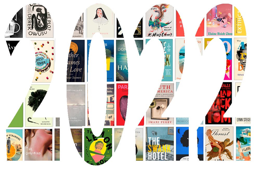
Just like last year, this post took longer than expected due to the best possible circumstance: there were so many great book cover designs in 2022 that I had a hard time whittling down the list. Even as it is, we’re busting right through last year’s limit of 50. Good times!
If we take a step back and look at the trends this years’ favorites represent, it’s more and better illustration, custom and hand-painted type, and a sense of a single focus — one, dominant thing on a field of color. Also, the trend of fewer photographs continues — more evidence that photography has become so ubiquitous that something different is required to stand out. (Or, of course, a really great photograph.)
Please remember that these are my favorites — others might say “best,” but I’ve been in this business long enough to know that there’s always another great title you haven’t seen or read about, and I don’t want to disrespect any of the great book designers not on this list. I’ve tried to include design credit where I could (special thanks to the folks who answered emails with that information), and I wish to stress that any mistakes in the list below (incorrect attribution, for instance) are mine.
Note: If you’re on Foreword’s main page, please click on the post title, above, to view this list. You’ll get larger covers for your viewing pleasure.
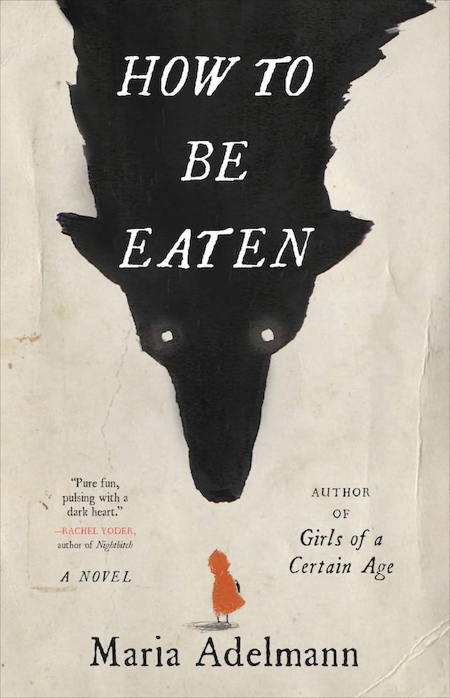
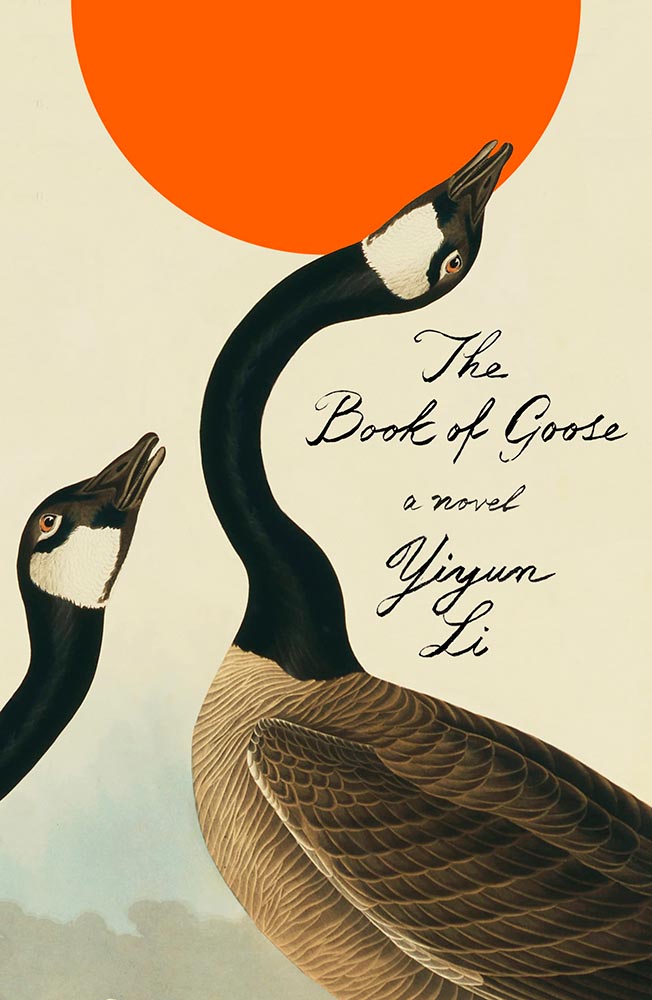
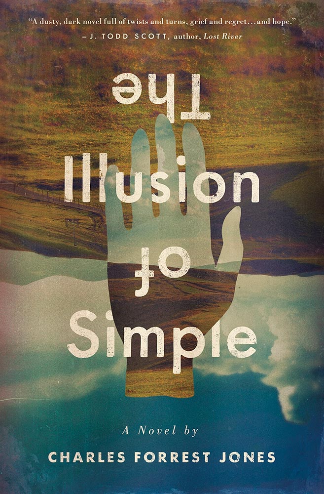
My favorite book covers for 2022 (Three-way tie):
Design by Julianna Lee.
How to be Eaten combines an aged look, just a smidgen of pencil sketch, hand-drawn type, and those eyes to create something that just goes beyond. I’m certain the background wolf and creases are real, too, either photographed or scanned — bonus points for that all-too-rare practical effects — and all this in what amounts to two colors. Simply awesome.
Design by Na Kim.
The Book of Goose defies use of the words “art form” — it’s the kind of cover that for many designers would be once-in-a-career good. However, Na’s work appears below, was here last year, and speaks to Na’s creativity being, well, a golden goose that just keeps on giving.
Design by Derek Thornton.
Simply put: there’s literally nothing about The Illusion of Simple that isn’t perfect. J’adore.
Other 2022 favorites, in alphabetical order:
Design by Matt Bray.
This is striking not only for the beautifully-photographed woman in the pool, but the way the pool is extended out to make that woman even more striking. The pattern overlay is fantastic, too.
Design by Pete Garceau.
There’s nothing about this not to like: the frankly perfect illustration on a great background color, the head through the “O,” subtitle censorship bar, the sock, even the title. Enjoy-a-cigarette-after good.
SoHo Press didn’t return a request for cover design information.
Bunch of aged books with a little type, right? Yes, by so much more: striking colors, great hand-done supplementary text, perfect title treatment, style in spades.
Design by Jo Walker.
This is a UK cover — the American one is okay, but not on this list — that celebrates a minimalism that is rarely seen, let alone so well seen.
Design by Tyler Comrie.
What’s not to say about this cover? While faceless women are perhaps overused, this is a book I’d snatch off the shelf — and seemly catch something from — in an instant. Well. Done.
Design by Oliver Munday.
As simple illustrations go, this one in on track for the city of Superlative. Another Oliver Munday classic.
Illustration by Seb Agresti.
Along with “faceless woman” is “headless woman,” but the illustration here more than makes up for it. But it’s the expert, almost laugh-out-loud use of a void that makes it. Well done.
Design by Aleia Murawski and Sam Copeland.
Sure, the title and background colors are neat, the sky outside is cool, and “a novel” is a nice, subtle addition. However: I want to know how this photograph happened. (And a waffle hot dog.)
Design by Maddie Partner.
The first of a couple of titles with unexpected wrap-around type treatments, this one has great type choices, too. But the real treat for me is the plane knocked out the photograph. Fantastic.
Design by Suzanne Dean.
This title hides a secret: under the simple and wonderfully-die-cut jacket is a beautiful photo from René Groebli’s photoessay The Eye of Love.
Awesome. (Note that, once again, we celebrate the UK version of the book; the US hardcover has a design not on this list. Crumpets.)
Design by Mike Topping.
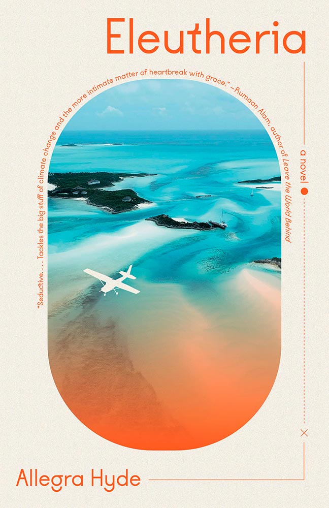
The moon as O. The birds. The graduation from fur to imagery. The yellow. Any would be good on their own, but are great together. Have to say: I’ve seen this in multiple shades of yellow. I prefer the darker — closer to the Barnes title, above — to the lighter, shown here.
Design by Anna Morrison.
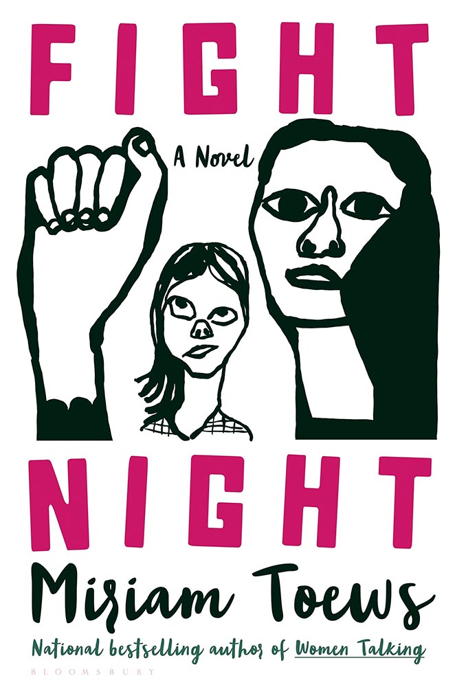
The typography, awesome little plane — the purse(r)! — the clouds, all of it: sky-high levels of good.
Interestingly, Fight Night‘s cover also had a 2021 version worthy of note:
Design by Patti Ratchford, illustration by Christina Zimpel.
I can’t begin to imagine what caused the redesign, or why it wound up being so radically — 180 degree! — different. The old design wound up on some “best covers” lists (here’s LitHub’s October 2021 post, for instance); both have wound up on mine.
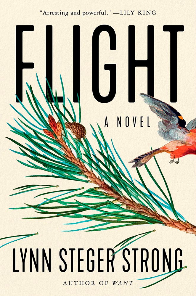
Design by Ploy Siripant.
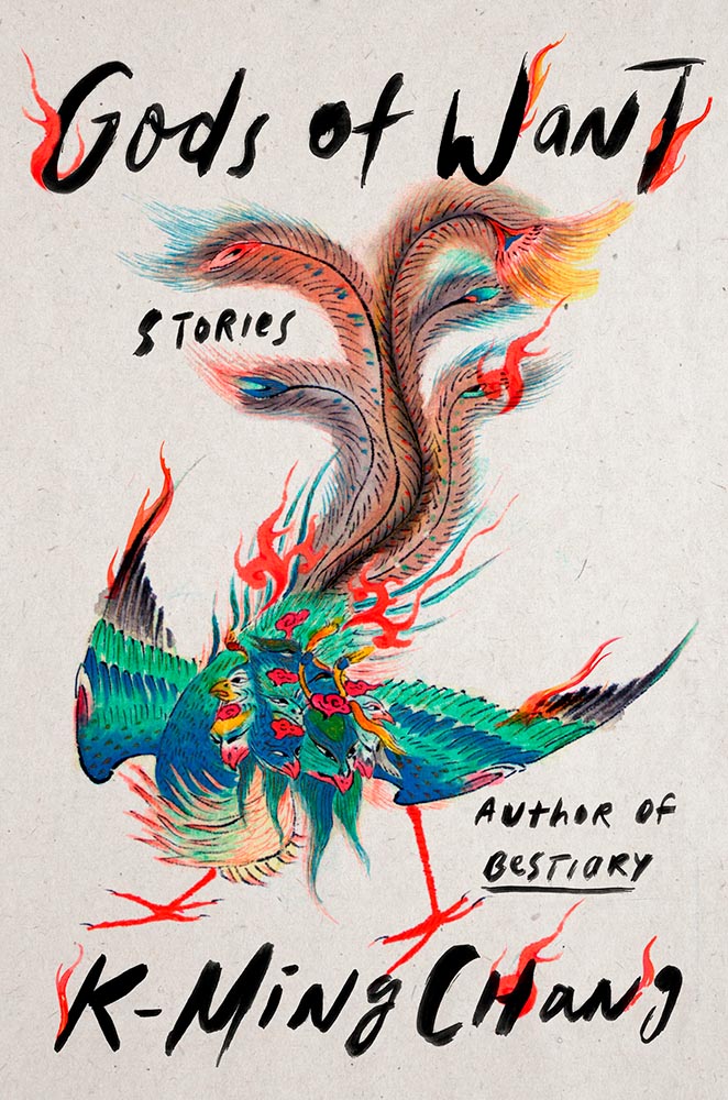
The bird exiting the scene stage right makes this just right, with bonus points for the textured paper and slightly-rounded sans serif. I think the illustration is perfect — classically done, one could say — and also love that “author of Want” is in a different font.
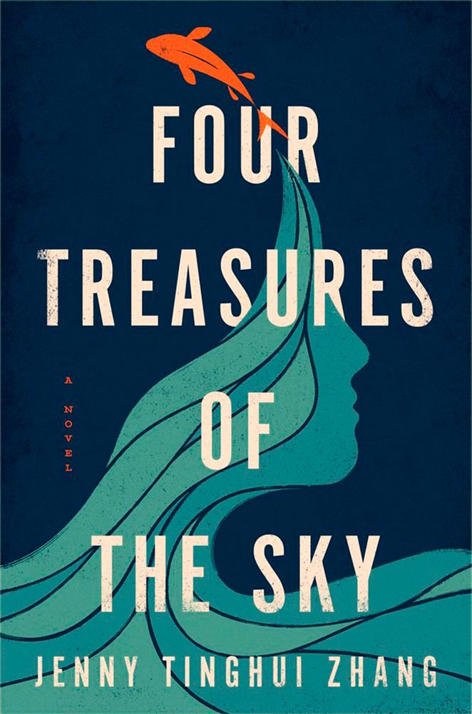
Design by Vi-An Nguyen.
Four Treasures to the Sky, mentioned in the May book cover design roundup, leaps into the best-of-the-best list. It features an aged look, but in a woodblock way that celebrates its limited palette. Add in the illustration’s interactions with the type and the vertical “a novel” — often an afterthought — and brilliance emerges.
W. W. Norton didn’t respond to a cover designer request. Apologies.
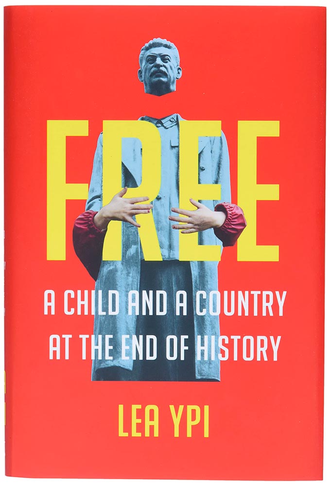
As photomontages go, this one is simple — yet simply powerful: red Albania meets (and hugs!) beheaded Stalin. Great choices.
Design by Alison Forner.
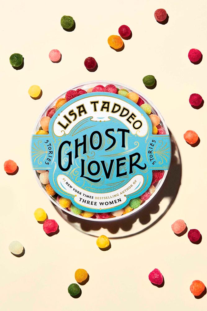
The quality of type and decorations on this “label” are beyond outstanding. This cover is candy for book design lovers and readers alike.
Design by Alex Merto.
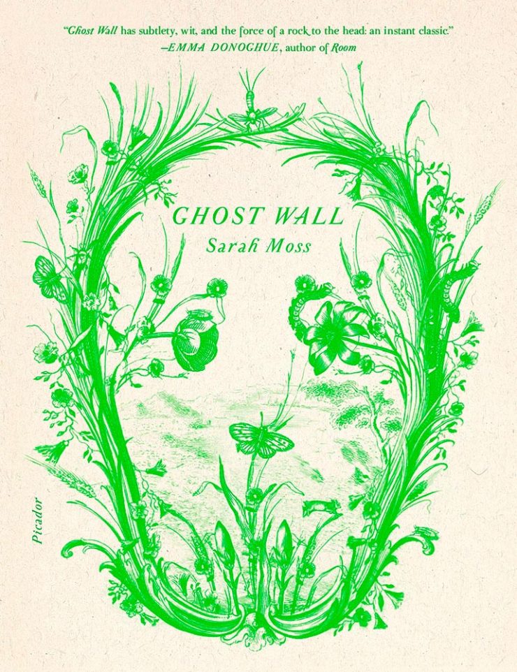
From It’s Nice That, we have a nice feature on Alex Merto — whose Ghost Wall cover is a great example of plant life adding so much more: “the force of a river to the head,” to paraphrase Emma Donoghue’s quote. Plus, one color! Win.
Design by Grace Han.
Nine parts awesome: type and illustration join to light a fire under the words “quality” and “imagination.” (Have I mentioned that I love a textured paper? Here’s a different one that’s also great.) This is one of several titles that’s not only a great book cover, but on a bunch of “best book” lists, too. Great books should have cover equal to their contents, and this one scores.
Design by Emily Mahon.
This isn’t here because of the attention Ukraine deserves these days, it’s here because of that illustration. Brilliant design needn’t be complicated, so ably proved here.
Design by Lucy Kim.
I mentioned at the top of the post that, these days, photographs have to bring something special to the table to stand out. And this cover does, from any table in any bookstore anywhere. (Lovely typography choices here, too.)
Design by Matthew Broughton.
One trend I didn’t mention at the top of the article is the montage-in-type, done here to absolute perfection.
Design by Andrea Ucini.
The woman in looking off the edge of the page at … something looking back. (Not only that, whatever it is casts a shadow.) The book is described as “subtle yet candid,” something that could equally be said about this brilliant cover.
Design by Holly Ovenden.
Another UK cover, this image doesn’t show the uncoated stock and debased type — but does show the jump-off-the-shelf color choices and awesome interaction of title with background. (The US cover, alas, resorted to stereotype. Perhaps we aren’t sophisticated enough?)
Yale Univ. Press didn’t respond to a request for the cover designer.
Choose a interesting texture, put some blocks of color on it, some type and … done. Hah! (Seriously, just look at the hands: they say it all.) Bonus to the hints of doily in heaven.
Design by Emma Ewbank.
The wrap-around title treatment makes another appearance here, with bonus second and third layers and a perfectly-done pull quote. With the aged ink fill and type accenting the striking illustration, this one is in that “wall-worthy” category.
Design by Matt Dorfman.
On our second Ukrainian title, both flower and umbrella work together here to force us to stop and look. (The stenciled type is a brilliant stroke, too.) Proof that genius often appears simple.
Design by Jenny Carrow.
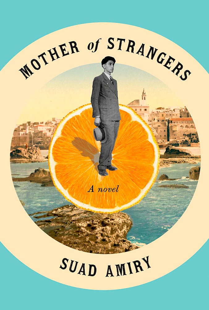
The montage, taken to the next level: Jaffa, orange exports, and an healthy serving of emotion. (Also: curved text is rarely so on-target.)
Design by John Gall.
So simple, yet it is precisely that reaching off the shelf, grabbing your attention. This book is described as “spare and monumental,” and no less can be said of the cover.
Design by June Park.
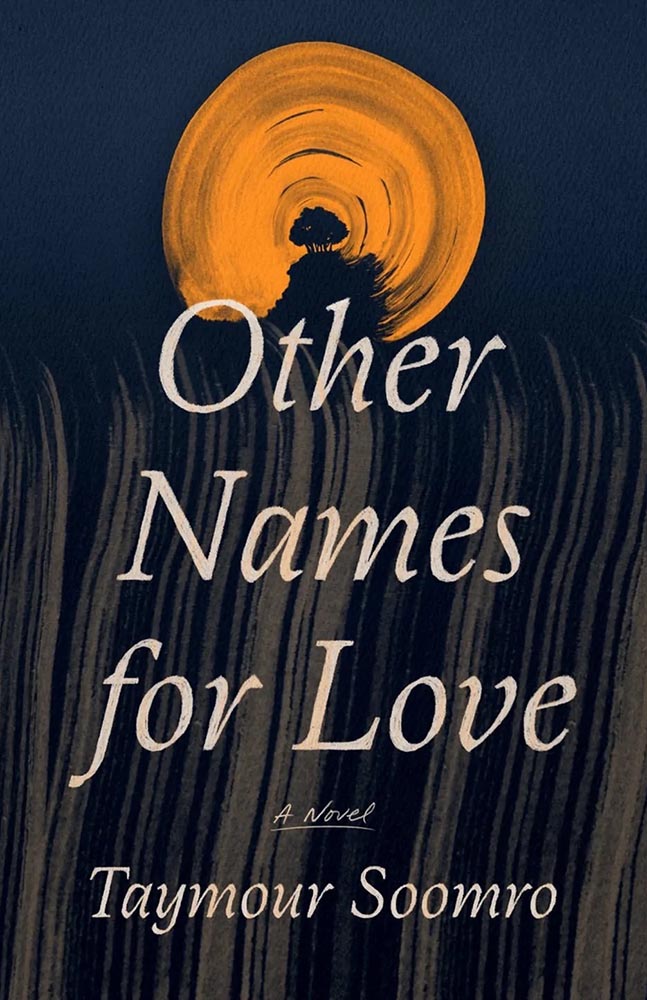
“Texture is key,” sure, but there’s texture and there’s this. The island’s brush strokes into what seem like a moon are whatever happens beyond perfection. I didn’t expect this cover for a novel about Pakistan, yet the emotion, the … evocation is perfect.
Design by Oliver Munday.
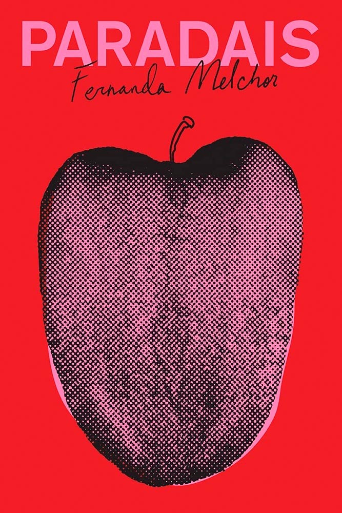
Apple? Tongue? Misfit teenager? Disturbed and distressed? Yes.
W. W. Norton didn’t respond to a request for cover design information.
Rarely are such seemingly “dry” subjects treated with such skill: the angled type set against an urgent red, the subtitle sticker-that’s-better, and the photo choices add up to something I’d grab off a shelf immediately.
Cover design: Christopher Sergio
LitHub says this one has a very high “hang on the wall” factor. I can’t think of a better description — great stuff.
Cover design: Na Kim
Na Kim just can’t help but design the best covers: a wonderful, antique background complimented by sheer brilliance. (Great typography, too.)
Cover design: Emily Mahon
It’s nigh-on impossible to look at this cover and not flip it around to read the text trisecting the leopard. Take something simple, add the elusive more, get this. Yeah.
Cover design: Jim Tierney
Another fantastic example of plants adding more than the sum of their parts. The mottled green background and watercolor-style falloff is perfectly complimentary. Great stuff.
Macmillan did not return my inquiry regarding a cover designer.
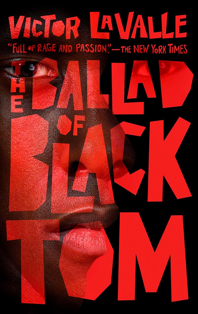
From the Banned Books Department, we have the 20th Anniversary edition of this difficult title rendered in a photo-based collage that’s nothing short of brilliant. Highest praise.
Very nearly the perfect black-and-white cover. Texture and shape combine with an incredible title treatment in a way that shrugs off the need for color. Fantastic.
Design by Allison Saltzman, art by Sonya Clark.
I’ve said before that moving to the South was a bit of a shock — the racism still all-too-evident jars all-too-often. This cover takes a simple, elegant idea and, without any of the stereotypes so often reached for, delights with style and simplicity, absolutely earning its spot in this list. (This is another of those titles that’s on many “best of” book lists, too. It’s a genuine pleasure to see worthy books get great covers.)
Design by Holly Macdonald.
“Wow” is the only word here — a stunner of a photograph used in, if I may borrow from the cover, a breathtaking way. Simple, elevated to exquisite.
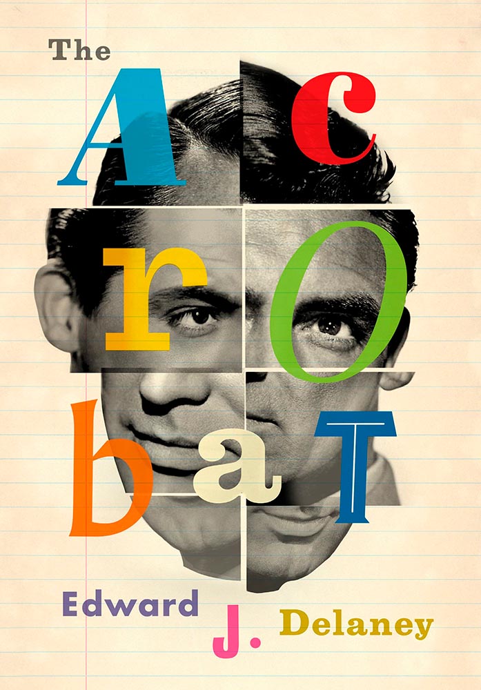
Design by Jamie Keenan.
Never mind that I never knew Cary Grant was once a stilt walker (or named Archie Leach), this is an exercise in using a famous face in an innovative way, with a cast of supporting characters that flow as naturally as lines on paper. A trip through the possible — fantastically well-done.
Design by Jamie Stafford-Hill.
Fantastic type and color treatments, yes, but it’s the way the photograph is handled that shines: where the eyes are, the color treatment implying front and side, all of it. A 2016 book reissued in hardcover with a cover guaranteed to attract new readers.
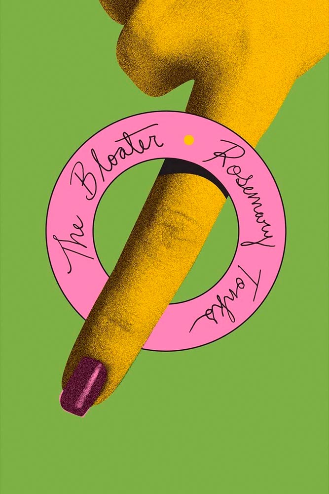
Design by Oliver Munday, or perhaps Erik Rieselbach (depending on who you ask).
This cover is the antithesis of a swelled, salted herring: it’s brisk, to the point (if I do say so), and throws a life ring out to inspire book designers everywhere.
Book design: David Drummond
Brilliant: actual text, printed (on a great color paper, too), with actual string, photographed on said print. Not only is it exactly right for the subject matter, it’s simply and beautifully done.
Cover design: Jack Smyth
Never mind the great brushed color blocks or boat-rowing-the-ocean above the title. This is here mainly for the overlap between color and island: shortlisted for the prize for intersection-of-the-year.
Design by Luke Bird.
“I’ll just do a little cropping,” designers say. Then there’s … genius.
Design by Mary Austin Speaker, art by Stacia Brady.
Another piece of art that’s absolutely wall-worthy — actually by the author’s mother — complimented by a tasteful type treatment with a wonderfully-offset “poems.”
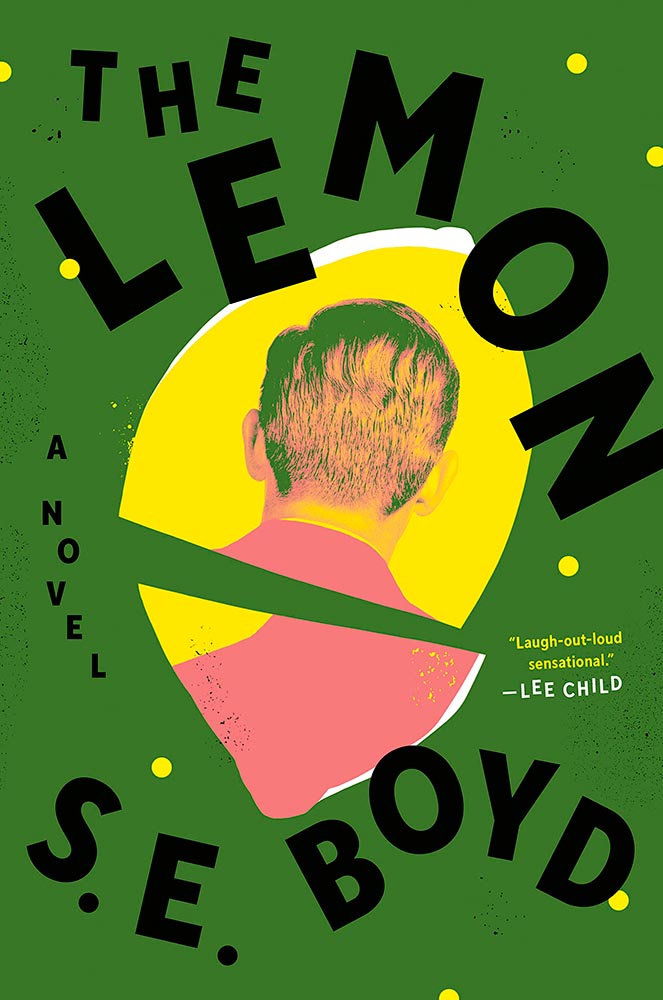
Design by Colin Webber.
“Great” can’t even begin to describe this cover — from the lemon shape, staggered type, green background, back-of-head portrait, to the slightly-aged treatment, we have ingredients that add up to that highest of achievements: a book I’d buy knowing nothing about, no hype [machine] needed.
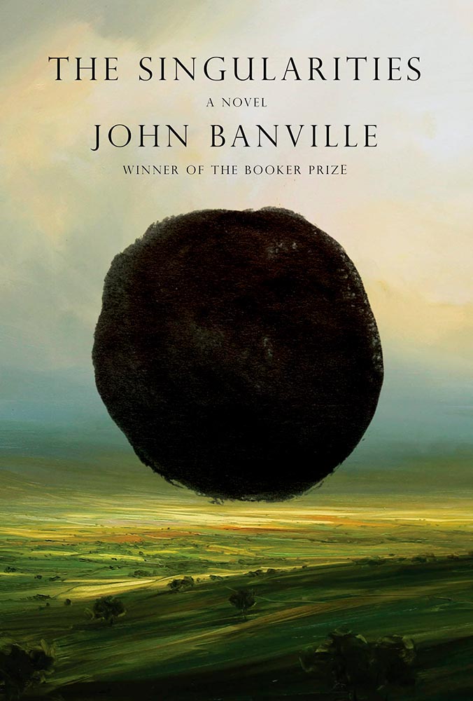
Design by John Gall.
Classical painting with a singularity. Sure. So easily pulled off … if you’re John Gall.
Graywolf Press didn’t respond to a request regarding cover design.
The title treatment is the winner here, using two translucent shades of orange to the best possible effect — taking a nice painting/illustration to the top floor.
Design by Alex Merto.
Describing this cover as “haunting” would be a cheat — but completely accurate. (Love the line of type down the right side, too.)
Design by Jamie Keenan.
The rare type-only treatment … taken to an entirely new level. Fantastic.
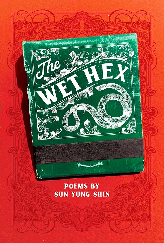
Design by Christina Vang.
A triumph of textures: one matchbook you never want to throw away.
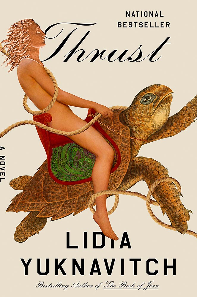
Design by Lauren Peters-Collier.
Breaks through more than water and time: it’s thrust into your memory. (See a note from the designer at LitHub’s cover reveal.)
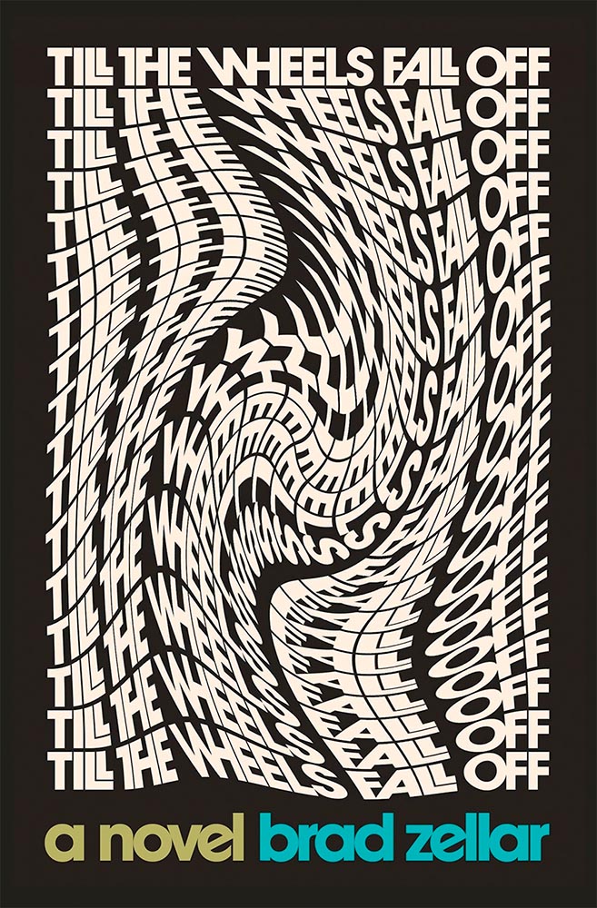
Design by Albon Fischer.
One of only two text-only treatments in this list, done in a ’70s style — yet taken to a clever and impressive level. (Love the stacked “lls.”)
Design by June Park.
I adore how the type and frankly fantastic illustration work together here. Wonderful!
Cookbooks rarely make an appearance on “best book covers” lists — yet this one earns its spot with an antithesis-of-the-stereotype approach. Ordinary it is not, in the best possible way.
Design by Jack Smyth.
Another UK version — the US version is good, more than most even, but it’s this one that shines with its great photo choices, cut lines, and great type treatment.
Design by Katie Tooke.
This one’s a two-fer, with the UK version, above, showing the book-edge treatment done really well, while the US version…
Design by … ?
…takes it to another level. Is there such a thing as a cloud globe? Or is that one of those old-fashioned stock-ticker covers? Either way, the subtle pattern — in front in some places, receding in others — adds a wonderful touch. Great stuff. (Great, too, to see the US version take one: a rare treat.)
Cover design by Roman Muradov.
Bellevue Literary Press scores a win here, with something immediately recognizable as about music, yet so much more. Performance art, indeed.
Note: I originally attributed this title to Yale University Press instead of Bellevue Literary Press. I regret the error.
Design by Na Kim.
Na Kim apparently not only did the design but the illustration, as well. The rest of us can only aspire to that level of talent.
Cover design: Leanne Shapton
This illustration being in grayscale is, at first, a little off. But, of course, that’s exactly the point. I overuse “brilliant,” but it’s the best description. (Again, see a note from the designer at LitHub‘s cover reveal.)
Design by Elizabeth Yaffe.
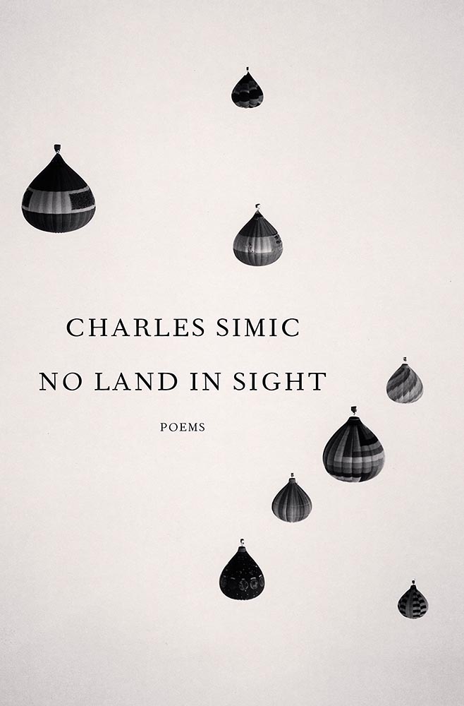
Family epics, climate change, dystopian futures, and Moon — all somehow included in this rich illustration. Two-color greatness. (Bonus: Another great use of “a novel,” something often “meh.”)
Design by Brian Moore.
A standout historical photograph is only the beginning: it’s really the coloration that’s the story here, for both book and cover — so well done.
Design by Kelly Blair. Illustration by Toby Leigh.
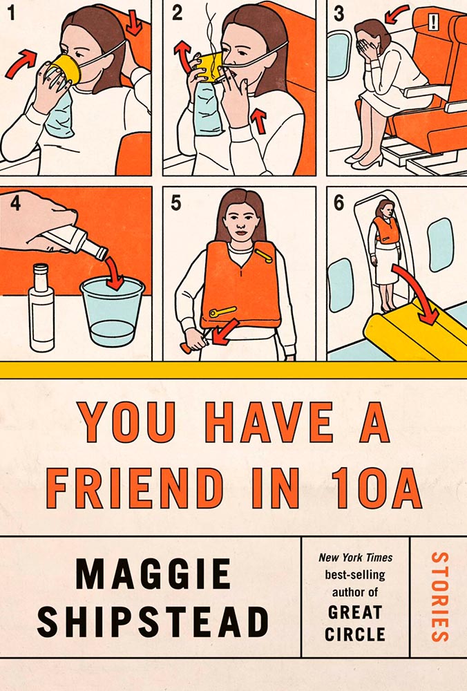
Among the best book cover illustrations ever, perfectly inserted into the seatback in front of you. (Great Circle’s cover was in last year’s list, by the way.)
Design by Christopher Moisan.
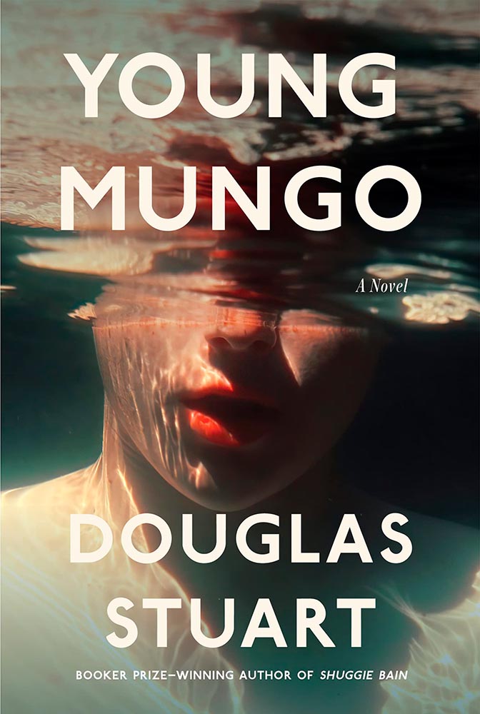
There’s something about underwater photography, with its beautiful, soft light and fascinating reflections, that is evocative — and there’s nothing about this photograph that isn’t evocative. A triumph.
• • •
Whew. Seventy great book covers. 70!
Okay, let’s summarize: 2022’s crop of favorite covers not only surpass 2021’s, the quality of work here represent what I believe to be a new standard. To all the designers — and art directors that chose them — congratulations.
I don’t usually think it’s fair to quote another blog post in its entirety, and I certainly won’t make a habit of it. With that out of the way, the always-interesting Pixel Envy, written by Nick Heer, hits us with a doozy — one that, due to its length and depth, requires the complete quote:
It’s a cycle. People create something, together, that reflects their energy and weird work; that thing becomes compelling as a result, and that makes it valuable, and at some point someone puts a price on it and someone else pays that price. It is at that moment that the thing begins to change. The new owner will almost always decide that what is most interesting about this thing is not the human essence that gave it value, but The Owner Himself, and will act accordingly. People will come back for the valuable stuff until the owner succeeds in crowding it out; when that crowding is done, the owned thing dies. Until then, what’s left is just what’s valuable—the humanity and brilliance and unpredictability and fun that all that cynical and idiotic and self-serving wealth is always and everywhere busy replacing with itself. There’s nothing to do but look for the good stuff until the looking becomes too challenging, or until it’s gone.
Heer writes in response: “You may disagree with Roth’s headline thesis — ‘everything is Silicon Valley now’ — or his tie-in with the story du jour, Twitter, or his analysis of baseball’s problems. But the paragraph above? That is something to keep pinned in your brain. For most of us, it is a reminder to be wary of how things are changed in exploitative ways; for those in power, it should be seen as a cautionary pattern.”
Pinned.
Kottke is Back!
After a few months off, Jason Kottke is back in the blogger’s seat to enrich all of our lives. As someone who’s been reading for years — he started in 1998, and I’m certain his site was in the blogroll of the old Foreword, back in the Aughts.
Fine hypertext products indeed: Kottke.org, December, 2022.
We might be waiting a while for his so-called “comically long what I did on sabbatical post,” but his Sabbatical Media Diet post is a gold mine of to-read and to-watch items.
Welcome back, sir. May you blog for many seasons more.
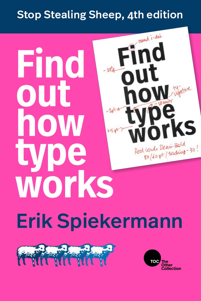
Stop Stealing [Free] Sheep
No, not that — the type book:
From Kottke, while we’re on the subject, one of his Quick Links from Dec 20th: “Google Fonts is offering a free download of the newly updated 4th edition of Erik Spiekermann’s Stop Stealing Sheep & Find Out How Type Works.” It’s a PDF, available now.
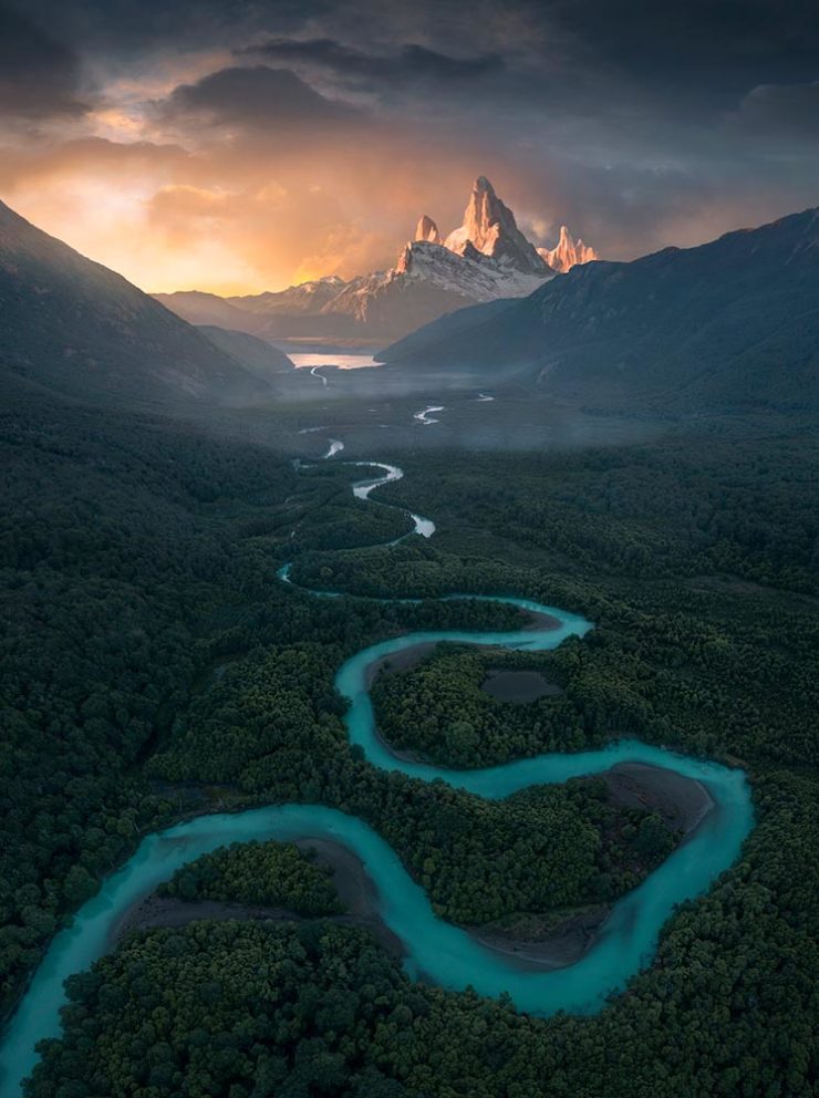
9th Annual Landscape Photography Awards
It’s fair criticism to say that I both decry photography contests and yet sometimes celebrate the results. But…:
“The Winding Journey” by Max Rive, Border Between Chile And Argentina, Patagonia
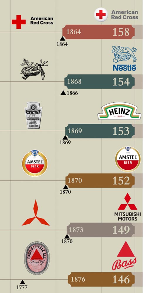
Image Relay has an interesting item showing how long some familiar logos have been used — and, yeah, there’s a reason they’re familiar!
The black triangle is when the company was founded, and the bar indicates how long a logo with elements still used today has been around.
That’s but a sample of the complete listing; shown are nos. 3–8. Coca-Cola, the company I’d probably name if asked for the oldest logo, is no. 12. Click through for the rest.
That’s it for this year
Foreword will be back in January with our annual first-of-the-year best-of: my favorite book covers of 2022. Happy holidays, everyone!
Top image: Tree Lights, December 2020, downtown Macon, Georgia.
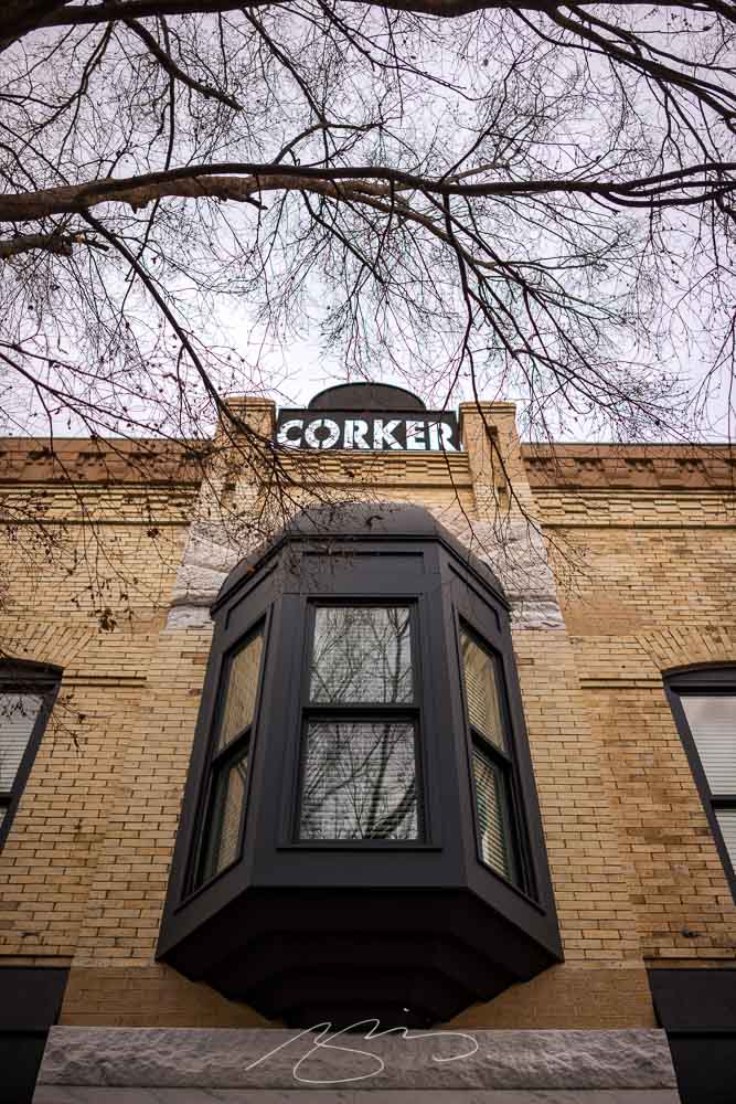
Named for the city in Ireland, Dublin in Georgia is an hour or so southeast of Macon. It’s my third trip there, and, like last time, I enjoyed Gerald’s company.1He seemed to enjoy the trip, rain notwithstanding, but apparently the creative juices didn’t flow. (Sorry, man.) Details here.
It has a photogenic downtown, too:
Corker (of a) Building, W. Jackson St.Fountain and Holiday Tree, N. Monroe St. and Bellevue Ave.
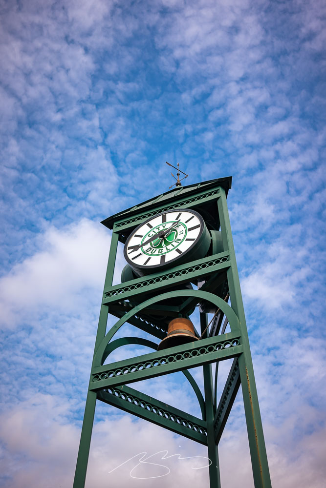
The Welcome Park includes a clock and bell complete with clover, reminding visitors that the name is, in fact, a tribute:
Dublin Welcome Tower #1
As has become typical, my favorite — “best” is debatable, of course — shot is a close-up that’s almost an abstract. In this case, a turquoise box car in the appropriately-named Railroad Park:
Pull Down for Camel, Dublin Railraod Park
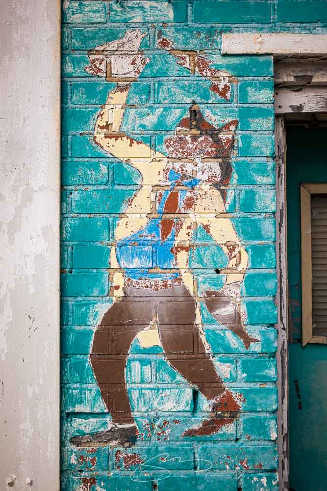
Just off the main drag we found an item thankfully not yet painted over:
Aqua Fox, Jefferson and Madison
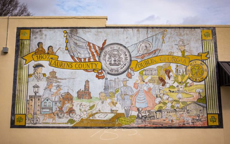
. . . Which may, in fact, be a holdover from a bygone era. In fact, I’d be remiss if I didn’t call this subject out:
Laurens and Dublin Mural (No Biases Shown), S. Lawrence St.
The only people of color depicted here are Native Americans, relegated to viewing (probably from afar), and two Blacks, very much shown “in their place.” (Dublin still prominently features a Confederate memorial, as well.) Let’s hope that this small city continues its journey into the 21st century, one step at a time.
See the updated gallery here. As always, once in the gallery, click on any photograph to start a slide show.
1
He seemed to enjoy the trip, rain notwithstanding, but apparently the creative juices didn’t flow. (Sorry, man.) Details here.
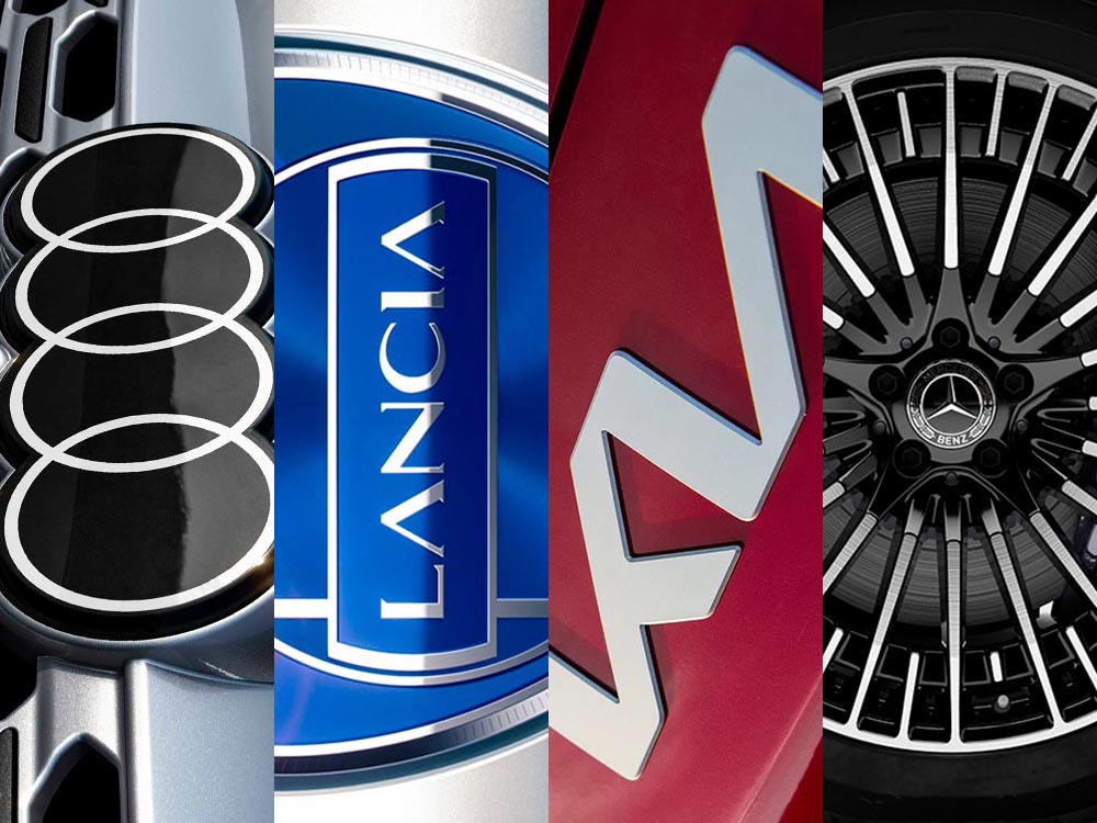
This time, it’s three automotive logos . . . and Mercedes’ accounting department, plus a holiday bonus. Joy to the Auto!
New Audi Logo Falls Flat
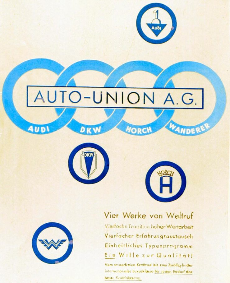
Audi’s “Four Rings” have been around for a long time — since Auto Union was formed, ninety years ago:
Now Audi follows the pack (see VW, Mini, Volvo, etc.) and converts their logo from three-dimensional to two; the rings now are either white and framed by a thin black border or dark grey with black borders.
Four-ring closeup. (It’s hiding sensors, too.)
Not an improvement, IMHO. One of the articles mentions the concept of “a consequence of digitalization,” and think that’s about as good a description as you’re gonna get.
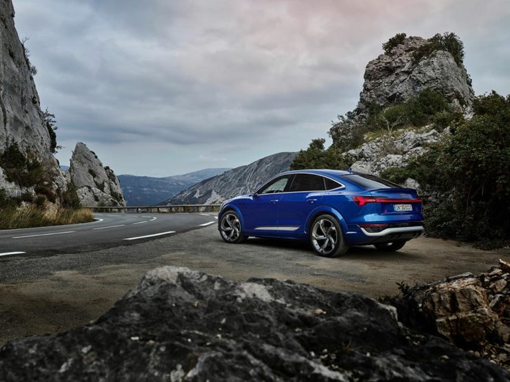
The change will roll out starting with the updated Q8 e-tron — which, thankfully, still looks good:
Okay, it’s not really — it’s a conceptual sculpture, titled “Pu+Ra Zero,” that represents their rebirth:
They call it a “a three-dimensional manifesto,” and no, I don’t get it either. (The light signatures and, apparently, the circular sunroof will carry through to the new models, however.) The logo, their eighth in 116 years, is new as well:
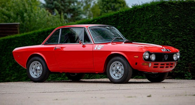
I didn’t know Lancia well (only in passing? Eh. —Ed.) until the famous Top Gearsegment naming them “the Greatest Car Manufacturer of All Time,” although I knew of the Delta Integrale — and think that the Fulvia is one of the prettiest sedans ever:
The 1972 Lancia Fulvia
Let’s hope their new models, and conversion to an all-electric manufacturer, lives up to their past achievements. Meanwhile, The Autopian has the best roundup of the new Lancia.
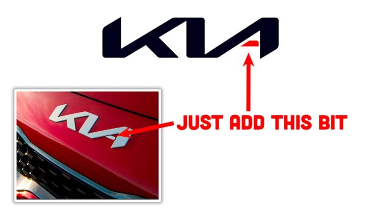
Kia, KN, and … Wait, What?
30 thousand folks a year are doing Google searches for “the KN car.” Why? Kia’s logo, of course:
I’m not a huge fan of the new Kia logo — and can absolutely see the “KN problem” — but I think it speaks more to modern society that this is a news item than anything related to graphic design. Willing to be wrong.
Mercedes: $1200/yr for Full Output
This subscription thing has gotten seriously out of hand: Mercedes-Benz USA, in an effort to further bilk their customers — ’cause, y’know, MBs don’t cost enough — has decided that the last 60-110 horsepower available on their 2023 electric vehicles are only available for a yearly fee.
This time, art from old encyclopedias, architectural art, and an appeal to add art to your post-holiday shopping and giving plans.
Books as Art — In a Different Way
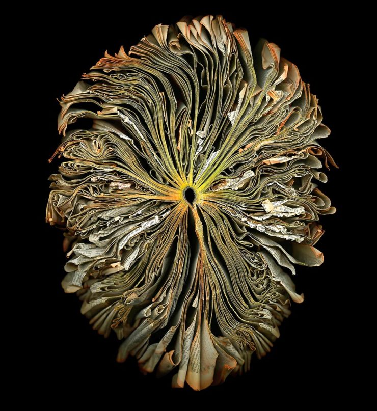
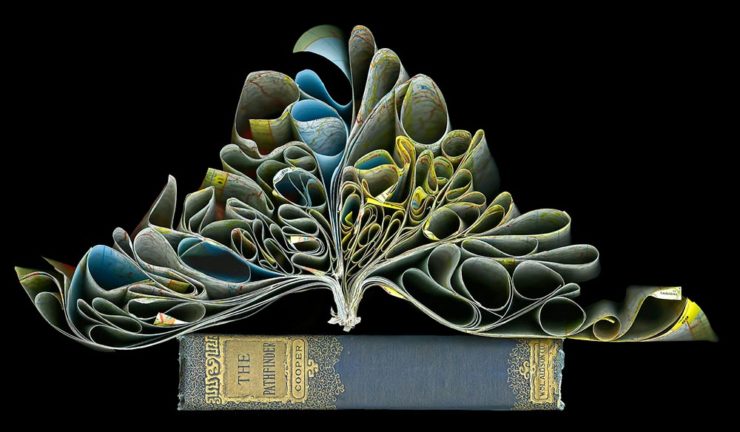
Cara Barer says, “Books, physical objects and repositories of information, are being displaced by zeros and ones in a digital universe with no physicality. Through my art, I document this and raise questions about the fragile and ephemeral nature of books and their future.”
It’s more than that, though:
As This is Colossal puts it: “With cracked spins and crinkled pages, the manipulated objects reference the relationship between the natural and human-made as they evoke flowers at peak bloom.”
As a book designer, I’m glad that the titles used aren’t something a designers labored over but rather mostly instruction manuals and old encyclopedias. Either way, they’re a beautiful way to make commentary.
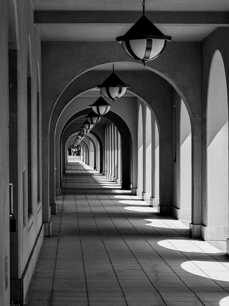
“Photographic escapades in arcades and colonnades”
Liberty Station, San Diego by Keith James
Few scenes set my photographic heart aflutter as does the view down a long covered walkway towards a distant, barely visible vanishing point. As a self-confessed symmetry addict drawn to architectural images in black and white, photographing these vistas scratches a deep creative itch.
Keith James, MacFolios
His article is well-illustrated, informative, and speaks to my heart: I love a good arcade — although, in some cases, I feel like an entry or exit makes the point:
Vassar College Chapel Arcade, September 2021
This is not the first time I’ve admired Keith’s work. His “Architecture Meets Sculpture in Black and White: the Interplay of Light and Form” was great work. Both articles are highly recommended.
Artist Sunday
For those of you in the United States, this weekend is the Thanksgiving holiday. It’s also that most American of traditions: a shopping weekend. I have spent recent years boycotting Black Friday and Cyber Monday, and am encouraged by the emergence of Giving Tuesday. Here’s something to add to that list:
Photographer Chris Sherman developed the concept of “Artists Sunday” in 2019, after noticing a bump in sales on that day in November. “The idea struck,” Sherman told Hyperallergic. “What a great time to patronize artists — during the busiest shopping weekend of the year.”
In 2020, Sherman launched the project alongside Cynthia Freese, a fellow artist who has also spent extensive time on the boards of arts nonprofits. On a dedicated website, Sherman and Freese provide artists and arts organizations with free marketing materials to promote the event. Now in its third year, over 4,000 artists and more than 600 towns and cities across the country have signed onto the initiative, which takes advantage of special events and partnerships (with nonprofits, individual artists, and businesses) to spread the message.
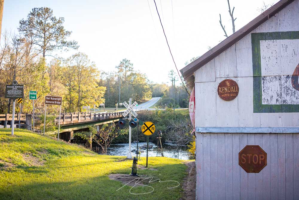
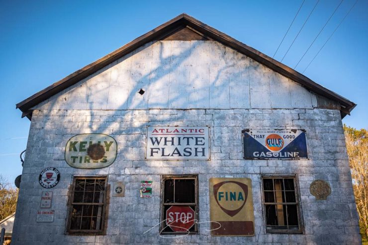
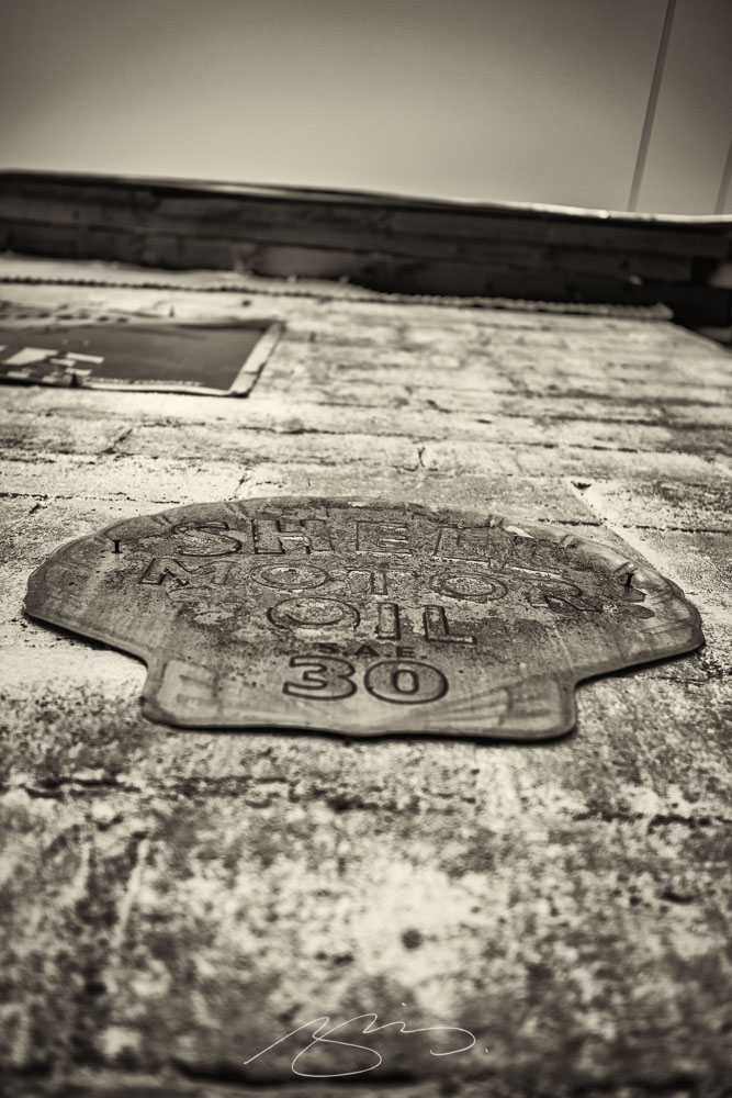
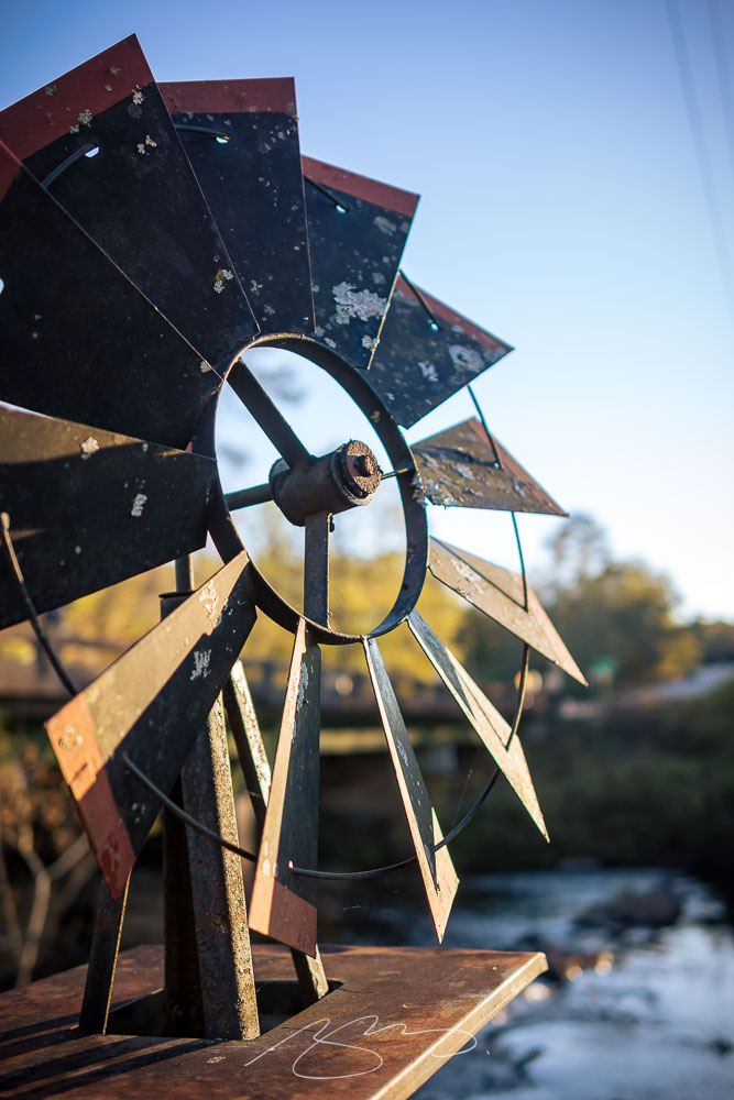
An unintended postscript to the recent photostroll, and another in the lengthy list of places you pass through without stopping — except, this time:
Signs of White FlashShell Motor Oil
While tiny, Fickling Mill in 2022 is eye-catching, thanks to this building at the water crossing, and likely represents exactly what the name advertises — the location of a former mill of some sort, driven by the power of the water of Patsilinga Creek.
Patsiliga Creek Over the Fickling Mill Dam
We were there late in the day, hence the fading-yet-still-golden light:
Windmill Decor and Patsiliga Creek
Only nine photographs, but posted as a dedicated gallery. Enjoy your virtual photostroll — and thanks for visiting.